Chapter 4
Practicing Persuasion
“To make converts is the natural ambition of everyone.”
—Goethe
Getting someone to see ideas in data is good. Getting them to change their thinking because of what they see is special. To move people, to bust their assumptions, to gain allies, or just to get funding, you need to persuade—not just inform—them. But persuasion isn’t easy. It requires a balance of aggressiveness and restraint. You need to actively shift people’s eyes and minds to where you want them to go, but you also need to refrain from rigging your charts to make that happen. The line between persuasion and unfair manipulation is blurry, and you shouldn’t cross it.
At the same time, to suggest that you should avoid persuasion altogether is wrong. Passively reporting statistics with no point of view is unrealistic. In fact, it’s impossible. Any chart is a manipulation—some combination of conscious and unconscious decisions about how to use space, what to include or exclude, and when to highlight or downplay. You need to make good decisions so that your charts are positively persuasive. Consider, for a hot-button issue such as immigration, how the exact same data can be used to create two remarkably divergent visualizations:

Follow these guidelines when trying to build persuasion into your charts.
1 |
Shift your context question. Before I make a chart, I ask myself, What am I trying to say, to whom, and where? This helps me produce visualizations that convey the right idea to the right people in the right format. When it comes time to be persuasive, this exercise can be amended by adding a new prompt: I need to convince them that . . . Compare “I’m trying to say that competitors’ revenues are growing” with “I need to convince them that competitors’ growing revenues are a real threat to us.” The latter can lead to a different visual solution. |
2 |
Emphasize and isolate. To make your visualization persuasive, shine a bright light on the most salient information. Limit the number of places an audience can focus. Move their eyes to where you want them to go. If a competitive threat will persuade them to shift strategy, emphasize that threat by making it bolder and more colorful and making everything else lighter colors or gray. The secondary information will recede, and your main point won’t have to fight for attention. This advice applies to all chart making to a degree, but in persuasive viz, be blunt with it. Persuasion time is not the time for depth, nuance, and detail. Insurance companies’ ads don’t persuade you to buy their products by providing all their plans and prices in a structured table so that you can make an informed decision. They say, “Fifteen minutes can save you 15% or more.” One idea, emphasized and isolated. |
3 |
Consider your reference points. The ultimate form of isolation is to remove any information that doesn’t directly support your point. If what matters is what has happened to inventory in the past three months, remove inventory data from a year ago that also appears in that spreadsheet column. Zoom in on the part that matters most. If your report always compares the performances of four regions but you really want to focus on just two of them, remove the other two. You’re not persuasive if you provide the audience a chart that invites multiple interpretations, and the more data you include, the more likely they will find alternative interpretations. Conversely, think beyond your data set to what you might add to the chart to increase its persuasive power. New and different points of comparison can make an audience see something familiar in a fresh way. A report on productivity that usually shows hours lost might instead visualize FTE positions that could be filled if the cost of that time were recouped. New reference points can shift their thinking from how many hours have been lost to the value of lost hours. |
4 |
Point things out. It doesn’t take much to move someone’s eyes. Pointers, demarcations, and simple labels signal to an audience what matters. Highlighting a section of a scatter plot makes it clear that this is the “active zone.” Point an arrow to a gap in the data and label it “the opportunity.” That’s explicit. The gap itself draws viewers’ eyes; the label tells the audience what to think about it. You could add a “danger” line (probably red) to a line chart. If the trend sinks below that line, it’s time to panic. We see a trend in relation to an idea. It makes us think about what it means to cross a line. |
5 |
Lure. Upending expectations can be powerfully persuasive. If you set up your chart with a visual the audience expects to see and then show how reality differs from their expectations, you create a moment of psychological tension. It forces them to reconcile the disconnect—why what they thought was true is not. Evidence to the contrary is challenging and will foster discussion: Here’s what you think our data looks like; here’s how it actually looks. This approach works well to delight and engage the audience in presentations. |
6 |
Bonus pro tip: Use narrative structure. Nothing is as persuasive, as uniquely human, as a story. It’s the most effective form of communication we have. People don’t just respond to narrative; they crave it. So tell stories with your charts. “Storytelling with data” is a phrase that’s starting to show signs of wear. Many people talk about doing it, but often they have no idea what it really means. All I mean by it is that you can benefit from using the basic structure of a story to create a chart or a series of charts. That structure is:
In most stories, conflict or “rising action” is adversarial. A storm, a duel, or a married person’s unexpected love interest. With charts, we’re liberally interpreting the term “conflict.” It’s often adversarial but sometimes it’s just a change, or even a positive change. A big new client was acquired, or a promotion was won. Data sets involving a time element (sign-ups by quarter, or REM sleep during the night) lend themselves to storytelling, but others will work in this structure as well. |
The following challenges are designed to develop skills in persuasiveness. Focus on ways to increase the persuasive power of your ideas without being dishonestly manipulative. For these challenges don’t worry about alternate forms, or color choices, or other considerations, unless they help persuade.
1. Which of the following statements is a good contextual starting point for developing a persuasive chart?
A “I need to show them our declining overseas revenue.”
B “I want them to see the two-year revenue trend in every market so that they can see that revenues are declining more in most of the 13 overseas markets than they are in our home markets—and by percentages higher than seasonal or historical averages.”
C “I need to prove to them that the revenue trend overseas is troubling. Especially in the past six months.”
2. This chart convincingly shows a precipitous drop in employee vacation days taken. Identify two ways in which it may be unfairly manipulative.

3. You want to convince your boss that marketing should focus on fewer product features when offering a new credit card. Your analysis tells you that only the top three features offered drive meaningful conversion. Sketch a way to make a more persuasive case.

4. New context for the above chart: Your bosses are convinced that retail rewards and a mobile app are what will drive credit card purchases. Sketch out a presentation of the data that will persuade them that’s not the case and that you think they should stick to the basics.
5. Your scatter plot shows the weight (x-axis), height (y-axis) and speed (dot color) of hundreds of American football players. You want to convince your audience that American football players are uniquely massive and powerful. List some of the ways you could alter your scatter plot, adding and removing reference points to make this point clearer and more persuasive.
6. You’ve amassed data on noise-pollution levels from a street corner over the course of a year. List some reference points not included in your data that you could add to help persuade people that the noise level on this corner is unacceptable.
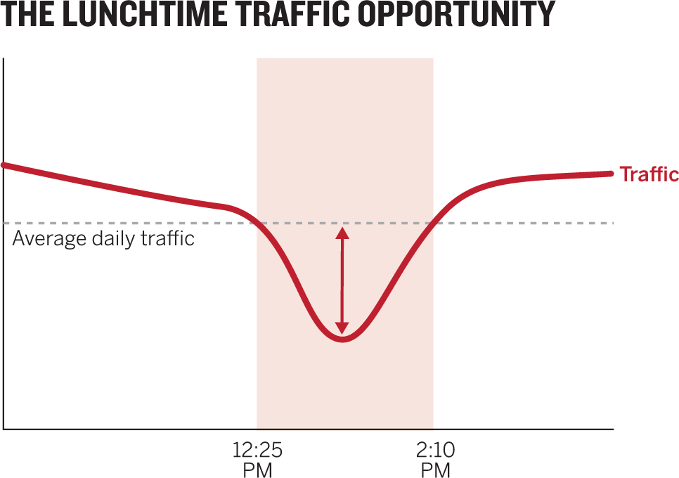
7. You want to show your team that there’s an opportunity to increase traffic to your website between 12:25 p.m. and 2:10 p.m. Adjust this chart to make it more persuasive on that point.

8. Which of the following statements will most likely lead to a chart that veers into unfair manipulation?
A “I need to convince them that they’ve set the year-end goals way too high, that there’s no historical precedent for such aggressive targets, and that we’re being set up for failure.”
B “I have to show them how ridiculous they’re being and that they’re doing this just to make us look bad. The year-end goal is so off the charts that we’ll basically fail by the end of the first quarter. There’s no chance for success, and they need to stop being idiots.”
C “I want to show them how unlikely it is that we can attain the goals they’ve set for the year.”
9. The scatter plot here shows a reasonably linear correlation between price and download speed. But the line chart shows that download speed is not a linear function. How might you adjust the scatter plot to amplify the point that our sense of the value of the bandwidth we pay for is skewed?

10. Tell a story with this chart. Write out a setup, a conflict, and a resolution and then sketch how you could present each part of the story.

Discussion
1. Answer: C. This statement is imperative and focused. Option A is too passive and general. The speaker just wants to show people something. There’s no analysis or persuasive impulse in the statement. He may be thinking that it’s a troubling trend, but because he hasn’t explicitly said so, it’s unlikely his chart will reflect that sense of trouble. Option B is so laden with detail that it could become two or three charts. The statement has no clear point of focus and, again, no persuasive idea. The speaker is describing data, not an idea she wants viewers to grasp. With option C you can almost see a persuasive chart: One line for overseas revenue over the past six months, with domestic revenue as a gray secondary line or another line showing historical trends.
2. 1. Width. The narrower the chart, the steeper the hills. Sometimes the space is what you have or what you need to use. Imagine, for example, that another chart will sit beside this one on the page. But in a typical presentation, or on a typical screen or piece of paper, there’s room to make time series horizontal. When the chart is widened, the trend is still falling, but it looks less abrupt: this decline takes time.

2. Truncated y-axes. Another way to make curves steeper is to truncate values from the y-axes. Fewer values means more distance between them. Here I’ve limited the y-axis range to the high and low values in the data—a common approach. Sometimes that’s okay. (Scientific values clustered together between, say, 1 and 1.1 may not benefit from a full y-axis that would tightly cluster all the values in a small part of the chart area. Differences in values that are meaningful may be hidden or hard to see because of the full y-axis.) Here we’re dealing with vacation days, whether that means one or 21. And the percentage of full-week vacations should start at 0. Truncating here effectively means hiding data. This chart certainly highlights the decline, but is it fair to make it this steep? Look at the same data without truncated axes: at the very least, the decline appears less abrupt.

3. My approach involved removing most of the information from the chart and adding just a couple of key markers. The original encourages me to read and compare everything. I want to know what all those features are and where they fall on the interest scale. Even if I treat that block of features as one variable, I’m left with seven variables to compare (the top six and the rest).
But the challenge is to persuade the bosses that the company should focus on fewer product features. One easy way to do that is to literally remove things they could focus on so that their eyes go where you want them to. Label only the good features, and all the rest become just “do not convert.” The dividing line makes the idea even more explicit.

A note of caution: If you use this kind of persuasion, you had better be able to defend your analysis. Can you explain why and how the top three convert and the others don’t? If not, you’re making arbitrary distinctions that feel unfairly manipulative. And be prepared to talk about the variables you haven’t labeled, because you may very well get questions about them—What are they? If you had to pick one to explore further, which would it be? In short, know your stuff.
4. Here’s an excellent opportunity to use a lure procedure: psychologists’ term for a bait and switch. Here the bait is what the bosses expect. They believe the new features are working, but your analysis demonstrates that they are not. By showing them their expectations first and reality next, you create a moment of surprise and a need to reconcile the disparity. Their brains want to understand why what they thought was true isn’t. It’s a compelling way to help someone see something in a new way. If this were being presented on paper or in a small setting, the “expected” and “actual” charts would probably suffice.
I’ve created three charts for a presentation setting. Here’s a script to accompany them:
1. “As you know, we surveyed customers about their interest in all the features of our credit cards, and they found some more interesting than others.”
2. “We invested in adding retail rewards and the app, thinking customers would really want those new features. So, were those features the ones that scored highest?” (Pause)

3. “No. The basic features we’ve offered for years are still the ones customers are most interested in. In fact, our analysis says those top three are the only ones that sway potential customers to adopt our product.”

5. Here’s a fun exercise for really messing with reference points. In my mind’s eye, I saw a scatter plot with players getting taller, heavier, and slower in lockstep. I prototyped it:

From this I could see that these guys are big and fast. I could also see the general correlation between size and speed. But to make immediately accessible the idea that these people are uniquely massive and powerful, I needed to add some reference points—such as a person who’s not a football player—for comparison. I could use any number of them: other athletes, historical figures, animals, even myself. In this case I chose two:

Seeing another world-class athlete barely make it onto the chart puts the size of American football players into a new, convincing perspective. I deliberately put Messi “off the chart” to suggest that we’re dealing here with another category of size altogether. Putting the average, hopelessly slow American male near the bottom accomplishes the same. But this is still a lot of data, and our focus still goes to the player dots. We’re tempted to spend more time with them than with the comparison. One way to make the comparison more immediate is to remove reference points and use the average size of players by position:

Using “you” for average is playful and would work if the audience were mostly average American men, but in general the average-person data point should probably be labeled more clearly. This view of the idea is somewhat persuasive too, but encoding speed in color isn’t ideal for conveying the sense of size combined with power. Big people shouldn’t be able to run as fast as most pro football players can. One way to highlight speed better would be to remove height from the visualization. Height is interesting, but speed is more interesting. We could make the trade-off, forgoing height and putting speed on a spatial axis rather than a color one:
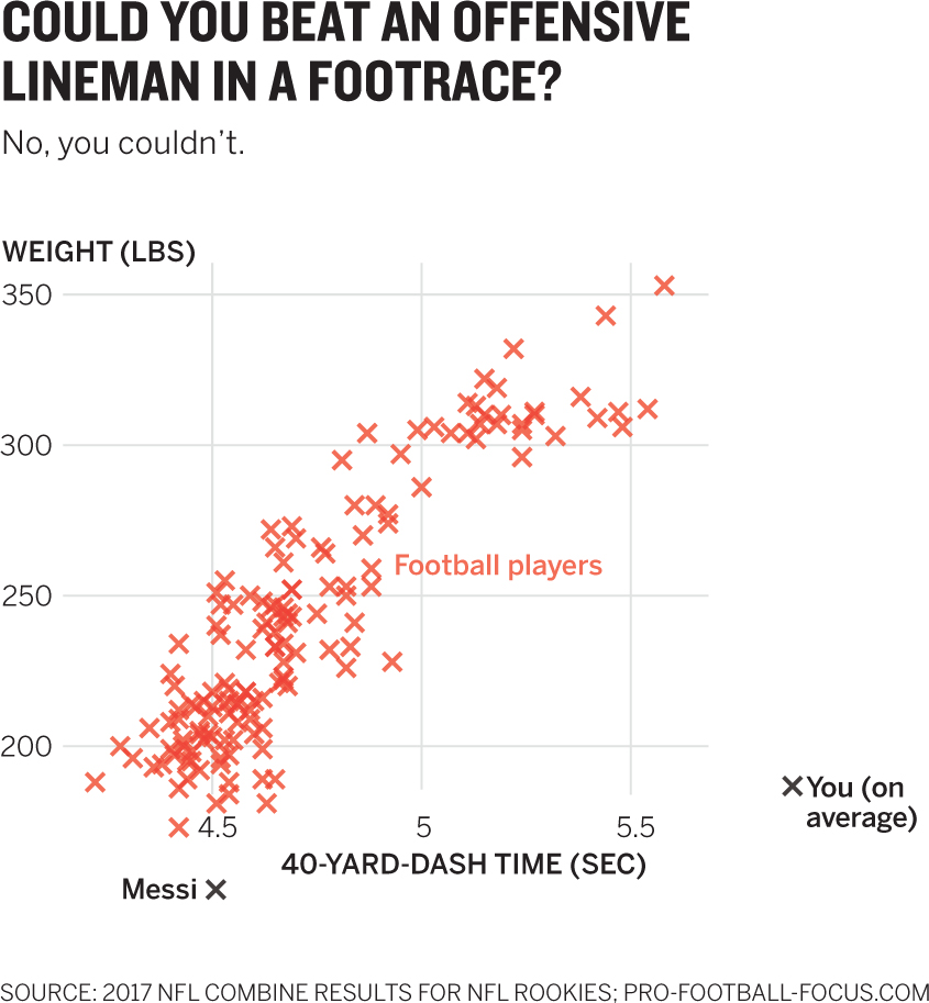
This is playful. When that’s appropriate, it can enhance engagement and a chart’s persuasiveness. But know your audience. If they don’t want to joke around, refrain. I used crosses here just to see how they might read compared with dots. I do that sometimes to test design ideas. In this case I think it’s fine, because I’m not trying to get you to see anything in the red other than the overall cluster. We don’t need to discern positions or individual data points. I could just as well have left the dots. The decision to remove weight is the focus here; you commonly have enough good material to get to a good chart in multiple ways. Often there’s no right answer—it may come down to simple preference. Here I could make a case for either the three-variable plot with height, weight, and color or the one that removes height. I could use dots or crosses. The broader point is that I’m persuasively manipulating reference points.
6. Using information outside your data set is an important and underutilized tactic for making charts persuasive. The subtle semantic shift from visualizing data to visualizing an idea can open you to the notion that the idea can be crafted using more than just data. Here are some common, consistently useful outside reference points:
- • Historical precedent. How does your data compare with a similar set from the past? Example: Voter turnout in this election compared with turnout in past elections.
- • Competitive set. What does your visual look like when compared with some competitive force? Example: the accuracy of your algorithm versus that of similar algorithms.
- • Regrouping. What does your data look like if you group variables differently? Example: Sales team performance by region regrouped as sales team performance by product sold.
- • Statistical patterns. How does your data compare with what we’d expect to see statistically? Example: Actual distribution of student grades versus expected distribution.
- • Unexpected reference points. What does your data look like compared with something completely unrelated or creative that the audience can identify with? Example: Miles traveled by delivery staffers compared with how many times they’ve traveled the same distance as to the moon.
For the noisy street corner challenge, I conjured a few reference points that might make the data come alive:
- • Data from another corner or several other corners added to show how loud this one is relative to others (competitive set).
- • A comparison of the average noise level, the peak noise level, and the lowest noise level with other sounds, such as animals, jet engines, rushing water, or a library (unexpected comparisons).
- • Average noise mapped against a distribution of average urban noise levels to see whether the noise here is typical or an outlier (statistical patterns).
- • Stress levels plotted against noise levels to show how the sound affects anxiety (unexpected comparisons).
7. Sometimes the most persuasive charts are the simplest; they present one idea so unmistakably clearly that the audience has nothing else to focus on or no other way to interpret what they see. Given the very specific context provided here, we can remove almost all the data in this chart except the opportunity. The other data may be interesting for other contexts—How does bandwidth rise and fall with traffic? Does more traffic translate to more purchases? But those weren’t the context. I can visualize what’s needed with very few elements. I don’t even use values on the y-axis, and I’ve put only the bounds of the opportunity on the x-axis, in case there’s any doubt about what’s important. No words are needed to see where the opportunity is here. (It was a happy accident that the word Opportunity in the headline falls right above the opportunity in the chart.)
8. Answer: B. This speaker is certainly passionate, but notice the focus on the attitude of the audience (they’re “idiots” being “ridiculous”) and on ideas that don’t come from the data. “There’s no chance for success” may be true, but it’s not something you can visualize. This person wants to pick a fight, not persuade—so it’s easy to imagine that emotion will lead the chart into manipulative territory. The chart maker may ignore important variables or visuals that soften the case as a way of avoiding hard truths. Option C feels passive and general, but it appears to be leading not so much to trouble as to a chart that’s insufficiently persuasive. Option A looks promising. It is focused on data (goals are too high, and historical precedents for targets can be plotted) and feels active and passionate without being angry.
9. The original charts tell an important story: We pay double for double bandwidth, but we don’t get double the performance! Once we understand that the most value comes by increasing from 0 to 50 megabits per second, and that the value increase diminishes significantly after that, we can make some judgments about the cost–speed relationship. In this case I want to show that viewers may think paying a moderate price for extremely high speeds is “a deal,” but it’s not nearly as good a deal as they think. Meanwhile, paying more to get from, say, 10 to 25 Mbps is a much better value than they think. The biggest rip-offs are the very-high-bandwidth offers that cost the most. As the chart shows, people are paying a lot for small, incremental gains. Creating zones (and using “cool” colors for value and “hot” colors for little value) creates a more immediate association between cost and value than the previous chart provides. Of course, you have to be able to defend these value judgments.

10. Time series charts lend themselves well to storytelling techniques. To make them into a story you can selectively reveal the x-axis, as I’ve done here. Here’s the story in the form of presentation notes. The narrative frame is highlighted:

Setup: The Avengers opening was a massive success, dwarfing the box-office performance of other superhero movies. But the pattern it followed over the next week was similar to that of other movies in the genre, albeit at a higher level: a big opening that declines over the weekend and tapers off during the week.

Conflict: Usually the second weekend shows a modest bump in box-office receipts, but The Avengers surprisingly had a huge bump. It grossed as much in its second weekend as most superhero flicks haul in on their opening weekend.

Resolution: During week two The Avengers finally settled into the normal pattern, matching the performance of other superhero movies.

The more you learn about making good charts, the more you’ll notice abuses of persuasive techniques—some deliberate, most accidental—that unfairly manipulate reality. This simple view of stock prices over 11 months is just such an animal. At first blush it looks good and tells a clean story, reflected in the headline. It’s clear and well designed. It even looks official. Unfortunately, it’s grossly manipulative. As you gain dataviz literacy, you’ll want to be able to identify how a chart like this tries to put one over on viewers and how to change it to more responsibly reflect the truth. Let’s work on it.
- 1. Find and explain three ways this chart unfairly manipulates the user.
- 2. Sketch a version of it using share price that better reflects reality.
- 3. Sketch an alternative chart that supports the idea that Elan Inc. is the stronger investment.
Discussion
This chart is irresistible. We immediately see a compelling story whose crisp, declarative headline couldn’t be more succinct. There it is in pink and blue: Elan Inc.’s stock shot past Pomme Co.’s. But a closer look reveals the false narrative. Even if it takes only a few seconds to recognize the game, it’s still hard to unsee the narrative. Compelling charts have a high facticity—a term researchers use to describe the feeling that something is objectively true. Our minds love to find a story in the picture; they want to believe what they see, and it takes effort to understand what’s really going on without recharting.
1. 1. The dual y-axis uses the same variable in different ranges. Elan’s value tops out at $200, but it’s at the same height as Pomme’s $1,000. So at the point where the two share prices “cross,” Elan’s value is actually one-fifth Pomme’s. Once Elan’s line rises above Pomme’s, we see its share price as higher, but it’s not.
Dual y-axes in general make charts difficult to use. Measuring two different things in the same space is like playing chess and backgammon on the same board at the same time.
2. The headline. The word overtakes in the headline reinforces the rising pink line. The chart maker has made it too easy to glance at the lines, see the headline, and form the false narrative. In general, headlines are good for reinforcing ideas, but if they’re reinforcing false ideas that’s an unfair manipulation.
3. The semi-logarithmic scale. This point is subtler. Did you notice that the y-axis lines aren’t equidistant? This chart is known as “log-linear,” because the y-axis is plotted logarithmically, and the x-axis is linear. A log scale shows equal distance between exponents, so low-end values will be further apart than high-end ones. Log scales are usually used to plot large ranges of values, or when outliers are so far away from most values that a majority of the plots are in a corner, squashed so close together that you can’t see any patterns. If, for example, most of your data fits into the 10-to-100 range but five values are in the 10,000 range, it would be hard to see any difference between most of your values on a linear scale. The log scale stretches out the low end so that you can see differences but also plot outliers or higher values.
Statisticians and scientists are accustomed to log scales, but most of us find them hard to readily grasp. I struggle with them. Charles Richter, inventor of the logarithmic Richter scale for measuring earthquake intensity, is known to have said, “Logarithmic plots are a device of the devil.” You should probably use them only when necessary and when you know your audience will understand them.
Here the log scale is completely unnecessary—even illogical. The ranges aren’t stretched such that they demand exponential treatment. Even more pernicious is that because log scales stretch the low values and squish the high values, this chart exaggerates Elan’s rise, which happens mostly on the low end.
2. The easiest fix here is a single, linear y-axis in the range of all stock price values from $0 to about $700—close enough in value to warrant a linear range. Suddenly the word overtakes is at odds with what we see. I’ve changed the headline because I still want to persuade people that Elan is the stronger investment. But despite the headline, you might think from this chart that Elan’s performance is unimpressive. Although Elan outperformed Pomme in this period, it’s hard to get that feeling from this chart. It doesn’t persuade me of Elan’s strength. To make the point persuasive, I need to find another way to express the data.

3. Investments are more about volatility and change in value than about raw value. We care less how much it costs than how the cost compares with what we paid. To see that, make what we paid a 0 point and then plot the percentage change in that value over time. The same initial data will produce a radically different view—and one that’s far more persuasive about the value of investing in Elan versus Pomme.
In some cases you may need both charts. If the audience for this visualization doesn’t know that despite Pomme’s flat performance, one of its shares is worth five times as much as an Elan share, they should be told.

Persuading a Patient to Get Some Sleep

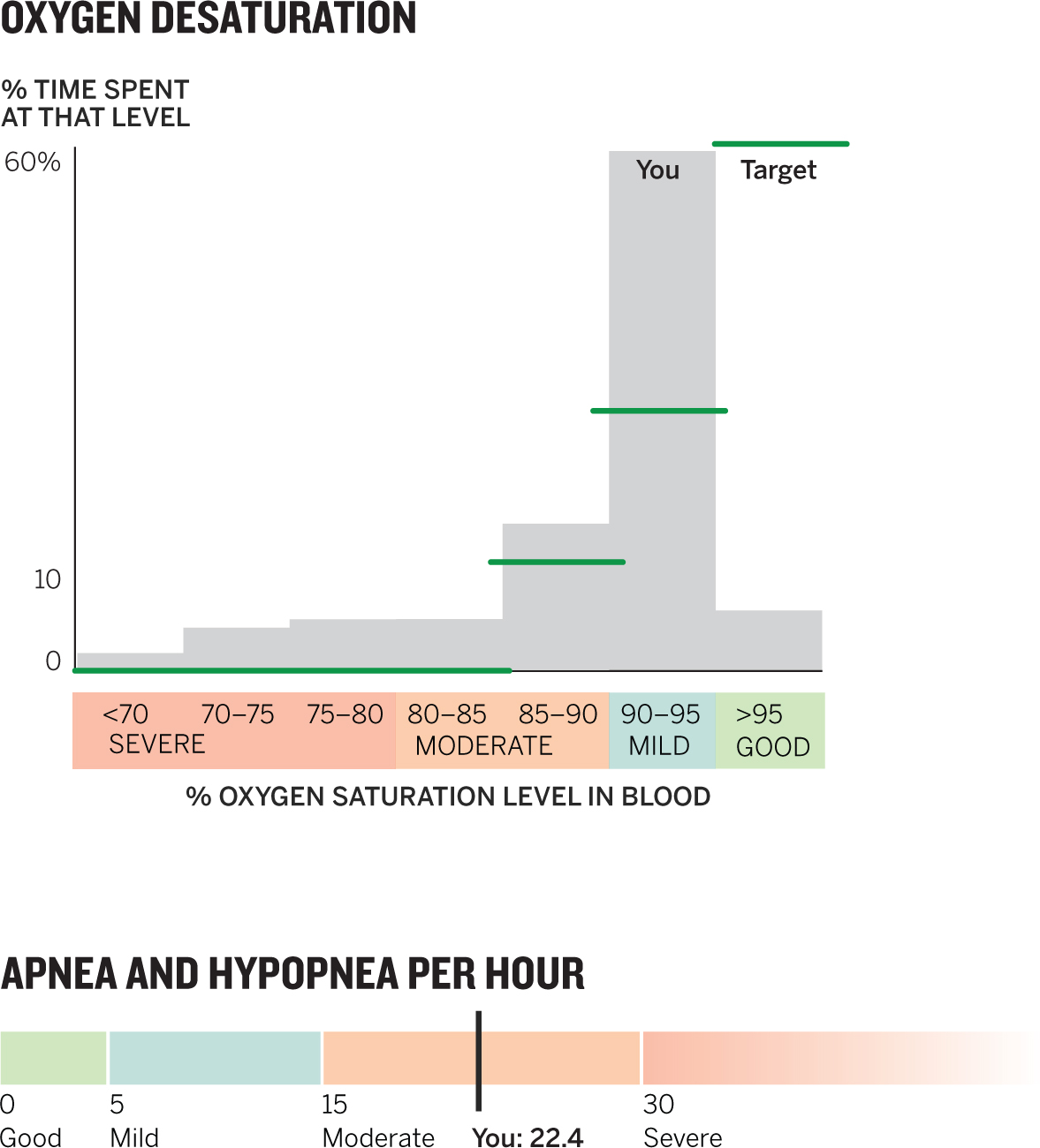
Health care providers want to help patients make good decisions. That’s not easy. Health data isn’t always easy to understand, and at highly stressful moments, such as immediately after a difficult diagnosis, patients can hardly even think straight, much less make decisions about their care. Data visualization can help—and more generally, it can be the persuasive element that turns a dense set of data about the body’s workings into a decision-making tool. Here is a doctor’s report on a patient’s test for symptoms of sleep apnea. The doctor knows that this patient is skeptical of the diagnosis; he must convince the patient that his symptoms have entered the “moderate” stage and should be treated. He has even highlighted some of the most important data, but the patient is unpersuaded. Let’s work on it.
- 1. List three things about the table that could be improved to make them more effective for a patient.
- 2. Sketch a version of this data as a visual report. Don’t focus on getting the data just right. Focus on creating forms you might use for the various elements in the report.
- 3. Given the baseline data in the two severity indexes in the bottom right of the table, make some sketches based on the report that will persuade the patient to address his sleep apnea.
Discussion
Reports like this are typical, and not just in health care. This is a classic data dump of key performance indicators. Everything we need is here, but that doesn’t mean we know how to read and interpret it. And persuasion is nearly nonexistent. The highlights are a halfhearted attempt to get me to focus on parts of the report, but I’m unlikely to be convinced there’s a problem, much less to take action. More needs to be done.
1. 1. Translation of technical terms. Doctors can use these tables; patients can’t. Context: The doctor wants to persuade the patient to address his health. Terms such as oximetry distribution and desat index are going to undermine that as the patient struggles to learn what everything means before even beginning to wonder what the measurements in these categories indicate. “Total amount of oxygen in the blood” and “Number of times blood oxygen levels fell” are clearer for the audience.
2. Specificity. Whether the mean duration of a hypopnea was 22.2 seconds or 22.5 seconds doesn’t matter to the patient (however much it may matter to the doctor), and using decimal points when rounded numbers would do makes it harder to read.
3. Lack of benchmarks. Even if the patient goes directly to the highlighted data and sees what the doctor wants him to see, he’s almost certainly going to ask, Is that normal? This report provides numbers without any value judgment, when that’s what matters most. Are the numbers good? Acceptable? Poor? Dire? The patient needs reference points to show how this information stacks up against what the doctor expects or wants.
You might wonder why I’m critiquing the table rather than heading straight into chart making. Two reasons. First, critiquing the presentation of data sets you up to make better charts, because you’ll have seen what’s missing and what’s difficult to understand. Second, in many cases you want to provide a table like this after the audience has seen a visual so that they can take a deeper dive—so it helps to ensure that you can create good tables as well.
2. Effectively, this challenge is to build a small dashboard for sleep performance. My effort is just a start and leaves plenty of room for improvement. I stopped here to show the work in progress—how I systematically moved through the various tables looking for simple ways to visualize. I should note that these sketches represent the second or third (albeit rapid) iterations of the ideas. Let’s discuss them from left to right, top to bottom.

Basic patient data: table. I saw no need to visualize this information. It’s core data that works fine as a table.
Time of study: arc. I used the notion of a 24-hour clock to show both how long the study lasted (shaded area) and in what time span it occurred (horizontal axis). I haven’t yet decided how to divvy up the time, but I put midnight at the top because in the mind’s eye that’s where midnight is. On the other hand, 6 p.m. appears where we expect to see 9 p.m. and 6 a.m. where we expect to see 3 a.m. So I also toyed with using a full circle here. If daytime were involved in the sleep issue, it would be easy to add sunrise and sunset markers here as well. I wanted to work on this more. This visual could be very small. It communicates simple, basic information.
Events/hour: unit chart. A sleep apnea event is a short period during which a person stops breathing or struggles to breathe. In most cases sufferers have dozens to hundreds of these a night, a manageable number for showing each event as its own visual mark—in this case a dot. Marking individual units on a visualization always helps the audience see those events as more than a collection of statistics formulated into something abstract, such as a bar. Apnea is an event, and each dot here represents an event. I can categorize units of time with colors to represent the type of event that occurred. Adding units for “good sleep” time helps paint the big picture for the patient: Here’s when you were breathing, and here’s when you weren’t. Well-organized unit charts have the effect of simultaneously being powerful displays of individual units and more-holistic stacked bar charts, like this one. Units are inherently reusable, too. If you know when each event happened, you can redeploy the colored dots on a histogram to show when the patient stopped breathing.
Heart rate: lollipop chart. So named because the dot-and-line combo looks something like the candy, these charts are a great, simple way to show ranges or distance between two points. This one shows the range of heart rates over the course of the night. Adding a scale from 60 to 100—the typical range for human heartbeats—provides a reference. My only hesitation here was that the average BPM while the patient slept was 54, meaning that for the most part the heart rate was below the scale and the rate spiked only a few times to a higher rate. This visual may overemphasize those short bursts by showing the range without any distribution of frequency. A histogram would show that more immediately. I’ve made a trade-off here.
Total sleep interruption: stacked bar. I felt that the data set included similar information in different places. Snoring was separate from apnea events, but both interrupt sleep. Adding those two things together allows us to compare wakeful time with sleeping time. The amount of wakeful time in that bar is somewhat astonishing: nearly 30 minutes out of 435. One caveat: It’s unclear whether the snoring and apnea overlapped, so I’d have to confirm that they were separate events before presenting this way.
Oximetry distribution: histogram. The word distribution sent me right to the most common chart type for that—a histogram. Oximetry measures how much oxygen is in the blood, and more is better, so this chart should skew right. Histograms look like bar charts, though traditionally their bars touch. Someone without experience using one may mistake it for a bar chart and not immediately understand how to read it. It sometimes helps to provide prototypical distributions (average, good, bad) for comparison, or to explain in words, as I just did, how you want this visual to look.
If this were to become something I wanted to give to patients, my next step would be to think about creating some hierarchy of information. I wouldn’t keep all the visual elements the same size, and I’d fiddle with the order of what’s presented. I’d want to create a dominant visual and some supporting ones, and I’d want to make sure the ideas progressed logically.
If you’re so inclined, a great exercise is to take your sketches to the next level: Imagine you will be handing this piece of paper to a patient. How would you design it?
3. Now I’m actively trying to persuade a patient to change his behavior. The dashboard exercise created a more engaging entry into a lot of data, which may help patients get beyond a page full of numbers, but it didn’t do much more than present findings dispassionately. Changing behavior is difficult and requires more-aggressive tactics. My attempts at persuasion here focus on two main elements. First, I address the patient directly whenever I can: This is not just data, it’s your data. This is when you stop breathing. Poor results become something the patient owns. Second, I added some qualitative ranges and labels. Even good charts that get to meaning quickly may lack useful parameters. You’ll hear reactions such as So is this good? Is this normal? Where should I be on here? By emphasizing good and bad results (and using green for the former and red for the latter), I help the patient see not only what his results are but also what they mean.

Let’s take these one by one with some additional commentary.
Oxygen desaturation: histogram. Even a patient unused to reading histograms will be able to use this chart. Without effort, you can see where the patient’s results are above or below what they should be. To help convey the idea of distribution of frequency, I’ve made the axis labels a bit wordier and plainly descriptive. I toyed with making the bars in the histogram the same color as their qualitative level (green, aqua, orange, pink), or making each range’s color rise up the y-axis, but all that felt overwhelming and confusing, so I opted to color code just the labels.
Apnea + hypopnea per hour: stacked bar and gauge. Here I present only one data point from the results, but we can see the power of putting that one result in the context of what’s a good or a bad result. It’s important to think about reference points and not assume that the best visualizations encompass the most data. I can imagine that in cases where multiple tests are done, each test could be plotted to show the general direction of results as well.
Duration without breathing: timeline. Here’s another simple view that should persuade the patient to address his condition. I’ve plotted only two data points, an average and a maximum. But seeing the proportion of time spent not breathing is much more powerful than seeing a simple report of apnea-event lengths. I can imagine a minute; thinking about barely breathing for that amount of time is effectively frightening.
Your typical hour: timeline. In this case I used the data to create something that isn’t real but represents an average hour. If I had the real data for an hour, or for a whole night, I would plot that; this timeline is representative in terms of number of events per hour and average length of event. It’s a variation on the one-minute timeline, which shows only a single event—in that case we want to understand what an event is like. Here I wanted to give a sense of what events do to the patient’s sleep over a longer period. It’s hard not to see just how disruptive this person’s moderate sleep apnea has become.
You’ve sat through this presentation before, right? The important topic with plenty of data that turns into an exercise in squinting to read bullet points or ignoring the presentation while you read the paper version sitting in front of you, taking notes on it and prepping your questions—which the presenter may already have answered, but you wouldn’t know, because you’re not listening.
Presentation software tends to encourage this kind of disaster. The default prompts you to enter a headline and bullet points. Worse, though, the software discourages good visualization by making it easy to automatically import click-and-viz output from a spreadsheet or a table from a text document.
A good presentation should be inherently visual. The right combination of what the audience sees and what you say will make the best experience. No one should be reading while you’re talking.
In this case the presenter wants to persuade the HR department to improve family leave policies for new parents. The presentation teems with good data and persuasive ideas. Good charts would transform the experience and make the case much more persuasive. Let’s work on it.
I’ll keep this simple with just one challenge: Transform this presentation into a persuasive one.
1

2

3

4

Discussion
This presenter did his or her homework. The overwhelming amount of information here could convince me that the parental leave policy needs fixing. But research has shown that piling up evidence doesn’t necessarily correlate with increasing persuasion. A few convincing pieces of evidence can be far more effective.
Let’s take the slides one by one.
Slide 1: Average comparison. Putting this straightforward data into text form dilutes its power. One of the most common questions audiences will have about data—especially when it pertains to their performance—is Are we normal? or How do we stack up? So I’ve quite literally stacked up weeks of leave for this firm against averages. This firm gets color, while averages, because they’re not real entities, are gray. The shortcoming comes through much more powerfully here than in the original. Notice that I did not include the last bullet point, about other companies. I thought it would be too much to introduce an entirely new comparison in the same space. This slide is about “our firm” against the average, so I put only that here.
1

One of the most common dataviz mistakes I see in presentations is when presenters try to stuff as many ideas as possible into one chart—or multiple charts on one slide—to keep the slide count down. I’d rather use two slides, each for a single idea or chart, than try to pack in the ideas. And that last bullet point reflects the data that appears in the next slide anyway, so I saved it.
Slide 2: Competitive set comparison. I didn’t mind the organization of the original tables, but reading numbers is more laborious than comparing lengths. So I returned to the hybrid bar–unit chart from the previous slide. Units (the blocks representing weeks) help image the numerator; a solid bar turns all those weeks into a single statistic, but units help us think about each week as part of the value. I retained the color scheme so that as the presentation builds, the audience won’t have to think about that variable; they’ll know what orange and green mean. Typically, I like to create as few alignment points as possible, and here I’ve limited them, but you’ll see that the three qualitative labels (“leading,” “good,” “lagging”) float to the right. I decided that the signal of their relative positions, with leading literally being ahead and lagging farthest back, was more valuable than maintaining alignment for them.
2

I think this chart could still use some work. On a large screen it would be effective. But I’m concerned about scale and trying to read some of the labels if this is on paper or a personal screen. Even without the labels, though, a clear point comes through: There are three kinds of leave policies, and “our firm” doesn’t have the good kind.
You could create suspense by presenting this chart without “our firm’s” data and inviting the audience to speculate about which group the firm falls into before revealing the answer. It’s a powerful way to keep an audience engaged.
Slide 3: Young talent. I sketched many approaches to this slide and wasn’t satisfied with any of them, so I decided to try a simple list with proportional bars. The point, I had said when talking it through with a friend, was to demonstrate a lack of equivocation. Each bar shows that young talent overwhelmingly thinks better leave is a good idea. Taken together, they’re a litany of evidence.
3
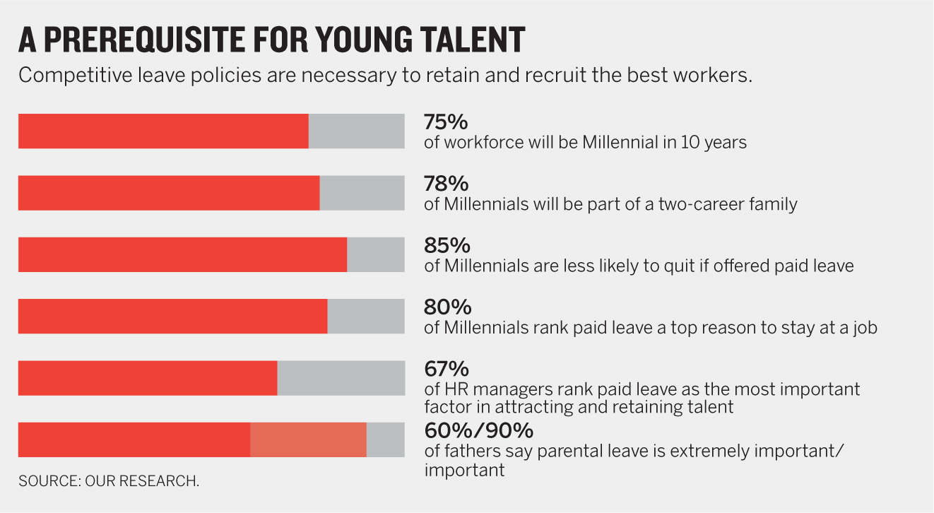
Still, this requires a lot of reading. It comes closest to a traditional presentation slide in its format. The bars are merely suggestions of charts, reminders that the data points to their right—78%, 85%—are big proportions of the whole.
If I were presenting this, I wouldn’t take the time to read through each “bullet point.” Instead I’d get at the overall idea by saying something like “On all measures, the young talent we’re competing for expect a competitive leave policy.” (Remember, I’ve already shown that the firm doesn’t offer that.) Then I might choose to expound on one or two data points from the list.
Still, I can imagine that others would come up with different treatments for this data. I look forward to seeing some of them.
Slide 4: Productivity and costs. Because I had established a “litany” approach, I stuck with it. Constantly switching forms forces an audience to repeatedly reset mentally to learn what they’re looking at before analyzing it. If they see the same form, they’ll know instantly what to do and how to read. In this variation on the theme, I start with a bar chart that shows a very low percentage—a nice way to make people take notice. This is similar but different—how? is what their brains will ask when first seeing it.
4

Overall, I’m building a case by showing data against anticipated concerns: This will cost money. We’ll lose productivity. It hurts performance even if it’s good for those out on leave.
In anticipation of that pushback, I provide evidence against it. “Actually, it not only doesn’t cost money but it shows a positive ROI and is at least neutral on productivity and profitability.” Again, in a presentation, it may be powerful to unroll these one at a time by raising the concern and then showing the data that allays it.
Some general points about this entire presentation set:
- 1. The original presentation, however bloated, was well crafted from a narrative point of view. It flowed smoothly, and that comes through even better when each slide is cleaned up to make its main point more clearly. The flow is something like:
- a. Our firm’s leave is below average.
- b. How far below? We are competitive laggards.
- c. That’s bad because competitive leave is a crucial talent-recruitment tool.
- d. I know you have concerns about adopting more-competitive leave policies, so let me address some of them.
2. Note that the title and subtitle of every chart serve the same role for that slide as a whole. When you create a blank slide in presentation software, it often prompts you to create a title (and then bullet points), so you do so without thinking. Then you paste in a chart that has its own title, creating clutter and redundancy. There’s no need. The chart is the thing!
3. It may be hard to believe, but not much of anything from the original slides has been left out—a valuable reminder that you can present a lot of information clearly so that it doesn’t feel like a lot. That makes it more persuasive, because the audience can more readily get to and think about the idea.