Chapter 7
The Monthly Report
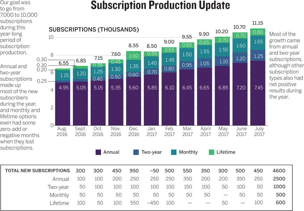
Here it is: the classic data dump. The bosses want an update on The Numbers, so that’s what the marketing manager at a podcast app company creates: a single slide showing all of them. The manager needs to update her supervisor about subscription production every month, and this is the slide she uses. The company offers four subscription options and has target goals for growth. In addition to totals by month, her boss likes to see how many of each type of subscription are added each month. Recently he complained about the chart, saying it was confusing, and annoying to deal with. Even reading it by himself on his screen, the boss said, was frustrating. The marketing manager wants to remake her chart to impress him next month.
To improve it, we’re going to talk, sketch, and prototype. The talking has already been done, by me and my friend the marketing manager. Review this conversation. Mark it up with notes; highlight visual language and cues that will help you create an alternative. Sketch your solutions until you feel you have an improved approach, and then create a paper prototype of your version of the monthly report.
“So, what are you working on?”
“I need to improve this chart, because my boss finds it confusing and frustrating.”
“How?”
“He says he has a hard time reading it and can see other people in the room tuning it out because they just read the captions and then wait for the next slide.”
“Why is this chart important?”
“Are you kidding? This is the monthly update. This is how they know how we’re doing with subscriptions.”
“How are you doing?”
“Good. We’ve surpassed our target of 10,000 subscriptions. We were slightly below target a year ago; now we’re slightly above.”
“Why, do you think?”
“That’s the best part—we’ve improved mostly in the two subscription categories we want to grow: annual and two-year. I mean, they’re all important, but we really want to focus on those two as the most important, sort of versus the other two, because annual and two-year are our most profitable subscriptions.”
“What are the others?”
“Monthly and lifetime. Monthly is hard because it requires renewal each month, so there’s more turnover. And lifetime is nice because once you have those customers, you have them. But they can cancel, and it’s definitely not our most profitable option.”
“Was there a promotion or something that caused the growth to exceed your goal?”
“No, it’s been steady growth, which is great. We did one promotion on lifetime subscriptions, and it looked like it worked—they jumped up. But then a bunch of people canceled almost immediately because they just didn’t see the value, so that category actually dropped the very next month.”
“That seems important to show.”
“Not really. They know about that disaster of a campaign. We learned a lot, but I’d rather focus on the steady growth in the categories we want to grow.”
“So why not just show that? Get rid of everything else?”
“I can’t do that! They need the other information, too.”
“What other information?”
“They need to see the portfolio of subscriptions and how they’re trending. All at once, in one place, stacked up against each other.”
“Why?”
“Why? This is the monthly update. They want to see an update, not just the good news I want to show them. I can highlight the steady growth, but they want all the data.”
“Do they want to see each subscription type more than the total? Which is more important?”
“Both are important. They want to see everything.”
“But if you had to choose, which would you choose?”
“I can’t choose! They need to know it all. Total. How we’re doing against our goals. How each type is doing. And my boss is really interested in seeing a breakdown of monthly subscription adds.”
“Why?”
“Well, it’s one thing to just show a total, but people cancel, too. So net adds are important. If 100 people cancel and 150 subscribe, that’s a plus-50 net add. He likes to see that. That’s why I put the big table there. It has every data point, so he knows if any subscription category has negative net adds, which would raise a red flag.”
“So that’s the most important thing?”
“For him, maybe, but he’s not the only person in the room. It’s all important. Why do you keep forcing me to say what’s most important?”
“I look at your chart and think it’s just trying to do so many things. I don’t know what’s most important. By making it all important, you keep me from seeing any one thing that I’m supposed to focus on. I don’t even see the goal at all.”
“Well, the goal isn’t really in the spreadsheet, so we never think to make it part of the chart. I just put it in the caption. But we should probably show the goal. I know what you mean about it doing all this different stuff; but like I said, I need to show more than one thing. I suppose I could take each part of the data one by one. I just haven’t figured out how.”
“Do they need to know every month’s specific value, as you’ve labeled?”
“I think they like having that.”
“Why?”
“It just seems like something that’s good for them to have. I mean, they really care about the trend more than anything. That’s how they think—in trends.”
“Maybe it’s making it confusing here, and you could give them the table afterward and just focus on the trend line?”
“Yeah, maybe. Never thought of that.”
“OK. The only other thing I don’t get is the table. It’s so much information for a presentation. I just wonder if there’s a visual way to do that.”
“I was thinking about that. I tried to line it up so that each month is underneath the label for the month in the bar chart, to make that connection.”
“I didn’t get that at all. But now I see it.”
“Oh. That’s not good. I think what he does is try to eyeball how many adds we have each month in annual and two-year subscriptions and how many adds we have in the others and compare those. He wants to make sure there’s healthy production in annual and two-year. And you can see in the second half of this report, that really started to happen.”
“I don’t actually see it without your telling me that.”
“OK. So I need to show that better, too.”
“Yeah, I think it’s all here, but let’s just start sketching some ideas on how to show everything while showing one thing at a time so that it’s not all jumbled together. I’m imagining trying to look at this on a screen and get the idea during the presentation. I’d have a hard time seeing some of the trends you point out. The one that jumps out at me is the overall steady growth, but it’s hard to see where that’s coming from within the categories with all those little labeled slices.”
“Yeah, let’s sketch and try some things.”
Discussion
Instead of marking up the conversation in this scenario, I’m going to present my notes from each part of the process as they unfolded. The first set of notes represents what I wrote down during the conversation. Remember that talking and sketching usually overlap, even though I present them sequentially. Also note that some of the sketching time was used to mark up the original chart with ideas and comments. I often do that as a form of visual critique and to connect ideas in the conversation to the existing chart. I look for places where the conversation seems to be supported by what’s shown and places where I don’t see what we’re talking about. As you proceed through the discussion, note:
- 1. The process of capturing keywords, phrases, and ideas from the conversation. Sometimes I underline for emphasis, or note how many times a phrase comes up, telling me it’s important. You’ll also see quick sketches near some of the keywords, and lots of question marks, which I use to indicate where I still have questions or to prompt myself to explore further.
- 2. How messy my sketching is. I’m purposefully incautious—I’m just seeking a general direction. Although I use some color, I try to limit it to the essential so that I’m not spending sketching time choosing colors. I just want to make distinctions that I can focus on later, during prototyping. Sometimes I repeat keywords near my sketch to remind myself of the connection between what we talked about and what we’re trying show. I also put stars next to things I like and something else next to ideas I don’t like to indicate that I’ve ruled them out.
- 3. The relative neatness of the prototype. It’s by no means perfect, but I’m being more careful and thinking more deeply about color, labels, and arrangement on the page.
- 4. The changes between prototype and final product. The first prototype guides the final product, but I’m still making adjustments to layout and color decisions as I see them unfold in the final chart.
Talk
The notes show just how much of this conversation was visual. Words and phrases popped: steady growth, stacked up, passed the target, and, most notably, trend line, which came up in various forms four or five times. This was especially instructive because no trend line was to be found in the original chart. I noticed that performance against goal seemed to be important, but the target goal wasn’t a visual element; as my friend had acknowledged, it was buried in a caption. I was intrigued by the table, because she could explain to me exactly how she thought her boss was using it, and that led to several ideas about ways to make this crucial information more usable and more visual. Her explanation that it was meant to connect to the bar chart by x-axis dates was a surprise, because the bar chart’s key completely broke that connection for me. And since the table was so important, I felt it could be improved on; I was already thinking about how to visualize it. I also started marking up some obvious design shortcomings in the original, such as the x-axis labels and the bar section labels.

My friend got frustrated by my repeatedly asking what was most important—and I got frustrated by her continually telling me that everything was important. This is typical in such conversations. The inclination is to leave everything in, both to show our work and because we truly believe that everything is important. Challenge yourself to prioritize information and have the courage to simplify. Showing all the information isn’t an advantage if it makes the chart impossible to use.
We finally broke the stalemate when we jointly identified the three ideas that the one chart and one table were meant to convey. We realized that everything could be equally important—we just didn’t have to put it all in one space. So we set about thinking through the three ideas marked by the red star in my notes.
Sketch
Sketching attacked the three ideas in order. First, we wanted to see the trend line against goals. So we literally sketched those two things and looked at the result: simple, and it explicitly shows a comparison between where things stood and the company’s goals. I was confident this was the way to go, but we also jotted down a couple of other ideas. My friend suggested adding a goals trend line to the existing bars because it was easy. I don’t mind that in a time pinch, but I thought it might draw attention to the pieces of a bar rather than to the total bar against goals. I also wanted to see if showing the distance between results and goal each month would work. That would create a lollipop chart with several floating bars. The distance between the performance point and goal point each month would be instructive concerning how far off targets the company was each month. I think this would be an effective approach in some contexts, but here it shifts the focus to making comparisons in individual months rather than seeing the trend—that word that came up so often. So we nixed it; starred the first, simple approach; and moved on.

Our second idea was to show each subscription type against the others. The original does that, but the notion of those two groups we talked about (annual and two-year versus monthly and lifetime) doesn’t come through, largely because of color. In the original I see “purple” and “the others.” So we spent time thinking about how we might color code the bars to make them more effective. But I was eager to get away from bars. Bars are good at encouraging comparisons. They invite us to compare October with November, March with April, and so forth. The trend! We kept coming back to the trend. If we used a line chart for the first idea, why not another? It would almost feel like a breakdown of the overall trend in the first chart—and breakdown was precisely the word we used in our conversation. The phrase stacked up also kept coming back, so I scribbled a stacked area chart just to think through how that might work. If we got the color right, it might. That was the key. We wanted to compare two groups of two, not four different subscription options. So we scribbled in a blue/orange color scheme, and even as we sketched it, we felt confident it would work. So we moved on.
The third idea, showing net adds, didn’t come easily at first. We thought we might reuse the stacked bars, since individual months were more important than the trend line in this data. Remember that her boss liked to see each month’s performance and wanted to compare the performance of the two groups. At first we just stared for a few minutes. In my notes I rendered her boss’s intent as a simple equation question: Is x > y? We knew we needed to show x and y and be able to compare them. We had no other ideas for side-by-side comparisons of the two groups. During a lull we returned to the conversation notes. Nothing popped, and we felt stuck. Often, if the numbers I’m dealing with aren’t large or complex, I like to at least try a unit chart. Unit charts assign values to individual marks to make the numbers seem more concrete. Here a dot could equal some number of new subscriptions. So I started stabbing at the page, making dots—first one color and then another as a comparison. What if every dot equaled, say, 100 subscriptions? We agreed that this was worth pursuing and quickly sketched a couple more, liking that the dots looked like bar charts but also had that sense of units. Then I tried combining the two groups next to each other, x in one set and y in the other. Is x > y? There it was. We were ready to prototype.
Prototype
The paper prototype here (yes it’s a digital file, but it’s a neat sketch and was created by hand, like a paper prototype) went quickly. We neatened up the axes and approximated real values. Colors were purposeful and consistent throughout—two groups of opposing colors so that viewers could still see all four variables but look at them as two groups. On the unit chart, given all the repetition of the original x-axis, I decided to use a label common in charts—just the first letter of the month. If these unit charts sit with the other charts, I decided, that would work; but I made a mental note that if they were separated, longer abbreviations might be better. The prototype confirmed that we had hit on something that increased clarity but didn’t sacrifice much information in the original chart. This prototype was followed by a few digital prototypes (not pictured here to save space and because they incorporate only small tweaks) that were converted to SVG files and polished up as our final product: a new monthly update for the boss that would be easier to understand and more usable.

Good Charts
Those three ideas are so clearly executed here that it’s hard to imagine people getting confused or tuning out of the monthly update. I can picture each of these as its own slide in a presentation setting. The consistent use of color trains the audience on what greens mean and what oranges mean, no matter where they go in the presentation. We switched from blue to green, and looking back, we’re not sure it was the best choice. The oranges seem to dominate the greens. We talked about it, but we didn’t have the time then to go back and tweak. We might do so now. Notice, too, that the unit chart changed: we switched to comparing each month’s x and y rather than a full year’s x and a full year’s y from the prototype. When we got close to the end, my friend said that her boss likes to make these comparisons monthly—indeed, she had said that in the conversation. So we made the switch. In fact, we tried it three ways. Here are the other two, for comparison.
I could make an argument for any of the three depending on context, but I’m happy to stick with the month-by-month comparison we ultimately chose to use.
Having the whole process laid out here should help you see the progression of ideas, and why that conversation is so crucial. Throughout the process those keywords and ideas kept coming back to inform the chart types we tried, the ways we organized the information, and even the tweaks we made to the final product. The conversation was the well we kept going back to draw from; whether we were stuck or flying forward, it’s what impelled us. Start with a few words and a few scribbles; you’ll find you’re already much closer to a good chart than you think.

