Chapter 2
Crafting for Clarity
“For me the greatest beauty always lies in the greatest clarity.”
—Gotthold Ephraim Lessing
If you find yourself using text captions to explain parts of your visual, or if your audience asks you to explain how a chart is structured, or if—as happens to me sometimes—someone looks at your chart and blurts out, What exactly am I looking at? then the chart isn’t clear. A clear chart communicates its ideas with little or no intervention. It stands on its own and sometimes produces what one data scientist (now an executive with the San Antonio Spurs) calls a “bliss point”—a moment when we feel we get it, instantly and without thinking.
That feeling is different from the one we get from eye candy—really pretty charts with gorgeous color schemes, curvy forms, and a multitude of data. Those are captivating but may or may not generate insight. Bliss points produce a flash of instant understanding. They don’t even have to be pretty. Compare:
Eye candy:

Bliss point:

The first chart is gorgeous but takes work to figure out. It’s unclear how the twisting bands function beyond grabbing our attention. They make it harder to get to the meaning. The idea in the second chart hits us almost as soon as we see it. That’s what you’re aiming for.
Sometimes simplicity helps achieve clarity, but simple things aren’t always clear, and clear things don’t have to be simple. To achieve clarity, to get to those bliss points, requires more than nice colors and sparse, simple designs. Every mark on a chart that requires the audience to stop and consider, to make decisions about where to focus, to challenge how they normally think, works against clarity. Use these guidelines to achieve a clear design.
1 |
Take stuff away. Think about every mark on your chart and ask, Is this necessary to make my point? Often extraneous axis labels and distracting grid lines, for example, which are generated automatically by chart-making programs, get left in. Unnecessary color can pull attention away from the core idea. Be aggressive. Even try to delete variables altogether if you think you can make your point without them. |
2 |
Remove redundancy. A headline that reads “Sales vs. Revenue” just repeats the axis labels. Captions that simply describe what the visual shows add no insight. Axes representing dollars or percentages don’t need $ or % repeated on every label. Look for places in your dataviz where information is repeated and take as much as you can off the page while maintaining clarity. |
3 |
Limit color and eye travel. Color is powerful—and distracting. If eye-catching colors are assigned to noncore elements, they’ll fight for attention. Think of color as a fraction that needs to be reduced. You want to show 2/3, not 12/18. Do this by grouping variables and using gray for contextual, secondary information. Keys, legends, and captions with pointers force eye travel. It may seem trivial to have to look to the right corner for the key and then back to the visual, repeating the process three or four times, but it’s not. Darting back and forth, or following long lines to labels, slows down chart reading significantly. The farther the information is from what it references, the longer the trek for the eyes. Keep labels and captions close to the parts of the visual they reference. In line charts I like to put labels at the ends of the lines they represent; they make a natural stopping point for eyes scanning the visual, and they remove the need for a key. |
4 |
Know how people think. The brain works on heuristics. It takes shortcuts. In our minds, the future always comes after the present—to the right of it. Values go up, with higher values above lower ones. In general red means hot or danger or bad, while blue is cool or water, and green is good or safe. When you design against such neurological conventions, viewers must work hard to get past it. Imagine trying to read a timeline from right to left, or a y-axis with 0 at the top and 100% at the bottom. Respect convention—and take advantage of it. If a trend is worrisome, make it red. Put a higher value literally higher than others on your chart. Put North up and South down. |
5 |
Describe ideas, not structure. Use text, headlines, captions, and other visual markers to highlight ideas or insights rather than to describe the visualization’s architecture. Headlines that reiterate the form don’t help the audience as much as ones that hint at or explicitly state why the visual exists. Compare, for example, “Distribution of Spending on Health Care and Wellness” with “More Spending Doesn’t Increase Wellness.” Or “Trend Line of Median Operating Losses by Year” with “Losses Are Mounting.” |
6 |
Bonus pro tip: Align everything. This simple guideline is supremely effective at creating visual order. The sense of clutter and murkiness that some charts produce comes in part from the way items float independently throughout the visual space. Axis labels are centered on their axes and tilted. Captions hover wherever there happens to be white space. Use the y-axis as a left alignment, establish a second point with which to align captions and other labels, and the cluttered feeling will disappear. |
Clarity isn’t easy, and it takes courage. Chart makers tend to stuff everything they have into their visuals—variables, labels, colors. Maybe they’re not sure what the central idea is; maybe they want all the data there to show the boss how busy they are. It may be comforting to the chart makers, but it makes their visualizations inaccessible or, worse, impenetrable for users. Presenting a clear chart that says one thing well may discomfit you at first, but your audience will appreciate it.
The following challenges are intended to improve clarity. Focus mostly on ways to remove confusion and clutter, using the prompts with each chart. Don’t worry about forms, and think about color, labels, standard conventions, and other considerations only as they relate to creating clarity.
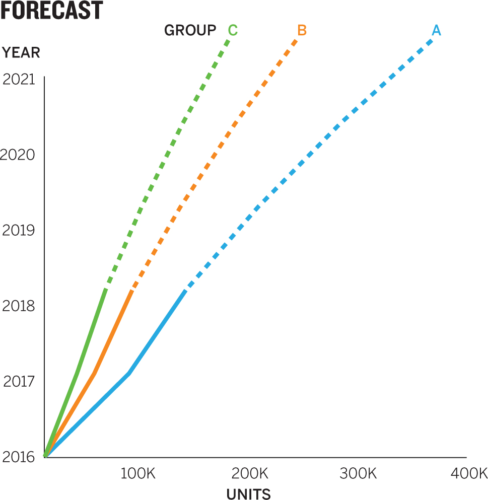
1. You want to use a line chart to show the year-to-year trend in three forecasts. Which grid creates the clearest experience for that context?

2. Find a common element in the following bar charts that makes both unclear. Find one element in each that makes it uniquely unclear.

3. True or false: To make a chart clearer, you should always remove as many things from the visualization as you can.
4. Will a data visualization plotted on these axes be clear? Why?

5. In a scatter plot you want to plot average health care spending against average life expectancy for several countries. The plot will show a positive correlation across all countries except one: the United States, which spends the most but achieves only a middle-to-low life expectancy. Which headline would you choose for clarity?
A Health Care Spending vs. Life Expectancy for Several Countries
B Investing in Health Care Works—Nearly Everywhere
C Countries That Spend More on Health Care Live Longer
D What Does Health Care Spending Tell Us About Life Expectancy?
6. What makes this pie chart less clear than it could be? How would you fix it?

7. You want to show customers’ relative happiness or anger by region on a map. Which color scheme will be clearest?

8. Without knowing what this scatter plot is about, what in the visual field would you attack first to improve its clarity?

9. Here is an expansion of the same scatter plot made less clear by the number of alignment points. Mark all the horizontal and vertical alignment points.

10. After improving the chart’s alignment, find other ways to make it clearer and sketch a new version.
Discussion
1. Answer: B. The key is the context of needing to talk about “year-to-year trends.” That disqualifies C, which—in an effort to be as simple as possible—has literally removed any sign of those trends. In a presentation in which the five-year trend matters, it might be a fine chart, but it’s not enough for our context. The first chart, A, also provides year-to-year trends, but it’s probably not simple enough. The number and heaviness of the grid lines on the y-axis make it hard to read. If those grid lines were lighter, as in B, one could argue that they’re useful. They give us more-exact values at each year’s intersecting grid line. But even if the lines weren’t so dominant, it would be hard to connect them to their value, because values are scrunched together. You could make the chart higher to create more space between values, but even then the visual busyness would fight the trend lines.
Notice some other small adjustments between A and B that make B clearer: Labels have been aligned. The word “group” is used once rather than repeated in three colors. The redundant “January” on the x-axis labels has been removed because it wasn’t helpful.
2. Common element: The categories on the x-axis are organized alphabetically. Although that’s a valid way to organize information, it’s not clarifying here—it just creates a haphazard collection of comparisons. And galaxies are not arranged alphabetically in the universe. We’re comparing distances and brightness. Arranging the galaxies on one of those progressions—nearest to farthest, or brightest to dimmest—would provide an anchor point for seeing what one variable does to the other. To me, distance is the more accessible variable, so I would arrange the data to progress from near to far. Far to near would challenge a perceptual convention that we start on the left with the nearest thing. It would feel weird to start with the farthest away and progress to the nearest.
Unique unclear element: For chart 1, it’s redundancy. The chart is laden with repetition. The title, the subtitle, both y-axes, the key, and the caption all effectively say the same thing. If you identified the pointers, that’s also a good catch. It’s confusing to have the pointers refer to bars from different galaxies, and the long lines create visual distraction, too.
For chart 2, it’s ambiguity. This chart fixes many of the previous version’s problems, but it oversimplifies. The title is vague—distance and brightness of what?—and the subtitle is reflexively obvious. It doesn’t help us understand why we’re looking at this thing. The axis labels are nice and short, but what do they refer to? How far is what? How bright is what? The label “Which” on the x-axis is aggressively unclear. If you don’t know that Bootes I et al. are galaxies, you’re lost. But even if we imagine that we can figure out this presentation, the arrangement of the data will thwart us. I find myself asking, What does this mean? It looks more like a thoughtless display of data than a visual that conveys an idea. What’s the point?
Here’s a reimagined attempt to create clarity through a balance of simplicity and well-organized information. Notice that variables are arranged by increasing distance, which highlights the idea that brightness doesn’t follow an inverse pattern. I reinforced that with the headline and then cleaned up the axis labels and created fewer points of alignment.

3. Answer: False. Simplicity is valuable, but only to a point. Take away too much, and you’re left with ambiguity. A chart that’s too simple is as unclear as a cluttered mess. Einstein is credited with saying, “Everything should be made as simple as possible, but not simpler.” Don’t simplify so much that you can’t still quickly grasp the core ideas in the visual. Complex things can be clear if they’re thoughtfully organized.
4. It will be unclear. The axes are transposed in a way that feels unnatural. Time going up the y-axis doesn’t make much sense, because we think of time as going left to right. Flouting that kind of expectation creates needless difficulty for the audience. To see just how neurologically disruptive this is, look at this plot on those axes and try to answer simple questions such as Which group is growing the most? In what year does Group B cross 200,000 units? You’re probably tilting your head to make the y-axis seem like the x-axis. But if you do that, you’ll see an x-axis that goes backward, right to left. It all makes for a terribly unclear experience.
5. Answer: B. This title comes closest to conveying the idea we want people to see: The United States is an outlier. The others would not be wrong, but each suffers from some shortcoming. C comes close to revealing the idea, but it doesn’t acknowledge the outlier—which is the focus not only for us but also for anyone who looks at the chart. Outliers draw the eye. This headline also contains a grammatical gaffe: countries don’t live longer; people in countries do.
More obviously unclear, A simply describes the axes and the variables. It says what other parts of the visual show, and it doesn’t do enough work. D is tempting because it invites people looking at the chart to answer the question with what they see—which, again, will be the outlier. What does it tell us? That the United States is different, and not in a good way. It feels just a bit too open-ended in this case, though question titles can be effective when the answer in the visual is blatantly clear. (In fact, as I look at it, I have a hard time thinking D is “wrong” here, though I’d still use B.)
6. The lines make this chart much less clear than it could be. For one thing, they create too much eye travel. Connecting the visual element to its label requires some navigation, and it’s not direct navigation. It’s work to follow all the elbows in those pointers. Also, nothing is aligned and labels are placed at different and arbitrary distances from the chart. The Group labels are the most puzzling choice here: they create extra lines, they’re far from the visual, and they’re redundant. We’ve already created groups with color. There’s no need to label them again.
7. Answer: A. On this spectrum we want colors to fit convention. Because we associate red with heat and negativity, it makes sense to increase red’s intensity as the anger level rises. This is especially true when the juxtaposed color is green, which is associated with safety and positivity. Those conventions make C a poor choice. Regions colored in deep red on a map would not immediately convey “happy customers.” As for the gray scale of B, it’s not bad, but it’s linear. Instead of conveying a comparison of happy versus sad, it suggests a degree of one variable: anger.
8. Color. Try to imagine the key for this chart, with more than two dozen. The alternative to a key would be labeling each dot—which would create a rough sea of labels tossed about in the visual space. The best way to attack color here is to find logical groupings of the variables that significantly reduce the number of colors.
9. Marking the alignments in a chart is a good exercise for identifying visual clutter and eliminating it. Make sure you find both horizontal and vertical points of alignment for various elements. Here I’ve found 10 points of alignment. That’s too many. Notice, too, how the captions float between grid lines—which are natural places to align material. The chart already has two axes that can be used for alignment, and as you add elements, you want to align as many as possible on as few alignment points as possible.

10. I’m not thrilled by those pointers from the captions—they’re long, and they cross the linear slope line that shows a statistical fit for the data, creating a bit of traffic—but I made the trade-off of including them because I thought a key and captions would have been even more disruptive. Still, as I look at it now, the color in the caption may be enough to make the connection. I may not need the pointers after all. To offset the use of pointers, I removed some of the x-axis grid lines. The captions do double duty here, helping to explain the idea and serving as a key. Using color for the words that would have been repeated in a key saves an element. Everything else is aligned left. This version shows the power of alignment: I’ve added a caption and three pointers, yet it feels much clearer.

It’s tempting to think that a chart with ample white space, few words, and a clean design will be clear, but it might not be. In general, simplicity leads to clarity, but sometimes less is less. Simplicity fails when we’re forced to stop and think about what we’re looking at. If the audience is asking for information that’s not there, the chart is probably too simple. Missing or confusing labels, visual elements that draw the eye without explanation, and clever but obtuse headlines are some of the ways simplicity can go awry, as it has here. Let’s work on it.
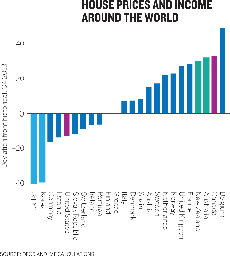
- 1. Identify four elements of this chart that contribute to a lack of clarity.
- 2. Sketch a new version of it given the following contextual information:
- a. The y-axis shows a percentage deviation from the historical average ratio of house price to income during the fourth quarter of 2013.
- b. Large positive deviations from historical averages may signal a housing bubble.
Discussion
This is obscurity disguised as simplicity. The layout is neat and the use of color restrained, but we simply don’t have enough information to know what this viz is meant to show us. Charts usually end up this simple and unclear for one of two reasons: The chart maker was either striving for well-designed simplicity but failed in execution, or was making assumptions about what the audience already knows. Indeed, this chart may make perfect sense to someone who has been analyzing housing data, but that person will end up having to explain it to a confused audience that’s not as familiar with the topic.
1. 1. The values on the y-axis are unclear. 40 and –40 what? Deviation from historical what? Limiting the words in labels is good—but limiting them so much that we don’t know what the values represent is not.
2. The bars are different colors, but it’s not immediately clear why. If we study for a moment, we may get it—they represent regions—but it’s unclear enough to give us pause.
3. The amount of eye travel needed to connect a bar and its label is very high and, given the width of the chart and the orientation of the labels, very difficult without sliding a finger across. That also makes the job of connecting color to region harder.
4. The headline mentions house prices and income but we see neither anywhere on the chart. Headlines should reflect the idea people will see or the point you want to discuss. They are neutral when they simply describe the structure of the chart. They are downright obfuscating when they mention variables we can’t even find on the chart.
2. This challenge would have been impossible if we hadn’t given you the context provided. Once you have that extra information, the adjustments can be made without much structural change. Most of my adjustments focused on text; a little more text goes a long way here. First, I’ve made the y-axis label more explicit—the bars represent deviations from normal—and it’s now clear that the axis refers to percentages. This is quite a long axis label, but I can’t think of a way to make it more succinct.

Likewise, I changed the headline to something much more useful. It mentions the key metric—the ratio—and comments on it in a way that confirms what we see in the chart. With so many diving bars and shooting bars, things don’t seem in whack. Dynamic change is occurring. I also added a subtitle to give just a little more context that will facilitate discussion. In fact, one good way to create subtitles if you need them is to think of what you’d say about the chart during a presentation. For versions you won’t be presenting, that sentence or two will provide valuable context, as it does here: We’re not showing this data just because it’s interesting; we’re showing it because although some countries are still recovering from a housing bubble, others seem headed for another one. That’s out of whack!
Normally, I advocate for fewer words on a chart, but in the absence of changing the form, this one was too simple and required more. This version has added words but it doesn’t feel more complex. That’s in part because of the left alignment of text and because the labels are all horizontal now as well, and snug to the bars. The sideways words and the difficulty in connecting labels to bars were two of the elements that most frustrated me with the original. The connection between value and country is now much clearer—so I decided to keep the color groupings. It’s not hard here to pick out the North American countries, the European countries, and so forth. (But I waffled on this; removing those colors wouldn’t be a bad choice either.)
Finally, you may not have noticed, but this chart is wider than the original. I did that deliberately to create breathing room. In some ways the tightly packed tall and thin bars are more visually dynamic, but they cause problems with the labels. And when I decided that I needed more words, I thought more horizontal space would keep those words from turning into blocks of text that overwhelmed the visual. It’s subtle but clarifying.

I wish this kind of chart were less common than it is. It seems to pop up especially when the goal is to show viewers not just the data but also an analysis of it. When it comes time to provide the takeaway, the chart maker seems to lose trust in the visual and fill it with words and marks to ensure that the audience knows where to look to see the analysis. Unfortunately, all the words and marks here don’t create clarity; they leach it out. We don’t know whether we should be looking or reading, and with all those places to focus, it’s unclear where to start. Let’s work on it.
- 1. Identify at least two instances of redundancy and say how you’d eliminate them.
- 2. Identify at least three more elements that make the chart less clear than it could be.
- 3. Sketch a clearer version that maintains focus on all three variables. Assume that the y-axis refers to dollars. Assume that the promo schedule is as follows:
Day 1: Original promo
Day 5: Follow-up email 1
Day 14: Follow-up email 2
Day 20: Last-chance email
- 4. Sketch a version of this chart that focuses clearly on a comparison of sneaker and jacket promotions.
- 5. Sketch a version that shows the “valuable” promotion period versus the “costly” promotion period (assuming that your analysis showed that promotional activities after 12 days were not cost-beneficial).
Discussion
Too much content and too much redundancy make this chart overdone. Visual elements that aren’t part of the actual data visualization, trend lines that fight for attention—it’s hard to know where to focus. The redundancy also contributes to a lack of focus. Redundancy isn’t a good thing, but it can be instructive. We tend to repeat what we think is important. To make sure the audience gets it, we chart it, label it, point to it, give it color, caption it. If you can identify redundancy, it may mean you’ve found the ideas you want to highlight and you just need to bring them forward in other ways that don’t create clutter and confusion.
1. 1. The x-axis labels. Repeating “day” 24 times clutters up the page and makes it hard to see which day connects to which vertical grid line once the numbers are in double digits. Furthermore, the axis itself does the job of telling us what the values 1 through 24 are. You could also consider not putting every day on the x-axis. Ask yourself whether it’s important that the audience be able to access every day’s value. If it’s not—if, say, only the days that email promotions went out are important—you could eliminate most of these labels altogether.
2. Promotion “bumps” captions. The words in the caption boxes describe what we see in the line chart and also point to what they describe, where there are other labels. So we’ve shown a bump, talked about a bump, pointed to the bump, and labeled the bump. The bump seems important, but so much information around it makes it harder to use. Should I look at the chart? Read the caption? Start with the labels? Which pointers should I start with? There’s no clear way through this chart because of the redundancy.
3. The headline. This headline describes the structure of the chart: store promotions (points along the trend line) and sales (y-axis) over two-plus weeks (x-axis). Remember that users usually don’t read from the headline down—they start with the visual field and use the headline as a “confirming cue” to check whether what they think they see is in fact what they’re being shown. Use your headline to describe the main idea of a chart, not its structure.
2. 1. The y-axis. It needs more information. Is this dollars? Units? What?
2. The grid lines. Their heaviness and number distract from the trend lines. Grid lines are most valuable when you want the audience to be able to map values anywhere along the x-axis to the y-axis. In other words, if specific points on the trend line are important, grid lines will help. Ask how many x-axis points need to be accessed on the y-axis: One every week? Every day? (If individual points are more important than the general trend, perhaps a trend line isn’t the right form. Maybe a dot plot or a table would serve you better.) If the trend line matters most, the grid lines can go, along with the visual noise they create.
3. Color. The color scheme of the trend lines is perfectly fine, but the additional colors on the page create confusion. The thick teal of the target-sales line gives it too much prominence, and the dashes make an already busy grid busier. This is secondary information, for reference. A thin gray would work better. The dark-gray caption boxes draw our eyes, so we fight between looking at the chart and reading the captions. They also add to an overall heaviness.
4. Pointers. Although they’re effective in connecting captions to the bumps described, they create confusion by crossing over lines and using color. The various shapes and angles lessen clarity and create unnecessary eye travel.
5. Alignment. There is none. Labels float; captions are offset; the key is on its own plane. So many unique entry points erode clarity.
3. This chart makes an exponential leap in clarity without losing any crucial information. Maybe surprisingly, most of the newfound clarity comes from simply removing some elements and aligning others. I took away all the grid lines except those for the promo days. Yes, this creates a cleaner look—but more important, it helps us see the story. Now the distance between two vertical lines represents the life of a promo email. We instantly see each bump and how it weakens over time until the next promo. Captions have been replaced with a subtitle that provides the same information in just seven words, with no pointers and no dark-gray boxes. And the title and subtitle are confirming cues, reminding viewers what they’ve just seen in the chart. Alignment is on two verticals: the y-axis and the key. The target line is quieter—a reference point rather than a primary visual feature.

4. Often, once you heighten a chart’s clarity, you can see a number of ways to create variations on the theme. In this case, I used all the same techniques as in the previous challenge, but I also “zoomed in.” The y-axis goes only to $30,000. I could have just removed the orange BOGO line from the original, but that would have left half the vertical space empty. Making the y-axis half as high doubled the change between two points in the space, so the curves are more pronounced. For this comparison, that’s useful. Look at how flat the blue and pink lines are on the previous chart compared with this one.
A note of caution: Juxtaposing this chart with the previous one would not be a good idea. It would create confusion because the audience would want to compare the charts to each other. The blue line in the second chart looks a lot like the orange one in the first, even though it represents much less change. So give each of these charts its own space. Don’t invite comparison on different scales.

5. Once again, here’s a variation on the theme; this one divides the space according to the analysis. Labels make the delineation clear. I removed the labels from the costly-time promos while adding one (Day 12) for the demarcation between the two regions. That wasn’t necessary; I just thought it emphasized that anything following the valuable time should be downplayed. I also downplayed low-value time by fading the color—signaling to the audience that this is not where their focus should be. The headline describes the idea authoritatively.


A heat map’s strength is also its weakness. It relies on color change—rather than the more typical size or distance—to show difference. That’s powerful because it creates regions with similar coloring, forming “hot spots” (or, depending on the variables, “cold spots”) that tell us something about regional and clustered relationships in a way that other forms can’t. It may be one of the few chart types that stays clear even when you squint. However, color gradations aren’t easy to get right. In general, seeing meaningful differences between colors is more difficult than dissecting spatial relationships. And because they often include lots of data, heat maps must be well organized to be clear. When they work, they sing. But executed poorly, they appear random, like this one. The colors are dynamic and eye-catching, but it’s hard to discern meaning in this patchwork. Let’s work on it.
- 1. Describe how this visualization’s axes are organized and identify at least two alternative ways to organize them.
- 2. Sketch a new version of it using a different organizing principle.
- 3. Describe the general color scheme of this heat map.
- 4. Sketch a new version using a different color scheme to improve clarity.
Discussion
There’s a method to the madness here. The information is organized systematically, and colors are meant to distinguish rankings. Hot spots and cold spots are here, sort of, but finding them takes work. The general sense of randomness results from arbitrary principles used to sort the information. It’s organized, but it’s still unclear. To increase clarity, you need to understand how it was sorted in the first place and then find a new set of organizing principles.
1. The x-axis is alphabetical by job sector save the first column, which represents overall ranking for each skill—presumably an average of all the others. That makes sense. Putting “Overall” amid the different jobs that make up the overall score would seem strange. We’re used to getting the full score first or last.
X-axis alternative grouping 1: by job type—health care, finance, manufacturing, management, etc. Organizing this way would show whether in-demand (or low-demand) skills cluster within job sectors.
X-axis alternative grouping 2: by median salary. If we ranked these from highest to lowest median salary, we could see how in-demand (and low-demand) skills cluster around high-paying and low-paying jobs.
Both are valid groupings, but neither is so compelling that it makes me want to adopt it. The job types are already rather broad; creating even broader groupings seems superfluous and probably wouldn’t add to the clarity. Median salaries sound like a good idea, but the salary range within information technology, for example, is enormous. The median salaries may not be that different from one another. After I’ve thought this through, I may just leave it as is.
The y-axis is also alphabetical, by skill. This feels arbitrary and problematic. Skills are specific enough that they can be grouped with more purpose than this.
Alternative grouping 1: by skill type. Skills could be clustered in “leadership,” “technical,” “intellectual,” “collaborative,” and so forth. If hot spots emerged within some of those clusters, we would immediately see whether certain categories are more highly valued than others.
Alternative grouping 2: by ranking. This seems almost too obvious to overlook. The list of skills can descend from overall ranking 1 to overall ranking 28. That ensures that the hot spots are at the top and the cold spots at the bottom. We then have a map that can be traversed easily from “skills in demand” to “skills less valued.”
2. The allure of organizing skills by overall ranking was irresistible, so I used that. It paid immediate dividends. Now we see the hot-to-cold skills and we can pick out some outliers—gray amid the color and color amid the gray. I didn’t change the x-axis, because other possible ways of arranging the information didn’t feel compelling enough. This looks like an improvement on the original, but color is still an issue.

3. What appeared to be haphazard color in the original was actually carefully planned. When the skills are rank-ordered, we see it: 1–2 yellows; 3–4 oranges; 5–6 reds; 7–8 purples; 9–10 blues. After that the gray gets lighter as the ranking goes down. It’s a reasonable attempt at a deliberate color scheme, but it doesn’t quite work. For one thing, red is more dominant than orange or yellow—“hotter”—but it represents a lower ranking. And because the blue is significantly separate from the redness of the rest of the palette, it draws the eye even though it represents the lowest of the top 10 rankings.
4. Two key changes bring clarity to this heat map. First, the top 10 skills are all blue, with decreasing saturation as scores decline. Because skill ratings are of a piece, there’s no need to use highly contrasting colors for rankings. A score of 9 is not so different from a score of 4 that one needs to be orange and the other blue. By using a single color, I created a single source of “heat”: the color blue, with darker blue representing “hotter” spots, or higher rankings. You might argue that blue means “cool” and maybe isn’t the best choice for a single color here. Fair critique. In this case the blue isn’t in opposition to anything, and rankings aren’t particularly associated with a “hot” metaphor (they’re more about high and low), so I’m OK with using blue. But I would understand if you chose red or orange.
Second, I flipped gray to move from light to dark rather than dark to light. An interim version of this chart (not pictured here) didn’t flip the gray, and it created a contrast between the very light blue of something ranked 10 and the dark gray of something ranked 11. That didn’t make as much sense to me as moving from light blue to light gray. Looking down the list of overall rankings in this version, we see a natural gradient effect: dark colors are the extremes, and light colors are the middle.
As a bonus, I made two more small adjustments that didn’t appear in the published version to improve the clarity of this heat map. I separated the overall column from the rest, so it now serves as part of the skill label, an inline key. Metaphorically, it makes sense to separate it from the other categories, since it comprises them. I also created space between the top 10 skills and the rest. To consider 28 skills all together is somewhat overwhelming. By dividing them, I effectively created two charts: “The Most Important Skills” and “The Rest.” It’s subtle, but that little cross-section of white space helps immensely.
