
15. Color Correction
In This Chapter
No matter how well your source footage was shot, there’s always room to clean up and adjust the look of it in post. Whether you’re trying to fix a poorly exposed shot, trying to match clips to make them look like they were shot in the same location, or altering the color and contrast as a storytelling technique, manipulating the appearance of your footage is a significant part of the post-production process.
Final Cut Pro has a unique color correction workflow that combines automatic color balancing (based on analysis), color matching across shots, and an unconventional new interface called the Color Board that allows you to make manual adjustments to color, saturation, and contrast.
There are also a large number of prebuilt “looks” that you can apply to your shots in a single step. Some of these are video effects, and some are presets in the Color Board.
Color Balance
One of the key aspects of the optional footage analysis in Final Cut Pro is a determination of the relative contrast and color temperature of your source footage.
By finding the lightest and darkest parts of the shot in each of the color channels, the software can automatically stretch the contrast to give a shot a sharper, cleaner look. This also serves to neutralize a shot’s white balance, removing unwanted color casts or erroneous hue shifts (caused by incorrect camera settings or poor lighting environments). This magic is called color balance, and it’s built into every clip in FCP.
Still, any automatic correction is bound to have limited usefulness, and this is no exception. There will always be shots where the Color Balance setting makes it look worse or removes a particular look that you spent hours on set perfecting. Fortunately, you can easily try the automatic correction and, if it’s not to your liking, disable it.
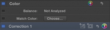
Clip Analysis
To take advantage of the automatic color balancing, your clips must be analyzed. This can be done when importing clips, or it can be done later.
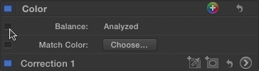
The Color Balance setting in the Video Inspector indicates whether the selected clip has been analyzed ![]() .
.
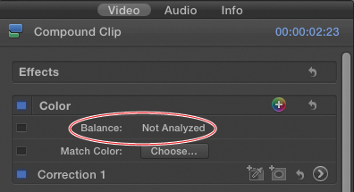
![]() To see whether a clip has been analyzed, check the Color section of the Video Inspector.
To see whether a clip has been analyzed, check the Color section of the Video Inspector.
To analyze files during import
• In the Video section of the Import Files dialog, select the “Analyze for balance color” checkbox ![]() .
.
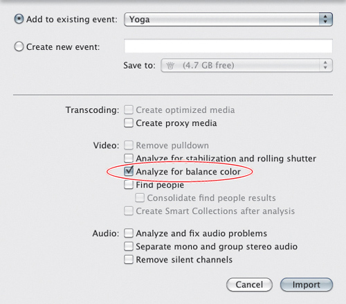
![]() When importing footage, select the “Analyze for balance color” checkbox.
When importing footage, select the “Analyze for balance color” checkbox.
To analyze files after import
1. In the Event Browser, select the clip or clips you want to analyze, and do one of the following:
• Choose Modify > Analyze and Fix.
• Right-click the selected clips, and choose Analyze and Fix from the shortcut menu.
The Analyze and Fix dialog opens ![]() .
.
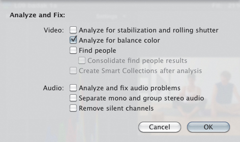
![]() Analyze already-imported clips by opening the Analyze and Fix dialog.
Analyze already-imported clips by opening the Analyze and Fix dialog.
2. In the Video section, select the “Analyze for balance color” checkbox, and click OK.
The analysis begins in the background.
To balance a shot’s color
• Select the clip, and do one of the following:
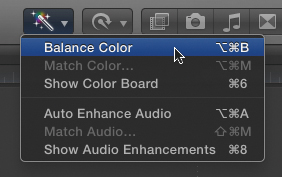
• Click the Auto Enhancements menu in the toolbar, and choose Balance Color.
A check mark will appear next to the menu item when Balance Color is enabled ![]() .
.
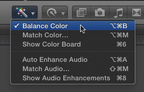
![]() Choose Balance Color from the Auto Enhancements menu. If color is currently balanced, the menu item will display a check mark (as shown here).
Choose Balance Color from the Auto Enhancements menu. If color is currently balanced, the menu item will display a check mark (as shown here).
• Press Option-Command-B.
• Open the Video Inspector, and in the Color section, click the activation checkbox next to Balance Color ![]() .
.

![]() In the Video Inspector, enable Color Balance by clicking the activation checkbox.
In the Video Inspector, enable Color Balance by clicking the activation checkbox.
The image’s color is “balanced.”
To disable Color Balance
• Select the clip, and do one of the following:
• Click the Auto Enhancements menu in the toolbar, and choose Balance Color ![]() .
.
![]() Turn off Color Balance in the Auto Enhancements menu.
Turn off Color Balance in the Auto Enhancements menu.
The checkbox will disappear.
• Press Option-Command-B.
• Open the Video Inspector, and in the Color section, click the blue activation checkbox next to Balance Color to deselect it ![]() .
.
![]() Or click the blue activation checkbox to deselect it.
Or click the blue activation checkbox to deselect it.
The Color Balance effect is removed.
Match Color
One of the most common color correction tasks is to change the look of one shot to match that of another shot. This can help make a sequence seem more coherent or provide a subtle but essential clue to a viewer that two scenes take place in the same setting (even if they were filmed in completely different locations).
To match a shot’s color
1. Select the clip in the Timeline, and open the Video Inspector.
2. Position the playhead over the clip on a representative frame ![]() .
.
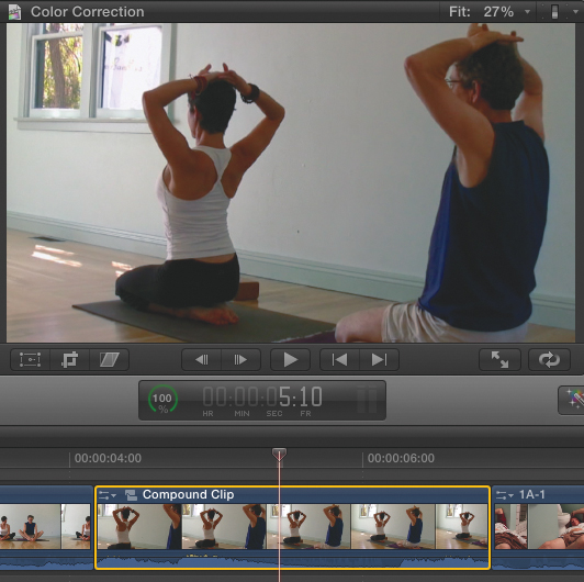
![]() Position the playhead over the frame in the clip you want to match.
Position the playhead over the frame in the clip you want to match.
This will be the frame you will use to judge the new color settings.
3. Do one of the following:
• In the Color section of the Inspector, click the Choose button in the Match Color parameters.
• In the Auto Enhancements menu in the toolbar, choose Match Color.
• Press Option-Command-M.
The Match Color window opens. The Viewer shows a two-up display with the current shot on the right and a black frame on the left ![]() .
.
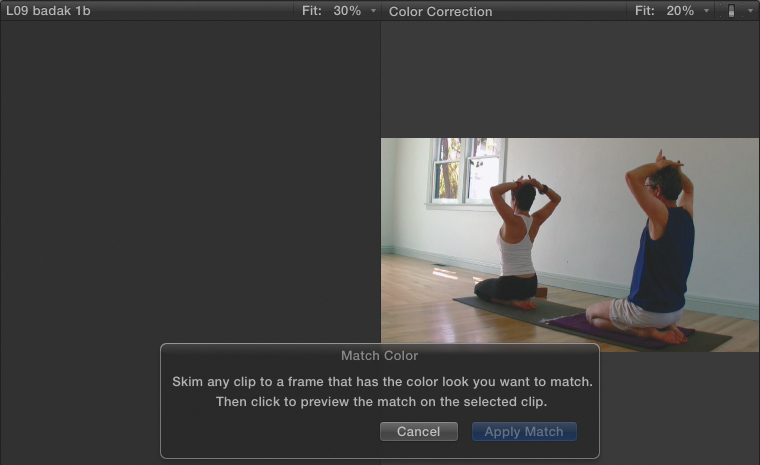
![]() The Match Color window is where you set the matching shot.
The Match Color window is where you set the matching shot.
4. Skim through the project until you find the frame you want to copy the color settings from ![]() .
.

![]() Skim in the project to find the frame to which you want to match the color of your clip. The clip you want to change appears on the right side; the clip you are matching to appears on the left.
Skim in the project to find the frame to which you want to match the color of your clip. The clip you want to change appears on the right side; the clip you are matching to appears on the left.
The skimmed clips appear on the left side of the Viewer.
5. When you find a frame you want to match, click in the Timeline.
The right side of the Viewer updates to show how your clip will look with the new color settings applied ![]() .
.
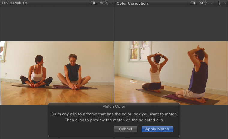
![]() When you find the frame you want to match, click. The right side of the viewer updates to show you how your matched shot will look.
When you find the frame you want to match, click. The right side of the viewer updates to show you how your matched shot will look.
6. When you’re satisfied with the new look, click the Apply Match button in the Match Color window.
The color settings are applied to the clip.
To remove Match Color settings
• Click the blue activation checkbox for the Match Color parameter in the Color section of the Video Inspector.
The Match Color effect is disabled. You can reenable it, and it will remember its last settings, or you can click Choose again to select a new match color.
Preset Color Correction
Using the Color Balance and Match Color settings can improve the look of your shots, but they’re pretty limited in terms of applying creative and dramatic visual style.
Of course, you can use the manual color correction tools to create an unlimited variety of looks and styles, but that takes some time and skill.
In between the auto settings and full-manual control are the variety of preset color correction settings that are like fully baked “looks” you can apply with a single click.
There are two different types of color settings that fall in this category: effects and presets.
Color Effects
The Effects Browser contains many video effects that are nothing more than color correction settings. This includes all of the effects in the Looks category and many of the effects in the Basics category. Many of these effects have adjustable parameters you can use to further customize the results ![]() .
.
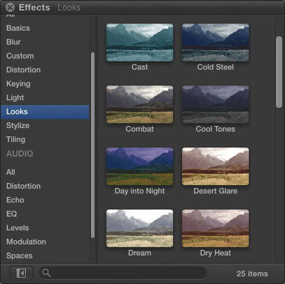
![]() The Effects Browser contains a variety of looks (and also some “basics”) that are essentially preset color correction settings.
The Effects Browser contains a variety of looks (and also some “basics”) that are essentially preset color correction settings.
For more on applying and modifying effects such as these, see Chapter 14, “Video Effects.”
Presets
The other group of one-click settings is the preset list in the Color Board window. These presets modify the controls in the Color Board; so if you want to customize one after you’ve applied it, follow the instructions in the “Manual Color Correction” section of this chapter.
You can also save your own presets to this list. If you use the Color Board to create a look or a style that you want to reuse later, you can save them to the Preset list.
Saved presets retain settings made in all three Color Board panes: Color, Saturation, and Exposure.
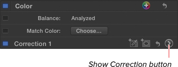
To apply a preset Color Board setting
1. Select a clip in the Timeline, and open the Video Inspector.
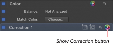
2. In the Color section of the Inspector, click the Show Correction button at the right edge of the Correction 1 parameter ![]() .
.

![]() Open the Video Inspector for your clip, and click the Show Correction button.
Open the Video Inspector for your clip, and click the Show Correction button.
The Color Board opens.
3. Click the gear icon in the lower-right corner of the Color Board ![]() .
.
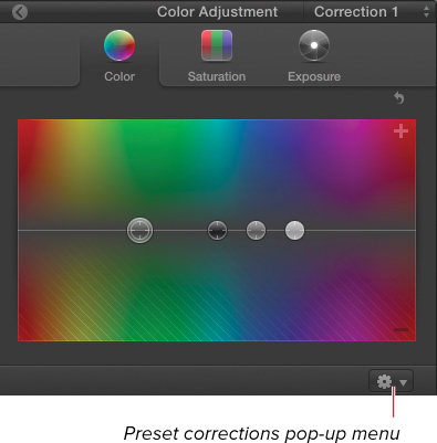
![]() The Color Board opens in all its glory.
The Color Board opens in all its glory.
The Color Board presets list appears ![]() .
.
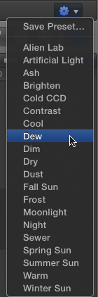
![]() Click the Gear icon to see a list of preset corrections.
Click the Gear icon to see a list of preset corrections.
4. Select a preset from the pop-up menu.
The preset is applied to your clip ![]() .
.
![]() Apply a preset, and the settings are applied in the Color Board, affecting the selected clip.
Apply a preset, and the settings are applied in the Color Board, affecting the selected clip.
To save a Color Board setting
1. Adjust the Color Board settings based on the instructions in the following “Manual Color Correction” section.
2. Click the gear icon in the lower-right corner of the Color Board.
The Color Board preset list appears ![]() .
.
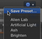
![]() Open the Preset Correction menu, and choose Save Preset.
Open the Preset Correction menu, and choose Save Preset.
3. Choose Save Preset.
The Save Preset dialog appears.
4. Type a name into the Save Preset dialog, and click OK ![]() .
.

![]() Enter a name in the Save Preset dialog.
Enter a name in the Save Preset dialog.
The settings are saved to the list as a preset ![]() .
.

![]() The saved preset is added to the pop-up menu.
The saved preset is added to the pop-up menu.
Manual Color Correction
All those automatic settings and preset corrections are fun and easy to employ, but the real power of color correction lies in making manual adjustments in the Color Board.
The Color Board has three panes: Color, Saturation, and Exposure. All three follow the same basic rules and workflow: There are four pucks in each pane. The pucks represent the settings for the shadows, midtones, highlights, and a global setting. By dragging the pucks, you assign a value to that range of the image ![]() .
.
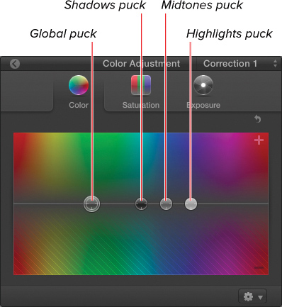
![]() Each puck controls the color for a range of brightness in the selected shot.
Each puck controls the color for a range of brightness in the selected shot.
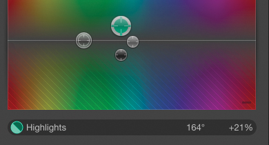
For example, to add yellow to the highlights, drag the Highlights puck toward the yellow section of the Color pane. Similarly, to remove saturation from the shadows, drag the Shadows puck downward in the Saturation pane.
Dividing the image into these three ranges of brightness provides a surprising amount of precise control over the image, allowing you to perform different adjustments to each range simultaneously.
It’s important to understand what portion of the image each puck affects. In fact, all three pucks have some impact on the whole image, but each puck’s influence is heavily weighted in different ways.
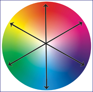
In figure ![]() , the blue line represents the Shadows puck, which has significant influence over the darkest areas of the image, and the influence tapers off in the brighter areas. The Highlights puck is represented by the green line, which has minimal influence over the darkest areas but great influence over the bright areas. The Midtones puck (shown in red) affects the middle of the graph the most, and its effect tapers off toward both the brightest and darkest parts of the image.
, the blue line represents the Shadows puck, which has significant influence over the darkest areas of the image, and the influence tapers off in the brighter areas. The Highlights puck is represented by the green line, which has minimal influence over the darkest areas but great influence over the bright areas. The Midtones puck (shown in red) affects the middle of the graph the most, and its effect tapers off toward both the brightest and darkest parts of the image.

![]() This graph shows how the three main pucks affect an overlapping range of brightness. Red: Midtones, Blue: Shadows, and Green: Highlights.
This graph shows how the three main pucks affect an overlapping range of brightness. Red: Midtones, Blue: Shadows, and Green: Highlights.
The important things to take away from this is to understand that all three pucks will affect the whole image and that their influences overlap.
You can (and likely will) adjust multiple pucks simultaneously in each pane. The art and craft of color correction often involves dragging one of the pucks in one direction and tempering the effect by dragging another of the pucks in an opposing direction.
For example, you might drag the Shadows puck toward Cyan but drag the Midtones puck toward Red (which will remove Cyan). In this way, you carefully limit the cyan adjustment to just the darkest shadows.
Adjusting Contrast
It is wise to adjust your exposure before making any changes to the color of your image. Our eyes are much more sensitive to slight changes in contrast (the difference between the light and dark areas of the image). Often, fixing the contrast may make color changes unnecessary.
In general, nearly every image can benefit from stretching the contrast—that is, making the dark sections darker and making the light sections lighter. If you go too far, you risk losing detail in the highlights and shadows of your image. But if you stretch contrast properly, it has the effect of wiping a layer of grime off the screen.
To adjust the contrast
1. Select a clip in the Timeline, and open the Video Inspector; then, do one of the following:
• In the Color section, click the Show Correction button next to Correction 1 ![]() .
.
![]() There are many ways to open the Color Board. For one, you can click the Show Correction button in the Video Inspector.
There are many ways to open the Color Board. For one, you can click the Show Correction button in the Video Inspector.
If any corrections have been applied, the Show Correction button appears in color (as shown in ![]() ).
).
• In the Auto Enhancement menu in the toolbar, choose Show Color Board ![]() .
.
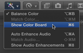
![]() Here’s another way: choose Show Color Board from the Auto Enhancement menu.
Here’s another way: choose Show Color Board from the Auto Enhancement menu.
• In the Timeline clip’s Adjustment popup menu, choose Color Adjustment ![]() .
.
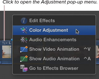
![]() Two more ways to open the Color Board: choose Color Adjustment in the Time clip’s Adjustment pop-up menu, or just press Command-6.
Two more ways to open the Color Board: choose Color Adjustment in the Time clip’s Adjustment pop-up menu, or just press Command-6.
• Press Command-6.
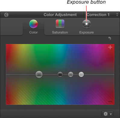
![]() In the Color Board, click the Exposure button.
In the Color Board, click the Exposure button.
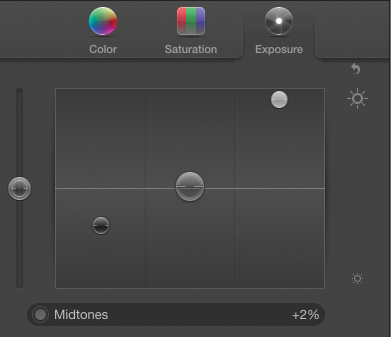
2. Click the Exposure button to open the Exposure pane ![]() .
.
![]() The Exposure pane contains four pucks: Shadows, Midtones, Highlights, and Global.
The Exposure pane contains four pucks: Shadows, Midtones, Highlights, and Global.
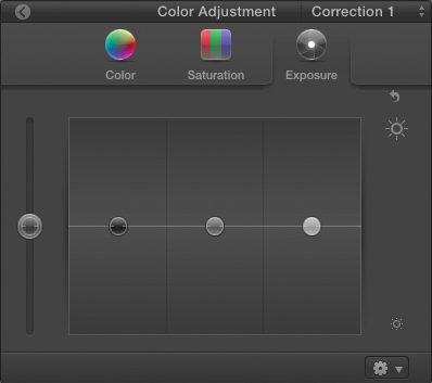
3. Drag the Shadows puck down until the darkest areas of your image appear black ![]() .
.
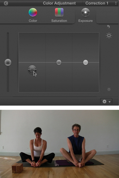
![]() Begin by setting the black levels.
Begin by setting the black levels.
There is great latitude here in terms of the look you desire. You must decide how much detail you want to retain in the shadows.
4. Drag the Highlights puck up until the brightest areas of your image appear white ![]() .
.
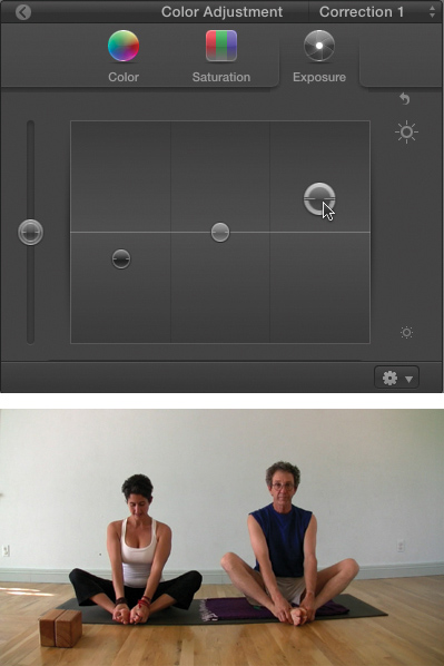
![]() Next, set the white levels.
Next, set the white levels.
Again, use your own discretion. You don’t want to make skin tones (like those shown in ![]() ) or a yellow wall appear pure white, but if there’s anything in the image that can be brightened without losing too much detail, go for it!
) or a yellow wall appear pure white, but if there’s anything in the image that can be brightened without losing too much detail, go for it!
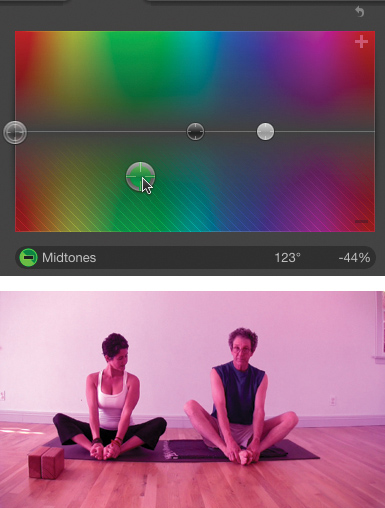
5. Drag the Midtones puck up or down to control the overall tone of the image ![]() .
.
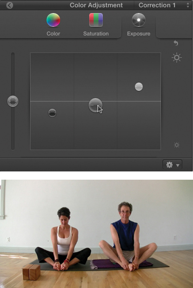
![]() If necessary, adjust the midtones. In this example, they have been raised slightly to give the overall image a brighter tone.
If necessary, adjust the midtones. In this example, they have been raised slightly to give the overall image a brighter tone.
6. Optionally, you may want to drag the Global puck up or down to make a broad adjustment to the entire clip ![]() .
.
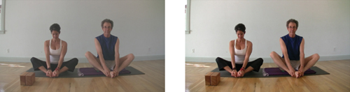
![]() The corrected version (on the right) looks like a layer of grime has been wiped off the screen.
The corrected version (on the right) looks like a layer of grime has been wiped off the screen.
Remember to move your playhead around a bit within the clip while you are making corrections. Beware of making one frame look perfect at the expense of the rest of the shot.
Adjusting Color
Once your contrast is looking good, you can begin adjusting the color and saturation of your image.
The Color pane of the Color Board works differently from the Exposure pane. You can drag each of the pucks anywhere at all on the board. Drag above the middle line to add a color, and drag below the middle line to remove a color ![]() .
.
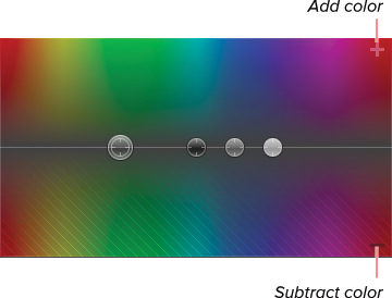
![]() Drag above the line to add a color, and drag below the line to subtract a color.
Drag above the line to add a color, and drag below the line to subtract a color.
The color displayed in the board indicates the color you are affecting in the image. Dragging farther away from the centerline in either direction (up or down) adds or subtracts more of the color.
Unlike with exposure, there’s no “correct” order in which to adjust the pucks in the Color pane. It really depends on the image you’re correcting and what you’re trying to achieve.
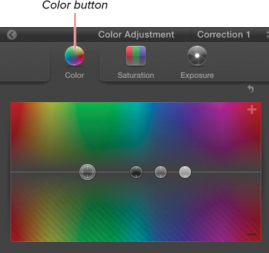
To adjust the color
1. Select a clip in the Timeline, and open the Video Inspector; then do one of the following:
• In the Color section, click the Show Correction button next to Correction 1 ![]() .
.
![]() Click the Show Correction button to open the Color Board.
Click the Show Correction button to open the Color Board.
• In the Auto Adjustment menu in the toolbar, choose Show Color Board.
• In the Timeline clip’s Adjustment popup menu, choose Color Adjustment.
• Press Command-6.
The Color Board opens.
2. Click the Color button to open the Color pane ![]() .
.
![]() In the Color Board, click the Color button to open the Color pane.
In the Color Board, click the Color button to open the Color pane.
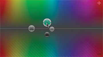
3. Drag the Shadows, Midtones, and Highlights pucks to adjust the color to create your desired effect ![]() .
.
![]() In the Color pane, you can drag any of the pucks anywhere on the board.
In the Color pane, you can drag any of the pucks anywhere on the board.
When a puck is selected, the info area below the board shows the numerical value of the color setting ![]() .
.
![]() For whichever puck is selected, the window shows the numerical value for the applied setting.
For whichever puck is selected, the window shows the numerical value for the applied setting.
Remember to move your playhead around a bit within the clip while you are making corrections. Beware of making one frame look perfect at the expense of the rest of the shot.
4. Optionally, you may want to drag the Global puck to add a tint to the entire clip.
If you look at the way the colors are arranged on a traditional color wheel, you can see how the axes of color are arranged and how dragging away from one color inherently adds another ![]() .
.
![]() A color wheel illustrates how the farther you move away from one color, the more you move toward its complementary color. Also, the farther away from the center, the more saturated the added color.
A color wheel illustrates how the farther you move away from one color, the more you move toward its complementary color. Also, the farther away from the center, the more saturated the added color.
In the Color Board, this relationship is not clear. You can inadvertently add one color by subtracting too much of another. The colors drawn on the board don’t give any clue to this. Dragging up is pretty intuitive; drag toward the color you want, and you add that color. But when you drag down, you’re subtracting, which means you’re adding the complementary color ![]() .
.
![]() Dragging down is the same as dragging up on a different color. For example, in this example, the midtones are set to subtract green, which is equivalent to adding magenta.
Dragging down is the same as dragging up on a different color. For example, in this example, the midtones are set to subtract green, which is equivalent to adding magenta.
Adjusting Saturation
Color and saturation are tied together very closely. In fact, adding more color by dragging one of the pucks in the Color pane toward the top or bottom of the Color Board does effectively increase the saturation of that color.
However, sometimes you want to adjust the overall saturation of the image. The Saturation pane facilitates this and allows you to also limit your adjustments to the shadows, midtones, or highlights.
To adjust the saturation
1. Select a clip in the Timeline, and open the Color Board.
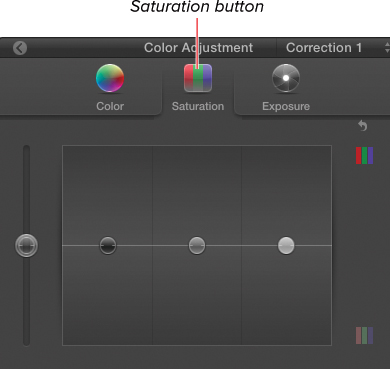
2. Click the Saturation button to open the Saturation pane ![]() .
.
![]() Click the Saturation button to open the Saturation pane.
Click the Saturation button to open the Saturation pane.
3. Drag the Shadows, Midtones, and Highlights pucks up to add saturation to that range of the image, or drag them down to remove saturation from that range ![]() .
.

![]() Drag the pucks to increase or decrease saturation in the specified brightness range. In this example, the shadows and highlights have been desaturated, while the midtone saturation has been boosted.
Drag the pucks to increase or decrease saturation in the specified brightness range. In this example, the shadows and highlights have been desaturated, while the midtone saturation has been boosted.
4. Optionally, you may want to drag the Global puck up or down to raise or lower the saturation for the whole clip.
To close the Color Board
• Click the Return to Video Inspector button in the upper left of the Color Board, or press Command-6 ![]() .
.
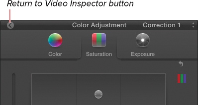
![]() To return to the Video Inspector, click the button in the upper-left corner of the Color Board, or press Command-6.
To return to the Video Inspector, click the button in the upper-left corner of the Color Board, or press Command-6.
To reset one pane of the Color Board
• Click the Reset button for the pane you want to reset ![]() .
.
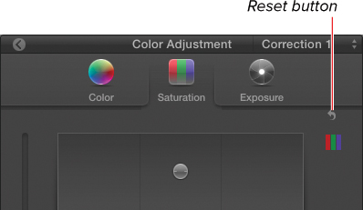
![]() To reset a specific pane, click the Reset button for that pane.
To reset a specific pane, click the Reset button for that pane.
The pucks in that pane are reset to their default positions.
To reset all panes of the Color Board
1. Close the Color Board.
2. In the Color section of the Video Inspector, click the Reset button for the correction you want to reset ![]() .
.
![]() To reset all panes in the Color Board, click the Reset button for the correction in the Video Inspector.
To reset all panes in the Color Board, click the Reset button for the correction in the Video Inspector.
All panes of the Color Board are reset to their default (neutral) settings.
Secondary Color Correction
All of the techniques described thus far are what considered primary color correction. This has nothing to do with the idea of primary colors (that is, red, green, and blue). Rather, primary correction refers to adjustments that affect the entirely of an image.
In contrast, secondary correction refers to changes that are limited to a portion of the image, such as the sky, a character’s skin, or an area of the frame masked by a shape. The term secondary refers to the fact that these corrections are typically done after primary corrections have been made.
By masking certain areas of the frame, you can apply different corrections to the different parts of the scene; you can make the sky bluer, the grass greener, and the skin tones skin-tonier. In fact, major motion pictures employ this technique on every frame of every movie. There’s no reason that Andrew Garfield’s skin should get the same adjustment as Judy Greer’s. And neither should get the same look as the Swamp Thing does! Using secondaries, actors can be tweaked to make them look their best—and now, in Final Cut Pro, you can bestow your own actors with the same indulgence.
You can employ as many corrections as you want, and each one can be limited using a color mask, shape masks, or both.
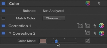
Color Masks
You create color masks by choosing a specific range of colors in the image, such as the blue of the sky, or the color of a person’s skin. Once that area has been identified, you can make adjustments using the three panes of the Color Board, and those corrections will be limited to that selected area.
To create a color mask
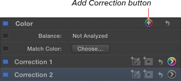
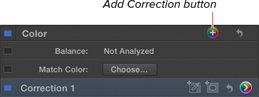
1. Select a clip in the Timeline, and open the Video Inspector.
2. Click the Add Correction button to add a new correction ![]() .
.
![]() Click the Add Correction button to add a new color correction setting.
Click the Add Correction button to add a new color correction setting.
A new correction is added to the Color section of the Inspector.
This step presumes you’re using Correction 1 to perform whatever primary color adjustments your shot requires.
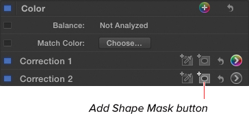
3. Click the Add Color Mask button for Correction 2 ![]() .
.
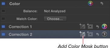
![]() Click the Add Color Mask button.
Click the Add Color Mask button.
A mask row is added to the correction, and the pointer changes to an eyedropper (once you hover over the Viewer) ![]() .
.
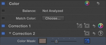
![]() A color mask item is added to the correction in the Inspector.
A color mask item is added to the correction in the Inspector.
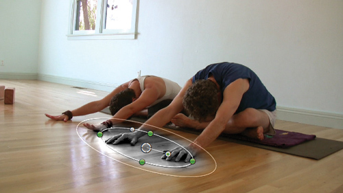
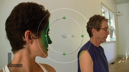
4. Click the color you want to select, and optionally drag to select a range of color ![]() .
.
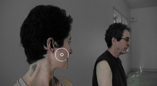
![]() Click and drag in the Viewer on the range of color you want to select. Areas outside the selection appear in black-and-white. In this example, the skin tones are being selected.
Click and drag in the Viewer on the range of color you want to select. Areas outside the selection appear in black-and-white. In this example, the skin tones are being selected.
A circle appears under the pointer to show the range of colors selected. Any similar colors throughout the image are automatically selected, and the rest of the image is temporarily displayed in black-and-white.
When you release the mouse, it appears that your selection has been lost, but it has not; it’s just that you haven’t made any changes in the Color Board yet, so you can’t see any change in the Viewer.
5. Click the Show Correction button for Correction 2 ![]() .
.
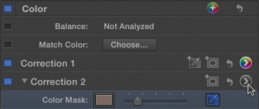
![]() Click the Show Correction button to open the Color Board for Correction 2.
Click the Show Correction button to open the Color Board for Correction 2.
The Color Board opens.
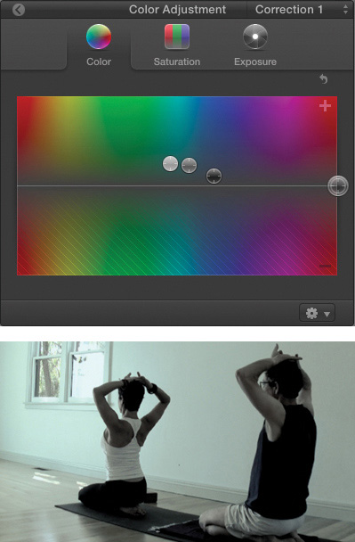
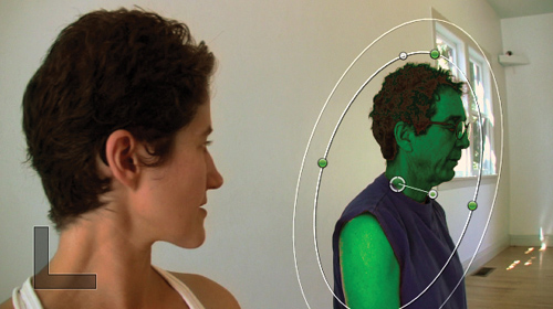
6. Make adjustments in the Color Board as described in the earlier “Manual Color Correction” section ![]() .
.
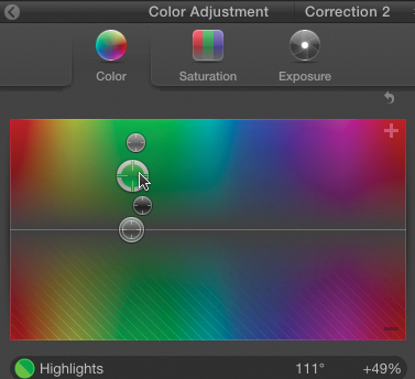
![]() Make adjustments in the Color Board. In this example, we’re going to turn the yoginis into Martians.
Make adjustments in the Color Board. In this example, we’re going to turn the yoginis into Martians.
The adjustments are limited to the color range selected ![]() .
.
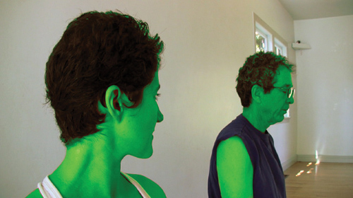
![]() The changes are limited to the selected area in the image—in this case, the skin tones.
The changes are limited to the selected area in the image—in this case, the skin tones.
7. Return to the Video Inspector, and adjust the Mask Softness slider ![]() .
.
![]() Optionally soften the selection using the Mask Softness slider in the Color section of the Video Inspector.
Optionally soften the selection using the Mask Softness slider in the Color section of the Video Inspector.
You can also redefine the selected color by repeating step 4 after you’ve made the corrections in step 6.
To delete a color mask
• Click the mask name in the Color section of the Video Inspector, and press Delete.
The color mask is deleted. If you had any corrections applied, they will now be applied to the entire image.
Shape Masks
In addition to color masks, you can identify a portion of the image using a simple shape (oval or rectangle). The idea is the same as with the color mask—identify an area in the image, and the corrections you apply are limited to that selected area.
You can create multiple shapes in the same correction to color correct a noncontiguous selection.
To add a shape mask
1. Select a clip in the Timeline, and open the Video Inspector.
2. Click the Add Correction button to add a new correction ![]() .
.
![]() Click the Add Correction button to add a new correction.
Click the Add Correction button to add a new correction.
A new correction is added to the Color section of the Inspector.
3. Click the Add Shape Mask button for the new correction ![]() .
.
![]() Click the Add Shape Mask button to add a new shape mask.
Click the Add Shape Mask button to add a new shape mask.
A shape appears in the Viewer ![]() .
.
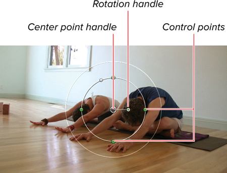
![]() The shape mask appears in the Viewer.
The shape mask appears in the Viewer.
4. In the Viewer, move the mask by dragging in the center point, resize it by dragging any of the four control points, and rotate it by dragging the rotation handle ![]() .
.
![]() Drag the shape handles to resize and rotate it, and drag the center point handle the mask to move it around.
Drag the shape handles to resize and rotate it, and drag the center point handle the mask to move it around.
The mask is customized to your liking.
5. Click the Show Correction button for the correction.
The Color Board opens.
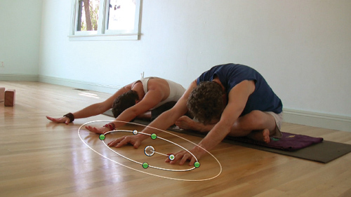
6. Make necessary adjustments to any of the three panes ![]() .
.
![]() Make whatever changes are desired in the Color Board.
Make whatever changes are desired in the Color Board.
The corrections are limited to the area specified by the mask ![]() .
.
![]() The changes are reflected only in the masked area of the Viewer.
The changes are reflected only in the masked area of the Viewer.
To convert a mask from an oval to a rectangle
• Drag the roundness handle to the left to make the shape more square, and drag it to the right to make the shape more round ![]() .
.
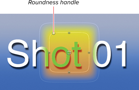
![]() Drag the Roundness handle to make your shape more square.
Drag the Roundness handle to make your shape more square.
To control mask softness
• Drag the outer ring around the mask to control the softness ![]() .
.

![]() Drag the outer ring to control the softness of the mask.
Drag the outer ring to control the softness of the mask.
The farther away the outer ring is from the inner ring, the softer the edge of the mask.
To add additional shape masks
• Click the Add Shape Mask button for the correction ![]() .
.
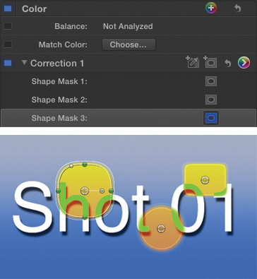
![]() Add as many shape masks as you want. They will all use the same correction settings.
Add as many shape masks as you want. They will all use the same correction settings.
To hide the mask on-screen controls
• Click the Toggle Shape Mask On-Screen Controls button for the mask whose controls you want to hide ![]() .
.
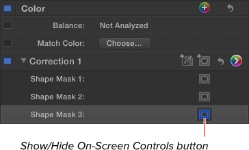
![]() Hide or show the on-screen controls by clicking the Toggle Shape Mask On-Screen Controls button for the mask in question.
Hide or show the on-screen controls by clicking the Toggle Shape Mask On-Screen Controls button for the mask in question.
The on-screen controls for that mask are hidden in the Viewer.
To delete a shape mask
• Select the shape mask under the correction in the Color section of the Video Inspector, and press Delete.
The mask is deleted.
If you have made adjustments in the Color Board for that correction and you delete the last mask, the correction will be applied to the entire image.
Combining Masks
You can combine color masks and shape masks in the same correction. This allows you to select the intersection of the masks, which can be extremely useful in terms of limiting your selection effectively.
For example, if you were trying to select an actor’s face but didn’t want the correction to affect their hand that was also visible in the shot, you could use a color mask to select the skin tones (which would select both the face and the hand), then add a shape mask around the face, excluding the hand from the effects of the correction.
To combine a color mask and a shape mask in one correction
1. Add a color mask as described in the task on page 345 ![]() .
.

![]() Add a color mask to identify a range of color.
Add a color mask to identify a range of color.
2. Add a shape mask as described in the task on page 347 ![]() .
.
![]() Add a shape mask to limit what part of the color mask is used.
Add a shape mask to limit what part of the color mask is used.
3. Adjust the shape mask to overlap the portion of the color mask you want to include in the selection ![]() .
.
![]() Corrections applied will be limited to the intersection of both color and shape masks. In this case, now only one of the actors is from Mars.
Corrections applied will be limited to the intersection of both color and shape masks. In this case, now only one of the actors is from Mars.
The resulting correction will affect only those areas selected by both masks.
Inside vs. Outside
Whenever you add masks to limit the effect of a correction, you have the option to apply different color settings to the area inside the mask and the area outside the mask.
By default, changes you make in the Color Board affect only the inside of the masked area, but you can make corrections to the outside as well. The result is two completely separate sets of Color Board settings, saved in a single correction.
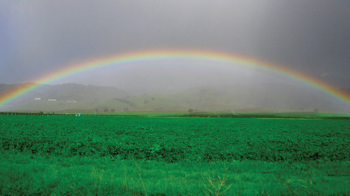
This allows you to use one mask to create two corrections. For example, if you create a shape mask around the sky in a landscape shot, you can use the inside of the mask to increase the contrast and the depth of the blue sky, and you can use the outside of the mask to add a golden hue to the land.
To make corrections to the outside of a masked area
1. Create a correction using a color or shape mask (or both) as described in the previous tasks ![]() .
.
![]() Add a color mask or a shape mask to your image. In this example, the color of the grass is being intensified and sharpened using a shape mask.
Add a color mask or a shape mask to your image. In this example, the color of the grass is being intensified and sharpened using a shape mask.
2. Click the Show Correction button (or press Command-6) to open the Color Board.
3. Make the corrections as desired to the area inside the mask.
4. In the bottom of the Color Board window, click the Outside Mask button ![]() .
.
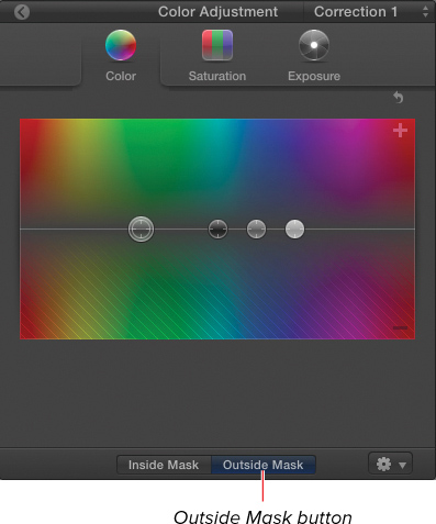
![]() Click the Outside Mask button at the bottom of the Color Board window.
Click the Outside Mask button at the bottom of the Color Board window.
The Color Board is reset to neutral settings.
5. Make corrections to any of the three panes in the Color Board.
The settings are applied to the area outside the mask ![]() .
.
![]() A separate set of corrections is applied to the outside area.
A separate set of corrections is applied to the outside area.
6. Click the Inside Mask button in the Color Board to make more changes to the correction inside the mask.
You can continue to switch between the inside and outside masks, making changes to both. Each set of changes is saved independently within the same correction.
Video Scopes
Video scopes can be helpful when color correcting your images. They provide an objective perspective on the color and contrast values of your video. When looking at a video with a greenish tint, your eyes quickly get used to the color cast and your brain automatically corrects for the error.
Using scopes can help you see such errors, and also can allow you to compare multiple images in a more objective way.
There are three scopes: Histogram, Vectorscope, and Waveform monitor.
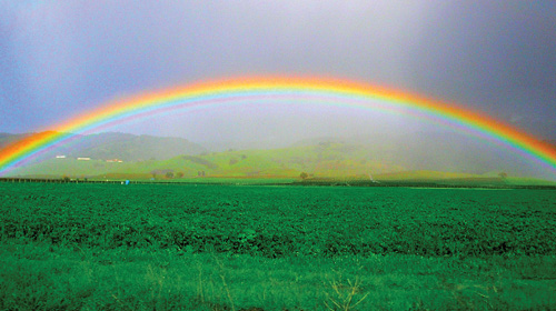
• Histogram ![]() plots the pixels of the image on a two-dimensional graph where the left side shows darker pixels and the right side shows lighter pixels. The more pixels of a particular color, the higher the bump in the graph.
plots the pixels of the image on a two-dimensional graph where the left side shows darker pixels and the right side shows lighter pixels. The more pixels of a particular color, the higher the bump in the graph.
![]() An example of a Histogram.
An example of a Histogram.
The Histogram is helpful in determining how the brightness of an image (or of its individual channels) is distributed. This indicates overall contrast as well as potentially identifying if the image is over- or under-exposed.
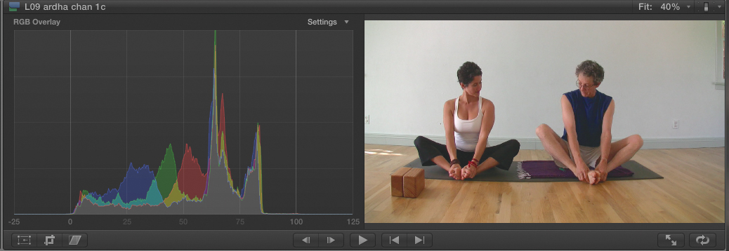
• Vectorscope plots the pixels of the image on a graph where the more saturated the color, the farther away it appears from the center point, and the hue determines the angle ![]() .
.
![]() An example of a Vectorscope.
An example of a Vectorscope.
The Vectorscope is helpful in determining if the image has a color cast or other type of hue-related problems. It can also show you how saturated an image is, as well as indicate the accuracy of specific colors, such as fleshtones.
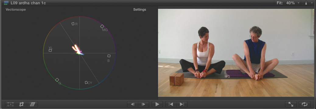
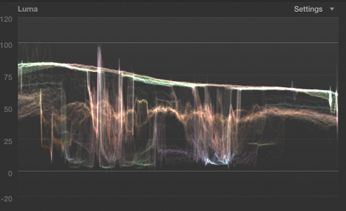
• Waveform Monitor plots the pixels of the image on a graph where the vertical axis indicates the brightness of the pixels (higher is lighter) and the horizontal axis represents the horizontal placement in the image ![]() .
.
![]() An example of a Waveform Monitor.
An example of a Waveform Monitor.
The Waveform Monitor can help you quickly identify the overall contrast level of an image, a well as identify specifically what areas might be under- or over-exposed.
To display Video Scopes
• Click the Viewer Display Options menu and choose Show Video Scopes or press Command-7 ![]() .
.

![]() Choose Show Video Scopes from the Viewer Display Options menu or press Command-7.
Choose Show Video Scopes from the Viewer Display Options menu or press Command-7.
The Viewer is split in half, and the left side displays one of three mathematical representations of the color and lightness values that comprise your video image.
Once the scopes are showing, you can choose among any of the three types of scopes, and for each of the three, there are additional settings available.
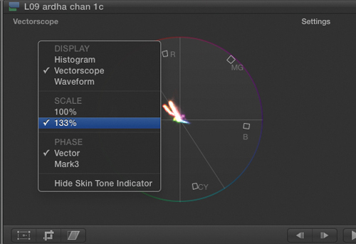
To switch between Video Scopes
1. Right-click anywhere on the scopes, or click the Settings pop-up menu ![]() .
.
![]() Choose a scope from the Display section of the Settings pop-up menu.
Choose a scope from the Display section of the Settings pop-up menu.
2. From the Display section of the pop-up menu choose the scope you wish to display ![]() .
.
![]() The display changes to show the scope of your choice.
The display changes to show the scope of your choice.
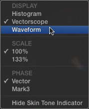
To select specific scope view settings
1. Right-click anywhere on the scopes, or click the Settings pop-up menu ![]()
![]()
![]() .
.

![]() The Histogram allows you to select a variety of different channels or channel combinations.
The Histogram allows you to select a variety of different channels or channel combinations.
![]() The Vectorscope allows you to zoom in on the scope, change the phase of the display, and hide or show the Skin Tones indicator.
The Vectorscope allows you to zoom in on the scope, change the phase of the display, and hide or show the Skin Tones indicator.
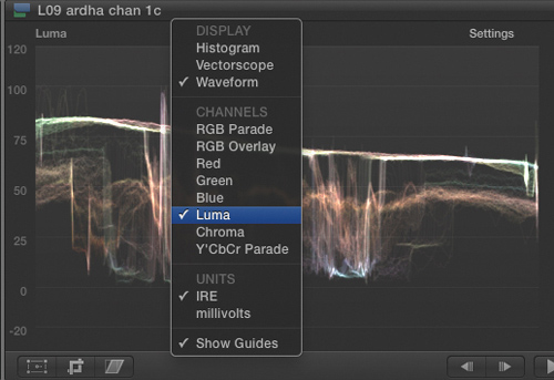
![]() The Waveform Monitor allows you to select a variety of different channels or channel combinations, change the scale between IRE and millivolts, and hide or show guides.
The Waveform Monitor allows you to select a variety of different channels or channel combinations, change the scale between IRE and millivolts, and hide or show guides.
2. Select the channels you want to display, or change other settings as desired, based on the specific scope.