
4
Other Topics in Product Development and Optimization: Response Surface and Mixture Designs
4.1 Introduction
In the previous chapter, the case study on the development of an innovative dishwashing product discussed the design and analysis of a general factorial design to identify which formula maximizes the cleaning performance response.
The present chapter extends the topic of design and analysis of factorial designs by introducing two classes of designs particularly suited to fitting and analyzing response surfaces and for optimizing response variables: central composite designs (CCDs) and Box‐Behnken designs.
When the factors represent ingredients or components of a formulation, the total amount of which is fixed and we are interested in evaluating whether one or more responses vary when decreasing or increasing the proportions of the ingredients, mixture experiments can be designed and analyzed to take into account the dependence among components.
The first case study considers the development of a new polymeric membrane, with the goal being to maximize the product's elasticity. Based on previous results, the scientists identify the region of exploration to search for the factor levels that maximize product elasticity. The example shows how to plan a CCD or a Box‐Behnken design in line with specific interests. For the analysis of the design, given that the experimenters are relatively close to the optimum set of factor levels, a second‐order model is fitted to allow the detection of curvatures, if any, in the response surface.
The second example considers a mixture experiment. In the development of a new detergent, the investigators aim to analyze to what extent three different components of a formulation can affect the product's technical performance. The reader is guided through the planning of different kinds of mixture designs depending on the presence or absence of other process variables in the design, or the presence of component bounds or linear constraints among components. The analysis of the selected mixture design closes the chapter.
In short, the chapter deals with the following:
| Topics | Stat tools |
| Central composite designs | 4.1 |
| Box‐Behnken designs | 4.2 |
| Mixture experiments | 4.3 |
| Simplex centroid designs | 4.4 |
| Simplex lattice designs | 4.5 |
| Constrained simplex designs | 4.6 |
| Extreme vertices designs | 4.7 |
| Mixture models | 4.8 |
4.2 Case Study for Response Surface Designs: Polymer Project
In the development of a new polymeric membrane, the research team aims to maximize the product's elasticity. Previous research has shown that the concentrations of two additives (factors A, B) and the exposure temperature explain much of the variability in elasticity. The scientists decide that the region of exploration in the search for factor levels that maximize the elasticity of the product should be around (3%, 10%) for the two additives and (40°, 80°) for the temperature. For logistic reasons, investigators need to arrange the experiment in such a way that the combinations of factor levels will be tested by two different operators. As the experimenters are relatively close to having the optimum set of factor levels, a second‐order model will be suitable to study all main effects (both linear and quadratic) and the two‐way interactions between factors. This model will allow the detection of curvatures in the response surface if any.
4.2.1 Plan of the Experimental Design
In Chapter 3, section 3.5, we fit a second‐order model to analyze a general factorial design with continuous factors with more than two levels specified by the experimenters and estimate the response surface in order to identify regions where the responses were close to the optimum. Now, as an alternative approach, we will create the experimental design by using a popular class of response surface designs called CCD (Stat Tool 4.1). Then we will present a variant of the CCD called the face‐centered design, and lastly another standard response surface design named the Box‐Behnken design (Stat Tool 4.2). The experimenters will choose one of the three designs according to the characteristics of each one and the main purposes of the study.
For this study:
- The two additives and the temperature represent the key factors.
- For factors A and B, the percentages of concentrations 3% and 10% represent the factor levels for the definition of the cube points.
- For factor Temperature, the temperatures 40° and 80° represent the factor levels for the definition of the cube points.
- The elasticity represents the response variable.
- The two operators represent two blocks (Stat Tool 2.4).
To perform the experiment, let's proceed in the following way:
- Step 1 – Create a CCD.
- Step 2 – Alternatively, create a face‐centered CCD.
- Step 3 – Alternatively, create a Box‐Behnken design.
- Step 4 – Assign the designed factor‐level combinations (design points) to the experimental units and collect data for the response variable.
4.2.1.1 Step 1 – Create a CCD
Let's begin creating a CCD, considering the three factors A, B, and Temperature.
 To create a CCD, go to: Stat > DOE > Response Surface > Create Response Surface Design
Under Type of Design select Central composite and in Number of continuous factors specify 3. Note that you can also consider categorical factors in your design.
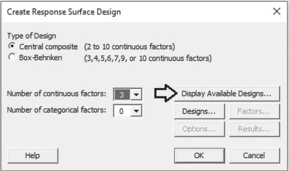
Click on Display Available Designs to have an idea of the number of runs based on the design type both with and without blocks and the number of continuous factors in the design. Note that depending on the number of continuous factors, you can create a full or fractional design (Stat Tool 2.2). Click on Designs. In the next dialog box, select the number of experimental runs and the number of blocks for the design. Note that with two blocks (the two operators), the CCD will include 20 runs.
There will be six center points, four of which will be included in the cube block, i.e. in the block with the experimental runs at the high and low levels of the factors. The other two center points will be in the axial block, i.e. the other block with the experimental runs at the axial levels of the factors.
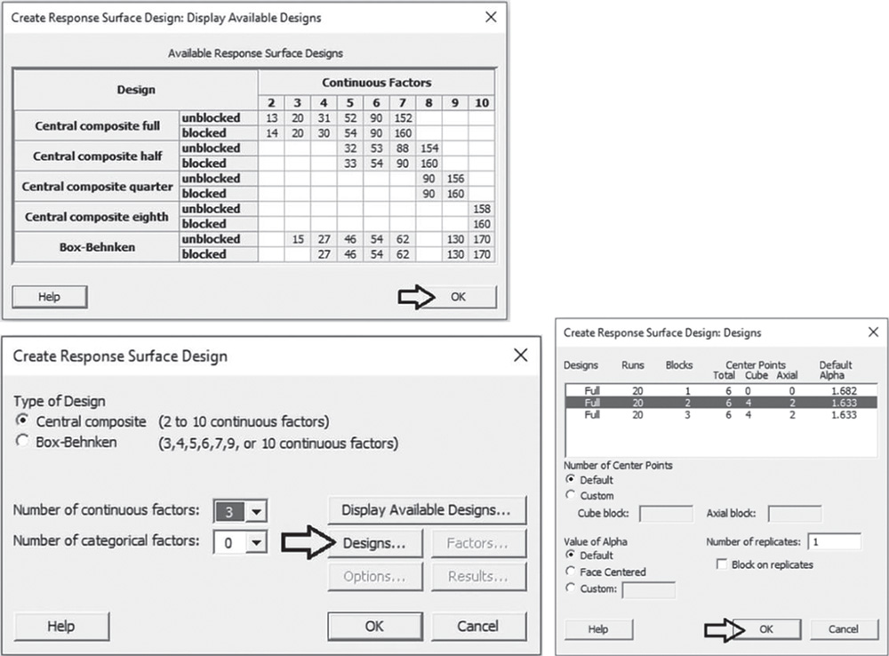
Under Number of Center Points leave the selected option Default to ensure that the design preserves some desirable statistical properties. However, Custom can be selected if you want to modify the number of center points in the design and their deployment into the blocks.
Under Value of Alpha check the option Default to ensure that the design preserves some desirable statistical properties. Again, Custom can be selected if you want to modify the value of alpha used to define the axial points. The option Face Centered allows you to create a variant of the CCD called Face Centered CCD (Stat Tool 4.1).
In Number of replicates specify 1 or, depending on available resources, enter how many times to perform each experimental run. Remember you can add replicates to your design later with Stat > DOE > Modify Design. If you specify more than 1 replicate and check the option Block on replicates, Minitab will put each replicate into its own block. If the base design has blocks, then the total number of blocks will be the product of the number of blocks in the base design and the number of replicates. Click OK.
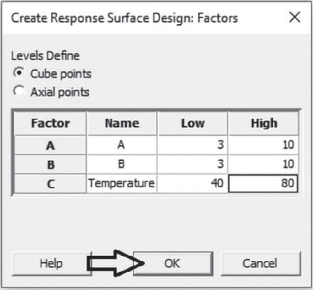
In the main dialog box select Factors. Under Name, Low and High, enter a name for each factor and its high and low levels. By default, Minitab sets the low level of all factors to −1 and the high level to +1. Under Levels Define, choose the appropriate factor setting Cube points or Axial points. In our example, the factor setting represents Cube points. If you have categorical factors, the window will allow you to enter the name, number of levels, and level values.
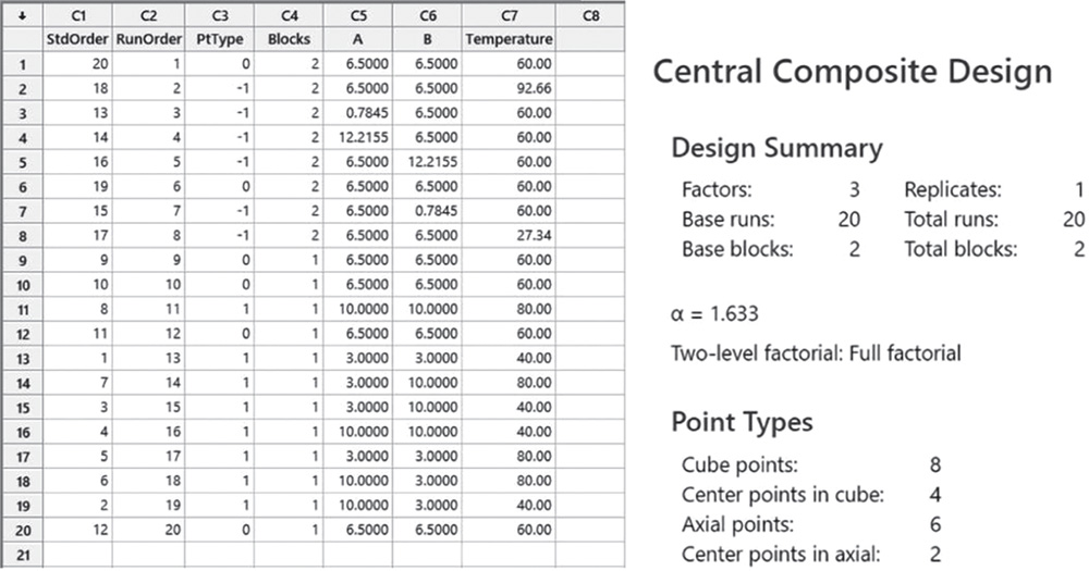
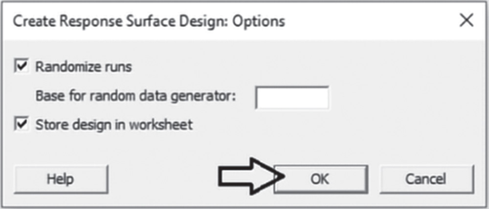
Proceed by clicking Options in the main dialog box and check the option Randomize runs (Stat Tool 2.3). Click OK in the main dialog box and Minitab shows the design of the experiment in the worksheet, and some information in the Session window.

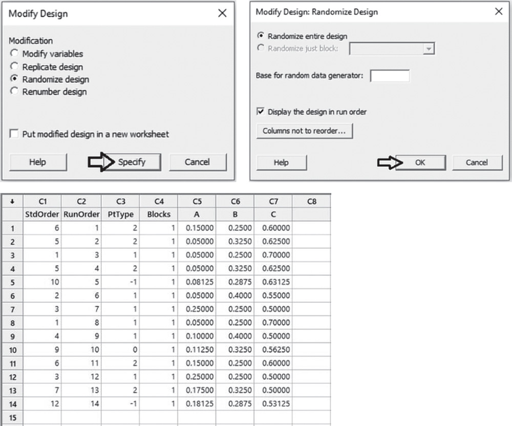
You can see that the design includes 20 runs distributed between two blocks. Column PtType shows each design point's type, where the value “0” represents a central point, “1” a cube point, and “−1” an axial point. Block 1 (one of the two operators) is a cube block since it includes cube points with the factors set at their low or high levels. Block 2 is an axial block since it includes axial points. Four center points are in block 1 and two in block 2.
4.2.1.2 Step 2 – Alternatively, Create a Face‐Centered CCD
If you need to evaluate the relationship between the three factors (A, B, Temperature) and elasticity, by exploring a cuboidal region around the basic factorial design, you can create a face‐centered CCD (Stat Tool 4.1).
To create a face‐centered CCD, go to: Stat > DOE > Response Surface > Create Response Surface Design
Under Type of Design select Central composite and in Number of continuous factors specify 3.
Click on Designs. In the next dialog box, select the number of experimental runs and the number of blocks for the design. As outlined in step 1, with two blocks (the two operators), the CCD will include 20 runs. There will be six center points, four of which will be included in the cube block, i.e. in the block with the experimental runs at the high and low levels of the factors. The other two center points will be in the axial block, i.e. the other block with the experimental runs at the axial levels of the factors.
Under Number of Center Points leave the selected option Default to ensure that the design preserves some desirable statistical properties. However, Custom can be selected if you want to modify the number of center points in the design and their deployment into the blocks.
Under Value of Alpha check the option Face Centered.
In Number of replicates specify 1 or, depending on available resources, enter how many times to perform each experimental run. Remember you can add replicates to your design later with Stat > DOE > Modify Design. If you specify more than 1 replicate and check the option Block on replicates, Minitab will put each replicate into its own block. If the base design has blocks, then the total number of blocks will be the product of the number of blocks in the base design and the number of replicates. Click OK.

In the main dialog box select Factors. Under Name, Low and High, enter a name for each factor and its high and low levels. By default, Minitab sets the low level of all factors to −1 and the high level to +1. Under Levels Define, choose the appropriate factor setting Cube points or Axial points. In our example, the factor setting represents Cube points. If you have categorical factors, the window will allow you to enter the name, number of levels, and level values.

Proceed by clicking Options in the main dialog box and check the option Randomize runs (Stat Tool 2.3). Click OK in the main dialog box and Minitab shows the design of the experiment in the worksheet, and some information in the Session window.
You can see that the design includes 20 runs distributed between two blocks. Column PtType shows each design point's type, where the value “0” represents a central point, “1” a cube point, and “−1” an axial point. Block 1 (one of the two operators) is a cube block since it includes cube points with the factors set at their low or high levels. Block 2 is an axial block since it includes axial points. Four center points are in block 1 and two in block 2. Note that the value of α is now set to 1.

4.2.1.3 Step 3 – Alternatively, Create a Box‐Behnken Design
You can decide to evaluate the relationship between the three factors (A, B, Temperature) and elasticity, by creating a Box‐Behnken design (Stat Tool 4.2), which often has fewer design points than CCDs with the same number of factors. The number of blocks (Stat Tool 2.4) that it is possible to include in a Box‐Behnken design depends on the number of factors. Designs with three factors cannot have blocks. For this reason, we now suppose the absence of blocks in our experiment.
To create a Box‐Behnken design, go to: Stat > DOE > Response Surface > Create Response Surface Design
Under Type of Design select Box‐Behnken and in Number of continuous factors specify 3.
Click on Designs. Under Number of Center Points you can leave the selected option Default. However, select Custom if you wish to modify the number of center points in the design. In Number of replicates specify 1 or, depending on available resources, enter how many times to perform each experimental run. Remember you can add replicates to your design later with Stat > DOE > Modify Design. If you specify more than 1 replicate, check the option Block on replicates and Minitab will put each replicate into its own block. If the base design has blocks, then the total number of blocks will be the product of the number of blocks in the base design and the number of replicates. If you have blocks (with more than three factors), then specify the number of blocks and click OK.

In the main dialog box select Factors. Under Name, Low and High, enter a name for each factor and its high and low levels. By default, Minitab sets the low level of all factors to −1 and the high level to +1. If you have categorical factors, the window will allow you to enter the name, number of levels, and level values.
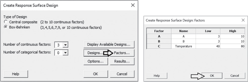
Proceed by clicking Options in the main dialog box and select Randomize runs (Stat Tool 2.3). Click OK in the main dialog box and Minitab shows the design of the experiment in the worksheet, as well as some information in the Session window.

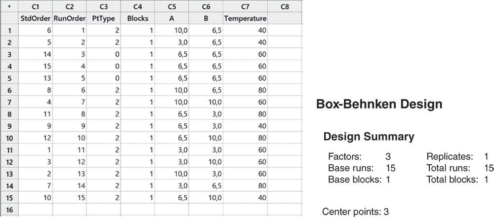
You can see the design includes 15 runs. Column PtType shows each design point type, where the value “0” represents a central point and “2” an edge mid‐point.
4.2.1.4 Step 4 – Assign the Designed Factor Level Combinations to the Experimental Units and Collect Data for the Response Variable
Collect the data for the response variables (elasticity) following the order provided in column RunOrder in the chosen design. For example, for the CCD design created in step 1, the first condition for the operator corresponding to block 2 to test will be that with component A at level 6.5, component B at level 6.5 and temperature at 60°.
Once all the designed factor level combinations have been tested, enter the recorded response values (elasticity) in the worksheet containing the design. Now you are ready to proceed with the statistical analysis of the collected data.
4.2.2 Plan of the Statistical Analyses
The main focus of a statistical analysis of a CCD is to study in depth how several factors contribute to the explanation of a response variable and understand how the factors interact with each other. A second important objective is optimization, i.e. the search for those combinations of factor levels that are linked to desirable values of the response.
For these purposes, a second‐order model provides a suitable approximation for the unknown functional relationship between factors and response variables. This is useful for identifying regions of factor levels that optimize response variables.
Let's proceed in the following way:
- Step 1 – Perform a descriptive analysis (Stat Tool 1.3) of the response.
- Step 2 – Fit a second‐order model to estimate the effects and determine the significant ones.
- Step 3 – If need be, reduce the model to include the significant terms.
- Step 4 – Optimize the response.
- Step 5 – Examine the shape of the response surface and locate the optimum.
For the Polymer Project, the dataset (File: CCD_Polymer_Project.xlsx) opened in Minitab appears as below.
The variables setting is the following:
- Columns C1 – C3 are related to the previous creation of the CCD design.
- Variables A, B and Temperature are the quantitative factors, each assuming three levels.
- Variable Elasticity is the quantitative response variable.
| Column | Variable | Type of data | Label |
| C4 | Blocks | Numeric data | The two operators labeled 1 and 2 |
| C5 | A | Numeric data | Additive A with levels: 0.78, 6.5, 12.22 |
| C6 | B | Numeric data | Additive B with levels: 0.78, 6.5, 12.22 |
| C7 | Temperature | Numeric data | Temperature with levels: 27.3°, 60°, 92.7° |
| C8 | Elasticity | Numeric data | Elasticity |
CCD_Polymer_Project.xlsx
4.2.2.1 Step 1 – Perform a Descriptive Analysis of the Response Variables
As the response is a quantitative variable, let's use the boxplot to describe how the elasticity occurred in our sample, and calculate means and measures of variability to complete the descriptive analysis.
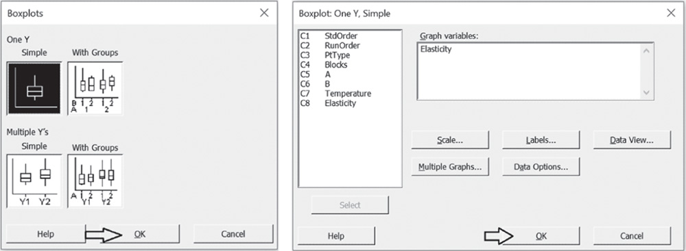
To display the boxplot, go to: Graph > Boxplot
Under One Y select the graphical option Simple and, in the next dialog box, under Graph variables select “Elasticity.” Then click OK in the dialog box.
To change the appearance of a boxplot, use the tips in Chapter 2, section 2.2.2.1, relating to histograms, as well as the following ones:
- To display the boxplot horizontally: double‐click on any scale value on the horizontal axis. A dialog box will open with several options to define. Select from these options: Transpose value and category scales.
- To add the mean value to the boxplot: right‐click on the area inside the border of the boxplot, then select Add > Data display > Mean symbol.
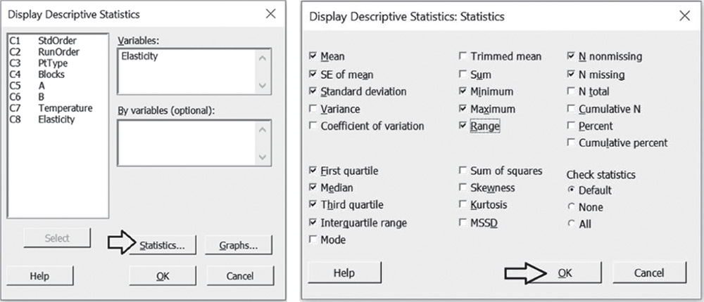
To display the descriptive measures (means, measures of variability, etc.), go to:
In the dialog box, select “Elasticity” under Variables, then click Statistics to open a dialog box displaying a range of possible statistics to choose from. In addition to the default options, select Interquartile range and Range.
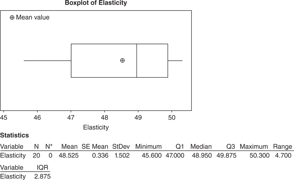
4.2.2.1.1 Interpret the Results of Step 1
Elasticity data is slightly skewed to the left (Stat Tools 1.4–1.5). About 50% of the trials showed an elasticity value greater than 48.9 (the median, Stat Tool 1.6), and around 25% greater than 49.9 (Q3, Stat Tool 1.7). With respect to variability, the average distance of the response values from their mean (standard deviation) is about 1.5 (Stat Tool 1.9).
4.2.2.2 Step 2 – Fit a Second‐Order Model to Estimate the Effects and Determine the Significant Ones
Before analyzing the CCD design, we have to specify the factors within Minitab.
To define the CCD design, go to:
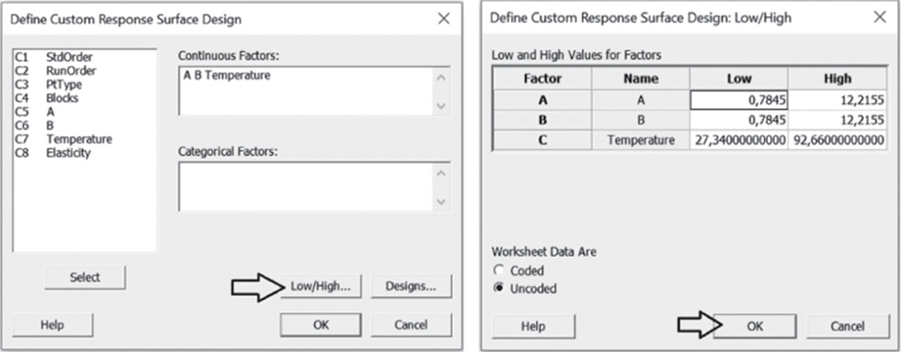
Under Continuous Factors, select the factors A, B, and Temperature. If some of your factors are categorical, these should be specified under Categorical Factors. Click on Low/High. For each factor in the list, verify that the high and low settings are correct, and if these levels are in the original units of the data, select Uncoded under Worksheet data are. Click OK.
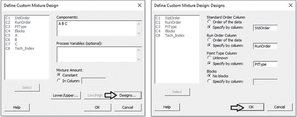
In the main dialog box, click on Designs. Specify the columns corresponding to the standard order, run order and point type of the runs. At the bottom of the screen, under Blocks, check the option Specify by column, and in the available space select the column representing the blocking variable. Click OK in each dialog box. Now you are ready to analyze the response surface design.

To analyze the response surface design, go to:
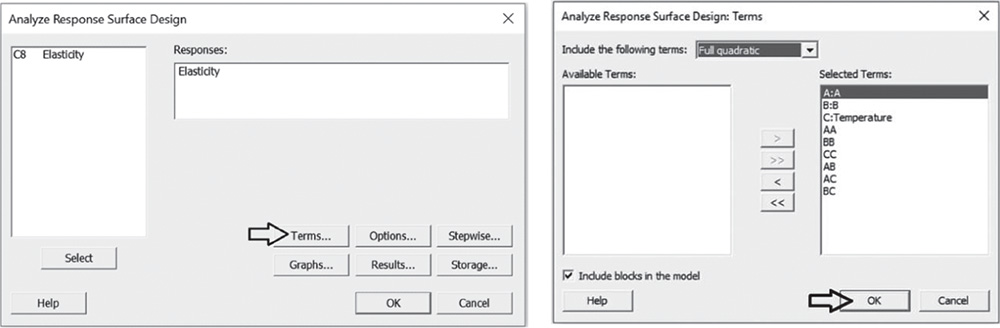
Select the response variable “Elasticity” in Responses and click on Terms. At the top of the next dialog box, in Include terms in the model up through order, specify Full quadratic to study all main effects (both linear and quadratic effects) and the two‐way interactions between factors. Select Include blocks in the model to consider blocks in the analysis. Click OK and in the main dialog box, choose Graphs. In Effects plots choose Pareto and Normal. These graphs help you identify the terms (linear and quadratic factor effects and/or interactions) that influence the response and compare the relative magnitude of the effects, along with their statistical significance. Click OK in the main dialog box and Minitab shows the results of the analysis, both in the Session window and through the required graphs.

4.2.2.2.1 Interpret the Results of Step 2
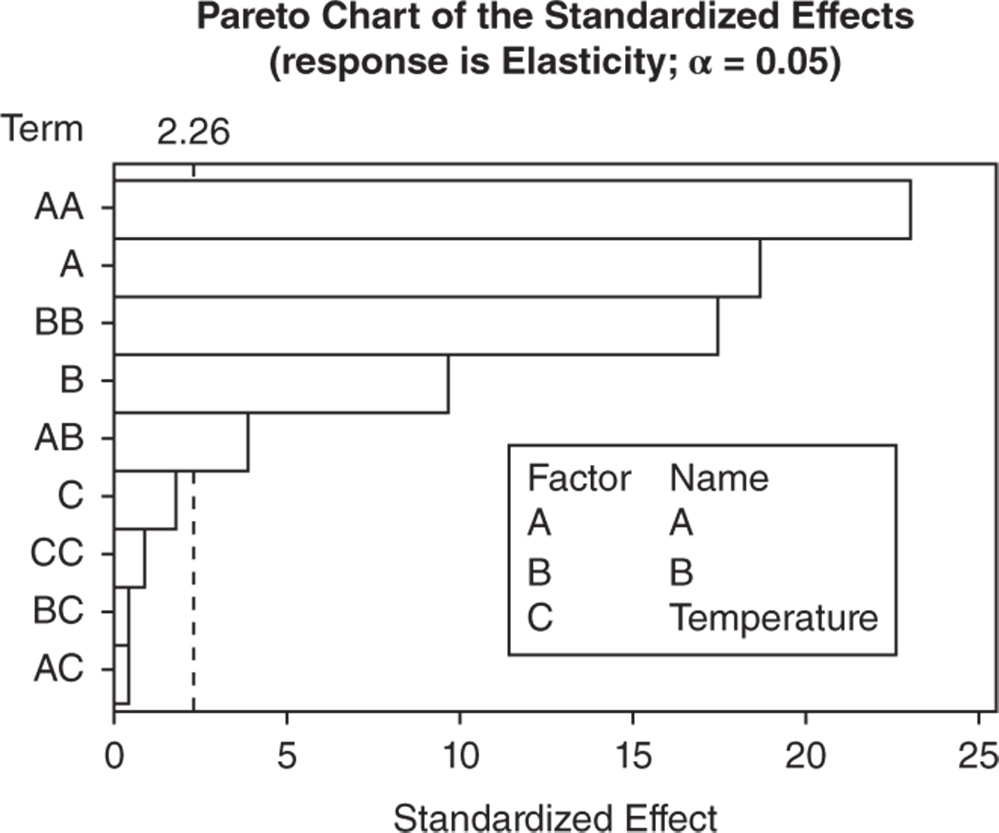
First consider the Pareto chart that shows which terms contribute the most to explaining the elasticity. Any bar extending beyond the reference line (considering a significance level equal to 5%) represents a significant effect.
In our example, with the exception of the effects involving temperature, the other main effects, the two‐factor interactions and the quadratic effects are statistically significant at the 0.05 level.
The Pareto chart shows which effects are statistically significant, but you have no information on how these effects affect the response.
Use the normal plot of the standardized effects to evaluate the direction of the effects.

In the normal plot of the standardized effects, the line represents the situation in which all the effects are 0. Effects that are further from 0 and from the line are statistically significant. Minitab shows statistically significant and nonsignificant effects by giving the points different colors and shapes. In addition, the plot indicates the direction of the effect. Positive effects (displayed on the right of the graph) increase the response when the factor moves from its low value to its high value.
Negative effects (displayed on the left of the graph) decrease the response when moving from the factor's low value to its high value. In our example, the main effects for additives A and B are statistically significant at the 0.05 level. Elasticity seems to increase with higher levels of each additive.
The interaction between the two additives and their quadratic effects are also marked as statistically significant. Later, we will clarify the meaning further.
Response surface regression
| ANOVA | |||||
| Source | DF | Adj SS | Adj MS | F‐Value | p‐Value |
| Model | 10 | 42.5324 | 4.2532 | 125.46 | 0.000 |
| Blocks | 1 | 0.3000 | 0.3000 | 8.85 | 0.016 |
| Linear | 3 | 15.0789 | 5.0263 | 148.27 | 0.000 |
| A | 1 | 11.8549 | 11.8549 | 349.69 | 0.000 |
| B | 1 | 3.1197 | 3.1197 | 92.02 | 0.000 |
| Temperature | 1 | 0.1044 | 0.1044 | 3.08 | 0.113 |
| Square | 3 | 26.6435 | 8.8812 | 261.98 | 0.000 |
| A*A | 1 | 17.9803 | 17.9803 | 530.38 | 0.000 |
| B*B | 1 | 10.3571 | 10.3571 | 305.51 | 0.000 |
| Temperature*Temperature | 1 | 0.0231 | 0.0231 | 0.68 | 0.430 |
| Two‐way interaction | 3 | 0.5100 | 0.1700 | 5.01 | 0.026 |
| A*B | 1 | 0.5000 | 0.5000 | 14.75 | 0.004 |
| A*Temperature | 1 | 0.0050 | 0.0050 | 0.15 | 0.710 |
| B*Temperature | 1 | 0.0050 | 0.0050 | 0.15 | 0.710 |
| Error | 9 | 0.3051 | 0.0339 | ||
| Lack‐of‐fit | 5 | 0.2126 | 0.0425 | 1.84 | 0.287 |
| Pure error | 4 | 0.0925 | 0.0231 | ||
| Total | 19 | 42.8375 | |||
In the ANOVA table we examine the p‐values to determine whether any factors or interactions, or even blocks, are statistically significant. Remember that the p‐value is a probability that measures the evidence against the null hypothesis. Lower probabilities provide stronger evidence against the null hypothesis.
For the main effects, the null hypothesis is that there is no significant difference in mean elasticity across levels of each factor. As we estimate a full quadratic model, we have two tests for each factor that analyze its linear and quadratic effect on response. The statistical significance of the quadratic effects denotes the presence of curvatures in the response surface.
For the two‐factor interactions, H0 states that the relationship between a factor and the response does not depend on the other factor in the term.
We usually consider a significance level alpha equal to 0.05, but in an exploratory phase of the analysis we may also consider a significance level equal to 0.10.
When the p‐value is greater than or equal to alpha, we fail to reject the null hypothesis. When it is less than alpha, we reject the null hypothesis and claim statistical significance.
So, if we set the significance level alpha to 0.05, which terms in the model are significant in our example? The answer is: the linear effects of additives A and B; the two‐way interactions between these two factors and their quadratic effects. You may now wish to reduce the model to include only significant terms.
When using statistical significance to decide which terms to keep in a model, it is usually advisable not to remove entire groups of nonsignificant terms at the same time. The statistical significance of individual terms can change because of other terms in the model. To reduce your model, you can use an automatic selection procedure, the stepwise strategy, to identify a useful subset of terms, choosing one of the three commonly used alternatives (standard stepwise, forward selection, and backward elimination).
4.2.2.3 Step 3 – If Need Be, Reduce the Model to Include the Significant Terms
To reduce the model, go to:

Select the numeric response variable “Elasticity” under Responses and click on Terms. In Include the following terms, specify Full Quadratic, to study all main effects (both linear and quadratic effects) and the two‐way interactions between factors. Select Include blocks in the model to consider blocks in the analysis. Click OK and in the main dialog box, choose Stepwise. In Method select Backward elimination and in Alpha value to remove specify 0.05, then click OK. In the main dialog box, choose Graphs.
Under Residual plots choose Four in one. Minitab will display several residual plots to examine whether your model meets the assumptions of the analysis (Stat Tools 2.8, 2.9). Click OK in the main dialog box.

Complete the analysis by adding the factorial plots that show the relationships between the response and the significant terms in the model, displaying how the response mean changes as the factor levels or combinations of factor levels change.
To display factorial plots, go to:

4.2.2.3.1 Interpret the Results of Step 3
By setting the significance level alpha to 0.05, the ANOVA table shows the significant terms in the model. Consider that the stepwise procedure may add nonsignificant terms in order to create a hierarchical model. In a hierarchical model, all lower‐order terms that comprise a higher‐order term also appear in the model.
Response surface regression
| Backward elimination of terms α to remove = 0.05 ANOVA | |||||
| Source | DF | Adj SS | Adj MS | F‐Value | p‐Value |
| Model | 6 | 42.3949 | 7.0658 | 207.53 | 0.000 |
| Blocks | 1 | 0.3000 | 0.3000 | 8.81 | 0.011 |
| Linear | 2 | 14.9745 | 7.4873 | 219.91 | 0.000 |
| A | 1 | 11.8549 | 11.8549 | 348.19 | 0.000 |
| B | 1 | 3.1197 | 3.1197 | 91.63 | 0.000 |
| Square | 2 | 26.6203 | 13.3102 | 390.94 | 0.000 |
| A*A | 1 | 17.9801 | 17.9801 | 528.10 | 0.000 |
| B*B | 1 | 10.3401 | 10.3401 | 303.70 | 0.000 |
| Two‐way interaction | 1 | 0.5000 | 0.5000 | 14.69 | 0.002 |
| A*B | 1 | 0.5000 | 0.5000 | 14.69 | 0.002 |
| Error | 13 | 0.4426 | 0.0340 | ||
| Lack‐of‐fit | 9 | 0.3501 | 0.0389 | 1.68 | 0.324 |
| Pure error | 4 | 0.0925 | 0.0231 | ||
| Total | 19 | 42.8375 | |||
Model summary
| S | R‐sq | R‐sq(adj) | R‐sq(pred) |
| 0.184518 | 98.97% | 98.49% | 97.41% |
Note that in the ANOVA table, Minitab displays the lack‐of‐fit test when your data contain replicates. This test helps investigators to determine whether the model accurately fits the data. Its null hypothesis states that the model accurately fits the data. As usual, compare the p‐value to your significant level α. If the p‐value is less than α, reject the null hypothesis and conclude that the lack of fit is statistically significant. If the p‐value is larger than α, you fail to reject the null hypothesis and you can conclude that the lack of fit is not statistically significant.
In our example, the p‐value (0.324) is greater than 0.05: we conclude that there is no strong evidence of lack of fit. Lack of fit can occur if important terms such as interactions or quadratic terms are not included in the model or if the fitted model shows several, unusually large residuals (Stat Tool 2.9).
In addition to the results of the analysis of variance, Minitab displays some other useful information in the Model Summary table.
The quantity R‐squared (R‐sq, R2) is interpreted as the percentage of the variability among elasticity data, explained by the terms included in the ANOVA model.
The value of R2 varies from 0 to 100%, with larger values being more desirable.
The adjusted R2 (R‐sq(adj)) is a variation of the ordinary R2 that is adjusted for the number of terms in the model. Use adjusted R2 for more complex experiments with several factors, when you want to compare several models with different numbers of terms.
The value of S is a measure of the variability of the errors that we make when we use the ANOVA model to estimate the elasticity data. Generally, the smaller it is, the better the fit of the model to the data.
Before proceeding with the results reported in the Session window, take a look at the residual plots. A residual represents an error, i.e. the distance between an observed value of the response and its value estimated by the ANOVA model. The graphical analysis of residuals based on residual plots helps you to discover possible violations of the underlying ANOVA assumptions (Stat Tools 2.8, 2.9).
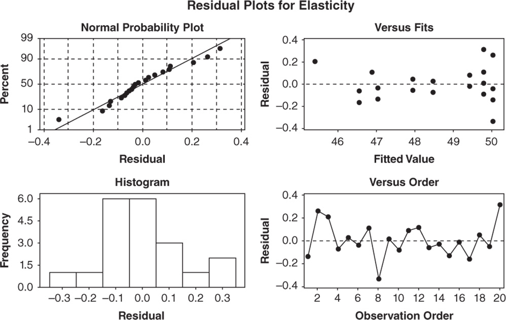
A check of the normality assumption could be made looking at the histogram of the residuals (bottom left), but with small samples, often the histogram has an irregular shape.
The normal probability plot of the residuals may be more useful. Here we can see a tendency of the plot to follow the straight line.
The other two graphs (Residuals versus Fits and Residuals versus Order) seem unstructured, thus supporting the validity of the ANOVA assumptions.
Returning to the Session window, we find a table of coded coefficients followed by a regression equation in uncoded units. In the regression equation, we have a coefficient for each term in the model. They are expressed in uncoded units, i.e. in the original measurement units. These coefficients are also displayed in the Coded Coefficients table, but in coded units (see section 2.2.2.3.1). In the Coded Coefficients table, we find the same results as in the ANOVA table in terms of tests on coefficients and we can evaluate the p‐values to determine whether they are statistically significant. The null hypothesis states that there is no effect on the response. Setting the significance level α at 0.05, if a p‐value is less than α, reject the null hypothesis and conclude that the effect is statistically significant.
Coded coefficients
| Term | Coef | SE Coef | t‐Value | p‐Value | VIF |
| Constant blocks | 49.9143 | 0.0648 | 769.72 | 0.000 | |
| 1 | −0.1250 | 0.0421 | −2.97 | 0.011 | 1.00 |
| A | 1.5398 | 0.0825 | 18.66 | 0.000 | 1.00 |
| B | 0.7899 | 0.0825 | 9.57 | 0.000 | 1.00 |
| A*A | −3.104 | 0.135 | −22.98 | 0.000 | 1.00 |
| B*B | −2.354 | 0.135 | −17.43 | 0.000 | 1.00 |
| A*B | 0.667 | 0.174 | 3.83 | 0.002 | 1.00 |
| Regression equation in uncoded units Elasticity = 41.069 + 1.3718 A + 0.9422 B − 0.09501 A * A − 0.07205 B * B + 0.02041 A * B Equation averaged over blocks. | |||||
Look at the factorial plots to better understand how the mean elasticity varies as factor levels change.
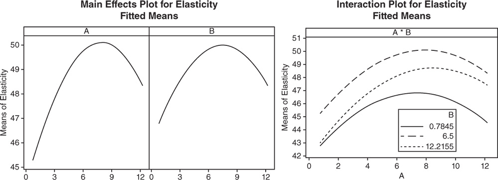 The presence of the quadratic terms A*A and B*B results in a curvature in the factorial plots involving factors A and B. Considering the interaction A*B, the best results in terms of elasticity are obtained when A is around 8 and B is set at its middle value.
4.2.2.4 Step 4 – Optimize the Response
After fitting the response surface model, additional analyses can be carried out to find the optimum set of factor levels that optimizes the response (Stat Tool 3.8).
To optimize the response variable, go to:
In the table, under Goal, select one of the following options for the response:
- Do not optimize: Do not include the response in the optimization process.
- Minimize: Lower values of the response are preferable.
- Target: The response is optimal when values meet a specific target value.
- Maximize: Higher values of the response are preferable.
In our case study the goal is to maximize elasticity: choose Maximize from the drop‐down list and click Setup. In the next window you need to specify a response target and lower or upper bounds depending on your goal. Minitab automatically sets the Lower value and the Upper value to the smallest and largest values in the data, but you can change these values depending on your response goal (Stat Tool 3.8).
- If your goal is to maximize the response (larger is better), you need to specify the lower bound and a target value. You may want to set the lower value to the smallest acceptable value and the target value at the point of diminishing returns, i.e. a point at which going above its value does not make much difference. If there is no point of diminishing returns, use a very high target value.
- If your goal is to target a specific value, you should set the lower value and upper value as points of diminishing returns.
- If the goal is to minimize (smaller is better), you need to specify the upper bound and a target value. You may want to set the upper value to the largest acceptable value and the target value at the point of diminishing returns, i.e. a point at which going below its value does not make much difference. If there is no point of diminishing returns, use a very small target value.
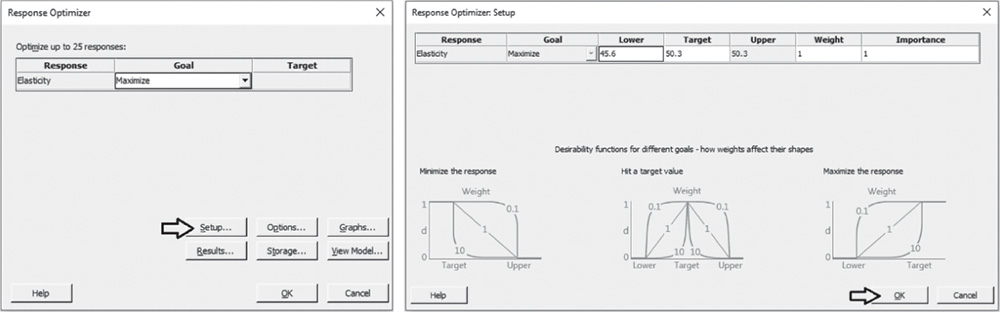 In our example, we leave the default values with the lower bound set to the minimum and the target and upper values set to the maximum.
Note that in the process of response optimization, Minitab calculates and uses desirability indicators from 0 to 1 to represent how well a combination of factor levels satisfies the goals you have for the responses. Specifying a different weight varying from 0.1 to 10, you can emphasize or deemphasize the importance of attaining the goals. Furthermore, when you have more than one response, Minitab calculates individual desirabilities for each response and a composite desirability for the entire set of responses. With multiple responses, you may assign a different level of importance to each response by specifying how much effect each response has on the composite desirability.
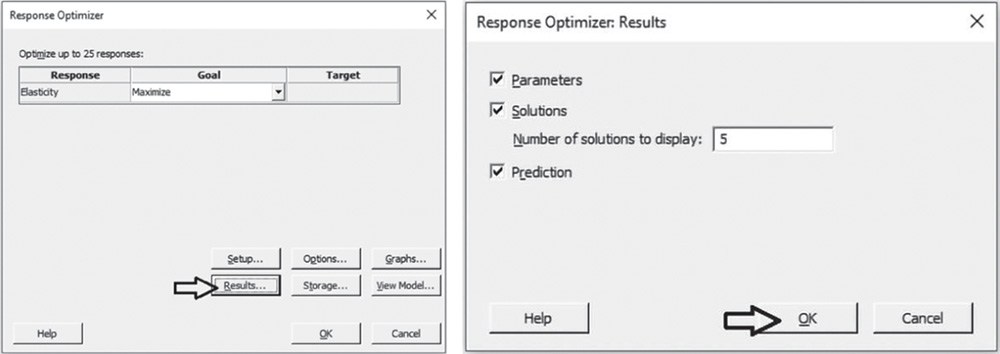
In our example, leave Weight and Importance equal to 1 and click OK. In the main dialog box select Results and in Number of solutions to display, specify 5. Click OK in each dialog box. In the optimization plot, Minitab will display the optimal solution, i.e. the factor setting that maximizes the composite desirability, while in the Session window we will find a list of five different factor combinations close to the optimal one, which is the first on the list.
The optimization plot shows how different factor settings affect the response. The vertical lines on the graph represent the current factor settings. The numbers displayed at the top of a column show the current factor level settings (Minitab displays them in red). The horizontal blue lines and numbers represent the responses for the current factor level. The optimal solution is displayed on the graph and serves as the initial point. The settings can then be modified interactively, to determine how different combinations of factor levels affect the response, by moving the red vertical lines corresponding to each factor. To return to the initial settings, right‐click and select Navigation and then Reset to Initial Settings.
4.2.2.4.1 Interpret the Results of Step 4
The optimization plot is a useful tool for exploring the sensitivity of the response variable to changes in the factor settings and in the neighborhood of a local solution – for example, the optimal one.
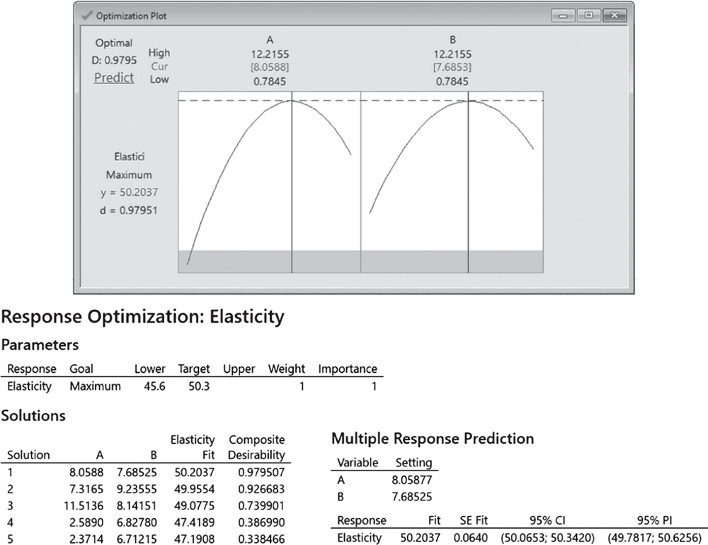
The Session window displays:
- Information about the boundaries, weight, and importance for the response variable (Parameters).
- The factor settings, the fitted response, and the composite desirability for the required 5 solutions. The first in the list is the optimal solution (Solutions).
- The factor settings for the optimal solution and the fitted response with their confidence intervals (Stat Tool 1.14) and prediction intervals (Multiple Response Prediction).
For elasticity data the optimal solution has the additive A set to 8.06 and the additive B to 7.68. For this setting, the fitted response (mean elasticity) is equal to 50.20 (95% CI: 50.06‐50.34). The composite desirability (0.98) is quite close to 1, denoting a satisfactory overall achievement of the specified goal.
4.2.2.5 Step 5 – Examine the Shape of the Response Surface and Locate the Optimum
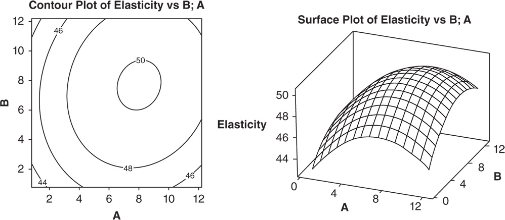
Graphic techniques such as contour, surface, and overlaid plots help us to examine the shape of the response surface in regions of interest. Through these plots, you can explore the potential relationship between pairs of factors and the responses. You can display a contour, a surface or an overlaid plot considering two factors at a time, while setting the remaining factors to predefined levels. With contour and surface plots, you consider a single response; in overlaid plots, you can consider more than one response.
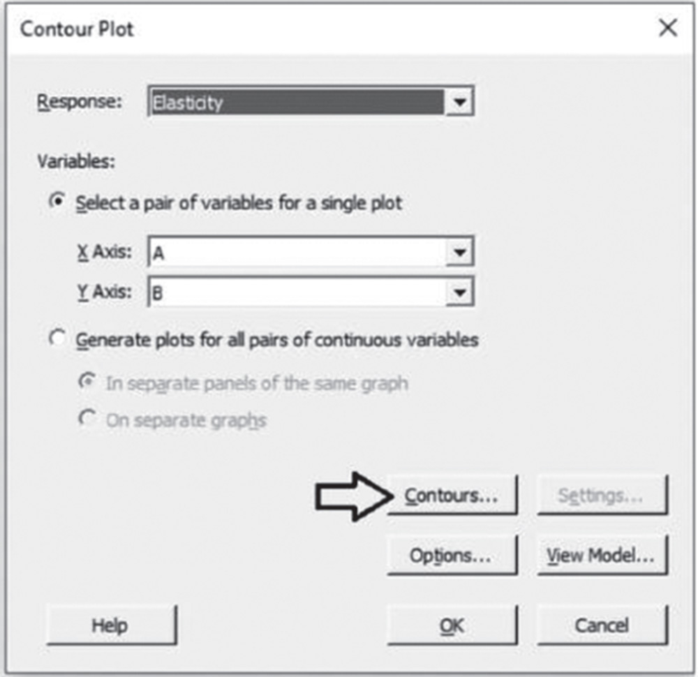
To display the contour plot, go to: Stat > DOE > Response Surface > Contour Plot
In the dialog box, select the response “Elasticity” in Response. Click Contours, and under Data Display, choose Contour lines. Click OK.
To display the surface plots, go to: Stat > DOE > Response Surface > Surface Plot
In the dialog box, select the reponse “Elasticity” in Response. Click OK.
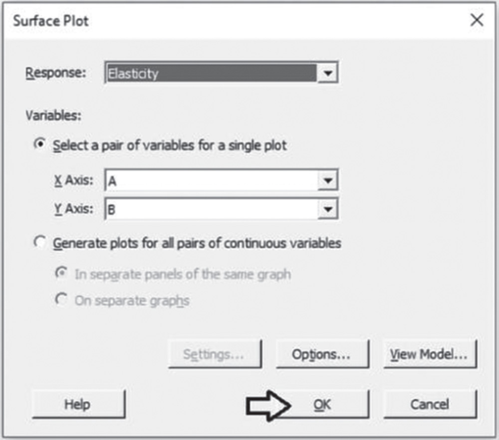
To change the appearance of the surface plot, double‐click on any point inside a surface. In Attributes, under Surface Type, select the option Wireframe instead of the default Surface.

4.2.2.5.1 Interpret the Results of Step 5
In the contour plot, additives A and B are plotted in the x‐ and y‐axes and elasticity is represented by different level curves. Double‐click on any point in the frame and select Crosshairs to interactively view variations in the response. In the surface plot, elasticity is represented by a smooth surface. It is relatively easy to see that the optimum is very near to 8 for additive A and to 7 for additive B and to explore how the elasticity changes while increasing or decreasing factor levels.
4.3 Case Study for Mixture Designs: Mix‐Up Project
In the development of a new detergent, the research team aims to analyze how three different components can affect the product's technical performance. The three components (A, B, and C) form a mixture of fixed amount. The researchers want to evaluate if changing the proportions of the components inside the mixture will lead to the technical performance (measured as an index assuming values from 0 to 70, with high values representing a better performance) displaying different behavior.
In case study 4.2, we created and analyzed a response surface design in which the levels of each factor can vary independently of the other factors. In this case study, the three components represent ingredients of a mixture and the amount of the mixture is fixed. Consequently, the components are not independent, i.e. if we increase one component, at least one other must decrease. This kind of experiment is called a mixture experiment (Stat Tool 4.3).
4.3.1 Plan of the Experimental Design
We will create the experimental design using either a simplex centroid design (Stat Tool 4.4) or a simplex lattice design (Stat Tool 4.5).
For the present study:
- The three components A, B, and C represent the key factors.
- The technical performance represents the response variable.
To perform the experiment, let's proceed in the following way:
- Step 1 – Create a simplex centroid design for a simple mixture experiment.
- Step 2 – Alternatively, create a simplex centroid design for a simple mixture experiment with lower limits for components.
- Step 3 – Alternatively, create a simplex centroid design for a mixture‐process variable experiment.
- Step 4 – Alternatively, create a simplex centroid design for a mixture‐amount experiment.
- Step 5 – Alternatively, create a simplex lattice design for a simple mixture experiment.
- Step 6 – Alternatively, create an extreme vertices design with lower and upper limits for components.
- Step 7 – Alternatively, create an extreme vertices design with linear constraints for components.
- Step 8 – Assign the designed factor level combinations (design points) to the experimental units and collect data for the response variable.
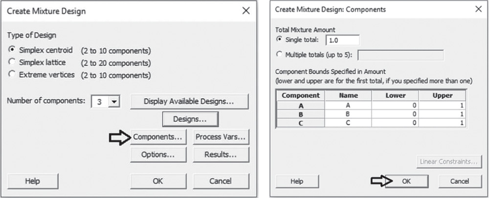
4.3.1.1 Step 1 – Create a Simplex Centroid Design for a Simple Mixture Experiment
Let's start with a simple mixture experiment in which only the proportions of the three components are expected to be related to the technical performance. For this purpose we will create a simplex centroid design, considering the three factors A, B, and C.
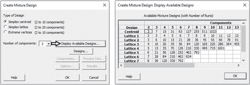
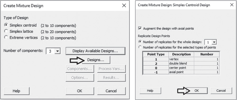
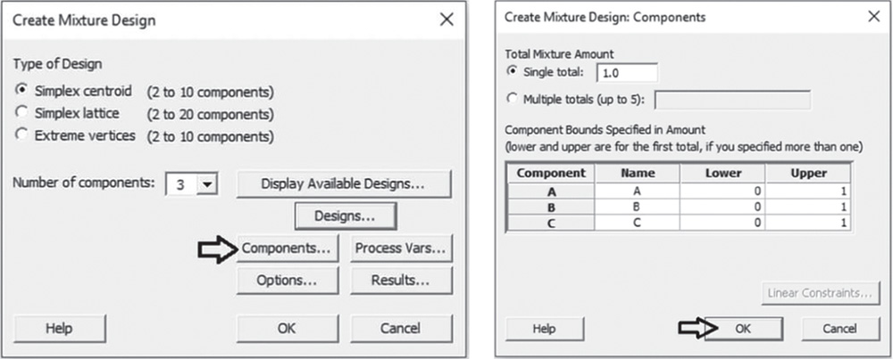
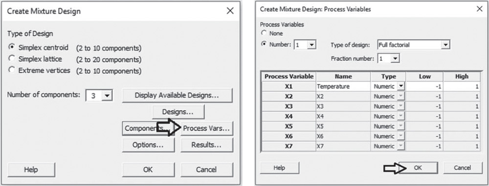
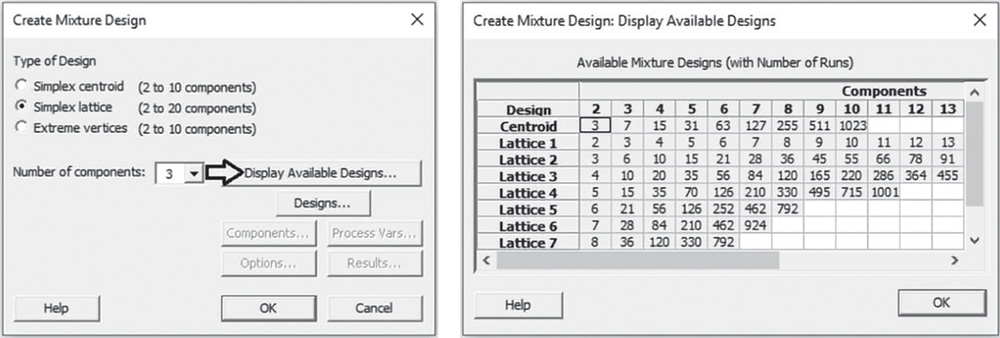
To create a simplex centroid design, go to: Stat > DOE > Mixture > Create Mixture Design
In Type of Design select Simplex centroid and in Number of components specify 3. Click on Display Available Designs to have an indication of the number of runs based on the design type and the number of components in the mixture. Click OK.
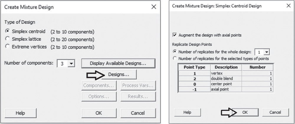
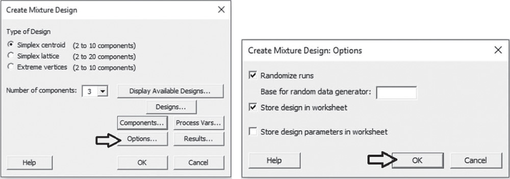
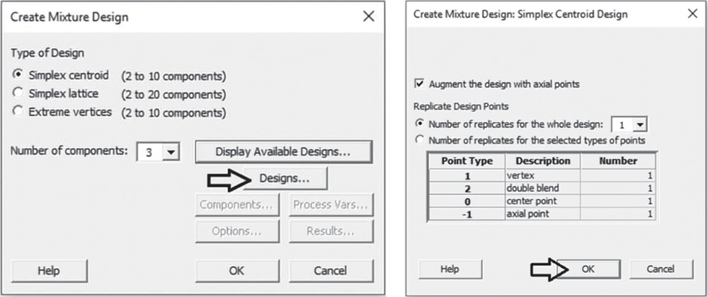
In the main dialog box select Designs. Check the option Augment the design with axial points. In Number of replicates for the whole design specify 1 or, depending on available resources, enter how many times to perform each experimental run. To add replicates for specific design points, for example for a center point or a vertex point, select the option Number of replicates for the selected types of points. Remember, you can add replicates to the whole design later with Stat > DOE > Modify Design. Click OK.
In the main dialog box select Components. Check the option Single total under Total Mixture Amount and leave the default value 1.0 given that the experiment considers a single fixed amount for the mixture and the components are expressed as proportions. Under Name, enter a name for each mixture component. For the moment, suppose that each component can vary from 0 to 1. In steps 2 and 6, we will see how to specify lower and/or upper limits for components. Click OK.
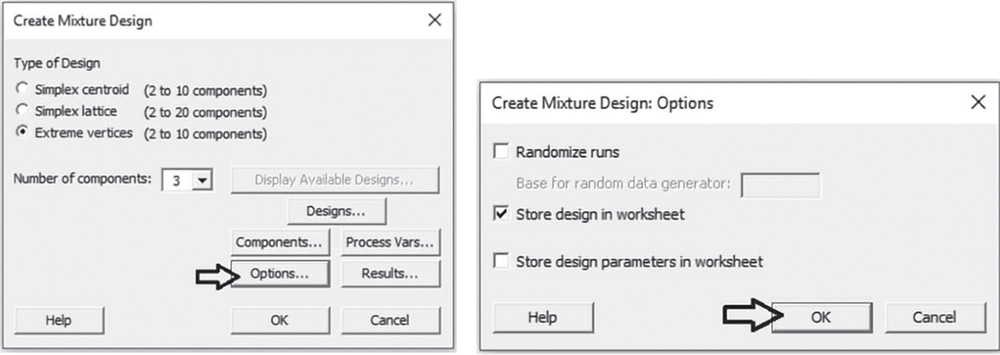
Proceed by clicking Options in the main dialog box and check the option Randomize runs (Stat Tool 2.3). Click OK in each dialog box and Minitab shows the design of the experiment in the worksheet and some information in the Session window.

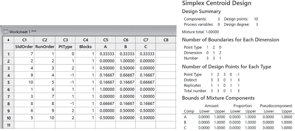
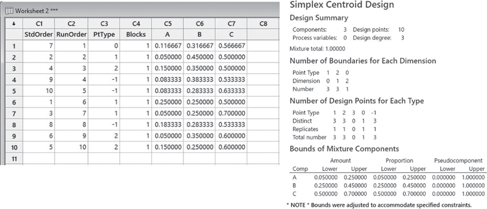
The design includes 10 design points. In the table, Number of Design Points for Each Type, each design point type can be seen. In the design we have three vertices (point type = 1), three double blends (point type = 2), one center point (point type = 0) and three axial points (point type = −1).
You can display the design to graphically check the experimental region.
Go to: Stat > DOE > Mixture > Simplex Design Plot
Under Components, check the option Select a triplet of components for a single plot. If you have more than three components in the mixture, you can select the option Generate plots for all triplets of components. Under Component Unit in Plot(s), check Proportion and under Point Labels, select Point Type. Click OK.

If you hover over the design points, Minitab displays the corresponding mixture. For example, the top vertex corresponds to the pure blend (A = 1, B = 0, C = 0).
In Stat Tools 4.4–4.7, the main characteristics and purposes of each mixture design are presented.
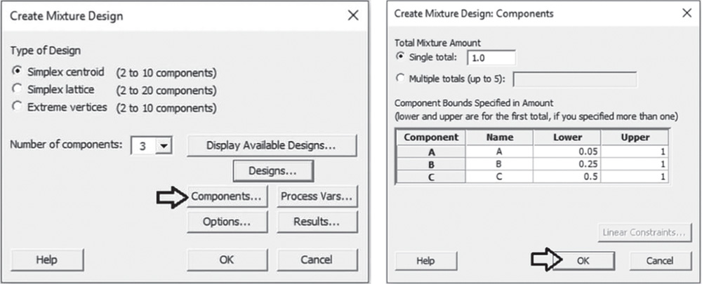
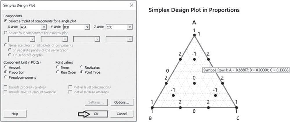
4.3.1.2 Step 2 – Alternatively, Create a Simplex Centroid Design for a Simple Mixture Experiment with Lower Limits for Components
Suppose you have to specify a lower limit for some or all components of the mixture. For example, consider the following constraints on the component proportions: A ≱ 0.05; B ≱ 0.25; C ≱ 0.50. When you specify lower limits to some or all components, the experimental region is still a simplex and you can still create a simplex centroid design.
To create a simplex centroid design with lower limits, go to: Stat > DOE > Mixture > Create Mixture Design
Under Type of Design select Simplex centroid and in Number of components specify 3. Select Designs. Check the option Augment the design with axial points. In Number of replicates for the whole design specify 1 or, depending on available resources, enter how many times to perform each experimental run. You can also add replicates for specific design points, for example for a center point or a vertex point, by checking the option Number of replicates for the selected types of points. Remember you can add replicates to the whole design later with Stat > DOE > Modify Design. Click OK.
In the main dialog box select Components. Check the option Single total under Total Mixture Amount and leave the default value 1.0 given that the experiment considers a single fixed amount for the mixture and the components are expressed as proportions. Under Name, enter a name for each mixture component. Under Lower, specify the lower limits for each component. Click OK.
Proceed by clicking Options in the main dialog box and check the option Randomize runs (Stat Tool 2.3). Click OK in each dialog box and Minitab shows the design of the experiment in the worksheet and some information in the Session window.

The design includes 10 design points. The table Number of Design Points for Each Type identifies each design point type. Here we have three vertices (point type = 1), three double blends (point type = 2), one center point (point type = 0) and three axial points (point type = −1).
In the table Bounds of Mixture Components, you can see that Minitab adjusted the upper limits of each component to accommodate the specified constraints.
You can display the design to graphically check the experimental region.
Go to: Stat > DOE > Mixture > Simplex Design Plot
Under Components, check the option Select a triplet of components for a single plot. If you have more than three components in the mixture, you can select the option Generate plots for all triplets of components. Under Component Unit in Plot(s), check Proportion and under Point Labels, select Point Type. Click OK.
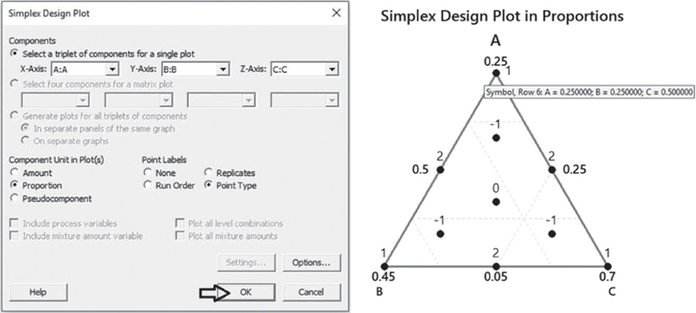
If you hover over the design points, Minitab displays the corresponding mixture. For example, the top vertex corresponds to the complete blend (A = 0.25, B = 0.25, C = 0.50).
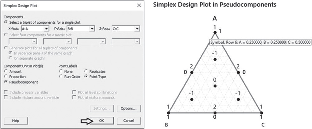
You can also display the design in pseudocomponents rather than in proportions.
Go to: Stat > DOE > Mixture > Simplex Design Plot
Under Components, check the option Select a triplet of components for a single plot. If you have more than three components in the mixture, you can select the option Generate plots for all triplets of components. Under Component Unit in Plot(s), check Pseudocomponent and under Point Labels, select Point Type. Click OK.
If you hover over the design points, Minitab displays the corresponding mixture. Again the top vertex corresponds to the complete blend (A = 0.25, B = 0.25, C = 0.50).
4.3.1.3 Step 3 – Alternatively, Create a Simplex Centroid Design for a Mixture‐Process Variable Experiment
Suppose you now suspect the response is related to the proportions inside the mixture and to other factors which are not part of the mixture. These additional factors are called process variables. Minitab allows you to include up to seven process variables but they must be binary, i.e. factors with only two levels. For example, suppose we need to take into account the possible relationship between temperatures of a washing cycle. For this process variable we set the following levels: 30 and 60 °C.
To create a simplex centroid design with process variables, go to: Stat > DOE > Mixture > Create Mixture Design
In Type of Design select Simplex centroid and in Number of components specify 3. Select Designs. Check the option Augment the design with axial points. In Number of replicates for the whole design specify 1 or, depending on available resources, enter how many times to perform each experimental run. You can also add replicates for specific design points, for example for a center point or a vertex point, by checking the option Number of replicates for the selected types of points. Take into account that you can add replicates to the whole design later with Stat > DOE > Modify Design. Click OK.

In the main dialog box select Components. Check the option Single total under Total Mixture Amount and leave the default value 1.0 given that the experiment considers a single fixed amount for the mixture and the components are expressed as proportions. Under Name, enter a name for each mixture component. Suppose that each component can vary from 0 to 1. You can, however, specify lower limits for some or all of the components as in step 2. Click OK.
In the main dialog box, select Process Vars. Under Process Variables, select Number and specify 1. Enter the name of the factor and leave the other default options. Note that Minitab codes the low and high levels of the factor as “−1” and “1.”
Proceed by clicking Options in the main dialog box and check the option Randomize runs (Stat Tool 2.3). Click OK in each dialog box and Minitab shows the design of the experiment in the worksheet and some information in the Session window.
The design includes 20 design points. The table Number of Design Points for Each Type identifies each design point type. In the design we have six vertices (point type = 1), six double blends (point type = 2), two center points (point type = 0), and six axial points (point type = −1).
You can display the design to graphically check the experimental region.
Go to: Stat > DOE > Mixture > Simplex Design Plot
Under Components, check the option Select a triplet of components for a single plot. If you have more than three components in the mixture, you can select the option Generate plots for all triplets of components. Under Component Unit in Plot(s), check Proportion. Check the options Include process variables and Plot all level combinations. Click OK.

You can see that the simplex centroid design has been generated at each level of the process variable.
4.3.1.4 Step 4 – Alternatively, Create a Simplex Centroid Design for a Mixture‐Amount Experiment
Suppose you now suspect the response is related to both the proportions inside the mixture and the total amount of the mixture. Minitab allows you to specify up to five different amounts. For example, suppose we need to evaluate two different amounts of the mixture equal to 10 and 12 g.
To create a simplex centroid design with multiple mixture amounts, go to: Stat > DOE > Mixture > Create Mixture Design
In Type of Design select Simplex centroid and in Number of components specify 3. Select Designs. Check the option Augment the design with axial points. In Number of replicates for the whole design specify 1 or, depending on available resources, enter how many times to perform each experimental run. You can also add replicates for specific design points, for example for a center point or a vertex point, by checking the option Number of replicates for the selected types of points. Remember that you can add replicates to the whole design later with Stat > DOE > Modify Design. Click OK.
In the main dialog box select Components. Check the option Multiple totals under Total Mixture Amount and specify the two amounts, 10 and 12 g. Under Name, enter a name for each mixture component. Note that in the table, the amounts for lower and upper limits must be specified only for the first total (10 g). Click OK.

Proceed by clicking Options in the main dialog box and check the option Randomize runs (Stat Tool 2.3). Click OK in each dialog box and Minitab shows the design of the experiment in the worksheet, as well as some information in the Session window.

The design includes 20 design points. The table Number of Design Points for Each Type identifies each design point type. In the design we have six vertices (point type = 1), six double blends (point type = 2), two center points (point type = 0) and six axial points (point type = −1).

You can display the design to graphically check the experimental region.
Go to: Stat > DOE > Mixture > Simplex Design Plot
Under Components, check the option Select a triplet of components for a single plot. If you have more than three components in the mixture, you can select the option Generate plots for all triplets of components. Under Component Unit in Plot(s), check Amount (or Proportion if you want to display the plot in proportions). Check the options Plot all mixture amounts. Click OK.
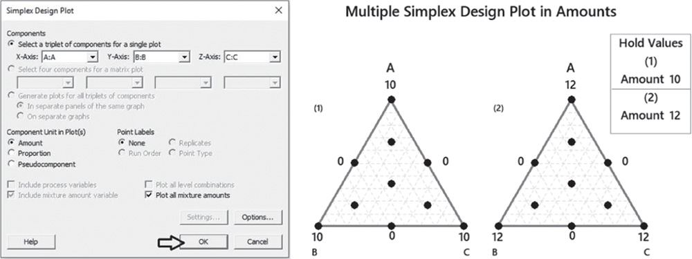
You can see that the simplex centroid design has been generated at each level of the total amount of the mixture.
4.3.1.5 Step 5 – Alternatively, Create a Simplex Lattice Design for a Simple Mixture Experiment
Let us again consider a simple mixture experiment in which only the proportions of the three components are expected to be related to technical performance. For this purpose we will now create a simplex lattice design (Stat Tool 4.5), considering the three factors A, B, and C.
To create a simplex lattice design, go to: Stat > DOE > Mixture > Create Mixture Design
In Type of Design select Simplex lattice and in Number of components specify 3. Click on Display Available Designs to get an idea of the number of runs based on the design type, the number of components in the mixture and the degree of the lattice. Click OK.
 In the main dialog box select Designs. In Degree of lattice specify for example 3 in order to include the edge trisectors that are two‐blend mixtures in which one component makes up one‐third and a different component makes up two‐thirds of the mixture. Check the options Augment the design with center point and Augment the design with axial points. In Number of replicates for the whole design specify 1 or, depending on available resources, enter how many times to perform each experimental run. You can also add replicates for specific design points, for example for a center point or a vertex point, by checking the option Number of replicates for the selected types of points. Remember you can add replicates to the whole design later with Stat > DOE > Modify Design. Click OK.

In the main dialog box select Components. Check the option Single total under Total Mixture Amount and leave the default value 1.0, given that the experiment considers a single fixed amount for the mixture and the components are expressed as proportions. Under Name, enter a name for each mixture component. Suppose that each component can vary from 0 to 1. You can, however, specify lower limits for some or all of the components. Click OK.

Proceed by clicking Options in the main dialog box and check the option Randomize runs (Stat Tool 2.3). Click OK in each dialog box and Minitab shows the design of the experiment in the worksheet, as well as some information in the Session window.

The design includes 13 design points. The table Number of Design Points for Each Type identifies each design point type. In the design we have three vertices (point type = 1), six double blends (point type = 2), one center point (point type = 0) and three axial points (point type = −1).
You can display the design to graphically check the experimental region.
Go to: Stat > DOE > Mixture > Simplex Design Plot
Under Components, check the option Select a triplet of components for a single plot. If you have more than three components in the mixture, you can select the option Generate plots for all triplets of components. Under Component Unit in Plot(s), check Proportion and under Point Labels, select Point Type. Click OK.
If you hover over the design points, Minitab displays the corresponding mixture. For example, the edge trisector indicated on the right corresponds to the two‐blend mixture (A = 0.67, B = 0, C = 0.33).
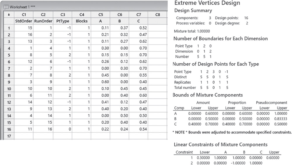
4.3.1.6 Step 6 – Alternatively, Create an Extreme Vertices Design with Lower and Upper Limits for Components
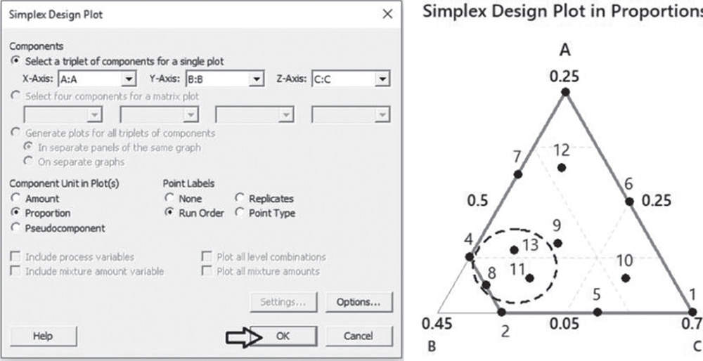
Suppose that you have to specify lower and upper limits or only upper limits for some or all components of the mixture. For example, consider the following constraints on the component proportions: 0.05 ≤ A ≤ 0.25; 0.25 ≤ B ≤ 0.40; 0.50 ≤ C ≤ 0.70. In this case the experimental region is no longer a simplex and we can use an extreme vertices design (Stat Tool 4.7). Furthermore, suppose that we want to perform a maximum of 14 runs including some replicates.
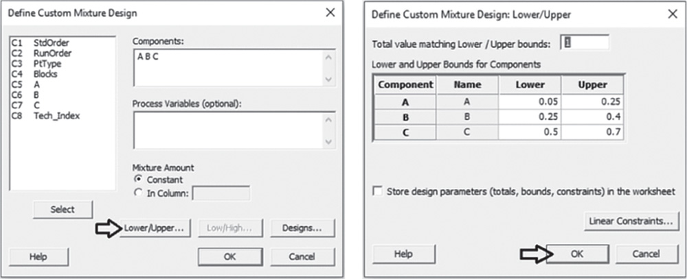
To create an extreme vertices design, go to: Stat > DOE > Mixture > Create Mixture Design
In Type of Design select Extreme vertices and in Number of components specify 3. Select Designs. In Degree of design specify for example 2. Check the options Augment the design with center point and Augment the design with axial points. In Number of replicates for the whole design specify 1. Click OK.
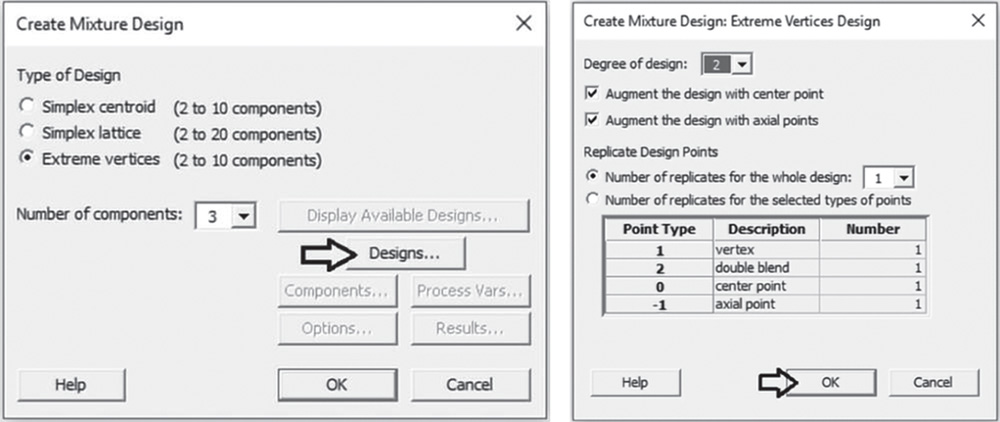
In the main dialog box select Components. Check the option Single total under Total Mixture Amount and leave the default value 1.0, given that the experiment considers a single fixed amount for the mixture and the components are expressed as proportions. Under Name, enter a name for each mixture component. Under Lower and Upper, specify the lower and upper limits for each component. Click OK.
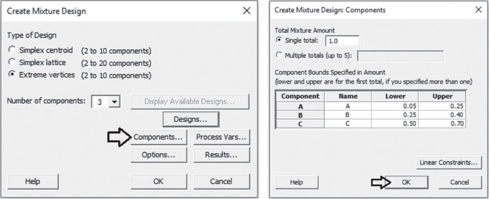
Proceed by clicking Options in the main dialog box and uncheck the option Randomize runs since for the moment, we just want to check the design. Then, when we have decided that the design is suitable for our needs, we will randomize the runs. Click OK in each dialog box and Minitab shows the design of the experiment in the worksheet, as well as some information in the Session window.
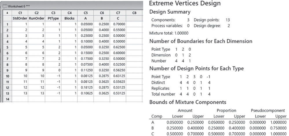
The design includes 13 design points. In the table Bounds of Mixture Components, you can see that Minitab created a pseudocomponent for each component to accommodate the specified constraints.
You can display the design to graphically check the experimental region.
Go to: Stat > DOE > Mixture > Simplex Design Plot
Under Components, check the option Select a triplet of components for a single plot. If you have more than three components in the mixture, you can select the option Generate plots for all triplets of components. Under Component Unit in Plot(s), check Proportion (or Pseudocomponent) and under Point Labels, select Point Type. Click OK.
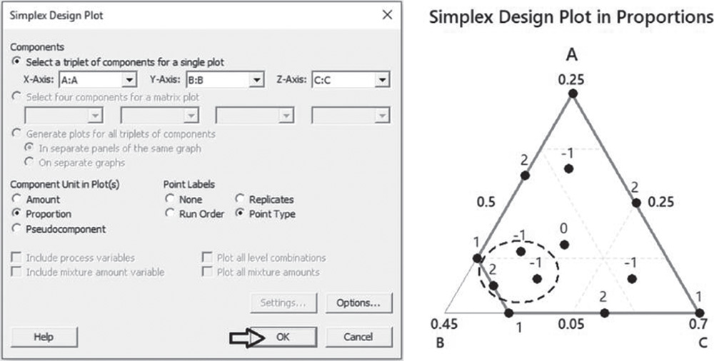
You can see that the region is not a simplex. Furthermore, you see that three design points inside the marked dotted oval are very close to each other and to other design points nearby. Given that we have to create a design with 14 design points that includes some replicates, we can try to select an optimal design from the basic extreme vertices design. An optimal design represents a design that is best according to some statistical criterion. It includes only a suitable subset of all combinations of factors (mixtures of components) in order to reduce the number of runs. For this reason, they are often used when there are some constraints in the number of runs to perform.
In our example, it would be desirable to keep all the design points of the basic design except the three points inside the dotted oval and then to augment the design with some replicates to obtain an optimal design with 14 runs. With Minitab, you can create an indicator column that identifies any experimental run that must be in the optimal design. This indicator column specifies a number for each design point. The sign of the number identifies whether an experimental run must be in the optimal design: a positive sign identifies a point that can be left out of the design, while a negative sign denotes a point that must remain in the optimal design.
To better identify the three design points that can be left out of the design, let's again create the simplex plot by displaying the run order of each design point.
Go to: Stat > DOE > Mixture > Simplex Design Plot
Under Components, check the option Select a triplet of components for a single plot. Under Component Unit in Plot(s), check Proportion (or Pseudocomponent) and under Point Labels, select Run Order. Click OK.
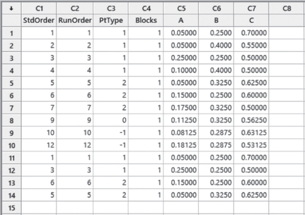
You can see that the three design points that can be left out of the design, have Run Order 8, 11, and 13 in the worksheet of the basic design.
Let's create the indicator column specifying “1” for the three points with Run Order 8, 11, and 13, and “−1” for all the remaining points. The worksheet will appear in the following way:

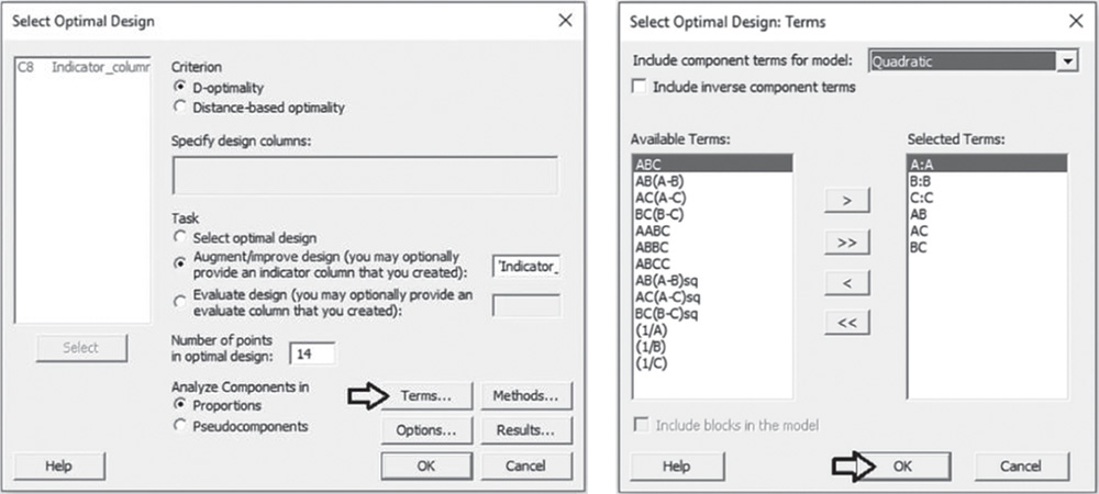
To select the optimal design, go to: Stat > DOE > Mixture > Select Optimal Design
Under Criterion, check the option D‐Optimality. Under Task, choose Augment/improve design and in the blank field select the indicator column. In Number of points in optimal design, specify 14. Click on Terms. In the next dialog box, beside Include component terms for model, specify Quadratic to detect curvatures if present. Click OK in each dialog box and Minitab shows the optimal design in a new worksheet, as well as some information in the Session window.
You can display the design to graphically check the experimental region.
Go to: Stat > DOE > Mixture > Simplex Design Plot
Under Components, check the option Select a triplet of components for a single plot. Under Component Unit in Plot(s), check Proportion (or Pseudocomponent) and under Point Labels, select Replicates. Click OK.
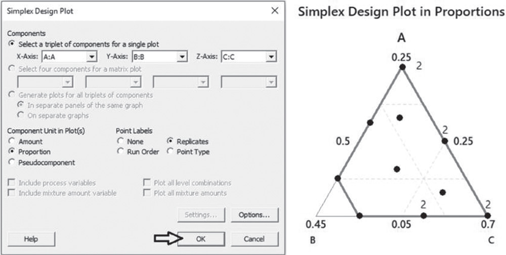
You can see that the design includes 10 different design points and four of these runs (two vertices and two edge centers) are replicated and are denoted in the simplex plot by the number “2.”
The last step is to randomize the runs. Before this step, we have to renumber the runs.
Go to: Stat > DOE > Modify Design
Under Modification, check the option Renumber design. Click OK.

Finally to randomize the runs, go to: Stat > DOE > Modify Design
Under Modification, check the option Randomize design. Select Specify and then click OK in each dialog box.
4.3.1.7 Step 7 – Alternatively, Create an Extreme Vertices Design with Linear Constraints for Components
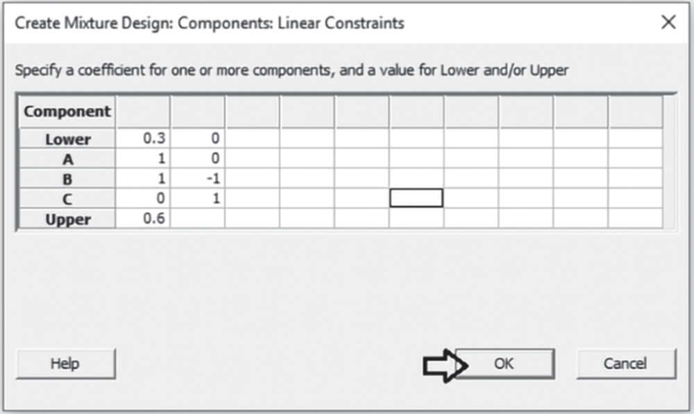
Suppose that you have to specify one or more linear constraints for some or all components of the mixture. For example, suppose that the sum of the proportions of components A and B in the mixture must be between 0.3 and 0.6 (0.3 ≤ A + B ≤ 0.6) and that component C must always be no less than the proportion of component A (C ≱ B). In this case, the experimental region is no longer a simplex and we can use an extreme vertices design (Stat Tool 4.7).
To create an extreme vertices design, go to: Stat > DOE > Mixture > Create Mixture Design
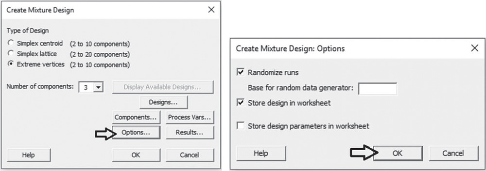
In Type of Design select Extreme vertices and in Number of components specify 3. Select Designs. In Degree of design specify for example 2. Check the options Augment the design with center point and Augment the design with axial points. In Number of replicates for the whole design specify 1. Click OK.

In the main dialog box select Components. Check the option Single total under Total Mixture Amount and leave the default value 1.0, given that the experiment considers a single fixed amount for the mixture and the components are expressed as proportions. Under Name, enter a name for each mixture component. Under Lower and Upper, leave the default values 0 and 1. You can, however, specify lower and/or upper limits for the components. Select Linear Constraints.
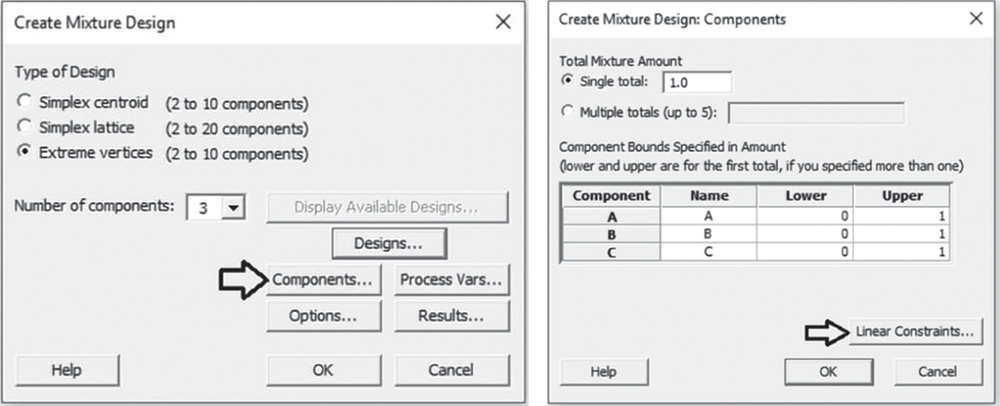
Enter the linear constraints by specifying a coefficient for each component of the mixture and a value for Lower and/or Upper, then click OK.
Proceed by clicking Options in the main dialog box and check the option Randomize runs. Click OK in each dialog box and Minitab shows the design of the experiment in the worksheet, as well as some information in the Session window.
The design includes 16 design points. In the table Bounds of Mixture Components, you can see that Minitab created a pseudocomponent for each component to accommodate the specified constraints.
You can display the design to graphically check the experimental region.
Go to: Stat > DOE > Mixture > Simplex Design Plot
Under Components, check the option Select a triplet of components for a single plot. If you have more than three components in the mixture, you can select the option Generate plots for all triplets of components. Under Component Unit in Plot(s), check Proportion (or Pseudocomponent) and under Point Labels, select Point Type. Click OK.

You can see that the region is not a simplex. If required you can decide to select an optimal design from the basic one as done previously in step 6.
4.3.1.8 Step 8 – Assign the Designed Factor Level Combinations (Design Points) to the Experimental Units and Collect Data for the Response Variable
Collect the data for the response variable, i.e. the technical performance measured on a scale of 0 to 70, following the order given in the column RunOrder in the chosen design. For example, for the extreme vertices design created in step 6, the first mixture to test will be the mixture with component A at level 0.15, component B at 0.25 and C at 0.60, where components are expressed as proportions.
Once all the designed mixtures have been tested, enter the recorded response values (technical performance index) in the worksheet containing the design. Now you are ready to proceed with the statistical analysis of the collected data.
4.3.2 Plan of the Statistical Analyses
Second‐order models can represent a suitable approximation for the unknown functional relationship to study the effects of mixture components on the response variable.
Let's proceed in the following way:
- Step 1 – Perform a descriptive analysis (Stat Tool 1.3) of the response variables.
- Step 2 – Fit a second‐order model to estimate the effects and determine the significant ones.
- Step 3 – Optimize the response.
- Step 4 – Examine the shape of the response surface and locate the optimum.
For the Mix‐Up Project, the dataset (File: Mix_Up_Project.xlsx) opened in Minitab appears as below.
The variables setting is the following:
- Columns C1–C4 are related to the previous creation of the extreme vertices design.
- Variables A, B, and C are the quantitative mixture components.
- Variable Tech_Index is the quantitative response variable.
| Column | Variable | Type of data | Label |
| C5 | A | Numeric data | Proportion of component A of the mixture |
| C6 | B | Numeric data | Proportion of component B of the mixture |
| C7 | C | Numeric data | Proportion of component C of the mixture |
| C8 | Tech_Index | Numeric data | Technical performance index |
Mix_Up_Project.xlsx
4.3.2.1 Step 1 – Perform a Descriptive Analysis of the Response Variables
As the response is a quantitative variable, let's use a boxplot to describe how the technical performance index occurred in our sample, and calculate means and measures of variability to complete the descriptive analysis.
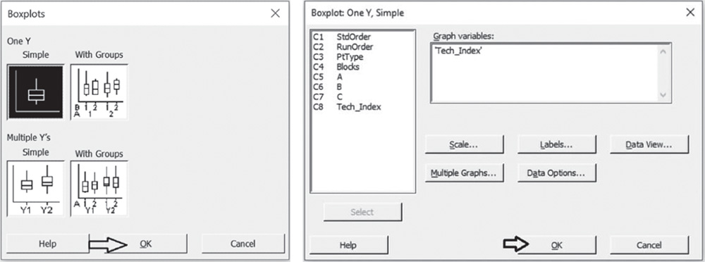
To display the boxplot, go to: Graph > Boxplot
Under One Y, check the graphical option Simple and in the next dialog box, select “Tech_Index” under Graph variables. Then click OK in the dialog box.
To change the appearance of a boxplot, use the tips in Chapter 2, Section 2.2.2.1 to histograms, as well as the following ones:
- To display the boxplot horizontally: double‐click on any scale value on the horizontal axis. A dialog box will open with several options to define. Select from these options: Transpose value and category scales.
- To add the mean value to the boxplot: right‐click in the area inside the border of the boxplot and select Add > Data display > Mean symbol.
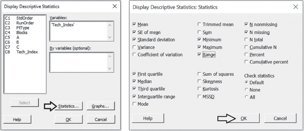
To display the descriptive measures (means, measures of variability, etc.), go to:
In the dialog box, select “Tech_Index” in Variables, then click on Statistics to open a dialog box displaying a range of possible statistics to choose from. In addition to the default options, select Interquartile range and Range.
4.3.2.1.1 Interpret the Results of Step 1
Technical performance data are slightly skewed with two outliers showing high values of performance. About 50% of the trials showed a performance score greater than 29.9 (the median, Stat Tool 1.6), and around 25%, greater than 34.8 (Q3, Stat Tool 1.7). With respect to variability, the average distance of the response values from their mean (standard deviation) is about 15.9 (Stat Tool 1.9).

4.3.2.2 Step 2 – Fit a Second‐Order Model to Estimate the Effects and Determine the Significant Ones
Before analyzing the extreme vertices design, we must specify the mixture components within Minitab.
To define the mixture design, go to:
Under Components, select the factors A, B, and C. If there are any process variables (Section 4.3.1.3, step 3), you have to specify them under Process variables. If you have a mixture‐amount experiment (Section 4.3.1.4, step 4), under Mixture Amount select In Column and specify the column including the different mixture amounts. In our design we don't have process variables and the mixture amount is constant. Therefore, leave the field under Process Variables blank and under Mixture Amount, check the option Constant. Click Lower/Upper. For each component in the list, verify that the high and low limit settings are correct. If you have linear constraints (Section 4.3.1.7, step 7) select Linear Constraints and specify them. In our design we don't have linear constraints. Click OK.
In the main dialog box, click on Designs. Specify the columns corresponding to the standard order, run order, and point type of the runs. Click OK in each dialog box. Now you are ready to analyze the mixture design.
To analyze the mixture design, go to:
Select the response variable “Tech_Index” under Responses. Under Type of Model, select Mixture components only. With process variables or different mixture amounts check the corresponding option. Under Analyze Components in, choose Pseudocomponents, then click on Terms. At the top of the next dialog box, in Include component terms for model, specify Quadratic. Click OK and in the main dialog box, choose Graphs. Under Residual Plots, choose Four in one. Click OK in each dialog box and Minitab shows the results of the analysis both in the Session window and through the required graphs.


4.3.2.2.1 Interpret the Results of Step 2
In the ANOVA table, we examine the p‐values to determine whether the associations between any terms in the model and the response are statistically significant. Remember that the p‐value is a probability that measures the evidence against the null hypothesis. Lower probabilities provide stronger evidence against the null hypothesis. The null hypothesis is that there is no association between the term and the response. Usually we consider a significance level α = 0.05, but in an exploratory phase of the analysis we may also consider a significance level equal to 0.10. When the p‐value is greater than or equal to alpha, we fail to reject the null hypothesis. When it is less than alpha, we reject the null hypothesis and claim statistical significance.
Regression for Mixtures: Tech_Index versus A; B; C Analysis of variance for Tech_Index (pseudocomponents)
| Source | DF | Seq SS | Adj SS | Adj MS | F‐Value | p‐Value |
| Regression | 5 | 3083.77 | 3083.8 | 616.75 | 22.85 | 0.000 |
| Linear | 2 | 2383.49 | 1572.2 | 786.09 | 29.12 | 0.000 |
| Quadratic | 3 | 700.28 | 700.3 | 233.43 | 8.65 | 0.007 |
| A*B | 1 | 0.20 | 163.7 | 163.68 | 6.06 | 0.039 |
| A*C | 1 | 146.25 | 163.2 | 163.24 | 6.05 | 0.039 |
| B*C | 1 | 553.83 | 553.8 | 553.83 | 20.52 | 0.002 |
| Residual error | 8 | 215.94 | 215.9 | 26.99 | ||
| Lack‐of‐fit | 4 | 111.67 | 111.7 | 27.92 | 1.07 | 0.474 |
| Pure error | 4 | 104.27 | 104.3 | 26.07 | ||
| Total | 13 | 3299.71 |
The table does not display p‐values for the linear terms of the components in mixture experiments because of the dependence between the components. Additionally, the model does not include a constant because it is incorporated into the linear terms.
If an interaction term that includes only mixture components shows a p‐value less than the significance level, the association between the blend of components and the response is statistically significant.
If your model includes process variables, significant interaction terms that include components and the process variables indicate that the effect of the components on the response variable depends on the process variables.
Looking at the ANOVA table, all the interaction terms between mixture components show a p‐value less than 0.05. This means that the mean technical performance index for the two‐blend mixture is statistically different from the value you would obtain by calculating the simple mean of the response variable for each pure mixture.
Note that in the ANOVA table, Minitab displays the lack‐of‐fit test when your data contain replicates. This test helps investigators to determine whether the model accurately fits the data. Its null hypothesis states that the model accurately fits the data. As usual, compare the p‐value to your significant level α. If the p‐value is less than α, reject the null hypothesis and conclude that the lack of fit is statistically significant. If the p‐value is larger than α, you fail to reject the null hypothesis and you can conclude that the lack of fit is not statistically significant.
In our example, the p‐value (0.474) is greater than 0.05: we conclude that there is no strong evidence of lack of fit. Lack‐of‐fit can occur if important terms such as interactions are not included in the model or if the fitted model shows several unusually large residuals (Stat Tool 2.9).
In addition to the results of the analysis of variance, Minitab displays some other useful information in the Model Summary table. Model summary
| S | R‐sq | R‐sq(adj) | PRESS | R‐sq(pred) |
| 5.19542 | 93.46% | 89.37% | 925.580 | 71.95% |
The quantity R‐squared (R‐sq, R2) is interpreted as the percentage of the variability among technical performance data, explained by the terms included in the ANOVA model.
The value of R2 varies from 0 to 100%, with larger values being more desirable.
The adjusted R2 (R‐sq(adj)) is a variation of the ordinary R2 that is adjusted for the number of terms in the model. Use adjusted R2 for more complex experiments with several factors, when you want to compare several models with different numbers of terms.
The value of S is a measure of the variability of the errors that we make when we use the ANOVA model to estimate the performance data. Generally, the smaller it is, the better the fit of the model to the data.
Before proceeding with the results reported in the Session window, take a look at the residual plots. A residual represents an error that is the distance between an observed value of the response and its estimated value by the ANOVA model. The graphical analysis of residuals based on residual plots helps you discover possible violations of the ANOVA underlying assumptions (Stat Tools 2.8, 2.9).
A check of the normality assumption could be made looking at the histogram of the residuals (lower left), but with small samples, often the histogram shows irregular shape.
The normal probability plot of the residuals may be more useful. Here we can see a tendency of the plot to follow the straight line.

Estimated regression coefficients for Tech_Index (pseudocomponents)
| Term | Coef | SE Coef | t‐Value | p‐Value | VIF |
| A | 26.74 | 3.60 | * | * | 1.68 |
| B | 37.49 | 9.09 | * | * | 5.38 |
| C | 64.95 | 3.59 | * | * | 1.86 |
| A*B | −66.6 | 27.1 | −2.46 | 0.039 | 3.25 |
| A*C | −41.6 | 16.9 | −2.46 | 0.039 | 1.65 |
| B*C | −109.9 | 24.3 | −4.53 | 0.002 | 3.81 |
The other two graphs (Residuals versus Fits and Residuals versus Order) seem unstructured, thus supporting the validity of the ANOVA assumptions. In the Residual versus Fits graph, we notice the two ouliers.
Returning to the Session window, we find two tables of coefficients expressed as pseudocomponents and as proportions. Look at the sign of the coefficients of the interactions of two components. Negative coefficients indicate that the two components act against each other. That is, the mean response value for the two‐component blend is less than the value obtained by calculating the simple mean of the response variable for each pure mixture.
Estimated regression coefficients for Tech_Index (component proportions)
| Term | Coef |
| A | 463.82 |
| B | 1038.56 |
| C | 457.53 |
| A*B | −1665.42 |
| A*C | −1040.08 |
| B*C | −2748.19 |
Positive coefficients indicate that the two components act in synergy. That is, the mean response value for the two‐component blend is greater than the value you would obtain by calculating the simple mean of the response variable for each pure mixture.
4.3.2.3 Step 3 – Optimize the Response
After fitting the model, additional analyses can be carried out to find the optimum set of mixture components that optimizes the response (Stat Tool 3.8).
To optimize the response variable, go to:
In the table, under Goal, select one of the following options for the response:
- Do not optimize: Do not include the response in the optimization process.
- Minimize: Lower values of the response are preferable.
- Target: The response is optimal when values meet a specific target value.
- Maximize: Higher values of the response are preferable.
In our case study the goal is to maximize the technical performance: choose Maximize from the drop‐down list and click Setup. In the next window you need to specify a response target and lower or upper bounds depending on your goal (Stat Tool 3.8).
- If your goal is to maximize the response (larger is better), you need to specify the lower bound and a target value. You may want to set the lower value to the smallest acceptable value and the target value at the point of diminishing returns, i.e. a point at which going above its value does not make much difference. If there is no point of diminishing returns, use a very high target value.
- If your goal is to target a specific value, you should set the lower value and upper value as points of diminishing returns.
- If the goal is to minimize (smaller is better), you need to specify the upper bound and a target value. You may want to set the upper value to the largest acceptable value and the target value at the point of diminishing returns, i.e. a point at which going below its value does not make much difference. If there is no point of diminishing returns, use a very small target value.
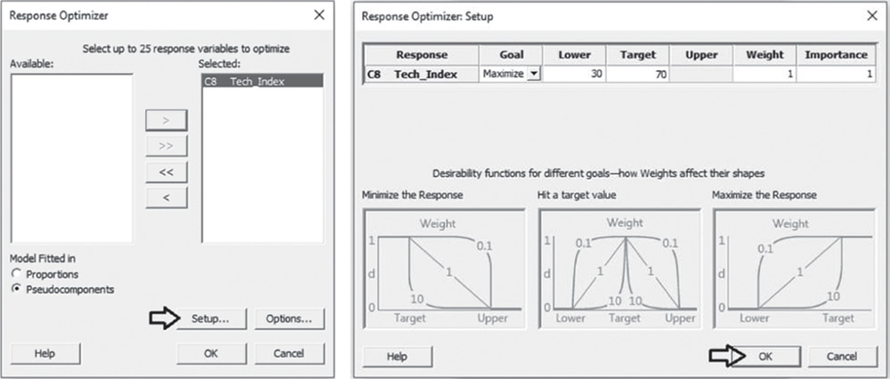
In our example, we can set Lower at 30 and the Target at 70.
Note that in the process of response optimization, Minitab calculates and uses desirability indicators from 0 to 1 to represent how well a combination of factor levels satisfies the goals you have for the responses. Specifying a different weight varying from 0.1 to 10, you can emphasize or deemphasize the importance of attaining the goals. Furthermore, when you have more than one response, Minitab calculates individual desirabilities for each response and a composite desirability for the entire set of responses. With multiple responses, you may assign a different level of importance to each response by specifying how much effect each response has on the composite desirability.
In our example, leave Weight and Importance equal to 1. Click OK in each dialog box. In the optimization plot, Minitab will display the optimal solution, i.e. the component setting which maximizes the composite desirability.
The optimization plot shows how different component settings affect the response. The vertical lines on the graph represent the current component settings. The numbers displayed at the top of a column show the current mixture (in red). The horizontal blue lines and numbers represent the responses for the current mixture. The optimal solution is plotted on the graph and serves as the initial point. The settings can then be modified interactively, to determine how different mixtures affect the response, by moving the red vertical lines corresponding to each component. To return to the initial settings, right‐click and select Navigation and then Reset to Initial Settings.
4.3.2.3.1 Interpret the Results of Step 3
The optimization plot is a useful tool to explore the sensitivity of the response variable to changes in the component settings and in the neighborhood of a local solution, for example the optimal one.

The Session window displays:
- information about the boundaries, weight, and importance for the response variable (Parameters);
- the solution that maximizes the response (Global Solution);
- the fitted response for the global solution and the value of the desirability function.
For technical performance data, the global solution has component A set at 0.05, component B at 0.25 and C at 0.70 (components are expressed as proportions). For this mixture the fitted response (mean technical performance index) is equal to 64.9. The composite desirability (0.87) is quite close to 1 denoting a satisfactory overall achievement of the specified goal.
4.3.2.4 Step 4 – Examine the Shape of the Response Surface and Locate the Optimum
Graphic techniques such as contour, surface, and overlaid plots help us to examine the shape of the response surface in regions of interest. Through these plots, you can explore the potential relationship between pairs of factors and the responses. You can display a contour, a surface or an overlaid plot considering two factors at a time, while setting the remaining factors to predefined levels. With contour and surface plots, you consider a single response; in overlaid plots, you can consider more than one response.
To display the contour and surface plots, go to: Stat > DOE > Mixture > Contour/Surface Plots
Choose Contour plot and click Setup. In the dialog box, select the response “Tech_Index” beside Response. Under Components or Process Variables, check the option Select a triplet of components for a single plot. If you have more than three components in the mixture, you can select the option Generate plots for all triplets of components. Under Component Unit in Plot(s), check Proportion. Click Contours, and under Data Display, choose Contour lines and Symbols at design points. Click OK in the last two dialog boxes. In the main dialog box select Surface Plot and click Setup.

In the dialog box, select the response “Tech_Index” in Response. Under Components or Process Variables, check the option Select a triplet of components for a single plot. If you have more than three components in the mixture, you can select the option Generate plots for all triplets of components. Under Component Unit in Plot(s), check Proportion. Click OK in each dialog box.
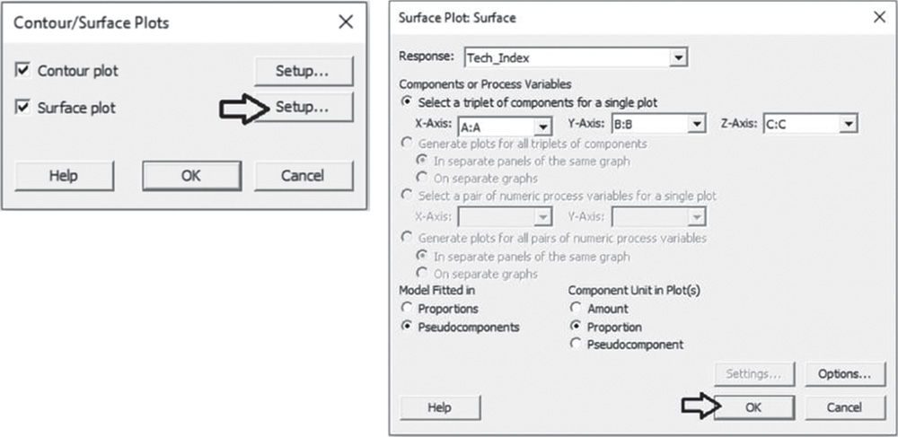
To change the appearance of the surface plot, double‐click on any point inside a surface.
4.3.2.4.1 Interpret the Results of Step 4
In the contour plot, the technical performance index is represented by different level curves. Double‐click on any point in the frame and select Crosshairs to interactively view variations in the response. In the surface plot the performance index is represented by a smooth surface. Both plots show how the component proportions are related to the performance. To maximize performance, researchers should choose proportions for the components in the lower right corner of the design space where the performance index is highest. It is relatively easy to see that the optimum is very close to 8 for additive A and to 7 for additive B, and to explore how the technical performance changes while increasing or decreasing factor levels.
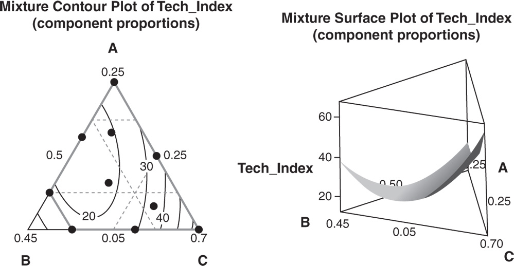
In the contour plot the solid gray contour represents the design space for this mixture design. However, you can see that the plot extends beyond the design space. In the surface plot the boundaries of the design space are not shown. Generally, you should use proportions that are in the design space because the relationships between the variables are uncertain outside the design space.