
Null hypothesis H0: Mean content of the anesthetic ingredient = 2.4
3
Product Development and Optimization
3.1 Introduction
Developing or improving products, streamlining a production process or comparing the performance of alternative formulations, very often represent core issues for researchers and managers (Box, G. E. P. and Woodall, W. H., 2012; Hoerl, R., Snee, R., 2010; Jensen, W. et al., 2012).
In this context, many questions can be viewed as problems of comparison of synthetic measures, such as mean values or proportions, with expected target values, or of comparison among different configurations of the investigated product. Furthermore, statistical modeling and optimization techniques find a vast number of applications when the objective is to study in depth how one or more desirable product characteristics are related to a set of process variables and how to set these variables in order to optimize product performance.
In this chapter, four different case studies are presented to cover several concrete situations that experimenters can encounter in the development and optimization phases.
The first example refers to the development of a new sore throat medication, where the research team aims to check the following issues:
- The mean content of an anesthetic ingredient is not different to the target value of 2.4 mg.
- The percentage of lozenges with total weight greater than 2.85 mg is less than 40%.
One‐sample inferential technique allows us to compare sample means or proportions to target values.
In the second case study, two different formulations of condoms have been manufactured and the researchers would like to evaluate the following features:
- Is there any significant difference in the variability of thickness between the two formulations?
- Is there any significant difference in the mean of thickness between the two formulations?
- Is there any significant difference in the proportion of condoms with thickness less than or equal to 0.045 mm between the two formulations?
For these kinds of problems, two‐sample inferential techniques can help the investigators to identify the better formulation.
The third example, the Fragrance Project, aims to introduce an innovative shaving oil. It is of interest to assess two fragrances to investigate whether there are any consumer perceived differences in their in‐use characteristics and if so, which is the more suitable. A total of 30 female respondents are given the two fragrances and asked to answer how appropriate the fragrance is for a shaving product by assigning an integer score from 0 (very unsuitable) to 10 (very suitable). The research team needs to assess whether there are any significant differences in appropriateness between the two fragrances. Since the respondents evaluate both fragrances, a specific hypothesis test for dependent samples (paired data) must be used.
The final example refers to a Stain Removal Project that aims to complete the development of an innovative dishwashing product. During a previous screening phase, investigators selected four components affecting cleaning performance by using a two‐level factorial design. After identifying the key input factors, the experimental work proceeds with a general factorial design increasing the number of levels of the four components in order to identify the formulation that maximizes stain release on several stains. For logistic reasons, investigators need to arrange the new experiment in such a way that only 40 different combinations of factor levels will be tested. In this context, the planning and analysis of general and optimal factorial designs (Ronchi, F., et al., 2017) allows us to identify which formula could maximize cleaning performance, taking into account the constraint in the number of runs.
In short, the chapter deals with the following:
| Topics | Stat Tools |
| Comparison of a mean to a target value: One‐sample t‐test | 3.1 |
| Comparison of a proportion to a target value: One proportion test | 3.2 |
| Comparison of two variances: Two variances test | 3.3, 3.4 |
| Comparison of two means with independent samples: Two‐sample t‐test | 3.3, 3.5 |
| Comparison of two means with paired data: Paired t‐test | 3.7 |
| Comparison of two proportions: Two proportions test | 3.6 |
| Response optimization in factorial designs | 3.8 |
3.2 Case Study for Single Sample Experiments: Throat Care Project
In the development of a new throat medication, the research team aims to check the following issues:
- The mean content of an anesthetic ingredient does not differ from the target value of 2.4 mg.
- The percentage of lozenges with total weight greater than 2.85 mg is less than 40%.
Under controlled conditions, 30 trials were performed by randomly selecting a sample of 30 lozenges (experimental units, Stat Tool 1.2) and measuring the content of the ingredient and the total weight of each lozenge (statistical variables, Stat Tool 1.1).
In the Throat Care project, investigators must deal with one‐sample inferential problems as it is of interest to compare a population parameter (e.g. a mean value or a proportion) with a specified value (a target, standard, or historical value).
To solve these problems, we can apply an appropriate one‐sample hypothesis test:
- Considering the variable “content of the anesthetic ingredient,” use the one‐sample t‐test to determine whether the population mean content is not different to the required value of 2.4 mg.
- Considering the variable “total weight,” use the one proportion test to determine whether the population proportion of lozenges with total weight greater than 2.85 mg is less than 0.40.
The variable settings are the following:
- Variable “Ingredient” is a continuous quantitative variable expressed in mg.
- Variable “Weight” is a continuous quantitative variable expressed in mg.
| Column | Variable | Type of data | Label |
| C1 | Lozenges | Lozenges' code | |
| C2 | Ingredient | Numeric data | Content of the anesthetic agent in mg |
| C3 | Weight | Numeric data | Total weight of each lozenge in mg |
File: Throat_Care_Project.xlsx
3.2.1 Comparing the Mean to a Specified Value
To determine whether the population mean content does not differ from the required value of 2.4 mg, let's proceed as follows:
- Step 1 – Perform a descriptive analysis (Stat Tool 1.3) of the variable “Ingredient.”
- Step 2 – Assess the null and the alternative hypotheses (Stat Tool 1.15) and apply the one‐sample t‐test (Stat Tools 1.16, 3.1).
3.2.1.1 Step 1 – Perform a Descriptive Analysis of the Variable “Ingredient”
For the quantitative variable “Ingredient,” use the dotplot (recommended for small samples with less than 50 observations) or the histogram (for moderate or large datasets with sample size greater than 20) to show its distribution. Add the boxplot and calculate means and measures of variability to complete its descriptive analysis.
 To display the histogram, go to: Graph > Histogram
Check the graphical option Simple and in the next dialog box, select “Ingredient” in Graph variables. Then, select the option Scale and in the next screen choose Y‐scale type, to display percentages in the histogram. Then click OK in the main dialog box.


To change the width and number of bar intervals, double‐click on any bar and select the Binning tab. A dialog box will open with several options to define. Specify 5 in Number of intervals and click OK.
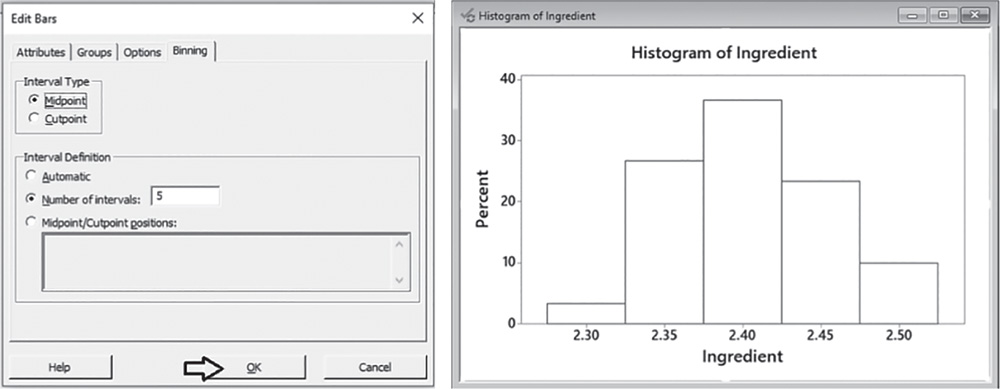
Use the tips in Chapter 2, Section 2.2.2.1 to change the appearance of the histogram.
To display the boxplot, go to: Graph > Boxplot
Check the graphical option Simple and in the next screen, select “Ingredient” in Graph variables. Then click OK in the main dialog box.
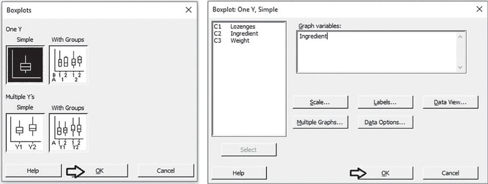
To change the appearance of a boxplot, use the tips previously referred to histograms, as well as the following:
- To display the boxplot horizontally: double‐click on any scale value on the horizontal axis. A dialog box will open with several options to define. Select from these options: Transpose value and category scales.
- To add the mean value to the boxplot: right‐click on the area inside the border of the boxplot, then select Add > Data display > Mean symbol.
To display the descriptive measures (means, measures of variability, etc.), go to:
Stat > Basic Statistics > Display Descriptive Statistics
Select “Ingredient” in Variables; then click on Statistics to open a dialog box displaying a range of possible statistics to choose from. In addition to the default options, select Interquartile range and Range.

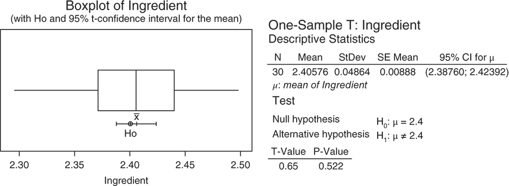
3.2.1.1.1 Interpret the Results of Step 1 Let us describe the shape, central and non‐central tendency and variability of the content of the anesthetic ingredient.
Shape: the distribution is fairly symmetric: middle values are more frequent than low and high values (Stat Tools 1.4–1.5, 1.11).
Central tendency: the mean is equal to 2.4058 mg. Mean and median are close in values (Stat Tools 1.6, 1.11).
Non‐central tendency: 25% of the values are less than 2.3706 mg (first quartile Q1) and 25% are greater than 2.4402 mg (third quartile Q3), (Stat Tools 1.7, 1.11).
Variability: observing the length of the boxplot (range) and the width of the box (interquartile range, IQR), the distribution shows moderate variability. The lozenges' content varies from 2.2953 mg (minimum) to 2.4976 mg (maximum). 50% of middle values vary from 2.3706 to 2.4402 mg (IQR = maximum observed difference between middle values equal to 0.0696 mg) (Stat Tools 1.8, 1.11).
The average distance of the values from the mean (standard deviation) is 0.0486 mg: the lozenges' content varies on average from (2.4058–0.0486) = 2.3572 mg to (2.4058 + 0.0486) = 2.4544 mg (Stat Tools 1.9).

From a descriptive point of view, the mean content of the anesthetic agent seems not to be different from the required value of 2.4.
Is the difference between the sample mean of 2.4058 and the target value 2.4 statistically significant or NOT? Do the sample results lead to rejection of the null hypothesis of equality of the population mean content of the anesthetic ingredient to the required value? Apply the one‐sample t‐test to answer these questions.
3.2.1.2 Step 2 – Assess the Null and the Alternative Hypotheses and Apply the One‐Sample t‐Test
The appropriate procedure to determine whether the population mean content does not differ from the required value of 2.4 mg is the one‐sample t‐test (Stat Tool 3.1). What are the null and alternative hypotheses?
Alternative hypothesis H1: Mean content of the anesthetic ingredient ≠ 2.4
Look at the alternative hypothesis: the mean content can be greater or less than 2.4. This is a bidirectional alternative hypothesis. In this case, the test is called a two‐tailed (or two‐sided) test. Next, we'll look at the test results and decide whether to reject or fail to reject the null hypothesis.
To apply the one‐sample t‐test, go to:
In the dialog box, leave the option One or more samples, each in a column, and select the variable “Ingredient.” Check the option Perform hypothesis test and specify the target value “2.4” in Hypothesized mean. Click Options if you want to modify the significance level of the test or specify a directional alternative. Click on Graphs to display the boxplot with the null hypothesis and the confidence interval for the mean.

3.2.1.2.1 Interpret the Results of Step 2 The sample mean 2.4058 mg is a point estimate of the population mean content of the anesthetic agent. The confidence interval provides a range of likely values for the population mean. We can be 95% confident that on average the true mean content is between 2.3876 and 2.4239. Notice that the CI includes the value 2.4. Because the p‐value (0.522) is greater than the significance level α = 0.05, we fail to reject the null hypothesis. There is not enough evidence that the mean content is different from the target value 2.4 mg. The difference between the sample mean 2.4058 mg and the required value 2.4 mg is not statistically significant.
3.2.2 Comparing a Proportion to a Specified Value
To determine whether the population proportion of lozenges with total weight greater than 2.85 mg is less than 0.40, let's proceed in the following way:
- Step 1 – Calculate the sample proportion of lozenges with total weight greater than 2.85 mg.
- Step 2 – Assess the null and the alternative hypotheses (Stat Tool 1.15) and apply the one proportion test (Stat Tools 1.16, 3.2).
3.2.2.1 Step 1 – Calculate the Sample Proportion of Lozenges with Total Weight Greater than 2.85 mg
Let us create a new categorical variable from the total weight that incorporates the two categories: “total weight less than or equal to 2.85,” “total weight greater than 2.85.”
To create a new categorical variable, go to: Data > Recode > To Text
Under Recode values in the following columns, select the variable “Weight.” Then, under Method, choose the option Recode ranges of values. Define the lower and upper endpoint of each category and in Endpoints to include, specify Lower endpoint only. Then click OK in the dialog box.

Note that the new variable “Recoded Weight” will appear at the end of the current worksheet. This variable is a categorical variable incorporating two categories: “Less than or equal to 2.85,” “Greater than 2.85.”

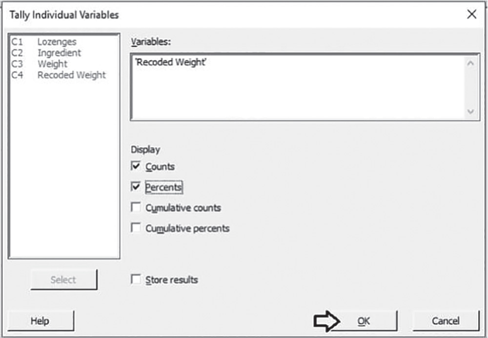
To calculate the sample proportion of lozenges with total weight greater than 2.85, go to:
In Variables, select the variable “Recoded Weight.” Then, in Display, check the options Count and Percents. Click OK in the dialog box.
To graphically display the sample proportion of lozenges with total weight greater than 2.85, go to:
In Categorical variables, select the variable “Recoded Weight.” Click Labels and in the dialog box select Slice Labels. Check the option Percent and click OK in each dialog box.

3.2.2.1.1 Interpret the Results of Step 1 The table stored in the Session window and the pie chart show the frequency distribution of the variable “Recoded weight.” In 7 out of 30 lozenges (sample percentage = 23.3%; sample proportion = 0.233), the total weight is greater than 2.85 mg.

From a descriptive point of view, the new formulated lozenges seem not to have exceeded the critical value of 40%, as the sample percentage is equal to 23.3%.
Is the difference between the sample proportion of 0.233 and the critical proportion of 0.40 statistically significant or NOT? Do the sample results lead to rejection of the null hypothesis of equality of the population proportion to the critical value? Apply the one proportion test to answer these questions.
3.2.2.2 Step 2 – Assess the Null and the Alternative Hypotheses and Apply the One Proportion Test
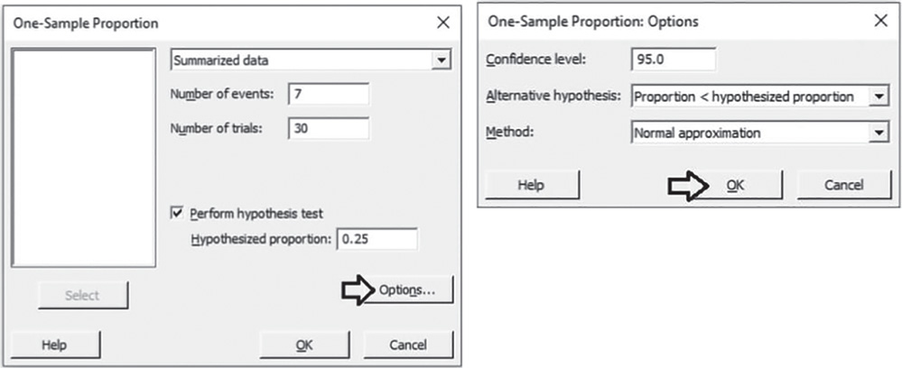
The appropriate procedure to determine whether the proportion of lozenges with total weight greater than 2.85 mg is less than 0.40 is the One Proportion Test (Stat Tool 3.2). What are the null and alternative hypotheses?
| Null hypothesis | H0: Proportion of lozenges with total weight greater than 2.85 mg = 0.40. |
| Alternative hypothesis | H1: Proportion of lozenges with total weight greater than 2.85 mg < 0.40. |
Look at the alternative hypothesis: the researchers expect the proportion exceeding the total weight of 2.85 mg to be less than 0.40. This is a directional alternative hypothesis. In this case the test is called a one‐tailed (or one‐sided) test. Next, we'll look at the test results and decide whether to reject or fail to reject the null hypothesis.
To apply the one proportion test, go to:
In the drop‐down menu at the top, choose Summarized data. In Number of events, enter 7 (the number of lozenges exceeding 2.85 mg as total weight). In Number of trials, enter 30 (the sample size). Check Perform hypothesis test. In Hypothesized proportion, enter 0.40 (the critical value). Click Options. Under Alternative hypothesis, choose Proportion < hypothesized proportion, and under Method select Normal approximation. If the number of events and non‐events is less than 5 observations, under Method choose Exact. Click OK in each dialog box.
3.2.2.2.1 Interpret the Results of Step 2 The sample proportion 0.233 is a point estimate of the population proportion of lozenges with total weight greater than 2.85 mg. In our case, we required a one‐sided test; therefore, only the lower bound of the confidence interval is shown. We can be 95% confident that the true proportion is less than 0.36. Notice that the lower bound is less than the critical value 0.40. Because the p‐value (0.031) is less than the significance level α = 0.05, we reject the null hypothesis. There is enough evidence that the proportion is less than 0.40. The difference between the sample proportion 0.233 and the critical value 0.40 is statistically significant.
Test and CI for One Proportion
Method
p: event proportion
Normal approximation method is used for this analysis.
Descriptive Statistics
| 95% Upper Bound | |||
| N | Event | Sample p | for p |
| 30 | 7 | 0.233333 | 0.360349 |
Test
| Null hypothesis | H0: p = 0.4 |
| Alternative hypothesis | H1: p < 0.4 |
| z‐Value | p‐Value |
| −1.86 | 0.031 |
3.3 Case Study for Two‐Sample Experiments: Condom Project
Two different formulations (A, B) of condoms have been manufactured. The team would like to know if there is any significant difference between the thickness of the condoms and have provided data from across the product. Under controlled conditions, 48 trials were performed by randomly selecting a sample of 23 condoms for formulation A and 25 condoms for formulation B and measuring the thickness at 30 + 5 mm from open end.
They need to assess the following issues:
- Is there any significant difference in the variability of thickness between the two formulations?
- Is there any significant difference in the mean of thickness between the two formulations?
- Is there any significant difference in the proportion of condoms with thickness less than or equal to 0.045 mm, between the two formulations?
In the Condom Project, investigators must deal with two‐sample inferential problems (Stat Tool 3.3) as the comparison of a population parameter (e.g. a mean value, a measure of variability or a proportion) between two groups of statistical units is of interest.
To solve these problems, we can apply an appropriate two‐sample hypothesis test.
In relation to the variable “thickness at 30 + 5 mm from open end:”
- Use the two variances test (Stat Tool 3.4) to determine whether the population variability differs between the two formulations.
- Use the two‐sample t‐test (Stat Tool 3.5) to determine whether the population mean differs between the two formulations.
- Use the two proportions test (Stat Tool 3.6) to determine whether the population proportion of condoms with a thickness at 30 + 5 mm from open end of less than or equal to 0.045 mm, differs between the two formulations.
The variable settings are the following:
- The variable “Open_end” is a continuous quantitative variable, expressed in mm.
- The variable “Formulation” is a categorical variable, assuming two categories: “A” and “B.”
| Column | Variable | Type of data | Label |
| C1 | Condom | Condoms' code | |
| C2 | Formulation | Categorical data | Formulations A and B |
| C3 | Open_end | Numeric data | Thickness at 30 + 5 mm from open end, in mm |
File: Condom_Project.xlsx
3.3.1 Comparing Variability Between Two Groups
To determine if there is any significant difference in the variability of thickness at 30 + 5 mm from open end between the two formulations, let's proceed in the following way:
- Step 1 – Perform a descriptive analysis (Stat Tool 1.3) of the variable “Open_end” stratifying by formulations.
- Step 2 – Assess the null and the alternative hypotheses (Stat Tools 1.15) and apply the Two Variances Test (Stat Tools 1.16, 3.4).
3.3.1.1 Step 1 – Perform a Descriptive Analysis of the Variable “Open_end” Stratifying by Formulations
For the quantitative variable “Open_end,” use the dotplot (recommended for small samples with less than 50 observations) or the histogram (for moderate or large datasets with sample size greater than 20), stratifying by formulations. Finally, add the boxplot (for moderate or large datasets) and calculate means and measures of variability to complete the descriptive analysis.
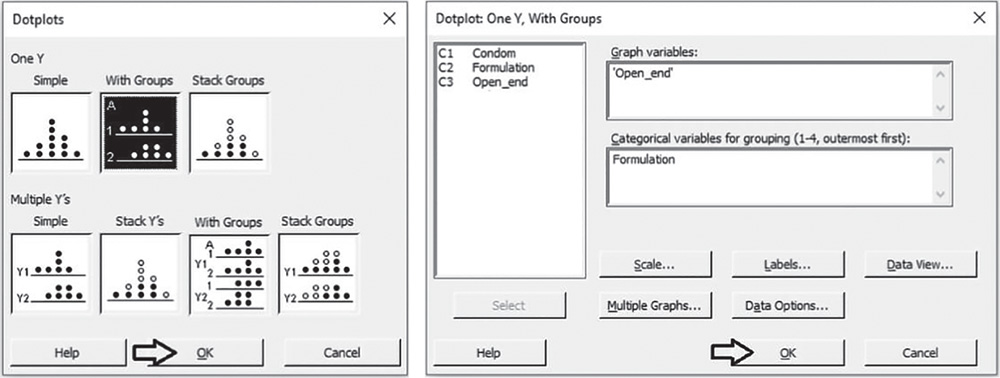
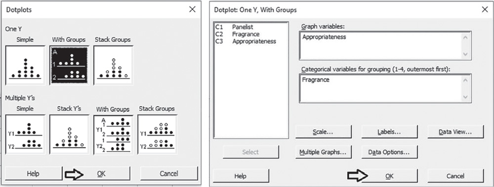
To display the dot plots by formulations, go to: Graph > Dotplot
Under One Y, select the graphical option With Groups and in the next dialog box, select “Open_end” in Graph variables and “Formulation” in Categorical variables for grouping. Then click OK in the dialog box.
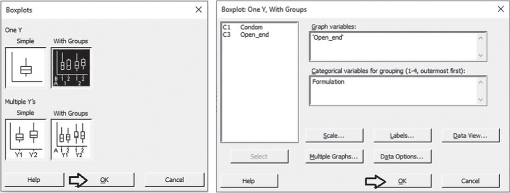
To display the boxplots by formulations, go to: Graph > Boxplot
Under One Y, select the graphical option With Groups and in the next dialog box, select “Open_end” in Graph variables and “Formulation” in Categorical variables for grouping. Then click OK in the dialog box. To change the appearance of a boxplot, use the tips in section 3.2.1.1.
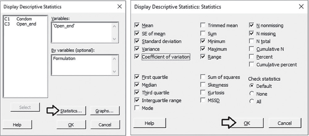
To display the descriptive measures (means, measures of variability, etc.) by formulations, go to:
Select “Open_end” in Variables, and “Formulation” in By variables, then click on Statistics to open a dialog box displaying a range of possible statistics to choose from. In addition to the default options, select Variance, Coefficient of variation, Interquartile range and Range. Click OK in each dialog box.
3.3.1.1.1 Interpret the Results of Step 1 Let's describe the shape, central, and non‐central tendency and variability of the thickness at 30 + 5 mm from open end for the two formulations.
Shape: The distribution is asymmetric to the left for formulation A while formulation B tends to be more symmetric (Stat Tools 1.4, 1.5, 1.11).
Central tendency: The mean is equal to 0.046 mm for group A and 0.048 for group B. Mean and median are close in values for formulation B (Stat Tools 1.6, 1.11).
Non‐central tendency: 25% of condoms of type A have thickness less than 0.044 mm (first quartile Q1) and 25% greater than 0.048 mm (third quartile Q3), (Stat Tools 1.7, 1.11). For formulation B, the first and third quartiles are respectively equal to 0.046 mm and 0.050 mm.
Variability: Observing the length of the boxplot (range) and the width of the box (Interquartile range, IQR), formulation B shows slightly higher variability than formulation A. Condom thickness varies from 0.041 mm (minimum) to 0.049 mm (maximum) for group A and from 0.041 mm (minimum) to 0.055 mm (maximum) for group B (Stat Tools 1.8, 1.11).
For formulation A, the average distance of the values from the mean (standard deviation) is 0.002 mm: condom thickness varies on average from (0.046–0.002) = 0.044 mm to (0.046 + 0.002) = 0.048 mm (Stat Tools 1.9). For formulation B, the standard deviation is 0.003 mm: condom thickness varies on average from 0.045 to 0.051 mm (mean ± standard deviation). Remember that the standard deviation is the square root of the variance.

Statistics
| Variable | Formulation | N | N* | Mean | SE Mean | StDev | Variance | CoefVar | Minimum |
| Open_end | A | 23 | 0 | 0.045961 | 0.000479 | 0.002298 | 0.000005 | 5.00 | 0.040666 |
| B | 25 | 0 | 0.048029 | 0.000680 | 0.003398 | 0.000012 | 7.07 | 0.041419 |
| Variable | Formulation | Q1 | Median | Q3 | Maximum | Range | IQR |
| Open_end | A | 0.043959 | 0.046498 | 0.047853 | 0.049540 | 0.008874 | 0.003894 |
| B | 0.045901 | 0.047852 | 0.050127 | 0.055029 | 0.013610 | 0.004225 |
From a descriptive point of view, formulation B seems to have slightly higher variability than A. Look at the coefficient of variation (Stat Tool 1.10), which is greater for condoms of type B. The two standard deviations (or variances) seem to be different. Is this difference statistically significant or NOT? Do the sample results lead to rejection of the null hypothesis of equality of the population variances for the two formulations? Apply the two variances test to answer these questions.
3.3.1.2 Step 2 – Assess the Null and the Alternative Hypotheses and Apply the Two Variances Test
The appropriate procedure to determine whether the variability of thickness measured at 30 + 5 mm from open end differs between the two formulations is the two variances test (Stat Tool 3.4). What are the null and alternative hypotheses?
Null hypothesis
H0: For the two formulations, the variances of thickness at 30 + 5 mm from open end are equal.
Alternative hypothesis
H1: For the two formulations, the variances of thickness at 30 + 5 mm from open end are not equal.
Look at the alternative hypothesis: the group A variance can be greater or less than the group B variance. This is a bidirectional alternative hypothesis. In this case the test is called a two‐tailed (or two‐sided) test. Next we'll look at the test results and decide whether to reject or fail to reject the null hypothesis.
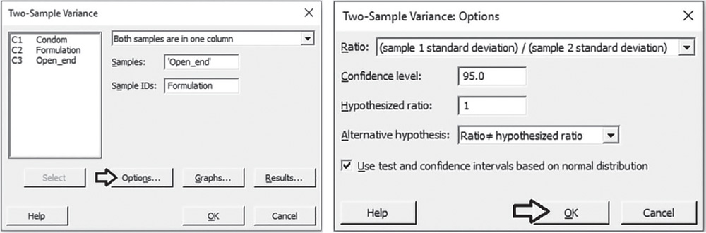
To apply the two variances test, go to:
In the drop‐down menu at the top, choose Both samples are in one column. In Samples, select the variable “Open_end” and in Sample IDs, select the variable “Formulation,” then click Options. Note that the 2 variances procedure performs hypothesis tests and computes confidence intervals for the ratios between two populations' variances or standard deviations. This is why the alternative hypothesis is related to the ratio of the two populations' variances or standard deviations, where a ratio of 1 suggests equality between populations. Under Ratio, leave the selection (sample 1 standard deviation) / (sample 2 standard deviation). Under Alternative hypothesis, choose Ratio ≠ hypothesized ratio, and check the option Use test and confidence intervals based on normal distribution. If your samples have less than 20 observations each, or the distribution for one or both populations is known to be far from the normal distribution, uncheck this option.
Click OK in each dialog box.
3.3.1.2.1 Interpret the Results of Step 2 The sample ratio of standard deviations 0.676 is a point estimate of the population ratio. The confidence interval provides a range of likely values for the population ratio. We can be 95% confident that on average the true ratio is between 0.446 and 1.033. Notice that the CI includes the value 1. Because the p‐value (0.069) of the test is greater than the significance level α = 0.05, we fail to reject the null hypothesis. There is insufficient evidence that the variability is different between the two formulations. The difference between the two standard deviations (or variances) is not statistically significant.
Test and CI for Two Variances: Open_end versus Formulation
Method
σ1: standard deviation of Open_end when Formulation = A
σ2: standard deviation of Open_end when Formulation = B
Ratio: σ1/σ2
F method was used. This method is accurate for normal data only.
Descriptive Statistics
| Formulation | N | StDev | Variance | 95% CI for σ |
| A | 23 | 0.002 | 0.000 | (0.002; 0.003) |
| B | 25 | 0.003 | 0.000 | (0.003; 0.005) |
Ratio of Standard Deviations
| Estimated ratio | 95% CI for ratio using F |
| 0.676203 | (0.446; 1.033) |
Test
| Null hypothesis | H0: σ1 / σ2 = 1 | |||
| Alternative hypothesis | H1: σ1 / σ2 ≠ 1 | |||
| Significance level | α = 0.05 | |||
| Method | Test Statistic | DF1 | DF2 | p‐Value |
| F | 0.46 | 22 | 24 | 0.069 |
3.3.2 Comparing Means Between Two Groups
To determine if there is any significant difference in the mean of thickness at 30 + 5 mm from open end between the two formulations, let's proceed in the following way:
- Step 1 – Perform a descriptive analysis (Stat Tool 1.3) of the variable “Open_end” stratifying by formulations.
- Step 2 – Assess the null and the alternative hypotheses (Stat Tool 1.15) and apply the two‐sample t‐test (Stat Tools 1.16, 3.5).
3.3.2.1 Step 1 – Perform a Descriptive Analysis of the Variable “Open_end” stratifying by Formulations
In step 1 of Section 3.3.1 we have already performed the descriptive analysis of variable “Open_end,” stratifying by formulations and displaying the dotplots, the boxplots, and calculating the descriptive measures.
3.3.2.1.1 Interpret the Results of Step 1 We take back the considerations made previously in Section 3.3.1.1.1 about the distribution of the thickness at 30 + 5 mm from open end. In particular, we noticed that the mean was equal to 0.046 mm for group A and 0.048 for group B.
From a descriptive point of view, formulation B seems to have a slightly higher mean than A. The two means seem to differ. Is this difference statistically significant or NOT? Do the sample results lead to rejection of the null hypothesis of equality of the population means for the two formulations? Apply the two‐sample t‐test to answer these questions.
3.3.2.2 Step 2 – Assess the Null and the Alternative Hypotheses and Apply the Two‐Sample t‐Test
The appropriate procedure to determine whether the means of thickness measured at 30 + 5 mm from open end differ between the two formulations is the two‐sample test, as the two random samples are independent (Stat Tools 3.3, 3.5). What are the null and alternative hypotheses?
Null Hypothesis
H0: For the two formulations, the means of thickness at 30 + 5 mm from open end are equal.
Alternative Hypothesis
H1: For the two formulations, the means of thickness at 30 + 5 mm from open end are not equal.
Look at the alternative hypothesis: the group A mean can be greater or less than the group B mean. This is a bidirectional alternative hypothesis. In this case the test is called a two‐tailed (or two‐sided) test.
Next, we'll look at the test results and decide whether to reject or fail to reject the null hypothesis.
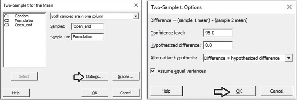
To apply the two‐sample t‐test, go to:
In the drop‐down menu at the top, choose Both samples are in one column. In Samples, select the variable “Open_end” and in Sample IDs, select the variable “Formulation,” then click Options. Under Alternative hypothesis, choose Difference ≠ hypothesized difference, to apply a two‐sided test. Check the option Assume equal variances because in Section 3.3.1 after applying the two variances test, we concluded in favor of the equality of variances between the two formulations. If in the application of the two variances test, you did not reject the null hypothesis, uncheck this option. Click OK in each dialog box.
3.3.2.2.1 Interpret the Results of Step 2
The difference between the two sample means −0.002069, is a point estimate of the population mean difference. The confidence interval provides a range of likely values for the population mean difference. We can be 95% confident that on average the true difference is between −0.003769 and − 0.002924. Notice that the CI does not include the value 0. Because the test's p‐value (0.018) is less than the significance level α = 0.05, we reject the null hypothesis. There is enough evidence that the mean of the thickness at 30 + 5 mm from open end is different between the two formulations. The difference between the two means is statistically significant.
Two‐Sample T‐Test and CI: Open_end; Formulation
Method
μ1: mean of Open_end when Formulation = A
μ2: mean of Open_end when Formulation = B
Difference: μ1 − μ2
Equal variances are assumed for this analysis.
Descriptive Statistics: Open_end
| Formulation | N | Mean | StDev | SE Mean |
| A | 23 | 0.04596 | 0.00230 | 0.00048 |
| B | 25 | 0.04803 | 0.00340 | 0.00068 |
Estimation for Difference
| Difference | Pooled StDev | 95% CI for Difference |
| −0.002069 | 0.002924 | (−0.003769; −0.000368) |
Test
| Null hypothesis | H0: μ1 − μ2 = 0 |
| Alternative hypothesis | H1: μ1 − μ2 ≠ 0 |
| t‐Value | DF | p‐Value |
| −2.45 | 46 | 0.018 |
3.3.3 Comparing Two Proportions
To determine whether the proportion of condoms with thickness less than or equal to 0.045 mm differs between the two formulations, let's proceed in the following way:
Step 1 ‐ For the two formulations, calculate the sample proportion of condoms with thickness less than or equal to 0.045 mm.
Step 2 ‐ Assess the null and the alternative hypotheses (Stat Tool 1.15) and apply the two proportions test (Stat Tools 1.16, 3.6).
3.3.3.1 Step 1 – Calculate the Sample Proportions of Condoms with Thickness Less than or Equal to 0.045 mm
Let us create a new categorical variable from variable “Open_end” that assumes the two categories: “thickness less than or equal to 0.045,” “thickness greater than 0.045.”
To create a new categorical variable, go to: Data > Recode > To Text
Under Recode values in the following columns, select the variable “Open_end.” Then, under Method, choose the option Recode ranges of values. Define the lower and upper endpoint of each category and in Endpoints to include, specify Lower endpoint only. Then click OK in the dialog box.
Note that the new variable “Recoded Open_end” will appear at the end of the current worksheet. This variable is a categorical variable assuming two categories: “Less than or equal to 0.045,” “Greater than 0.045.”
To calculate the sample proportion of condoms with thickness less than or equal to 0.045 mm by formulations, go to:
In the drop‐down menu at the top, choose Raw data (Categorical variables). In Rows, select the variable “Recoded Open_end” and in Columns, choose “Formulation.” Then, under Display, check the options Count and Column Percents. Click OK in the dialog box.

| ↓ | C1 | C2‐T | C3 | C4‐T | C5 | C6 |
| Condom | Formulation | Open_end | Recoded Open_end | |||
| 1 | 1 | A | 0.049 | Greater than 0.045 | ||
| 2 | 2 | A | 0.049 | Greater than 0.045 | ||
| 3 | 3 | A | 0.048 | Greater than 0.045 | ||
| 4 | 4 | A | 0.048 | Greater than 0.045 | ||
| 5 | 5 | A | 0.044 | Less than or equal to 0.045 | ||
| 6 | 6 | A | 0.045 | Greater than 0.045 |

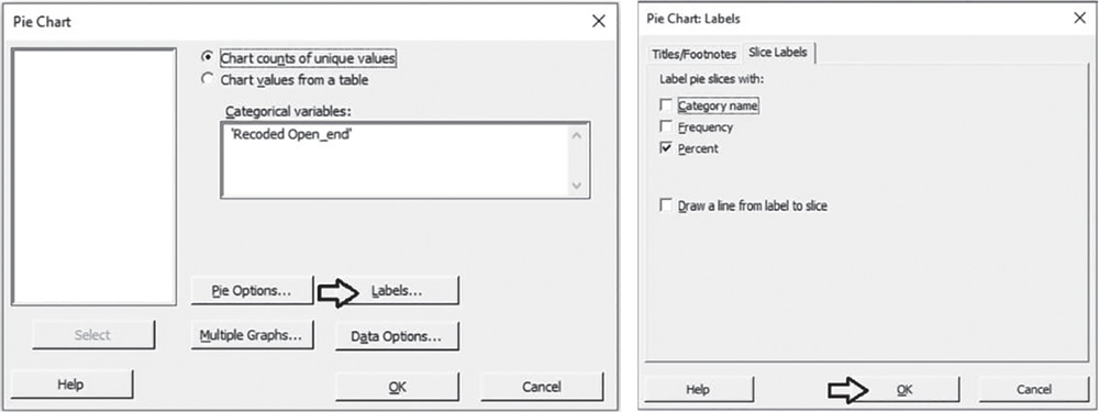
To graphically display the sample proportions of condoms with thickness less than or equal to 0.045 mm, go to:
In Categorical variables, select the variable “Recoded Open_end.” Click Labels and in the dialog box select Slice Labels. Check the option Percent and click OK.
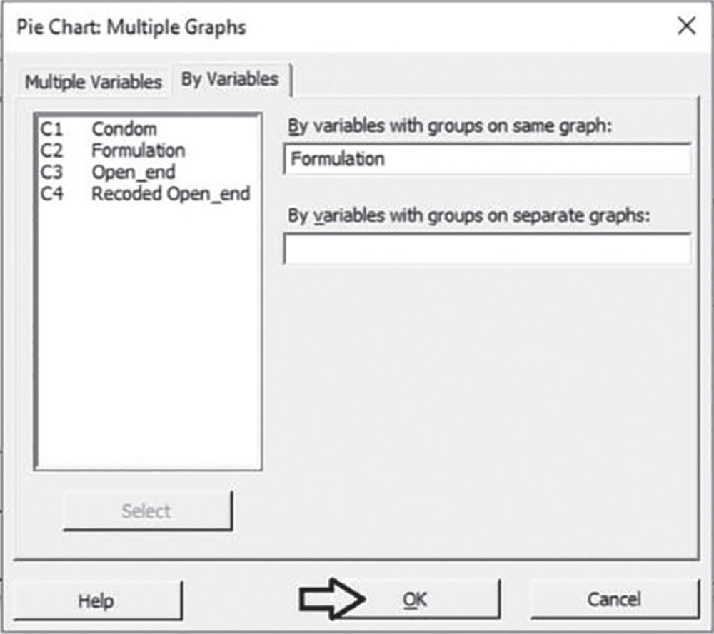
In the main dialog box select Multiple Graphs. In the next window, select By variables. In the new dialog box under By variables with groups on same graph, select “Formulation.” Click OK in each dialog box.

3.3.3.1.1 Interpret the Results of Step 1 The table stored in the Session window and the pie charts shows the frequency distribution of the variable “Recoded Open_end” by formulation. For group A, in 8 out of 23 condoms (sample percentage = 34.8%; sample proportion = 0.348), the thickness is less than or equal to 0.045 mm; for formulation B, this sample percentage is 20.0%.
From a descriptive point of view, the two percentages seem to be a little different. Is the difference of 14.8% statistically significant or NOT? Do the sample results lead to rejection of the null hypothesis of equality of the population proportions? Apply the two proportions test to answer these questions.
Tabulated Statistics: Recoded Open_end; Formulation
Rows: Recoded Open_endColumns: Formulation
| A | B | All | |
| Less than or equal to 0.045 | 8 | 5 | 13 |
| 34.78 | 20.00 | 27.08 | |
| Greater than 0.045 | 15 | 20 | 35 |
| 65.22 | 80.00 | 72.92 | |
| All | 23 | 25 | 48 |
| 100.00 | 100.00 | 100.00 | |
| Cell Contents | |||
| Count | |||
| % of Column |

3.3.3.2 Step 2 – Assess the Null and the Alternative Hypotheses and Apply the Two Proportions Test
The appropriate procedure to determine whether the proportions of condoms with thickness less than or equal to 0.045 mm is different between the two formulations, is the two proportions test (Stat Tool 3.6). What are the null and alternative hypotheses?
| Null hypothesis H0: | For the two formulations, the proportions of condoms with thickness less than or equal to 0.045 mm are equal. |
| Alternative hypothesis | H1: For the two formulations, the proportions of condoms with thickness less than or equal to 0.045 mm are not equal. |
Look at the alternative hypothesis: The group A proportion can be greater or less than the group B proportion. This is a bidirectional alternative hypothesis. In this case, the test is called a two‐tailed (or two‐sided) test.
Next we'll look at the test results and decide whether to reject or fail to reject the null hypothesis.
To apply the two proportions test, go to:
In the drop‐down menu at the top, choose Summarized data. Under Sample 1, in Number of events, enter 8 (the number of condoms not exceeding 0.045 mm as thickness for formulation A) and in Number of trials, enter 23 (the sample size). Under Sample 2, in Number of events, enter 5 (the number of condoms not exceeding 0.045 mm as thickness for formulation B) and in Number of trials, enter 25 (the sample size). Click Options. Under Alternative hypothesis, choose Difference ≠ hypothesized difference, to apply a two‐sided test, and under Test Method leave the default option Estimate the proportions separately. Click OK in each dialog box.

3.3.3.2.1 Interpret the Results of Step 2 The difference between the two‐sample proportions 0.148 is a point estimate of the population difference. We can be 95% confident that on average the true difference is between −0.102119 and 0.397771. Notice that the CI includes the value 0.
Minitab uses the normal approximation method and Fisher's exact method to calculate the p‐values for the two proportions test. If the number of events and the number of non‐events is at least 5 in both samples, use the smaller of the two p‐values. If either the number of events or the number of non‐events is less than 5 in either sample, the normal approximation method may be inaccurate. Because the test's p‐value (0.246) is greater than the significance level α = 0.05, we fail to reject the null hypothesis. There is not enough evidence that the proportions of condoms with thickness less than or equal to 0.045 mm is different between the two formulations. The difference between the two proportions is not statistically significant.
Test and CI for Two Proportions Method
p1: proportion where Sample 1 = Event
p2: proportion where Sample 2 = Event
Difference: p1 – p2
Descriptive Statistics
| Sample | N | Event | Sample p |
| Sample 1 | 23 | 8 | 0.347826 |
| Sample 2 | 25 | 5 | 0.200000 |
Estimation for Difference
| Difference | 95% CI for Difference |
| 0.147826 | (–0.102119; 0.397771) |
CI closed on normal approximation
Test
| Null hypothesis | H0: p1 – p2 = 0 | |
| Alternative hypothesis | H1: p1 – p2 ≠ 0 | |
| Method | z‐Value | p‐Value |
| Normal approximation | 1.16 | 0.246 |
| Fisher's exact | 0.335 |
3.4 Case Study for Paired Data: Fragrance Project
The Fragrance Project aims to introduce an innovative shaving oil differentiated from existing shaving creams and foams. It is of interest to assess two fragrances (A and B) to investigate if there are any consumer perceived differences in their in‐use characteristics and if so, which is the more suitable.
A total of 30 female respondents (panelists) are presented with the two fragrances and asked to answer the question, “How suitable or unsuitable is this fragrance for a shaving product?” and then assign an integer score from 0 (very unsuitable) to 10 (very suitable).
The research team needs to assess the following issue:
- Is there any significant difference in the appropriateness between the two fragrances?
The variables setting is the following:
- Variable “Fragrance” is a nominal categorical variable, assuming two different categories “A” and “B.”
- Variable “Appropriateness” is a discrete quantitative variable, assuming values from 0 to 10.
| Column | Variable | Type of data | Label |
| C1 | Panelist | Panelists' code | |
| C2‐T | Fragrance | Categorical data | A = first fragrance; B = second fragrance |
| C3 | Appropriateness | Numeric data | Appriopriateness of fragrance: 0 = very unsuitable to 10 = very suitable |
File: Fragrance:Project.xlsx
The case study represents a typical two‐sample inferential problem on means, but the scores of appropriateness for fragrance A and B are dependent paired data because each panelist tests both the fragrances at different times (Stat Tool 3.3). The sampling units are the 30 female respondents who assess the two fragrances and give opinions at two different times.
Use the paired t‐test to compare a population mean between two dependent groups or samples of statistical units (Stat Tool 3.7).
In the Fragrance Project, to investigate if there are any consumer‐perceived differences in appropriateness between the two fragrances, work out the statistical analysis in the following way:
- Step 1 – Perform a descriptive analysis (Stat Tool 1.3) of the variable “Appropriateness” stratified by the categorical variable “Fragrance.”
- Step 2 – Calculate the differences between the score for fragrance A and the score for fragrance B for each panelist, creating a new variable “Difference:A_B” and perform a descriptive analysis of this variable.
- Step 3 – Apply the paired t‐test (Stat Tool 3.7).
3.4.1.1 Step 1 – Descriptive Analysis of “Appropriateness” Stratified by “Fragrance”
Let's start the descriptive analysis of the variable “Appropriateness” stratified by the categorical variable “Fragrance,” by displaying the frequency distribution of the “Appropriateness” by “Fragrance” through graphs that help to emphasize trend, pattern, and other important aspects of data distributions. “Appropriateness” being a quantitative discrete variable, use the dotplot or the histogram to display the distribution of the data. Add the boxplot and calculate means and measures of variability to complete the analysis.
To display the histogram, go to: Graph > Histogram
Choose the graphical option With Groups to display one histogram of Appropriateness for each fragrance. In the next dialog box, select “Appropriateness” in Graph variables and “Fragrance” in Categorical variables for grouping. Then, the option Multiple Graphs gives access to additional options that help to display the histograms in separate panels (one for each fragrance) of the same graph.

Use the tips in Chapter 2, section 2.2.2.1 to change the appearance of the histogram:
To display the Dotplot, go to: Graph > Dotplot
Choose the graphical option With Groups to display one dotplot of Appropriateness for each fragrance. In the next dialog box, select “Appropriateness” in Graph variables and “Fragrance” in Categorical variables for grouping.
Use the tips previously referred to histograms to change the appearance of a dotplot.
To display the boxplot, go to: Graph > Boxplot
Choose the graphical option With Groups to display one boxplot of Appropriateness for each fragrance. In the next dialog box, select “Appropriateness” in Graph variables and “Fragrance” in Categorical variables for grouping.

To change the appearance of a boxplot, use the tips previously referred to histograms, as well as the following ones:
- To display the boxplot horizontally: double‐click on any scale value on the horizontal axis. A dialog box will open with several options to define. Select from these options: Transpose value and category scales.
- To add the mean value to the boxplot: right‐click in the area inside the border of the boxplot, then select Add > Data display > Mean symbol.
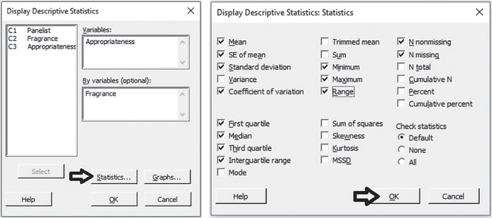
To display the descriptive measures (means, measures of variability, etc.), go to:
In the dialog box, under Variables select “Appropriateness” and under By variables select “Fragrance,” then click on Statistics to open a dialog box displaying a range of possible statistics to choose from. In addition to the default options, select Coefficient of variation, Interquartile range and Range.
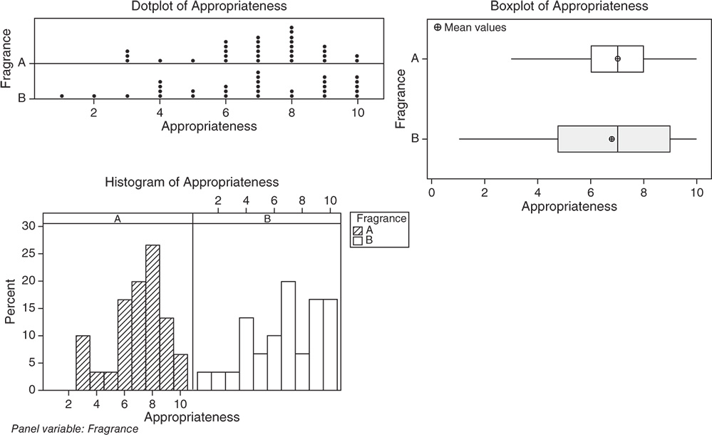
3.4.1.1.1 Interpret the Results of Step 1 From a descriptive point of view, let us compare the shape, central and non‐central tendency and variability of the distribution of appropriateness between the two fragrances.
Shape. The distributions of appropriateness are skewed to the left for both fragrances: middle and high scores are more frequent than low scores. For fragrance A, the distribution is unimodal with mode equal to 8. For fragrance B, the distribution is reasonably spread out with no concentration on a unique value; scores 6, 9, and 10 show the higher frequencies (Stat Tools 1.4–1.5, 1.11).
Central tendency. For both fragrances, the central tendency of appropriateness (the median score) is equal to 7: about 50% of the scores is less than or equal to 7 and 50% greater than or equal to 7. Mean and median overlap for fragrance A, while for fragrance B, with a distribution more skewed to the left, mean and median are not close in value. The median score is a better indicator than the mean (Stat Tools 1.6, 1.11).
Non‐central tendency. For fragrance A, 25% of the scores are less than 6 (first quartile Q1) and 25% are greater than 8 (third quartile Q3). For fragrance B, 25% of the scores are less than 4.75 (first quartile Q1) and 25% are greater than 9 (third quartile Q3) (Stat Tools 1.7, 1.11).
Variability. Observing the length of the boxplots (ranges) and the width of the boxes (Interquartile ranges, IQRs), fragrance B shows more variability. Its scores vary from 1 (minimum) to 10 (maximum). For fragrance A, no respondent gave a score less than 3 and the maximum observed difference between evaluations was 7 (Range). 50% of middle evaluations vary from 6 to 8 for fragrance A (IQR = maximum observed difference between evaluations equal to 2) and from 4.75 to 9 for fragrance B (IQR = 4.25) (Stat Tools 1.8, 1.11).
The average distance of the scores from the mean (standard deviation) is 1.93 for fragrance A (scores vary on average from 7 – 1.93 = 5.07 to 7 + 1.93 = 8.93) and 2.56 for fragrance B (scores vary on average from 6.77 – 2.56 = 4.21 to 6.77 + 2.56 = 9.33) (Stat Tools 1.9).
The coefficient of variation is less for fragrance A (CV = 27.57%) confirming the lower variability of the scores for this fragrance (Stat Tool 1.10).
Statistics
| Variable | Fragrance | N | N* | Mean | SE Mean | StDev | CoefVar | Minimum | Q1 | Median |
| Appropriateness | A | 30 | 0 | 7.000 | 0.352 | 1.930 | 27.57 | 3.000 | 6.000 | 7.000 |
| B | 30 | 0 | 6.767 | 0.467 | 2.555 | 37.76 | 1.000 | 4.750 | 7.000 |
| Variable | Fragrance | Q3 | Maximum | Range | IQR |
| Appropriateness | A | 8.000 | 10.000 | 7.000 | 2.000 |
| B | 9.000 | 10.000 | 9.000 | 4.250 |
3.4.1.2 Step 2 – Descriptive Analysis of “Difference:A_B”
Let's calculate the differences between the score for fragrance A and the score for fragrance B for each panelist, creating a new variable “Difference:A_B,” and perform a synthetic descriptive analysis to get a sense of the mean and variability in the differences between scores. “Difference:A_B” being a quantitative continuous variable, use the boxplot and calculate means and measures of variability to complete the analysis.
To split the column “Appropriateness” into separate columns according to the values of “Fragrance,”
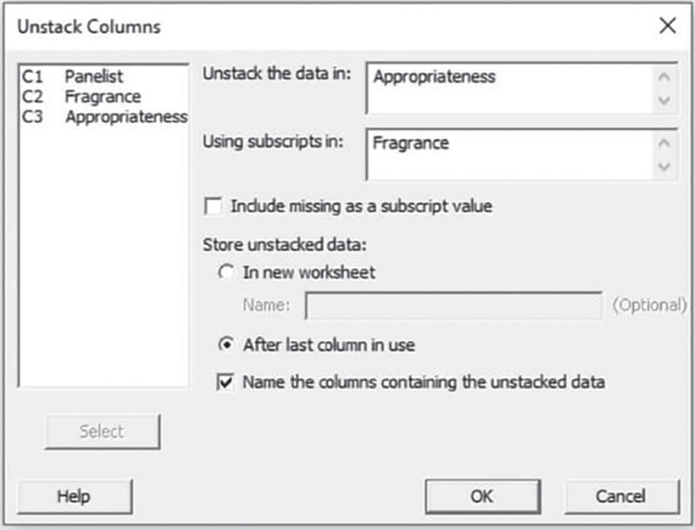
go to: Data > Unstack columns
In the dialog box, select “Appropriateness” in Unstack the data in, and “Fragrance” in Using subscripts in, then check the option After last column in use. The worksheet will include two new variables “Appropriateness_A” and “Appropriateness_B.”
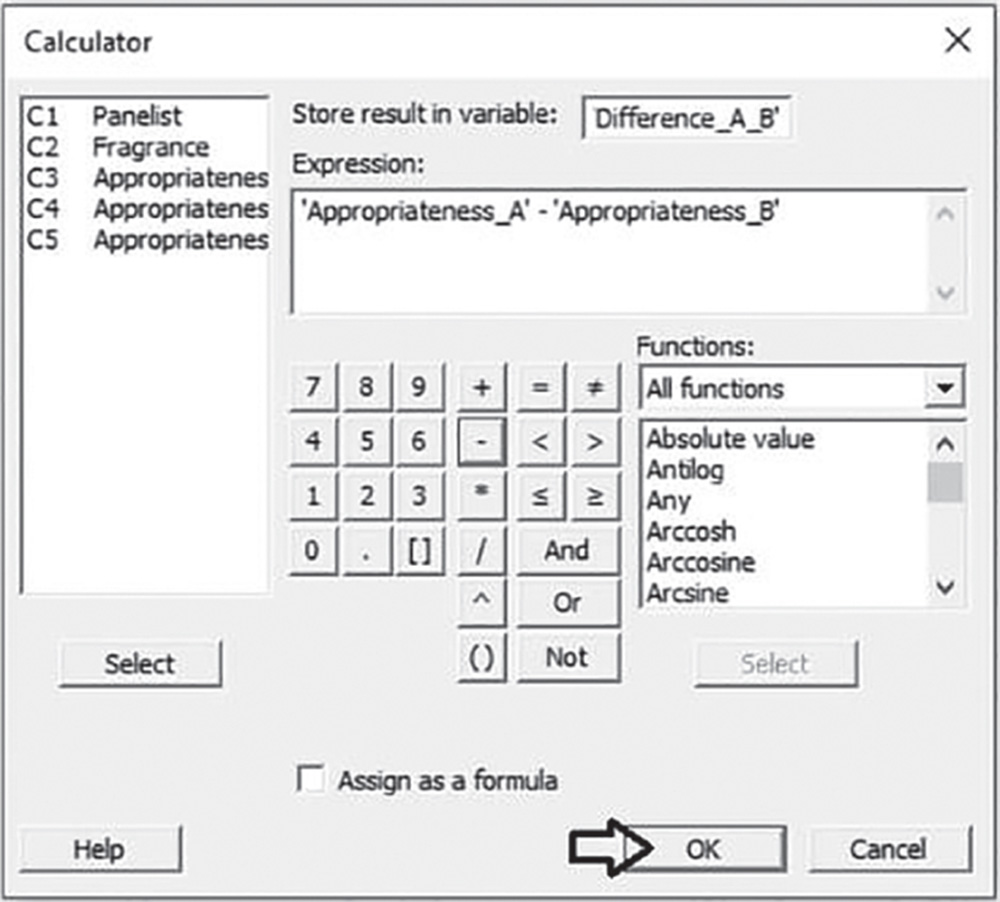
To calculate the differences between the new variables, go to: Calc > Calculator
In the dialog box, write the name of variable “Difference:A_B” in Store result in variable, and type the expression under Expression, selecting variables “Appropriateness_A” and “Appropriateness_B” from the list on the left and using the numeric keypad. The worksheet will include a new variable “Difference:A_B.”
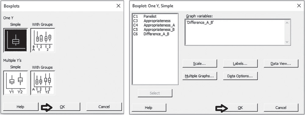
To display the boxplot, go to: Graph > Boxplot
Choose the graphical option Simple under One Y. In the next dialog box, select “Difference:A_B” in Graph variables.
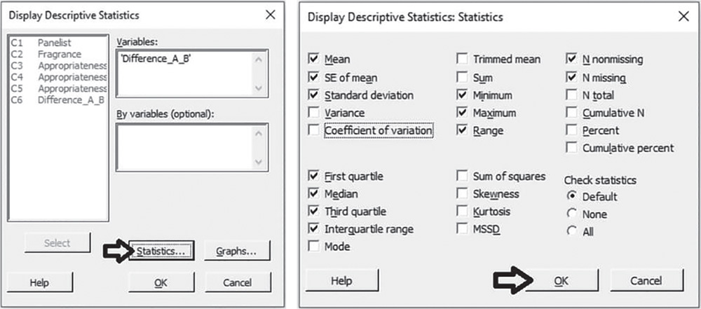
To display the descriptive measures (means, measures of variability, etc.), go to:
In the dialog box, under Variables select “Difference:A_B” and leave By variables blank, then click on Statistics to open a dialog box displaying a range of possible statistics to choose from. In addition to the default options, select Interquartile range and Range and uncheck Coefficient of variation.
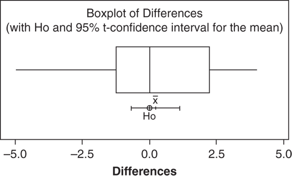
3.4.1.2.1 Interpret the Results of Step 2 We may see that on average the difference in the score of appropriateness of fragrances is 0.23 (median = 0) (Stat Tools 1.6, 1.11). 50% of middle differences vary from −1.25 to 2.25 (IQR = 3.5) (Stat Tools 1.8, 1.11). The average distance of the differences from their mean (standard deviation) is 0.44 (differences vary on average from 0.23–0.44 = −0.21 to 0.23 + 0.44 = 0.67) (Stat Tool 1.9).

Statistics
| Variable | N | N* | Mean | SE Mean | StDev | Minimum | Q1 | Median | Q3 | Maximum | Range |
| Difference:A_B | 30 | 0 | 0.233 | 0.444 | 2.431 | −5.000 | −1.250 | 0.000 | 2.250 | 4.000 | 9.000 |
| Variable | IQR |
| Difference:A_B | 3.500 |
From a descriptive point of view, the two fragrances show similar appropriateness, but we need to analyze the paired t‐test results to determine whether the mean difference between the two fragrances is statistically different from 0.
3.4.1.3 Step 3 – Paired t‐Test on Mean Difference
Let's apply the paired t‐test (Stat Tool 3.7). The paired t‐test results include both a confidence interval and a p‐value. Use the confidence interval to obtain a range of reasonable values for the population mean difference. Use the p‐value to determine whether the mean difference is statistically equal or not equal to 0. If the p‐value is less than α, reject the null hypothesis that the mean difference equals 0.
To apply the paired t‐test, go to: Stat > Basics Statistics > Paired t
In the dialog box, choose the option Each sample is in a column and select “Appropriateness_A” in Sample 1 and “Appropriateness_B” in Sample 2. Click Options if you want to modify the significance level of the test or specify a directional alternative. Click on Graphs to display the boxplot with the null hypothesis and the confidence interval for the mean difference.

3.4.1.3.1 Interpret the Results of Step 3
The sample mean difference 0.233 is an estimate of the population mean difference. The confidence interval provides a range of likely values for the mean difference. We can be 95% confident that on average the true mean difference is between −0.674 and 1.141. Notice that the CI includes the value 0.
Because the p‐value (0.603) is greater than 0.05, we fail to reject the null hypothesis. There is not enough evidence that the mean difference is different from 0. The mean difference of 0.233 between the appropriateness of fragrances A and B is not statistically significant. The two fragrances show similar appropriateness score means.
Paired T‐Test and CI: Appropriateness_A; Appropriateness_B
Descriptive Statistics
| Sample | N | Mean | StDev | SE Mean |
| Appropriateness_A | 30 | 7.000 | 1.930 | 0.352 |
| Appropriateness_B | 30 | 6.767 | 2.555 | 0.467 |
Estimation for Paired Difference
| Mean | StDev | SE Mean | 95% CI for μ_difference |
| 0.233 | 2.431 | 0.444 | (−0.674; 1.141) |
μ_difference: mean of (Appropriateness_A – Appropriateness_B)
Test
| Null hypothesis | H0: μ_difference = 0 |
| Alternative hypothesis | H1: μ_difference ≠ 0 |
| t‐Value | p‐Value |
| 0.53 | 0.603 |
3.5 Case Study: Stain Removal Project
A Stain Removal Project aims to complete the development of an innovative dishwashing cleaning product. The research team needs to identify which formula from four component concentrations, maximizes stain release on several stains. Different combinations of component concentrations will be tested on a random sample of fabric specimens and reflectance measures (scores varying from 1: very bad performance, to 100: very good performance) will be obtained by a spectrophotometer. We need to plan and analyze an experimental study in order to identify which formula could maximize the cleaning performance.
3.5.1 Plan of the General Factorial Experiment
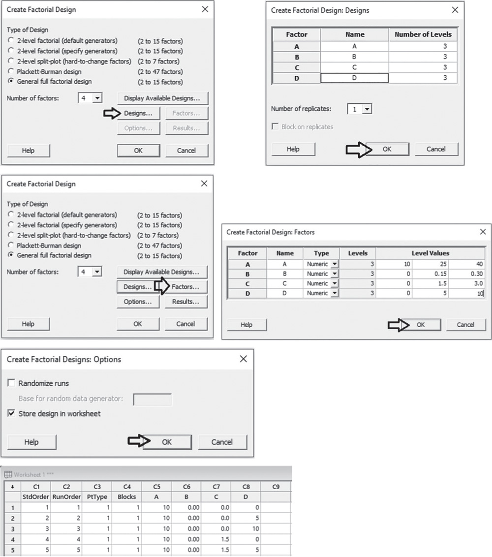
During a previous screening phase (for a review on screening designs, see Chapter 2), investigators selected four components affecting cleaning performance by using a two‐level factorial design. We will denote these four components as A, B, C, D. After identifying the key input factors, the experimental work can proceed with a general factorial design increasing the number of levels to optimize responses (Stat Tool 2.2). The research team will test the following concentrations of the four components:
| Components (Factors) | A | B | C | D |
| Concentrations (Levels) | 10 | 0 | 0 | 0 |
| 25 | 0.15 | 1.5 | 5 | |
| 40 | 0.3 | 3.0 | 10 |
For the present study:
- The four components represent the key factors.
- Each factor has three levels (concentrations).
- The cleaning performance scores (reflectance measures) for a list of stains represent the response variables (one for each stain).
For logistical reasons, investigators need to arrange the experiment in such a way that only 40 different combinations of factor levels will be tested.
We will proceed initially by constructing a full factorial design (all combinations of factor levels are tested) and then selecting an optimal design (only a suitable subset of all combinations are tested) in order to reduce the number of runs, thus respecting the restriction to 40 runs. Furthermore, we will reasonably assume that interactions among more than two factors are negligible.
An optimal design (Johnson, R. T., Montgomery, D. C., Jones, B. A., 2011) is a design that is best in relation to a particular statistical criterion (Anderson, M. J. and Whitcomb, P. J., 2014). Computer programs are required to construct such designs.
Remember that when feasible, the experiment should include at least two replicates of the design, i.e. the researcher should run each factor level combination at least twice. Replicates are multiple independent executions of the same experimental conditions (Stat Tool 2.5). In the present case study we will consider two replicates of each run.
To create the design for our factorial experiment, let's proceed in the following way:
- Step 1 – Create a full factorial design.
- Step 2 – Reduce the full design to an optimal design.
- Step 3 – Assign the designed factor level combinations to the experimental units and collect data for the response variable.
3.5.1.1 Step 1 – Create a Full Factorial Design
Let's begin to create a full factorial design, considering three levels for each factor.
To create a full factorial design, go to: Stat > DOE > Factorial > Create Factorial Design
Choose General full factorial design and in Number of factors specify 4. Click on Designs. In the next dialog box, enter the names of the factors (A to D) and the number of levels. Under Number of replicates, specify 1: We will request two replicates in step 2. Click OK and in the main dialog box select Factors. Select Numeric in Type as they are quantitative variables and specify the levels for each factor. If you have a categorical variable, choose Text in Type.
Proceed by clicking Options in the main dialog box and then uncheck the option Randomize runs: we will request the randomization in step 2 (Stat Tool 2.3). Click OK in the main dialog box and Minitab shows the design of the experiment in the worksheet (only the first five runs are shown here as an example), adding some extra columns that are useful for the statistical analysis. Information on the design is shown in the Session window. Note that the full factorial design includes 81 runs, which are all possible combinations of factor levels.
Multilevel Factorial Design
Design Summary
| Factors: | 4 | Replicates: | 1 |
| Base runs: | 81 | Total runs: | 81 |
| Base blocks: | 1 | Total blocks: | 1 |
Number of levels: 3; 3; 3; 3
3.5.1.2 Step 2 – Reduce the Full Factorial Design to an Optimal Design
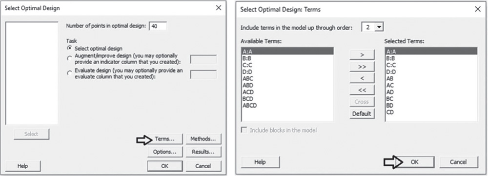
Investigators need to arrange the experiment in such a way that only 40 different combinations of factor levels will be tested. We proceed by reducing the previous full factorial design to obtain an optimal design with 40 runs.
To create an optimal factorial design, go to:
Stat > DOE > Factorial > Select Optimal Design
In Number of points in optimal design, specify 40. Click on Terms. In the next dialog box, under Include terms in the model up through order, specify 2, as we want to consider only the interactions between two factors. Click OK in each dialog box and Minitab shows the optimal design in a new worksheet (only the first five runs are shown here as an example), as well as some information in the session panel. Note that in the Session window you can check which of the 81 runs have been selected in the optimal design.
| ↓ | C1 | C2 | C3 | C4 | C5 | C6 | C7 | C8 | C9 |
| StdOrder | RunOrder | PtType | Blocks | A | B | C | D | ||
| 1 | 27 | 27 | 1 | 1 | 10 | 0.30 | 3.0 | 10 | |
| 2 | 63 | 63 | 1 | 1 | 40 | 0.00 | 3.0 | 10 | |
| 3 | 75 | 75 | 1 | 1 | 40 | 0.30 | 0.0 | 10 | |
| 4 | 52 | 52 | 1 | 1 | 25 | 0.30 | 3.0 | 0 | |
| 5 | 70 | 70 | 1 | 1 | 40 | 0.15 | 3.0 | 0 |
Optimal Design: A; B; C; D
Factorial design selected according to D‐optimality
Number of candidate design points: 81
Number of design points in optimal design: 40
Model terms: A; B; C; D; AB; AC; AD; BC; BD; CD
Initial design generated by sequential method
Initial design improved by exchange method
Number of design points exchanged is 1
Optimal Design
Row number of selected design points: 27; 63; 75; 52; 70; 76; 45; 51; 69; 80; 3; 8; 20; 56; 40; 15; 16; 22; 33; 34; 39; 44; 46; 50; 58; 64; 68; 6; 23; 1; 11; 29; 54; 72; 79; 7; 17; 32; 21; 78
To request two replicates of each run, go to:
Under Modification, choose Replicate design, then click on Specify. In the next dialog box, under Number of replicates to add, specify 1. Click OK in each dialog box and Minitab shows the replicated optimal design in the previous worksheet. The second replicates for each run will have the value 2 under the column Block.
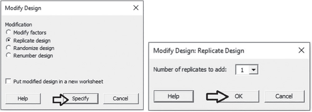
Before proceeding with the randomization, renumber the design by going to:
Under Modification, choose Renumber design, then click on Put the modified design in a new worksheet. Click OK in each dialog box and Minitab shows the replicated optimal design in a new worksheet.

Let's complete the creation of the optimal design with the randomization of the runs. Go to:
Under Modification, choose Randomize runs, then click on Specify. In the next dialog box, select Randomize entire design. Click OK in each dialog box and Minitab shows the randomized optimal design in the previous worksheet (only the first five runs are shown here as an example).

3.5.1.3 Step 3 – Assign the Designed Factor Level Combinations to the Experimental Units and Collect Data for the Response Variable
Collect the data for the response variables (reflectance measures) in the order set out in the column RunOrder in the optimal design. For example, the first formulation to test will be that with component A at level 40, component B at level 0.30, C at 0 and D at 10. Each formulation will be tested on two fabric specimens given we are considering two replicates. Note that the column “Blocks” has two values: 1 for the first replicate and 2 for the second.
Using a spectrophotometer, reflectance data (cleaning performance scores) will be measured in relation to several stains. To take into account the inherent variability in the measurement system, the cleaning performance for each stain will be measured at two different points on each fabric specimen. Remember that the individual measurements for each point on the piece of fabric are not replicates but repeated measurements because the two positions will be processed together in the experiment, receiving the same formulation simultaneously. Their average will be the response variable to analyze (Stat Tool 2.5).
Once all the designed factor level combinations have been tested, enter the recorded response values (cleaning performance scores) onto the worksheet containing the design. Now you are ready to proceed with the statistical analysis of the collected data.
3.5.2 Plan of the Statistical Analyses
The main focus of a statistical analysis of a general factorial design (Stat Tool 2.2) is to study in depth how several factors contribute to the explanation of a response variable and understand how the factors interact with each other. In a mature or reasonably well‐understood system, a second important objective is the optimization of the response, i.e. the search for those combinations of factor levels that are linked to desirable values of response variables.
The appropriate procedures to use for these purposes is the analysis of variance (ANOVA) (Stat Tool 2.7) and, when at least one factor is a quantitative variable, a response surface model, can help investigators to find a suitable approximation for the unknown functional relationship between factors and response variables. This is useful to identify regions of factor levels that optimize response variables.
If your general factorial design includes all categorical factors, then you can analyze it as shown in Chapter 2, section 2.2.2. If at least one factor is a quantitative variable as in the Stain Removal Project, proceed in the following way:
- Step 1 – Perform a descriptive analysis (Stat Tool 1.3) of the response variables.
- Step 2 – Fit a response surface model to estimate the effects and determine the significant ones.
- Step 3 – If need be, reduce the model to include the significant terms.
- Step 4 – Optimize the responses.
- Step 5 – Examine the shape of the response surface and locate the optimum.
For the Stain Removal Project, the dataset (File: Stain_Removal_Project.xlsx) opened in Minitab and containing two replicates for each formulation, i.e. for each combination of factor levels, and two repeated measurement for reflectance data on two stains (mustard and curry), appears as below.
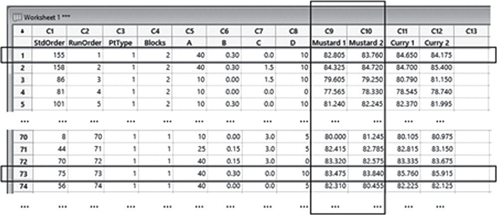
For example, records 1 and 73 represent two replicates of the formulation with component A at level 40, component B at level 0.30, C at 0 and D at 10. Columns C9 “Mustard 1” and C10 “Mustard 2” include the two repeated measurements for reflectance at two different positions on each fabric.
The variables setting is the following:
- Columns C1 to C4 are related to the previous creation of the optimal factorial design.
- Variables A, B, C, D are the quantitative factors, each assuming three levels.
- Variables from “Mustard 1” to “Curry 2” are quantitative variables, assuming values from 0 to 100.
| Column | Variable | Type of data | Label |
| C5 | A | Numeric data | Component A of the formulation with levels: 10, 25, 40 |
| C6 | B | Numeric data | Component B of the formulation with levels: 0, 0.15, 0.30 |
| C7 | C | Numeric data | Component C of the formulation with levels: 0, 1.5, 3 |
| C8 | D | Numeric data | Component D of the formulation with levels: 0, 5, 10 |
| C9 | Mustard 1 | Numeric data | Reflectance for mustard, first measurement from 0 to 100 |
| C10 | Mustard 2 | Numeric data | Reflectance for mustard, second measurement from 0 to 100 |
| C11 | Curry 1 | Numeric data | Reflectance for curry, first measurement from 0 to 100 |
| C12 | Curry 2 | Numeric data | Reflectance for curry, second measurement from 0 to 100 |
Stain_Removal_Project.xlsx
3.5.2.1 Step 1 – Perform a Descriptive Analysis of the Response Variables
Firstly calculate the average of the two repeated measurements for each stain, creating two new variables that will become the response variables to analyze.
To calculate the average of the two repeated measurements for each stain, go to: Calc > Calculator
In the dialog box, write the name of a new column “Mustard” in Store result in variable, and type the expression under Expression, selecting variables “Mustard 1” and “Mustard 2” from the list on the left and using the numeric keypad. The worksheet will include the new response variable “Mustard”. Do the same to create the new response variable “Curry.”

The responses are quantitative variables, so let's use a boxplot to represent how the cleaning performance scores occurred in our sample, and calculate means and measures of variability to complete the descriptive analysis of each response.
To display the boxplot, go to: Graph > Boxplot
As the two responses have the same measurement scale of 0 to 100, the two boxplots can be displayed in the same graph. To do this, under Multiple Y's, check the graphical option Simple and in the next dialog box select “Mustard” and “Curry” in Graph variables. Then click OK in the dialog box.

To change the appearance of a boxplot, use the tips in Chapter 2, Section 2.2.2.1 in relation to histograms, as well as the following ones:
- To display the boxplot horizontally: double‐click on any scale value on the horizontal axis. A dialog box will open with several options to define. Select from these options: Transpose value and category scales.
- To add the mean value to the boxplot: right‐click on the area inside the border of the boxplot, then select Add > Data display > Mean symbol.
To display the descriptive measures (means, measures of variability, etc.), go to:
In the dialog box, under Variables select “Mustard” and “Curry,” then click on Statistics to open a dialog box displaying a range of possible statistics to choose from. In addition to the default options, select Interquartile range, Range, and Coefficient of variation.

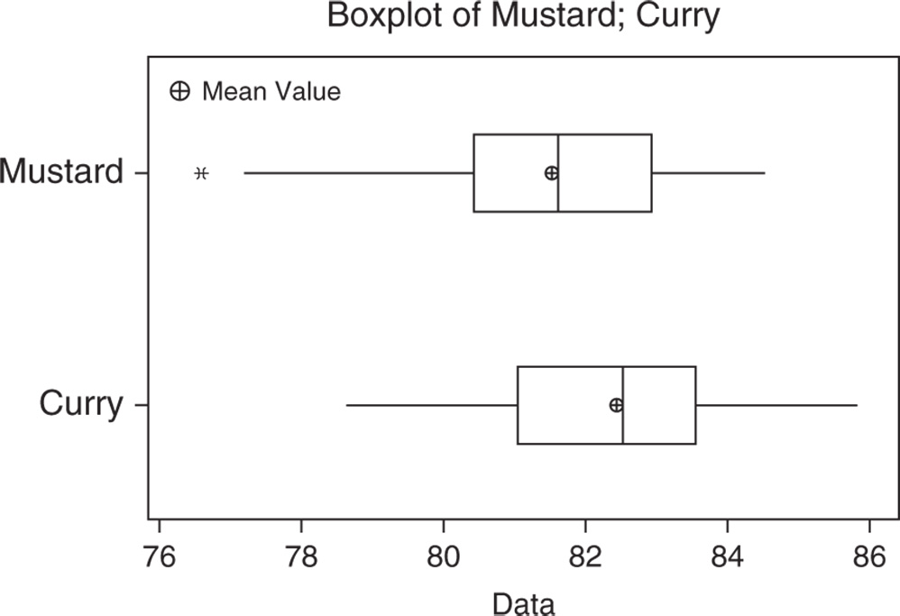
3.5.2.1.1 Interpret the Results of Step 1 Reflectance data is fairly symmetric for the curry stain and slightly skewed to the left with the presence of an outlier for the mustard stain (Stat Tools 1.4–1.5).
Regarding the central tendency, the mean and median overlap for cleaning performances on curry and mustard stains, with a higher mean value for curry (Stat Tools 1.6, 1.11).
With respect to variability, observing the length of the boxplots (ranges) and the width of the boxes (interquartile ranges, IQRs), the performance shows moderate spread for both stains. The average distance of the scores from the mean (standard deviation) is about 1.7/1.8, respectively, for Mustard and Curry (Stat Tools 1.9). Additionally, the coefficient of variation is about 2.1%/2.2% respectively for Mustard and Curry, confirming the similar spread of the cleaning scores for the two stains (Stat Tool 1.10).
Statistics
| Variable | N | N* | Mean | SE Mean | StDev | CoefVar | Minimum | Q1 | Median | Q3 | Maximum |
| Mustard | 80 | 0 | 81.509 | 0.187 | 1.676 | 2.06 | 76.567 | 80.426 | 81.594 | 82.926 | 84.523 |
| Curry | 80 | 0 | 82.403 | 0.196 | 1.754 | 2.13 | 78.610 | 81.043 | 82.535 | 83.548 | 85.837 |
| Variable | Range | IQR |
| Mustard | 7.955 | 2.500 |
| Curry | 7.227 | 2.505 |
3.5.2.2 Step 2 – Fit a Response Surface Model
When you have at least one quantitative factor in your general factorial design, you can analyze it by fitting a response surface model. We have added two new variables, “Mustard” and “Curry,” to the worksheet including the factorial design. Therefore, before analyzing it, we must specify our factors.
To define the response surface design, go to:
Under Continuous Factors, select the components A, B, C, D. If some of your factors are categorical, these must be specified under Categorical Factors. Click on Low/High. For each factor in the list, verify that the high and low settings are correct and if these levels are in the original units of the data, check the option Uncoded under Worksheet Data Are. Click OK in each dialog box. Now you are ready to analyze the response surface design.
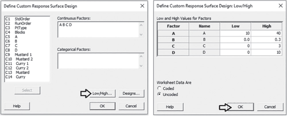
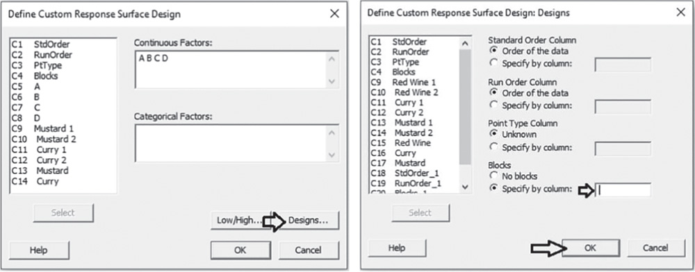
Note that in our example we don't have blocking factors (Stat Tool 2.4). Should there be any, in the main dialog box click on Designs. At the bottom of the screen, under Blocks, check the option Specify by column, and in the available space select the column representing the blocking variable.
Click OK in each dialog box. You would now be ready to analyze the response surface design.
To analyze the response surface design, go to:
Stat > DOE > Response Surface > Analyze Response Surface Design
Select the first response variable “Mustard” under Responses and click on Terms. At the top of the next dialog box, in Include the following terms, specify Full quadratic to study all main effects (both linear and quadratic effects) and the two‐way interactions between factors. As stated previously, we don't have blocking factors in our example (Stat Tool 2.4). If present, the grayed‐out Include blocks in the model option would be selectable to consider blocks in the analysis. Click OK and now choose Graphs in the main dialog box. Under Effects plots choose Pareto and Normal. These graphs help identify the terms (linear and quadratic factor effects and/or interactions) that influence the response and compare the relative magnitude of the effects, along with their statistical significance. Click OK in the main dialog box and Minitab shows the results of the analysis, both in the Session window and through the relevant graphs.

3.5.2.2.1 Interpret the Results of Step 2
Let us first consider the Pareto chart that shows which terms contribute the most to explaining the clinical performance on the mustard stain. Any bar extending beyond the reference line (considering a significance level equal to 5%) is related to a significant effect.
In our example, the main effects of three components B, C and D and their interactions are statistically significant at the 0.05 level. Also, the quadratic effect of factor B is marked as statistically significant.
From the Pareto chart, you can detect which effects are statistically significant, but you have no information on how these effects affect the response.
Use the normal plot of the standardized effects to evaluate the direction of the effects.
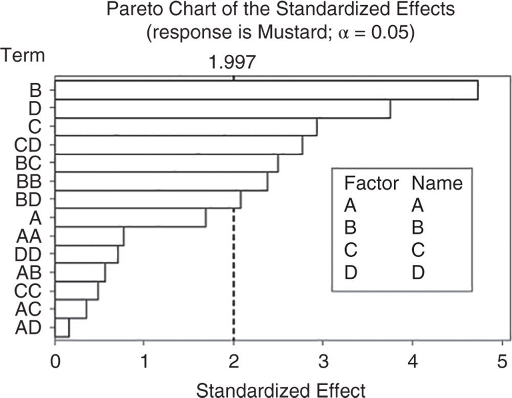

In the normal plot, the line represents the situation in which all the effects (main effects and interactions) are 0. Effects that are further from 0 and from the line are statistically significant. Minitab shows statistically significant and nonsignificant effects by giving different colors and shapes to the points. In addition, the plot indicates the direction of the effect. Positive effects (displayed on the right of the graph) increase the response when the factor moves from its low value to its high value.
Negative effects (displayed on the left of the line) decrease the response when moving from the factor's low value to its high value.
In our example, the main effects for B, C, D are statistically significant at the 0.05 level.
The cleaning scores seem to increase with higher levels of each component. Furthermore, the interactions between factor pairs are marked as statistically significant, but the interaction between components C and D lies on the left of the graph along with the quadratic effect of component B. We will clarify the meaning of this later.
In the ANOVA table we examine the p‐values to determine whether any factors or interactions, or the blocks if present, are statistically significant. Remember that the p‐value is a probability that measures the evidence against the null hypothesis. Lower probabilities provide stronger evidence against the null hypothesis.
For the main effects, the null hypothesis is that there is no significant difference in the mean performance score across levels of each factor. As we estimate a full quadratic model, we have two tests for each factor that analyze its linear and quadratic effect on the response.
For the two‐factor interactions, H0 states that the relationship between a factor and the response does not depend on the other factor in the term.
Usually we consider a significance level alpha equal to 0.05, but in an exploratory phase of the analysis, we may also consider a significance level equal to 0.10.
When the p‐value is greater than or equal to alpha, we fail to reject the null hypothesis. When it is less than alpha, we reject the null hypothesis and claim statistical significance.
So, setting the significance level alpha to 0.05, which terms in the model are significant in our example? The answer is: the linear effects of B, C, D; the two‐way interactions among these three components and the quadratic effect of B. Now, you may want to reduce the model to include only significant terms.
Response Surface Regression: Mustard versus A; B; C; D
Analysis of Variance
| Source | DF | Adj SS | Adj MS | F‐Value | p‐Value |
| Model | 14 | 120.882 | 8.6344 | 5.55 | 0.000 |
| Linear | 4 | 76.960 | 19.2400 | 12.36 | 0.000 |
| A | 1 | 4.452 | 4.4524 | 2.86 | 0.096 |
| B | 1 | 34.836 | 34.8358 | 22.39 | 0.000 |
| C | 1 | 13.436 | 13.4362 | 8.63 | 0.005 |
| D | 1 | 21.910 | 21.9097 | 14.08 | 0.000 |
| Square | 4 | 10.654 | 2.6635 | 1.71 | 0.158 |
| A*A | 1 | 0.948 | 0.9476 | 0.61 | 0.438 |
| B*B | 1 | 8.873 | 8.8726 | 5.70 | 0.020 |
| C*C | 1 | 0.375 | 0.3755 | 0.24 | 0.625 |
| D*D | 1 | 0.788 | 0.7881 | 0.51 | 0.479 |
| Two‐way interaction | 6 | 29.320 | 4.8866 | 3.14 | 0.009 |
| A*B | 1 | 0.506 | 0.5058 | 0.33 | 0.571 |
| A*C | 1 | 0.203 | 0.2035 | 0.13 | 0.719 |
| A*D | 1 | 0.039 | 0.0386 | 0.02 | 0.875 |
| B*C | 1 | 9.745 | 9.7450 | 6.26 | 0.015 |
| B*D | 1 | 6.758 | 6.7577 | 4.34 | 0.041 |
| C*D | 1 | 12.025 | 12.0251 | 7.73 | 0.007 |
| Error | 65 | 101.143 | 1.5560 | ||
| Lack‐of‐fit | 25 | 46.991 | 1.8796 | 1.39 | 0.174 |
| Pure error | 40 | 54.152 | 1.3538 | ||
| Total | 79 | 222.025 |
When you use statistical significance to decide which terms to keep in a model, it is usually advisable not to remove entire groups of nonsignificant terms at the same time. The statistical significance of individual terms can change because of other terms in the model. To reduce your model, you can use an automatic selection procedure, namely the stepwise strategy, to identify a useful subset of terms, choosing one of the three commonly used alternatives (standard stepwise, forward selection, and backward elimination).
3.5.2.3 Step 3 – If Need Be, Reduce the Model to Include the Significant Terms
To reduce the model, go to:
Select the numeric response variable “Mustard” under Responses and click on Terms. In Include the following terms, specify Full Quadratic, to study all main effects (both linear and quadratic effects) and the two‐way interactions between factors. Note that in our example we don't have blocking factors (Stat Tool 2.4). If present, the grayed‐out Include blocks in the model option would be selectable to consider blocks in the analysis. Click OK and in the main dialog box choose Stepwise. In Method select Backward elimination and in Alpha to remove specify 0.05, then click OK. In the main dialog box choose Graphs. Under Residual plots choose Four in one. Minitab will display several residual plots to examine whether your model meets the assumptions of the analysis (Stat Tools 2.8, 2.9). Click OK in the main dialog box.

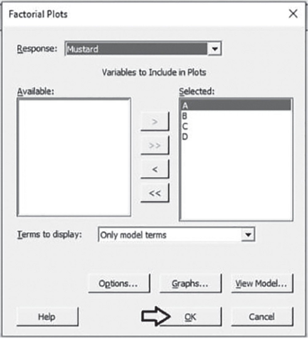
Complete the analysis by adding the factorial plots that show the relationships between the response and the significant terms in the model, displaying how the response mean changes as the factor levels or combinations of factor levels change.
To display factorial plots, go to:
3.5.2.3.1 Interpret the Results of Step 3 Setting the significance level alpha to 0.05, the ANOVA table shows the significant terms in the model. Take into account that the stepwise procedure may add nonsignificant terms in order to create a hierarchical model. In a hierarchical model, all lower‐order terms that comprise a higher‐order term also appear in the model.
Response Surface Regression: Mustard versus A; B; C; D
Backward Elimination of Terms
α to remove = 0.05
Analysis of Variance
| Source | DF | Adj SS | Adj MS | F‐Value | P‐Value |
| Model | 6 | 107.690 | 17.948 | 11.46 | 0.000 |
| Linear | 3 | 80.045 | 26.682 | 17.04 | 0.000 |
| B | 1 | 38.869 | 38.869 | 24.82 | 0.000 |
| C | 1 | 14.717 | 14.717 | 9.40 | 0.003 |
| D | 1 | 25.803 | 25.803 | 16.47 | 0.000 |
| Square | 1 | 9.038 | 9.038 | 5.77 | 0.019 |
| B*B | 1 | 9.038 | 9.038 | 5.77 | 0.019 |
| Two‐way interaction | 2 | 21.980 | 10.990 | 7.02 | 0.002 |
| B*C | 1 | 11.972 | 11.972 | 7.64 | 0.007 |
| C*D | 1 | 12.660 | 12.660 | 8.08 | 0.006 |
| Error | 73 | 114.336 | 1.566 | ||
| Lack‐of‐fit | 33 | 60.184 | 1.824 | 1.35 | 0.183 |
| Pure error | 40 | 54.152 | 1.354 | ||
| Total | 79 | 222.025 |
Note that in the ANOVA table, Minitab displays the lack‐of‐fit test when data contain replicates. This test helps investigators to determine whether the model accurately fits the data. Its null hypothesis states that the model accurately fits the data. As usual, compare the p‐value to your significant level α. If the p‐value is less than α, reject the null hypothesis and conclude that the lack of fit is statistically significant. If the p‐value is larger than α, you fail to reject the null hypothesis and you can conclude that the lack of fit is not statistically significant.
Model Summary
| S | R‐sq | R‐sq(adj) | R‐sq(pred) |
| 1.25150 | 48.50% | 44.27% | 37.37% |
In our example, the p‐value (0.183) is greater than 0.05: we conclude that there is no strong evidence of lack of fit. Lack‐of‐fit can occur if important terms such as interactions or quadratic terms are not included in the model or if the fitted model shows several, unusually large residuals (Stat Tool 2.9).
In addition to the results of the analysis of variance, Minitab displays some other useful information in the Model Summary table.
The quantity R‐squared (R‐sq, R2) is interpreted as the percentage of the variability among reflectance scores, explained by the terms included in the ANOVA model.
The value of R2 varies from 0 to 100%, with larger values being more desirable.
The adjusted R2 (R‐sq(adj)) is a variation of the ordinary R2 that is adjusted for the number of terms in the model. Use adjusted R2 for more complex experiments with several factors, when you want to compare several models with different numbers of terms.
The value of S is a measure of the variability of the errors that we make when we use the ANOVA model to estimate the reflectance scores. Generally, the smaller it is, the better the fit of the model to the data.
Before proceeding with the results reported in the Session window, take a look at the residual plots. A residual represents an error that is the distance between an observed value of the response and its estimated value by the ANOVA model. The graphical analysis of residuals based on residual plots helps you to discover possible violations of the ANOVA underlying assumptions (Stat Tools 2.8, 2.9).

A check of the normality assumption could be made by looking at the histogram of the residuals (bottom left), but with small samples, often the histogram has an irregular shape.
The normal probability plot of the residuals may be more useful. Here we can see a tendency of the plot to bend slightly upward on the right, but the plot is not in any case grossly non‐normal. In general, moderate departures from normality are of little concern in the ANOVA model with fixed effects.
The other two graphs (Residuals versus Fits and Residuals versus Order) seem unstructured, thus supporting the validity of the ANOVA assumptions.
Coded Coefficients
| Term | Coef | SE Coef | t‐Value | p‐Value | VIF |
| Constant | 81.801 | 0.249 | 328.05 | 0.000 | |
| B | 0.855 | 0.172 | 4.98 | 0.000 | 1.01 |
| C | 0.543 | 0.177 | 3.07 | 0.003 | 1.02 |
| D | 0.695 | 0.171 | 4.06 | 0.000 | 1.04 |
| B*B | –0.726 | 0.302 | –2.40 | 0.019 | 1.02 |
| B*C | 0.600 | 0.217 | 2.76 | 0.007 | 1.02 |
| C*D | –0.610 | 0.215 | –2.84 | 0.006 | 1.05 |
Regression Equation in Uncoded Units

Returning to the Session window, we find a table of coded coefficients followed by a regression equation in uncoded units.
In ANOVA, we have seen that many of the questions the experimenter wishes to answer can be solved by several hypothesis tests.
It is also helpful to present the results in terms of a regression model, i.e. an equation derived from the data that expresses the relationship between the response and the important design factors.
In the regression equation, we have a coefficient for each term in the model. They are expressed in uncoded units, i.e. in the original measurement units. These coefficients are also displayed in the Coded Coefficients table, but in coded units. Earlier, we learned how to examine the p‐values in the ANOVA table to determine whether a factor is statistically related to the response. In the Coded Coefficients table, we find the same results in terms of tests on coefficients and we can evaluate the p‐values to determine whether they are statistically significant. The null hypothesis states the absence of any effect on the response. Setting the significance level α at 0.05, if a p‐value is less than α, reject the null hypothesis and conclude that the effect is statistically significant.
Look at the factorial plots to better understand how the mean reflectance score varies as factor levels change.

The presence of the quadratic term B*B makes a curvature in the factorial plots involving component B. Considering the interaction B*C, the best result (the higher mean cleaning score) is obtained when B and C are increasing in value. For the interaction C*D, when C is equal to its highest level (3), the mean cleaning score does not vary much across levels of component D. When C is absent, the mean cleaning score tends to increase with increasing levels of D. Note that the interaction C*D lies on the left side of the normal plot of the standardized effects.

Now repeat steps 2 and 3 for the second response variable “Curry.” For brevity, we show only the reduced model with residual and factorial plots.
Response Surface Regression: Curry versus A; B; C; D
Backward Elimination of Terms
α to remove = 0.05
Analysis of Variance
| Source | DF | Adj SS | Adj MS | F‐Value | p‐Value |
| Model | 7 | 174.552 | 24.9361 | 26.20 | 0.000 |
| Linear | 4 | 134.193 | 33.5482 | 35.24 | 0.000 |
| A | 1 | 5.886 | 5.8857 | 6.18 | 0.015 |
| B | 1 | 57.281 | 57.2815 | 60.18 | 0.000 |
| C | 1 | 7.154 | 7.1544 | 7.52 | 0.008 |
| D | 1 | 59.144 | 59.1438 | 62.13 | 0.000 |
| Square | 1 | 5.807 | 5.8071 | 6.10 | 0.016 |
| B*B | 1 | 5.807 | 5.8071 | 6.10 | 0.016 |
| Two‐way interaction | 2 | 45.011 | 22.5055 | 23.64 | 0.000 |
| B*C | 1 | 18.653 | 18.6527 | 19.60 | 0.000 |
| C*D | 1 | 31.251 | 31.2506 | 32.83 | 0.000 |
| Error | 72 | 68.536 | 0.9519 | ||
| Lack‐of‐fit | 32 | 29.970 | 0.9366 | 0.97 | 0.529 |
| Pure error | 40 | 38.566 | 0.9642 | ||
| Total | 79 | 243.089 |
Model Summary
| S | R‐sq | R‐sq(adj) | R‐sq(pred) |
| 0.975651 | 71.81% | 69.06% | 65.43% |
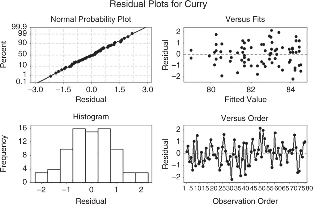

3.5.2.4 Step 4 – Optimize the Responses
After fitting the response surface models, additional analyses can be carried out to find the optimum set of formulation components that optimizes the response variables (Stat Tool 3.8).
To optimize the response variables, go to:
In the table, under Goal, select one of the following options for each response:
- Do not optimize: Do not include the response in the optimization process.
- Minimize: Lower values of the response are preferable.
- Target: The response is optimal when values meet a specific target value.
- Maximize: Higher values of the response are preferable.
In our case study, the goal is to maximize the reflectance data: choose Maximize from the drop‐down list and click Setup. In the next window you need to specify a response target and lower or upper bounds, depending on your goal. Minitab automatically sets the Lower value and the Upper value to the smallest and largest values in the data, but you can change these values depending on your response goal (Stat Tool 3.8).
- If your goal is to maximize the response (larger is better), you need to specify the lower bound and a target value. You may want to set the lower value to the smallest acceptable value and the target value at the point of diminishing returns, i.e. a point at which going above its value does not make much difference. If there is no point of diminishing returns, use a very high target value.
- If your goal is to target a specific value, you should set the lower value and upper value as points of diminishing returns.
- If the goal is to minimize (smaller is best), you need to specify the upper bound and a target value. You may want to set the upper value to the largest acceptable value and the target value at the point of diminishing returns, i.e. a point at which going below its value does not make much difference. If there is no point of diminishing returns, use a very small target value.
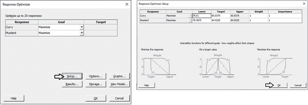
In our example, we leave the default values with the lower bound set to the minimum for each response and the target and upper values set to the maximum.
Note that in the process of response optimization, Minitab calculates and uses desirability indicators from 0 to 1 to represent how well a combination of factor levels satisfies the goals you have for the responses. Specifying a different weight varying from 0.1 to 10, you can emphasize or deemphasize the importance of attaining the goals. Furthermore, when you have more than one response, Minitab calculates individual desirabilities for each response and a composite desirability for the entire set of responses. With multiple responses, you may assign a different level of importance to each response by specifying how much effect each response has on the composite desirability.
In our example, leave Weight and Importance equal to 1 and click OK. In the main dialog box, select Results and in Number of solutions to display, specify 5. Click OK in each dialog box. In the optimization plot, Minitab will display the optimal solution, that is the factor setting which maximizes the composite desirability, while in the Session window we will find a list of five different factor combinations close to the optimal one, which is the first on the list.

The optimization plot shows how different factor settings affect the responses. The vertical red lines on the graph represent the current factor settings. The numbers displayed at the top of a column show the current factor level settings (in red). The horizontal blue lines and numbers represent the responses for the current factor level. The optimal solution is plot on the graph and serves as the initial point. The settings can then be modified interactively, to determine how different combinations of factor levels affect responses, by moving the red vertical lines corresponding to each factor. To return to the initial settings, right‐click and select Navigation and then Reset to Initial Settings.
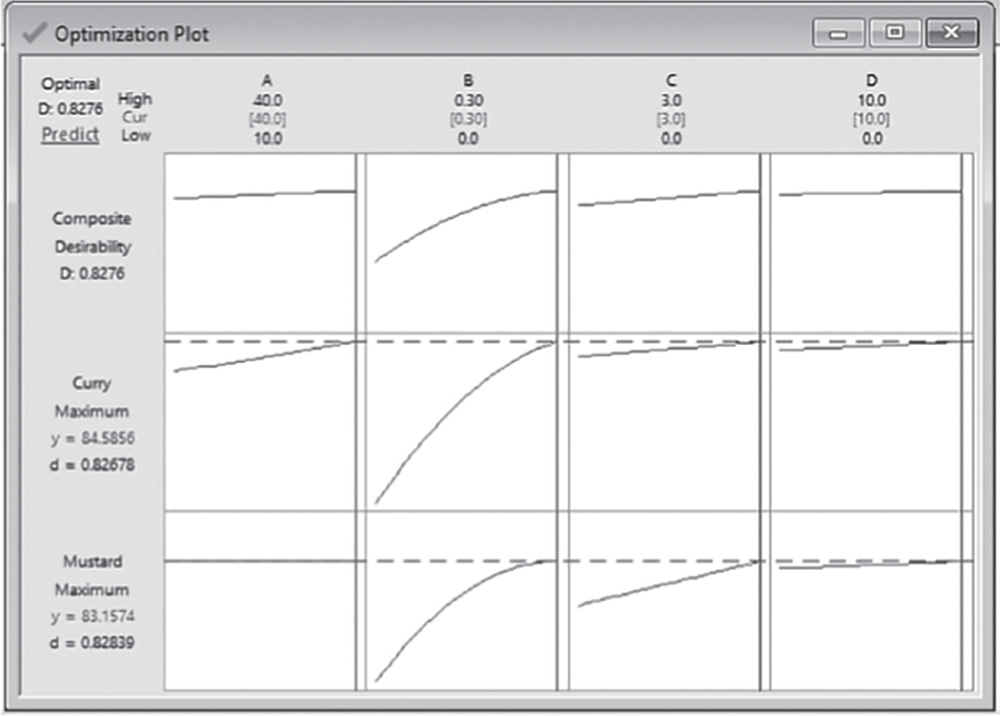
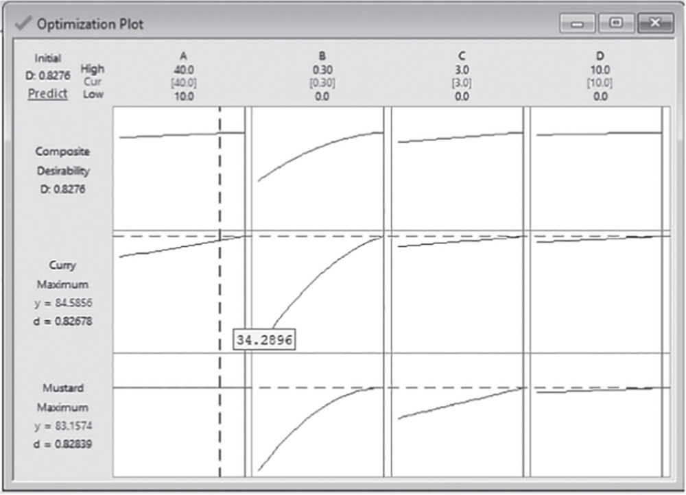
3.5.2.4.1 Interpret the Results of Step 4 The optimization plot is a useful tool to explore the sensitivity of response variables to changes in the factor settings and in the vicinity of a local solution – for example, the optimal one.
Response Optimization: Curry; Mustard
Parameters
| Response | Goal | Lower | Target | Upper | Weight | Importance |
| Curry | Maximum | 78.6100 | 85.8375 | 1 | 1 | |
| Mustard | Maximum | 76.5675 | 84.5225 | 1 | 1 |
Solutions
| Curry | Mustard | Composite | |||||
| Solution | A | B | C | D | Fit | Fit | Desirability |
| 1 | 40.0000 | 0.300000 | 3.00000 | 10 | 84.5856 | 83.1574 | 0.827588 |
| 2 | 39.5859 | 0.300000 | 3.00000 | 10 | 84.5763 | 83.1574 | 0.826945 |
| 3 | 39.2871 | 0.300000 | 3.00000 | 10 | 84.5696 | 83.1574 | 0.826481 |
| 4 | 39.2056 | 0.300000 | 3.00000 | 10 | 84.5678 | 83.1574 | 0.826354 |
| 5 | 40.0000 | 0.240593 | 2.80211 | 10 | 84.2634 | 83.0032 | 0.795500 |
Multiple Response Prediction
| Variable | Setting |
| A | 40 |
| B | 0.3 |
| C | 3 |
| D | 10 |
| Response | Fit | SE Fit | 95% CI | 95% PI |
| Curry | 84.586 | 0.344 | (83.901; 85.271) | (82.524; 86.648) |
| Mustard | 83.157 | 0.419 | (82.322; 83.993) | (80.527; 85.788) |
The Session window displays:
- Information about the boundaries, weight, and importance for each response variable (Parameters).
- The factor settings, the fitted responses, and the composite desirability for the required 5 solutions. The first in the list is the optimal solution (Solutions).
- The factor settings for the optimal solution and the fitted responses with their confidence intervals (Stat Tool 1.14) and prediction intervals (Multiple Response Prediction).
For reflectance data, the optimal solution is the formulation with component A set to 40, B to 0.30, C to 3, and D to 10. For this setting, the fitted response is equal to 84.59 (95% CI: 83.90–85.27) for the Curry stain and 83.16 (95% CI: 82.32–83.99) for Mustard. The composite desirability (0.83) is reasonably close to 1, denoting a satisfactory overall achievement of the specified goals.
3.5.2.5 Step 5 – Examine the Shape of the Response Surface and Locate the Optimum
Once investigators have found the optimal solutions, it is usually convenient to study the response surface in the vicinity of these points. Graphic techniques such as contour, surface, and overlaid plots help you to examine the shape of the response surface in regions of interest. Through these plots, you can explore the potential relationship between pairs of factors and the responses. You can display a contour, a surface, or an overlaid plot considering two factors at a time, while setting the remaining factors to predefined levels. With contour and surface plots, you consider a single response; in overlaid plots, you consider all the responses together.
To display the contour plots, go to: Stat > DOE > Response Surface > Contour Plot
In the dialog box, select the first response “Mustard” in Response, and check the option Generate plots for all pairs of continuous variables. Click Contours, and under Data Display, choose Contour lines. Click OK and in the main dialog box and select Settings. Set the factors at levels shown in the first optimal solution found previously in the Response Optimizer (A = 40, B = 0.30, C = 3, D = 10). Remember that for the response Mustard, only three components B, C, D showed a significant relationship with this response. For this reason, in the window Contour Plot: Settings, you must specify values only for these three factors. Click OK in each dialog box. Do the same for the response variable “Curry.”

To display the surface plots, go to: Stat > DOE > Response Surface > Surface Plot
In the dialog box, select the first response “Mustard” in Response, and check the option Generate plots for all pairs of continuous variables. Then click Settings, and set the factors at levels shown in the first optimal solution found previously in the Response Optimizer (A = 40, B = 0.30, C = 3, D = 10). Click OK in each dialog box. Do the same for the response variable “Curry.”
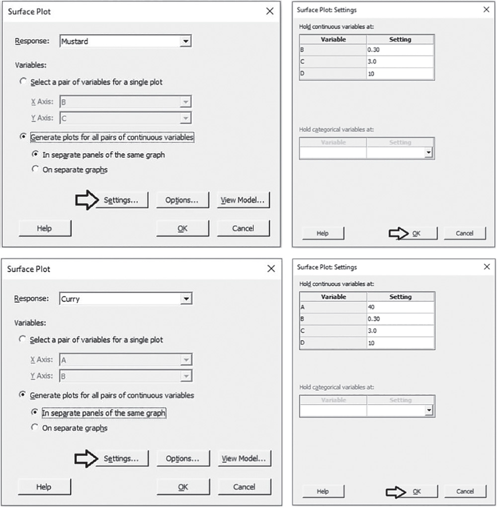
To change the appearance of the surface plots, double‐click on any point inside a surface. In Attributes, under Surface Type, select the option Wireframe instead of the default Surface.
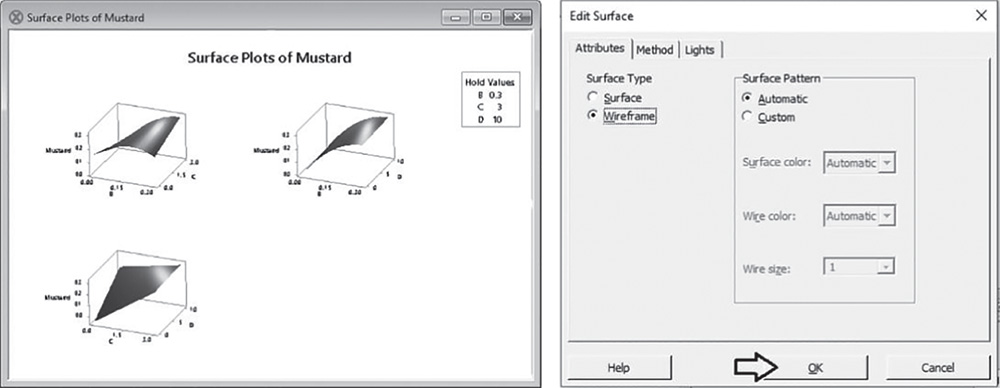
To display the overlaid plots, go to: Stat > DOE > Response Surface > Overlaid Contour Plot
Select all the responses and click Contours. Note that we are building the overlaid contour plot for the pair A and B. In the next window, for each response, you need to define a low and a high contour, depending on your goal for the responses. For example, you may want to set the Low value and the High value at the points of diminishing returns, or you can simply consider the fitted response values obtained with the optimal solution and specify two points close to the fitted values. In step 4, the fitted response values for the optimal solution were 83.157 for Mustard and 84.586 for Curry. Specify the interval 82–84 for Curry and 81–83 for Mustard as Contours and then click OK. In the main dialog box, select Settings. Set the remaining factors (C and D) at levels shown in the first optimal solution found previously in the Response Optimizer (A = 40, B = 0.30, C = 3, D = 10). Click OK in each dialog box. Repeat the process for the other factor pairs to create all overlaid contour plots.
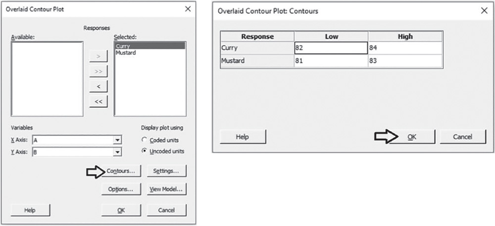

3.5.2.5.1 Interpret the Results of Step 5 Contour and surface plots are useful tools to explore how a response variable changes while increasing or decreasing in factor levels. In contour plots, two factors are plotted on the x‐ and y‐ axes and the reflectance performance is represented by different level curves, while the remaining factors are set to predefined levels (Hold values). Double‐click on any point in the frame and select Crosshairs to interactively view variations in the response. In surface plots the reflectance performance is represented by a smooth surface.
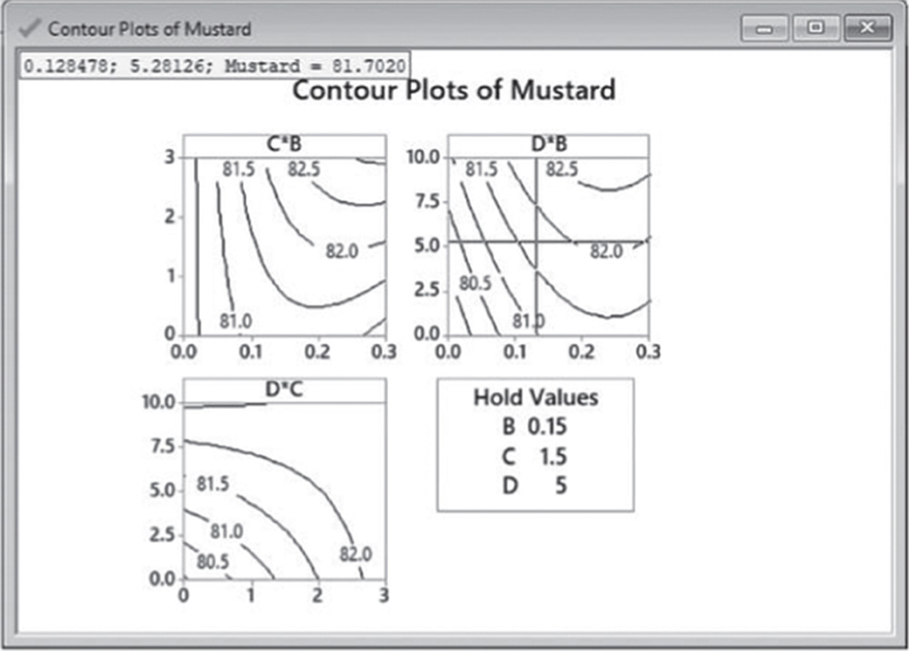
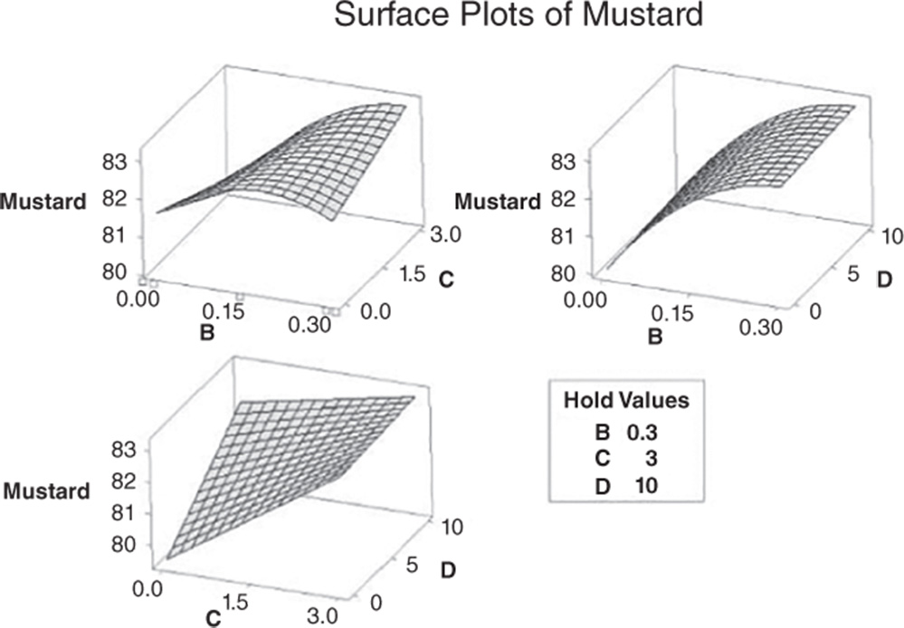
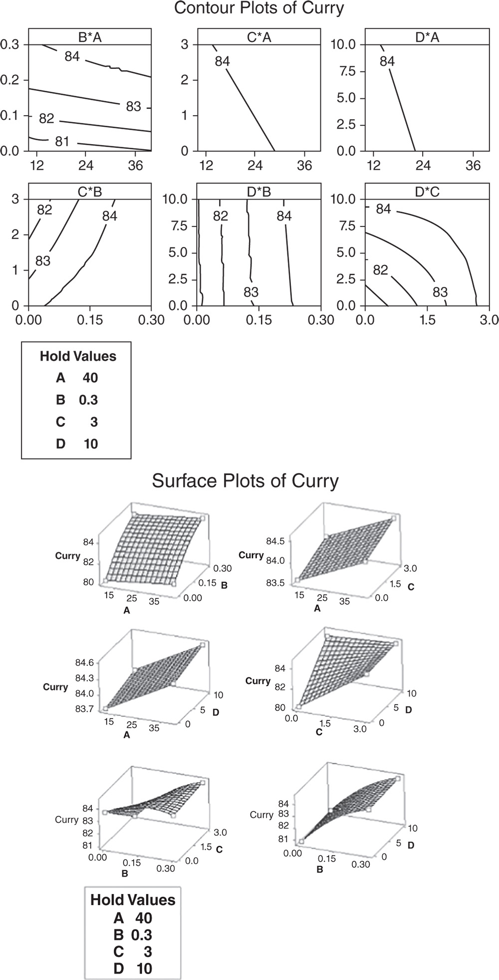
In overlaid contour plots we simultaneously consider both responses in order to explore factor settings that to a certain extent optimize all responses or keep them in desired ranges of values. Remember that Minitab builds an overlaid contour plot for each factor pair. For brevity, here we show only one of these plots, namely that related to factors C and D, respectively plotted on the x‐ and y‐axes.
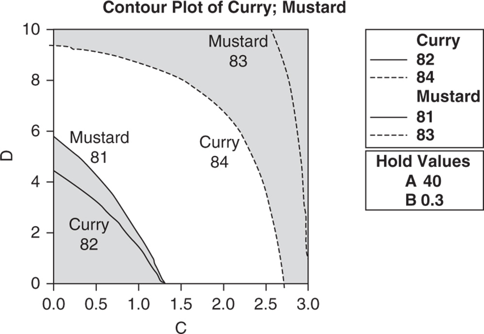
Double‐click on any point in the frame and select Crosshairs to interactively view variations in the responses. The white region shows the ranges of values for component C and D where the criteria (low and high boundaries previously defined in the Settings dialog box) are satisfied for both response variables.
..................Content has been hidden....................
You can't read the all page of ebook, please click here login for view all page.