2
The Screening Phase
2.1 Introduction
In the initial stages of development of a new consumer product, a team is generally faced with many options and it is difficult to screen without the risk of missing opportunities to find preferred consumer solutions. When making crucial decisions regarding the next steps to take in product development, it is important to identify suitable statistical tools. Such tools make it possible to combine scientific expertise with data analytics capability and to support the understanding of each factor's relevance in providing an initial indication of possible synergistic effects among different factors. This can generally be achieved with relatively simple techniques, such as factorial designs, and analysis of the results through ANOVA (ANalysis Of VAriance).
This chapter is a guide for developers to properly organize a factorial experimental design through proper randomization, blocking, and replication (Anderson, M. J. and Whitcomb, P. J., 2015). It also provides suggestions on how to reduce variability and analyze data to achieve the best outcome.
A concrete example of product development is provided, looking at an air freshener and consumer preferences regarding constituent oils.
Specifically, this chapter deals with the following:
| Topics | Stat tools |
| Introduction to DOE (Design Of Experiments) and guidelines for planning and conducting experiments | 2.1, 2.6 |
| Factors, levels, and responses | 2.1 |
| Screening experiments and factorial designs | 2.2 |
| Basic principles of factorial designs (randomization, blocking, replication) | 2.3, 2.4, 2.5 |
| ANOVA (ANalysis Of VAriance) | 2.7 |
| Model assumptions for ANOVA | 2.8 |
| Residual analysis | 2.9 |
2.2 Case Study: Air Freshener Project
An air freshener project aims to introduce a new scented oil to provide consistent and long‐lasting fragrance to homes. Six oils have to be tested to determine if there are any consumer perceived differences among different combinations of the fragrances. Expert panelists will test different combinations of oils by assigning them a liking score varying from 1 (dislike extremely) to 5 (like extremely). We need to plan and analyze an experimental study in order to identify which oils affect consumers' preferences.
2.2.1 Plan of the Screening Experiment
During an experiment, investigators select some factors to systematically vary in order to determine their effect on a response variable (Stat Tool 2.1). For the present study:
- The six oils represent the key factors.
- The liking score represents the response variable.
Suppose we know very little about consumers' preferences in relation to these oils and their combinations. At the beginning of an experimental study, if researchers have to investigate many factors, screening experiments based on factorial designs considering k factors, each at only two levels, are widely used to identify the key factors affecting responses. This also reduces the number of experimental conditions to test (also called runs). These designs are called two‐level factorial designs (Stat Tool 2.2) and may be:
- Full (all combinations of the factors' levels are tested);
- Fractional (only a subset of all combinations is tested).
With fractional factorial designs, the experimenter can further reduce the number of runs to test, if they can reasonably assume that certain high‐order interactions among factors are negligible.
In our example, as the number of potential input factors (the six oils) is large, we consider a two‐level factorial design selecting the two levels: “absent” and “present” for each oil.
We will initially construct a full factorial design and then a fractional design in order to reduce the number of runs.
As two expert panelists will test the selected combinations of oils, assigning them a liking score from 1 to 5, panelists represent a blocking factor with two levels (Stat Tool 2.4): each panelist is a block.
Blocking is a technique for dealing with known and controllable nuisance factors, i.e. variables that probably have some effect on the response but are of no interest to the experimenter. Nuisance factors' levels are called blocks.
When feasible, the experiment should include at least two replicates of the design, i.e. the researcher should run each factor level combination at least twice. Replicates are multiple independent executions of the same experimental conditions (Stat Tool 2.5). As we have two blocks (the two panelists), this leads us to have two replicates of each run.
To create the design for our screening experiment, let's proceed in the following way:
- Step 1 – Create a full factorial design.
- Step 2 – Alternatively, choose the desired fractional design.
- Step 3 – Assign the designed combinations of factor levels to the experimental units and collect data for the response variable.
2.2.1.1 Step 1 – Create a Full Factorial Design
Let's begin to create a full factorial design, considering two levels (absent/present) for each factor and a blocking factor with two blocks (the two panelists).
 To create a full factorial design, go to:
Choose 2‐level factorial (default generators) and in Number of factors, specify 6. Click on Designs. In the next dialog box, select Full Factorial. You can see that this design will include 64 factor‐level combinations. In Number of replicates for corner points and in Number of blocks, specify 2. Click OK, and in the main dialog box select Factors. Enter the names of the factors (Oil1 to Oil6); select Text in Type as they are categorical variables, and specify NO and YES in Low and High to represent respectively the “absence” and the “presence” of each factor.
Proceed by clicking Options in the main dialog box and check the option Randomize runs, so that both the allocation of the experimental units and the order of the individual runs will be randomly performed (Stat Tool 2.3). Clicking OK in the main dialog box, Minitab shows the design of the experiment in the worksheet (only the first five runs are shown here as an example), adding some extra columns that are useful for the statistical analysis, and some information on the design in the Session window.


2.2.1.2 Step 2 – Alternately, Choose the Desired Fractional Design
Suppose we need to construct a fractional design to reduce the number of runs to test.
To create a fractional factorial design, go to:
Choose 2‐level factorial (default generators) and in Number of factors specify 6. Click on Designs. In the next dialog box, you can select three types of fractional designs, respectively, with 8, 16, and 32 runs for each block. These designs correspond to specific fractions of the full design (e.g. 1/8, 1/4, or 1/2 fraction). Fractional designs can't estimate all the main effects and interactions among factors separately from each other: some effects will be confused (aliased) to other effects. The way in which the effects are aliased is described by the so‐called “Design Resolution.” By choosing fractional designs that have the highest resolution, the experimenter can usually obtain information on the main effects and low‐order interactions, while assuming that certain high‐order interactions are negligible. In our case, let's select, for example, a 1/2 fraction design of Resolution VI. You can see that this design will include 32 factor‐level combinations for each block. In Number of replicates for corner points and in Number of blocks specify 2. Click OK, and in the main dialog box select Factors. Enter the names of the factors (Oil1 to Oil6); select Text in Type, as they are categorical variables, and specify NO and YES in Low and High to represent, respectively, the “absence” and the “presence” of each factor.
Proceed by clicking Options in the main dialog box and check the option Randomize runs as before. Clicking OK in the main dialog box, Minitab shows the design in a new worksheet and more information is in the session panel. Note that for the fractional design, in the Session window the alias structure lists the aliasing between main effects and interaction. For example, A + BCDEF means that factor A (Oil1) is aliased with the four‐order interaction BCDEF; we will estimate the effect of (A + BCDEF), but if we can reasonably assume that the interaction BCDEF is negligible, we will assign the total estimate of the effect to the main effect A.

2.2.1.3 Step 3 – Assign the Designed Factor Level Combinations to the Experimental Units and Collect Data for the Response Variable
For each block, collect the data for the response variable following the order provided by the column RunOrder in the full or fractional design. For example, in the full factorial design created in step 1, the second panelist (Blocks = 2) will first test the fragrance where Oil2 and Oil5 are present, while Oil1, Oil3, Oil4, and Oil6 are absent. The two panelists will test each run by assigning it a liking score, varying from 1 (dislike extremely) to 5 (like extremely). Once all the designed factor‐level combinations have been tested, enter the recorded response values (liking scores) into the worksheet containing the design. The worksheet will be like the one below (only the first five records are shown here as an example for the fractional design obtained in step 2). Now you are ready to proceed with the statistical analysis of the collected data, but before doing this, have a look at Stat Tool 2.6 to get a summary overview of the main aspects of the design and analysis of experiments.

2.2.2 Plan of the Statistical Analyses
The main interest in the statistical analysis of a screening experiment is to detect which factors (if any) show a significant contribution to the explanation of the response variable and also something about how the factors interact. For each factor, it is possible to evaluate if the mean response varies between the two factor levels, taking into account the effect of other factors on the response. The appropriate procedure to use for this purpose is the ANOVA (Stat Tool 2.7).
Let's consider the fractional design obtained in step 2 (Section 2.2.1) and suppose to have collected the response data (File: Air_freshener_Project.xlsx). Remember that if the experimenter can reasonably assume that certain high‐order interactions are negligible, a fractional design can give useful information on the main effects and low‐order interactions. The factors identified as important through the statistical analysis of collected data will then be investigated more thoroughly in subsequent experiments.
To analyze our screening experiment, let's proceed in the following way:
- Step 1 – Perform a descriptive analysis (Stat Tool 1.3) of the response variable.
- Step 2 – Apply the ANOVA to estimate the effects and determine the significant ones.
- Step 3 – If required, reduce the model to include the significant terms.
The variables setting is the following:
- Columns from C1 to C3 are related to the previous creation of the fractional factorial design.
- Column C4 is the blocking factor, assuming values 1 and 2.
- Variables OIL1–OIL6 are the categorical factors, each assuming two levels.
- Variable “Response” is the response variable, assuming values from 1 to 5.
| Column | Variable | Type of data | Label |
| C4 | Block | Numeric data | Blocking factor representing the two panelists 1 and 2 |
| C5–C10 | OIL1–OIL6 | Categorical data | The six oils for fragrances, each with levels: NO, YES |
| C11 | Response | Numeric data | The liking score, varying from 1 to 5 |
Air_freshener_Project.xlsx
2.2.2.1 Step 1 – Perform a Descriptive Analysis of the Response Variable
As the response is a quantitative variable, use a dotplot (recommended for small samples with less than 50 observations) or a histogram (for moderate or large datasets with a sample size greater than 20) to describe how the liking scores occurred in our sample. Add a boxplot (for moderate or large datasets) and calculate means and measures of variability to complete the descriptive analysis of the response.
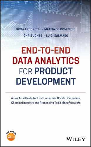
To display the histogram, go to: Graph > Histogram
Check the graphical option Simple, and in the next dialog box select “Response” in Graph variables. Then, select the option Scale and in the next screen Y‐Scale Type to display percentages in the histogram. Then click OK in the main dialog box.
To change bar width and number of intervals, double‐click on any bar and select the Binning tab. A dialog box will open with several options to define. Specify 5 in Number of intervals and click OK.

Use the following tips to change the appearance of the histogram:
- To change the scale of the horizontal axis: double‐click on any scale value on the horizontal axis. A dialog box will open with several options to define.
- To change the scale of the vertical axis: double‐click on any scale value on the vertical axis. A dialog box will open with several options to define.
- To change the width and number of intervals of the bars: double‐click on any bar and then select the Binning tab. A dialog box will open with several options to define.
- To change the graph window (background and border): double‐ click on the area outside the border of the histogram. A dialog box will open with several options to define.
- To add reference lines: right‐click on the area inside the border of the boxplot, then select Add > Data display > Mean symbol.
- To change the title, labels, etc.: double‐click on the object to change. A dialog box will open with several options to define.
- To insert a text box, lines, points, etc.: from the main menu at the top of the session window, go to Tools > Toolbars > Graph Annotation Tools the Session window.

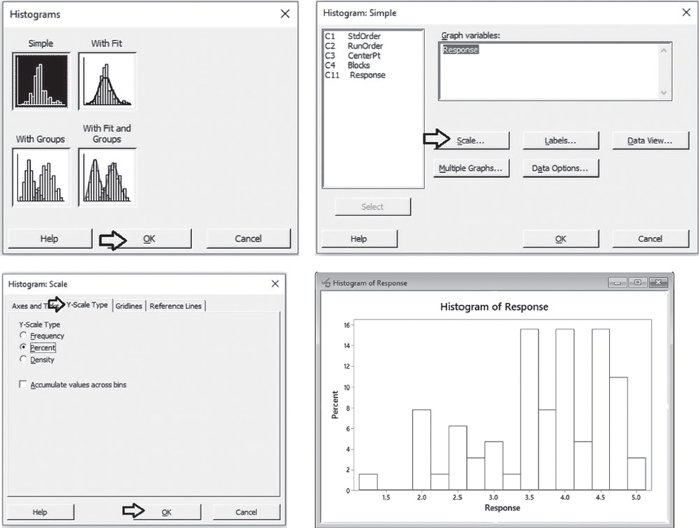
To display the boxplot, go to: Graph > Boxplot
Check the graphical option Simple and in the next dialog box, select “Response” in Graph variables. Then click OK in the main dialog box.
To change the appearance of a boxplot, follow the tips provided for histograms, as well as the following:
- To display the boxplot horizontally: double‐click on any scale value on the horizontal axis. A dialog box will open with several options to define. Select from these options: Transpose value and category scales.
- To add the mean value to the boxplot: right‐click on the area inside the border of the boxplot, then select Add > Data display > Mean symbol.
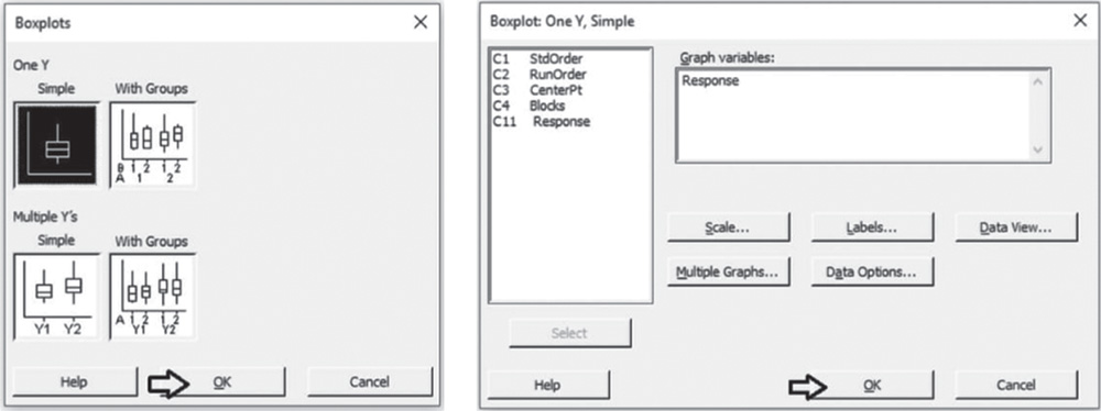
To display the descriptive measures (means, measures of variability, etc.), go to:
Select “Response” in Variables, then click on Statistics to open a dialog box displaying a range of possible statistics to choose from. Leave the default options and select Interquartile range and Range.
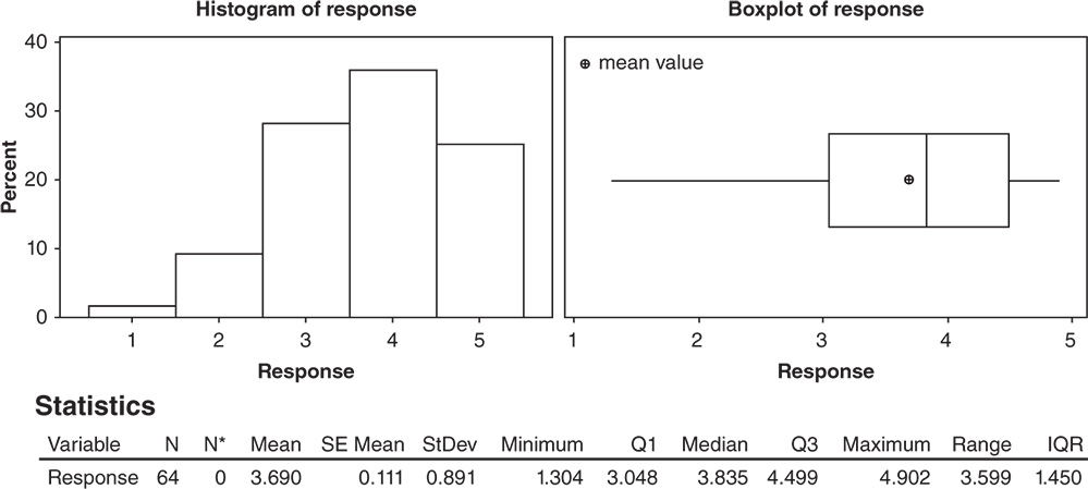
2.2.2.1.1 Interpret the Results of Step 1
Let's describe the shape, central, and non‐central tendency and variability of the distribution of the liking scores, presented in the histogram and boxplot below.
Shape: The distribution of the liking scores is skewed to the left: middle and high scores are more frequent than low scores (Stat Tools 1.4–1.5, 1.11).
Central tendency: The central tendency (the median score) is equal to 3.8: about 50% greater than or equal to 3.8. The mean is equal to 3.69. Mean and median are quite close in value (Stat Tools 1.6, 1.11).
Non‐central tendency: 25% of the scores are less than 3.0 (first quartile Q1) and 25% are greater than 4.5 (third quartile Q3) (Stat Tools 1.7, 1.11).
Variability: Observing the length of the boxplot (range) and the width of the box (interquartile range, IQR), the distribution shows high variability. Its scores vary from 1.3 (minimum) to 4.5 (maximum). 50% of middle evaluations vary from 3.0 to 4.5 (IQR = maximum observed difference between evaluations equal to 1.5) (Stat Tools 1.8, 1.11).
The average distance of the scores from the mean (standard deviation) is 0.89: Scores vary on average from (3.69–0.89) = 2.80 to (3.69 + 0.89) = 4.58 (Stat Tool 1.9).
2.2.2.2 Step 2 – Apply the Analysis of Variance to Estimate the Effects and Determine the Significant Ones
The appropriate procedure to analyze a factorial design is the ANOVA (Stat Tool 2.7).
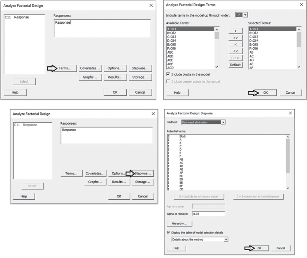
To analyze the screening design, go to:
Select the numeric response variable Response and click on Terms. At the top of the next dialog box, in Include terms in the model up through order, specify 2 to study all main effects and the two‐way interactions. Select Include blocks in the model to consider blocks in the analysis. Click OK and in the main dialog box, choose Graphs. In Effects plots, choose Pareto chart and Normal Plot. These graphs help you identify the terms (factors and/or interactions) that influence the response and compare the relative magnitude of the effects, along with their statistical significance. Click OK in the main dialog box and Minitab shows the results of the analysis both in the session window and through the required graphs.


2.2.2.2.1 Interpret the Results of Step 2 Let us first consider the Pareto chart that shows which terms contribute the most to explain the response. Any bar extending beyond the reference line (considering a significance level equal to 5%) is related to a significant effect.
In our example, the main effects for Oil2 and Oil5 are statistically significant at 0.05. Furthermore, the interaction between Oil4 and Oil5 is marked as statistically significant, while the interaction between Oil4 and Oil6 is nearly significant. From the Pareto chart, you can detect which effects are statistically significant but you have no information on how these effects affect the response.
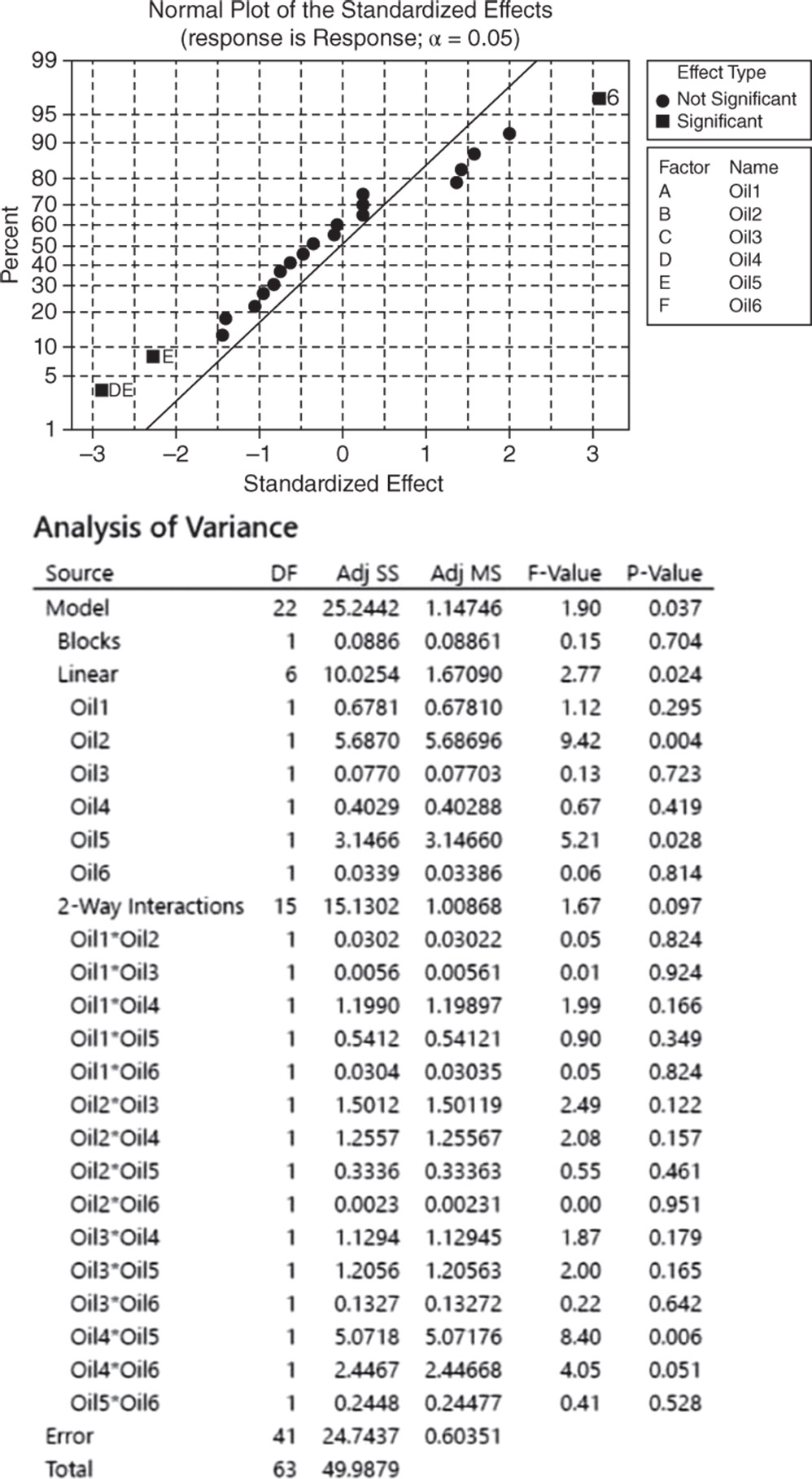
Use the normal plot of the standardized effects to evaluate the direction of the effects. In this case, the line represents the situation in which all the effects (main effects and interactions) are 0. Effects that depart from 0 and from the line are statistically significant. Minitab shows statistically significant and nonsignificant effects by giving the points different colors and shapes. In addition, the plot indicates the direction of the effect. Positive effects (displayed on the right side of the line) increase the response when the factor moves from its low value to its high value. Negative effects (displayed on the left side of the graph) decrease the response when moving from the low value to the high value.
In our example, the main effects for Oil2 and Oil5 are statistically significant. The low and high levels represent the absence and presence of the specific oil; therefore, the liking scores seem to increase when Oil2 is present and Oil5 is absent. Furthermore, the interaction between Oil4 and Oil5 is marked as statistically significant.
In the ANOVA table we examine p‐values to determine whether any factors or interactions, or even the blocks, are statistically significant. Remember that the p‐value is a probability that measures the evidence against the null hypothesis. Lower probabilities provide stronger evidence against the null hypothesis. For the main effects, the null hypothesis is that there is not a significant difference in the mean liking score across each factor's low level (absence) and high level (presence). For the two‐factor interactions, H0 states that the relationship between a factor and the response does not depend on the other factor in the term. With respect to the blocks, the null hypothesis is that the two panelists do not change the response. Usually we consider a significance level alpha equal to 0.05, but in an exploratory phase of the analysis we may also consider a significance level of 0.10.
When the p‐value is greater than or equal to alpha, we fail to reject the null hypothesis. When it is less than alpha, we reject the null hypothesis and claim statistical significance.
So, setting the significance level α = 0.05, which terms in the model are significant in our example? The answer is: Oil2, Oil5 and the interaction between Oil4 and Oil5. Now you may want to reduce the model to include only significant terms.
When using statistical significance to decide which terms to keep in a model, it is usually advisable not to remove entire groups of terms at the same time. The statistical significance of individual terms can change because of the terms in the model. To reduce your model, you can use an automatic selection procedure – the stepwise strategy – to identify a useful subset of terms, choosing one of the three commonly used alternatives (standard stepwise, forward selection, and backward elimination).
2.2.2.3 Step 3 – If Required, Reduce the Model to Include the Significant Terms
To reduce the model, go to:
Select the numeric response variable Response and click on Terms. In Include terms in the model up through order, specify 2 to study all main effects and the two‐way interactions. Select Include blocks in the model to consider blocks in the analysis. Click OK and in the main dialog box, choose Stepwise. In Method select Backward elimination and in Alpha to remove specify 0.05, then click OK. In the main dialog box, click Options and in the next dialog box specify in Means table: All terms in the model. Minitab will display the estimated means for the significant effects in the output. Click OK, and in the main dialog box, choose Graphs. Under Residual plots choose Four in one. Minitab will display several residual plots to examine whether your model meets the assumptions of the analysis (Stat Tools 2.8 and 2.9). Click OK in the main dialog box.

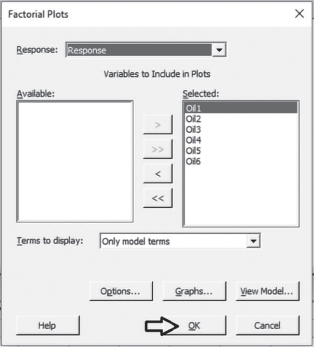
Complete the analysis by adding the factorial plots that show the relationships between the response and the significant terms in the model, thus displaying how the response mean changes as the factor levels or combinations of factor levels change.
To display factorial plots, go to:
2.2.2.3.1 Interpret the Results of Step 3
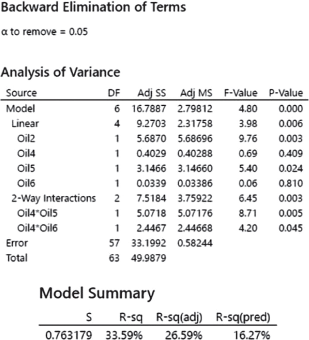
Setting the significance level alpha to 0.05, the ANOVA table shows the significant terms in the model. Take into account that the stepwise procedure may add nonsignificant terms in order to create a hierarchical model. In a hierarchical model, all lower‐order terms that comprise higher‐order terms also appear in the model. You can see, for example, that the model includes the nonsignificant terms Oil4 and Oil6, because their interaction is present and also significant.
In addition to the results of the ANOVA, Minitab displays some other useful information in the Model Summary table.
The quantity R‐squared (R‐sq, R2) is interpreted as the percentage of the variability among liking scores, explained by the terms included in the ANOVA model.
The value of R2 varies from 0% to 100%, with larger values being more desirable.
The adjusted R2 (R‐sq(adj)) is a variation of the ordinary R2 that is adjusted for the number of terms in the model. Use adjusted R2 for more complex experiments with several factors, when you want to compare several models with different numbers of terms.
The value of S is a measure of the variability of the errors that we make when we use the ANOVA model to estimate the liking scores. Generally, the smaller it is, the better the fit of the model to the data.
Before proceeding with the results reported in the session window, take a look at the residual plots. A residual represents an error that is the distance between an observed value of the response and its estimated value by the ANOVA model. The graphical analysis of residuals based on residual plots helps you to discover possible violations of the ANOVA underlying assumptions (Stat Tools 2.8 and 2.9).
A check of the normality assumption could be made by looking at the histogram of the residuals (on the lower left), but with small samples, the histogram often shows irregular shape.
The normal probability plot of the residuals may be more useful. Here we can see a tendency of the plot to bend upward slightly on the right, but the plot is not grossly non‐normal in any case. In general, moderate departures from normality are of little concern in the ANOVA model with fixed effects.
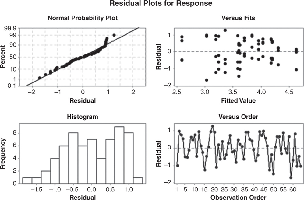
The other two graphs (Residuals vs. Fits and Residuals vs. Order) seem unstructured, thus supporting the validity of the ANOVA assumptions.
Returning to the Session window, we find a table of coded coefficients followed by a regression equation in uncoded units. To understand the meaning of these results and how we can interpret them, consider also the factorial plots and the Mean table.
In ANOVA, we have seen that many of the questions that the experimenter wishes to answer can be solved by several hypothesis tests. It is also helpful to present the results in terms of a regression model, i.e. an equation derived from the data that expresses the relationship between the response and the important design factors.
In the regression equation, the value 3.69 is the intercept. It's the sample response mean. We calculated it in the descriptive phase, considering all 65 observations. Then, in the regression equation we have a coefficient for each term in the model that indicates its impact on the response: a positive impact, if its sign is positive, or a negative impact, if its sign is negative.
In the regression equation, the coefficients are expressed in uncoded units – that is, in the original measurement units. These coefficients are also displayed in the Coded Coefficients table, but in coded units. What are the coded units? Minitab codes the low level of a factor to −1 and the high level of a factor to +1. The data expressed as −1 or + 1 are in coded units.
Coded coefficients
| Term | Effect | Coef | SE Coef | t‐Value | p‐Value | VIF |
| Constant | 3.6901 | 0.0954 | 38.68 | 0.000 | ||
| Oil2 | 0.5962 | 0.2981 | 0.0954 | 3.12 | 0.003 | 1.00 |
| Oil4 | −0.1587 | −0.0793 | 0.0954 | −0.83 | 0.409 | 1.00 |
| Oil5 | −0.4435 | −0.2217 | 0.0954 | −2.32 | 0.024 | 1.00 |
| Oil6 | 0.0460 | 0.0230 | 0.0954 | 0.24 | 0.810 | 1.00 |
| Oil4*Oil5 | −0.5630 | −0.2815 | 0.0954 | −2.95 | 0.005 | 1.00 |
| Oil4*Oil6 | 0.3910 | 0.1955 | 0.0954 | 2.05 | 0.045 | 1.00 |
Regression Equation in Uncoded Units
Response = 3.6901 + 0.2981 Oil2 − 0.0793 Oil4 − 0.2217 Oil5 + 0.0230 Oil6 − 0.2815 Oil4*Oil5 + 0.1955 Oil4*Oil6
When factors are categorical, the results in coded units or uncoded units are the same. When factors are quantitative, using coded units has a few benefits. One is that we can directly compare the size of the coefficients in the model, since they are on the same scale, thus determining which factor has the biggest impact on the response.
For example (for categorical factors):
| Oil2 | |
| Uncoded units | Coded units |
| NO | −1 |
| YES | +1 |
Earlier, we learned how to examine the p‐values in the ANOVA table to determine whether a factor is statistically related to the response. In the Coded Coefficients table, we find the same results in terms of tests on coefficients and we can evaluate the p‐values to determine whether they are statistically significant. The null hypothesis is that a coefficient is equal to 0 (no effect on the response). Setting the significance level α at 0.05, if a p‐value is less than the α level, reject the null hypothesis and conclude that the effect is statistically significant.
However, how can we interpret the regression coefficients? Looking at the Coded Coefficient table, see, for example, that when Oil2 is present (Oil2 = +1), the mean liking score increases by +0.298. This result is graphically presented in the factorial plots and with further details in the Means table. As Oil2 is not involved in a significant interaction, consider the Main Effects Plot.
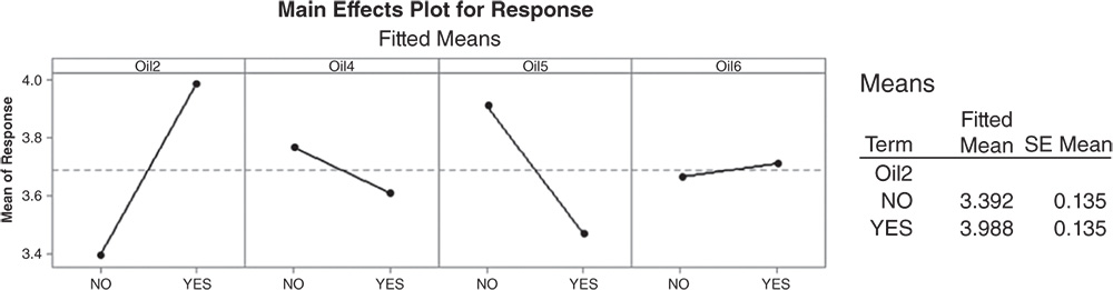
Extrapolate the plot related to Oil2 to analyze it in detail. The dashed horizontal line in the middle is the total mean liking score = 3.690. When Oil2 is present, the mean liking score increases by 0.298 (the magnitude of the coefficient) to 3.988 (this can be seen in the Means Table under Fitted Mean), while when absent, the mean liking score decreases by 0.298–3.392.

So the coefficient in coded units tells us the increase or the decrease with respect to the total mean.
Two times the coefficient is the effect of the factor (see its value in the Coded Coefficients table, under the column Effect).
For Oil5, we have the significance of its main effect and of the interaction between Oil5 and Oil4. The main effect of Oil4 is not statistically significant. The interaction between Oil4 and Oil6 is statistically significant. Look at the interaction plots and the Means table, and consider how the mean liking score varies as the levels of Oil4 and Oil5 change and as the levels of Oil4 and Oil6 change.

Considering the Oil4*Oil5 interaction, the best result (the highest mean liking score) is obtained when Oil4 is present and Oil5 is absent (fitted mean liking score = 4.114) and the worst result when both of them are present. For the Oil4*Oil6 interaction, the highest mean liking score is reached when both oils are absent (fitted mean liking score = 3.942), but the second best result is obtained when both oils are present. The interpretation of these results is not so clear. Remember that in a fractional design, we are not able to estimate all the main effects and interactions separately from each other: some of them will be confused (aliased) with others. In the fractional design we are analyzing, for example, factor B (Oil2) is aliased with the four‐order interaction BCDEF; the ANOVA model estimates the effect of (B + ACDEF), but if we can reasonably assume that the interaction ACDEF is negligible, we can assign the total estimate to the main effect B. The three‐ and four‐factor (higher‐order) interactions are rarely considered because they represent complex events, which are sometimes difficult to interpret.
A three‐factor interaction, for example, would mean that the effect of a factor changes as the setting of another factor changes, and that the effect of their two‐factor interaction varies according to the setting of a third factor. As a consequence of this, out of the many factors that are investigated, we expect only a few to be statistically significant, and we can usually focus on the interactions containing factors whose main effects are themselves significant.
Returning to our example, based only on statistical considerations, it would seem reasonable to perform a new experiment to evaluate more deeply the effect of Oil2 and perhaps of Oil4 and Oil6. The likelihood of this interpretation should, however, be judged by the process experts. The experimenter might even think of adding some levels to the factors, considering, for example, three levels representing different concentrations of each oil. From a two‐level fractional design, the researcher could move to a general (i.e. with more than two levels for at least one factor) full or fractional design to further investigate the relationship between oils and the liking scores.