The iOS and iPadOS Touchy Text Casebook
Although using mobile phones for texting was already quite popular when the iPhone first appeared, mobile phones of that era were far from text-handling powerhouses. Text entry, when it was available, mostly allowed you to create short text messages of a dozen or so words at a time, enter address information in contact lists, type in short (very short) details for calendar appointments, and generate other small snippets of alphanumeric text. The majority of mobile phones didn’t even offer a full text keyboard: you used their telephone keypads for text entry (tap the 2 key once for “A,” twice for “B,” and so on). Editing? Don’t bother; just backspace over your typos and retype: it’s not like you’re transcribing À la recherche du temps perdu, buddy!
The full, albeit virtual, keyboard available on the first iPhone provided text entry capabilities beyond what all but the top tier of business-oriented mobile phones, encrusted with tiny physical keyboards, could provide. That the iPhone lacked any form of basic text-editing capabilities was a sore point (cut, copy, paste, and undo were completely absent, as I’ve mentioned elsewhere), but it was not a very sore point, as pretty much no one else provided them either. Nonetheless, those niceties were looming, even though no one outside Apple knew when and how they would appear.
Finally, a text selection interface, along with cut, copy, paste, and undo, appeared in iPhone OS 3.0, released in June 2009 along with the iPhone 3GS. At that time, Apple was less than a year away from releasing the first iPad: that device, with a virtual keyboard large enough to touch-type on, cried out for more robust text editing capabilities. Were Apple to release the iPad with only the primitive text-entry capabilities that the original iPhone provided, it would be greeted with howls of derision. In a nutshell, iOS 3.0 provided iPhone users with text editing features because the secret still-in-development iPad needed an operating system that had text editing features, and Apple needed to field test those features.
As we all know, those features worked well enough that they remained almost unchanged in iOS 3.2, which was released in April 2010 along with the iPad. iOS users on Apple multitouch devices both large and small could now cut, copy, and paste text with abandon, and they could undo edits as well, although the newly introduced technique of shaking the device to undo an action was less physically taxing—albeit no less comical—with an iPhone than with its much larger, much heavier, sibling.
And for many years those editing features remained almost unchanged, being good enough to support full blown word processors like Apple’s own Pages software. But lately, with the advent of iPadOS and Apple’s push to position its Pro model iPads in the liminal market space that lies between tablets and laptop computers, the text handling capabilities of both iOS and iPadOS have been supplemented, tweaked, and polished.
The Dancing Fingers Oscillation
Apple faced a big challenge developing an interface that could support the complexities of text-editing on a handheld touchscreen device: the human finger itself. The dexterous digit, our species’ built-in pointing device, although adept is big and clumsy and opaque, ill-designed to range accurately over lines of text and place an insertion point exactly where you’d like it.
An experiment: place the tip of your finger on a word in this ebook…say, right here ☞ word ☜ …and ask yourself how much of that word you can see. Unless you’ve enlarged the text of this book significantly, or you have incredibly dainty fingers, chances are good that your fingertip covers the whole word. Wonderful as the finger is, it’s a blunt object where, for accurate insertion point placement, a fine point is needed.
The Selection Struggle
Even given the chunkiness and opacity of human fingers, selecting chunks of text with a finger is not that difficult, and has gotten easier over time. For example, you merely need a long press to select a word currently in iOS and iPadOS: touch the word and hold briefly and, if the text is selectable, you see something like Figure 69 (for other quick ways of selecting specific chunks of text, see Syntactic Selections.)

Text selections have looked more or less like this since the days of iPhone OS 3. The selection editing interface accommodates the thickness and opacity of human fingers by providing relatively easy to touch targets on the drag handles at each end of the selection, and the interface places the two handles on opposite sides of the text vertically so there’s less chance you’ll drag the wrong one even when a selection is very narrow.
This interface design, however, is not without its weaknesses. For example, it’s easier to extend a selection more precisely to the right than to the left: the selection handle’s target on the right falls below the text so there’s a good chance you can see the text above it as you drag. On the left, your finger covers the line of text, making where you release the selection handle more a matter of guesswork.
No matter whether you are trying to set the right end of a text selection with a drag or to set a text insertion point with a tap, setting it precisely is literally a hit-or-miss affair because your finger obscures the text.
Early on, Apple provided, if not a solution, at least an aid for setting insertion point positions precisely: a magnifying loupe (Figure 70) that appeared when you attempted to drag an insertion point.

The loupe displayed, somewhat magnified, the text and insertion point that lay directly beneath your finger tip so you could see where the insertion point was and position it accurately.
This assistance improved matters, but did not lack drawbacks. For one thing, there was scant room to display the loupe when the text being touched lay too close to the top of the screen—subsequent versions of the loupe became shorter and more rectangular.
A much bigger drawback was psychological: some users tried to position the loupe where they wanted the insertion point to go because the only insertion point they could see was the one visible in the loupe. For them, the loupe felt like a pointing device, and they had to make a conscious mental adjustment to treat it as the viewing aid it was. A lot of users couldn’t make that adjustment easily nor comfortably.
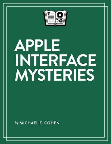
This drawback, apparently, was fatal: the magnifying loupe is no longer present in iOS and iPadOS. Instead, Apple has developed a new placement aid for setting an insertion point’s position using a text-obscuring fleshy fingertip: an insertion point that grows taller when you touch it (Figure 71).
Here’s how it works. You start by tapping the text to set the insertion point position, and you don’t need to worry about being precise. If the insertion point is in the wrong place, you just touch it. When you do, it grows taller, extending both above your fingertip and down to where your finger actually is making contact with the screen. This allows you to move your finger slightly downward, an action that feels natural enough that you almost don’t have to perform it consciously, revealing the text around the visible insertion point’s top above your fingertip. You can then drag the insertion point accurately to where you want it to go. In operation it feels like your finger has sprouted a precision pointing device: you drag the insertion point you can see, even though, beneath your finger, it may well extend to the line of text beneath.
Unfortunately, as I write this Apple hasn’t yet devised a similar solution for the left text selection handle. Evolution is a slow process…
The Clipboard Connection
When you set an insertion point in text, it’s often (as the nomenclature suggests) because you want to insert more text by typing or by pasting the clipboard contents. Similarly, when you select text, it’s often because you want to cut or copy it to the clipboard or replace it by pasting the clipboard’s contents. To support those very common actions, iOS and iPadOS can present an Edit menu above the selection or insertion point (you can see one in Figure 69, in The Selection Struggle just previously).
Although these menus are helpful enough to have withstood the test of time and Apple’s software updates, they have some usability issues:
Newly selected text usually displays the Edit menu immediately, but if you happen to tap the selection again (not hard to do: fingers can stutter), the menu vanishes, even though the selection remains.
When you tap to set an insertion point, an Edit menu does not appear above it until you tap the insertion point a second time. As we’ve seen, human fingers are not always accurate enough to ensure that your second tap will land on the insertion point and not a little to the right or left. Remember the “comfortable minimum size of tappable UI elements is 44 x 44 points” that Apple recommends? The insertion point is much smaller than that! A slightly mis-aimed tap just moves the insertion point instead of producing the Edit menu.
The Edit Buttons Solution
One common solution developers have used in recent years to overcome the possible evaporation or absence of an Edit menu is to take advantage of the suggestions bar that can appear above the onscreen keyboard by placing buttons on it for the Cut, Copy, and Paste commands (Figure 72): when text is editable, the keyboard appears whenever text or an insertion point is selected (that is, unless you have a physical keyboard connected to your device, in which case the standard Mac ⌘-X, ⌘-C, and ⌘-V keypresses do the job).

The suggestions bar solution, unfortunately, is not standardized: developers can (and do) omit providing it, or change how it works or what it looks like, and it is much more commonly found on iPadOS devices, which have bigger onscreen keyboards with more room to exploit than iOS devices. These buttons are worth looking for when you’re editing text, but you can’t rely on their being there.
The Three-Finger Solution
Fortunately, with version 13 of iOS and iPadOS, Apple has come up with another solution for evanescent Edit menus, one that exercises the “Multi” in Multi-Touch—a set of three-finger gestures:
Copy: Make a selection and then pinch inward with three fingers anywhere on the text field.
Paste: Set an insertion point or make a selection, then place three fingers on the text field and spread them outward in a reverse pinch gesture.
Undo and Redo: To undo the previous editing action, swipe across the screen from right to left with three fingers; to redo an action, swipe left to right across the screen with three fingers.
When you perform one of these three-finger gestures, iOS and iPadOS briefly display a confirmation notice at the top of the screen; for example, when you successfully copy text with a three-finger gesture, the word “Copy” appears for a few seconds.
The New Edit Menu Solution
You may have noticed that there is no three-finger gesture for Cut. Not to worry: you can use the Cut command that appears on a new system Edit menu, a feature Apple also introduced in iOS 13 and iPadOS 13. This Edit menu appears at the top of the screen when you touch and hold briefly on a text editing region of the screen with three fingers (Figure 73). You can tap any of the commands on this menu to perform them.

The new Edit menu does not supersede the traditional Edit menu that has appeared above a text selection or insertion point since the days of iPhone OS 3. This menu still appears and works as it always did in the latest versions of iOS and iPadOS. That’s right: you can have two Edit menus on the screen at the same time. We live in an era of unparalleled abundance.
The Glass Keyboard Discombobulation
If you’ve read The Curious Case of the Cryptic Glyphs, you already know that the onscreen keyboard has some physical limitations that affect its use. But, as this keyboard is made of that malleable stuff called software, Apple has been able to ameliorate some of its limitations as well as provide additional capabilities absent from real physical keyboards. Let me tell you a tale…
Tales of the Glass Keyboard Gang
The early iOS keyboards don’t look all that different from today’s edition (Figure 75 and Figure 76). The current character keys remain roughly the same size, and important modifier keys (like Shift and Delete) haven’t moved.


Nonetheless, big visual changes can be seen above and below the key area; for example, an optional suggestions bar can now appear above the keyboard, and developers can add yet another text-related toolbar above that. In addition, the Next keyboard ![]() button has migrated to a new toolbar below the keyboard, along with a Dictate
button has migrated to a new toolbar below the keyboard, along with a Dictate ![]() button that the early keyboards lacked (Voice Dictation began showing up on iOS devices mid-2012).
button that the early keyboards lacked (Voice Dictation began showing up on iOS devices mid-2012).
In a nod to the expanded popularity of emoji characters since the iPhone’s introduction, an Emoji ![]() button replaces the Next keyboard
button replaces the Next keyboard ![]() button’s place beside the Space bar, giving you a quick way to display the current array of emoji characters and to type one; on the other hand, the Next keyboard
button’s place beside the Space bar, giving you a quick way to display the current array of emoji characters and to type one; on the other hand, the Next keyboard ![]() button’s new position makes it even easier for thumb typists to reach (Figure 77).
button’s new position makes it even easier for thumb typists to reach (Figure 77).

 button’s menu in iOS 13.
The iPhone’s keyboard’s vertical expansion is a usability enhancement made feasible only by the increased screen area that iPhones have acquired since the device’s introduction. The expansion comes with an obvious drawback: every pixel devoted to a larger keyboard comes at the expense of screen area available to display the text being edited. Toolbars have to be really useful for that sacrifice to be worth it on an iPhone.
What about keyboards in landscape mode? iPhones have always had the ability to adjust the screen layout when flipped to landscape orientation, allowing the onscreen keyboard to accommodate larger, easier-to-target keys, such as the iOS 7 keyboard shown in Figure 78.

Bigger keys are all well-and-good, but the landscape keyboard has vertical space issues: its height consumes nearly half of the vertical screen area, allowing even less editable text to be visible than with its portrait orientation sibling. Toolbars on an iPhone keyboard in landscape orientation are even more problematic—on my iPhone X running Notes in iOS 13, the landscape keyboard with its toolbar reduces the visible text area in Notes to a paltry two or three lines!
For a time, Apple experimented with the extra horizontal space available to an onscreen landscape keyboard. In iOS 8, for example, Apple made the keys slightly less wide and tall in order to accommodate a plethora of extra special purpose keys as well as a QuickType bar, the precursor to the bar on which predictive text suggestions appear in iOS 13 (Figure 79).

 icon.)
The special-purpose keys provided functions like cut and paste, bold text, and undo, along with a few punctuation characters and a Hide keyboard ![]() button that you could use to get the whole thing out of the way briefly, allowing you to see more of the text that this button-bristling text-entry interface was covering.
button that you could use to get the whole thing out of the way briefly, allowing you to see more of the text that this button-bristling text-entry interface was covering.
This keyboard variant went away, probably because it was cumbersome and because most users tended to type on their iPhones in portrait orientation. Heck, most users can’t even be bothered to flip their phones to landscape orientation to shoot videos, let alone to do something so mundane as typing!
Instead, Apple has more recently been playing with ways to provide alternative iPhone keyboards suited for specific subsets of users. For example, take those users who have learned how to perform one-handed thumb-typing swiftly and who actually need a smaller keyboard positioned as close as possible to the left or right screen edge to do that, especially on iPhones with wider screens than earlier models had. In iOS 13, those users can access such a keyboard with the keyboard alignment choices offered at the bottom of the Next keyboard ![]() button’s menu, shown in Figure 77 a page or so back.
button’s menu, shown in Figure 77 a page or so back.
But there’s only so much fiddling Apple can do with the iPhone keyboard and not that much user interest: the iPhone is rarely used as a primary text input device for anything lengthy. The iPad is where the text interface action seems to be today for Apple, and it has provided a set of alternative keyboard configurations to meet the needs of specific sets of iPad typists.
For you to get at those configurations, Apple has made the Hide keyboard ![]() button perform a number of extra tasks: if you touch and hold the button, instead of hiding the keyboard the button offers you a menu of several keyboard configurations (Figure 80); the menu changes depending on the current state of the keyboard. Unlike most other iOS and iPadOS menus, this one remains visible only while your finger is on the button: to make a menu choice, you slide from the Hide keyboard
button perform a number of extra tasks: if you touch and hold the button, instead of hiding the keyboard the button offers you a menu of several keyboard configurations (Figure 80); the menu changes depending on the current state of the keyboard. Unlike most other iOS and iPadOS menus, this one remains visible only while your finger is on the button: to make a menu choice, you slide from the Hide keyboard ![]() button to the menu and lift once you’re touching the item of your choice.
button to the menu and lift once you’re touching the item of your choice.

 button menu for the default iPad keyboard; right: the menu when the keyboard has been split.
The iPadOS 13 keyboard configurations have the following uses and characteristics:
Undocked:
When you choose this keyboard, it becomes unmoored from the bottom of the screen so you can drag it to a (possibly) more convenient location (Figure 81).

Figure 81: You can move an undocked iPad keyboard up and down the screen to the location of your choice. To drag the keyboard, you touch and immediately drag the Hide keyboard
button instead of waiting for its menu to appear.
Split:
This keyboard splits (Figure 82), moving each half to the right and left screen edges, so that accomplished thumb typists can reach every key with their thumbs when holding the iPad.

Figure 82: A split keyboard on the iPad, useful for thumb typists. Like the undocked keyboard, you can use the Hide keyboard
button to drag it up and down the screen.You can use the Hide keyboard
button’s menu to merge the two halves or to both merge them and dock the keyboard back on the bottom of the screen.
Floating:
Use a floating keyboard (Figure 83) to consume the least amount of screen real estate with the keyboard. It can cozy up to the left or right screen edge, useful for one-handed thumb typists, and you can drag it around the screen by the indicator line at its base.

Figure 83: The iPad floating keyboard has much in common with the portrait orientation iPhone keyboard. The floating keyboard lacks a Hide keyboard
button and its keyboard configuration menu: to revert to the default iPad keyboard, you drag the floating keyboard to the center of the screen’s bottom edge.
The Curious Case of the Alternative Entry Enablers
To make an anatomically incorrect metaphor, no matter how you tweak it the onscreen virtual keyboard remains the Achilles heel of handheld devices when it comes to text entry. Realizing this, Apple has devoted much development time and resources to come up with ways to make text entry on its iOS and iPadOS devices easier. Some of these involve machine learning and artificial intelligence, others involve gestural tweaks to typing, and still others involve the application of simple software tricks.
Keyboard Trackpad
Take insertion point positioning and text selection. As you saw in The Selection Struggle, accurately placing an insertion point and making a text selection on a touchscreen device is not a trivial matter.
Some apps supplement Apple’s keyboard with arrow key buttons to make insertion point positioning easier, which can help, but arrow keys are better for moving an insertion point over short ranges of text than they are for ranging over an entire iPad Pro’s screen. By comparison, navigating a large screen with a trackpad and pointer—even a 27-inch iMac Retina display—is a piece of cake. If only iOS and iPadOS devices had something like a trackpad—oh, wait, they do…or, at least, the iPad does.
Even if you don’t have a trackpad handy to link to your iPad, you can turn your onscreen keyboard into a temporary trackpad with which you can move the insertion point around the current text field, and this works in both iOS and iPadOS: touch and hold the Space bar until the keyboard’s character labels vanish (Figure 84), then drag your finger around the blank keyboard. As you do, the insertion point moves through the text, matching your finger movements. Lift your finger and the keyboard becomes a keyboard again.

On iPadOS devices, instead of using a single finger on the Space bar to make a temporary trackpad (which does work in iPadOS), you can touch and hold the keyboard’s keys themselves with two fingers to make the keys vanish. When they do, you can move your two fingers around to place the insertion point.
This would be nothing more than a gestural synonym and hardly worth mentioning except that the two-finger trackpad in iPadOS has an additional feature. When you have an insertion point set, you can touch and hold with two fingers until the keys vanish and then keep holding a moment longer: this makes the insertion point into a text selection. Then you can drag your two fingers across the keyboard to move the selection’s handles.
Key Sliding
To make iPhone text entry somewhat easier, Apple has added a feature it calls QuickPath, an onscreen keyboard text entry technique that it adapted (some would say “purloined”) from a feature offered by other mobile device developers. When enabled (which it is by default in iOS 13), QuickPath replaces taps with swipes: you swipe from character to character on the keyboard without lifting your finger, and, as you do, iOS shows you a ghostly trail of your fingertip’s path and adds each character on which your swipe ends or changes direction to the current word. The technique also offers to complete each word as you slide-type using the iOS built-in dictionary (Figure 85).

In iPadOS 13, QuickType is not available with the standard onscreen keyboard, though it can be enabled for the iPhone-sized iPad Floating keyboard described previously.
But iPadOS does offer a different slide-to-type feature with its standard keyboard. Using this feature, which Apple calls “key flicks,” you can skip most switching back and forth from the alphabetic keys to the numeric and punctuation keys. When key flicks are enabled (Settings > General > Keyboard > Enable Key Flicks), instead of tapping a character key you flick down to type the alternative character that appears in gray atop each key label (Figure 86).
Speech-to-Text
People have been speaking to their iPhones since iPhone OS 3, when Apple introduced something called Voice Control, giving users the ability to verbally tell their phones which contacts to call or songs to play. It took iOS 5, released in late 2011, before Siri came along, superseding Voice Control and providing speech-to-text transcription capabilities along with its other artificially intelligent features.
Over the years, Siri’s speech-to-text abilities have improved, becoming both more accurate and supporting longer speeches (at first, you were lucky to get 25 words spoken before the feature stopped listening and transcribed what you’d said).
To use it, tap the onscreen keyboard’s Dictate ![]() button. The keyboard’s keys vanish, replacing them with an animated waveform of the sounds that your device is picking up (Figure 87). As you speak, the speech-to-text transcription appears at your current insertion point position. To finish dictating, you tap the keyboard
button. The keyboard’s keys vanish, replacing them with an animated waveform of the sounds that your device is picking up (Figure 87). As you speak, the speech-to-text transcription appears at your current insertion point position. To finish dictating, you tap the keyboard ![]() button that appears below the waveform.
button that appears below the waveform.

Speech-to-text doesn’t just transcribe words. You can also utter simple punctuation and and typing commands, such as “new line” to start a new line of text and “cap” to capitalize the next word you speak. Apple’s article on the feature lists some of the most common speech-to-text commands.
Text Completion
You know the acronym WYSIWYG? People use it to describe a desirable characteristic of word processors—What You See Is What You Get. With iOS and iPadOS word processing, there’s another acronym with which you have to contend: WYTINWYG—What You Typed Is Not What You Get.
Realizing that entering text on a handheld device is fraught with usability obstacles (cast your eyes back over the last dozen or so pages for evidence that this is so), Apple has developed shortcuts of several kinds that allow your handheld device to share the burden of text entry with you. These shortcuts include a combination of complex machine-learning and artificial intelligence techniques along with some old-school software shenanigans.
Let’s take the shenanigans first, or, as Apple labels the feature, Text Replacement. Text Replacement comprises a list of text items, such as “c/o,” and what you would like the item replaced with when you type it, like ℅ (Figure 88). With a trip to Settings > General > Keyboard > Text Replacement, you can add items and replacements to the list, remove them, and edit them. It’s a simple substitution trick and has been around on various software platforms for ages.

Simple to understand as the Text Replacement feature is, it can confuse you if you don’t know (or have forgotten) that it’s there and it swaps in a replacement for something you have just typed. OTOH (which Text Replacement could easily convert to “On the other hand” if I bothered to add it to my Text Replacement list), it can be a very useful feature, especially when you regularly need to type the same long phrases or sentences and want an easy-to-create shortcu…um…text replacement for it.
And my little “bothered to add it” pleasantry just above points out a big shortcoming of Text Replacement: it only works if you bother to add replacements to the list. Many users, probably most users, don’t, and a large percentage of them don’t know it even exists.
That’s one reason Apple has spent years and lots of money on artificial intelligence and machine learning technology: to create a text replacement system that “understands” enough about language and the sorts of things you are apt to type to come up with replacements on the fly. Apple calls this feature predictive text.
Predictive text is the feature that populates the suggestions bar above the onscreen keyboard, and what it populates it with are, as Apple describes it, “choices for words and phrases you’d probably type next, based on your past conversations, writing style, and even websites you visit in Safari.” The suggestions bar shows you three choices for the next word: tap one to insert it in your text.
The computations that arrive at these choices use information that’s mostly local to your device and not from a central server hiding in the caves of Cupertino. Because the feature uses local, device-specific information, you may well see different predictions on different devices. For example, when I typed the phrase “Now is the” on both my iPhone and iPad, I got two different sets of predictions (Figure 89).

Many users tend to conflate predictive text suggestions and Auto-Correction suggestions (described next) but they are not the same thing.
Interned in the Correctional System
In addition to alternative ways of entering text (through dictation, sliding fingers, your replacements list, and predictive text) iOS and iPadOS tries to help you avoid making typing mistakes. Unfortunately, this help can be unhelpful at times.
The help comes in several forms, the settings for which are spread around in Settings > General > Keyboard:
Auto-Capitalization: When enabled, typing a period and a space capitalizes the next word you type.
Check Spelling: This, when enabled, shows you red dots under words that iOS and iPadOS don’t recognize. This feature only indicates possible misspellings; it doesn’t correct anything. You can, however, tap a word marked with red dots to choose from possible replacements from a pop-up menu.
Smart Punctuation: When enabled, iOS and iPadOS convert double hyphens (--) to em-dashes (—) and replace straight single and double quotes (' ") with the open (‘ “) and closed (’”) forms of those characters depending on their context.
“.” Shortcut: Added way back in the early iPhone days, when you had to tap the 123 key (the .?123 key in iPadOS) to access any punctuation characters, this feature inserts a period and a space when you type two consecutive spaces. This saves you from summoning up the punctuation keyboard at the end of every sentence. However, Auto-Capitalization doesn’t kick in when you insert a period and space via this shortcut—you win some, you lose some.
And then there’s the big corrective helper, one which has come in for its share of mockery: Auto-Correction. Auto-Correction uses the keyboard dictionary on your device to correct what it calculates to be typos or misspellings. How it informs you of a pending correction depends on whether you have predictive text enabled or not (see Text Completion above).
When predictive text is enabled the correction appears as the middle suggestion on the suggestions bar: you can tell if that suggestion is an Auto-Correction suggestion instead of a prediction if the choice is highlighted. Unlike a predictive text suggestion, a highlighted Auto-Correction suggestion replaces the word you entered if you then type a space or punctuation mark (Figure 90).

It’s common for users to miss noticing an Auto-Correction in the suggestions bar: even highlighted, it doesn’t really stand out from predictive text suggestions. Moreover, it may not even appear until you have typed enough of a mistyped word for your device to determine that you need an Auto-Correction suggestion instead of a predictive text suggestion.
With predictive text disabled (via Settings > General > Keyboard > Predictive), Auto-Correction suggestions are much easier to see (Figure 91). The suggestion is brightly colored and it appears right where you are typing instead of in the bar just above the keyboard, which can be some distance away from the current text insertion point on which, very likely, your eyes may well be focused.

 button.
Over time, the keyboard dictionary on your device can get filled with typos or errant spellings that you, at one point or another, have chosen to accept. This can sometimes lead Auto-Correction to suggest something that is not only what you didn’t intend but that is just plain wrong.
Fortunately, when you reject the same Auto-Correction suggestion several times, your device will eventually catch on and not offer it again. But if you see a lot of errant Auto-Correction suggestions popping up, you can take more drastic action: reset your keyboard dictionary completely.
Here’s how to do that:
Open Settings > General > Reset.
Tap Reset Keyboard Dictionary.
Confirm the reset with your passcode.
With your dictionary reset you’ll be free to fill it up again with different errant but approved spellings.