How Mac Menus Got Complicated
The original Mac’s menus and its always-present menu bar were a spiffy thing in 1984. Up until then, most computer users had to memorize lots of commands, and then laboriously type those commands to get something done.
Menus blew away that memory burden. Instead of having to be stashed in your memory, nearly all of an app’s commands were stashed in menus, categorized neatly. Want to know what file-handling commands are available? Pull down the File menu and take a look.
That worked. Until it didn’t.
The Case of the Overburdened Memory
Menus are great—until you have an app with many hundreds of commands tucked away in its menus. At that point, you’re no longer asking yourself “what is the command for…” but “where the heck did I see the command for…”.
As it turns out, Apple’s usability folk came up with a way of answering that question years ago, although it’s not an answer that most people know about or use. Part of the Mac usability guidelines that Apple offers to developers is one that specifies the standard Help menu that apps should have, and that suggests the items the Help menu should have on it. One of those items, if the developers have built their apps using Apple’s frameworks, is an automatic Search field at the top of the Help menu (Figure 2).

And what gets searched? Among other things, the app’s menus: type part of a command’s name in that field and the app shows you the menus where that command might be.
Granted, finding and using this capability isn’t much of a mystery…except that, until you use it, there’s no indication of what using the Help menu’s Search field searches. And, of course, you must remember a command’s name well enough to search for it in the first place.
Welcome back, memory burden!
The Riddle of the Menu Shortcuts
For many years, Mac users suffered happily with a single set of command menus, available right at the top of the screen on the menu bar (ignoring, for the moment, pop-up menus, which I get to a little later in The Puzzle of the Popping Menus). They were so simple to use: just aim your (single-button mouse) pointer at a menu name in the menu bar, hold down the button, slide the pointer down to the command of your choice, and release. Easy-Peasy.
Meanwhile, in the non-Mac world, mice and other pointing devices started to appear with multiple buttons. One of those buttons, when you clicked it anywhere on the screen in an operating system like Windows or Unix, could bring up a contextual menu with specific commands, commands tailored for acting upon whatever it was you clicked. The Mac finally began flirting with contextual menus in 1997 with Mac OS 8; when the Unix-based Mac OS X arrived at the turn of this century, it included full support for them (Figure 3).

Here’s the mystery: when your mouse has only one button (true of most turn-of-the-century Macs), how do you invoke a contextual menu? Apple’s solution was for you to hold down the Control key when you click. Not the most discoverable of solutions: it’s one that you just have to learn. But it’s simple…or was at the time.
These days, Apple provides a number of pointing devices, all of them capable of bringing up contextual menus—and all of them lacking any visible buttons whatsoever because the entire device is the button! So now, what do you do?
The answer: sadly, you once again have to learn what to do based on the pointing device you have.
Fortunately for those not good with mysteries (or for those who are just in a hurry right now and have no time to learn yet another new thing), a Control-click continues to bring up contextual menus with just about all Apple pointing devices (and just about all third-party pointing devices as well), so you can certainly continue to invoke them that way. Or, you can use System Preferences > Mouse or System Preferences > Trackpad to tailor your Apple pointing device’s Secondary click setting (Figure 4) to give you a traditional Windows-style right-click capability.

So, all’s well that end’s well, right? Not so fast, seeker. Some applications treat the old, trusty Control-click and the new, shiny Secondary-click as not being synonyms: they can bring up different menus!
I wish I could say that such confusions only happen with third-party apps, but Apple itself is guilty of such shenanigans. For example, in Apple’s Numbers app, when you Control-click a token in a cell’s Custom Format dialog, you see a standard System contextual menu, but a click using your device’s Secondary click method brings up a different contextual menu (Figure 5).

This kind of thing is a puzzle with no shortcut to its solution: you just have to learn about it by word of mouth (in the case of the Numbers example above, I learned about it from Sharon Zardetto’s comprehensive Take Control of Numbers—as Ringo said in A Hard Day’s Night, “you can learn from books”).
The Mystery of the Mercurial Menus
Compared to the items in a contextual menu, which change depending upon where you click when you invoke one, the menus on the menu bar are bastions of stability—or so you would think. Sure, we’re used to some items being dimmed when those items are not relevant to the current state of things—such as the standard Edit menu’s dimmed Cut command when nothing is selected that can be cut to the clipboard (Figure 6)—but we generally expect the contents of the menu bar’s menus to be reliably changeless. That’s, after all, the point of menus: to display the bulk of an app’s commands so you don’t have to memorize them all.

But even menu bar menus can be shifty. For years now, savvy Mac users have discovered that holding down a modifier key, usually the Option key, can cause some applications to modify their menus contents, displaying one or more alternative commands (Figure 7). Apple’s own apps, such as Pages, can engage in this behavior.

Once you know about the Option key menu trick, which has become a standard Mac interface convention by this point, you can easily discover an app’s available alternative commands simply by pulling down menus and then pressing and releasing the Option key to see what changes. Nonetheless, it’s just one more addition to the memory burden that menus were originally created to help reduce.
The Puzzle of the Popping Menus
Macs have long offered yet another kind of menu, the pop-up menu, and they’ve been on the Mac since practically forever. Unlike menu bar menus, which apply to the entire app, or contextual menus, which apply to the specific thing on which you Control-clicked, pop-up menus appear within a window or dialog and provide choices appropriate for that location. These choices, instead of being commands like Print or Cut (as is typical of menu bar menus), usually consist of specific setting options.
There’s nothing mysterious about these most traditional of Mac pop-up menus. They look distinctly clickable and even have an easily recognizable menu ![]() indicator that stands out against the background on which you usually find them. Customarily, when not being accessed, these kinds of pop-up menus display the most recent choice made from them.
indicator that stands out against the background on which you usually find them. Customarily, when not being accessed, these kinds of pop-up menus display the most recent choice made from them.
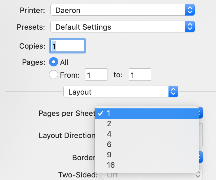
You generally find traditional Mac pop-up menus where screen space is limited and the choices being offered are many. For example, the standard Mac Page Setup dialog is rife with pop-up menus (Figure 8) from which you can choose various printing settings. The pop-up menus in that dialog provide a lot of options in a small amount of screen space.
Because a traditional pop-up menu usually displays, when not open, the most recent choice made from it, it can be used in conjunction with other interface elements to form complete phrases. Take, for example, the Spacing settings in Pages for the Mac, where the Spacing pop-up menu choice applies to an adjacent measurement field, resulting in a phrase that describes the line spacing setting: At Least 30 pt as in Figure 9.

So if pop-up menus are hardly mysterious, why are they in a book about Mac interface mysteries? Because, over time, variations on the look and functionality of pop-up menus have arisen, making them harder to spot and to interpret than back in the Good Old Days that we remember so fondly through the flaw-obscuring golden haze of nostalgia.
Today, various pop-up menu indicators in addition to the standard pop-up ![]() menu symbol have come to indicate the presence of a pop-up menu. A common substitute is the small pop-up menu
menu symbol have come to indicate the presence of a pop-up menu. A common substitute is the small pop-up menu ![]() button that typically sits beside an otherwise non-menu-looking item on the screen, often used to conserve space.
button that typically sits beside an otherwise non-menu-looking item on the screen, often used to conserve space.
A less-common menu indicator is a gear-shaped ![]() icon, which sometimes is used to indicate the presence of a pop-up menu in small screen areas that don’t provide room for any accompanying text or graphic (Figure 10).
icon, which sometimes is used to indicate the presence of a pop-up menu in small screen areas that don’t provide room for any accompanying text or graphic (Figure 10).

And not just those. A common pop-up menu indicator symbol, imported from the web and from small screen devices, is the “hamburger” menu ![]() icon that, if you squint real hard, looks like a pared-down representation of a menu itself. Still another is the three-dot ellipsis … symbol.
icon that, if you squint real hard, looks like a pared-down representation of a menu itself. Still another is the three-dot ellipsis … symbol.
While some developers may intend a semantic distinction between the various pop-up symbols they use in their apps, the conventions for their use are still fluid and by no means widely accepted. At this point, a user would be hard pressed to know without poking at it whether a symbol on the screen indicates a pop-up menu (and, if so, what kind of menu), a button, or just a simple visual ornament.
The confusion, if regrettable, is certainly understandable. With the advent of the web and of Windows—both achieving wide popularity about a decade after the Mac came out of the sack—the “design language” Apple had originally created for the Mac began to be influenced by the symbols and conventions of those other platforms. Today, users of graphical interfaces have many opportunities to be confused by interference from competing design languages. Pop-up menu indicators are just one place where such interference manifests…on the other hand, an optimist could claim that the diversity among those indicators simply means that Apple’s design language has grown richer.
The Perplexity of the Popovers
Although they have been a basic element of the Mac graphical user interface from the beginning, menus have remained mostly textual ever since the very first one descended from the original Macintosh OS 1.0 menu bar. Sure, an occasional Mac app might have offered a menu or two with an occasional icon over the years but those tended to be interesting exceptions. That is until something called a popover began to become popular on the web and on handheld devices.
Popovers present an interesting combination of menu and window:
Like a pop-up menu, they appear in response to a click on an indicator.
Also like a menu (and unlike a window), popovers vanish the moment you click outside of their boundaries.
Like a window but unlike a menu, you can perform multiple actions within a popover’s confines.
A typical example of a Mac popover is the Advanced Options popover for setting character attributes in Apple’s Pages word processor (Figure 11).

Popovers, like dialogs, can offer a number of options in a compact space. And they also offer two additional advantages over dialogs: no space need by taken up by an OK button because clicking anywhere outside of the popover closes it, and popovers usually come with an arrow that points to the element on the screen you clicked to bring it up—dialogs provide no such hint to tell you from whence they arose.
At the same time, popovers only increase the memory burden, especially when they provide a lot of otherwise inaccessible commands and options, and even more especially when the item you click to bring them up is, itself, mysterious.
Once again, take a look at the Advanced Options popover from Pages shown just previously in Figure 11. You bring it up by clicking an element in a window sidebar (which, by the way, can itself be hidden to conserve screen space). That element consists of two symbols: the rightmost is the pop-up menu ![]() symbol that indicates something will pop up when you click it. So far, so good.
symbol that indicates something will pop up when you click it. So far, so good.
But then there’s the symbol to its left: a gear ![]() symbol. As we saw back in Figure 10, that symbol can also indicate the presence of a pop-up menu. But you may also see that gear in contexts where its meaning is different. For example, in some apps it can indicate that clicking it brings up a settings dialog, in other apps it may bring up a menu of advanced commands. All the poor user can really know for sure upon encountering the gear is that it signals something that’s likely to be advanced or complicated.
symbol. As we saw back in Figure 10, that symbol can also indicate the presence of a pop-up menu. But you may also see that gear in contexts where its meaning is different. For example, in some apps it can indicate that clicking it brings up a settings dialog, in other apps it may bring up a menu of advanced commands. All the poor user can really know for sure upon encountering the gear is that it signals something that’s likely to be advanced or complicated.
While solving the problem of saying a lot while conserving screen space, popovers, combined with their sometimes mysteriously opaque onscreen triggers, can make wrapping your head around any particular Mac apps’ features more difficult.
And that, really, is the story in a nutshell of how menus on the Mac got complicated: as apps offered ever more capabilities, the number of menus and types of menus had to increase to accommodate those expanded capabilities, all within the relatively confined space of a Mac screen.
Your memory never really had a chance.