Chapter 4: Move It! Animating Our First Lottie With After Effects
And... here we are! Ready to start our own first animated project in Adobe After Effects! Yes! It has been an exciting journey, and we've learned loads of new words, concepts, and tools. Looking back, it seems like ages ago when we started talking about Lottie, don't you think? Not because of the matter of time, but because we've learned so many new things! In the first part of the book, we learned what Lottie and LottieFiles are, we went through the history and principles of 2D classic animation, and got our hands on the Adobe After Effects working area and main animating features. Now, we are all ready and set to animate our icon.
In this chapter, we are going to go step by step through creating our animated icon. Get ready, as we are going to put everything we've learned so far on the table, all the knowledge we've gained about Lottie, classic animation, and Adobe After Effects. We will learn how to import our assets from different vector-based tools, we will create and adjust our composition, create keyframes, and change layer properties to give the illusion of animation. We will also learn how to animate a path, adjust the timing, and apply ease, based on classic animation concepts, to give our icon a more trustable movement. So, by the end of this chapter, we will have our first animated icon ready to be exported for LottieFiles.
In this chapter, we are going to cover the following topics:
- Importing vector files into our Adobe After Effects (AE) project from different design tools such as Sketch, Figma, and Adobe XD
- Setting up the composition for our animated icon
- Creating keyframes
- Animating our icon by changing layer properties
- Being time efficient by learning how to use Trim Paths and radial burst effects
- Adding ease and adjusting timing to polish our animation
Technical requirements
Remember that this chapter is a hands-on project, and in order to be able to complete it successfully, it is important you have the following tools up and running:
- Adobe AE.
- A vector illustration software of your choice. We will be focusing on Sketch, Figma, and Adobe XD:
- If you use Sketch: You need the AEUX plugin for Sketch installed.
- If you use Figma: You need the AEUX plugin for Figma installed.
- If you use Adobe XD: There's no need to install any extra plugins.
Creating your first project in Adobe AE – an animated check icon
Cool, let me recap a bit here. Sometimes you may think, why go through all this effort to create an animation if we could just have a text or an illustration instead? Well, as we mentioned earlier, animations can be so helpful in terms of UX. They help us to talk to our users; we've learned how animation can communicate so many things, such as actions or emotions.
If we go back to our brief, remember we've decided to create a check icon that will show the user the purchase has been successfully made and the money is safe and well spent.
So, in UX terms, what sort of emotions do we want our users to feel? I guess something like the following:
- Safety: The purchase has been made correctly.
- Relief: The money hasn't been lost in the middle of the transaction.
- Excitement: Imagine the feeling you have after treating yourself to a new T-shirt. Exciting, right?
When animating, we are not just talking about some cool motion graphics that will show up in our app to make it look better; instead, we are talking about making our users' lives easier and happier. We are talking about making people feel better! Can you see the power we've got in our hands? So, let's not waste any more time. Let's make our users feel great!
Importing our icon to After Effects
Let's start by importing our assets to AE. To do that, we assume you already have your icon design ready in any of these three vector-based tools: Sketch, Figma, or Adobe XD.
Important
If you don't have any vector-based tool chosen yet, I would recommend using Adobe XD, which will save you time and effort. The exporting option for XD is already included in XD and there is no need to add any extra extensions or plugins. However, if you already use Sketch or Figma, no worries, we will cover that too. Also, you can find more information about how to install the plugins in Chapter 6, Don't Stop! Exploring Plugins and Resources That Will Keep You Going, of this book.
Importing files from Sketch to AE
In order to avoid some animation issues, I always recommend keeping the illustrations as tidy and as simple as possible. For example, some Boolean operations, text layers, or symbols can generate problems when exporting to AE.
That said, let's open our icon in Sketch. Go to the top bar menu and select File | Open Local Document:

Figure 4.1 – Sketch File menu
Go to the Files folder provided with this book and open lottie/chapter04/ sketch/lottie_sketch.
Now is the time to install the AEUX plugin for both Sketch and AE. You'll find more information on how to install AEUX for Sketch and AE in Chapter 6, Don't Stop! Exploring Plugins and Resources That Will Keep You Going.
Important
If you installed the plugin without following our instructions, please check the How to set up AEUX in AE section in Chapter 6, Don't Stop! Exploring Plugins and Resources That Will Keep You Going, as some options have to be selected.
Once we have our AEUX plugin installed in Sketch, let's open it up and check the panel. To do that, go to the top bar menu and select Plugins | AEUX | Open panel:

Figure 4.2 – AEUX plugin panel window
As we can see in Figure 4.3, this is a very simple panel with just three different options:

Figure 4.3 – AEUX for Sketch plugin window
- Send selection to Ae: This is pretty straightforward; by selecting the layers and clicking this option, we will export our illustration to AE.
- Flatten shapes: As we mentioned earlier, when exporting for AE, it is always a good idea to keep our illustration and layers tidy. With the Flatten shapes option, we can flatten our grouped or Boolean layers into a flat vector single shape and avoid AE layer issues.
- Detach symbols: Symbols may be confusing for AE to represent. With the Detach symbols option, we will remove the symbol dependence from its master so it will work better in AE.
So, as we can see here, our icon is composed of just two single layers: check for the blue check sign and Oval for the white circle. The layers are basic simple shapes that won't give us any trouble when exporting. Perfect!

Figure 4.4 – Layers panel
Now that we've got our icon ready and tidy, let's export it to AE:
- Open Adobe AE if you haven't done that yet.
- Go back to Sketch and select both layers at the same time: check and Oval.
- Click Send selection to Ae in the AEUX panel.
- Go to Adobe AE and check that the files have been imported:

Figure 4.5 – Imported layers from Sketch to AE
Great! We've got our icon perfectly imported into AE and ready to be animated. Just save it! Now, let's see how to do the same using the Figma tool.
Importing files from Figma to AE
To export your illustrations from Figma to AE, the process is quite similar. You can go to Chapter 6, Don't Stop! Exploring Plugins and Resources That Will Keep You Going, where you'll find a guide on how to install the plugin for Figma and also AE. Remember, if you have installed the plugin on your own, please check the How to set up AEUX in AE section to be sure the selected options are the same as you have.
Now that you have your plugins up and running, let's open the icon in Figma. How to do that? Follow these instructions:
- Open Figma.
- Choose the Import file option from the home page:

Figure 4.6 – Figma home page
- Search for the lottie/chapter04/Figma folder from the provided files.
- Open the lottie_Figma.fig file.
- Click the Done button. The file will appear on Figma's home page, as shown in Figure 4.7:
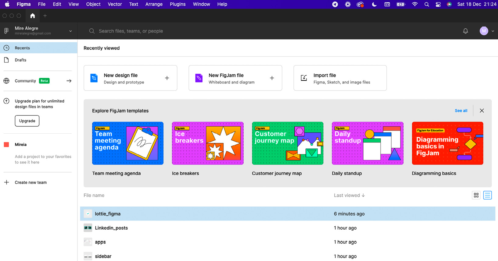
Figure 4.7 – Figma home page and provided Figma imported file
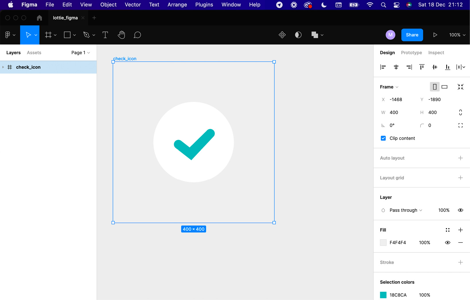
Figure 4.8 – Icon file
Cool! Now, we've got lottie_Figma.fig imported.
- Let's open the AEUX panel and check out the options available to export our icon to AE. Go to Plugins | Development | AEUX.
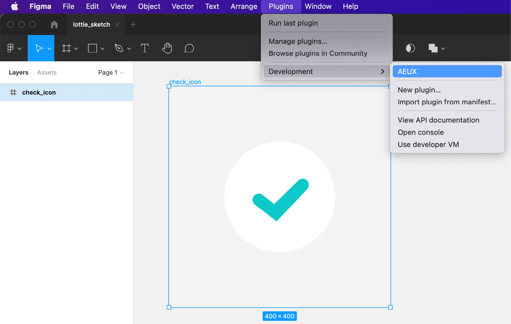
Figure 4.9 – AEUX plugin panel window
As we can see in Figure 4.10, this is a very simple panel with just three different options:
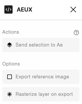
Figure 4.10 – AEUX for Figma plugin panel window
- Send selection to Ae: This works the same way as in Sketch. It is pretty straightforward; by selecting the layers and clicking this option, we will export our illustration to AE.
- Export reference image: There are a few known alignment issues with layers from Figma, such as text layers and rotated images. Enable this checkbox to generate an image overlay of the Figma frame to allow for manual alignment.
- Rasterize layer on export: It is possible to automatically send anything in Figma to AE as a PNG file. This becomes very useful for anything that doesn't need to be animated and could be optimized by flattening it down to a single image.
As we mentioned earlier, it is very important to keep our illustration as simple as possible, as some effects can generate issues. You'll notice our illustration is very simple; it is made of just two layers named check and Oval, and that's all we need.
Now that our icon is done and tidy, let's export it to AE:
- Open Adobe AE if you haven't done that yet.
- Go back to Figma and select both layers at the same time: check and Oval.
- Click on the Send selection to Ae AEUX panel option.
- Go to Adobe AE and check that the files have been imported:

Figure 4.11 – Imported files from Figma to AE
Cool! We've got our icon ready to go in AE; now, remember to save it! Let's see how to do the same with XD.
Exporting assets from XD to AE
Exporting your icon from XD to AE is probably the easiest way that exists right now. There is no need to install any plugin as Adobe XD already includes an exporting option for AE. Let's have a look. Let's open the XD file provided with this book.
Let's open our icon in Adobe XD. To do this, just follow the next steps:
- Open XD.
- Go to File | Open from Your Computer....
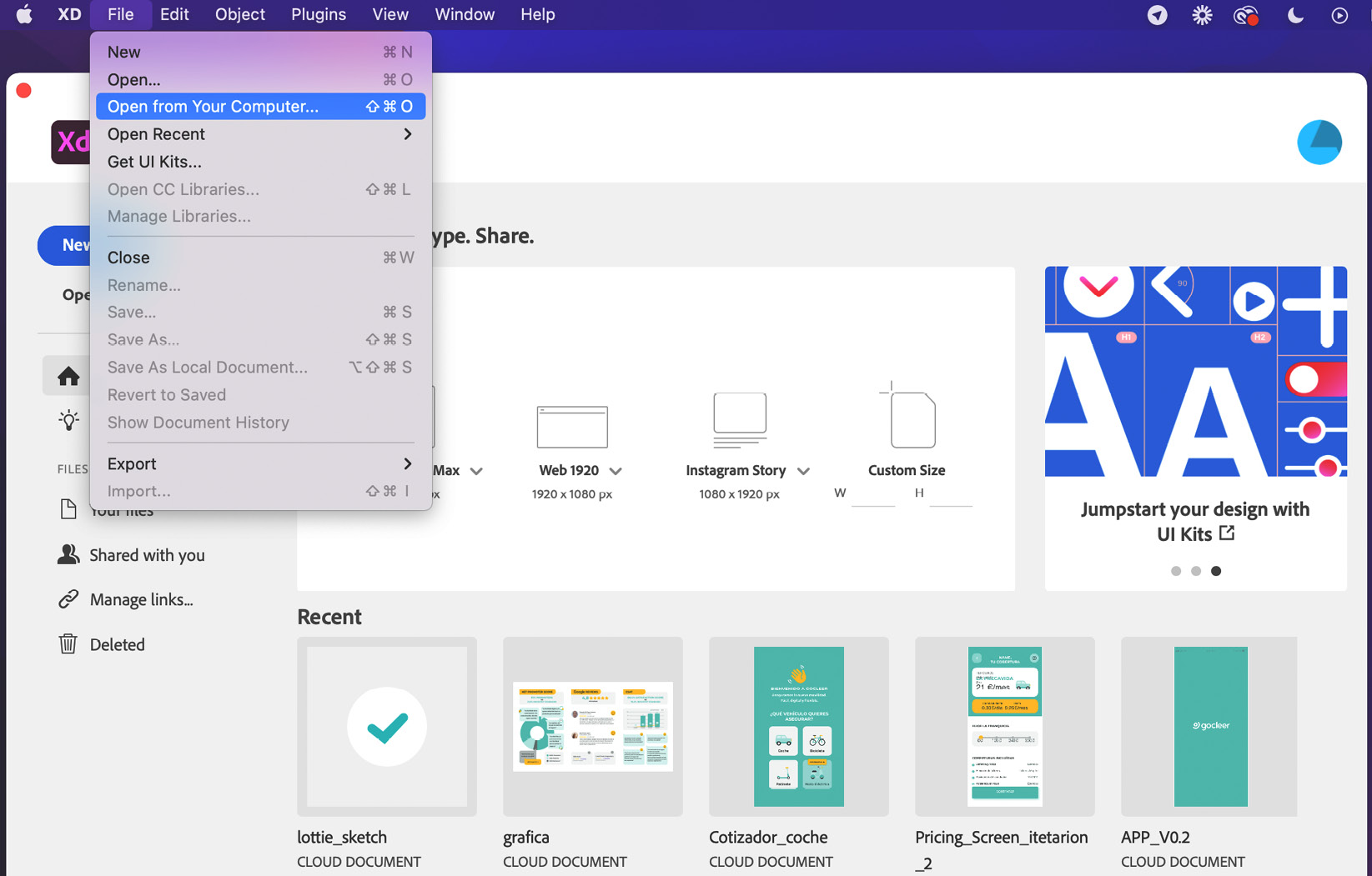
Figure 4.12 – XD home page

Figure 4.13 – XD lottie_xd icon file
Now, you'll see how easy it is to export our icon to AE:
- Select the entire layout area by clicking on its name.
- Go to the top bar menu and select File | Export | After Effects…:
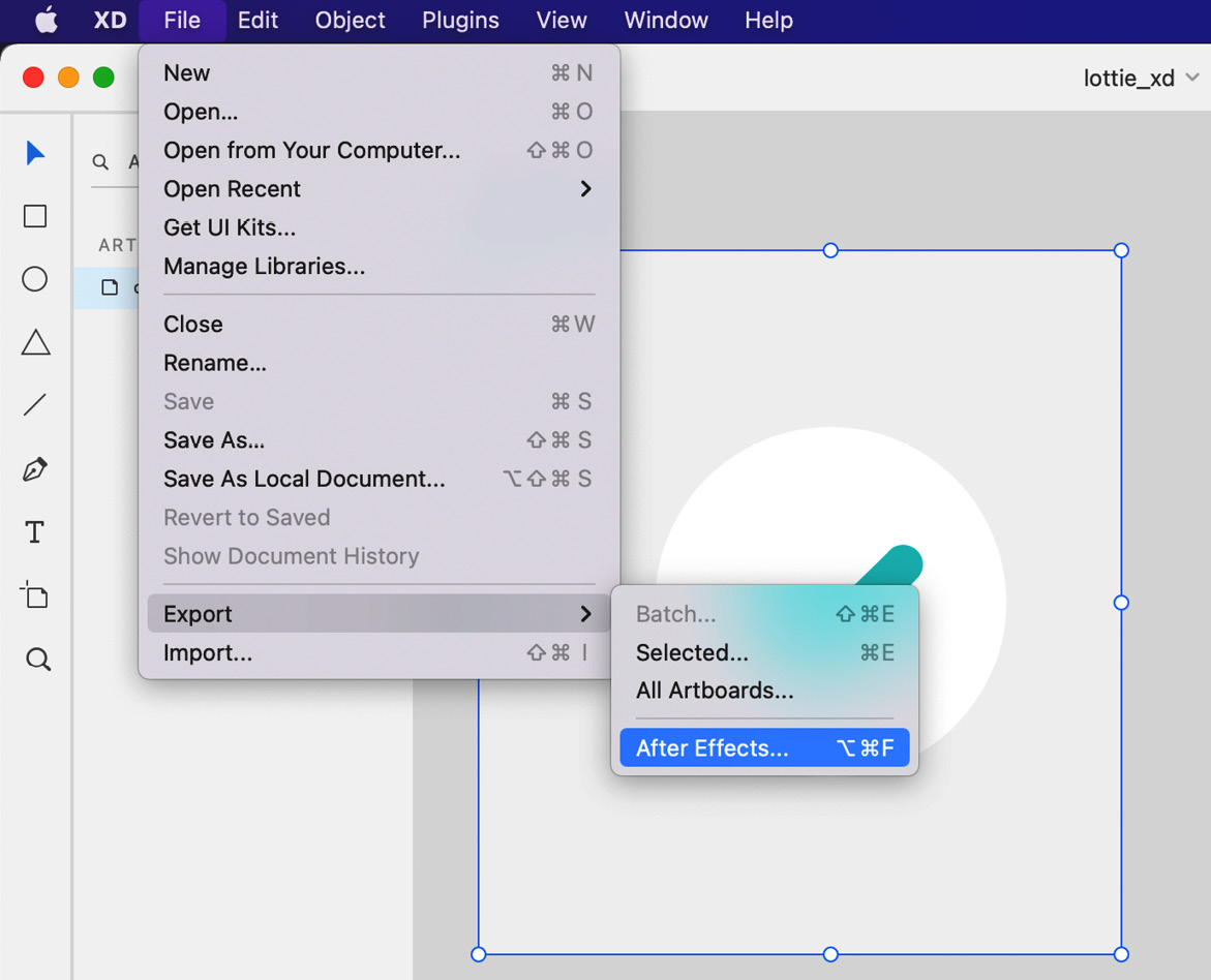
Figure 4.14 – Export option from XD
And, voilà! AE will open automatically, and our icon will be ready to be animated. Easy, right?
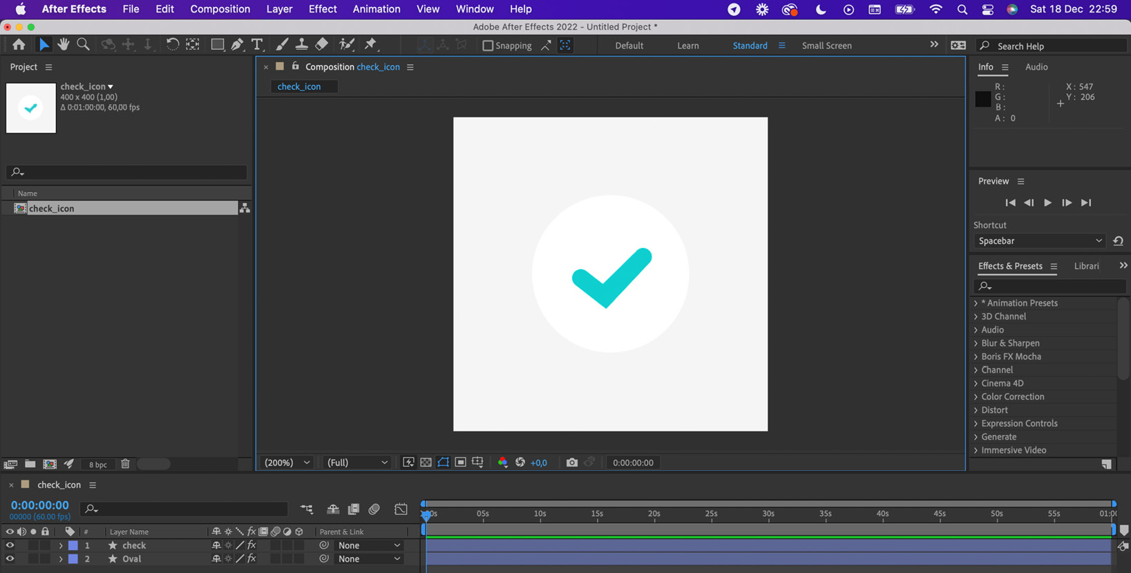
Figure 4.15 – XD icon imported to AE
Save the project and let's start animating!
UX animation workflow
Before we start messing around with AE, I want to share with you the workflow I normally use when animating.
You'll see we've been through half of the process already; now, we just need to bring it to life. And please, take this workflow as a suggestion and feel free to change it in any way to meet your own requirements. Here is my workflow:
- UX research to find user pain points.
- Spot problems/find solutions based on users' comments.
- Wireframing.
- Storyboard.
- Low fidelity design to test again.
- Design.
- Export assets to AE.
We have already covered all of these:
- Set up compositions.
- Create keyframes.
- Modify layers.
- Adjust timing.
- Add ease.
We will cover the following in Chapter 5, Share It With the World: Working With LottieFiles:
- Export as .json for LottieFiles
- Preview in LottieFiles
- Hand off to developers
I know, this process might look a bit long, but this is just an example that covers the whole process of a complex project. Sometimes, there won't be any need to run user interviews, or at some point, you won't need to draw a storyboard or wireframes as these will be in your head.
Let's go back and see where we were, let's see where we left our storyboard. Let's recap; what was our icon doing?
- Our icon will increase from 0% to 110% approximately.
- Bubbles come out from the Oval-like sparkles.
- Oval goes back to real size (100%) and the bubbles start to disappear.
- While the bubbles disappear, the check symbol starts to draw.
- Finally, the check symbol is revealed at 100%:

Figure 4.16 – Our storyboard
At this point, we have given you all the elements, resources, and tools necessary to have everything ready to start animating. We've been through a few main UX concepts, learned how to import our files to AE, checked one of many animation workflows, and gone through the storyboard again to refresh our minds.
So, now that we've got a pretty clear idea in our heads and on paper about how the animation is going to look, what needs to be done, and the steps to follow, let's start animating! Let's create our compositions.
Adjusting our icon composition settings
Remember back in Chapter 3, Learning the Tools: Getting Familiar With After Effects, we talked about compositions, what they are, and what we use them for? Cool. Now is the time to start putting everything we've learned into context.
When we import our icon to AE, it normally gets imported as a composition. Remember, compositions are shown in the Project panel, and to open one, we just need to double-click on it.
Now, how is this composition imported to AE? Are the main specifications of this composition the ones we want? Let's check it out. Let's check our Composition Settings icon:
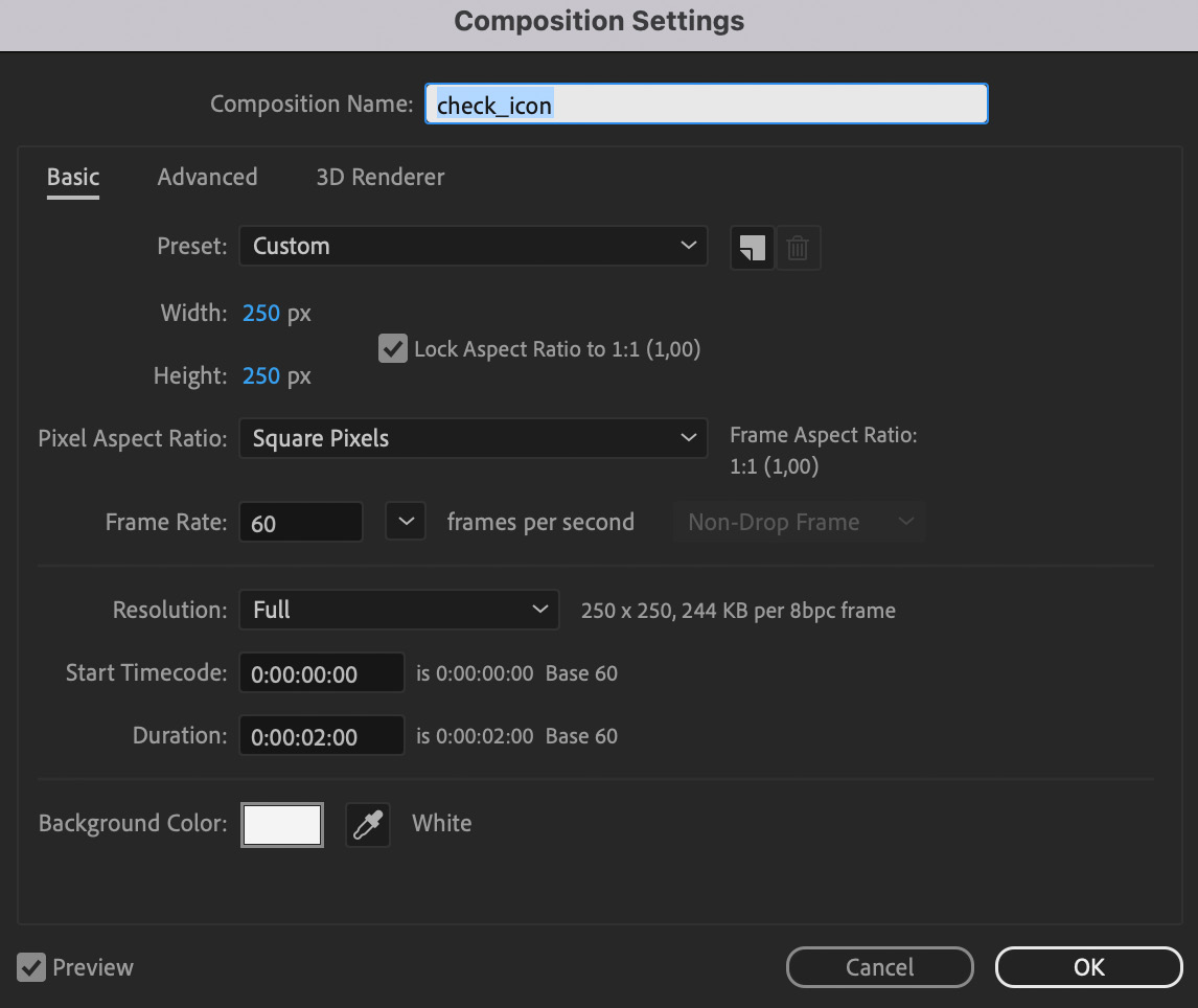
Figure 4.17 – Composition Settings window view
Let's adjust some of these settings. Remember how to do that? Here are the instructions:
- Select your composition from the Project panel.
- Select Composition | Composition Settings from the top menu.
- Adjust the composition size to 250 x 250 px.
- Set the frame rate to 60 frames per second.
- Set the duration to 2 seconds.
- Change the background color to #989898. Notice that the background color won't be exported, but I'm changing it so we can see the white circle better.
That was easy, right? Now that we've got our composition ready, let's move to the Layers panel.
Understanding our check icon layers
We've got our icon composition sorted and adjusted to our needs; now is the time to understand how our icon is built in terms of layers, so, let's check what we've got in our layers panel.
As you can see in Figure 4.18, when we check the Layer panel, we find the same two layers we had in our illustration file that we just imported, check and Oval.
Just to be clear, check is a stroke and Oval is a shape. This is important and will help us to give the effect that we want to the check layer. But, don't worry for now; we will see that a few steps further in this section.

Figure 4.18 – Layer panel with check and Oval layer properties
Also, as you can see in the preceding screenshot, each of our layers has a lot of sub-layers. We are going to be seeing this in the next steps.
But first, let's recap. Remember, our animation will start with the oval getting bigger.
Suggestion
Since we are going to be focusing on the Oval for now, I recommend blocking and hiding the check layer as it is not relevant at this stage. Of course, we've just got two layers and there's probably no need to start hiding or blocking other layers, but when we start working with some more complicated projects, this is good to have as a habit.
Click the little eye and lock icons from the Layer panel to hide and block any layer you want, as shown in the following screenshot:

Figure 4.19 – Eye and lock icons
Adding Keyframes
Great! Now that we are more familiar with our layers, and the Oval is on its own, and there's no danger that we are going to move the check icon, even by mistake, let's start creating some movement.
Remember back in Chapter 3, Learning the Tools: Getting Familiar With After Effects, when we talked about keyframes? Exactly! Keyframes are used to create movement and to do that, we need at least two of them: one keyframe as a starting point and one as an ending point.
That said, we want our Oval to grow from 0 to 100%, right? Any idea about how to do that? Sure, we will create two keyframes and change the scale of the Oval, so one keyframe will be 0% and the other 100%. Let's do that now.
Changing scale
We are going to start by animating the scale. How do we do that? By adjusting the scale's Oval properties, at specific keyframes. Here's how to do it:
- Go to the Layer panel.
- Open the Oval layer's Transform properties. You could do that by selecting the layer and pressing S, but we will talk more about shortcuts in the following sections.

Figure 4.20 – Scale values for the Oval layer
- Place the time slider at 0 frames.
- Click on the stopwatch of Scale to create our first keyframe:
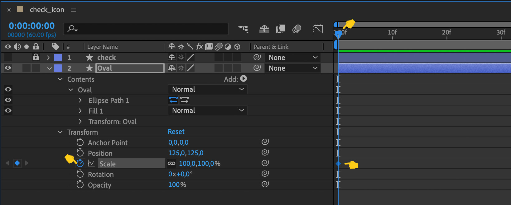
Figure 4.21 – New keyframe for the Scale property
- Move the time slider to frame 30.
- Click on the little diamond at the left of the Scale property to create our second keyframe:
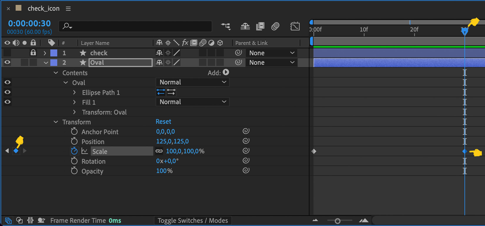
Figure 4.22 – Second keyframe
Now, let's move the time slider left and right; can you notice anything different? Of course not. We've just created the keyframes but haven't changed the Scale property yet. Let's do that as follows:
- Move the time slider to frame 0.
- Click on the keyframe we've just created.
- Set the Scale property's percentage to 0%:
Figure 4.23 – Scale value to 0%
- Press the spacebar or move your time slider from left to right; is anything happening now? Yes! Our icon is finally doing something!
- Place the time slider back at 0 and press the spacebar. Do that a few times to check the animation; what do you think? Is the timing correct? It is maybe too slow? No worries, we will adjust that later when we talk about Ease.
Now, going back to our storyboard, we've defined the Oval as scaling up to 110-120% and then going back to 100%. But, why are we doing that? Remember when we talked about 2D animation principles? For this little icon animation, we will be applying the Exaggeration and Stretch and Squash principles to our Oval, to give an idea of flexibility, mass, weight, and speed. So, simply exaggerating the size of it will give this impression.
How to do that? Easy. Follow these steps:
- Move the time slider to frame 25.
- Click on the diamond to create a new keyframe.
- Set the scale to 120%.
Press the spacebar to play our animation again. What do you think? With just this little tweak, our animation looks more real now; of course, the timing is still not good and is missing some Ease, but we are getting there.
Let's stick to the Oval. Let's adjust the timing. To do that, we just need to drag our keyframes. I encourage you to play around and move them around the timeline to see how Oval behaves. I'll set my Oval keyframes between frame 0, frame 18, and frame 21:
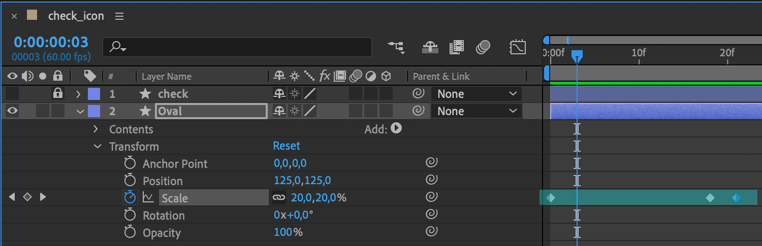
Figure 4.24 – Scale keyframes
Let's move the time slider to 0 and play it again a few times. What do you think? It looks better now, right? What about scaling up and down, maybe we could adjust the size a little bit? Let's adjust the second keyframe to make it subtle, the one that scales up to 120%, and take it down to 110%. Play again, and... it now looks smoother. Right! Let's keep moving! Let's tweak the Opacity property to make our illustration even smoother.
Adjusting the Opacity
Now that we've got the Scale property as we want it, let's adjust the opacity. To do that, we are going to follow the same steps as we did in the previous section. Of course, we could have done both at the same time, but I preferred to show you step by step; there will be plenty of time to do things quicker, but we want to have the basics clear, right?
Important
From now on, I'm going to start introducing some shortcuts that will save you tons of time and will help you be more productive. The shortcuts I'm using here are for macOS. Most of them are the same for macOS and Windows; however, if you are using a Windows system and you are not sure which shortcut to use, check Chapter 6, Don't Stop! Exploring Plugins and Resources That Will Keep You Going, for a list of the most common and useful shortcuts for macOS and Windows.
That said, let's change the opacity:
- Select the Oval layer.
- Press T to reveal the Opacity property (T stands for Opacity, A for Anchor Point, S for Scale, P for Position, and R for Rotation).
- Press Shift + S to show the Scale keyframes as well. We want to have that layer visible too, so by pressing Shift + A, S, P, or R we will open and close them without closing the rest.
- Place the time slider at keyframe 0. We can move backward and forward between keyframes by pressing K to move to the next keyframe and J to the previous one.
- Press the Opacity layer stopwatch to create our keyframe. We can also do that by pressing Option + T.
- Change the Opacity value down to 40%, for example:
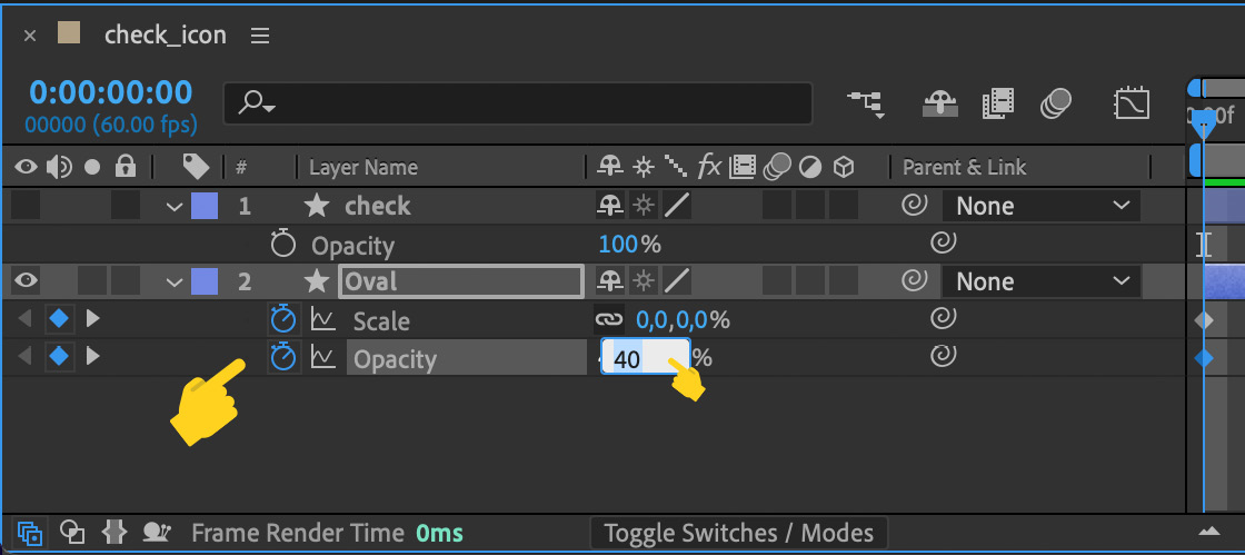
Figure 4.25 – Opacity value
Nice! That's the first keyframe created with a value of 40% opacity. Let's create a second keyframe:
- Move the time slider to the next keyframe by pressing K.
- Press
 + T to create a new keyframe or click on the little diamond icon as we did earlier.
 - Set the Opacity value to 100%.

Figure 4.26 – Second keyframe opacity property value set to 100%
- Let's move the time slider to 0 and press the spacebar to check our animation again.
Looks good to me, at least for now. Once we add some ease to the animation, it will look much more realistic and flexible. But, let's go first to animate check.
So, check behaves differently; it doesn't scale up or down or fade in, and is not rotating or moving either. What we've decided check will do is draw itself. How do we do that? Well, I'm going to show you how to use Trim Paths.
Trim Paths
To show and hide a path or reveal a part of it, we could be working with masks; however, Lottie doesn't work very well with them, at least not yet. Using masks can get us in trouble so we are going to try to avoid them and try something else.
Another option could be to draw our check animation frame by frame, so the following keyframe always shows a little bit more of the drawing than the first one, but this would be very time-consuming!
This is where Trim Paths comes into the picture. Using this option can be very helpful and time-saving. Let's see what this can do for us:
- Block the Oval layer. In that case, we are not going to hide this layer as it is behind the check layer.
- Show and unlock the check layer by pressing the little eye and lock icon.
- Open the check layer.
- Open the Contents properties and close everything else:

Figure 4.27 – Contents properties
- Click on the Add arrow button and select the Trim Paths option:
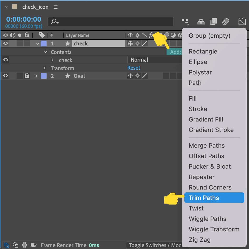
Figure 4.28 – Selecting Trim Paths
Now, let's check our Layer panel; what happened there? As you can see, a layer called Trim Paths 1 has appeared. Let's open it up by clicking on the little arrow. A few different options come up; what are these?
These new options will let us decide whether the check path starts drawing itself from the beginning of the path or the end. Instead of a drawing effect, it is more of an erasing effect.

Figure 4.29 – Trim Path options
Let's mess around a bit with these options:
- Place the time slider on keyframe 0.
- Create a new keyframe at the Start layer.
- Set the Start value to 0.
- Place the time slider on keyframe 30.
- Create a new keyframe.
- Set the Start value to 100%.
- Move the time slider back to 0.
- Press the spacebar to check the animation.
What's happening here? It looks like check is doing what we wanted but the other way around. Instead of drawing itself, it is erasing itself. Right, this feature can be a bit confusing sometimes, but don't get frustrated! It took me a while to understand the logic behind it, and even now, sometimes I have to try it a few times to get it right. So, I encourage you to play around with the Start and End values to get used to the effect and its behavior.
Now let's swap the values and try to get it right:
- Let's set up the Start value at keyframe 0 to 100%.
- Move to the next frame and set the Start value to 0.
- Press the spacebar and check it out.
Great! Now, the check icon is doing it right. It starts from nothing to drawing itself, as if someone was writing it, right? We've got it! However, the animation is not placed in the right place.
Notice that the check animation is starting before the Oval is 100% on screen. If we take a look at our timeline (see Figure 4.30), we can see that both layers have the keyframes within the same time. Both are starting at frame 0, which is why the check icon is playing at the same time as the Oval.
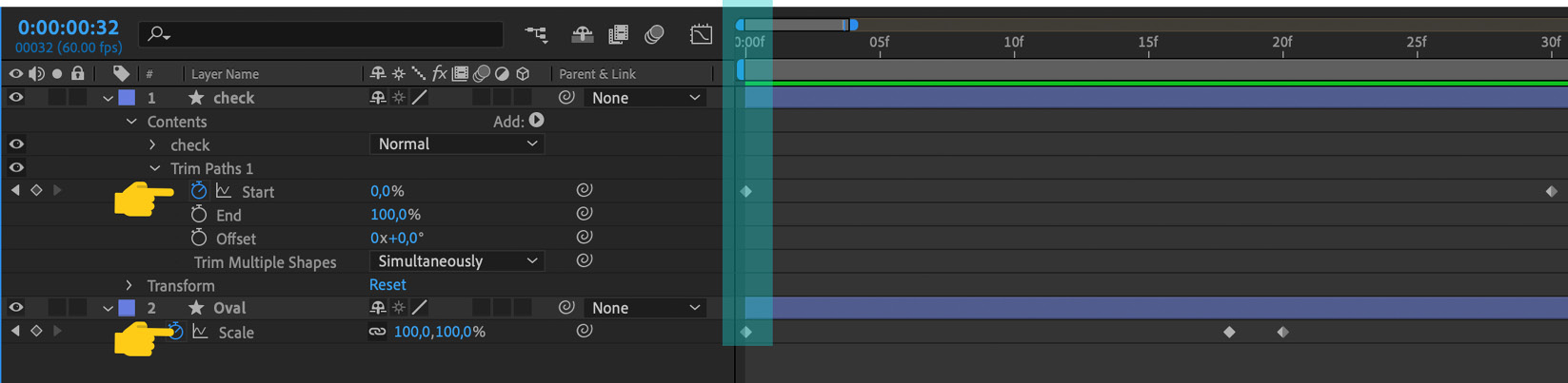
Figure 4.30 – Keyframes position on the timeline
Remember that when we defined our storyboard, we decided check was going to be drawn after the Oval was shown on screen. So, to do that, we need to adjust a couple of things:
- Unlock the Oval layer.
- Select the Oval layer and press S to show the Scale property.
Let's check our keyframes on the Layer panel. We can see both animations are starting at frame 0. Instead, based on our storyboard, the check animation should start once the Oval is fully 100% on screen. That means, we need to move the check keyframes to the end of the Oval animation. We can do that by selecting both the check keyframes and just dragging them to the right. You'll know both keyframes are selected as they both will be blue:
- Select both keyframes and drag them to the right.
- Press the spacebar and check the animation:

Figure 4.31 – Check keyframes
Cool! Looks perfect to me now! However, it looks a bit slow, don't you think?
- Select the second check keyframe.
- Drag it to frame 35 approximately.
- Press the spacebar to play the animation.
Perfect, we've got it! We are getting there. Now, we are going to add the sparks.
Working with radial bursts
To add some fun to our animation, we are going to add little sparks coming out of Oval. To do that, we could animate each individual sparkle on its own, drawing little circles, and changing the Position, Scale, and Opacity values for each of them. However, we are going to try something different here. I'm going to teach you how to create a radial burst, a really cool effect that is going to save us a lot of time.
So, let's do it! Let's start by creating a new composition by pressing ![]() + N and naming it Sparks. We don't need to change any more settings.
+ N and naming it Sparks. We don't need to change any more settings.

Figure 4.32 – Composition settings
Follow these steps:
- Now, let's draw a shape layer inside our Sparks composition. Let's do a circle.
- Grab Ellipse Tool from the top menu.
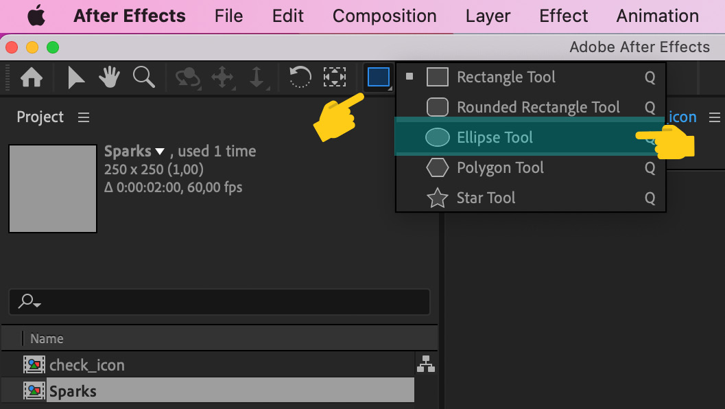
Figure 4.33 – View of the Project panel with a new composition called Sparks
- Draw a circle in the Stage panel.
- Let's draw a small circle. Let's name the Shape layer as circle by right-clicking on the shape layer's name, Shape Layer 1.

Figure 4.34 – Renaming the layer
- Let's open up the circle layer and see what we've got there. As you may notice, we can see two different Transform options:
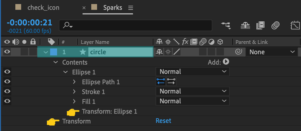
Figure 4.35 – Circle layer Transform options
For this effect, we are not going to use the Transform options we've been using up till now; instead, if we want the radial burst effect to work, we are going to be working with the Transform options we can find inside the Contents option:
- So, let's open that up. Open Transform: Ellipse 1.
- Click on Contents.
- Click on Transform: Ellipse 1.
As you can see in Figure 4.36, we find almost the same options as we found earlier in the Transform tools:

Figure 4.36 – Transform Ellipse 1 options
- Select the Position property.
- Create a keyframe on frame 0.
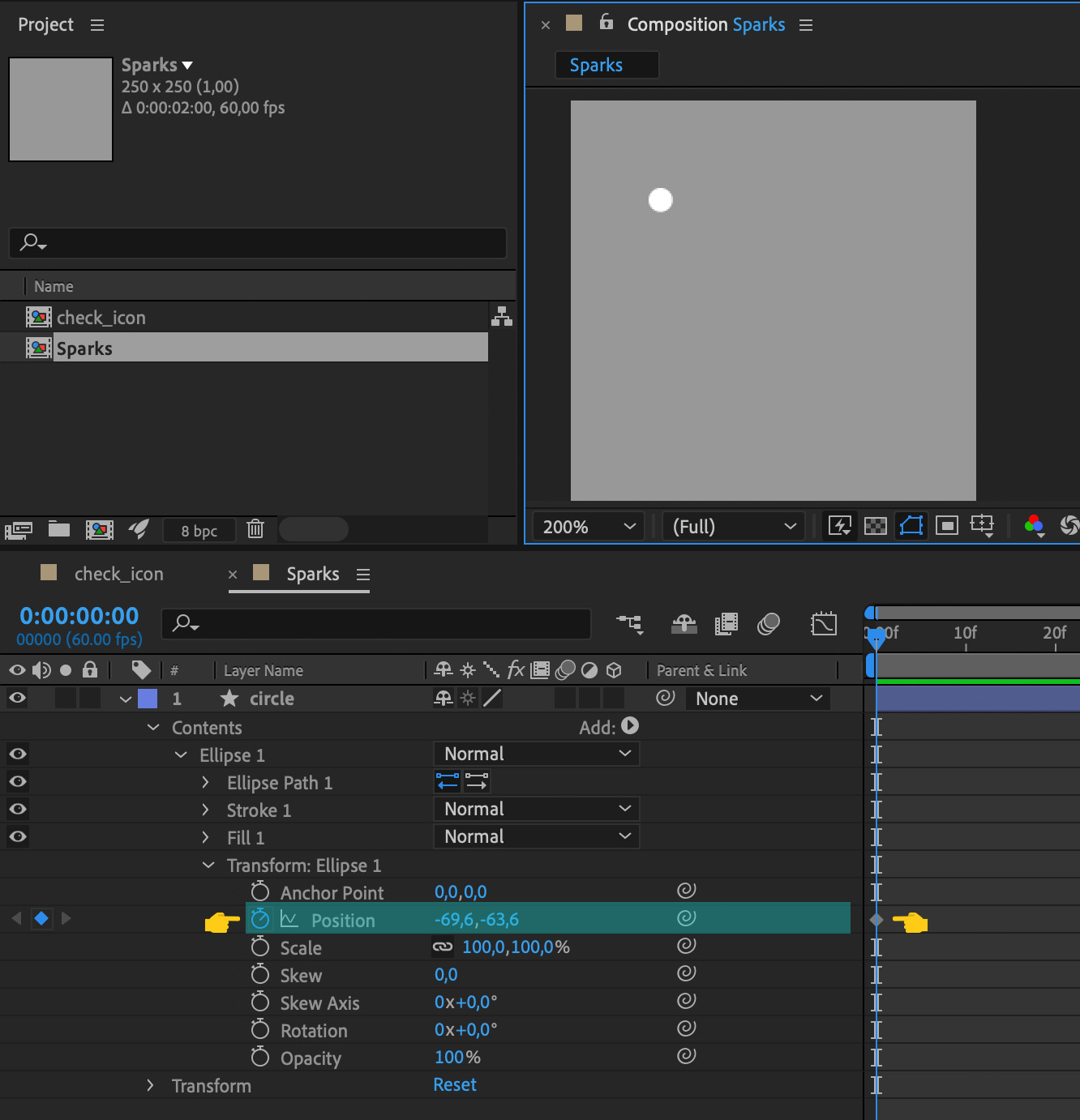
Figure 4.37 – Layer and Timeline view of a new keyframe for the Position property
- Now, hold down Shift +
 and press the right arrow three times; that will move our time slider to frame 30. Or, just drag and drop the time slider.
 - Create a Position keyframe.
- Move circle a few pixels up, and a few pixels right.

Figure 4.38 – Layer and Timeline view of a second new keyframe for the Position property
Now, let's change the Scale property so it will scale out at the end:
- Move the time slider to 0.
- Create a Scale keyframe.
- Move the time slider to frame 30.
- Create a second Scale keyframe.
- Scale down the circle to 0.

Figure 4.39 – Timeline view of the Scale keyframes
While we are at it, let's make our circle fade out, so let's change Opacity:
- Move the time slider to 0.
- Create an Opacity keyframe.
- Move the time slider to 30.
- Create a second Opacity keyframe.
- Set the Opacity property to 0.
Good! Can you feel it? We are animating with no effort at all! Now, your timeline should look something like the one shown in the following screenshot:

Figure 4.40 – Timeline view of the Opacity keyframes
- Let's select circle.
- Click the Add button.
- Select the Repeater option:

Figure 4.41 – Add menu view

Figure 4.42 – Repeater 1 layer view in the Layer panel
Let's open it up and see what's in there. As you can see in the following screenshot, we find new properties and values. As always, I encourage you to play around with the values here:
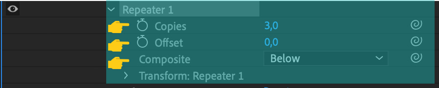
Figure 4.43 – The Repeater properties view
Let's continue. For our animation, I suggest you do the following:
- Change the Copies value to 15.
- Open up Transform: Repeater 1.
- Set Position to 0.
- Set Rotation to 24.
And then, press play!
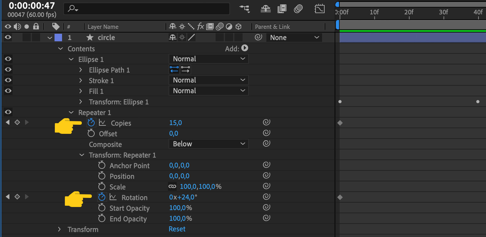
Figure 4.44 – Repeaters properties and transformations view
Isn't that cool? In just no time, we've created our version of sparks by just animating one circle. Imagine what we could do if we start adding some more elements!
Now, let's go back to our main composition:
- Go to the Project panel.
- Double-click on the check icon.
Let's finish our animation:
- Drag the Spark composition from the Project panel to the Layer panel.
- Go to the timeline.
- Drag the Spark composition to the right, so that the animation starts at frame 21. Our timeline will look like the following screenshot:
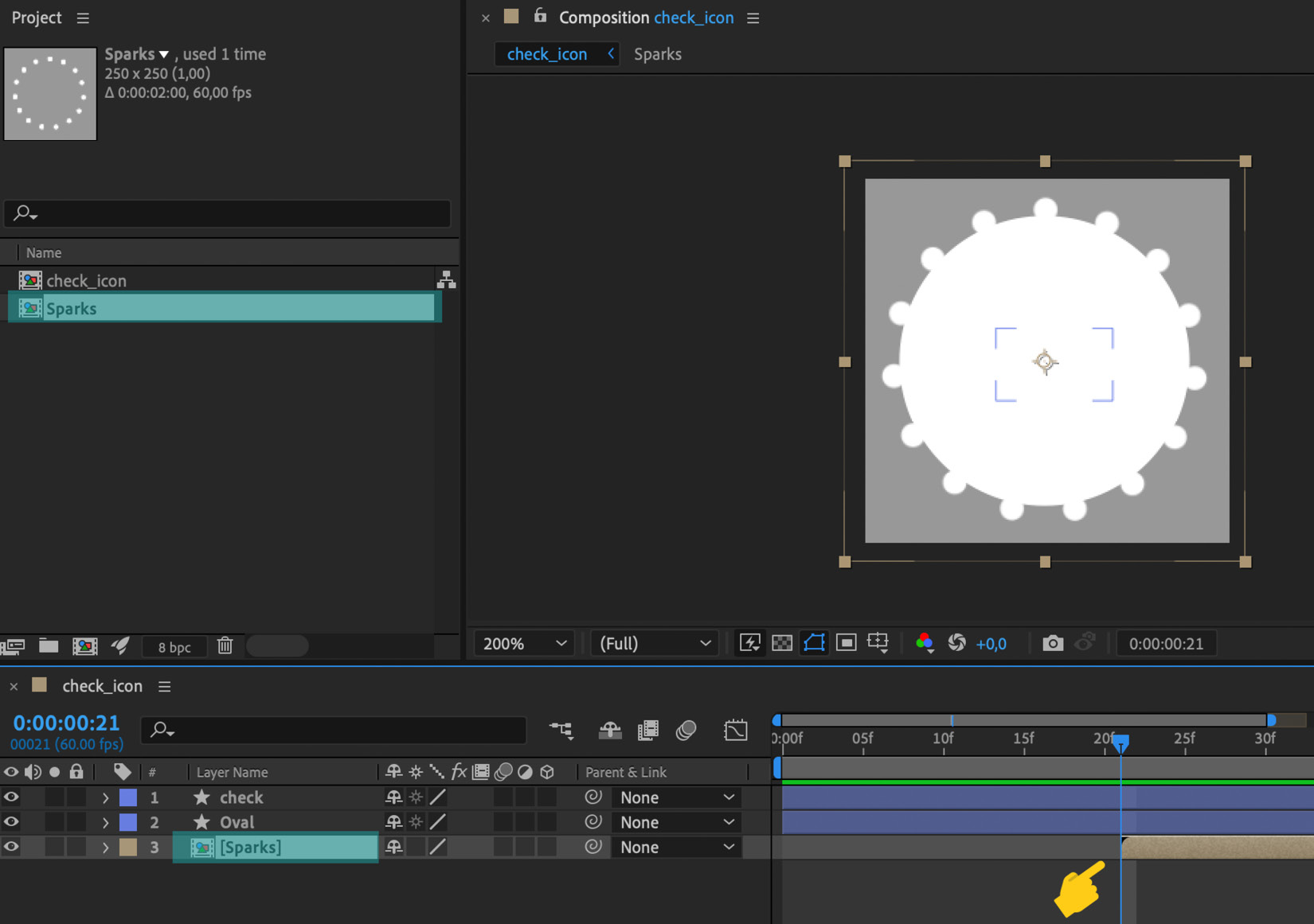
Figure 4.45 – View of the timeline of the Spark composition starting at frame 21
Now, let's play the animation! What do you think? I'm going to adjust Scale of Sparks a little bit; I'm going to change the value to 110%. Let's do that and play it again. Nice! We are nearly done!

Figure 4.46 – Radial burst effect
Good job! We've come a long way! In this last section, we've learned about and practiced so many new things. We got hands-on with our first animated icon. We now know how to create keyframes and change the property values to create the illusion of motion and animation. We know that by changing the layer's scale, rotation, position, and transparency, we can achieve great effects.
We also learned two cool techniques that will save us a lot of effort when animating: Trim Paths and radial burst. We also applied some of the principles we learned in the first part of this book.
But, before we move to exporting and handing off our animations, I want to show you the Ease effect I've been talking about in the last two chapters. So, let's move forward; let's discover Ease!
Adding ease
Now that we've got our animation up and running, let's nail it by adding some Ease. Remember the anticipation principle we talked about back in Creating the illusion: Get Rolling with the Basic Principles of 2D Classic Animation? That's what we can achieve with Ease: the perception of acceleration and slowing down with just one click. And, this little tweak is going to make our animation look much nicer, smoother, and professional. Here's how to do it:
- Open up the Oval layer to reveal its keyframes.
- Go to the timeline, right-click on the Scale keyframe 0, and select Keyframe Assistant | Easy Ease Out.

Figure 4.47 – Right-click on the Keyframe menu view
Now, let's do the same with the last keyframe, the one placed at frame :1.
- Go to the timeline, right-click on the Scale keyframe 21, and select Keyframe Assistant | Easy Ease Out.
- For the second keyframe, the one placed at frame 18, let's right-click on it and apply Easy Ease In, so your timeline should look as in Figure 4.48:

Figure 4.48 – Representation of Keyframes with Ease In and Out applied
Let's check the Ease panel. Click on the little icon from the timeline. From the graph, we can predict the velocity of the animation; it will accelerate exponentially at the beginning and slow down at the end.
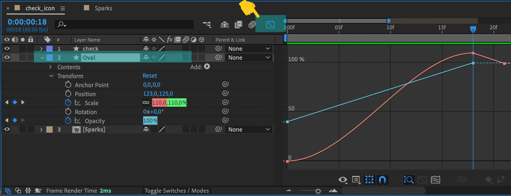
Figure 4.49 – The Ease panel view
Now, let's play our animation. What do you think? Can you tell the difference? I bet you can! Now, the animation looks smoother. But, before we move to do the same to the check layer, I suggest you play around with values and options. You know, learn by doing!
Great! We've got our Oval looking quite cool, so now let's do the same with check:
- Open the check layer.
- Open the Contents layer.
- Open the Trim Paths layer.
- Right-click on the keyframe placed at frame 21, the first frame of our check animation.
- Select Keyframe Assistant | Easy Ease.
- Do the same for the keyframe placed at frame 35.
- Play the animation.
It's getting there! Now, to finalize it, I'm going to do that in the spark composition as well:
- Go to the Project panel.
- Double-click on the spark composition.
- Select all keyframes.
- Apply Easy Ease.
- Go to the Project panel.
- Double-click on the check icon composition.
- Play it.
Our animation is done!
As you've just experienced, Ease is a really powerful tool that will make your animations look stunning in no time. Of course, there is a lot more to learn about it; we've just gone through a couple of aspects of it so that you have the basic skills to learn further on your own.
As we mentioned at the beginning of this book, we are not aiming to be an AE tutorial book; instead, we want to give you enough knowledge, background, and resources for you to start creating animations on your own, from concept to hand-off. So, I encourage you to explore and read more about Ease.
If you don't know where to start, you know we've got you sorted, so just keep reading as, in Chapter 6, Don't Stop! Exploring Plugins and Resources That Will Keep You Going, you'll find more resources about Ease and much more!
Summary
It wasn't that hard, was it? We've finished our first professional-looking animation in no time! Our customers won't feel confused after the purchase and our app will look much better. Win-win-win!
In this chapter, we've been through a real project and learned the UX animation AE workflow. We have now covered the whole process, from ideation to final animation. We know how to read and understand storyboards, we've learned how to import our assets to AE, set up a composition, create keyframes, and modify layer properties such as Scale, Position, Rotation, and Opacity to create our animation. We've also learned how to use Trim Paths and radial bursts to create special effects, how to adjust timing, and how to apply Ease to finalize our project.
Let's move on to the next chapter, where we will learn how to export our animation as a .json file and preview it on the LottieFiles platform. See you there!