
14
Advanced Concepts for Machine Learning Projects
In the previous chapter, we introduced a possible workflow for solving a real-life problem using machine learning. We went over the entire project, starting with cleaning the data, through training and tuning a model, and then lastly evaluating its performance. However, this is rarely the end of the project. In that project, we used a simple decision tree classifier, which most of the time can be used as a benchmark or minimum viable product (MVP). In this chapter, we cover a few more advanced concepts that can help with improving the value of the project and make it easier to adopt by the business stakeholders.
After creating the MVP, which serves as a baseline, we would like to improve the model’s performance. While attempting to improve the model, we should also try to balance underfitting and overfitting. There are a few ways to do so, some of which include:
- Gathering more data (observations)
- Adding more features—either by gathering additional data (for example, by using external data sources) or through feature engineering using currently available information
- Using more complex models
- Selecting only the relevant features
- Tuning the hyperparameters
There is a common stereotype that data scientists spend 80% of their time on a project gathering and cleaning data while only 20% remains for the actual modeling. In line with the stereotype, adding more data might greatly improve a model’s performance, especially when dealing with imbalanced classes in a classification problem. But finding additional data (be it observations or features) is not always possible, or might simply be too complicated. Then, the other solution may be to use more complex models or to tune the hyperparameters to squeeze out some extra performance.
We start the chapter by presenting how to use more advanced classifiers, which are also based on decision trees. Some of them (XGBoost and LightGBM) are frequently used for winning machine learning competitions (such as those found on Kaggle). Additionally, we introduce the concept of stacking multiple machine learning models to further improve prediction performance.
Another common real-life problem concerns dealing with imbalanced data, that is, when one class (such as default or fraud) is rarely observed in practice. This makes it especially difficult to train a model to accurately capture the minority class observations. We introduce a few common approaches to handling class imbalance and compare their performance on a credit card fraud dataset, in which the minority class corresponds to 0.17% of all the observations.
Then, we also expand on hyperparameter tuning, which was explained in the previous chapter. Previously, we used either an exhaustive grid search or a randomized search, both of which are carried out in an uninformed manner. This means that there is no underlying logic in selecting the next set of hyperparameters to investigate. This time, we introduce Bayesian optimization, in which past attempts are used to select the next set of values to explore. This approach can significantly speed up the tuning phase of our projects.
In many industries (and finance especially) it is crucial to understand the logic behind a model’s prediction. For example, a bank might be legally obliged to provide actual reasons for declining a credit request, or it can try to limit its losses by predicting which customers are likely to default on a loan. To get a better understanding of the models, we explore various approaches to determining feature importance and model explainability. The latter is especially relevant when dealing with complex models, which are often considered to be black boxes, that is, unexplainable. We can additionally use those insights to select only the most relevant features, which can further improve the model’s performance.
In this chapter, we present the following recipes:
- Exploring ensemble classifiers
- Exploring alternative approaches to encoding categorical features
- Investigating different approaches to handling imbalanced data
- Leveraging the wisdom of the crowds with stacked ensembles
- Bayesian hyperparameter optimization
- Investigating feature importance
- Exploring feature selection techniques
- Exploring explainable AI techniques
Exploring ensemble classifiers
In Chapter 13, Applied Machine Learning: Identifying Credit Default, we learned how to build an entire machine learning pipeline, which contained both preprocessing steps (imputing missing values, encoding categorical features, and so on) and a machine learning model. Our task was to predict customer default, that is, their inability to repay their debts. We used a decision tree model as the classifier.
Decision trees are considered simple models and one of their drawbacks is overfitting to the training data. They belong to the group of high-variance models, which means that a small change to the training data can greatly impact the tree’s structure and its predictions. To overcome those issues, they can be used as building blocks for more complex models. Ensemble models combine predictions of multiple base models (for example, decision trees) in order to improve the final model’s generalizability and robustness. This way, they transform the initial high-variance estimators into a low-variance aggregate estimator.
On a high level, we could divide the ensemble models into two groups:
- Averaging methods—several models are estimated independently and then their predictions are averaged. The underlying principle is that the combined model is better than a single one as its variance is reduced. Examples: Random Forest and Extremely Randomized Trees.
- Boosting methods—in this approach, multiple base estimators are built sequentially and each one tries to reduce the bias of the combined estimator. Again, the underlying assumption is that a combination of multiple weak models produces a powerful ensemble. Examples: Gradient Boosted Trees, XGBoost, LightGBM, and CatBoost.
In this recipe, we use a selection of ensemble models to try to improve the performance of the decision tree approach. As those models are based on decision trees, the same principles about feature scaling (no explicit need for it) apply and we can reuse most of the previously created pipeline.
Getting ready
In this recipe, we build on top of what we already established in the Organizing the project with pipelines recipe from the previous chapter, in which we created the default prediction pipeline, from loading the data to training the classifier.
In this recipe, we use the variant without the outlier removal procedure. We will be replacing the last step (the classifier) with more complex ensemble models. Additionally, we first fit the decision tree pipeline to the data to obtain the baseline model for performance comparison. For your convenience, we reiterate all the required steps in the notebook accompanying this chapter.
How to do it...
Execute the following steps to train the ensemble classifiers:
- Import the libraries:
from sklearn.ensemble import (RandomForestClassifier,
                              GradientBoostingClassifier)
from xgboost.sklearn import XGBClassifier
from lightgbm import LGBMClassifier
from chapter_14_utils import performance_evaluation_report
In this chapter, we also use the already familiar
performance_evaluation_reporthelper function.
- Define and fit the Random Forest pipeline:
rf = RandomForestClassifier(random_state=42)
rf_pipeline = Pipeline(
    steps=[("preprocessor", preprocessor),
           ("classifier", rf)]
)
rf_pipeline.fit(X_train, y_train)
rf_perf = performance_evaluation_report(rf_pipeline, X_test,
                                        y_test, labels=LABELS,
                                        show_plot=True,
                                        show_pr_curve=True)
The performance of the Random Forest can be summarized by the following plot:

Figure 14.1: Performance evaluation of the Random Forest model
- Define and fit the Gradient Boosted Trees pipeline:
gbt = GradientBoostingClassifier(random_state=42)
gbt_pipeline = Pipeline(
    steps=[("preprocessor", preprocessor),
           ("classifier", gbt)]
)
gbt_pipeline.fit(X_train, y_train)
gbt_perf = performance_evaluation_report(gbt_pipeline, X_test,
                                         y_test, labels=LABELS,
                                         show_plot=True,
                                         show_pr_curve=True)
The performance of the Gradient Boosted Trees can be summarized by the following plot:

Figure 14.2: Performance evaluation of the Gradient Boosted Trees model
- Define and fit an XGBoost pipeline:
xgb = XGBClassifier(random_state=42)
xgb_pipeline = Pipeline(
    steps=[("preprocessor", preprocessor),
           ("classifier", xgb)]
)
xgb_pipeline.fit(X_train, y_train)
xgb_perf = performance_evaluation_report(xgb_pipeline, X_test,
                                         y_test, labels=LABELS,
                                         show_plot=True,
                                         show_pr_curve=True)
The performance of the XGBoost can be summarized by the following plot:

Figure 14.3: Performance evaluation of the XGBoost model
- Define and fit the LightGBM pipeline:
lgbm = LGBMClassifier(random_state=42)
lgbm_pipeline = Pipeline(
    steps=[("preprocessor", preprocessor),
           ("classifier", lgbm)]
)
lgbm_pipeline.fit(X_train, y_train)
lgbm_perf = performance_evaluation_report(lgbm_pipeline, X_test,
                                          y_test, labels=LABELS,
                                          show_plot=True,
                                          show_pr_curve=True)
The performance of the LightGBM can be summarized by the following plot:
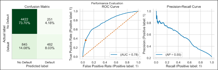
Figure 14.4: Performance evaluation of the LightGBM model
From the reports, it looks like the shapes of the ROC curve and the Precision-Recall curve were very similar for all the considered models. We will look at the scores of the models in the There’s more… section.
How it works...
This recipe shows how easy it is to use different classifiers, as long as we want to use their default settings. In the first step, we imported the classifiers from their respective libraries.
In this recipe, we have used the scikit-learn API of libraries such as XGBoost or LightGBM. However, we could also use their native approaches to training models, which might require some additional effort, such as converting a pandas DataFrame to formats acceptable by those libraries. Using the native approaches can yield some extra benefits, for example, in terms of accessing certain hyperparameters or configuration settings.
In Steps 2 to 5, we created a separate pipeline for each classifier. We combined the already established ColumnTransformer preprocessor with the corresponding classifier. Then, we fitted each pipeline to the training data and presented the performance evaluation report.
Some of the considered ensemble models offer additional functionalities in the fit method (as opposed to setting hyperparameters when instantiating the class). For example, when using the fit method of LightGBM we can pass in the names/indices of categorical features. By doing so, the algorithm knows how to treat those features using its own approach, without the need for explicit one-hot encoding. Similarly, we could use a wide variety of available callbacks.
Thanks to modern Python libraries, fitting all the considered classifiers was extremely easy. We only had to replace the model’s class in the pipeline with another one. Keeping in mind how simple it is to experiment with different models, it is good to have at least a basic understanding of what those models do and what their strengths and weaknesses are. That is why below we provide a brief introduction to the considered algorithms.
Random Forest
Random Forest is an example of an ensemble of models, that is, it trains multiple models (decision trees) and uses them to create predictions. In the case of a regression problem, it takes the average value of all the underlying trees. For classification it uses a majority vote. Random Forest offers more than just training many trees and aggregating their results.
First, it uses bagging (bootstrap aggregation)—each tree is trained on a subset of all available observations. Those are drawn randomly with replacement, so—unless specified otherwise—the total number of observations used for each tree is the same as the total in the training set. Even though a single tree might have high variance with respect to a particular dataset (due to bagging), the forest will have lower variance overall, without increasing the bias. Additionally, this approach can also reduce the effect of any outliers in the data as they will not be used in all of the trees. To add even more randomness, each tree only considers a subset of all features to create each split. We can control that number using a dedicated hyperparameter.
Thanks to those two mechanisms, the trees in the forest are not correlated with each other and are built independently. The latter allows for the parallelization of the tree-building step.
Random Forest provides a good trade-off between complexity and performance. Often—without any tuning—we can get much better performance than when using simpler algorithms, such as decision trees or linear/logistic regression. That is because Random Forest has a lower bias (due to its flexibility) and reduced variance (due to aggregating predictions of multiple models).
Gradient Boosted Trees
Gradient Boosted Trees is another type of ensemble model. The idea is to train many weak learners (shallow decision trees/stumps with high bias) and combine them to obtain a strong learner. In contrast to Random Forest, Gradient Boosted Trees is a sequential/iterative algorithm. In boosting, we start with the first weak learner, and each of the subsequent learners tries to learn from the mistakes of the previous ones. They do this by being fitted to the residuals (error terms) of the previous models.
The reason why we create an ensemble of weak learners instead of strong learners is that in the case of the strong learners, the errors/mislabeled data points would most likely be the noise in the data, so the overall model would end up overfitting to the training data.
The term gradient comes from the fact that the trees are built using gradient descent, which is an optimization algorithm. Without going into too much detail, it uses the gradient (slope) of the loss function to minimize the overall loss and achieve the best performance. The loss function represents the difference between the actual and predicted values. In practice, to perform the gradient descent procedure in Gradient Boosted Trees, we add such a tree to the model that follows the gradient. In other words, such a tree reduces the value of the loss function.
We can describe the boosting procedure using the following steps:
- The process starts with a simple estimate (mean, median, and so on).
- A tree is fitted to the error of that prediction.
- The prediction is adjusted using the tree’s prediction. However, it is not fully adjusted, but only to a certain degree (based on a learning rate hyperparameter).
- Another tree is fitted to the error of the updated prediction and the prediction is further adjusted as in the previous step.
- The algorithm continues to iteratively reduce the error until a specified number of rounds (or another stopping criterion) is reached.
- The final prediction is the sum of the initial prediction and all the adjustments (predictions of the error weighted with the learning rate).
In contrast to Random Forest, Gradient Boosted Trees use all available data to train the models. However, we can use random sampling without replacement for each tree by using the subsample hyperparameter. Then, we are dealing with Stochastic Gradient Boosted Trees. Additionally, similarly to Random Forest, we can make the trees consider only a subset of features when making a split.
XGBoost
Extreme Gradient Boosting (XGBoost) is an implementation of Gradient Boosted Trees that incorporates a series of improvements resulting in superior performance (both in terms of evaluation metrics and estimation time). Since being published, the algorithm has been successfully used to win many data science competitions.
In this recipe, we only present a high-level overview of its distinguishable features. For a more detailed overview, please refer to the original paper (Chen et al. (2016)) or documentation. The key concepts of XGBoost are the following:
- XGBoost combines a pre-sorted algorithm with a histogram-based algorithm to calculate the best splits. This tackles a significant inefficiency of Gradient Boosted Trees, namely that the algorithm considers the potential loss for all possible splits when creating a new branch (especially important when considering hundreds or thousands of features).
- The algorithm uses the Newton-Raphson method to approximate the loss function, which allows us to use a wider variety of loss functions.
- XGBoost has an extra randomization parameter to reduce the correlation between the trees.
- XGBoost combines Lasso (L1) and Ridge (L2) regularization to prevent overfitting.
- It offers a more efficient approach to tree pruning.
- XGBoost has a feature called monotonic constraints—the algorithm sacrifices some accuracy and increases the training time to improve model interpretability.
- XGBoost does not take categorical features as input—we must use some kind of encoding for them.
- The algorithm can handle missing values in the data.
LightGBM
LightGBM, released by Microsoft, is another competition-winning implementation of Gradient Boosted Trees. Thanks to some improvements, LightGBM results in a similar performance to XGBoost, but with faster training time. Key features include the following:
- The difference in speed is caused by the approach to growing trees. In general, algorithms (such as XGBoost) use a level-wise (horizontal) approach. LightBGM, on the other hand, grows trees leaf-wise (vertically). The leaf-wise algorithm chooses the leaf with the maximum reduction in the loss function. Such algorithms tend to converge faster than the level-wise ones; however, they tend to be more prone to overfitting (especially with small datasets).
- LightGBM employs a technique called Gradient-based One-Side Sampling (GOSS) to filter out the data instances used for finding the best split value. Intuitively, observations with small gradients are already well trained, while those with large gradients have more room for improvement. GOSS retains instances with large gradients and additionally samples randomly from observations with small gradients.
- LightGBM uses Exclusive Feature Bundling (EFB) to take advantage of sparse datasets and bundles together features that are mutually exclusive (they never have values of zero at the same time). This leads to a reduction in the complexity (dimensionality) of the feature space.
- The algorithm uses histogram-based methods to bucket continuous feature values into discrete bins in order to speed up training and reduce memory usage.
The leaf-wise algorithm was later added to XGBoost as well. To make use of it, we need to set grow_policy to "lossguide".
There’s more...
In this recipe, we showed how to use selected ensemble classifiers to try to improve our ability to predict customers’ likelihood of defaulting their loan. To make things even more interesting, these models have dozens of hyperparameters to tune, which can significantly increase (or decrease) their performance.
For brevity, we will not discuss the hyperparameter tuning of these models here. We refer you to the accompanying Jupyter notebook for a short introduction to tuning these models using a randomized grid search approach. Here, we only present a table containing the results. We can compare the performance of the models with default settings versus their tuned counterparts.

Figure 14.5: Table comparing the performance of various classifiers
For the models calibrated using the randomized search (including the _rs suffix in the name), we used 100 random sets of hyperparameters. As the considered problem deals with imbalanced data (the minority class is ~20%), we look at recall for performance evaluation.
It seems that the basic decision tree achieved the best recall score on the test set. This came at the cost of much lower precision than the more advanced models. That is why the F1 score (a harmonic mean of precision and recall) is the lowest for the decision tree. We can see that the default LightGBM model achieved the best F1 score on the test set.
The results by no means indicate that the more complex models are inferior—they might simply require more tuning or a different set of hyperparameters. For example, the ensemble models enforced the maximum depth of the tree (determined by the corresponding hyperparameter), while the decision tree had no such limit and it reached the depth of 37. The more advanced the model, the more effort it requires to “get it right.”
There are many different ensemble classifiers available to experiment with. Some of the possibilities include:
- AdaBoost—the first boosting algorithm.
- Extremely Randomized Trees—this algorithm offers improved randomness as compared to Random Forests. Similar to Random Forest, a random subset of features is considered when making a split. However, instead of looking for the most discriminative thresholds, the thresholds are drawn at random for each feature. Then, the best of these random thresholds is picked as the splitting rule. Such an approach usually allows us to reduce the variance of the model, while slightly increasing its bias.
- CatBoost—another boosting algorithm (developed by Yandex) that puts a high emphasis on handling categorical features and achieving high performance with little hyperparameter tuning.
- NGBoost—at a very high level, this model introduces uncertainty estimation into the gradient boosting by using the natural gradient.
- Histogram-based gradient boosting—a variant of gradient boosted trees available in
scikit-learnand inspired by LightGBM. They accelerate the training procedure by discretizing (binning) the continuous features into a predetermined number of unique values.
While some algorithms have introduced certain features first, the other popular implementations of gradient boosted trees often receive those as well. An example might be the histogram-based approach to discretizing continuous features. While it was introduced in LightGBM, it was later added to XGBoost as well. The same goes for the leaf-wise approach to growing trees.
See also
We present additional resources on the algorithms mentioned in this recipe:
- Breiman, L. 2001. “Random Forests.” Machine Learning 45(1): 5–32.
- Chen, T., & Guestrin, C. 2016, August. Xgboost: A scalable tree boosting system. In Proceedings of the 22nd international conference on knowledge discovery and data mining, 785–794. ACM.
- Duan, T., Anand, A., Ding, D. Y., Thai, K. K., Basu, S., Ng, A., & Schuler, A. 2020, November. Ngboost: Natural gradient boosting for probabilistic prediction. In International Conference on Machine Learning, 2690–2700. PMLR.
- Freund, Y., & Schapire, R. E. 1996, July. Experiments with a new boosting algorithm. In International Conference on Machine Learning, 96: 148–156.
- Freund, Y., & Schapire, R. E. 1997. “A decision-theoretic generalization of on-line learning and an application to boosting.” Journal of Computer and System Sciences, 55(1), 119–139.
- Friedman, J. H. 2001. “Greedy function approximation: a gradient boosting machine.” Annals of Statistics, 29(5): 1189–1232.
- Friedman, J. H. 2002. “Stochastic gradient boosting.” Computational Statistics & Data Analysis, 38(4): 367–378.
- Ke, G., Meng, Q., Finley, T., Wang, T., Chen, W., Ma, W., ... & Liu, T. Y. 2017. “Lightgbm: A highly efficient gradient boosting decision tree.” In Neural Information Processing Systems.
- Prokhorenkova, L., Gusev, G., Vorobev, A., Dorogush, A. V., & Gulin, A. 2018. CatBoost: unbiased boosting with categorical features. In Neural information Processing Systems.
Exploring alternative approaches to encoding categorical features
In the previous chapter, we introduced one-hot encoding as the standard solution for encoding categorical features so that they can be understood by ML algorithms. To recap, one-hot encoding converts categorical variables into several binary columns, where a value of 1 indicates that the row belongs to a certain category, and a value of 0 indicates otherwise.
The biggest drawback of that approach is the quickly expanding dimensionality of our dataset. For example, if we had a feature indicating from which of the US states the observation originates, one-hot encoding of this feature would result in the creation of 50 (or 49 if we dropped the reference value) new columns.
Some other issues with one-hot encoding include:
- Creating that many Boolean features introduces sparsity to the dataset, which decision trees don’t handle well.
- Decision trees’ splitting algorithm treats all the one-hot-encoded dummies as independent features. It means that when a tree makes a split using one of the dummy variables, the gain in purity per split is small. Thus, the tree is not likely to select one of the dummy variables closer to its root.
- Connected to the previous point, continuous features will have higher feature importance than one-hot encoding dummy variables, as a single dummy can only bring a fraction of its respective categorical feature’s total information into the model.
- Gradient boosted trees don’t handle high-cardinality features well, as the base learners have limited depth.
When dealing with a continuous variable, the splitting algorithm induces an ordering of the samples and can split that ordered list anywhere. A binary feature can only be split in one place, while a categorical feature with k unique categories can be split in ![]() ways.
ways.
We illustrate the advantage of the continuous features with an example. Assume that the splitting algorithm splits a continuous feature at a value of 10 into two groups: “below 10” and “10 and above.” In the next split, it can further split any of the two groups, for example, “below 6” and “6 and above.” That is not possible for a binary feature, as we can at most use it to split the groups once into “yes” or “no” groups. Figure 14.6 illustrates potential differences between decision trees created with or without one-hot encoding.

Figure 14.6: Example of a dense decision tree without one-hot encoding (on the left) and a sparse decision tree with one-hot encoding (on the right)
Those drawbacks, among others, led to the development of a few alternative approaches to encoding categorical features. In this recipe, we introduce three of them.
The first one is called target encoding (also known as mean encoding). In this approach, the following transformation is applied to a categorical feature, depending on the type of the target variable:
- Categorical target—a feature is replaced with a blend of the posterior probability of the target given a certain category and the prior probability of the target over all the training data.
- Continuous target—a feature is replaced with a blend of the expected value of the target given a certain category and the expected value of the target over all the training data.
In practice, the simplest scenario assumes that each category in the feature is replaced with the mean of the target value for that category. Figure 14.7 illustrates this.

Figure 14.7: Example of target encoding
Target encoding results in a more direct representation of the relationship between the categorical feature and the target, while not adding any new columns. That is why it is a very popular technique in data science competitions.
Unfortunately, it is not a silver bullet to encoding categorical features and comes with its disadvantages:
- The approach is very prone to overfitting. That is why it assumes blending/smoothing of the category mean with the global mean. We should be especially cautious when some categories are very infrequent.
- Connected to the risk of overfitting, we are effectively leaking target information into the features.
In practice, target encoding works quite well when we have high-cardinality features and are using some form of gradient boosted trees as our machine learning model.
The second approach we cover is called Leave One Out Encoding (LOOE) and it is very similar to target encoding. It attempts to reduce overfitting by excluding the current row’s target value when calculating the average of the category. This way, the algorithm avoids row-wise leakage. Another consequence of this approach is that the same category in multiple observations can have a different value in the encoded column. Figure 14.8 illustrates this.

Figure 14.8: Example of Leave One Out Encoding
With LOOE, the ML model is exposed not only to the same value for each encoded category (as in target encoding) but to a range of values. That is why it should learn to generalize better.
The last of the considered encodings is called Weight of Evidence (WoE) encoding. This one is especially interesting, as it originates from the credit scoring world, where it was employed to improve the probability of default estimates. It was used to separate customers who defaulted on the loan from those who paid it back successfully.
Weight of Evidence evolved from logistic regression. Another useful metric with the same origin as WoE is called Information Value (IV). It measures how much information a feature provides for the prediction. To put it a bit differently, it helps rank variables based on their importance in the model.
The weight of evidence indicates the predictive power of an independent variable in relation to the target. In other words, it measures how much the evidence supports or undermines a hypothesis. It is defined as the natural logarithm of the odds ratio:

Figure 14.9 illustrates the calculations.

Figure 14.9: Example of the WoE encoding
The fact that the encoding originates from credit scoring does not mean that it is only usable in such cases. We can generalize the good customers as the non-event or negative class, and the bad customers as the event or positive class. One of the restrictions of the approach is that, in contrast to the previous two, it can only be used with a binary categorical target.
WoE was also historically used to encode categorical features as well. For example, in a credit scoring dataset, we could bin a continuous feature like age into discrete bins: 20–29, 30–39, 40–49, and so on, and only then calculate the WoE for those categories. The number of bins chosen for the encoding depends on the use case and the feature’s distribution.
In this recipe, we show how to use those three encoders in practice using the default dataset we have already used before.
Getting ready
In this recipe, we use the pipeline we have used in the previous recipes. As the estimator, we use the Random Forest classifier. For your convenience, we reiterate all the required steps in the Jupyter notebook accompanying this chapter.
The Random Forest pipeline with one-hot encoded categorical features resulted in the test set’s recall of 0.3542. We will try to improve upon this score with alternative approaches to encoding categorical features.
How to do it…
Execute the following steps to fit the ML pipelines with various categorical encoders:
- Import the libraries:
import category_encoders as ce from sklearn.base import clone - Fit the pipeline using target encoding:
pipeline_target_enc = clone(rf_pipeline)
pipeline_target_enc.set_params(
    preprocessor__categorical__cat_encoding=ce.TargetEncoder()
)
pipeline_target_enc.fit(X_train, y_train)
target_enc_perf = performance_evaluation_report(
    pipeline_target_enc, X_test,
    y_test, labels=LABELS,
    show_plot=True,
    show_pr_curve=True
)
print(f"Recall: {target_enc_perf['recall']:.4f}")
Executing the snippet generates the following plot:

Figure 14.10: Performance evaluation of the pipeline with target encoding
The recall obtained using this pipeline is equal to
0.3677. This improves the score by slightly over 1 p.p.
- Fit the pipeline using Leave One Out Encoding:
pipeline_loo_enc = clone(rf_pipeline)
pipeline_loo_enc.set_params(
   preprocessor__categorical__cat_encoding=ce.LeaveOneOutEncoder()
)
pipeline_loo_enc.fit(X_train, y_train)
loo_enc_perf = performance_evaluation_report(
    pipeline_loo_enc, X_test,
    y_test, labels=LABELS,
    show_plot=True,
    show_pr_curve=True
)
print(f"Recall: {loo_enc_perf['recall']:.4f}")
Executing the snippet generates the following plot:

Figure 14.11: Performance evaluation of the pipeline with Leave One Out Encoding
The recall obtained using this pipeline is equal to
0.1462, which is significantly worse than the target encoding approach.
- Fit the pipeline using Weight of Evidence encoding:
pipeline_woe_enc = clone(rf_pipeline)
pipeline_woe_enc.set_params(
    preprocessor__categorical__cat_encoding=ce.WOEEncoder()
)
pipeline_woe_enc.fit(X_train, y_train)
woe_enc_perf = performance_evaluation_report(
    pipeline_woe_enc, X_test,
    y_test, labels=LABELS,
    show_plot=True,
    show_pr_curve=True
)
print(f"Recall: {woe_enc_perf['recall']:.4f}")
Executing the snippet generates the following plot:

Figure 14.12: Performance evaluation of the pipeline with Weight of Evidence encoding
The recall obtained using this pipeline is equal to 0.3708, which is a small improvement over target encoding.
How it works…
First, we executed the code from the Getting ready section, that is, instantiated the pipeline with one-hot encoding and Random Forest as the classifier.
After importing the libraries, we cloned the entire pipeline using the clone function. Then, we used the set_params method to replace the OneHotEncoder with TargetEncoder. Just as when tuning the hyperparameters of a pipeline, we had to use the same double underscore notation to access the particular element of the pipeline. The encoder was located under preprocessor__categorical__cat_encoding. Then, we fitted the pipeline using the fit method and printed the evaluation scores using the performance_evaluation_report helper function.
As we have mentioned in the introduction, target encoding is prone to overfitting. That is why instead of simply replacing the categories with the corresponding averages, the algorithm is capable of blending the posterior probabilities with the prior probability (global average). We can control the blending with two hyperparameters: min_samples_leaf and smoothing.
In Steps 3 and 4, we followed the very same steps as with target encoding, but we replaced the encoder with LeaveOneOutEncoder and WOEEncoder respectively.
Just as with target encoding, the other encoders use the target to build the encoding and are thus prone to overfitting. Fortunately, they also offer certain measures to prevent that from happening.
In the case of LOOE, we can add normally distributed noise to the encodings in order to reduce overfitting. We can control the standard deviation of the Normal distribution used for generating the noise with the sigma argument. It is worth mentioning that the random noise is added to the training data only, and the transformation of the test set is not impacted. Just by adding the random noise to our pipeline (sigma = 0.05), we can improve the measured recall score from 0.1462 to around 0.35 (depending on random number generation).
Similarly, we can add random noise for the WoE encoder. We control the noise with the randomized (Boolean flag) and sigma (standard deviation of the Normal distribution) arguments. Additionally, there is the regularization argument, which prevents errors caused by division by zero.
There’s more…
Encoding categorical variables is a very broad area of active research, and every now and then new approaches to it are being published. Before changing the topic, we would also like to discuss a couple of related concepts.
Handling data leakage with k-fold target encoding
We have already mentioned a few approaches to reducing the overfitting problem of the target encoder. A very popular solution among Kaggle practitioners is to use k-fold target encoding. The idea is similar to k-fold cross-validation and it allows us to use all the training data we have. We start by dividing the data into k folds—they can be stratified or purely random, depending on the use case. Then, we replace the observations present in the l-th fold with the target’s mean calculated using all the folds except the l-th one. This way, we are not leaking the target from the observations within the same fold.
An inquisitive reader might have noticed that the LOOE is a special case of k-fold target encoding, in which k is equal to the number of observations in the training dataset.
Even more encoders
The category_encoders library offers almost 20 different encoding transformers for categorical features. Aside from the ones we have already mentioned, you might want to explore the following:
- Ordinal encoding—very similar to label encoding; however, it ensures that the encoding retains the ordinal nature of the feature. For example, the hierarchy of bad < neutral < good is preserved.
- Count encoder (frequency encoder)—each category of a feature is mapped to the number of observations belonging to that category.
- Sum encoder—compares the mean of the target for a given category to the overall average of the target.
- Helmert encoder—compares the mean of a certain category to the mean of the subsequent levels. If we had categories [A, B, C], the algorithm would first compare A to B and C and then B to C alone. This kind of encoding is useful in situations in which the levels of the categorical feature are ordered, for example, from lowest to highest.
- Backward difference encoder—similar to the Helmert encoder, with the difference that it compares the mean of the current category to the mean of the previous one.
- M-estimate encoder—a simplified version of the target encoder, which has only one tunable parameter (responsible for the strength of regularization).
- James-Stein encoder—a variant of target encoding that aims to improve the estimation of the category’s mean by shrinking it toward the central/global mean. Its single hyperparameter is responsible for the strength of shrinkage (this means the same as regularization in this context)—the bigger the value of the hyperparameter, the bigger the weight of the global mean (which might lead to underfitting). On the other hand, reducing the hyperparameter’s value might lead to overfitting. The best value is usually determined by cross-validation. The approach’s biggest disadvantage is that the James-Stein estimator is defined only for Normal distribution, which is not the case for any binary classification problem.
- Binary encoder—converts a category into binary digits and each one is provided a separate column. Thanks to this encoding, we generate far fewer columns than with OHE. To illustrate, for a categorical feature with 100 unique categories, binary encoding just needs to create 7 features, instead of 100 in the case of OHE.
- Hashing encoder—uses a hashing function (often used in data encryption) to transform the categorical features. The outcome is similar to OHE, but with fewer features (we can control that with the encoder’s hyperparameters). It has two significant disadvantages. First, the encoding results in information loss, as the algorithm transforms the full set of available categories into fewer features. The second issue is called collision and it occurs as we are transforming a potentially high number of categories into a smaller set of features. Then, different categories could be represented by the same hash values.
- Catboost encoder—an improved variant of Leave One Out Encoding, which aims to overcome the issues of target leakage.
See also
- Micci-Barreca, D. 2001. “A preprocessing scheme for high-cardinality categorical attributes in classification and prediction problems.” ACM SIGKDD Explorations Newsletter 3(1): 27–32.
Investigating different approaches to handling imbalanced data
A very common issue when working with classification tasks is that of class imbalance, that is, when one class is highly outnumbered in comparison to the second one (this can also be extended to multi-class cases). In general, we are dealing with imbalance when the ratio of the two classes is not 1:1. In some cases, a delicate imbalance is not that big of a problem, but there are industries/problems in which we can encounter ratios of 100:1, 1000:1, or even more extreme.
Dealing with highly imbalanced classes can result in the poor performance of ML models. That is because most of the algorithms implicitly assume balanced distribution of classes. They do so by aiming to minimize the overall prediction error, to which the minority class by definition contributes very little. As a result, classifiers trained on imbalanced data are biased toward the majority class.
One of the potential solutions to dealing with class imbalance is to resample the data. On a high level, we can either undersample the majority class, oversample the minority class, or combine the two approaches. However, that is just the general idea. There are many ways to approach resampling and we describe a few selected methods below.
When working with resampling techniques, we only resample the training data! The test data stays intact.

Figure 14.13: Undersampling of the majority class and oversampling of the minority class
The simplest approach to undersampling is called random undersampling. In this approach, we undersample the majority class, that is, draw random samples (by default, without replacement) from the majority class until the classes are balanced (with a ratio of 1:1 or any other desired ratio). The biggest issue of this method is the information loss caused by discarding vast amounts of data, often the majority of the entire training dataset. As a result, a model trained on undersampled data can achieve lower performance. Another possible implication is a biased classifier with an increased number of false positives, as the distribution of the training and test sets is not the same after resampling.
Analogically, the simplest approach to oversampling is called random oversampling. In this approach, we sample multiple times with replacement from the minority class, until the desired ratio is achieved. This method often outperforms random undersampling, as there is no information loss caused by discarding training data. However, random oversampling comes with the danger of overfitting, caused by replicating observations from the minority class.
Synthetic Minority Oversampling Technique (SMOTE) is a more advanced oversampling algorithm that creates new, synthetic observations from the minority class. This way, it overcomes the previously mentioned problem of overfitting.
To create the synthetic samples, the algorithm picks an observation from the minority class, identifies its k-nearest neighbors (using the k-NN algorithm), and then creates new observations on the lines connecting (interpolating) the observation to the nearest neighbors. Then, the process is repeated for other minority observations until the classes are balanced.
Aside from reducing the problem of overfitting, SMOTE causes no loss of information, as it does not discard observations belonging to the majority class. However, SMOTE can accidentally introduce more noise to the data and cause overlapping of classes. This is because while creating the synthetic observations, it does not take into account the observations from the majority class. Additionally, the algorithm is not very effective for high-dimensional data (due to the curse of dimensionality). Lastly, the basic variant of SMOTE is only suitable for numerical features. However, SMOTE’s extensions (mentioned in the There’s more… section) can handle categorical features as well.
The last of the considered oversampling techniques is called Adaptive Synthetic Sampling (ADASYN) and it is a modification of the SMOTE algorithm. In ADASYN, the number of observations to be created for a certain minority point is determined by a density distribution (instead of a uniform weight for all points, as in SMOTE). This is how ADASYN’s adaptive nature enables it to generate more synthetic samples for observations that come from hard-to-learn neighborhoods. For example, a minority observation is hard to learn if there are many majority class observations with very similar feature values. It is easier to imagine that scenario in the case of only two features. Then, in a scatterplot, such a minority class observation might simply be surrounded by many of the majority class observations.
There are two additional elements worth mentioning:
- In contrast to SMOTE, the synthetic points are not limited to linear interpolation between two points. They can also lie on a plane created by three or more observations.
- After creating the synthetic observations, the algorithm adds a small random noise to increase the variance, thus making the samples more realistic.
Potential drawbacks of ADASYN include:
- A possible decrease in precision (more false positives) of the algorithm caused by its adaptability. This means that the algorithm might generate more observations in the areas with high numbers of observations from the majority class. Such synthetic data might be very similar to those majority class observations, potentially resulting in more false positives.
- Struggling with sparsely distributed minority observations. Then, a neighborhood can contain only one or very few points.
Resampling is not the only potential solution to the problem of imbalanced classes. Another one is based on adjusting the class weights, thus putting more weight on the minority class. In the background, the class weights are incorporated into calculating the loss function. In practice, this means that misclassifying observations from the minority class increases the value of the loss function significantly more than in the case of misclassifying the observations from the majority class.
In this recipe, we show an example of a credit card fraud problem, where the fraudulent class is observed in only 0.17% of the entire sample. In such cases, gathering more data (especially of the fraudulent class) might simply not be feasible, and we need to resort to other techniques that can help us in improving the models’ performance.
Getting ready
Before proceeding to the coding part, we provide a brief description of the dataset selected for this exercise. You can download the dataset from Kaggle (link in the See also section).
The dataset contains information about credit card transactions made over a period of two days in September 2013 by European cardholders. Due to confidentiality, almost all features (28 out of 30) were anonymized by using Principal Components Analysis (PCA). The only two features with clear interpretation are Time (seconds elapsed between each transaction and the first one in the dataset) and Amount (the transaction’s amount).
Lastly, the dataset is highly imbalanced and the positive class is observed in 0.173% of all transactions. To be precise, out of 284,807 transactions, 492 were identified as fraudulent.
How to do it...
Execute the following steps to investigate different approaches to handling class imbalance:
- Import the libraries:
import pandas as pd from sklearn.model_selection import train_test_split from sklearn.ensemble import RandomForestClassifier from sklearn.preprocessing import RobustScaler from imblearn.over_sampling import RandomOverSampler, SMOTE, ADASYN from imblearn.under_sampling import RandomUnderSampler from imblearn.ensemble import BalancedRandomForestClassifier from chapter_14_utils import performance_evaluation_report - Load and prepare data:
RANDOM_STATE = 42
df = pd.read_csv("../Datasets/credit_card_fraud.csv")
X = df.copy().drop(columns=["Time"])
y = X.pop("Class")
X_train, X_test, y_train, y_test = train_test_split(
    X, y,
    test_size=0.2,
    stratify=y,
    random_state=RANDOM_STATE
)
Using
y.value_counts(normalize=True)we can confirm that the positive class is observed in 0.173% of the observations.
- Scale the features using
RobustScaler:robust_scaler = RobustScaler() X_train = robust_scaler.fit_transform(X_train) X_test = robust_scaler.transform(X_test) - Train the baseline model:
rf = RandomForestClassifier( random_state=RANDOM_STATE, n_jobs=-1 ) rf.fit(X_train, y_train) - Undersample the training data and train a Random Forest classifier:
rus = RandomUnderSampler(random_state=RANDOM_STATE)
X_rus, y_rus = rus.fit_resample(X_train, y_train)
rf.fit(X_rus, y_rus)
rf_rus_perf = performance_evaluation_report(rf, X_test, y_test)
After random undersampling, the ratio of the classes is as follows:
{0: 394, 1: 394}.
- Oversample the training data and train a Random Forest classifier:
ros = RandomOverSampler(random_state=RANDOM_STATE)
X_ros, y_ros = ros.fit_resample(X_train, y_train)
rf.fit(X_ros, y_ros)
rf_ros_perf = performance_evaluation_report(rf, X_test, y_test)
After random oversampling, the ratio of the classes is as follows:
{0: 227451, 1: 227451}.
- Oversample the training data using SMOTE:
smote = SMOTE(random_state=RANDOM_STATE)
X_smote, y_smote = smote.fit_resample(X_train, y_train)
rf.fit(X_smote, y_smote)
rf_smote_perf = peformance_evaluation_report(
    rf, X_test, y_test,
)
After oversampling with SMOTE, the ratio of the classes is as follows:
{0: 227451, 1: 227451}.
- Oversample the training data using ADASYN:
adasyn = ADASYN(random_state=RANDOM_STATE)
X_adasyn, y_adasyn = adasyn.fit_resample(X_train, y_train)
rf.fit(X_adasyn, y_adasyn)
rf_adasyn_perf = performance_evaluation_report(
    rf, X_test, y_test,
)
After oversampling with ADASYN, the ratio of the classes is as follows:
{0: 227451, 1: 227449}.
- Use sample weights in the Random Forest classifier:
rf_cw = RandomForestClassifier(random_state=RANDOM_STATE, class_weight="balanced", n_jobs=-1) rf_cw.fit(X_train, y_train) rf_cw_perf = performance_evaluation_report( rf_cw, X_test, y_test, ) - Train the
BalancedRandomForestClassifier:balanced_rf = BalancedRandomForestClassifier( random_state=RANDOM_STATE ) balanced_rf.fit(X_train, y_train) balanced_rf_perf = performance_evaluation_report( balanced_rf, X_test, y_test, ) - Train the
BalancedRandomForestClassifierwith balanced classes:balanced_rf_cw = BalancedRandomForestClassifier( random_state=RANDOM_STATE, class_weight="balanced", n_jobs=-1 ) balanced_rf_cw.fit(X_train, y_train) balanced_rf_cw_perf = performance_evaluation_report( balanced_rf_cw, X_test, y_test, ) - Combine the results in a DataFrame:
performance_results = {
    "random_forest": rf_perf,
    "undersampled rf": rf_rus_perf,
    "oversampled_rf": rf_ros_perf,
    "smote": rf_smote_perf,
    "adasyn": rf_adasyn_perf,
    "random_forest_cw": rf_cw_perf,
    "balanced_random_forest": balanced_rf_perf,
    "balanced_random_forest_cw": balanced_rf_cw_perf,
}
pd.DataFrame(performance_results).round(4).T
Executing the snippet prints the following table:

Figure 14.14: Performance evaluation metrics of the various approaches to dealing with imbalanced data
In Figure 14.14 we can see the performance evaluation of various approaches we have tried in this recipe. As we are dealing with a highly imbalanced problem (the positive class accounts for 0.17% of all the observations), we can clearly observe the case of the accuracy paradox. Many models have an accuracy of ≈99.9%, but they still fail to detect fraudulent cases, which are the most important ones.
The accuracy paradox refers to a case in which inspecting accuracy as the evaluation metric creates the impression of having a very good classifier (a score of 90%, or even 99.9%), while in reality it simply reflects the distribution of the classes.
Taking that into consideration, we compare the performance of the models using metrics that account for that. While looking at precision, the best performing approach is Random Forest with class weights. When considering recall as the most important metric, the best performing approach is either undersampling followed by a Random Forest model or a Balanced Random Forest model. In terms of the F1 score, the best approach seems to be the vanilla Random Forest model.
It is also important to mention that no hyperparameter tuning was performed, which could potentially improve the performance of all of the approaches.
How it works...
After importing the libraries, we loaded the credit card fraud dataset from a CSV file. In the same step, we additionally dropped the Time feature, separated the target from the features using the pop method, and created an 80–20 stratified train-test split. It is crucial to remember to use stratification when dealing with imbalanced classes.
In this recipe, we only focused on working with imbalanced data. That is why we did not cover any EDA, feature engineering, and so on. As all the features were numerical, we did not have to carry out any special encoding.
The only preprocessing step we did was to scale all the features using RobustScaler. While Random Forest does not require explicit feature scaling, some of the rebalancing approaches use k-NN under the hood. And for such distance-based algorithms, the scale does matter. We fitted the scaler using only the training data and then transformed both the training and test sets.
In Step 4, we fitted a vanilla Random Forest model, which we used as a benchmark for the more complex approaches.
In Step 5, we used the RandomUnderSampler class from the imblearn library to randomly undersample the majority class in order to match the size of the minority sample. Conveniently, classes from imblearn follow scikit-learn's API style. That is why we had to first define the class with the arguments (we only set the random_state). Then, we applied the fit_resample method to obtain the undersampled data. We reused the Random Forest object to train the model on the undersampled data and stored the results for later comparison.
Step 6 is analogical to Step 5, with the only difference being the use of the RandomOverSampler to randomly oversample the minority class in order to match the size of the majority class.
In Step 7 and Step 8, we applied the SMOTE and ADASYN variants of oversampling. As the imblearn library makes it very easy to apply different sampling methods, we will not go deeper into the description of the process.
In all the mentioned resampling methods, we can actually specify the desired ratio between classes by passing a float to the sampling_strategy argument. The number represents the desired ratio of the number of observations in the minority class over the number of observations in the majority class.
In Step 9, instead of resampling the training data, we used the class_weight hyperparameter of the RandomForestClassifier to account for the class imbalance. By passing “balanced" , the algorithm automatically assigns weights inversely proportional to class frequencies in the training data.
There are different possible approaches to using the class_weight hyperparameter. Passing "balanced_subsample" results in a similar weights assignment as in "balanced"; however, the weights are computed based on the bootstrap sample for every tree. Alternatively, we can pass a dictionary containing the desired weights. One way of determining the weights can be by using the compute_class_weight function from sklearn.utils.class_weight.
The imblearn library also features some modified versions of popular classifiers. In Steps 10 and 11, we used a modified Random Forest classifier, that is, Balanced Random Forest. The difference is that in Balanced Random Forest the algorithm randomly undersamples each bootstrapped sample to balance the classes. In practical terms, its API is virtually the same as in the vanilla scikit-learn implementation (including the tunable hyperparameters).
In the last step, we combined all the results into a single DataFrame and displayed the results.
There’s more...
In this recipe, we presented only some of the available resampling methods. Below, we list a few more possibilities.
Undersampling:
- NearMiss—the name refers to a collection of undersampling approaches that are essentially heuristic rules based on the Nearest Neighbors algorithm. They base the selection of the observations from the majority class to keep on the distance between the observations from the majority and minority classes. The rest is removed in order to balance the classes. For example, the NearMiss-1 method selects observations from the majority class that have the smallest average distance to the three closest observations from the minority class.
- Edited Nearest Neighbors—this approach removes any majority class observation whose class is different from the class of at least two of its three nearest neighbors. The underlying idea is to remove the instances from the majority class that are near the boundary of classes.
- Tomek links—in this undersampling heuristic we first identify all the pairs of observations that are nearest to each other (they are the nearest neighbors) but belong to different classes. Such pairs are called Tomek links. Then, from those pairs, we remove the observations that belong to the majority class. The underlying idea is that by removing those observations from the Tomek link we increase the class separation.
Oversampling:
- SMOTE-NC (Synthetic Minority Oversampling Technique for Nominal and Continuous)—a variant of SMOTE suitable for a dataset containing both numerical and categorical features. The vanilla SMOTE can create illogical values for one-hot-encoded features.
- Borderline SMOTE—this variant of the SMOTE algorithm will create new, synthetic observations along the decision boundary between the two classes, as those are more prone to being misclassified.
- SVM SMOTE—a variant of SMOTE in which an SVM algorithm is used to indicate which observations to use for generating new synthetic observations.
- K-means SMOTE—in this approach, we first apply k-means clustering to identify clusters with a high proportion of minority class observations. Then, the vanilla SMOTE is applied to the selected clusters and each of those clusters will have new synthetic observations.
Alternatively, we could combine the undersampling and oversampling approaches. The underlying idea is to first use an oversampling method to create duplicate or artificial observations and then use an undersampling method to reduce the noise or remove unnecessary observations.
For example, we could first oversample the data with SMOTE and then undersample it using random undersampling. imbalanced-learn offers two combined resamplers—SMOTE followed by Tomek links or Edited Nearest Neighbours.
In this recipe, we have only covered a small selection of the available approaches. Before changing topics, we wanted to mention some general notes on tackling problems with imbalanced classes:
- Do not apply under/oversampling on the test set.
- For evaluating problems with imbalanced data, use metrics that account for class imbalance, such as precision, recall, F1 score, Cohen’s kappa, or the PR-AUC.
- Use stratification when creating folds for cross-validation.
- Introduce under-/oversampling during cross-validation, not before. Doing so before leads to overestimating the model’s performance!
- When creating pipelines with resampling using the
imbalanced-learnlibrary, we also need to use theimbalanced-learnvariants of the pipeline. This is because the resamplers use thefit_resamplemethod instead of thefit_transformrequired byscikit-learn's pipelines. - Consider framing the problem differently. For example, instead of a classification task, we could treat it as an anomaly detection problem. Then, we could use different techniques, for example, isolation forest.
- Experiment with selecting a different probability threshold than the default 50% to potentially tune the performance. Instead of rebalancing the dataset, we can use the model trained using the imbalanced dataset to plot the false positive and false negative rates as a function of the decision threshold. Then, we can choose the threshold that results in the performance that best suits our needs.
We use the decision threshold to determine over which probability or score (a classifier’s output) we consider that the given observation belongs to the positive class. By default, that is 0.5.
See also
The dataset we have used in this recipe is available on Kaggle:
Additional resources are available here:
- Chawla, N. V., Bowyer, K. W., Hall, L. O., & Kegelmeyer, W. P. 2002. “SMOTE: synthetic minority oversampling technique.” Journal of artificial intelligence research 16: 321–357.
- Chawla, N. V. 2009. “Data mining for imbalanced datasets: An overview.” Data mining and knowledge discovery handbook: 875–886.
- Chen, C., Liaw, A., & Breiman, L. 2004. “Using random forest to learn imbalanced data.” University of California, Berkeley 110: 1–12.
- Elor, Y., & Averbuch-Elor, H. 2022. “To SMOTE, or not to SMOTE?.” arXiv preprint arXiv:2201.08528.
- Han, H., Wang, W. Y., & Mao, B. H. 2005, August. Borderline-SMOTE: a new over-sampling method in imbalanced data sets learning. In International conference on intelligent computing, 878–887. Springer, Berlin, Heidelberg.
- He, H., Bai, Y., Garcia, E. A., & Li, S. 2008, June. ADASYN: Adaptive synthetic sampling approach for imbalanced learning. In 2008 IEEE international joint conference on neural networks (IEEE world congress on computational intelligence), 1322–1328. IEEE.
- Le Borgne, Y.-A., Siblini, W., Lebichot, B., & Bontempi, G. 2022. Reproducible Machine Learning for Credit Card Fraud Detection – Practical Handbook.
- Liu, F. T., Ting, K. M., & Zhou, Z. H. 2008, December. Isolation forest. In 2008 Eighth Ieee International Conference On Data Mining, 413–422. IEEE.
- Mani, I., & Zhang, I. 2003, August. kNN approach to unbalanced data distributions: a case study involving information extraction. In Proceedings of workshop on learning from imbalanced datasets, 126: 1–7. ICML.
- Nguyen, H. M., Cooper, E. W., & Kamei, K. 2009, November. Borderline over-sampling for imbalanced data classification. In Proceedings: Fifth International Workshop on Computational Intelligence & Applications, 2009(1): 24–29. IEEE SMC Hiroshima Chapter.
- Pozzolo, A.D.et al. 2015. Calibrating Probability with Undersampling for Unbalanced Classification, 2015 IEEE Symposium Series on Computational Intelligence.
- Tomek, I. (1976). Two modifications of CNN, IEEE Transactions on Systems Man and Communications, 6: 769-772.
- Wilson, D. L. (1972). “Asymptotic properties of nearest neighbor rules using edited data.” IEEE Transactions on Systems, Man, and Cybernetics 3: 408–421.
Leveraging the wisdom of the crowds with stacked ensembles
Stacking (stacked generalization) refers to a technique of creating ensembles of potentially heterogeneous machine learning models. The architecture of a stacking ensemble comprises at least two base models (known as level 0 models) and a meta-model (the level 1 model) that combines the predictions of the base models. The following figure illustrates an example with two base models.

Figure 14.15: High-level schema of a stacking ensemble with two base learners
The goal of stacking is to combine the capabilities of a range of well-performing models and obtain predictions that result in a potentially better performance than any single model in the ensemble. That is possible as the stacked ensemble tries to leverage the different strengths of the base models. Because of that, the base models should often be complex and diverse. For example, we could use linear models, decision trees, various kinds of ensembles, k-nearest neighbors, support vector machines, neural networks, and so on.
Stacking can be a bit more difficult to understand than the previously covered ensemble methods (bagging, boosting, and so on) as there are at least a few variants of stacking when it comes to splitting data, handling potential overfitting, and data leakage. In this recipe, we follow the approach used in the scikit-learn library.
The procedure used for creating a stacked ensemble can be described in three steps. We assume that we already have representative training and test datasets.
Step 1: Train level 0 models
The essence of this step is that each of the level 0 models is trained on the full training dataset and then those models are used to generate predictions.
Then, we have a few things to consider for our ensemble. First, we have to pick what kind of predictions we want to use. For a regression problem, this is straightforward as we do not have any choice. However, when working with a classification problem we can use the predicted class or the predicted probability/score.
Second, we can either use only the predictions (whichever variant we picked before) as the features for the level 1 model or combine the original feature set with the predictions from the level 0 models. In practice, combining the features tends to work a bit better. Naturally, this heavily depends on the use case and the considered dataset.
Step 2: Train the level 1 model
The level 1 model (or the meta-model) is often quite simple and ideally can provide a smooth interpretation of the predictions made by the level 0 models. That is why linear models are often selected for this task.
The term blending often refers to using a simple linear model as the level 1 model. This is because the predictions of the level 1 model are then a weighted average (or blending) of the predictions made by the level 0 models.
In this step, the level 1 model is trained using the features from the previous step (either only the predictions or combined with the initial set of features) and some cross-validation scheme. The latter is used to select the meta-model’s hyperparameters and/or the set of base models to consider for the ensemble.

Figure 14.16: Low-level schema of a stacking ensemble with two base learners
In scikit-learn's approach to stacking, we assume that any of the base models could have a tendency to overfit, either due to the algorithm itself or due to some combination of its hyperparameters. But if that is the case, it should be offset by the other base models not suffering from the same problem. That is why cross-validation is applied to tune the meta-model and not the base models as well.
After the best hyperparameters/base learners are selected, the final estimator is trained on the full training dataset.
Step 3: Make predictions on unseen data
This step is the easiest one, as we are essentially fitting all the base models to the new observations to obtain the predictions, which are then used by the meta-model to create the stacked ensemble’s final predictions.
In this recipe, we create a stacked ensemble of models applied to the credit card fraud dataset.
How to do it...
Execute the following steps to create a stacked ensemble:
- Import the libraries:
import pandas as pd from sklearn.model_selection import (train_test_split, StratifiedKFold) from sklearn.metrics import recall_score from sklearn.preprocessing import RobustScaler from sklearn.svm import SVC from sklearn.naive_bayes import GaussianNB from sklearn.tree import DecisionTreeClassifier from sklearn.linear_model import LogisticRegression from sklearn.ensemble import RandomForestClassifier from sklearn.ensemble import StackingClassifier - Load and preprocess data:
RANDOM_STATE = 42 df = pd.read_csv("../Datasets/credit_card_fraud.csv") X = df.copy().drop(columns=["Time"]) y = X.pop("Class") X_train, X_test, y_train, y_test = train_test_split( X, y, test_size=0.2, stratify=y, random_state=RANDOM_STATE ) robust_scaler = RobustScaler() X_train = robust_scaler.fit_transform(X_train) X_test = robust_scaler.transform(X_test) - Define a list of base models:
base_models = [
    ("dec_tree", DecisionTreeClassifier()),
    ("log_reg", LogisticRegression()),
    ("svc", SVC()),
    ("naive_bayes", GaussianNB())
]
In the accompanying Jupyter notebook, we specified the random state of all the models to which it is applicable. Here, we omitted that part for brevity.
- Train the selected models and calculate the recall using the test set:
for model_tuple in base_models:
    clf = model_tuple[1]
    if "n_jobs" in clf.get_params().keys():
        clf.set_params(n_jobs=-1)
    clf.fit(X_train, y_train)
    recall = recall_score(y_test, clf.predict(X_test))
    print(f"{model_tuple[0]}'s recall score: {recall:.4f}")
Executing the snippet generates the following output:
dec_tree's recall score: 0.7551
log_reg's recall score: 0.6531
svc's recall score: 0.7041
naive_bayes's recall score: 0.8469
Out of the considered models, the Naive Bayes classifier achieved the best recall on the test set.
- Define, fit, and evaluate the stacked ensemble:
cv_scheme = StratifiedKFold(n_splits=5,
                            shuffle=True,
                            random_state=RANDOM_STATE)
meta_model = LogisticRegression(random_state=RANDOM_STATE)
stack_clf = StackingClassifier(
    base_models,
    final_estimator=meta_model,
    cv=cv_scheme,
    n_jobs=-1
)
stack_clf.fit(X_train, y_train)
recall = recall_score(y_test, stack_clf.predict(X_test))
print(f"The stacked ensemble's recall score: {recall:.4f}")
Executing the snippet generates the following output:
The stacked ensemble's recall score: 0.7449Our stacked ensemble resulted in a worse score than the best of the individual models. However, we can try to further improve the ensemble. For example, we can allow the ensemble to use the initial features for the meta-model and replace the logistic regression meta-model with a Random Forest classifier.
- Improve the stacking ensemble with additional features and a more complex meta-model:
meta_model = RandomForestClassifier(random_state=RANDOM_STATE)
stack_clf = StackingClassifier(
    base_models,
    final_estimator=meta_model,
    cv=cv_scheme,
    passthrough=True,
    n_jobs=-1
)
stack_clf.fit(X_train, y_train)
The second stacked ensemble achieved a recall score of 0.8571, which is better than the best of the individual models.
How it works...
In Step 1, we imported the required libraries. Then, we loaded the credit card fraud dataset, separated the target from the features, dropped the Time feature, split the data into training and test sets (using a stratified split), and finally, scaled the data with RobustScaler. The transformation is not necessary for tree-based models, however; we use various classifiers (each with its own set of assumptions about the input data) as base models. For simplicity, we did not investigate different properties of the features, such as normality. Please refer to the previous recipe for more details on those processing steps.
In Step 3, we defined a list of base learners for the stacked ensemble. We decided to use a few simple classifiers, such as a decision tree, a Naive Bayes classifier, a support vector classifier, and logistic regression. For brevity, we will not describe the properties of the selected classifiers here.
When preparing a list of base learners, we can also provide the entire pipelines instead of just the estimators. This can come in handy when only some of the ML models require dedicated preprocessing of the features, such as scaling or encoding categorical variables.
In Step 4, we iterated over the list of classifiers, fitted each model (with its default settings) to the training data, and calculated the recall score using the test set. Additionally, if the estimator had an n_jobs parameter, we set it to -1 to use all the available cores for computations. This way, we could speed up the model’s training, provided our machine has multiple cores/threads available. The goal of this step was to investigate the performance of the individual base models so that we could compare them to the stacked ensemble.
In Step 5, we first defined the meta-model (logistic regression) and the 5-fold stratified cross-validation scheme. Then, we instantiated the StackingClassifier by providing the list of the base classifiers, together with the cross-validation scheme and the meta-model. In the scikit-learn implementation of stacking, the base learners are fitted using the entire training set. Then, in order to avoid overfitting and improve the model’s generalization, the meta-estimator uses the selected cross-validation scheme to train the model on the out-samples. To be precise, it uses cross_val_predict for this task.
A possible shortcoming of this approach is that applying cross-validation only to the meta-learner can result in overfitting of the base learners. Different libraries (mentioned in the There’s more… section) employ different approaches to cross-validation with stacked ensembles.
In the last step, we tried to improve the performance of the stacked ensemble by modifying its two characteristics. First, we changed the level 1 model from logistic regression to a Random Forest classifier. Second, we allowed the level 1 model to use the features used by the level 0 base models. To do so, we set the passthrough argument to True while instantiating the StackingClassifier.
There’s more...
In order to get a better understanding of stacking, we can take a peek at the output of Step 1, which is the data being used to train the level 1 model. To get that data, we can use the transform method of a fitted StackedClassifier. Alternatively, we can use the familiar fit_transform method when the classifier was not fitted. In our case, we look into the stacked ensemble using both the predictions and original data as features:
level_0_names = [f"{model[0]}_pred" for model in base_models]
level_0_df = pd.DataFrame(
    stack_clf.transform(X_train),
    columns=level_0_names + list(X.columns)
)
level_0_df.head()
Executing the snippet generates the following table (abbreviated):

Figure 14.17: Preview of the input for the level 1 model in the stacking ensemble
We can see that the first four columns correspond to the predictions made by the base learners. Next to those, we can see the rest of the features, that is, those used by the base learners to generate their predictions.
It is also worth mentioning that when using the StackingClassifier we can use various outputs of the base models as inputs for the level 1 model. For example, we can either use the predicted probabilities/scores or the predicted labels. Using the default settings of the stack_method argument, the classifier will try to use the following types of outputs (in that specific order): predict_proba, decision_function, and predict.
If we had used stack_method="predict", we would have seen four columns of zeros and ones corresponding to the models’ class predictions (using the default decision threshold of 0.5).
In this recipe, we presented a simple example of a stacked ensemble. There are multiple ways in which we could try to further improve it. Some of the possible extensions include:
- Adding more layers to the stacked ensemble
- Using more diverse models, such as k-NN, boosted trees, neural networks, and so on
- Tuning the hyperparameters of the base classifiers and/or the meta-model
The ensemble module of scikit-learn also contains a VotingClassifier, which can aggregate the predictions of multiple classifiers. VotingClassifier uses one of the two available voting schemes. The first one is hard, and it is simply the majority vote. The soft voting scheme uses the argmax of the sums of the predicted probabilities to predict the class label.
There are also other libraries providing stacking functionalities:
vecstackmlxtendh2o
These libraries also differ in the way they approach stacking, for example, how they split the data or how they handle potential overfitting and data leakage. Please refer to the respective documentation for more details.
See also
Additional resources are available here:
- Raschka, S. 2018. “MLxtend: Providing machine learning and data science utilities and extensions to Python’s scientific computing stack.” The Journal of Open Source Software 3(24): 638.
- Wolpert, D. H. 1992. “Stacked generalization”. Neural networks 5(2): 241–259.
Bayesian hyperparameter optimization
In the Tuning hyperparameters using grid search and cross-validation recipe in the previous chapter, we described how to use various flavors of grid search to find the best possible set of hyperparameters for our model. In this recipe, we introduce an alternative approach to finding the optimal set of hyperparameters, this time based on the Bayesian methodology.
The main motivation for the Bayesian approach is that both grid search and randomized search make uninformed choices, either through an exhaustive search over all combinations or through a random sample. This way, they spend a lot of time evaluating combinations that result in far from optimal performance, thus basically wasting time. That is why the Bayesian approach makes informed choices of the next set of hyperparameters to evaluate, this way reducing the time spent on finding the optimal set. One could say that the Bayesian methods try to limit the time spent evaluating the objective function by spending more time on selecting the hyperparameters to investigate, which in the end is computationally cheaper.
A formalization of the Bayesian approach is Sequential Model-Based Optimization (SMBO). On a very high level, SMBO uses a surrogate model together with an acquisition function to iteratively (hence “sequential”) select the most promising hyperparameters in the search space in order to approximate the actual objective function.
In the context of Bayesian HPO, the true objective function is often the cross-validation error of a trained machine learning model. It can be computationally very expensive and can take hours (or even days) to calculate. That is why in SMBO we create a surrogate model, which is a probability model of the objective function built using its past evaluations. It maps the input values (hyperparameters) to a probability of a score on the true objective function. Hence, we can think of it as an approximation of the true objective function. In the approach we follow (the one used by the hyperopt library), the surrogate model is created using the Tree-Structured Parzen Estimator (TPE). Other possibilities include Gaussian processes or Random Forest regression.
In each iteration, we first fit the surrogate model to all observations of the target function we made so far. Then, we apply the acquisition function (such as Expected Improvement) to determine the next set of hyperparameters based on their expected utility. Intuitively, this approach uses the history of past evaluations to make the best possible selection for the next iteration. Values close to the ones that performed well in the past are more likely to improve the overall performance than those that historically performed poorly. The acquisition function also defines a balance between the exploration of new areas in the hyperparameter space and the exploitation of the areas that are already known to provide favorable results.
The simplified steps of Bayesian optimization are:
- Create the surrogate model of the true objective function.
- Find a set of hyperparameters that performs best on the surrogate.
- Use that set to evaluate the true objective function.
- Update the surrogate, using the results from evaluating the true objective.
- Repeat Steps 2–4, until reaching the stop criterion (the specified maximum number of iterations or amount of time).
From these steps, we see that the longer the algorithm runs, the closer the surrogate function approximates the true objective function. That is because with each iteration it is updated based on the evaluation of the true objective function, and thus with each run it is a bit “less wrong.”
As we have already mentioned, the biggest advantage of Bayesian HPO is that it decreases the time spent searching for the optimal set of parameters. That is especially significant when the number of parameters is high and evaluating the true objective is computationally expensive. However, it also comes with a few possible shortcomings:
- Some steps of the SMBO procedure cannot be executed in parallel, as the algorithm selects the set of hyperparameters sequentially based on past results.
- Choosing a proper distribution/scale for the hyperparameters can be tricky.
- Exploration versus exploitation bias—when the algorithm finds a local optimum, it might concentrate on hyperparameter values around it, instead of exploring potential new values located far away in the search space. Randomized search is not troubled by this issue, as it does not concentrate on any values.
- The values of hyperparameters are selected independently. For example, in Gradient Boosted Trees, it is recommended to jointly consider the learning rate and the number of estimators, in order to avoid overfitting and reduce computation time. TPE would not be able to discover this relationship. In cases where we know about such a relation, we can partially overcome this problem by using different choices to define the search space.
In this brief introduction, we presented a high-level overview of the methodology. However, there is much more ground to cover in terms of surrogate models, acquisition functions, and so on. That is why we refer to a list of papers in the See also section for a more in-depth explanation.
In this recipe, we use the Bayesian hyperparameter optimization to tune a LightGBM model. We chose this model as it provides a very good balance between performance and training time. We will be using the already familiar credit card fraud dataset, which is a highly imbalanced dataset.
How to do it...
Execute the following steps to run Bayesian hyperparameter optimization of a LightGBM model:
- Load the libraries:
import pandas as pd import numpy as np from sklearn.model_selection import train_test_split from sklearn.model_selection import (cross_val_score, StratifiedKFold) from lightgbm import LGBMClassifier from hyperopt import hp, fmin, tpe, STATUS_OK, Trials, space_eval from hyperopt.pyll import scope from hyperopt.pyll.stochastic import sample from chapter_14_utils import performance_evaluation_report - Define parameters for later use:
N_FOLDS = 5 MAX_EVALS = 200 RANDOM_STATE = 42 EVAL_METRIC = "recall" - Load and prepare the data:
df = pd.read_csv("../Datasets/credit_card_fraud.csv") X = df.copy().drop(columns=["Time"]) y = X.pop("Class") X_train, X_test, y_train, y_test = train_test_split( X, y, test_size=0.2, stratify=y, random_state=RANDOM_STATE ) - Train the benchmark LightGBM model with the default hyperparameters:
clf = LGBMClassifier(random_state=RANDOM_STATE)
clf.fit(X_train, y_train)
benchmark_perf = performance_evaluation_report(
    clf, X_test, y_test,
    show_plot=True,
    show_pr_curve=True
)
print(f'Recall: {benchmark_perf["recall"]:.4f}')
Executing the snippet generates the following plot:

Figure 14.18: Performance evaluation of the benchmark LightGBM model
Additionally, we learned that the benchmark’s recall score on the test set is equal to
0.4286.
- Define the objective function:
def objective(params, n_folds=N_FOLDS, random_state=RANDOM_STATE, metric=EVAL_METRIC): model = LGBMClassifier(**params, random_state=random_state) k_fold = StratifiedKFold(n_folds, shuffle=True, random_state=random_state) scores = cross_val_score(model, X_train, y_train, cv=k_fold, scoring=metric) loss = -1 * scores.mean() return {"loss": loss, "params": params, "status": STATUS_OK} - Define the search space:
search_space = {
    "n_estimators": hp.choice("n_estimators", [50, 100, 250, 500]),
    "boosting_type": hp.choice(
        "boosting_type", ["gbdt", "dart", "goss"]
    ),
    "is_unbalance": hp.choice("is_unbalance", [True, False]),
    "max_depth": scope.int(hp.uniform("max_depth", 3, 20)),
    "num_leaves": scope.int(hp.quniform("num_leaves", 5, 100, 1)),
    "min_child_samples": scope.int(
        hp.quniform("min_child_samples", 20, 500, 5)
    ),
    "colsample_bytree": hp.uniform("colsample_bytree", 0.3, 1.0),
    "learning_rate": hp.loguniform(
        "learning_rate", np.log(0.01), np.log(0.5)
    ),
    "reg_alpha": hp.uniform("reg_alpha", 0.0, 1.0),
    "reg_lambda": hp.uniform("reg_lambda", 0.0, 1.0),
}
We can generate a single draw from the sample space using the
samplefunction:sample(search_space)Executing the snippet prints the following dictionary:
{'boosting_type': 'gbdt',
 'colsample_bytree': 0.5718346953027432,
 'is_unbalance': False,
 'learning_rate': 0.44862566076557925,
 'max_depth': 3,
 'min_child_samples': 75,
 'n_estimators': 250,
 'num_leaves': 96,
 'reg_alpha': 0.31830737977056545,
 'reg_lambda': 0.637449220342909}
- Find the best hyperparameters using Bayesian HPO:
trials = Trials() best_set = fmin(fn=objective, space=search_space, algo=tpe.suggest, max_evals=MAX_EVALS, trials=trials, rstate=np.random.default_rng(RANDOM_STATE)) - Inspect the best set of hyperparameters:
space_eval(search_space , best_set)Executing the snippet prints the list of the best hyperparameters:
{'boosting_type': 'dart',
 'colsample_bytree': 0.8764301395665521,
 'is_unbalance': True,
 'learning_rate': 0.019245717855584647,
 'max_depth': 19,
 'min_child_samples': 160,
 'n_estimators': 50,
 'num_leaves': 16,
 'reg_alpha': 0.3902317904740905,
 'reg_lambda': 0.48349252432635764}
- Fit a new model using the best hyperparameters:
tuned_lgbm = LGBMClassifier( **space_eval(search_space, best_set), random_state=RANDOM_STATE ) tuned_lgbm.fit(X_train, y_train) - Evaluate the fitted model on the test set:
tuned_perf = performance_evaluation_report(
    tuned_lgbm, X_test, y_test,
    show_plot=True,
    show_pr_curve=True
)
print(f'Recall: {tuned_perf["recall"]:.4f}')
Executing the snippet generates the following plot:
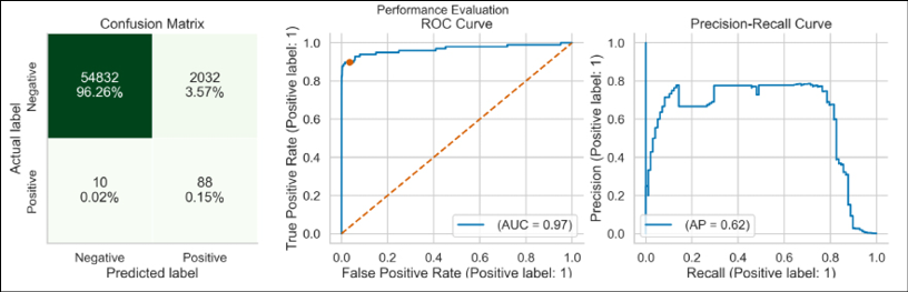
Figure 14.19: Performance evaluation of the tuned LightGBM model
We can see that the tuned model achieved better performance on the test set. To make it more concrete, its recall score was 0.8980, as compared to the benchmark value of 0.4286.
How it works...
After loading the required libraries, we defined a set of parameters that we used in this recipe: the number of folds for cross-validation, the maximum number of iterations in the optimization procedure, the random state, and the metric used for optimization.
In Step 3, we imported the dataset and created the training and test sets. We described a few preprocessing steps in previous recipes, so please refer to those for more information. Then, we trained a benchmark LightGBM model using the default hyperparameters.
While using LightGBM, we can actually define a few random seeds. There are separate ones used for bagging and selecting a subset of features for each tree. Also, there is a deterministic flag that we can specify. To make the results fully reproducible, we should also make sure those additional settings are correctly specified.
In Step 5, we defined the true objective function (the one for which the Bayesian optimization will create a surrogate). The function takes the set of hyperparameters as inputs and uses stratified 5-fold cross-validation to calculate the loss value to be minimized. In the case of fraud detection, we want to detect as much fraud as possible, even if it means creating more false positives. That is why we selected recall as the metric of interest. As the optimizer will minimize the function, we multiplied it by -1 to create a maximization problem. The function must return either a single value (the loss) or a dictionary with at least two key-value pairs:
loss—The value of the true objective function.status—An indicator that the loss value was calculated correctly. It can be eitherSTATUS_OKorSTATUS_FAIL.
Additionally, we returned the set of hyperparameters used for evaluating the objective function. We will get back to it in the There’s more… section.
We used the cross_val_score function to calculate the validation score. However, there are cases in which we might want to manually iterate over the folds created with StratifiedKFold. One such case would be to access more functionalities of the native API of LightGBM, for example, early stopping.
In Step 6, we defined the hyperparameter grid. The search space is defined as a dictionary, but in comparison to the spaces defined for GridSearchCV, we used hyperopt's built-in functions, such as the following:
hp.choice(label,list)—returns one of the indicated options.hp.uniform(label,lower_value,upper_value)—the uniform distribution between two values.hp.quniform(label,low,high,q)—the quantized (or discrete) uniform distribution between two values. In practice, it means that we obtain uniformly distributed, evenly spaced (determined byq) integers.hp.loguniform(label,low,high)—the logarithm of the returned value is uniformly distributed. In other words, the returned numbers are evenly distributed on a logarithmic scale. Such a distribution is useful for exploring values that vary over several orders of magnitude. For example, when tuning the learning rate we would like to test values such as 0.001, 0.01, 0.1, and 1, instead of a uniformly distributed set between 0 and 1.hp.randint(label,upper_value)—returns a random integer in the range[0, upper_value).
Bear in mind that in this setup we had to define the names (denoted as label in the snippets above) of the hyperparameters twice. Additionally, in some cases, we wanted to force the values to be integers using scope.int.
In Step 7, we ran the Bayesian optimization to find the best set of hyperparameters. First, we defined the Trials object, which was used for storing the history of the search. We could even use it to resume a search or expand an already finished one, that is, increase the number of iterations using the already stored history.
Second, we ran the optimization by passing the objective function, the search space, the surrogate model, the maximum number of iterations, and the trials object for storing the history. For more details on tuning the TPE algorithm, please refer to hyperopt's documentation. Additionally, we set the value of rstate, which is hyperopt's equivalent of random_state. We can easily store the trials object in a pickle file for later use. To do so, we can use the pickle.dump and pickle.load functions.
After running the Bayesian HPO, the trials object contains a lot of interesting and useful information. We can find the best set of hyperparameters under trials.best_trial, while trials.results contains all the explored sets of hyperparameters. We will be using this information in the There’s more… section.
In Step 8, we inspected the best set of hyperparameters. Instead of just printing the dictionary, we had to use the space_eval function. This is because just by printing the dictionary we will see the indices of any categorical features instead of their names. As an example, by printing the best_set dictionary we could potentially see a 0 instead of 'gbdt' for the boosting_type hyperparameter.
In the last two steps, we trained a LightGBM classifier using the identified hyperparameters and evaluated its performance on the test set.
There’s more...
There are still quite a lot of interesting and useful things to mention about Bayesian hyperparameter optimization. We try to present those in the following subsections. For brevity’s sake, we do not present all the code here. For the complete code walk-through, please refer to the Jupyter notebook available in the book’s GitHub repository.
Conditional hyperparameter spaces
Conditional hyperparameter spaces can be useful when we would like to experiment with different machine learning models, each of those coming with completely separate hyperparameters. Alternatively, some hyperparameters are simply not compatible with others, and this should be accounted for while tuning the model.
In the case of LightGBM, an example could be the following pair: boosting_type and subsample/subsample_freq. The boosting type "goss" is not compatible with subsampling, that is, selecting only a subsample of the training observations for each iteration. That is why we would like to set subsample to 1 when we are using GOSS, but tune it otherwise. subsample_freq is a complementary hyperparameter that determines how often (every n-th iteration) we should use subsampling.
We define a conditional search space using hp.choice in the following snippet:
conditional_search_space = {
    "boosting_type": hp.choice("boosting_type", [
        {"boosting_type": "gbdt",
         "subsample": hp.uniform("gdbt_subsample", 0.5, 1),
         "subsample_freq": scope.int(
            hp.uniform("gdbt_subsample_freq", 1, 20)
         )},
        {"boosting_type": "dart",
         "subsample": hp.uniform("dart_subsample", 0.5, 1),
         "subsample_freq": scope.int(
            hp.uniform("dart_subsample_freq", 1, 20)
         )},
        {"boosting_type": "goss",
         "subsample": 1.0,
         "subsample_freq": 0},
    ]),
    "n_estimators": hp.choice("n_estimators", [50, 100, 250, 500]),
}
And an example of a draw from this space looks as follows:
{'boosting_type': {'boosting_type': 'dart',
  'subsample': 0.9301284507624732,
  'subsample_freq': 17},
 'n_estimators': 250}
There is one more step that we need to take before being able to use such a draw for our Bayesian HPO. As the search space is initially nested, we have to assign the drawn samples to the top-level key in the dictionary. We do so in the following snippet:
# draw from the search space
params = sample(conditional_search_space)
# retrieve the conditional parameters, set to default if missing
subsample = params["boosting_type"].get("subsample", 1.0)
subsample_freq = params["boosting_type"].get("subsample_freq", 0)
# fill in the params dict with the conditional values
params["boosting_type"] = params["boosting_type"]["boosting_type"]
params["subsample"] = subsample
params["subsample_freq"] = subsample_freq
params
The get method extracts the value of the requested key from the dictionary or returns the default value if the requested key does not exist.
Executing the snippet returns a properly formatted dictionary:
{'boosting_type': 'dart',
 'n_estimators': 250
 'subsample': 0.9301284507624732,
 'subsample_freq': 17}
Lastly, we should place the code cleaning up the dictionary in the objective function, which we then pass to the optimization routine.
In the Jupyter notebook, we have also tuned the LightGBM with the conditional search space. It achieved a recall score of 0.8980 on the test set, which is the same score as the model tuned without the conditional search space.

Figure 14.20: Performance evaluation of the LightGBM model tuned with the conditional search space
A deep dive into the explored hyperparameters
We have mentioned that hyperopt offers a wide range of distributions from which we could sample. It will be much easier to understand when we actually see what the distributions look like. First, we inspect the distribution of the learning rate. We have specified it as:
hp.loguniform("learning_rate", np.log(0.01), np.log(0.5))
In the following figure, we can see a kernel density estimate (KDE) plot of 10,000 random draws from the log-uniform distribution of the learning rate.

Figure 14.21: Distribution of the learning rate
As intended, we can see that the distribution puts more weight on observations from several orders of magnitude.
The next distribution worth inspecting is the quantized uniform distribution that we have used for the min_child_samples hyperparameter. We defined it as:
scope.int(hp.quniform("min_child_samples", 20, 500, 5))
In the following figure, we can see that the distribution reflects the assumptions we set for it, that is, the evenly spaced integers are uniformly distributed. In our case, we sampled every fifth integer. To keep the plot readable, we only displayed the first 20 bars. But the full distribution goes to 500, just as we have specified.

Figure 14.22: Distribution of the min_child_samples hyperparameter
So far, we have only looked at the information available in the search space. However, we can also derive much more information from the Trials object, which stores the entire history of the Bayesian HPO procedure, that is, which hyperparameters were explored and what the resulting score was.
For this part, we use the Trials object containing the search history, using the search space without the conditional boosting_type tuning. In order to easily explore that data, we prepare a DataFrame containing the required information per iteration: the hyperparameters and the value of the loss function. We can extract the information from trials.results. This is the reason why we additionally passed the params object to the final dictionary while defining the objective function.
Initially, the hyperparameters are stored in one column as a dictionary. We can use the json_normalize function to break them up into separate columns:
from pandas.io.json import json_normalize
results_df = pd.DataFrame(trials.results)
params_df = json_normalize(results_df["params"])
results_df = pd.concat([results_df.drop("params", axis=1), params_df],
                       axis=1)
results_df["iteration"] = np.arange(len(results_df)) + 1
results_df.sort_values("loss")
Executing the snippet prints the following table:

Figure 14.23: A snippet of the DataFrame containing all the explored hyperparameter combinations and their corresponding losses
For brevity, we only printed a few of the available columns. Using this information, we can further explore the optimization that resulted in the best set of hyperparameters. For example, we can see that the best score was achieved in the 151st iteration (the first row of the DataFrame has an index of 150 and indices in Python start with 0).
In the next figure, we have plotted the two distributions of the colsample_bytree hyperparameter: the one we defined as the prior for sampling, and the one that was actually sampled during the Bayesian optimization. Additionally, we plotted the evolution of the hyperparameter over iterations and added a regression line to indicate the direction of change.
In the left plot, we can see that the posterior distribution of colsample_bytree was concentrated toward the right side, indicating the higher range of considered values. By inspecting the KDE plots it seems that there is a non-zero density for values above 1, which should not be allowed.
This is just the artifact from using the plotting method; in the Trials object we can confirm that not a single value above 1.0 was sampled during the optimization. In the right plot, the values of colsample_bytree seem to be scattered all over the allowed range. By looking at the regression line, it seems that there is a somewhat increasing trend.

Figure 14.24: Distribution of the colsample_bytree hyperparameter
Lastly, we can look at the evolution of the loss over iterations. The loss represents the negative of the average recall score (from a 5-fold cross-validation on the training set). The lowest value (corresponding to maximum average recall) of -0.90 occurred in the 151st iteration. With a few exceptions, the loss is quite stable in the -0.75 to -0.85 range.

Figure 14.25: The evolution of the loss (average recall) over iterations. The best iteration is marked with a star
Other popular libraries for hyperparameter optimization
hyperopt is one of the most popular Python libraries for hyperparameter optimization. However, it is definitely not the only one. Below you can find a list of popular alternatives:
optuna—a library offering vast hyperparameter tuning capabilities, including exhaustive Grid Search, Random Search, Bayesian HPO, and evolutionary algorithms.scikit-optimize—a library offering theBayesSearchCVclass, which is a Bayesian drop-in replacement forscikit-learn'sGridSearchCV.hyperopt-sklearn—a spin-off library ofhyperoptoffering model selection among machine learning algorithms fromscikit-learn. It allows you to search for the best option among preprocessing steps and ML models, thus covering the entire scope of ML pipelines. The library covers almost all classifiers/regressors/preprocessing transformers available inscikit-learn.ray[tune]—Ray is an open-source, general-purpose distributed computing framework. We can use itstunemodule to run distributed hyperparameter tuning. It is also possible to combinetune's distributed computing capabilities with other well-established libraries such ashyperoptoroptuna.Tpot—TPOT is an AutoML tool that optimizes ML pipelines using genetic programming.bayesian-optimization—a library offering general-purpose Bayesian global optimization with Gaussian processes.smac—SMAC is a general tool for optimizing the parameters of arbitrary algorithms, including hyperparameter optimization of ML models.
See also
Additional resources are available here:
- Bergstra, J. S., Bardenet, R., Bengio, Y., & Kégl, B. 2011. Algorithms for hyper-parameter optimization. In Advances in Neural Information Processing Systems: 2546–2554.
- Bergstra, J., Yamins, D., & Cox, D. D. 2013, June. Hyperopt: A Python library for optimizing the hyperparameters of machine learning algorithms. In Proceedings of the 12th Python in science conference: 13–20.
- Bergstra, J., Yamins, D., Cox, D. D. 2013. Making a Science of Model Search: Hyperparameter Optimization in Hundreds of Dimensions for Vision Architectures. Proc. of the 30th International Conference on Machine Learning (ICML 2013).
- Claesen, M., & De Moor, B. 2015. “Hyperparameter search in machine learning.” arXiv preprint arXiv:1502.02127.
- Falkner, S., Klein, A., & Hutter, F. 2018, July. BOHB: Robust and efficient hyperparameter optimization at scale. In International Conference on Machine Learning: 1437–1446. PMLR.
- Hutter, F., Kotthoff, L., & Vanschoren, J. 2019. Automated machine learning: methods, systems, challenges: 219. Springer Nature.
- Klein, A., Falkner, S., Bartels, S., Hennig, P., & Hutter, F. 2017, April. Fast Bayesian optimization of machine learning hyperparameters on large datasets. In Artificial intelligence and statistics: 528–536. PMLR.
- Komer B., Bergstra J., & Eliasmith C. 2014. “Hyperopt-Sklearn: automatic hyperparameter configuration for Scikit-learn” Proc. SciPy.
- Li, L., Jamieson, K., Rostamizadeh, A., Gonina, E., Hardt, M., Recht, B., & Talwalkar, A. 2018. Massively parallel hyperparameter tuning: https://doi.org/10.48550/arXiv.1810.05934
- Shahriari, B., Swersky, K., Wang, Z., Adams, R. P., & De Freitas, N. 2015. Taking the human out of the loop: A review of Bayesian optimization. Proceedings of the IEEE, 104(1): 148–175.
- Snoek, J., Larochelle, H., & Adams, R. P. 2012. Practical Bayesian optimization of machine learning algorithms. Advances in Neural Information Processing Systems: 25.
Investigating feature importance
We have already spent quite some time creating the entire pipeline and tuning the models to achieve better performance. However, what is equally—or in some cases even more—important is the model’s interpretability. That means not only giving an accurate prediction but also being able to explain the why behind it. For example, we can look into the case of customer churn. Knowing what the actual predictors of the customers leaving are might be helpful in improving the overall service and potentially making them stay longer.
In a financial setting, banks often use machine learning in order to predict a customer’s ability to repay credit or a loan. In many cases, they are obliged to justify their reasoning, that is, if they decline a credit application, they need to know exactly why this customer’s application was not approved. In the case of very complicated models, this might be hard, or even impossible.
We can benefit in multiple ways by knowing the importance of our features:
- By understanding the model’s logic, we can theoretically verify its correctness (if a sensible feature is a good predictor), but also try to improve the model by focusing only on the important variables.
- We can use the feature importances to only keep the x most important features (contributing to a specified percentage of total importance), which can not only lead to better performance by removing potential noise but also to a shorter training time.
- In some real-life cases, it makes sense to sacrifice some accuracy (or any other performance metric) for the sake of interpretability.
It is also important to be aware that the more accurate (in terms of a specified performance metric) the model is, the more reliable the feature importances are. That is why we investigate the importance of the features after tuning the models. Please note that we should also account for overfitting, as an overfitted model will not return reliable feature importances.
In this recipe, we show how to calculate the feature importance on an example of a Random Forest classifier. However, most of the methods are model-agnostic. In other cases, there are often equivalent approaches (such as in the case of XGBoost and LightGBM). We mention some of those in the There’s more… section. We briefly present the three selected methods of calculating feature importance.
Mean Decrease in Impurity (MDI): The default feature importance used by Random Forest (in scikit-learn), also known as the Gini importance. As we know, decision trees use a metric of impurity (Gini index/entropy/MSE) to create the best splits while growing. When training a decision tree, we can compute how much each feature contributes to decreasing the weighted impurity. To calculate the feature importance for the entire forest, the algorithm averages the decrease in impurity over all the trees.
While working with impurity-based metrics, we should focus on the ranking of the variables (relative values) rather than the absolute values of the feature importances (which are also normalized to add up to 1).
Here are the advantages of this approach:
- Fast calculation
- Easy to retrieve
Here are the disadvantages of this approach:
- Biased—It tends to inflate the importance of continuous (numerical) features or high-cardinality categorical variables. This can sometimes lead to absurd cases, whereby an additional random variable (unrelated to the problem at hand) scores high in the feature importance ranking.
- Impurity-based importances are calculated on the basis of the training set and do not reflect the model’s ability to generalize to unseen data.
Drop-column feature importance: The idea behind this approach is very simple. We compare a model with all the features to a model with one of the features dropped for training and inference. We repeat this process for all the features.
Here is the advantage of this approach:
- Often considered the most accurate/reliable measure of feature importance
Here is the disadvantage of this approach:
- Potentially highest computation cost caused by retraining the model for each variant of the dataset
Permutation feature importance: This approach directly measures feature importance by observing how random reshuffling of each predictor influences the model’s performance. The permutation procedure breaks the relationship between the feature and the target. Hence, the drop in the model’s performance is indicative of how much the model is dependent on a particular feature. If the decrease in the performance after reshuffling a feature is small, then it was not a very important feature in the first place. Conversely, if the decrease in performance is significant, the feature can be considered an important one for the model.
The steps of the algorithm are:
- Train the baseline model and record the score of interest.
- Randomly permute (reshuffle) the values of one of the features, then use the entire dataset (with one reshuffled feature) to obtain predictions and record the score. The feature importance is the difference between the baseline score and the one from the permuted dataset.
- Repeat the second step for all features.
For evaluating the performance, we can either use the training data or the validation/test set. Using one of the latter two has the additional benefit of gaining insights into the model’s ability to generalize. For example, features that turn out to be important on the training set but not on the validation set might actually cause the model to overfit. For more discussion about the topic, please refer to the Interpretable Machine Learning book (referenced in the See also section).
Here are the advantages of this approach:
- Model-agnostic
- Reasonably efficient—no need to retrain the model at every step
- Reshuffling preserves the distribution of the variables
Here are the disadvantages of this approach:
- Computationally more expensive than the default feature importances
- Is likely to produce unreliable importances when features are highly correlated (see Strobl et al. for a detailed explanation)
In this recipe, we will explore the feature importance using the credit card default dataset we have already explored in the Exploring ensemble classifiers recipe.
Getting ready
For this recipe, we use the fitted Random Forest pipeline (called rf_pipeline) from the Exploring ensemble classifiers recipe. Please refer to this step in the Jupyter notebook to see all the initial steps not included here to avoid repetition.
How to do it...
Execute the following steps to evaluate the feature importance of a Random Forest model:
- Import the libraries:
import numpy as np import pandas as pd from sklearn.inspection import permutation_importance from sklearn.metrics import recall_score from sklearn.base import clone - Extract the classifier and preprocessor from the fitted pipeline:
rf_classifier = rf_pipeline.named_steps["classifier"] preprocessor = rf_pipeline.named_steps["preprocessor"] - Recover feature names from the preprocessing transformer and transform the training/test sets:
feat_names = list(preprocessor.get_feature_names_out()) X_train_preprocessed = pd.DataFrame( preprocessor.transform(X_train), columns=feat_names ) X_test_preprocessed = pd.DataFrame( preprocessor.transform(X_test), columns=feat_names ) - Extract the MDI feature importance and calculate the cumulative importance:
rf_feat_imp = pd.DataFrame(rf_classifier.feature_importances_, index=feat_names, columns=["mdi"]) rf_feat_imp["mdi_cumul"] = np.cumsum( rf_feat_imp .sort_values("mdi", ascending=False) .loc[:, "mdi"] ).loc[feat_names] - Define a function for plotting the top x features in terms of their importance:
def plot_most_important_features(feat_imp, title,
                                 n_features=10,
                                 bottom=False):
    if bottom:
        indicator = "Bottom"
        feat_imp = feat_imp.sort_values(ascending=True)
    else:
        indicator = "Top"
        feat_imp = feat_imp.sort_values(ascending=False)

    ax = feat_imp.head(n_features).plot.barh()
    ax.invert_yaxis()
    ax.set(title=f"{title} ({indicator} {n_features})",
           xlabel="Importance",
           ylabel="Feature")

    return ax
We use the function as follows:
plot_most_important_features(rf_feat_imp["mdi"],
                             title="MDI Importance")
Executing the snippet generates the following plot:

Figure 14.26: Top 10 most important features using the MDI metric
The most important features are categorical features indicating the payment status from July and September. After four of those, we can see continuous features such as
limit_balance,age, various bill statements, and previous payments.
- Plot the cumulative importance of the features:
x_values = range(len(feat_names))
fig, ax = plt.subplots()
ax.plot(x_values, rf_feat_imp["mdi_cumul"].sort_values(), "b-")
ax.hlines(y=0.95, xmin=0, xmax=len(x_values),
          color="g", linestyles="dashed")
ax.set(title="Cumulative MDI Importance",
       xlabel="# Features",
       ylabel="Importance")
Executing the snippet generates the following plot:

Figure 14.27: Cumulative MDI importance
The top 10 features account for 86.23% of the total importance, while the top 17 features account for 95% of the total importance.
- Calculate and plot permutation importance using the training set:
perm_result_train = permutation_importance(
    rf_classifier, X_train_preprocessed, y_train,
    n_repeats=25, scoring="recall",
    random_state=42, n_jobs=-1
)
rf_feat_imp["perm_imp_train"] = (
    perm_result_train["importances_mean"]
)
plot_most_important_features(
    rf_feat_imp["perm_imp_train"],
    title="Permutation importance - training set"
)
Executing the snippet generates the following plot:

Figure 14.28: Top 10 most important features according to permutation importance calculated on the training set
We can see that the set of the most important features was reshuffled in comparison to the MDI importance. The most important now is
payment_status_sep_Unknown, which is an undefined label (not assigned a clear meaning in the original paper) in thepayment_status_sepcategorical feature. We can also see thatageis not among the top 10 most important features determined using this approach.
- Calculate and plot permutation importance using the test set:
perm_result_test = permutation_importance(
    rf_classifier, X_test_preprocessed, y_test,
    n_repeats=25, scoring="recall",
    random_state=42, n_jobs=-1
)
rf_feat_imp["perm_imp_test"] = (
    perm_result_test["importances_mean"]
)
plot_most_important_features(
    rf_feat_imp["perm_imp_test"],
    title="Permutation importance - test set"
)
Executing the snippet generates the following plot:

Figure 14.29: Top 10 most important features according to permutation importance calculated on the test set
Looking at the figures, we can state that the same four features were selected as the most important ones using the training and test sets. The other ones were slightly reshuffled.
If we notice that the feature importances calculated using the training and test sets are significantly different, we should investigate whether the model is overfitted. To solve that, we might want to apply some form of regularization. In this case, we could try increasing the value of the
min_samples_leafhyperparameter.
- Define a function for calculating the drop-column feature importance:
def drop_col_feat_imp(model, X, y, metric, random_state=42):
    model_clone = clone(model)
    model_clone.random_state = random_state
    model_clone.fit(X, y)
    benchmark_score = metric(y, model_clone.predict(X))

    importances = []

    for ind, col in enumerate(X.columns):
        print(f"Dropping {col} ({ind+1}/{len(X.columns)})")
        model_clone = clone(model)
        model_clone.random_state = random_state
        model_clone.fit(X.drop(col, axis=1), y)
        drop_col_score = metric(
            y, model_clone.predict(X.drop(col, axis=1))
        )
        importances.append(benchmark_score - drop_col_score)

    return importances
There are two things worth mentioning here:
- We fixed the
random_state, as we are specifically interested in performance changes caused by removing a feature. Hence, we are controlling the source of variability during the estimation procedure. - In this implementation, we use the training data for evaluation. We leave it as an exercise for the reader to modify the function to accept additional objects for evaluation.
- We fixed the
- Calculate and plot the drop-column feature importance:
rf_feat_imp["drop_column_imp"] = drop_col_feat_imp(
    rf_classifier.set_params(**{"n_jobs": -1}),
    X_train_preprocessed,
    y_train,
    metric=recall_score,
    random_state=42
)
First, plot the top 10 most important features:
plot_most_important_features(
    rf_feat_imp["drop_column_imp"],
    title="Drop column importance"
)
Executing the snippet generates the following plot:

Figure 14.30: Top 10 most important features according to drop-column feature importance
Using the drop-column feature importance (evaluated on the training data), the most important feature was
payment_status_sep_Unknown. The same feature was identified as the most important one using permutation feature importance.Then, plot the 10 least important features:
plot_most_important_features(
    rf_feat_imp["drop_column_imp"],
    title="Drop column importance",
    bottom=True
)
Executing the snippet generates the following plot:

Figure 14.31: The 10 least important features according to drop-column feature importance
In the case of drop-column feature importance, negative importance indicates that removing a given feature from the model actually improves the performance. That is true as long as the considered metric treats higher values as better.
We can use these results to remove features that have negative importance and thus potentially improve the model’s performance and/or reduce the training time.
How it works...
In Step 1, we imported the required libraries. Then, we extracted the classifier and the ColumnTransformer preprocessor from the pipeline. In this recipe, we worked with a tuned Random Forest classifier (using the hyperparameters determined in the Exploring ensemble classifiers recipe).
In Step 3, we first extracted the column names from the preprocessor using the get_feature_names_out method. Then, we prepared the training and test sets by applying the preprocessor’s transformations.
In Step 4, we extracted the MDI feature importances using the feature_importances_ attribute of the fitted Random Forest classifier. The values were automatically normalized so that they added up to 1. Additionally, we calculated the cumulative feature importance.
In Step 5, we defined a helper function to plot the most/least important features and plotted the top 10 most important features, calculated using the mean decrease in impurity.
In Step 6, we plotted the cumulative importance of all the features. Using this plot, we could decide if we wanted to reduce the number of features in the model to account for a certain percentage of total importance. By doing so, we could potentially decrease the model’s training time.
In Step 7, we calculated the permutation feature importance using the permutation_importance function available in scikit-learn. We decided to use recall as the scoring metric and set the n_repeats argument to 25, so the algorithm reshuffled each feature 25 times. The output of the procedure is a dictionary containing three elements: the raw feature importances, the average value per feature, and the corresponding standard deviation. Additionally, while using permutation_importance we can evaluate multiple metrics at once by providing a list of selected metrics.
We decided to use the scikit-learn implementation of permutation feature importance. However, there are alternative options available, for example, in the rfpimp or eli5 libraries. The former also contains the drop-column feature importance.
In Step 8, we calculated and evaluated the permutation feature importance, this time using the test set.
We have mentioned in the introduction that permutation importance can return unreliable scores when our dataset has correlated features, that is, the importance score will be spread across the correlated features. We could try the following approaches to overcome this issue:
- Permute groups of correlated features together.
rfpimpoffers such functionality in theimportancesfunction. - We could use hierarchical clustering on the features’ Spearman’s rank correlations, pick a threshold, and then only keep a single feature from each of the identified clusters.
In Step 9, we defined a function for calculating the drop-column feature importance. First, we trained and evaluated the baseline model using all features. As the scoring metric, we chose recall. Then, we used the clone function of scikit-learn to create a copy of the model with the exact same specification as the baseline one. We then iteratively trained the model on a dataset without one feature, calculated the selected evaluation metric, and stored the difference in scores.
In Step 10, we applied the drop-column feature importance function and plotted the results, both the most and least important features.
There’s more...
We have mentioned that the default feature importance of scikit-learn's Random Forest is the MDI/Gini importance. It is also worth mentioning that the popular boosting algorithms (which we mentioned in the Exploring ensemble classifiers recipe) also adapted the feature_importances_ attribute of the fitted model. However, they use different metrics of feature importance, depending on the algorithm.
For XGBoost, we have the following possibilities:
weight—measures the number of times a feature is used to split the data across all trees. Similar to the Gini importance, however, it does not take into account the number of samples.gain—measures the average gain of the feature when it is used in trees. Intuitively we can think of it as the Gini importance measure, where Gini impurity is replaced by the objective of the gradient boosting model.cover—measures the average coverage of the feature when it is used in trees. Coverage is defined as the number of samples affected by the split.
The cover method can overcome one of the potential issues of the weight approach—simply counting the number of splits may be misleading, as some splits might affect just a few observations, and are therefore not really relevant.
For LightGBM, we have the following possibilities:
split—measures the number of times the feature is used in a modelgain—measures the total gains of splits that use the feature
See also
Additional resources are available here:
- Altmann, A., Toloşi, L., Sander, O., & Lengauer, T. 2010. “Permutation importance: a corrected feature importance measure.” Bioinformatics, 26(10): 1340–1347.
- Louppe, G. 2014. “Understanding random forests: From theory to practice.” arXiv preprint arXiv:1407.7502.
- Molnar, C. 2020. Interpretable Machine Learning: https://christophm.github.io/interpretable-ml-book/
- Hastie, T., Tibshirani, R., Friedman, J. H., & Friedman, J. H. 2009. The elements of statistical learning: data mining, inference, and prediction, 2: 1–758. New York: Springer.
- Hooker, G., Mentch, L., & Zhou, S. 2021. “Unrestricted permutation forces extrapolation: variable importance requires at least one more model, or there is no free variable importance.” Statistics and Computing, 31(6): 1–16.
- Parr, T., Turgutlu, K., Csiszar, C., & Howard, J. 2018. Beware default random forest importances. March 26, 2018. https://explained.ai/rf-importance/.
- Strobl, C., Boulesteix, A. L., Kneib, T., Augustin, T., & Zeileis, A. 2008. “Conditional variable importance for random forests.” BMC Bioinformatics, 9(1): 307.
- Strobl, C., Boulesteix, A. L., Zeileis, A., & Hothorn, T. 2007. “Bias in random forest variable importance measures: Illustrations, sources and a solution.” BMC bioinformatics, 8(1): 1–21.
Exploring feature selection techniques
In the previous recipe, we saw how to evaluate the importance of features used for training ML models. We can use that knowledge to carry out feature selection, that is, keeping only the most relevant features and discarding the rest.
Feature selection is a crucial part of any machine learning project. First, it allows us to remove features that are either completely irrelevant or are not contributing much to a model’s predictive capabilities. This can benefit us in multiple ways. Probably the most important benefit is that such unimportant features can actually negatively impact the performance of our model as they introduce noise and contribute to overfitting. As we have already established—garbage in, garbage out. Additionally, fewer features can often be translated into a shorter training time and help us avoid the curse of dimensionality.
Second, we should follow Occam’s razor and keep our models simple and explainable. When we have a moderate number of features, it is easier to explain what is actually happening in the model. This can be crucial for the ML project’s adoption by the stakeholders.
We have already established the why of feature selection. Now it is time to explore the how. On a high level, feature selection methods can be grouped into three categories:
- Filter methods—a generic set of univariate methods that specify a certain statistical measure and then filter the features based on it. This group does not incorporate any specific ML algorithm, hence it is characterized by (usually) lower computation time and is less prone to overfitting. A potential drawback of this group is that the methods evaluate the relationship between the target and each of the features individually. This can lead to them overlooking important relationships between the features. Examples include correlation, chi-squared test, analysis of variance (ANOVA), information gain, variance thresholding, and so on.
- Wrapper methods—this group of approaches considers feature selection a search problem, that is, it uses certain procedures to repeatedly evaluate a specific ML model with a different set of features to find the optimal set. It is characterized by the highest computational costs and the highest possibility of overfitting. Examples include forward selection, backward elimination, stepwise selection, recursive feature elimination, and so on.
- Embedded methods—this set of methods uses ML algorithms that have built-in feature selection, for example, Lasso with its regularization or Random Forest. By using these implicit feature selection methods, the algorithms try to prevent overfitting. In terms of computational complexity, this method is usually somewhere between the filter and wrapper groups.
In this recipe, we will apply a selection of feature selection methods to the credit card fraud dataset. We believe it provides a good example, especially given a lot of the features are anonymized and we do not know the exact meaning behind them. Hence, it is also likely that some of them do not really contribute much to the model’s performance.
Getting ready
In this recipe, we will be using the credit card fraud dataset that we introduced in the Investigating different approaches to handling imbalanced data recipe. For convenience, we have included all the necessary preparation steps in this section from the accompanying Jupyter notebook.
Another interesting challenge to applying feature selection methods would be BNP Paribas Cardif Claims Management (the dataset is available at Kaggle—a link is provided in the See also section). Similar to the dataset used in this recipe, it contains 131 anonymized features.
How to do it…
Execute the following steps to experiment with various feature selection methods:
- Import the libraries:
from sklearn.ensemble import RandomForestClassifier from sklearn.metrics import recall_score from sklearn.feature_selection import (RFE, RFECV, SelectKBest, SelectFromModel, mutual_info_classif) from sklearn.model_selection import StratifiedKFold - Train the benchmark model:
rf = RandomForestClassifier(random_state=RANDOM_STATE,
                            n_jobs=-1)
rf.fit(X_train, y_train)
recall_train = recall_score(y_train, rf.predict(X_train))
recall_test = recall_score(y_test, rf.predict(X_test))
print(f"Recall score training: {recall_train:.4f}")
print(f"Recall score test: {recall_test:.4f}")
Executing the snippet generates the following output:
Recall score training: 1.0000
Recall score test: 0.8265
Looking at the recall scores, the model is clearly overfitted to the training data. Normally, we should try to address this. However, to keep the exercise simple we assume that the model is good enough to proceed.
- Select the best features using Mutual Information:
scores = []
n_features_list = list(range(2, len(X_train.columns)+1))
for n_feat in n_features_list:
    print(f"Keeping {n_feat} most important features")
    mi_selector = SelectKBest(mutual_info_classif, k=n_feat)
    X_train_new = mi_selector.fit_transform(X_train, y_train)
    X_test_new = mi_selector.transform(X_test)
    rf.fit(X_train_new, y_train)
    recall_scores = [
        recall_score(y_train, rf.predict(X_train_new)),
        recall_score(y_test, rf.predict(X_test_new))
    ]
    scores.append(recall_scores)
mi_scores_df = pd.DataFrame(
    scores,
    columns=["train_score", "test_score"],
    index=n_features_list
)
Using the next snippet, we plot the results:
(
    mi_scores_df["test_score"]
    .plot(kind="bar",
          title="Feature selection using Mutual Information",
          xlabel="# of features",
          ylabel="Recall (test set)")
)
Executing the snippet generates the following plot:

Figure 14.32: Performance of the model depending on the number of selected features. Features are selected using the Mutual Information criterion
By inspecting the figure, we can see that we achieved the best recall score on the test set using
8,9,10, and12features. As simplicity is desired, we decided to choose8. Using the following snippet, we extract the names of the 8 most important features:mi_selector = SelectKBest(mutual_info_classif, k=8) mi_selector.fit(X_train, y_train) print(f"Most importance features according to MI: {mi_selector.get_feature_names_out()}")Executing the snippet returns the following output:
Most importance features according to MI: ['V3' 'V4' 'V10' 'V11' 'V12' 'V14' 'V16' 'V17']
- Select the best features using MDI feature importance, retrain the model, and evaluate its performance:
rf_selector = SelectFromModel(rf)
rf_selector.fit(X_train, y_train)
mdi_features = X_train.columns[rf_selector.get_support()]
rf.fit(X_train[mdi_features], y_train)
recall_train = recall_score(
    y_train, rf.predict(X_train[mdi_features])
)
recall_test = recall_score(y_test, rf.predict(X_test[mdi_features]))
print(f"Recall score training: {recall_train:.4f}")
print(f"Recall score test: {recall_test:.4f}")
Executing the snippet generates the following output:
Recall score training: 1.0000
Recall score test: 0.8367
Using the following snippet, we extract the threshold used for feature selection and the most relevant features:
print(f"MDI importance threshold: {rf_selector.threshold_:.4f}")
print(f"Most importance features according to MI: {rf_selector.get_feature_names_out()}")
This generates the following output:
MDI importance threshold: 0.0345
Most importance features according to MDI: ['V10' 'V11' 'V12' 'V14' 'V16' 'V17']
The threshold value corresponds to the average feature importance of the RF model.
Using a loop similar to the one in Step 3, we can generate a bar chart showing the model’s performance depending on the number of features kept in the model. We iteratively select the top k features based on the MDI. To avoid repetition, we do not include the code here (it is available in the accompanying Jupyter notebook). By analyzing the figure, we can see that the model achieved the best score with
10features, which is more than in the previous approach.
Figure 14.33: Performance of the model depending on the number of selected features. Features are selected using the Mean Decrease in Impurity feature importance
- Select the best 10 features using Recursive Feature Elimination:
rfe = RFE(estimator=rf, n_features_to_select=10, verbose=1)
rfe.fit(X_train, y_train)
In order to avoid repetition, we present the most important features and the accompanying scores without the code, as it is almost identical to what we have covered in the previous steps:
Most importance features according to RFE: ['V4' 'V7' 'V9' 'V10' 'V11' 'V12' 'V14' 'V16' 'V17' 'V26']
Recall score training: 1.0000
Recall score test: 0.8367
- Select the best features using Recursive Feature Elimination with cross-validation:
k_fold = StratifiedKFold(5, shuffle=True, random_state=42)
rfe_cv = RFECV(estimator=rf, step=1,
               cv=k_fold,
               min_features_to_select=5,
               scoring="recall",
               verbose=1, n_jobs=-1)
rfe_cv.fit(X_train, y_train)
Below we present the outcome of the feature selection:
Most importance features according to RFECV: ['V1' 'V4' 'V6' 'V7' 'V9' 'V10' 'V11' 'V12' 'V14' 'V15' 'V16' 'V17' 'V18'
 'V20' 'V21' 'V26']
Recall score training: 1.0000
Recall score test: 0.8265
This approach resulted in the selection of
16features. Overall,6features appeared in each of the considered approaches:V10,V11,V12,V14,V16, andV17.Additionally, using the following snippet we can visualize the cross-validation scores, that is, what the average recall of the
5folds was for each of the considered numbers of retained features. We had to add5to the index of the DataFrame, as we chose to retain a minimum of5features in theRFECVprocedure:cv_results_df = pd.DataFrame(rfe_cv.cv_results_) cv_results_df.index += 5 ( cv_results_df["mean_test_score"] .plot(title="Average CV score over iterations", xlabel="# of features retained", ylabel="Avg. recall") )Executing the snippet generates the following plot:

Figure 14.34: Average CV score for each step of the RFE procedure
Inspecting the figure confirms that the highest average recall was obtained using 16 features.
While evaluating the benefits of feature selection, we should consider two scenarios. In the more obvious one, the performance of the model improves when we remove some of the features. This does not need any further explanation. The second scenario is more interesting. After removing features, we can end up with a very similar performance to the initial one or slightly worse. However, this does not necessarily mean that we have failed. Consider a case in which we removed ~60% of the features while keeping the same performance. This could already be a major improvement that—depending on the dataset and model—can potentially reduce the training time by hours or days. Additionally, such a model would be easier to interpret.
How it works…
After importing the required libraries, we trained a benchmark Random Forest classifier and printed the recall score from the training and test sets.
In Step 3, we applied the first of the considered feature selection approaches. It was an example of the univariate filter category of feature selection techniques. As the statistical criterion, we used the Mutual Information score. To calculate the metric, we used the mutual_info_classif function from scikit-learn, which is capable of working with a categorical target and numerical features only. Hence, any categorical features need to be appropriately encoded beforehand. Fortunately, we only have continuous numerical features in this dataset.
The Mutual Information (MI) score of two random variables is a measure of the mutual dependence between those variables. When the score is equal to zero, the two variables are independent. The higher the score, the higher the dependency between the variables. In general, calculating the MI requires knowledge of the probability distributions of each of the features, which we do not usually know. That is why the scikit-learn implementation uses a nonparametric approximation based on k-Nearest Neighbors distances. One of the advantages of using MI is that it can capture nonlinear relationships between the features.
Next, we combined the MI criterion with the SelectKBest class, which allows us to select the k best features determined by an arbitrary metric. Using this approach, we almost never know upfront how many features we would like to keep. Hence, we iterated over all the possible values (from 2 to 29, where the latter is the total number of features in the dataset). The SelectKBest class employs the familiar fit/transform approach. Within each iteration, we fitted the class to the training data (both features and the target are required for this step) and then transformed the training and test sets. The transformation resulted in keeping only the k most important features according to the MI criterion. Then, we once again fitted the Random Forest classifier using only the selected features and recorded the relevant recall scores.
scikit-learn allows us to easily use different metrics together with the SelectKBest class. For example, we could use the following scoring functions:
f_classif—the ANOVA F-value estimating the degree of linear dependency between two variables. The F statistic is calculated as the ratio of between-group variability to the within-group variability. In this case, the group is simply the class of the target. A potential drawback of this method is that it only accounts for linear relationships.chi2—the chi-squared statistics. This metric is only suitable for non-negative features such as Booleans or frequencies, or more generally, for categorical features. Intuitively, it evaluates if a feature is independent of the target. If that is the case, it is also uninformative when it comes to classifying the observations.
Aside from selecting the k best features, the feature_selection module of scikit-learn also offers classes that allow choosing features based on the percentile of the highest scores, a false positive rate test, an estimated false discovery rate, or a family-wise error rate.
In Step 4, we explored an example of the embedded feature selection techniques. In this group, feature selection is performed as part of the model building phase. We used the SelectFromModel class to select the best features based on the model’s built-in feature importance metric (in this case, the MDI feature importance). When instantiating the class, we can provide the threshold argument to determine the threshold used to select the most relevant features. Features with weights/coefficients above that threshold would be kept in the model. We can also use the "mean" (default one) and "median" keywords to use the mean/median values of all feature importances as the threshold. We can also combine those keywords with scaling factors, for example, "1.5*mean". Using the max_features argument, we can determine the maximum number of features we allow to be selected.
The SelectFromModel class works with any estimator that has either the feature_importances_ (for example, Random Forest, XGBoost, LightGBM, and so on) or coef_ (for example, Linear Regression, Logistic Regression, and Lasso) attribute.
In this step, we demonstrated two approaches to recovering the selected features. The first one is the get_support method, which returns a list with Boolean flags indicating whether the given feature was selected. The second one is the get_feature_names_out method, which directly returns the names of the selected features. While fitting the Random Forest classifier, we manually selected the columns of the training dataset. However, we could have also used the transform method of the fitted SelectFromModel class to automatically extract only the relevant features as a numpy array.
In Step 5, we used an example of the wrapper methods. Recursive Feature Elimination (RFE) is an algorithm that recursively trains an ML model, calculates the feature importances (via coef_ or feature_importances_), and drops the least important feature or features.
The process starts by training the model using all the features. Then, the least important feature or features are pruned from the dataset. Next, the model is trained again with the reduced feature set, and the least important features are again eliminated. The process is repeated until it reaches the desired number of features. While instantiating the RFE class, we provided the Random Forest estimator together with the number of features to select. Additionally, we could provide the step argument, which determined how many features to eliminate during each iteration.
RFE can be a computationally expensive algorithm to run, especially with a large feature set and cross-validation. Hence, it might be a good idea to apply some other feature selection technique before using RFE. For example, we could use the filtering approach and remove some of the correlated features.
As we have mentioned before, we rarely know the optimal number of features upfront. That is why in Step 6 we try to account for that drawback. By combining RFE with cross-validation, we can automatically determine the optimal number of features to keep using the RFE procedure. To do so, we used the RFECV class and provided some additional inputs. We had to specify the cross-validation scheme (5-fold stratified CV, as we are dealing with an imbalanced dataset), the scoring metric (recall), and the minimum number of features to retain. For the last argument, we arbitrarily chose 5.
Lastly, to explore the CV scores in more depth, we accessed the cross-validation scores for each fold using the cv_results_ attribute of the fitted RFECV class.
There’s more…
Some of the other available approaches
We have already mentioned quite a few univariate filter methods. Some other notable ones include:
- Variance thresholding—this method simply removes features with variance lower than a specified threshold. Thus, it can be used to remove constant and quasi-constant features. The latter ones are those that have very little variability as almost all the values are identical. By definition, this method does not look at the target value, only at the features.
- Correlation-based—there are multiple ways to measure correlation, hence we will only focus on the general logic of this approach. First, we determine the correlation between the features and the target. We can choose a threshold above which we want to keep the features for modeling.
Then, we should also consider removing features that are highly correlated among themselves. We should identify such groups and then leave only one feature from each of the groups in our dataset. Alternatively, we could use the Variance Inflation Factor (VIF) to determine multicollinearity and drop features based on high VIF values. VIF is available in statsmodels.
We did not consider using correlation as a criterion in this recipe, as the features in the credit card fraud dataset are the outcomes of PCA. Hence, by definition they are orthogonal, that is, uncorrelated.
There are also multivariate filter methods available. For example, Maximum Relevance Minimum Redundancy (MRMR) is a family of algorithms that attempts to identify a subset of features that have high relevance with respect to the target variable, while having a small redundancy with each other.
We could also explore the following wrapper techniques:
- Forward feature selection—we start with no features. We test each of the features separately and see which one most improves the model. We add that feature to our feature set. Then, we sequentially train models with a second feature added. Similarly, at this step, we again test all the remaining features individually. We select the best one and add it to the selected pool. We continue adding features one at a time until we reach a stopping criterion (max number of features or no further improvement). Traditionally, the feature to be added was based on the features’ p-values. However, modern libraries use the improvement on a cross-validated metric of choice as the selection criterion.
- Backward feature selection—similar to the previous approach, but we start with all the features in our set and sequentially remove one feature at a time until there is no further improvement (or all features are statistically significant). This method differs from RFE as it does not use the coefficients or feature importances to select the features to be removed. Instead, it optimizes for the performance improvement measured by the difference in the cross-validated score.
- Exhaustive feature selection—simply speaking, in this brute-force approach we try all the possible combinations of the features. Naturally, this is the most computationally expensive of the wrapper techniques, as the number of feature combinations to be tested grows exponentially with the number of features. For example, if we had 3 features, we would have to test 7 combinations. Assume we have features
a,b, andc. We would have to test the following combinations:[a, b, c, ab, ac, bc, abc]. - Stepwise selection—a hybrid approach combining forward and backward feature selection. The process starts with zero features and adds them one by one using the lowest significant p-value. At each addition step, the procedure also checks if any of the current features are statistically insignificant. If that is the case, they are dropped from the feature set and the algorithm continues to the next addition step. The procedure allows the final model to have only statistically significant features.
The first two approaches are implemented in scikit-learn. Alternatively, you can find all four of them in the mlxtend library.
We should also mention a few things to keep in mind about the wrapper techniques presented above:
- The optimal number of features depends on the ML algorithm.
- Due to their iterative nature, they are able to detect certain interactions between the features.
- These methods usually provide the best performing subset of features for a given ML algorithm.
- They come at the highest computational cost, as they operate greedily and retrain the model multiple times.
As the last wrapper method, we will mention the Boruta algorithm. Without going into too much detail, it creates a set of shadow features (permuted duplicates of the original features) and selects features using a simple heuristic: a feature is useful if it is doing better than the best of the randomized features. The entire process is repeated multiple times before the algorithm returns the best set of features. The algorithm is compatible with ML models from the ensemble module of scikit-learn and algorithms such as XGBoost and LightGBM. For more details on the algorithm, please refer to the paper mentioned in the See also section. The Boruta algorithm is implemented in the boruta library.
Lastly, it is worth mentioning that we can also combine multiple feature selection approaches to improve their reliability. For example, we could select features using a few approaches and then ultimately select the ones that appeared in all or most of them.
Combining feature selection and hyperparameter tuning
As we have already established, we do not know the optimal number of features to keep in advance. Hence, we might want to combine feature selection with hyperparameter tuning and treat the number of features to keep as another hyperparameter.
We can easily do so using pipelines and GridSearchCV from scikit-learn :
from sklearn.pipeline import Pipeline
from sklearn.model_selection import GridSearchCV
pipeline = Pipeline(
   [
    ("selector", SelectKBest(mutual_info_classif)),
    ("model", rf)
   ]
)
param_grid = {
   "selector__k": [5, 10, 20, 29],
   "model__n_estimators": [10, 50, 100, 200]
}
gs = GridSearchCV(
   estimator=pipeline,
   param_grid=param_grid,
   n_jobs=-1,
   scoring="recall",
   cv=k_fold,
   verbose=1
)
gs.fit(X_train, y_train)
print(f"Best hyperparameters: {gs.best_params_}")
Executing the snippet returns the best set of hyperparameters:
Best hyperparameters: {'model__n_estimators': 50, 'selector__k': 20}
When combining filter feature selection methods with cross-validation, we should do the filtering within the cross-validation procedure. Otherwise, we are selecting the features using all the available observations and introducing bias.
One thing to keep in mind is that the features selected within various folds of the cross-validation can be different. Let’s consider an example of a 5-fold cross-validation procedure that keeps 3 features. It can happen that in some of the 5 cross-validation rounds, the 3 selected features might not overlap. However, they should not be too different, as we assume that the overall patterns in the data and the distribution of the features are very similar across folds.
See also
Additional references on the topic:
- Bommert, A., Sun, X., Bischl, B., Rahnenführer, J., & Lang, M. 2020. “Benchmark for filter methods for feature selection in high-dimensional classification data.” Computational Statistics & Data Analysis, 143: 106839.
- Ding, C., & Peng, H. 2005. “Minimum redundancy feature selection from microarray gene expression data.” Journal of bioinformatics and computational biology, 3(2): 185–205.
- Kira, K., & Rendell, L. A. 1992. A practical approach to feature selection. In Machine learning proceedings, 1992: 249–256. Morgan Kaufmann.
- Kira, K., & Rendell, L. A. 1992, July. The feature selection problem: Traditional methods and a new algorithm. In Aaai, 2(1992a): 129-134.
- Kuhn, M., & Johnson, K. 2019. Feature engineering and selection: A practical approach for predictive models. CRC Press.
- Kursa M., & Rudnicki W. Sep. 2010. “Feature Selection with the Boruta Package” Journal of Statistical Software, 36(11): 1-13.
- Urbanowicz, RJ., et al. 2018. “Relief-based feature selection: Introduction and review.” Journal of biomedical informatics, 85: 189–203.
- Yu, L., & Liu, H. 2003. Feature selection for high-dimensional data: A fast correlation-based filter solution. In Proceedings of the 20th international conference on machine learning (ICML-03): 856–863.
- Zhao, Z., Anand, R., & Wang, M. 2019, October. Maximum relevance and minimum redundancy feature selection methods for a marketing machine learning platform. In 2019 IEEE international conference on data science and advanced analytics (DSAA): 442–452. IEEE.
You can find the additional dataset mentioned in the Getting ready section here:
Exploring explainable AI techniques
In one of the previous recipes, we looked into feature importance as one of the means of getting a better understanding of how the models work under the hood. While this might be quite a simple task in the case of linear regression, it gets increasingly difficult with the complexity of the models.
One of the big trends in the ML/DL field is explainable AI (XAI). It refers to various techniques that allow us to better understand the predictions of black box models. While the current XAI approaches will not turn a black box model into a fully interpretable one (or a white box), they will definitely help us better understand why the model returns certain predictions for a given set of features.
Some of the benefits of having explainable AI models are as follows:
- Builds trust in the model—if the model’s reasoning (via its explanation) matches common sense or the beliefs of human experts, it can strengthen the trust in the model’s predictions
- Facilitates the model’s or project’s adoption by business stakeholders
- Gives insights useful for human decision-making by providing reasoning for the model’s decision process
- Makes debugging easier
- Can steer the direction of future data gathering or feature engineering
Before mentioning the particular XAI techniques, it is worth clarifying the difference between interpretability and explainability. Interpretability can be considered a stronger version of explainability. It offers a causality-based explanation of a model’s predictions. On the other hand, explainability is used to make sense of the predictions made by black box models, which cannot be interpretable. In particular, XAI techniques can be used to explain what is going on in the model’s prediction process, but they are unable to causally prove why a certain prediction has been made.
In this recipe, we cover three XAI techniques. See the There’s more… section for a reference to more of the available approaches.
The first technique is called Individual Conditional Expectation (ICE) and it is a local and model-agnostic approach to explainability. The local part refers to the fact that this technique describes the impact of feature(s) at the observation level. ICE is most frequently presented in a plot and depicts how an observation’s prediction changes as a result of a change in a given feature’s value.
To obtain the ICE values for a single observation in our dataset and one of its features, we have to create multiple copies of that observation. In all of them, we keep the values of other features (except the considered one) constant, while replacing the value of the feature of interest with the values from a grid. Most commonly, the grid consists of all the distinct values of that feature in the entire dataset (for all observations). Then, we use the (black box) model to make predictions for each of the modified copies of the original observation. Those predictions are plotted as the ICE curve.
Advantages:
- It is easy to calculate and intuitive to understand what the curves represent.
- ICE can uncover heterogeneous relationships, that is, when a feature has a different direction of impact on the target, depending on the intervals of the explored feature’s values.
Disadvantages:
- We can meaningfully display only one feature at a time.
- Plotting many ICE curves (for multiple observations) can make the plot overcrowded and hard to interpret.
- ICE assumes independence of features—when features are correlated, some points in the curve might actually be invalid data points (either very unlikely or simply impossible) according to the joint feature distribution.
The second approach is called the Partial Dependence Plot (PDP) and is heavily connected to ICE. It is also a model-agnostic method; however, it is a global one. It means that PDP describes the impact of feature(s) on the target in the context of the entire dataset.
PDP presents the marginal effect of a feature on the prediction. Intuitively, we can think of partial dependence as a mapping of the expected response of the target as a function of the feature of interest. It can also show whether the relationship between the feature and the target is linear or nonlinear. In terms of calculating the PDP, it is simply the average of all the ICE curves.
Advantages:
- Similar to ICE, it is easy to calculate and intuitive to understand what the curves represent.
- If the feature of interest is not correlated with other features, the PDP then perfectly represents how the selected feature impacts the prediction (on average).
- The calculation for the PDPs has a causal interpretation (within the model)—by observing the changes in prediction caused by the changes to one of the features, we analyze the causal relationship between the two.
Disadvantages:
- PDPs also assume the independence of features.
- PDPs can obscure heterogenous relationships created by interactions. For example, we could observe a linear relationship between the target and a certain feature. However, the ICE curves might show that there are exceptions to that pattern, for example, where the target remains constant in some ranges of the feature.
- PDPs can be used to analyze, at most, two features at a time.
The last of the XAI techniques we cover in this recipe is called SHapley Additive exPlanations (SHAP). It is a model-agnostic framework for explaining predictions using a combination of game theory and local explanations.
The exact methodology and calculations involved in this method are outside of the scope of this book. We can briefly mention that Shapley values are a method used in game theory that involves a fair distribution of both gains and costs to players cooperating in a game. As each player contributes differently to the coalition, the Shapley value makes sure that each participant gets a fair share, depending on how much they contributed.
We could compare it to the ML setting, in which features are the players, the cooperative game is creating the ML model’s prediction, and the payoff is the difference between the average prediction of the instance minus the average prediction of all instances. Hence, the interpretation of a Shapley value for a certain feature is as follows: the value of the feature contributed x to the prediction of this observation, compared to the average prediction for the dataset.
Having covered the Shapley values, it is time to explain what SHAP is. It is an approach to explaining the outputs of any ML/DL model. SHAP combines optimal credit allocation with local explanations, using Shapley values (originating from game theory) and their extensions.
SHAP offers the following:
- It is a computationally efficient and theoretically robust method of calculating Shapley values for ML models (ideally having trained the model only once).
- KernelSHAP—an alternative, kernel-based estimation method for estimating Shapley values. It was inspired by local surrogate models.
- TreeSHAP—an efficient estimation method for tree-based models.
- Various global interpretation methods based on aggregations of Shapley values.
To get a better understanding of SHAP, it is recommended to also get familiar with LIME. Please refer to the There’s more… section for a brief description.
Advantages:
- Shapley values have a solid theoretical background (axioms of efficiency, symmetry, dummy, and additivity). Lundberg et al. (2017) explain minor discrepancies between those axioms in the context of Shapley values and their counterpart properties of the SHAP values, that is, local accuracy, missingness, and consistency.
- Thanks to the efficiency property, SHAP might be the only framework in which the prediction is fairly distributed among the feature values.
- SHAP offers global interpretability—it shows feature importance, feature dependence, interactions, and an indication of whether a certain feature has a positive or negative impact on the model’s predictions.
- SHAP offers local interpretability—while many techniques only focus on aggregate explainability, we can calculate SHAP values for each individual prediction to learn how features contribute to that particular prediction.
- SHAP can be used to explain a large variety of models, including linear models, tree-based models, and neural networks.
- TreeSHAP (the fast implementation for tree-based models) makes it feasible to use the approach for real-life use cases.
Disadvantages:
- Computation time—the number of possible combinations of the features increases exponentially with the number of considered features, which in turn increases the time of calculating SHAP values. That is why we have to revert to approximations.
- Similar to permutation feature importance, SHAP values are sensitive to high correlations among features. If that is the case, the impact of such features on the model score can be split among those features in an arbitrary way, leading us to believe that they are less important than if their impacts remained undivided. Also, correlated features might result in using unrealistic/impossible combinations of features.
- As Shapley values do not offer a prediction model (such as in the case of LIME), they cannot be used to make statements about how a change in the inputs corresponds to a change in the prediction. For example, we cannot state that “if the value of feature Y was higher by 50 units, then the predicted probability would increase by 1 percentage point.”
- KernelSHAP is slow and, similarly to other permutation-based interpretation methods, ignores dependencies between features.
Getting ready
In this recipe, we will be using the credit card fraud dataset that we introduced in the Investigating different approaches to handling imbalanced data recipe. For convenience, we have included all the necessary preparation steps in this section of the accompanying Jupyter notebook.
How to do it…
Execute the following steps to investigate various approaches to explaining the predictions of an XGBoost model trained on the credit card fraud dataset:
- Import the libraries:
from xgboost import XGBClassifier from sklearn.metrics import recall_score from sklearn.inspection import (partial_dependence, PartialDependenceDisplay) import shap - Train the ML model:
xgb = XGBClassifier(random_state=RANDOM_STATE,
                    n_jobs=-1)
xgb.fit(X_train, y_train)
recall_train = recall_score(y_train, xgb.predict(X_train))
recall_test = recall_score(y_test, xgb.predict(X_test))
print(f"Recall score training: {recall_train:.4f}")
print(f"Recall score test: {recall_test:.4f}")
Executing the snippet generates the following output:
Recall score training: 1.0000
Recall score test: 0.8163
We can conclude that the model is overfitted to the training data and ideally we should try to fix that by, for example, using stronger regularization while training the XGBoost model. To keep the exercise concise, we assume that the model is good to go for further analysis.
Similarly to investigating feature importance, we should first make sure that the model has satisfactory performance on the validation/test set before we start explaining its predictions.
- Plot the ICE curves:
PartialDependenceDisplay.from_estimator(
    xgb, X_train, features=["V4"],
    kind="individual",
    subsample=5000,
    line_kw={"linewidth": 2},
    random_state=RANDOM_STATE
)
plt.title("ICE curves of V4")
Executing the snippet generates the following plot:

Figure 14.35: The ICE plot of the V4 feature, created using 5,000 random samples from the training data
Figure 14.35 presents the ICE curves for the
V4feature, calculated using5,000random observations from the training data. In the plot, we can see that the vast majority of the observations are located around0, while a few of the curves show quite a significant change in predicted probability.The black marks at the bottom of the plot indicate the percentiles of the feature values. By default, the ICE plot and PDP are constrained to the 5th and 95th percentiles of the feature values; however, we can change this using the
percentilesargument.A potential issue with the ICE curves is that it might be hard to see if the curves differ between observations, as they start at different predictions. A solution would be to center the curves at a certain point and display only the difference in the prediction compared to that point.
- Plot the centered ICE curves:
PartialDependenceDisplay.from_estimator(
    xgb, X_train, features=["V4"],
    kind="individual",
    subsample=5000,
    centered=True,
    line_kw={"linewidth": 2},
    random_state=RANDOM_STATE
)
plt.title("Centered ICE curves of V4")
Executing the snippet generates the following plot:

Figure 14.36: The centered ICE plot of the V4 feature, created using 5,000 random samples from the training data
The interpretation of the centered ICE curves is only slightly different. Instead of looking at the impact of changing the value of a feature on the prediction, we look at the relative change in the prediction, as compared to the average prediction. This way, it is easier to analyze the direction of the change in the predicted value.
- Generate the Partial Dependence Plot:
PartialDependenceDisplay.from_estimator(
    xgb, X_train,
    features=["V4"],
    random_state=RANDOM_STATE
)
plt.title("Partial Dependence Plot of V4")
Executing the snippet generates the following plot:

Figure 14.37: The Partial Dependence Plot of the V4 feature, prepared using the training data
By analyzing the plot, on average there seems to be a very small increase in the predicted probability with the increase of the
V4feature.Similar to the ICE curves, we can also center the PDP.
To get some further insights, we can generate the PDP together with the ICE curves. We can do so using the following snippet:
PartialDependenceDisplay.from_estimator(
    xgb, X_train, features=["V4"],
    kind="both",
    subsample=5000,
    ice_lines_kw={"linewidth": 2},
    pd_line_kw={"color": "red"},
    random_state=RANDOM_STATE
)
plt.title("Partial Dependence Plot of V4, together with ICE curves")
Executing the snippet generates the following plot:

Figure 14.38: The Partial Dependence Plot of the V4 feature (prepared using the training data), together with the ICE curves
As we can see, the partial dependence (PD) line is almost horizontal at 0. Because of the differences in scale (please refer to Figure 14.37), the PD line is virtually meaningless in such a plot. To make the plot more readable or easier to interpret, we could try restricting the range of thy a-axis using the
plt.ylimfunction. This way, we would focus on the area with the majority of the ICE curves, while neglecting the few ones that are far away from the bulk of the curves. However, we should keep in mind that those outlier curves are also important for the analysis.
- Generate the individual PDPs of two features and a joint one:
fig, ax = plt.subplots(figsize=(20, 8))
PartialDependenceDisplay.from_estimator(
    xgb,
    X_train.sample(20000, random_state=RANDOM_STATE),
    features=["V4", "V8", ("V4", "V8")],
    centered=True,
    ax=ax
)
ax.set_title("Centered Partial Dependence Plots of V4 and V8")
Executing the snippet generates the following plot:
Figure 14.39: The centered Partial Dependence Plot of the V4 and V8 features, individually and jointly
By jointly plotting the PDPs of two features, we are able to visualize the interactions among them. By looking at Figure 14.39 we could draw a conclusion that the
V4feature is more important, as most of the lines visible in the rightmost plot are perpendicular to theV4axis and parallel to theV8axis. However, there is some shift in the decision lines determined by theV8feature, for example, around the0.25value.
- Instantiate an explainer and calculate the SHAP values:
explainer = shap.TreeExplainer(xgb)
shap_values = explainer.shap_values(X)
explainer_x = explainer(X)
The
shap_valuesobject is a284807by29numpyarray containing the calculated SHAP values.
- Generate the SHAP summary plot:
shap.summary_plot(shap_values, X)Executing the snippet generates the following plot:

Figure 14.40: The summary plot calculated using SHAP values
When looking at the summary plot, we should be aware of the following:
- Features are sorted by the sum of the SHAP value magnitudes (absolute values) across all observations.
- The color of the points shows if that feature had a high or low value for that observation.
- The horizontal location on the plot shows whether the effect of that feature’s value resulted in a higher or lower prediction.
- By default, the plots display the
20most important features. We can adjust that using themax_displayargument. - Overlapping points are jittered in the y axis direction. Hence, we can get a sense of the distribution of the SHAP values per feature.
- An advantage of this type of plot over other feature importance metrics (for example, permutation importance) is that it contains more information that can help with understanding the global feature importance. For example, let’s assume that a feature is of medium importance. Using this plot, we could see if that medium importance corresponds to the feature values having a large effect on the prediction for a few observations, but in general no effect. Or maybe it had a medium-sized effect on all predictions.
Having discussed the overall considerations, let’s mention a few observations from Figure 14.40:
- Overall, high values of the
V4feature (the most important one) contributed to higher predictions, while lower values resulted in lower predictions (observation being less likely to be a fraudulent one). - The overall effect of the
V14feature on the prediction was negative, but for quite a few observations with a low value of that feature, it resulted in a higher prediction.
Alternatively, we can present the same information using a bar chart. Then, we focus on the aggregate feature importance, while ignoring the insights into feature effects:
shap.summary_plot(shap_values, X, plot_type="bar")Executing the snippet generates the following plot:

Figure 14.41: The summary plot (bar chart) calculated using the SHAP values
Naturally, the order of the features (their importance) is the same as in Figure 14.40. We could use this plot as an alternative to the permutation feature importance. However, we should then keep in mind the underlying differences. Permutation feature importance is based on the decrease in model performance (measured using a metric of choice), while SHAP is based on the magnitude of feature attributions.
We can get an even more concise representation of the summary chart using the following command:
shap.plots.bar(explainer_x).
- Locate an observation belonging to the positive and negative classes:
negative_ind = y[y == 0].index[0] positive_ind = y[y == 1].index[0] - Explain those observations:
shap.force_plot(
    explainer.expected_value,
    shap_values[negative_ind, :],
    X.iloc[negative_ind, :]
)
Executing the snippet generates the following plot:

Figure 14.42: An (abbreviated) force plot explaining an observation belonging to the negative class
In a nutshell, the force plot shows how features contribute to pushing the prediction from the base value (average prediction) to the actual prediction. As the plot contained much more information and it was too wide to fit the page, we only present the most relevant part. Please refer to the accompanying Jupyter notebook to inspect the full plot.
Below are some of the observations we can make based on Figure 14.42:
- The base value (-8.589) is the average prediction of the entire dataset.
- f(x) = -13.37 is the prediction of this observation.
- We can interpret the arrows as the impact of given features on the prediction. The red arrows indicate an increase in the prediction. The blue arrows indicate a decrease in the prediction. The size of the arrows corresponds to the magnitude of the feature’s effect. The values by the feature names show the feature values.
- If we subtract the total length of the red arrows from the total length of the blue arrows, we will get the distance from the base value to the final prediction.
- As such, we can see that the biggest contributor to the decrease in the prediction (compared to the average prediction) was feature
V14's value of -0.3112.
We then follow the same step for the positive observation:
shap.force_plot(
    explainer.expected_value,
    shap_values[positive_ind, :],
    X.iloc[positive_ind, :]
)
Executing the snippet generates the following plot:

Figure 14.43: An (abbreviated) force plot explaining an observation belonging to the positive class
Compared to Figure 14.42, we can clearly see how outbalanced the blue features (negatively impacting the prediction, labeled lower) are compared to the red ones (labeled higher). We can also see that both figures have the same base value, as this is the dataset’s average predicted value.
- Create a waterfall plot for the positive observation:
shap.plots.waterfall(explainer(X)[positive_ind])Executing the snippet generates the following plot:

Figure 14.44: A waterfall plot explaining an observation from the positive class
Inspecting Figure 14.44 reveals many similarities to Figure 14.43, as both plots are explaining the very same observation using a slightly different visualization. Hence, most of the insights on interpreting the waterfall plot are the same as for the force plot. Some nuances include:
- The bottom of the plot starts at the baseline value (the model’s average prediction). Then, each row shows the positive or negative contribution of each feature that leads to the model’s final prediction for that particular observation.
- SHAP explains XGBoost classifiers in terms of their margin output. This means that the units on the x axis are log-odds units. A negative value implies probabilities lower than
0.5that the observation was a fraudulent one. - The least impactful features are collapsed into a joint term. We can control that using the
max_displayargument of the function.
- Create a dependence plot of the
V4feature:shap.dependence_plot("V4", shap_values, X)Executing the snippet generates the following plot:
Figure 14.45: A dependence plot visualizing the dependence between the V4 and V12 features
Some things to know about a dependence plot:
- It is potentially the simplest global interpretation plot.
- This type of plot is an alternative to Partial Dependence Plots. While PDPs show the average effects, the SHAP dependence plot additionally shows the variance on the y axis. Hence it contains information about the distribution of effects.
- The plot presents the feature’s value (x axis) vs. the SHAP value of that feature (y axis) across all the observations in the dataset. Each dot represents a single observation.
- Given we are explaining an XGBoost classification model, the unit of the y axis is the log odds of being a fraudulent case.
- The color corresponds to a second feature that may have an interaction effect with the feature we specified. It is automatically selected by the
shaplibrary. The documentation states that if an interaction effect is present between the two features, it will show up as a distinct vertical pattern of coloring. In other words, we should look out for clear vertical spreads between colors for the same values on the x axis.
To complete the analysis, we can mention a potential conclusion from Figure 14.45. Unfortunately, it will not be quite intuitive, as the features were anonymized.
For example, let’s look at observations with the value of feature V4 around 5. For those samples, observations with lower values of feature V12 are more likely to be fraudulent than the observations with higher values of the V12 feature.
How it works…
After importing the libraries, we trained an XGBoost model to detect credit card fraud.
In Step 3, we plotted the ICE curves using PartialDependenceDisplay class. We had to provide the fitted model, the dataset (we used the training set), and the feature(s) of interest. Additionally, we provided the subsample argument, which specified the number of random observations from the dataset for which the ICE curves were plotted. As the dataset has over 200,000 observations, we arbitrarily chose 5,000 as a manageable number of curves to be plotted.
We have mentioned that the grid used for calculating the ICE curves most frequently consists of all the unique values available in the dataset. scikit-learn by default creates an equally spaced grid, covering the range between the extreme values of the feature. We can customize the grid’s density using the grid_resolution argument.
The from_estimator method of PartialDependenceDisplay also accepts the kind argument, which can take the following values:
kind="individual"—the method will plot the ICE curves.kind="average"—the method will display the Partial Dependence Plot.kind="both"—the method will display both the PDP and ICE curves.
In Step 4, we plotted the same ICE curves; however, we centered them at the origin. We did so by setting the centered argument to True. This effectively subtracts the average target value from the target vector and centers the target value at 0.
In Step 5, we plotted the Partial Dependence Plot, also using the PartialDependenceDisplay.from_estimator. As the PDP is the default value, we did not have to specify the kind argument. We also showed the outcome of plotting both the PDP and ICE curves in the same figure. As plotting the two-way PDP takes quite a bit of time, we sampled (without replacement) 20,000 observations from the training set.
One thing to keep in mind about PartialDependenceDisplay is that it treats categorical features as numeric.
Partial Dependence Plots are also available in the pdpbox library.
In Step 6, we created a more complex figure using the same functionality of PartialDependenceDisplay. In one figure, we plotted the individual PD plots of two features (V4 and V8), and their joint (also called two-way) PD plot. To obtain the last one, we had to provide the two features of interest as a tuple. By specifying features=["V4", "V8", ("V4", "V8")], we indicated that we wanted to plot two individual PD plots and then a joint one for the two features. Naturally, there is no need to plot all 3 plots in the same figure. We could have used features=[("V4", "V8")] to create just the joint PDP.
Another interesting angle to explore would be to overlay two Partial Dependence Plots, calculated for the same feature but using different ML models. Then we could compare if the expected impact on the prediction is similar across different models.
We have focused on plotting the ICE curves and the Partial Dependence line. However, we can also calculate those values without automatically plotting them. To do so, we can use the partial_dependence function. It returns a dictionary containing 3 elements: the values that create the evaluated grid, the predictions for all the points in the grid for all samples in the dataset (used for ICE curves), and the averaged values of the predictions for each point in the grid (used for the PDP).
In Step 7, we instantiated the explainer object, which is the primary class used to explain any ML/DL model using the shap library. To be more precise, we used the TreeExplainer class, as we were trying to explain an XGBoost model, that is, a tree-based model. Then, we calculated the SHAP values using the shap_values method of the instantiated explainer. To explain the model’s predictions, we used the entire dataset. At this point, we could have also decided to use the training or validation/test sets.
By definition, SHAP values are very complicated to compute (an NP-hard class problem). However, thanks to the simplicity of linear models, we can read the SHAP values from a partial dependence plot. Please refer to shap's documentation for more information on this topic.
In Step 8, we started with global explanation approaches. We generated two variants of a summary plot using the shap.summary_plot function. The first one was a density scatterplot of SHAP values for each of the features. It combines the overall feature importance with feature effects. We can use that information to evaluate the impact each feature has on the model’s predictions (also on the observation level).
The second one was a bar chart, showing the average of the absolute SHAP values across the entire dataset. In both cases, we can use the plot to infer the feature importance calculated using SHAP values; however, the first plot provides additional information. To generate this plot, we had to additionally pass plot_type="bar" while calling the shap.summary_plot function.
After looking at the global explanations, we wanted to look into local ones. To make the analysis more interesting, we wanted to present the explanations for observations belonging to both the negative and positive classes. That is why in Step 9 we identified the indices of such observations.
In Step 10, we used shap.force_plot to explain observation-level predictions of both observations. While calling the function, we had to provide three inputs:
- The baseline value (the average prediction for the entire dataset), which is available in the explainer object (
explainer.expected_value) - The SHAP values for the particular observation
- The feature values of the particular observation
In Step 11, we also created an observation-level plot explaining the predictions; however, we used a slightly different representation. We created a waterfall plot (using the shap.plots.waterfall function) to explain the positive observation. The only thing worth mentioning is that the function expects a single row of an Explanation object as input.
In the last step, we created a SHAP dependence plot (a global-level explanation) using the shap.dependence_plot function. We had to provide the feature of interest, the SHAP values, and the feature values. As the considered feature, we selected the V4 one as it was identified as the most important one by the summary plot. The second feature (V12) was determined automatically by the library.
There’s more…
In this recipe, we have only provided a glimpse of the field of XAI. The field is constantly growing, as explainable methods are becoming more and more important for practitioners and businesses.
Another popular XAI technique is called LIME, which stands for Local Interpretable Model-Agnostic Explanations. It is an observation-level approach used for explaining the predictions of any model in an interpretable and faithful manner. To obtain the explanations, LIME locally approximates the selected hard-to-explain model with an interpretable one (such as linear models with regularization). The interpretable models are trained on small perturbations (with additional noise) of the original observations, thus providing a good local approximation.
Treeinterpreter is another observation-level XAI method useful for explaining Random Forest models. The idea is to use the underlying trees to explain how each feature contributes to the end result. The prediction is defined as the sum of each feature’s contributions and the average given by the initial node that is based on the entire training set. Using this approach, we can observe how the value of the prediction changes along the prediction path within the decision tree (after every split), combined with the information on which features caused the split, that is, a change in prediction.
Naturally, there are many more available approaches, for example:
- Ceteris-paribus profiles
- Break-down plots
- Accumulated Local Effects (ALE)
- Global surrogate models
- Counterfactual explanations
- Anchors
We recommend investigating the following Python libraries focusing on AI explainability:
shapash—compiles various visualizations from SHAP/LIME as an interactive dashboard in the form of a web app.explainerdashboard—prepares a dashboard web app that explainsscikit-learn-compatible ML models. The dashboard covers model performance, feature importance, feature contributions to individual predictions, a “what if” analysis, PDPs, SHAP values, visualization of individual decision trees, and more.dalex—the library covers various XAI methods, including variable importance, PDPs and ALE plots, breakdown and SHAP waterfall plots, and more.interpret—the InterpretML library was created by Microsoft. It covers popular explanation methods of black-box models (such as PDPs, SHAP, LIME, and so on) and allows you to train so-called glass-box models, which are interpretable. For example,ExplainableBoostingClassifieris designed to be fully interpretable, but at the same time provides similar accuracy to the state-of-the-art algorithms.eli5—an explainability library that provides various global and local explanations. It also covers text explanation (powered by LIME) and permutation feature importance.alibi—a library focusing on model inspection and interpretation. It covers approaches such as anchors explanations, integrated gradients, counterfactual examples, the Contrastive Explanation Method, and accumulated local effects.
See also
Additional resources are available here:
- Biecek, P., & Burzykowski, T. 2021. Explanatory model analysis: Explore, explain and examine predictive models. Chapman and Hall/CRC.
- Friedman, J. H. 2001. “Greedy function approximation: a gradient boosting machine.” Annals of Statistics: 1189–1232.
- Goldstein, A., Kapelner, A., Bleich, J., & Pitkin, E. 2015. “Peeking inside the black box: Visualizing statistical learning with plots of individual conditional expectation.” Journal of Computational and Graphical Statistics, 24(1): 44–65.
- Hastie, T., Tibshirani, R., Friedman, J. H., & Friedman, J. H. 2009. The Elements of Statistical Learning: Data Mining, Inference, and Prediction, 2: 1–758). New York: Springer.
- Lundberg, S. M., Erion, G., Chen, H., DeGrave, A., Prutkin, J. M., Nair, B., ... & Lee, S. I. 2020. “From local explanations to global understanding with explainable AI for trees.” Nature Machine Intelligence, 2(1): 56–67.
- Lundberg, S. M., Erion, G. G., & Lee, S. I. 2018. “Consistent individualized feature attribution for tree ensembles.” arXiv preprint arXiv:1802.03888.
- Lundberg, S. M., & Lee, S. I. 2017. A unified approach to interpreting model predictions. Advances in Neural Information Processing Systems, 30.
- Molnar, C. 2020. Interpretable machine learning. https://christophm.github.io/interpretable-ml-book/.
- Ribeiro, M.T., Singh, S., & Guestrin, C. 2016. “Why should I trust you?: Explaining the predictions of any classifier.” Proceedings of the 22nd ACM SIGKDD International Conference on Knowledge Discovery and Data Mining. ACM.
- Saabas, A. Interpreting random forests. http://blog.datadive.net/interpreting-random-forests/.
Summary
In this chapter, we have covered a wide variety of useful concepts that can help with improving almost any ML or DL project. We started by exploring more complex classifiers (which also have their corresponding variants for regression problems), considering alternative approaches to encoding categorical features, creating stacked ensembles, and looking into possible solutions to class imbalance. We also showed how to use the Bayesian approach to hyperparameter tuning, in order to find an optimal set of hyperparameters faster than using the more popular yet uninformed grid search approaches.
We have also dived into the topic of feature importance and AI explainability. This way, we can better understand what is happening in the so-called black box models. This is crucial not only for the people working on the ML/DL project but also for any business stakeholders. Additionally, we can combine those insights with feature selection techniques to potentially further improve a model’s performance or reduce its training time.
Naturally, the data science field is constantly growing and more and more useful tools are becoming available every day. We cannot cover all of them, but below you can find a short list of libraries/tools that you might find useful in your projects:
DagsHub—a platform similar to GitHub, but tailor-made for data scientists and machine learning practitioners. By integrating powerful open-source tools such as Git, DVC, MLFlow, and Label Studio and doing the DevOps heavy lifting for its users, you can easily build, manage and scale your ML project - all in one place.deepchecks—an open-source Python library for testing ML/DL models and data. We can use the library for various testing and validation needs throughout our projects; for example, we can verify our data’s integrity, inspect the features’ and target’s distributions, confirm valid data splits, and evaluate the performance of our models.DVC—an open-source version control system for ML projects. Using DVC (data version control), we can store the information about different versions of our data (be it tabular, images, or something else) and models in Git, while storing the actual data elsewhere (cloud storage like AWS, GCS, Google Drive, and so on). Using DVC, we can also create reproducible data pipelines, while storing the intermediate versions of the datasets along the way. And to make using it easier, DVC uses the same syntax as Git.MLFlow—an open-source platform for managing the ML life cycle. It covers aspects such as experimentation, reproducibility, deployment, and model registry.nannyML—an open-source Python library for post-deployment data science. We can use it to identify data drift (a change in the distribution of the features between the data used for training a model and inference in production) or to estimate the model’s performance in the absence of ground truth. The latter one can be especially interesting for projects in which the ground truth becomes available after a long period of time, for example, a loan default within multiple months from the moment of making the prediction.pycaret—an open-source, low-code Python library that automates a lot of the components of ML workflows. For example, we can train and tune dozens of machine learning models for a classification or regression task using as little as a few lines of code. It also contains separate modules for anomaly detection or time series forecasting.