 Applying limitations to charts
by Ferran Garcia Pagans, Neeraj Kharpate, Philip Hand, James Richardson, Dr. Henric
Qlik Sense: Advanced Data Visualization for Your Organization
Applying limitations to charts
by Ferran Garcia Pagans, Neeraj Kharpate, Philip Hand, James Richardson, Dr. Henric
Qlik Sense: Advanced Data Visualization for Your Organization
- Qlik Sense: Advanced Data Visualization for Your Organization
- Table of Contents
- Qlik Sense: Advanced Data Visualization for Your Organization
- Credits
- Preface
- 1. Module 1
- 1. Qlik Sense® and Data Discovery
- 2. Overview of a Qlik Sense® Application's Life Cycle
- 3. Empowering Next Generation Data Discovery Consumers
- 4. Contributing to Data Discovery
- 5. Authoring Engaging Applications
- 6. Building Qlik Sense® Data Models
- 7. Qlik Sense® Apps in the Cloud
- 8. Extending the Qlik® Analytic Platform
- 9. Administering Qlik Sense®
- 10. Sales Discovery
- 11. Human Resource Discovery
- 12. Travel Expense Discovery
- 13. Demographic Data Discovery
- 2. Module 2
- 1. Getting Started with the Data
- Introduction
- Extracting data from databases and data files
- Extracting data from Web Files
- Activating the Legacy Mode in Qlik Sense® desktop
- Extracting data from custom databases
- Invoking help while in the data load editor or the expression editor
- Previewing data in the Data model viewer
- Creating a Master Library from the Data model viewer
- Using a Master Library in the Edit mode
- 2. Visualizations
- Introduction
- Creating Snapshots
- Creating and adding content to a story
- Adding embedded sheets to the story
- Highlighting the performance measure in a bar chart
- Associating persistent colors to field values
- Using the ColorMix1 function
- Composition
- Relationships
- Comparison
- Distribution
- Structuring visualizations
- 3. Scripting
- Introduction
- Structuring the script
- Efficiently debugging the script
- Packaging the code in script files
- How to use sub routines in Qlik Sense®
- Optimizing the UI calculation speed
- Optimizing the reload time of the application
- Using a For Each loop to load data from multiple files
- Using the Concat function to store multiple field values in a single cell
- 4. Managing Apps and User Interface
- Introduction
- Publishing a Qlik Sense® application created in Qlik Sense® desktop
- Creating private, approved, and community sheets
- Publishing a Qlik Sense® application to Qlik Sense® cloud
- Creating geo maps in Qlik Sense®
- Reference lines in Sales versus Target gauge chart
- Effectively using the KPI object in Qlik Sense®
- Creating Tree Maps
- Creating dimensionless bar charts in Qlik Sense®
- Adding Reference Lines to trendline charts
- Creating text and images
- Applying limitations to charts
- Adding thumbnails – a clear environment
- Navigating many data points in a scatter chart
- 5. Useful Functions
- Introduction
- Using an extended interval match to handle Slowly Changing Dimensions
- Using the Previous() function to identify the latest record for a dimensional value
- Using the NetworkDays() function to calculate the working days in a calendar month
- Using the Concat() function to display a string of field values as a dimension
- Using the Minstring() function to calculate the age of the oldest case in a queue
- Using the Rangesum() function to plot cumulative figures in trendline charts
- Using the Fractile() function to generate quartiles
- Using the FirstSortedValue() function to identify the median in a quartile range
- Using the Declare and Derive functions to generate Calendar fields
- Setting up a moving annual total figure
- Using the For Each loop to extract files from a folder
- Using the Peek() function to create a currency Exchange Rate Calendar
- Using the Peek() function to create a Trial Balance sheet
- 6. Set Analysis
- Introduction
- Cracking the syntax for Set Analysis
- Using flags in Set Analysis
- Using the = sign with variables in Set Analysis
- Point in time using Set Analysis
- Using comparison sets in Set Analysis
- Using embedded functions in Set Analysis
- Creating a multi-measure expression in Set Analysis
- Using search strings inside a set modifier
- Capturing a list of field values using a concat() function in Set Analysis
- Using the element functions P() and E() in Set Analysis
- 7. Extensions in Qlik Sense®
- 8. What's New in Version 2.1.1?
- Introduction
- Using the visual exploration capability in Qlik Sense® 2.1.1
- Defining variables in Qlik Sense®
- Exporting stories to MS PowerPoint
- Using the Qlik Dev Hub in Qlik Sense® 2.1.1
- Using Extension editor in Qlik Dev Hub
- Using Qlik Dev Hub to generate mashups
- Embedding Qlik Sense® application on a website using a single configurator
- Using the Qlik DataMarket
- Creating dynamic charts in Qlik Sense®
- Using Smart Search
- Using smart data load profiling
- Conclusion
- A. Appendix
- 1. Getting Started with the Data
- 3. Module 3
- 1. Getting Ready with Predictive Analytics
- 2. Preparing Your Data
- 3. Exploring and Understanding Your Data
- 4. Creating Your First Qlik Sense Application
- 5. Clustering and Other Unsupervised Learning Methods
- 6. Decision Trees and Other Supervised Learning Methods
- 7. Model Evaluation
- 8. Visualizations, Data Applications, Dashboards, and Data Storytelling
- 9. Developing a Complete Application
- A. Bibliography
- Index
While outliers can reveal all kinds of useful intelligence such as issues in data capture or associated process patterns, they can cause problems when you are building data visualizations. The most common issue is to do with scale, as you can see in the following example.
For this recipe, we will make use on inline data load which gives us the information on the number of call made for each month. Add the following code into the data load editor and reload the Qlik Sense application:
Data:
LOAD * INLINE [
    Month, Date, Calls
    Jan, 27/01/15, 25
    Jan, 28/01/15, 27
    Jan, 29/01/15, 25
    Jan, 30/01/15, 600
    Jan, 31/01/15, 22
    Feb, 01/02/15, 20
    Feb, 02/02/15, 19
    Feb, 03/02/15, 21
    Feb, 04/02/15, 1
    Feb, 05/02/15, 600
];
.- Add a Bar chart object onto the content page.
- Add Month as a dimension.
- Add Avg(Calls) as a measure. Label it
Average Calls. - Click on Done. Notice that the values in both months are just below 150:

- Next, go back into the Edit mode and replace the measure with the following code:
Avg(If (Calls > Aggr(NODISTINCT Fractile(Calls, 0.1), Month) and Calls < Aggr(NODISTINCT Fractile(Calls, 0.9), Month),Calls))
- Click on Done.
- The chart should now resemble the following image. It not only has both bars significantly reduced down to below 30, but there is also a much bigger gap between January and February's average call volumes:
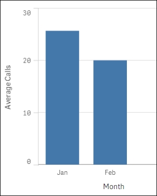
If we look at the source data we loaded at the beginning of the recipe it is clear that there are some outliers present. To exclude these and get a real picture of the normal, average amount of calls, we remove the top and bottom 10 percent of the value. This is done using the fractile function. The fractile function calculates the cut-off point for 10 and 90 percent based on our data. The Aggr function is needed because fractile is an aggregation function being nested inside another aggregation.
Another method of handling outliers is not to exclude them from the expression, but hide them from what is visualized. For example, if a data point far exceeds the norm, you can set the axis limit to the second largest value; this focuses the visualization on the points that are closely related. You can do this by going to the object properties:
- Under Appearance, click on Y-axis.
- Switch off Auto Range and set the Max value by using an expression such as the following:
=Max(aggr(avg(Calls),Date),2)
Here, we simply work out what the second largest number is and set that as the axis limit. This way we can produce an all inclusive line graph by date, albeit one data point will be off the screen.
-
No Comment