
On our demo site, we have a human resource app. You can find it on http://sense-demo.qlik.com, by clicking on the Human Capital Management link. In it, you will find a subset of what you can analyze in HR data. Mainly, it analyzes training investments and employee satisfaction.
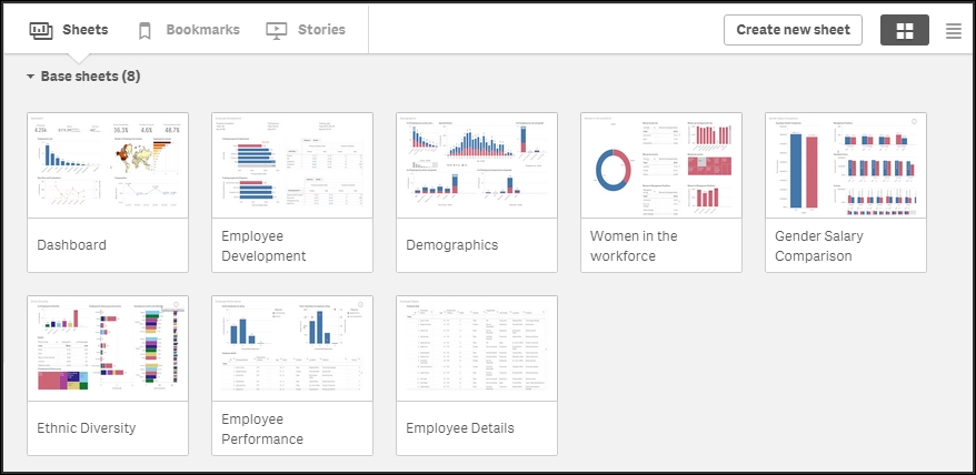
When you open the app, you will first see the app overview, with a small description of the app and a thumbnail in the form of a small bar chart, as shown in the following screenshot:

The overview of the Human Capital Management application
The following is this overview; you will see a number of sheets. These are created according to the dashboard analysis report principles described in Chapter 5, Authoring Engaging Applications. This means the leftmost sheet is an overview, very much like a dashboard, whereas the other sheets are prepared for analysis and detailed information.
If you click on the Stories button, you will see that the app also contains a story—a story that can be used to present the data in the app. It can also be used as an introduction to the app the first time you open it.
The sheets on the app overview page
The first sheet is called Dashboard, and if you open this, you will see several key numbers, a couple of charts, and a map. This overview is designed so that you can quickly get an overview and a brief understanding of the information without having to make any selections.

The first sheet – the Dashboard
The top-left chart and the map show the number of employees per role and per country. The two charts at the bottom show the number of hires, number of terminations, and total compensation over time. Note that this sheet does not contain any filter panes because it should not encourage making selections.
The other sheets contain more detailed information, ordered by topics, such as Demographics, Ethnic Diversity, and so on. The final sheet contains a table only, showing the details about what the application captures, should the user be interested in drilling down to the lowest level.
This application contains information that covers only some of the KPIs mentioned in the previous section. One area that it covers well is training. Hence, our first question could be what the total expenditure on training is. The answer to this can easily be found from the Employee Development sheet.

The Employee Development sheet
In the top part of the sheet, you can find a textbox containing Total: under Training costs.
The next question is what the percentage of employees who have gone through the training is. The answer to this can be found from the same sheet. All charts on this sheet show the training completion ratio, split per department or program. By clicking on a chart, you can drill down to the data and explore how the numbers vary between departments, programs, job, course type, and course name.
When you analyze data in a Qlik Sense application, you will realize that there are many ways of using it. For example, say that you want to look at the training progress by gender, to see whether there is any difference between men and women. You have already found the charts showing training progress on the Employee Development sheet, but these only show the progress by department and by program.

Chart showing training progress by department
If you have been authorized to create your own visualizations, you can simply go to edit mode, duplicate the sheet, and then drag Gender onto the chart, thus replacing the existing dimension with Gender.
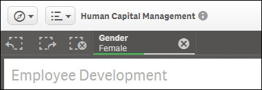
But even if you aren't allowed to change anything, you can still do your analysis. You just have to do it in a different way. What you could do is use the global selector (the rightmost button in the SELECTIONS bar) to select Female first, and then Male, as shown in the following screenshot:

Selecting Gender in the global selector
When you now close the global selector and return to your Employee Development sheet, you can toggle between Male and Female using the Step back and Step forward buttons to the left in the SELECTIONS bar, as shown in the following screenshot. There's also a Clear all selections button in this bar:
The left part of the Selections bar has the Step back, Step forward, and Clear all selections buttons. Further right, the current selections are listed
This way, you can see how the chart changes as you toggle between the data of male and female employees.
The next question could be about employee compensation. For this, you need to go to the Employee Performance sheet. Here, you will find a table showing all employees and the compensation attached to them. By clicking on Avg Compensation in the table, you can sort the employees in ascending or descending order, and can thus get a good overview of the span.
Avg Compensation is the rightmost column in the table, and due to the responsive design of Qlik Sense, it may be that this column is hidden. If so, just click the three dots on the edge of the table, and you can change the order of the columns so that this column becomes visible.

As users, we would probably also want to see a chart showing the average and total salary costs, split by department, but unfortunately, this has not been created by the app developer. However, in a real-life situation, a user should be empowered to create such charts. After all, it is impossible for an application developer to foresee all the needs of a user. Hence, this is a good example of the need for self-service data discovery.