
The following script can be used to create a choropleth map that shows the total wildfires in the US from 1984-2015, based on total count per state. We can use the MTBS with fire data that was introduced in Chapter 4, Data Types, Storage, and Conversion, which gives us point data of all of the wildfire occurrences from 1984-2015. We can use the state field of the wildfire data to map the wildfire occurrences by state. But, we choose here to overlay the data on a separate shapefile with state geometries, to illustrate the use of a spatial join. Next, we'll count the total wildfires per state and map the results. GeoPandas can be used to accomplish all of these tasks.
We start with importing the module:
In: import geopandas
Next, we import the shapefile with all of the state boundaries:
In:  states =
     geopandas.read_file(r"C:datagdalNE110m_cultural
e_110m_admin_
     1_states_provinces.shp")
The attribute table of the file can be displayed as a pandas dataframe by repeating the variable name:
In: states
We can see all of the state names listed in the name column. We will need this column later. The vector data can be plotted inside our Jupyter Notebook, using the magic command and the plot method from matplotlib. As the default maps look quite small, we'll pass in some values using the figsize option to make it look bigger:
In: %matplotlib inline
    states.plot(figsize=(10,10))
You'll see the following map:

The same procedure is repeated for our wildfire data. Using large values for the figsize option gives a large map showing the location of the wildfires:
In: fires =
    geopandas.read_file(r"C:datamtbs_fod_pts_datamtbs_fod_pts_201705
    01.shp")
    fires
In: fires.plot(markersize=1, figsize=(17,17))
The map looks something like this:

Have a look at the column called MTBS Zone in the fires GeoDataFrame, and verify that this dataset does not include all of the state names to reference the data. However, we have a geometry column that we can use to join both of the datasets. Before we can do this, we have to make sure that the data uses the same map projection. We can verify this as follows:
In:    fires.crs
Out:   {'init': 'epsg:4269'}

In:    states.crs
Out:   {'init': 'epsg:4326'}
There are two map projections, but both need to have the same CRS in order to line up correctly. We can reproject the fires shapefile to WGS84 as follows:
In: fires = fires.to_crs({'init': 'epsg:4326'})
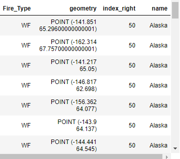
Now, we're ready to perform a spatial join, using the sjoin method, indicating we want to know if the fires geometries are within the state geometries:
In: state_fires =
   geopandas.sjoin(fires,states[['name','geometry']].copy(),op='within'    )
    state_fires
The new state_fires GeoDataFrame has a column added to the outer right called name, showing the state where each fire is located:
We can now count the total amount of wildfires per state. The result is a pandas series object showing the state name and total count. To start with the highest counts, we'll use the sort_values method:
In:   counts_per_state = state_fires.groupby('name').size()
      counts_per_state.sort_values(axis=0, ascending=False)
Florida, California, and Idaho are the three states with the most wildfires during 1984-2015, according to our data:

These values can be fed into the original shapefile as a new field, showing total wildfire count per state:
In: states =
    states.merge(counts_per_state.reset_index(name='number_of_fires'))
    states.head()
The head method prints the first five entries in the states shapefile, with a new field added to the right end of the table. Finally, a choropleth map for wildfire count per state can be created and plotted as follows:
In: ax = states.plot(column='number_of_fires', figsize=(15, 6),
    cmap='OrRd', legend=True)
The output will look something like this:

Compare this to another color scheme applied to the same results, doing away with the light colors for the lower values:
In: ax = states.plot(column='number_of_fires', figsize=(15, 6),
    cmap='Accent', legend=True)
Here is what the map looks like:

Use the following code to fine-tune the map a little further, by adding a title and dropping the x-axis and y-axis:
In: import matplotlib.pyplot as plt
    f, ax = plt.subplots(1, figsize=(18,6))
    ax = states.plot(column='number_of_fires', cmap='Accent',
    legend=True, ax=ax)
    lims = plt.axis('equal')
    f.suptitle('US Wildfire count per state in 1984-2015')
    ax.set_axis_off()
    plt.show()
The output is as follows:
