This chapter will provide readers with more advanced ways to visualize data. There is a great deal of new functionality that has been developed for rendering data in the last year. There are now many visualization tools that are unique to QGIS and allow you to create beautiful data visualizations.
The topics you will cover in this chapter are:
- Use of live layer effects
- Creating coastal vignettes and study area masks using inverted polygon shapeburst fills
- Creating a 3D view with QGIS2ThreeJS
- Creating an atlas
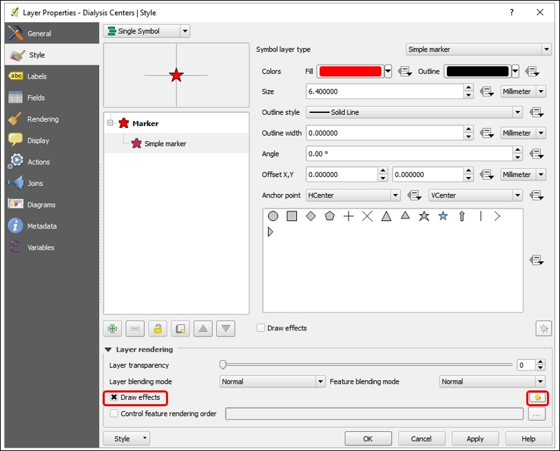
You can make stunning visuals using live layer effects. From the Style tab of Layer Properties, you can enable this feature by clicking Draw effects in the Layer Rendering section, as seen here:
Once the Draw effects feature has been enabled, the Customise effects button is also enabled. Click the Customise effects yellow star button to open the Effect Properties window shown here:
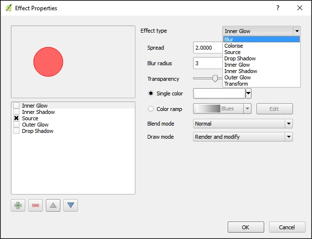
The Effect type dropdown gives you access to eight different effects. For most of these, transparency, blending modes, and draw modes are customizable. The available effects are:
- Blur – Creates a blurred version of the feature.
- Colorise – Allows you to change the color of the feature using brightness, contrast, and saturation sliders along with transparency, blending modes, and draw modes.
- Source – The original feature style.
- Drop Shadow – Creates a drop shadow around a feature. The sun angle (offset), shadow length, blur radius, transparency, and color are adjustable.
- Inner Glow – Creates a glow effect from the features edge inward along a customizable color gradient. The spread, blur radius, transparency, and color are adjustable.
- Inner Shadow – Creates a shadow effect from the features edge inward. The sun angle (offset), shadow length, blur radius, transparency, and color are adjustable.
- Outer Glow - Creates a glow effect from the feature's edge outward along a customizable color gradient. The spread, blur radius, transparency, and color are adjustable.
- Transform – Allows you to transform the feature symbol in a variety of ways: shear, scale, rotation, and XY translation.
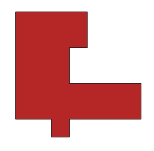
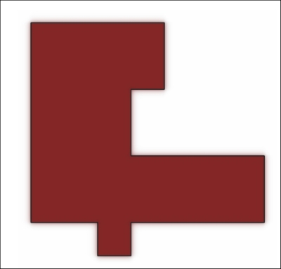
The following examples will illustrate several of these effects using the LiveLayerEffects.qgs map file. The effects will be applied to the Food Dessert polygons and will show one particular dessert for illustrative purposes. Here is the original data without any live layer effects applied:
This is the Drop Shadow effect, which gives more visual weight to a feature and lifts it off the map a bit:

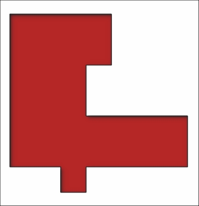
This is the Blur effect, which gives the polygon a fuzzy boundary:
This is the Inner Shadow effect. With the default effect configuration, it creates a shadow on the interior of the upper-left sides:
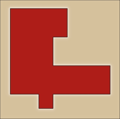
This is the Outer Glow effect. The map background was changed so the effect would be visible against a darker background:
These effects can also be used in combination by enabling multiple effects in the Effects Properties window. These effects, along with blending modes, allow you to create cartographic effects available in no other GIS software! They are extremely powerful cartographic tools and we encourage you to experiment with them.