
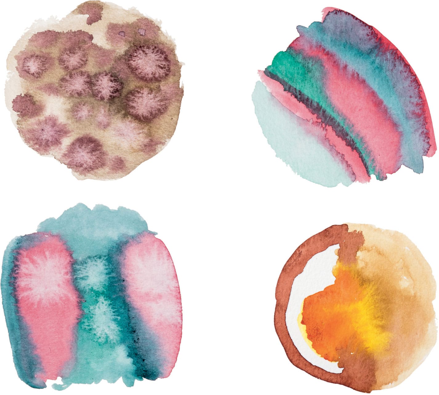
1
Starter Projects
Glorious Extravagance
First, a brief history lesson. Before the Industrial Revolution, artists had to make their paint by hand, and they stored it in pig bladders. For real. At some point in the mid-1800s, paint tubes with a screw cap were invented and companies began mass-producing paint for artists. Van Gogh (1853–1890) was one of the first painters who squeezed paint directly onto his canvas. The invention of mass-produced paint and aluminum tubes directly led to the expressionist painting movement, which 125 years later led directly to this project.
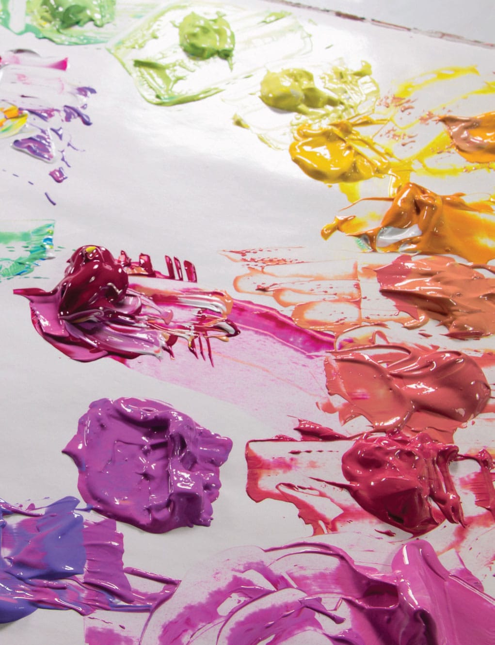
As we know, art supplies cost money. As a result, it’s easy to get miserly and precious with them and work on tiny little projects with tiny little outcomes. For this project, however, a required mindset will be “I am going to use all the paint.” You may or may not actually use all the paint, but you want to get used to the idea that the paint you just paid hard-earned money for is going to be used, possibly all of it. Even, gasp, wasted. I generally don’t like to waste things I paid cash money for, but you’ve got to take a risk to get a break.
SKILL LEVEL
Beginner and up
SKILLS LEARNED
Basic color mixing, and how to be excessive, abundant, over the top, leading to reckless joy
MATERIALS
15” x 15” (38 x 38 cm) prestretched and primed canvas
3–5 tubes of acrylic paint + large tube of white
Palette knife
MESS LEVEL
Potentially off the charts; take precautions
TIME TO COMPLETE
60 minutes

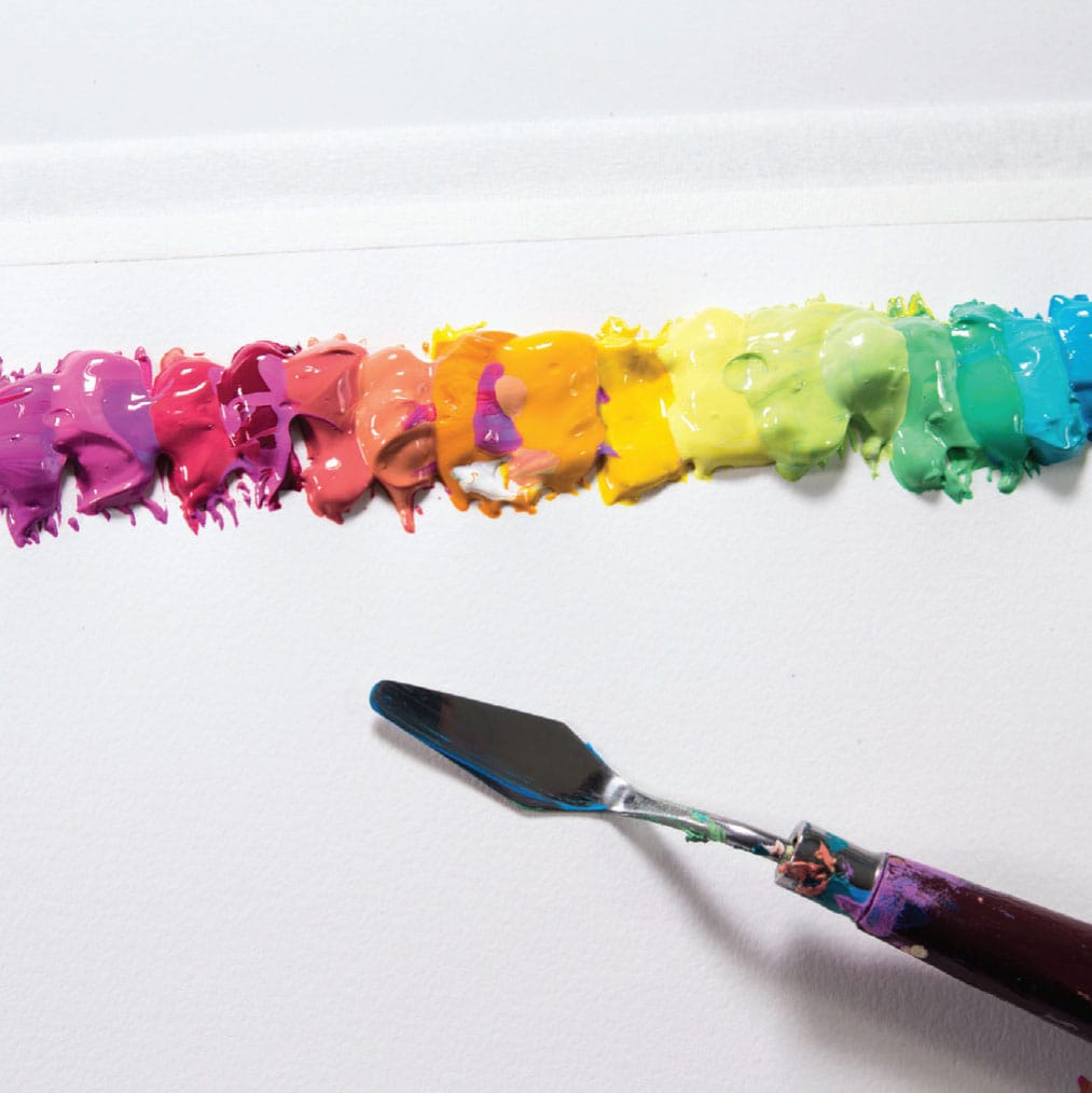
1 Get your canvas ready by laying it flat and squeeze white all over. Add color here and there straight out of the tube. Be bold. You won’t need a brush for this project, but you will need a small, flexible palette knife. There are a lot of different shapes and sizes. I like the diamond-shaped ones, and this project works better with a smaller knife.
2 Using the knife, start smushing the paint around. The first lesson of this project is waste paint and the second lesson is don’t overwork. You’ll be mixing the colors with the white and with one another, but you’ll have a big pile of mud real fast if you overmix. You want to dash in and dash out, and once you’ve piled up some paint in one area, move on!
3 Your goals: Completely cover the entire white surface of the canvas, and create interesting textures. There should be some areas where you’ve mixed the paint completely, and other sections where the paint is only barely mixed and showing contrast and dimension. You’ve covered the whole canvas?
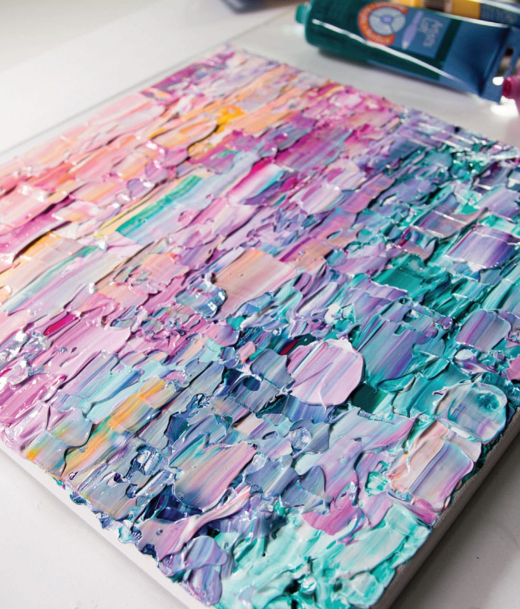
4 Stop! The painting will take a good while to dry—possibly even three to four days, depending on your humidity and thickness of paint, so put it somewhere safe and wait. You have now learned some wonderfully reckless life skills that can be applied to almost any situation (abundance! joy! liberation!), plus you made an amazing painting.
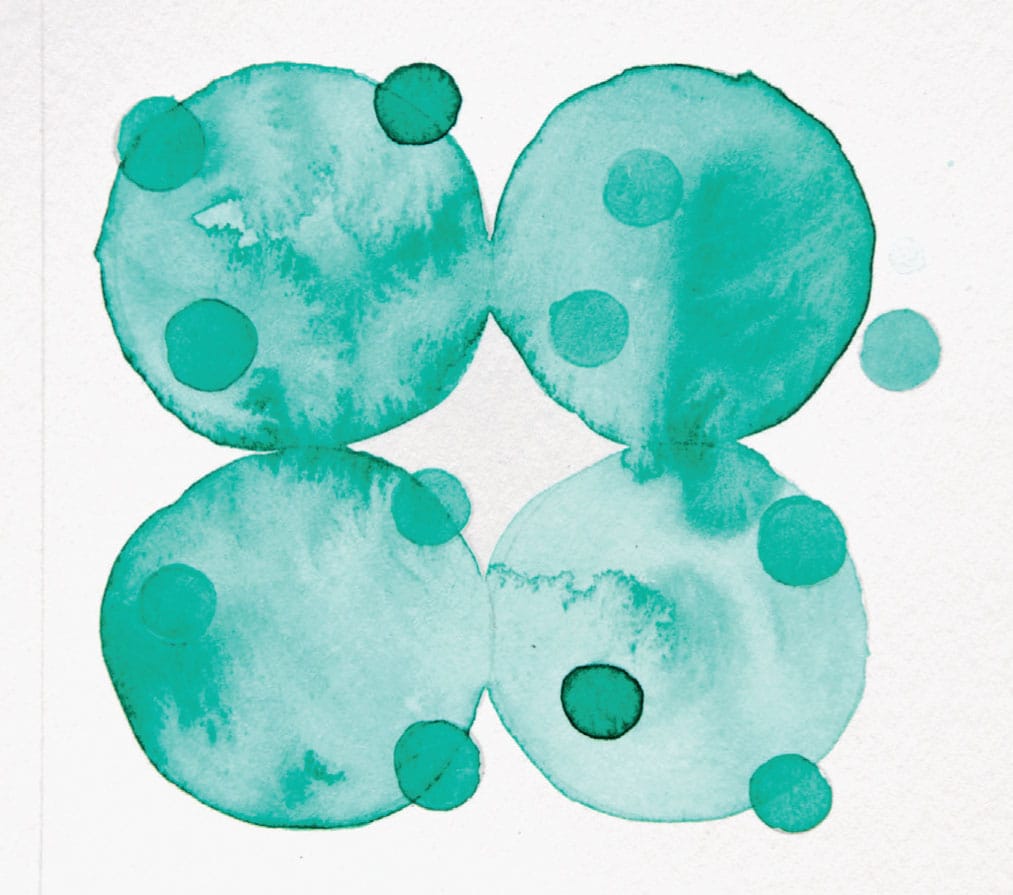
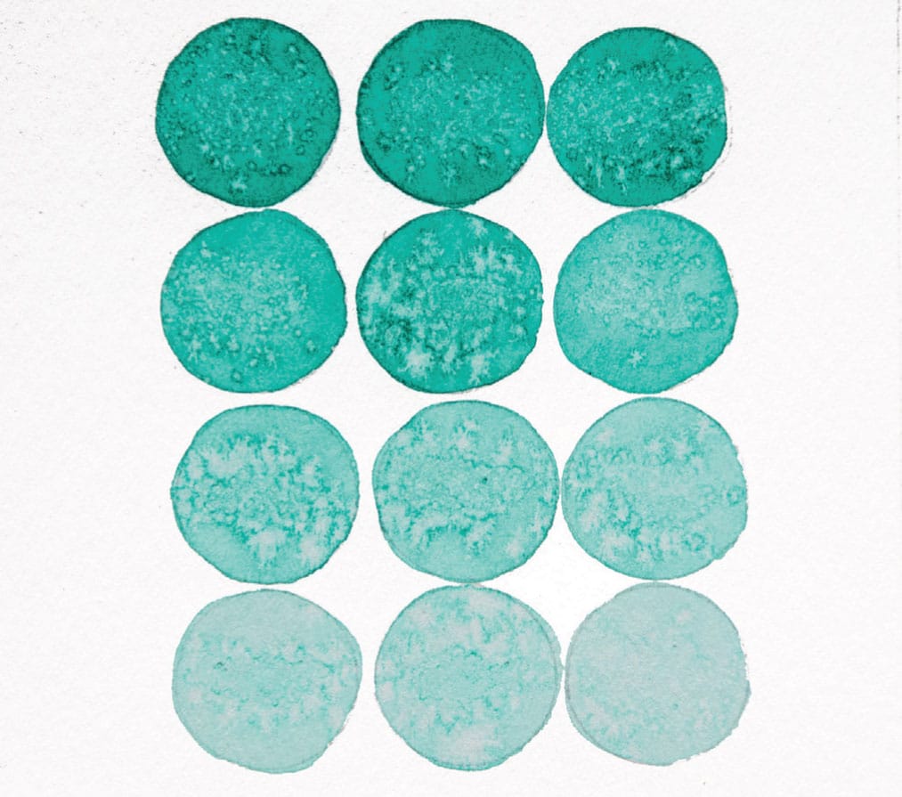
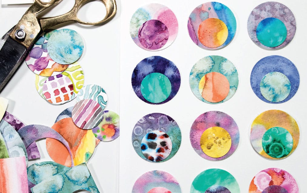
Mini Mono
Established artists have rules. They may not call them rules. In fact, it may be offensive to even suggest to them that they have rules because artists often base their whole careers on breaking rules and conventions. (Question: If your “rule” is breaking the rules, wouldn’t the most rebellious act be compliance? Asking for a friend.) Rules, order, and structure seem to be “uncreative.” The perception is that the whole point of being an artist is that you can do anything you want. But the fact is most artists who have spent time developing their voice make their work within very structured systems. They might work with a certain medium. They work with certain colors. They use repetitive lines or marks. They revisit a consistent subject. Naturally, there are time-honored situations when a well-known artist changes everything they do (think Picasso, Blue Period). But at its heart, design and creativity are all about finding your voice within the bounds of a medium or a technique, and the only way to do that is to narrow the possibilities and, yes, apply rules.
I conceived this project with very rigid guidelines: one color, one shape, one size. In the beginning I had about five turquoise circle ideas. Then I ran out of ideas, and I decided it was a stupid and extremely boring project and it was likely that I also was stupid and boring. But when I was working on the last painting before I stopped, I had another idea. And that next painting led to another idea. Sometimes the ideas would be directly linked to the previous painting in an obvious way, but sometimes my mind would just wander and a new turquoise circle plan would introduce itself. It got to where I was dreaming about turquoise circles, and I’d have turquoise circle ideas in the shower and in the car. It actually started to inform my other work, and overall this exercise helped me learn a lot about composition and paint, and added new tools to my arsenal of visual language.
SKILL LEVEL
Beginner
SKILLS LEARNED
Designing your own template; using stencils; monochromatic painting
MATERIALS
12-color watercolor kit (see here)
#1, #4, and #8 round brushes
Paper towel
140 lb. (300 g/m2) watercolor paper cut in 5” (12.5 cm) square swatches
MESS LEVEL
Minimal
TIME TO COMPLETE
A few minutes for one

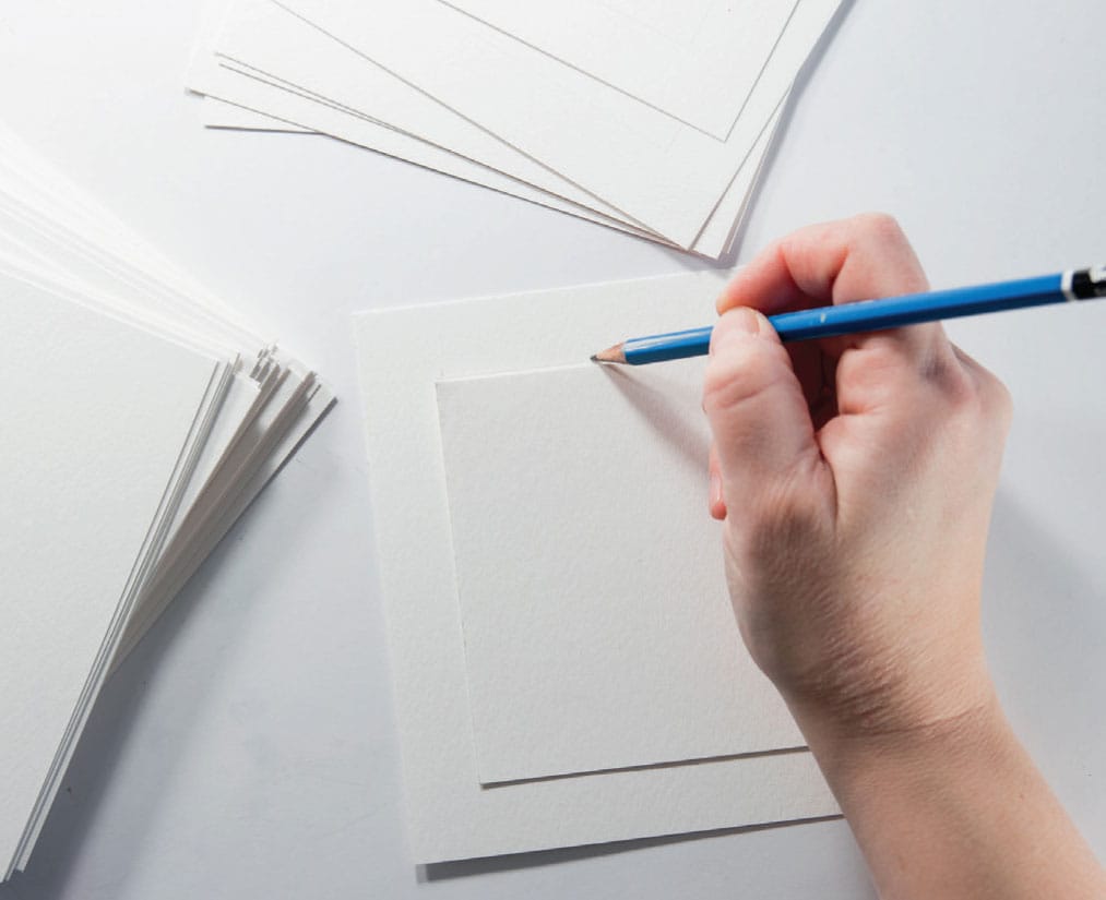
1 Cut watercolor paper into approximately 5” x 5” (12.5 x 12.5 cm) pieces. If you’re working with a 9” x 12” (22.9 x 30.5 cm) pad, you could do a 4.5” (11.5 cm) square. Let your source paper size be your guide so that you don’t waste paper. How many you cut is up to you—for this project I made about forty-five paintings, but then, I am an epic overachiever. It is nice to have a bunch cut up and ready to go because you will want to quickly shift between paintings.
2 Having a “frame” inside your paper helps to organize your composition. I consider this step essential. Create a 4” x 4” (10 x 10 cm) border within your 5” x 5” (12.5 x 12.5 cm) page. I used a 6H pencil (a pencil with a very hard graphite that leaves a faint, thin mark). For speed, cut a 4” x 4” (10 x 10 cm) template out of card stock and trace it instead of having to measure out a 4” x 4” (10 x 10 cm) window.
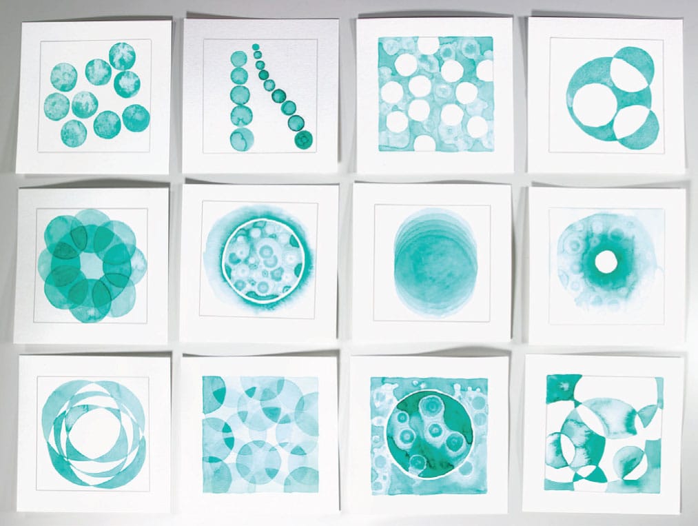
3 Trace circles of various sizes from various sources. Use your thumbnails for reference and generate different compositional ideas, patterns, and arrangements. Paint your circles using a single color of watercolor paint (this is called “monochromatic”). I used brushes in multiple sizes for versatility.

4 You will develop your own working rhythm, but for me it was helpful to work fairly rapidly. I can tend to overwork something, but if I have ten small paintings on my table simultaneously, it helps me to leave well enough alone (a big challenge for me).
5 Looking back, my favorite paintings are the ones I initially considered too minimal and intended to add more stuff—but didn’t because I was too busy working with other paintings.
A FEW WATERCOLOR TECHNIQUES

Wet on Wet
Wet on Dry
Salt. Sprinkle basic table salt on medium-damp paint. Set aside and wait. I’ve discovered this technique takes a long time to dry, longer than you’d think. If you try to brush the salt off before it is truly dry, you’ll have a bit of a mess.
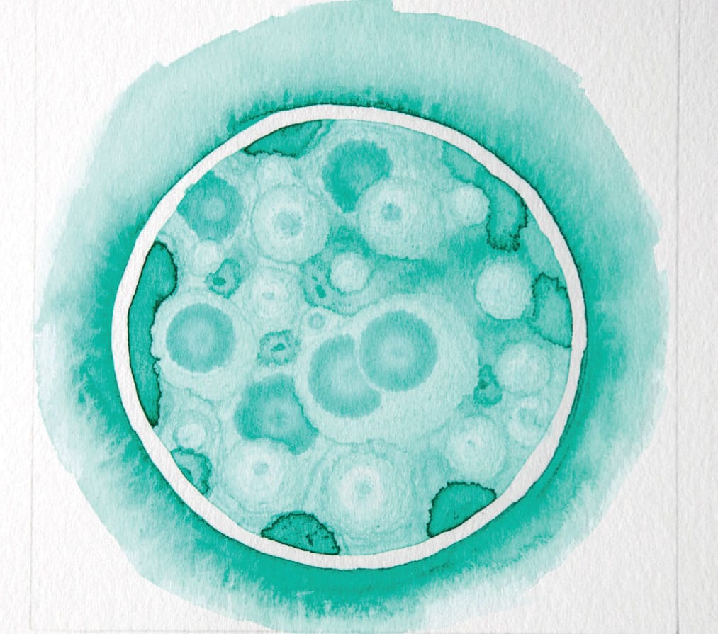
Rubbing alcohol (isopropyl alcohol). Alcohol and water don’t mix, and this incompatibility can result in amazing effects. There are two ways to do it: use a small brush dipped in alcohol, then drop the alcohol into damp paint; or drop rubbing alcohol onto blank paper, let it dry for a few seconds, and paint color over it.
Flow: Not Just for Hippies
When I was going through the terrible, horrible, no good, very bad time, I experienced extraordinary, transcendent moments. Right smack-dab in the middle of crying all day and not sleeping or breathing much. These extraordinary moments actually happened quite a lot, sometimes while receiving support from loved ones, sometimes in nature, and significantly, often while I was making art. When I was immersed in color and pattern, I would come home to myself. I could breathe again. It was like I had a moment on an island in a choppy sea. The effect was so powerful, like an altered state caused by a psychotropic drug or alcohol, but, happily, with a painting at the end rather than a headache.
My curiosity about this experience led me to read about the science of flow. Flow, in a nutshell, is a state of active, intense concentration. Everyone has experienced it at one time or another—it’s the experience where you suddenly realize that you haven’t gotten up from your desk in four hours, and you’re thirsty and you have to pee. Basically, it’s getting so immersed in a focused activity that all other bids for your attention are totally muted. Including the need to pee. Time can take on weird dimensions—hours can pass but feel like mere moments, or a single moment can elongate into multiple decision points, such as a snowboarder executing a complicated move.
Given that this fairly broad term could have many interpretations, it would be easy to think that flow isn’t a sciencey kind of thing . . . but it is. In the formal scientific literature, “flow” is studied by psychologists, occupational therapists, neural biologists, creativity researchers, efficiency experts, the military (I know, weird), elite athletes, and the list goes on. There are measurable biochemical changes in the brain and body. Performance is elevated. Get this: Getting into a flow state is an effective treatment for post-traumatic stress disorder (ptsd).
Flow is known to be a very pleasurable experience that furthermore produces enhanced performance. Flow-inducing experiences vary from individual to individual, but we’re all wired to experience it. Like many people, I feel flow when I’m in a creative endeavor. Other flow triggers are team sports, meditation, cooking, performing music, being in sync with a group while working on a complex task, surfing, video games—the list goes on. Whatever you consider your flow triggers, painting can be a flow gateway drug—it’s an easy entry point and a way to get your brain chemistry on board.

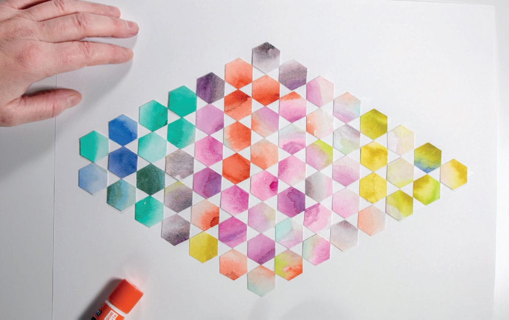
Collage Rainbow Wheel
We’ve taken an academic look at the color wheel, and now we’re going to make one. Kind of. The color wheel is the old standby, and every school child is an expert. I taught a college-level painting class where I had the students do a “Free Will Color Wheel,” by which I meant as long as they mixed pure, color-wheel colors, they could paint them in any arrangement they fancied. I explained a little about the history of the color wheel—my main man Sir Isaac Newton invented it. At the age of twenty-three, while being cloistered in his house to avoid the plague, as one does in 1665, he messed around with prisms and, being a physics genius, established the basis of what we understand as primary colors, roy g biv, and how colors interact with light, turning Plato’s earlier musings (and the basis for all color theory for two thousand years) on its head. Charmingly, he also thought the color wheel was correlated to musical notes, though he was never able to get his analogy to make perfect scientific sense. In the end, it seems, that particular notion was more poetry than science. In any case, he did understand that color existed in clear light, and he sketched the first ever wheel (with musical notes).
Anyway, there was an older guy in my class—and when I say older, I mean, like, in his eighties. The university offered free tuition to people over seventy-five. I suspected this gentleman had a few pulls from the scotch glass before the evening class most nights, as did I (um, jk). Whatever the reason, he always appeared to be having a good time. Come review time for the Free Will Color Wheel project, he presented a straightforward, classic, by-the-book color wheel. No frills. As explanation, he announced emphatically, “If Sir Isaac Newton says a wheel, I paint a wheel.” Indeed.
I see your wheel, sir, and I raise you. That said, rules, schmules. Let’s have some fun with this wheel!
SKILL LEVEL
Beginner and up
SKILLS LEARNED
Basic color sourcing and organizing
MATERIALS
Glossy magazines with high-quality paper
Scissors
18” x 24” (45.5 x 61 cm) mixed-media paper
Glue stick
MESS LEVEL
Moderate but not permanent
TIME TO COMPLETE
60+ minutes
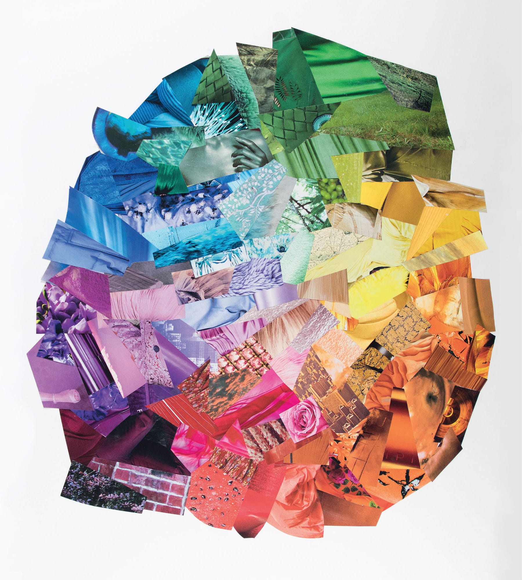
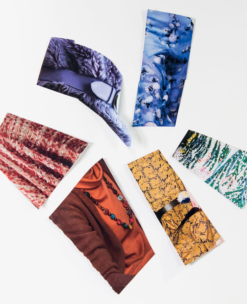
1 Start with color hunting. It takes a little while to train yourself to see the color and not the photograph of the handbag or whatever, so sometimes it helps to read the magazine upside down. Look for basic color-wheel colors on this project: red, orange, yellow, blue, green, and purple with in-between colors like turquoise and buttercream. You’re looking for vibrant colors that may have some value shifts, slight variations, tertiary colors, and texture variety. Don’t try to tell a story with words and pictures. Try to create a sensation with dynamic color.
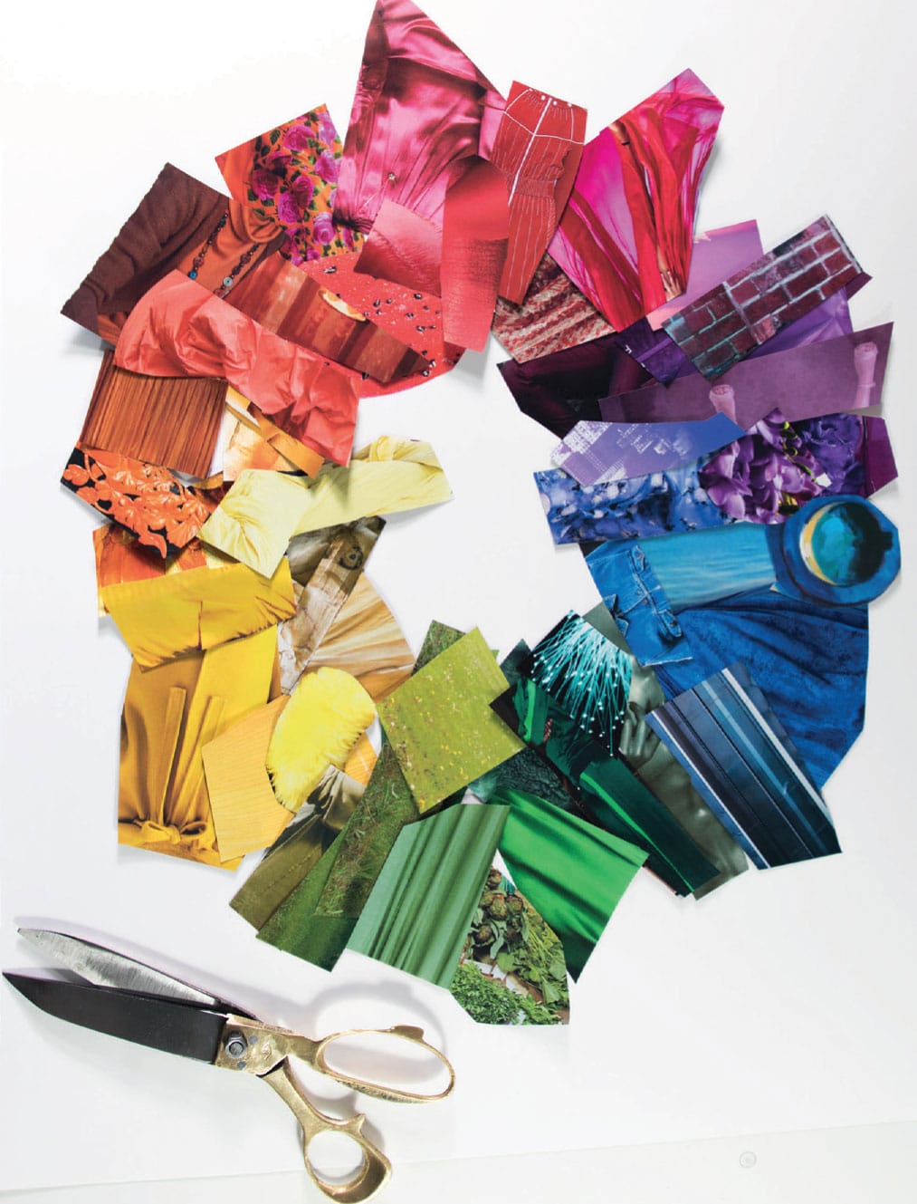
2 When you’ve assembled a nice collection of the colors, glue them down on all-purpose art paper (show here, 18” x 24” [45.5 x 61 cm]). I often cut them to suit the shape and size I’m after, but since you layer them, you don’t need a perfect fit. To get the paper to glue down flat, it helps to fully smear the glue on the paper and then press firmly starting from the middle and moving out, pushing out the bubbles. I overlapped the paper quite a bit.

3 I grouped the colors lighter in value toward the middle and did not make a perfect circle. You can keep adding more paper bits to various sections until you’re satisfied with the overall effect. The idea is to make the colors appear to blend into one another. When in doubt, cut the bigger chunks into smaller pieces.
The Classic Schmear
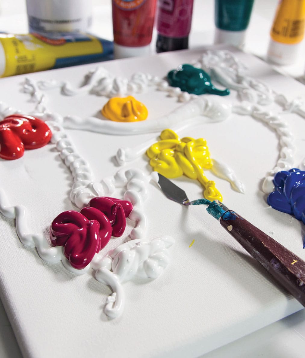
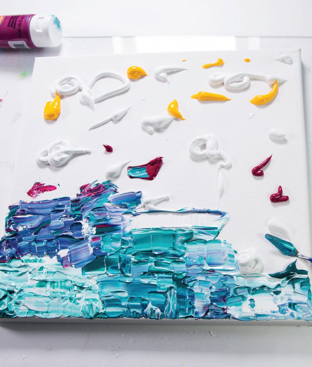
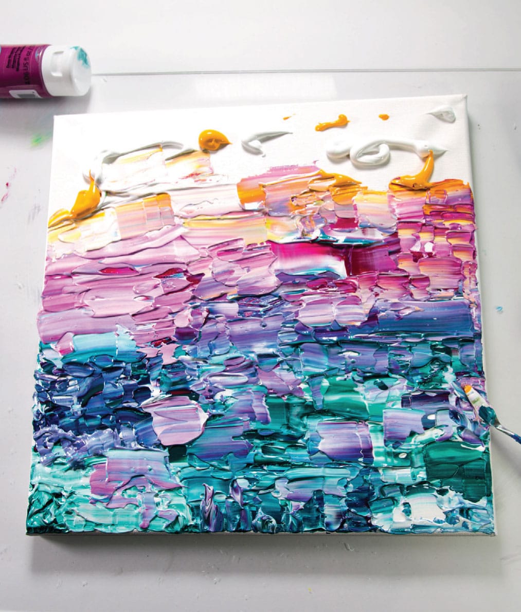
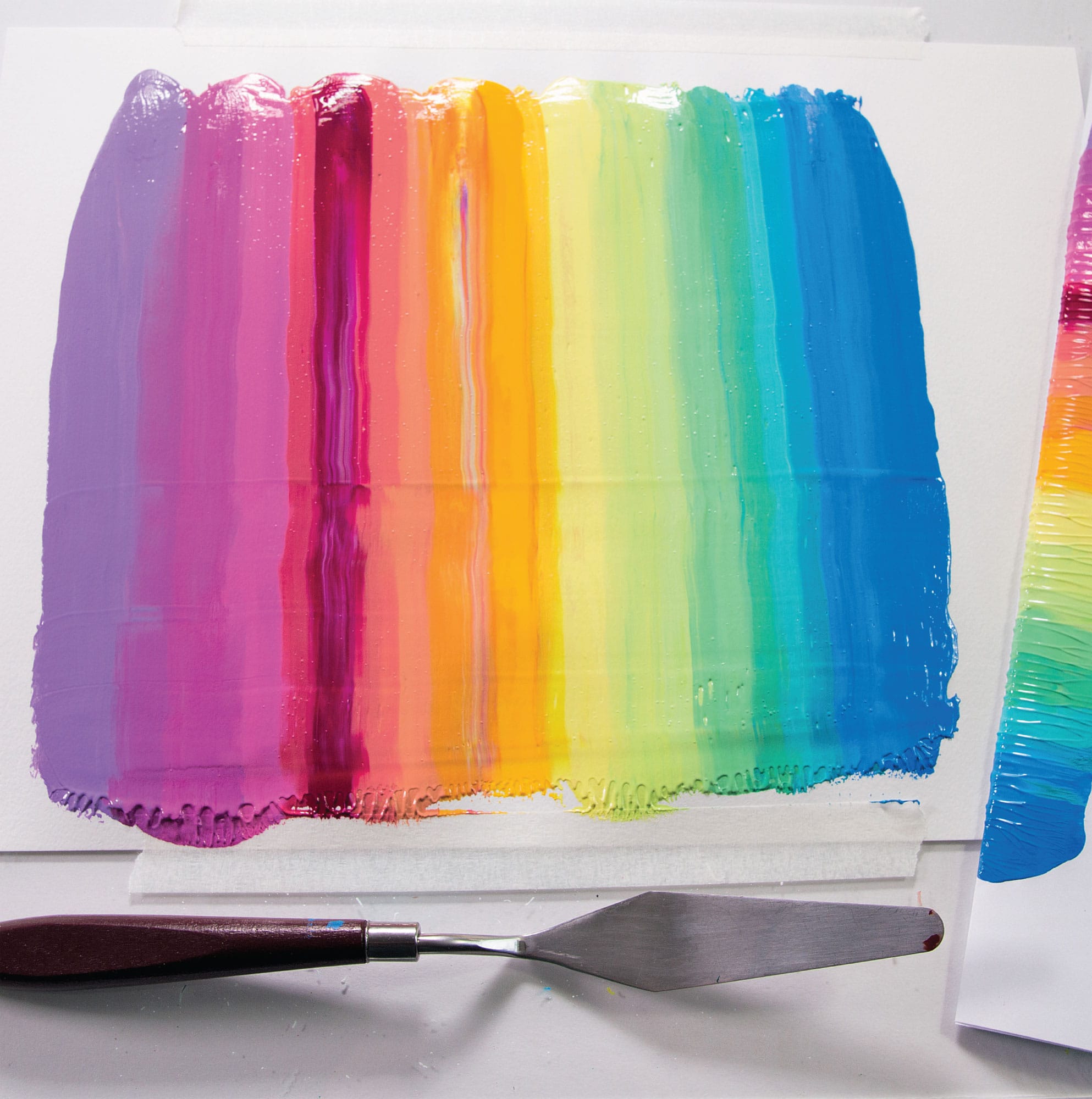
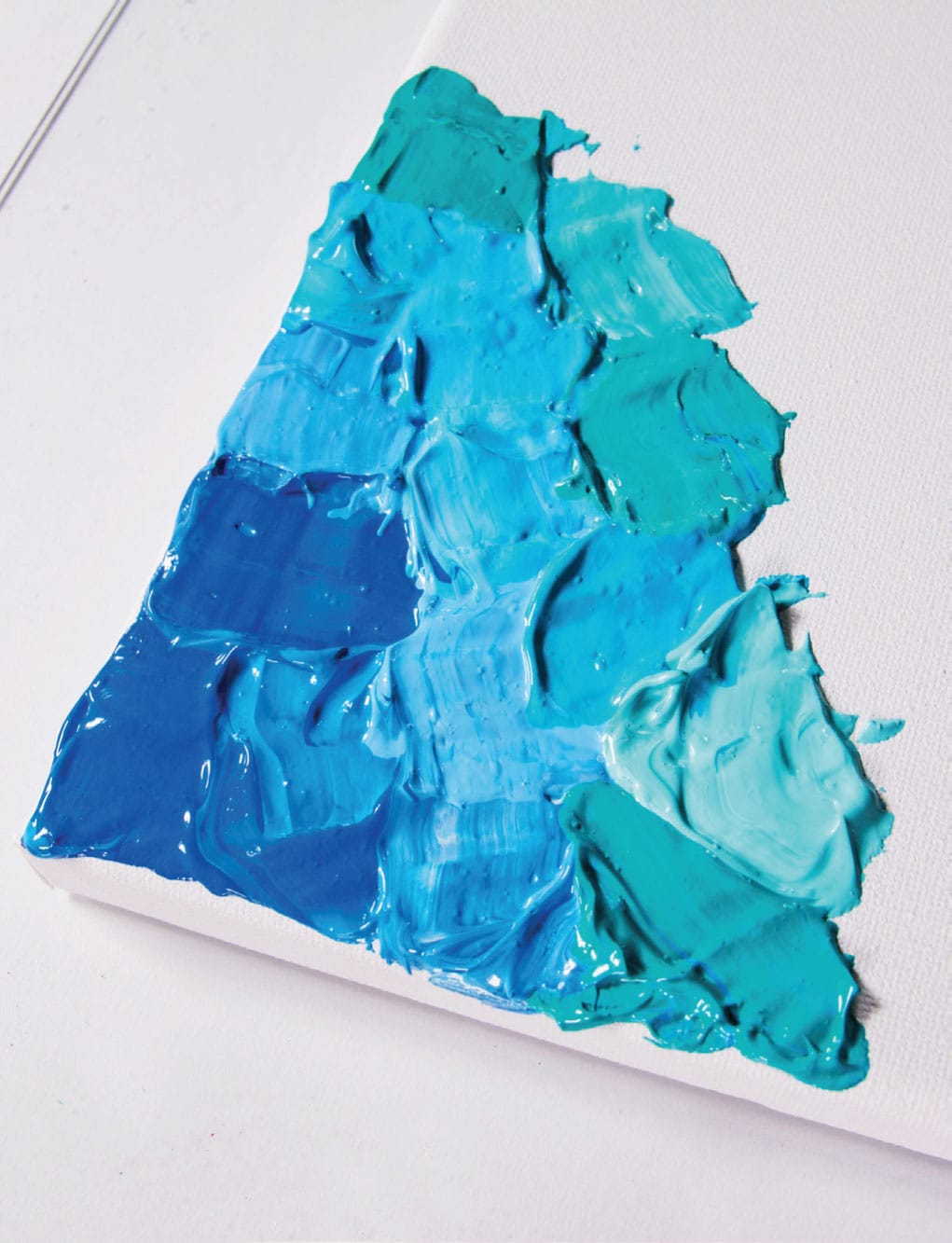
Ah, the schmear. This is really where it all comes together for me. Mixing delicious piles of paint and creating tonal and value shifts, globbing different colors in a line, and smushing them together has got to be the ultimate satisfaction exercise. There are tons of ways to go about this, but the classic rainbow approach is a great starter.
A note on the rainbow: You absolutely can take the acrylic tube colors right out of the tube and schmear them all over the place. That is a legitimate approach, and if the spirit leads you, I wouldn’t try to talk you out of it. But the thing about rainbows, really good rainbows, is that sometimes you need to tweak those tube colors. The tube colors are usually intensely pigmented (a sign of better-quality paint), and thus so concentrated as to be difficult to fully see. So I add white to almost every acrylic color. Also, my gradient obsession is to try to create a little hint of value shift in the color-wheel colors—the deep blue transitions to baby blue before it shifts to aqua. This just happens to be my jam in rainbow, but there are many, many ways to approach the rainbow—and to kill the schmear.
SKILL LEVEL
Beginner rainbow to advanced spectrum
SKILLS LEARNED
Navigating tube paint colors; creating color and value shifts
MATERIALS
Acrylic paints (5 + colors plus white, listed opposite)
Palette knife
Disposable palette
8.5” x 11” (90 lb. (165 g/m2) paper
Computer paper or scratch paper for the schmear instrument
MESS LEVEL
There might be paint on your undies after this project, so use caution
TIME TO COMPLETE
30–40 minutes for mixing; 30 seconds for schmear
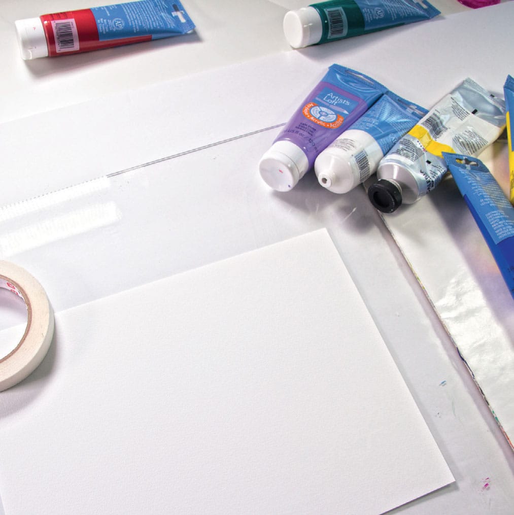
1 Prep your paper. Tape the top and bottom edge with a bit of masking tape. Use an underlying surface you don’t mind getting paint on, because you will.
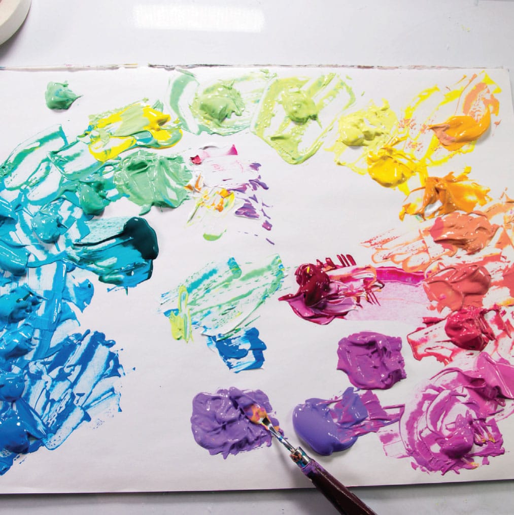
2 Using a disposable palette, mix the paint colors first. Squeeze out the paint in a half circle in that order. Use The Mother Method (see here) on mixing. This basically means you have a “mother” on your palette—a color you’ve mixed by which you draw from to guide the development of your whole painting. In this case, starting on one end of your palette, mix a desired blue by adding a bit of white. When you have a good amount of a blue that you like, scoop most of it over, setting aside a teaspoon or so for later use. Taking that mixed blue, you will add a little turquoise (and/or white) to create another pile of paint. Leave a little and move on. By transitioning directly from the previous mix, you will be able to achieve a spectacular rainbow ombré.
3 When you have your whole rainbow mixed—I mixed about twenty different colors across the spectrum—use the palette knife to plop/glob/galoop your paint on your page in a nice line. You want to make sure to put a good amount of paint here so that it will spread nicely across the page.
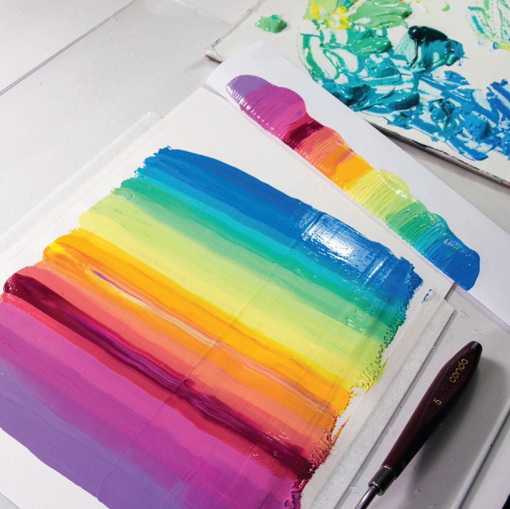
4 Fold a piece of computer paper into fourths (the long way). When you are ready—and you may have to do some meditation exercises and use calming breaths to handle the outrageous excitement—use both hands and the folded computer paper (which should be an inch or two wider than the line of paint) and with fingers spread out to provide even pressure, schmear the paint. You can make multiples passes if you wish. phew. There’s nothing like it. Congratulations.
Flow Neuroscience: Turning Off
Flow is effective because it deactivates parts of the brain. This may sound alarming, but it’s actually amazing.
A very important part of the brain is the prefrontal cortex. The prefrontal cortex is called the “executive,” in charge of higher functions such as planning, judgment, self-awareness, and social moderation. You’d think you’d need that for creative work, but what’s interesting is that getting into a flow state actually slows down the function of the prefrontal cortex. The state is called transient hypofrontality, which simply means the functions of the prefrontal cortex are diminished temporarily. Self-awareness is reduced, time takes on weird dimensions, and the ticker tape of to-do lists, judgments, and opinions are downgraded to background noise, or complete silence. Being in flow is a lot like having an out-of-self experience. And let me tell you folks, I reeeeeeeaaaaallllly appreciate getting a break from myself. Sometimes my internal self is worse than a whiny four-year-old.
A person in flow even experiences physiological changes: She breathes more slowly, and her heart rate and blood pressure drops. Another thing that happens is that the major facial muscles relax. We’ve seen this when a concert pianist is so involved in her performance that her face makes weird expressions as she plays. Because flow has taken over, she is fully connected to the music and not concerned at all about how her face looks to other people. This is the job of the prefrontal cortex, and it’s temporarily off-line.
In transient hypofrontality, our brains become more flexible and “loose.” A person who regularly experiences flow is usually more creative and adaptable across all activities. Because creativity is sometimes defined as something that is novel and useful, we need our brains to be very flexible when we are solving a creative problem. By the way, creativity doesn’t just include art! Your creative problem could include a design problem, a parenting issue, a physician trying to diagnose a tricky illness, a new route to work because your usual way is blocked, a fresh communication technique when the old ones aren’t working, etc. This is why people frequently report thinking of the key to a complicated problem while they are doing something unrelated, like driving or jogging. In flow, our minds are free to roam. The internal judger is turned off and new solutions appear, as if out of nowhere.
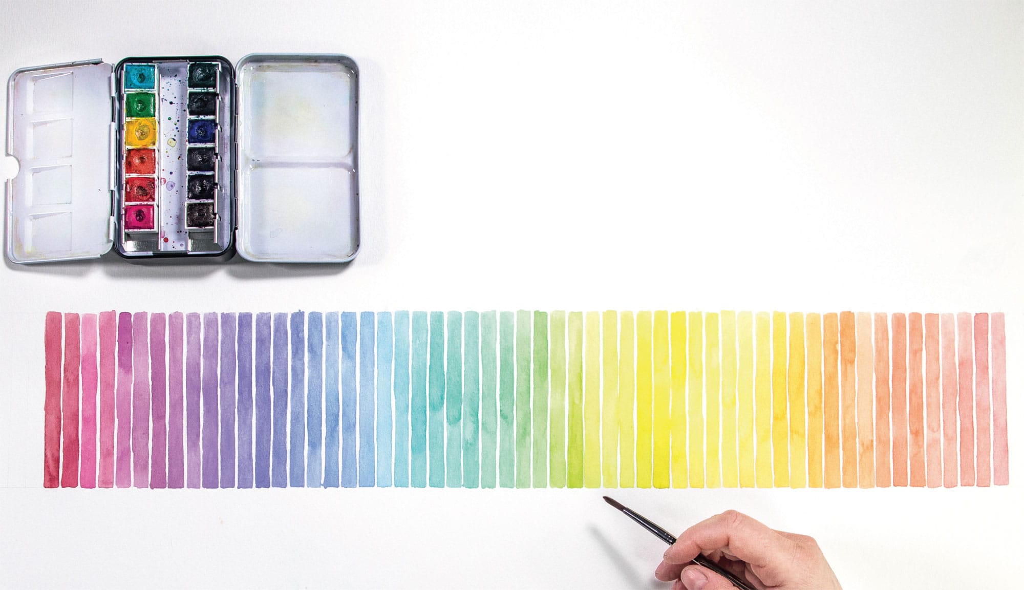
Value Gradient Primer
Master watercolorist Edward Hopper (1882–1967) was called “the painter of light.” Seeing his watercolors in person, I made a careful inspection to see exactly how he was so masterfully painting light. As it turns out, the lightest bits in his paintings were actually just bare naked paper. He wasn’t painting light at all—he was leaving it alone. A more apt description was that he knew what colors to paint around the light to make it really pop and glow, and had the presence of mind and discipline to leave some areas alone.
Important and sometimes not-understood tip: Do not use “white” with watercolor. You get white, or lighter colors, by adding clear water and diluting the color by utilizing the white of the paper. You can buy white watercolor, but if you use it, please be forewarned: It will be like muddy, flat chalk with no luminosity. Like Dracula’s skin. Like the back of my knee in January. Like grass that is trying to grow under a rock. For almost exactly the same reason, I do not use black with my watercolor kit. Black will also be flat, dead, and opaque. Dracula again. And coal. And mud. I will say more about how to darken your colors without using black paint in later projects, but don’t worry, you’ll be fine.
This project is twofold—it’s a great way to explore the pure, unmixed colors on your palette while learning how to introduce water to create a value gradient (darker to lighter).
SKILL LEVEL
Beginner
SKILLS LEARNED
Exploring your colors; using water to change value
MATERIALS
Templates:
• Value Gradient Primer, shown here (shown here)
• Value Gradient Primer: Variation, shown here (shown here)
12-color watercolor kit (see here)
#4 round brush
Paper towel
MESS LEVEL
Minimal
TIME TO COMPLETE
30 minutes

1 Use the provided template (see here) or create your own.
2 To keep everything from running together, you must have channels/moats in between your swatch colors. Consider this essential. The goal here is to create the truest, unmixed tones of your watercolor pans. Your palette, your paints, and your water need to be clean and untainted by other colors or you will not get a pure color. In between colors, dab up the previous mix on your paint palette with a paper towel so that there’s no chance of contamination.
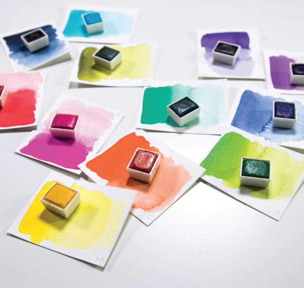
3 Start by using your brush to add water to your pan of color. Using a few brush loads of water, really squish that brush around in there for a while, like ten seconds. I used a #4 brush for this painting. The goal is to get superconcentrated paint load on the brush for the first, darkest swatch.
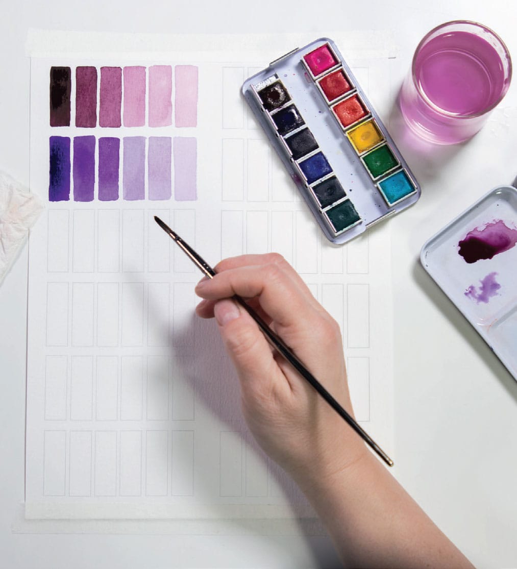
4 Paint the first, darkest swatch. After you add the dark paint to the template, don’t wash your brush! Using the same paint load, spread that paint on a clean and dry spot in your mixing palette. Do a flash dip in the water—just collecting a bit more water but not washing the brush. Mix this water to the color already on your palette, and add this slightly more watery color to the next spot on the swatch. Add more color from the damp half-pan.
5 It is difficult to see the true color on your mixing palette. Test your color on a blotter, and when the value is slightly lighter than the first swatch, add the next swatch! And repeat. I use The Mother Method (see here) because a single color remains on your paint tray, always informing the next value gradient. You don’t have to mix up a completely new color.
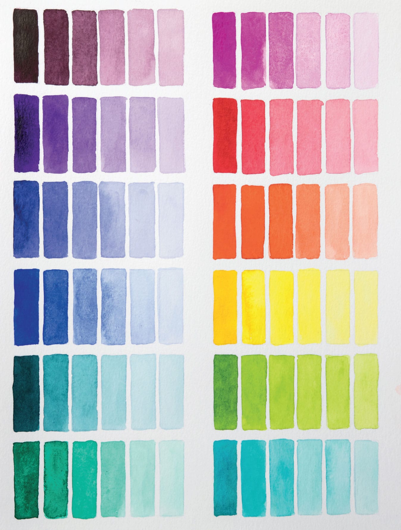
VARIATION: GRADIENT BARS
Using the Gradient Primer as a jumping-off point, this project uses all of the blending techniques: across the wheel, around the wheel, and up and down value—at the same time.


1 Paint the first swatch and work across the page, lightening the color with water until you feel the time is right for a color/value shift. I started from the top left and worked across the page, just like reading a book.
2 Following The Mother Method (see here), use the previous color still mixed on your palette. Add a speck of either water or color to subtly alter the earlier color. Or both if you want to get real crazy!
3 If you can get the color and the value to shift in a natural way, you are a watercolor master.
Tri Me
Value is one of those tricky art terms that doesn’t have anything to do with how much something costs. Value has to do with light, specifically, quantities of light and dark in a color. The more white or lightness in a color, the lighter the value. If black is added to a color, the value will usually be darker. However, a color that is heavily saturated with intense chroma can have a darker perceptual value than a muted color. Up and down value is the third technique of color mixing that I use, but value can sometimes be tricky to actually see, especially when you are looking at different colors with different levels of saturation. When you’re learning how to differentiate value, it’s sometimes helpful to work with a monochromatic color range, meaning one color, because it simplifies the process. I used red, but any color will work.
SKILL LEVEL
Beginner
SKILLS EXPLORED
Collage; monochromatic color; value
MATERIALS
Crafting card stock
Triangle punch
11” x 14” (28 x 35.5 cm) mixed-media paper
Glue stick
MESS LEVEL
Don’t work around a ceiling fan. Or blow-dry your hair nearby.
TIME TO COMPLETE
30–60 minutes
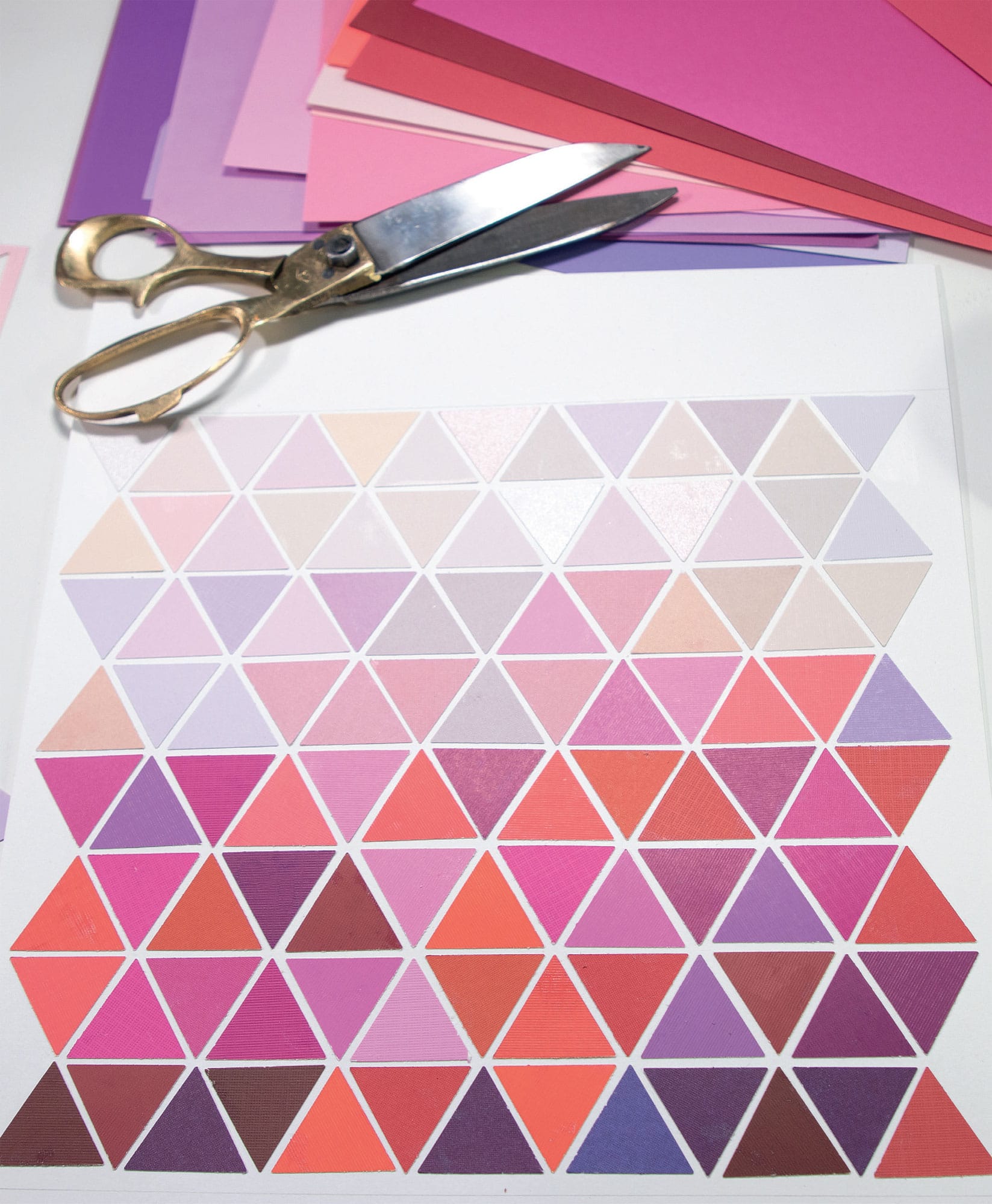

1 Assemble your color range in some sort of color organization. This project is not strictly following the rules of monochromatic, as you can see that I was trending toward tertiary colors on either side of red on the color wheel (purpleish and orangeish). This subtle range creates temperature changes. Red is commonly regarded as a warm color, but when it trends toward purple it’s cooler, and likewise warmer as it moves toward orange. Making slight temperature shifts within a single color makes for complex and sophisticated visual interest.

2 For this project, I punched out about 120 triangles and used 11” x 14” (28 x 35.5 cm) mixed-media paper as a support. Once you have your shapes cut out, you can loosely organize them according to their value range.

3 These triangles are placed with a narrow channel or moat in between the shapes instead of being butted up against one another. I usually apply the glue to the substrate rather than the triangles, but if things get messy, it can help to put the glue right on the collage element. In either case, please expect that your fingers will get real sticky.
Loose Brain Mojo
The number one thing that people say when I tell them I’m an artist is: “Oh, I’m not creative. I can’t even draw a stick figure.” People are intrigued and fascinated by the artist life, but also a little defensive, as if they are uncomfortable because of their (perceived) lack of creativity.
Let me be real honest with you: This attitude drives me crazy. First of all, creativity is the force that propels the universe. Look at nature. Everything, at every moment, is begetting and begetting. Bees do it, flowers do it, rocks do it (verrrrrry slowly), stars do it, atoms do it. Everything is trying to make order out of chaos; everything is trying to make something from nothing. Every human is born creative, creativity pouring off them, dripping from their soul.
Creativity can be broadly defined as something novel and useful. For the love of Mike, it is not limited to the fine arts! Research shows that developing creativity in one area opens up the brain to be more creative in other areas. Unfortunately, creativity tends to be applied only to a very small population of people who perform music, are eccentrically flamboyant, or happen to have paint on their hands.
Intelligence relates to organizing what is already known and having a controlled, dense, and categorical system of knowledge. An intelligent brain is a “tight” brain. Intelligence is convergent thinking, tending to follow well-established patterns. Paradoxically, creativity involves release. A creative brain is a loose brain, actively releasing the known solutions and allowing for the unknown. Creativity is divergent thinking, which—news flash—we need more of. Divergent thinking is “other” thinking. It takes a new path; it forms a new path. The intelligent brain will retain all the details and history and background of a problem. The creative brain will discover the new solutions that no one thought of yet. I’m not dissing intelligence; obviously, we need it! In fact, a genius is a person who is extremely strong in intelligence and creativity.
The Freud
You know those inkblot Rorschach tests they use to find out if you’re crazy? I guess they’re hoping you look at one and say, “It looks like my mother . . . and a bear trap,” because then they’d know exactly what was wrong with you. Well, I don’t know what Freud would think about the color version of the Rorschach. One thing is for sure: These images can be rather provocative. Certainly they evoke hips and, um, female anatomy. One observer, however, thought it looked like—and I quote—“Otters fighting.” If I were a psychiatrist, I would screw in my monocle, scribble some notes, and say, “Hmm, fascinating; tell me more.” My four-year-old daughter saw it and, without being prompted, immediately said, “Socks!” Not sure what that means, but she has been helping me match the socks when I do laundry, so maybe the forced child labor situation I have going on here (um, jk) is really getting into her blood.
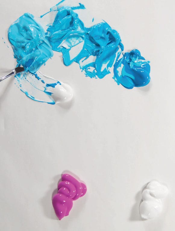
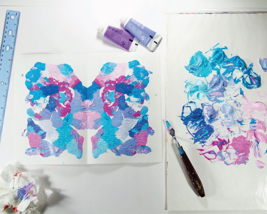
The great thing about this project is that you can make something legitimately cool and all you have to do is mix up thick, gloopy batches of paint and squish them onto a page. I use the low-end acrylic paint for a project like this—the “student-grade” acrylics. You don’t even need a paintbrush, but you do need a flexible small palette knife. You can use any kind of palette, but I prefer starting with a fresh sheet every time (disposable palette sheets) rather than cleaning a wooden or plastic palette.
SKILL LEVEL
Can you open and close a book? You’re ready.
SKILLS LEARNED
Analogous color; acrylic paint mixing
MATERIALS
8.5” x 11” (21.5 x 28 cm) 90 lb. (165 g/m2) mixed-media paper (scored down the middle for easy folding)
Palette knife
Disposable palette
Acrylic paints in blue and magenta + white
MESS LEVEL
You know what they say about getting toothpaste back in the tube? It can’t be done. Same goes for acrylic paint. Also, imagine taking a peanut butter and jelly sandwich and stomping on it. The jelly will go everywhere. This is a real risk with this project.
TIME TO COMPLETE
30–90 minutes
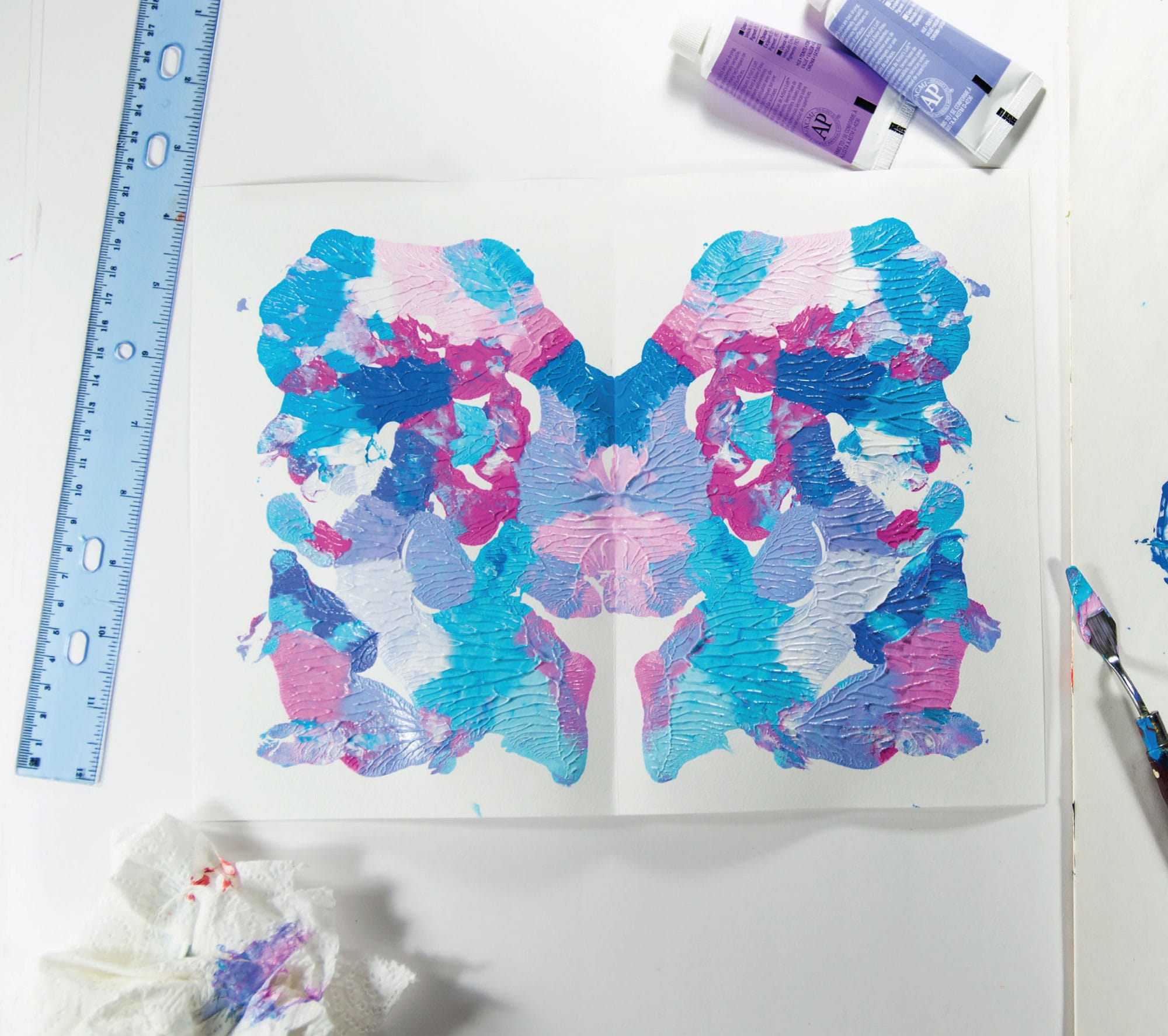
1 Prep some 9” x 12” (22.9 x 30.5 cm) 90 lb. (165 g/m2) general-purpose art paper by folding it in half. Heavier-weight paper will be hard to fold, but if the paper is any lighter, it won’t hold up with the paint and becomes a wrinkly mess. Since the paper is moderately stiff, it helps to mark the center of the page lightly with a ruler and pencil, then use a hard edge to score the paper in a straight line. It will fold beautifully along that line. Fold it now so that you don’t have to mess with trying to fold it when it’s full of paint.

2 On a fresh palette, squeeze out healthy amounts of two colors plus white on either side of the page. I chose a fuchsia and robin’s egg blue. Those two colors create lavender when mixed, so I was working with an analogous color scheme—when three colors neighbor one another on the color wheel. Make multiple blends, mixing these colors with white and with one another, preserving little piles of the various tones you are creating.
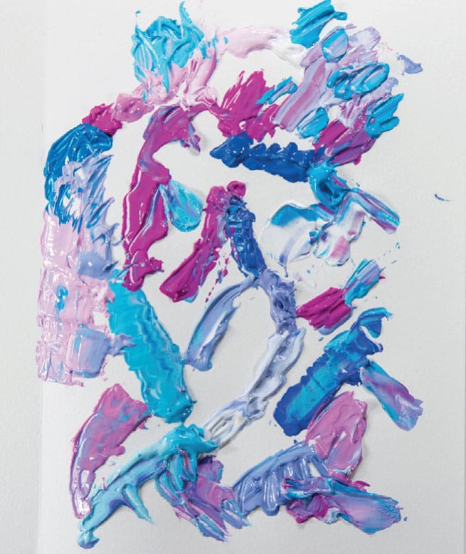
3 When you have a nice arrangement of mixed colors on your palette, don’t stop! I mean, you literally can’t, because if the paint dries, you have to start over. You have about 15–30 minutes of working time with acrylic. Using the palette knife, add some paint to one side of your unfolded sheet of paper, opened like a book. Leave some white space, but add little pockets of thick, impasto paint in various places (impasto paint looks a lot like dabs of buttercream frosting). Leave an inch (2.5 cm) or so around the outside edge.
4 Now comes the fun part: Fold the two sides together. Carefully press down, guiding your fingers inward (you don’t want to press the paint out between the paper, like too much peanut butter on a sandwich). Make sure all points of the folded pages have made contact. When you’re ready, carefully pull pages apart for the big reveal.

5 You’ll probably have some paint left over. Make a few more! I added more colors and made another.
6 Bring your painting to your psychologist and ask her to interpret. She will probably say, “Socks!”
What Happens If
It’s sometimes helpful to head into a project expecting that you’ll throw most of it away. In the end you may not want to, but it’s helpful to take the pressure off. Hmm, don’t like how that one turned out? No problem—toss it. My psychologist friend talks about the value of approaching your life like a video game. No, not vaporizing the rude clerk at the grocery store with your Gandalf wand, but treating the challenges that come your way like “levels.” What’s the best way to “win” when you’re dealing with rude people? Probably not vaporizing them. Kill them with kindness? Ignore and smile? For sure winning would be not letting it ruin your day or making you behave rudely. If you can solve this challenge, you move on to the next level! And we all know, video games don’t really matter. Stop taking yourself so seriously.
SKILL LEVEL
Beginner
SKILLS LEARNED
Banishing perfectionism
MATERIALS
12-color watercolor kit (see here)
#4 round brush
Paper towel
140 lb. (300 g/m2) watercolor paper cut in 3” (7.5 cm) square swatches
MESS LEVEL
Minimal
TIME TO COMPLETE
30 seconds and up

1 You can do this all on one sheet if cutting isn’t your thing. I like to work on many 3” x 3” (7.5 x 7.5 cm) swatches so that I can move around quickly. To begin, ask yourself: What happens if ______________________? (Examples: What happens if I try to make a beautiful one? What happens if I try to make an ugly one? What happens if I make a superpink one?) Then try it.
2 Give yourself 30–90 seconds for each swatch. Set it aside and move on quickly. You’re just figuring out how this video game works; you have a lot of spare lives. There’s no money or blood riding on this. Or even ego, because no one will see it after you throw it away (probably)!
3 This project benefits from painting fast and furious but with limited colors. The more colors you add, the better your chances are of a muddy mess. For most swatches I used two colors. But since this is the new analog game of What Happens If, feel free to go crazy, as in, “What Happens If I Add All the Colors?” (p.s.: If you decide to keep your swatches, they will come in handy for the Bring Out Your Dead project; see here.)

Above and below are some of the questions I asked, and the “answers.”
Whipped Rainbow
I call this Whipped Rainbow because there’s something particularly edible about using the paint in this fashion. It reminds me of making meringue and getting those luscious soft peaks out of the eggs. (That was that one time I baked back in ’95. It was great.) Still, I’d strongly advise against eating any of this project. Do not eat your paint. I’m pretty sure, however, that you can transfer these skills directly to cake decorating. So if you want to include your portfolio shots of your Whipped Rainbow work along with your bakery job application, I would recommend it. As you would expect, cake frosting color-mixing ratios are strongly correlated to actual paint. For instance, a friend was trying to mix purple frosting with red and blue food coloring and failed miserably. Mixing colors is never as simple as one part blue, one part red. Nope. In the case of purple—notoriously tricky—it’s more like five parts red and one part blue. For frosting or acrylic paint. Stay tuned for more handy baking tips.
SKILL LEVEL
Beginner to moderate
SKILLS LEARNED
Palette knife black belt award
MATERIALS
15” x 15” (38 x 38 cm) prestretched primed canvas
6 acrylic tube colors + white
Palette knife
MESS LEVEL
Maybe I’m unusual, but when I use acrylic, my hands always look like I’ve been attacked by live fireworks dipped in liquid Skittles. So yeah, it’s messy.
TIME TO COMPLETE
1–2 hours

1 Mix your colors on the palette using The Mother Method (see The Classic Schmear, shown here). After mixing each color, immediately apply it to the premade canvas using the palette knife. Following The Mother Method, make sure you preserve some of that first mix to use for the next color to create the color shift.
2 This is another painting that will benefit from not overworking. After you mix the right color on the palette, carefully lay it down with your knife in an area roughly the size of a square inch (2.5 cm), and move on.

3 I started with the top left because, being right-handed, I tend to drag my knuckles across the top of the painting, and if there’s wet paint there, you can imagine the result.

4 I didn’t particularly plan my color approach, but you can sketch out your plan with pencil if you wish.
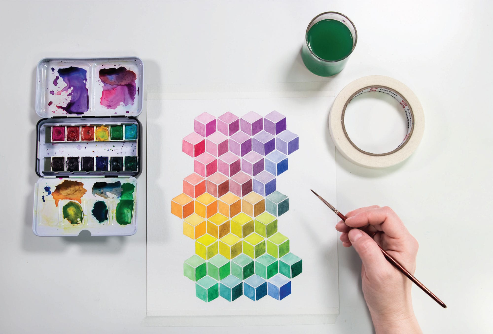
Q*bert
When I was making this painting, I was like, Wow, I’m really feeling all neon tube socks and Hula-Hoops and George Michael suddenly. What’s happening to me? Then it came to me: I’m just getting pulled back to my roots. My Q*bert roots. If you have no idea what I’m talking about, please know that there was a pretty cool video game in the ’80s called Q*bert, where a little orange guy would jump around on a pyramid of colored cubes and the colors of the platform would change as he jumped. Take my word for it, it was rad.
SKILL LEVEL
Beginner
SKILLS LEARNED
Getting a 3-D effect
MATERIALS
Template: shown here
12-color watercolor kit (see here)
#2 and #4 round brushes
Paper towel
MESS LEVEL
Minimal
TIME TO COMPLETE
60 minutes
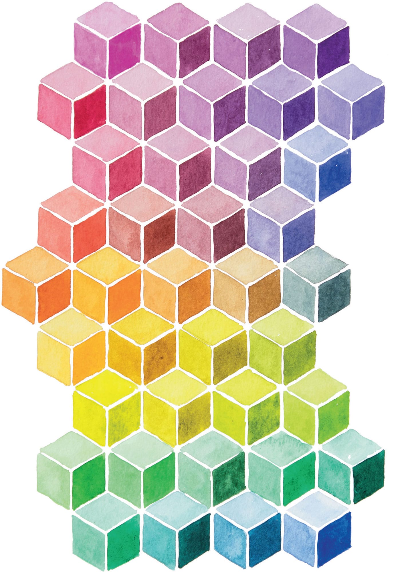

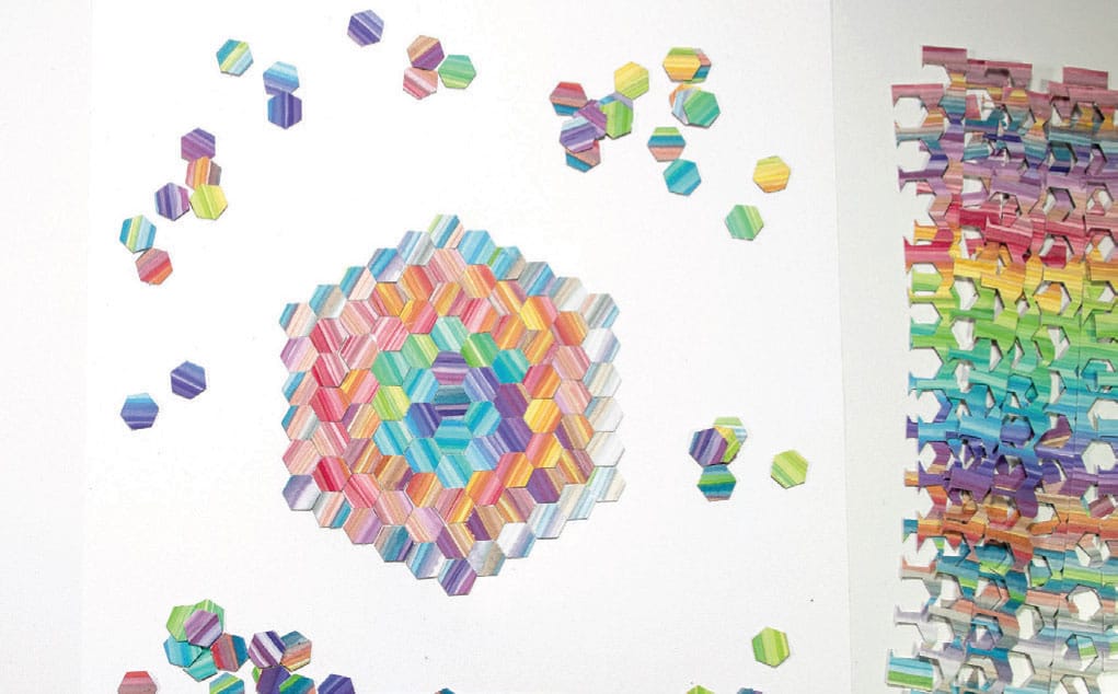
1 We’re going to continue utilizing The Mother Method (see here) here while transitioning value and shifting color around the wheel. This pattern, common in tile, is assembled simply out of diamonds, which for some reason for me was a revelation when I finally understood what was going on. This design has the sweet capability of adding some 3-D effects. If you want to create the illusion of depth, you need to think about how your value range is being utilized.

2 In this design there are groups of three diamonds that make up a hexagon. Each panel of the hexagon needs to be distinctly different in value. I started with the darkest, most concentrated value (c), added a bit of water and went onto the medium range (b), and finished with the lightest section (a).
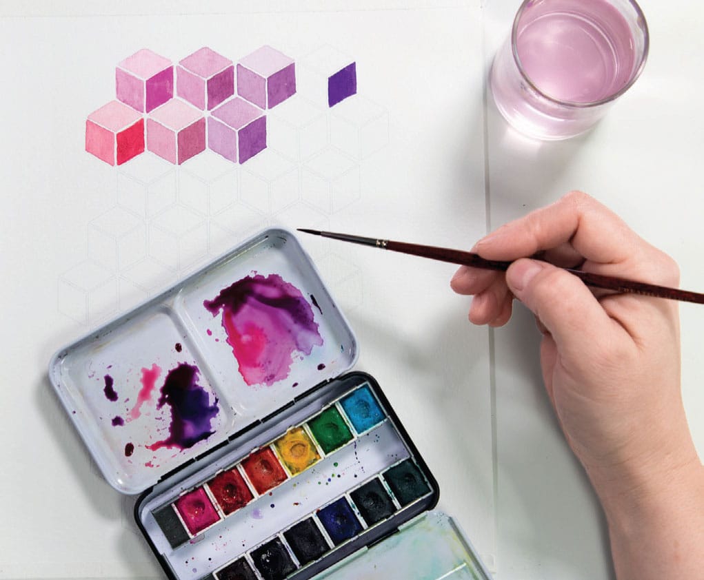
3 You can plan out your colors in advance. There are about forty cubes in the Q*bert template. If you want to work with the whole spectrum, that means about six to seven cubes per color group (based on a six-color wheel). You can mark small notations on each section using a 6H pencil (it leaves a very faint mark) to indicate where you want your colors to go as a guide while you’re painting. If I don’t keep track, I lose my head and paint everything pink.
Failure
Do you realize that another phrase for “experiment” is “multiple failure”? Failure is 100 percent essential to the creative life. Failure is 100 percent essential to a fully lived human life. I really believe perfectionism might be the biggest enemy to human joy. The compulsion to get it right all the time = ego! The compulsion to be well regarded by others = ego! Perfectionism is also probably the biggest enemy to good art. All the artists I know who are making anything interesting have made a ton of things that aren’t interesting. Seriously, “talent” doesn’t have that much to do with it. Persistence is more like it. Endurance. Consistency. As Benjamin Franklin said (or possibly it was just my friend’s dad): “The harder I work, the luckier I get.”
People who are regarded as geniuses in their fields, statistically speaking, don’t just simply have a few really good ideas; they have hundreds and hundreds of ideas, and one or two of them turns out to be astonishing. Live boldly. You don’t have to exactly revel in your failures, but don’t regard your failures as a sign you’re doing something wrong. Regard your failures as signposts that you are making your path.
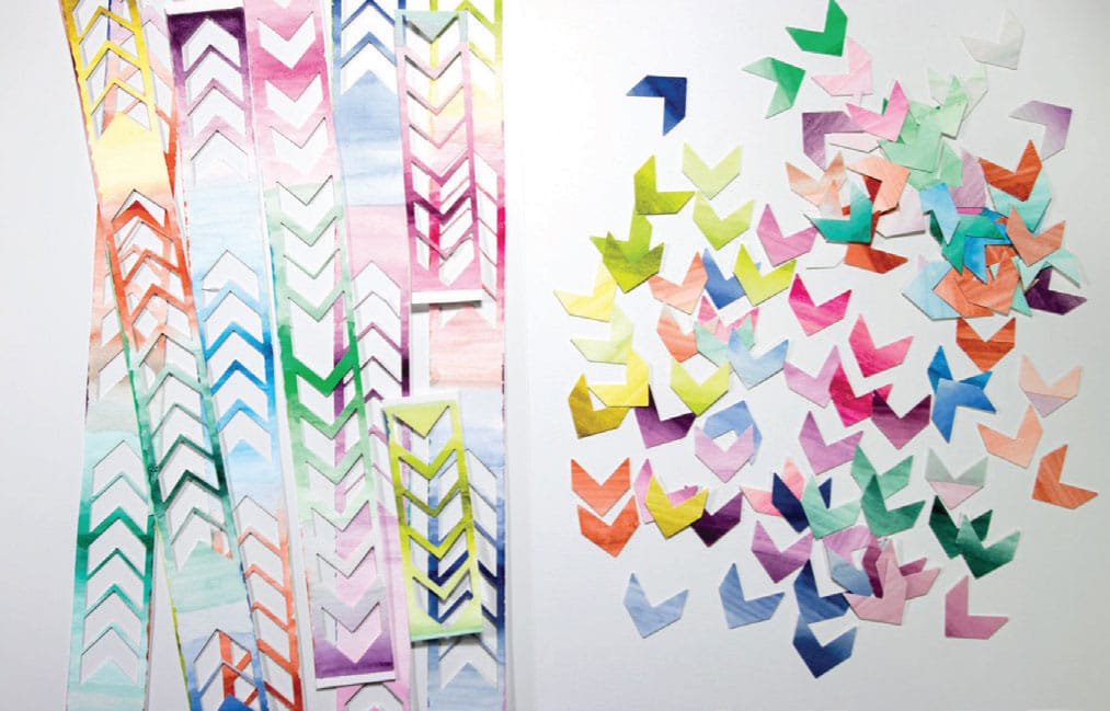
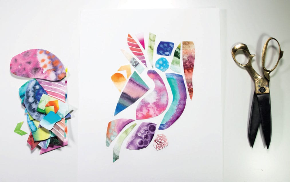
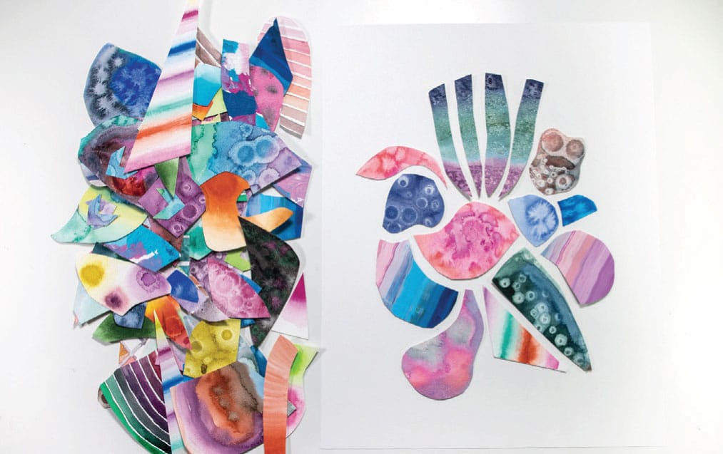
Bring Out Your Dead
Nothing is ever wasted. You loved someone and it didn’t work out? Don’t worry, that love is still alive and vital and ready to be passed on to the next recipient. You put your heart into a project and didn’t get a good result? Don’t worry, all that energy is boomeranging back to you in a different form. Something was taken from you? Some injustice was done to you? There was betrayal, loss, judgment, pain, and malice? Like a living thing, put that energy on the altar of the world. Offer it up, knowing that letting go of the sorrow will create room in your heart for the real. Bring your sorrow to the light; let it be exposed and vulnerable and wilted and beautiful. It’s like you’re at church and the usher is bringing around the basket. But instead of a wrinkled and damp five-dollar bill, you put in your worst pain. The Mother World will take the pain, and cherish it, and bring you something throbbing with life and sweetness in return.
Embracing failure is one of the best gifts you can give yourself. Sometimes you bury your failures and they never see the light of day, which is a perfectly legitimate choice. Sometimes you put your failures in a box. A literal box, not the metaphorical church basket. I like to call this box my “Used Paper Box.” Friends, it’s overflowing. For this project, we’re going to bring out the failures. It’s like the scene in Monty Python: “Bring out your dead!” If you have no idea what I’m talking about, please enter that phrase in your YouTube search box and watch the two-minute video. Consider yourself educated in old-school comedy gold. You’re welcome.
SKILL LEVEL
Beginner
SKILLS LEARNED
Recycling
MATERIALS USED
Watercolor paper
Glue stick
Scissors
Various punches
11” x 14” (28 x 35.5 cm) mixed-media paper
MESS LEVEL
Moderate
TIME TO COMPLETE
One never knows

Freehand shapes. See here for more ideas.
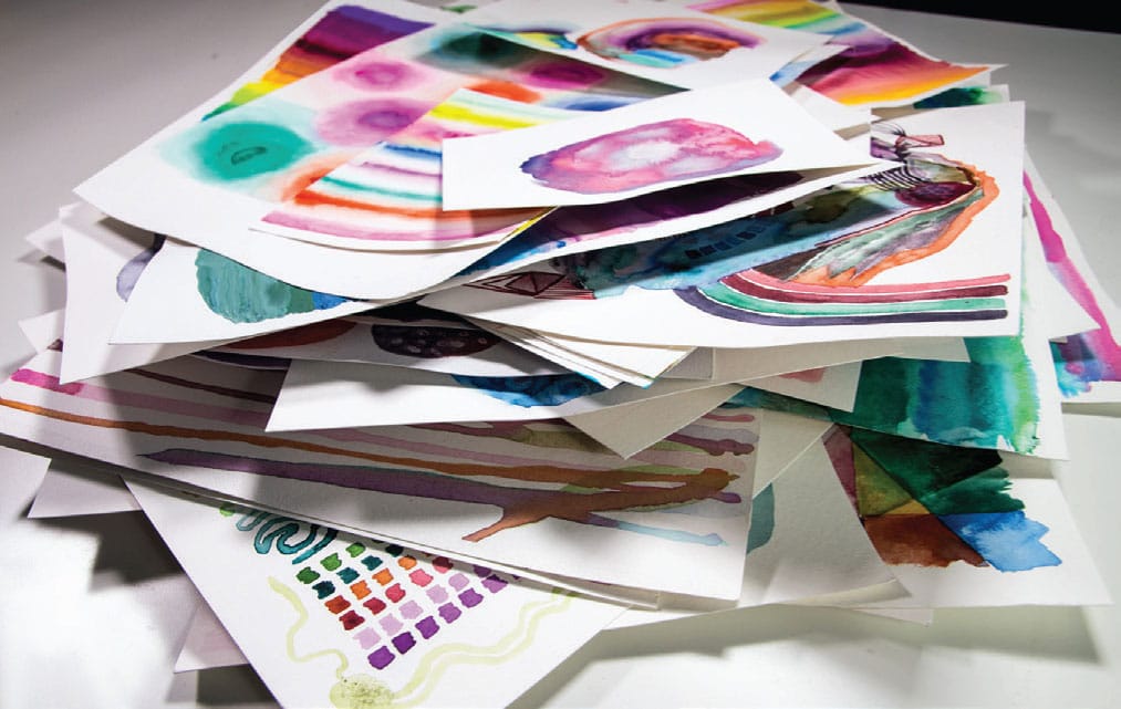
1 First, you need to paint a lot so that you can create a lot of failures so that you have abundant materials for this project. #winning! Or you can just mess around and experiment with paint on paper to generate materials. But that’s the cheater’s way.
2 Grab your box of not-so-good paintings. Prep scissors, punch, glue, and mixed-media paper.
3 Depending on your resources of failed paintings, you should be able to make a few collages. I recommend working on several at once. I like to lay things out (prior to gluing) and then change them as I go. It helps me to have fresh eyes. Some things to experiment with:
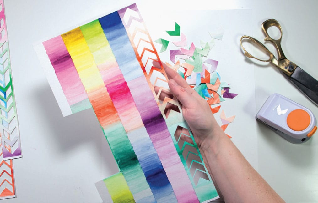
Repetitive shapes made by the punches
Negative spaces
Pointed versus rounded
Delicate versus chunky
Loose paint style versus rigid geometric cutting

Value and color contrasts
Repeating motifs
Layering
Stacking
Geometry
4 I played around quite a bit before I glued anything down. My advice is try different things and don’t be committed to any one course of action. The discovery process of upturning the failures into a new language is refreshing. New ideas will certainly be born.
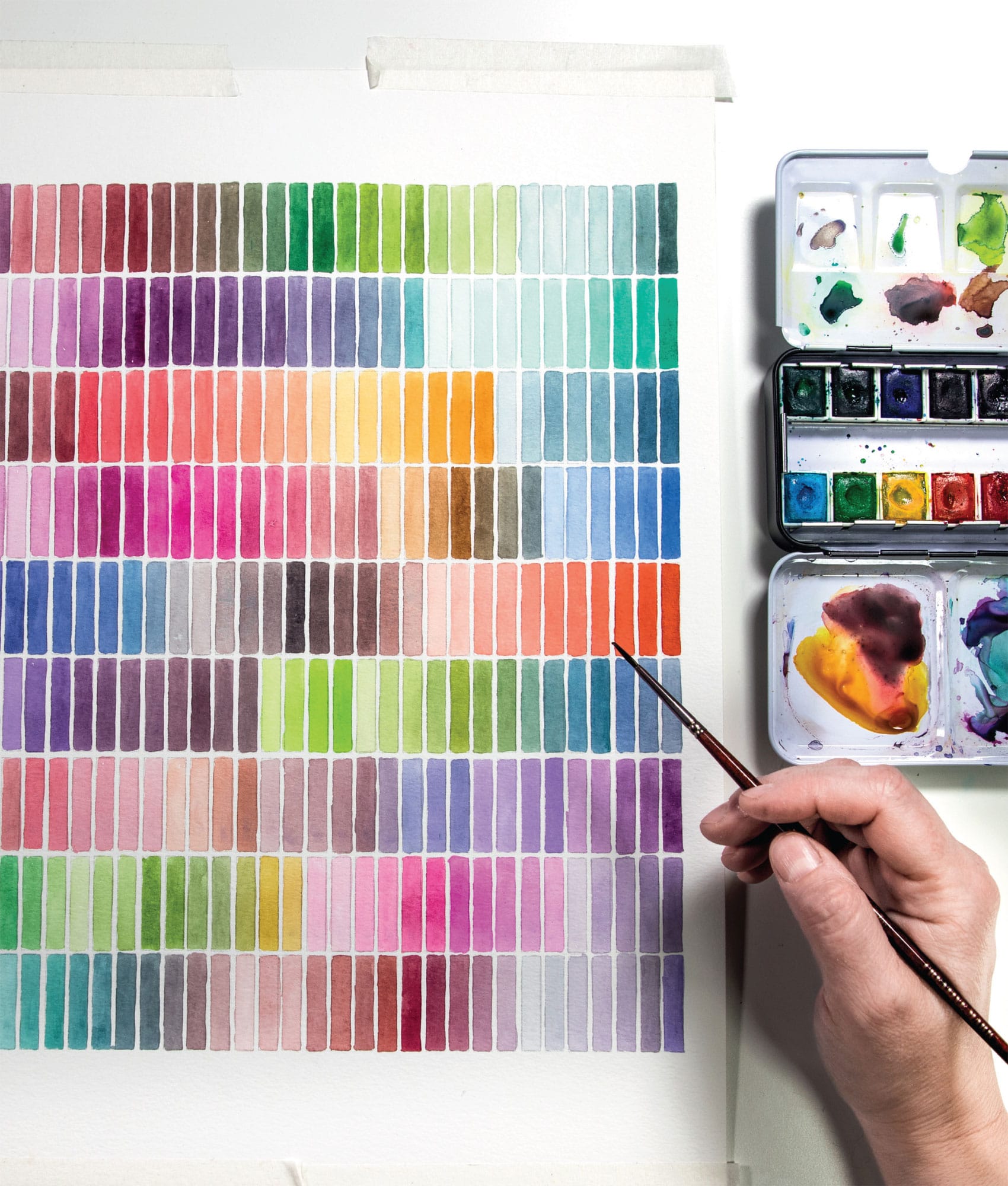
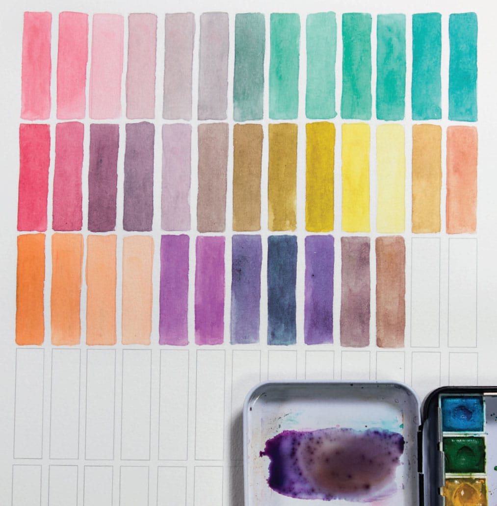
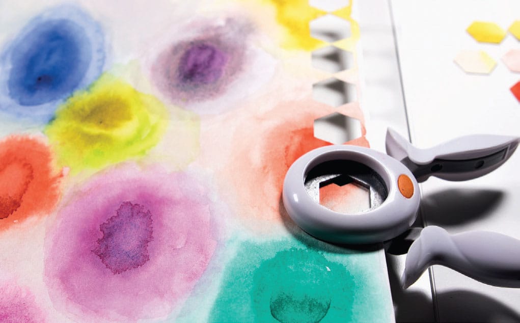
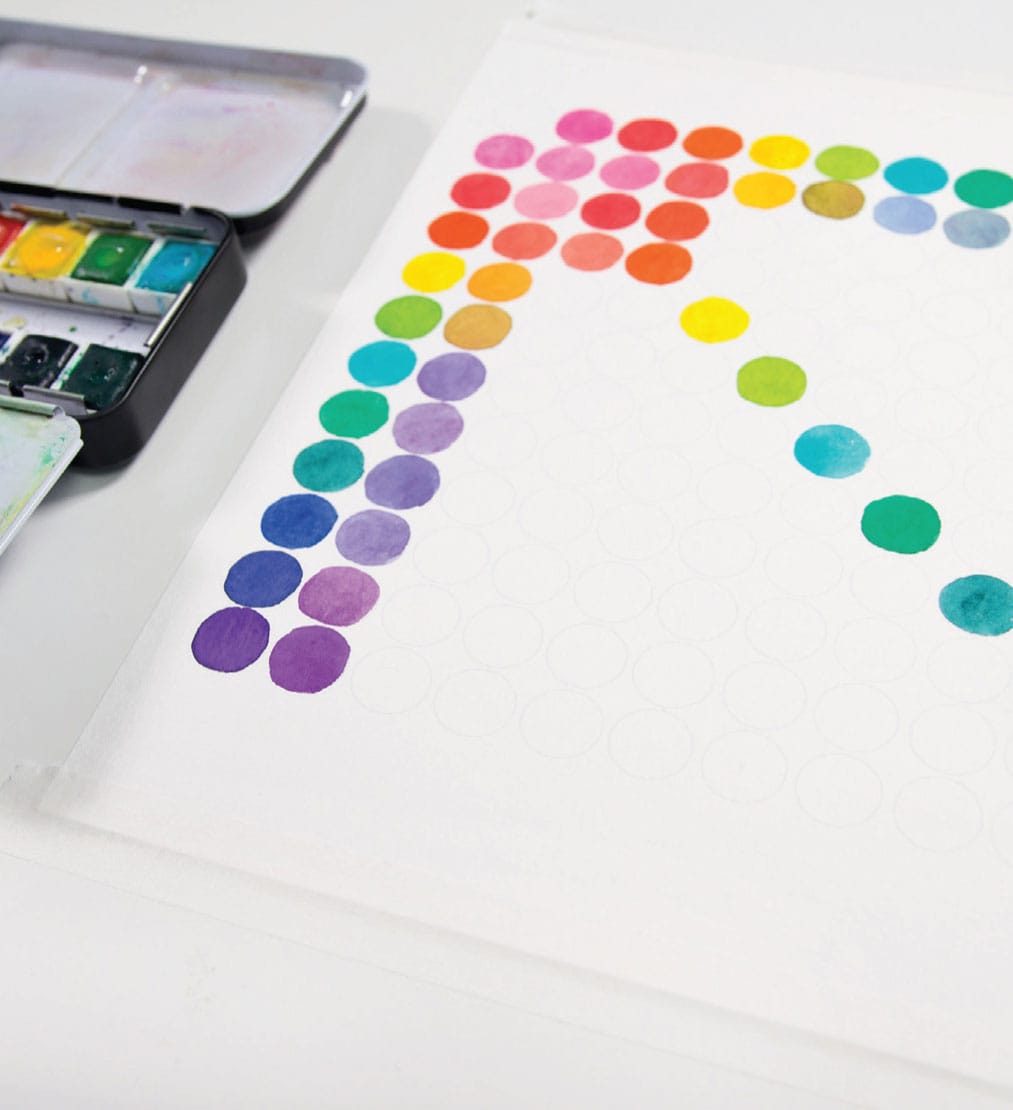
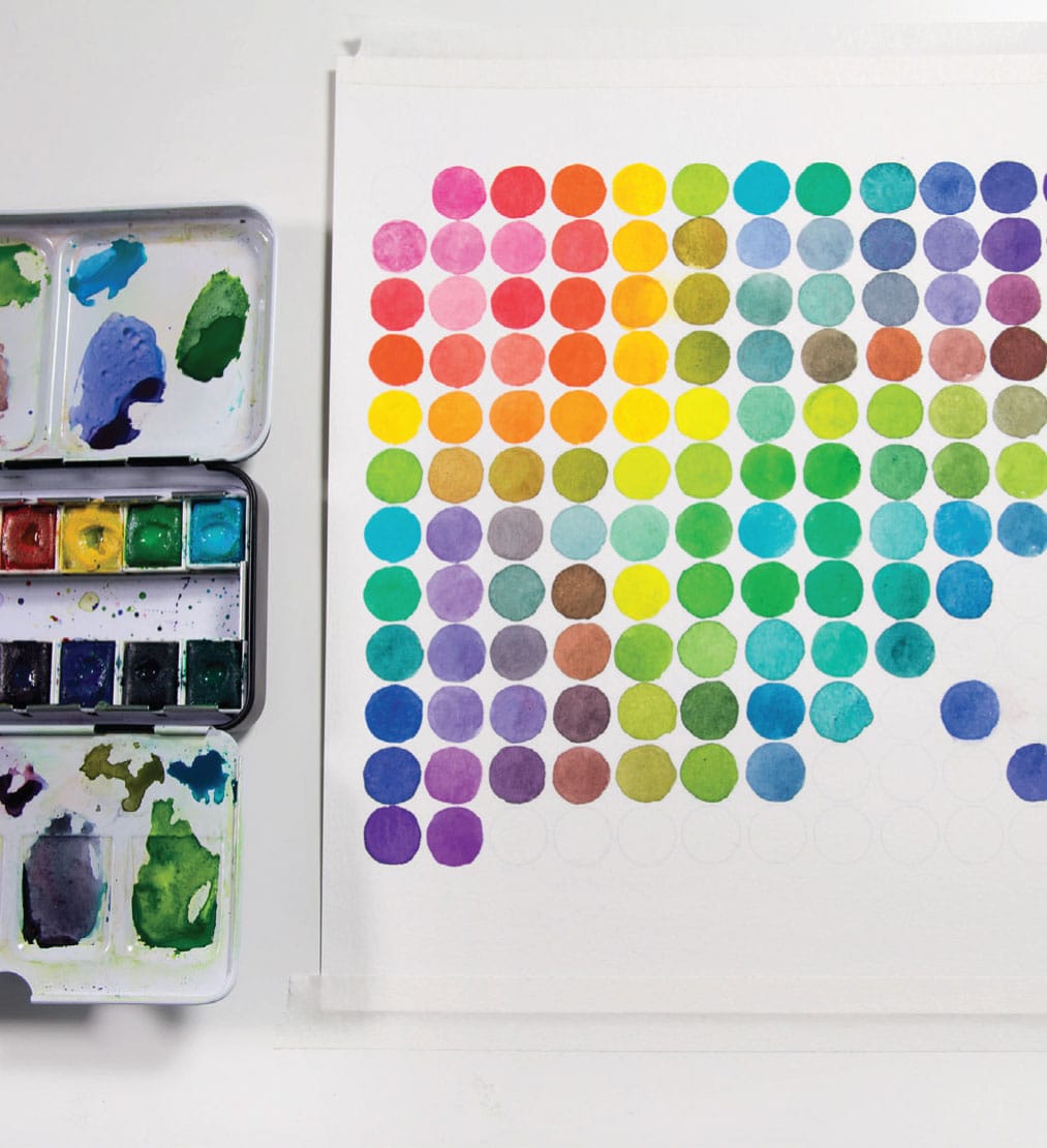
Dots
I love color charts and paint swatching. I rarely do things like follow systematic, organized rules when I execute a color chart (I mean, that’s asking a lot), but I love them all the same.
In this color chart, I actually followed the rules of all sensible, methodical color charting. And let me just say that painting a legit color chart is hard. There are a lot of balls, er, dots in the air, a lot of paint flying around the palette, and it is very difficult to moderate the color and value of your swatches. That said, doing a proper color chart is one of the best (only?) ways to learn mad mixing skilz. What will perhaps feel like suffering in the short term will pay off in extravagant dividends in later paintings.
SKILL LEVEL
Moderate, but helpful for beginners to gain skills
SKILLS LEARNED
Basic paint blending in watercolor
MATERIALS
Template: shown here
12-color watercolor kit (see here)
#4 round brush
Paper towel
MESS LEVEL
Minimal
TIME TO COMPLETE
60 minutes
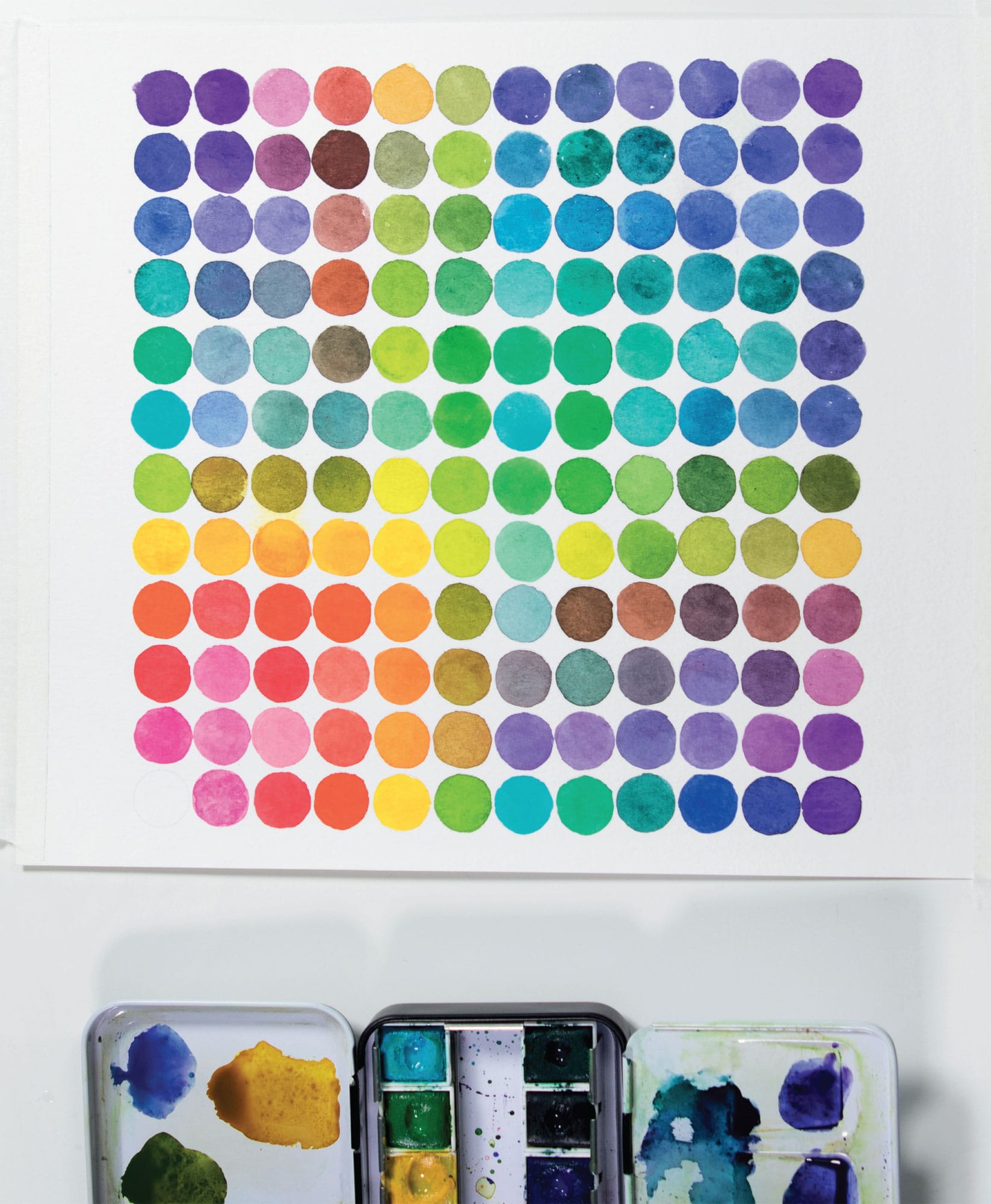
1 This style of chart works something like an Excel spreadsheet. Basically, there are rows and columns. At the intersection of, say, column 7 (yellow-green) and row 3 (quinacridone coral), you will see an example of those two colors mixed.
2 This chart requires strong, clean palette discipline just like the Value Gradient Primer project (see here). Keep a roll of paper towels handy to clean up the wet paint on the mixing area from time to time to keep your mixes as pure as possible.
3 You’ll also have to consider the ratio of each color when blending. You’ll find that as far as mixing paint goes, blue, purple, and red are extremely staining and powerful. If you are mixing yellow with any other color, it’s not as simple as a one-to-one ratio. It’s more like ten-to-one (favoring yellow). With a red-blue mix, you’re going to want to see purple, but you’ll need a five-to-one mix (favoring red). Different brands and hues of paints have different staining power, so a big part of this is experimentation.
Art Scars
By third grade, many people have received what social psychologist and author Brené Brown calls “Art Scars.” Often in school, many kids receive a shame-based message that they are not, and could never be, creative. This is usually when the “talented” kids are shuffled off to the advanced art or music rooms. The Art Scar goes deep, completely inhibiting people’s freedom to explore their own creative abilities. Instead of the extravagant joy and exploration of the uninhibited first grader, the third grader starts to apply self-judgment, comparison, and perfectionism to the art practice. Activate prefrontal cortex! Eliminate flow! (By the way, while I don’t have many art scars due to my unschooling in the woods by artist hippies, I absolutely do have volleyball scars. Major issues there.)
Some of the projects in this book may appear to be too simple. Have you ever heard someone look at a piece of art and say, “My kid could do that”? Well, since the people carrying Art Scars were probably kids when they got them, I say let’s start at the source of the harm: third grade! Let’s start making projects that a third grader would love! And then if you want to go on to paint the Mona Lisa, go forth—no one is stopping you!
In the scientific literature, the experts have concluded that for people to enter a flow state of transient hypofrontality (flow), they must be engaged in an activity with 4 percent difficulty. I think this is hilarious, because how do you ever quantify 4 percent difficulty? What if your activity trends toward 7 percent? Or 3 percent? But, the point is this: You want to exercise a skill that you feel you can master, but not one that is so easy that you are bored. I think it’s interesting and revealing that the number is 4 percent. I would have guessed 25 percent or even 30 percent. It’s encouraging to know that we only need to dial up the difficulty to 4 percent. Probably the reason a lot of people quit trying to gain a new skill is that they start at 40 percent instead of 4 percent and the result is frustration, sulking, quitting, etc. And/or breaking their leg because they are trying to learn to snowboard. Or getting crushed by the mean girls spiking volleyballs. Hypothetically, that could totally happen, too.
When I teach art classes, I’ve observed that most of the projects in this book hit the sweet spot of 4 percent for most people across many skill levels, for novice artists or professionals. I’m not sure why this is, because working with colors and shapes seems to be almost childishly elemental, and yet the vast array of color combinations, surface treatments, and design possibilities keeps it firmly engaging.