
Practical Considerations for Sharing Your Work
Since you are definitely going to want to share your cool new artwork with the world, it might help to have a few tips on photography and editing. You can have amazing art, but if your photography of it is subpar, no one will be able to appreciate it. Most phones have great cameras these days as well as photo-editing capabilities. Instagram and other social media apps have photo editing built in.
The two main approaches I use for shooting art for social media are the tight shot and the wide shot, which includes art supplies and possibly the artist’s hand. The latter approach is also called a flatlay and is very popular for showing art and tools used in the process. You can also shoot your work from different angles.
A tight shot
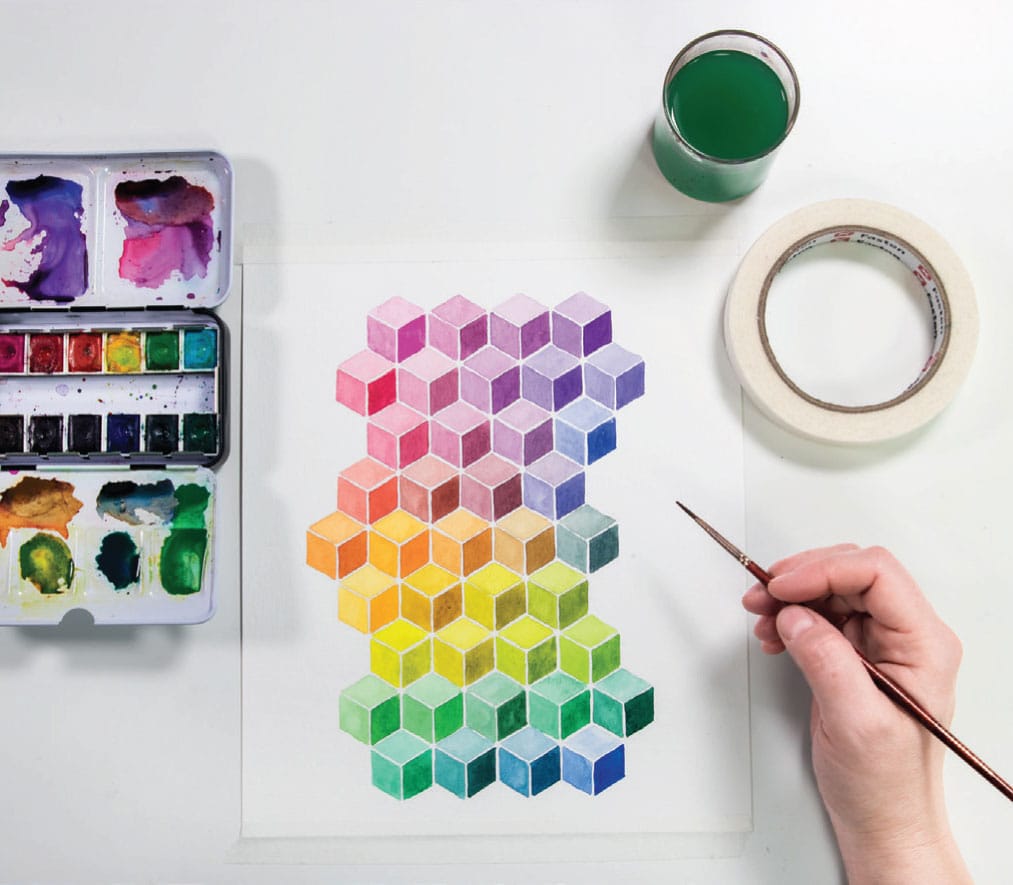
A wide shot or flatlay
An angled shot
The main thing to keep in mind is lighting, lighting, lighting. Most household lights have a very warm (orangeish) tone that will make your art look unprofessional. It’s best to use natural daylight (I’ve found that outside with a cloudy sky is the best). An art station by a window can work well. Avoid direct sunlight. If you want to upgrade your lighting, I use led light panels or bulbs with a Kelvin temperature of about 6000K. The Kelvin number describes the warmth of the light. For reference, daylight is about 6000K, most household lights are 3000K, and candlelight is 2000K.
I usually take ten to fifteen shots of something I want to post and pick the best one. I look at the composition, the lighting, the shadows, the focus, and the overall content. Taking a lot of shots to get one winner is pretty standard with photographers. I read once that for every photograph published in National Geographic, there were an average of 3,200 supporting shots of the same subject.
Your editing style will be unique to you. I like a superbright white image with saturated color, but your preference may be more golden and soft. I never use filters, but I think there are some cool apps that provide some of the effects that I mention here. I find that every image needs a slightly different touch and filters are too samesy.
For my particular style, when I’m editing, my go-to edits are:
• Cropping, depending on the social media format I’m working with
• Brightness, usually more
• Contrast, usually more
• Whites, usually more
• Shadows (I play around with this)
• Structure/clarity/sharpness (it’s called different things). I usually turn structure way up but be warned, it’s not flattering on skin.
• Vibrance/saturation (I usually turn it up a little)
When you share projects from this book, tag them #colorcompanion to find the color community!