Main Color Techniques: Around, Across, Up, and Down
I use a lot of different mediums, but I’m usually trying to achieve one thing—seamless color transitions. The glow. I love all things ombré, gradients, tiny stripes close together, pointillism in painting, neon radiance, traffic lights reflected on wet pavement, Mexican serape blankets, rainbows, and, naturally, the color picker in Photoshop.
There are three ways I shift colors. They are:
• Around the Wheel
• Across the Wheel
• Up and Down Value

Around the wheel
When I shift colors around the wheel, I use high chroma, high-intensity, extra-saturated colors found on the color wheel. Saturation or chroma is the level of intensity of a color. A highly saturated color will have no gray, no white, and no black. The colors are all pure hue. The transitions are based on the blend of the rainbow spectrum. Blue changes to turquoise changes to green, for example. Using a range of color shifts from around the wheel will result in all high-key, saturated colors with equal dominance across the whole composition.

Across the wheel
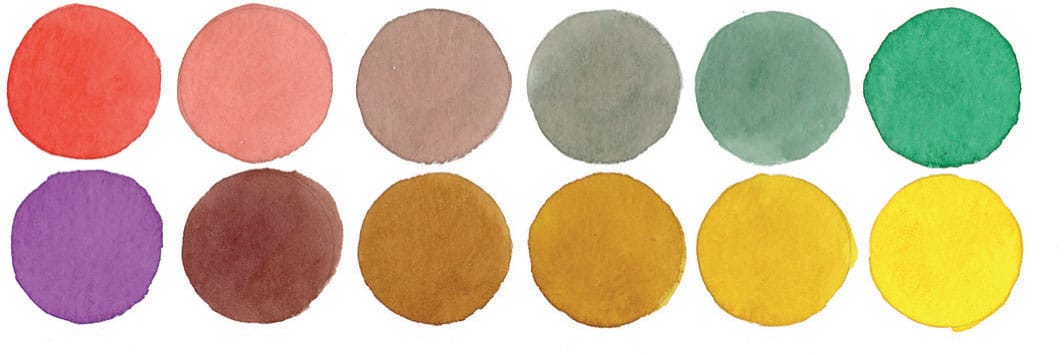
When I use colors across the wheel, I transition colors between their complementary color on the opposite side of the wheel. Green gets mixed with red in various ratios to create olive green and oxblood. Blue gets mixed with orange to create stormy gray and muted pumpkin. The colors that stretch the divide across the complementary colors will be toned-down versions of themselves trending to gray.

Up and down value
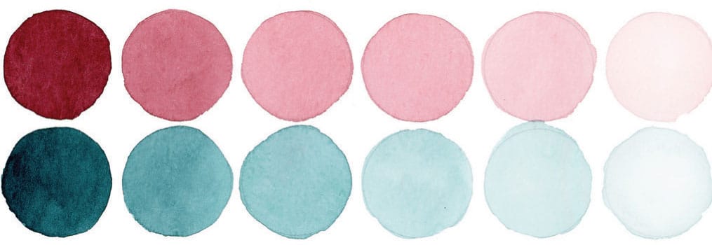
Up and down value adds dimension to your color. Colors across and around the wheel are essentially colors on the same value plane. If you add value progressions, you change the lightness or the darkness of a color. The colors go up (lighter) or down (darker). This means adding white (a tint) or adding black (a shade).
