A
Analyze and Graph Menu Commands
The Analyze menu is for statistics and data analysis. The Graph menu is for specialized plots. That distinction, however, doesn’t prevent analysis platforms from being full of graphs, nor the graph platforms from computing statistics. Each platform provides a context for sets of related statistical methods and graphs. It won’t take long to learn which platforms you want to use for your data. The next sections briefly describe the Analyze and Graph commands.
Analyze Menu
Distribution is for univariate statistics, and describes the distribution of values for each variable, one at a time, using histograms, box plots, and other statistics.
Fit Y by X is for bivariate analysis. A bivariate analysis describes the distribution of a y-variable across values of the x-variable. The continuous or categorical modeling type of the y- and x- variables leads to one of the four following analyses: scatterplot with regression curve fitting and correlation, one-way analysis of variance, contingency table analysis and chi square, or logistic regression.
Matched Pairs compares means between two response columns using a paired t-test. Often the two columns represent measurements on the same subject before and after a test or treatment.
Fit Model launches a general fitting platform for linear models. Analyses found in this platform include multiple regression, analysis of variance models, generalized linear models, logistic regression, partial least squares and survival analysis.
Modeling 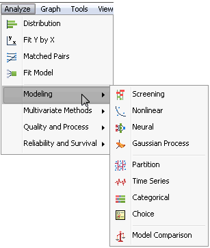
Screening aids in variable selection and helps select a model to fit to a two-level screening design by showing which effects are large.
Nonlinear fits models that are nonlinear in their parameters, defined by a formula with the parameters to be estimated, using iterative methods.
Neural performs a flexible fitting of Y’s to X’s within a specific framework of layering and s-shaped functions.
Gaussian Process models the relationship between a continuous response and one or more continuous predictors. These models are common in areas like computer simulation experiments, such as the output of finite element codes, and they often perfectly interpolate the data. Gaussian processes can deal with these no-error-term models.
Partition recursively partitions values, similar to CART™ and CHAID™.
Time Series lets you explore, analyze, and forecast univariate time series taken over equally spaced time periods. The analysis begins with a plot of the points in the time series with autocorrelations and partial autocorrelations, and can fit ARIMA, seasonal ARIMA, transfer function models, and smoothing models.
Categorical tabulates and summarizes categorical response data, including multiple response data, and calculates test statistics. It is designed to handle survey and other categorical response data, including multiple response data like defect records, side effects, and so on.
Choice fits choice models for market research and conjoint experiments.
Model Comparison, a JMP Pro feature, lets you compare the predictive ability of different models you create using prediction columns saved in the analysis data table. Measures of fit are provided for each model along with overlaid diagnostic plots.
Multivariate Methods
Multivariate describes relationships among variables, focusing on the correlation structure: correlations and other measures of association, scatterplot matrices, multivariate outliers, and principal components.
Cluster allows for k-means and hierarchical clustering. Normal mixtures and Self-Organizing Maps SOMs) are found in this platform.
Principal Components derives a small number of independent linear combinations (principal components) of a set of variables that capture as much of the variability in the original variables as possible. JMP offers several types of orthogonal and oblique Factor-Analysis-Style rotations to help interpret the extracted components.
Discriminant fits discriminant analysis models, categorizing data into groups; classifies points to groups according to which group means the column values are closest to.
Partial Least Squares predicts Y’s with many X’s, especially when there are more X’s hand rows..
Item Analysis analyzes questionnaire or test data using Item Response Theory.
Quality and Process
Control Chart Builder is similar to Graph Builder, letting you interactively drag columns to drop zones on a graph palette to construct XBar, Individual measurement, Range, and Standard Deviation charts.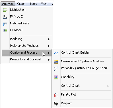
Measurement Systems Analysis provides the EMP (Evaluate Measurement Process) and Gauge R&R methods for assessing the precision, consistency, and bias of a measurement system.
Variability/Attribute Gauge Chart produces ‘multi-vari’ charts, and is used for analyzing continuous or attribute measurement systems.
Capability measures the conformance of many processes to given specification limits. Graphical tools such as the goal plot and box plot give you quick visual ways of observing process capability.
Control Chart presents a submenu of various control charts available in JMP such as a Run, XBar, IR charts, P, NP, C, and U charts, running average plots, and others.
Pareto Plot creates a bar chart (Pareto chart) that displays the severity (frequency) of problems in a quality-related process or operation. Pareto plots compare quality-related measures or counts in a process or operation. The defining characteristic of Pareto plots is that the bars are in descending order of values, which visually emphasizes the most important measures or frequencies.
Diagram constructs Ishikawa charts, also called fishbone charts, or cause-and-effect diagrams. These charts are useful when organizing the sources (causes) of a problem (effect), perhaps for brainstorming, or as a preliminary analysis to identify variables in preparation for further experimentation.
Reliability and Survival
Life Distribution looks at the distribution of time-to-event data, often when there is censoring, to estimate reliability and product lifetime; allows interactive evaluation to find best fitting distribution and supports competing causes.
Fit Life by X performs a life distribution parameterized through a single regression factor; used for accelerated failure models, life distribution across groups and supports interactive evaluation of distributions and regressor transformations.
Recurrence Analysis analyzes repairable system to find how a recurring event is distributed over time, per system, until the system goes out of service.
Degradation analyzes degradation data to predict pseudo-failure times, which then can be used by other reliability platforms to estimate failure distributions.
Reliability Forecast is used to forecast how any units will be returned during a specified warranty period. Repair costs can be incorporated into the analysis to forecast total cost of repairs across all failed units.
Reliability Growth provides a cumulative events plot, showing how reliability events accumulate over time, and a mean time between failure failure plot, to study failures over time.
Survival models the time until an event, allowing censored data. This kind of analysis is used in both reliability engineering and survival analysis.
Fit Parametric Survival uses the Fit Model dialog to model survival distributions parameterized by a general linear model; used to accelerated failure-time models and supports multiple regression terms.
Fit Proportional Hazards uses the Fit Model dialog to fit the Cox proportional hazards model, where the survival distribution is nonparametric but the scaling is a regression model.
The Graph Menu
Graph Builder is an interactive platform that lets you build graphs by dragging columns into graph zones, changing graph forms by dragging columns to different zones as needed.Chart gives many forms of charts such as bar, pie, line, and needle charts; charts data or summary statistics of numeric columns.
Overlay Plot overlays several numeric y-variables to a common variable on the x axis, with options to connect points, or show a step plot, needle plot, or others. It is possible to have two y-axes in these plots.
Scatterplot 3D produces a three-dimensional spinnable display of values from any three numeric columns in the active data table. It also produces an approximation to higher dimensions through principal components, standardized principal components, rotated components, and biplots.
Contour Plot forms contours of a Y variable with respect to two x-variables where the x-variables need not form a grid but are assumed to lie in a rectangular coordinate system. Contours are lines of equal value.
Bubble Plot draws a scatter plot which represents its points as circles (bubbles). Optionally the bubbles can be sized according to another column, colored by yet another column, aggregated across groups defined by one or more other columns, and dynamically indexed by a time column.
Parallel Plot shows connected-line plots of several variables at once; a coordinate plot for multivariate data.
Cell Plot produces a “heat map” of a column, assigning colors based on a gradient (for continuous variables) or according to a discrete list of colors (for categorical variables).
Tree Map presents a two-dimensional, tiled view of the data.
Scatterplot Matrix produces a grid of scatterplots between multiple pairs of variables.
Ternary Plot constructs a plot using triangular coordinates, used to plot three (or more) variables in a mixture and show proportional contribution to the sum. The ternary platform uses the same options as the contour platform for building and filling contours. In addition, it uses a specialized crosshair tool that lets you read the triangular axis values.
Profiler is available for tables with columns whose values are computed from model prediction formulas. Usually, profiler plots appear in standard least squares reports, where they are a menu option. However, if you save the prediction equation from the analysis, you can access the prediction profile independent of a report from the Graph menu and look at the model using the response column with the saved prediction formula.
Contour Profiler works the same as the Profiler command. It is usually accessed from the Fit Model platform when a model has multiple responses. However, if you save the prediction formulas for the responses, you can access the Contour Profiler at a later time from the Graph menu and specify the columns with the prediction equations as the response columns.
Surface Plot draws up to four three-dimensional, rotatable surfaces. It can also produce density shells and isosurfaces.
Mixture Profiler is a contour profiler in a ternary graph for three or more mixture terms.
Custom Profiler is a profiler for larger problems; an advanced feature that emphasizes optimization and simulation rather than graphics.
..................Content has been hidden....................
You can't read the all page of ebook, please click here login for view all page.