
Chapter Contents
Rolling Dice
A simple example of a Monte Carlo simulation from elementary probability is rolling a six-sided die and recording the results over a long period of time. Of course, it is impractical to physically roll a die repeatedly, so JMP is used to simulate the rolling of the die.
The assumption that each face has an equal probability of appearing means that we want to simulate the rolls using a function that draws from a uniform distribution. The Random Uniform() function pulls random real numbers from the (0,1) interval. However, JMP has a special version of this function for cases where we want random integers (in this case, we want random integers from 1 to 6).
The table has a column named Dice Roll to hold the random integers. Each row of the data table represents a single roll of the die. A second column keeps a running average of all the rolls up to that point.
Figure 6.1 DiceRolls.jmp Data Table
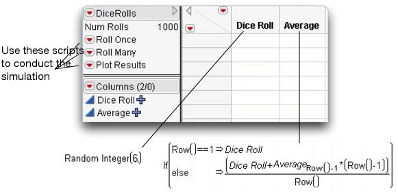
The law of large numbers states that as we increase the number of observations, the average should approach the true theoretical average of the process. In this case, we expect the average to approach  , or 3.5.
This adds a single roll to the data table. Note that this is equivalent to adding rows through the Rows > Add Rows command. It is included as a script simply to reduce the number of mouse clicks needed to perform the function.
This produces the control chart of the results in Figure 6.2. Note that the results fluctuate fairly widely at this point.
Figure 6.2 Plot of Results After Five Rolls

This adds many rolls at once. In fact, it adds the number of rows specified in the table variable Num Rolls (1000) each time it is clicked. To add more or fewer rolls at one time, adjust the value of the Num Rolls variable. Double-click Num Rolls at the top of the of the tables panel and enter any number you want in the edit box.
Also note that the control chart has automatically updated itself. The chart reflects the new observations just added.
You will need to manually adjust the x-axis to see the plot in Figure 6.3.
Figure 6.3 Observed Mean Approaches Theoretical Mean

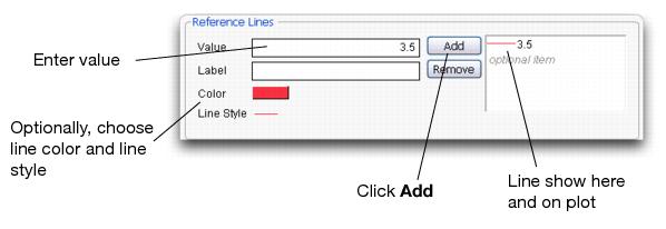
The control chart shows that the mean is leveling off, just as the law of large numbers predicts, at the value 3.5. In fact, you can add a horizontal line to the plot to emphasize this point.
Figure 6.4 Adding a Reference Line to a Plot
Although this is not a complicated example, it shows how easy it is to produce a simulation based on random events. In addition, this data table could be used as a basis for other simulations, like the following.
Rolling Several Dice
If you want to roll more than one die at a time, simply copy and paste the formula from the existing column into other columns. Adjust the running average formula to reflect the additional random dice rolls.
Flipping Coins, Sampling Candy, or Drawing Marbles
The techniques for rolling dice can easily be extended to other situations. Instead of displaying an actual number, use JMP to re-code the random number into something else.
For example, suppose you want to simulate coin flips. There are two outcomes that (in a fair coin) occur with equal probability. One way to simulate this is to draw random numbers from a uniform distribution, where all numbers between 0 and 1 occur with equal probability. If the selected number is below 0.5, declare that the coin landed heads up. Otherwise, declare that the coin landed tails up.

Extending this to sampling candies of different colors is easy. Suppose you have a bag of multi-colored candies with the distribution shown on the left in Figure 6.5.
Also, suppose you had a column named t that held random numbers from a uniform distribution. Then an appropriate JMP formula could be the middle formula in Figure 6.5.
JMP assigns the value associated with the first condition that is true. So, if t = 0.18, “Brown” is assigned and no further formula evaluation is done.
Or, you could use a slightly more complicated formula. The formula on the right in Figure 6.5 uses a local variable called t to combine the random number and candy selection into one column formula. Note that a semicolon is needed to separated the two scripting statements. This formula eliminates the need to have the extra column, t, in the data table.
Figure 6.5 Probability of Sampling Different Color Candies

Probability of Making a Triangle
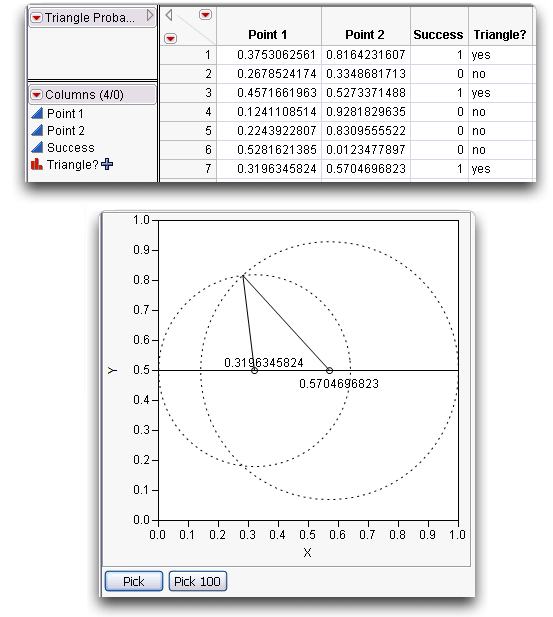
Suppose you randomly pick two points along a line segment. Then, break the line segment at those two points forming three line segments, as illustrated here. What is the probability that a triangle can be formed from these three segments? (Isaac, 1995)It seems clear that you cannot form a triangle if the sum of any two of the subsegments is less than the third. This situation is simulated in the triangleProbability.jsl script, found in the Sample Scripts folder. Run this script to create a data table that holds the simulation results.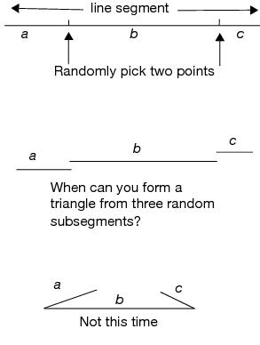
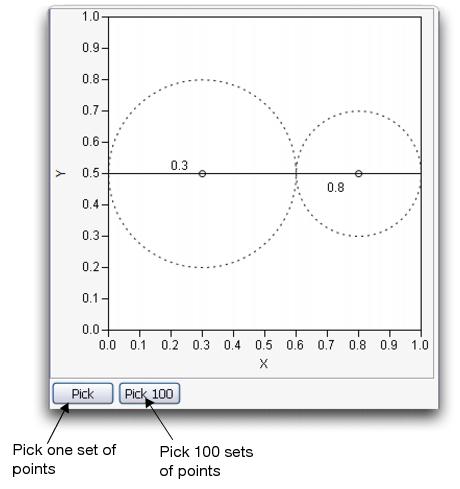
The initial window is shown in Figure 6.6. For each of the two selected points, a dotted circle indicates the possible positions of the ‘broken’ line segment that they determine.
Figure 6.6 Initial Triangle Probability Window
To use this simulation,
Two points are selected and their information is added to a data table. The results after seven simulations are shown in Figure 6.7.
Figure 6.7 Triangle Simulation after Seven Iterations
To get an idea of the theoretical probability, you need many rows in the data table.
Figure 6.8 Triangle Probability Distribution Report
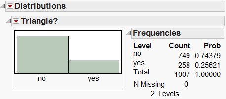
It appears (in this case) that about 26% of the samples result in triangles. To investigate whether there is a relationship between the two selected points and their formation of a triangle,
This puts a different color on each row depending on whether it formed a triangle (Yes) or not (No). Examine the data table to see the results.
This reveals a scatterplot that clearly shows a pattern.
Figure 6.9 Scatterplot of Point 1 by Point 2

The entire sample space is in a unit square, and the points that formed triangles occupy one fourth of that area. This means that there is a 25% probability that two randomly selected points form a triangle.
Analytically, this makes sense. If the two randomly selected points are x and y, letting x represent the smaller of the two, then we know 0 < x < y < 1, and the three segments have length x, y – x, and 1 – y (see Figure 6.10).
Figure 6.10 Illustration of Points

To make a triangle, the sum of the lengths of any two segments must be larger than the third, giving the following conditions on the three points:

Elementary algebra simplifies these inequalities to

which explain the upper triangle in Figure 6.9. Repeating the same argument with y as the smaller of the two variables explains the lower triangle.
Confidence Intervals
Beginning students of statistics an nonstatisticians often think that a 95% confidence interval contains 95% of a set of sample data. It is important to help students understand that the confidence measurement is on the test methodology itself.
To demonstrate the concept, use the Confidence.jsl script from the Sample Scripts folder. Its output is shown in Figure 6.11
Figure 6.11 Confidence Interval Script

The script draws 100 samples of sample size 20 from a Normal distribution with a mean of 5 and a standard deviation of 1. For each sample, the mean is computed with a 95% confidence interval. Each interval is graphed, in gray if the interval captures the overall mean and in red if it doesn’t. Note that the grey intervals cross the mean line on the graph (meaning they capture the mean), while the red lines don’t cross the mean.
Press Ctrl+D ( +D on the Macintosh) to generate another series of 100 samples. Each time, note the number of times the interval captures the theoretical mean. The ones that don’t capture the mean are due only to chance, since we are randomly drawing the samples. For a 95% confidence interval, we expect that around five intervals will not capture the mean, so seeing a few is not remarkable.
This script can also be used to illustrate the effect of changing the confidence level on the width of the intervals.
This shrinks the size of the confidence intervals on the graph.
The Use Population SD? option allows you to use the population standard deviation in the computation of the confidence intervals (rather than the one from the sample). When this is set to “no”, all the confidence intervals are the same width.
Other JMP Simulations
Some of the simulation examples in this chapter are table templates found in the Sample Scripts folder. A table template is a table that has no rows, but has columns with formulas that use a random number function to generate a given distribution. You add as many rows as you want and examine the results with the Distribution platform and other platforms as needed.
Many popular simulations in table templates, including DiceRolls, have been added to the Simulations outline in the Teaching Resources section under Help > Sample DataThese simulations are described below..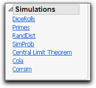
• DiceRolls is the first example in this chapter.
• Primes is not actually a simulation table. It is a table template with a formula that finds each prime number in sequence, and then computes differences between sequential prime numbers.
• RandDist simulates four distributions: Uniform, Normal, Exponential, and Double Exponential. After adding rows to the table, you can use Distribution or Graph Builder to plot the distributions and compare their shapes and other characteristics.
• SimProb has four columns that compute the mean for two sample sizes (50 and 500), for two discrete probabilities (0.25 and 0.50). After you add rows, use the Distribution platform to compare the difference in spread between the samples sizes, and the difference in position for the probabilities. Hint: After creating the histograms, use the Uniform Scaling command from the top red triangle menu. Then select the grabber (hand) tool from the tools menu and stretch the distributions.
• Central Limit Theorem has five columns that generate random uniform values taken to the 4th power (a highly skewed distribution) and finds the mean for sample sizes 1, 5, 10, 50, and 100. You add as many rows to the table as you want and plot the means to see the Central Limit Theorem unfold. You’ll explore this simulation in an exercise, and we’ll revisit it later in the book.
• Cola is presented in Chapter 11, “Categorical Distributions” to show the behavior of a distribution derived from discrete probabilities.
• Corrsim simulates two random normal distributions and computes the correlation between at levels 0.50, 0.90, 0.99, and 1.00.Hint: After adding columns, use the Fit Y by X platform with X as X, Response and all the Y columns as Y. Then select Density Ellipse from the red triangle menu on the Bivariate title bar for each plot.
A variety of other simulations in the Sample Scripts folder, such as triangleProbability and Confidence, are JMP scripts. A selection of the more widely used simulation scripts can be found in Help > Sample Data under the Teaching Demonstrations outline.
A set of more comprehensive simulation scripts for teaching core statistical concepts are available from www.jmp.com/academic under Interactive Learning Tools. These “Concept Discovery Modules” cover topics such as sampling distributions, confidence intervals, hypothesis testing, probability distributions, regression and ANOVA.
Exercises
1. Use the Central Limit Theorem simulation to explore the distribution of sample means for highly skewed data.
(g) Add 100 rows to the data table. Each row will contain the mean for the sample size specified in the column name. So, column N=1 will contain individual values, and column N=100 will have means for samples of size 100.
(h) Use the Distribution platform to plot the distributions of the five columns.
(i) Describe the shape of each distribution. Specifically, what happens to the shape of the distributions as the sample size increases?
(j) Describe the variability, or spread, of each distribution. What happens to the spread of the distribution as the sample size increases?
2. Open the Confidence.jsl script, and explore what happens to the width of confidence intervals as the sample size and confidence level are changed.
(a) Use different values for the sample size (i.e. 5, 10, 50, and 100). What happens to the widths of the confidence intervals as the sample size changes?
(b) Change the confidence intervals (the confidence level) to different values (i.e. 0.8, 0.9, and 0.99). What happens to the widths of the confidence intervals as the confidence level changes? How does the percentage captured by the true mean change? Conversely, how does this impact the number of times the intervals miss the true mean?
..................Content has been hidden....................
You can't read the all page of ebook, please click here login for view all page.