
9
Black Belt Nonstatistical Tools (R through Z)
INTRODUCTION
The tools that are presented in this chapter include the following:
RELIABILITY MANAGEMENT SYSTEM

JUST THE FACTS
Although everyone is talking about quality today, it isn’t quality that gets your customers to come back—it’s reliability. Quality is what makes the first sale, but it is reliability that keeps the customers. Reliability is the most important thing to customers of both products and services. Customers expect that their new car will start when they pick it up at the dealer, but it is even more important that it starts every time they get into it to drive to the airport for a flight that they are already late for (reliability).
We are amazed at the way reliability is being overlooked. In fact, it’s hard to find a book on quality management that directly addresses reliability. In 20 books on quality that we pulled at random from our bookshelves, only two had reliability even listed in their index: Joe Juran’s old faithful Quality Control Handbook (McGraw-Hill, 1988) and Armand Feigenbaum’s classic Total Quality Control.
Unfortunately, management has been trained to understand quality but has little understanding about the methodologies that result in improved reliability; as a result, they do not ask the right questions of their engineers and supporting managers. This results in misguided focus all the way through the organization.
- Rule 1: To get quality, everyone must understand what quality is.
- Rule 2: To get reliability, everyone needs to understand what reliability is.
The maximum reliability is determined by the product design. The production process design can only detract from the inherent reliability of the original design.
It is not poor quality that is causing North America to continue to lose market share—it is poor reliability. We analyzed the midsized passenger automobiles reliability data reported in the Consumer Reports Buying Guide 1998. We calculated an index by weighing the complexity of the unit from 1 to 3. We scored each unit’s reliability as shown in Table 9.1.
Reliability Weighting Auto Table
| Excellent | +2 points |
| Very good | +1 points |
| Good | 0 point |
| Fair | –1 point |
| Poor | –2 points |
The very best index a brand of automobile could get is 180. Using this index, we discovered that Japanese brands have an index that is almost 100% higher than North American brands (Japanese brands index = 113.8, North American brands index = 60.9). The two lowest reliability indexes were for two European cars. The Japanese Subaru Legacy had the highest reliability index, which was 133 out of a maximum possible points of 180. Only one Japanese car had a rating lower than 118 points, the Mitsubishi Gallant, which had a rating of 62. All of the North American brands index ratings were below 72.
The difference between Japanese and North American midsized passenger cars is only 5 percentage points. It is so small that the consumer cannot detect the difference. It is the lack of reliability that is turning once-loyal consumers of Ford, GM, or Chrysler autos to Toyota, Nissan, or Honda. The result is that U.S. brands are continuously losing their market share in passenger cars even within the United States. (See Figure 9.1.)
In the 1990s it was well known that the reason U.S. automakers were losing market share was because of their poor reliability record compared to Japanese cars. Now 20 years later the U.S. automobile industry has made some progress, but is it enough? I will let you be the judge. The following is the analysis of today’s 3-year-old cars’ error-free performance by automakers as defined in Consumer Reports Magazine (April 2012, p. 78). They are listed in order from the best to the worst.
- Toyota
- Subaru
- Honda
- Nissan
- Volvo

U.S. domestic brands’ share of U.S. car sales. (From Consumer Reports, 1998.)
- Ford
- Hyundai
- Mercedes-Benz
- Mazda
- Chrysler
- General Motors
- Volkswagen
- BMW
To provide a competitive, reliable item or service requires that the organization delivering the output understands and improves the processes that are used to design and build reliability into its output. Figure 9.2 represents a typical reliability system or, as we like to call it, reliability cycle. We have selected the word cycle because each generation builds upon the experiences and knowledge generated in the previous cycle.

The reliability cycle.
Phase I: Defining Reliability Requirements
The textbook approach is for the marketing organization to identify a product opportunity and develop a product perspective that defines the cost, performance, and reliability requirements needed to service a specific market. Typical reliability measurements would be:
- Mean time to failure
- Mean time between failures
This perspective should be based upon a detailed knowledge of the external customer/consumer’s needs and environment, plus a great deal of customer/consumer contact and potential customer/consumer inputs. The major value-added contents that a marketing group contributes to a product are the customer/consumer’s perspective, needs, expectations, and an expert projection of how these factors will change between the time the marketing group collected the research data and the date that the product will be available to the consumer. This is often a difficult task because many product development cycles are measured in years, not weeks, and technology is improving so fast that it is sometimes difficult for marketing’s “crystal ball” to accurately project reliability requirements. On the other hand, there should be no one closer to the customer/consumer and in a better position to do it than the marketing organization. A good marketing organization not only will understand the customer/consumer’s present and projected expectations, but also will have a detailed understanding of the present technologies that are being developed that will drive further customer/consumer requirements.
Using the product perspective as the product performance basic document, the product reliability specifications are usually developed by product engineering or research and development (R&D). Often, the reliability specifications are more impacted by inherent reliability of the embedded technologies and competition than they are by customer/consumer expectations. In the better organizations, the consumer’s reliability expectations are less demanding than the product reliability specifications. That does not mean that the reliability specification developed by R&D does not consider the customer/consumer requirements, because in most cases, they do, but the engineer’s thought process is very different. The engineer has a tendency to say: “The product’s reliability is X. What percentage of the market will consider buying our product?” The marketing-driven approach will state: “If you can provide product that will do this function, at this cost, and at this level of reliability, the market for the product would be y customers/consumers, and we should be able to capture z percent of the market.” It is then left up to R&D to design a product that will meet or exceed the market expectations.
Phase II: Designing Reliability into the Item
A major consideration in every design is the reliability requirement for the end item. Major considerations in the design of an item are:
- Cost
- Performance
- Reliability
- System compatibility
- Availability
- Manufacturability
The item’s intrinsic reliability is defined by the design. The design will dictate, for example, the materials selection, the item operating temperature, the structure of an item, the way it is maintained, and the way components of the item are used.
Of course, maintainability is part of reliability because downtime is a typical reliability measurement, and of course, easy maintenance has a big input on the customer/consumer’s cost of ownership.
Phase I is the most important phase in the reliability cycle because it starts the whole cycle, and defines the requirements for each of the other phases, but Phase II runs a close second. Proper preventive maintenance may mask some of the reliability problems, but other activities, like manufacturing, field repairs, and shipping, only serve to degrade the intrinsic reliability of the design. Even preventive maintenance often has a temporary negative effect on the item’s reliability.
A well-designed, preventive maintenance system removes components just before they reach their end-of-life points where the components’ failure rates take off.
Note: There is a Rule 3: The item’s intrinsic reliability is defined by the design.
In order for the R&D engineers to create an acceptable design, a great deal of component reliability data need to be at their fingertips. In addition, they need to have an excellent understanding of reliability considerations (for example, impact on components’ reliability when the component is used at derated values, or impact of changing environmental conditions, or where and when to use a redundant circuit).
Phase III: Defining Component Reliability
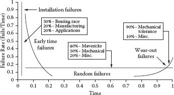
It is easy to see that the engineering departments need to understand the bathtub curve failure rates of all components if they are going to design a product that meets customer/consumer reliability requirements.

Establishing the bathtub curve error rates of all components is a critical part of a reliability program. Although early-life and end-of-life failure rates are important design considerations, the most important consideration is the intrinsic failure rate. For a typical electronic component, the early-life phase lasts anywhere between 100 and 200 hours of operation, and the end-of-life phase begins about 8 to 10 years after its first poweron point. Some place between 5 and 7 years of the electronic component’s life cycle, it will be performing at its intrinsic failure rates. It is for this reason that most reliability projects use only intrinsic failure rates in calculating the total item’s projected reliability. This approach greatly simplifies the calculations. Unfortunately, the first thing that the consumer is subjected to is the high early-life failure rates. As a result, consumer impression of the product is heavily weighted on the early-life failures. “I just got this product and it already isn’t working. I’ll take it back and get another brand.”
A properly designed manufacturing process can do a lot to keep early-life failures from reaching the consumer. There are many ways that intrinsic (inherent) component failure rate data can be obtained:
- Components’ supplier databases
- Reliability data collected by clearinghouses
- U.S. government databases
- Performance of the components in the organization’s previous products
- Component reliability testing by the organization
Phase IV: Calculating the Item’s Reliability
There are two ways to calculate an item’s reliability:
- Testing at the completed item level and statistically analyzing the results
- Testing at the lower levels and calculating the item’s reliability
Usually, a combination of both these approaches is used to give a maximum level of confidence at minimum cost. Testing the completed item in a simulated customer/consumer environment provides the most accurate data, but it is expensive, very time-consuming, and often impractical. For example, if the product’s life expectancy were 10 years, the organization would have to test a very large sample of the item for 10 years before it could publish reliability figures. For this reason, stress testing and accelerated life testing of a small sample of the product is most frequently used to support shipment to customers/consumers.
This approach makes all of your customers/consumers part of the organization’s product reliability test sample. To minimize the chance of not meeting the reliability specifications in the customer/consumer’s environment, the final item’s tests are supplemented and verified by mathematically combining testing at the lower levels of the item (component, assembly, unit, etc.). This is the best way to estimate the item’s reliability during the design stage of the item’s life cycle.
Once the error rate for the individual component is determined, the reliability of assembly can be calculated. In order to accomplish this calculation, the engineer must understand how the components are used and what environmental conditions they will be subjected to. An assembly’s reliability can be calculated by mathematically combining the reliability projections for the components that make up the assembly once they have been adjusted to reflect the way they are used. Assembly reliability can be combined mathematically to define unit-estimated reliability. These data usually do not take into consideration any degradation that would occur as a result of the manufacturing and servicing activities. If the reliability estimates do not indicate that the product will meet the reliability specification, Phase II (design the item), Phase III (define component reliability), and Phase IV (calculate the item’s reliability) will be repeated. (See Figure 9.2.)
Phase V: Minimizing Manufacturing Degradation
As we have stated, the item’s intrinsic reliability is defined by the design. The manufacturing process can only degrade the item’s performance from this intrinsic reliability value. Typical manufacturing things that could cause degradation of the item are:
- Stresses that are applied to the component during manufacturing that exceed the component specification or expected use, but the unit does not stop functioning altogether. (Example: A flow soldering machine that is set too high can cause damage to many flow solder joints within the components and the connections on the circuit board without causing them to completely fail, but it could greatly decrease their mechanical integrity, increasing the item’s failure rates after it is delivered to the customer.)
- Tests that do not functionally test all the conditions that the customer will apply to the item. This is referred to as test coverage when applied to electronic systems.
- Assembly errors. (Example: A wire pulled too tight around a sharp edge could result in cold flow, causing the unit to short out.)
New manufacturing processes should be qualified to minimize the degradation they have on the design. Typical things that would be considered during a manufacturing process qualification activity would be:
- Are the documents complete and understandable when used by the manufacturing operators?
- Are the tools and test equipment capable of producing high-quality products that repeatedly meet the engineering specification?
- Are the controls in place to ensure that out-of-specification conditions can be quickly identified, preventing the escape of deviant product from the process?
- Have process control requirements been met? The process should be capable of producing products at a Cpk of 1.4 minimum. World-class Cpk is 2.0 or six sigma.
Phase VI: Qualifying the Item
To qualify an item, two factors have to be evaluated:
- The product design needs to be evaluated to ensure it is capable of meeting its design requirements. This is called verifying the design.
- The manufacturing processes and their support processes need to be evaluated to ensure that they do not degrade the basic design to an unacceptable level. This is called manufacturing process validation.
Once the design has been released and the item’s production process has been certified, the item should be subjected to a qualification test to determine if the theoretical reliability estimates were correct and to provide a minimum degree of assurance that the specified reliability performance has been designed and built into the item. At the components and small assemblies levels, the sample size may be large enough for the organization to have a high degree of confidence that the reliability projections will be met. For large, complex assemblies and items (for example, cars, planes, computers, etc.), it is often too costly and time-consuming to evaluate a large enough sample size to have a meaningful level of confidence that reliability projections can be met. To offset this risk, many organizations conduct a number of evaluations throughout the product development cycle in order to gain a higher level of confidence that the item will meet reliability expectations in the customer’s environment.
Phase VII: Measuring Customer/Consumer Reliability
Once the floodgates are open and the product is being delivered to the external customers, the true reliability of the item can be measured. Unfortunately, the customer sees reliability as a black and white consideration. For example, a man/woman gets into the car, and the car starts or doesn’t. He/she puts on the brakes, and the car stops or doesn’t. The customer doesn’t care if it is an early-life failure or end-of-life failure or whether he/she was using the item as it was intended to be used or not. The customer just expects it to work each time he/she wants it to operate. Now, the real test of your reliability system is put on the line. It is very important that systems be put in place to collect these data in a way that will allow the reliability problems related to the item to be corrected and to provide information that will allow future items to benefit from the mistakes made on this item. It is a lot easier to say that the data system should be put in place than it is to make it work.
In today’s fast-reacting environment, it is absolutely essential to have pertinent information available to the total organization on an ongoing basis. Today’s best practices put the repair action data from yesterday’s failures on the president and other key executives’ desks today. IBM’s field reporting system is an excellent one to benchmark.
Phase VIII: Corrective Action and Database Updating
The database that is developed in Phases III, IV, V, VI, and VII is established for three purposes:
- To measure current product reliability
- To correct current reliability or perceived reliability problems
- To collect component and assembly-error rate information for future use
The key to good corrective action is defining the root cause of the problems. In most cases, this means the suspected component needs to undergo a detailed failure analysis activity where it is characterized and very often dissected. We like to be able to recreate every external failure condition. When you can take a good component and get it to fail in exactly the same way that the component under study failed in the field operation, you have gained true knowledge of the failure mechanism and can solve the problem. In most cases, a good failure analysis system is a key ingredient of an effective corrective action cycle, but correcting the problem is only the start of the total cycle. Truly, you need to prevent problems from reoccurring on the current process and all future products. In this case, we need to look at what an effective preventive action cycle is. Seven critical ingredients that are required in any long-range plan to permanently eliminate problems are:
- Awareness
- Desire
- Training in problem solving
- Failure analysis
- Follow-up system
- Prevention activities
- Liberal credit
The reliability cycle in Figure 9.2 depicts the process that every item whose reliability is of concern to the customer and/or management should go through. You will note that each cycle is triggered with a new reliability requirement and that the cycle is short-circuited when an item’s calculated reliability does not meet reliability requirements or when the product’s actual reliability performance fails to meet consumer expectations.
In a pure service environment, the reliability cycle needs to be modified to focus upon the processes that produce the service. In these cases, a fault tree analysis-type activity becomes very important. Too often, management believes that reliability is a hardware measurement and does not apply to the service industry. Nothing could be further from the truth. The five things that are most important to having customers return to a service provider are:
- Accuracy of information provided
- Timeliness of service
- Responsiveness of personnel
- Reliability of organization’s process
- Physical appearance
Reliability can be your competitive edge. Is your reliability management system up to it?

Yearly cost to own a roof with different roofing materials.
Examples
While customers/consumers treat product reliability as a specified quantity, they fail to consider reliability costs of various producers during purchase negotiations. Quality may be free, but reliability is not. The basic bromide of “you get what you pay for” is substantially untrue. Your house shingles that last for 50 years initially installed cost 60% more than the house shingles that last 20 years. In the long run, the less reliable materials cost 500% more to own. (See Figures 9.3 to 9.8.)

Product that does not wear out.

Product designed for complete wear-out.

MTBF of automobile batteries.

MTBF of a semiconductor component.
Input information to a product reliability specification.
Additional Reading
Anderson, Les, and H. James Harrington. Reliability Simplified—Going Beyond Quality to Keep Customers for Life (New York: McGraw-Hill, 1998).
Dovich, Robert A. Reliability Statistic (Milwaukee, WI: ASQ Quality Press, 1990).
Feigenbaum, Armand. Total Quality Control—Engineering and Management (New York: McGraw-Hill, 1961).
Kececioglu, Dimitri. Reliability Engineering Handbook, vol. 1 (Milwaukee, WI: ASQ Quality Press, 1991).
Lloyd, David K., and Myron Lipon. Reliability: Management, Methods and Mathematics (Milwaukee, WI: ASQC Quality Press, 1984).
Modarres, M. What Every Engineer Should Know about Reliability and Risk Analysis (New York: Marcel Dekker, 1992).
ROOT CAUSE ANALYSIS
Treating the symptoms often will not correct the problem.

Just the Facts
Everyone talks about industrial problem solving, and some books explain how to do it. These books typically provide precise methods for selecting the problem to work on and ways to protect customers from receiving defective products. They all advise you not to treat the symptoms, but to define the root cause so that the real problem can be corrected. It sounds so simple; all you have to do is define the root cause, but most books never tell you how. Why do they avoid giving details about this crucial activity? The reason is simple. Defining the root cause is often very difficult and complex; there is no one right way that works all the time. The practitioner must be skilled at selecting the most effective approach.
There are a number of ways to get to the root of a problem. A good failure analysis laboratory can provide the insight necessary to understand how a failure such as a broken bolt occurred. Duplicating the failure under laboratory conditions also has proved to be an effective way to define the root cause of problems. You know you have found the root cause when you can cause the problem to occur and go away at will. Either of these approaches works well, but they require expensive laboratories and highly trained personnel.
Excessive variation is at the heart of most problems, at least the difficult ones. Variation is part of life. No two items or acts are exactly identical. Even identical twins have very different fingerprints, voice patterns, and personal values. No two screws made on the same machine are exactly the same. Equipment may not be sensitive enough to measure the variation, but it exists. Some variation is good; it keeps our lives from being monotonous. No one would like steak, mashed potatoes, and peas three times a day, every day of the week. They are good once in a while but would get old and boring if eaten at every meal.
Some variation, within specific limits, has little or no effect on output. In other cases, variation can cause an entire plant to come to a halt. The variation we’re concerned about here is the variation that causes problems resulting in waste. There is no such thing as a random problem, just problems whose occurrence is more or less infrequent, meaning that the combination of specific variables occurs more or less infrequently. The art of defining the root cause is the art of variables analysis and isolation.
The root cause of a problem has been found when the key variables that caused the problem have been isolated. Over the years, there have been many methods developed to isolate key variables. Design of experiments and Taguchi methods are popular today. But the difficulties and effort required to prepare and conduct these studies cause them to be used on only a small fraction of the problems. Engineers, managers, production employees, and sales personnel solve most of their problems by brute force and a lot of luck. Even then, most of the time, the answer that is implemented is not the best solution to the problem.
While this part of our book covers root cause analysis, not statistical process control, we need to understand that by studying different types of variation, the source of the variation can be identified. Then the problem solver can quickly and effectively reduce the many potential sources to a critical few, and often to a single factor, thereby greatly simplifying the problem evaluation cycle and reducing the amount of data for collection. The results can be profound:
- Problems can be solved faster.
- Fewer samples are required.
- Less-skilled people can solve very complex problems.
- Preventive and corrective action plans can be evaluated quickly.
- Nontechnical people can easily understand the results of a technical evaluation.
How to Do a Root Cause Analysis in Six Steps
Step 1: Identify the potential root cause for the problem. The most effective method of root cause analysis is to determine how the root cause will be identified or what approach will be used. One of the most frequently used tools for identifying root cause is the cause-and-effect or fishbone diagram. (This tool is part of the Green Belt training.) Its primary function is to provide the user with a picture of all the possible causes of a specific problem or condition. (See Figure 9.9.)
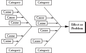
Example of a cause-and-effect diagram.
Step 2: Gather data on the frequency of the problem. Use check sheets or other approaches to track occurrences of problems and identify the causes. Figure 9.10 shows how a check sheet can be used for several problems that may result from one or more of several causes.
Step 3: Determine the impact of the problem. Use a scatter diagram or similar tool. (See Figure 9.11.) Scatter diagrams are explained later in this chapter.
Step 4: Summarize all major root causes and relate them back to the major opportunity areas. The purpose of this is to:
- Identify root causes that impact several problems.
- Ensure that the major root causes are identified in all opportunity areas.
- Aid in selection of the key root cause to eliminate it.

Example of a check sheet.
Step 5: Prioritize the root causes. Use a prioritization matrix. (See Table 9.2.) This procedure consists of the following four steps:
- List the criteria to be used to evaluate the causes.
- Weight each criterion according to its relative importance. Put the weight for each criterion in that column heading.

Example of a scatter diagram.
Example of a Prioritization Matrix

- Using one criterion at a time, rank the order of all the causes— with 1 being the least important. Enter the ranking in the column under the criterion in question.
- Multiply each rank order figure for each cause by the weight of each of the criteria to arrive at a total for each cause. Enter these totals in the final column of each row.
Step 6: Select the key root cause to eliminate. This decision should be based on the analysis of all available data. If you use a prioritization matrix, you may simply decide according to the totals in the final column.
Examples
The fault tree analysis is another alternative and sometimes is more effective than the approach just described. (See Figure 9.12.) We like to think of it as the “What could cause this?” approach.
The following is an example of the “What could cause this?” approach in use.
Symptom: TV will not turn on.
What could cause this? (Level 1)
- TV is defective
- Electrical power is out
- Remote control is defective
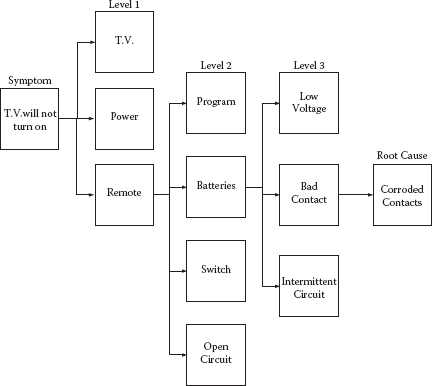
Fault tree analysis.
Investigation: TV turns on when the on button on the TV is pushed, but not when the on button on the remote control is pushed.
What could cause this? (Level 2)
- Not programmed to the TV
- Discharged batteries
- Defective on switch
- Open circuit
Investigation: Replaced batteries. Remote control now turns on the TV. Put back in the old batteries and the remote turned on the TV.
What could cause this? (Level 3)
- Batteries’ voltage is low so the remote control works intermittently.
- Bad contact
- Intermittent circuit
Investigation: Inspected battery terminals and found that they were corroded. Cleaned terminals. Checked the age of the batteries. They were less than 2 months old. Checked the voltage and current of the batteries. They checked out well. Put the old batteries in the remote control and it turned on the TV at a distance of two times normal usage.
Root cause of failure: Corroded terminals.
SCATTER DIAGRAMS

Just the Facts
The scatter diagram is used to test for possible cause-and-effect relationships. It does not prove that one variable causes the other, but it does show whether a relationship exists and reveals the character of that relationship.
The relationship between the two sets of variables can be evaluated by analyzing the cluster patterns that appear on the graph when the two sets of data are plotted with each axis being used for one of the sets of data. The direction and tightness of the cluster gives an indication of the relationship between the two variables.
Steps to Prepare a Scatter Diagram
- Collect paired samples of data.
- Construct the horizontal and vertical axes of the diagram. The vertical axis is usually used for the variable on which we are predicting or measuring the possible effect. The horizontal axis is used for the variable that is being investigated as the possible cause of the other variable.
- Plot the data on the diagram. Circle data points that are repeated.
- Analyze the cluster pattern that appears.
Guidelines and Tips
Though a scatter diagram is completed to study the cause-and-effect relationship between two variables, you should be cautious about the statement that “Variable 1 causes Variable 2.” There might be other reasons why two variables appear to be related, such as a third variable not represented in the plot, but related to both of the other variables.
Keep in mind that the full range over which Variable 1 varies is sometimes key in detecting a correlation between two variables. For example, experimental studies are often done over a wider range than normal production.
Also keep in mind that correlations do not have to be linear. Notice the last example, showing two variables that are correlated, but not in a linear fashion. Look for patterns that might indicate a relationship between two variables.
Example
See Figure 9.13.

Sample scatter diagrams.
Additional Reading
Brassard, Michael. The Memory Jogger Plus (Milwaukee, WI: ASQ Quality Press, 1989).
Harrington, H. James. The Improvement Process (New York: McGraw-Hill, 1987).
Lynch, Robert F., and Thomas J. Werner. Continuous Improvement Team and Tools: A Guide for Action (Milwaukee, WI: ASQ Quality Press, 1991).
SELECTION MATRIX (DECISION MATRIX)
Just the Facts
The selection matrix is frequently implemented in planning quality activities to set goals and develop process flows. It is useful in selecting alternative solutions. (See Table 9.3)
Example
The steps in implementing a selection or decision matrix are:
- Identify the possible alternatives.
- Agree on the decision/selection criteria.
- Evaluate each criterion and assign a relative weighted value.
- Establish a scoring system.
- Identify and rank the alternatives.
- Total the scores.
Additional Reading
Cox, Jeff, and Eliyahu M. Goldratt. The Goal: A Process of Ongoing Improvement (Croton-on-Hudson, NY: North River Press 1986).
Picard, Daniel (ed.). The Black Belt Memory Jogger (GOAL/QPC and Six Sigma Academy, 2002).
Wortman, Bill. The Certified Six Sigma Black Belt Primer (Quality Council of Indiana, 2001).
Selection Matrix
| Criterion | Weight | Alternative 1 | Alternative 2 | Alternative 3 |
|---|---|---|---|---|
| Company performance |
3 | 3 × 3 = 9 | 1 × 3 = 3 | 3 × 3 = 9 |
| Ease of implementation |
1 | 3 × 1 = 3 | 5 × 1 = 5 | 5 × 1 = 5 |
| Negative elements |
2 | 3 × 2 = 6 | 1 × 2 = 2 | 3 × 2 = 6 |
| Total | 18 | 10 | 20 |
Scoring: 5 = high, 3 = medium, 1 = low.
SIPOC DIAGRAM

Just the Facts
There are two approaches to understanding the present process: One is descriptive and the other is graphic. A good way to understand the process is to describe it. One benefit of describing the process is that it sometimes leads to the discovery of obvious problems and solutions that can be fixed quickly. A flowchart of the process is particularly helpful in obtaining an understanding of how the process works because it provides a visual picture.
There are four types of flowcharts that are particularly useful:
- Top-down flowchart
- Deployment matrix flowchart
- Process map
- SIPOC diagram
Of the four types, the SIPOC diagram method is the one that is most often used. The SIPOC diagram will assist with improvements and simplification by providing:
- A high-level description of the business process addressed by the project.
- An accurate picture of how work is currently done in order to pinpoint the location or source of error as precisely as possible by building a factual understanding of the current process conditions.
- Knowledge that will allow the problem solvers to narrow the range of potential causes to be investigated. The key is to understand how the process presently works. Before the Six Sigma Team (SST) can attempt to improve the process, it must understand how it works now and what it is supposed to do.
The team should ask and answer key questions:
- What does the process do?
- What are the stages of the process?
- What are the starting and finishing points of the process?
- What are the inputs and outputs from the process?
- Who are the suppliers and customers of the process?
- Who uses the product and who pays for it?
- Are there obvious problems with the process?
A SIPOC diagram shows only the essential steps in a process without detail. Because it focuses on the steps that provide real value, it is particularly useful in helping the team to focus on those steps that must be performed in the final “improved” process. The SIPOC diagram provides a picture of the process that the team can use to work on and simplify. It allows people to focus on what should happen instead of what does happen. Usually, most processes have evolved in an ad hoc manner. When problems have occurred, the process has been fixed. The end result is that a simple process has evolved into something complex. A flowchart is a first step to simplify things.
The SIPOC diagram is impressively astute at identifying the part in the process that affects customer satisfaction the most. It illustrates the upstream inputs to the process as well as the outputs and the customers served. This global view assists in identifying exactly where to make baseline measurements.

SIPOC diagram for credit card processing.
Two examples illustrate how a SIPOC diagram can keep the focus on the performance of the inputs and outputs so glaring problems can be identified. (See Figures 9.14 and 9.15.)
This is useful because it shows who is responsible for each activity, how they fit into the flow of work, and how they relate to others in accomplishing the overall job. To construct a SIPOC diagram, you list the major steps in the process vertically down the center of the page, and you list the suppliers and input groups on the left and the outputs and customers on the right.

SIPOC table for credit card processing.
Capturing the as-is picture of an organization’s processes is important because it allows a company to be ready for project selection and the introduction of Six Sigma tools and Six Sigma certification. If done correctly, defining the current state of a company’s processes can help break down strategic focus areas into project ideas. In early Six Sigma deployments, often project scopes are too large, causing excessive project cycle times and loss of internal organizational support. The goal should be ensuring that high-value, well-scoped projects are identified and linked to the company’s strategic objectives. This is the importance of project identification and process mapping: It allows an organization to better understand all the steps, critical inputs and outputs, and product and information flows from supplier to customer. Armed with a detailed and shared visual understanding of how work actually occurs, the organization can more easily identify project ideas for improvement.
Once projects are identified, a discussion with key stakeholders can take place to validate initial findings and prioritize projects. This healthy discussion allows individuals to come together and objectively discuss ongoing activities and gaps. Not only will many Lean Six Sigma projects be identified, but other projects that the organization could address will come to light. For the Six Sigma project ideas selected, team charters can be drafted that provide the business case for each project and serve as the guiding framework for improvement efforts. It also is at this point that baseline metrics are established, allowing one to track project and process improvement performance, but it all starts with mapping the current state.
The SIPOC Approach Expanded
As previously discussed, the purpose of mapping an organization’s current process is to position the organization to quickly define, document, analyze, prioritize, and recommend solutions and follow-up plans to move the company toward its financial- and customer-focused goals. Any process mapping activity starts with a simple assessment that can be conducted by interviewing the key stakeholders of the processes. A key activity for this assessment is capturing those critical to quality (CTQ) factors of internal clients’ processes and services to their customers. This lays the foundation for collecting data, developing metrics to measure success, and ultimately building value stream maps. But before a company can leverage the Six Sigma process to identify and execute critical process improvement initiatives—let alone do detailed mapping techniques such as value stream mapping—it needs to capture the basics from initial interviews and assessment. This is where one would use a SIPOC diagram, and this initial phase of process mapping is the foundation leveraged throughout the initial phase of a Six Sigma deployment. Think of the SIPOC as a simple process mapping tool used to map the entire chain of events from trigger to delivery of the target process.
Basically the SIPOC diagram used is a combination of matrix, flowchart, and summarization and includes:
- Suppliers: Significant internal/external suppliers to the process.
- Inputs: Significant inputs to the process, like material, forms, information, etc.
- Process: One block representing the entire process.
- Outputs: Significant outputs to internal/external customers.
- Customers: Significant internal/external customers to the process.
A SIPOC diagram helps to identify the process outputs and the customers of those outputs so that the voice of the customer can be captured. When mapping the detailed level of the SIPOC diagram, one can choose the swim lane or other related method. A swim lane flowchart is a type of process flow diagram that depicts where and who is working on a particular activity or subset of the process. (See Figure 9.16.)
The swim lane flowchart differs from other flowcharts in that processes and decisions are grouped visually by placing them in lanes. Parallel lines divide the chart into lanes, with one lane for each person or group. Lanes are arranged either horizontally or vertically, and labeled to show how the chart is organized.
This method requires that the business unit capture all information without directly relating it to a certain process, output, etc., similar to a brainstorming session. This method works best with high-level mapping and is vertical in nature. The swim lane method is best suited for lower-detail-level mapping. Swim lanes allow the business unit to capture all information directly related to a specific process, output, etc. This method requires more space and several mapping sessions due to the amount of time required to map each process; it is horizontal in nature.
A team should initially avoid the swim lane flowchart unless the objective is detailed lower-level mapping, as this method takes many hours and sessions to complete.

Swim lane flowchart.
Part of the power of the SIPOC diagram is that it is simple to do, but it is full of information that allows the participants in a process to learn together. This enables them to come to consensus, not only about the makeup of the SIPOC diagram itself, but on the lessons learned and opportunities as well. Places in the processes for potential improvement can then be discussed and prioritized in a nonthreatening fashion. By having the business units participate in the session and rank/prioritize opportunities together, they tend to be clearer and more descriptive in a shorter period of time. So, the SIPOC diagram acts as a dynamic tool to create dialogue and acceptance of a new approach to change, in addition to simply capturing the as-is state.
Building a SIPOC Diagram
When creating a SIPOC diagram, a SST does not necessarily begin at the beginning. The team should more likely start in the middle and ask questions about the process itself. The team may label the process with the summaries of the most critical three to six steps. Next is documenting what is delivered to whom. The team can brainstorm and prioritize the most critical one to three customers and identify, prioritize, and align the outputs most significant to those customers. Later, the team can verify these initial assumptions with voice-of-the-customer tools from the Six Sigma process and/or designate them as critical to quality, speed, or cost. Finally, the team can identify what input or information is needed to perform that process and who provides that input. This brainstorming and prioritization of significant inputs finishes the activities around building a SIPOC diagram.
The following are some further concepts about building a SIPOC diagram:
- Outputs: Outputs are defined as anything the business unit distributes. Frequency/timing is listed along with the output. Examples of outputs would be reports, ratings, products, documents, etc.
- Recipients (customers): A recipient is defined as anyone who receives outputs. It is important to note that the recipient must get the output directly from the business unit and does not necessarily have to be a user of the output. If the output is received from a third party, it is not a recipient. Examples of recipients would be a manager, CEO, board of directors, or another department.
- Triggers: Triggers are anything that starts the business unit’s process. A trigger could be the receipt of a report, a certain day of the month, etc.
- Estimated time: The estimated time is how long it takes to complete process steps—this can be continuous, days, weeks, years, etc.
- Fail points: Fail points are ranked/prioritized and then numbered based on the priority.
In the end, the reason a SST frequently begins with building a SIPOC diagram as a first step in the process mapping exercise is threefold in nature:
- A SIPOC diagram quickly and easily captures the current or as-is state of the organization and processes in question.
- The SIPOC exercise brings associates together in a nonthreatening way that builds teamwork and momentum to the cause around culture and learning about Six Sigma.
- The SIPOC exercise allows the team to review all the processes in a manner in which next steps can be identified, and limited resources assigned during the next phase of the rollout to those processes with an objectively identified listing of the most critical project opportunities.
Example: Mama Mia Case Study
One of our first steps was to go out and ask our customers what they liked and didn’t like about Mama Mia’s. Surveys, focus groups, and follow-up interviews with customers identified their most important requirements as fresh-tasting pizzas on time. Then we interviewed our internal customers, including the food preparation personnel, the VP procurement, the VP food and beverage, and delivery personnel. They indicated that having enough supplies on hand to fill orders and freshness were important requirements. (See Figure 9.17.)
But we had to redefine our terms to clearly understand what a botched delivery meant. To us, it was whenever the right pizza didn’t get to the right house. We felt if we made a mistake, but eventually fixed it, that was still a successful mission. By our count, we were getting it right about 97% of the time, which is 3.4 sigma. For Mama Mia’s customers, a botched delivery was whenever they received anything less than a perfect pizza the first time, on time. By their definition, we were only getting it right 87% of the time. We had a problem: How to get the pizza to the customers on time, every time? (See Figure 9.18.)
Customer requirements—operationally defined—delivery example.

Mama Mia’s SIPOC diagram—Food ordering delivery process.
The VP of procurement creates and places a weekly order from Pizza Supplies R Us. She negotiates for price and quantity of the order. The order is scheduled to be delivered to Mama Mia’s warehouse. The order is tracked and received at the warehouse and is unloaded. (See Figure 9.19.)

Food order SIPOC diagram.

Food storage SIPOC diagram.
Mama Mia’s SIPOC—Food Storage Process
The VP of food and beverage checks the order for completeness and freshness. The stock is put into inventory. The pizza supplies are inspected weekly for freshness. The food and beverage VP determines if the food is within shelf life, disposes of spoiled food, and notifies the VP procurement of any spoiled items within shelf life. (See Figure 9.20.)
Mama Mia’s SIPOC—Food Preparation and Order Delivery
The store manager orders supplies from the warehouse. The supplies are delivered and checked for completeness. The food preparation personnel stock and refrigerate food supplies. The customer places his or her order on the phone or in person and provides address if needed. The food preparation person provides cost and estimated delivery time. The pizza is baked, boxed, and assigned to the delivery person, who scopes out the directions from an old plastic map. The pizza is delivered and money is collected. The delivery person returns to the store. (See Figure 9.21.)
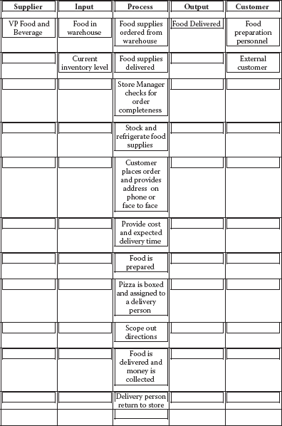
Food preparation and order delivery SIPOC diagram.
SWOT—STRENGTHS, WEAKNESSES, OPPORTUNITIES, AND THREATS
Just the Facts
A SWOT analysis starts by defining a desired objective. Strategic planning should incorporate a SWOT analysis as part of the planning. The elements of SWOT can be defined as:
S—Strengths: The elements of the business that constitute its advantages.
W—Weaknesses: The disadvantages that a business has.
O—Opportunities: The chances of achieving greater profits in the market.
T—Threats: Market elements that could be problematic to achieving the desired results.
SWOT Matrix
| Opportunities | Threats | |
|---|---|---|
| Strengths | O-S strategies | T-S strategies |
| Weaknesses | O-W strategies | T-W strategies |
O-S strategies describe opportunities that build on the company’s strengths.
O-W strategies identify weaknesses and means of overcoming them.
T-S strategies identify how to use the company’s strengths to reduce external threats.
T-W strategies define plans to prevent the weaknesses from achieving the goal.
The SWOT Matrix
The SWOT analysis can be placed into a matrix of these factors. An example of a SWOT matrix is shown in Table 9.4.
Example
Strengths are resources and capabilities that form a basis for developing a competitive advantage such as:
- Patents
- Brand recognition
- Positive customer base
- Proprietary knowledge
- Access to distribution networks
Weaknesses are an absence of strengths such as:
- Patent protection liabilities
- Negative customer recognition
- High cost
- Poor distribution
Weakness may be the antithesis of strength.
Opportunities come from an evaluation of the marketplace, customer desires, and competitor strengths, which will give indications for profit and growth opportunities. Some examples are:
- A customer-indicated need that is not met
- Implementation of new technologies
- International trade barriers
- Regulations
Threats may consist of changes in the marketplace that threaten the company’s products or services. Some examples are:
- Changes in consumer desires and wants
- Introduction of competitor products
- Changes in regulations
- Changes in trade barriers
Additional Reading
Bradford, Robert W., Peter J. Duncan, and Brian Tarcy. Simplified Strategic Planning: A No-Nonsense Guide for Busy People Who Want Results Fast! (Worcester, MA: Chandler House Press, 2000)
Picard, Daniel (ed.). The Black Belt Memory Jogger (GOAL/QPC and Six Sigma Academy, 2002).
Wortman, Bill. The Certified Six Sigma Black Belt Primer (Quality Council of Indiana, 2001).
TAKT TIME
Just the Facts
If you have five steps in a process that take different times to complete, then the process is gated by the process step that takes the longest time. For example, if the process steps take A = 13, B = 9, C = 10, D = 12, and E = 18 minutes, respectively, then process step B will be waiting for process step A, and the entire process is gated by process step E, which requires the longest time. This means that the work-in-process (WIP) will increase and the overall flow is slowed.
Takt time is used to balance work flow across work steps and to meet demand. Roughly translated, Takt is a German word meaning “beat.” Producing to the pace of customer demand (no faster, no slower), when the work steps are in balance, this produces maximum productivity and saves cost. When you have total processing time, all you need is customer demand to calculate Takt time. Takt gives you a starting point to think about balancing the workload across work steps. (See Figure 9.22.)
Each work step in a process should operate as close to Takt time as possible without going over. If your process has four operations that take 10, 13, 12, and 17 minutes in that order, work step 4 is holding up the process. As seen above, when you have work steps that are faster than the slowest step, and they precede the slowest step, WIP is increased and overall production is slowed. A rebalancing of the work in such a way as to have each work step function as close as possible to each other will improve efficiency.

Takt time formula.
To get the Takt all the time for a process, you start by calculating the two individual elements of the formula above. First, you determine the portal available processing time for the process. If the process has two shifts per day, and each shift is 8 hours long, the total available time is not 16 hours per process. You must deduct any downtime, such as lunch breaks for employees. Each shift may have downtime for breaks and perhaps for tailgate meetings. If each shift has a 1-hour lunch and two breaks, you must deduct 3 hours of downtime from the total shift time. In this example this would be 13 hours of production time.
The other variable that is required is customer demand, and if customer demand is 600 units per month and the organization is working 5-day weeks (most often 21 productive days per month), processes must complete 29 units per day using both shifts. Takt for this process is 0.45 hours per unit.
Once you determine Takt time, you attempt to adjust your process speed so that all work steps are as close to Takt time as possible without exceeding them. Operations vary in the amount of work assigned to them and can also be very inefficient.
Redistribution of the work to come up with a well-spaced balanced flow process is the goal. You should consider two general approaches to achieve Takt time to route your process: move work from one station to another, or change the number of stations or operations in the process.
There are four approaches that should be considered when attempting to balance work steps in a process:
- If the process has a small amount of variation, it may be possible to redistribute the work more evenly by assigning uniform slack time. Slack time is the time not being used by the faster work steps in the process. For instance, if the slowest step in the process is 10 minutes and the fastest step in the process is 7 minutes, the 7-minute process has 3 minutes of slack time. If the average work time (7 minutes) is below Takt time (for example, 8 minutes), you have 1 minute per unit to work with. If production is 60 units per day, then you have 1 hour of time that might be redistributed to the slower work step. This begins balancing the two work steps, speeding up the slower work step, and making the faster work step more efficient.
- When large amounts of variation exist, you can use a relatively simple way to rebalance the process. You can reassign the work so that any slack time comes off the end of the process.
- When there are small amounts of variation, it may be possible to eliminate a work step for work consolidation. For example, instead of four work steps you now have three. If this can be done within Takt time, the savings this represents makes it much better.
- If, when examining the work, it is found that there is significant opportunity for making the work itself more efficient and improving the process, efficiency should be your first choice. Then, reassess your Takt time and, if necessary, begin balancing the work across the process.
Example
To get the Takt time, follow these steps:
- Determine the available processing time.
- Count all shifts.
- Deduct any downtime:
− Breaks
− Lunch
− Clean-up
− Shift change meetings
- This will yield the available processing time.
- Determine the customer demand.
- If the customer wants 1,000 units
- If the company works 5 days/week (21 days/month)
− Production rate should deliver 48 units per day
- If we assume:
- Effective production time to be 13 hours/day
- 48 units required per day
- Takt time will be 0.62 hour/unit
Additional Reading
Picard, Daniel (ed.). The Black Belt Memory Jogger (GOAL/QPC and Six Sigma Academy, 2002).
THEORY OF CONSTRAINTS (TOC)
Just the Facts
A constraint is anything that prevents a system from achieving its goal. While there are many types of constraints, there are only a few constraints that are the principle constraints.
Constraints may be internal or external to the process. Internal constraints could be when production can’t keep up with customer demand. External constraints could manifest in the problem of producing more than the marketplace demands.
Types of (Internal) Constraints
- Equipment: Equipment limitations in its ability to produce more goods or services.
- People: Poorly trained people.
- Processes: Processes that limit the production capability.
TOC focuses on the mechanism for management of the system. In optimizing the system, constraints are specifically expressed in order to limit the scope of implementation.
Example
For operations, the goal is to “pull” materials through the processes instead of pushing them.
For supply chain the goal is to focus on use of supplies instead of replenishing supplies.
For finance and accounting, the goal is focused on the effect each step in the process has on the overall throughput.
For project management, the goal is focused on the critical path of the process, also referred to as the critical chain project management (CCPM).
Additional Reading
Cox, Jeff, and Eliyahu M. Goldratt. The Goal: A Process of Ongoing Improvement (Croton-on-Hudson, NY: North River Press 1986).
Picard, Daniel (ed.). The Black Belt Memory Jogger (GOAL/QPC and Six Sigma Academy, 2002).
Wortman, Bill. The Certified Six Sigma Black Belt Primer (Quality Council of Indiana, 2001).
TREE DIAGRAMS
Just the Facts
This approach systematically maps the details of sub- or smaller activities required to complete a project, resolve an issue, or reach a primary goal. This task is accomplished by starting with a key problem or issue and then developing the branches on the tree into different levels of detail. The tree diagram is most often used when a complete understanding of the task is required (i.e., what must be accomplished, how it is to be completed, and the relationships between goals and actions). It can be used at the beginning of the problem-solving process to assist in analyzing a particular issue’s root causes prior to data collection. It can also be used in the final stages of the process to provide detail to a complex implementation plan, allowing for a more manageable approach to the individual elements. Tree diagrams are also used in:
- Strategic planning
- Policy development
- Project management
- Change management
The application of this tool is to logically branch out (flowchart) levels of detail on projects, problems, causes, or goals to be achieved. (See Figure 9.23.)

Typical tree diagram.

Example of a components-development tree diagram.
There are basically two types of tree diagrams:
- Components-development tree diagram: Typically used in the early stages of the problem-solving process when analyzing a particular problem and trying to establish the root causes prior to data collection. (This is also known as the “ask why” diagram.) It refers to the components or elements of the work being performed. (See Figure 9.24.)
Steps to completing this type of diagram are relatively simple:
- State the problem or issue so everyone on the team is in agreement on its meaning. Put that statement in the box on the left of the diagram.
- By asking why, identify the causes believed to contribute to the problem or issue. Place these causes in a box to the right of the problem or issue. Link them with a line pointing to the cause.
- Repeat step 2 and continue to develop more causes until a key or root cause is identified.

Example of a plan-development tree diagram.
- Plan-development tree diagram: Used toward the end of the problem-solving process to provide detail to the individual elements of the implementation plan. (This is also known as the “ask how” diagram.) It helps to identify the tasks required to accomplish a goal and the hierarchical relationships between the tasks. (See Figure 9.25.)
The plan-development tree diagram is developed much the same as the component-development diagram. The difference is here we are trying to provide detail to a particular goal or element of a plan. In step 2, instead of asking “why” you would ask “how” the goal can be achieved. The following are the steps:
- State the goal or element so everyone on the team is in agreement on its meaning. Put that statement in the box on the left of the diagram.
- By asking “how,” identify how the goal, task, or element may be achieved. Place this information in a box to the right of the goal/element. Link them with a line pointing to the cause.
- Repeat step 2 and continue to develop more detail on the relationship of the task or element, or until the appropriate level of detail has been provided on achieving the goal.

Example of a semicompleted plan-development tree diagram.
Examples
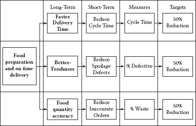
Figure 9.26 shows a completed plan-development tree diagram, showing how one element of a Total Quality Management (TQM) improvement plan might look.
Additional Reading
Eiga, T., R. Futami, H. Miyawama, and Y. Nayatani. The Seven New QC Tools: Practical Applications for Managers (New York: Quality Resources, 1994).
King, Bob. The Seven Management Tools (Methuen, MA: Goal/QPC, 1989).
Mizuno, Shigeru (ed.). Management for Quality Improvement: The 7 New QC Tools (Portland, OR: Productivity Press, 1988).
VALUE STREAM MAPPING
Just the Facts
The process starts with creating a flowchart of the existing process and then identifying areas in the process that cause delays in the continuous flow of information or product. These areas are assessed and plans are put in place to eliminate these areas of waste.
Implementation involves the following steps:
- Identify the process to be evaluated.
- Construct a flowchart of the current process (current state value stream map) to identify:
- Current steps
- Delays
- Information flows required:
− Raw materials
− Design flow
− Handling
− Storage
- Evaluate the current state value stream map flow to eliminate waste.
- Construct a future state value stream map.
- Implement plans to move toward the future state process flow.
Example
Symbols have been developed to help in the process evaluation. An example from www.valuebasedmanagement.net/methods_value_stream_mapping.html appears in Figure 9.27. An example of a current and future state value stream map from the same source is seen in Figure 9.28.

Value stream map example.

Current state and future state value stream map.
Additional Reading
Rother, Mike, and John Shook. Learning to See: Value-Stream Mapping to Create Value and Eliminate Muda (Cambridge, Ma: Lean Enterprise Institute, 1999).
Shingo, Shigeo. Quick Changeover for Operators Learning Package: A Revolution in Manufacturing: The SMED System (New York: Productivity Press, 1985).