
Chapter 8. Gathering Feedback
“Millions saw the apple fall, but Newton was the one who asked why.”
It’s time to go out into the world and find out what users really think about the applications we make for them. We need to ask detailed questions and open ourselves to criticism that may be difficult to hear. We have to observe users and document our findings in order to gain an overall understanding of what works and what doesn’t.
Receiving criticism is not fun. If anyone has told you they enjoy getting feedback on their work, that person is lying. Being told you missed something, made a mistake, or went in the wrong direction essentially means you’re not finished. It means you have more work to do. It means you’re not perfect.
I’m not going to tell you to enjoy criticism. I’m not going to say you should shout with glee at the thought of redesigning an application or that you should do a happy dance when you realize you’ll have to recode a complex function.
The truth is that we all want to hit a home run. We want to show our new application to users, clients, friends, and family and be told we’ve nailed it: we got everything right, we’re done, and we did it all on version 1.0.
Here’s what I will suggest: we have to learn to be tolerant of feedback. The best developers I know have a desire to get things right, no matter the consequence. Above all else (sleep, money, or ego), they want to build the best application possible. They realize that receiving honest, quality feedback is the only way to get there, and here’s the kicker—they actually ask for this feedback. I didn’t say they enjoyed it, but they do value it. These developers get their applications into the hands of potential users as soon as possible. They ask them detailed questions and encourage them to be brutally honest. They survey the marketplace, look at their competitors, and revise their applications to ensure they provide competitive value.
I spend all my time and earn my livelihood from writing code; I absolutely love doing it. In my opinion, it’s the best part of building any application. The act of creating a functioning product from nothing is, to put it mildly, addicting. If you don’t have the desire to write code, it’s impossible for you to be a successful developer. How else could you muster the energy to spend a week trying to get an event trigger just right?
When I’m working inside code, I’m comfortable, and as odd as it sounds, it provides me the least resistance. I can plunk away at keys and become hyper-focused on getting features to work. The problem with this approach is I never stop to consider, “Do users even want this feature?” I know I should spend time with my users first, and I know I should be asking questions and creating a plan of action. Instead, I end up saying things like, “I just want to see if [programming challenge] is possible first.” I tell myself, time and again, that I’ll go back to a more structured software development process as soon as I get [programming challenge] working. When I do this, I set myself up for failure.
I often remind myself that I’ll get to the code in due time, but before that, I need to get some questions answered. I need to gain a fundamental understanding of what I’m trying to build. Sure, I might have a general idea, but I need to make sure I’ve worked out the specifics. It’s impossible to effectively discover what my application is going to be while I’m writing it. If I want to be successful and create an application users are going to want to use, I have to be disciplined and patient.
If you’re currently working on an application, I challenge you to answer the following fundamental questions:
What problem does your application solve? What’s its core focus?
Who are the ideal users for your application? What are they like? Are they advanced users or novices?
What are your three must-have features? How do you know they are the most important?
How will your application provide value? How will it improve on what people are currently using?
If you can’t easily answer some of these questions, don’t fret. Most developers I know have a hard time with them. The truth is that if we’re only focused on getting features to work, it’s impossible to maintain perspective on the overall vision and purpose of our application. This is why I suggest developers embrace user-centered design, which is why I wrote this book! Only by allowing users to continually give us feedback can we test our assumptions and ensure we’re moving in the right direction.
However, it’s much more than just asking users to share their opinions. We have to be methodical, almost anthropological, in our study. We need to ask our users for input and observe their behaviors. This way, we can learn from what they’re telling us and catch the things they’re not.
Let’s take a look at some tools we can use to collect feedback and observe our users effectively.
How Many Users Will I Need?
First, you might be asking yourself how many study subjects you should have to produce meaningful feedback. As with any great question, the answer is that it depends. It really depends on what you’re trying to achieve and what value you plan to put on the results.
In some cases, I’ll start out with some pretty informal questioning. I might ask only a handful of people some questions about their needs in a particular problem space. I realize that their feedback might not be representative of the larger user base, so I take that into context when reviewing their responses.
I would argue that the mix far outweighs the quantity. In other words, get information from a diverse set of people. Developers often seek feedback amongst their peers. There’s nothing wrong with that, but we have to realize that our developer friends tend to evaluate our work from a technical perspective. Obviously, if the target audience for your application is developers, then it makes sense to capture feedback from developers at all ranges of experience.
If I’m building an application for nursing managers to organize staffing for each shift, I’ll want to gather feedback from a mixture of people involved with the nurse staffing process. I might survey nurse managers, registered nurses, licensed nurses, nursing directors, and unit coordinators. This could be a group as few as 5 or as many as 30. It just depends on how many resources I have available to me. It wouldn’t make sense to test the application with my developer colleagues. They may provide some useful feedback, but it would be lacking the real-world knowledge of a nursing professional.
How you recruit your subjects can also affect the legitimacy of your sample. Let’s say you’re building a website for seniors to help them learn about their health benefits. You want to know how comfortable seniors are with using the Web, so you send out a survey via email. By sending an email survey you may be targeting the wrong group. Sure, they might be in the desired age range, but the fact that they’re using email might put them in a particular group, namely people who are comfortable using computers. To ensure we’re getting feedback from a diverse group of seniors, we might consider sending an email and printed survey. This way, our design decisions will be based on seniors who are comfortable and not so comfortable using computers.
Many studies have been done to discover the magic number of people that makes a sample statistically viable. While there is some industry debate on this issue, renowned usability expert Jakob Nielsen believes that you can achieve the best results with a minimum of five users. He states that a majority of usability errors will be discovered by the first five users and little is learned after that, as shown in Figure 8-1. Therefore, studying more than five users doesn’t add additional value. If anything, it makes the study more complex and unmanageable
Think of when you order a pizza. The first slice is always the best because it provides you the most enjoyment. If you were hungry, you might be willing to pay $5 for it. The sixth (if you can eat as much pizza as I can) is simply not as enjoyable, and the chances are that you would be less willing to pay $5 for it. Therefore, the sixth slice of pizza is just not as valuable as the first.
Nielsen suggests that adding users to your study has the same effect. Adding more users just increases the complexity of the study and doesn’t really offer as much value as the first five.

So, with all of that said, I think if you can gather between 5 to 10 subjects to observe while using your application, you’ll discover some meaningful insight into what could be improved.
Notice the graph in Figure 8-1. If you don’t study a single subject, you can expect to discover zero usability problems. That number seems to be the most guaranteed.
Surveys
One way to get direct user feedback is by creating and collecting surveys. Surveys can be a powerful tool in reaching a broad spectrum of people in a short amount of time. There are plenty of websites and online tools to help you prepare and distribute surveys (SurveyMonkey is one that I’ve used on many occasions).
Creating a valid and reliable survey is an art form. It really is! Not only do you have to know what questions to ask, but you also have to ask them in a way that gives you useful feedback. Having clear, concise, and impartial questions, as well as selecting the right group of people, is the key to a successful survey.
My personal preference for the style of survey questions is to use the Likert scale. Named after the scale’s creator, Dr. Rensis Likert, it features a range of responses for each question. Here’s an example:
This book has helped me improve my application-development skills.
Strongly Agree
Agree
Neither Agree nor Disagree
Disagree
Strongly Disagree
By providing a range of responses, Likert scales help you gain greater insight into how much a respondent agrees with a particular statement. This can be valuable when dealing with fence sitters, users who tell you everything is good when prompted for their opinion.
These types of ranges help respondents by structuring their answers and guiding them in qualifying their opinion. With Likert scales, you can cover a variety of response types:
- Frequency
Always, Frequently, Sometimes, and Never
- Importance
Very Important, Important, Somewhat Important, and Not at All Important
- Value:
Very High, High, Medium, Low, and Very Low
- Satisfaction
Completely Satisfied, Satisfied, Neutral, Dissatisfied, and Completely Dissatisfied
- Ranking
5, 4, 3, 2, and 1
However, one downside to Likert scales is the potential for acquiescence bias, which is the tendency for respondents to agree with statements because it feels less confrontational or takes less effort. Often times you’ll conduct a survey only to find that you have a bunch of users who are in complete agreement with what you’re stating. That’s not very useful information if you’re trying to decide which feature you should spend your time on.
If you’re concerned about agreement bias, you can always employ top box scoring in your calculations. With top box, you only consider those values that are the best or most desired.
For example, if you were asking users about the importance of having spellcheck in your application, you would only count those that marked Very Important and divide that number by the total number of respondents. This may seem extreme, but it will help you understand just how desired a particular feature is.
If you choose to use Likert scales, try your best to ask questions using clear and neutral language. The more difficult the question is to process—or the more extreme the statement—the more likely respondents will answer in a way that does not reflect their intentions.
For example, a question like this is too positively leaning:
The messaging feature in IT Works is useful.
Strongly Agree
Agree
Neither Agree nor Disagree
Disagree
Strongly Disagree
At first glance, it seems like we’re trying to understand the usefulness of the messaging feature in IT Works. This question is understandable, but the formatting could lead to responses that are less viable. For example, what if users believe the messaging feature is valuable because in training they were told it was? We might mistake users’ perception of value as an indication of how much they use the messaging feature.
A way we might fix this is by asking the question using the frequency scale:
I use the messaging feature in IT Works:
Throughout the day
A few times a week
A few times a month
Almost never
Never
By phrasing the question this way, we’re getting to the heart of what we want to know. If we want to know how useful the messaging feature is, we should be asking how often it’s used.
In order to improve readability in my surveys, I like to pick one or two Likert scales and stick with them. For instance, if I choose to use a frequency scale twice, I’m going to make sure the range of responses is the same. I also prefer to limit the range of responses to no more than five, and I make sure they are easy to decode. I don’t want users intending to agree with a statement and accidentally disagreeing. By making statements brief and providing consistency in my choices of response, I allow respondents to quickly assess and complete my surveys.
Also, by mixing up your statements to reflect both positive and negative language, you’ll cause respondents to pause and consider their responses. Do your best to strike an equal balance. A consistent survey is easy to read and understand, but with a dash of inconsistency it will keep respondents on their toes and engaged in the questioning.
You can collect open-ended answers, such as essay questions, but I find that many subjects don’t want to take the time to complete them. Additionally, spelling errors, fragmented sentences, and unclear statements end up providing very little value. Like everything else, the use of essay questions will likely depend on the audience you’re surveying.
Conducting Interviews
While surveys can reach a large audience with little effort, they only give you a broad understanding of your users’ needs. No matter how careful you are with your survey process, it can still feel like you’re making assumptions based on the results. While interviews are time intensive and reach a smaller audience, they offer more detailed information. Conducting interviews ensures that you capture the intent of the user’s remarks. You can clarify misunderstood questions and pick up on nonverbal cues like body language and tone.
For the most part, there are three types of interviews: structured, unstructured, and contextual. They’re also known respectively as formal interviews, informal interviews, and contextual inquiries. All three approaches have their pros and cons, but they all share the value of direct interaction. The differences between structured and unstructured interviews are minimal; however, contextual interviews are a bit different. It doesn’t necessarily have to be an either/or. You can choose to use each method at different stages in your application’s development.
When you begin researching your application, you might choose to conduct unstructured interviews to explore the problem space. Unstructured interviews allow for a more open dialog that’s fitting for this type of exploration. The key to unstructured interviews is the level of informality. Not structuring your interview allows free-form ideas to emerge because you’re having an open discussion about the problem space.
That’s not to say that your discussion should be random. It’s just less focused on formalities and consistency. Unstructured interviews are useful when you really don’t know what questions to ask. Perhaps you have an idea for an application but haven’t decided on any specific features yet. The goal of unstructured interviews is to talk to as many people as you can about the problem you’re trying to solve.
Unstructured interviews allow for normal conversation. By asking users about the problem space and letting them speak freely, you’ll be surprised by the insight you gain. It’s quite possible that they’ll mention an issue you were unaware of or a workaround they use that ends up being a differentiating feature in your application.
Opposite of the unstructured interview is the structured interview. While unstructured interviews encourage freedom and exploration, structured interviews value consistency. Typically, structured interviews are conducted using a script. Each user is asked the same questions in the same tone and in the same order, and their responses are carefully documented.
This level of formality is best when you need answers to specific questions. For instance, let’s say you want to know how users feel about a new navigational menu in your application. In a structured interview, you can ask specific questions about the menu and make design decisions based on direct user feedback. Typically, structured interviews have a tendency to be quicker because you already know what questions you’d like to have answered.
If you plan to conduct structured interviews, I encourage you to commit to it. Prepare a script ahead of time and do your best to read from it consistently with each user. Focus only on the script and do your best to avoid distractions or side conversations. This will allow you to compare each user’s response equally.
Much like structured and unstructured interviews, contextual inquiries require that you ask a series of questions. However, the process is much more intimate because you immerse yourself in the user’s environment. Rather than holding interviews in a conference room or over the phone, the focus of a contextual inquiry is to ensure that you engage users in the environment where they’ll be using your application. This type of study allows you to come in contact with the environmental factors that might affect your users’ ability to use your application. These factors, such as lighting, noise, and ergonomics, can be wide reaching yet powerful in their effect on users’ overall experience. Some users take these factors for granted and would never think to bring them up in an interview over the phone or in your office. Sometimes, it pays to go where your application is or will be used and see for yourself.
For an example, let’s go back to my visitor directory application discussed in Chapter 3.
The visitor directory was a touch-based system, and to give proper feedback, I spent weeks crafting the perfect audible tone that would indicate an item had been pressed. I tried several tones and labored over finding the perfect pitch. One was too high and another too low. I even played around with creating my own tone using a synthesizer. It took forever to find a sound that I was happy with.
When I finally found an appropriate tone and finished the project, I installed the kiosk in the hospital’s front lobby. It was then that I realized I had made a fundamental mistake.
Roughly 15 feet from the kiosk’s location was a water fountain. With the sound of running water so close, you couldn’t hear my application’s auditory feedback!
I also realized that because you couldn’t hear the tones, my visual feedback wasn’t significant. You could barely see the button change color when it was pressed. Therefore, I had to make the color brighter to ensure that users could acknowledge the input, regardless if they heard the tone or not. The water fountain, although wonderful to look at, had dramatically affected the ability for visitors to use my application.
I also ramped up the volume of the tone so it could be heard over the fountain. That was a mistake. I discovered later that the volunteers who worked at the front lobby would often unplug the speakers. When I asked them why they were doing this, they said that the sound was too noisy and obnoxious when they were speaking to visitors.
The point of this story is if I had taken the time to explore the hospital’s front lobby by conducting a contextual inquiry, I would’ve been tipped off to these environmental factors. I would’ve realized that the noise from the water fountain would impact the user’s ability to receive appropriate feedback from my design. I would’ve also realized there was a limit to how loud my application could be before I started to annoy the staff.
Additionally, if I had conducted a focus group with visitors in a conference room, I would not expect any of them to bring up an issue with the water fountain. Instead, we would’ve spent time discussing features they would’ve liked to have in a directory. By not spending time in the environment where the visitor directory was going to be used, I missed key insights.
As they say, hindsight is 20/20. When I placed the kiosk in the front lobby, it was clear to everyone that there wasn’t enough visual or audible feedback. However, when I tested the application in my quiet office, there was no way for me to know that visual and auditory feedback would be an issue. I could have chosen to beat myself up about it, but it’s impossible to foresee all the variables that affect a user’s experience with an application.
That’s why it’s important to engage in activities like contextual inquiries and user interviews. With each aspect of the user-centered design model, I broaden my window of understanding.
This requires that we get up from our desks, ask questions, walk around the environment, and explore the problem space for ourselves.
Task Analysis
There are two more types of analysis you can use to assess the effectiveness of your application, task analysis and heuristic evaluation
Task analysis is the study of each step for a given task. The point of this type of analysis is to fully understand all the steps required to complete a task to improve the process with our application. In Chapter 4, we talked about the usefulness of workflow diagrams. Task analysis is a great way to generate these types of models.
Unlike a contextual inquiry, it’s not necessary to observe users as they engage in their task, although I would definitely recommend it. With task analysis, it’s possible to gain understanding about a task simply by asking questions or reading a procedural manual.
The challenge of walking through a task analysis with users is that they often want to describe all the aspects of the task all at once. If you’re not careful, your analysis will be marred with confusing steps that are out of sequence. Users do not always have the ability to explain the tasks they perform. All too often, they’ll provide insignificant details or leave out critical steps. It’s not their fault. They don’t know that developers think in terms of loops and conditional statements. They don’t understand that we’re thinking about the task and trying to apply 1s and 0s to it.
Because of this, I like to use scenario-based questioning to get the story of the task. At the hospital my questioning will often sound like this:
Okay, let’s rewind. Say I got my arm lopped off and I just walked into the ER. What happens next?
It’s a gruesome image—and provides a little comic relief—but it also helps users walk through a task and take it one step at a time. I also make sure to stop them if they get ahead of themselves and ask them to explain acronyms or industry terms.
Additionally, it’s critical that you repeat your understanding to users. Often, it will sound something like this:
So let me make sure I’ve got what you’re saying. You said that your first step is to go over to the scanner, then you bring up the scanning application on the computer, then you...
It’s amazing how easily we misinterpret what users explain to us. Only by repeating my perceptions can I make sure I’ve received their explanations correctly.
Heuristic Evaluation
Rather than focusing on a particular task, heuristic evaluation is the process of examining applications against a set of rules or guidelines. Pioneered by Jakob Nielsen, heuristic evaluations can occur with or without the user present. It’s almost like the process of editing a written work, but instead of evaluating grammar and spelling guidelines, you’re evaluating your application’s effectiveness based on industry standards or principles.
There are a lot of resources available to give you guidance. For instance, Microsoft, Google, and Apple all have fairly strict guidelines for the design of applications on their platforms. These guidelines can help you understand what your application should and should not do. I’ve seen design guidelines that are very specific, right down to the pixel. They give you guidance on the position of user interface (UI) elements, use of animations, load times, terminology, and various other instructions.
For example, if users know that the Share button in iOS applications is used for sharing content via email, social networks, and other services, it would be unwise to create your own sharing mechanism that users would have to learn. In some cases, companies will actually reject the submission of your application if these guidelines aren’t met. Software companies enforce these standards because they want to ensure their users have a consistent experience among applications. Therefore, it can be costly to not understand the guidelines of the development platform you are using.
The more familiar you become with the rules of the framework’s design, the easier it will be for you to spot inconsistencies.
Storyboarding
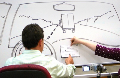
Another way to get feedback early in the design process is by storyboarding, the practice of sketching an experience point by point. Storyboarding is often used in Hollywood to plan the steps of a movie scene.
Like sketching, storyboarding can seem intimidating, but I can’t make this point enough: you don’t need to be an artist to engage in storyboarding. If you can draw basic shapes or lines, then that’s all you’ll need. See Figure 8-2 for an example. The point of storyboarding is not to create amazingly artistic experiences. It’s to begin formulating the progression of your application in a visual way. If you only know how to draw stick figures, then draw the entire process with stick figures!
Spend time thinking: “First, users will do this, then they’re going to do this, then...” Unlike a dataflow or workflow diagram, storyboarding is far more visual. Your storyboards should include early sketches of UI elements. Also think about the layout and design of your application and how it will respond to users as they navigate your application: What does that look like? What screens might they see? Are there animations to cue them into the progression from one screen to another?
I’ve heard some folks refer to this process as pseudocoding, and in a way that makes sense. It’s a way for us to start to code without actually writing in a coding language. Instead, we’re using a visual language. It prepares us for all the possibilities and functionality that we will be required to code. With storyboarding, we get a 50,000-foot view of the application and we’re left with a much clearer roadmap for where we’re headed.
Storyboarding leads you to make early decisions about your application’s layout and process. You’ll begin to realize what concepts will and will not be necessary for a good user experience. Show your storyboards to your users and make sure the workflow meets their needs. This is a great way to root out any miscommunication and avoid costly design mistakes.
It may be tempting to use a software design tool for your storyboards. I’d argue against that. With storyboarding, the pen and paper are your best friends. With applications like Adobe Photoshop and QuarkXPress, you run the risk of focusing on the quality of the storyboard and not the quality of the user experience.
Storyboards can help you turn your development into a story, just like we learned from FiftyThree’s narrative-based design process for Paper. Storyboarding helps you explore each step of your application and evaluate your design.
Try taking one of your application’s workflows and creating a storyboard around it. How many steps are required? What screens are displayed? How does the user react to them? Is there any way to eliminate or combine screens to make the process easier?
Using Prototypes
Prototyping is the process of building low- or high-quality mockups of your application’s design to have something tangible to test with users. Prototyping is a powerful way to help your users visualize what you intend to deliver through your application.
There is an incredible benefit that comes from seeing your early ideas take shape. Although prototypes can take time up front, they can save you hours of building something that ultimately doesn’t work. They are a way to assess the visual design of your application without making a significant programming investment.
When you make the mistake of approaching your design from code, you’re more apt to find solutions that are best for your code and not for the user experience. Prototyping frees you from thinking about the coding challenges and focuses you on the user’s interaction with your application.
However, there is a danger in prototyping for us code-hungry developers. Prototyping can closely mimic the actual building of the application and can easily get out of hand.
Developer and designer Billy Hollis has a great way to know if your prototype has reached that point:
If you’ve got unit testing in your prototype, you’re doing it wrong.
That’s not to suggest that pursuing a high-fidelity prototype is without merit. In some cases, software developers craft a semi-functional prototype that will eventually turn into the finished product.
The problem is that developers make the mistake of focusing on the prototype. They use it as a way to suggest they are testing the design; but in reality, they’re just writing code. Additionally, developers may choose to build their prototype in their native development tool. I feel strongly that if you’re building a prototype using your development tools (e.g., Microsoft Visual Studio, XCode, or some other popular integrated development environment) the temptation to submerge yourself in code becomes even greater.
There are other solutions (see Chapter 11) that are better designed for building functional prototypes. These software products give you the proper tools to ensure you’re focusing on the right elements of your prototype. They make it easy to quickly adjust your layout, and they limit your ability to delve into elaborate programming. This keeps your focus away from code and instead on the application’s visual and interactive design.
When considering the quality of your prototype, think about the perception the user will have about what development stage the application is in. The higher the fidelity or richness of the prototype can have implications on the type of feedback you’ll receive from users.
For instance, if you place a polished prototype in front of a user and ask her to evaluate it, don’t be surprised if she offers you little substantial insight. It’s because the more functionality and design your prototype provides, the more likely she’ll believe that it’s near completion. No sense in providing feedback at this point—it looks like you’re almost done!
She may not question some of the fundamental assertions you’ve made. She may have the misunderstanding that they’ve already been decided. Therefore, she’ll only give you feedback on minor details.
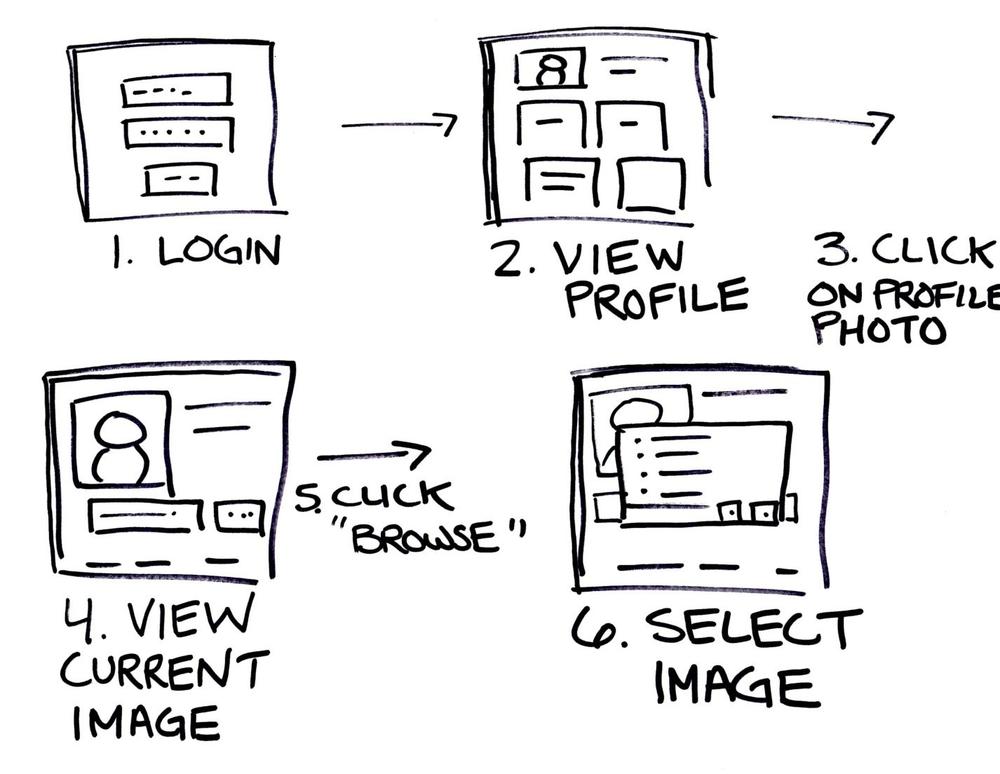
However, if you place a low-fidelity prototype like the one shown in Figure 8-3 in front of her, the impression is that very little commitment has been made to the overall design. She’ll feel more emboldened to question functionality and core concepts.
Likewise, you are more willing to accept feedback when you’ve invested less time building your prototype. If a user tells you that you’ve missed a critical screen in your prototype, and you’ve only drawn it on paper, that’s no problem! You’ll just grab a new piece of paper, and in minutes, you’ve reorganized your prototype to explore that need. You’ll spend less time defending your work and more time constructively working with the user—and that’s exactly what you want to be doing.
When users don’t know what they need, it’s common to find yourself with what I call The Commissioned Artist Syndrome. This happens when you get caught in a cycle in which you’re constantly presenting options.
You show them the application workflow. They don’t like it. They can’t tell you why they don’t like it, so they say, “Try using fewer screens.”
You go back to your office, labor for a few days, and come back with the application re-designed with a new workflow. They don’t like that either. They suggest, “A couple more screens might make it better.”
Every developer dreads this process, and I would argue that it’s the main reason we shy away from getting users involved. No one wants to build something by committee, so we allow users to get involved but severely limit the scope of what they can help us with.
We build an almost finished prototype and ask users about small minute features. By limiting their choice, we’ve effectively limited their involvement. It’s phantom user-centered design. It’s more lip service than reality. Hollis explains how we make this mistake:
You’ve asked users for help—they’re gonna give you help. But you didn’t give them any room to give you help. You didn’t give them any choices. You didn’t give them any place to exert significant value judgment about what you’re doing. You gave them this very narrow tunnel to be in and said, “Now, give me help in that small, confined space!”
Our job is to come up with choices and show the user possibilities. We do this to help them explore and communicate what they’re looking for. The bottom line is that users can’t do this effectively without seeing and visualizing multiple options or possibilities. We have to challenge ourselves to place different concepts and ideas in front of our users so we can drive to the core of what they need.
One strategy I employ is to put a challenging mockup in front of my users. Perhaps it’s something that I know is radically different from what they’d be comfortable with. I’m not expecting them to love the design. In fact I’m hoping they hate it! I find users tend to be more articulate explaining what they don’t like.
By listening to them list what they don’t like, I can drill down to the heart of what my users need. It’s a great strategy when you have fence sitters who can’t seem to decide what they want. Try showing them a prototype that they’re not expecting, and if they don’t like it, ask why. You may be surprised how many design decisions can be made this way.
If you want to get your users out of the minutia of picking apart small details in your application, give them larger details to critique. Get them involved early and let them give you suggestions about the big stuff. Not only will you protect yourself from heading in the wrong direction, but your users will also feel more invested in the finished product.
A/B Testing
Even with viable data from direct user feedback, it may still be difficult to make a definitive design decision. Perhaps you’re laboring over the old, “Should we go with this? Or should we go with that?” decision. In situations where both design decisions have merit or positive responses from users, you may consider conducting an A/B test.
A/B testing is the practice of testing users on two different designs and letting the data make the decision.
Let’s say you’re trying to decide where to display the Buy Now button on your product pages. Some people on your team think it should be directly below the product’s picture, and others think that it should be placed beneath the product’s description. Both seem like good ideas.
In this case, your A/B test would provide two different product pages for two separate groups of users. It would be a blind study because users would be unaware that there are actually two different experiences when purchasing a product.
In an A/B test, the winning design might be the configuration that causes users to click the Buy Now button more often. Essentially, we’ve relegated the design decision to a data decision. We’re having users decide with their mouse-clicks which method is the most appropriate.
I guarantee that if you spend any amount of time on the Internet, you’ve participated in this type of A/B testing. Microsoft’s Bing search service, for instance, uses A/B testing quite often. It’s my default search engine, and many times I’ve noticed little changes here and there. Once I noticed that Bing changed the Search button from a magnifying glass to a button that read “Search,” similar to the illustration shown in Figure 8-4. Later that day, it was switched back to the magnifying glass. Granted, the change was subtle, but now that I’m aware of A/B testing practices, I tend to pick up on those changes. Be observant and you may notice your favorite websites doing this, too!

While A/B testing can be a great method to reach design decisions, it should be used in moderation. It can be easy to get into the practice of creating an A/B test for every facet of your application. By relying solely on data to make decisions, you focus less on understanding your users’ behaviors.
Jeff Atwood, author of the blog Coding Horror, likens the challenges of A/B testing to the movie Groundhog Day. The movie, if you’re unfamiliar with it, stars Bill Murray as a meteorologist named Phil who inexplicably ends up repeating the same day over and over. Phil uses this weird circumstance to go on thousands of dates with Rita, the woman he’s fallen in love with. Much like A/B testing, with each date, Phil captures tiny details of Rita’s likes and dislikes and makes different choices in every subsequent date. Over time, Phil uses all the data he’s collected to create a seemingly perfect date. When Rita still doesn’t fall in love with Phil, we realize that his idea just doesn’t work.
Atwood explains:
Phil wasn’t making these choices because he honestly believed in them. He was making these choices because he wanted a specific outcome—winning over Rita—and the experimental data told him which path he should take. Although the date was technically perfect, it didn’t ring true to Rita, and that made all the difference.
If you plan to try A/B testing, be mindful to not focus on irrelevant details. It’s OK to test minutiae, but make sure you’re considering the bigger picture as well.
Also note that proper A/B testing can require a large sample size to gather meaningful data.
In addition, the success of A/B testing relies on your ability to choose the right indicators. For example, if you’re judging the success of your site’s design by the color of a shopping cart icon, you may be missing more meaningful criteria, such as the ability for shoppers to find what items to buy.