
In this chapter and the appendices, we put all previous chapters to practical use. We intend to take everything that you have learned throughout the book and give you real-life examples that you can modify for your own use. While we do not intend to dictate your processes and how you should build your own guidelines, we will provide you with templates you can use for discussions within your team to build your own. We will also go through the process of making a framework from start to finish that you can then adapt to the needs of your website.
In Appendices 1, 2, 3, and 4, you will find an example CSS Coding Standards document, an example Accessibility Guidelines document, an example Browser Support Guidelines document, and an example Development Process document, respectively.
In this chapter you will learn the following:
How to deconstruct a design into assets and templates for a site
Which factors to consider when creating a CSS framework
How to document a CSS library of design assets
Let us introduce you to the design of the fictitious Igloo Refrigerator Parts Inc. company. Here you are shown the homepage (see Figure 11-1) and an interior top-level section page (see Figure 11-2), as provided by the design team.


The design team has made an effort to create a design that is in line with the business needs and goals, making sure that the user experience and interaction is as clear and simple as possible, that the message is conveyed seamlessly, and that the user completes his journey happily.
As often happens in large organizations, many stakeholders have probably had a say into how the design should look, or what content should be included in certain areas of the website. Knowing that several people with different responsibilities and objectives have had influence in this outcome, it is the job of the CSS author and developers in general to make sure that what has been created is feasible, that it is coded as cleanly as possible, and that everything is built so that you end up with a final product that is not only usable and accessible, but that is also maintainable.
The next step is to analyze this design and see whether there are any issues that we might have to resolve before moving on to building it.
When analyzing a design before building it, there are certain important questions that should always be answered:
What is (and is not) acceptable to appear differently in different browsers?
What issues might you encounter when implementing the solution?
What other questions do you need to discuss with the designers that might become larger problems if left unaddressed?
After answering these questions, a good exercise is to identify common elements that are used across the pages (this might have already been done by the design team if a design library is in place; you can read more about design libraries in Chapter 5). This will make it easier for you to avoid redundancy in your code: if you notice a component is being used repeatedly, in different locations of the page, you will know that you should not make the CSS for it too specific so that you can allow for it to be reused. If you notice another component has two (needed) variations, you will know that you should create base CSS for the default state of the component, which can then be easily extended with another class (as inspired by Object Oriented CSS (OOCSS), which you can read more about in Chapter 4).
In answer to the first question, after a discussion with the designers, you have been told that it is not acceptable for the logo to look different cross-browser.
As for the second half of that question, it is acceptable for the following elements to look different cross-browser (but as similar as possible for browsers with level A support):
Rounded corners on boxes
Drop shadows on buttons
Drop shadows on text
Some of the concerns and queries that your team has raised with the solution are the following:
How will the text on the homepage's banner be handled? It is using Futura Condensed, which is not a web-safe font, and is only available via
font-facethrough web font services (see Chapter 5 for more details on these).The design does not provide hover states for the navigation items or links. You will need to feed this back to the design team so that together you can reach a solution.
An example of a question that you should pose within your own team is whether or not it is acceptable to use advanced selectors (such as the :nth-child() selector) to remove margins and borders on first/last elements. Is the performance hit that comes with advanced selectors worth it? Should you go with the simpler solution of targeting these elements via a class? And if you do use advanced selectors, will you be providing a JavaScript fallback for browsers that do not support them?
This last question should also be consulted with the design team because if you do not supply a fallback, some browsers will display a different design. Remember to explain the pros and cons of the proposed solution not only to developers but also to the business, as the designers will prefer to have the solution implemented as similar as possible to their original artwork, regardless of whether you will have more work implementing it.
The underlying grid of the design should be specified in the Design Guidelines, and is not something that the front-end developer will usually create. Being aware of this grid, at least at a basic level, will make it easier to build the CSS and will make your results more accurate. Grids are covered in more detail in Chapter 5.
In our example website, the grid is based on the Blueprint default grid, which is composed of 24 columns, with 30 pixels width and 10 pixel-wide gutters (see Figure 11-3). Knowing this, you will know that if an element spans 4 columns, it will be 150 pixels wide (this result is achieved by adding 4*30px, the width of the columns, to 3*10px, the width of the gutters).

As mentioned previously, it is important to identify reusable blocks before starting to write the markup and CSS. And this is especially important if there isn't a design library or component library set in place that you can follow.
In the two pages you have been provided, you have identified seven different boxes or content blocks that will be reused throughout the various different pages of the website (see Figure 11-4):
Rounded pale ("Contact")
Rounded with background image ("About")
Gradient with links list ("Services")
Call-to-action banner ("Book an engineer")
Search
Table
Pale with 3 columns ("Press")

This list gives you a bird's-eye view of the design and an important outline for you to use as you start your work. It also makes it easy to detect blocks and elements that are very similar and that can be merged into one single module so the CSS and the designs can be further simplified. In the case of our example, on the content page (refer to Figure 11-2), you can see that the first row of services boxes and the second row are very similar, except that the second row's headings are larger (see Figure 11-5).
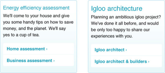
Figure 11-5. The only difference between the box on the left and the box on the right is the size of the headings
Ideally, the decision of making this a single box by homogenizing the heading sizes would not be made by the implementation team, but would have to be signed off by a designer. Still, it is important to be aware of these small variations that may creep into the designs and make them more complex (the design team and brand manager will also be looking out for them as part of their roles). It is unlikely that the variations in your case are as simple as the previous example, but it is important that you be aware that sometimes the design solution can and should be changed to keep both design and code simple.
The design presents us with ten colors used frequently throughout:
Main text
Help text (search)
Unvisited links
Navigation background
Navigation selected
Boxes backgrounds (blue and yellow)
Dotted lines
Gradient box border
Table background
There are also four gradients used: on the box with links list, on the buttons, on the table headings, and on the footer background.
Other colors are used (for example, on the Awards promotional banner), but they are mainly one-offs that should not clutter the basic color palette.
While analyzing the colors used, make sure you have the correct values necessary to work with by either talking directly to the design team or consulting your organization's design guidelines. It is important that, for example, whenever you are dealing with simple text, you use the same correct color rather than ending up with 12 different very similar (and incorrect) variations.
Ideally, the designer or design team will have tested the designs so that the color combinations provide enough contrast for colorblind users. In the Accessibility Guidelines (see Appendix 2), it is recommended that the designs are tested with a tool such as Color Oracle, which provides a quick and easy way of simulating what a colorblind user would see.
Foreground and background colors should have also been tested using a contrast checker, such as Jonathan Snook's Colour Contrast Check (again, mentioned in the Accessibility Guidelines).
A quick analysis of the design surfaced one issue: the contrast between the text on the footer and the background does not appear to be sufficient. In cases such as this, if the suspicions prove to be correct, you can discuss the best solution with the design team: perhaps simply changing the text color to white would solve it.
For now, we are analyzing possible complications based on only the design at hand. Other accessibility considerations should have been discussed while developing this design solution, and others can only be addressed while creating the code.
If there are accessibility concerns that you can spot immediately, it is better to solve them before getting hands-on with the code.
It is easy for developers to feel completely separate from designers and for communication to be kept to a minimum. This is not ideal. Both designers and developers are working toward the same goal: having a great website that people will feel compelled to visit and use and that will help the company achieve its goals. While developers might not feel comfortable advising designers on design, it is reasonable to ask from a diligent CSS author that he feeds back, advises, and even educates not only designers but also everyone involved in the creation of a website on best practices, standards, and the implications of doing things a certain way. This is not a one-way street: the same diligent developer should be open to new ideas brought by other sections of the business and should strive to find solutions to problems that might not necessarily be easy to solve in code but that are ultimately best for the users.
One type of element that tends to spark confusion is the headings, so they are a good example of how communication between people who make the designs and people who build the pages is so crucial. If a designer keeps in mind that the heading level used in a particular situation is not dependent on how large we want the type to be, but rather on the actual hierarchy of the content, it will be easier for him to develop a solution in which headings (and their sizes and scales relative to their position on the page) are better thought through and more carefully considered.
After the important step of analyzing the overall design, it is time to start creating the HTML and CSS for the website. As this book focuses on the CSS side of things, we assume you will be following web standards and making your markup accessible, and (as much as is possible) clean and semantic. Remember: clean and efficient CSS can only come from clean and efficient markup, although it is in the moments of difficulty, where more complicated and messy puzzles need to be solved, that true expertise comes to light. If you head to this book's accompanying website at http://procssforhightrafficwebsites.com, you can inspect its markup at will.
We will continue to use the Igloo Refrigerator Parts Inc. website as our example. Even though it isn't an overly complex website, we will provide you with tips on how to think about and write your CSS that can be applied to any website and process.
The main goals of this exercise are to discuss and amend the design; provide you and your team with CSS that will allow you to create more pages without the need to edit the CSS files (except on occasions where a different type of design element might need to be added to the library); and show you how to create efficient and maintainable code, and create and augment its associated design library.
The creation of the CSS for Igloo Refrigetor Parts Inc's website follows the organization's CSS Standards Guide (Appendix 1), CSS Accessibility Guidelines (Appendix 2), Browser Support Guidelines (Appendix 3), and Development Process (Appendix 4).
We will begin every CSS file with our charset declaration:
@charset "UTF-8";
This helps us avoid having to escape characters later, which saves characters and makes our code easier to read.
Following the CSS Standards Guide (see Appendix 1), we will use CSSDOC comments (see Chapter 2 for more details on CSSDOC) at the beginning—file comment—and for separating the sections of the style sheet—section comments. In the file comment, we will include a description of the style sheet and information about the project, the team who originally created the style sheet and copyright. We will also use this comment to include a list of main colors used throughout the CSS (as listed previously). Here is what this comment looks like:
/**
 * Igloo Refrigerator Parts Inc Corporate site
 *
 * Main CSS file for the IRP Inc's corporate site
 *
 * @project             IRP Inc Corporate
 * @author               Design Team at IRP Inc
 * @copyright            2011 Igloo Refrigerator Parts Inc
 *
 * @colordef            #333; main text
 * @colordef            #999; help text (search)
 * @colordef            #1299b4; unvisited links
 * @colordef            #cdf2f8; navigation background
 * @colordef            rgba(18,153,180,.2); navigation selected
 * @colordef            #a1e0e9; navigation selected fallback
 * @colordef            #e1f4f7; box background blue
 * @colordef            #fffbeb; box background yellow
 * @colordef            #cecac5; dotted lines
 * @colordef            #b0daea; gradient box border
 * @colordef            #fffbeb; table background
 */
Following the file comment, we will state whether this file has any dependencies. In our case, we will import a reset style sheet (reset.css), so we will include the following comment:
/**
 * Dependencies
 *
 * Importing reset file: reset.css
 */
Followed by the table of contents, for easier reference of the contents of the style sheet. Remember, it is more practical if this table of contents is succinct, so it doesn't have to be updated very often.
/**
 * Table of contents
 *
 * Structure
 * Generic typography and lists
 * Global elements
 * Links
 * Forms
 * Tables
 * Visual media
 * Components
 * Reusable
 * One-offs
 */
This structure is also an indication of which section comments we will need to include in the style sheet. It is a good idea, however, to already have a bare bones template, which should include an example file comment and the ideal structure of the CSS file, followed by the section comments. This will make it easier for developers creating new style sheets to start working. Here is an example of a section comment, where the description is optional:
/**
 * Reusable
 *
 * Modular classes that can be applied to other elements
 *
 * @section reusable
 */
Apart from introductory and sectioning comments, some of the most useful comments that you can add to your style sheets are the ones that explain why a certain action was taken. In our example, we have commented on every Internet Explorer filter used, so that future editors of the file know the reason for them. Here is an example:
#masthead {
        margin-top: −20px;
        *margin-top: 0; /* IE 7 and below: Navigation is partially hidden on IE 7 without this
property. */
padding-top: 20px; }
In this case, we needed to reverse the negative top margin property from the "masthead" section, so that its contents aren't cropped in IE 7. By adding the asterisk before the property name, only IE 7 and below will correctly parse the second property (you can read more about this in Chapter 3).
You might want to include a note on which CSS hacks are acceptable to use within the main style sheet in your CSS Standards Guide. Sometimes, when the number of hacks applied is small, it is more efficient and performant to not have these stains separated from the main CSS. You may argue that, in the future, if you want to remove these hacks this will make it a harder task, but it is unlikely that these simpler documented hacks will pose any problems if left untouched.
You can also (and, in fact, you should) mark up the hacks with a common language so they are easy to search for in the future. We will use "HACK_" and then details of the hack. Our updated code follows:
#masthead {
margin-top: −20px;
*margin-top: 0; /* HACK_IE_LTE_7: Navigation is partially hidden on IE 7 without this
property. */
padding-top: 20px;

}The exact syntax of this code is detailed in Appendix 3, and you can read more about commenting in Chapter 2.
In our CSS we will use a combination of relative and absolute units: ems for font sizes and pixels for other measurements. The reasoning behind this decision is that fonts sized in relative units can be resized in most browsers, but also using ems for values such as an element's width will make the whole layout expand, even when the user has set a preference for only resizing text.
To make the calculations simpler, we have included in the body element the property font-size: 62.5%. This will make the default browser font size 10 pixels (it is usually 16 pixels). Knowing this, we can then infer that 1 em equals 10 pixels, 1.1 em equals 11 pixels, and so on.
We want to start with a clean slate, so we will create a reset style sheet (you might want to call this "base.css" rather than "reset.css") that will make most HTML elements work similarly cross-browser by resetting some of the properties that tend to be less consistent (such as margins and padding). But we do not want to reset everything, so we will take advantage of some of the user agent style sheet defaults rather than adding those to our code later on (you can read more about user agent style sheets in Chapter 3).
Starting with Eric Meyer's reset style sheet (you can read more about this and other reset style sheets in Chapter 4), we will remove the following elements from the initial declaration: fieldset, dt, and dd. Despite the margins and padding on these elements being inconsistent in some browsers, they are good enough as a basic styling, and we know that, in this case, they will not be used often.
The next step is to customize the body selector, so that it meets our needs. In his original reset, Eric only applied line-height: 1 to the body element. In our case, we will need a bit more than that:
body {
        background: #fbfdfc url(i/bkg.jpg);
        color: #333;
        font-family: "Helvetica Neue", Helvetica, Arial, sans-serif;
        font-size: 62.5%;
        line-height: 1;
}
We will also add basic style for elements such as blockquote, ins and abbr. We will leave the default typography to the main style sheet, applying generic font-related properties only to the body element at this point.
Our website's design follows a simple two-column layout with a full-width header section at the top (which incorporates the navigation) and full-width footer at the bottom. The underlying grid (refer to Figure 11-3), as mentioned previously, is based on a 24-column layout, where each column is 30 pixels wide separated by 10 pixel-wide gutters. Container elements can span across 6, 9, 12, 18, and 24 columns.
Taking note of these measurements is a fairly simple but extremely important step in starting to build your framework. These are values that will emerge in your style sheets over and over again, so it is vital that you have the correct ones, rather than mere approximations.
The same applies to values such as margins and padding. In the case of our design, the standard box has a padding value of 14px 11px. It is unlikely that good designers would create solutions where, for example, list items present different bottom margins. Consistency is important, and consistency in the mockups will have to be translated into consistency in the code.
Let's begin to write our CSS. In the "Structure" section of our bare bones template, we will add the styles for the main content wrapper:
.wrapper {
        width: 950px;
        margin: auto;
}
We have used a class in this instance because we will be using this wrapper more than once per page. Because some of the areas of our design have a full-width background, with the content area centered in the middle, we will use this generic class to style inner container div or section elements, while keeping the main area wrapper full width. Here is the footer markup:
<footer>
        <div class="wrapper">
                <ul>
                        <li><a href="#">Help</a></li>
                        <li><a href="#">Terms of Service</a></li>
                        <li><a href="#">Privacy Policy</a></li>
                </ul>
                <p class="copy">© 2011 Igloo Refrigerator Parts Inc</p>
        </div>
</footer>
Following this generic class, we will add styles for the other main containers such as the top header element, the main (#main) and secondary column (#sec) areas, and the footer element. We will, however, leave the widths of the #main and #sec selectors for later...
Because we want our elements to be as flexible as possible, we will create accessory classes that can be appended to any container, giving it one of the possible widths we want to allow page builders to use. For these, we will use presentational classes. This is fine as long as there is a justification for it; in our case, how else would we name a class that means an element that spans across 6 columns other than "span-6" or "col-6"? If we had included the width per element (for example, a width for the "main" and "sec" container, and so on), we would not be providing enough flexibility for page creators—be they developers or content editors—to create new pages rapidly. If this is exacly what you need to achieve, then we advise you to not use these nonsemantic class names—this is a compromise that we are willing to accept for a higher level of flexibility. Here are the classes we will make available for container widths:
.span-6,
.span-9,
.span-12,
.span-18 {
        margin-right: 10px;
}
.span-6 {
        width: 230px;
}
.span-9 {
        width: 350px;
}
.span-12 {
        width: 470px;
}
.span-18 {
        width: 710px;
}
These classes follow the example that known frameworks set, in which every width selector also includes a right margin. When you need to have floated containers, you can use the classes "fRight" or "fLeft" (mentioned following). To remove the margin of the last container in a row, you will have to add the class "last" to it, which only contains the property margin-right: 0 (you can read more about reusable classes later in this chapter).
When building a generic and public framework, such as 960.gs or Blueprint (you can read more about these frameworks in Chapter 4), you need to make sure your code is catering for as many variations possible. When creating a custom framework, however, there is no need to go to such extremes. You know the design it will be used for, you know the possible variations, and you will probably even know what you don't want it to do. You can think of this framework as a tool that will allow you to create as many page variations as you need, no more and no fewer. Rather than being everything to everyone, this framework is exactly what is necessary, which means no wasted or unused code or bandwidth.
For our website, we will not need more than the container widths listed previously. In your particular case, you might want more complex variations.
After defining the main structural elements and creating reusable classes for varying layouts, we will add basic typographic styles for all the elements we need to cater for. The difference between this and the reset style sheet is that in this section only selectors with font-related properties are included.
By having a basic style for every element, you make sure content creators can build new pages that will always present at least the correct hierarchy of elements and follow the design guidelines. We will style all six heading levels (h1 to h6), paragraphs (p), list elements (li), definition lists (dt and dd), quotes (blockquote) and preformatted text (pre). The design has a very consistent heading hierarchy, so we know that even when some level headings are within specific containers they will have the same font-size, line-height, and margin values. There are some variations, but they should not be addressed in the default style section and should only be added at a component level, applying only the necessary changes and taking advantage of inheritance to make the variations minimal and avoid redundancy.
As we have mentioned previously, we will use ems to define the font-size values in our website, but we will use pixels to define heights, widths, margins, and padding. This will allow for font resizing even in older browsers, keeping the layout consistent and avoiding unwanted horizontal scrollbars.
Here is the style for the first three level of headings:
h1, h2, h3, h4, h5, h6 {
        font-weight: normal;
}
h1 {
        font-size: 2.4em;
        margin-bottom: 10px;
}
h2 {
        font-size: 1.8em;
        margin-bottom: 12px;
}
h3 {
        font-size: 1.5em;
        margin-bottom: 10px;
}
And here is the style for our paragraphs and list elements:
p, li, dt, dd {
        font-size: 1.3em;
        line-height: 1.4;
        margin-bottom: 12px;
}
The line-height value is unitless, so that it can adapt itself to the size of the text. In this case, the computed font-size value will be 13px, and the computed line-height value will be 18.2px (you can read more about computed values in Chapter 3). If the font size is increased, for example to 1.5em, the computed values will be 15px and 21px, respectively—the line-height value grows proportionaly with the font-size.
We have consciously left the ul, ol, and dl elements out of this basic styling: the default user agent style serves the needs of the design, so there is no need to reset these styles or override them.
You can go even further, by adding styles for headings that follow certain elements. For example:
p + h1,
p + h2,
p + h3,
p + h4,
p + h5,
p + h6 {
        margin-top: 24px;
}
The possibilities are endless: you can include styles for headings that follow certain list types or images, or for paragraphs that follow the same elements, or list types that follow certain heading levels, and so on.
For our website, we will also add styles for the p and cite elements when placed within a blockquote element:
blockquote p {
        font-size: 1.3em;
        font-style: italic;
        margin-bottom: 8px;
}
blockquote p:before {
        content: """;
}
blockquote p:after {
        content: """;
}
blockquote cite {
        display: block;
        font-size: 1.3em;
}
blockquote cite:before {
        content: "—";
}
The previous code should be self-explanatory. We have used the :before and :after pseudo-elements to add the quotation marks to the beginning and end of the paragraphs within the blockquote. Since we have already declared the charset of the file to be UTF-8, there was no need to escape these special characters. We did not use the CSS3 version of these pseudo-elements (::before and ::after, respectively) so that Internet Explorer 8 could understand them: we want to show the same design to as many browsers as possible.
We haven't included forms and table styles in this section for two reasons. Our form elements will inherit most of their styling from the user agent style sheet, with only some added styles for positioning and custom button design. Table styles can be quite involved on their own, so keeping a separate section in the style sheet where tables are treated as a special type of component can make this basic styles section cleaner and easier to scan and refer to.
You can read more about typographic considerations in Chapter 5.
After adding the basic styles, we will create the styles for the global elements. These are elements that are present on every (or almost every) page of the website. In our case, these are the header area, the main navigation, and the footer. For some, we will be required to override some of the basic styles we have created, as in the case of the navigation list:
nav ul {
        list-style: none;

}
nav li {
        display: inline;
        font-size: 1.4em;
        font-weight: bold;
        margin-top: −35px;
        margin-bottom: 0;
}
For the list items in the main navigation, we have had to override the default user agent list-style value, apply different margin values from the basic styles, and increase the font size. We will leave link styles for the "Links" section so that we have a centralized area where we can make sure all link states are being catered for. You do not have to follow this structure in your own style sheets, but our experience shows that having all the links in the same place makes it easier for different developers to find them in the document whenever they need to be edited or augmented.
Depending on the design at hand, this section may have more or fewer elements that you will need to include. You might find it easier to separate global elements in their own sections and then have different sections for the main navigation, secondary navigation, footer, and so on.
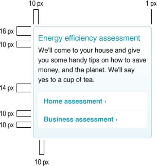
In our example, we have classified components as reusable blocks of content that have specific styles applied. By adding the class or ID of the component to a container element, the elements inside it can be made to inherit these styles. This makes the CSS more reusable and modular. Rather than styling these blocks for each instance where they appear, they are location-agnostic, movable chunks. We will use the serviceBox as our example component (refer to Figure 11-6).
Before creating the serviceBox, however, we have first created a basic box component:
.box {
        background: #fffbeb;
        padding: 14px 11px;
        -moz-border-radius: 4px;
        -webkit-border-radius: 4px;
        border-radius: 4px;
}
This class can be applied to any container and it will be styled with the correct rounded corners value, padding, and background. With the "serviceBox" class we will expand the "box" class. This follows the concepts of OOCSS, where classes can be reused and expanded by other classes, making for a more modular style sheet. You can read more about OOCSS in Chapter 4.
The next step is to create the serviceBox class:
.serviceBox {
        background: #fff url(i/box-grad.jpg) repeat-x left bottom;
        border: 1px solid #b0daea;
overflow: hidden;
height: 1%;
}As shown in the design, the serviceBox has a different background, a border, and appears in rows of three. The width and margins of the "serviceBox" element will be determined by a parent container div, with the correct "span" class applied (in this case, span-6). We have included the height property with a value of 1% so that IE 6 will clear the container, as it does not understand the overflow: hidden property (which is used to clear the container in other more compliant browsers). The content within this box is always a heading, a paragraph, and a list of links. Knowing this, we can further style the contents inside it:
.serviceBox ul {
        list-style: none;
        margin-left: 0;
}
.serviceBox li {
        border-top: 1px solid #eef9fb;
        margin: 0;
        width: 100%;
}
We have taken advantage of the fact that the heading is using the same style as the ones defined in the basic styles section of our file, so we don't need to add any styles for it here. We now only need to add the rounded corners to the list elements. Because this is not a style that will change with the hover or active state of the link, we can add it in this section:
.serviceBox li:first-child a {
        border-top: none;
        -moz-border-radius: 4px 4px 0 0;
        -webkit-border-top-left-radius: 4px;
        -webkit-border-top-right-radius: 4px;
        border-radius: 4px 4px 0 0;
}
.serviceBox li:last-child a {
        -moz-border-radius: 0 0 4px 4px;
        -webkit-border-bottom-left-radius: 4px;
        -webkit-border-bottom-right-radius: 4px;
        border-radius: 0 0 4px 4px;
}
Notice that the WebKit-specific properties were added individually for older versions of WebKit. WebKit only supports the shorthand in its most recent versions in the border-radius property. Some older browsers will not see this style, but they wouldn't understand the border-radius property, either, so it is a fair compromise. And we have styled our serviceBox component! As mentioned previously, we will add the link styles in the appropriate section of our style sheet.
Components are reusable, but here we make the distinction between components and reusable classes in that reusable classes have a more presentational aspect to them, and tend to only cater for a single property/value combination. Components are mainly created to hold a particular type or combination of content.
In our main style sheet, we have created five different reusable classes. The first reusable class is one that is likely to be familiar to most front-end developers: clearfix. This class can be applied to any element that needs to be "self-clearing" (cleared without an element specifically created to do this). We also include the Internet Explorer 7 and below version of this little trick:
.clearfix:after {
        content: ".";
        display: block;
        height: 0;
        clear: both;
        visibility: hidden;
}
.clearfix { /* HACK_IE_LTE_7: IE 7 and below don't support the :after pseudo-element (above). */
        *zoom: 1;
}
Next, we create two classes that will allow developers and content creators to easily left- or right-align elements:
.fLeft {
        float: left;
}
.fRight {
        float: right;
}
Following this, we will add the "last" class that can be applied to the final element in a row. This will remove the right margin, which would otherwise be applied, so that it neatly fits the available width:
.last {
        margin-right: 0;
}
And finally, we include an accessibility class that will allow content creators to hide pieces of text that are only to be read by screen readers:
.accessibility {
        position: absolute;
        text-indent: −9999px;
}Invariably there will be elements that need to be created and styled that do not follow the design of anything else we've added to our framework. We call these one-offs. You might prefer to call them "exceptions," "uniques," or any other name you feel is appropriate.
In the case of the Igloo Refrigerator Parts Inc. website, we have identified (so far) two special cases: the banner on the homepage, and the "Best Engineering Service Award" box, also on the homepage.
For the banner, we will create a class that can be appended to the #masthead component, including the correct background image, and text sizes:
.planet {
        background:url(i/hp-banner01.jpg) no-repeat center 20px;
}
.planet h2 {
        font-size: 4.8em;
        margin-bottom: 0;
}
.planet p {
        font-size: 1.6em;
        padding-bottom: 6px;
}
This class is basically an extender of the #mastead ID and is dependent on it. Because its style is so particular and does not apply to anything else, it is placed under the "One-offs" section of the style sheet.
For the award box, we will also take advantage of the default styling of some elements, but we will need to alter many properties:
#bestEngAward {
        border: 1px solid #fce8b8;
        background: #fff;
        padding: 23px 20px;
}
#bestEngAward h2 {
        color: #fcb61a;
        font: 3em/1.1 Impact, "Helvetica Compressed", "Helvetica Inserat", Arial Narrow,
Tahoma, Geneva, "MS Sans Serif", sans-serif;
        margin-bottom: 20px;
        text-transform: uppercase;
}
#bestEngAward p {
        margin-bottom: 0;
        width: 100%;
}
#bestEngAward p a:link, #bestEngAward p a:visited {
        border: none;
}
#bestEngAward p a:after {
        content: " >";
}
#bestEngAward blockquote {
        background: url(i/blockquote.gif) no-repeat;
        color: #0f6080;
        margin: 0 25px 0 0;
        padding: 3px 0 0 40px;
        width: 321px;
}
#bestEngAward blockquote p {
        font-size: 1.6em;
        font-style: normal;
        margin-bottom: 3px;
}
#bestEngAward blockquote p:before {
content: "";
}In order to style them differently, we had to overwrite properties of the h2 and p elements, link styles, and the style of the blockquote element and its children. This code would have been a lot more verbose were the initial styles overly specific: we either could have not taken advantage of inheritance to declare only the minimum amount of properties, or we would have had to overwrite selectors that were too specific.
Be careful: as websites grow, the number of one-offs is likely to grow exponentially. Designers should be sensitive to this scenario and make sure that elements are not created that are very similar to existing ones. This will not only make the CSS more complex and rendundant but also make the design solution more diluted. Make sure the element you are creating is not already present in some way in your style sheet or that it cannot expand an existing component with a couple of properties.
As conscious CSS authors, we know what the best practices are; we are aware of and follow web standards; and we are on top of the latest CSS techniques, which are usually created with the intent of making CSS more efficient and developers more productive. We know all of this. But as CSS authors that work on large-scale websites—visited by millions of users on infinite number of different devices and settings—we also know we need to make some compromises.
The Igloo Refrigerator Parts Inc. website is not an exception. We have already mentioned some of the compromises made, such as using nonsemantic class names to increase flexiblity or resorting to user agent style sheets defaults for basic styling of some of the elements.
Another example of a compromise we have made is the use of an image to be able to display a custom, non-web-safe font on the banner on the homepage. The original design uses Futura Condensed Medium, which very few users are likely to have installed in their computers. The options for this scenerio were the following:
Use an image
Use an image replacement technique
Use Cufón or sIFR (you can read more about them in Chapter 5)
Use Fontdeck as a web font service, since it provides this font
Since this font is only used in one instance, simply replacing the text with an image and using the alt attribute to identify the text within the image proved to be the quickest, simplest, and cheapest solution, and one that doesn't hamper accessibility. Our favorite solution would have been utilizing a service such as Fontdeck if the font was needed in more places, but the extra download, and the added expense, were not justifiable in this scenario.
In the case of the font used in the "Best Engineering Service Award" box, Impact, we know that this is a font that is commonly installed by default in Windows and Mac computers. The best solution in this instance is, then, to create a font stack that, where the font is not installed, the second, third, or even fifth font in the stack are still acceptable (the final font stack is Impact, Helvetica Compressed, Helvetica Inserat, Arial Narrow, Tahoma, Geneva, MS Sans Serif, and sans-serif). See Figure 11-6.

Figure 11-6. Comparison between the text rendered in the preferred font, Impact (top), and rendered in a font that appears later in the font stack, in this case Arial Narrow (bottom)
These are very simple examples of where you might have to make compromises, but as long as you weigh all the options and opt for the most accessible one that is sensible in terms of efficiency and maintenance, you should be on the right track. Remember, you (and the team involved in the creation of the design) are likely to be the only ones who will know things don't look exactly right; the users won't compare the rendering of the site across different platforms.
The subject of cross-browser consistency is neatly tied into the subject of compromises, discussed previously. When we analyzed the design before starting the CSS, we were informed that the only element that needed to be perfect cross-browser was the company's logo. Other elements should look the same in browsers with A-level support (see Appendix 3 for Browser Support Guidelines) as much as possible.
To make sure the logo looks consistent even in IE 6, which does not support alpha-transparent PNG images, we have resorted to the Fireworks hack, where we export the logo with alpha-transparency as an 8-bit file; this gives us alpha-transparency in browsers that support it and index transparency in IE 6. The difference is almost impercetible, so it was deemed acceptable. You can read more about this trick in Chapter 8.
header h1 a:link, header h1 a:visited {
        background: url(i/logo.png) no-repeat;
        border: none;
        width: 132px;
        height: 46px;
        display: block;
        text-indent: -9999px;
}
We could have achieved the same effect with the following code, using a different image and a hack instead to give us more control over the display in IE 6:
header h1 a:link, header h1 a:visited {
        background: url(i/logo.png) no-repeat;
        _background: url(i/logo.gif) no-repeat; /* HACK_IE_6: IE 6 doesn't support alpha
transparent PNGs */
        border: none;
        width: 132px;
        height: 46px;
        display: block;
        text-indent: -9999px;
}
In this instance, this level of control was not necessary, but we have resorted to some hacks (or filters) within the main style sheet to overcome other browser discrepencies. We know what you are thinking: you should not use hacks. We certainly do not recommend this technique where more than a handful of hacks are needed. When only a couple are needed, though (for an entire website), we have to be pragmatic: we are dealing with high-traffic websites, where HTTP requests need to be minimized, and serving the browser an extra file just for a particular browser is never ideal. As long as it is a global decision, and that developers are informed about which hacks they are permitted to use, we do not feel this is an approach that you should absolutely disregard. It impacts performance positively and it makes it easier for values to be updated at the same time for both cases: compliant and noncompliant. How many times have you forgotten to update the file path for background images in IE-only style sheets or the correspondent min-height/height value?
The most noticeable browser-rendering differences that were not catered for (but that were considered acceptable variations) in the CSS are present in Internet Explorer 6 and 7.
The main navigation does not render perfectly (IE 6 and 7) (see Figure 11-7)
Attribute selectors used to target the search input are not supported, affecting the styling of the search box (IE 6 and 7). See Figure 11-8.
When the
:emptypseudo-class is not supported, empty table cells present a background (IE 6, 7, and 8). See Figure 11-9.


Figure 11-8. The search box does not show the background image (Firefox 3.6, left) in Internet Explorer 7 (right)

Figure 11-9. Firefox 3.6 (top) renders empty table cells correctly. Internet Explorer 8 (bottom) does not, since it does not understand the :empty pseudo-class
Other decorative details that do not show at all in some browsers are the following:
Rounded corners
Transparency of the selected link in the main navigation
Drop shadows on buttons
In our experience, these are details that most designers are comfortable to have render differently in different browsers. The time that it would take to make these work consistently in older noncompliant browsers and the impact that these techniques would have on the style sheets' (and markup's) maintainability are not justifiable, knowing that there are simpler solutions that still look right.
However, some measures were taken to provide the nicest possible solution for older browsers:
Rather than using CSS3 gradients for some backgrounds, simple GIF images were used.
Instead of using advanced selectors to target first and last elements that would have otherwise broken the layout in older browsers (for lack of support), classes were used.
Where transparent colors were used, solid fallback colors were provided that mimic as closely as possible the result that would have displayed had transparency been supported.
Sometimes we need to shy away from more complex and advanced features if we know that in doing so we will be providing a nicer experience to more visitors to our site. We do not recommend that you go to extremes; as you can see from the lists above, there are newer and easier ways of doing things that would have taken hours or days just a few years ago. But sometimes, by simply using an image instead of a CSS gradient, the experience will be exponentially improved for some users, who will appreciate the effort.
Accessibility must be something that is constantly in the back of our minds in the creation and development process of a website. In terms of front-end development, it must start from the very foundations, the markup, what gives the content meaning, and then build its way up to the other layers—style and behavior.
The Igloo Refrigerator Parts Inc. website makes sure that it is as accessible as possible by doing the following:
Ensuring the website's content is clear and understandable with all styles disabled, and also with CSS enabled and images disabled.
Making sure foreground and background color combinations have enough contrast for colorblind users.
Testing the website for font size increases of two steps up and down (see Figure 11-10).
Providing not only hover and active link states but also focus link states, for keyboard users.
Including a "Skip to content" link, right at the top of the page. This will make it easier for users to jump straight into the content.
Providing hooks, in the form of
bodyclasses and IDs, which users can use to create user style sheets.Wherever possible, using microformats, which turn content into more machine-readable formats. This helps screen readers, as well as assistive devices and search engines.

Figure 11-10. Although slightly less elegant, the layout survives neatly a font size increase of two steps.
Other steps can be added to your list, such as making sure the mobile version of the website is stripped of secondary elements (but still providing a link for the user to view the full website) and making sure that all image file sizes are as small as possible.
All these measures should exist in a CSS Accessiblity Guidelines document (see Appendix 4).
We have included the topic of links in accessibility because they are one of the most important elements to take into account when making our websites accessible and are frequently forgotten. In our style sheet, we have joined all the link styles into a single section so it is easier to compare different link styles and to guarantee all necessary link states are styled.
You can read more about accessibility in Chapter 6.
Once the reusable elements are defined, the next step is to keep them in a repository that can be accessed by designers, developers, and content editors.
Ideally, each reusable snippet should be documented visually and accompanied by the HTML markup necessary to use it on a page, as well as Photoshop files for the designers to easily drop into their designs, examples, class names, IDs, and anything else that might be useful. This repository should be accessible to everyone, searchable, and versioned.
For example, if we were to document the serviceBox, it would be useful to show the different measurements used in creating it (see Figure 11-11).
When developers need to use this box in a page, they will copy and paste the following HTML markup:
<div class="box serviceBox">
        <h3>Title</h3>
        <p>Description of title</p>
        <ul>
                <li><a href="#">Action link</a></li>
                <li><a href="#">Action link</a></li>
        </ul>
</div>
In this case, we can specify that this particular block should not be used by itself; it should always be used in rows in multiples of three, where the last block in each row should include the class of "last" (a reusable class that can be used to remove the right margin on the last element in a row, regardless of context), and preceded by a heading (h2). We can also specify the amount of copy that each block should include, how many links it should contain, and whether it has any dependencies on surrounding code (not in this instance).
Even though our recommendations are geared toward developers, it is also useful to include, along with the code and specification, a Photoshop file (or other type of layered file such as Illustrator or Fireworks) that can be used by designers.
Bear in mind that this library easily becomes useless if not kept up to date. Assigning someone with the task of updating it on a regular schedule is of utmost importance.
Finally, we have a site ready and built with a CSS backbone that is ready for as many pages as we want to throw at it. In this chapter we took you through dissecting the design and the conversations you might have had to ensure agreement between design, the business, and the developers. We considered which elements were reusable, structure and grids, global elements, one-offs, and accessibility. We also demonstrated the likely points of contention and compromise between browsers and how you might tackle them. Our resulting CSS was clear, concise, and uncomplicated. The selectors are not difficult to override, and it is easy to locate particular pieces in the code. Most importantly, it is fast, with the minimum reasonable file size and few HTTP requests.
We looked at building the design library, which is paramount to achieving efficiency and consistency in these designs and future amendments to the sites. As much as possible, we tried to follow our own advice and give justification where we did not. It's all about increasing efficiency and reducing redundancy.
In the four appendices you will find supporting documents for the process and rules we have implemented with our fictitious organization, which are intended to be as practical and useful to you as possible.
We genuinely hope that you have enjoyed this book and that you will take away with you a good understanding of how CSS can make a really big difference to your website, from many angles such as productivity, cost, brand perception, user experience, and performance. Let's all work together to build scalable, accessible, clever interfaces that look beautiful and work intuitively. Every team has its own way of doing things, and as long as everyone is agreed on the same system, that is absolutely fine. We would love to hear about your own experiences.
Thanks for reading. Now go write some code!