5
Product Validation
5.1 Introduction
Product validation is a key phase of product development. It is when the success criteria of the developed product are tested and evaluated by consumers to ensure expectations and product potential are explored before launching onto the market. This phase requires a combination of different tests to prove product performance involving both technical tests to establish key variables and tests with consumers to ensure it is actually perceived. In general it is key to assess: (i) performance and efficacy of the product against criteria connected to consumer claims and regulation requirements, (ii) consumer reaction to the product, and (iii) stability over time to ensure performance can be maintained. In all three of these key aspects, it is important to understand how response variables relate to each other and that predictions for variables are within the relevant performance range. This is possible using linear or multiple linear regression models.
Three case studies are discussed in this chapter. The first concerns a multicenter randomized pilot study performed to assess the effect of a new pharmaceutical preparation as add‐on therapy in GERD (gastroesophageal reflux disease) patients. Based on data retrieved from a questionnaire designed to measure and evaluate specific GERD symptoms of heartburn, regurgitation, and dyspepsia, three scores were calculated by combining frequency and severity of each symptom. Investigators need to analyze the relationship between these GERD scores and establish whether the score for heartburn symptoms can be explained by the other two scores. The example shows how linear regression analyses can help to solve such problems.
The second and third case studies refer to the application of linear regression models in Stability Studies, used to analyze the stability of a product over time and to determine the product's shelf life (i.e. the length of time that a response is expected to remain within desired specifications). A typical stability study tests multiple batches of a product over time to determine the shelf life. Through a linear model, investigators can represent the relationship between the response variable, the time variable, and an optional batch factor. This batch factor can be fixed if investigators sample all of the batches available for the product under study, or random if the batches are a random sample from a larger population of possible batches. As an example of a fixed batch factor, we consider a quality engineer who wants to determine the shelf life of lozenges that contain a new component, taking into account that the component's concentration in the lozenges (mg/loz) decreases over time. Considering four pilot batches available for production, the engineer wants to determine if and for how long the component concentration remains between 23.4 and 28.6 mg/loz. The engineer wants to test one lozenge from each batch at six different times at three‐month intervals. He or she needs first to create a stability study data collection worksheet and then to analyze the collected data to estimate the new component's shelf life.
As an example of random batch factor, we consider a pharmaceutical company that wants to explore if the viscosity of a drug is shown to be stable and between 8000 and 40 000 mPa.s throughout the first six months under accelerated conditions. Considering a sample of three batches from those available for production, the viscosity of a 75 ml quantity of drug is measured at five different times at varying intervals. The example shows first how to create a stability study data collection worksheet and then how to analyze the collected data to estimate the drug's shelf life.
In short, the chapter deals with the following:
| Topics | Stat tools |
| Correlation and regression analysis, correlation coefficient | 5.1, 5.3 |
| Scatterplot | 5.2 |
| Regression models, simple linear regression models | 5.4, 5.5 |
| Goodness of fit, residual analysis | 5.6, 5.7 |
| Multiple linear regression models | 5.8 |
5.2 Case Study: GERD Project
A multicenter randomized pilot study was performed to assess the effect of a new pharmaceutical preparation as add‐on therapy in GERD patients with inadequate response to daily proton pump inhibitor treatment. At baseline, during a seven‐day run‐in period, 141 patients completed a specific symptom questionnaire designed to measure and evaluate specific GERD symptoms of heartburn, regurgitation, and dyspepsia. Three scores were calculated, one for each symptom, by combining the frequency and severity of each. Investigators need to analyze the relationship between the GERD scores. In particular, they wish to establish whether the score related to heartburn symptoms can be explained by the other two scores.
To solve this problem, we can apply a regression analysis in which the variable Heartburn is the response and the other two scores, Regurgitation and Dyspepsia, are the explanatory variables (Stat Tool 5.1).
The variables' setting is the following:
- Variables Heartburn, Regurgitation, and Dyspepsia are continuous quantitative variables.
| Column | Variable | Type of data | Label |
| C1 | SUBJECT_ID | Patients' code | |
| C2 | Heartburn | Numeric data | Score based on heartburn symptoms |
| C3 | Regurgitation | Numeric data | Score based on regurgitation symptoms |
| C4 | Dyspepsia | Numeric data | Score based on dyspepsia symptoms |
File: Gerd_Project.xlsx.
5.2.1 Evaluation of the Relationship among Quantitative Variables
To study the relationship among the three GERD symptom scores, let's proceed in the following way:
- Step 1 – Perform an exploratory analysis through scatterplots (Stat Tool 5.2) and calculate the correlation coefficients (Stat Tool 5.3).
- Step 2 – Build a multiple linear regression model (Stat Tools 5.4–5.8).
- Step 3 – If required, reduce the model to include the significant terms.
- Step 4 – Predict response values.
- Step 5 – Explore the response surface in multiple linear regression.
5.2.1.1 Step 1 – Perform an Exploratory Analysis through Scatterplots and Calculate the Correlation Coefficients
To detect a possible association between two quantitative variables, the first thing to do is to plot the data on a scatterplot (Stat Tool 5.2). This helps us to explore the direction, strength, and form of any potential relationship. When a linear relationship is a plausible model to represent the trend of data, the correlation coefficient (Stat Tool 5.3) helps us to quantify this possible linear relationship.
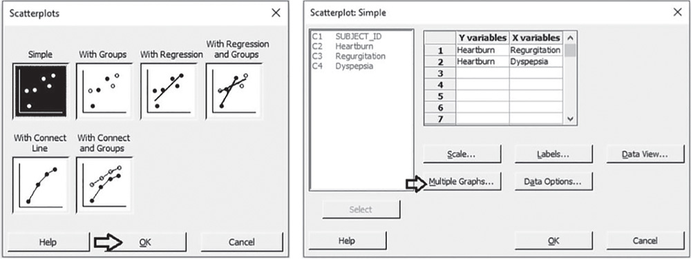
 To display the scatterplots, go to:
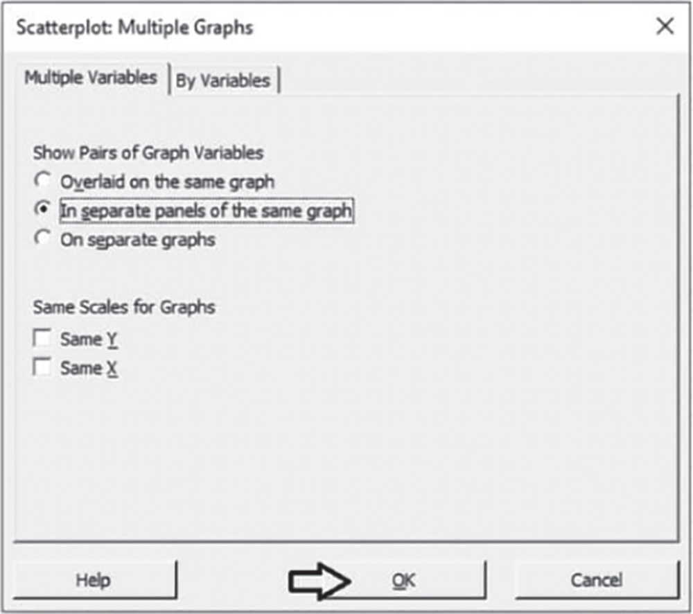
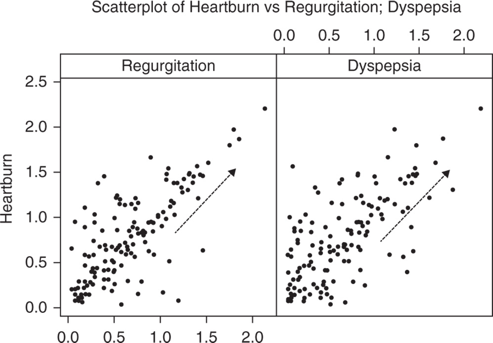
Check the graphical option Simple. In the table in the next dialog box, you can choose up to 20 scatterplots, specifying the X and Y variables for each of them. Under Y variables, select Heartburn for the first and second scatterplots, and under X variables, select Regurgitation for the first and Dyspepsia for the second. Click Multiple Graphs, and in the next screen choose the option In separate panels of the same graph. Then click OK in each dialog box.
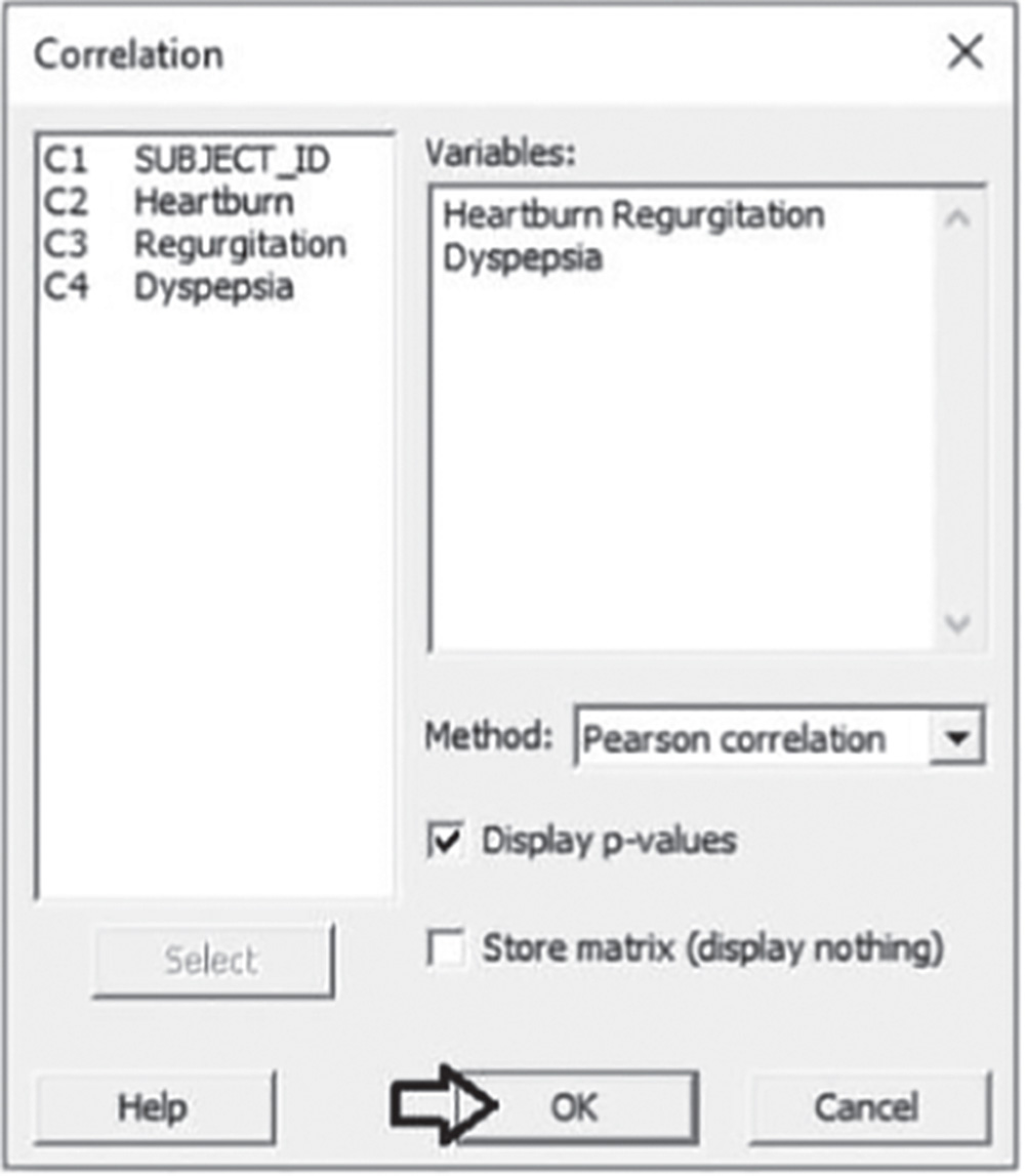
To calculate the correlation coefficients, go to: Stat > Basic Statistics > Correlation
Under Variables, select Heartburn, Regurgitation, and Dyspepsia. As they are quantitative continuous variables, choose Pearson correlation in Method. Check the option Display p‐values and click OK.
5.2.1.1.1 Interpret the Results of Step 1 The scores related to the symptoms of both regurgitation and dyspepsia seem to be positively related to those of heartburn, since the points form an upward pattern from left to right (Stat Tool 5.2). However, the points are scattered, indicating variability in the data.
Correlations
| Heartburn | Regurgitation | |
| Regurgitation | 0.755 | |
| 0.000 | ||
| Dyspepsia | 0.688 | 0.605 |
| 0.000 | 0.000 | |
| Cell contents | ||
| Pearson correlation | ||
| p‐value | ||
The correlation coefficient (Pearson correlation) between the Heartburn and Regurgitation scores is equal to 0.76, which indicates that the two variables have a reasonably strong linear relationship (Stat Tool 5.3). Setting the significance level α at 0.05, the p‐value (0.000) is less than 0.05. The linear relationship between the two variables is statistically significant.
The correlation coefficient between Heartburn and Dyspepsia is equal to 0.69, which indicates that the two variables have a slightly weaker statistically significant relationship (p‐value less than 0.05).
5.2.1.2 Step 2 – Build a Multiple Linear Regression Model
When we believe one or more variables may influence other variables, we can use regression models (Stat Tool 5.4) to better understand this kind of relationship.
Furthermore, if the data form a linear pattern, we can use linear regression models (Stat Tools 5.5–5.8). In our case study we need to establish whether the score related to the Heartburn symptoms (response) can be explained by the scores related to the Regurgitation and Dyspepsia symptoms (explanatory variables). From the exploratory analysis, a linear relationship can be a reasonable model.
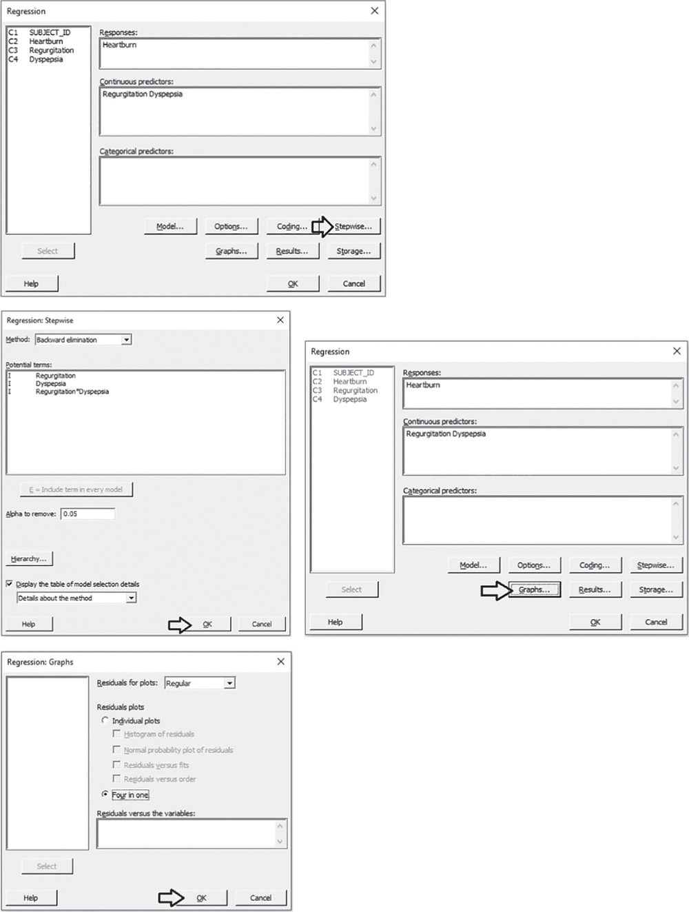
To build a linear regression model, go to:
Select the numeric response variable “Heartburn” under Responses. Under Continuous predictors, select “Regurgitation” and “Dyspepsia” and click on Model. In the next window, highlight the two explanatory variables “Regurgitation” and “Dyspepsia” and next to Interactions through order: 2, select Add to include the main effects and the two‐way interaction between the two predictors in the model. Click OK in each dialog box.

5.2.1.2.1 Interpret the Results of Step 2 In the analysis of variance (ANOVA) table we examine the p‐values to determine whether any predictor or interaction is statistically significant. Remember that the p‐value is a probability that measures the evidence against the null hypothesis. Lower probabilities provide stronger evidence against the null hypothesis.
For the main effects, the null hypothesis is that there is no linear relationship between a predictor and the response.
For the two‐way interaction, H0 states that the relationship between a predictor and the response does not depend on the other predictor in the term.
We usually consider a significance level α equal to 0.05, but in an exploratory phase of the analysis we may also consider a significance level α of 0.10.
When the p‐value is greater than or equal to alpha, we fail to reject the null hypothesis. When it is less than alpha, we reject the null hypothesis and claim statistical significance.
Regression analysis: Heartburn versus Regurgitation; Dyspepsia.
| Analysis of variance | |||||
| Source | DF | Adj SS | Adj MS | F‐value | p‐value |
| Regression | 3 | 21.6704 | 7.22346 | 86.64 | 0.000 |
| Regurgitation | 1 | 3.0337 | 3.03369 | 36.39 | 0.000 |
| Dyspepsia | 1 | 1.3771 | 1.37708 | 16.52 | 0.000 |
| Regurgitation*Dyspepsia | 1 | 0.0105 | 0.01046 | 0.13 | 0.724 |
| Error | 137 | 11.4216 | 0.08337 | ||
| Total | 140 | 33.0920 | |||
So, setting the significance level α to 0.05, which terms in the model are significant in our example? The answer is: only the main effects of Regurgitation and Dyspepsia are statistically significant. You may want to reduce the model to include only significant terms, thus excluding the interaction term.
5.2.1.3 Step 3 – If Required, Reduce the Model to Include the Significant Terms
In our example, we have only one term to remove from the model, but generally with more terms to remove, it is advisable not to remove entire groups of nonsignificant terms at the same time. The statistical significance of individual terms can change because of other terms in the model. To reduce your model, you can use an automatic selection procedure, the stepwise strategy, to identify a useful subset of terms, choosing one of the three commonly used alternatives (standard stepwise, forward selection, and backward elimination).
To reduce the model, go to:
Select the numeric response variable “Heartburn” under Response. Under Continuous predictors, select “Regurgitation” and “Dyspepsia” and choose Stepwise. In Method select Backward elimination and in Alpha to remove specify 0.05, then click OK. In the main dialog box, choose Graphs. Under Residual plots choose Four in one. Minitab will display several residual plots to examine whether your model meets the assumptions of the analysis (Stat Tool 5.7). Click OK in each dialog box.
Complete the analysis by adding the factorial plots that show the relationships between the response and the significant terms in the model, displaying how the response changes as the predictors change.
To display factorial plots, go to:
Move the variables “Regurgitation” and “Dyspepsia” from Available: to Selected: using the button >> and then click OK.

5.2.1.3.1 Interpret the Results of Step 3
Setting the significance level alpha to 0.05, the ANOVA table shows the significant terms in the model. Remember that the stepwise procedure may add nonsignificant terms in order to create a hierarchical model. In a hierarchical model, all lower‐order terms that comprise a higher‐order term also appear in the model.
In addition to the results of the ANOVA, Minitab displays some other useful information in the Model Summary table to evaluate its goodness of fit (Stat Tool 5.6).
The quantity R‐squared (R‐sq, R2) is interpreted as the percentage of the variability among Heartburn scores, explained by the terms included in the model.
The value of R2 varies from 0% to 100%, with larger values being more desirable. The model that includes Regurgitation and Dyspepsia explains 65.45% of the variation of Heartburn.
The adjusted R2 (R‐sq(adj)) is a variation of the ordinary R2 that is adjusted for the number of terms in the model. Use adjusted R2 when you want to compare several models with different numbers of terms.
Regression Analysis: Heartburn versus Regurgitation; Dyspepsia
Backward Elimination of Terms
α to remove = 0.05
ANOVA
| Source | DF | Adj SS | Adj MS | F‐Value | p‐Value |
| Regression | 2 | 21.660 | 10.8300 | 130.73 | 0.000 |
| Regurgitation | 1 | 6.006 | 6.0056 | 72.50 | 0.000 |
| Dyspepsia | 1 | 2.776 | 2.7764 | 33.52 | 0.000 |
| Error | 138 | 11.432 | 0.0828 | ||
| Total | 140 | 33.092 |
Model Summary
| S | R‐sq | R‐sq(adj) | R‐sq(pred) |
| 0.287822 | 65.45% | 64.95% | 63.54% |
The value of S is a measure of the variability of the errors that we make when we use the linear model to estimate the Heartburn scores. Generally, the smaller it is, the better the fit of the model to the data.
Before proceeding with the results reported in the Session window, take a look at the residual plots. A residual represents an error, i.e. the distance between an observed value of the response and its value estimated by the model. The graphical analysis of residuals based on residual plots helps discover possible violations of the underlying assumptions (Stat Tool 5.7).
A check of the normality assumption could be made by looking at the histogram of the residuals (lower left), but with small samples, often the histogram shows irregular shape.
The normal probability plot of the residuals may be more useful. Here we can see a tendency of the plot to follow the straight line. The assumption of normality can reasonably be considered satisfied.
The other two graphs (Residuals versus Fits and Residuals versus Order) seem unstructured, thus supporting the validity of the linear regression assumptions.

In particular, the plot of residuals versus the fitted values doesn't display any recognizable pattern. The constant variance assumption is not violated. Some points are quite distant from the other points and may be outliers. The plot of Residuals versus Order shows a random pattern of residuals on both sides of 0. The independency assumption is not violated.
Returning to the Session window, we find the regression equation derived from the data that expresses the relationship between the response and the important predictors.
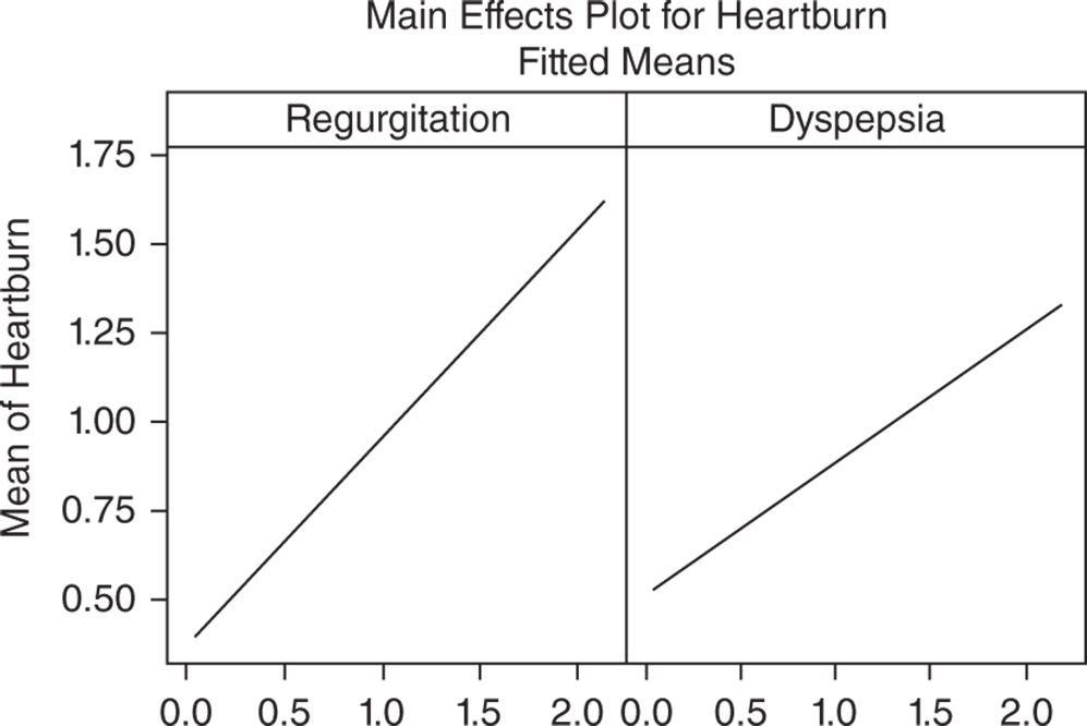
In the regression equation, we have a coefficient for each term in the model. They are expressed in the original measurement units. These coefficients are also displayed in the Coefficients table. The intercept (0.1317) is the value of Heartburn when the other two scores are equal to 0. Recall that sometimes the intercept has no practical meaning, but gives the line a better position across data points. The coefficient of Regurgitation (+0.5837) is positive. This means that as Regurgitation scores increase, the mean Heartburn score increases (positive relationship). The magnitude of the slope (0.5837) means that, keeping the value of Dyspepsia constant, as Regurgitation scores increase by 1 point, the mean Heartburn score increases by 0.5837. The coefficient of Dyspepsia (+0.3731) is positive. This means that as Dyspepsia scores increase, the mean Heartburn score increases (positive relationship). The magnitude of the slope (0.3731) means that, keeping the value of Regurgitation constant, as Dyspepsia scores increase by 1 point, the mean Heartburn score increases by 0.3731. Look also at the factorial plots (Main Effects Plots) to display how the mean Heartburn score linearly varies as predictors change.
Coefficients
| Term | Coef | SE coef | t‐Value | p‐Value | VIF |
| Constant | 0.1317 | 0.0456 | 2.89 | 0.004 | |
| Regurgitation | 0.5837 | 0.0686 | 8.51 | 0.000 | 1.58 |
| Dyspepsia | 0.3731 | 0.0644 | 5.79 | 0.000 | 1.58 |
Regression Equation
Earlier we learned how to examine the p‐values in the ANOVA table to determine whether an explanatory variable is statistically related to the response. In the Coefficients table, we find the same results in terms of tests on coefficients and we can evaluate the p‐values to determine whether they are statistically significant. The null hypothesis is that there is no linear effect on the response. Setting the significance level α at 0.05, if a p‐value is less than α, reject the null hypothesis and conclude that the linear effect on the response is statistically significant.
Both for Regurgitation and Dyspepsia the p‐value (0.000) is less than 0.05. The linear relationships between the response variable and the two explanatory variables are statistically significant.
5.2.1.4 Step 4 – Predict Response Values
Use the regression equation to predict values (fitted values) of the response variable Heartburn for combinations of explanatory variables of interest. This fitted value is obtained by inserting the specified values of the explanatory variables into the regression equation.
To predict response values, go to:
Suppose that you need to predict the value of Heartburn when Regurgitation and Dyspepsia are both equal to 0.40. Under Regurgitation and Dyspepsia. specify the value 0.4 and click OK.
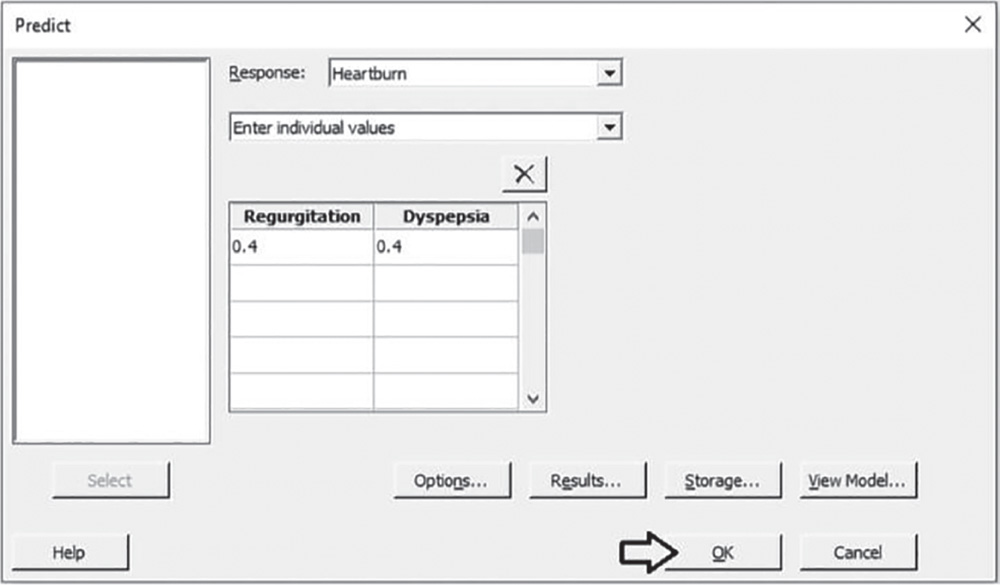
5.2.1.4.1 Interpret the Results of Step 4 Suppose that you need to predict the mean response when Regurgitation and Dyspepsia are both equal to 0.40. We obtain a predicted value of 0.51 for the mean Heartburn score.
You can also see two confidence intervals (Stat Tool 1.14) for the predicted value. The confidence interval (CI) of the prediction represents a range within which the mean response is likely to fall given specified settings of the predictors. The prediction interval (PI) represents a range within which a single new observation is likely to fall given specified settings of the predictors.
Prediction for Heartburn
Regression Equation
Settings
| Variable | Setting |
| Regurgitation | 0.4 |
| Dyspepsia | 0.4 |
Prediction
| Fit | SE fit | 95% CI | 95% PI |
| 0.514461 | 0.0284568 | (0.458194; 0.570729) | (−0.0574243; 1.08635) |
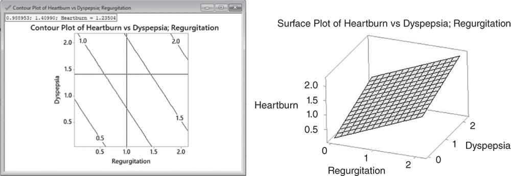
5.2.1.5 Step 5 – Explore the Response Surface in Multiple Linear Regression
In multiple linear regression with more than one predictor, graphic techniques such as contour, surface, and overlaid plots help us to examine the response surface in regions of interest. Through these plots, you can explore the potential relationship between pairs of explanatory variables and the response. You can display a contour, a surface, or an overlaid plot considering two predictors at a time, while setting the remaining explanatory variables to predefined values. With contour and surface plots, you consider a single response; in overlaid plots, you may consider more than one response together.
To display the contour plots, go to:
In the dialog box, select “Heartburn” in Response. Here we have only two predictors, but with more than two explanatory variables, you have to check the option Generate plots for all pairs of continuous variables to create a contour plot for each pair of predictors. Click Contours, and under Data Display, choose Contour lines. Click OK. With only two predictors, click OK in the main dialog box. Or, if you have more than two predictors, select Settings in the main dialog box and set the remaining explanatory variables at specified values. Click OK in each dialog box.

To display the surface plots, go to:
In the dialog box, select “Heartburn” in Response, and click OK. With more than two predictors check the option Generate plots for all pairs of continuous variables. Then select Settings to set the other explanatory variables at specified values and click OK.
To change the appearance of the surface plots, double‐click on any point inside the surface. In Attributes, under Surface Type, select the option Wireframe instead of the default Surface. Then click OK.

5.2.1.5.1 Interpret the Results of Step 5 Contour and surface plots are useful tools to explore how a response variable changes while the predictors increase or decrease. In the Contour plot, Regurgitation and Dyspepsia scores are plotted on the x‐ and y‐axes and the mean Heartburn score is represented by different level contours. Double‐click on any point in the frame and select Crosshairs to interactively view variations in the response. In surface plots, the mean Heartburn score is represented by a hyperplane.
5.3 Case Study: Shelf Life Project (Fixed Batch Factor)
Linear regression models (Stat Tools 5.4–5.8) have important applications in stability studies, used to analyze the stability of a product over time and to determine the product's shelf life, i.e. the length of time that a response is expected to remain within desired specifications. A typical stability study tests multiple batches of a product over time to determine the shelf life (e.g. investigators test two pills from each of four batches every two weeks). Through a linear model, investigators can represent the relationship between the response variable, the time variable, and an optional batch factor. Stability studies usually refer to a quantitative continuous response variable. The batch factor can be fixed or random: it is fixed if investigators sample all of the batches available for the product under study; it is random if the batches are a random sample from a larger population of possible batches.
A quality engineer wants to determine the shelf life of lozenges that contain a new component. The concentration of the component in the lozenges decreases over time. Considering four pilot batches available for the production, the engineer wants to determine if and how long the component concentration remains within 23.4 and 28.6 mg/loz. The engineer wants to test one lozenge from each batch at six different times at three‐month intervals. First they need to create a stability study data collection worksheet and then analyze the collected data to estimate the shelf life of the new component.
To study the shelf life of the new component, let's proceed in the following way:
- Step 1 – Create a data collection worksheet.
- Step 2 – Apply a stability analysis to estimate the shelf life.
- Step 3 – Predict response values.
5.3.1.1 Step 1 – Create a Data Collection Worksheet
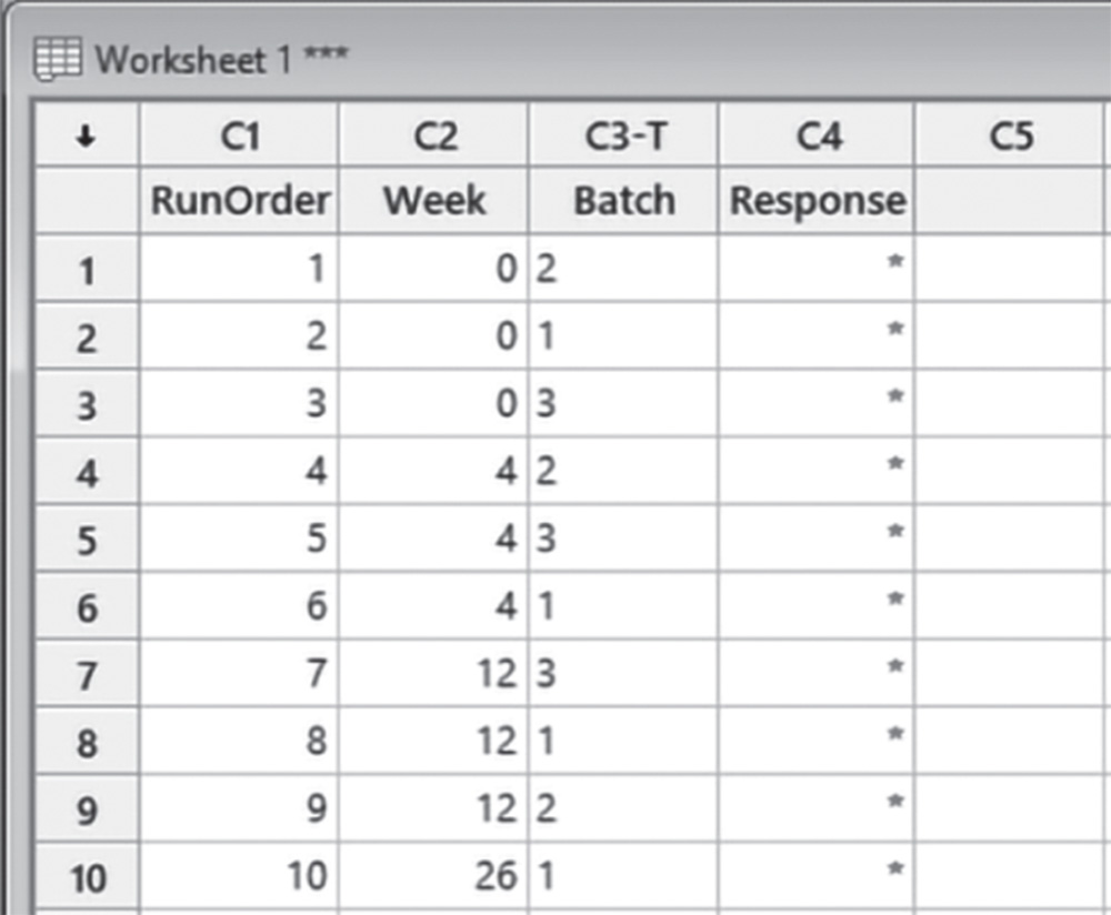
Let's begin by creating a data collection worksheet, considering four batches, six different times at three‐month intervals and only one replicate (one measure) for each trial.
To create the data collection worksheet, go to:
In the drop‐down menu at the top, choose Test times in numeric format, at constant intervals. You can choose different options according to your specific interests. In Number of test times, select 6, then specify 0 and 3 as Starting time and Interval length. In Unit of time specify Month. Set 4 as Number of batches and in Number of samples from each batch at each time, choose 1. Click Options. In the next window select the option Randomize batch sequence and repeats at each testing time and click OK in each dialog box.
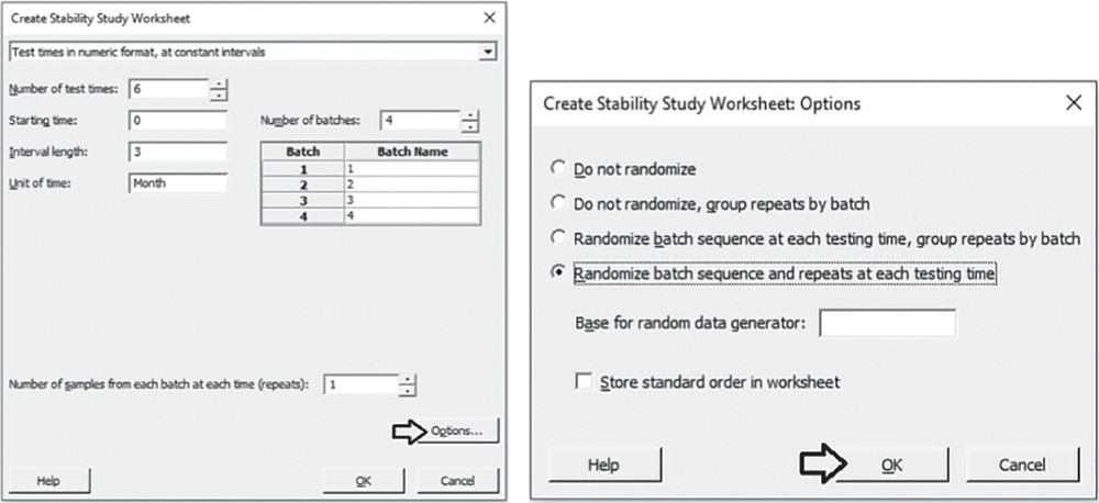
Minitab shows the data collection form in the worksheet (only the first 10 runs are shown here as an example). You can then proceed by collecting the data for the response variable following the order provided by the column “RunOrder” and entering the values in the column “Response”.

5.3.1.2 Step 2 – Apply a Stability Analysis to Estimate the Shelf Life
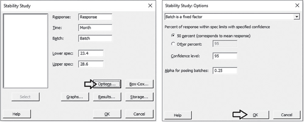
To estimate the shelf life of the new component and determine if and how long the component concentration remains within 23.4 and 28.6 mg/loz, you can apply a stability analysis with a fixed batch factor. We fit a linear model to represent the relationship between the response variable (component concentration), the time variable, and the batch factor.
The variables setting is the following:
- Variable “Month” is a discrete quantitative variable, expressed in months.
- Variable “Response” is a continuous quantitative variable, expressed in mg/loz.
| Column | Variable | Type of data | Label |
| C1 | Runorder | Order of trial execution | |
| C2 | Month | Numeric data | Time of response measurement in months |
| C3‐T | Batch | Categorical data | Number of batch |
| C4 | Response | Numeric data | Component concentration in mg/loz |
File: Shelf_Life_fixed_Project.xlsx.
To apply the stability analysis with a fixed batch factor, go to:
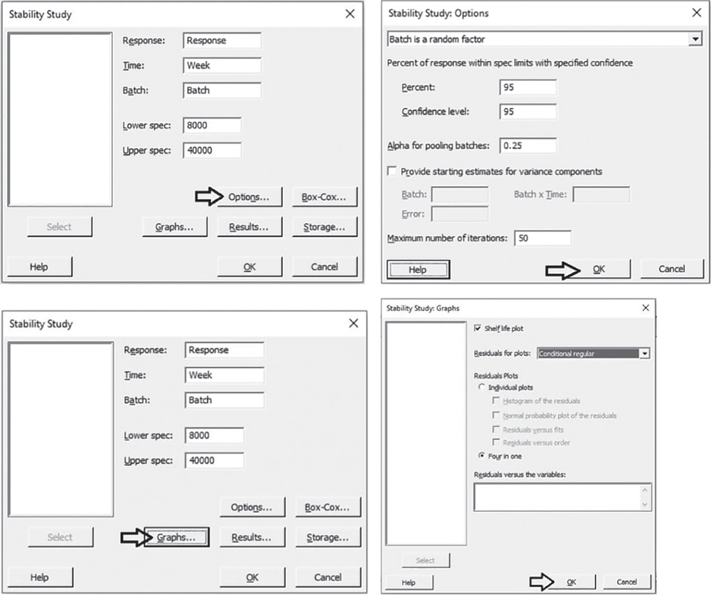
Select the response variable “Response”, the time variable “Month”, the batch factor “Batch” and specify the lower and upper specification limits. Click Options. In the drop‐down menu at the top, choose Batch is a fixed factor. Under Percent of response within spec limits with specified confidence, select 50% to calculate the shelf life based on the mean of the response values. Take into account that Minitab considers a symmetric normal distribution (Stat Tools 1.5 and 5.7) so that the 50th percentile, which corresponds to the median is equal to the mean (Stat Tool 1.6). In Confidence level, enter the level of confidence for the confidence interval or leave the default value 95%. In Alpha for pooling batches, enter the level of significance for model selection or leave the default value 0.25. During model selection, if the p‐value for each term in the model is greater than or equal to the alpha level you specify, then the term is removed from the model. Then click OK. In the main window, click Graphs. Under Shelf life plot, in the second drop‐down list, select No graphs for individual batches, and under Residual Plots, select Four in one. Click OK in each dialog box.

5.3.1.2.1 Interpret the Results of Step 2 The Model Selection table shows the results to determine whether the association between the response and the terms in the model (time, batch, and their interaction) is statistically significant. Take into account that during the model selection process, Minitab considers a significance level alpha equal to 0.25 (generally used in stability analysis) to include terms in the model and creates a hierarchical model. In a hierarchical model, all lower‐order terms that comprise a higher‐order term, are included in the model: you can see that the p‐value for the Month by Batch interaction is 0.000, so both “Month” and “Batch” are in the model (they would have been included even if one of them had been singularly not significant). To further examine the relationship with the response, also consider the Regression Equation table.
Model Selection with α = 0.25
| Source | DF | Seq SS | Seq MS | F‐value | p‐value |
| Month | 1 | 31.0889 | 31.0889 | 510.15 | 0.000 |
| Batch | 3 | 7.0812 | 2.3604 | 38.73 | 0.000 |
| Month*Batch | 3 | 2.4644 | 0.8215 | 13.48 | 0.000 |
| Error | 16 | 0.9750 | 0.0609 | ||
| Total | 23 | 41.6096 |
Regression Equation
| Batch | |
| 1 | Response = 26.548 − 0.2152 Month |
| 2 | Response = 26.629 − 0.1838 Month |
| 3 | Response = 26.343 − 0.3257 Month |
| 4 | Response = 25.429 − 0.1638 Month |
When the batch by time interaction term is included in the final model, Minitab displays a separate equation for each batch where batches have different intercepts and different slopes. If the batch factor is included in the final model, but the batch by time interaction is not included, then all batches have different intercepts but the same slope. Lastly, if time is the only term in the model, then all batches share the same intercept and slope, and Minitab displays a single regression equation.
In our example, the regression equations for each batch have different intercepts and slopes. Note that as expected, all the slopes are negative, thus indicating that the component concentration reduces with time. Batch 3 has the steepest slope, −0.3257, which indicates that, every three months, the component concentration for Batch 3 decreases by 0.3257 mg/loz. Batch 4 has the smallest intercept, 25.429 mg/loz, which indicates that Batch 4 had the lowest concentration at time zero.
Minitab uses the final model to estimate shelf life for each batch. The Shelf Life Estimation table shows the specification limits and the shelf life estimates. If the batch factor is not included in the final model, then the shelf life is the same for all batches. Otherwise, the shelf life for each batch is different and the overall shelf life is equal to the smallest of the individual shelf life values.
In our example, Batch 3 has the shortest shelf life estimate equal to 8.34 months, so the overall shelf life is estimated as 8.34 months.
Shelf Life Estimation
| Batch | Shelf life |
| 1 | 13.147 |
| 2 | 15.424 |
| 3 | 8.3698 |
| 4 | 10.828 |
| Overall | 8.3698 |
Lower spec limit = 23.4, upper spec limit = 28.6, shelf life = time period in which you can be 95% confident that at least 50% of response is within spec limits

To determine how well the model fits your data, examine the goodness‐of‐fit statistics (Stat Tool 5.6) in the Model Summary table. You see that both R2 and adjusted R2 are close to 100, which indicates that the model fits the data well. Remember also that the value of S is a measure of the variability of the errors that we make when we use the linear model to estimate the component concentrations. Generally, the smaller it is, the better the fit of the model to the data.
Model Summary
| S | R‐sq | R‐sq(adj) | R‐sq(pred) |
| 0.246861 | 97.66% | 96.63% | 94.49% |
To discover possible violations of the underlying assumptions of the regression model used to estimate the shelf life (Stat Tool 5.7), let's have a look at the residual plots.
A check of the normality assumption could be made looking at the histogram of the residuals (bottom left), but with small samples, often the histogram has an irregular shape.
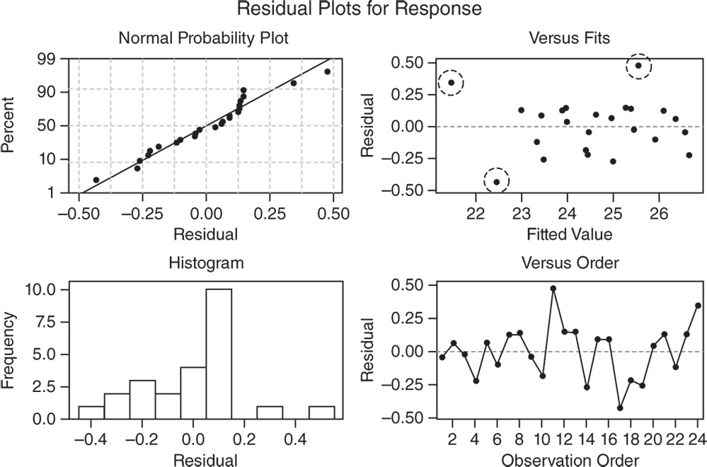
In the normal probability plot, we can see a tendency of the plot to bend slightly upward on the right, but the plot is not in any case grossly non‐normal.
The other two graphs (Residuals versus Fits and Residuals versus Order) seem unstructured, thus supporting the validity of the linear regression assumptions.
In the Residuals versus Fits plot, the only noteworthy observation is the presence of three points (enclosed in dashed circles) that could be outliers. In these cases investigators may try to identify the cause of potential outliers.
5.3.1.3 Step 3 – Predict Response Values
Use the final model to predict values (fitted values) of the variable “Response” at a specified time of interest.
To predict response values, go to:
Since the batch variable is included in the final model, you can also predict the response for specific batches. Suppose that you need to predict the value of “Response” after 15 months for the first batch. Under Month specify the value 15 and under Batch enter the number of the batch. Click OK.

5.3.1.3.1 Interpret the Results of Step 3 The predicted value for the mean component concentration at month 15 for the first batch is equal to 23.319 mg/loz. You can also see two confidence intervals (Stat Tool 1.14) for the predicted value. The confidence interval of the prediction (95% CI) represents a range within which the mean response is likely to fall at that specified time. The prediction interval (95% PI) represents a range within which a single new observation is likely to fall at that time.
Prediction for Response
Regression Equation
| Batch | |
| 1 | Response = 26.548 − 0.21524 Month |
Settings
| Variable | Setting |
| Month | 15 |
| Batch | 1 |
Prediction
| Fit | SE fit | 95% CI | 95% PI |
| 23.3190 | 0.178665 | (22.9403; 23.6978) | (22.6730; 23.9651) |
5.4 Case Study: Shelf Life Project (Random Batch Factor)
The previous section shows how linear regression models (Stat Tools 5.4–5.8) are used in stability studies to examine the stability of a product over time and estimate the product's shelf life. The present case study considers a random batch factor: the batches of products used for the study are a random sample from a larger population of possible batches.
A pharmaceutical company wants to explore whether the viscosity of a drug remains stable and between 8000 and 40 000 mPa·s throughout the first six months under accelerated conditions. If confirmed, this would commonly lead to two‐year stability under long‐term conditions. Taking a sample of three batches from those available for production, the viscosity of 75 ml of the drug is measured at five different times at varying intervals. First we need to create a stability study data collection worksheet and then analyze the collected data to estimate the drug's shelf life.
To study the stability of the viscosity, let's proceed in the following way:
- Step 1 – Create a data collection worksheet.
- Step 2 – Apply a stability analysis to estimate the shelf life.
5.4.1.1 Step 1 − Create a Data Collection Worksheet
Let's begin by creating a data collection worksheet, considering three batches, five different times at varying intervals and only one replicate (one measure) for each trial.
To create the data collection worksheet, go to:
In the drop‐down menu at the top, choose Test times in numeric format, at varying intervals. You can choose different options according to your specific interests. In Number of test times and in Unit of time specify Week. Under Week, set the five time intervals at 0, 4, 12, 26, and 52 weeks. Select 3 as Number of batches and in Number of samples from each batch at each time, choose 1. Click Options. In the next window select the option Randomize batch sequence and repeats at each testing time and click OK in each dialog box.

Minitab shows the data collection form in the worksheet (only the first 10 runs are shown here as an example). You can then proceed by collecting the data for the response variable following the order provided by the column “RunOrder” and entering the values in the “Response” column.
5.4.1.2 Step 2 – Apply a Stability Analysis to Estimate the Shelf Life
To estimate the shelf life for the drug and determine if and how long the viscosity remains within 8000 and 40 000 mPa·s, you can apply a stability analysis with a random batch factor. We fit a linear model to represent the relationship between the response variable (viscosity), the time variable, and the batch factor.
The variables setting is the following:
- Variable “Week” is a discrete quantitative variable, expressed in weeks.
- Variable “Response” is a continuous quantitative variable, expressed in mPa·s.
| Column | Variable | Type of data | Label |
| C1 | Runorder | Order of trial execution | |
| C2 | Week | Numeric data | Time of response measurement in weeks |
| C3‐T | Batch | Categorical data | Number of batch |
| C4 | Response | Numeric data | Viscosity in mPa·s |
File: Shelf_Life_random_Project.xlsx.
To apply the stability analysis with a random batch factor, go to:
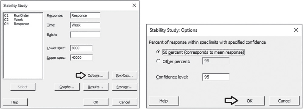
Select the response variable “Response”, the time variable “Week”, the batch factor “Batch” and specify the lower and upper specification limits. Click Options. In the drop‐down menu at the top, choose Batch is a random factor. Under Percent of response within spec limits with specified confidence, by default Minitab uses the 95th percentile instead of the 50th percentile to calculate the shelf life. In Confidence level, enter the level of confidence for the confidence interval or leave the default value 95%. In Alpha for pooling batches, enter the level of significance for model selection or leave the default value 0.25. During model selection, if the p‐value for each term in the model is greater than or equal to the alpha level you specify, then the term is removed from the model. Then click OK. In the main window, click Graphs. Here you can select marginal or conditional residuals to display on the residual plots, where marginal residuals are the difference between the fits and the observed values for the overall population, while conditional residuals are the difference between the fits and the observed values for the batches in the sample data. Use the conditional residuals to check the normality of the residuals. In Residuals for plots, choose Conditional regular and under Residual Plots, select Four in one. Click OK in each dialog box.
5.4.1.2.1 Interpret the Results of Step 2 The Model Selection table shows the model selection process during which Minitab considers a significance level alpha equal to 0.25 (generally used in stability analysis) to include terms in the model and create a hierarchical model (where all lower‐order terms that comprise a higher‐order term are included in the model). In our example, the batches and their interaction with time, don't show a significant impact on the response. A final model with pooled data and including only the time term is therefore estimated and Minitab specifies the result with the message: “Terms in selected model: Week”.
Model Selection with α = 0.25
| Model | −2 LogLikelihood | Difference | p‐value |
| Week batch Week*batch | 218.826 | ||
| Week batch | 218.946 | 0.119770 | 0.836 |
| Week | 218.956 | 0.010098 | 0.460 |
Terms in selected model: Week
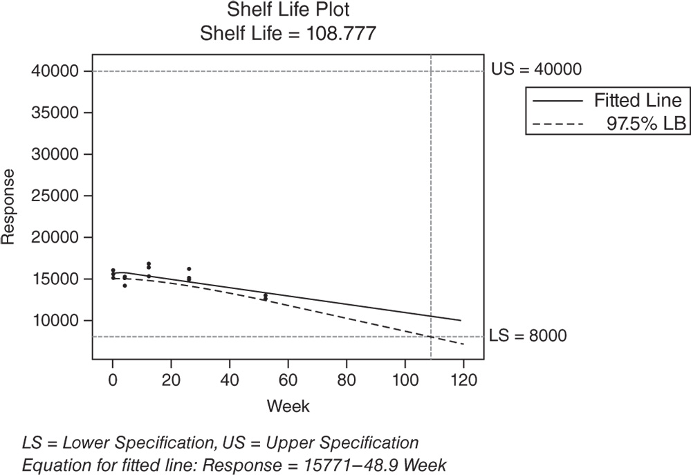
With a random batch factor, Minitab uses the final model to estimate only the overall shelf life, whether the batch factor is included or excluded from the model. The Shelf Life Estimation table and the Shelf Life Plot show the specification limits and the shelf life estimate. The shelf life, which is approximately 86 weeks, is an estimate of how long the investigators can be 95% confident that 95% of products are within the specification limits. This estimate applies to any batch randomly selected from the process.
Shelf Life Estimation
Lower spec limit = 8000
Upper spec limit = 40 000
Shelf life = time period in which you can be 95% confident that at least 95% of response is within spec limits
Shelf life for all batches = 86.3636

To determine how well the model fits your data, examine the goodness‐of‐fit statistics (Stat Tool 5.6) in the Model Summary table. You can see that both R2 and adjusted R2 are quite high, which indicates that the model fits the data quite well. Remember also that the value of S is a measure of the variability of the errors that we make when we use the linear model to estimate the viscosity. Generally, the smaller it is, the better the fit of the model to the data.
Model Summary
| S | R‐sq | R‐sq(adj) | R‐sq(pred) |
| 712.184 | 77.68% | 75.97% | 70.35% |
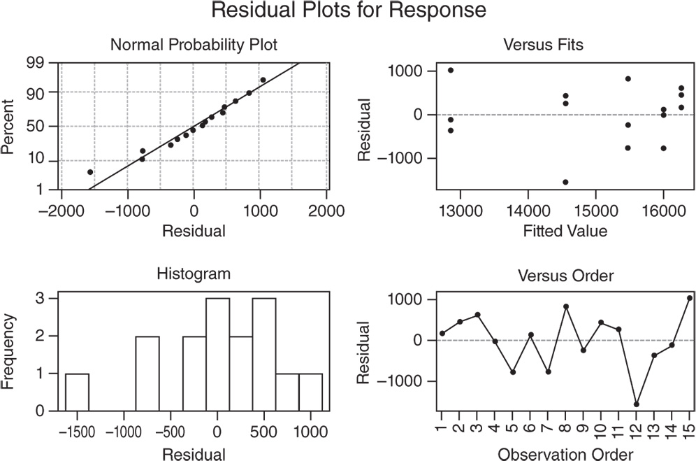
To discover possible violations of the underlying assumptions of the regression model used to estimate the shelf life (Stat Tool 5.7), let's have a look at the residual plots.
In the Normal Probability Plot, we can see a tendency of the plot to follow a straight line.
The other two graphs (Residuals versus Fits and Residuals versus Order) seem unstructured.
The linear regression assumptions can be considered satisfied.
If you want to estimate shelf life based on the 50th percentile instead of the 95th percentile, you can reapply the stability analysis without specifying the batch factor shown to be not significant in the previous analysis.
To change the shelf life estimate percentile, go to:
Select the response variable “Response,” the time variable “Week,” and specify the lower and upper specification limits. Click Options. Under Percent of response within spec limits with specified confidence, select 50% to calculate the shelf life based on the mean of the response values. Take into account that Minitab considered a symmetric normal distribution (Stat Tools 1.5 and 5.7) so that the 50th percentile which corresponds to the median is equal to the mean (Stat Tool 1.6). In Confidence level, enter the level of confidence for the confidence interval or leave the default value 95%. Click OK in each dialog box. In both the Session window and the Shelf Life Plot, Minitab shows the new shelf life estimate.
Shelf Life Estimation
Lower spec limit = 8000
Upper spec limit = 40 000
Shelf life = time period in which you can be 95% confident that at least 50% of response is within spec limits
Shelf life for all batches = 108.777