Chapter 7: Formatting and Customizing Charts
In This Chapter
• Getting an overview of chart formatting
• Formatting fill and borders
• Formatting chart background elements
• Working with chart titles
• Working with legends, data labels, gridlines, and data tables
• Understanding chart axes
• Formatting 3-D charts
If you create a chart for your own use, spending a lot of time on formatting and customizing the chart may not be worth the effort. But if you want to create the most effective chart possible, or if you need to create a chart for presentation purposes, you will want to take advantage of the additional customization techniques available in Excel.
This chapter discusses the ins and outs of formatting and customizing your charts. It’s easy to become overwhelmed with all the chart customization options. However, the more you work with charts, the easier it becomes. Even advanced users tend to experiment a great deal with chart customization, and they rely heavily on trial and error — a technique that’s highly recommend.
Chart Formatting Overview
Customizing a chart involves changing the appearance of its elements, as well as possibly adding new elements to it or removing elements from it. These changes can be purely cosmetic (such as changing colors or modifying line widths) or quite substantial (such as changing the axis scales).
Before you can customize a chart, you must activate it. To activate an embedded chart, click anywhere within the chart. To deactivate an embedded chart, just click anywhere in the worksheet or press Esc (once or twice, depending on which chart element is currently selected). To activate a chart on a chart sheet, click its sheet tab.
 If you press Ctrl while you activate an embedded chart, the chart is selected as an object. In fact, you can select multiple charts using this technique. When a group of charts is selected, you can move and resize them all at once. In addition, the tools in the Drawing Tools→Format→Arrange group are available. For example, you can align the selected charts vertically or horizontally.
Selecting chart elements
Modifying a chart is similar to everything else you do in Excel: First you make a selection (in this case, select a chart element); then you issue a command to do something with the selection.
You can select only one chart element at a time. For example, if you want to change the font for two axis labels, you must work on each label separately. The exceptions to the single-selection rule are elements that consist of multiple parts, such as gridlines. Selecting one gridline selects them all.
Excel provides three ways to select a particular chart element:
→ Use the mouse
→ Use the keyboard
→ Use the Chart Elements drop-down list
These selection methods are described in the following sections.
Selecting with the mouse
To select a chart element with your mouse, just click the element.
To ensure that you’ve selected the chart element that you intended to select, check the name that’s displayed in the Chart Elements dropdown found on the far left of the Chart Tools→Format tab. The Chart Elements dropdown displays the name of the selected chart element, and you can also use this control to select a particular element. See the “Selecting with the Chart Elements dropdown” section later in this chapter.
When you move the cursor over a selected chart, a small “chart tip” displays the name of the chart element under the mouse pointer. When the mouse pointer is over a data point, the chart tip also displays the series, category, and value of the data point. If you find these chart tips annoying, you can turn them off in the Advanced tab in the Excel Options dialog box. In the Chart section, you’ll find two check boxes: Show Chart Element Names on Hover, and Show Data Point Values on Hover.
Some chart elements (such as a chart series, a legend, and data labels) consist of multiple items. For example, a chart series is made up of individual data points. To select a single data point, you need to click twice: First click the series to select it; then click the specific element within the series (for example, a column or a line chart marker). Selecting an individual element enables you to apply formatting only to a particular data point in a series. This might be useful if you’d like one marker in a line chart to stand out from the others.
 If you find that some chart elements are difficult to select with the mouse, you’re not alone. If you rely on the mouse for selecting a chart element, it may take several clicks before the desired element is actually selected. And in some cases, selecting a particular element with the mouse is almost impossible. Fortunately, Excel provides other ways to select a chart element, and it’s worth your while to be familiar with them.
Selecting with the keyboard
When a chart is active, you can use the up- and down-arrow keys on your keyboard to cycle among the chart’s elements. Again, keep your eye on the Chart Elements control to verify which element is selected.
When a chart series is selected, use the left- and right-arrow keys to select an individual data point within the series. Similarly, when a set of data labels is selected, you can select a specific data label by using the left- or right-arrow key. And when a legend is selected, you can select individual elements within the legend by using the left- or right-arrow keys.
Selecting with the Chart Elements dropdown
As noted earlier, the Chart Elements drop-down list (found on the far left of the Chart Tools→Format tab) displays the name of the selected chart element. This control contains a drop-down list of all chart elements (excluding shapes and text boxes), so you can also use it to select a particular chart element.
The Chart Elements drop-down list lets you select a particular chart element from the active chart (see Figure 7-1). This drop-down list lists only the top-level elements in the chart. To select an individual data point within a series, for example, you need to select the series and then use one of the other techniques to select the desired data point.

Figure 7-1: Use the Chart Elements drop-down list to select an element on a chart.
When a single data point is selected, the Chart Elements control will display the name of the selected element, even though it’s not actually available for selection in the drop-down list.
Common chart elements
Table 4-1 contains a list of the various chart elements that you may encounter. Note that the actual chart elements that are present in a particular chart depend on the chart type and on the customizations that you’ve performed on the chart.
Table 4-1 Chart Elements
|
Part |
Description |
|
Category Axis |
The axis that represents the chart’s categories. |
|
Category Axis Title |
The title for the category axis. |
|
Chart Area |
The chart’s background. |
|
Chart Title |
The chart’s title. |
|
Data Label |
A data label for a point in a series. The name is preceded by the series and the point. Example: Series 1 Point 1 Data Label. |
|
Data Labels |
Data labels for a series. The name is preceded by the series. Example: Series 1 Data Labels. |
|
Data Table |
The chart’s data table. |
|
Display Units Label |
The units label for an axis. |
|
Up/Down Bars |
Vertical bars in a line chart or stock market chart. |
|
Drop Lines |
Lines that extend from each data point downward to the axis (line and area charts only). |
|
Error Bars |
Error bars for a series. The name is preceded by the series. Example: Series 1 Error Bars. |
|
Floor |
The floor of a 3-D chart. |
|
Gridlines |
A chart can have major and minor gridlines for each axis. The element is named using the axis and the type of gridlines. Example: Primary Vertical Axis Major Gridlines. |
|
High-Low Lines |
Vertical lines in a line chart or stock market chart. |
|
Legend |
The chart’s legend. |
|
Legend Entry |
One of the text entries inside a legend. |
|
Plot Area |
The chart’s plot area — the actual chart, without the legend. |
|
Point |
A point in a data series. The name is preceded by the series name. Example: Series 1 Point 2. |
|
Secondary Category Axis |
The second axis that represents the chart’s categories. |
|
Secondary Category Axis Title |
The title for the secondary category axis. |
|
Secondary Value Axis |
The second axis that represents the chart’s values. |
|
Secondary Value Axis Title |
The title for the secondary value axis. |
|
Series |
A data series. |
|
Series Axis |
The axis that represents the chart’s series (3-D charts only). |
|
Series Lines |
A line that connects a series in a stacked column or stacked bar chart. |
|
Trendline |
A trend line for a data series. |
|
Trendline Equation |
The equation for a trend line. |
|
Value Axis |
The axis that represents the chart’s values. There also may be a Secondary Value Axis. |
|
Value Axis Title |
The title for the value axis. |
|
Walls |
The walls of a 3-D chart only (except 3-D pie charts). |
UI choices for formatting
When a chart element is selected, you have some choices as to which UI method you can use to format the element:
→ The Ribbon
→ The mini toolbar
→ The Format dialog box
Formatting by using the Ribbon
The controls in the Chart Tools→Format tab are used to change the appearance of the selected chart element. For example, if you would like to change the color of a series in a column chart, one approach is to use one of the predefined styles in the Chart→Tools→Format→Shape Styles group.
For a bit more control, follow these steps:
1. Click the series to select it.
2. Choose Chart Tools→Format→Shape Styles→Shape Fill, and select a color.
3. Choose Chart Tools→Format→Shape Styles→Shape Outline, and select a color for the outline of the columns.
You can also modify the outline width and the type of dashes (if any).
4. Choose Chart Tools→Format→Shape Styles→Shape Effects, and add one or more effects to the series.
Note that you can modify the Shape Fill, Shape Outline, and Shape Effects for almost every element in a chart.
Here’s one way to change the formatting of a chart’s title so that the text is white on a black background:
1. Click the chart title to select it.
2. Choose Chart Tools→Format→Shape Styles→Shape Fill, and select black.
3. Choose Chart Tools→Format→WordArt Styles→Text Fill, and select white.
Notice that some of the controls in the Home→Font and Home→Alignment groups are also available when a chart element is selected. An alternate way of changing a chart’s title to white on black is as follows:
1. Click the chart title to select it.
2. Choose Home→Font→Fill Color, and select black.
3. Choose Home→Font→Font Color, and select white.
The Ribbon commands do not contain all possible formatting options for chart elements. In fact, the Ribbon controls contain only a small subset of the chart formatting commands. For optimal control, you need to use the Format dialog box (discussed later in this chapter).
Formatting by using the Mini Toolbar
When you right-click a chart element, Excel displays its shortcut menu, with the Mini Toolbar on top. Figure 7-2 shows the Mini Toolbar that appears when you right-click a chart title. Use the Mini Toolbar to make formatting changes to the selected element. Note that the Mini Toolbar also works if you’ve selected only some of the characters in the chart element. In such a case, the text formatting applies only to the selected characters.

Figure 7-2: You can use the Mini Toolbar to format chart elements.
A few of the common keystroke combinations also work when a chart element that contains text is selected — specifically: Ctrl+B (bold), Ctrl+I (italic), and Ctrl+U (underline).
Formatting by using the Format dialog box
For complete control over text element formatting, use the Format dialog box. Each chart element has a unique Format dialog box, and the dialog box has several tabs.
You can access the Format dialog box by using either of the following methods:
→ Select the chart element and press Ctrl+1.
→ Right-click the chart element and choose Format xxxx from the shortcut menu (where xxxx is the chart element’s name).
In addition, some of the Ribbon controls contain a menu item that, when clicked, opens the Format dialog box and displays a specific tab. For example, when you choose Chart Tools→Format→Shape Outline→Weight, one of the options is More Lines. Click this option, and Excel displays the Format dialog box with the Border Styles tab selected. This tab enables you to specify formatting that’s not available on the Ribbon.
Figure 7-3 shows an example of a Format dialog box. Specifically, the figure shows the Legend Options tab of the Format Legend dialog box. As noted, each chart element has a different Format dialog box, which shows options that are relevant to the chart element.
The Format dialog box is a stay-on-top dialog box. In other words, you can keep this dialog box open while you’re working on a chart. It’s not necessary to close the dialog box to see the changes on the chart. In some cases, however, you need to activate a different control in the dialog box to see the changes you’ve specified. Usually, pressing Tab will move to the next control in the dialog box and force Excel to update the chart.

Figure 7-3: Each chart element has its own Format dialog box. This dialog box controls formatting for the chart’s legend.
Adjusting Fills and Borders: General Procedures
Many of the Format dialog boxes for chart elements include a tab named Fill as well as other tabs that deal with border formatting. These tabs are used to change the interior and border of the selected element.
About the Fill tab
Figure 7-4 shows the Fill tab in the Format Chart Area dialog box when the Solid Fill option is selected. The controls on this tab change, depending on which option is selected.

Figure 7-4: The Fill tab of the Format Chart Area dialog box.
Although the Fill tabs of the various Format dialog boxes are similar, they are not identical. Depending on the chart element, the dialog box may have additional options that are relevant for the selected item.
Not all chart elements can be filled. For example, the Format Major Gridlines dialog box does not have a Fill tab because filling a line makes no sense. You can, however, change the gridline formatting by using the tabs that are displayed.
The main Fill tab options are as follows:
→ No Fill: Makes the chart element transparent.
→ Solid Fill: Displays a color selector so that you can choose a single color. You can also specify the transparency level for the color.
→ Gradient Fill: Displays several additional controls that allow you to select a preset gradient or construct your own gradient. A gradient consists of from two to ten colors that are blended together in various ways. You have literally millions of possibilities.
→ Picture or Texture Fill: Enables you to select from 24 built-in textures, choose an image file, or use clip art for the fill. This feature can often be useful in applying special effects to a data series. See the section “Formatting Chart Series,” later in this chapter.
→ Pattern Fill: Lets you specify a two-color pattern. This option is not available in Excel 2007.
→ Automatic: Sets the fill to the default color. All chart elements start out with Automatic fill.
As a general rule, it’s best to use these fill options sparingly. Using too much fill formatting can subdue your data, hindering the chart’s ability to communicate the data. For example, Figure 7-5 shows a very ugly chart with various types of fill formatting applied. The column data series uses clip art, in the form of stacked monkeys. The plot area uses a texture, the chart area uses a gradient fill, and the axis labels use a solid black fill.

Figure 7-5: Using too many fill types can quickly lead to ugly charts that are difficult to read.
Formatting borders
A border is the line around an object. Excel offers four general choices for formatting a border:
→ No Line: The chart element has no line.
→ Solid Line: The chart element has a solid line. You can specify the color, the transparency, and a variety of other settings.
→ Gradient Line: The chart element has a line that consists of a color gradient.
→ Automatic: The default setting. Excel decides the border settings automatically.
Figure 7-6 shows the Border Styles tab of the Format Chart Area dialog box. If you explore this dialog box, you’ll soon discover that a border can have a huge number of variations. Keep in mind that all settings are not available for all chart elements. For example, the Arrow Settings are disabled when a chart element that can’t display an arrow is selected.

Figure 7-6: Some of the settings available for a chart element border.
Formatting Chart Background Elements
Every chart has two key components that play a role in the chart’s overall appearance:
→ The chart area: The background area of the chart object
→ The plot area: The area (within the chart area) that contains the actual chart
The default colors of the chart area and the plot area depend on which chart style you choose from the Chart Tools→Design→Chart Styles gallery.
Working with the chart area
The chart area is an object that contains all other elements on the chart. You can think of it as a chart’s master background. The chart area is always the same size as the chart object (the chart’s container).
When the chart area is selected, you can adjust the font for all the chart elements that display text. In other words, if you want to make all text in a chart 12 point, select the chart area and then apply the font formatting.
In some cases, you may want to make the chart area transparent so that the underlying worksheet shows through. Figure 7-7 shows a column chart with a transparent chart area. You can accomplish this by setting the chart area’s fill to No Fill, or set it to a Solid Fill and make it 100% transparent.
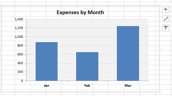
Figure 7-7: The chart area for this chart is transparent. The plot area, however, contains a fill color.
Working with the plot area
The plot area is the part of the chart that contains the actual chart. The plot area contains all chart elements except the chart title and the legend.
Although the plot area consists of elements such as axes and axis labels, when you change the fill of the plot area, these “outside” elements are not affected.
If you set the Fill option to No Fill, the plot area will be transparent. Therefore, the color and patterns applied to the chart area will show through. You can also set the plot area to a solid color and adjust the Transparency setting so that the chart area shows through partially.
In some situations, you may want to insert an image into the plot area. To do so, use the Fill tab of the Format Plot Area dialog box, and choose the Picture or Texture Fill option. The image can come from a file, the Clipboard, or clip art. Figure 7-8 shows a column chart that uses a graphic in the plot area. In addition, the column series is partially transparent.
Figure 7-8: The plot area for this chart uses a graphic image.
To reposition the plot area within the chart area, select the plot area and then drag a border to move it. To change the size of the plot area, drag one of the corner “handles.” If you like, you can expand the plot area so that it fills the entire chart area.
You’ll find that different chart types vary in how they respond to changes in the plot area dimensions. For example, you cannot change the relative dimensions of the plot area of a pie chart or a radar chart (it’s always square). But with other chart types, you can change the aspect ratio of the plot area by changing either the height or the width.
Also, be aware that the size of the plot area can be changed automatically when you adjust other elements of your chart. For example, if you add a legend or title to a chart, the size of the plot area may be reduced to accommodate the legend.
Remember to think of the purpose and utility of your chart before adding images to the plot area. Images may be appropriate for charts used as marketing or sales tools where visual components and eye candy help attract attention. Although in an analytical environment where the data is the primary product of your chart, there is no be a need to dress up your data with superfluous images.
Formatting Chart Series
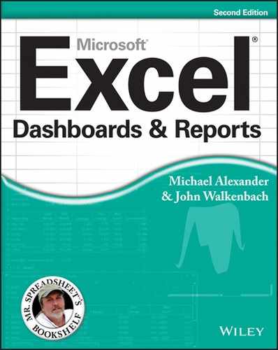
Making a few simple formatting changes to a chart series can make a huge difference in the readability of your chart. When you create a chart, Excel uses its default colors and marker styles for the series. In many cases, you’ll want to modify these colors or marker styles for clarity (basic formatting). In other cases, you may want to make some drastic changes for impact.
You can apply formatting to the entire series or to a single data point within the series — for example, make one column a different color to draw attention to it.
 This workbook, named Chapter 7 Samples.xlsx, is available at www.wiley.com/go/exceldr with the other example files for this book.
Basic series formatting
Basic series formatting is very straightforward: Just select the data series on your chart and use the tools in the Chart Tools→Format→Shape Styles group to make changes. For more control, press Ctrl+1 and use the Format Data Series dialog box.
Using pictures and graphics for series formatting
You can add a picture to several chart elements, including data markers on line charts and series fills for column, bar, area, bubble, and filled radar charts. Figure 7-9 shows a column chart that uses a clip art image of a car. The picture was added using the Fill tab of the Format Data Series dialog box (select the Picture or Texture Fill option; then click the Clip Art button to select the image). In addition, the original image is sized so that each car represents approximately 20 units.
Figure 7-10 shows another example. The data markers in this line chart display a shape that was inserted in the worksheet and then copied to the Clipboard. Select the line series and press Ctrl+V to paste the shape.

Figure 7-9: This column chart uses a clip art image.
You can also use the Marker Fill tab of the Format Data Series dialog box to specify Picture or Texture Fill. However, the result is very different. If you use the Clipboard button to paste the copied shape, the pasted image will fill the existing marker (not replace it). You’ll probably need to increase the marker size, and also hide the marker borders.
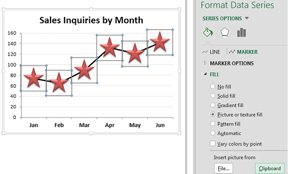
Figure 7-10: The data markers use a shape that was copied to the Clipboard.
Again, the purpose and utility of your chart should dictate whether pictures and graphics are appropriate. Charts for sales presentations, for example, can benefit from pictures and graphics given that visual enhancements can increase the possibility of prospective buyers paying attention to you. But in boardroom presentations where data is king, images will just get in the way. Think of it as selecting the right outfit for the right occasion. You wouldn’t give a serious a speech in a Roman general’s uniform. How well will you get your point across when your audience is thinking, “What’s the deal with Tiberius”?
Additional series options
Chart series offer a number of additional options. These options are located in the Series Options tab of the Format Data Series dialog box. The set of options varies, depending on the chart type of the series. In most cases, the options are self-explanatory. But, if you are unsure about a particular series option, try it! If the result isn’t satisfactory, change the setting to its original value or press Ctrl+Z to undo the change.
Figure 7-11 shows an example of modifying series settings. The chart uses a Series Overlap of 50% and a Gap Width of 28%.

Figure 7-11: A column chart, after adjusting the Series Overlap and Gap Width settings
About those fancy effects
Excel 2007 introduced several new formatting options, which are known as effects. Access these effects by choosing Chart Tools→Format→Shape Styles→Shape Effects. For more options, use the Format dialog box. Note that not all effects work with all chart elements.
Following is a general description of the effect types:
• Shadow: Adds a highly customizable shadow to the selected chart element. Choose from a number of preset shadows, or create your own using the Shadow tab of the Format dialog box. Shadows, when used tastefully, can improve the appearance of a chart by adding depth.
• Glow: Adds a color glow around the element. Charts are rarely improved by adding a glow to any element.
• Soft Edges: Makes the edges of the element softer. Extreme settings make the element appear to be out of focus, become smaller, or even disappear.
• Bevel: Adds a 3-D bevel look to the element. This effect is highly customizable, and you can use it to create a frame for your chart (see the accompanying figure).
• 3-D Rotation: This effect does not work with any chart elements.
The best advice regarding these effects is to use them sparingly with charts. Generally, a chart’s formatting shouldn’t draw attention away from the point you’re trying to make with the chart.
Working with Chart Titles
A chart can have as many as five different titles:
→ Chart title
→ Category axis title
→ Value axis title
→ Secondary category axis title
→ Secondary value axis title
The number of titles depends on the chart type. For example, a pie chart supports only a chart title because it has no axes. Figure 7-12 shows a chart that contains four titles: the chart title, the horizontal category axis title, the vertical value axis title, and the secondary vertical axis title.

Figure 7-12: This chart has four titles.
Adding titles to a chart
To add a chart title to a chart, activate the chart and click the Chart Elements button next to the chart. This will expand a menu of chart elements you can add to your chart. Place a check next to Chart Title.
To add axis titles to a chart, simply place a check next to the Axis Titles option. Keep in mind that the options include only those that are appropriate for the chart. For example, if the chart doesn’t have a secondary value axis, you don’t have an option to add a title to the nonexistent axis.
Contrary to what you might expect, you cannot resize a chart title. When you select a title, it displays the characteristic border and handles — but the handles cannot be dragged to change the size of the object. The only way to change the size is to change the size of the font used in the title. For more control over a chart’s title, you can use a text box instead of an official title.
Changing title text
When you add a title to a chart, Excel inserts generic text to help you identify the title. To edit the text used in a chart title, click the title once to select it; then click a second time inside the text area. If the title has a vertical orientation, things get a bit tricky because you need to use the up- and down-arrow keys rather than the left- and right- arrow keys.
For lengthy titles, Excel handles the line breaks automatically. To force a line break in the title, press Enter. To add a line break within existing title text, press Ctrl+Shift+Enter.
Formatting title text
Unfortunately, Excel does not provide a “one-stop” place to change all aspects of a chart title. The Format Chart Title dialog box provides options for changing the fill, border, shadows, 3-D format, and alignment. If you want to change anything related to the font, you need to use the Ribbon (or right-click and use the mini toolbar). Yet another option is to right-click the chart element and choose Font from the shortcut menu. This displays the Font dialog box, with options that aren’t available elsewhere. For example, the Font dialog box lets you control the character spacing of the text.
Most of the font changes you make will use the tools in the Home→Font group. You may be tempted to use the controls in the Chart Tools→Format→WordArt Styles group, but these controls are primarily for special effects.
You can easily modify the formatting for individual characters within a title. Select the title, highlight the characters that you want to modify, and apply the formatting. The formatting changes you make will affect only the selected characters.
Linking title text to a cell
When you create a chart, you might like to have some of the chart’s text elements linked to cells. That way, when you change the text in the cell, the corresponding chart element updates. And, of course, you can even link chart text elements to cells that contain a formula. For example, you might link the chart title to a cell that contains a formula that returns the current date.
You can create a link to a cell for the chart title or any of the axis titles. Follow these steps:
1. Select the chart element that will contain the cell link. Make sure that the text element itself is selected (don’t select text within the element).
2. Click the Formula bar.
3. Type an equal sign (=).
4. Click the cell that will be linked to the chart element.
5. Press Enter.
Figure 7-13 shows a chart that has links for the following elements: chart title, the vertical axis title, and the horizontal axis title.
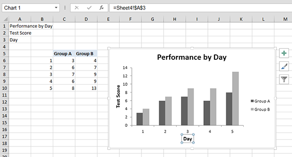
Figure 7-13: The titles in this chart are linked to cells.
Adding free-floating text to a chart
Text in a chart is not limited to titles. In fact, you can add free-floating text anywhere you want by inserting a text box into the chart. To do so, follow these steps:
1. Select the chart.
2. Choose Insert→Text Box.
3. Click and drag within the chart to create the text box.
4. Start typing the text.
You can click and drag the text box to change its size or location. And when the text box is selected, you can access the formatting tools using the controls on the Drawing Tools→Format tab.
The accompanying figure shows a chart with a text box that contains quite a bit of formatted text. The chart’s plot area was reduced in size to accommodate the text box.
There’s nothing special about a text box. A text box is actually a rectangular shape object that contains text. You can change it to a different shape, if you like. Select the text box and choose Drawing Tools→ Format→ Insert Shapes→ Edit Shape →Change Shape, and select a shape from the list. The Format Shape dialog box gives you lots of options for changing the look of the text box.
If you would like to link the text box to a cell, follow these steps:
1. Select the text box.
2. Click the Formula bar.
3. Type an equal sign (=).
4. Click the cell that will be linked to the chart element.
After you create the link, the text box will always display the contents of the cell it’s linked to.
Some people prefer to use a text box in place of a chart’s title because a text box provides much more control over formatting. When a text box is selected, its Format Shape dialog box provides several additional options, compared to the Format Chart Title dialog box.
Working with a Chart’s Legend
A chart legend identifies the series in the chart and consists of text and keys. A key is a small graphic image that corresponds to the appearance of the corresponding chart series. The text displayed in a legend corresponds to the series names. The order of the items within a legend varies, depending on the chart type.
Adding or removing a legend
To add a legend to a chart, activate the chart and click the Chart Elements button next the chart. This will expand a menu of chart elements you can add to your chart. Place a check next to Legend.
The quickest way to remove a legend is to select it and press Delete.
Moving or resizing a legend
To move a legend, click it and drag it to the desired location. Alternatively, you can activate the chart, click the Chart Elements button next the chart, and then click the arrow next to the Legend option to choose any one of the predefined positions listed (Right, Top, Left, or Bottom). If you move a legend from its default position, you may want to change the size of the plot area to fill in the gap left by the legend. Just select the plot area and drag a border to make it the desired size.
To change the size of a legend, select it and drag any of its corners. Excel will adjust the legend automatically and may display it in multiple columns.
Formatting a legend
You can select an individual legend entry within a legend and format it separately. For example, you may want to make the text bold to draw attention to a particular data series. To select an element in the legend, first select the legend and then click the desired entry.
You can’t change the formatting of individual characters in a legend entry. For example, if you’d like the legend to display a superscript or subscript character, you’re out of luck.
When a single legend entry is selected, you can use the Format Legend Entry dialog box to format the entry. When a legend entry is selected, and you apply any type of formatting except text formatting, the formatting affects the legend key and the corresponding series. In other words, the appearance of the legend key will always correspond to the data series.
You can’t use the Chart Elements drop-down list to select a legend entry. You must either click the item or select the legend itself, and then press the right-arrow key until the desired element is selected.
Changing the legend text
The legend text corresponds to the names of the series on the chart. If you didn’t include series names when you originally selected the cells to create the chart, Excel displays a default series name (Series 1, Series 2, and so on) in the legend.
To add series names, choose Chart Tools→Design→Select Data to display the Select Data Source dialog box. Select the series name and click the Edit button. In the Edit Series dialog box, type the series name or enter a cell reference that contains the series name. Repeat for each series that needs naming. Alternatively, you can edit the SERIES formula, as described in Chapter 5.
Deleting a legend entry
For some charts, you may prefer that one or more of the data series not appear in the legend. To delete a legend entry, just select it and press Delete. The legend entry will be deleted, but the data series will remain intact.
If you’ve deleted one or more legend entries, you can restore the legend to its original state by deleting the entire legend and then adding it back.
Identifying series without using a legend
Legends are appropriate for charts that have at least two series. But even then, all charts do not require a legend. You may prefer to identify relevant data using other methods, such as a data label, a text box, or a shape with text. Figure 7-14 shows a chart in which the data series are identified by using text in shapes, which were added to the chart using Insert→Illustrations→Shapes.

Figure 7-14: This chart uses shapes as an alternative to a legend.
Working with Chart Axes
As you know, charts vary in the number of axes that they use. Pie and doughnut charts have no axes. All 2-D charts have at least two axes, and they can have three (if you use a secondary value or category axis) or four (if you use a secondary category axis and a secondary value axis). Three-dimensional charts have three axes — the “depth” axis is known as the series axis.
Excel provides you with a great deal of control over the look of chart axes. To modify any aspect of an axis, access its Format Axis dialog box. The dialog box varies, depending on which type of axis is selected.
This workbook, named axes.xlsx, is available at www.wiley.com/go/exceldr with the other example files for this book.
All aspects of axis formatting are covered in the sections that follow.
Value axis versus category axis
Before getting into the details of formatting, it’s important to understand the difference between a category axis and a value axis. A category axis displays arbitrary text, whereas a value axis displays numerical intervals. Figure 7-15 shows a simple column chart with two series. The horizontal category axis displays labels that represent the categories. The vertical value axis, on the other hand, is a value axis which has a numerical scale.

Figure 7-15: The category axis displays arbitrary labels, whereas the value axis displays a numerical scale.
In this example, the category labels happen to be text. Alternatively, the categories could be numbers. Figure 7-16 shows the same chart after replacing the category labels with numbers. Even though the chart becomes meaningless, it should be clear that the category axis does not display a true numeric scale. The numbers displayed are completely arbitrary, and the chart itself was not affected by changing these labels.
Figure 7-16: The category labels have been replaced with numbers — but the numbers do not function as numbers.
Two of Excel’s chart types are different from the other chart types in one important respect. Scatter charts and bubble charts use two value axes. For these chart types, both axes represent numeric scales.
Figure 7-17 shows two charts (a scatter chart and a line chart) that use the same data. The data shows world population estimates for various years. Note that the interval between the years in column A is not consistent.
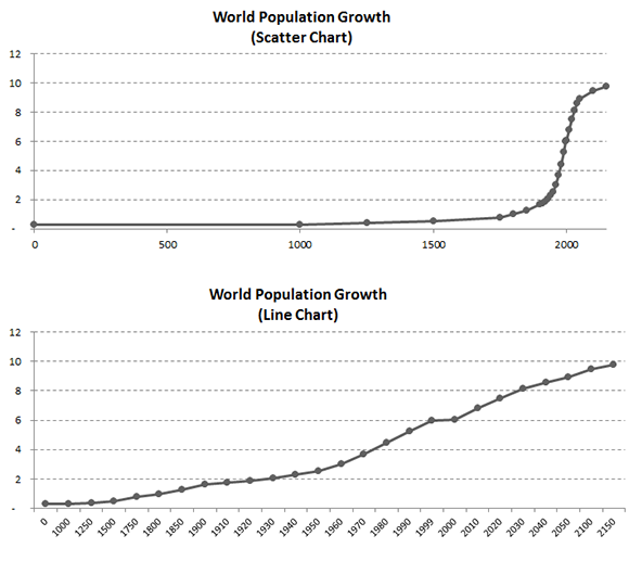
Figure 7-17: These charts plot the same data but present very different pictures.
The scatter chart, which uses two value axes, plots the years as numeric values. The line chart, on the other hand, uses a (non-numeric) category axis, and it assumes that the categories (the years) are equally spaced. This, of course, is not a valid assumption, and the line chart presents a very inaccurate picture of the population growth: It appears to be linear, but it’s definitely not.
 For more information about time-based axes, refer to the “Using time-scale axes” section later in this chapter.
Value axis scales
The numerical range of a value axis represents the axis’s scale. By default, Excel automatically scales each value axis. It determines the minimum and maximum scale values for the axis, based on the numeric range of the data. Excel also automatically calculates a major unit and a minor unit for each axis scale. These settings determine how many intervals (or tick marks) are displayed on the axis and determine how many gridlines are displayed. In addition, the value at which the axis crosses the category axis is also calculated automatically.
You can, of course, override this automatic behavior and specify your own minimum, maximum, major unit, minor unit, and cross-over for any value axis. You set these specifications by right-clicking on the axis and selecting Format Axis. This will activate the Format Axis dialog box shown in Figure 7-18. Use the settings under Axis Options to customize the axis as needed.
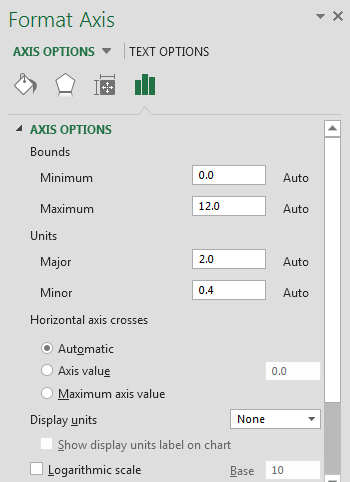
Figure 7-18: The Axis Options tab of the Format Axis dialog box.
A category axis does not have a scale because it displays arbitrary category names. For a category axis, the Axis Options tab of the Format Axis dialog box displays a number of other options that determine the appearance and layout of the axis.
Adjusting the scale of a value axis can dramatically affect the chart’s appearance. Manipulating the scale, in some cases, can present a false picture of the data. Figure 7-19 shows two line charts that depict the same data. The top chart uses Excel’s default axis scale values, which extend from 8,000 to 9,200. In the bottom chart, the Minimum scale value was set to 0, and the Maximum scale value was set to 10,000. A casual viewer might draw two very different conclusions from these charts. The top chart makes the differences in the data seem more prominent. The lower chart gives the impression that not much change has occurred over time.
The actual scale that you use depends on the situation. There are no hard-and-fast rules regarding setting scale values, except that you shouldn’t misrepresent data by manipulating the chart to prove a point that doesn’t exist. In addition, most agree that the value axis of a bar or column chart should always start at zero (and even Excel follows that rule).

Figure 7-19: These two charts show the same data, but they use different value axis scales.
If you’re preparing several charts that use similarly scaled data, keeping the scales constant across all charts facilitates comparisons across charts. The charts in Figure 7-20 show the distribution of responses for two survey questions. For the top chart, the value axis scale ranges from 0% to 50%. For the bottom chart, the value axis scale extends from 0% to 35%. Because the same scale was not used on the value axes, however, comparing the responses across survey items is difficult.

Figure 7-20: These charts use different scales on the value axis, making a comparison between the two difficult.
Another option in the Format Axis dialog box is Values in Reverse Order. The top chart in Figure 7-21 uses default axis settings. The bottom chart uses the Values in Reverse Order option, which reverses the scale’s direction. Notice that the category axis is at the top. If you would prefer that it remain at the bottom of the chart, select the Maximum Axis Value option for the Horizontal Axis Crosses setting.
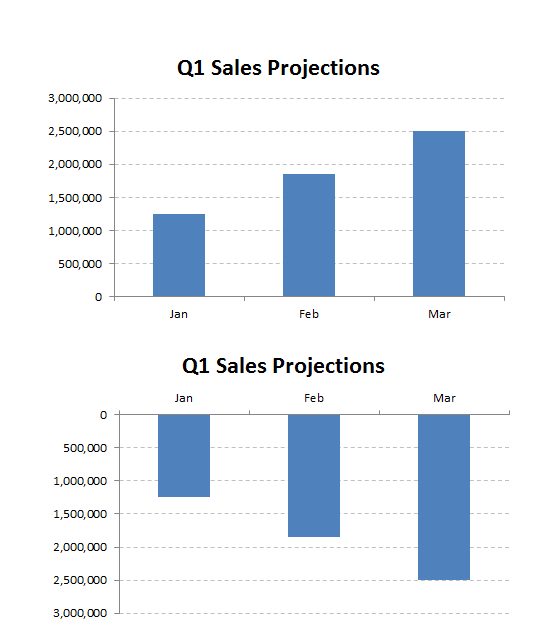
Figure 7-21: The bottom chart uses the Values in Reverse Order option.
If the values to be plotted cover a very large range, you may want to use a logarithmic scale for the value axis. A log scale is most often used for scientific applications. Figure 7-22 shows two charts. The top chart uses a standard scale, and the bottom chart uses a logarithmic scale. Note that the base is 10, so each scale value in the chart is 10 times greater than the one below it. Increasing the base unit to 100 would result in a scale in which each tick mark value is 100 times greater than the one below.
If your chart uses very large numbers, you may want to change the Display Units settings. Figure 7-23 shows a chart that uses very large numbers. The lower chart uses the Display Units as Millions setting, with the option to Show Display Units Label on Chart. Excel inserted the label “Millions,” which was edited to display as “Millions of Miles.”

Figure 7-22: These charts display the same data, but the lower chart uses a logarithmic scale.
Another way to change the number display is to use a custom number format for the axis values. For example, to display the values in millions, click the Number tab of the Format Axis dialog box, select the Custom category, and then enter this format code:

Figure 7-23: The lower chart uses display units of millions.
An axis also has tick marks — the short lines that depict the scale units and are perpendicular to the axis. In the Axis Options dialog box, you can select the type of tick mark for the major units and the minor units. The options are as follows:
→ None: No tick marks
→ Inside: Tick marks on the inside of the axis only
→ Outside: Tick marks on the outside of the axis only
→ Cross: Tick marks on both sides of the axis
You can also control the position of the tick mark labels. The options are as follows:
→ None: No labels.
→ Low: For a horizontal axis, labels appear at the bottom of the plot area; for a vertical axis, labels appear to the left of the plot area.
→ High: For a horizontal axis, labels appear at the top of the plot area; for a vertical axis, labels appear to the right of the plot area.
→ Next to axis: Labels appear next to the axis (the default setting).
Major tick marks are the axis tick marks that normally have labels next to them. Minor tick marks are between the major tick marks.
When you combine these settings with the Axis Crosses At option, you have a great deal of flexibility, as shown in Figure 7-24. These charts all display the same data, but the axes are formatted differently.

Figure 7-24: Various ways to display axis labels and crossing points.
Using time-scale axes
When you create a chart, Excel attempts to determine whether your category axis contains date or time values. If so, it creates a time-series chart. Figure 7-25 shows a simple example. Column A contains dates, and column B contains the values plotted on the column chart. The data consists of values for only ten dates, yet Excel created the chart with 31 intervals on the category axis. It recognized that the category axis values were dates, and created an equal-interval scale.
If you would like to override Excel’s decision to use a time-based category axis, you need to access the Axis Options tab of the Format Axis dialog box. There, you’ll discover that the default category axis option is Automatically Select Based on Data. Change this option to Text Axis, and the chart will resemble Figure 7-26. On this chart, the dates are treated as arbitrary text labels.

Figure 7-25: Excel recognizes the dates and creates a time-based category axis.

Figure 7-26: The previous chart, using a standard category axis.
A time-scale axis option is available only for the category axis (not the value axis).
When a category axis uses dates, the Axis Options tab of the Format Axis dialog box lets you specify the Base Unit, the Major Unit, and the Minor Unit — each in terms of days, months, or years.
If you need a time-scale axis for smaller units (such as hours), you need to use a scatter chart. That’s because a date-scale axis treats all values as integers. Therefore, every time value is plotted as midnight of that day. Figure 7-27 shows a scatter chart that plots scheduled versus actual arrival times for flights. Note that both of the value axes display times, in one-hour increments.
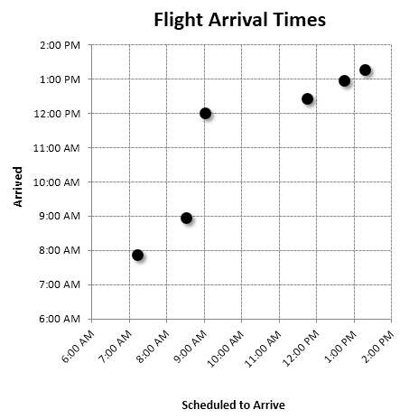
Figure 7-27: This scatter chart displays times on both value axes.
Unfortunately, Excel does not allow you to specify time values on the Axis Options tab of the Format Axis dialog box. If you want to override the default minimum, maximum, or major unit values, you must manually convert the time value to a decimal value.
This chart uses the following scale values:
→ Minimum axis scale value: .25 (6:00 am)
→ Maximum axis scale value: .58333 (2:00 pm)
→ Major unit: .041666 (1:00:00)
To convert a time value to a decimal number, enter the time value into a cell. Then apply General number formatting to the cell. Time values are expressed as a percentage of a 24-hour day. For example, 12:00 noon is 0.50.
Creating a multiline category axis
Most of the time, the labels on a category axis consist of data from a single column or row. You can, however, create multiline category labels, as shown in Figure 7-28. This chart uses the text in columns A:C for the category axis labels.

Figure 7-28: The category axis contains labels from three columns.
When this chart was created, range A1:E10 was selected. Excel determined automatically that the first three columns would be used for the category axis labels.
This type of data layout is common when you work with pivot table, and pivot charts often use multiline category axes.
Removing axes
To remove an axis is to select it and then press Delete.
Figure 7-29 shows three charts with no axes displayed. Using data labels makes the value axis superfluous, and it is assumed that the reader understands what the horizontal axis represents.

Figure 7-29: Three line charts with no axes.
Axis number formats
A value axis, by default, displays its values using the same number format that’s used by the chart’s data. You can provide a different number format, if you like, by using the Number tab of the Format Axis dialog box. Changing the number format for a category axis that displays text will have no effect.
Don’t forget about custom number formats. Figure 7-30 shows a chart that uses the following custom number format for the value axis:
General “ mph”
This number format causes the text mph to be appended to each value.

Figure 7-30: The value axis uses a custom number format to provide units for the values.
Working with Gridlines
Gridlines can help the viewer determine the values represented by the series on the chart. Gridlines are optional, and you have quite a bit of control over the appearance of gridlines. Gridlines simply extend the tick marks on the axes. The tick marks are determined by the major unit and minor unit specified for the axis.
Gridlines are applicable to all chart types except pie charts and doughnut charts.
Some charts look better with gridlines; others appear more cluttered. It’s up to you to decide whether gridlines can enhance your chart. Sometimes, horizontal gridlines alone are enough, although scatter charts often benefit from both horizontal and vertical gridlines. In many cases, gridlines will be less overpowering if you make them dashed lines with a gray color.
Adding or removing gridlines
To add or remove gridlines, activate the chart and click the Chart Elements button next the chart. This will expand a menu of chart elements you can add to your chart. Place a check next to Gridlines to add gridlines. Remove the check to remove gridlines.
Each axis has two sets of gridlines: major and minor. Major units are the ones that display a label. Minor units are those in between the labels. If you’re working with a chart that has a secondary category axis, a secondary value axis, or a series axis (for a 3-D chart), the dialog box has additional options for three sets of gridlines.
A more direct way to remove a set of gridlines is to select the gridlines and press Delete.
If a chart uses a secondary axis, you can specify either or both value axes to display gridlines. As you might expect, displaying two sets of gridlines in the same direction can be confusing and result in additional clutter.
To modify the properties of a set of gridlines, select one gridline in the set (which selects all in the set) and access the Format Gridlines dialog box. Or, use the controls in the Chart Tools→Format→Shape Styles group.
You can’t apply different formatting to individual gridlines within a set of gridlines. All gridlines in a set are always formatted identically.
Working with Data Labels
For some charts, you may want to identify the individual data points in a series by displaying data labels.
Adding or removing data labels
To add data labels, activate the chart and click the Chart Elements button next the chart. This will expand a menu of chart elements you can add to your chart. Place a check next to Data Labels.
To remove data labels from a particular series, select the data labels and press Delete. To remove a single data label, click the individual label once to select the series data labels; then click the individual label again. This will ensure that only the targeted label is selected. At this point, you can press Delete.
If an entire chart series is selected, data labels will be added to the selected series. If a single point is selected, a data label will be applied to only to the selected point. If a chart element other than a series (or single point) is selected, Excel adds data labels to all series in the chart.
Editing data labels
After adding data labels to a series, you can apply formatting to the labels by right-clicking on the labels and selecting Format Data Labels. This will activate the Format Data Labels dialog box. To specify the contents of the data labels, use the Label Options tab of the Format Data Labels dialog box. Figure 7-31 shows this dialog box for a pie chart.
When you click a data label, the labels for the entire series are selected. If you click a second time (on a single label), only that data label is selected. In other words, Excel lets you format all data labels at once or format just a single data label.
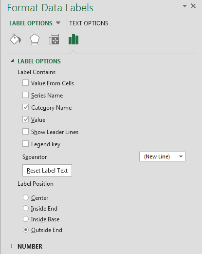
Figure 7-31: Options for displaying data labels.
The types of information that can be displayed in data labels are as follows:
→ The series name
→ The category name
→ The numeric value
→ The value as a percentage of the sum of the values in the series (for pie charts and doughnut charts only)
→ The bubble size (for bubble charts only)
Other options are as follows. Keep in mind that not all options are available for all chart types.
→ Show Leader Lines: If selected, Excel displays a line that connects the data label with the chart series data point.
→ Label Position: Specifies the location of the data labels, relative to each data point.
→ Include Legend Key in Label: If selected, each data label displays its legend key image next to it.
→ Separator: If you specify multiple contents for the data labels, this control enables you to specify the character that separates the elements (a comma, a semicolon, a period, a space, or a line break).
The Format Data Labels dialog box also lets you specify a variety of other formatting options for your data labels.
The column chart in Figure 7-32 contains data labels that display category names and their values. These labels are positioned to appear on the Outside End. These data labels use the New Line separator option, so the value appears on a separate line. Because the category name is included in the data labels, the horizontal category axis labels aren’t necessary.
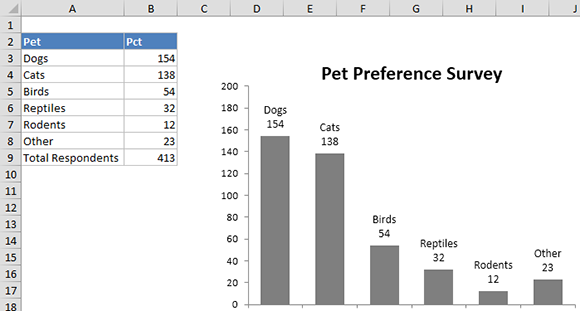
Figure 7-32: Data labels in a column chart.
The data labels display the values for each data point. For this particular chart, it would be preferable to display the value as a percentage of the total. Unfortunately, the Percent option is available only for a pie or doughnut chart. The alternative is to calculate the percentages using formulas and then plot the percentage data rather than the actual value data.
Figure 7-33 shows a line chart in which the data labels are positioned on top of the (large) markers. The data labels were positioned using the Center option.
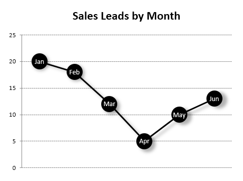
Figure 7-33: Positioning data labels on series markers.
To make your markers large, right-click on any of the markers in your series and select Format Data Series. This will activate the Format Data Series dialog box. Click on the Fill & Line icon (the paint bucket) and choose Marker→Maker Options. Adjust the Size property to make your markers as big as you need them to be.
To override a particular data label with other text, select the label and enter the new text. To select an individual data label, click once to select all the data labels; then click the specific data label to select it.
To link a selected data label to a cell, follow these steps:
1. Click in the Formula bar.
2. Type an equal sign (=).
3. Click the cell that contains the text.
4. Press Enter.
After adding data labels, you’ll often find that the data labels aren’t positioned optimally. For example, one or more of the labels may be obscured by another data point or a gridline. If you select an individual label, you can drag the label to a better location.
Problems and limitations with data labels
As you work with data labels, you will probably discover that Excel’s Data Labels feature leaves a bit to be desired. For example, it would be nice to be able to specify a range of text to be used for the data labels. This would be particularly useful in scatter charts in which you want to identify each data point with a particular text item. Figure 7-34 shows a scatter chart. If you would like to apply data labels to identify the student for each data point, you’re out of luck.

Figure 7-34: Excel provides no direct way to add descriptive data labels to the data points.
Despite what must amount to thousands of requests, Microsoft still has not added this feature to Excel! You need to add data labels and then manually edit each label.
A few utility add-ins are available, which allow you to specify an arbitrary range of text to be used for data labels. One such product is Power Utility Pak, available from John Walkenbach’s website (http://spreadsheetpage.com).
As you work with data labels, you’ll find that this feature works best for series that contain a relatively small number of data points. The chart in Figure 7-35, for example, contains 24 data points. You can’t display all the data labels on this chart and keep the chart legible.

Figure 7-35: Data labels don’t work well for this chart.
One option is to delete some of the individual data labels. For example, you might want to delete all the data labels except those at the high and low points of the series. Deleting only certain data labels is, however, a manual process. To delete an individual data label, select it and press Delete. Using gridlines provides another way to let the reader discern the values for the data points. Yet another alternative is to use a data table, which is described in the next section.
Working with a Chart Data Table
There may be situations where it’s valuable to show all the data values along with the plotted data points. However, you’ve adding data labels can inundate your audience with a bevy of numbers that muddle the chart.
Instead of using data labels, you can attach a Data Table to your Excel chart. A data table allows you to see the data values for each plotted data point, beneath the chart, showing the data without overcrowding the chart itself. Figure 7-36 shows a chart that includes a data table.
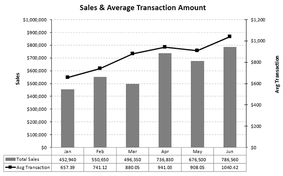
Figure 7-36: This chart includes a data table.
This workbook, named data table.xlsx, is available at www.wiley.com/go/exceldr with the example files for this book.
Adding and removing a data table
To add or remove data tables, activate the chart and click the Chart Elements button next the chart. This will expand a menu of chart elements you can add to your chart. Place a check next to Data Table to add a data table. Remove the check to remove the data table.
Problems and limitations with data tables
One problem with data tables, as noted previously, is that this feature is available for only a few chart types. Formatting options for a data table are relatively limited. Data table formatting changes are made in the Format Data Table dialog box.
The Fill tab is a bit misleading because it does not actually allow you to change the fill color for the data table. Rather, you are limited to formatting the background of the text and numbers in the data table.
Unfortunately, you cannot apply different font formatting to individual cells or rows within the data table. You also can’t change the number formatting. The numbers displayed in a data table always use the same number formatting as the source data.
When you add a data table to a chart, the data table essentially replaces the axis labels on the horizontal axis. The first row of the data table contains these labels, so losing them isn’t a major problem. However, you will not be able to apply separate formatting to the axis labels — they will have the same formatting as the other parts of the data table.
An exception to the behavior described in the preceding paragraph occurs with bar charts and charts with a time-scale category axis. For these types of charts, the data table is positioned below the chart and does not replace any axis labels.
Another potential problem with data tables occurs when they are used with embedded charts. If you resize the chart to make it smaller, the data table may not show all the data.
Using a data table is probably best suited for charts on chart sheets. If you need to show the data used in an embedded chart, you can do so using data in cells, which provides you with much more flexibility in terms of formatting.