Chapter 8: Components That Show Trending
In This Chapter
• Understanding basic dashboard trending concepts
• Comparing trends across multiple series
• Emphasizing distinct periods of time in your trends
• Working past other anomalies in trending data
One of the most common concepts used in dashboards and reports is the concept of trending. A trend is a measure of variance over some defined interval — typically time periods, like days, months, or years.
The reason trending is so popular is that it provides a rational expectation of what might happen in the future. If we know this book has sold 5,000 copies a month over the last 12 months, we have reason to believe that sales next month will be around 5,000 copies. In short, trending tells you where you’ve been and where you might be going.
In this chapter, you explore basic trending concepts and some of the advanced dashboard techniques you can use to take your trending components beyond simple line charts.
Trending Dos and Don’ts
Building trending components for your dashboards has some dos and don’ts. This section helps you avoid some common trending faux pas.
Using chart types appropriate for trending
It would be nice if you could definitively say which chart type you should use when building trending components. But the truth is that no chart type is the silver bullet for all situations. For effective trending, you need to understand which chart types are most effective in different trending scenarios.
Using line charts
Line charts are the kings of trending. In business presentations, a line chart almost always indicates movement across time. Even in areas not related to business, the concept of lines is used to indicate time — consider timelines, family lines, bloodlines, and so on. The benefit of using a line chart for trending is that it’s instantly recognized as a trending component, avoiding any delay in information processing.
Line charts are especially effective in presenting trends with many data points — as the top chart in the Figure 8-1 shows. You can also use a line chart to present trends for more than one time period, as shown in the bottom chart in Figure 8-1.

Figure 8-1: Line charts are the chart of choice when you need to show trending over time.
Using area charts
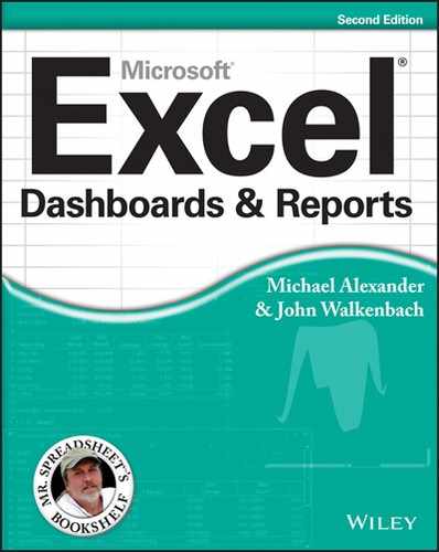
An area chart is essentially a line chart that’s been filled in. So, technically, area charts are appropriate for trending. They’re particularly good at highlighting trends over a long time span. For example, the chart in Figure 8-2 spans more than 120 days of data.
Using combination charts
If you’re trending one series of time, a line chart is absolutely the way to go. However, if you’re comparing two or more time periods on the same chart, combination charts may bring out the comparisons better.
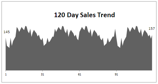
Figure 8-2: You can use area charts to trend over a long time span.
Figure 8-3 demonstrates how a combination chart can more easily call attention to the exact months when 2010 sales fell below 2009. A combination of line and column charts is a very effective way to show the difference in units sold between two time periods. We show you how to create this type of chart later in this chapter.

Figure 8-3: Using columns and lines emphasizes the trending differences between two time periods.
Starting the vertical scale at zero
The vertical axis on trending charts should almost always start at zero. The reason we say almost is because you may have trending data that contains negative values or fractions. In those situations, it’s generally best to keep Excel’s default scaling. However, in situations where there are only non-negative integers, ensure that your vertical axis starts at zero.
The reason is that the vertical scale of a chart can have a significant impact on the representation of a trend. For instance, the two charts shown in Figure 8-4 contain the same data. The only difference is that in the top chart, we did nothing to fix the vertical scale assigned by Excel (it starts at 96), but in the bottom chart, we fixed the scale to start at zero.
Now, you may think the top chart is more accurate because it shows the ups and downs of the trend. However, if you look at the numbers closely, you see that the units represented went from 100 to 107 in 12 months. That’s not exactly a material change, and it certainly doesn’t warrant such a dramatic chart. Actually, the trend is relatively flat, yet the top chart makes it look as though the trend is way up.
The bottom chart more accurately reflects the true nature of the trend. We achieved this effect by locking the Minimum value on the vertical axis to zero.

Figure 8-4: Vertical scales should always start at zero.
To adjust the scale of your vertical axis, follow these simple steps:
1. Right-click the vertical axis and choose Format Axis.
The Format Axis dialog box appears. (See Figure 8-5.)
2. In the Format Axis dialog box, expand the Axis Options section and set the Minimum value to 0.
3. (Optional) You can set the Major Unit value to half the Maximum value in your data.
This ensures that your trend line is placed in the middle of your chart.
4. Click the Close button (the x) to apply your changes.

Figure 8-5: Always set the Minimum value of your vertical axis to zero.
 Some of you would argue that the bottom chart shown in Figure 8-4 hides the small-scale trending that may be important. That is, a seven unit difference may be very significant in some businesses. Well, if that’s true, why use a chart at all? If each unit has such an impact on the analysis, why use a broad-sweep representation like a chart? A table with conditional formatting will do a better job at highlighting small-scale changes than any chart can.
Leveraging Excel’s logarithmic scale
In some situations, your trending may start with very small numbers and end with very large numbers. In these cases, you end up with charts that don’t accurately represent the true trend. Take Figure 8-6, for instance. In this figure, you see the unit trending for both 2009 and 2010. As you can see in the source data, 2009 started with a modest 50 units. As the months progressed, the monthly unit count increased to 11,100 units through December 2010. Because the two years are on such different scales, it’s difficult to discern a comparative trending for the two years together.

Figure 8-6: A standard linear scale doesn’t allow for accurate trending in this chart.
The solution is to use a logarithmic scale instead of a standard linear scale.
Without going into high school math, a logarithmic scale allows your axis to jump from 1 to 10, to 100 to 1,000, and so on without changing the spacing between axis points. In other words, the distance between 1 and 10 is the same as the distance between 100 and 1,000.
Figure 8-7 shows the same chart as the one in Figure 8-6, but in a logarithmic scale. Notice that the trending for both years is now clear and accurately represented.

Figure 8-7: Using the logarithmic scale helps bring out trending in charts that contain very small and very large values.
To change the vertical axis of a chart to logarithmic scaling, follow these steps:
1. Right-click the vertical axis and choose Format Axis. The Format Axis dialog box appears.
2. Expand the Axis Options section and place a check next to Logarithmic scale, as shown in Figure 8-8.
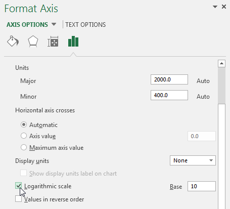
Figure 8-8: Setting the vertical axis to Logarithmic scale.
 Logarithmic scales work only with positive numbers.
Applying creative label management
As trivial as it may sound, labeling can be one of the sticking points to creating effective trending components. Trending charts tend to hold lots of data points, whose category axis labels take up lots of room. Inundating users with a gaggle of data labels can definitely distract from the main message of the chart. In this section, you find a few tips to help manage the labels in your trending components.
Abbreviating instead of changing alignment
Month names look and feel very long when you have to place them in a chart — especially when that chart must fit on a dashboard. However, the solution isn’t to change their alignment, as shown in Figure 8-9. Words that are placed on their sides inherently cause a reader to stop for a moment and read the labels. This isn’t ideal when you want them to think about your data and not spend time reading with their heads tilted.
Although it’s not always possible, the first option is always to keep your labels normally aligned. So instead of jumping right to the alignment option to squeeze them in, try abbreviating the month names. As you can see in Figure 8-9, even using the first letter of the month name is appropriate.

Figure 8-9: Choose to abbreviate category names instead of changing alignment.
Implying labels to reduce clutter
When you’re listing the same months over the course of multiple years, you may be able to imply the labels for months instead of labeling each and every one of them.
Take Figure 8-10, for example. In this figure, you see a chart that shows trending through two years. There are so many data points that the labels are forced to be vertically aligned. To reduce clutter, as you can see, only certain months are explicitly labeled. The others are implied by a dot. To achieve this effect, you can simply replace the label in the original source data with a dot (or whatever character you like).
Figure 8-10: To save real estate on your dashboard, try labeling only certain data points.
Going vertical when you have too many data points for horizontal
Trending data by day is common, but it does prove to be painful if the trending extends to 30 days or more. In these scenarios, it becomes difficult to keep the chart to a reasonable size and even more difficult to effectively label it.
One solution is to show the trending vertically using a bar chart. (See Figure 8-11.) With a bar chart, you have room to label the data points and keep the chart to a reasonable size. This isn’t something to aspire to, however. Trending vertically isn’t as intuitive and may not convey your information in a very readable form. Nevertheless, this solution can prove to be just the workaround you need when the horizontal view proves to be impractical.

Figure 8-11: A bar chart can prove to be effective when trending days extending to 30 or more data points.
Nesting labels for clarity
Often, the data you’re trying to chart has multiple time dimensions. In these cases, you can call out these dimensions by nesting your labels. Figure 8-12 demonstrates how including a year column next to the month labels clearly partitions each year’s data. You simply include the year column when identifying the data source for your chart.

Figure 8-12: Excel is smart enough to recognize and plot multiple layers of labels.
Comparative Trending
Although the name is fancy, comparative trending is a simple concept. You chart two or more data series on the same chart so that the trends from those series can be visually compared. In this section, you walk through a few techniques that allow you to build components that present comparative trending.
Creating side-by-side time comparisons
Figure 8-13 shows a chart that presents a side-by-side time comparison of three time periods. With this technique, you can show different time periods in different colors without breaking the continuity of the overall trending.
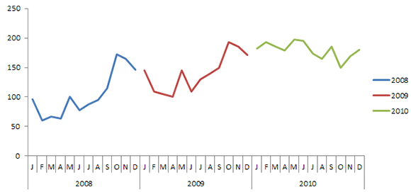
Figure 8-13: You can show trends for different time periods side by side.
1. To create this type of chart, structure your source data similar to the structure shown in Figure 8-14.
Note that instead of placing all the data into one column, you’re staggering the data into respective years. This tells the chart to create three separate lines (allowing for the three colors).
2. Select the entire table and create a line chart.
This creates the chart shown in Figure 8-13.
3. If you want to get a bit fancy, click the chart to select it and then right-click. Select Change Chart Type from the context menu that opens.
4. When the Change Chart Type dialog box opens, select Stacked Column Chart.
As you can see in Figure 8-15, your chart now shows the trending for each year in columns.

Figure 8-14: The source data needed to display side-by-side trends.

Figure 8-15: Change the chart type to Stacked Column Chart to present columns instead of lines.
Would you like a space in between the years? Adding a space in the source data (between each 12-month sequence) adds a space in the chart. (See Figure 8-16.)
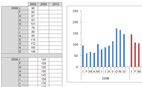
Figure 8-16: If you want to separate each year with a space, simply add a space into the source data.
Creating stacked time comparisons
The stacked time comparison places two series on top of each other instead of side-by-side. Although this approach removes the benefit of having an unbroken overall trending, you get the benefit of an at-a-glance comparison within a compact space. Figure 8-17 illustrates a common stacked time comparison.
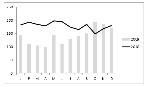
Figure 8-17: A stacked time comparison allows you to view and compare two years of data in a compact space.
1. Create a new structure and add data to it like the one shown in Figure 8-18.

Figure 8-18: Start with a structure containing the data for two time periods.
2. Highlight the entire structure and create a column chart.
3. Select and right-click any of the bars for the 2010 data series and then choose Change Series Chart Type.
4. When the Change Chart Type dialog box opens, select the Line type.
This technique works well with two time series. You generally want to avoid stacking any more than that. Stacking more than two series often muddies the view and causes users to constantly reference the legend to keep track of the series they’re evaluating.
Trending with a secondary axis
In some trending components, you’ll have series that trend two very different units of measure. For instance, in Figure 8-19, you have a table that shows a trend for People Count and a trend for % of Labor Cost.
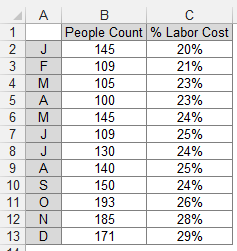
Figure 8-19: You often need to trend two very different units of measure, such as counts and percentages.
These are two very different units of measure that, when charted, produce the unimpressive chart you see in Figure 8-20. Because Excel builds the vertical axis to accommodate the largest number, the percentage of labor cost trending gets lost at the bottom of the chart. Even a logarithmic scale doesn’t help in this scenario.

Figure 8-20: The trending for percentage of labor cost gets lost at the bottom of the chart.
Because the default vertical axis (or primary axis) doesn’t work for both series, the solution is to create another axis to accommodate the series that doesn’t fit into the primary axis. This other axis is the secondary axis.
To place a data series on the secondary axis, follow these steps:
1. Right-click the data series and select Format Data Series.
The Format Data Series dialog box appears (see Figure 8-21).
2. In the Format Data Series dialog box, expand the Series Options section and then select the Secondary Axis radio button.

Figure 8-21: Placing a data series on the secondary axis.
Figure 8-22 illustrates the newly added axis to the right of the chart. Any data series on the secondary axis has its vertical axis labels shown on the right.
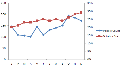
Figure 8-22: Thanks to the secondary axis, both trends are clearly defined.
Again, changing the chart type of any one of the data series can help in comparing the two trends. In Figure 8-23, the chart type for the People Count trend has been changed to a column. Now you can easily see that although the number of people went down in November and December, the percentage of labor cost continues to rise.

Figure 8-23: Changing the chart type of one data series can underscore comparisons.
Technically, it doesn’t matter which data series you place on the secondary axis. A general rule is to place the problem data series on the secondary axis. In this scenario, because the data series for percentage of labor cost seems to be the problem, we place that series on the secondary axis.
Emphasizing Periods of Time
Some of your trending components may contain certain periods where a special event occurred, causing an anomaly in the trending pattern. For instance, you may have an unusually large spike or dip in the trend caused by some occurrence in your organization. Or maybe you need to mix actual data with forecasts in your charting component. In such cases, it could be helpful to emphasize specific periods in your trending with special formatting.
Formatting specific periods
Imagine you just created the chart component illustrated in Figure 8-24, and you want to explain the spike in October. You could, of course, use a footnote somewhere, but that would force your audience to look for an explanation elsewhere on your dashboard. Calling attention to an anomaly directly on the chart helps give your audience context without the need to look away from the chart.

Figure 8-24: The spike in October warrants emphasis.
A simple solution is to format the data point for October to display in a different color and then add a simple text box that explains the spike.
To format a single data point:
1. Click the data point once.
This places dots on all the data points in the series.
2. Click the data point again to ensure Excel knows you’re formatting only that one data point.
The dots disappear from all but the target data point.
3. Right-click and select Format Data Point.
The Format Data Point dialog box opens, as shown in Figure 8-25. The idea is to adjust the formatting properties of the data point as you see fit.
The dialog box shown in Figure 8-25 is for a column chart. Different chart types have different options in the Format Data Point dialog box. Nevertheless, the idea remains the same in that you can adjust the properties in the Format Data Point dialog box to change the formatting of a single data point.
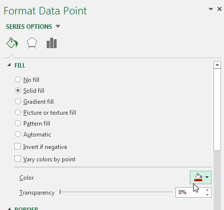
Figure 8-25: The Format Data Point dialog box gives you formatting options for a single data point.
After changing the fill color of the October data point and adding a text box with some context, the chart nicely explains the spike. (See Figure 8-26.)
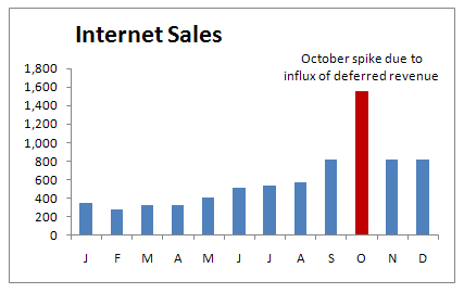
Figure 8-26: The chart now draws attention to the spike in October and provides instant context via a text box.
To add a text box to a chart, click the Insert tab on the Ribbon and select the Text Box icon. Then click inside the chart to create an empty text box, which you can fill with your words.
Using dividers to mark significant events
Every now and then a particular event shifts the entire paradigm of your data permanently. A good example is a price increase. The trend shown in Figure 8-27 has been permanently affected by a price increase implemented in October. As you can see, a dividing line (along with some labeling) provides a distinct marker for the price increase, effectively separating the old trend from the new.
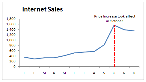
Figure 8-27: Use a simple line to mark particular events along a trend.
Although there are lots of fancy ways to create this effect, you will rarely need to get any fancier than manually drawing a line yourself. To draw a dividing line inside a chart, take the following steps:
1. Click the chart to select it.
2. Select the Insert tab on the Ribbon and click the Shapes drop-down command.
3. Select the line shape, go to your chart, and draw the line where you want it.
4. Right-click your newly drawn line and select Format Shape.
5. Use the Format Shape dialog box to format your line’s color, thickness, and style.
Representing forecasts in your trending components
It’s common to be asked to show both actual data and forecast as a single trending component. When you do show the two together, you want to ensure that your audience can clearly distinguish where actual data ends and where forecasting begins. Take a look at Figure 8-28.

Figure 8-28: You can easily see where sales trending ends and forecast trending begins.
The best way to achieve this effect is to start with a data structure similar to the one shown in Figure 8-29. As you can see, sales and forecasts are in separate columns so that when charted, you get two distinct data series. Also note that the value in cell B14 is actually a formula referencing C14. This value serves to ensure a continuous trend line (with no gaps) when the two data series are charted together.

Figure 8-29: Start with a table that places your actual data and your forecasts in separate columns.
When you have the appropriately structured dataset, you can create a line chart. At this point, you can apply special formatting to the 2013 forecast data series. Follow these steps:
1. Click the data series that represents the 2013 forecast.
This places dots on all the data points in the series.
2. Right-click and select Format Data Series.
This opens the Format Data Series dialog box. When the Format Data Series dialog box opens, you can adjust the properties to format the series color, thickness, and style.
Other Trending Techniques
In this section, you explore a few techniques that go beyond the basic concepts covered so far.
Avoiding overload with directional trending
Do you work with a manager who is crazy for data? Are you getting headaches from trying to squeeze three years of monthly data into a single chart? Although it’s understandable to want to see a three-year trend, placing too much information on a single chart can make for a convoluted trending component that tells you almost nothing.
When you’re faced with the need to display impossible amounts of data, step back and think about the true purpose of the analysis. When your manager asks for a three-year sales trend by month, what’s he really looking for? It could be that he’s really asking whether current monthly sales are declining when compared to historical data. Do you really need to show each and every month or can you show the directional trend?
A directional trend is one that uses simple analysis to imply a relative direction of performance. The key attribute of a directional trend is that the data used is often a set of calculated values as opposed to actual data values. For instance, instead of charting each month’s sales for a single year, you could chart the average sales for Q1, Q2, Q3, and Q4. With such a chart, you get a directional idea of monthly sales, without the need to look into detailed data.
Take a look at Figure 8-30, which shows two charts. The bottom chart trends each year’s monthly data in a single trending component. You can see how difficult it is to discern much from this chart. It looks like monthly sales are dropping in all three years. The top chart shows the same data in a directional trend, showing average sales for key time periods. The trend really jumps at you, showing that sales have flattened out after healthy growth in 2011 and 2012.

Figure 8-30: Directional trending (bottom) can help you reveal trends that may be hidden in more complex charts.
Smoothing data
Certain lines of business lend themselves to wide fluctuations in data from month to month. For instance, a consulting practice may go months without a steady revenue stream before a big contract comes along and spikes the sales figures for a few months. Some call these ups and downs seasonality or business cycles.
Whatever you call them, wild fluctuations in data can prevent you from effectively analyzing and presenting trends. Figure 8-31 demonstrates how highly volatile data can conceal underlying trends.
This is where the concept of smoothing comes in. Smoothing does just what it sounds like — it forces the range between the highest and lowest values in a dataset to smooth to a predictable range without disturbing the proportions of the dataset.
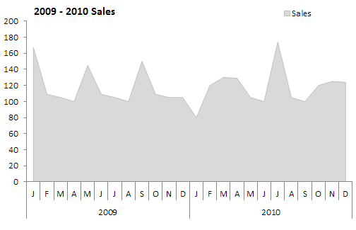
Figure 8-31: The volatile nature of this data makes it difficult to seek the underlying trend.
You can use lots of different techniques to smooth a dataset. Take a moment to walk through two of the easier ways to apply smoothing.
Smoothing with Excel’s moving average functionality
Excel has a built-in smoothing mechanism in the form of a moving average trend line. That is, a trend line that calculates and plots the moving average at each data point. A moving average is a statistical operation that is used to track daily, weekly, or monthly patterns. A typical moving average starts calculating the average of a fixed number of data points; then with each new day’s (or week’s or month’s) numbers, the oldest number is dropped, and the newest number is included in the average. This calculation is repeated over the entire dataset, creating a trend that represents the average at specific points in time.
Figure 8-32 illustrates how Excel’s moving average trend line can help smooth volatile data, highlighting a predictable range.
In this example, a four-month moving average is applied.

Figure 8-32: A four–month moving average trend line is added to smooth the volatile nature of the original data.
To add a moving average trend line, follow these steps:
1. Right-click the data series that represents the volatile data and then select Add Trendline.
2. In the Format Trendline dialog box that opens (see Figure 8-33), select Moving Average and then specify the number of periods.
In this case, Excel will average a four–month moving trend line.
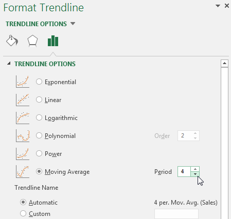
Figure 8-33: Applying a four–month moving average trend line.
Creating your own smoothing calculation
As an alternative to Excel’s built-in trend lines, you can create your own smoothing calculation and simply include it as a data series in your chart. In Figure 8-34, a calculated column (appropriately called smoothing) provides the data points needed to create a smoothed data series.
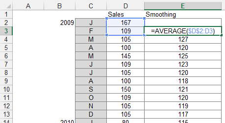
Figure 8-34: A calculated smoothing column feeds a new series to your chart.
In this example, the second row of the smoothing column contains a simple average formula that averages the first data point and the second data point. Note that the reference to the first data point (cell D2) is locked as an absolute value with dollar ($) signs. This ensures that when this formula is copied down, the range grows to include all previous data points.
Once the formula is copied down to fill the entire smoothing column, it can simply be included in the data source for the chart. Figure 8-35 illustrates the smoothed data plotted as a line chart.
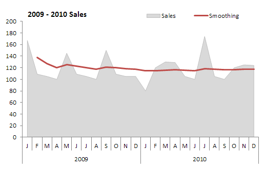
Figure 8-35: Plotting the smoothed data reveals the underlying trend.