
Chapter 4: Chartless Visualization Techniques
In This Chapter
• Using conditional formatting
• Leveraging symbols in formulas
• Using the Camera tool
Chartless visualization is less a feature specific to Excel than it is a concept that you can apply to your dashboard presentation. With these types of visualization, you can easily add layers of visualization to your dashboard and take advantage of some common worksheet features that can turn your data into meaningful views.
Enhancing Reports with Conditional Formatting
Conditional formatting applies to the Excel functionality used that dynamically changes the formatting of a value, cell, or range of cells based on a set of conditions you define. Conditional formatting allows you to look at your Excel reports and make split-second determinations on which values are “good” and which are “bad,” all based on formatting.
In this section, you discover the world of conditional formatting and find out how to leverage this functionality to enhance your reports and dashboards.
Applying basic conditional formatting
Thanks to the many predefined options offered with Excel 2013, you can apply some basic conditional formatting with a few clicks of the mouse. To get a first taste of what you can do, go the Ribbon, click the Home tab, and choose the Conditional Formatting icon (see Figure 4-1).
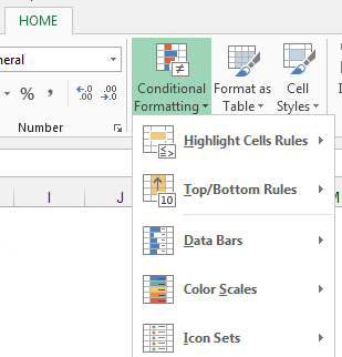
Figure 4-1: Click the Conditional Formatting icon to reveal the predefined options available in Excel 2013.
As you can see, five categories of predefined options are available:
Highlight Cells Rules
Top/Bottom Rules
Data Bars
Color Scales
Icon Sets
Take a moment now to review what each category enables you to do.
Using Highlight Cells Rules
The formatting options in the Highlight Cells Rules category, shown in Figure 4-2, allow you to highlight those cells whose values meet a specific condition.
 These options work very much like an If…Then…Else… statement. That is, if the condition is met, the cell is formatted; if the condition isn’t met, the cell isn’t touched.
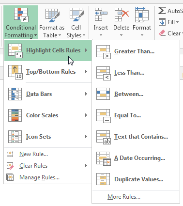
Figure 4-2: The Highlight Cells Rules options apply formats if specific conditions are met.
The options in the Highlight Cells Rules category are pretty self-explanatory:
→ Greater Than: Allows you to conditionally format a cell whose value is greater than a specified amount.
For instance, you can tell Excel to format those cells that contain a value greater than 50.
→ Less Than: Allows you to conditionally format a cell whose value is less than a specified amount.
For instance, you can tell Excel to format those cells that contain a value less than 100.
→ Between: Allows you to conditionally format a cell whose value is between two given amounts.
For example, you can tell Excel to format those cells that contain a value between 50 and 100.
→ Text That Contains: Allows you to conditionally format a cell whose contents contain any form of a given text you specify as a criterion.
For example, you can tell Excel to format the cells that contain the text North.
→ A Date Occurring: Allows you to conditionally format a cell whose contents contain a date occurring in a specified period relative to today’s date.
For example, Yesterday, Last Week, Last Month, Next Month, Next Week, and so on.
→ Duplicate Values: Allows you to conditionally format both duplicate values and unique values in a given range of cells.
 This rule was designed more for data cleanup than for dashboarding, enabling you to quickly identify duplicates and unique values in your dataset.
Here’s a simple example of how to apply one of these options. To highlight all values greater than a certain amount, follow these steps:
1. Select the range of cells to which you need to apply the conditional formatting.
2. In the Highlight Cells Rules category, choose the Greater Than option (see Figure 4-2).
The Greater Than dialog box opens, as shown in Figure 4-3. The idea here is to define a value that will trigger the conditional formatting. You can either
• Type the value (400 in this example).
• Reference a cell that contains the trigger value.
Also in this dialog box, you can use the drop-down menu to specify the format you want applied.
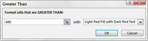
Figure 4-3: Each option has its own dialog box that you can use to define the trigger values and the format for each rule.
3. Click OK.
You immediately see the formatting rule applied to the selected cells (see Figure 4-4).
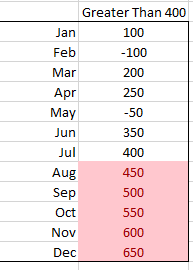
Figure 4-4: Cells greater than 400 are formatted.
The benefit of a conditional formatting rule is that Excel automatically reevaluates the rule each time a cell is changed (provided that cell has a conditional formatting rule applied to it). For instance, if you were to change any of the low values to 450, the formatting would automatically change because all of the cells in the dataset have the formatting applied to it.
Applying Top/Bottom Rules
The formatting options in the Top/Bottom Rules category, shown in Figure 4-5, allow you to highlight those cells whose values meet a given threshold.
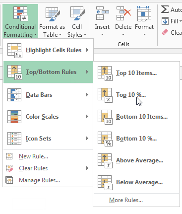
Figure 4-5: The Top/Bottom Rules options apply formats if specific thresholds are met.
As with the Highlight Cells Rules, these options work like If…Then…Else… statements:
→ If the condition is met, the cell is formatted.
→ If the condition isn’t met, the cell isn’t touched.
In the Top/Bottom Options category, you can select a percentage or number of cells.
Some of the names of the options are misleading. Options that are named with 10 Items can select any number of cells, and options that are named with 10% can select any percentage.
You can select from these options:
→ Top 10 Items: Allows you to specify any number of cells to highlight based on individual cell values (not just 10 cells).
For example, you can highlight the cells whose values are the 5 largest numbers of all the cells selected.
→ Top 10%: Allows you to specify any percentage of cells to highlight based on individual cell values (not just 10 percent) option.
For instance, you can highlight the cells whose values make up the top 20 percent of the total values of all the selected cells.
→ Bottom 10 Items: Allows you to specify the number of cells to highlight based on the lowest individual cell values (not just 10 cells).
For example, you can highlight the cells whose values are within the 15 smallest numbers among all the cells selected.
→ Bottom 10%: Allows you to specify any percentage of cells to highlight based on individual cell values (not just 10 percent).
For instance, you can highlight the cells whose values make up the bottom 15 percent of the total values of all the selected cells.
→ Above Average: Allows you to conditionally format each cell whose value is above the average of all cells selected.
→ Below Average: Allows you to conditionally format each cell whose value is below the average of all cells selected.
In this example, you conditionally format all cells whose values are within the top 40 percent of the total values of all cells.
To avoid overlapping different conditional formatting options, before applying a new option, you may want to delete any conditional formatting you’ve previously applied. To clear the conditional formatting for a given range of cells, select the cells, go to Ribbon, and select Home→Conditional Formatting. Here you find the Clear Rules selection. Click Clear Rules and select whether you want to clear conditional formatting for the entire sheet or only the selected workbook.
1. Select the range of cells to which you need to apply the conditional formatting.
2. In the Top/Bottom Options category, choose Top 10% (see Figure 4-5).
The Top 10% dialog box opens, as illustrated in Figure 4-6. Here you define the threshold that that will trigger the conditional formatting.
3. In this example, enter 40.
Here you can also use the drop-down menu to specify the format you want to apply.

Figure 4-6: Each option has its own dialog box where you can define its trigger values and format.
4. Click OK.
You immediately see the formatting option applied to the selected cells (see Figure 4-7).
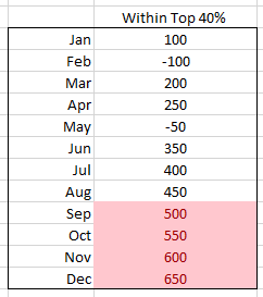
Figure 4-7: With conditional formatting, you can easily see that September through December makes up 40 percent of the total value in this dataset.
Creating Data Bars
Data Bars fill each cell you’re formatting with mini-bars in varying length, indicating the value in each cell relative to other formatted cells. Excel essentially takes the largest and smallest values in the selected range and calculates the length for each bar.
To apply Data Bars to a range, do the following:
1. Select the target range of cells to which you need to apply the conditional formatting.
2. Click the Home tab and choose Conditional Formatting→Data Bars.
As you can see in Figure 4-8, you can choose from a menu of Data Bars varying in gradient and color.
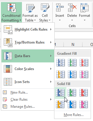
Figure 4-8: Applying Data Bars.
As shown in Figure 4-9, the result is essentially a mini-chart within the cells you selected. Also note that the Data Bars category, by default, accounts for negative numbers nicely by changing the direction of the bar and inverting the color to red.
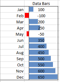
Figure 4-9: Conditional formatting with Data Bars.
After you create your Data Bars, it’s easy to go back and change their colors. Highlight the range of cells that contain the Data Bars, and then go up to the Home tab and select Conditional Formatting→Manage Rules. This opens the Rules Manager dialog box that lists all the conditional formatting rules applied to the highlighted range. Here, select your Data Bar rule and click the Edit Rule button. The Edit Formatting Rule dialog box appears, allowing you to change the colors for both positive and negative Data Bars.
Applying Color Scales
Color Scales fill each cell you’re formatting with a color, varying in scale based on the value in each cell relative to other formatted cells. Excel essentially takes the largest and smallest values in the selected range and determines the color for each cell.
To apply Color Scales to a range, do the following:
1. Select the target range of cells to which you need to apply the conditional formatting.
2. Click the Home tab and choose Conditional Formatting→Color Scales.
As you can see in Figure 4-10, you can choose from a menu of Color Scales varying in color.
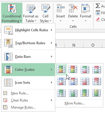
Figure 4-10: Applying Color Scales.
As you can see in Figure 4-11, the result is a kind of heat-map within the cells you selected.

Figure 4-11: Conditional formatting with Color Scales.
Using icon sets
Icon sets are sets of symbols that are inserted in each cell you’re formatting. Excel determines which symbol to use based on the value in each cell relative to other formatted cells.
To apply an icon set to a range, do the following:
1. Select the target range of cells to which you need to apply the conditional formatting.
2. Click the Home tab and choose Conditional Formatting→Icon Sets.
As you can see in Figure 4-12, you can choose from a menu of icon sets varying in shape and colors.
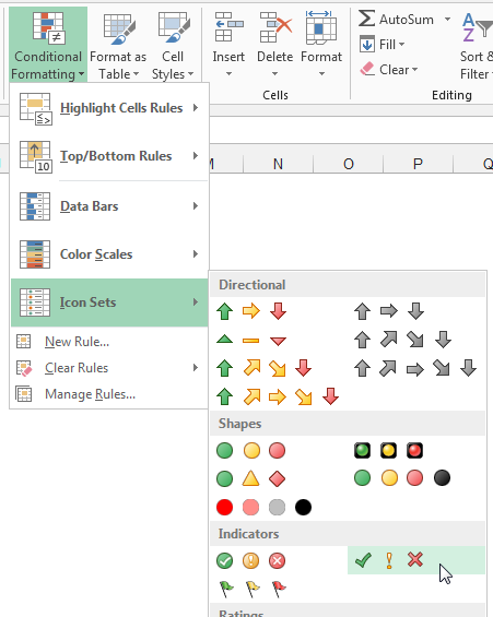
Figure 4-12: Applying icon sets.
Figure 4-13 illustrates how each cell is formatted with a symbol indicating each cell’s value based on the other cells.
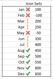
Figure 4-13: Conditional formatting with icon sets.
Adding your own formatting rules manually
You don’t have to use one of the predefined options offered by Excel. Excel gives you the flexibility to create your own formatting rules manually. Creating your own formatting rule helps you better control how cells are formatted and allows you to do things you can’t do with the predefined options.
For example, a useful conditional formatting rule is to tag all above-average values with a Check icon, whereas all below-average values get an X icon, as shown in Figure 4-14.

Figure 4-14: With a custom formatting rule, you can tag the above-average values with a check and the below-average values with an X.
Although the above average and below average options built into Excel allow you to format cell and font attributes, they don’t enable the use of icon sets. You can imagine why icon sets will be better on a dashboard than just color variances. Icons and shapes do a much better job at conveying your message, especially when your dashboard is printed in black and white.
To start creating your first custom formatting rule, open the Chapter 4 Samples.xlsx file found in the sample files for this book. With the file open, go to the Create Rule by Hand tab.
1. Select the target range of cells to which you need to apply the conditional formatting and select New Rule as, shown in Figure 4-15.

Figure 4-15: Select the target range; then select New Rule.
The New Formatting Rule dialog box opens, as shown in Figure 4-16.
As you can see, some of the rule types at the top of the dialog box are predefined option choices discussed earlier in this chapter:
• Format All Cells Based on Their Values: Measures the values in the selected range against each other.
This selection is handy for finding general anomalies in your dataset.
• Format Only Cells That Contain: Applies conditional formatting to those cells that meet specific criteria you define.
This selection is perfect for comparing values against a defined benchmark.
• Format Only Top or Bottom Ranked Values: Applies conditional formatting to those cells that are ranked in the top or bottom nth number or percent of all the values in the range.
• Format Only Values That Are Above or Below the Average: Applies conditional formatting to those values that are mathematically above or below the average of all values in the selected range.
• Format Only Unique or Duplicate Values: Applies conditional formatting to cells that either contain values that are duplicated within the selected range or contain values are unique (not duplicated) within the selected range.
• Use a Formula to Determine Which Cells to Format: Evaluates values based on a formula you specify. If a particular value evaluates to true, then the conditional formatting is applied to that cell.
This selection is typically used when applying conditions based the results of an advanced formula or mathematical operation.
You can use Data Bars, Color Scales, and icon sets only with the Format All Cells Based on Their Values rule.
2. Ensure that the Format All Cells Based on Their Values rule is selected; then use the Format Style drop-down menu to switch to icon sets.
3. Click the Icon Style drop-down menu to select your desired icon set.
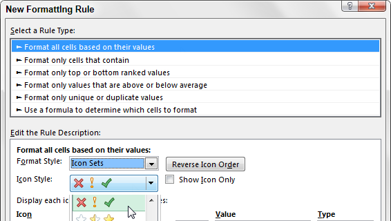
Figure 4-16: Select the Format All Cells Based on Their Values rule; then use the Format Style drop-down menu to switch to icon sets.
4. In the Type drop-down boxes, change both types to Formula.
5. In each Value box, enter =Average($C$2:$C$22).
This tells Excel that the value in each cell must be greater than the average of the entire dataset in order to get the Check icon.
At this point, your dialog box will look similar to the one in Figure 4-17.
6. Click OK to apply your conditional formatting.
It’s worth taking some time to understand how this conditional formatting rule works. Excel will assess every cell in your target range to see if its contents match the logic in each Value box in order (top box first):
→ If a cell contains a number or text that evaluates true to the first Value box, the first icon is applied, and Excel moves on to the next cell in your range.
→ If not, Excel continues down each Value box until one of them evaluates to true.
→ If the cell being assessed doesn’t fit any of the logic placed in the Value boxes, Excel automatically tags that cell with the last icon.

Figure 4-17: Change the Type drop-down box to Formula and enter the appropriate formulas in the Value boxes.
In this example, you want your cells to get a Check icon only if the value of that cell is greater than (or equal to) the average of the total values. Otherwise, you want Excel to skip right to the X icon and apply the X.
Show only one icon
In many cases, you may not need to show all icons when applying the icon set. In fact, showing too many icons at one time may only serve to obstruct the data you’re trying to convey in your dashboard.
In the last example, you applied Check icons to values above the average for the range, whereas all below-average values were formatted with the X icon (see Figure 4-18). However, in the real world, you often need to bring attention only to the below-average values. This way, your eyes aren’t inundated with superfluous icons.
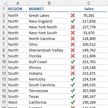
Figure 4-18: Too many icons can hide the items you want to draw attention to.
Excel provides a clever mechanism to allow you to stop evaluating and formatting values if a condition is true.
In this example, you remove the Check icons. The cells that contain those icons all have values above the average for the range. Therefore, you first need to add a condition for all cells whose values are above average.
1. Select the target range of cells; then click the Home tab and select Conditional Formatting→Manage Rules.
The Conditional Formatting Rules Manager dialog box opens, as shown in Figure 4-19.
2. Click the New Rule button to start a new rule.
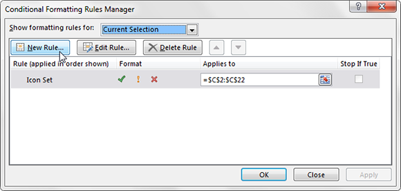
Figure 4-19: Open the Conditional Formatting Rules Manager and select New Rule.
3. Click the rule type Format Only Cells That Contain. Then configure the rule so that the format applies to cell values greater than the average (see Figure 4-20).
4. Click OK without changing any of the formatting options.
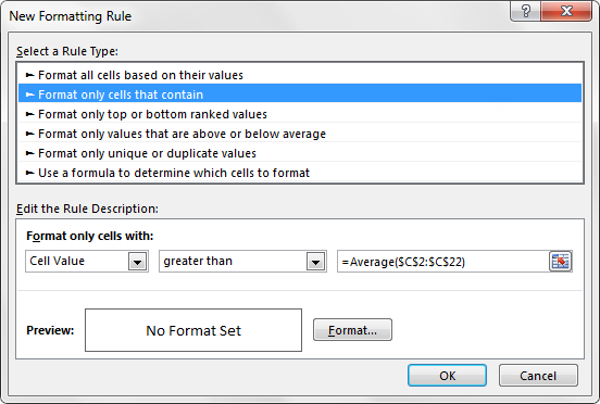
Figure 4-20: This new rule applies to any cell value that you don’t want formatted.
5. Back in the Conditional Formatting Rules Manager, place a check in the Stop If True check box, as demonstrated in Figure 4-21.
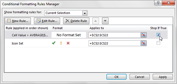
Figure 4-21: Click Stop If True to tell Excel to stop evaluating those cells that meet the first condition.
6. Click OK to apply your changes.
As you can see in Figure 4-22, only the X icons are now shown. Again, this allows your audience to focus on the exceptions, rather than determining which icons are good and bad.

Figure 4-22: This table is now formatted to show only one icon.
Show Data Bars and icons outside of cells
Although Data Bars and icon sets give you a snazzy way of adding visualizations to your dashboards, you don’t have a lot of say in where they appear within your cell. Take a look at Figure 4-23 to see what I mean.
The Data Bars are, by default, placed directly inside each cell, almost obfuscating the data. From a dashboarding perspective, this is less than ideal for two reasons:
→ The numbers can get lost in the colors of the Data Bars, making them difficult to read — especially when printed in black and white.
→ It’s difficult to see the ends of each bar.

Figure 4-23: Showing Data Bars inside the same cell as your values can make it difficult to analyze the data.
The answer to this issue is to show the Data Bars outside the cell that contains the value. Here’s how:
1. To the right of each cell, enter a formula that references the cell that contains your data value.
For example, if your data is in B2, go to cell C2 and enter =B2.
2. Apply the Data Bar conditional formatting to the formulas you just created.
3. Select the formatted range of cells; then click the Home tab and select Conditional Formatting→Manage Rules.
The Conditional Formatting Rules Manager dialog box opens.
4. Click the Edit Rule button.
5. Place a check in the Show Bar Only option, as demonstrated in Figure 4-24.
6. Click OK to apply your change.
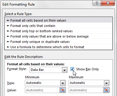
Figure 4-24: Edit the formatting rule to show only the Data Bars, not the data.
The reward for your efforts is a view that is cleaner and much better suited for reporting in a dashboard environment. Figure 4-25 illustrates the improvement gained with this technique.
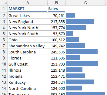
Figure 4-25: Data Bars cleanly placed next to the data values.
Using the same technique, you can separate icon sets from the data, allowing you to position the icons where they best suit your dashboard.
Representing trends with icon sets
In a dashboard environment, there may not always be enough space available to add a chart that shows trending. In these cases, icon sets are an ideal replacement, enabling you to visually represent the overall trending without taking up a lot of space. Figure 4-26 illustrates this with a table that provides a nice visual element, allowing for an at-a-glance view of which markets are up, down, and flat over the previous month.
In your situations, you will want to do the same type of thing. The key is to create a formula that gives you a variance or trending of some sort.
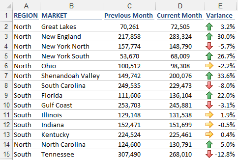
Figure 4-26: Conditional Formatting icon sets enable trending visualizations.
To achieve this type of view, follow these steps:
1. Select the target range of cells to which you need to apply the conditional formatting.
In this case, the target range will be the cells that hold your variance formulas.
2. Click the Home tab and choose Conditional Formatting→Icon Set; then choose the most appropriate icons for your situation.
In this example, the set with three arrows works (see Figure 4-27).
• The up arrow indicates an upward trend.
• A down arrow indicates a downward trend.
• A right-pointing arrow indicates a flat trend.
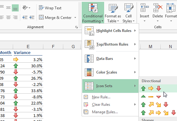
Figure 4-27: Your newly applied conditional formatting allows for a quick view of performance.
In most cases, you will want to adjust the thresholds that define what up, down, and flat mean. Imagine that you need any variance above 3% to be tagged with an up arrow, any variance below –3% to be tagged with a down arrow and all others to show flat.
3. Select the target range of cells; then click the Home tab and select Conditional Formatting→Manage Rules.
The Conditional Formatting Rules Manager dialog box opens.
4. Click the Edit Rule button.
The Edit Formatting Rule dialog box opens.
5. Adjust the properties, as shown in Figure 4-28.
6. Click OK to apply your changes.
In Figure 4-28, notice that the Type property for the formatting rule is set to Number even though the data you’re working with (the variance) is in percentages. You’ll find that working with the Number setting gives you more control and predictability when setting thresholds.
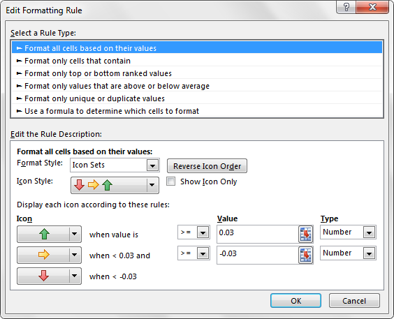
Figure 4-28: You can adjust the thresholds that define what up, down, and flat mean.
Using Symbols to Enhance Reporting
Symbols are essentially tiny graphics, not unlike those you see when you use the Wingdings, Webdings, or the other fancy fonts. However, symbols are not really fonts. They’re Unicode characters. Unicode characters are a set of industry-standard text elements designed to provide a reliable character set that remains viable on any platform regardless of international font differences.
One example of a commonly used symbol is the Copyright symbol (©). This symbol is a Unicode character. You can use this symbol on a Chinese, Turkish, French, and American PC, and it will be available reliably with no international differences.
In terms of Excel presentations, Unicode characters (or symbols) can be used in places where conditional formatting cannot. For instance, in the chart labels that you see in Figure 4-29, notice that the x-axis shows some trending arrows that allow an extra layer of analysis. This couldn’t be done with conditional formatting.
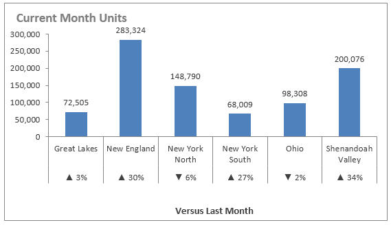
Figure 4-29: Use symbols to add an extra layer of analysis to charts.
Now, take some time to review the steps that led to the chart in Figure 4-29.
Start with the data shown in Figure 4-30. Note a cell (C1 in this case) is designated to hold any symbols you’re going to use. This cell isn’t really all that important. It’s just a holding cell for the symbols you will insert.
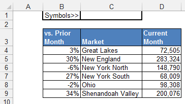
Figure 4-30: The starting data with a holding cell for your symbols.
Follow these steps to integrate symbols into your visualization:
1. Click in C1 and then select the Symbol command on the Insert tab.
The Symbol dialog box opens, as shown in Figure 4-31.
2. Find and select your desired symbols, clicking the Insert button for each symbol.
Then follow these steps:
a. Select the DOWN symbol; then click Insert.
b. Click the UP symbol; then click insert.
3. Close the dialog box when you’re done.

Figure 4-31: Use the Symbol dialog box to insert the desired symbols into your holding cell.
At this point, you have the UP and DOWN symbols in cell C1 (see Figure 4-32).
4. Click in the cell, go to the Formula bar, and copy the two symbols (highlight them and press Ctrl+C on your keyboard).
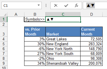
Figure 4-32: Copy the newly inserted symbols to the Clipboard.
5. Go to your data table, right-click on the percentages and then select Format Cells.
The Format Cells dialog box appears.
6. Create a new custom format by pasting the UP and DOWN symbols into the appropriate syntax parts (see Figure 4-33).
In this case, any positive percent will be preceded with the UP symbol, whereas any negative percent will be preceded with the DOWN symbol.
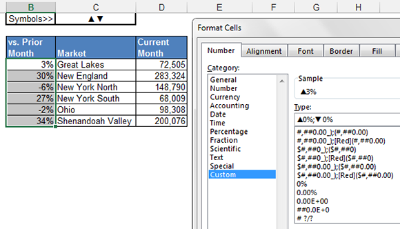
Figure 4-33: Create a custom number format using the symbols.
 Not familiar with custom number formatting? Feel free to visit Chapter 2 where we cover the ins and outs of custom number formatting in detail.
7. Click OK, and you will see that the symbols are now a part of your number formatting.
Figure 4-34 illustrates what your percentages will look like. Changing any number from positive to negative (or vice versa) will automatically apply the appropriate symbol.
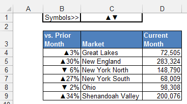
Figure 4-34: Your symbols are now part of your number formatting.
Because charts automatically adopt number formatting, a chart created from this data will show the symbols as part of the labels. Simply use this data as the source for the chart.
This is just one way to use symbols in your reporting. Using this basic technique, you can use inserted symbols to add visual appeal to tables, pivot tables, formulas, or other objects you can think of.
Using Excel’s Camera Tool
Excel’s Camera tool enables you to take a live picture of a range of cells that updates dynamically while the data in that range updates. If you haven’t heard of this tool, don’t feel too badly. Microsoft has hidden this nifty tool in the last few versions of Excel by not including it on the Ribbon. However, it’s actually quite useful for those of us building dashboards and reports.
Finding the Camera tool
Before you can use the Camera tool, you have to find it and add it to your Quick Access toolbar.
The Quick Access toolbar is a customizable toolbar on which you can store frequently used commands so that they’re always accessible with just one click. You can add commands to the Quick Access toolbar by dragging them directly from the Ribbon or by going through the Customize menu.
Follow these steps to add the Camera tool to the Quick Access toolbar:
1. Click the File tab and then click the Options button.
The Excel Options dialog box opens.
2. Click the Quick Access Toolbar button.
3. In the Choose Commands From drop-down menu, select Commands Not in the Ribbon.
4. Scroll down the alphabetical list of commands (see Figure 4-35) and find Camera; double-click to add it to the Quick Access toolbar.
5. Click OK.
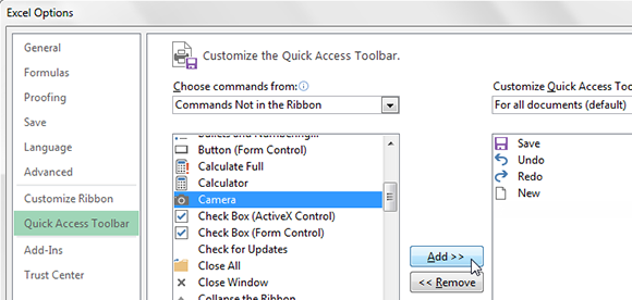
Figure 4-35: Add the Camera tool to the Quick Access toolbar.
After you take these steps, you see the Camera tool in your Quick Access toolbar, as shown in Figure 4-36.
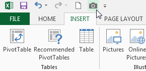
Figure 4-36: Not surprisingly, the icon for the Camera tool looks like a camera.
Using the Camera tool
To use the Camera tool, you simply highlight a range of cells to capture everything in that range in a live picture. The cool thing about the Camera tool is that you’re not limited to showing a single cell’s value like you are with a linked text box. Also, because the picture is live, all updates made to the source range automatically change the picture.
In Figure 4-37, you see some simple numbers and a chart based on those numbers. The goal here is to create a live picture of the range that holds both the numbers and the chart.
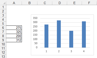
Figure 4-37: Enter some simple numbers in a range and create a basic chart from those numbers.
Take a moment to walk through this basic demonstration of the Camera tool.
1. Highlight the range that contains the information you want to capture.
In this scenario, B3:F13 is selected to capture the area with the chart.
2. Select the Camera tool icon in the Quick Access toolbar.
You added the Camera tool to the Quick Access toolbar in the preceding section.
3. Click the worksheet in the location where you want to place the picture.
Excel immediately creates a live picture of the entire range, as shown in Figure 4-38.
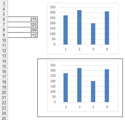
Figure 4-38: A live picture is created via the Camera tool.
Changing any number in the original range automatically causes the picture to update.
By default, the picture that’s created has a border around it. To remove the border, right-click the picture and select Format Picture. This opens the Format Picture dialog box. On the Colors and Lines tab, you see a Line Color drop-down menu. Here you can select No Color, thereby removing the border. On a similar note, to get a picture without gridlines, simply remove the gridlines from the source range.
Enhancing a dashboard with the Camera tool
Here are a few ways to go beyond the basics and use the Camera tool to enhance your dashboards and reports.
→ Consolidate varied ranges from different sources into one print area.
→ Rotate objects to simplify your work.
→ Create small charts.
Consolidating disparate ranges into one print area
Sometimes a data model gets so complex that it’s difficult to keep all the final data in one printable area. This often forces the printing of multiple pages that are inconsistent in layout and size. Given that dashboards are most effective when contained in a compact area that can be printed in a page or two, complex data models prove to be problematic when it comes to layout and design.
When you create pictures with the Camera tool, you can resize and move the pictures around freely. This gives you the freedom to test different layouts without needing to work on column widths, hidden rows, or other such nonsense. In short, you can create and manage multiple analyses on different tabs and then bring all your presentation pieces together in a nicely formatted presentation layer; see Figure 4-39.

Figure 4-39: Use the Camera tool to get multiple source ranges into a compact area.
Rotating objects to save time
Again, because the Camera tool outputs pictures, you can rotate the pictures in situations where placing the copied range on its side can help save time. A great example is a chart. Certain charts are relatively easy to create in a vertical orientation but extremely difficult to create in a horizontal orientation.
Figure 4-40 shows a vertical bullet graph (on the left). Whereas creating a horizontal bullet graph involves lots of intricate steps with multiple chart types, this graph is relatively easy to create in this vertical format.
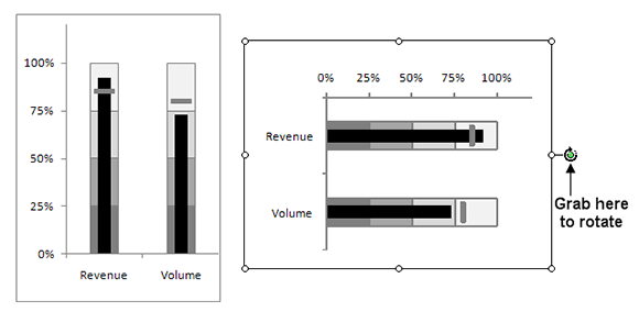
Figure 4-40: Use the rotation handle to rotate your live pictures to a horizontal orientation, as seen here on the right.
The Camera tool to the rescue! When the live picture of the chart is created, all you have to do is change the alignment of the chart labels and then rotate the picture using the rotate handle to create a horizontal version.