Chapter 6: Working with Chart Series
In This Chapter
• Adding and removing series from a chart
• Finding various ways to change the data used in a chart
• Using noncontiguous ranges for a chart
• Charting data from different worksheets or workbooks
• Dealing with missing data
• Controlling a data series by hiding data
• Unlinking a chart from its data
• Using secondary axes
Every chart consists of at least one series, and the data used in that series is (normally) stored in a worksheet. This chapter provides an in-depth discussion of data series for charts and presents lots of tips to help you select and modify the data used in your charts.
 All workbook examples in this book are available on the companion website for this book at www.wiley.com/go/exceldr.
Specifying the Data for Your Chart
When you create a chart, you almost always start by selecting the worksheet data to be plotted. Normally, you select the numeric data as well as the category labels and series names, if they exist.
When creating a chart, a key consideration is the orientation of your data: by rows or by columns. In other words, is the data for each series in a single row or in a single column?
Excel attempts to guess the data orientation by applying a simple rule: If the data rows outnumber the data columns, each series is assumed to occupy a column. If the number of data columns is greater than or equal to the number of data rows, each series is assumed to occupy a row. In other words, Excel always defaults to a chart that has more category labels than series.
After you create the chart, it’s a simple matter to override Excel’s orientation guess. Just activate the chart and choose Chart Tools→Design→Data→Switch Row/Column.
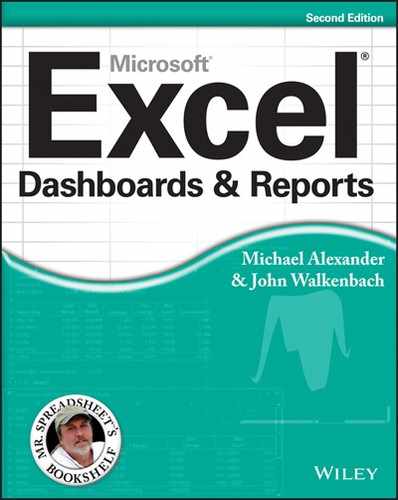
Your choice of orientation determines how many series the chart has, and it affects the appearance and (possibly) the legibility of your chart. Figure 6-1 shows two charts that use the same data. The chart on the left displays three series, arranged in columns. The chart on the right shows four series, arranged in rows.
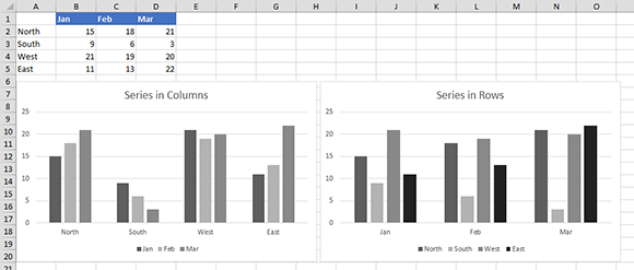
Figure 6-1: Your choice of data orientation (by row or by column) determines the number of series in the chart.
In many situations, you may find it necessary to modify the ranges used by a chart. Specifically, you may want to do the following:
→ Add a new series to the chart.
→ Delete a series from the chart.
→ Extend the range used by a series (show more data).
→ Contract the range used by a series (show less data).
→ Add or modify the series names.
All these topics are covered in the following sections.
 Chart types vary in the number of series that they can use. All charts are limited to a maximum of 255 series. Other charts require a minimum number of series. For example, a high-low-close stock chart requires three series. A pie chart can use only one series.
Dealing with numeric category labels
It’s not uncommon to have category labels that consist of numbers. For example, you may create a chart that shows sales by year, and the years are numeric values. If your category labels include a heading, Excel will (incorrectly) interpret the category labels as a data series and use generic category labels that consist of integers (1, 2, 3, and so on). The following figure shows an example.
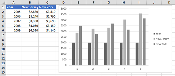
You can, of course, choose Chart Tools→Design→Data→Select Data and use the Select Data Source dialog box to fix the chart. But a more efficient solution is to make a simple change before you create the chart: Remove the header text above the category labels! The following figure shows the chart that was created when the heading was removed from the category label column.
Adding a New Series to a Chart
Excel provides four ways to add a new series to an existing chart:
→ Copy the range and then paste the data into the chart.
→ Use the Select Data Source dialog box.
→ Select the chart and extend the blue highlighting rectangle to include the new series.
→ Activate the chart, click in the Formula bar, and manually type a SERIES formula.
These techniques are described in the following sections.
Attempting to add a new series to a pie chart has no apparent effect because a pie chart can have only one series. The series, however, is added to the chart but isn’t displayed. If you select a different chart type for the chart, the added series is then visible.
Adding a new series by copying a range
One way to add a new series to a chart is to perform a standard copy/paste operation. Follow these steps:
1. Select the range that contains the data to be added (including the series name).
2. Choose Home→Clipboard→Copy (or press Ctrl+C).
3. Click the chart to activate it.
4. Choose Home→Clipboard→Paste (or press Ctrl+V).
If the series you are trying to copy and paste into your chart has a series name that is a number (for example, a year like 2009) Excel will try to plot that series name as an actual value to the chart. In these cases, you can use the Paste Special feature to avoid this problem. Read on to find out how.
For more control when adding data to a chart, choose Home→Clipboard→Paste→Paste Special in Step 4. This command displays the Paste Special dialog box. Figure 6-2 shows a new series (using data in row 5) being added to a line chart.
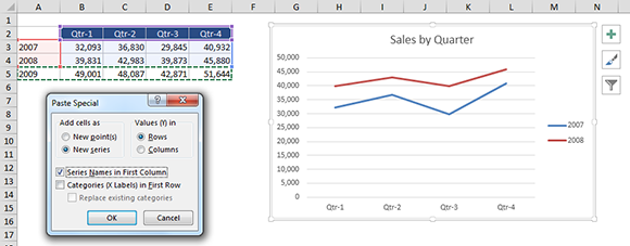
Figure 6-2: Using the Paste Special dialog box to add a series to a chart.
Following are some pointers to keep in mind when you add a new series using the Paste Special dialog box:
→ Make sure that the New Series option is selected.
→ Excel will guess at the data orientation, but you should verify that the Rows or Columns option is guessed correctly.
→ If the range you copied included a cell with the series name, ensure that the Series Names in First Row/Column option is selected.
→ If the first column of your range selection included category labels, make sure that the Categories (X Labels) in First Column/Row check box is selected.
→ If you want to replace the existing category labels, select the Replace Existing Categories check box.
Adding a new series by extending the range highlight
When you select a series in a chart, Excel displays an outline around the data used by that series. When you select something other than a series in a chart, Excel displays an outline around the entire data range used by the chart — but only if the data is in a contiguous range of cells.
If you need to add a new series to a chart (and the new series is contiguous with the existing chart’s data), you can just drag the blue range highlight to add the new series. Start by selecting any chart element except a series. Excel highlights the range with a blue outline. Drag a corner of the blue outline to include the new data, and Excel creates a new series in the chart.
Adding a new series using the Select Data Source dialog box
The Select Data Source dialog box provides another way to add a new series to a chart, as follows:
1. Click the chart to activate it.
2. Choose Chart Tools→Design→Data→Select Data to display the Select Data Source dialog box.
3. Click the Add button to display the Edit Series dialog box.
4. Use the range selector controls to specify the cell for the Series Name (optional) and Series Values (see Figure 6-3).
5. Click OK to close the Edit Series dialog box and return to the Select Data Source dialog box.
6. Click OK to close the Select Data Source dialog box or click the Add button to add another series to the chart.
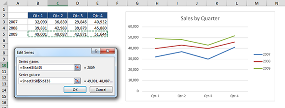
Figure 6-3: Using the Edit Series dialog box to add a series to a chart.
The configuration of the Edit Series dialog box varies, depending on the chart type. For example, if the chart is a scatter chart, the Edit Series dialog box displays range selectors for the Series Name, the Series X Values, and the Series Y Values. If the chart is a bubble chart, the dialog box displays an additional range selector for the Series Bubble Size.
Adding a new series by typing a new SERIES formula
Excel provides yet another way to add a new series: Type a new SERIES formula. Follow these steps:
1. Click the chart to activate it.
2. Click the Formula bar.
3. Type the new SERIES formula and press Enter.
This method is certainly not the most efficient way to add a new series to a chart. It requires that you understand how the SERIES formula works, and (as you might expect) it can be rather error-prone. Note, however, that you don’t need to type the SERIES formula from scratch. You can copy an existing SERIES formula, paste it into the Formula bar, and then edit the SERIES formula to create a new series.
 For more information about the SERIES formula, see the “SERIES formula syntax” sidebar, later in this chapter.
Deleting a Chart Series
The easiest way to delete a series from a chart is to select the series and press Delete.
Deleting the only series in a chart does not delete the chart. Rather, it gives you an empty chart. If you’d like to delete this empty chart, just press Delete a second time.
You can also use the Select Data Source dialog box to delete a series. Choose Chart Tools→Design→Data→Select Data to display this dialog box. Then select the series from the list and click the Remove button.
Modifying the Data Range for a Chart Series
After you’ve created a chart, you may want to modify the data ranges used by the chart. For example, you may need to expand the range to include new data. Or you might need to substitute an entirely different range. Excel offers a number of ways to perform these operations:
→ Drag the range highlights.
→ Use the Select Data Source dialog box.
→ Edit the SERIES formula.
Each of these techniques is described in the following sections.
 If you create your chart from data in a table (created by choosing Insert→Tables→Table), the chart will adjust automatically if you add new data to the table.
Using range highlighting to change series data
When you select a series in a chart, Excel highlights the worksheet ranges used in that series. This range highlighting consists of a colored outline around each range used by the series. Figure 6-4 shows an example in which the chart series (Region 1) is selected. Excel highlights the following ranges:
→ C2 (the series name)
→ B3:B8 (the category labels)
→ C3:C8 (the values)
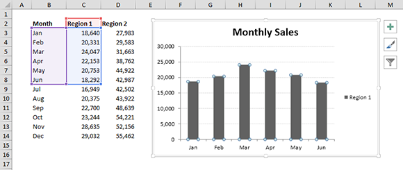
Figure 6-4: Selecting a chart series highlights the data used by the series.
Each of the highlighted ranges contains a small handle at each corner. You can perform two operations with the highlighted data:
→ Expand or contract the data range. Click one of the handles and drag it to expand the outlined range (specify more data) or contract the data range (specify less data). When you move your cursor over a handle, the mouse pointer changes to a double arrow.
→ Specify an entirely different data range. Click one of the borders of the highlight and then drag it to highlight a different range. When you move the cursor over a border, the mouse pointer changes to a four-way arrow.
Figure 6-5 shows the chart after the data range has been changed. In this case, the highlight around cell C2 was dragged to cell D2, and the highlight around C3:C8 was dragged to D3:D8 and then expanded to include D3:D14. Notice that the range for the category labels (B3:B8) wasn’t modified — and the missing labels aren’t shown in the chart. To finish the job, that range needs to be expanded to B3:B14.
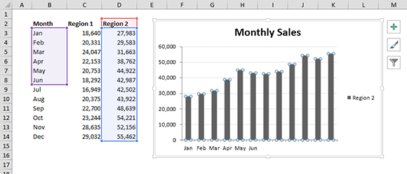
Figure 6-5: The chart’s data range has been modified.
Modifying chart source data by using the range highlights is probably the simplest method. Note, however, that this technique works only with embedded charts (not with chart sheets). In addition, it doesn’t work when the chart’s data is in a worksheet other than the sheet that contains the embedded chart.
A surface chart is a special case. You cannot select an individual series in a surface chart. But when you select the plot area of a surface chart, Excel highlights all the data used in the chart. You can then use the range highlighting to change the ranges used in the chart.
Using the Select Data Source dialog box to change series data
Another method of modifying a series data range is to use the Select Data Source dialog box. Select your chart and then choose Chart Tools→Design→Data@>Select Data. Figure 6-6 shows the Select Data Source dialog box.
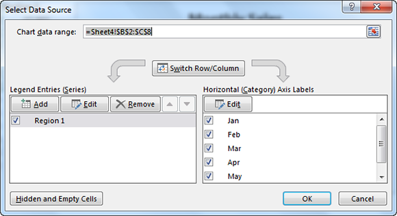
Figure 6-6: The Select Data Source dialog box.
Notice that the Select Data Source dialog box has three parts:
→ The top part of the dialog box shows the entire data range used by the chart. You can change this range by selecting new data.
→ The lower-left part displays a list of each series. Select a series and click the Edit button to display the Edit Series dialog box to change the data used by a single series.
→ The lower-right part displays the category axis labels. Click the Edit button to display the Axis Labels dialog box to change the range used as the axis labels.
The Edit Series dialog box can vary somewhat, depending on the chart type. The Edit Series dialog box for a bubble chart, for example, has four range selector controls: Series Name, Series X Values, Series Y Values, and Series Bubble Size.
Editing the SERIES formula to change series data
Every chart series has its own SERIES formula. When you select a data series in a chart, its SERIES formula appears in the Formula bar. In Figure 6-7, for example, you can see one of two SERIES formulas in the Formula bar for a chart that displays two data series.

Figure 6-7: The SERIES formula for the selected data series appears in the Formula bar.
Although a SERIES formula is displayed in the Formula bar, it isn’t a “real” formula. In other words, you can’t put this formula into a cell, and you can’t use worksheet functions within the SERIES formula. You can, however, edit the arguments in the SERIES formula to change the ranges used by the series. To edit the SERIES formula, just click in the Formula bar and use standard editing techniques. Refer to the sidebar, “SERIES formula syntax,” to find out about the various arguments for a SERIES formula.
When you modify a series data range using either of the techniques discussed previously in this section, the SERIES formula is also modified. In fact, those techniques are simply easy ways of editing the SERIES formula.
Following is an example of a SERIES formula:
=SERIES(Sheet4!$D$2,Sheet4!$B$3:$B$8,Sheet4!$D$3:$D$8,2)
This SERIES formula does the following:
→ Specifies that cell D2 (on Sheet4) contains the series name.
→ Specifies that the category labels are in B3:B8 on Sheet4.
→ Specifies that the data values are in D3:D8, also on Sheet4.
→ Specifies that the series will be plotted second on the chart (the final argument is 2).
Notice that range references in a SERIES formula always include the worksheet name, and the range references are always absolute references. An absolute reference, as you may know, uses a dollar sign before the row and column part of the reference. If you edit a SERIES formula and remove the sheet name or make the cell references relative, Excel will override these changes.
Understanding Series Names
Every chart series has a name, which is displayed in the chart’s legend. If you don’t explicitly provide a name for a series, it will have a default name, such as Series1, Series2, and so on.
The easiest way to name a series is to do so when you create the chart. Typically, a series name is contained in a cell adjacent to the series data. For example, if your data is arranged in columns, the column headers usually contain the series names. If you select the series names along with the chart data, those names will be applied automatically.
Figure 6-8 shows a chart with three series. The series names, which are stored in B3:D3, are Main, N. County, and Westside. The SERIES formula for the first data series is as follows:
=SERIES(Sheet1!$B$3,Sheet1!$A$4:$A$9,Sheet1!$B$4:$B$9,1)
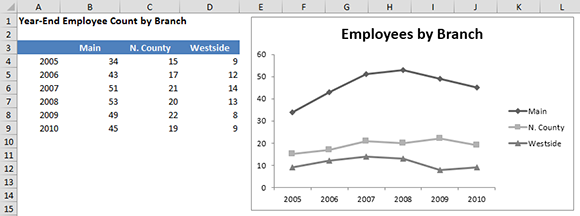
Figure 6-8: The series names are picked up from the worksheet.
Note that the first argument for this SERIES formula is a reference to the cell that contains the series name.
Changing a series name
The series name is the text that appears in a chart’s legend. In some cases, you may prefer the chart to display a name other than the text that’s in the worksheet. To change the name of a series, follow these steps:
1. Activate the chart.
2. Choose Chart Tools→Design→Data→Select Data to display the Select Data Source dialog box.
3. In the Select Data Source dialog box, select the series that you want to modify, and click the Edit button to display the Edit Series dialog box.
4. Type the new name in the Series Name box.
Normally, the Series Name box contains a cell reference. But you can override this and enter any text.
If you go back to a series that you’ve already renamed, you’ll find that Excel has converted your text into a formula — an equal sign, followed by the text you entered (the new series name), within quotation marks.
Figure 6-9 shows the previous chart, after changing the series names. The first argument in each of the SERIES formulas no longer displays a cell reference. It now contains the literal text. For example, the SERIES formula for the first series is as follows:
=SERIES(“Branch 1”,’Figure 6-9’!$A$4:$A$9,’Figure 6-9’!$B$4:$B$9,1)
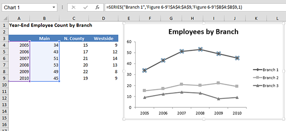
Figure 6-9: The series names have been changed; the new names are shown in the legend.
You can also change the name of a series by editing the SERIES formula directly. Select the series, click inside the Formula bar, and replace the first argument with your text (make sure that the text is enclosed within quotation marks).
Deleting a series name
To delete a series name, use the Edit Series dialog box as described previously. Highlight the range reference (or text) in the Series Name box and press Delete.
Alternatively, you can edit the SERIES formula and remove the first argument. Here’s an example of a SERIES formula for a series with no specified name (it will use the default name):
=SERIES(,Sheet2!$A$2:$A$6,Sheet2!$B$2:$B$6,1)
When you remove the first argument in a SERIES formula, make sure that you do not delete the comma that follows the first argument. The comma is required as a placeholder to indicate the missing argument.
To create a series with no name, use a set of empty quotation marks for the first argument in the SERIES formula. A series with no name still appears in the chart’s legend, but no text is displayed.
Adjusting the Series Plot Order
Every chart series has a plot order parameter. A chart’s legend usually displays the series’ names in the order in which they’re plotted. I say usually, because you do find exceptions. For example, consider a combination chart that displays a column series and a line series. Changing the series order doesn’t change the order in which the series are listed in the legend.
To change the plot order of a chart’s data series, use the Select Data Source dialog box. In the lower-left list, the series are listed in the order in which they’re plotted. Select a series and then use the up- or down-arrow buttons to adjust its position in the list — which also changes the plot order of the series.
Alternatively, you can edit the SERIES formulas — specifically, the fourth parameter in the SERIES formulas. See the “SERIES formula syntax” sidebar, earlier in this chapter, for more information about SERIES formulas.
For some charts, the plot order is not important. For others, however, you may want to change the order in which the series are plotted. Figure 6-10 shows a stacked column chart generated from the data in A2:E6. Notice that the columns are stacked, beginning with the first data series (Region 1) on the bottom. You may prefer to stack the columns in the order in which the data appears. To do so, you need to change the plot order.
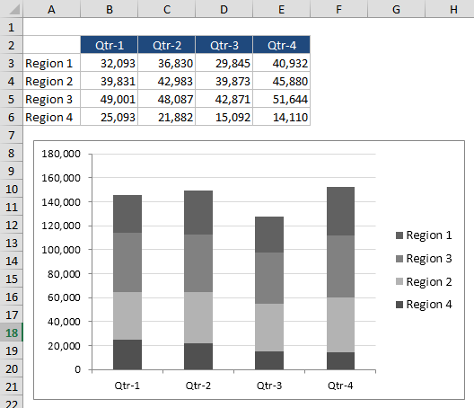
Figure 6-10: The plot order of this chart doesn’t correspond to the order of the data.
After changing the plot order of the series, the chart now appears as in Figure 6-11.
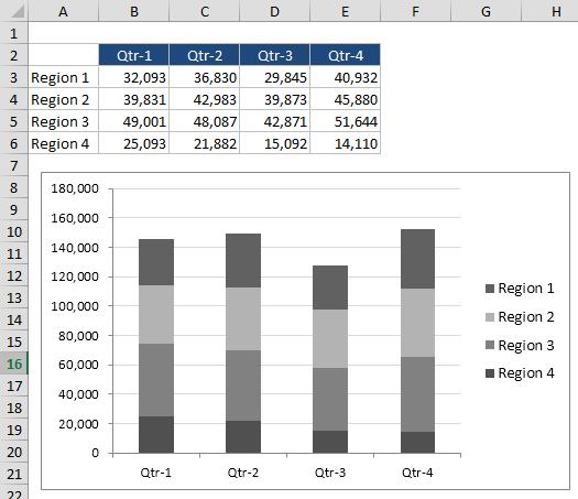
Figure 6-11: After changing the plot order, the stacked columns correspond to the order of the data.
Charting a Noncontiguous Range
Most of the time, a chart series consists of a contiguous range of cells. But Excel does allow you to plot data that isn’t in a contiguous range. Figure 6-12 shows an example of a noncontiguous series. This chart displays monthly data for the first and fourth quarters. The data in this single series is contained in rows 2:4 and 11:13. Notice that the category labels display Jan, Feb, Mar, Oct, Nov, and Dec.

Figure 6-12: This chart uses data in a noncontiguous range.
The SERIES formula for this series is as follows:
=SERIES(‘Figure 6-12’!$B$1,(‘Figure 6-12’!$A$2:$A$4,’Figure 6-12’!$A$11:$A$13),(‘Figure 6-12’!$B$2:$B$4,’Figure 6-12’!$B$11:$B$13),1)
The first argument is omitted, so Excel uses the default series name. The second argument specifies six cells in column A as the category labels. The third argument specifies six corresponding cells in column B as the data values. Note that the range arguments for the noncontiguous ranges are displayed in parentheses, and each subrange is separated by a comma.
When a series uses a noncontiguous range of cells, Excel doesn’t display the range highlights when the series is selected. Therefore, the only way to modify the series is to use the Select Data Source dialog box or to edit the SERIES formula manually.
Using Series on Different Sheets
Typically, data to be used on a chart resides on a single sheet. Excel, however, does allow a chart to use data from any number of worksheets, and the worksheets don’t need to be in the same workbook.
Normally, you select all the data for a chart before you create the chart. But if your chart uses data from different worksheets, you need to create an empty chart and then add the series (see the section “Adding a New Series to a Chart,” earlier in this chapter).
Figure 6-13 shows a chart that uses data from two other worksheets. Each of the three worksheets is shown in a separate window.
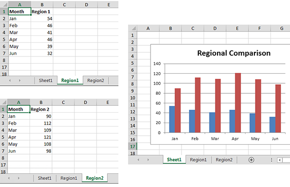
Figure 6-13: This chart uses data from different worksheets.
The SERIES formulas for this chart are as follows:
=SERIES(Region1!$B$1,Region1!$A$2:$A$7,Region1!$B$2:$B$7,1)
=SERIES(Region2!$B$1,Region1!$A$2:$A$7,Region2!$B$2:$B$7,2)
Another way to handle data in different worksheets is to create a summary range in a single worksheet. This summary range consists of simple formulas that refer to the data in other sheets. Then you can create a chart from the summary range.
Handling Missing Data
Sometimes, data that you use in a chart may lack one or more data points. Excel offers the following ways to handle the missing data:
→ Ignore the missing data. Plotted data series will have a gap.
→ Treat the missing data as zero values.
→ Interpolate the missing data (for line and scatter charts only).
For some reason, Excel makes these options rather difficult to locate. The Ribbon doesn’t contain these options, and you don’t specify these options in the Format Data Series dialog box. Rather, you must follow these steps:
1. Select your chart.
2. Choose Chart Tools→Design→Data→Select Data to display the Select Data Source dialog box.
3. In the Select Data Source dialog box, click the Hidden and Empty Cells button. Excel displays the dialog box shown in Figure 6-14.
4. Choose the appropriate option and click OK.

Figure 6-14: Use the Hidden and Empty Cell Settings dialog box to specify how to handle missing data.
The setting that you choose applies only to the active chart and applies to all series in the chart. In other words, you can’t specify a different missing data option for different series in the same chart. In addition, not all chart types support all missing data options.
Figure 6-15 shows three charts that depict the three missing data options. The chart shows temperature readings at one-hour intervals, and four data points are missing. The “correct” missing data option depends on the message that you want to convey. In the top chart, the missing data is obvious because of the gaps in the line. In the middle chart, the missing data is shown as zero — which is clearly misleading. In the bottom chart, the missing data is interpolated. Because of the time-based and relatively smooth nature of the data, interpolating the missing data may be an appropriate choice.

Figure 6-15: These three charts depict the three ways to present missing data in a chart.
For line charts, you can force Excel to interpolate missing values by placing =NA() in the empty cells. Those cell values will be interpolated, regardless of the missing data option that is in effect for the chart. For other charts, =NA() is interpreted as zero.
Controlling a Data Series by Hiding Data
By default, Excel doesn’t plot data that is in a hidden row or column. You can sometimes use this to your advantage because it’s an easy way to control what data appears in the chart.
Figure 6-16 shows a line chart that plots 365 days of data stored in a table (created by choosing Insert→Tables→Table). Figure 6-17 shows the same chart after I applied a filter to the table. The filter hides all rows except those in which the month is September.
In some cases, when you’re working with outlines or filtered tables (both of which use hidden rows), you may not like the idea that hidden data is removed from your chart. To override this, activate the chart and choose Chart Tools→Design→Data→Select Data to display the Select Data Source dialog box. Click the Hidden and Empty Cells button and select the Show Data in Hidden Rows and Columns check box.
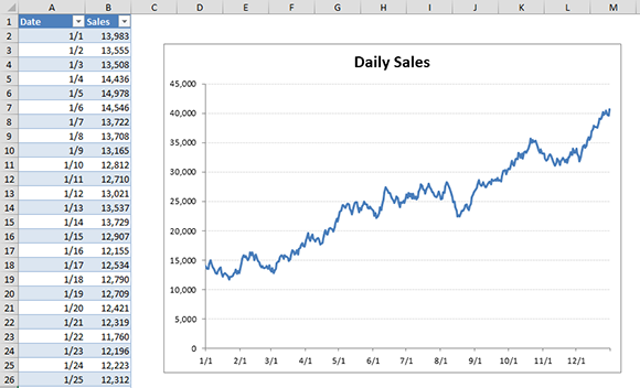
Figure 6-16: A line chart that uses data in a table.
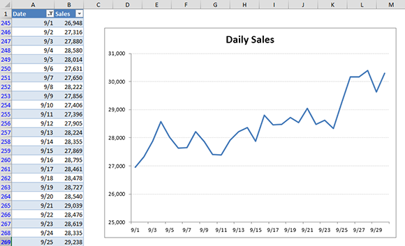
Figure 6-17: After filtering the table, the chart shows only data for September.
Unlinking a Chart Series from Its Data Range
Typically, an Excel chart uses data stored in a range. Change the data in the range, and the chart updates automatically. In some cases, you may want to “unlink” the chart from its data ranges and produce a static chart — a chart that never changes. For example, if you plot data generated by various what-if scenarios, you may want to save a chart that represents some baseline so that you can compare it to other scenarios. You can create such a chart in the following ways:
→ Convert the chart to a picture.
→ Convert the range references to arrays.
Converting a chart to a picture
To convert a chart to a static picture, follow these steps:
1. Create the chart as usual and make any necessary modifications.
2. Click the chart to activate it.
3. Choose Home→Clipboard→Copy (or press Ctrl+C).
4. Click in any cell to deselect the chart.
5. Choose Home→Clipboard→Paste→Picture.
The result is a picture of the original chart. This picture can be edited as a picture, but not as a chart. In other words, you can no longer modify properties such as chart type, data labels, and so on.
When you select such a picture, you see Excel’s Picture Tools→Format tab. Figure 6-18 shows a few examples of built-in formatting options applied to a picture of a chart.
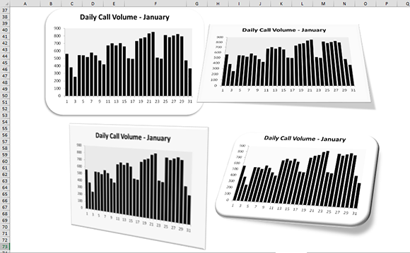
Figure 6-18: After converting a chart to a picture, you can apply various types of formatting to the picture.
Converting a range reference to arrays
The other way to unlink a chart from its data is to convert the SERIES formula range references to arrays. Figure 6-19 shows an example of a pie chart that doesn’t use data stored in a worksheet. Rather, the chart’s data is stored directly in the SERIES formula, which is as follows:
=SERIES(,{“Work”,”Sleep”,”Drive”,”Eat”,”Other”},{9,7,2.5,3,2.5},1)

Figure 6-19: This chart is not linked to a data range.
The first argument, the series name, is omitted. The second argument consists of an array of five text strings. Notice that each array element appears within quotation marks and is separated by a comma. The array is enclosed in braces. The chart’s data is stored as another array (the third argument).
This chart was originally created by using data stored in a range. Then the SERIES formula was delinked from the range, and the original data was deleted. The result is a chart that doesn’t rely on data stored in a range.
Follow these steps to convert the range references in a SERIES formula to arrays:
1. Create the chart as usual.
2. Click the chart series.
The SERIES formula appears in the Formula bar.
3. Click inside the Formula bar.
4. Press F9.
5. Press Enter, and the range references are converted to arrays.
Repeat this procedure for each series in the chart. This method of unlinking a chart series (as opposed to creating a picture) enables you to continue to edit the chart and apply formatting. Note that you can also convert just a single argument to an array. Highlight the argument in the SERIES formula and press F9.
Excel imposes a 1,024-character limit to the length of a SERIES formula, so this technique doesn’t work if a chart series contains a large number of values or category labels.
Working with Multiple Axes
An axis is a chart element that contains category or value information for a series. A chart can use zero, two, three, or four axes, and any or all of them can be hidden if desired.
Pie charts and doughnut charts have no axes. Common chart types, such as a standard column or line chart, use a single category axis and a single value axis. If your chart has at least two series — and it’s not a 3-D chart — you can create a secondary value axis. Each series is associated with either the primary or the secondary value axis. Why use two value axes? Two value axes are most often used when the data being plotted in a series varies drastically in scale from the data in another series.
Creating a secondary value axis
Figure 6-20 shows a line chart with two data series: Income and Profit Margin. Compared to the Income values, the Profit Margin numbers (represented by squares) are so small that they barely show up on the chart. This is a good candidate for a secondary value axis.
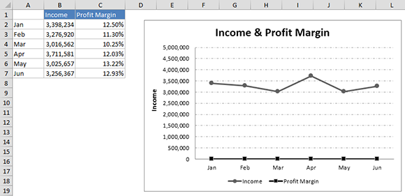
Figure 6-20: The values in the Profit Margin series are so small that they aren’t visible in the chart.
To add a secondary value axis, follow these steps:
1. Select the Profit Margin series on the chart.
2. Press Ctrl+1 to display the Format Data Series dialog box.
3. In the Format Data Series dialog box, click the Series Options tab.
4. Choose the Secondary Axis option.
A new value axis is added to the right side of the chart, and the Profit Margin series uses that value axis. Figure 6-21 shows the dual-axis chart.
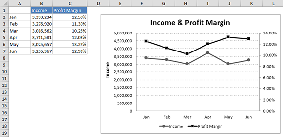
Figure 6-21: Using a secondary value axis for the Profit Margin series.
Creating a chart with four axes
Very few situations warrant a chart with four axes. The problem, of course, is that using four axes almost always causes the chart to be difficult to understand. An exception is scatter charts. Figure 6-22 shows a scatter chart that has two series, and the series vary quite a bit in magnitude on both dimensions. If the objective is to compare the shape of the lines, this chart doesn’t do a very good job because most of the chart consists of white space. Using four axes might solve the problem.
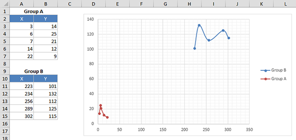
Figure 6-22: The two series vary in magnitude.
Follow these steps to add two new value axes for this scatter chart:
1. Select the Group B series.
2. Press Ctrl+1 to display the Format Data Series dialog box.
3. In the Format Data Series dialog box, click the Series Options tab.
4. Choose the Secondary Axis option.
At this point, each of the series has its own y-value axis (one on the left, one on the right), but they share a common x-value axis.
5. Choose Chart Tools→Layout→Axes→Secondary Horizontal Axis→Show Default Axis.
Note that this Ribbon command is available only if you’ve assigned a series to the secondary axis.
Figure 6-23 shows the result. The Group B series uses the left and bottom axes, and the Group A series uses the right and top axes. The chart also has four axis titles to clarify the axes for each group. If necessary, the scales for each axis can be adjusted separately.
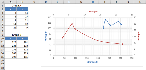
Figure 6-23: This chart uses four value axes.