Chapter 5: Excel Charting for the Uninitiated
In This Chapter
• What is a chart?
• How Excel handles charts
• Embedded charts versus chart sheets
• The parts of a chart
• The basic steps for creating a chart
• Working with charts
No other tool is more synonymous with dashboards and reports than the chart. Charts offer a visual representation of numeric values and at-a-glance views that allow you to specify relationships between data values, point out differences, and observe business trends. Few mechanisms allow you to absorb data faster than a chart, which can be a key component in your dashboard.
When most people think of a spreadsheet product such as Excel, they think of crunching rows and columns of numbers. However, Excel is no slouch when it comes to presenting data visually, in the form of a chart. In this chapter, we present an overview of Excel’s charting ability and show you how to create and customize your own charts using Excel.
What Is a Chart?
We start with the basics. A chart is a visual representation of numeric values. Charts (also known as graphs) have been an integral part of spreadsheets since the early days of Lotus 1-2-3. Charts generated by early spreadsheet products were extremely crude by today’s standards, but over the years, their quality and flexibility improved significantly. You’ll find that Excel provides you with the tools to create a wide variety of highly customizable charts that can help you effectively communicate your message.
Displaying data in a well-conceived chart can make your numbers more understandable. Because a chart presents a picture, charts are particularly useful for summarizing a series of numbers and their interrelationships. Making a chart can often help you spot trends and patterns that might otherwise go unnoticed.
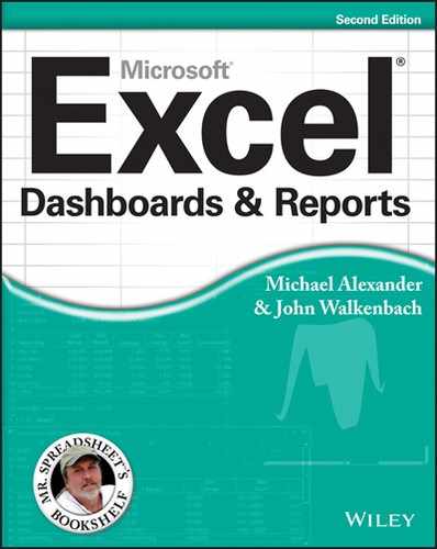
Figure 5-1 shows a worksheet that contains a simple column chart that depicts a company’s sales volume by month. Viewing the chart makes it very apparent that sales were off in the summer months (June through August), but they increased steadily during the final four months of the year. You could, of course, arrive at this same conclusion simply by studying the numbers. But viewing the chart makes the point much more quickly.
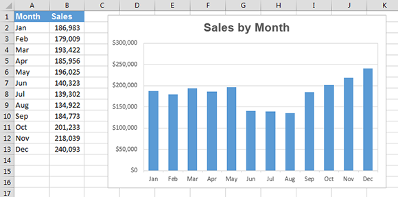
Figure 5-1: A simple column chart depicts the sales volume for each month.
A column chart is just one of many different types of charts that you can create with Excel. By the way, creating this chart is simple: Select the data in A1:B13 and press Alt+F1.
 All the charts pictured in this chapter are available at
 www.wiley.com/go/exceldr in a workbook file named Chapter 5 Samples.xlsx.
How Excel Handles Charts
Before you can create a chart, you must have some numbers — sometimes known as data. The data, of course, is stored in the cells in a worksheet. Normally, the data that is used by a chart resides in a single worksheet, but that’s not a strict requirement. A chart can use data that’s stored in any number of worksheets, and the worksheets can even be in different workbooks. The decision to use data from one sheet or multiple sheets really depends on your data model, the nature of your data sources, and the interactivity you want to give your dashboard.
A chart is essentially an “object” that Excel creates upon request. This object consists of one or more data series, displayed graphically. The appearance of the data series depends on the selected chart type. For example, if you create a line chart that uses two data series, the chart contains two lines, and each line represents one data series.
→ The data for each series is stored in a separate row or column.
→ Each point on the line is determined by the value in a single cell and is represented by a marker.
You can distinguish the lines by their thickness, line style, color, and data markers.
Figure 5-2 shows a line chart that plots two data series across a nine-year period. The series are identified by using different data markers (squares versus circles), shown in the legend at the bottom of the chart. The lines also use different colors, which is not apparent in the grayscale figure.
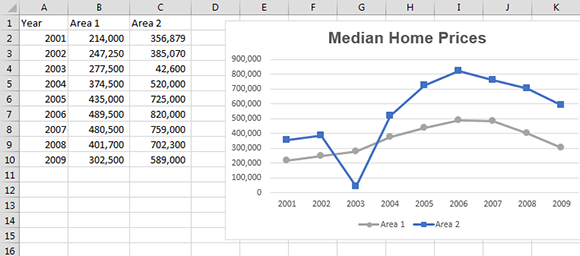
Figure 5-2: This line chart displays two data series.
A key point to keep in mind is that charts are dynamic. In other words, a chart series is linked to the data in your worksheet. If the data changes, the chart is updated automatically to reflect those changes so your dashboard can show the most current information.
After you create a chart, you can always change its type and formatting, add new data series to it, or change an existing data series so that it uses data in a different range.
Charts can reside in either of two locations in a workbook:
→ On a worksheet (an embedded chart)
→ On a separate chart sheet
Embedded charts
An embedded chart basically floats on top of a worksheet, on the worksheet’s drawing layer. The charts shown previously in this chapter are both embedded charts.
As with other drawing objects (such as a text box or a shape), you can move an embedded chart, resize it, change its proportions, adjust its borders, and add effects such as a shadow. Using embedded charts enables you to view the chart next to the data that it uses. Or you can place several embedded charts together so that they print on a single page.
As we discuss in Chapter 11, you ideally place your charts in the presentation layer, presenting the relevant charts in a single viewable area that fit on one page or a single screen.
When you create a chart, it always starts off as an embedded chart. The exception to this rule is when you select a range of data and press F11 to create a default chart. Such a chart is created on a chart sheet.
To make changes to the actual chart in an embedded chart object, you must click the chart to activate it. When a chart is activated, Excel displays the two Chart Tools context tabs, Design and Format, as shown in Figure 5-3. To access these commands, choose Chart Tools→Design and Chart Tools→Format, respectively.
In addition, when clicking a chart, you’ll see several buttons next to the chart. These are helper buttons that provide an easy way to customize the various properties of the chart. These include
Chart Elements
Chart Style
Chart Filter
Figure 5-3: Activating a chart displays additional tabs on the Excel Ribbon and helper buttons next to the chart.
Chart sheets
You can move an embedded chart to its own chart sheet so that you can view it by clicking a sheet tab (covered later in this chapter in the “Moving and resizing a chart” section). When you move a chart to a chart sheet, the chart occupies the entire sheet. If you plan to print a chart on a page by itself, using a chart sheet is often your better choice. If you have many charts to create, you may want to put each one on a separate chart sheet to avoid cluttering your worksheet. This technique also makes locating a particular chart easier because you can change the names of the chart sheets’ tabs to provide a description of the chart that it contains. Although chart sheets are not typically used in traditional dashboards, they can come in handy when producing reports that will be viewed in a multi-tab workbook.
Figure 5-4 shows a chart on a chart sheet. When a chart sheet is activated, Excel displays the Chart Tools context tabs, as described in the previous section.

Figure 5-4: A chart on a chart sheet.
Parts of a Chart
A chart is made up of many different elements, and all of these elements are optional. Yes, you can create a chart that contains no chart elements — an empty chart. It’s not very useful, but Excel allows it.
Refer to the chart in Figure 5-5 as you read the following description of the chart’s elements.

Figure 5-5: Parts of a chart.
This particular chart is a combination chart that displays both columns and a line. The chart has two data series: Income and Profit Margin. Income is plotted as vertical columns, and the Profit Margin is plotted as a line with square markers. Each bar (or marker on the line) represents a single data point (the value in a cell).
The chart has a horizontal axis, known as the category axis. This axis represents the category for each data point (January, February, and so on). This axis doesn’t have a label because the category units are obvious.
Notice that this chart has two vertical axes. These are known as value axes, and each one has a different scale. The axis on the left is for the column series (Income), and the axis on the right is for the line series (Profit Margin).
The value axes also display scale values. The axis on the left displays scale values from 0 to 250,000, in major unit increments of 50,000. The value axis on the right uses a different scale: 0 percent to 14 percent, in increments of 2 percent. For a value axis, you can command the minimum and maximum values, as well as the increment value.
A chart with two value axes is appropriate because the two data series vary dramatically in scale. If the Profit Margin data were to be plotted using the left axis, the line would not even be visible.
If a chart has more than one data series, you’ll usually need a way to identify the data series or data points. A legend, for example, is often used to identify the various series in a chart. In this example, the legend appears at the bottom of the chart. Some charts also display data labels to identify specific data points. The example chart displays data labels for the Profit Margin series, but not for the Income series. In addition, most charts (including the example chart) contain a chart title and additional labels to identify the axes or categories.
The example chart also contains horizontal gridlines (which correspond to the values on the left axis). Gridlines are basically extensions of the value axis scale, which makes it easier for the viewer to determine the magnitude of the data points.
In addition, all charts have a chart area (the entire background area of the chart) and a plot area (the part that shows the actual chart, including the plotted data, the axes, and the axis labels).
Charts can have additional parts or fewer parts, depending on the chart type. For example, a pie chart (see Figure 5-6) has “slices” and no axes. A 5-D chart may have walls and a floor (see Figure 5-7).
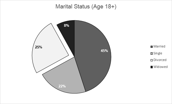
Figure 5-6: A pie chart.
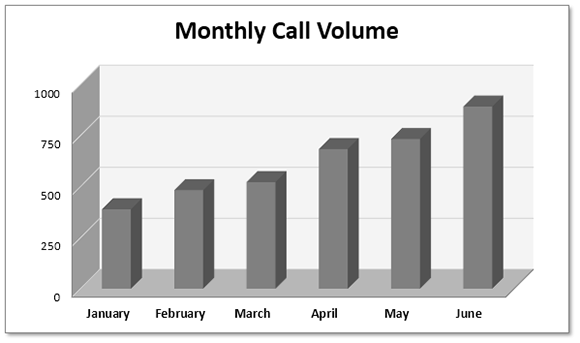
Figure 5-7: A 3-D column chart.
Several other types of items can be added to a chart. For example, you can add a trend line or display error bars.
Like everything else in Excel, charts do have limitations. Table 5-1 lists the limitations of Excel charts.
Table 5-1: Chart Limitations
|
Item |
Limitation |
|
Charts in a worksheet |
Limited by available memory |
|
Worksheets referred to by a chart |
255 |
|
Data series in a chart |
255 |
|
Data points in a data series |
32,000 |
|
Data points in a data series (3D charts) |
4,000 |
|
Total data points in a chart |
256,000 |
Most users never find these limitations to be a problem. However, one item that frequently does cause problems is the limit on the length of the SERIES formula. Each argument is limited to 255 characters, and in some situations, that’s simply not enough characters. See Chapter 6 for more information about SERIES formulas.
Basic Steps for Creating a Chart
Creating a chart is relatively easy. The following sections describe how to create and then customize a basic chart in Excel 2013 to best communicate your business goals.
Creating the chart
Follow these steps to create a chart using the data in Figure 5-8:
1. Select the data that you want to use in the chart.
Make sure that you select the column headers, if the data has them.
 If you select a single cell within a range of data, Excel uses the entire data range for the chart.
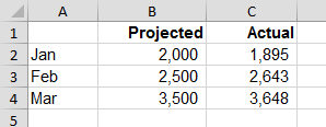
Figure 5-8: This data would make a good chart.
2. Click the Insert tab and then in the Charts group, click a Chart icon.
The icon expands into a gallery list that shows subtypes (see Figure 5-9).
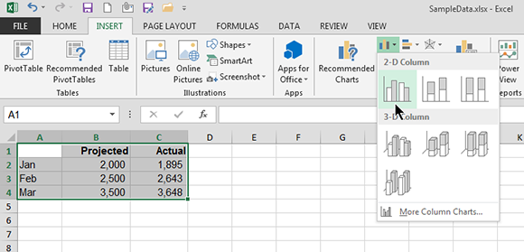
Figure 5-9: The icons in the Insert→Charts group expand to show a gallery of chart subtypes.
3. Click a Chart subtype, and Excel creates the chart of the specified type.
Figure 5-10 shows a column chart created from the data.
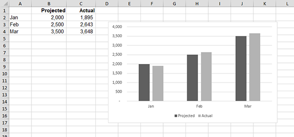
Figure 5-10: A column chart with two data series.
To quickly create a default chart, select the data and press Alt+F1 to create an embedded chart, or press F11 to create a chart on a chart sheet.
Switching the row and column orientation
When Excel creates a chart, it uses an algorithm to determine whether the data is arranged in columns or in rows. Most of the time, Excel guesses correctly, but if it creates the chart using the wrong orientation, you can quickly change the orientation by selecting the chart and choosing Chart Tools→Design→Data→Switch Row/Column. This command is a toggle, so if changing the data orientation doesn’t improve the chart, just choose the command again (or click the Undo button found on the Quick Access toolbar).
The orientation of the data has a drastic effect on the look (and, perhaps, understandability) of your chart. Figure 5-11 shows the column chart in Figure 5-10 after changing the orientation. Notice that the chart now has three data series, one for each month. If the goal of your dashboard is to compare actual values to projected values for each month, this version of the chart is much more difficult to interpret because the relevant columns are not adjacent.

Figure 5-11: The column chart, after swapping the row/column orientation.
Changing the chart type
After you create a chart, you can easily change the chart type. Although a column chart may work well for a particular data set, there’s no harm in checking out other chart types. You can choose Chart Tools→Design→Type→Change Chart Type to display the Change Chart Type dialog box and experiment with other chart types. Figure 5-12 shows the Change Chart Type dialog box.
In the Change Chart Type dialog box, the main categories are listed on the left, and the subtypes are shown as icons. Select an icon and click OK, and Excel displays the chart using the new chart type. If you don’t like the result, click the Undo button.
If the chart is an embedded chart, you can also change a chart’s type by using the icons in the Insert→Charts group. In fact, this method is more efficient because it doesn’t involve a dialog box.
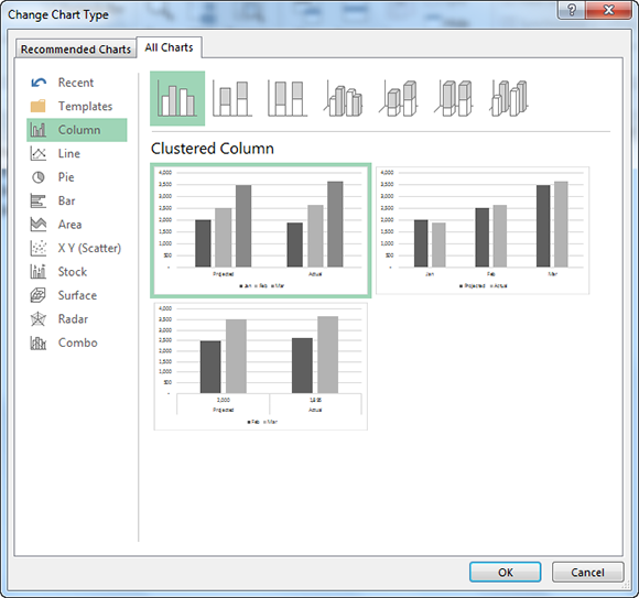
Figure 5-12: The Change Chart Type dialog box.
Applying chart styles
Each chart type has a number of prebuilt styles that you can apply with a single mouse click. A style contains additional chart elements, such as a title, data labels, and axes. This step is optional, but one of the prebuilt designs might be just what you’re looking for. Even if the style isn’t exactly what you want, it may be close enough that you need to make only a few adjustments.
To apply a style, select the chart and use the Chart Tools→Design→Chart Styles gallery. Figure 5-13 shows how a column chart looks using various styles.
Applying a chart style
The Chart Tools→Design→Chart Styles gallery contains quite a few styles that you can apply to your chart. The styles consist of various color choices and some special effects. Again, this step is optional.
The styles displayed in the gallery depend on the workbook’s theme. When you choose Page Layout→Themes to apply a different theme, you see a new selection of chart styles designed for the selected theme.

Figure 5-13: One-click design variations of a column chart.
Adding and deleting chart elements
In some cases, applying a chart layout (as described previously) gives you a chart with all the elements you need. Most of the time, however, you need to add or remove some chart elements and fine-tune the layout. You do so using the Chart Elements button next to the chart command.
For example, to give a chart a title, choose the Chart Elements button and place a check next to Chart Title (see Figure 5-14).
As you can see in Figure 5-14, you add all kinds of chart elements, such as axis titles, data labels, gridlines, and trend lines.

Figure 5-14: Use the Chart Elements button to add or remove various chart elements.
Moving and deleting chart elements
Some of the elements within a chart can be moved. The movable chart elements include the plot area, titles, the legend, and data labels. To move a chart element, click it to select it. Then drag its border.
The easiest way to delete a chart element is to select it and then press Delete. Note that if you delete a chart element and later decide that you want to add it back, all previous formatting will be lost, and you’ll need to reapply the formatting.
A few chart elements consist of multiple objects. For example, the data labels element consists of one label for each data point. To move or delete one data label, click once to select the entire element and then click a second time to select the specific data label. You can then move or delete the single data label.
Formatting chart elements
Many users are content to stick with the predefined chart layouts and chart styles. For more precise customizations, Excel allows you to work with individual chart elements and apply additional formatting.
Every element in a chart can be formatted and customized in many ways. Many users are content with charts that are created using the steps described earlier in this chapter. But because you’re reading this book, you probably want to find out how to customize charts for maximum impact.
 For more detailed information about formatting and customizing your chart, see Chapter 6.
Excel provides two ways to format and customize individual chart elements. Both of the following methods require that you select the chart element first:
→ Use the Ribbon commands on the Chart Tools→Format tab.
→ Press Ctrl+1 to display the Format dialog box that’s specific to the selected chart element.
If you use Excel 2013, you can also double-click a chart element to display the Format dialog box for the element.
 The Ribbon commands contain only a subset of the formatting options. For maximum command, use the Format dialog box.
For example, assume that you want to change the color of the columns for one of the series in the chart. Click any column in the series (which selects the entire series). Then choose Chart Tools→Format→Shape Styles→Shape Fill and select a color from the list that appears. To change the properties of the outline around the columns, use the Chart Tools→Format→Shape Styles→Shape Outline command. To change the effects used in the columns (for example, add a shadow), use the Chart Tools→Format→Shape Styles→Shape Effects command.
Alternatively, you can select a series in the chart, press Ctrl+1, and use the Format Data Series dialog box shown in Figure 5-15. Note that this is a tabbed dialog box. Click the icons along the top of the dialog box to view additional commands. It’s also a persistent dialog box, so you can click another element in the chart. In other words, you don’t have to close the dialog box to see the changes you specify.

Figure 5-15: Using the Format Data Series dialog box.
Working with Charts
As you develop your charts in Excel, you will find the need to move your charts around, resize your charts, duplicate your charts, etc. The following section covers some of the common actions you will inevitably have to perform when working with charts.
Before you can work with a chart, you must activate it. To activate an embedded chart, click an element in the chart. Doing so activates the chart and also selects the element that you click. To activate a chart on a chart sheet, just click its sheet tab.
Moving and resizing a chart
If your chart is an embedded chart, you can freely move and resize it with your mouse. Click the chart’s border and then drag the border to move the chart. Drag any of the handles to resize the chart. The handles consist of dots that appear on the chart’s corners and edges when you click the chart’s border. When the mouse pointer turns into a double arrow, click and drag to resize the chart.
When a chart is selected, you can use the Chart Tools→Format→Size commands to adjust the height and width of the chart. Use the spinners or type the dimensions directly into the Height and Width commands. Oddly, Excel doesn’t provide similar commands to specify the top and left positions of the chart.
To move an embedded chart, just click its border at any location except one of the eight resizing handles. Then drag the chart to its new location. You also can use standard cut-and-paste techniques to move an embedded chart. Select the chart and choose Home→Clipboard→Cut (or press Ctrl+X). Then activate a cell near the desired location and choose Home→Clipboard→Paste (or press Ctrl+V). The new location can be in a different worksheet or even in a different workbook. If you paste the chart to a different workbook, it will be linked to the data in the original workbook. Another way to move a chart to a different location is to choose Chart Tools→Design→Location→Move Chart. This command displays the Move Chart dialog box, which lets you specify a new sheet for the chart (either a chart sheet or a worksheet).
Converting an embedded chart to a chart sheet
When you create a chart using the icons in the Insert→Charts group, the result is always an embedded chart. If you prefer that your chart be located on a chart sheet, you can easily move it.
To convert an embedded chart to a chart on a chart sheet, select the chart and choose Chart→Tools→Design→Location→Move Chart to display the Move Chart dialog box shown in Figure 5-16. Select the New Sheet option and (optionally) provide a different name for the chart sheet.
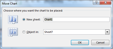
Figure 5-16: Use the Move Chart dialog box to move an embedded chart to a chart sheet (or vice versa).
To convert a chart on a chart sheet to an embedded chart, activate the chart sheet and then choose Chart→Tools→Design→Location→Move Chart to display the Move Chart dialog box. Select the Object In option and specify the sheet by using the drop-down command.
Copying a chart
To make an exact copy of an embedded chart, select the chart and choose Home→Clipboard→Copy (or press Ctrl+C). Then activate a cell near the desired location and choose Home→Clipboard→Paste (or press Ctrl+V). The new location can be in a different worksheet or even in a different workbook. If you paste the chart to a different workbook, it will be linked to the data in the original workbook.
To copy a chart on a chart sheet, press Ctrl while you click and drag the sheet tab to the left or right. After you let go of the mouse, you will have a copy of the chart sheet.
Deleting a chart
To delete an embedded chart, click the chart (this selects the chart as an object). Then press Delete. With the Ctrl key pressed, you can select multiple charts and then delete them all with a single press of the Delete key.
To delete a chart sheet, right-click its sheet tab and choose Delete from the shortcut menu. To delete multiple chart sheets, select them by pressing Ctrl while you click the sheet tabs.
Copying a chart’s formatting
If you create a nicely formatted chart and realize that you need to create several more charts that have the same formatting, you have these three choices:
→ Make a copy of the original chart and then change the data used in the copied chart. One way to change the data used in a chart is to choose the Chart Tools→Design→Data→Select Data command and make the changes in the Select Data Source dialog box.
→ Create the other charts, but don’t apply any formatting. Then activate the original chart and press Ctrl+C. Select one of the other charts and choose Home→Clipboard→Paste→Paste Special. In the Paste Special dialog box, click the Formats option and then click OK. Repeat for each additional chart.
→ Create a chart template and then use the template as the basis for the new charts. Or you can apply the new template to existing charts.
Renaming a chart
When you activate an embedded chart, its name appears in the Name box (located to the left of the Formula bar). To change the name of an embedded chart, just type the new name into the Name box and press Enter.
Why rename a chart? If a worksheet has many charts, you may prefer to activate a particular chart by name. Just type the chart’s name in the Name box and press Enter. It’s much easier to remember a chart named Monthly Sales as opposed to a chart named Chart 9.
When you rename a chart, Excel allows you to use a name that already exists for another chart. Normally, it doesn’t matter if multiple charts have the same name, but it can cause problems if you use VBA macros that select a chart by name.
Printing charts
Printing embedded charts is nothing special; you print them the same way that you print a worksheet. As long as you include the embedded chart in the range that you want to print, Excel prints the chart as it appears on-screen. When printing a sheet that contains embedded charts, it’s a good idea to preview first (or use Page Layout view) to ensure that your charts don’t span multiple pages. If you create the chart on a chart sheet, Excel always prints the chart on a page by itself.
If you select an embedded chart and choose File→Print, Excel prints the chart on a page by itself (as though it were a chart sheet) and does not print the worksheet.
If you don’t want a particular embedded chart to appear on your printout, select the background area of the chart (the chart area), right-click, and choose Format. In the Format Chart Area dialog box, click the Properties tab and deselect the Print Object check box (see Figure 5-17).

Figure 5-17: Specifying that a chart should not be printed with the worksheet.