
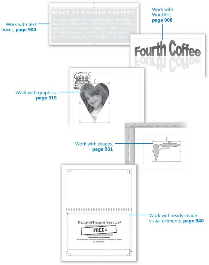
Chapter at a Glance
Microsoft Publisher 2010 is specifically designed to make it easy to create publications that contain a mixture of text and visual elements arranged on the page. Knowing basic techniques for inserting and manipulating visual elements such as photographs, illustrations, and decorative images is key to quickly assembling impressive publications.
Publications are most effective when you achieve a balance of text and graphics that is appropriate for your purpose. Some publications convey information through text and include visual elements only to catch the reader’s eye or to reinforce or illustrate a point. At the other end of the scale, some publications include almost no text and instead rely on visual elements to carry the message.
In this chapter, you’ll first create a text object and see how to enhance the text with color and formatting. Then you’ll use WordArt to create fancy, stylized text for those occasions when regular formatting doesn’t quite meet your needs. Next, you’ll insert clip art graphics and pictures, add borders, and change the size, color, and position of the images. You’ll draw, connect, and group shapes. Finally, you’ll insert ready-made design elements from the Building Block Library.
Note
Practice Files Before you can complete the exercises in this chapter, you need to copy the book’s practice files to your computer. The practice files you’ll use to complete the exercises in this chapter are in the Chapter30 practice file folder. A complete list of practice files is provided in Using the Practice Files at the beginning of this book.
When you create a document by using a word processing program such as Microsoft Word, you enter text on the page in the area defined by the margins. When you create a publication by using Publisher, however, you place a text box on the page and enter text into the text box. The text box is an object that can be sized to fit the text it contains, and can be moved with its contents intact. You can create text boxes or manipulate the text boxes that are part of a Publisher template. You can type text directly into the text box, paste text from another file, or insert the entire contents of another file.
Tip
In Publisher, the text in a text box is called a story. A story is any discrete block of text that occupies a single text box or a set of linked text boxes. It can be a single paragraph or multiple paragraphs.
After you create a text box, or when you click a text box to make it active, you can move it by dragging its frame.
Note
Keyboard Shortcut To create a copy of a text box and its contents, hold down the Ctrl key while you drag the text box to the location where you want the copy.
You can drag the handles of the frame to change the size or shape of the box. If you want a specific size or shape, you can change the settings on the Drawing Tools Format contextual tab or the Text Box Tools Format contextual tab. On these tabs, you can also specify:
The background color of the text box, whether it has a border, and the color of the border.
Whether the text box has a shadow or three-dimensional effects.
The position of the text box on the page, and how text in adjacent frames flows around this text box.
The vertical text alignment, the margins, and whether Publisher can automatically adjust the size of the text box to fit the amount of text you insert in it.
When a text box is active, a green rotating handle is attached to its upper-middle handle. You can drag this handle to change the angle of the text box and the text within it.
Tip
You can rotate a text box and its contents by clicking the Rotate button in the Arrange group on the Drawing Tools Format contextual tab and then clicking the rotation option you want. You can change the direction of only the text within the text box from horizontal to vertical by clicking the Text Direction button in the Text group on the Text Box Tools Format contextual tab.
Brief segments of text, such as those on a postcard or flyer, need to have more visual impact than longer blocks of text, such as those in a newsletter. You can vary the look of text by changing the character formatting. Here are some things about character formatting to be aware of:
All text is displayed in a particular font consisting of alphabetic characters, numbers, and symbols that share a common design.
Almost every font comes in a range of font sizes, which are measured in points from the top of letters that have parts that stick up (ascenders), such as h, to the bottom of letters that have parts that drop down (descenders), such as p. A point is approximately 1/72 of an inch.
Almost every font comes in a range of font styles. The most common are regular (or plain), italic, bold, and bold italic.
Fonts can be enhanced by applying font effects, such as underlining, small capital letters (small caps), or shadows.
You can choose from a palette of harmonious font colors, and you can also specify custom colors.
You can alter the character spacing by pushing characters apart or squeezing them together.
Tip
The instructions in the exercises assume that you’re working in a blank publication so that you can focus on the techniques you’re learning. However, you can easily adapt the instructions to any type of publication.
In this exercise, you’ll create a blank publication, add a text box, and then insert the contents of an existing Word document. You’ll then format the text box by filling it with color and format the text by changing its character formatting.
Note
SET UP You need the Text document located in your Chapter30 practice file folder to complete this exercise. Display the New page of the Backstage view, and then follow the steps.
In the Home section of the New page, click More Blank Page Sizes.
On the More Blank Page Sizes page, under Standard, click the Letter (Portrait) thumbnail. Then, in the right pane, click the Create button.
Publisher creates a blank publication of the selected size. Blue margin guides designate the margins of the publication.
Note
Troubleshooting The appearance of buttons and groups on the ribbon changes depending on the width of the program window. For information about changing the appearance of the ribbon to match our screen images, see Modifying the Display of the Ribbon at the beginning of this book.
Save the publication as TextBox in your Chapter30 practice file folder.
 On the Home tab,
in the Objects group, click the
Draw Text Box button.
On the Home tab,
in the Objects group, click the
Draw Text Box button.Move the cross-hair pointer over the blank page, and when the pointer is slightly to the right of the left margin guide and slightly below the top margin guide, hold down the mouse button, and drag to the right and down, without releasing the mouse button.
Don’t release the mouse button yet.
As you drag, Publisher displays the exact coordinates of the upper-left corner (the anchor point) of the text box and its exact dimensions at the left end of the status bar.
Release the mouse button when the text box dimensions are 5.00 x 2.00 in.
The Drawing Tools Format contextual tab and the Text Box Tools Format contextual tab appear on the ribbon.
 Without clicking anything else, on the Insert tab, in the Text group, click the Insert
File button.
Without clicking anything else, on the Insert tab, in the Text group, click the Insert
File button.The Insert Text dialog box opens, displaying the contents of your Documents library.
If necessary, navigate to your Chapter30 practice file folder. Then double-click the Text document.
Publisher inserts the contents of the document into the text box.
 On the View tab,
in the Zoom group, click the 100%
button.
On the View tab,
in the Zoom group, click the 100%
button.The inserted text is now a legible size.
Point to the frame around the text box, and when the pointer changes to a four-headed arrow, drag the frame down and to the right, releasing the mouse button when the text box coordinates shown on the status bar are 2.00, 2.00 in.
 With the text box still selected, on the Drawing Tools Format tab, in the Shape Styles group, click the Shape Fill
arrow. Then in the Standard Colors
palette, click the Orange
square.
With the text box still selected, on the Drawing Tools Format tab, in the Shape Styles group, click the Shape Fill
arrow. Then in the Standard Colors
palette, click the Orange
square.Note
See Also For information about applying a different color scheme and using custom colors, see Creating Folded Cards in Chapter 31.
 Click anywhere within the text in the text box.
On the Home tab, in the Editing group, click the Select button and then, in the Select list, click Select All Text in Text Box.
Click anywhere within the text in the text box.
On the Home tab, in the Editing group, click the Select button and then, in the Select list, click Select All Text in Text Box.On the Home tab, in the Font group, click the Font arrow. Then scroll down the Font list and click Verdana.
 In the Font
group, click the Increase Font Size
button twice, to increase the font size to 12 points.
In the Font
group, click the Increase Font Size
button twice, to increase the font size to 12 points. In the Font
group, click the Font Color arrow, and in the Scheme Colors palette, click the white
square (Accent 5). Then click
anywhere in the text box to release the selection.
In the Font
group, click the Font Color arrow, and in the Scheme Colors palette, click the white
square (Accent 5). Then click
anywhere in the text box to release the selection.Drag the bottom handle (the square box in the center of the bottom frame) of the text box frame upward, releasing the mouse button when the text box dimensions shown on the status bar are 5.00 x 1.50 in.
The Fit Text button appears on the right side of the text box and the text box handles turn red to indicate that it is too small to fit its contents. We’ll leave that for now.
Note
Troubleshooting If the dimensions don’t change but the coordinates do, you missed the handle and moved the text box by dragging its frame instead of the handle. (When dragging the handle, the cursor shape changes to a two-headed arrow. When dragging the frame, the cursor shape changes to a four-headed arrow.) Click the Undo button on the Quick Access Toolbar, and then try dragging the handle again.
Select the heading What Is Fourth Coffee? by dragging across or triple-clicking it.
 In the Font
group, click the Increase Font
Size button
five times to increase the font size to 22 points. Then click the Bold button.
In the Font
group, click the Increase Font
Size button
five times to increase the font size to 22 points. Then click the Bold button. With the heading still selected, click the
Font dialog box launcher.
With the heading still selected, click the
Font dialog box launcher.The Sample pane shows the formatting applied to the selection. As you make changes to settings in the dialog box, the sample changes to show how the selection will look if you click Apply or OK. (Clicking Apply implements the current settings without closing the dialog box; clicking OK implements the changes and closes the dialog box.)
In the Effects section, select the Small caps check box. Then click OK.
Tip
You can use the commands in the Format group on the Home tab to change the font style of text, but to apply font effects, you have to use the commands in the Font dialog box. If you want to apply several attributes to the same text, it is often quicker to open the dialog box and apply them all from there.
 In the Font
group, click the Character
Spacing button and then, in the
Character Spacing list, click
Very Loose.
In the Font
group, click the Character
Spacing button and then, in the
Character Spacing list, click
Very Loose.Click outside the text box.
The text box handles disappear.
Click anywhere in the text box to select it.
 On the Text Box
Tools tab, in the Text
group, click the Text Fit button and then, in the
Text Fit list, click Grow Text Box to Fit.
On the Text Box
Tools tab, in the Text
group, click the Text Fit button and then, in the
Text Fit list, click Grow Text Box to Fit.The text box expands vertically to fit its contents.


If you want to add a fancy title to a publication, and you can’t achieve the effect you want with regular text formatting, you can use WordArt. With WordArt, you can visually enhance text in ways that go far beyond changing a font or font effect, simply by choosing a style from a set of thumbnail images arranged in a gallery.
Tip
For the best results, use WordArt to emphasize short phrases, such as Customer Service, or a single word, such as Welcome. Overusing WordArt can clutter your publication and draw attention away from your message.
You add stylized text to a publication by clicking the WordArt button in the Text group on the Insert tab. You then select a style from the WordArt gallery, enter your text, and apply any additional formatting. Publisher inserts the text in your publication as a WordArt object that you can size and move like any other object. You can also change the shape of the object to stretch and form the letters of the text in various ways.
In this exercise, you’ll add a WordArt object to a publication and then modify the appearance of the WordArt text.
Note
SET UP You need the Blank_start publication located in your Chapter30 practice file folder to complete this exercise. Open the Blank_start publication, and save it as WordArt. Then follow the steps.
On the Insert tab, in the Text group, click the WordArt button.
In the WordArt Transform Styles section of the WordArt gallery, click the Gradient Fill – Red, Curved icon (the second icon in the third row).
The Edit WordArt Text dialog box opens. The dialog box contains sample text for you to replace with the text you want to format.
With the placeholder text selected, type Fourth Coffee, and then click OK.
The formatted text appears as an object in the center of the page.
Point to the word Fourth. When the pointer changes to a four-headed arrow, drag the WordArt object up toward the top of the page until the top margin changes from a light blue and white dotted line to a light blue and dark blue dotted line that spans the entire page.
This indicates that the top of the WordArt object is aligned with the top margin of the page.
Release the mouse button to move the object to the top of the page.
Point to the lower-left sizing handle of the WordArt object. When the pointer changes to a diagonal double-headed arrow, drag the sizing handle to the left, until the dotted line representing the left edge of the object is aligned with the left page margin.
Drag the lower-right sizing handle down and to the right, until the WordArt object spans the full width of the page and is about two inches high.
It’s not necessary to set the height exactly; we’ll use another method to do so.
- On the WordArt Tools
Format tab, click the Size
dialog box launcher.
The Format WordArt dialog box opens, displaying the Size page.
In the Size and rotate section of the Size page, replace the measurement in the Height box with 2, and replace the measurement in the Width box with 7.5. Then click the Layout tab.
The Layout page of the Format WordArt dialog box displays settings that control the position of the WordArt object on the page in relation to other page elements.
In the Position on page section of the Layout page, replace the measurements in the Horizontal and Vertical boxes with 0.5. Then click OK.
Your changes are reflected in the Size group on the WordArt Tools Format tab.
The position that you specify on the Layout page of the Format WordArt dialog box is the position of the upper-left corner of the WordArt object frame. Notice that because of the curve of the letters, the left and right edges of the words Fourth Coffee currently extend beyond the left and right page margins.
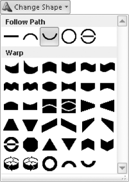
On the WordArt Tools Format tab, in the WordArt Styles group, click the Change Shape button.
The Change Shape gallery displays a variety of shapes. The current shape, Arch Down (Curve) is selected.
In the Warp section of the Change Shape gallery, click the Triangle Up icon (the third icon in the fifth row).
The shape of the WordArt object changes.
On the WordArt Tools Format tab, in the WordArt Styles group, click the Shape Fill button.
At the bottom of the Shape Fill gallery, click Gradient.
The Gradient gallery displays options for working with gradient fill colors. The gallery currently displays one-color gradient options, with a single color (blue) fading to white or black.
At the bottom of the Gradient gallery, click More Gradients.
The Fill Effects dialog box opens, displaying the Gradient page. The page displays gradient settings based on the existing color of the selected WordArt object.
In the Colors section, click Two colors.
A Color 2 list appears below the Color 1 list.
Click the Color 1 arrow and then, in the top row of the Scheme Colors palette, click the medium-blue Accent 3 icon (the fourth icon). Click the Color 2 arrow and then, in the top row of the Scheme Colors palette, click the violet Followed Hyperlink icon (the seventh icon).
As you select colors, the previews in the Variants pane update to display the effects of your selections.
In the Shading styles area, click Horizontal. In the Variants box, click the lower-left thumbnail. Then click OK.
The WordArt object reflects your changes.
On the WordArt Tools Format tab, in the Shadow Effects group, click the Shadow Effects button.
The Shadow Effects gallery displays options for applying standard shadows to the letters of the WordArt object.
In the Additional Shadow Styles section of the Shadow Effects gallery, click the Shadow Style 17 icon (the fourth icon in the first row). Then click away from the WordArt object to display the full effect.


Publisher 2010 provides access to hundreds of professionally designed pieces of clip art—license-free graphics that often take the form of cartoons, sketches, or symbolic images, but can also include photographs, audio and video clips, and more sophisticated artwork. In a publication, you can use clip art to illustrate a point you are making or as eye-pleasing accompaniments to text. For example, you might insert an icon of an envelope to draw attention to an e-mail address, or a picture of mountains to set a “back to nature” tone.
To search for a clip art image, you display the Clip Art task pane and enter a keyword. You can search a specific clip art collection in the Microsoft Clip Organizer; search for specific media types, such as photographs; and search for images on the Microsoft Office Online Web site.
Tip
To open the Microsoft Clip Organizer, click Start, All Programs, Microsoft Office, Microsoft Office 2010 Tools, and then Microsoft Clip Organizer; or enter clip in the Start menu Search box and then, in the results list, click Microsoft Clip Organizer.
You can add illustrations created and saved in other programs or scanned photographs and illustrations to your publications. Images such as these, saved as graphic files, are referred to as pictures. Like clip art, pictures can be used to make your publications more attractive and visually interesting. However, pictures can also convey information in a way that words cannot. For example, you might display photographs of your company’s products in a catalog or brochure.
After you insert a graphic into a publication, you can move and size it just as you can any other object. When a graphic object is selected, Publisher displays the Picture Tools Format contextual tab on the ribbon. You can use the commands on this tab to modify the appearance of the selected graphic in various ways, including the following:
Rotate the graphic to any angle.
Crop away the parts of the graphic that you don’t want to show in the publication, or crop the graphic into a shape. (The graphic itself is not altered—parts of it are simply not shown.)
Compress the image to minimize the file size.
Adjust the brightness, contrast, and color of the image, and apply color variations such as grayscale (shades of gray), sepia (to give the image an old-fashioned look), and washout (muted shades of the original colors).
And if you decide you don’t like the changes you have made to a graphic, you can restore the original image by clicking the Reset Picture button.
In this exercise, you’ll insert and modify a clip art image, and then insert and crop a picture. Then you’ll decrease the file sizes of the two graphics by compressing them.
Note
SET UP You need the Blank_start publication and BirthdayGirl image located in your Chapter30 practice file folder, and an Internet connection, to complete this exercise. Open the Blank_start publication, and save it as Graphics. Then follow the steps.
 On the Insert tab,
in the Illustrations group, click the
Clip Art button.
On the Insert tab,
in the Illustrations group, click the
Clip Art button.Tip
If you are designing the layout of a publication and know you will want to insert some sort of graphic later, you can click Picture Placeholder to insert a graphic placeholder.
The Clip Art task pane opens.
In the Search for box at the top of the Clip Art task pane, type birthday. Then define the scope of your search, as follows:
If All media file types doesn’t already appear in the Results should be box, click the Results should be arrow and then, in the list, select the All media types check box.
If the Include Office.com content check box isn’t already selected, select it.
In the Clip Art task pane, click Go.
Thumbnails of clip art, photographs, movies, and sounds with the keyword birthday appear in the task pane.
Note
Troubleshooting If you do not select the Include Office.com Content check box or do not have an active Internet connection, your search might return zero results.
Icons indicate special properties of the images. For example, a yellow star icon in the lower-right corner of a thumbnail indicates an animated image, and a globe icon in the lower-left corner of a thumbnail indicates an image that is available from the Microsoft Office Online Web site rather than from the clip art collection stored locally on your computer.
In the Clip Art task pane, point to the first image.
A vertical button appears on the right side of the image, and a ScreenTip displays information about the image.
Tip
The file size of a publication that contains graphics can become quite large. You can shrink the size of a graphic file (without affecting the displayed graphic) by using the Compress Pictures feature. Depending on the resolution setting, you might lose some visual quality when you compress a picture. You choose the resolution you want for the pictures based on where or how the presentation will be viewed—for example, on the Web or printed. You can also set other options, such as deleting cropped areas of a picture, to achieve the best balance between quality and file size. This is especially important when you intend to distribute a publication electronically, because the file size affects how long it takes to transmit or download.
Click the button that appears on the right side of the active image.
A menu of actions you can take with the image appears.
On the menu, click Edit Keywords.
The Keywords dialog box opens. From this dialog box, you can display the keywords for all the clip art images currently returned by your search. The number of images is shown above the Preview box.
Below the Preview box, click the Next button several times to display other images and their keywords. Then click Cancel.
In the Clip Art task pane, enter birthday cake in the Search for box. Click the Results should be arrow, clear the All media types check box, and select the Illustrations check box. Then click Go.
The clip art shown in the task pane changes to display only drawings.
Scroll down the list, locate an image of a birthday cake that you like, and click the image.
The image appears on the page, and the Picture Tools Format tab appears on the ribbon.
 On the Picture Tools
Format tab, in the lower-right corner of the Picture Styles gallery, click the More button.
On the Picture Tools
Format tab, in the lower-right corner of the Picture Styles gallery, click the More button.The Picture Styles gallery expands to display all the style options.
Point to each of the thumbnails in the Picture Styles gallery to preview the effect of applying that style to the clip art image.
In the Picture Styles gallery, click Picture Style 24 (the last style in the gallery).
A shaped, thick black frame appears around the image. Areas of the image that don’t fit within the frame are not visible.
 In the Picture
Styles group, click the Picture
Border arrow (not the button) and
then, on the menu below the color galleries, click Sample Line Color.
In the Picture
Styles group, click the Picture
Border arrow (not the button) and
then, on the menu below the color galleries, click Sample Line Color.The cursor changes from an arrow to an eyedropper.
With the eyedropper, click a color in the birthday cake clip art image you chose.
The color of the shaped frame changes to the color you clicked, and the cursor shape changes back to an arrow.
On the Picture Border menu, click Dashes, and then on the Dashes submenu, click Round Dot (the first dotted option).
 In the Arrange
group, click the Align button.
In the Arrange
group, click the Align button.Because no other objects are selected, only one alignment option is available.
In the Align list, click Relative to Margin Guides. Then click the Align button again.
All the alignment options are now available.
In the Align list, click Align Top. Then in the Align list, click Align Left. Then click a blank part of the page to release the selection.
The modified clip art graphic is now located in the upper-left corner of the printable area of the page.
Experiment with other settings on the Picture Tools Format tab, and then close the Clip Art task pane.
 On the Insert tab,
in the Illustrations group, click the
Picture button.
On the Insert tab,
in the Illustrations group, click the
Picture button.The Insert Picture dialog box opens, displaying the contents of your Pictures library.
Navigate to your Chapter30 practice file folder, and double-click the BirthdayGirl photo.
The photo is inserted on the page, and the Picture Tools Format tab appears on the ribbon. The photo occupies nearly the entire page.
- On the Picture Tools
Format tab, click the Size
dialog box launcher.
The Format Picture dialog box opens, displaying the Size page.
In the Scale section of the Size page, ensure that the Lock aspect ratio check box is selected. Then change the Height to 50, and press Tab.
Because the aspect ratio is locked, the Width setting also changes to 50%.
In the Format Picture dialog box, click OK.
The photograph is resized to half its original height and width.
In the Arrange group, click the Align button, and then click Distribute Horizontally.
 In the Picture
Styles group, click the Picture
Shape button.
In the Picture
Styles group, click the Picture
Shape button.The Picture Shapes gallery expands.
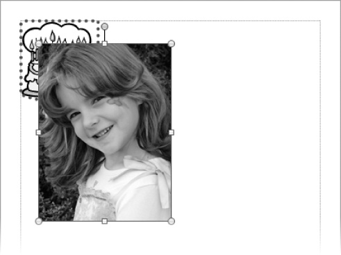
In the Basic Shapes section of the Picture Shapes gallery, click Heart (the fourth icon from the right end of the second row).
The photo is shaded, and crop handles appear on its sides and corners. A clear area in the center of the photo indicates the area that will be visible when you apply the shape.
Click a blank area of the page, and then point to the photo.
The photo appears to be cropped in the shape of a heart. Pointing to the cropped photo displays the outline of the original photo.
Drag the heart-shaped photo to overlap the birthday cake.
Although the original photo still exists, the parts that have been cropped away are not at all visible, and do not impede your view of the clip art image.
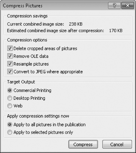
 With the photo still selected, click the Compress Pictures button in the Adjust group on the Picture Tools
Format tab.
With the photo still selected, click the Compress Pictures button in the Adjust group on the Picture Tools
Format tab.The Compress Pictures dialog box opens.
Notice the current size of the image files and the estimated size after compression using the default settings.
In the Target Output section of the dialog box, click Web.
The estimated size after compression changes to a much smaller size. The resolution necessary for displaying graphics on the Web is much lower than the resolution for printing.
In the Compress Pictures dialog box, click Compress. Then in the Microsoft Publisher dialog box that opens, click Yes to apply picture optimization.
Publisher compresses the images and deletes the cropped parts of the photo. If you were to save the file now, the compressed pictures would result in a smaller file size.


Publisher provides tools for creating several types of shapes, including lines, arrows, ovals, rectangles, stars, banners, and many more. With a little imagination, you will discover countless ways to create drawings by combining shapes.
When you create a shape in Publisher, you drag the pointer across the page to define the size of the shape. After you draw the shape, it is surrounded by a set of handles, indicating that it is selected. (You can select a shape at any time by simply clicking it.) When a shape is selected, the Drawing Tools Format contextual tab appears on the ribbon. Using the commands on this tab, you can change an existing shape, add text to the shape, apply a preformatted visual style, fill the shape with color, give the shape a three-dimensional appearance, and apply other formatting options.
You can easily insert text within a shape. Simply select the shape by clicking it, and then start typing. Publisher treats the text area of the shape as a text box. (A separate text box is not created.) You can then format the text by selecting it and using the commands in the Font group of the Text Box Tools Format contextual tab that appears.
You move and copy shapes just as you do other page elements. To move a shape from one location to another on the same page, you simply point to the shape, and when the pointer becomes a four-headed arrow, drag the shape to its new location, using the coordinates shown on the status bar to position it precisely. (You can create a copy of a selected shape by dragging it while holding down the Ctrl key.) You can also reposition a shape by changing settings on the Layout page of the Format AutoShape dialog box.
Note
Keyboard Shortcut Hold down the Shift key while moving a shape to restrict the position change to a horizontal or vertical movement.
The handles around a selected shape serve the same sizing and rotating purposes as those around any other object. You can use the dimensions shown on the status bar to adjust the size precisely, or you can set the size of the shape in the Size group on the Drawing Tools Format tab or on the Size page of the Format AutoShape dialog box. You can rotate it by using the Rotate Or Flip command on the Arrange menu.
After drawing a shape, you can fill it with color, change the color and width of the border, or apply a Shape Style by using the commands in the Shape Styles group on the Drawing Tools Format tab.
Tip
Having made changes to one shape, you can easily apply the same attributes to another shape by clicking the shape that has the desired attributes, clicking the Format Painter button in the Clipboard group on the Home tab, and then clicking the shape to which you want to copy the attributes. If you want to automatically apply the attributes of a shape to all future shapes in the same publication, right-click the shape, click Format AutoShape, and on the Colors And Lines page of the Format AutoShape dialog box, select the Apply Settings To New AutoShapes check box.
To show a relationship between two shapes, you can connect them with a line by joining special handles called connection points. Moving a connected shape also moves the line, maintaining the relationship between the connected shapes.
When you create a drawing composed of multiple shapes, you can group them so that you can edit, copy, and move them as a unit. While shapes are grouped, you can still change some of the attributes of an individual shape within the group by selecting only that shape. You can ungroup the grouped shapes at any time and regroup them after making changes.
In this exercise, you’ll draw several shapes of the same color. Then you’ll connect two shapes and format the connection line. Finally, you’ll group the shapes.
Note
SET UP You need the Blank_start publication located in your Chapter30 practice file folder to complete this exercise. Open the Blank_start publication, and save it as Shapes. Then follow the steps.
 On the Insert
tab, in the Illustrations group,
click the Shapes button.
On the Insert
tab, in the Illustrations group,
click the Shapes button.In the Basic Shapes section of the Shapes gallery, click Isosceles Triangle (the eighth shape in the first row).
Move the pointer over the page, and starting about 1 inch below the top margin guide, drag to draw a triangle about 1 inch tall and 0.5 inch wide.
 On the Drawing Tools
Format contextual menu that appears,
in the Arrange group, click the
Rotate button and then, on the
menu that appears, click Flip
Vertical.
On the Drawing Tools
Format contextual menu that appears,
in the Arrange group, click the
Rotate button and then, on the
menu that appears, click Flip
Vertical.The triangle is now upside down.
- Click the Shape
Styles dialog box launcher.
The Format AutoShape dialog box opens, displaying the Colors And Lines page.
In the Fill section of the Colors and Lines page, click the Color arrow and then, in the Standard Colors palette, click the Orange square.
At the bottom of the Colors and Lines page, select the Apply settings to new AutoShapes check box. Then click OK.
On the Drawing Tools Format tab, in the Insert Shapes gallery, click the Oval icon. Then hold down the Shift key, and drag to draw a circle above the triangle with a diameter slightly smaller than the triangle’s side.
When you release the mouse button, Publisher fills the circle with the orange color you specified for all shapes in this publication.
In the Insert Shapes gallery, click the Oval icon. Then drag to draw an oval about 1.5 inches wide to the right of the circle.
- In the lower-right corner of the Insert Shapes gallery, click the More button.
The full Insert Shapes gallery expands.
In the Lines section, click Curved Connector (the seventh shape in the row).
Point to the triangle.
Because you have selected a connector, blue dots appear at the ends and midpoints of each line of the triangle.
Drag to draw a line from the connection point at the upper-right corner of the triangle to the connection point at the bottom of the oval.
Publisher joins the two shapes with a curved connecting line. Red handles appear at each end of the line, indicating that the shapes are connected.
 With the line selected, click the Shape Outline arrow (not the button) in
the Shape Styles group on the Drawing Tools Format tab.
With the line selected, click the Shape Outline arrow (not the button) in
the Shape Styles group on the Drawing Tools Format tab.On the Shape Outline menu, click Weight.
The Weight submenu displays examples of various line weights, or thicknesses.
On the Weight submenu, click 6 pt. Then on the Shape Outline menu, in the Standard Colors palette, click the Orange square.
The color and weight of the curved connector changes.
Drag the oval shape to the left, close to the circle.
Publisher adjusts the length and curve of the connecting line.
Select the four shapes by holding down the Shift key as you click each one in turn.
 In the Arrange
group, click the Group button.
In the Arrange
group, click the Group button.Publisher groups the shapes together with only one set of handles around the edge of the entire group.
Point to any shape in the group, and when the pointer changes to a four-headed arrow, drag the grouped object to the upper-left corner of the page until the Object Position on the status bar is 1.00, 1.00 in.
Tip
If you have difficulty positioning the shape by dragging, you can set the position on the Layout tab of the Format AutoShape dialog box.
The entire group moves.
Drag the lower-right handle of the group up and to the left until the Object Size shown on the toolbar is 1.50 x 1.00 in.
On the Insert tab, in the Basic Shapes section of the Shapes gallery, click Trapezoid (the fourth shape in the first row).
Draw a small “cup” on top of the oval “tray.” Then hold down the Shift key, click any of the other shapes, and click the Group button in the Arrange group.
Publisher adds the cup shape to the group.


Publisher excels at helping you create visually exciting publications. One of the ways it provides assistance is by offering hundreds of ready-made visual elements, called building blocks, that you can insert in a publication with a couple of clicks.
To simplify the use of these visual elements, Publisher 2010 organizes them in categories in the Building Block Library. Many of the elements have a common design and color scheme to give your publications a consistent look. When you are more familiar with color schemes and themes, you will be able to customize the colors of these elements, but for now, we will show you how to use the default building blocks to add professional touches to your publications.
Note
See Also For information about applying a different color scheme and using custom colors, see Creating Folded Cards in Chapter 31.
You cannot add a customized element to the Building Block Library, even if you originally inserted it in your publication from that gallery. If you want to reuse a customized building block, or any other object, you can copy and paste it between publications.
In this exercise, you’ll insert ready-made elements from three categories of the Building Block Library into a publication.
Note
SET UP You need the Blank_start publication located in your Chapter30 practice file folder to complete this exercise. Open the Blank_start publication, and save it as Design. Then follow the steps.
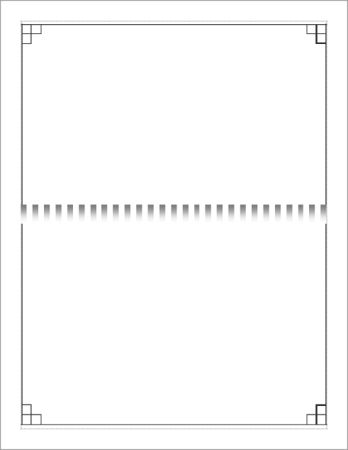
On the Insert tab, in the Building Blocks group, click the Borders & Accents button.
The Borders & Accents gallery expands, displaying some of the available preformatted border options.
Below the Borders & Accents gallery, click More Borders and Accents.
The Building Block Library dialog box opens, displaying the Borders & Accents page.
Scroll down the Borders & Accents page. In the Frames section, click the Stacked Corners thumbnail. Then in the Building Block Library dialog box, click Insert.
The Building Block Library dialog box closes and Publisher inserts an asymmetrical border around the perimeter of the page.
With the border selected, press the Right Arrow and Down Arrow keys repeatedly until the border is approximately centered within the blue margin guides.
The border consists of sets of overlapping rectangles. You can move the entire border because all of its components are grouped to form one object that can be treated as a single unit.
Note
See Also For information about grouping objects, see Connecting and Grouping Shapes, earlier in this chapter.
Repeat steps 1 and 2 to redisplay the Borders & Accents page of the Building Block Library dialog box. In the Bars section, double-click Awning Stripes.
Publisher inserts the bar in the center of the page. The Awning Stripes bar consists of a series of blue and white rectangles.
With the bar selected, drag one of its left corner handles to the left until a pink line indicates that the left edge of the bar is at the left page margin. Then repeat this step to extend the right edge of the bar to the right page margin.
The number of rectangles in the bar increases to fill the designated space.
 Select the bar graphic. On the Drawing Tools Format tab, in the Arrange group, click the Send Backward
button (not its arrow).
Select the bar graphic. On the Drawing Tools Format tab, in the Arrange group, click the Send Backward
button (not its arrow).Tip
You can send an object backward one layer at a time, or send it directly to the back of the stack by clicking the Send Backward arrow and then clicking Send To Back.
The bar graphic moves behind the border graphic, so the entire border is visible.
On the Insert tab, in the Building Blocks group, click the Advertisements button.
The Advertisements gallery expands, displaying some of the available black-and-white advertisement elements.
Below the Advertisements gallery, click More Advertisements.
The Building Block Library dialog box opens, displaying the Advertisements page.
Scroll down the Advertisements page. In the Coupon section, click the Tilted Box thumbnail.
The right pane displays a preview of the selected coupon and additional options.
In the Border list, click Cutout dots. Then click Insert.
The Building Block Library dialog box closes and Publisher inserts the coupon in the center of the page.
Drag the coupon to the area below the border row you inserted earlier. Then drag the corner handles to enlarge the coupon until it fills the available space.
By inserting the three ready-made objects from the Building Block Library, you have created a basic flyer.


Creating and manipulating visual elements is a basic Publisher skill that you will use when working in most publications.
You can reposition most elements by dragging them, and you can resize elements by dragging their sizing handles.
You can group elements together to manipulate them as a single unit.
Before you spend time creating graphics, check for publicly available clip art and ready-made Building Block Library elements.