
CHAPTER 8
Clear forms improve users' experience
“Not another form!” Forms, as certain as death and taxes because both need them, are widely despised. That's true even (or especially) when they stand between you and something you want, such as a job, a tax refund, redirected mail, or essential insurance coverage. Common problems with forms people must fill out every day—from the point of view of those doing the filling out—include finding it hard to know:
- where to begin and end
- how to navigate the rest
- what to fill out and what not to
- what's related, what's not
- how to fill it out correctly
- why to fill it out (inspiring thoughts such as “Do they really need this or do they just like to bother people?”)
- which form to fill out under which circumstances (even more despised than filling out a form at all is filling out the wrong form)
Reasons for those problems include:
- lack of clear, brief instructions when they're needed
- lack of logical sequence
- lack of grouping of related questions
- excessive, useless or outdated questions
- more than one title or a hard-to-find one
- inconsistent, ponderous, and incomprehensible language
- different styles of type (and other graphic elements such as line and box weights, screen percentages, and colors) for similar kinds of information
- illegible type
- type that doesn't change size or weight to emphasize what should be emphasized
- lack of alignment
- lack of planning for how the form will be treated, such as
- filling out with various computer programs, systems, or browsers, or by hand with pens or pencils
- printing, photocopying, scanning, or faxing
- prime space devoted to “for office use only” sections
- lack of planning for processing and incorporating the form's data
In addition to frustrating and alienating the audience, poorly designed forms add to the burden of the organizations that issue them. They force employees to:
- make errors in processing and using the information
- spend too much time helping confused audience members and correcting their errors
- deal with the consequences of uncorrected errors
But careful design, based on close attention to each form's various audiences and systems, reduces or eliminates the frustration that gives forms a bad name. So every time you're asked to design or redesign a form, think of it as an opportunity to perform a public service, to reflect well on the organization, and even save time and money for all concerned.
How to do all that? The process of designing a form is similar to that of any information-design project: It must start, says Janice Redish, information design consultant and first director of the former Document Design Center, by analyzing:
- the form's overall purpose
- the purpose of each question in the form
- the people who must fill out the form (their needs and skills, and the context in which they'll fill out the form)
- the people and systems that will process and use the data on the form. (Ask questions such as “What's the form's life cycle?” “Who gets the form after it's filled out?”)
- any constraints
Boiling down the questions, they're the same as for any information-design project, Redish says:
- What are we trying to do here?
- Who's the audience and what should we keep in mind about them?
- What's the scenario? What do I expect the audience to do?
The last question is especially important to bring to meetings with clients. For example, Redish says, if clients expect the audience “to read every word of [the form] and you know very well that people don't do that,” you need to find out early so you can move the team toward appropriate expectations.
Part of looking at the purpose of a new form means asking, “Why do you think you need a form?” says Carolyn Bocella Bagin, an information designer and consultant who also directed the Document Design Center. It incorporates a way of measuring its success: “How will you know if it works?”
Asking the right questions while planning a form, Redish adds, “makes you understand the dimensions of the problem and therefore how it has to be solved.”
Also ask the right questions on the form. Analyze every question. Find out why each item exists, who uses it, and how it's used, because you'll often find wasted items, Bagin says. People might say, “Sure, it's used,” but not be able to say how or by whom. “A lot of people assume that because it's on paper, it must be used,” or they think, “If we don't use it now, maybe we will.”
To help organizations evaluate questions in intended or existing forms, Redish designed this matrix for form projects.
Include how the organization that issues the form will collect, process, and use the information entered into it. For example, will the form require staff retraining or new equipment?
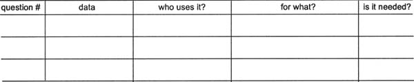
You can and should question every item on every form you design; you will if you use this form. © Janice (Ginny) Redish, used with permission.
When you create a form, it's useful to ask questions because that's what forms do. A form is like a conversation, according to “Designing Usable Forms: The Three-Layer Model of the Form,” an article by Caroline Jarrett, a usability consultant. Redish adds that the analogy is true even when the questions in the form look like labels, as in “number in household” versus the more conversational “How many people live with you?” (The latter format works better for typical consumers, she says.)
Jarrett's three-layer form model suggests attention to the form's:
- look. For example, Jarrett advises the use of headings and color to group related questions, and a legible typeface. Beyond that, consider such issues as the amount of space needed to write or type—give enough to fit in the amount of info, but not so much that people think they haven't answered sufficiently. Another Redish tip that's geared to Web-based forms, but just as valid in print: Make clear which questions people have to fill out.
- content. Word the form's questions so the audience will understand them, Redish says.
- task structure. This refers to the relationship between the people who fill out the form and the organization that issues it. Looking at the form's task structure can help you decide what information you need on the form, and what you don't. For example, avoid asking people to fill out info you already know about them. And make clear what you want people to do with the form after they've filled it out.
A taxing case study
Bagin worked with the U.S. Internal Revenue Service (IRS) to redesign tax forms that include 941: Employer's Quarterly Federal Tax Return. At the time of the redesign, about 6.6 million employers used the form to report wages and collected taxes, she says.
The goals of the revisions, according to Bagin, were to:
- make the form easier for small-business owners to fill out themselves
- reduce the number of errors they make
- reduce the number of errors internal processors make
EXERCISE: Before reading about the changes on page 214, compare the previous one-page form on page 211 with the two-page revision on pages 212 and 213.
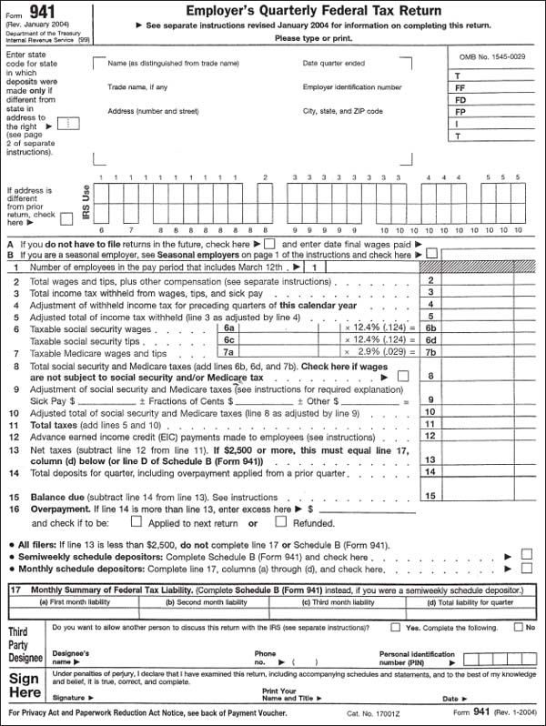
A U.S. tax form lacked alignment and consistency, making it harder to pay taxes than it should've been.
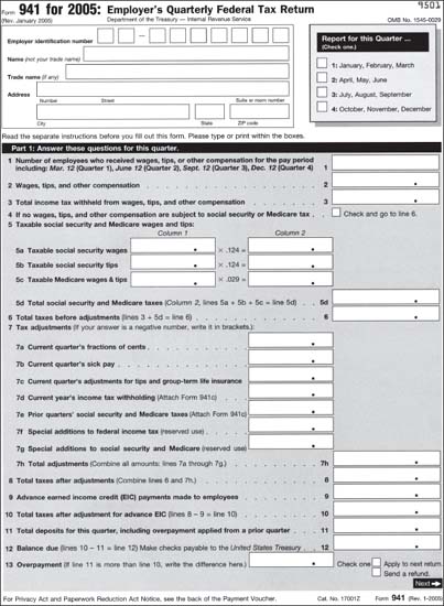
The IRS commissioned a clearer redesign that expanded into a second page. Find and evaluate the other changes. Client: Internal Revenue Service. Design firm: Center for Clear Communication, Inc. Designer: Carolyn Boccella Bagin.
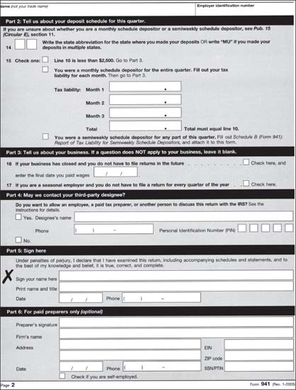
Here's page 2 of the redesign.
The first changes you might notice overall are:
- the shaded background that highlights the white answer boxes. The feature, borrowed from Australian forms, solves a problem, says Bob Erickson, senior technical adviser for the IRS's Tax Forms and Publications. When the background also was white in the form's previous version, “people were leaving key boxes empty.” What's more, the agency's research showed that “people really like” and understand the shading.
- more space (it took a second page to do it)
- a clearer path
- an absence of clutter
![]() Design in the real world: Can't always get what you want Design often involves compromise and working within constraints. You'll have to fight some constraints, but accept others. For example, although Carolyn Boccella Bagin, the tax form's redesigner, would have preferred a different typeface (such as CG Omega for its “contrast between weights”), she chose Helvetica from a limited list of typefaces supported by IRS systems:
Design in the real world: Can't always get what you want Design often involves compromise and working within constraints. You'll have to fight some constraints, but accept others. For example, although Carolyn Boccella Bagin, the tax form's redesigner, would have preferred a different typeface (such as CG Omega for its “contrast between weights”), she chose Helvetica from a limited list of typefaces supported by IRS systems:
Franklin Gothic: Bold, Demibold
Helvetica: Roman, Italic,
Bold, Bold Italic, Black
Helvetica Neue: Roman, Italic, Bold, Bold Italic, Light
Helvetica Condensed: Normal, Bold, Black
OCR A: Normal
Tekton: Normal
Symbol: Normal
Times-Roman: Normal, Italic, Bold, Bold Italic
Universal-Greek with Math Pi: Normal
Universal-News with Common Pi: Normal
Zapf Dingbats: Normal
Other improvements include:
- logical groupings, which make:
- related items look related
- optional items easy to skip
- the form look simpler and more accessible
- space for identifying the quarterly period in which the form is filed (the absence of such a feature in the previous form led to many errors)
- compatibility with new scanning equipment that's expected to reduce the numbers of errors made with manual processing
- prominence for questions that used to be “hidden”
About borrowing from Australia: The IRS regularly looks at other countries’ experiences to guide its forms design. You'll do well to follow suit. Check similar and even not-so-similar projects for elements worth testing and adapting for your own purpose.
How to evaluate a form
The tax-form project demonstrates steps you can use to evaluate an existing form.
- Interview experts on the topic.
- Review error reports and outside critiques.
- Question each item.
- Design, redesign, and revise.
Before the next round of revisions, the IRS did line-by-line, one-on-one testing with ten to fifteen taxpayers, says Michael Chesman, director of the Office of Taxpayer Burden Reduction at the IRS, which oversaw the project. In the final phase of testing, the IRS asked participants to use the form to do tasks such as looking up answers to questions.
No form is an island you can change without also changing the systems around it. In the IRS's case, that means as many as “fifty different [computer] systems. It's a two-to three-year exercise” that involves a team of fifty to a hundred people, with no more than three forms in major revision at any given time, Chesman says.
The IRS also consults with external software developers to find out details such as “how many inches of space a box needs or if you can use alphanumeric characters in a box,” Erickson says.
Extensive research before the redesigned form's release is a predictor of its success, but it's no guarantee. The IRS measures success by feedback from the public and its customer account services departments, and error reports. “These are living, breathing documents, and Congress changes tax laws every six months,” Erickson says.
So far the form, released just a month before the interview with Chesman and Erickson, has received “more mixed reactions” from the public compared with Form 1065, another IRS revision. Some complained about the additional page to print out. And despite the clutter of the old form, complainers were used to it, Erickson says.
All revisions require a learning curve, Chesman says, which people who aren't professional tax preparers object to more than the pros do (probably because for them, the learning curve's longer). For the 941 form, that could add up to a lot of objections: “More than 50 percent” of people who fill out that form by themselves are not professional tax preparers, he says.
Look inside, not just out
Identifying the audience, an essential information design principle, applies to internal audiences, not just external ones. For example, because the two pages of the form could get separated within the agency, the form asks for the employer's identification number on each page to help reunite separated pages.
The agency decides which of its 550 forms to revise next based on such factors as the number of people who must file it, the number of errors reported, and taxpayer feedback, Chesman says. The 1040’s form, “on the horizon,” might use some concepts by Karen Schriver, whom a newspaper reporter challenged to improve the form for an article titled “Making 1040s a Bit Less Taxing.”
The eventual official revision won't include Schriver's choice of typeface, Serifa, which, again, IRS systems don't support. It will reflect extensive research into the people and systems with which the form must interact (which, being a challenge that came from outside the agency, Schriver's project does not). It also will reflect “two major pieces of tax legislation” Congress passed “very late in the year,” months after her work on it.