
Chapter 8. Creating Written Content
“Someone showing their art should at least pretend they’re competent,” I heard a student sneer while surfing a site. That was harsh, but it’s easy to criticize when you know the difference between good and bad work. Writing is no different. Even if you’re dyslexic or just hate writing, you can’t afford to be embarrassed publicly.
The easiest way to avoid the issue is to design a portfolio with no written content—just your contact information. This strategy can work for some disciplines (animation comes to mind) but it is deadly for most design areas. Too much of what makes a good designer is in the decisions. To appreciate the decisions that went into your finished pieces, viewers need some context.
Fortunately, most of what you need for competent writing can be learned, and what’s left can be handled by a combination of software and patience.
This chapter will help you figure out how much text your portfolio requires, prevent you from making the worst writing errors, and help you keep your portfolio’s visual and verbal elements in sync.
Avoiding writing errors
You choose your samples carefully and attempt to craft a seamless presentation. What you write is equally important.
As someone who sees lots of student résumés and portfolio packages, I’ve been treated to many remarkable writing errors. They don’t make a potential employer feel confident, although they can brighten up a tense day at the sender’s expense. My personal favorites...the student who claimed proficiency in “Adope Photoshot” and the person who misspelled his own name. Then there was the poor applicant whose résumé design had a large initial letter at the beginning of each major heading. The problem was that these initial letters were for the words Louis, Objective, Schooling, Experience and References. Oops.
Want to look bad in print? Here are a few ways to do it.
Sad spelling and grammar
In the age of spell checkers, there is no excuse for misspelled words. They tell people that you are sloppy. Spell check even if you think you are good at spelling. Everyone has some words that they consistently spell incorrectly, and everyone makes typographical errors.
The paragraph below is an excerpt from a real online résumé. The résumé itself was very nicely designed but had a remarkable number of errors—indicated in bold—for one short paragraph.
Work with the design team developing new brands, as well as (verb missing) strategies for moving extisting brands online; present design mockups and iteration to clients; and manageeing the production of final media assets. Resposible for text production and layout, as well as digital photography.
If you don’t spell well, chances are your grammar isn’t perfect either. This paragraph also had a grammatical problem. The word “managing” should have been “manage” to match the verb tenses for “work” and “present.” Grammatical errors are trickier to catch than spelling errors but can lead to real embarrassment. Not only did these errors make it hard to appreciate the writer’s design, they raised a horrible question: Why was this person in charge of text production?
Unless the program you are using contains a spell-checker and a grammar checker—or you are both an accomplished typist and good writer—write everything in a program that has these helpful tools. Then cut and paste the text into whatever development program you’re using.
Microsoft Word can be irritating, but it does a pretty good job of preventing the worst grammatical goofs. In it, you can select Tools > Spelling and Grammar at any point and check your document for errors. If you don’t mind interruptions as you work, set Word to prompt you. To do this, go to File > Preferences (Windows) or Word > Preferences (Mac OS X). In the dialog box, you can choose to have Word highlight spelling and grammar errors as you type, so you can fix problems as they arise.
Fractured headlines
One little-known fact about spell checkers is that they don’t check words in all capital letters unless you tell them to. You are less likely to notice mistakes in all-cap words because they are usually headlines or captions. While you’re setting preferences for checking bad grammar, ask Word to spell-check uppercase words as well. It is usually worth the added hassle of false positives.
After you’ve unchecked the default “Ignore words in UPPERCASE,” Word will stop on every acronym it doesn’t know. To avoid this problem, create a custom dictionary. In the Word Spelling and Grammar preferences dialog box, click Dictionaries. In the next dialog, you can add a personal dictionary. (I like to put mine in the Office folder where Word’s default dictionary lives.) The first time Word stops you on an acronym such as AIGA, add it to your custom dictionary. Not only will Word stop bothering you, but it will alert you when you mistype the acronym in the future.
Sloppy typing
Having a program with a spell-checking tool is only half the battle. You must also remember to use it. It’s human nature when you’re pressed for time to type something in without checking it, because it’s only of few words long. That’s how mistakes happen in navigation bars and headlines.
Verbal diarrhea
Strange but true—people who hate to write almost always write too much once they start. Just as minimalist design is the art of deleting until you get it right, the trick to good writing is good cutting.
Too many “and”s
Don’t use the word “and” unless it’s in a series of things. “Books, periodicals, and annual reports” is fine. “This project was created to serve the needs of the client who wanted to focus their brand and they planned to use it for future online projects,” is incorrect. It’s actually two sentences glued together. Run-on sentences, besides being bad writing, are hard to read and understand onscreen.
Capital objects
In general, you should only capitalize words that begin a sentence, are proper names, or are acronyms (such as UI for user interface). Excessive capitalization puts emphasis where emphasis doesn’t belong. Be particularly alert for this problem if English is your second language. In German, for example, capitals are used much more liberally than they are in English.
What to write and why
Now that you’ve had a quick refresher on how to avoid the most frequent writing mistakes, it’s time to put your knowledge into action. People often look to your portfolio package to find out about your career or education, what you contributed to a project, and how you solve visual problems. Particularly if they will be bringing you into a close-knit team, they need a sense of who you are. The right text in the right place can help them put you and your work into personal context.
Some types of text are more important in your portfolio than others, so if you don’t write well, you can concentrate on these critical elements. In order of necessity, you will write to:
• Explain your ideas and process.
• Speak directly to your audience.
Identifying your work
Even a minimalist portfolio includes a way to identify each project. Your labels or captions should include the client and a short title. If there is any question about the role you might have played in the project (art direction, illustrations, or programming, for example) either the title or another line of the caption should specify your share of the creative result. The title can be descriptive (“graphics and art direction for”) or a formal work title (“Beyorn identity package”).
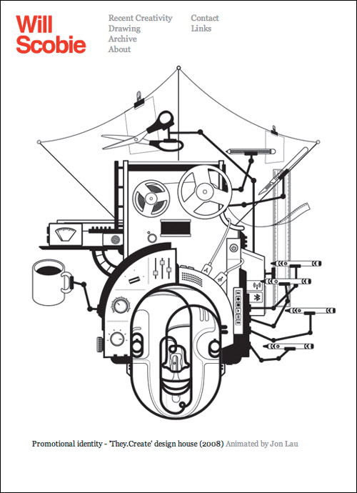
WWW.REVERIECREATE.CO.UK
Use visual cues to identify project titles, clients, or credits. Will Scobie uses simple quote marks to distinguish the title from the description, and gray type to indicate a credit. Initial capital letters, a typeface weight change, or a formatting change will work as well.
Distinguish between these captions and any descriptions you provide of the work. Captions are not the place to explain your design ideas and process.
Check your facts...don’t depend on your memory for titles, names, and spelling. Don’t use abbreviations for the client name unless it is so well known (like IBM) that everyone will recognize it.
Introducing yourself
Your portfolio presentation must include basic personal information to identify you and orient the casual visitor. You provide that with some text about yourself—a résumé, a bio, an introductory statement, or a cover letter.
The résumé
The classic professional writing requirement is the résumé. There are scads of books and workshops on creating effective résumés. Beyond the most basic guidelines, they don’t apply well to creatives. With the exception of academic vitae, the résumé is secondary to your portfolio. It could get you in the door at a large company’s human resources (HR) department, but it will never get you a job.
It can, in fact, have the opposite effect. In many large organizations, someone in HR is often making a first pass among a large volume of candidates. A sloppy résumé will give that person an excuse to toss you into the circular file without anyone ever seeing your portfolio. Later, it can be the tipping point when a company is having a tough time choosing among a short list of candidates.
The best advice anyone can give you about writing a résumé is: Keep it clean, visually and verbally. Then make sure that it contains no errors. Use a spell checker every time you edit it. Get other people to read it—the more eyes, the better.
Clean also means spare. Few résumés need to be longer than one page, even if your career spans decades. Older experience tends to become less relevant as time passes and can be cut or radically condensed. Education is an example. It’s important when you’ve just graduated, but after you’ve had even one job in the real world, your academic history or honors usually belong at the bottom of the page. By the time you’re heading for your second job, details like your grade point average should disappear.
Another “delete me” is the Objective that management gurus tell you to put at the top of your résumé. The only time it might be useful is if you’ve had an unusual career. When you’ve done a variety of work that you need to tie together or you’re making a radical change (from exhibit designer to interactive designer, for example), an objective can help you explain the transition: “My objective is to leverage my experience with wayfinding in physical space to designing for the virtual environment.”
Brevity is a creative blessing. Text-heavy résumés written by and for creatives simply don’t get read. No paragraph should be longer than four sentences, and no sentence should run longer than four lines, assuming about 30 picas a line and 10-point type. Shorter is even better. Stick to your responsibilities, range of work, and most significant accomplishments. Or simply take a sentence to explain what you did and then list the clients you did it for. You can always elaborate in person.
A résumé is best written and designed to be printed and read offline. That means it should not include anything that will slow the download and tempt someone to break the connection. No placed art of any kind. And use your name as the file title, not “résumé.” How will anyone remember whom your PDF belongs to otherwise?
The bio
People don’t need your full story on a portfolio site. A good compromise is a note that describes your experience and expertise. An online bio, like most web text, should be as short as you can make it while still hitting what you feel are your most important points. If you are looking for clients instead of employment, your bio should emphasize your capabilities or the type of work you do.
A text introduction on your splash page is not a résumé replacement, nor should it be deeply personal. It’s a centering device to give a reader a way to look at your work. Although you can include light personal information in this text, unless you can tell your story succinctly it is probably better to let your work speak for itself first. If you really can’t put yourself in context in three lines or less, it might be better to let the viewer select an “about” link should they decide that they want to get to know you.
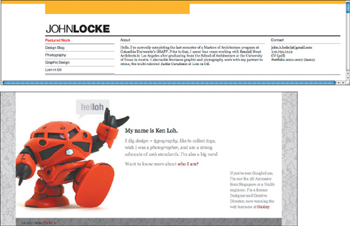
GRACEFULSPOON.COM | KENLOH.COM
How you approach your bio depends on your career path and your portfolio site’s purpose. Young architect John Locke offers a front-and-center solution to his biographical note. Nestled between his navigation and contact information, he provides immediate context. Ken Loh, on the other hand, has moved into management and uses his site to stay engaged and creative. He can afford to treat his bio more playfully.
Cover letters
When you send a portfolio or samples, you’ll need a cover letter to accompany them. You’ll also need to respond if someone sees your website or contacts you from some other connection. The fact that this response or accompanying note might be “just email” doesn’t make it any less subject to issues like grammar and spelling.
Whether it will be tangible or virtual, you should compose as much of your cover or response text as possible in advance—a particularly important step if you are not comfortable with any writing beyond messaging and tweets. A cover letter should include a standard salutation, a short reference to who you are, why you are sending your material, and a reference to any intermediary who might have arranged for the connection. Don’t forget to end with a thank you (in advance) for their interest in your work.
Explaining your creative thinking
Your portfolio doesn’t have to include a written commentary on your projects. Many artists and designers prefer to wait until they present their portfolio, particularly if they are more articulate in personal interviews. But some form of explanation can be a valuable asset in your portfolio.

WWW.CLOUDRAKER.COM
CloudRaker provides a concise and well-written description of their brief for client Buffalo David Bitton.
Creatives in different disciplines take a variety of approaches to commenting on work, and the areas do not adhere to the same standards. No fine artist has ever had their work rejected because of fuzzy thinking or typographic errors in his or her statement.
Design professionals, however, are at the opposite end of the spectrum. Although an eye-candy presentation can be sufficient for a potential client, when the audience is another design professional, it’s another story. To fully appreciate the design, it helps to know something about the project and its challenges.
Providing a project description can also be useful in the growing discipline of game design, particularly in the area of serious games, which usually have a goal beyond sheer entertainment. Understanding the project’s purpose, the project’s medium (online, iPhone, Xbox, etc.), and, if relevant, clients’ expectations, can be critical in determining the success of the observed gameplay.
Artist statement
One of the few exceptions to the “less is more” dictum for portfolios is for the portfolio fielded by a fine artist. Fine artists’ statements generally speak about a recent body of work and its inspirations. It is a big plus to have a statement that is both personal and well written, but content is far more important than form.
Although you should still avoid obvious bloviation, there is some purpose to explaining your personal mission or artistic philosophy or to discussing the inspiration for a series of images you have created. If you have a long career or an impressive history of one-person shows, or you are creating your online portfolio or disc because you are applying for an academic position, it’s actually a necessity to provide some type of statement. Most important is to make sure that your statement is clear, grammatical, and well proofread. If you have any doubts about your writing ability, enlist a friend you trust or find a partner to barter with to make sure you present yourself as articulate and clear.
Process comments
In disciplines where work evolves in stages, such as most areas of design, it can be enormously useful not only to show examples of your process, but to annotate your sketches with comments. What led you to your final color choices? What inspired the form for your product design? Here, as in most other writing, avoid duplicating in words information that a viewer can get by looking at the sketches themselves. Process comments can usually be treated like captions—short, direct phrases are good.
Design brief
Because design work is done in response to a set of requirements and constraints—usually called a design brief—it can be very useful to take the extended captioning one step further by including the brief, so the viewer can better understand the route you traveled. Design briefs can be minimal—a capsule overview of the client and their project—or they can be more complete explanations of the project and its criteria. Just remember that in a portfolio, “brief” is the operative term.
Case study
If you decide to share a full analysis of the design problem and its solution, you are writing a case study. Case studies should not be undertaken lightly, because they require good writing and analytical skills. Because they are usually at least a full page of text, you should give the viewer the choice to opt in. Put the case study in its own window or frame, or separate it out entirely from your main portfolio by making it a downloadable PDF.

WWW.METAVERSALSTUDIOS.COM
Game designer Jay Laird and his team at Metaversal provide a thumbnail description of each game on the web page for its category, but link to a comprehensive case study, complete with plot, educational context, and detailed game play description.
Blog
For a person with a Renaissance mix of professional interests or an acknowledged gift for writing, the blog has become a value-added way to talk about ideas and process. However, because it comes with a different set of expectations from most portfolio text, it should be considered carefully before it becomes part of your portfolio mix.
There are two types of blogs, the personal and the professional. Under no circumstances should a blog of the first type ever find its way into your portfolio site. If you have one, keep it at a separate address whose title page does not make it so easy to Google that it will come up before your portfolio in a search. Or make it a part of your Facebook page that you only share with close friends or relatives.
As for a blog of the second type, think twice. Do people sit at your feet and hang on your every word? Do you turn down the opportunity to judge at award ceremonies because you’re just too busy giving TED talks? I’m betting on “not yet.”
If I’m right, you can still blog about your design philosophy and social observations, but separate the blog from your main portfolio in some way. It’s very possible that people will read your writings and find them entertaining and intriguing. However, others may disagree with what you say or how you say it. Your work itself should be the primary medium where you demonstrate how you think and what you believe about your profession.
Writing to your audience
In Chapter 1, “Assessment and Adaptation,” I emphasize how important it is to know who will be viewing your portfolio and what they’ll be looking for. That guiding principle applies to writing your portfolio text. Whether you are writing to CEOs, small design studios, or to a highly focused niche audience, adapt your vocabulary and style as needed. Generational slang, pop culture references, and other elements that might make the text hard for your target audience to understand should be stripped away.
One of the easiest ways to check your tone is to hand your writing to someone who is similar to your audience. For example, if you’re young, enlist a mentor or older relative. If you can’t find the right reader, go in the other direction and read what your target audience writes. You don’t have to imitate it, but you should be sensitive to the differences in tone and language. In particular, pay attention to how loose or formal the writing seems, and try to strike a similar level of formality in your own text.
Obviously, the more like your target audience you are, the easier it can be to write appropriate text, and the more of your true personality you can expose. But even if you are quite different from your audience, it can be an enormous plus to be able to project a little of yourself into your writing. Light humor (see the “Humor” sidebar), a friendly tone, or a brief anecdote about a project can all help to get the reader on your side.
Humor
Nothing is more valuable—or trickier—than adding humor to your portfolio. Humor can be a great leveler. When someone makes us laugh, we instinctively warm to them and often to their work.
Unless you are as good verbally as you are visually, the best way to add humor to a portfolio is to show it. A project that includes humor can be valuable in a portfolio filled with serious, restrained work. Don’t grab just any funny project, though. Avoid any humor that relies on putting down others. You never know the sex, religion, age, or ethnicity of a potential employer or client. And gross-out humor is just as likely to alienate as amus
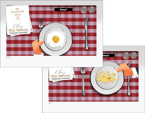
WWW.WIPVERNOOIJ.COM
Animation is often humorous, but you may not get the joke in the snippets that make up a reel. Vernooij displays his light side immediately in his interface. Click on the plate to reject the egg his “restaurant” offers, and the waiter brings you a new one.
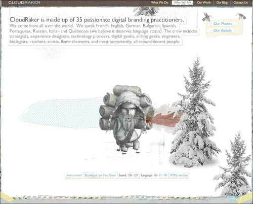
WWW.CLOUDRAKER.COM
Montreal-based digital branding agency Cloudraker is unafraid to entertain as well as enlighten. The visitor who, through inattention or patience, stays on their site without interacting with it will be treated to the Sherpa guide’s displays of impatience and occasional indiscreet scratching in tender places.
If you don’t have any projects that allow you to show your clever side, you can add some playful elements to your interface. Your portfolio presentation is a perfect opportunity to let people peek behind the curtain and see what you can do without client constraints.
Most importantly, consider your audience. If you are primarily targeting small studios and other creatives, you can probably be a little looser than if you are attempting to speak to the corporate market. Until you are established and can afford to break the mold, humor in the business world is best left to personal encounters, not incorporated into your personal sales tool.
Portfolio highlight: Sandstrom Partners | Get your words’ worth
One of today’s portfolio rules is that prospective clients visit your website to see really big, shiny pictures of your work. Rules like that exist because they are mostly true. Oregon’s Sandstrom Partners is a brand development company that for years has used its portfolio to reinforce its reputation for great copywriting and a killer sense of humor. A glossy gallery was never their main focus. How could they rise—or lower themselves—to this eye-candy challenge without defaulting to a site that looks and sounds just like everyone else’s?
The answer, it seems, is to have it both ways. Sandstrom’s site is a beautiful and tasty piece of work, starting with its lush landing page. The words “our company” and “your company” trade places on a richly colored full screen. The background colors loop through a rainbow of shades that have been carefully selected to match saturation and to segue beautifully. It makes a commanding display of smart design in the service of great concepts.
A window-shopping prospective client can move on to verify Sandstrom’s successful track record and see if it’s the approach they need. Existing clients and fans will still find their dose of the amusing and unpredictable. Sandstrom’s portfolio, like the company itself, is insidiously unique.
Navigation and architecture
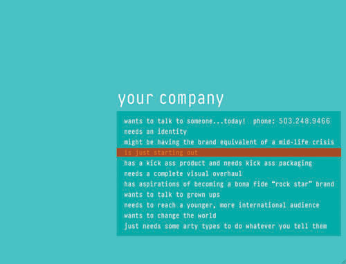
Select the “your company” option, and you’re presented with conversational navigation choices, not categories. If you are looking for options like “packaging” or “advertising,” you won’t find them here. Or you will, but not by expected names. Each choice presents a potential client scenario—some straightforward, like “needs an identity,” and others, like “wants to talk to grown ups,” tap shrewdly into emotional wants and needs. Sandstrom is leading you to their case studies through narrative.
Once you’ve made a selection, the navigation disappears. It’s replaced by a frequently tongue-in-cheek description of a client’s situation and Sandstrom’s response, complete with a clear description of the results of their work—and sometimes a punch line. After you’ve read the introductory text, your only navigation option is “see the work,” flashing onscreen. Yes, you could use the Back button, but who could resist the invitation? If you do resist, you can select the last menu option, “just needs some arty types to do whatever you tell them.” Never has a company been so clear about the type of client they’re not targeting. Their window closes, and the unsuspecting heathens find themselves at a “make your own logo” software site.

Click on a headline and its drop-down menu appears in a rectangle that shifts color in sync with the main background. As you roll over the choices, they highlight in hues that interact to give the impression that they are also changing color—although in fact they are consistent throughout.
Sandstrom’s navigation copy, like their site design, is sharp, clever and unexpected. Reading the options, you don’t know exactly where they’ll lead you, but the light humor of the approach encourages you to stay longer to find out. Even better, the savvy potential client gets the message that this firm can deliver visual and verbal excellence in equal measure.

Well-crafted, client-centric case studies provide a window into Sandstrom’s creative process. There is exactly the right amount of copy to make their point, while staying well within a visitor’s attention threshold.
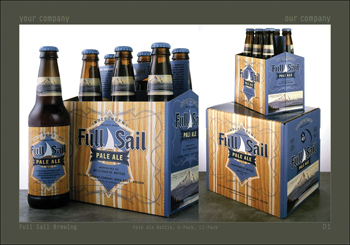
Shots of astutely chosen product artifacts emphasize Sandstrom’s stated areas of expertise: sensitivity to color and color interactions, and a gleefully playful attitude toward product packaging. The copy communicates a distinct personality for Full Sail Brewing.
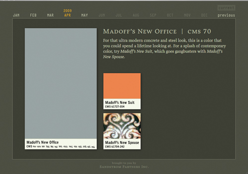
The Color of the Month page, like the Moment of Zen on The Daily Show, is a holdover from the beginnings of Sandstrom’s web presence. It’s another way that Sandstrom brings their copywriting and design strengths together.

Sandstrom’s interactive phone, probably the last place a prospective client will visit on the site, will leave an indelible and positive impression on a client who appreciates the company’s style and approach to their work.
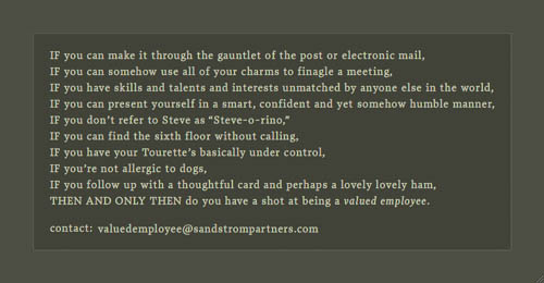
Have you explored their website and developed an irresistible impulse to join the Sandstrom cult? If so, research demands that you click the phone’s “2” button, and discover what the firm looks for in a member of their creative team.
If you select the “our company” menu, you’re presented with three options: a contact link, a client list that offers another entrance to the case studies, and “has a knack for color,” which opens a new window: Color of the Month, one of the site’s most popular features.
Content
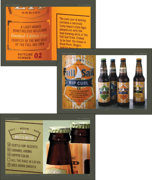
Sandstrom serves up many portfolio images, accessed through the case studies. Collectively, they provide a complete feel for each project. The photos are beautifully shot and composed, and they are displayed at such high resolution that you can recognize typefaces and read package text without difficulty. There are also many closeups of copy—in brand books, on the backs of wine bottles, in magazines—that highlight how all this company cleverness gets put to work for the clientele. Although not all of their client projects display their comedic gifts, they are unafraid to use humor—the disarming, slightly wacky, laugh-with-you style—when it is appropriate for their client’s message.
And if you’re already a client or have some extra time on your hands, there’s the equivalent of a software Easter egg. Select the contact menu, and a very slickly programmed interactive phone offers a staff list. A tickertape display urges you to press buttons for contact and information, but in fact most of the buttons on the phone have text or sound messages attached. Press 3 for their internship program, and delightfully smarmy text ensures that anyone who applies gets a taste of the company culture. And finally, hover over the blue button. The people who bring you Color of the Month still have a marked card up their sleeves.
Future plans
As with previous versions of their site, Sandstrom keeps updating their content while keeping an eye on its continued relevance. They’ve had to redesign infrequently, as each iteration has been far enough ahead of its competition to give them some breathing space. Although Rich Braithwaite, who set the tone as president of Sandstrom, has handed the reigns to Jack Peterson, they are both satisfied with the current version. As they say, “There’s a sense of discovery, from the navigational user interface through the writing. It’s a unique experience.”