Chapter Ten. Adding Effects and Interactivity with Spry
New to Dreamweaver CS3, Spry widgets provide access to dynamic and interactive elements that until now had to be created in other programs. Spry widgets include Menu Bars, tabbed panels, accordion effects, and collapsible panels.
In this chapter, I’ll first walk you through the process of creating tabbed panels in some detail, and then show you how to apply the techniques I explain there to other Spry widgets.
The Spry widgets in this chapter can be edited in the Property inspector. For example, if you create a Menu Bar, you can assign text and links to menu options in the Property inspector. But, in general, you cannot do much, if any, formatting for Spry widgets in the Property inspector. Instead, you format Spry widgets by editing style sheets that get generated by Dreamweaver whenever you create a Spry widget. This chapter assumes that you have a basic familiarity with CSS styles, and custom class styles in particular. It will be helpful to keep Chapter 7, “Formatting Page Elements with CSS,” bookmarked as you use this chapter to define and format Spry widgets.
There are a few things to be aware of when you create Spry widgets:
• Documents must be saved before you insert Spry widgets.
• Spry widgets generate lots of CSS styles and JavaScript files, and these files are saved every time you save a page with a Spry widget.
• You control basic features of the Spry widget, like text and links, in the Property inspector. But you format Spry widgets (elements like font, text color, background color, and so on) in the CSS Styles panel by editing the CSS style for the Spry widget.
Later in this chapter, I’ll show you how to apply effects to objects on your page. Effects animate your page and make page elements react to visitor actions by changing location or size or appearance. Editing effects requires some ability to work in the Behaviors panel, so for these features, you might find yourself jumping over to Chapter 11, “Adding Interactivity with Behaviors,” for background.
#78. Inserting Tabbed Panels
Tabbed panels transform a single Web page into a series of tabbed panels that look like distinct Web pages to a visitor. Tabbed panels are one way to create an easily navigable Web site.
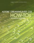
To enter content in a tabbed panel, click a tab. The selected tab displays a blue outline. Click in the Content area below the tab, and enter content for that tab. Tab content can be anything you would place on a regular Web page, including text and images (Figure 78a).
Figure 78a. Entering content into a tabbed panel.
You can add (or delete) tabbed panels for a selected tabbed panel in the Property inspector. To select an entire tabbed panel as opposed to a single tab, click the border of the entire tabbed panel. When you do this, the Tabbed Panels Property inspector allows you to add panels by clicking on the “+” icon in the Panels section of the Property inspector (Figure 78b).
Figure 78b. Adding a tabbed panel.

Chances are, you will not want your tabbed panels named Tab 1, Tab 2, and so on. Instead, you’ll want tab names that reflect the content of the actual tab, like “Home,” “Contact Info,” “About Us,” or whatever label makes sense for your content. To change the name of a tabbed panel, double-click the current label (for example, Tab 1), and type a new label.
Tip
When you hover over a tabbed panel, you will see an eye icon. Clicking the eye icon makes the tabbed panel invisible. This is a technique that can be used with JavaScript to make tabs appear and disappear. That level of JavaScripting is beyond the scope of this book, but be aware that if you do click the eye icon, the selected tab will not be visible.
To format elements of the tab like background and text color, select the CSS Styles panel (choose Window > CSS Styles), and view the styles for the SpryTabbedPanels.css. When you expand this CSS file in the CSS Styles panel, a set of class styles appears in the CSS Styles panel. In the lower part of the CSS Styles panel, you can change the properties of any style you select in the top part of the panel. I’ll show you how to edit a few frequently changed elements of a panel style, and then you can experiment with other properties.
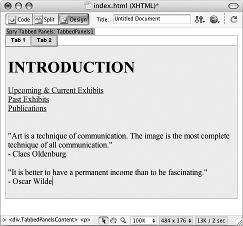
To change background color for nonselected tabs, click the .TabbedPanelsTab style in the CSS Styles panel, and choose a background color from the background-color property (Figure 78c).
Figure 78c. Changing the background color for nonselected tabs.
#79. Inserting a Spry Menu Bar Widget
Menu Bars, which display submenus when they are hovered over, are a very useful and appealing page element. Menu Bars allow a lot of menu options to be accessed from a clean, uncluttered main menu. And the interactivity they provide when a visitor hovers over a menu option adds energy and dynamism to your page.
The Spry widget for inserting Menu Bar widgets allows you to generate Menu Bars with two levels of submenus. That means a user can click on a menu option, see a submenu new set of options, choose one of those options...and pick from yet a second submenu.
To generate a Menu Bar widget, you must first save the page into which the Menu Bar widget will be inserted. Then, choose Insert > Spry > Spry Menu Bar. The Spry Menu Bar dialog appears, and you can choose between a horizontal or vertical Menu Bar.
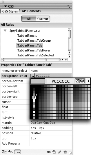
After you generate a Menu Bar widget, you can define some basic Menu Bar properties in the Property inspector. Select menu items or submenu items on the left side of the Property inspector. In the Text box, enter the text that will appear in the menu. In the Link box, enter the link that will open when the item is clicked. In the Title box, enter accessibility text (this text will appear in a browser window when a user hovers over the menu option). Leave the Target box blank to open the link in the same browser window, or enter _blank to open the link in a new browser window.
Use the “+” and “–” symbols above the menu or submenu (or sub-submenu) columns to add or delete new menu items. Use the Move Item Up or Move Item Down icons to change the order of menu items (Figure 79a).
Figure 79a. The Property inspector for Menu Bars.
#80. Formatting Spry Menu Bar Widgets
When you select a Menu Bar widget (or as you create one), you will notice a Turn Styles Off button in the Property inspector. Turning styles off pretty does not affect how the style is rendered in a browser but it turns off formatting in the Document window. You can adjust the formatting of different Menu Bar properties of a selected Menu Bar in the CSS Styles panel.
Every Menu Bar generates at least a dozen CSS styles. You edit the formatting of the Menu Bar by adjusting these styles. Some of the CSS Style options control relatively inconspicuous elements of the Menu Bar, but all of them can be edited in the CSS Styles panel.
To edit the styles associated with a Menu Bar widget, expand the SpryMenuBarHorizontal.css (or SpryMenuBarVertical.css if you created a vertical Menu Bar). When you do this, you will see a list of class styles associated with this style sheet. Selecting one of these class styles in the top part of the CSS Styles panel allows you to edit properties for that style in the bottom half of the CSS Styles panel.
To change the background or text color for the Menu Bar, select the style ul.MenuBarHorizontal a (or for a vertical menu bar, select the style ul.MenuBarVertical a). With the style selected in the CSS Styles panel, use the background-color swatch box in the bottom half of the CSS Styles panel to choose a new background color, and use the Color swatch to change font color.
Change the background and text color of a hovered-over horizontal menu option using the ul.MenuBarHorizontal a.MenuBarItemHover, ul.MenuBarHorizontal a.MenuBarItemSubmenuHover, ul.MenuBarHorizontal a.MenuBarSubmenuVisible menu. The style for vertical Menu Bars is similar, but with Vertical in place of Horizontal in the style name.
#81. Inserting a Spry Accordion Widget
The Spry Accordion widget creates horizontal regions on a Web page that can be expanded or collapsed. Only one of these regions can be expanded at any one time. Accordion regions have the benefit of allowing visitors to your site to view or hide some but not all of your page content, reducing clutter and allowing them to focus on the content they want to see.
To insert a Spry accordion, first save your page and then choose Insert > Spry > Accordion. By default, a two-part accordion is created, with Label 1 and Content 1 on top, and Label 2 and Content 2 on the bottom. In the Document window, click and drag to select the default text, “Label 1,” and enter a new label for the accordion section—this is what users will see in their browser window and what they will click to expand that accordion section. In the Content 1 area, delete the “Content 1” default text and enter new page content. That page content can be anything you would put on a regular Web page—images, text, media, and so on. Customize the second Spry accordion section the same way.
You can add or delete Spry accordion sections for a selected accordion in the Property inspector. Use the Add Panel or Remove Panel icon to add panels or to delete a selected panel. And use the Move Panel Up List and Move Panel Down List icons to rearrange the order of your panels (Figure 81a).
Figure 81a. The Spry Accordion Property inspector.

#82. Inserting a Spry Collapsible Panel Widget
Spry collapsible panels are handy ways to present optional information in a Web page. Spry collapsible panels have a clickable tab and a content area that displays or hides when a visitor clicks the tab.
The Web page that I use to check my bank balance has a number of clickable spots on the page where I can get explanations for terms or see additional detail. This information might not be necessary for a visitor and would in many cases clutter up a page. But when presented in a collapsible panel, such information is handy but doesn’t take up space.
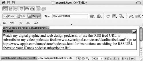
To insert a Spry collapsible panel, first save your page, and then choose Insert > Spry > Collapsible Panel. In the Document window, click and drag to select the default text, “tab,” and enter a new label for the collapsible panel. Visitors will see this label in their browser window. Clicking this tab label in a browser toggles between displaying and hiding the panel.
In the Content area of the collapsible panel, delete the “Content” default text and enter new page content. That page content can be anything you would put on a regular Web page.
Like other Spry widgets, you can edit basic features of the Collapsible Panel widget in the Property inspector (see the sidebar, “Hide or Display Spry Collapsible Panels?”). To format elements of the widget like background and text color, select the CSS Styles panel (choose Window > CSS Styles), and view the styles for the SpryCollapsiblePanel.css sheet by expanding that style in the CSS Styles panel (Figure 82a).
Figure 82a. Viewing styles generated for the Collapsible Panel widget.
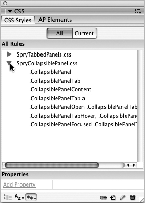
The main property of a collapsible panel that you will need to edit in the CSS Styles panel is the background color for the tab. You can edit the actual tab text in the Property inspector. But to edit the background of the collapsible panel tab, edit the background-color property of the .CollapsiblePanelTab style.
#83. Deleting Spry Widgets
Sometimes, selecting and deleting a Spry widget can get confusing, especially when you have a page loaded up with several of them or when you are editing inside a Spry widget, and you want to just start over and delete the whole darn thing.
There are two ways to select (and then delete) a Spry widget in Design view of the Document window. One is to click right on the border of the widget. This selects the widget, and you can just press the Delete key to remove the widget from your page.
The other technique for selecting widgets is more reliable, since sometimes it can be hard to precisely click on the border of a widget. If you click inside any widget, the widget Div tag displays in the Tag Bar on the bottom of the Document window. Click the Div tag for the widget you want to delete, and then press Delete (Figure 83a).
Figure 83a. Selecting a widget Div tag in the Tag Bar.
#84. Attaching Effects to Page Elements
Spry effects are animated events that you can apply to almost anything on your page that has an ID. These are the available effects:
• Appear/Fade: Makes the element fade away then reappear
• Blind: Applies an effect similar to a window going up or down, hiding and revealing the element
• Grow/Shrink: Expands or reduces the size of the element
• Highlight: Applies colored highlighting behind an element
• Shake: Moves an element rapidly from right to left as if it were being shaken sideways
• Slide: Displaces the element vertically
• Squish: Rapidly reduces the size of an element until it disappears
The easiest way to apply an effect to an object is to first select the object in the Document window. Then, view the Behaviors panel (choose Window > Behaviors).
In the Behaviors panel, click the “+” (Add Behaviors) icon, and choose the Effects submenu. Choose from one of the seven displayed effects.
After you select an effect, a dialog for that effect appears. The default settings for most effects work fine.
Note
For an exploration of fine-tuning effect parameters, see #86, “Editing and Deleting Effects.”
After you click OK in the dialog for the effect you assigned to an object, Dreamweaver generates JavaScript to enable the animation. Save your page and preview in a browser to test the effect. By default, effects are triggered by clicking the object to which the effect was applied. To change the triggering event to something other than a mouse click (like hovering over the image, for example), see #85, “Defining Effect Events.”
#85. Defining Effect Events
By default, effects are triggered by a visitor clicking his or her mouse on the object to which the event was applied. You applied a Grow/Shrink effect? When someone clicks the object to which that event was applied, it grows or shrinks, depending on the parameters you assigned to the effect.
But what if you want something other than a mouse click to trigger the effect? You can change the triggering event for an effect in the Behaviors panel. Do this by first selecting the object to which the event was applied. When you do that, the Behaviors panel will display the behavior (or behaviors) assigned to that object.
If you want to change the triggering event for the effect, click in the left column of the Behaviors panel for a selected effect. If you have more than one behavior associated with an object, they will display in multiple rows in the Behaviors panel, so you need to select the specific behavior for which you are changing the triggering event. As you do, a pop-up menu appears. Click it to display a set of alternate triggering events (Figure 85a).
Figure 85a. Choosing from a list of triggering events for a selected effect.

There are a lot of possible triggering events, but there are a smaller number that are used quite often. Many of them have names that are intuitive. For example, onClick means an event happens when a user clicks the object to which the event is attached.
The most frequently used events for effects include onLoad, which triggers an event when a page is loaded, and onMouseOver, which triggers an event when a mouse hovers over an object.
Besides onClick, onMouseOver, and onLoad, here are some frequently used triggering events:
• onBlur triggers an event when a form element, window, or frame loses focus.
• onContextMenu triggers an event when the user right-clicks (Ctrl-click with a Mac) a form element or a link.
• onDblClick triggers an event when the user double-clicks a form element or a link.
• onFocus triggers an event when, among other things, a cursor insertion point is placed in a form field.
• onKeyDown triggers an event when the user depresses a key.
• onMouseMove triggers an event when the user moves the cursor.
• onUnload triggers an event when the user exits a document.
#86. Editing and Deleting Effects
Once you define an effect, you might find you want to tweak the way in which the effect behaves.
With the event you want to edit selected, view the Behaviors panel (choose Window > Behaviors). In the right column of the Behaviors panel, you will see the effect you applied to the selected object. If you want to edit the parameters of that behavior, you can double-click the effect in the Behaviors panel to reopen the effect dialog (Figure 86a).
Figure 86a. Reopening an effect to edit the parameters.
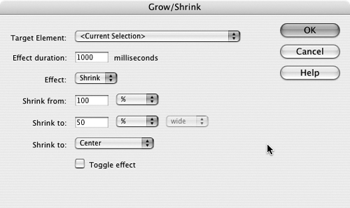
After you reopen the effect dialog, you can fine-tune the effect if you wish, changing the quantity, direction, and other attributes of the particular effect. There are some effect parameters that are common to all effects. Event duration defines how long it takes for the effect to happen (in milliseconds). The Effect pop-up menu defines the “direction” of an event—do you want a blind effect, for example, to go up or down? The Toggle effect check box enables the effect to work “in reverse” each time it is applied. For example, a blind effect that goes down the first time it is applied, would go up the next time it is applied.
Other effect parameters are unique to each particular effect and generally define the intensity of the effect. You can experiment with these settings and gauge the impact of any changes you make when you preview the page in a browser.