
Chapter Three. Designing Pages with Tables and Frames
Both tables and framesets have gone through a number of evolutionary transformations in their roles in Web page design. Tables originated in early HTML as a form for conveying rows and columns of data. Resourceful designers pushed the envelope, and used tables to lay out pages, using the cells created by the intersection of rows and columns to place objects on a page. Another early element in HTML, framesets, allowed designers to create “pages,” in reality framesets consisting of more than one page that were packed (framed) in a browser window. These two techniques for designing page layout have in some ways been superseded by the emergence of CSS, which offers greater flexibility in design. But tables remain a highly stable and widely supported technique for page layout, as well as a uniquely appropriate tool for displaying data—their original function. And frames provide discrete, independently navigable elements in a browser window that cannot be duplicated using CSS.
In an effort to provide a designer-friendly environment for page designers, Dreamweaver’s Layout mode somewhat duplicates the kind of tools you find in programs like Adobe Illustrator, InDesign, or Photoshop. In Layout mode, you actually draw boxes on the page and place text, images, or other content in those boxes. As you draw these boxes, Dreamweaver generates a table with rows and columns that provide the table framework for the boxes you draw. Since Layout mode is really another way of defining tables, I strongly recommend that readers start with #21, “Creating a Table in Standard Mode,” and then move on to Layout mode. That way, after you generate a table (invisibly) in Layout mode, you’ll know what it is you have created.
#21. Creating a Table in Standard Mode
A basic, useful, and safe way to design a Web page is to first define a single-cell table, and then place page content inside that cell. Constraining page content in a rectangular table—especially constraining page width using a table—allows you to control the width at which your page displays in a browser. Creating a one-cell table is also a useful way of familiarizing yourself with the basic concepts involved in Web page design with tables.
To create a one-cell table for page content, follow these steps:
- Open a new page. Choose File > New and select the Basic Page category and HTML in the New Document dialog; then click Create.
With the new page open, your cursor is in the upper-left corner of the page by default. Insert a new table at the cursor with the following steps.
- Choose Insert > Table from the Document window menu. The Table dialog appears.
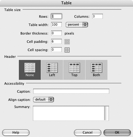
- In the Rows and Columns boxes, define the number of rows and columns in your table. It’s easy to add rows and columns later, so when in doubt, simply generate a one-row, one-column table by entering 1 in both the Rows and Columns boxes.
- In the Table width box, enter a value representing either a number of pixels or a percentage of page width. Then, choose either pixels or percent from the Table width pop-up menu (Figure 21a). For more on this, see #23, “Creating Fixed and Flexible Columns.”
Figure 21a. Defining table width in pixels.

- The Border thickness box defines the width of the displayed border. Normally, tables used for page layout are defined with no border displayed. To display no border around a table, enter 0 (zero) in the Border thickness box. Or, to display a border, enter a value such as 1 (for 1 pixel).
Tip
Table border color is defined in the Property inspector—see #25, “Defining Table Properties.”
- The Cell padding and Cell spacing boxes define the distance between cells and the padding inside a cell. Cell padding defines the buffer between cell content (like text or images) and the cell border. Cell spacing defines the spacing between cells. To define padding, enter a value (the unit of measurement is pixels) in the Cell padding box. To define spacing (around the outside of the single-cell table), enter a value in the Cell spacing box.
- The Header and Accessibility areas of the Table dialog define features that are used by screen readers—software programs that read Web pages out loud to people who cannot read screen content. These tools are not particularly important or useful if you are using your table as a display tool. So, when defining a single-cell table for page layout, leave these areas blank.
Note
The Header and Accessibility areas are useful if you are presenting large amounts of table data. In that case, left and/or top headers “announce” the nature of the content in the associated row (in the case of left headers) or column (in the case of top headers). Similarly, table captions and summaries are not necessary or helpful if you are using a table for page layout, but they can be helpful if you are presenting data that will be read out loud by reader software.
After you define a table in the Table dialog, click OK to generate the table. You will see the table displayed in the Document window even if you defined it with no border.
Even if your Web page doesn’t require intricate design, you can constrain the display width of your Web page in a table. Placing content in a table enables you to define the width of your page in a browser. Without a table to constrain width (either to a fixed number of pixels or to a percentage of the browser window width), the page content will expand horizontally to fill the browser window. In many cases, that will make the text lines too long to be readable.
Experts differ over optimum page width, but the consensus is that a 760-pixel-wide table provides a convenient, accessible, and attractive framework for presenting text and images in a browser window.
Page height is normally not defined in a table. This is because if table width is fixed, the content has to have a direction in which it can expand if a viewer’s browsing environment enlarges the content. This happens when a visitor’s screen displays a lower resolution (causing images to expand on the screen), when type font size is increased, or for other reasons.
There are two basic approaches to using a table to constrain page width—percent and pixels. Choosing a percent produces a table that is a set proportion of a browser window width. A setting of 75%, for example, will fill three quarters of a viewer’s browser window with your Web page.
Defining table width in pixels allows you more control over how a page displays. Choosing a 760-pixel-wide table, for example, produces a Web page that is about 8 inches wide in typical computer monitor resolutions.
Combining fixed-width columns with a flexible-width column in some ways is the best of both worlds. Some content (like navigation bars) can be constrained to fixed widths, while other content (like large blocks of text) can stretch horizontally so that the page fills all or most of the browser window.
#22. Creating a Table in Layout Mode
After you’ve worked with tables for a while, you begin to “think in tables,” and you can draw tables that provide boxes for content on the screen. But until you achieve that state of consciousness, and to provide a more comfortable table-drawing logic, Dreamweaver provides Layout mode.
Layout mode is a more intuitive way to draw boxes for page content, but Layout mode lacks features that define critical and basic properties of tables such as table alignment and border width. In short, you draw tables in Layout mode and then revert to Standard mode to enter content into your table and define features like table background or border color.
In Layout mode, you begin by electing to draw either a cell or a table, and then clicking and dragging the screen to create a table or cell anywhere on the page. If you elect to draw a cell and you haven’t created a table yet, Dreamweaver handles that for you. If you draw a table, you can either draw cells inside that table or you can draw another (embedded) table within that table.
Note
Drawing a table inside a table increases the challenges and complexity of designing a page, and sometimes does so unnecessarily. Quite complex page designs can be achieved using a single table with many cells. There are times when a page design requires embedded tables. Techniques and challenges involved in embedding tables within tables are explained in #24, “Embedding Tables Within Tables.”
To draw a table in Layout mode, follow these steps:
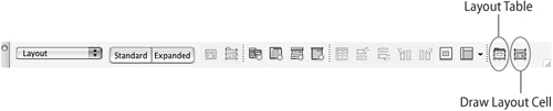
- Choose View > Table Mode > Layout Mode. As soon as you select Layout mode, the Insert bar displays (if it is not already displaying) with the Layout tools.
- To draw a table, click the Layout Table icon in the Insert bar. To draw a cell (and automatically generate a table if necessary), click the Draw Layout Cell icon in the Insert bar (Figure 22a).
Figure 22a. The Insert bar in Layout mode.
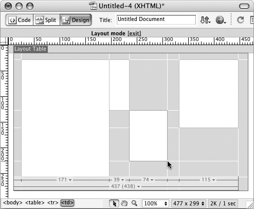
- Click and drag to define the table height and width. Or, a simpler, easier technique is to click the Draw Layout Cell icon in the Insert bar and draw a cell on the page. A table is generated to define the cell (Figure 22b).
Figure 22b. Drawing a cell and generating a table.

- After you define a table (by drawing either a table or a first cell), you can draw additional cells within the table. As you do, the table grid can become quite complex. You can also select a cell you already generated, and click and drag on a side or corner handle to change the height or width of that cell (Figure 22c).
Figure 22c. Generating a complex table by defining and editing many cells.
- After you define your table structure, click the [exit] link at the top of the table to get out of Layout mode and into Standard mode.
#23. Creating Fixed and Flexible Columns
A widely used and very functional technique for page design involves creating tables that combine fixed columns with a flexible column. Very frequently, Web pages are built around tables that have a locked (fixed-width) left and right columns and a center column that expands to fill a specified percent of a browser window.
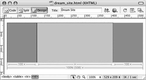
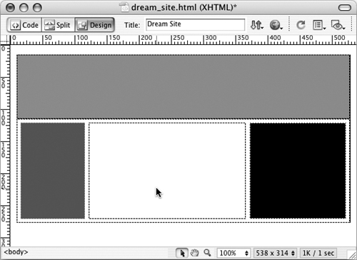
For example, a table might provide a 100-pixel-wide column on the left side of the page for navigation, a 100-pixel-wide column on the right, and a flexible column that fills all the remaining available space in a browser window (Figure 23a).
Figure 23a. Fixed and flexible columns.
The steps that follow can be used to create a Web page with two fixed-width columns and one flexible-width column. To apply these steps, choose Standard mode (either by clicking the Standard icon in the Insert bar or by choosing View > Table Mode > Standard Mode).
- Create a new three-column table by choosing Insert > Table. In the Table dialog, enter 3 in the Columns box, and enter 1 in the Rows box.
- Set Table width to 100%.
- Set Border thickness to 0, Cell padding to 6, and Cell spacing to 0. Click OK to generate a three-column table that will fill 100% of a browser window (Figure 23b).
Figure 23b. Defining a three-column table that fills 100% of a browser window.
- Select the left column in the table by clicking in it or on top of it, and enter 100 in the W (Width) box in the Property inspector (Figure 23c).
Figure 23c. Setting left column width to 100 pixels.
Tip
Column width is explained in more detail in #25, “Defining Table Properties.” As explained there, height and width are usually defined in pixels, which is the default setting in the Property inspector.
Tip
If the Property inspector is not visible, press Ctrl-F3 (Windows) or Command-F3 (Mac).
- Repeat Step 4, but select the right column and set the width to 100 pixels.
Tip
By default, columns that are not defined as autostretch have a fixed, or locking, width. Locking column widths only ensures that the width of the column does not get smaller than the set amount of pixels. If you place a large image in a column, the column will expand to accommodate the width of that image.
- Switch to Layout mode by clicking the Layout Mode icon in the Insert bar, or by choosing View > Table Mode > Layout Mode. Layout mode has the advantage of allowing you to easily define a column as autostretch—a feature that is harder to access in Standard mode.
Note
When you switch to Layout mode, you will notice that column widths are calculated differently than they are in Standard table mode. In Layout mode, Dreamweaver includes cell spacing and padding in column width. So, for example, a 100-pixel-wide column with 6 pixels of spacing and 6 pixels of padding displays as a 112-pixel-wide column in Layout mode, and as a 100-pixel column width in Standard mode.
- Click the triangle icon at the bottom of the middle column, and from the pop-up menu choose Make Column Autostretch (Figure 23d).
Figure 23d. Defining a flexible column width.

You can now add content to the columns you defined. When the page is viewed in a browser, the middle column will expand or contract horizontally when the width of the browser window is changed.
#24. Embedding Tables Within Tables
Many page designs can be created by dividing a table into rows and columns. More complex page layouts might require embedding tables inside other tables. One reason for this is that there are properties of a table that apply to all cells in a table—specifically cell spacing and padding. And there may be times when you need to combine page elements enclosed in a table with no buffer (a banner on the top of a page is an example of this), with page elements that are in columns buffered with spacing between cells.
In the scenario above, a clean way to design the page would be to create one “master” table with no cell spacing or cell padding. At the top of the table, you could embed one 1-column table with no cell padding or spacing. Under that, you could embed a second table with three columns, and content separated by 6 pixels of cell spacing (Figure 24a).
Figure 24a. A page design with two tables embedded within a master table.
There are a couple tricks involved in embedding a table within a table. The following steps will walk you through the process safe and sound:
- Create the first table with one column, one row, no border, no cell spacing, and no cell padding. See #21, “Creating a Table in Standard Mode,” for details. Set the width of the table with a value in pixels or percent. This value will set the outside limits of the page width, and all tables you embed within your table will be no wider than the width you define here. Click OK to generate the table (Figure 24b). The table appears in the browser window.
Figure 24b. Defining a master table in which other tables will be embedded.

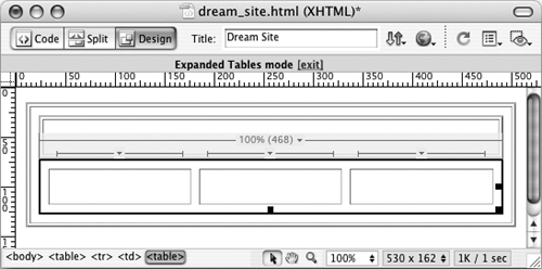
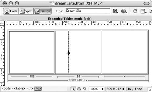
- In order to see the table and table elements clearly as you embed tables within it, choose Expanded table view. Do this by clicking the Expanded icon in the Insert bar, or by choosing View > Table Mode > Expanded Tables Mode. A more easily visible and selectable border appears around the single-cell table.
- As you insert tables within the table, you are actually inserting them within that table’s single cell. Vertical alignment in tables is defined by cell. Click in the cell and choose Top in the Vert (Vertical) field in the Property inspector (Figure 24c).
Figure 24c. Setting vertical alignment to Top.

Tip
Different cells in a table can have different vertical alignments. Oddly enough, the default vertical alignment setting for cells is middle—so content drops to the middle of the cell as you enter it. Here you want the vertical cell alignment set to Top so that content fills columns from the top.
- With your cursor still in the single cell of the table, choose Insert > Table. Now you can define any table properties you wish—choose a number of columns and rows, define borders, and cell padding or spacing. The only trick is that if you want your embedded table to fill the table in which it is placed, you need to set the width to 100%.
- Select the embedded table by clicking the embedded table border. Press the right arrow key on your keyboard to place the insertion point just to the right of the embedded table. Choose Insert > Table to place a new table and define table properties. Here, again, you will probably want to set the width of the second embedded table to 100% (Figure 24d).
Figure 24d. Two embedded tables viewed in Expanded Tables mode to make them easier to see and select.
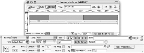
#25. Defining Table Properties
Table properties include elements like height, width, cell spacing, cell padding, border width and color, and background color or image. All these features can be defined in the Property inspector.
The trick is to select a table and not a cell. With the table selected, the Property inspector allows you to define table properties, and with a cell selected you can define cell properties (see #26, “Defining Cell Properties,” for details) (Figure 25a).
Figure 25a. The Property inspector with a table selected.
Some table features are rather esoteric. Table ID is used when the table is controlled by scripts (like a JavaScript animation), and to apply style properties using CSS style sheets. The Class pop-up menu is used to apply CSS styles to the table.
Note
CSS formatting is covered in Chapter 4, “Designing Pages with Absolute Placement Objects.”
Other features in the Property inspector are shortcuts for things like converting values from pixels to percent or vice versa—operations that don’t normally require programmed interactivity because they really aren’t that useful as design techniques.
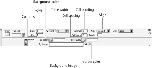
These are the critical options in the Property inspector:
• The Rows and Cols boxes define (or change) how many rows or columns are in a table. Adding to the existing number adds a row below the bottom row, or a column to the right of the last existing column. Lowering the value deletes rows or columns starting from the right or bottom of the table.
• Table width (W) and height (H) can be defined in pixels or percent. Normally, table height is not defined, as it will vary depending on the amount of content in the table.
• CellPad defines space (in pixels) between the border of a cell and cell content. CellSpace defines space (in pixels) between cells.
• The Align options pull-down menu places the table on the left (default), right, or center of the page.
• Bg color defines background color; a color selection palette appears when you click the box.
• Brdr color defines the color of a border if border width is set to a value greater than zero.
• Bg image defines a tiling (repeating) image that fills the background of the table.
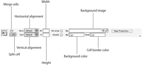
#26. Defining Cell Properties
When you click inside a table cell, the bottom half of the Property inspector displays properties for the selected cell. Normally, selecting a cell is easier than selecting a table and doesn’t present the same confusing challenge. Unless you click the table border, when you click inside a table, you select a table cell.
Some cell properties duplicate table properties. Background color can be defined for a cell or for a table. Border color and cell background images can also be defined for both tables and cells. Other cell properties cannot be defined for a table. Vertical alignment can only be defined for cells. The Property inspector also allows you to merge selected cells or split a cell.
The Property inspector that appears for a selected cell displays formatting options for type (or other selected objects, like an image) in the top section. In the bottom section, you define cell properties (Figure 26a).
Figure 26a. The Property inspector for a selected cell or cells.
Tip
If you can’t see the bottom section of the Property inspector, click the Expand (down-pointing) triangle in the lower-right corner of the Property inspector.
To set a cell width, enter a value in the Width box. To set cell height, enter a value in the Height box. You can also adjust cell height and width by simply clicking and dragging the divider between cell rows or columns (Figure 26b).
Figure 26b. Changing column width by dragging the divider between columns.
To combine cells, click and drag to select contiguous (touching) cells, and click the Merge cells button in the Property inspector. To split a cell, select the cell, and click the Split cell button in the Property inspector. The Split Cell dialog appears, allowing you to define how cells are split (Figure 26c).

#27. Generating a Frameset from Samples
Frames allow you to display more than one Web page in a browser window. You can accomplish this by generating a special kind of Web page that has no content of its own, but simply serves as a container to display other Web pages that are embedded in frames within that container page. The whole set of HTML pages that work together to present more than one page in a browser is referred to as a frameset.
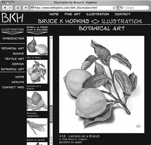
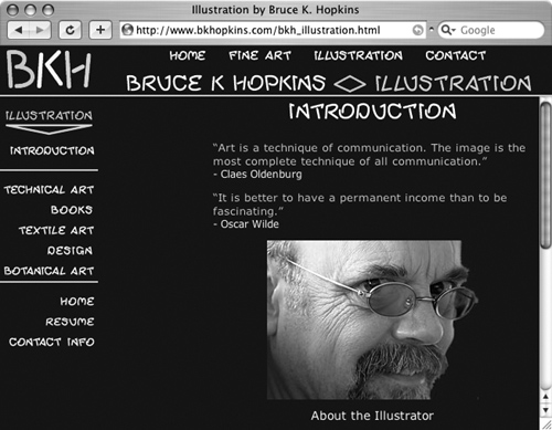
There are distinct advantages to designing with frames. Since each frame within a frameset is a separate Web page, visitors can scroll (usually vertically) within one frame, while continuing to view content undisturbed in a separate frame. Many artists and designers, for instance, use frames to display their portfolios—they use a frame on the left side of the page to allow visitors to scroll vertically down a long set of thumbnail images, and then much larger images display in a wider frame on the right side of the page. In particular, framesets are a popular form for presenting online artist portfolios (Figure 27a).
Figure 27a. Digital designer Bruce K. Hopkins uses a frameset to allow visitors to scroll through thumbnails in one frame, and see larger images in another.
Frames can also help reduce download time for Web pages, because page content in one frame does not have to reload when new content is displayed in another frame.
One downside to designing with frames is that managing files is at least three times as confusing as working with a normal page. That’s in part because each frameset includes at least three HTML pages: one to serve as the overall frameset, and at least two framed pages embedded in the frameset. The best way to manage this challenge is to generate framesets from a set of sample pages.
To see the set of sample frames, choose File > New and choose Page from Sample in the category list on the left side of the New Document dialog. In the Sample Folder column, choose Frameset. Preview predesigned framesets in the preview area in the upper right of the dialog (Figure 27b).
Figure 27b. Selecting the Fixed Left sample frameset.

Once you generate a frameset from a sample in the New Document window, the Frame Tag Accessibility Attributes dialog appears. Here, you assign names to all the frames in the frameset. Naming frames is different than naming the HTML files in a frameset. You’ll be prompted to do both, so don’t get confused by this. The frame name is useful in defining link targets and other frame attributes, and has to be defined separately. Normally, the default frame names in the dialog are fine (these names are not visible in browsers), so go ahead and OK each Frame Tag Accessibility Attribute dialog that appears when you generate a frameset (Figure 27c).
Figure 27c. Assigning a frame name to frames.

To save a frameset, choose File > Save All from the main Dreamweaver window. You will be saving at least three files: the frameset file and each embedded page within the frameset.
You can edit the content of that frameset, and you can edit the formatting of the frameset itself. That process is explained in #28, “Formatting Framesets.”
#28. Formatting Framesets
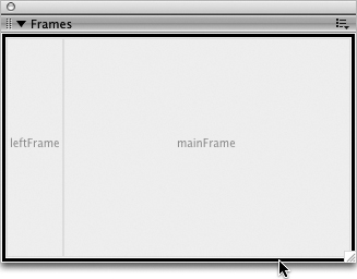
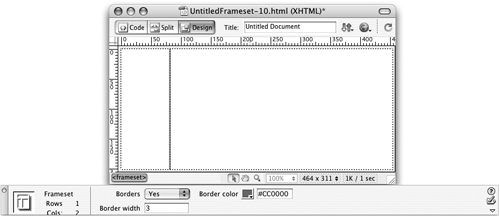
Frameset attributes include whether or not to display borders between pages in the frameset, as well as the width and/or height of various frames within the frameset. Both of these attributes are defined in the Property inspector. The tricky part is selecting the entire frameset to access these features.
The easiest way to select an entire frameset is to view the Frames panel (Window > Frames). Click on the border that surrounds the entire Frames panel to select the frameset. The frameset will be selected in both the Frames panel and in the Document window (Figure 28a).
Figure 28a. Selecting a frameset using the Frames panel.
Often, framesets are formatted so that there is no visible border between frames in a browser window. The “page” appears to be a single page in a browser, even though it is in fact at least three pages (Figure 28b).
Figure 28b. What appears to be a single, seamless page in a browser is actually several different HTML Web pages.
By default, framesets generated using Dreamweaver’s page designs are formatted to display no border between frames. To add a border, choose Yes from the Borders pop-up menu in the Property inspector, and define the border width in pixels in the Border width field. Choose a border color from the Border color swatch (Figure 28c).
Figure 28c. Defining a border between frames in a frameset.
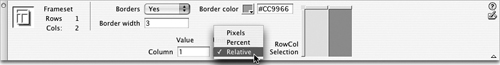
To define the widths (or heights) of frames within a frameset, use the RowCol Selection area in the Property inspector to click a row or column in your frameset. Then, choose a value for the selected column or row in the Column Value or Row Value field. Values can be either fixed (in pixels) or a percent. Or, you can make a column width Relative, which means it will fill all space left over after columns with fixed widths are displayed (Figure 28d).
Figure 28d. Defining a frame that will fill all available space after fixed-width frames display.
You can define scroll attributes (whether or not to display scrollbars), as well as set resize permission (whether or not to allow a viewer to click and drag on the border between frames and resize them in his or her browser) for selected frames.
First, click a specific frame in the Frames panel. The Property inspector then makes settings available for scrollbar display in the Scroll pop-up menu. You can choose Yes (always display a scrollbar), No (never display a scrollbar), Auto (display a scrollbar only as needed), or Default (whatever a browser defaults to). You can enable viewer resizing of frames by deselecting the No resize check box (Figure 28e).
Figure 28e. Enabling a scrollbar (only as needed) for a selected frame.

#29. Defining Links Between Frames
Defining links in framesets presents a special challenge. Since technically each frame in a frameset is a different HTML page, you need to click on a link in one page, and have the link open in a different HTML page. And you have to “tell” the link what page to open in. Sounds confusing, but I’ll walk you through the whole process here.
For example, let’s see how this works in a simple, basic, two-frame frameset with a left navigation frame and a right main frame. Links clicked in the left frame open in the right frame. The right side of the frameset changes, as new pages open in that frame depending on what link is clicked in the left frame.
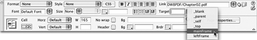
This is done by defining a target frame for links. After you define a link for text or an image using the Property inspector (enter the linked page in the Link box), define a target for that link from the Target pop-up menu in the Property inspector.
When you generated a frameset from one of Dreamweaver’s frameset page designs, you automatically assigned names to each frame within the frameset. These named frames show up in a list when you click the Target pop-up menu in the Property inspector (Figure 29a).
Figure 29a. Choosing a target for a link in a frameset.
It can be rather disastrous if you don’t define the target for a link in a frameset, as when a link doesn’t open in the appropriate frame, but in the frame from which the link was launched (Figure 29b).
Figure 29b. Ouch! A link that should have opened in the main frame opened in the left navigation frame, as well as in the main frame.
