
Chapter Eight . Collecting Data in Forms
Forms provide a uniquely interactive element in a Web site. Through a form, you not only convey content, you also collect content. This content can range from orders for products, feedback on site content, service requests, and subscription list sign-ups, to surveys, forum discussions, and opinion polls.
Some form content is managed using scripts that run in the visitor’s browser. Such scripts are referred to as client-side data handling. A jump menu, for example, collects data (the page a visitor to your Web site wants to go to, for example), and acts on that input (by opening a new Web page). And the client-side script does that without sending any data to a server. Other forms collect data and send it to a server, where scripts on the server manage the data. These are called server-side forms. Most form data is managed by server-side scripts. One example of a server-side script is a mailing list form. Visitors enter information (at least an e-mail address, and maybe more) into a form. That data is then stored in a database on a remote server. It can be accessed to send out mailings.
In short, this chapter explains how to design two kinds of forms:
• Forms that manage data in the browser (client-side)
• Forms that connect to scripts at a server (server-side)
In this chapter, you will learn how to connect a form to an existing server script (but not how to program the scripts), and I’ll throw in some tips on where you can find already-packaged server scripts to handle things like search forms, sign-up mailing lists, and discussion forums.
Adobe has implanted several Spry tools in Dreamweaver CS3 that make it easy to define forms with attached validation scripts. These scripts test form content before it is submitted to make sure certain rules are met; specifically in the case of the new Spry form fields, they require that a visitor fill in a form field before submitting the form. So, for example, if you want to require that visitors fill in the E-mail Address field in a form before they submit it, you can place a Spry Validation Text Field in your form. The last four How-Tos in this chapter explain how to use these Spry validation widgets.
#58. Creating Jump Menus
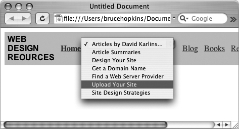
One great example of a client-side form is a jump menu—where a visitor selects a page in your Web site from a pop-up menu. A jump menu works because script (in this case, using JavaScript) acts on a form and effects an action (in this case, opening a new Web page) based on data the visitor entered into the form (the page he or she chose from the jump menu). Dreamweaver creates jump menu forms and automatically generates the required JavaScript.
Jump menus are an efficient and attractive way to allow visitors to navigate your site. You can provide a long list of target links in a jump menu without using much valuable space on your Web page (Figure 58a).
Figure 58a. Providing a long list of navigation options in a jump menu.
Jump menus use JavaScript to handle form input. In other words, when a visitor chooses a Web page (or other link, like an image file) from the jump menu, a script generated by Dreamweaver opens the selected page in a browser window. You don’t need to worry about this JavaScript. But you can look at it in Code view in the Document window if you’re interested in seeing what the JavaScript looks like (or, if you know how to, you can edit the generated JavaScript in Code view of the Document window).
To create a jump menu, follow these steps:
- With a page open in the Document window, choose Insert > Form > Jump Menu. The Insert Jump Menu dialog will open.
- In the Text field of the Insert Jump Menu dialog, enter the text that will appear in the jump menu.
Note
The text you enter in the Text field defines the name of the menu item. You don’t have to enter anything in the Menu Item field; that information is automatically generated by what you type in the Text field.
- In the When selected, go to URL field, either enter a URL for a link, or use the Browse button to navigate to and select a file on your site (Figure 58b).
Figure 58b. Defining a jump menu link.

- Define additional jump menu options by clicking the “+” button in the dialog, and entering new text and URL. Repeat to enter as many jump menu options as you need. Delete an item from the jump menu by selecting it and clicking the “–” button.
- To change the order of an item in the jump menu list, select the item and use the Up and Down arrow buttons in the dialog to move the selected item up or down in the list (Figure 58c).
Figure 58c. Moving a jump menu link up in the list of options.

- After you define all the links in the jump menu, click OK to generate the menu. Test the menu in a browser (you can’t test it in the Dreamweaver Document window because the jump menu works with JavaScript in a browser).
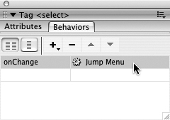
To edit an existing jump menu, you need to open the behavior that Dreamweaver created to control the jump menu. View the Behaviors panel (choose Window > Behaviors). Click the jump menu to select it. As you do, you will see Jump Menu listed in the second column of the Behaviors panel. Double-click it to reopen the Jump Menu dialog and edit the jump menu (Figure 58d).
Figure 58d. Opening the Jump Menu dialog by double-clicking Jump Menu in the Behaviors panel.
The Jump Menu dialog looks just like the Insert Jump Menu dialog, and you can add, remove, or move menu items or change menu options in this dialog.
#59. Embedding Forms Linked to Server Databases
There are many online services that provide you with server-side databases and scripts, and these services often host online databases and scripts as well (or else they tell you how to copy them to your server). For example, there are services that allow you to host a mailing list at their server. They provide you with HTML that you copy into your Web page. That HTML contains the coding for the form, as well as a connection to a script at a server that manages the data put into the form.
One of the most popular, easy-to-use, reliable, and professional online form-and-script services is the FreeFind search engine service (www.freefind.com). FreeFind will index your site (compile a list of all words in your site in a database), and provide you with a form that visitors can enter search criteria into.
Follow these steps to place a FreeFind search field on an open Dreamweaver Web page. You can also use them as a model for using similar services.
- Go to www.freefind.com, and enter your e-mail address and your site’s URL. Click the Instant Signup button. FreeFind will e-mail you a password and login and a link to the FreeFind control center. Follow the link, log in, and click the link for a free search field (or you can choose one of the more elaborate, ad-free pay options).
- Click the Build Index tab in the FreeFind control center, and then click the Index Now link. FreeFind will build a database, at the FreeFind server, of all the words in your Web site.
- Click the HTML tab and choose one of the four available types of search field forms you can use (the options are Site Search Only, Site and Web Search, Web Search Only, or Text Links).
- Select all the HTML for the search field you selected, and choose Edit > Copy from your browser menu.
- Back in Dreamweaver, click in the Document window to set the place where the search field will be inserted. Then choose View > Code to switch to Code view. Don’t worry about any of the code you see—your cursor is in the spot you clicked in Design view. Choose Edit > Paste to place the HTML code, and switch back to Design view to see the search field (Figure 59a).
Figure 59a. Placing a search field from FreeFind.
Note
The form copied from FreeFind includes hidden fields, indicated by icons in the form. These fields have information that directs search queries to the index FreeFind prepares for your particular site.
Test your search field in a browser. The search field form has fields and buttons. You can reformat the fields and buttons using the techniques for defining form and form field attributes covered in the rest of this chapter. In other words, you can customize the way this form looks—you just can’t delete any of the form fields. Further techniques in this chapter will cover how customization works, so you can customize forms you get from CGI hosts.
#60. Defining a Form in Dreamweaver
Form data is collected using different kinds of form fields. Text is entered into text boxes or text areas. Options can be selected from sets of radio buttons. Data can be uploaded using file fields. And forms are submitted (or cleared) using Submit (or Reset) buttons.
None of these form fields, however, works without a form. It’s important to be conscious of this. Many of my students get frustrated trying to figure out why their sets of form fields aren’t doing anything when the problem is that those form fields are not nested inside a form.
Further, a page can have more than one form. That’s often not a good idea from a design standpoint, but you can imagine situations when you might give visitors a choice of different forms to fill out.
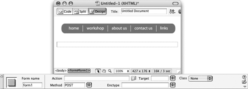
To create a form in an open Web page in Dreamweaver, simply click to place the location of the form, and choose Insert > Form > Form. The form will display as a dashed red box. The Property inspector displays the form name.
Make sure you have clicked inside the form before you add any form fields (Figure 60a)!
Figure 60a. A form placed on a page in Dreamweaver.
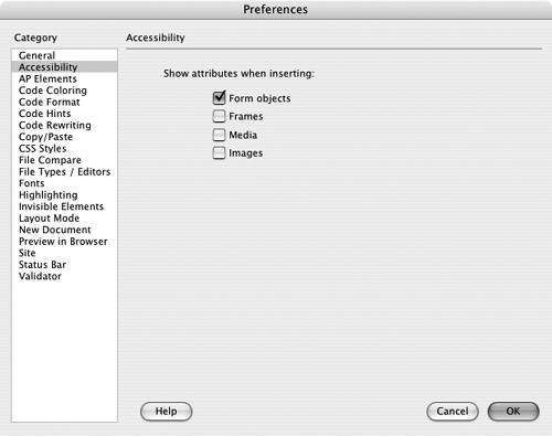
Forms can be a big hassle for visitors with disabilities. Form accessibility issues include making it easy for disabled visitors (who, for example, cannot use a mouse) to move from field to field in a form, and to easily select form fields. Dreamweaver CS3 promotes accessibility in many ways, including form design. If you enable accessibility preferences for form design, Dreamweaver will prompt you to enter accessibility features for each form field as you place it in the form.
To activate prompts for accessibility options in forms, choose Edit > Preferences (Windows) or Dreamweaver > Preferences (Mac), and select the Accessibility category. Select the Form objects check box if it is not already selected (Figure 60b).
Figure 60b. Activating prompts for accessibility options when designing forms.
With form accessibility options activated, Dreamweaver will prompt you with the Input Tag Accessibility Attributes dialog when you insert a form field into a form. The accessibility options allow for visitors to fill out the form without using a mouse, or if they are relying on reader software, to have an identifying label read to them.
You can enter a label in the Label field in the Input Tag Accessibility Attributes dialog, and use the radio buttons in the Style and Position areas to format and position the tag (Figure 60c). In the Access key field, you can enter a key (normally a letter) that visitors can use to select that field. For example, you might assign the letter N to a Name field. In the Tab index field, enter a numerical value to define the order in which visitors will tab to the defined field when they use their Tab key to navigate between fields. Tab indexes and access keys are used by visitors who cannot use a mouse.
Figure 60c. Defining access features for a form field.

Caution
Support for access keys is not standardized in all browsers, and so designers are divided on the usefulness of access keys to make forms more accessible.
#61. Defining a Form Fieldset
A fieldset is a design tool used to draw boxes around sections of a form. Fieldsets are particularly useful if you have a long form. Long forms tend to be intimidating or confusing, and by breaking groups of fields into boxed fieldsets, you can make your form more inviting and less overwhelming.
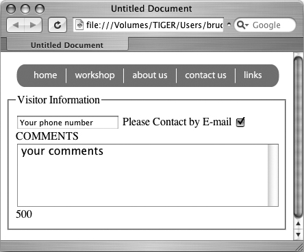
You can also use fieldsets to emphasize a set of fields in a form. For example, if there is some information that is required or that you particularly want to collect, you can enclose that group of fields in a fieldset (Figure 61a).
Figure 61a. A group of fields set off in a form by a fieldset.
To place a fieldset in a form, first make sure your cursor is inside the form. You don’t need to worry, initially, about the placement of the form fields you want to enclose in the fieldset. You can copy and paste them into the fieldset after you create it. Or, you can click and drag to select the fields you want to include in the fieldset, and then create the fieldset—that way, the fields are automatically enclosed in the fieldset.
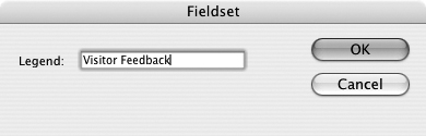
With your cursor inside a form, choose Insert > Form > Fieldset. The Fieldset dialog appears. In the Legend box, type a name that will appear at the top-left corner of the fieldset. This is the label that visitors will read when they see the form in their browsers (Figure 61b).
Figure 61b. Assigning a legend to a fieldset.
Tip
You can edit a fieldset legend right in the Document window. There is no need (and no way) to reopen the Fieldset dialog; just type right over the existing fieldset label to change it.
#62. Placing Text Fields and Text Areas
Text fields are used to collect all kinds of information in a form. E-mail addresses, phone numbers, purchase prices, zip codes, names, and a wide variety of other data can be entered into text fields.
Text fields collect a single line of text. Text areas can collect multiple lines of text. Text areas are used to collect comments, descriptions (like descriptions of problems for online service forms), guestbook entries, and other text that requires more than one line.
To place a text field or a text area in a form, follow these steps:
- With your cursor inside an existing form, choose Insert > Form > Text Field.
Tip
If you have enabled accessibility options, you’ll be prompted to enter them before defining the field itself. See #60, “Defining a Form in Dreamweaver,” for an explanation of these accessibility features.
- After you place the text field, you can define the field attributes in the Property inspector (Figure 62a). In the TextField field, enter a name that will help you remember the content of the field. In the Char width field, enter the number of characters that will display on a single line in a browser as a visitor enters data.
Figure 62a. Defining a one-line text field, with input formatted using a CSS Class style.

- In the Max chars field, you can enter the maximum number of characters that can be entered into the field.
- In the Init val field, enter text that will appear in the field in a browser before any user interaction. Sometimes (but not always) form designers will include text like “your e-mail goes here” in a field. Visitors then replace that content with their own entry.
- In the Type options, choose Single line for a text field, and Multi line for a text area. If you choose Multi line, the Num Lines field appears in the Property inspector. Enter the number of lines that will display in the form (you cannot define a limit for the number of characters that are entered). In the Wrap pop-up menu, choose default, so text wraps in the browser window.
- Enable the Password option to display content entered into the field as asterisks.
- You can use the Class pop-up menu to attach a CSS Class style to the field.
As you define text field or text area attributes in the Property inspector, they display in the Document window.
#63. Placing Check Boxes
You can place any number of check boxes in a form. Check boxes provide two options for visitors: checked or unchecked. And you can define a default state for a check box as either checked or unchecked.
To place a check box in a form, follow these steps:
- With your cursor inside an existing form, choose Insert > Form > Checkbox.
Tip
If you have enabled accessibility options, you’ll be prompted to enter them—including a label—before defining the field itself. See #60, “Defining a Form in Dreamweaver,” for an explanation of these accessibility features. Do enter a label (check boxes need text to tell visitors what they are checking, and generated labels do this well); the label will display to the left or right of the check box.
- After you place the check box, if you did not generate a label, you need to enter some text in the form (normally to the right of the check box) that identifies what is being selected when a visitor selects the check box.
- In the Property inspector, enter a name for the check box in the check box field. In the Checked value field, enter a value to go with the check box name. For example, if the check box is asking if a user wants to be contacted, the check box name might be “contact,” and the checked value might be “yes.”
Tip
There are different styles and systems for identifying and collecting data in check boxes, and if you are designing a form in conjunction with a database programmer, check with him or her on how to manage this.
- Select one of the Initial state option buttons to define whether the default state of the check box is checked or unchecked (Figure 63a).
Figure 63a. Defining a check box.

#64. Placing Radio Buttons
Radio buttons differ from check boxes in that they always are organized in groups. You never have a single radio button—if you are asking a question for which a user can supply no, one, or several answers, use check boxes. The purpose of radio buttons is to compel a user to choose one from a group of options.
To create a radio button group, follow these steps:
- With your cursor inside an existing form, choose Insert > Form > Radio Group. The Radio Group dialog appears (Figure 64a).
Figure 64a. Defining a group of radio buttons.

- In the Name field, enter a name that indicates to you the nature of the group of options. For example, if you are inquiring as to a type of shipping (Overnight, Two-day, Ground, etc.), you might call your group “Shipping_options.”
- In the Radio buttons area of the dialog, click the Label column. In the first row enter a label that will appear for visitors. Next to that label, in the Value column, enter the data that will be sent with the form. For example, a label might read “Two-day shipping” to make clear to a user what he or she is selecting. But the value sent to your shipping department might be “TD-002”—an internal code that tells them how to handle and bill shipping.
- In the second row, enter another label and value. Use the “+” button to add more rows of labels and values, and the “–” button to delete a selected row. Use the Up and Down arrow buttons to move selected rows up or down in the list of radio buttons.
- In the Lay out using area, choose either Line breaks radio button (for separated rows) or Table radio button (for rows designed in a table).
- After you define the radio button options, click OK in the dialog to generate the radio button group.
After you generate a radio button group, you can edit (or delete) radio buttons individually. If you want to add a radio button, you can copy and paste an existing one from the group and, in the Property inspector, change the Checked value (but not the Radio Button) content (Figure 64b).
Figure 64b. Editing a single radio button.

#65. Placing Lists/Menus and File Fields
Menus and file fields are two different types of fields that can be placed in forms. Menus allow visitors to choose from a list of items. File fields allow users to upload files when they submit a form. In this How-To, we’ll explore both these types of fields. (Consider this two How-Tos for the price of one—I had to sneak them both into the same How-To to keep the book at an even 100 How-Tos!)
Menus (sometimes called pop-up menus) allow visitors to choose one option from a pop-up menu.
The main difference between menus and list menus is that list menus allow users to select more than one choice from a list, while regular menus restrict users to choosing just one item. List menus are usually a confusing way to collect data and are rarely used.
File field forms allow visitors to attach files from their own computers to the form and send them along with the form.
To create a menu, follow these steps:
- With your cursor inside an existing form, choose Insert > Form > List/Menu. You use this menu option to create either a menu or a list menu. Later, you will decide whether to make your menu a list menu or a regular menu.
Tip
If you have enabled accessibility options, you’ll be prompted to enter them before defining the field itself. See #60, “Defining a Form in Dreamweaver,” for an explanation of these accessibility features.
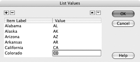
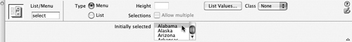
- To create a list for the menu, click the List Values button in the Property inspector. The List Values dialog will appear. In the Item Label column, enter the text that will display in the menu (for example, “Alaska”). In the Value column, enter the value that will be collected and sent in the form (such as “AK”). Use the “+” button to add new items to the list and the “–” button to delete selected items. After you define the list, click OK (Figure 65a).
Figure 65a. Defining a list/menu.
- After you generate a menu (or list), use the Property inspector to define additional features. If you click the List option button in the Type area of the Property inspector, you can convert the menu into a list menu. And if you choose the List option, you can click the Allow Multiple check box in the Options area of the Property inspector to allow users to choose more than one option from the menu. List menus can also display more than one option at a time in the drop-down menu.
- You can add, delete, or edit actual menu (or list) items by clicking the List Values button in the Property inspector. This will open the List Values dialog where you can edit or change the order of menu (or list) options. You can change the initially selected option in the Property inspector by clicking an option in the Initially selected area (Figure 65b). You can assign a CSS style using the Class pop-up menu.
Figure 65b. Choosing an initially selected option for a pop-up menu.
You can allow visitors to attach files to the form submission by inserting a file field in a form. Choose Insert > Form > File Field. You can define character width in the Property inspector. A Browse button appears next to the field that the user can use to navigate to and select a file to upload.
Tip
Don’t constrain the number of characters that visitors can use to define an uploaded file by entering a value in the Max chars field in the Property inspector. There is no point to setting a limit on number of characters in an uploaded file’s name.
#66. Using Hidden Fields
Hidden fields send information to a server that is not entered by the visitor filling out the online form. Hidden fields can be used to identify things like the page from which a form was sent.
Normally, you won’t be creating hidden fields. It’s more likely that they will be included in the HTML for a form that you download, connected to an existing server script. For instance, the form provided by FreeFind to link to a search index database at their server includes several hidden fields (Figure 66a).
Figure 66a. Examining hidden field values in code view.

If you do need to create a hidden field in a form, choose Insert > Form > Hidden Field. The field, of course, does not display in the form; it appears only as an icon in the Document window. Enter a name for the field in the HiddenField field in the Property inspector, and enter a value in the Value field.
#67. Placing Form Buttons
In order for form content to be sent to a server, there must be a Submit button in the form. Submit buttons are usually matched with a Reset button. The Reset button clears any data entered into the form, and allows the user to start fresh.
To place a button in a form, choose Insert > Form > Button. Use the Property inspector to define the button as a Submit or Reset button. In the Action area of the Property inspector, choose the Submit form or Reset form radio button (Figure 67a). No other settings are usually applied to Submit or Reset buttons, but a Submit button is essential if the form content is to be sent to a server.
Figure 67a. Defining a Reset button.
You can define custom labels for either the Submit or Reset button by entering text in the Value field for either button. Don’t get too fancy; visitors are used to seeing buttons that say something like “Submit” or “Reset.” But if you enter different text in the Value field, that text will display in browsers and can be previewed in the Document window (Figure 67b).
Figure 67b. Creating a custom label for a Submit button.
#68. Defining Form Actions
Form actions define how the data in a form is sent to a database on a server. Form actions are defined in the Property inspector with the form—not any specific form field—selected.
Tip
To select a form, click the dashed red line defining the form border. Or, click the <form> tag in the tag selector area on the bottom of the Document window.
The three important fields in the Property inspector for a form are the Action, Method, and Enctype fields. What you enter into these fields is determined by how the programmer (who set up the script and database to which the form data is being sent) configured the database and scripts at the server. Normally, Method is usually set to POST but can sometimes be set to GET; this again depends on how data is transferred to the server, and is defined by how the server is configured. The Action field contains the URL of the Web page at the server that has the script that will manage the data.
Enctype, short for “encryption type,” is sometimes used to define how characters are interpreted and formatted. Your server administrator will tell you what, if any, enctype coding is required for forms to be processed by your server.
Since form actions are determined by the settings at your server, the information you enter into the Property inspector is provided by your server administrator. In the case of forms designed to match server scripts, those forms normally come with Action settings defined (Figure 68a).
Figure 68a. Inspecting form action settings provided by a server administrator—in this case the FreeFind search engine.
If you want to collect data in a form and have it sent to an e-mail address, you can do this easily without having to work with additional server configuration or scripts. In the Action field, type mailto:(your e-mail address). From the Method pop-up menu, choose POST. In the Enctype field, type “text/plain” (Figure 68b).
Figure 68b. Defining an action that will send form content to an e-mail address—in this case, mine!
#69. Defining a Spry Validation Text Field Widget
Many times, you will want to test content entered into a text field before you allow a visitor to submit the form. For example, you might require a visitor to enter his or her name before submitting a form. In that case, the validation test would be that a visitor could not leave the Name field blank before submitting it. The Spry Validation Text Field widget can detect a blank field and alert the person filling out the form that a name is required before the form can be submitted.
Or, you might want to test content entered into a text field even beyond determining whether or not the field was left blank. If, for example, you are collecting a zip code from the visitor, you can test to see if the data entered into the zip code field actually is a five- (or nine-) digit zip code. You can use the Spry Validation Text Field widget to verify that the data submitted in the form field conforms to the criteria you define, and again, force people to provide data that at least looks like a zip code before the form can be submitted.
To place a Spry Validation Text Field widget in a form, follow these steps:
- Within a form, select Insert > Spry > Spry Validation Text Field.
Note
If you have accessibility prompts turned on, you will be prompted to enter accessibility attributes for the text field. Form field accessibility attributes are explained in #60, “Defining a Form in Dreamweaver.” You can enter accessibility attributes, or not. Click OK to insert the form field.
- A text field appears in your form. With the new text field selected, the Spry text field options are displayed in the Property inspector.
- In the Spry TextField box in the Property inspector, enter a field name with no spaces or special characters (use alphanumeric characters). The field name is used to process data, and is not displayed in a browser.
- By default, the Required check box is selected in the Property inspector. Leave this check box selected to make the text field a required field.
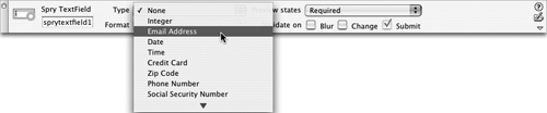
- If you want to test data entered into the text field to meet validation criteria (for instance, the data must be in the form of an e-mail address, a zip code, a URL, or a phone number), select one of those options from the Type pop-up menu in the Property inspector (Figure 69a).
Figure 69a. Choosing Email Address as the validation type.
- Many of the preset validation types include additional options. For example, if you chose to test input for zip codes, you can test for five-digit (“US-5”), nine-digit (“US-9”), British (“UK”), or Canadian (“Canada”) format. The Format pop-up menu displays these options (Figure 69b).
Figure 69b. Selecting from zip code–testing options.

- The Enforce Pattern check box makes it impossible for users to enter characters that do not conform to the validation rule. For example, if you define validation rules for a U.S. zip code, and a user tries to enter a letter (like A), that character will not appear in the field.
- Use the Hint box in the Property inspector to provide initial content in the text field (for instance, you might use “[email protected]” to suggest to users that they need to enter a complete e-mail address), you can enter that initial text in the Hint box in the Property inspector.
- Choose when to validate the field entry from the set of Validate on check boxes. Use Blur to validate when a user clicks outside the text field. Select Change to validate as the user changes text inside the text field. Choosing Submit validates when the user clicks the Submit button in the form.
- Many of the preset validation types include rules of how many characters will be allowed and/or maximum and minimum values. For example, the five-digit zip code validation type will only accept five numbers. However, you can also create your own custom validation rules by choosing Integer (number) from the Type pop-up menu in the Property inspector, and then defining a maximum (Max chars) and/or minimum (Min chars) number of characters, and a maximum (Max value) and/or minimum (Min value) value for numbers entered into the field.
- The Preview States pop-up menu in the Property inspector just defines what state is displayed in the Document window in Dreamweaver. The state that displays in a browser will depend on whether or not the user conforms to or breaks the validation rules.
- You can edit Spry validation rules at any time by selecting the turquoise Spry Textfield label and changing values in the Property inspector.
#70. Defining a Spry Validation Textarea Widget
Text area fields are used almost exclusively for comments. And comments, in our digital age, are one of the more available ways that customers, clients, students, patients, and people in general communicate with organizations and businesses.
If you place a text area field in a form, you might well want to use the Spry Validation Textarea widget to define a few rules for how much content can be entered into the field.
The Spry Validation Textarea widget can be used to make a text area field required. For example, if customers are asked to describe what kind of service their laptops need, you might want to insist that they describe their problem before submitting a request for service.
To place a Spry Validation Textarea widget in a form, follow these steps:
- Within a form, select Insert > Spry > Spry Validation Textarea.
Note
If you have accessibility prompts turned on, you will be prompted to enter accessibility attributes for the text field. Form field accessibility attributes are explained in #60, “Defining a Form in Dreamweaver.” You can enter accessibility attributes, or not. Click OK to insert the form field.
- A text area appears in your form. With the new text field selected, the Spry text field options are displayed in the Property inspector.
- In the Spry Textarea box in the Property inspector, enter a field name with no spaces or special characters (use alphanumeric characters). The field name is used to process data and is not displayed in a browser.
- By default, the Required check box is selected in the Property inspector. Leave this check box selected if you want to make the text area a required field.
- Use the Hint box in the Property inspector to provide “hint” content in the text field (for instance, you might have text like “your comment here” or “comment required”). You can enter that initial text in the Hint box in the Property inspector (Figure 70a).
Figure 70a. Defining hint content for a comment field.

- Choose when to validate the field entry from the set of Validate on check boxes. Use Blur to validate when a user clicks outside the text field. Select Change to validate as the user changes text inside the text field. Choosing Submit validates when the user clicks the Submit button in the form.
- Enter values in the Max chars and/or Min chars boxes in the Property inspector to constrain the number of characters that can be entered into the field (Figure 70b).
Figure 70b. Constraining the number of characters in a text area field to no more than 500.
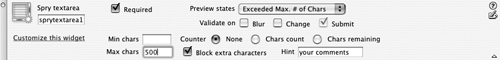
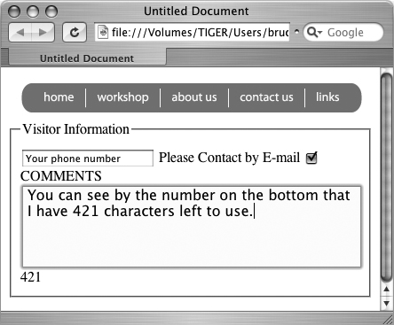
- If you define a maximum number of characters in the text area field, you can use the Counter options to define whether to display a count of used or remaining characters (Figure 70c).
Figure 70c. Viewing remaining characters in a browser.
- The Preview States pop-up menu in the Property inspector just defines what state is displayed in the Document window in Dreamweaver. The state that displays in a browser will depend on whether or not the user conforms to or breaks the validation rules.
You can edit Spry validation rules at any time by selecting the turquoise Spry Textarea label and changing values in the Property inspector.
#71. Defining a Spry Validation Checkbox Widget
Sometimes a check box provides an option that a user can either choose or not. Do you want to receive unsolicited e-mail? Do you have a discount code? Did you hear about this Web site from a friend? In all these cases, a form designer will likely allow the user to select, or not, any or all of the check boxes.
In other cases, clicking a check box is mandatory to submit a form. Required check boxes are used to verify that a visitor had read a license agreement before downloading software or that a visitor agrees to set terms before reading site content. In situations like these, you can use a Spry Validation Checkbox widget to require that a visitor select a check box before submitting a form.
To insert a Spry Validation Checkbox in an existing form, follow these steps:
- With your cursor in a form, select Insert > Spry > Spry Validation Checkbox.
Note
If you have accessibility prompts turned on, you will be prompted to enter accessibility attributes for the text field. Form field accessibility attributes are explained in #60, “Defining a Form in Dreamweaver.” You can enter accessibility attributes, or not. Click OK to insert the form field.
- The Required option is selected in the Property inspector. This is the main point of using this widget, and it is likely you will need to define no other options. However, you can define when to validate the field entry using the set of three different Validate on check boxes. Use Blur to validate when a user clicks outside the text field. Select Change to validate as the user changes text inside the text field. Submit is always selected, and validates when the user clicks the Submit button in the form (Figure 71a).
Figure 71a. Defining validation for a check box triggered by a user clicking the Submit button.

- The Preview States pop-up menu in the Property inspector just defines what state is displayed in the Document window in Dreamweaver. The state that displays in a browser will depend on whether or not the user conforms to or breaks the validation rules.
- You can edit Spry validation rules at any time by selecting the turquoise Spry Checkbox label and changing settings in the Property inspector.
You will notice that the Property inspector for a Spry check box includes an Enforce Range (Multiple) option. This allows you to define a minimum number of check boxes that must be selected before the form can be submitted.
Defining a validation rule for a group of check boxes is technically possible in Dreamweaver but requires some hand-coded HTML, and is not a particularly accessible feature of Dreamweaver CS3.
Is this something you would want to research and apply to your forms? Maybe, maybe not. There is controversy among form designers as to whether it is appropriate to use check boxes in groups. Some schools of form design teach that radio buttons are always used when a visitor has to choose from a set of options, and check boxes are always used to provide a set of independent choices. For example, if a customer has to choose a type of credit card, the set of radio button options might include Visa, MasterCard, American Express, and Discover Card. Every customer who makes an online purchase has to choose one—and just one—of these options. On the other hand, check boxes can be used to allow visitors to get e-mail discount coupons or to subscribe to a newsletter. Customers can select neither of these options, either of them, or both. I tend to favor this approach to form design, but other form design folks like the ability to group check boxes and require people filling in an online form to choose one—and just one—check box from a group.
#72. Defining a Spry Validation Select Widget
Spry Validation Select widgets are used to create validation rules for pop-up menus. (The formal name for what most folks refer to as pop-up menus is “select menus.”) In the main, Spry Validation Select widgets are used to force users to make a selection from a pop-up menu. For example, if the pop-up menu lists a set of geographical regions and you need to know what geographical region a client is located in, you might make it a requirement that before submitting a form, the client provides his or her location.
Creating a Spry Validation Select widget is a two-part process. Unlike the other Spry validation widgets surveyed in this chapter, the Spry Validation Select widget does not generate a working form field; it only generates the validation script. So, you need to both generate the validation widget and create a pop-up menu with options.
Defining labels and values for (pop-up) menus is covered in #65, “Placing Lists/Menus and File Fields,” earlier in this chapter. Here, I’ll walk you through generating a Spry Validation Select widget that provides a validation script for a menu.
To generate a Spry Validation Select widget, click in a form, and choose Insert > Spry > Spry Validation Select. An empty menu is generated. You can populate the menu after you define the validation rules in the Property inspector.
The unique validation option for a menu is that you can elect to force visitors to choose an option from the menu. And, you can constrain the selected option to a menu option with a value. Let’s start with the basic option: By default, Spry Validation Select scripts create a required form. If a user doesn’t select an option from the menu, he or she will not be able to submit the form (Figure 72a).
Figure 72a. The Property inspector displays the default validation rule for Spry Validation Select widgets—blank values are not allowed.
In addition to screening for blank value submissions, you can also define a value (besides blank) that you assign to menu options that are not accepted. For instance, if you are collecting data in the menu about where someone bought your product before you provide support for their purchase, you might define a form that would not accept menu selections like “I don’t know” or “I stole it!” In that case, you would define a value (like “1,” for instance) for all menu options that you will not accept, and enter that value in the Invalid value field, along with checking the Invalid value check box (Figure 72b).
Figure 72b. Defining an invalid value of 1.
After you attach a validation script to a menu, click the menu field (as opposed to the turquoise validation script label) in the Dreamweaver Document window. In the List/Menu Property inspector, click the List Values button to open the List Values dialog. Here, you enter labels and values for your menu.