COLOR IDEAS
Expressionist color can include:
• Minor key as well as major.
• Rich and varied neutrals as well as pure colors.
• Hue-dominant as well as hue-equal schemes.
• Tertiary colors as well as primary and secondary colors.
• Harmonies as well as contrasts.
Here is an exercise to develop expressionism in color: list and mix names of colors you can identify. To imagine them think of items from the world around you—edibles, fabrics, rocks, flora and fauna. They can also be derived from decorative objects and mental associations.
A list of light, high-value colors might include ice creams (peach, lemon, lime, custard, strawberry, raspberry), aqua glass, jade, mint, blueberry, blackberry, walnut, caramel, pineapple, banana, canvas, white wine, pear, lavender, buttercup, chartreuse, and dapple-gray. These are often tints.
High-middle values might suggest the colors of raffia, terra cotta, potato skin, old gold, rose, sage, juniper, watermelon (pink and green), clay, manila, blue spruce, rust, olive, persimmon and steel gray. These could be tints or tones.
Some middle-value examples are cherries, bottle green, bottle blue, slate blue, heather, maraschino, olive drab, russet, cypress green, red fox, granite, malachite and pomegranate. They could be pure colors, tones or shades.
Low-middle values might suggest royal blue, dark cherries, bankers gray and plum. These are also pure colors, tones or shades.
Dark colors could include chocolate, navy, spruce, maroon, royal violet, Prussian blue, charcoal gray, and other tones and shades.
OPTICAL MIXING
“The Soup”
Some artists make a neutral watercolor wash of complements such as orange and blue and use it to unify colors. (“Stock” is more like it!) Instead of pre-mixing it, overlay it as in the method of a sky overlay of blue over orange. Color hatching sometimes works in shadow if tones are close for special effect. Color hatching for optical mix in a lit textured area is excellent!
Choice of Colors for a Mix
• Should be equal in intensity, or:
• Should be equal in value.
• Color choices should be made from the Color Triangle: hue, tint, tone or shade.
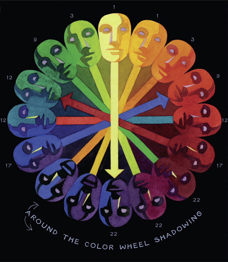
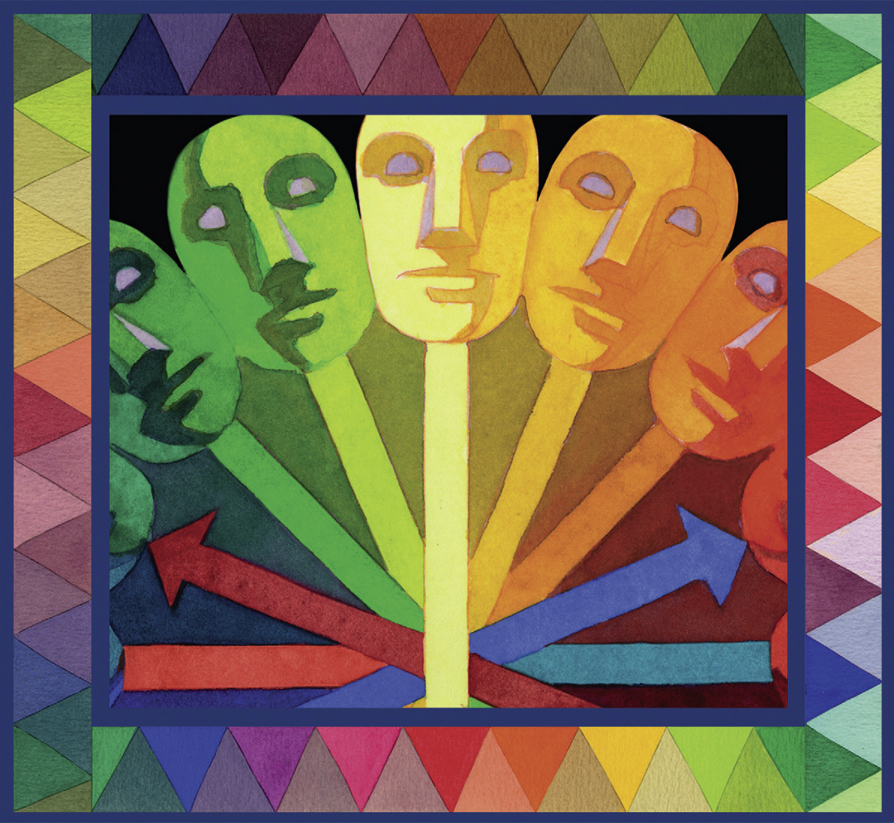
• For shadows consider three colors in shadow: a local hue, an incident light hue and a darkness hue. (For example: Darkness hue can be a color one or two steps down the color wheel so a yellow shadow would be orange with cool incident light such as lemon, resulting in a sienna hue. Blue shadow would be purple and a cool incident light mixed to a “navy” blue. A red shadow could include purple and magenta, equaling a plum color.)
• Merged shadows can vary in color and temperature in recognition of obscured local colors. The techniques of broken color and mottling can aid this effect.
Some Color Mixtures for Painting the Sky
The following are used for the overlay method. The first mixture is painted on and allowed to dry. A second color wash is added using the strong blue.
• Wash of Yellow Ochre and Rose Madder, Cobalt Blue painted over it.
• Cadmium Yellow and Vermilion mix/Cobalt Blue.
• Aureolin and Viridian mixture/Cobalt Violet.
• Black and Burnt Sienna mixture/Ultramarine Blue.
• Light Red and Emerald Green/Cobalt Blue.
• Raw Sienna and Rose with overlay of Manganese Blue.
Useful Colors
Burnt Sienna or Venetian Red functions as a brownish red in shadowed areas.
Burnt Sienna plus White gives a good smoky brownish red.
Raw Sienna functions as gold in shadow.
A flat warm tone can be made from Vermilion and Lamp Black or Indian red.
Shadowed yellow can be mixed from Yellow Ochre and Burnt Sienna or from warm Sepia.
• Cadmium Yellow Deep, Phthalocyanine Blue, Winsor Violet (for leaf green).
• Cerulean Blue and Cadmium Lemon.
• Ultramarine Blue plus Cadmium Lemon or Cadmium Yellow Medium.
• Phthalocyanine Blue plus Cadmium Lemon or Cadmium Yellow Medium (plus limited amount of Alizarin Crimson).
• Any yellow other than Lemon goes olive in the mix.
• In superimposing color, yellow over blue is brighter than blue over yellow.
Colored Neutrals—As both mixed primaries and mixed secondaries produce gray, any color mixed with black can produce a neutral.
The color of light takes precedence over all other color!
COLOR ADVICE FROM EDGAR PAYNE
• Two parts of a secondary are needed to neutralize one part primary.
• Rarely can a picture employ only analogous pure colors for harmony.
• All pure colors create activity. All muted colors rest.
• An artistic inequality of complements with a dominant color, shade or tint is a good plan.
• Mixing a dominant tone and injecting it in various colors is called the “soup” method and creates harmony.
• A “toner” can be made with Indian Red, Ultramarine Blue and Yellow.
• Any strong color affects its surroundings and should modify them in a picture.
• “Soup” can be any neutralized color: warm, cool, brown, russet.
• Little pure color exists outdoors.
• Outdoor color is much more intense than paint.
• Any color combination can be transposed by keeping the relationship true (i.e., intensity-darkness-warmth).
• Color is only one aspect. Drawing and value are important.
• Color is visual and easier studied than disguised principles.
Broken color replaces “soup”—for atmosphere.
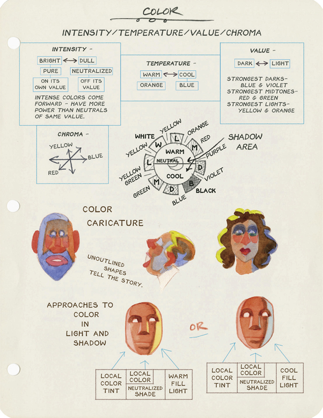
COLOR ANALYSIS OF FABER BIRREN

CHARTING THE HUE, VALUE, TEMPERATURE AND INTENSITY OF A COLOR

NEUTRALIZING A COLOR/CHANGING VALUE
A color is full intensity at its given value. Adding black is called “graying” the color. So is adding the complement. But adding white is graying it too (by reducing the intensity of the color!).
A pure color cannot be intensified. It can only be reduced in intensity.
HOME VALUE—Intensity lessens going up or down from home value.

RELATIONSHIP OF COLOR AND TONE
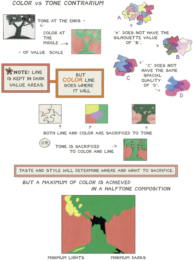
VIBRATING COLORS

Neutral Colors
Create more lively and varied “grays” by mixing them from color instead of adding black. Here are some useful combinations:
A “navyish” blue—Winsor Blue, Payne’s Gray and Alizarin Crimson.
Warm shadow—Cadmium Orange and Winsor Violet.
A rich gray—Winsor Blue, Alizarin Crimson and Raw Umber.
Enlivened cool gray—Payne’s Gray, Alizarin Crimson and Burnt Umber.
Neutral “Red” —Alizarin Crimson, Burnt Umber, Payne’s Gray and Winsor Violet.
Neutral “Green” —Payne’s Gray, Raw Umber and Winsor Blue.
Reddish Gray—Raw Sienna and Winsor Violet.
Super Black—Payne’s Gray, Alizarin Crimson and Winsor Blue.
Red Black—Payne’s Gray and Alizarin Crimson.
Blue Black—Payne’s Gray and Winsor Blue or Ultramarine Blue.
Green Black—Payne’s Gray and Winsor Green.
Yellow Black—Lamp Black and Indian Yellow.
Silvery—Alizarin Crimson and Winsor Green.
Gray Green—Payne’s Gray and Indian Yellow.
“Cooper’s” Gray I—Winsor Violet, Raw Sienna, Payne’s Gray and Burnt Umber.
“Cooper’s” Gray II—Payne’s Gray and Burnt Umber warmed with Alizarin Crimson and cooled with Winsor Blue.
COLOR AND THE PICTURE PLANE

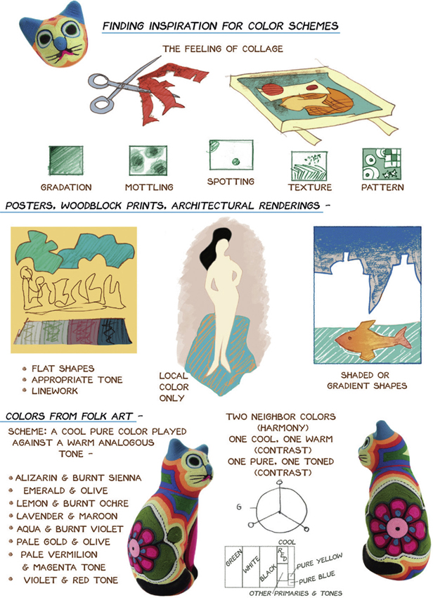
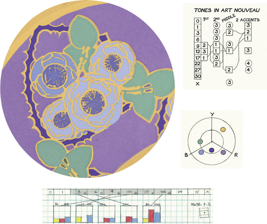
ANALYSIS OF ART NOUVEAU COLOR SCHEMES
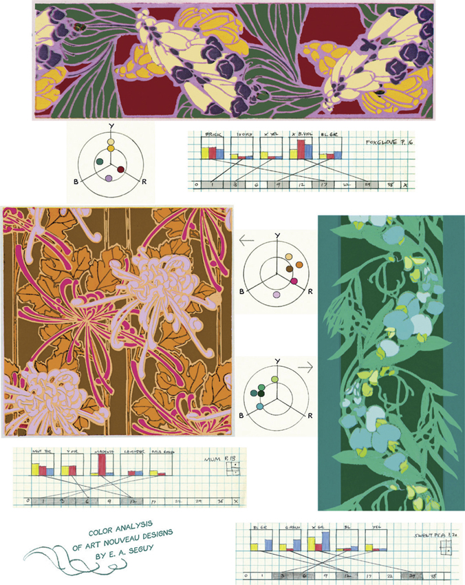
Art by E. A. Seguy from Full-Color Floral Designs in the Art Nouveau Style, Dover Publications
ART NOUVEAU COLOR SCHEMES
The Art Nouveau style originated at the turn of the twentieth century and derived its inspiration from plant forms. It is known for dramatic curved lines and unusual and subtle color schemes. This approach to color can be adapted to modern subjects.
Some characteristics:
HUE—No more than half the color wheel is used in many cases.
VALUE—Schemes consist of first and second dominant tones, a middle tone and two accents. The first and second dominants are most commonly midrange light values and middle tones. Middle tones and accents range from high light to dark shade and are least seen in midrange light to the middle of the value scale.
TONE STEPS—These are most commonly placed one or two steps apart in the first and second dominant tones. They may also be placed three and even four steps apart.
INTENSITY—Varying the intensity of the dominant colors retains their relationship and provides harmony and richness. The Color Triangle and Color Wheel can be helpful in discovering vibrant combinations.
THEMATIC COLOR FOR BACKGROUNDS

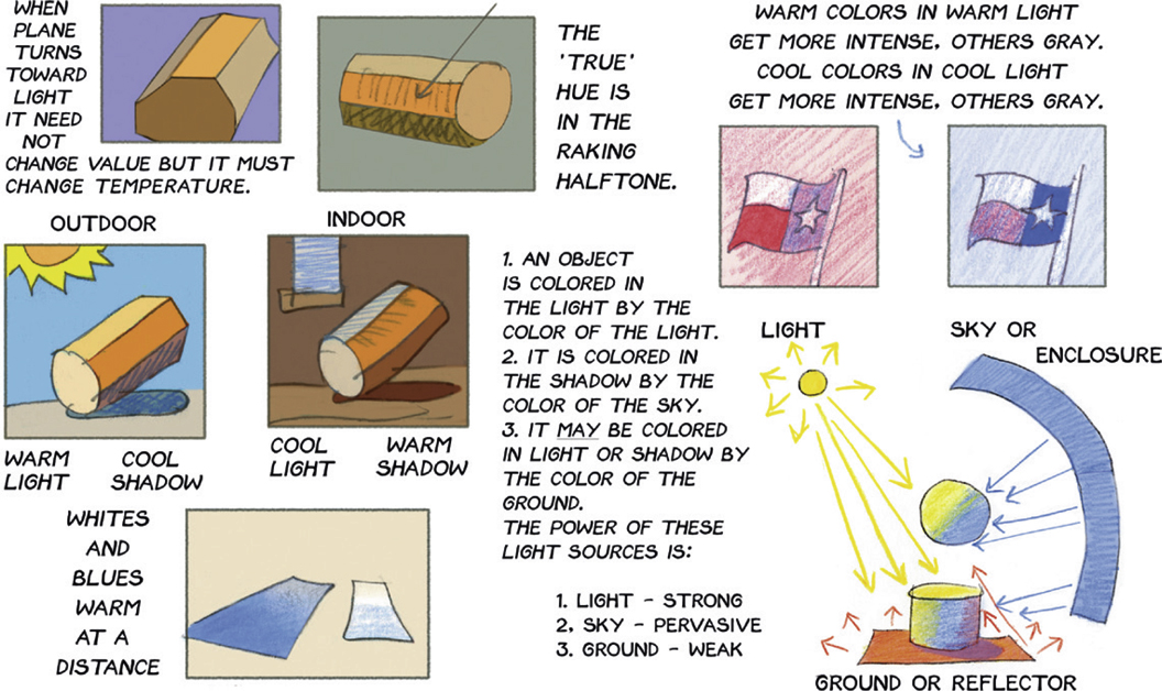
THE EFFECT OF LIGHT AND ATMOSPHERE ON COLOR
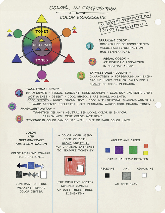
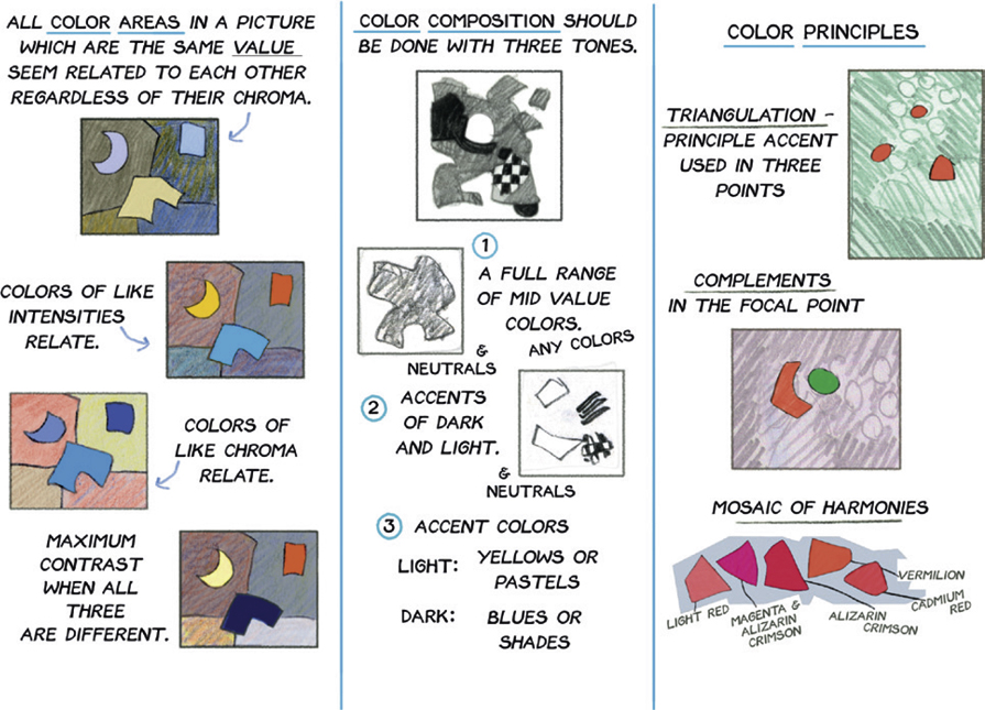
COLOR AND COMPOSITION
Key to “Around the Color Wheel Shadowing” chart

Tracing paper overlay used to determine color schemes and color neighbors on chart.
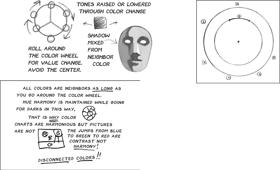
FOR RICHER COLOR—Mix light and shadow areas from neighboring color instead of adding white or black.