

OBSERVATIONS ON LINE
LINE
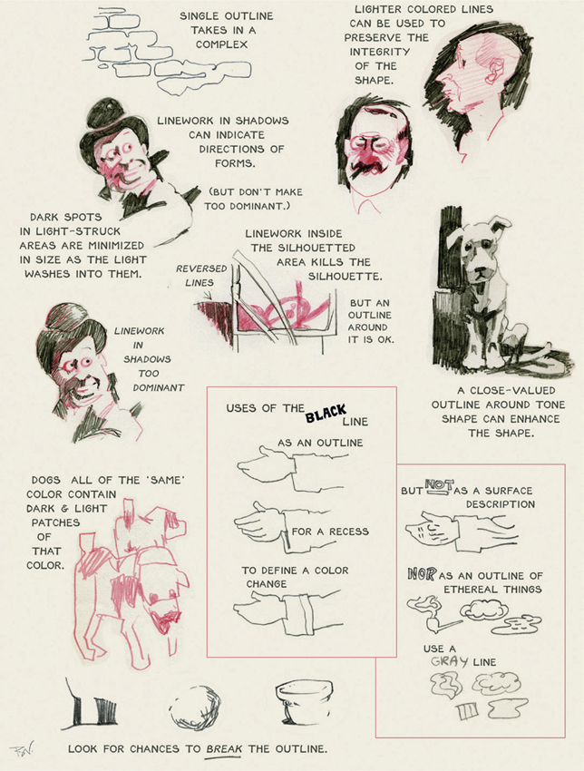
Line is a skinny tone. It mostly goes where light cannot get in. Where you wish areas to connect, don’t put in line. Line can be used to emphasize gesture and to bring out the rhythm of design. Light line on dark can make an effective area.
WHERE LINE CAN HELP

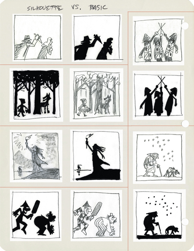
SILHOUETTE
Pure silhouette is any self-lined, unbroken tone of any value with a descriptive contour. It is a descriptive shape. Modified silhouette is a self-lined tone with gradation or mottling. Stylized silhouette is a tone outlined in a line of closely related value. It is similar to the dark edge of a puddled-on watercolor tone. It can also be soft edged or resembling a “brown-edged cookie.” Silhouette implies—it makes something understood without expressing it directly. The effect is strengthened by inclusion of two or more tones in one tonal value (a conglomerate). Silhouette suggests an unequal distribution of light: indoors/outdoors, near/far (aerial perspective light), light/shadow or a cast shadow.
The sense of silhouette is destroyed by:
• Contrasting outline
• Articulated outline
• Inclusion of pattern
• Not losing part of a form
• Inclusion of strong modeling
• Inclusion of a strong texture or interior drawing
• Shapes of unrelated local tone (indirect lighting)
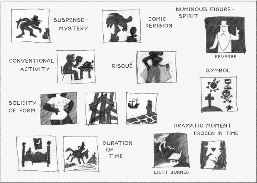
WHERE SILHOUETTE CAN HELP
SILHOUETTE VERSUS BASIC RENDERING
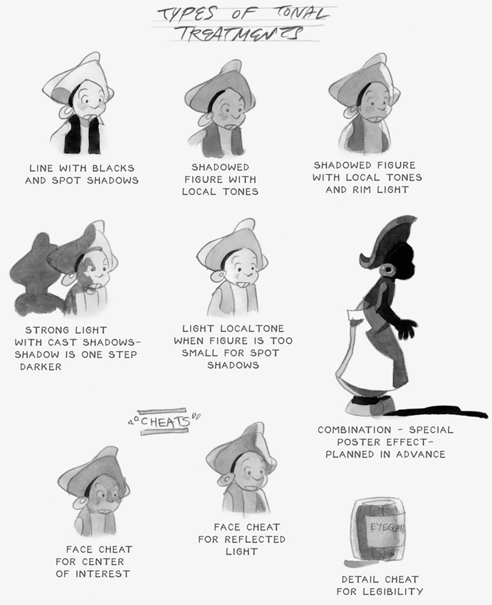
TYPES OF TONAL TREATMENT
HOW TONE DOMINATES COLOR
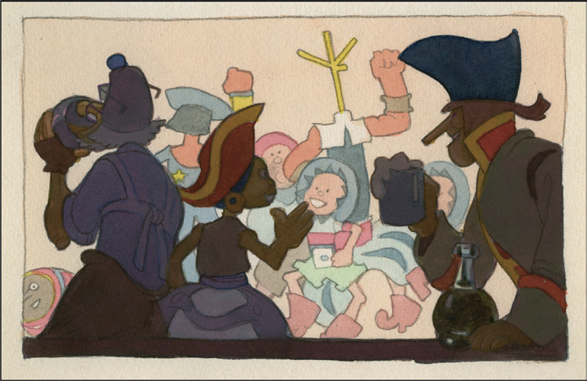
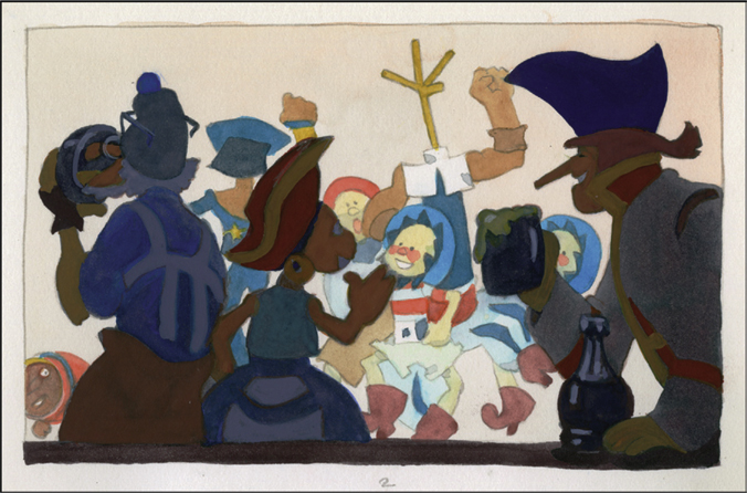
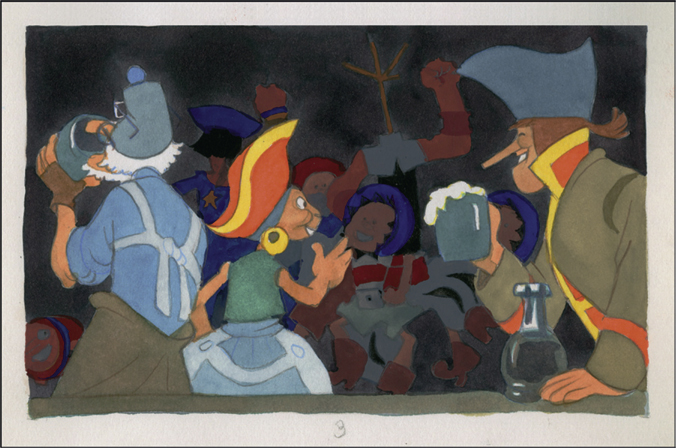
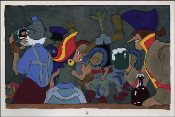
The following six panels, which depict characters from Pistol’s Pirates at the Blue Lobster Inn, demonstrate the control of color areas through the organization of tones. Related tones can be massed together to create a strong pattern, emphasize a specific area or separate pictorial space into planes of foreground and background. Please see 4 and 5 Value Chart in Chapter 9.
KEYS TO THE BLUE LOBSTER TONE/COLOR STUDIES

PANEL I-A
Key light at “light” tone, key dark at “Mid Shade”—Without lines

PANEL I-B
Key light at “Light” tone, key dark at “Mid Shade”—With lines
TONE STUDIES 1
PANEL 2
Key light of “Low Light” tone, key dark at “Dark Shade” tone
PANEL 3
Key light at “low Light” tone, key dark at “Dark Shade,” reversed foreground/background
TONE STUDIES 2
PANEL 4
Controlled lights with full darks—Pure colors and hard edges in “Light” tone, grayed colors and soft edges in “Middle” tone and background
PANEL 5
Modified Reverse Negative—Background mainly “Light” tone with warm purish colors, mid-ground in grayed colors, foreground in “Middle” through black

TONE STUDIES 3
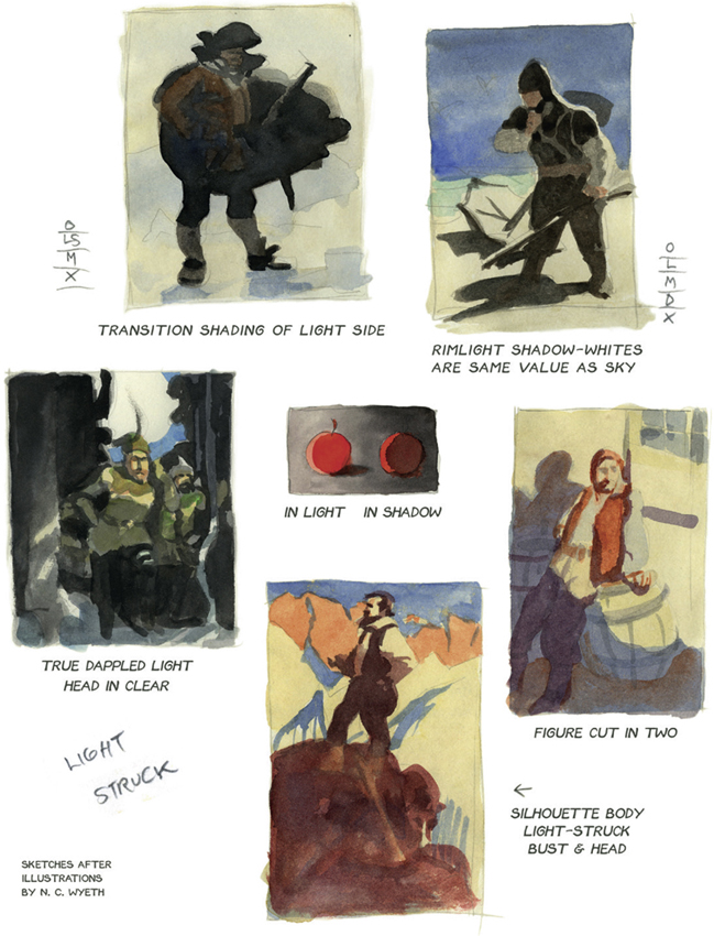
RELATIONSHIP OF SHAPE AND TONE TO LIGHT

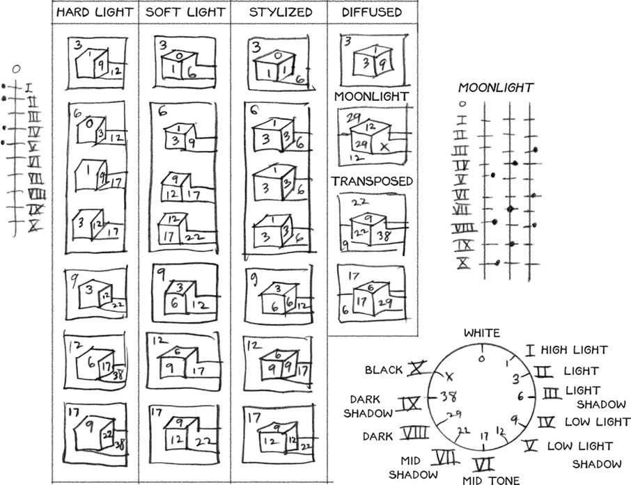
LIGHT QUALITY CREATED BY VALUE STEPS
TONE KEY TO LIGHT QUALITY CREATED BY VALUE STEPS
The key to more is less. You see more by restricting your vision. By squinting, with dark glasses, through an aperture in a haze.
The effect of a haze is created by treating the shadows as if they were black and opaque, but instead of painting them black they’re painted a tone which is lighter on the value scale. The tone then becomes the darkest tone permissible in the picture. The only way a tone can be darker is if it is out of the haze more—as in a fog. The nearest objects have the greatest contrast.
LIGHT QUALITY CREATED BY VALUE STEPS

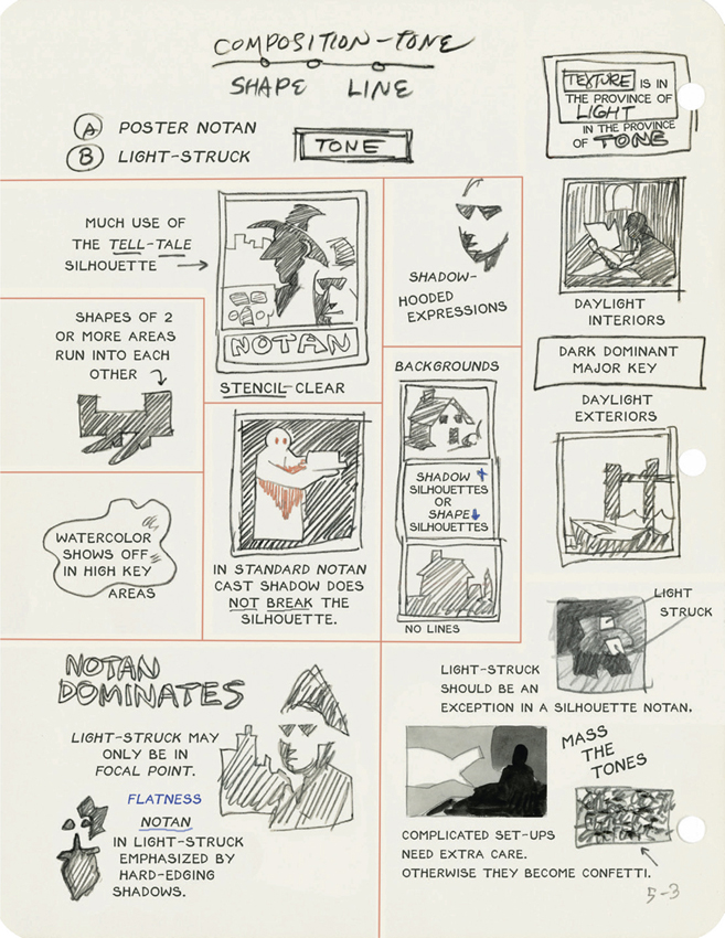
NOTAN
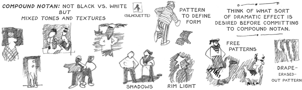
Notan refers to the design qualities of light and dark. It is concerned with their interaction. Its more complex form could be described as Compound Notan, where an overall light/dark composition is subdivided within the larger areas.
The Unique Puzzling Abstract Composition
= Compound Notan =
Aspects of the Compound Notan:
• It engages you as a visual riddle.
• Dialogue begins with a question.
• Dialogue is realized with an answer (from the viewer).
Figure/Ground versus Compound Notan vis-à-vis the Three Qualities for Beauty
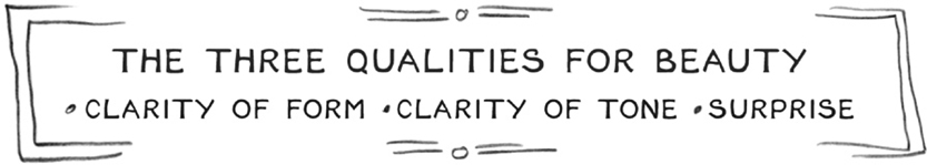
The three qualities for beauty are: clarity of form, clarity of tone and surprise.
A figure/ground composition gives very little scope for surprise. All surprise must come from some eccentricity in the figure or the ground.
In the figure it is exaggeration, treatment, stylization or caricature. This is the most primitive form of visual expression. It includes cartoon comics, cave art, Greek vases, pre-Renaissance art, primitive art, Henri Rousseau and Grandma Moses. The urge for surprise drives figure-oriented creators to manipulate the figure to the point of unrecognizability. Conventions become mannerisms.
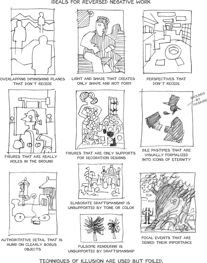
Emphasis on the ground is level-two sophistication as opposed to level-one sophistication (or non-sophistication), which is emphasis on the figure. All negative-space oriented art is in this category: graphic arts that are done in reverse, inlays such as “pietre dure” works (stone marquetry), scratch-board, friskit, resist-ink, and anything considered “reverse negative.” This is the area of strong “media-expressive” works such as Impressionism, pictures where “you must step back” to see the subject matter.
The puzzling abstraction of the compound notan automatically takes care of the “surprise” quality of beauty by its very nature.
Chiaroscuro, the arrangement of light and shade, launched puzzling abstraction. So many of the painters that have fascinated have been users of it—Rembrandt, Brueghel, the Baroque and Rococo artists, Gustav Klimt and Egon Schiele.
The Vienna Workshop (Wiener Werkstätte) and Art Deco have strong graphic treatments of it. Of the illustrators, N.C. Wyeth is the clearest user of it. Other examples are Edwin Austin Abbey, Howard Pyle, Frank Brangwyn, Dean Cornwell and many others.
The value of it is: distortion need not be used for the purpose of surprise—thus allowing beauty to be included in art. Art has no need to be ugly. It need not be brutal or crude to achieve an effect. It can be charming, elegant and sophisticated with no loss of power.
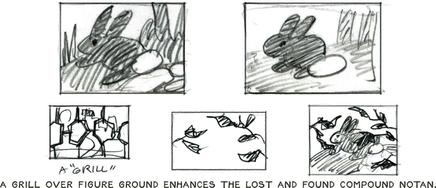
The appeal of the compound notan (besides the fact that it takes care of the artist–viewer dialogue) may be the pre-conscious “hunter’s eye.” The hunter gets a mental synapse electrical charge when he picks out the bunny in the grass or the stag in the brush. The puzzling abstraction snaps into figure/ground. This is discovery! Figure/ground understanding is mere recognition.
The added dimension of movement makes compound notan/puzzling abstraction “de rigueur” for animation.
STYLES OF NOTAN 1

STYLES OF NOTAN 2
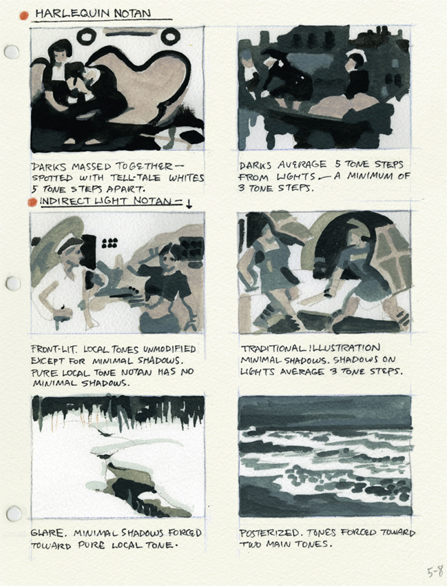
NOTAN AND LIGHTING

REVERSED NEGATIVE
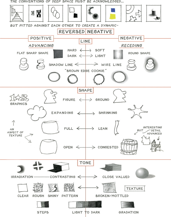
IDEALS FOR REVERSE NEGATIVE