Organizing the picture
This chapter is concerned with composing the image of your subject as a picture. It deals with recognizing and exploiting visual features of scenes and framing them up in the strongest possible way, more than technological aspects of photography.
Sometimes a photograph has to be composed in an instant, as some fast-changing action is taking place, so that exactly what you include and how it looks is changing every fraction of a second. Or your picture may be constructed quite slowly, as with a still-life shot painstakingly built up item by item. Most photography lies somewhere between these two extremes, but whatever the conditions there is always the need to make decisions on picture structuring. Basically you have to pick out from a mixture of three-dimensional elements, an image that works in two dimensions (perhaps translated into black and white too) and enclosed by corners and edges.
A successful photograph can be much more than a record. It should be able to tell you more, express or interpret more, than if you were actually there at the time viewing the subject itself. To achieve this you need to be a good organizer – being in the right place at the right time with suitable equipment, and perhaps any necessary props, models, lights, etc. You should also understand your technique – best use of perspective, lighting control, depth of field, exposure, etc. But perhaps above all you need the ability to know when all the visual elements look right and ‘hold together’ in a way that gives an outstanding visual result.
Often composition means simplifying from chaos, having a picture structure which is balanced and harmonious. Sometimes you may want the opposite, choosing imbalance and awkwardness, a kind of off-beat confusion which is the point of the picture or the way you decide to interpret the subject. Today, picture structuring is so subjective – open to individual style and original interpretation – that there are strong arguments for not having rules of composition. However, when you compare pictures that ‘work’ and are successfully structured for their content and purpose against others which are not, most of the long-established guidelines still apply. (In any case it is difficult to be a revolutionary until you know what you are revolting against.)
We tend to take the things around us for granted. There is too little time to spare. It is easy to get into a state where we no longer really look at objects, but just accept them for what they are or do. Have you really examined that table, the apple in that nearby bowl, a stone brought in from the garden? Imagine that you have just arrived from another planet and, having never experienced these items before, set out to evaluate them. Try jotting down the list of basic visual qualities you notice about the table, for example. It has its own particular shape; it may have texture, pattern, form, colour and tone values.
Every object has individuality in this way and everybody can form their own analysis, deciding which are for them the strongest visual features. There are no academic ‘rights’ and ‘wrongs’ about such an assessment. It is personal to you – an opening to express feeling as a photographer and not just blandly record everything in front of the camera.
Like most people you are probably stimulated by a change of environment – a trip abroad, or just a visit to an unfamiliar building. Here you are seeing new things, therefore making new evaluations. After a while the environment becomes commonplace, objects are accepted and grow less interesting. A young child examines (looks, bites and presses) each new material it meets, naively making an analysis – hard or soft, rough or smooth. A good photographer retains this ability always to look freshly at the visual content of subjects and situations. It provides the starting point from which to decide what features to make prominent in a successful picture; see Figure 8.1, for example.
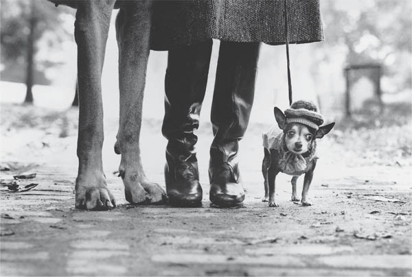
Figure 8.1 The humour in Elliott Erwitt’s visual pun is partly the subject itself, but comes mostly from his masterly use of viewpoint, which exploits shape, scale and cropping
A bold shape or outline is one of the strongest ways to identify an object or person, dramatically so in the case of a silhouette or shadow. A shape can be just a single item, or formed collectively by a mixed group of objects. In Figure 8.2 it is the shape of the hat and wearer’s face that gives this portrait its stark framework. But then again, having several strong shapes invites comparison, and may relate otherwise quite dissimilar elements, as in Figure 8.19.
One way of repeating shape is by hard, cast shadow. This can produce interesting variations, as when shadow falls on oblique or undulating surfaces. Hard sidelight may cast the shadow of one elevation of something alongside another (for example a face-on portrait with a profile shadow cast on a nearby wall). Shadow shapes also tell you about things outside your picture area, Figure 8.15.
The best way to stress shape is through your viewpoint and lighting. Use both to simplify and isolate subject outline against a contrasting, preferably plain, tone. Shallow depth of field will help you disentangle shape from background details.
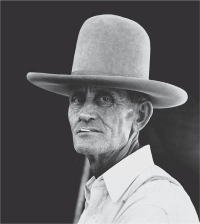
Figure 8.2 ‘An Eastern Texan’ Russell Lee’s documentary portrait, works strongly through its use of a bold, simple shape, and the subject’s direct relationship to the camera
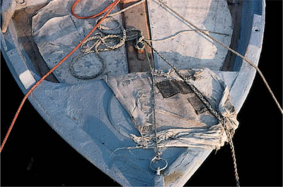
Figure 8.3 A mixture of materials, their textures emphasized by oblique, slightly diffused evening sunlight
Texture
Texture is concerned with surface – for example, the tight smooth skin of an apple, or the pitted surface of corroded metal. It can vary in scale from the rugged contours of a distant mountain range to a brick in close-up. The visual appearance of texture suggests the character of particular materials, and reminds you how they would feel to your touch. Texture can also be a symbol for the passage of time, from the bloom of youth to wrinkled old age. In fact subjects containing a rich mixture of textures are especially rewarding because of the ability to contrast or ‘play off’ one against another.

Figure 8.4 Pattern is often created by a mixture of actual forms and cast shadows, like these plants in Morocco rear-lit by sunlight. Try to use variations within a pattern, and include some core or ‘break’. Notice here how many lines are prevented from running directly out of the frame

Figure 8.5 Jack Delano’s very careful choice of viewpoint for this shot of Stonington, Connecticut, divides the frame into three bands of pattern. Flaton lighting also contributes greatly in setting the relative values of fence and sky. Instead of receding, the picture seems all on one flat plane
As both Figures 8.3 and 8.16 show, textures are best revealed by oblique lighting from the side or rear. Unless you are dealing mainly with a single surface, try to work in lighting which is not excessively contrasty, to avoid empty distracting shadows. To suppress texture use either predominantly frontal lighting, or backlight which throws the subject into total silhouette.
Pattern
The human eye seems to enjoy pattern, whether repetitive and formal, or irregular and off-beat. So by finding and exploiting a visual pattern in a scene you can create harmony, even transform something consisting of many disparate parts into a satisfying whole.
Pattern may be formed from a number of elements identical in size, shape and colour but irregular in distribution, like fallen leaves. Texture often creates pattern (although you can also find pattern on virtually textureless surfaces). Similarly multiples of shapes give pattern, perhaps varied by the effects of perspective, or contrasting colour or tone.
Look for strong, interesting patterns within the structure of a plant, or in a row of houses, a display of goods, or a group of people. Experiment with the effect of viewpoint, focal length, lighting, and the use of filters with black and white materials (page 171). There are no ground rules for lighting. Sometimes three-dimensional subjects, harshly side-lit, create a bold pattern of shadowed and lit areas. Sometimes shadow is cast all over your subject from an unseen patterned element, disguising true shapes, Figure 8.6. In other instances soft, frontal illumination is best to show detail and suppress confusing texture in what is turned into mainly two-dimensional pattern.
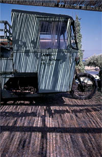
Figure 8.6 Overhead slats cast a powerful pattern over the farmer’s truck, camouflaging its shape but also suggesting the vineyard environment
Patterns are like musical rhythms which you can sometimes make dominate, or more often use as supportive ‘backing’, echoing or contrasting your main theme. In fact it is often the breaking of a pattern that gives emphasis to your chosen main subject.
Form
Form is to do with an object’s volume and solidity. It is best shown in two-dimensional photography through tone graduation (shading), although shape contributes greatly too. Forms range from the natural flowing curves of a simple vegetable like Figure 8.7 to the geometric man-made structure of a building. They include things as diverse as the human figure, the monumental form of a giant rock, or a delicate flower. Some dramatic-looking forms are transient and not really solid or physically ‘feelable’ at all. Cloud formations, waves, or the briefly held form of a wind-blown flag are all of this kind.
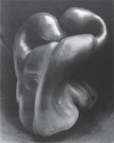
Figure 8.7 Form revealed by sympathetic lighting and richness of tone preserved in exposure, development and printing. Edward Weston took this famous photograph of a pepper softly lit by daylight
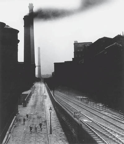
Figure 8.8 Dark, sombre, black and white tones set the low key mood of Bill Brandt’s 1930s view of Halifax. (This documentary shot is often printed as a fine-art image with the top half much darker, and road and railway highlights picked out with chemical reducer, page 258)
Learn to recognize form in objects irrespective of their actual function. A pile of old oil drums or a simple crumpled ball of paper can become as stimulating to photograph as a superbly designed car. Often this is the challenge – to make something that seems ordinary and familiar to others take on a new intensity of appearance. It is handled through your use of camera angle, perspective, lighting and the qualities of your final print.
Colour and tone values
The colours and tone values in a scene contribute greatly to emphasis and to mood. The relationship of object colours themselves, plus any predominant colour in the lighting (due to surroundings or the light source itself) can have a harmonious or discordant effect. Colours close to each other in the spectrum tend to blend, while widely separated colours contrast (Figure 9.25).
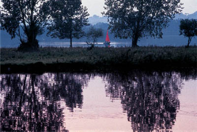
Figure 8.9 An emphasizing touch of colour in a late evening landscape of muted hues and silhouetted pattern. The foreground reflections give useful lead-in lines
Colour scheme is important too. A scene dominated by greens and blues suggests coldness and shade. Reds and yellows have the opposite association of warmth and sunlight. Notice how any element with a contrasting colour, or forming a small area of intense colour among muted hues, will appear with great prominence. Make sure that it really is intended to be important when shooting in colour, and remember it may lose this emphasis in black and white. Unwanted areas of colour can be subdued by cast shadow or shot against the light, or simply obscured by some close foreground object.

Figure 8.10 Aerial perspective. The visual impression of distance given by changing tone values is a powerful feature of this shot of Loch Shiel, Scotland, by Hunter Kennedy
Often a scene with quite subtle colour values makes a more satisfying colour photograph than a gaudy mix of strong colours, although of course this will depend on the mood you want to create. A crowded fairground or street will look busier packed out with many contrasting colours, while a romantic landscape is more likely to be given strength and unity through limited, perhaps sombre, colouring.
The range and distribution of tone values (scale of greys) contained in a scene has its own effect on mood. Large areas of dark are easily associated with strength, drama, mystery and even menace. Scenes that are predominantly light in tone suggest delicacy, space and softness. You can exaggerate tonal values in a picture, especially in black and white photography (because colours are not then distorted too). Use their influences to help set the scene constructively.
If the lighting is contrasty you have the option of showing your main subject in a small lighted area and setting exposure only for this (page 190) to give the rest of the scene a ‘low key’ effect. Or, if the subject can be in a small area of shadow and you expose solely for this instead, lit parts become bleached out, helping to give ‘high key’. Remember to choose a viewpoint or arrange the subject so that the main tone of background and foreground help along the scheme of your shot. Colour filters on black and white film can help too (Figure 9.27), by darkening chosen coloured areas, such as blue sky.
Notice how the distribution of tone values adds to your impression of depth and distance too, especially with landscape; see Figure 8.10. Atmospheric conditions often make objects look paler in both tone and colour with distance. Overlapping hill folds, trees, buildings, etc., at different distances appear like a series of cut-out shapes in different tones – an effect known as aerial perspective.
Movement
Movement is very apparent to the eye (even at the extremes of our field of vision we are highly sensitive to movements, probably for self-preservation). Fast movement makes subjects appear like streaky shapes, especially if they are close. Looking from the side of a moving vehicle, for example, close parts of the landscape whiz past while the horizon moves hardly at all. Movement seen against other movements in differing directions gives a sense of dynamic action, excitement or confusion.
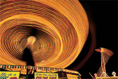
Figure 8.11 Moving fairground rides take on new dynamic forms when spread and blurred by an exposure several seconds long. Having the camera firmly supported records stationary objects sharp, to contrast the exaggerated movement and give a spectator’s eye view. Compare with Figure 8.27

Figure 8.12 Shooting at 1/8 sec has softened detail, increased apparent movement … and turned a harmless motorist into the stereotype of a road-rager

Figure 8.13 Just three boys in the park, but a picture given meaning by its multi-racial content and sense of friendship
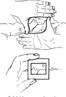
Figure 8.14 Use your hands, or a colour slide mount, to estimate how a scene will look – isolated and composed within a picture format. Position your eye the same distance from the slide mount as your camera lens’s focal length to see how much is included. Alter this distance to preview other focal lengths
In still photography, movement is highly subjective. Images on the move often record as unfamiliar forms and shapes, not as when you were watching the subject at the time. This is because the exposure onto film was much longer or shorter than the eye’s own perception of events. Results are said to be ‘time-based’. So fast movement can be frozen, like the footballer in Figure 8.26, or the relatively slow movement of a fairground wheel (Figure 8.11) seemingly speeded-up. Eye and brain read such images of movement against our experience of the relationship of blur to speed. You can similarly deceive the viewer about speed and degree of movement by panning (Figure 8.27) or zooming (Figure 5.15).
Since movement and time are so closely linked, a sequence of frozen images like frames from a movie or a comic strip also reads as action. Try making a series of closely related images which show changes only in the position of figures against the same background detail. Presented as a panel of matched prints they read as actions and movement happening over a period of time. Alternatively a whole bunch of sharp or blurred images can be superimposed within just one frame. The more numerous the overlapped images the more movement seems to be taking place. Bear in mind too that even though you shoot a picture to show frozen action it can later be digitally manipulated. The computer allows you to multi-superimpose, or add a controlled degree of blur to imply subject movement in any direction you choose; see page 280.
Content and meaning
Most of the subject features discussed so far have been concerned with narrow physical detail. Shape, texture, colour, etc., all have a combined effect on the appearance of things, to be stressed or suppressed according to their interest and importance. But remember too that they are only components in your photography’s hopefully much wider content and meaning.
Perhaps you choose to juxtaposition something expensive and luxurious against something cheap and tacky, to make a point about possessions. It could be strictly instructional ‘what and why’, showing correct actions when someone is doing a job, or using particular equipment. Or it might be some wry facial expression that reveals a relationship – say between people, or people and notices, or animals and children. These choices of content are all opportunities to express concepts and emotions such as craftsmanship, concern, bewilderment, aggression or joy.
Often meaning can be communicated by straight recording – the subject ‘speaks for itself’, like Figure 8.1. Sometimes (and this is usually more challenging for the photographer, and interesting for the final viewer) it operates through subtle use of symbols. For example, the cast shadow of a row of railings or a pile of timber can be made to look menacing, like some advancing horde. Use of ‘old against new’ can say something about ageing, irrespective of your actual subject. Visual communication, whether based on symbol, metaphor, or simply ‘gut-reaction’, is central to photography. Develop your ability firstly to notice and then select basic subject qualities which best help you to make statements – rather like choice of words.
You could go about this by picking something you feel strongly about, perhaps an environmental or social issue. Then build up a volume of work, with pictures that strengthen each other. The total can be a visual statement with powerful meaning. Look out for examples of the work of individualistic photographers such as Martin Parr, Cindy Sherman or Don McCullin, who have each pursued (very different) obsessions through the content and meaning of their pictures.
Structuring pictures through the camera
You can only go so far in looking at the subject direct. Picture composition must be done looking through the camera, because this brings in all kinds of other influences. Some are helpful, others less so.
The most obvious change is that you now have to work within a frame having distinct edges, corners and width-to-height ratio. The viewfinder or focusing screen is like a sheet of paper – you don’t have to be able to draw on to it, but you must be able to see and structure pictures within its frame and give due thought to balance and proportions of tone or colour, the use of lines, best placing of your main feature, and so on. Some viewfinder systems make composition much easier than others. A poorly designed direct-vision finder, or the upside-down picture on a view camera screen, takes more time and practice to ‘compose through’ than the viewfinding optics of a modern SLR.
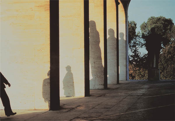
Figure 8.15 Franco Fontana’s ‘Presence-absence’ cleverly divides up the frame into strips and squares, putting some interesting shape into each. The final puzzle is to discover which are human and which are stone

Figure 8.16 Bruton Dovecot, Somerset. A picture by Fay Godwin structured through its viewpoint and side-lighting to give a strong horizontal flow and reveal textures
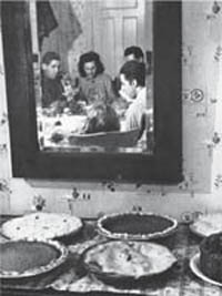
Figure 8.17 Frames within frames. Reflected in this mirror the family is grouped within one shape, placed beside the food on the sideboard like a picture in a frame. Mirrors, windows and doorways are all useful devices to relate one element to another
Using your camera as well as your eye means too that you add in all the techniques of photography, such as shallow or deep depth of field, blur, choice of focal length, etc. – hopefully to strengthen rather than detract from the points you want to make.
Proportions
Most cameras take rectangular pictures, so your first decision must be whether to shoot a vertical or a horizontal composition. Sometimes this choice is dictated by the proportions of the subject itself, or by how the result will be used (horizontal format for TV or computer screen, vertical to suit a show-card layout or magazine cover). Often, however, you have a choice.
Of the two formats, horizontal pictures tend to be easier to scan, possibly because of the relationship of our two eyes, or the familiarity of movie and monitor screen shapes. Horizontal framing seems to intensify horizontal movements and structural lines, especially when the format is long and narrow. In landscapes like Figure 8.10 it helps increase the importance of skyline, and in general gives a sense of panorama, and of stability.
Vertical pictures give more vertical ‘pull’ to their contents. There is less ground-hugging stability, and this can give a main subject a more imposing, dominant effect. Vertical lines are emphasized, probably because you tend to make comparisons between elements in the top and bottom of the frame rather than left and right, and so scan the picture vertically.

Figure 8.18 Standing stone, East Neuk. An unusual, near-symmetrical square format composition with the main subject blatantly centred, breaking a horizon which splits the frame. By Fay Godwin
Square pictures exert least influence. Each corner tends to pull away from the centre equally, giving a balanced, symmetrical effect. In fact this shape works well with formally structured symmetrical compositions such as Figure 8.18. However, many photographers find this ‘least committed’ of the three options the most difficult to work with.
You are of course not always restricted to a particular picture shape by the height to width proportions of your subject. A predominantly vertical subject can be composed within a horizontal format, sometimes by means of a ‘frame within the frame’ – showing it within a vertical area naturally formed by space between trees or buildings, or through a vertical doorway, window or mirror. It is also possible to crop any picture to different proportions during enlarging, producing either a slimmer or a squarer shape. (APS cameras have the advantage of allowing you choice of format at the time of shooting, Figure 4.23.)
Some leading photographers feel strongly against any such ‘manipulation’, even to the extent of printing a thin strip of the film rebate all round the frame to prove it remains exactly as composed in the camera. Others argue that keeping every picture to camera format proportions is monotonous and unnecessary, and that cropping during printing is no different from excluding parts of the subject from the viewfinder when shooting. Professionally, too, you may often have to produce results to proportions strictly imposed by a layout (pages 146–147).
Balance
Your combination of subject and the camera’s viewpoint and framing often divide up the picture area into distinctly different areas of tone, colour and detail. Frequently these are the shapes and proportions of objects themselves, but sometimes they are formed by the way edges of the frame ‘cut into’ things: a cropped building or person, Figure 8.15 for example, is reduced to just a part. Think of these ‘parts’ as areas or bands of tone, pattern, colour, etc., which to some extent you can alter to different proportions, move around, and make to fill large or small portions of your picture, all by change of viewpoint or angle.
The main division in a scene might be the horizon line, or some foreground vertical wall or post which crosses the picture, or even the junction of wall and floor in an interior. With a distant landscape, for example, tilting the camera will shift the horizon, and might alter your picture content from the ratio one part sky:three parts land, to the reverse. When most of your picture is filled with dark land detail there is an enclosed feeling, and the added foreground makes scale differences and therefore depth more apparent. With most of the picture area devoted to sky the impression is more open and detached.
A central horizon, dividing the picture into two halves, runs the danger of splitting it into areas of equal weight with neither predominating. Much depends on the range of shapes, colours and tones in each half. Occasionally, complete symmetry is useful as overall pattern surrounding and leading to a centralized main subject.
The best placing of divisions depends on the weight of tone, strength of colour, and pattern of detail they produce in different parts of the picture. One approach is to go for a balanced effect (Figure 8.19) where weight of tone allows the centre of the picture to ‘pivot’ like a set of scales, but without being monotonous and over-symmetrical. On the other hand, a picture intentionally structured to appear imbalanced can add tension and will stand out amongst others; see Figure 8.24.
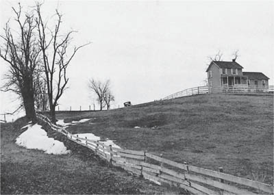
Figure 8.19 Balance. Like weights at the end of scales, the shapes and tonal values here pivot about the old car. There is a kind of equilibrium about the bleak farmstead, but also a sense of deadness. Arthur Rothstein, FSA
Line
You will improve the composition of pictures if you can use lines within your subject matter to give an appropriate structure or shape. They also help the mood you want to create.

Figure 8.20 Linear flow. Thanks to the camera’s single eye, lines can be built up within a composition from a whole chain of different objects at various distances. Fay Godwin shows this marker stone on the old Harlech road from a viewpoint which links it into crisscross stone walling spanning the Welsh hills
Lines need not be complete outlines but a whole chain of spaced or overlapping shapes – clouds, hedges, a blurred movement, a background shadow – which your camera’s single viewpoint sees as attached or linked together. In fact lines occur wherever a clear boundary occurs between tones or colours, with strongest lines where contrast is greatest. Subject lighting is therefore influential. Lines help to hold things together, give a flowing feeling to a landscape, ‘round off’ a group of still-life objects, or relate things in different parts of the frame; see Figure 8.20.

Figure 8.21 Emphasis by colour, contrasting with surrounding tones. Newspaper seller in Rome. Even the 0 and 8 formed by bits of string seem to possess surreal significance here
The general pattern of lines in a picture has an interesting influence. Well-spaced parallel lines and L shapes have the most tranquil, stable effect. Triangles, broad ovals or S shapes seem to offer more ‘flow’, encouraging you to view the picture more actively. Pictures with long, angled converging lines (formed by steep perspectives, for example) rapidly attract your eye to their point of convergence. A mass of short lines angled in all directions helps to suggest excitement, confusion and even chaos. Compare Figure 8.29 with Figure 8.4, for example.
All these reactions are probably linked to our visual experiences of life. Use them constructively. If you want a dramatic, dynamic image of a fast car, shoot it from a high or low angle, with steep perspective and bold contrasts. The same approach would be destructive for a gentle, romantic portrait, where a flowing open shape and graduated tones are much more helpful.
Emphasis
Try to ensure that everything included in the frame in some way supplements and supports (rather than dilutes or confuses) your main theme. The trouble is that photography tends to record too much, so you must be able to stress your chosen main element (or elements) relative to the rest of the picture. There are several well-proven ways of doing this. One is to choose a viewpoint which makes lines within the picture ‘lead in’ to the main subject; see Figure 8.18. You can also make your centre of interest prominent by showing it breaking the horizon or some other strong linear pattern.

Figure 8.22 Top: the so-called ‘rule of thirds’. Dividing each side of the frame by three and drawing intersecting lines forms four alternative locations for strongly placing the main subject. Bottom: the classic golden mean of ideal proportioning (for the format itself or composition of subject areas within). Starting with a square, a line drawn from the centre of one side to an opposite corner becomes the radius of an arc. This defines the base line of the final 5:8 ratio rectangle
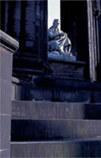

Figure 8.23 Far right: Scott memorial, Edinburgh. An example of composition making use of the rule of thirds

Figure 8.24 No composition has to comply with rules. John Batho’s ‘Couple and Blue Sky’ has a bold, lively effect because of its offbalance framing and restricted use of strong colours

Figure 8.25 Framing action. Both these prints are made from the same negative. By cropping to include most space in front of the boat (top version) the action seems to be just beginning. By reframing (bottom) to crop the front and including more wake it seems that events are nearly over
Another method of emphasis is to show your main element against a background, or framed by foreground, which strongly contrasts in tone or colour. Choice of lighting is again important, and camera techniques help to untangle subjects from surroundings too. Use shallow depth of field if things are at different distances; if one is moving relative to the other try panning.
There is a guide to the strongest positioning of your main subject within the frame, known as the rule of thirds (see Figure 8.22). This places an imaginary grid over the picture area, creating four off-centre intersections which tend to be strong locations. (A similar guide, much used in classical architecture and painting and called the golden mean, uses ratios of 5:8 instead of 1:2.)
Always remember such a guide but, like working only with a normalangle lens, don’t let it restrict and cramp your style. Sometimes the formality, or the tension, of your image will be better served if the main element is placed centrally, or against one edge. A shot can also be given two points of emphasis, and you can attract attention by placing them at opposite extremes of the frame so that the viewer scans from one to the other, making comparisons, conscious of distance and space.
Framing movement
You can alter your impression of active subjects by picture composition and choice of moment. Think of the frame as a stage. If the action is across the frame and you show the main subject at one side facing inwards the activity seems just to have started. But if it faces outwards with all the space behind, the same subject seems to have travelled the distance, done the action.
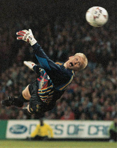
Figure 8.26 Ady Kerry’s split-second timing and framing captures Peter Schmeichel a moment after heading the ball. Using a 180mm lens on a 35mm SLR it was shot at 1/500 sec f/2.8 on ISO 1600 film, push one stop (see page 212). The resulting grainy quality seems to add atmosphere to subjects of this kind
You can make movement appear more dynamic and aggressive by composing it diagonally across the frame, angling vertical and horizontal subject lines, and if possible converging them too. Remember that even when no strong lines are present, a slow exposure (page 57), plus zooming and panning if necessary, will draw out highlights into powerful blur lines. Digital manipulation allows you similar effects after shooting.
The moment chosen to photograph moving objects and rapid-changing situations can make or break a picture. Fast reaction may allow you to select and capture one brief decisive moment, summing up a whole event or situation. This could be a momentary expression, a key action (like breaking the winning tape in a race) or just two elements briefly included in the same frame and signifying something by their juxtaposition. Shooting at four frames per second would seemingly cover every eventuality. But the vital moment can still fall between frames. There is no substitute for split-second manual timing.
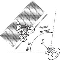

Figure 8.27 Panning a moving subject. The cyclist, right, had 1/15 sec exposure while the camera was smoothly panned sideways as shown above. Start the pan early to achieve a swing of the right speed when the shutter is released (S) and then follow through. Notice how in the foreground and background vertical details disappear and horizontal highlights spread into lines. The picture gives an impression of moving with the cyclist. In bright light, shoot with slow film and stop down fully; you may also need a neutral density filter to avoid overexposure at this slow shutter setting
If you are producing pictures purely for yourself, or for a portfolio or exhibition with a completely open brief, there may be no-one else’s requirements to take into consideration. But if you are a professional photographer given a commercial assignment, it is vital to adapt your freedom of approach to the needs of the job.
Commercial photography in its broadest sense (advertising, documentary, architectural, even medical) is problem-solving. The problem may be mostly technical – how to get a detailed informative picture under difficult conditions. Or it might be much more subjective, perhaps concerned with creating atmosphere and mood.
Start off with a clear, accurate idea of all aspects of the problem via a briefing with the client, designer or editor. What is the subject, the purpose of the picture and its intended audience? You also need to know practical details such as final proportions and size, how it will be physically shown or reproduced, and what will appear around it.
Scaling down or up
If your picture is to fill a space with fixed height-to-width proportions it will be a great help to mark up the camera focusing screen accordingly, and compose within this shape. As Figure 8.28 shows, by drawing a frame with the necessary proportions on paper and adding a diagonal you can scale it down to fit within any camera format. This is where it helps to have a camera allowing easy access to the focusing screen (such as view cameras, medium format SLRs or 35 mm models with removable pentaprism).
Use a thin black grease pencil to trace the new outline accurately on to the viewing side of your screen. In the same way you can mark out the precise areas where type matter or other images must finally appear within the completed illustration.
Preplanned proportions are not practical with candid or press photography. Here they tend to follow on from picture contents rather than lead them. However, the art editor will thank you if you can cover the same subject in both vertical and horizontal formats. Ideally too, avoid tight framing, and leave sufficient content around the edges to allow cropping to slightly different proportions according to layout. (Of course you are then in the hands of the editor, who can destroy your composition – some photographers purposely make uncroppable pictures to avoid this situation!)
Size
The smaller your final picture the simpler its image should be. If it is to be reproduced little larger than a postage stamp (or on coarse paper) aim for a bold, uncluttered composition, perhaps with a plain and contrasting background. The larger the reproduction and the better the paper, the more detail and tone graduation will be preserved. If you know that your final result will be displayed as a big photo-enlargement, for example, it is probably worth changing to a larger-format camera, or at least finer-grain film.
Take special care over limitations of size if you work with a digital image – whether it is shot by digital camera or scanned from film; see pages 99 and 270.
Managing the job
Having established the needs of the job – its ‘open’ aspects as well as specified layout, content and approach – you can get down to planning. If you are working in the studio, what are the most appropriate accessories to include? Will some form of set need building or hiring? If it will be a location job the right place has to be found, and hired if necessary. Models must be short-listed through an agency, interviewed and chosen.
Lighting has to be thought out too. If you have to rely on natural light, consult weather forecasts for your location. Existing artificial light needs checking for its technical suitability. Tungsten or flash lighting units, and special equipment such as a wind machine, smoke machine or portable generator, may have to be hired. If you are shooting on film choose the most appropriate stock – colour or black and white, negative or slide, plus instant picture material; see Chapter 9.

Figure 8.28 Scaling. Transferring picture proportions from a (larger) drawn layout to your camera focusing screen. 1 and 2: The page designer’s specified picture shape is traced and a diagonal added. 3: Aligning this tracing with the bottom left corner of the camera’s focusing screen, the diagonal now shows you the position for the top right corner of the format. 4: A wax pencil line drawn at this point gives you the scaled-down format needed
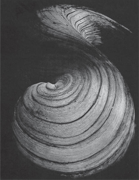
Figure 8.29 The eye seems to enjoy the sensuous pleasure of curved lines in pictures. The pattern in this weeping willow root flows around smoothly, bringing you back to where you began. By Jean Dieuzaide
On the day, and with all necessary items brought together, you can put flesh on what has until now been the bare bones of a picture. Which are the subject’s best features to exploit? What is distracting or irrelevant, and needs playing down or eliminating? Working through the camera, frame up the shot, checking proportions and balance. Is picture structure overpowering content? The main subject may require greater emphasis, through lighting, framing, relationship to other elements. Perhaps a different lens or change of viewpoint is the answer.
As shooting proceeds, instant pictures are taken to check that equipment is working properly, and to provide a quick print-out to compare against sketched layout. Later one roll or sheet of film typical of the shot will be test processed, then the remainder put through giving any modifications suggested by those first results. Of course, if you are working with a digital camera, making checks of this kind take far less time (page 105).
Summary. Organizing the picture
• |
Picture-building starts with recognizing the basic visual qualities of your subject and needs of your picture, then emphasizing or suppressing, and composing the resulting image in the strongest possible way. |
• |
Look out for subject qualities such as shape (identification, framework), texture (feel and character of surface), pattern (harmony, rhythm), form (volume and solidity), colour and tone (mood, emphasis), and movement (time-based action). |
• |
Subject appearance must carry through your picture’s meaning and purpose. This brings in factors such as expressions and relationships, and the way we read things into objects and situations. |
• |
Using a camera means working within a frame. Consider picture shape and proportions, balance of tone and colour, the use of lines to give structure and emphasis, and the positioning of your main subject. |
• |
Seize every opportunity for a strong structural composition, even though you have to think and shoot fast. After a while composition becomes almost a reflex – but don’t lapse into stereotyped pictures. |
• |
Most professional photography is visual problem-solving. You need to (1) understand the purpose of the picture, (2) evaluate subject qualities in the light of this purpose, (3) compose the subject into a meaningful, satisfying image within the frame, (4) choose the right technical controls to carry through the idea, and (5) organize all aspects of the shooting session in a professional manner. |
1 |
Choosing an appropriate subject in each case, produce four photographs. One must communicate texture, one shape, one form and one colour – excluding the other visual qualities as far as possible. |
2 |
Shafts of light – created by sunlight through leaves, slatted windows, half-open doors, etc. – have inspired work by photographers and artists. Look at some examples and produce photographs based on your own observations of interiors (naturally or artificially lit). |
3 |
Photograph a mousetrap twice, each picture meeting one of the following briefings: (a) An objective illustration in a catalogue distributed to hardware shops. Final size reproduction 36 × 54 mm, horizontal format. (b) A poster advertising the play The Mousetrap (the picture should simply and dramatically draw attention to the title, and that the play is a thriller). Final poster A2 size, vertical format. |
4 |
Produce four pictures which portray one of the following concepts: power, space, growth, action. |
5 |
Take several pictures with the main element (or elements) composed close to the sides or corners of the frame. Make this unusual positioning contribute positively to meaning in your results. |
6 |
Looking through books of photographs, find examples of pictures structured mostly through the considered use of (1) lead-in lines, (2) divisions or compartments within the frame, (3) patterns or textures, (4) high key, (5) low key, and (6) shape. |