
3. Tip Calculator App
Objectives
In this chapter you’ll:
 Change the default GUI theme.
Customize the GUI theme’s colors.
Design a GUI using a GridLayout.
Use the IDE’s Component Tree window to add views to a GridLayout.
Use TextViews, an EditText and a SeekBar.
Use Java object-oriented programming capabilities, including classes, objects, interfaces, anonymous inner classes and inheritance to add functionality to an app.
Programmatically change the text in a TextView.
Use event handling to respond to user interactions with an EditText and a SeekBar.
Specify that the keypad should display by default when the app executes.
Specify that the app supports only portrait orientation.
3.2 Test-Driving the Tip Calculator App
3.3.2 Activity Lifecycle Methods
3.3.3 AppCompat Library and Class AppCompatActivity
3.3.4 Arranging Views with a GridLayout
3.3.6 Formatting Numbers as Locale-Specific Currency and Percentage Strings
3.3.7 Implementing Interface TextWatcher for Handling EditText Text Changes
3.3.8 Implementing Interface OnSeekBarChangeListener for Handling SeekBar Thumb Position Changes
3.3.10 Material Design: Elevation and Shadows
3.3.11 Material Design: Colors
3.3.13 Searching in the Properties Window
3.4.2 Creating the TipCalculator Project
3.4.3 Changing to a GridLayout
3.4.4 Adding the TextViews, EditText and SeekBar
3.5 Default Theme and Customizing Theme Colors
3.5.2 Customizing Theme Colors
3.5.3 Common View Property Values as Styles
3.6.1 package and import Statements
3.6.2 MainActivity Subclass of AppCompatActivity
3.6.3 Class Variables and Instance Variables
3.6.4 Overriding Activity Method onCreate
3.6.5 MainActivity Method calculate
3.6.6 Anonymous Inner Class That Implements Interface OnSeekBarChangeListener
3.6.7 Anonymous Inner Class That Implements Interface TextWatcher
Self-Review Exercises | Answers to Self-Review Exercises | Exercises
3.1 Introduction
The Tip Calculator app (Fig. 3.1(a)) calculates and displays the tip and total for a restaurant bill amount. As you touch the numeric keypad to enter the bill amount’s digits, the app calculates and displays the tip and total bill amounts for the current tip percentage (15% by default). You specify a tip percentage from 0% to 30% by moving the SeekBar thumb—this updates the displayed tip percentage and recalculates the tip and total. All numeric values are displayed using locale-specific formatting. Figure 3.1(b) shows the app after the user enters the amount 56.32 and changes the tip percentage to 25%.
You’ll begin by test-driving the app. Then we’ll overview the technologies you’ll use to create the app. You’ll build the app’s GUI using Android Studio’s layout editor and the Component Tree window. Finally, we’ll present the complete Java code for the app and do a detailed code walkthrough.
Note Regarding the Keyboard in Our Screen Captures
The keypad in Fig. 3.1 may differ, based on your AVD’s or device’s Android version or whether you’ve installed and selected a custom keyboard on your device. We configured our AVD to display the dark keyboard for better contrast in our screen captures. To do so:

1. Touch the home ( ) icon on your AVD or device.
2. On the home screen, touch the launcher ( ) icon, then open the Settings app.
3. In the Personal section, touch Language and Input.
4. On an AVD, touch Android Keyboard (AOSP). On a device touch Google Keyboard—we assume you’re using the standard Android keyboard.
5. Touch Appearance & layouts, then touch Theme.
6. Touch Material Dark to change to the keyboard with the dark background.
3.2 Test-Driving the Tip Calculator App
Opening and Running the App
Perform the steps in Sections 1.9.1 and 1.9.3 to open the Tip Calculator app project in Android Studio and run the app on the Nexus 6 AVD. If you prefer, perform the steps in Section 1.9.4 to run the app on an Android phone.
Entering a Bill Total
Enter the bill total 56.32 by touching numbers on the numeric keypad. If you make a mistake, press the keypad’s delete button ( ) to erase the last digit you entered. Even though the keypad contains a decimal point, the app is configured so that you may enter only the digits 0 through 9—other input buttons on the keypad are ignored and an Android device will vibrate to indicate when you touch an invalid input button. Each time you touch a digit or delete a digit, the app reads what you’ve entered so far, and
• converts it to a number
• divides the number by 100.0 and displays the new bill amount
• recalculates the tip and total amounts, based on the current tip percentage (15% by default) and
• displays in the Tip and Total TextViews the new tip and total amounts.
If you delete all the digits, the app redisplays Enter Amount in the blue TextView and displays 0.00 in the orange TextViews. The app divides the value by 100.0 and displays the result in the blue TextView. The app then calculates and updates the tip and total amounts in the orange TextViews.
All monetary amounts are displayed in locale-specific currency formats and the tip percentage is displayed in a locale-specific percentage format. For the U.S. locale, as you enter the four digits 5, 6, 3 and 2, the bill total is displayed successively as $0.05, $0.56, $5.63 and $56.32, respectively.
Selecting a Tip Percentage
Use the Seekbar—often called a slider in other GUI technologies—to specify the tip percentage. Drag the Seekbar’s thumb until the percentage reads 25% (Fig. 3.1(b)). As you drag the thumb, the tip and total update continuously. By default, the Seekbar allows you to select values from 0 to 100, but we specified a maximum value of 30 for this app.
3.3 Technologies Overview
This section introduces the IDE and Android features you’ll use to build the Tip Calculator app. We assume that you’re already familiar with Java object-oriented programming—if not, we present Java in the book’s appendices. You’ll
• use various Android classes to create objects
• call methods on classes and objects
• define and call your own methods
• use inheritance to create a class that defines the Tip Calculator’s functionality and
• use event handling, anonymous inner classes and interfaces to process the user’s GUI interactions.
3.3.1 Class Activity
Android apps have four types of executable components—activities, services, content providers and broadcast receivers. In this chapter, we’ll discuss activities, which are defined as subclasses of Activity (package android.app). An app can have many activities, one of which is the first you see after launching the app. You interact with an Activity through views—GUI components that inherit from class View (package android.view).
Before Android 3.0, a separate Activity was typically associated with each screen of an app. As you’ll see, starting in Chapter 4, an Activity can manage multiple Fragments. On a phone, each Fragment typically occupies the entire screen and the Activity switches between the Fragments, based on user interactions. On a tablet, activities typically display multiple Fragments per screen to take advantage of the larger screen size.
3.3.2 Activity Lifecycle Methods
Throughout its life, an Activity can be in one of several states—active (i.e., running), paused or stopped. The Activity transitions between these states in response to various events:
• An active Activity is visible on the screen and “has the focus”—that is, it’s in the foreground. You can interact with the Activity currently in the foreground.
• A paused Activity is visible on the screen but does not have the focus—such as when an alert dialog is displayed. You cannot interact with the paused activity until it becomes active—for example, after the user dismisses an alert dialog.
• A stopped activity is not visible on the screen—it’s in the background and is likely to be killed by the system when its memory is needed. An Activity is stopped when another Activity enters the foreground and becomes active. For example, when you answer a phone call, the phone app becomes active and the app you previously were using is stopped.
As an Activity transitions among these states, the Android runtime calls various Activity lifecycle methods—all of which are defined by the Activity class in package android.app. You’ll override the onCreate method in every activity. This method is called by the Android runtime when an Activity is starting—that is, when its GUI is about to be displayed so you can interact with the Activity. Other lifecycle methods include onStart, onPause, onRestart, onResume, onStop and onDestroy. We’ll discuss most of these in later chapters. Each activity lifecycle method you override must call the superclass’s version; otherwise, an exception will occur. This is required because each lifecycle method in superclass Activity contains code that must execute in addition to the code you define in your overridden lifecycle methods. For more on the Activity lifecycle see
3.3.3 AppCompat Library and Class AppCompatActivity
A big challenge developers face when using new Android features is backward compatibility with earlier Android platforms. Google now introduces many new Android features via the Android Support Library—a set of libraries that enable you to use newer Android features in apps targeting current and past Android platforms.
One such library is the AppCompat library, which enables apps to provide an app bar (formerly called an action bar) and more on devices running Android 2.1 (API 7) and higher—app bars were originally introduced in Android 3.0 (API 11). Android Studio’s app templates have been updated to use the AppCompat library, enabling the new apps you create to run on almost all Android devices.
Android Studio’s Empty Activity app template defines the app’s MainActivity class as a subclass of AppCompatActivity (package android.support.v7.app)—an indirect subclass of Activity that supports using newer Android features in apps running on current and older Android platforms.
 Software Engineering Observation 3.1
By creating apps with the AppCompat library from the start, you avoid having to reimplement your code if you decide to support older Android versions to target a wider potential audience for your app.
Software Engineering Observation 3.2
Some Android features are not available in earlier Android versions, even if you use the AppCompat libraries. For example, Android’s printing capabilities are available only in Android 4.4 and higher. If you use such features in your app, you must either restrict the app to the supported platforms or disable those features on Android versions that do not support them.
For more details on Android Support Libraries, including when to use them and how to set them up, visit:
3.3.4 Arranging Views with a GridLayout
Recall that you arrange a GUI’s views in layouts. We’ll use a GridLayout (package android.widget) to arrange views into cells in a rectangular grid. Cells can occupy multiple rows and columns, allowing for complex layouts. Normally, GridLayout requires API level 14 or higher. However, the Android Support Library provides alternate versions of GridLayout and many other views and layouts so that you can use them in older Android versions. For more information on this library and how to use it in your apps, visit
We’ll cover more layouts and views in later chapters—for a complete list, visit
3.3.5 Creating and Customizing the GUI with the Layout Editor and the Component Tree and Properties Windows
You’ll create TextViews, an EditText and a SeekBar using the layout editor (that you used in Chapter 2) and Component Tree window, then customize them with the IDE’s Properties window.
An EditText—often called a text box or text field in other GUI technologies—is a subclass of TextView (presented in Chapter 2) that can display text and accept text input from the user. You’ll specify an EditText for numeric input, allow users to enter only digits and restrict the maximum number of digits that can be entered.
A SeekBar represents an integer in the range 0–100 by default and allows the user to select a number in that range by moving the SeekBar’s thumb. You’ll customize the SeekBar so the user can choose a tip percentage from the more limited range 0 to 30.
3.3.6 Formatting Numbers as Locale-Specific Currency and Percentage Strings
You’ll use class NumberFormat (package java.text) to create locale-specific currency and percentage strings—an important part of internationalizing your apps. You also can add accessibility strings and internationalize the app’s other text using the techniques you learned in Sections 2.7–2.8.
3.3.7 Implementing Interface TextWatcher for Handling EditText Text Changes
To respond to events when the user changes the text in this app’s EditText, you’ll use an anonymous inner class to implement the TextWatcher interface (from package android.text). In particular, you’ll use method onTextChanged to display the currency-formatted bill amount and to calculate the tip and total as the user enters each digit. If you’re not familiar with anonymous inner classes, visit
3.3.8 Implementing Interface OnSeekBarChangeListener for Handling SeekBar Thumb Position Changes
You’ll use another anonymous inner class to implement the SeekBar.OnSeekBarChangeListener interface (from package android.widget) to respond to the user moving the SeekBar’s thumb. In particular, you’ll use method onProgressChanged to display the selected tip percentage and to calculate the tip and total as the user moves the SeekBar’s thumb.
3.3.9 Material Themes
A theme gives an app a look-and-feel that’s consistent with Android. Projects that you create for Android 5 and higher use themes that adhere to Google’s material design guidelines. There are several predefined material design themes:
• The “light” theme has a white app bar, a white app background and text that is black or shades of dark gray.
• The “light” theme with a dark app bar is the same as above, but the app bar is black with white text by default.
• The “dark” has a black app bar, a dark gray app background and text that is white or shades of light gray.
For each of these themes, there is
• a Theme.Material version (e.g., Theme.Material.Light) for apps that do not use any AppCompat libraries and run on Android 5 and higher, and
• a Theme.AppCompat version (e.g., Theme.AppCompat.Light) for apps that use AppCompat libraries and run on Android 2.1 and higher.
When designing a GUI, you can choose from the predefined themes, or even create your own new ones. For this chapter, we’ll use Theme.AppCompat.Light.DarkActionBar, which is the default theme in Android Studio’s app templates. Apps that use the AppCompat libraries must use one of the AppCompat themes; otherwise, some views will not render correctly. For more information about each theme and to see sample screen captures, visit

Many of today’s Android phones use AMOLED displays. On such displays, a black pixel is turned off and does not consume power. Apps that use mostly black themes can reduce power consumption by approximately 40% (http://bit.ly/AndroidAMOLEDDisplay).
3.3.10 Material Design: Elevation and Shadows
Google’s material design guidelines recommend that objects in your user interfaces cast shadows just as real-world objects do. When you set a view’s elevation property, Android automatically casts a shadow for that view. Larger elevation values result in more pronounced shadows. For this app, we’ll set the elevation of the blue and orange TextViews that display monetary amounts.
The material design guidelines contain elevation recommendations for various onscreen components—for example, a dialog’s recommended elevation is 24dp and a menu’s is 8dp. For other recommended elevations, see:
3.3.11 Material Design: Colors
App developers often customize a theme’s colors to match a company’s branding. If you need to customize theme colors, Google’s material design guidelines for color1 recommend that you choose a color palette consisting of a primary color—with no more than three hues (shades)—and an accent color. The primary colors typically are used to color the status bar and the app bar at the top of the screen and also can be used in your GUI. The accent color is used to tint various views in your GUI, such as SeekBars, CheckBoxes and RadioButtons. Once you choose a palette, you can use Android Studio’s Theme Editor (Section 3.5.2) to modify a theme’s colors.
1. http://www.google.com/design/spec/style/color.html.
You can find recommended sample color swatches from the material design color palette at
For palette color recommendations, visit
This site enables you to click two colors from Google’s material design color palette, then it recommends three shades of the primary color, one secondary color and colors for your app’s text and icons.
In this app, we’ll use color swatches displayed in the Android Studio Theme Editor to select
• a blue primary color for app bar’s background color
• a darker blue dark primary color for the status bar that appears above the app bar, and
• an orange accent color used to tint the SeekBar.
For the amount TextView’s light blue color and the tip and total TextViews’ light orange color, we used Google’s material design color palette to choose lighter shades of the primary and accent colors.
3.3.12 AndroidManifest.xml
The AndroidManifest.xml file is created by the IDE when you create a new app project. This file contains many of the settings that you specify in the Create New Project dialog—the app’s name, package name and Activity name(s) and more. You’ll edit this file’s XML to add a new setting that forces the soft keyboard to be displayed when the app begins executing. You’ll also specify that the app supports only portrait orientation—that is, the device’s longer dimension is vertical.
3.3.13 Searching in the Properties Window
The Properties window allows you to search for properties by their names or portions of their names, which can help you find and set properties faster. To do so, click the Properties window’s title bar and begin typing. At the top of the property list, a Search for tooltip appears showing what you’ve typed so far, and Android Studio highlights parts of every property name in the list that matches all or part of what you’ve typed. Then you can scroll through the list looking at the property names containing highlights.
The window will also scroll to the specific property that best matches what you type. For example, when searching a TextView’s properties, if you type "text co" or "textco", the Properties window will highlight portions of many properties, but it specifically scrolls to and highlights the textColor property.
3.4 Building the GUI
In this section, we’ll show the precise steps for building the Tip Calculator’s GUI, including how to customize the Material theme’s primary and accent colors.
3.4.1 GridLayout Introduction
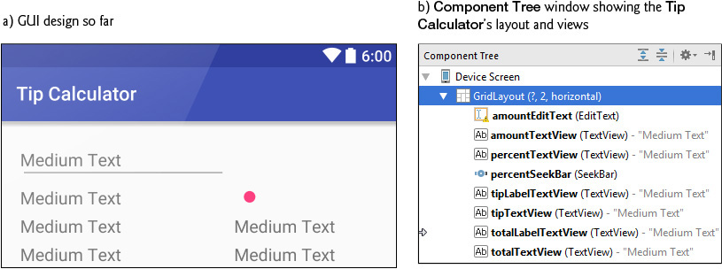
This app uses a GridLayout (package android.widget) to arrange views into four rows and two columns, each indexed from 0 like the elements in an array. You can specify a GridLayout’s number of rows and columns in the Properties window. Each cell can be empty or can hold one or more views, including layouts containing other views. A row’s height is determined by the row’s tallest view. Similarly, a column’s width is defined by the column’s widest view. Figure 3.2 shows the Tip Calculator’s GridLayout labeled by its rows and columns—we drew horizontal lines to delineate the rows and a vertical line to delineate the columns. Views can span multiple rows and/or columns—for example, the Enter Amount TextView in Fig. 3.2 spans both columns in row 0.
When you drag a view onto a GridLayout in the Component Tree, the view occupies the next available grid cell—cells populate the GridLayout left-to-right until a given row is full, then the next view appears in the first column of the next row. As you’ll see, you also can specify the exact row and column in which to place a view. We’ll discuss other GridLayout features as we present the GUI-building steps.

id Property Values for This App’s Views
Figure 3.3 shows the views’ id property values. For clarity, our naming convention is to use the view’s class name in the id property and the corresponding Java variable name. In the first row, there are actually two components in the same grid cell—the amountTextView (which initially displays Enter Amount) hides the amountEditText that receives the user input. As you’ll soon see, we restrict the user’s input to whole-number values entered as integer digits, so the user enters the bill amount $34.56 as 3456. This ensures the user cannot enter invalid input. However, this amount should be displayed as currency. As the user enters each digit, we divide the amount by 100.0 and display in the amountTextView the locale-specific, currency-formatted amount.

3.4.2 Creating the TipCalculator Project
Follow the steps in Section 2.3 to create a new project using the Empty Activity template. Specify the following values in the Create New Project dialog’s New Project step:
• Application name: Tip Calculator
• Company Domain: deitel.com (or specify your own domain name)
For the remaining steps in the Create New Project dialog, use the same settings as in Section 2.3. Also, follow the steps in Section 2.5.2 to add an app icon to your project.
Once the project is open in Android Studio, in the layout editor, select Nexus 6 from the virtual-device drop-down list (Fig. 2.11). Once again, we’ll use this device as the basis for our design. Also, delete the Hello world! TextView.
3.4.3 Changing to a GridLayout
Recall that the default layout for an Empty Activity is a RelativeLayout. Here, you’ll change that to a GridLayout:
1. Click the Text tab at the bottom of the layout editor to switch from the Design view to the layout’s XML text.
2. At the top of the XML, change RelativeLayout to GridLayout.
3. Switch back to the layout editor’s Design tab.
Specifying Two Columns and Default Margins for the GridLayout
Recall that the GUI in Fig. 3.2 consists of two columns. To specify this, select GridLayout in the Component Tree window, then change its columnCount property to 2—this property appears near the top of the Properties window with the other layout properties. You do not need to set the rowCount—it will be increased as we build the GUI.
By default, there are no margins—spacing that separates views—around a GridLayout’s cells. The material design guidelines recommend 8dp minimum spacing between views:
GridLayout can enforce this recommended spacing. With the GridLayout selected in the Component Tree, in the Properties window, check the GridLayout’s useDefaultMargins property (which sets it to true) to use the recommended margins around the layout’s cells.
3.4.4 Adding the TextViews, EditText and SeekBar
You’ll now build the GUI in Fig. 3.2. You’ll start with the basic layout and views in this section. In Section 3.4.5, you’ll customize the views’ properties to complete the design. Then, in Section 3.5, you’ll change the default theme and customize two of its colors. As you add each view to the GUI, immediately set its id property using the names in Fig. 3.3. You’ll add views to the GridLayout using the Component Tree window. If you drop a view in the wrong location in the Component Tree, you can drag it to the correct location.
You may also drag views directly onto the layout editor. For a GridLayout, the layout editor displays a grid of green guidelines to help you position the view. As you drag a view over the grid, the layout editor displays a tooltip indicating the row and column in which the view will be placed if you drop the view at that location.

The cells in the layout editor’s grid of green guidelines are small. If you drop a view in the wrong location, the layout editor might change the GridLayout’s rowCount and columnCount property values and incorrectly set the view’s layout:row and layout:column property values, causing your GUI to lay out incorrectly. If so, reset the GridLayout’s rowCount and columnCount, based on your design, and change the view’s layout:row and layout:column property values to the correct row and column for your design.
Step 1: Adding Views to the First Row
The first row consists of the amountTextView and the amountEditText—both occupy the same cell and span two columns. Each time you drop a view onto the GridLayout in the Component Tree window, the view is placed in the layout’s next open cell, unless you specify otherwise by setting the view’s layout:row and layout:column properties. You’ll do that in this step so that the amountEditText and amountTextView appear in the same cell with the amountTextView in the foreground.
This app’s TextViews use the medium-sized font from the app’s theme. The layout editor’s Palette provides preconfigured TextViews named Plain Text, Large Text, Medium Text and Small Text (in the Widgets section) for various text sizes. The Plain Text TextView uses the theme’s default font size. For the others, the IDE configures the TextView’s textAppearance property using the Material theme’s styles for the corresponding font sizes.
Perform the following steps to add to the GridLayout an EditText and a TextView for receiving and displaying the bill amount:
1. This app allows you to enter only nonnegative integers, which the app divides by 100.0 to display the bill amount. The Palette’s Text Fields section provides preconfigured EditTexts for various forms of input, including person names, passwords, e-mail addresses, phone numbers, times, dates and numbers. When the user interacts with an EditText, an appropriate keyboard is displayed, based on the EditText’s input type. From the Palette’s Text Fields section, drag and drop a Number EditText onto the GridLayout node in the Component Tree window—this creates an EditText with the id editText in the GridLayout. Change the id to amountEditText. The EditText is placed in the first column of the GridLayout’s first row. Set the EditText’s layout:column to 0 and the layout:columnSpan to 2—these settings ensure that the TextView spans both columns of row 0.
2. Drag a Medium Text TextView from the Palette’s Widgets section over the amountEditText in the Component Tree window—a horizontal black line appears below amountEditText, indicating that the TextView will be placed after amountEditText. The IDE creates a new TextView named textView and nests it in the GridLayout node. The default text "Medium Text" appears in the layout editor. You’ll change this in Step 5 (Section 3.4.5). Change the TextView’s id to amountTextView, then set the layout:row to 0, the layout:column to 0 and the layout:columnSpan to 2—these settings ensure that the TextView spans both columns of row 0, as you’ll see once we change the TextView’s background color.
Step 2: Adding Views to the Second Row
Next, add the percentTextView and percentSeekBar to the GridLayout for displaying and selecting the tip percentage (be sure to set each view’s id to the name we specify):
1. Drag a Medium TextView (percentTextView) from the Palette’s Widgets section over the amountTextView in the GridLayout node in the Component Tree window. The new view becomes the first view in row 1 (the second row).
2. Drag a SeekBar (percentSeekBar) from the Palette’s Widgets section over the percentTextView in the GridLayout node in the Component Tree window. The new view becomes the second view in row 1.
Step 3: Adding Views to the Third Row
Next, add the tipLabelTextView and the tipTextView to the GridLayout for displaying the tip amount:
1. Drag a Medium TextView (tipLabelTextView) over the percentSeekBar in the GridLayout node. The new view becomes the first view in row 2 (the third row).
2. Drag a Medium TextView (tipTextView) over the tipLabelTextView in the GridLayout node. The new view becomes the second view in row 2.
Step 4: Adding Views to the Fourth Row
Next, add the totalLabelTextView and the totalTextView to the GridLayout for displaying the tip amount:
1. Drag a Medium TextView (totalLabelTextView) over the tipTextView in the GridLayout node. This becomes the first view in row 3 (the fourth row).
2. Drag a Medium TextView (totalTextView) over the totalLabelTextView in the GridLayout node. This becomes the second view in row 3.
Reviewing the Layout So Far
The GUI and Component Tree window should now appear as shown in Fig. 3.4. The warning symbols shown in the layout editor and the Component Tree window will go away as you complete the GUI design in Section 3.4.5.
A Note Regarding the EditText’s Virtual Keyboard
When the virtual keyboard is displayed, the device’s back button ( ) changes to a down button (
 ) that enables you to dismiss the keyboard. If you do so, the down button () changes to a back button () that you can touch to return to the previous
 Activity—possibly a prior app or the device’s home screen.
Normally, you’d touch the EditText to redisplay the virtual keyboard. In this app, however, the EditText is hidden behind a TextView. If you were to dismiss this app’s keyboard, you’d have to leave the app and return to it to redisplay the keyboard. We could programmatically force the keyboard to stay on the screen, but this would prevent the back button from ever being displayed in this app. This, in turn, would prevent you from returning to the previous Activity—a basic Android feature that every user expects.
We used an Android virtual keyboard to demonstrate how to choose the keyboard displayed for a given EditText. Another approach would be to provide Buttons representing the digits 0–9 that always remain on the screen. We could handle their click events and use String manipulation rather than an EditText to keep track of the user input.
3.4.5 Customizing the Views
You’ll now customize additional view properties. As you did in Section 2.5, you’ll also create several String, dimension and color resources.
Step 5: Specifying Literal Text
Next, you’ll specify the literal text for the amountTextView, percentTextView, tipLabelTextView and totalLabelTextView. When a TextView’s text property is empty, its hint property’s value (if you specify one) is displayed—this property is commonly used with an EditText (a subclass of TextView) to help the user understand the EditText’s purpose. We’re using it similarly in the amountTextView to tell the user to enter a bill amount:
1. In the Component Tree, select amountTextView and locate its hint property in the Properties window.
2. Click the ellipsis (...) button to the right of the property’s value to display the Resources dialog.
3. In the dialog, click New Resource, then select New String Value... to display the New String Value Resource dialog and set the Resource name to enter_amount and Resource value to "Enter Amount". Leave the other settings and click OK to create the new String resource and set it as amountTextView’s hint.
Repeat these steps to set the text property for the percentTextView, tipLabelTextView and totalLabelTextView using the values shown in Fig. 3.5.

Step 6: Right Aligning the TextViews in the Left Column
In Fig. 3.2, the percentTextView, tipLabelTextView and totalLabelTextView are right aligned. You can accomplish this for all three TextViews at once as follows:
1. Select the percentTextView.
2. Hold Ctrl on Windows/Linux or Command on Mac and click the tipLabelTextView and totalLabelTextView. Now all three TextViews are selected.
3. Expand the layout:gravity property’s node and check the right checkbox.
Step 7: Configuring the amountEditText
In the final app, the amountEditText is hidden behind the amountTextView and is configured to allow only digits to be entered by the user. Select the amountEditText and set the following properties:
1. Set the digits property to 0123456789—this allows only digits to be entered, even though the numeric keypad contains other characters, such as minus (-), comma (,) and period (.).
2. Set the maxLength property to 6. This restricts the bill amount to a maximum of six digits—so the largest supported bill amount is 9999.99.
Step 8: Configuring the amountTextView
To complete the amountTextView’s formatting, select it and set the following properties:
1. Delete the default value of the text property ("Medium Text")—we’ll programmatically display text here, based on the user’s input.
2. Expand the layout:gravity property’s node and set the fill to horizontal. This indicates that the TextView should occupy all remaining horizontal space in this GridLayout row.
3. Set the background property (which specifies the view’s background color) to a new color resource named amount_background with the value #BBDEFB—a light blue color chosen from Google’s material design color palette.
4. Add padding around the TextView. A view’s padding specifies extra space around a view’s content. The all property specifies that the padding amount should be applied to the top, right, bottom and left of the view’s contents. You may also set the padding for each of these individually. Expand the padding property’s node, click the all property, then click the ellipsis button. Create a new dimension resource named textview_padding with the value 12dp. You’ll use this resource again shortly.
5. Finally, add a shadow to the view by setting the elevation property to a new dimension resource named elevation with the value 4dp. We chose this value for demonstration purposes to emphasize the shadow effect.
Step 9: Configuring the percentTextView
Notice that the percentTextView is aligned higher than the percentSeekBar. This looks better if it’s vertically centered. To do this, expand the layout:gravity property’s node, then set the center value to vertical. Recall that you previously set the layout:gravity to right. The combination of these settings appears in the layout XML as
android:layout_gravity="center_vertical|right"
A vertical bar (|) is used to separate multiple layout:gravity values—in this case indicating that the TextView should be centered vertically and right aligned within the grid cell.
Step 10: Configuring the percentSeekBar
Select percentSeekBar and configure the following properties:
1. By default, a SeekBar’s range is 0 to 100 and its current value is indicated by its progress property. This app allows tip percentages from 0 to 30 and specifies a default of 15 percent. Set the SeekBar’s max property to 30 and the progress property to 15.
2. Expand the layout:gravity property’s node and set the fill to horizontal so the SeekBar occupies all horizontal space in the SeekBar’s GridLayout column.
3. Set the layout:height property to a new dimension resource (seekbar_height) with the value 40dp to increase vertical space in which the SeekBar is displayed.
Step 11: Configuring the tipTextView and totalTextView
To complete the formatting of the tipTextView and totalTextView, select both and set the following properties:
1. Delete the default value of the text property ("Medium Text")—we’ll programmatically display the calculated tip and total.
2. Expand the layout:gravity property’s node and set the fill to horizontal so each TextView occupies all horizontal space in the TextViews’ GridLayout column.
3. Set the background property to a new color resource named result_background with the value #FFE0B2—a light orange color chosen from Google’s material design color palette.
4. Set the gravity property to center so the calculated tip and total amounts will be centered within these TextViews.
5. Expand the padding property’s node, click the ellipsis button for the all value, then select the dimension resource named textview_padding that you created previously for the amountTextView.
6. Finally, add a shadow to each view by setting the elevation property to the elevation dimension resource you created earlier.
3.5 Default Theme and Customizing Theme Colors
Each app has a theme that defines the default look-and-feel of the standard views you use. The theme is specified in the app’s AndroidManifest.xml file (Section 3.7). You can customize aspects of the theme, such those that define an app’s color scheme, by defining style resources in the styles.xml file located in the in the app’s res/values folder.
3.5.1 parent Themes
The style.xml resource file contains a style with the name "AppTheme" that’s referenced from the app’s AndroidManifest.xml file to specify the app’s theme. This style also specifies a parent theme, which is similar to a superclass in Java—the new style inherits its parent theme’s attributes and their default values. Just as in a Java subclass, a style can override parent theme attributes with values customized for specific apps. A company might do this, for example, to use the company’s branding colors. We’ll use this concept in Section 3.5.2 to customize three colors used in the app’s theme.
As we mentioned previously, Android Studio’s app templates now include support for the AppCompat libraries that enable you to use newer Android features in older Android versions. By default, Android Studio sets the parent theme to
Theme.AppCompat.Light.DarkActionBar
one of several predefined themes from the AppCompat library—apps that use this theme have a light background, except for the dark app bar at the top of the app. Each AppCompat theme uses Google’s material design recommendations to style your apps’ GUIs.
3.5.2 Customizing Theme Colors
Section 3.3.11 discussed where a theme’s primary, dark primary and accent colors are applied in an app’s on-screen elements. In this section, you’ll use the new Android Studio Theme Editor to change the app’s primary, dark primary and accent colors, thus overriding the values of the android:colorPrimary, android:colorPrimaryDark and android:colorAccent theme attributes shown in Fig. 3.6. These are three of many theme attributes you can override. For the complete list, visit:

Modifying the Theme’s Primary, Dark Primary and Accent Colors
To customize the colors:
1. Open styles.xml. In the editor’s upper-right corner, click the Open editor link to display the Theme Editor (Fig. 3.7) showing the current colors for colorPrimary (dark blue), colorPrimaryDark (a darker shade of colorPrimary) and colorAccent (bright pink)—these are the default colors specified in Android Studio’s Empty Activity app template. For this app, we’ll change colorPrimary and colorPrimaryDark to lighter blues and change colorAccent to orange.
2. Customize the app’s colorPrimary value by clicking its color swatch (Fig. 3.7) to display the Resources dialog (Fig. 3.8). In the dialog, click the Material Blue 500 color swatch, then click OK to change colorPrimary’s value—hovering the mouse cursor over a color swatch displays its color name in a tooltip. The number 500 represents a particular shade of the Material Blue color. Shades of each color range from 50 (a light shade) to 900 (a dark shade)—you can view samples of each color’s shades at


3. Next, click the colorPrimaryDark color swatch in the Theme Editor to display the Resources dialog. The Theme Editor recognizes the new colorPrimary value and automatically displays a color swatch containing the recommended darker colorPrimary shade you should use for colorPrimaryDark—in this case, Material Blue 700. Click that color swatch (Fig. 3.9), then click OK.

4. Next, click the colorAccent color swatch in the Theme Editor to display the Resources dialog. Again, the Theme Editor recognizes that you changed the colorPrimary value and displays swatches for various complementary accent colors. In the dialog, click the Orange accent 400 color swatch, then click OK to change colorAccent’s value (Fig. 3.10), then click OK.
You’ve now completed the app’s design, which should appear as shown in Fig. 3.11.
3.5.3 Common View Property Values as Styles
As you’ll see in later apps, style resources can define common property values that should be applied to multiple views. You apply a style resource to a given view by setting its style property. Any subsequent changes you make to a style are automatically applied to all views using the style. For example, consider the tipTextView and totalTextView that we configured identically in Step 11 of Section 3.4.5. We could have defined a style resource specifying the layout:gravity, background, gravity, padding and elevation properties’ values, then set both TextViews’ style properties to the same style resource.


3.6 Adding the App’s Logic
Class MainActivity (Figs. 3.12–3.18) implements the Tip Calculator app’s logic. It calculates the tip and total bill amounts, then displays them in locale-specific currency format. To view the file, in the Project window, expand the app/Java/com.deitel.tipcalculator node and double click MainActivity.java. You’ll need to enter most of the code in Figs. 3.12–3.18.
3.6.1 package and import Statements
Figure 3.12 shows the package statement and import statements in MainActivity.java. The package statement in line 3 was inserted when you created the project. When you open a Java file in the IDE, the import statements are collapsed—one is displayed with a  to its left. You can click the to see the complete list of
 import statements.
1 // MainActivity.java
2 // Calculates a bill total based on a tip percentage
3 package com.deitel.tipcalculator;
4
5 import android.os.Bundle; // for saving state information
6 import android.support.v7.app.AppCompatActivity; // base class
7 import android.text.Editable; // for EditText event handling
8 import android.text.TextWatcher; // EditText listener
9 import android.widget.EditText; // for bill amount input
10 import android.widget.SeekBar; // for changing the tip percentage
11 import android.widget.SeekBar.OnSeekBarChangeListener; // SeekBar listener
12 import android.widget.TextView; // for displaying text
13
14 import java.text.NumberFormat; // for currency formatting
15
Fig. 3.12 | MainActivity’s package and import statements.
Lines 5–14 import the classes and interfaces the app uses:
• Class Bundle of package android.os (line 5) stores key–value pairs of information—typically representing an app’s state or data that needs to be passed between activities. When another app is about to appear on the screen—e.g., when the user receives a phone call or launches another app—Android gives the currently executing app the opportunity to save its state in a Bundle. The Android runtime might subsequently kill the app—e.g., to reclaim its memory. When the app returns to the screen, the Android runtime passes the Bundle of the previously saved state to Activity method onCreate (Section 3.6.4). Then, the app can use the saved state to return the app to the state it was in when another app became active. We’ll use Bundles in Chapter 8 to pass data between activities.
• Class AppCompatActivity of package android.support.v7.app (line 6) provides the basic lifecycle methods of an app—we’ll discuss these shortly. AppCompatActivity is an indirect subclass of Activity (package android.app) that supports using newer Android features apps running on current and older Android platforms.
• Interface Editable of package android.text (line 7) allows you to modify the content and markup of text in a GUI.
• You implement interface TextWatcher of package android.text (line 8) to respond to events when the user changes the text in an EditText.
• Package android.widget (lines 9, 10 and 12) contains the widgets (i.e., views) and layouts that are used in Android GUIs. This app uses EditText (line 9), SeekBar (line 10) and TextView (line 12) widgets.
• You implement interface SeekBar.OnSeekBarChangeListener of package android.widget (line 11) to respond to the user moving the SeekBar’s thumb.
• Class NumberFormat of package java.text (line 14) provides numeric formatting capabilities, such as locale-specific currency and percentage formats.
3.6.2 MainActivity Subclass of AppCompatActivity
Class MainActivity (Figs. 3.13–3.18) is the Tip Calculator app’s Activity subclass. When you created the TipCalculator project, the IDE generated this class as a subclass of AppCompatActivity (an indirect subclass of Activity) and provided an override of class Activity’s inherited onCreate method (Fig. 3.15). Every Activity subclass must override this method. We’ll discuss onCreate shortly.
16 // MainActivity class for the Tip Calculator app
17 public class MainActivity extends Activity {
18
Fig. 3.13 | Class MainActivity is a subclass of Activity.
3.6.3 Class Variables and Instance Variables
Figure 3.14 declares class MainActivity’s variables. The NumberFormat objects (lines 20–23) are used to format currency values and percentages, respectively. NumberFormat’s static method getCurrencyInstance returns a NumberFormat object that formats values as currency using the device’s locale. Similarly, static method getPercentInstance formats values as percentages using the device’s locale.
19 // currency and percent formatter objects
20 private static final NumberFormat currencyFormat =
21 NumberFormat.getCurrencyInstance();
22 private static final NumberFormat percentFormat =
23 NumberFormat.getPercentInstance();
24
25 private double billAmount = 0.0; // bill amount entered by the user
26 private double percent = 0.15; // initial tip percentage
27 private TextView amountTextView; // shows formatted bill amount
28 private TextView percentTextView; // shows tip percentage
29 private TextView tipTextView; // shows calculated tip amount
30 private TextView totalTextView; // shows calculated total bill amount
31
Fig. 3.14 | MainActivity class’s instance variables.
The bill amount entered by the user into amountEditText will be read and stored as a double in billAmount (line 25). The tip percentage (an integer in the range 0–30) that the user sets by moving the Seekbar thumb will be divided by 100.0 to create a double for use in calculations, then stored in percent (line 26). For example, if you select 25 with the SeekBar, percent will store 0.25, so the app will multiply the bill amount by 0.25 to calculate the 25% tip.
Software Engineering Observation 3.3
For precise monetary calculations, use class BigDecimal (package java.math)—rather than type double—to represent the monetary amounts and perform calculations.
Line 27 declares the TextView that displays the currency-formatted bill amount. Line 28 declares the TextView that displays the tip percentage, based on the SeekBar thumb’s position (see the 15% in Fig. 3.1(a)). The variables in lines 29–30 will refer to the TextViews in which the app displays the calculated tip and total.
3.6.4 Overriding Activity Method onCreate
The onCreate method (Fig. 3.15)—which is autogenerated with lines 33–36 when you create the app’s project—is called by the system when an Activity is started. Method onCreate typically initializes the Activity’s instance variables and views. This method should be as simple as possible so that the app loads quickly. In fact, if the app takes longer than five seconds to load, the operating system will display an ANR (Application Not Responding) dialog—giving the user the option to forcibly terminate the app. You’ll learn how to prevent this problem in Chapter 9.
32 // called when the activity is first created
33 @Override
34 protected void onCreate(Bundle savedInstanceState) {
35 super.onCreate(savedInstanceState); // call superclass's version
36 setContentView(R.layout.activity_main); // inflate the GUI
37
38 // get references to programmatically manipulated TextViews
39 amountTextView = (TextView) findViewById(R.id.amountTextView);
40 percentTextView = (TextView) findViewById(R.id.percentTextView);
41 tipTextView = (TextView) findViewById(R.id.tipTextView);
42 totalTextView = (TextView) findViewById(R.id.totalTextView);
43 tipTextView.setText(currencyFormat.format(0)); // set text to 0
44 totalTextView.setText(currencyFormat.format(0)); // set text to 0
45
46 // set amountEditText's TextWatcher
47 EditText amountEditText =
48 (EditText) findViewById(R.id.amountEditText);
49 amountEditText.addTextChangedListener(amountEditTextWatcher);
50
51 // set percentSeekBar's OnSeekBarChangeListener
52 SeekBar percentSeekBar =
53 (SeekBar) findViewById(R.id.percentSeekBar);
54 percentSeekBar.setOnSeekBarChangeListener(seekBarListener);
55 }
56
Fig. 3.15 | Overriding Activity method onCreate.
onCreate’s Bundle Parameter
During the app’s execution, the user could change the device’s configuration—for example, by rotating the device, connecting to a Bluetooth keyboard or sliding out a hard keyboard. For a good user experience, the app should continue operating smoothly through such configuration changes. When the system calls onCreate, it passes a Bundle argument containing the Activity’s saved state, if any. Typically, you save state in Activity methods onPause or onSaveInstanceState (demonstrated in later apps). Line 35 calls the superclass’s onCreate method, which is required when overriding onCreate.
Generated R Class Contains Resource IDs
As you build your app’s GUI and add resources (such as strings in the strings.xml file or views in the activity_main.xml file) to your app, the IDE generates a class named R that contains nested classes representing each type of resource in your project’s res folder. The nested classes are declared static, so that you can access them in your code with R.ClassName. Within class R’s nested classes, the IDE creates static final int constants that enable you to refer to your app’s resources programmatically (as we’ll discuss momentarily). Some of the nested classes in class R include
• class R.drawable—contains constants for any drawable items, such as images, that you put in the various drawable folders in your app’s res folder
• class R.id—contains constants for the views in your XML layout files
• class R.layout—contains constants that represent each layout file in your project (such as, activity_main.xml), and
• class R.string—contains constants for each String in the strings.xml file.
Inflating the GUI
The call to setContentView (line 36) receives the constant R.layout.activity_main which indicates the XML file that represents MainActivity’s GUI—in this case, the constant represents the activity_main.xml file. Method setContentView uses this constant to load the corresponding XML document, which Android parses and converts into the app’s GUI. This process is known as inflating the GUI.
Getting References to the Widgets
Once the layout is inflated, you can get references to the individual widgets so that you can interact with them programmatically. To do so, you use class Activity’s findViewById method. This method takes an int constant representing a specific view’s Id and returns a reference to the view. The name of each view’s R.id constant is determined by the component’s Id property that you specified when designing the GUI. For example, amountEditText’s constant is R.id.amountEditText.
Lines 39–42 obtain references to the TextViews that we change programmatically in the app. Line 39 obtains a reference to the amountTextView that’s updated when the user enters the bill amount. Line 40 obtains a reference to the percentTextView that’s updated when the user changes the tip percentage. Lines 41–42 obtain references to the TextViews where the calculated tip and total are displayed.
Displaying Initial Values in the TextViews
Lines 43–44 set tipTextView’s and totalTextView’s text to 0 in a locale-specific currency format by calling the currencyFormat object’s format method. The text in each of these TextViews will change as the user enters the bill amount.
Registering the Event Listeners
Lines 47–49 get the amountEditText and call its addTextChangedListener method to register the TextWatcher object that responds to events generated when the user changes the EditText’s contents. We define this listener (Fig. 3.18) as an anonymous-inner-class object and assign it to the amountEditTextWatcher instance variable. Though we could have defined the anonymous inner class in place of amountEditTextWatcher in line 49 of Fig. 3.15, we chose to define it later in the class so that the code is easier to read.
Software Engineering Observation 3.4
Rather than defining anonymous inner classes in large methods, define them as private final instance variables to make your code easier to debug, modify and maintain.
Lines 52–53 get a reference to the percentSeekBar. Line 54 calls the SeekBar’s setOnSeekBarChangeListener method to register the OnSeekBarChangeListener object that responds to events generated when the user moves the SeekBar’s thumb. Figure 3.17 defines this listener as an anonymous-inner-class object that’s assigned to the instance variable seekBarListener.
Note Regarding Android 6 Data Binding
Android now has a Data Binding support library that you can use with Android apps targeting Android 2.1 (API level 7) and higher. You now can include in your layout XML files data-binding expressions that manipulate Java objects and dynamically update data in your apps’ user interfaces.
In addition, each layout XML file that contains views with ids has a corresponding autogenerated class. For each view with an id, the class has a public final instance variable referencing that view. You can create an instance of this “Binding” class to replace all calls to findViewById, which can greatly simplify your onCreate methods in Activity and Fragment classes with complex user interfaces. Each instance variable’s name is the id specified in the layout for the corresponding view. The “Binding” class’s name is based on the layout’s name—for activity_main.xml, the class name is ActivityMainBinding.
At the time of this writing, the Data Binding library is an early beta release that’s subject to substantial changes, both in the syntax of data-binding expressions and in the Android Studio tool support. You can learn more about Android data binding at
3.6.5 MainActivity Method calculate
Method calculate (Fig. 3.16) is called by the EditText’s and SeekBar’s listeners to update the tip and total TextViews each time the user changes the bill amount. Line 60 displays the tip percentage in the percentTextView. Lines 63–64 calculate the tip and total, based on the billAmount. Lines 67–68 display the amounts in currency format.
57 // calculate and display tip and total amounts
58 private void calculate() {
59 // format percent and display in percentTextView
60 percentTextView.setText(percentFormat.format(percent));
61
62 // calculate the tip and total
63 double tip = billAmount * percent;
64 double total = billAmount + tip;
65
66 // display tip and total formatted as currency
67 tipTextView.setText(currencyFormat.format(tip));
68 totalTextView.setText(currencyFormat.format(total));
69 }
70
Fig. 3.16 | MainActivity Method calculate.
3.6.6 Anonymous Inner Class That Implements Interface OnSeekBarChangeListener
Lines 72–87 (Fig. 3.17) create the anonymous-inner-class object that responds to percentSeekBar’s events. The object is assigned to the instance variable seekBarListener. Line 54 (Fig. 3.15) registered seekBarListener as percentSeekBar’s OnSeekBarChangeListener event-handling object. For clarity, we define all but the simplest event-handling objects in this manner so that we do not clutter the onCreate method with this code.
71 // listener object for the SeekBar's progress changed events
72 private final OnSeekBarChangeListener seekBarListener =
73 new OnSeekBarChangeListener() {
74 // update percent, then call calculate
75 @Override
76 public void onProgressChanged(SeekBar seekBar, int progress,
77 boolean fromUser) {
78 percent = progress / 100.0; // set percent based on progress
79 calculate(); // calculate and display tip and total
80 }
81
82 @Override
83 public void onStartTrackingTouch(SeekBar seekBar) { }
84
85 @Override
86 public void onStopTrackingTouch(SeekBar seekBar) { }
87 };
88
Fig. 3.17 | Anonymous inner class that implements interface OnSeekBarChangeListener.
Overriding Method onProgressChanged of Interface OnSeekBarChangeListener
Lines 75–86 (Fig. 3.17) implement interface OnSeekBarChangeListener’s methods. Method onProgressChanged is called whenever the SeekBar’s thumb position changes. Line 78 calculates the percent value using the method’s progress parameter—an int representing the SeekBar’s thumb position. We divide this by 100.0 to get the percentage. Line 79 calls method calculate to recalculate and display the tip and total.
Overriding Methods onStartTrackingTouch and onStopTrackingTouch of Interface OnSeekBarChangeListener
Java requires that you override every method in an interface that you implement. This app does not need to know when the user starts moving the SeekBar’s thumb (onStartTrackingTouch) or stops moving it (onStopTrackingTouch), so we simply provide an empty body for each (lines 82–86) to fulfill the interface contract.
Android Studio Tools for Overriding Methods
Android Studio can create for you empty methods that override inherited methods from the class’s superclasses or that implement interface methods. When you place the cursor in a class’s body, then select the Code > Override Methods... menu option, the IDE displays a Select Methods to Override/Implement dialog that lists every method you can override in the current class. This list includes all the inherited methods in the class’s hierarchy and the methods of any interfaces implemented throughout the class’s hierarchy.
Using Android Studio’s Code > Override Methods... menu option helps you write code faster and with fewer errors.
3.6.7 Anonymous Inner Class That Implements Interface TextWatcher
Lines 90–114 of Fig. 3.18 create an anonymous-inner-class object that responds to amountEditText’s events and assign it to the instance variable amountEditTextWatcher. Line 49 (Fig. 3.15) registered this object to listen for amountEditText’s events that occur when the text changes.
89 // listener object for the EditText's text-changed events
90 private final TextWatcher amountEditTextWatcher = new TextWatcher() {
91 // called when the user modifies the bill amount
92 @Override
93 public void onTextChanged(CharSequence s, int start,
94 int before, int count) {
95
96 try { // get bill amount and display currency formatted value
97 billAmount = Double.parseDouble(s.toString()) / 100.0;
98 amountTextView.setText(currencyFormat.format(billAmount));
99 }
100 catch (NumberFormatException e) { // if s is empty or non-numeric
101 amountTextView.setText("");
102 billAmount = 0.0;
103 }
104
105 calculate(); // update the tip and total TextViews
106 }
107
108 @Override
109 public void afterTextChanged(Editable s) { }
110
111 @Override
112 public void beforeTextChanged(
113 CharSequence s, int start, int count, int after) { }
114 };
115 }
Fig. 3.18 | Anonymous inner class that implements interface TextWatcher.
Overriding Method onTextChanged of Interface TextWatcher
The onTextChanged method (lines 92–106) is called whenever the text in the amountEditText is modified. The method receives four parameters. In this example, we use only CharSequence s, which contains a copy of amountEditText’s text. The other parameters indicate that the count characters starting at start replaced previous text of length before.
Line 97 converts the user input from amountEditText to a double. We allow users to enter only whole numbers in pennies, so we divide the converted value by 100.0 to get the actual bill amount—e.g., if the user enters 2495, the bill amount is 24.95. Line 98 displays the updated bill amount. If an exception occurs, lines 101–102 clear the amountTextView and set the billAmount to 0.0. Lines 105 calls calculate to recalculate and display the tip and total, based on the current bill amount.
Other Methods of the amountEditTextWatcher TextWatcher
This app does not need to know what changes are about to be made to the text (beforeTextChanged) or that the text has already been changed (afterTextChanged), so we simply override each of these TextWatcher interface methods with an empty body (lines 108–113) to fulfill the interface contract.
3.7 AndroidManifest.xml
In this section, you’ll modify the AndroidManifest.xml file to specify that this app’s Activity supports only a device’s portrait orientation and that the virtual keyboard should always be displayed when the Activity first appears on the screen or navigates back to the Activity. To open the manifest, double click AndroidManifest.xml in the Project window’s manifests folder. Figure 3.19 shows the completed manifest with our changes highlighted—the rest of the file was autogenerated by Android Studio when we created the app’s project. We’ll discuss some aspects of the manifest here. For a list of all the elements a manifest may contain, their attributes and their values, visit
1 <?xml version="1.0" encoding="utf-8"?>
2 <manifest xmlns:android="http://schemas.android.com/apk/res/android"
3 package="com.deitel.tipcalculator" >
4
5 <application
6 android:allowBackup="true"
7 android:icon="@mipmap/ic_launcher"
8 android:label="@string/app_name"
9 android:supportsRtl="true"
10 android:theme="@style/AppTheme" >
11 <activity
12 android:name=".MainActivity"
13 android:label="@string/app_name"
14 android:screenOrientation="portrait"
15 android:windowSoftInputMode="stateAlwaysVisible">
16 <intent-filter>
17 <action android:name="android.intent.action.MAIN" />
18
19 <category android:name="android.intent.category.LAUNCHER" />
20 </intent-filter>
21 </activity>
22 </application>
23
24 </manifest>
Fig. 3.19 | AndroidManifest.xml contents.
3.7.1 manifest Element
The manifest element (lines 2–24) indicates that this XML file’s contents represent the app’s manifest. This element’s package attribute specifies the app’s Java package name that was configured when you created the app’s project (Section 3.4.2). Recall that for apps you submit to the Google Play store, the package name is used as the app’s unique identifier.
3.7.2 application Element
The manifest element’s nested application element (lines 5–21) specifies attributes of the application, including
• android:allowBackup—Whether or not the app’s data should be backed up automatically by Android so that the data can be restored to the device or a new device at a later time.
• android:icon—The app icon that you touch in the launcher to execute the app.
• android:label—The app’s name that’s typically displayed below the icon in the launcher and often displayed in the app bar when the app is executing.
• android:supportsRtl—Whether or not the app’s interface can be flipped horizontally to support right-to-left languages like Arabic and Hebrew.
• android:theme—The theme that determines the default look-and-feel of the app’s views.
The application element’s nested elements define app components, such as activities.
3.7.3 activity Element
The application element’s nested activity element (lines 10–20) describes an Activity. An app can have many activities, one of which is designated as the Activity that’s displayed when the user touches the app’s icon in the launcher to execute the app. Each activity element specifies at least the following attributes:
• android:name—The Activity’s class name. The notation ".MainActivity" is shorthand for "com.deitel.MainActivity" (where com.deitel is the reverse of the domain name you specified when creating the app’s project).
• android:label—The Activity’s name. This is often displayed in the app bar when the Activity is on the screen. For single Activity apps, this name is typically the same as the app’s name.
For MainActivity, we added the following attributes:
• android:screenOrientation—In general, most apps should support both portrait and landscape orientations. In portrait orientation, the device’s longer dimension is vertical. In landscape orientation, the device’s longer dimension is horizontal. In the Tip Calculator app, rotating the device to landscape orientation on a typical phone would cause the numeric keypad to obscure most of the Tip Calculator’s GUI. For this reason, we set this property to "portrait" to support only portrait orientation.
• android:windowSoftInputMode—In the Tip Calculator app, the soft keypad should be displayed immediately when the app executes and should reappear each time the user returns to the Tip Calculator app. For this reason we set this property to "stateAlwaysVisible". This will not display the soft keyboard if a hard keyboard is present.
3.7.4 intent-filter Element
Intents are Android’s mechanism for communicating between executable components—such as activities, background services and the operating system. You state your intent, then Android uses intent messaging to coordinate the executable components to accomplish what you intend to do. This loose coupling makes it easy to mix and match parts of different applications. You tell Android what you want to accomplish, then let Android find the installed applications with activities that can handle the task.
Inter-App Communication
One example of how Intents are used is coordinating efforts between separate apps. Consider how photo sharing can be handled in Android:
• Most social-networking Android apps provide their own photo-sharing capabilities. Each app can advertise in its manifest its specific Activity that uploads a photo to the user’s account.
• Other apps can use these photo-sharing capabilities, rather than implementing their own. For example, a photo-editing app can provide a Share Photo option. The app can respond to a user’s photo-sharing request by stating its intent to share a photo—that is, creating a photo-sharing Intent and passing it to Android.
• Android looks at the Intent to determine which installed applications provide activities that can share photos.
• If there’s only one such app, Android executes that app’s photo-sharing Activity.
• If there are many such apps, Android displays a list of apps and asks the user to decide which app’s photo-sharing Activity should execute.
A key benefit of this loosely coupled approach is that the photo-editing app’s developer does not need to incorporate support for every possible social-networking site. By issuing a photo-sharing Intent, the app automatically supports any app that declares a photo-sharing Activity in its manifest, including those apps the user has already installed and any the user chooses to install in the future. For a list of the items that can be used with Intents, visit
Executing Apps
Another example of how Intents are used is in launching activities. When you touch an app’s icon in the device’s launcher app, your intent is to execute the app. In this case, the launcher issues an Intent to execute that app’s main Activity (discussed momentarily). Android responds to this Intent by launching the app and executing the specific Activity designated in the app’s manifest as the main Activity.
Determining Which Activity to Execute
Android uses information in the manifest to determine the activities that can respond to Intents and which Intents each Activity can handle. In the manifest, the activity element’s nested intent-filter element (Fig. 3.19, lines 16–20) determines which Intent types can launch an Activity. If an Intent matches only one Activity’s intent-filter, Android executes that Activity. If there are multiple matches, Android presents a list from which the user can choose an app, then executes the appropriate Activity in that app.
Android also passes the Intent to the Activity, because an Intent often contains data the Activity can use to perform its task. For example, a photo-editing app can include in a share-photo Intent the specific photo to share.
The intent-filter element must contain one or more action elements. The action "android.intent.action.MAIN" in line 17 of Fig. 3.19 indicates that MainActivity is the Activity to execute when the app launches. The optional category element in line 19 specifies what initiates the Intent—for "android.intent.category.LAUNCHER", it’s the device’s launcher. This category also indicates that the Activity should appear as an icon in the device’s launcher with the icons for the user’s other installed apps.
We’ll discuss and program with Intents in the next chapter. For more information on Intents and Intent filters, visit
3.8 Wrap-Up
In this chapter, you created the interactive Tip Calculator app. We discussed the app’s capabilities, then you test-drove it to calculate the tip and total, based on the bill amount. You built the app’s GUI using Android Studio’s layout editor, Component Tree window and Properties window. You also edited the layout’s XML and used the Theme Editor to customize the Theme.AppCompat.Light.DarkActionBar theme’s primary, dark primary and accent colors that were set by the IDE when you created the project. We presented the code for class MainActivity, a subclass of AppCompatActivity (and an indirect subclass of Activity) that defined the app’s logic.
In the app’s GUI, you used a GridLayout to arrange the views into rows and columns. You displayed text in TextViews and received input from an EditText and a SeekBar.
The MainActivity class required many Java object-oriented programming capabilities, including classes, objects, methods, interfaces, anonymous inner classes and inheritance. We explained the notion of inflating the GUI from its XML file into its screen representation. You learned about Android’s Activity class and part of the Activity lifecycle. In particular, you overrode the onCreate method to initialize the app when it’s launched. In the onCreate method, you used Activity method findViewById to get references to each of the views the app interacts with programmatically. You defined an anonymous inner class that implements the TextWatcher interface so the app can calculate new tips and totals as the user enters the bill amount in the EditText. You also defined an anonymous inner class that implements the OnSeekBarChangeListener interface so the app can calculate a new tip and total as the user changes the tip percentage by moving the SeekBar’s thumb.
Finally, you edited the AndroidManifest.xml file to specify that the MainActivity supports only portrait orientation and that the MainActivity should always display the keypad. We also discussed the other elements that Android Studio placed in the manifest when you created the project.
In Chapter 4, you’ll build the Flag Quiz app in which the user is shown a graphic of a country’s flag and must guess the country from 2, 4, 6 or 8 choices. You’ll use a menu and checkboxes to customize the quiz, specifying the number of guess options and limiting the flags to specific regions of the world.
Self-Review Exercises
3.1 Fill in the blanks in each of the following statements:
a) A(n) __________—often called a text box or text field in other GUI technologies—is a subclass of TextView that can display text and accept text input from the user.
b) Use a(n) __________ to arrange GUI components into cells in a rectangular grid.
c) Android Studio’s __________ window shows the nested structure of the GUI.
d) Class __________ of package android.os represents an app’s state information.
e) You implement interface __________ of package android.text to respond to events when the user interacts with an EditText component.
f) Before Android 3.0, a separate __________ was typically associated with each screen of an app.
g) The method __________ is called by the system when an Activity is starting—that is, when its GUI is about to be displayed so that the user can interact with the Activity.
h) As you build your app’s GUI and add resources (such as strings in the strings.xml file or GUI components in a layout XML file) to your app, the IDE generates a class named __________ that contains nested static classes representing each type of resource in your project’s res folder.
i) Class __________ (nested in class R) contains constants for any drawable items, such as images, that you put in drawable folder in your app’s res folder.
j) Class __________ (nested in class R) contains constants for each String in the strings.xml file.
k) Once the layout is inflated, you can get references to the individual widgets using Activity’s __________ method. This method takes an int constant for a specific view (that is, a GUI component) and returns a reference to it.
3.2 State whether each of the following is true or false. If false, explain why.
a) Method onCreate typically initializes the Activity’s instance variables and GUI components. This method should be as simple as possible so that the app loads quickly. In fact, if the app takes longer than five seconds to load, the operating system will display an ANR (Application Not Responding) dialog—giving the user the option to forcibly terminate the app.
b) As with all Java programs, Android apps have a main method.
c) An active (or running) activity is visible on the screen and “has the focus”—that is, it’s in the background.
d) A stopped activity is visible on the screen and is likely to be killed by the system when its memory is needed.
Answers to Self-Review Exercises
a) EditText.
b) GridLayout.
c) Outline.
d) Bundle.
e) TextWatcher.
f) activity.
g) onCreate.
h) R.
i) R.drawable.
j) R.string.
k) findViewById.
a) True.
b) False. Android apps don’t have a main method.
c) False. An active (or running) activity is visible on the screen and “has the focus”—that is, it’s in the foreground.
d) False. A stopped activity is not visible on the screen and is likely to be killed by the system when its memory is needed.
a) String literals should be placed in the strings.xml file in the app’s __________ folder.
b) Class __________ of package android.app provides the basic lifecycle methods of an app.
c) Interface __________ of package android.text allows you to change the content and markup of text in a GUI.
d) You implement interface __________ of package android.widget to respond to the user moving the SeekBar’s thumb.
e) Android apps have four types of components—activities, services, content providers and __________.
f) Throughout its life an activity can be in one of several states—active (or running), paused or __________. The activity transitions between these states in response to various events.
g) Class __________ (nested in class R) contains constants for the GUI components in your XML layout files.
h) Method setContentView uses a received constant to load the corresponding XML document, which is then parsed and converted into the app’s GUI. This process is known as __________ the GUI.
i) You can use Android Studio’s __________ to modify a theme’s colors.
3.4 State whether each of the following is true or false. If false, explain why.
a) By default, a Seekbar allows you to select values from 0 to 255.
b) A GUI component can span multiple columns in a GridLayout.
c) Every Activity subclass must override the construct method.
d) A paused activity is visible on the screen and has the focus.
e) Time-consuming initializations should be done in an onCreate method instead of the background process.
f) You override the onStart method to initialize the app when it’s launched.
g) AppCompat is an indirect subclass of Activity that supports using newer Android features in apps running on current and older Android platforms.
h) Apps that use the AppCompat libraries must use one of the AppCompat themes; otherwise, some views will not render correctly.
3.5 (Enhanced Tip Calculator App) Make the following enhancements to the Tip Calculator app:
a) Add an option to calculate the tip based on either the price before tax or after tax.
b) Allow the user to enter the number of people in the party. Calculate and display the amount owed by each person if the bill were to be split evenly among the party members.
3.6 (Mortgage Calculator App) Create a mortgage calculator app that allows the user to enter a purchase price, down payment amount and an interest rate. Based on these values, the app should calculate the loan amount (purchase price minus down payment) and display the monthly payment for 10, 20 and 30 year loans. Allow the user to select a custom loan duration (in years) by using a SeekBar and display the monthly payment for that custom loan duration.
3.7 (College Loan Payoff Calculator App) A bank offers college loans that can be repaid in 5, 10, 15, 20, 25 or 30 years. Write an app that allows the user to enter the amount of the loan and the annual interest rate. Based on these values, the app should display the loan lengths in years and their corresponding monthly payments.
3.8 (Car Payment Calculator App) Typically, banks offer car loans for periods ranging from two to five years (24 to 60 months). Borrowers repay the loans in monthly installments. The amount of each monthly payment is based on the length of the loan, the amount borrowed and the interest rate. Create an app that allows the customer to enter the price of a car, the down-payment amount and the loan’s annual interest rate. The app should display the loan’s duration in months and the monthly payments for two-, three-, four- and five-year loans. The variety of options allows the user to easily compare repayment plans and choose the most appropriate.
3.9 (Body Mass Index Calculator App) The formulas for calculating the BMI are
or
Create a BMI calculator app that allows users to enter their weight and height and whether they are entering these values in English or Metric units, then calculates and displays the user’s body mass index. The app should also display the following information from the Department of Health and Human Services/National Institutes of Health so the user can evaluate his/her BMI:
BMI VALUES
Underweight: less than 18.5
Normal: between 18.5 and 24.9
Overweight: between 25 and 29.9
Obese: 30 or greater
3.10 (Target-Heart-Rate Calculator App) While exercising, you can use a heart-rate monitor to see that your heart rate stays within a safe range suggested by your trainers and doctors. According to the American Heart Association (AHA), the formula for calculating your maximum heart rate in beats per minute is 220 minus your age in years (http://bit.ly/AHATargetHeartRates). Your target heart rate is a range that is 50–85% of your maximum heart rate. [Note: These formulas are estimates provided by the AHA. Maximum and target heart rates may vary based on the health, fitness and gender of the individual. Always consult a physician or qualified health care professional before beginning or modifying an exercise program.] Write an app that inputs the person’s age, then calculates and displays the person’s maximum heart rate and target-heart-rate range.