2. Welcome App
Objectives
In this chapter you’ll:
 Learn the basics of the Android Studio IDE, which you’ll use to write, test and debug your Android apps.
Use the IDE to create a new app project.
Design a graphical user interface (GUI) visually (without programming) using the IDE’s layout editor.
Display text and an image in a GUI.
Edit the properties of views (GUI components).
Build and launch an app in the Android emulator.
Make the app more accessible to visually impaired people by specifying strings for use with Android’s TalkBack and Explore-by-Touch features.
Support internationalization so your app can display strings localized in different languages.
2.2.2 LinearLayout, TextView and ImageView
2.2.3 Extensible Markup Language (XML)
2.3.1 Launching Android Studio
2.3.3 Create New Project Dialog
2.3.4 Target Android Devices Step
2.3.5 Add an Activity to Mobile Step
2.3.6 Customize the Activity Step
2.5 Building the App’s GUI with the Layout Editor
2.5.1 Adding an Image to the Project
2.5.3 Changing RelativeLayout to a LinearLayout
2.5.4 Changing the LinearLayout’s id and orientation
2.5.5 Configuring the TextView’s id and text Properties
2.5.6 Configuring the TextView’s textSize Property—Scaled Pixels and Density-Independent Pixels
2.5.7 Setting the TextView’s textColor Property
2.5.8 Setting the TextView’s gravity Property
2.5.9 Setting the TextView’s layout:gravity Property
2.5.10 Setting the TextView’s layout:weight Property
2.5.11 Adding an ImageView to Display the Image
2.7 Making Your App Accessible
2.8 Internationalizing Your App
2.8.2 Naming the Folders for Localized Resources
2.8.3 Adding String Translations to the App’s Project
2.8.5 Testing the App in Spanish on an AVD
2.8.6 Testing the App in Spanish on a Device
2.8.7 TalkBack and Localization
2.8.9 Professional Translation
Self-Review Exercises | Answers to Self-Review Exercises | Exercises
2.1 Introduction
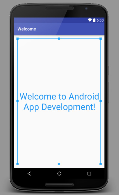
In this chapter, you’ll build the Welcome app that displays a welcome message and an image. You’ll use Android Studio to create a simple app (Fig. 2.1) that runs on Android phones and tablets in both portrait and landscape orientations:
• In portrait the device’s height is greater than its width.
• In landscape the width is greater than the height.
You’ll use Android Studio’s layout editor to build the GUI using drag-and-drop techniques. You’ll also edit the GUI’s XML directly. You’ll execute your app in the Android emulator and on an Android device, if you have one.
You’ll provide descriptive text for the app’s image to make the app more accessible for people with visual impairments. As you’ll see, Android’s Explore by Touch enables users to touch items on the screen and hear TalkBack speak the corresponding descriptive text. We’ll discuss how to test these features, which are available only on Android devices.

Finally, you’ll internationalize the app so that you can provide localized strings in different languages. You’ll then change the locale setting on the Android emulator so that you can test the app in Spanish. When your app executes, Android chooses the correct strings based on the device’s locale. We show how to change the locale on a device. We assume that you’ve read the Preface, Before You Begin and Section 1.9.
2.2 Technologies Overview
This section introduces the technologies you’ll use to build the Welcome app.
2.2.1 Android Studio
In Section 2.3, you’ll use the Android Studio integrated development environment (IDE) to create a new app. As you’ll see, the IDE creates a default GUI that contains the text "Hello world!" You’ll then use the layout editor’s Design and Text views and the Properties window to visually build a simple graphical user interface (GUI) consisting of text and an image (Section 2.5).
2.2.2 LinearLayout, TextView and ImageView
GUI components in Android are called views. Layouts are views that contain and arrange other views. You’ll use a vertical LinearLayout to arrange the app’s text and image with each occupying half the LinearLayout’s vertical space. A LinearLayout also can arrange views horizontally.
This app’s text is displayed in a TextView and its image is displayed in an ImageView. The default GUI created by Android Studio already contains a TextView. You’ll modify its properties, including its text, font size and font color and its size relative to the ImageView within the LinearLayout (Section 2.5.5). You’ll use the layout editor’s Palette of views (Fig. 2.11) to drag and drop an ImageView onto the GUI (Section 2.5.11), then configure its properties, including its image source and positioning within the LinearLayout.
2.2.3 Extensible Markup Language (XML)
Extensible Markup Language (XML) is a natural way to express GUIs. XML is human-and computer-readable text and, in the context of Android, helps you specify the layouts and components to use, as well as their attributes, such as size, position, color, text size, margins and padding. Android Studio parses the XML to display your design in the layout editor and to generate the Java code that produces the runtime GUI. You’ll also use XML files to store app resources, such as strings, numbers and colors (Section 2.2.4).
2.2.4 App Resources
It’s considered good practice to define all strings, numeric values and other values in XML resource files that are placed in the subfolders of a project’s res folder. In Section 2.5.5, you’ll create resources for strings (such as the text on a TextView) and measurements (such as a font’s size). For the TextView’s font color, you’ll create a color resource using a color selected from Google’s Material Design color palette:
2.2.5 Accessibility
Android provides accessibility features to help people with certain disabilities use their devices. People with visual impairments can use Android’s TalkBack to allow a device to speak screen text or text that you provide to help them understand the purpose and contents of a view. Android’s Explore by Touch enables the user to touch the screen to hear TalkBack speak what’s on the screen near the touch. Section 2.7 shows how to enable these features and configure your app’s views for accessibility.
2.2.6 Internationalization
Android devices are used worldwide. To reach the most users with your apps, you should consider customizing them for various locales and spoken languages. Configuring your app so that it can be customized for various locales is known as internationalization. Customizing your app for a specific locale is known as localization. Section 2.8 shows how to provide Spanish text for the Welcome app’s TextView and the ImageView’s accessibility string, and how to test the app on an AVD or device configured for Spanish.
2.3 Creating an App
This book’s examples were developed using the Android 6 SDK that was current at the time of this writing. This section shows you how to use Android Studio to create a new project. We introduce additional features of the IDE throughout the book.
2.3.1 Launching Android Studio
As you did in Section 1.9, open Android Studio via its shortcut:
The IDE displays either the Welcome window (Fig. 1.17) or the last project you had open.
2.3.2 Creating a New Project
A project is a group of related files, such as code files, resource files and images that make up an app. To create an app, you must first create its project. To do so, click Start a new Android Studio project in the Welcome window or, if a project is open, select File > New > New Project.... This displays the Create New Project dialog (Fig. 2.2).
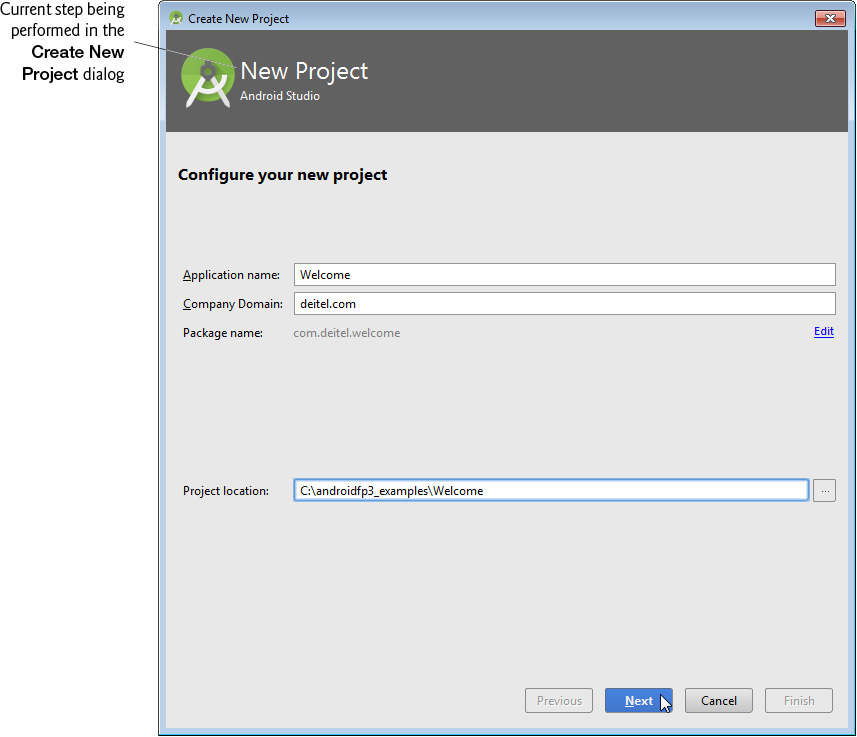
2.3.3 Create New Project Dialog
In the Create New Project dialog’s Configure your new project step (Fig. 2.2), specify the following information, then click Next:
1. Application name: field—Your app’s name. Enter Welcome in this field.
2. Company Domain: field—Your company website’s domain name. We used our deitel.com website domain. For learning purposes you can use example.com, but this must be changed if you intend to distribute your app.
3. Package name: field—The Java package name for your app’s source code. Android and the Google Play store use this as the app’s unique identifier, which must remain the same in all versions of your app that you upload to the Google Play store. The package name normally begins with your company’s or institution’s Company Domain in reverse—our Company Domain is deitel.com, so our Java package names begin with com.deitel. This is followed by a dot (.) and the app’s name in all lowercase letters with any spaces removed. By convention, package names use only lowercase letters. The IDE sets the package name using the text you enter for Application Name and Company Domain. You can click the Edit link to the right of the generated package name to customize the Package name.
4. Project location: field—The path of the location on your computer in which to store the project. By default, Android Studio places new project folders in the subfolder AndroidStudioProjects in your user account directory. A project’s folder name consists of the project name with the spaces removed. You also can customize the location by entering a path or clicking the ellipsis (...) button to the right of the field and browsing for a location to store the project. After selecting a location, click OK. Click Next to move to the next step.

If the path to the folder in which you wish to save a project contains spaces, the Create New Project dialog displays the message “Your project location contains whitespace. This can cause problems on some platforms and is not recommended.” To resolve this, click the ellipsis (...) button to the right of the Create New Project dialog’s Project location field and select a location that does not contain spaces; otherwise, your project might not compile or execute correctly.
2.3.4 Target Android Devices Step
In the Create New Project dialog’s Target Android Devices step (Fig. 2.3):
1. Check the checkbox for each Android device type (Phone and Tablet, TV, Wear, Android Auto and Glass) that your app should support. For the Welcome app, ensure that only the Phone and Tablet type is checked.
2. Next, select a Minimum SDK in the drop-down for each type of device that you selected, then click Next. The Minimum SDK is the minimum Android API level that’s required to run your app. This allows your app to execute on devices supporting that API level and higher. Select API23: Android 6.0 (Marshmallow) for this book’s apps and click Next. Figure 2.4 shows the Android SDK versions and their API levels—versions not shown here are deprecated and should not be used. The percentage of Android devices running each platform version is shown at
 Software Engineering Observation 2.1
Lower Minimum SDK values enable your app to run on more devices—e.g., at the time of this writing, you could reach 94% of devices with API 15. Generally you should target the lowest API level on which your app can run. You must disable newer features that are not available on older platforms when your app is installed on those platforms.


Fig. 2.4 | Android SDK versions and API levels. (http://developer.android.com/about/dashboards/index.html)
2.3.5 Add an Activity to Mobile Step
In the Add an Activity to Mobile step (Fig. 2.5), you’ll select an app template. Templates provide preconfigured starting points for common app designs and app logic.

Figure 2.6 briefly describes four commonly used templates from Fig. 2.5. For this app, select Empty Activity, then click Next. This template defines a one-screen app that displays Hello World!. We’ll use other templates in later chapters. For multiscreen apps, you also can define a new screen by adding one of the Fig. 2.5 activities to an existing app. For example, in Chapter 4’s Flag Quiz app, we’ll add a Settings Activity that provides a screen in which the user can specify the quizzes settings.

2.3.6 Customize the Activity Step
This step (Fig. 2.7) depends on the template selected in the previous step. For the Empty Activity template, this step allows you to specify:
• Activity Name—MainActivity is the default name provided by the IDE. This is the name of an Activity subclass that controls the app’s execution. Starting in Chapter 3, we’ll modify this class to implement the app’s functionality.
• Layout Name—activity_main is the default name provided by the IDE. This file (which has the .xml extension) stores an XML representation of the app’s GUI that you’ll build in Section 2.5 using visual techniques.
For this app, keep the default settings, then click Finish to create the project.

2.4 Android Studio Window
When you finish creating the project, the IDE opens both MainActivity.java and activity_main.xml. Close MainActivity.java so that the IDE appears as shown in Fig. 2.8. The IDE shows the layout editor, so you can begin designing your app’s GUI. In this chapter, we discuss only the IDE features we need to build the Welcome app. We’ll introduce more IDE features throughout the book.

2.4.1 Project Window
The Project window provides access to all of the project’s files. You can have many projects open in the IDE at once—each in its own window. Figure 2.9 shows the Welcome app project’s contents in the Project window—we expanded the res folder and it’s nested layout folder. The app folder contains the files you’ll edit to create your apps’ GUIs and logic. The app folder’s contents are organized into nested folders containing files. In this chapter, you’ll use only files located in the res folder, which we discuss in Section 2.4.4—we’ll discuss the other folders and files as we use them in later chapters.

2.4.2 Editor Windows
To the right of the Project window in Fig. 2.8 is the layout editor window. When you double click a file in the Project window, its contents are displayed in an appropriate editor window, depending on the file’s type. For a Java file, the Java source-code editor is displayed. For an XML file that represents a GUI (such as activity_main.xml), the layout editor’s Design tab is displayed by default and you can click the Text tab to view the corresponding XML side-by-side with a design preview—if the preview does not appear, you can view it by selecting View > Tool Windows > Preview. For other XML files, a custom XML editor or text-based XML editor is displayed, depending on the XML files’ purposes. The code editors for Java and XML help you write code quickly and correctly via code-completion—as you type, you can press Enter (or Return) to auto-complete a Java code element or an XML element name, attribute name or value that is currently highlighted in the code-completion window.
2.4.3 Component Tree Window
When the layout editor is open in Design view, the Component Tree appears at the right side of the IDE (Fig. 2.8). This window shows the layouts and views (GUI components) that comprise the GUI and their parent-child relationships—for example, a layout (the parent) might contain many nested views (the children), including other layouts.
2.4.4 App Resource Files
Layout files like activity_main.xml are app resources and are stored in subfolders of the project’s res folder. The subfolders contain different resource types. The ones we use in this app are shown in Fig. 2.10, and the others (menu, animator, anim, color, mipmap, raw and xml) are discussed as we need them later in the book.

2.4.5 Layout Editor
When you first create a project, the IDE opens the app’s activity_main.xml file in the layout editor (Fig. 2.11). You also can double click activity_main.xml in the res/layout folder to open the file in the layout editor.
Selecting the Screen Type for GUI Design
Android devices can run on many types of devices. In this chapter, you’ll design an Android phone GUI. As we mentioned in the Before You Begin section, we use an AVD that emulates the Google Nexus 6 phone for this purpose. The layout editor comes with many device configurations that represent various screen sizes and resolutions that you can use to design your GUI. For this chapter, we use the predefined Nexus 6, which you can select in the virtual-device drop-down at the top of the layout editor in Fig. 2.11—Nexus 4 is selected by default. This does not mean that the app can execute only on a Nexus 6 device—it simply means that the design is for devices similar in screen size and resolution to the Nexus 6. In later chapters, you’ll see how to design your GUIs to scale appropriately for a wide range of devices.

2.4.6 Default GUI
The default GUI for a Blank Page app (Fig. 2.11) consists of a RelativeLayout with a white background and a TextView containing "Hello World!". A RelativeLayout arranges views relative to one another or relative to the layout itself—for example, you can specify that one view should appear below another and be centered horizontally within the RelativeLayout. For the Welcome app, you’ll change the RelativeLayout to a vertical LinearLayout in which text and an image will be arranged top-to-bottom on the screen and each will occupy half the layout’s height. A TextView displays text. You’ll add an ImageView to display the image. We’ll say more about each of these in Section 2.5.
2.4.7 XML for the Default GUI
As we mentioned previously, the file activity_main.xml contains the GUI’s XML representation. Figure 2.12 shows the initial XML. We reduced the amount of indentation in the default XML for book-publication purposes. You’ll edit this XML directly to change the RelativeLayout to a LinearLayout.
1 <?xml version="1.0" encoding="utf-8"?>
2 <RelativeLayoutxmlns:android="http://schemas.android.com/apk/res/android"
3 xmlns:tools="http://schemas.android.com/tools"
4 android:layout_width="match_parent"
5 android:layout_height="match_parent"
6 android:paddingBottom="@dimen/activity_vertical_margin"
7 android:paddingLeft="@dimen/activity_horizontal_margin"
8 android:paddingRight="@dimen/activity_horizontal_margin"
9 android:paddingTop="@dimen/activity_vertical_margin"
10 tools:context=".MainActivity">
11
12 <TextView
13 android:layout_width="wrap_content"
14 android:layout_height="wrap_content"
15 android:text="@string/hello_world" />
16
17 </RelativeLayout>
Fig. 2.12 | Initial contents of the project’s activity_main.xml file.
The attribute values that begin with @, such as
@dimen/activity_vertical_margin
in line 6, are resources with values defined in other files. By default, the XML editor displays a resource’s literal value (16dp for the resource in line 6) and highlights the value with a light green background (or light gray, if you’re using the dark Android Studio theme). This enables you to see the resource’s actual value that’s used in a particular context. If you click the literal value (16dp for @dimen/activity_vertical_margin), the editor instead displays the corresponding resource name.
2.5 Building the App’s GUI with the Layout Editor
You’ll now create the Welcome app’s GUI. The IDE’s layout editor allows you to build your GUI by dragging and dropping views—such as TextViews, ImageViews and Buttons—onto the layout editor. By default, the GUI layout for an app based on the Empty Activity template is stored in an XML file called activity_main.xml, located in the project’s res folder in the layout subfolder. In this chapter, we’ll use the layout editor and the Component Tree window to build the GUI. You’ll edit the XML in activity_main.xml only to change the layout used to arrange this app’s TextView and ImageView.
2.5.1 Adding an Image to the Project
For this app, you’ll need to add an image to the project. We’ll use the Deitel bug logo1 image (bug.png), which is located with the book’s examples in the images folder’s Welcome subfolder. File names for image resources—and all the other resources you’ll use in later chapters—must be in all lowercase letters.
1. Before you use any image in an app, you should ensure that you’ve properly licensed the image. Some image licenses require you to pay for the right to use an image and others provide free open-source or Creative Commons (creativecommons.org) licenses.
drawable Folders
Android devices have various screen sizes, resolutions and pixel densities (that is, dots per inch or DPI), so you typically provide images in various resolutions that the operating system chooses based on a device’s pixel density. These are placed in drawable folders (in a project’s res folder) that store images with different pixel densities (Fig. 2.13). For example, images for devices that are similar in pixel density to the Google Nexus 6 phone (560 dpi) we use in our phone AVD would be placed in the folder drawable-xxxhdpi. Images for devices with lower pixel densities are placed in the other drawable folders—normally the folder that represents the closest pixel density to the actual device.

Android Studio displays only one drawable folder containing the app’s drawable resources, even if your project contains resources for multiple densities. For a resource stored in the project’s folder drawable-xxxhdpi on disk, Android Studio displays
filename.xml (xxxhdpi)
in the project’s drawable folder.
For this app, we provide only one version of the image. If Android cannot find an image in the drawable folder that most closely matches the device’s pixel density, Android will scale the version from another drawable folder up or down as necessary. By default, Android Studio creates only a drawable folder without a DPI qualifier, which we’ll use for this initial app. For detailed information on supporting multiple screens and screen sizes in Android, visit:

Low-resolution images do not scale well. For images to render nicely, a high-pixel-density device needs highe-resolution images than a low-pixel-density device.
Adding bug.png to the Project
Perform the following steps to add the images to this project:
1. In the Project window, expand the project’s res folder.
2. In the book’s examples folder on your file system, open the images folder, then the Welcome subfolder.
3. Copy the bug.png file, then in Android Studio’s Project window select res folder’s drawable subfolder and paste the file into that subfolder.
4. In the Copy dialog that appears, click OK.
The image can now be used in the app.
2.5.2 Adding an App Icon
When your app is installed on a device, its icon and name appear with all other installed apps in the launcher, which you can access via the  icon on your device’s home screen. To add the app’s launcher icon, right click the
 res folder, then select New > Image Asset. This will open the Asset Studio window (Fig. 2.14), which enables you to configure the app’s icon from an existing image, a piece of clip art or text.
For this app, we chose the DeitelOrange.png image located in the images folder with the book’s examples. To use this image:
1. Click the ellipsis button to the right of the Image file: field.
2. Navigate to the images folder in the book’s examples folder.
3. Select DeitelOrange.png and click OK. Previews of the scaled images are shown in the dialog’s Preview area.
4. Click Next, then click Finish.
The IDE creates several scaled versions of the image, each named ic_launcher.png, and places them in the project’s mipmap2 subfolders of the res folder. The mipmap subfolders are similar to the drawable subfolders, but are specifically for the app’s icon. When you upload an app to Google Play, you can upload multiple versions of the app for various device sizes and screen resolutions. All images in the mipmap folders are uploaded with every versions of your app, whereas you can remove extra drawable folders for specific pixel densities from a given app version to minimize the total installation size for a particular device.
2. For the origin of the term mipmap, see https://en.wikipedia.org/wiki/Mipmap.
Images do not always scale well. For apps that you intend to place in the Google Play store, you might want to have an artist design icons for the appropriate resolutions. In Chapter 10, we discuss submitting apps to the Google Play store and list several companies that offer free and fee-based icon-design services.

2.5.3 Changing RelativeLayout to a LinearLayout
When you open a layout XML file, the layout’s design appears in the layout editor and the layout’s views and their hierarchical relationships appear in the Component Tree window (Fig. 2.15). To configure a layout or view, you can select it in the layout editor or in the Component Tree, then use the Properties window below the Component Tree to specify the view’s property values without editing the XML directly. When designing and modifying more complex layouts, it’s often easier to work directly in the Component Tree.

For some GUI modifications—such as changing the default RelativeLayout to a LinearLayout—you must edit the layout’s XML directly. (This might change as Google improves the layout editor’s capabilities.) To do so:
1. Click the Text tab at the bottom of the layout editor to switch from the Design view to the layout’s XML text.
2. At the top of the XML (line 2 in Fig. 2.12), double click the XML element name RelativeLayout to select it, then start typing LinearLayout.
3. As you type in line 2, the IDE edits the corresponding ending XML tag (line 17 in Fig. 2.12) simultaneously to keep them in sync, and a code-completion window appears containing element names that begin with the letters you’ve typed so far. Once LinearLayout appears in the code-completion window and is highlighted, press Enter (or Return) to select LinearLayout and enable Android Studio to auto-complete the edit.
4. Save the changes and switch back to the layout editor’s Design tab.
The Component Tree should now appear as in Fig. 2.16.

2.5.4 Changing the LinearLayout’s id and orientation
In this section, you’ll customize the LinearLayout’s properties. In general, give each layout and component a relevant name. This helps you easily identify each view in the Component Tree and enables you to manipulate the views programmatically, as we’ll do in subsequent apps.
When a GUI is displayed in the layout editor, you can use the Properties window below the Component Tree (Fig. 2.8) to configure the selected view’s properties. You also can edit a view’s most commonly used properties (as you’ll do in this section) by double clicking the view in the canvas. The layout editor then displays a small dialog in which you can set the view’s id property and other properties that depend on the specific view:
• For a LinearLayout, you can set the orientation to specify whether the layout’s children are arranged in horizontal or vertical orientation.
• For a TextView, you can set the text that’s displayed.
• For an ImageView, you can set the src (source) of the image to display.
Setting the LinearLayout’s orientation and id Properties
To change the LinearLayout’s orientation, double click the virtual phone screen’s white background in the layout editor to display the dialog of common LinearLayout properties, then select vertical from the orientation: drop-down as shown in Fig. 2.17. This sets the property’s value and dismisses the dialog. A view’s name is defined by setting its id property, which is specified in the layout’s XML with the attribute android:id. Double click the virtual phone screen’s white background, enter the name welcomeLinearLayout in the id: field, then press Enter (or Return) to set the value and dismiss the dialog.

The id Property’s XML Representation
In the layout’s XML representation—viewable via the Text tab at the bottom of the layout editor—the LinearLayout’s android:id has the value:
@+id/welcomeLinearLayout
The + in the syntax @+id indicates that a new id should be created with the identifier to the right of the forward slash (/). In some cases, the XML contains the same syntax without the + to refer to an existing view—for example, to specify the relationships between views in a RelativeLayout.
2.5.5 Configuring the TextView’s id and text Properties
The Welcome app’s default GUI already contains a TextView, so you’ll simply modify its properties.
Setting the TextView’s id Property
Double click the TextView in the layout editor, then in the dialog that appears set the id: to welcomeTextView and press Enter (or Return).
Configuring the TextView’s text Property Using a String Resource
According to the Android documentation for application resources
it’s considered good practice to place strings, string arrays, images, colors, font sizes, dimensions and other app resources in XML files within the subfolders of the project’s res folder, so these resources can be managed separately from your app’s Java code. This is known as externalizing the resources. For example, if you externalize color values, all components that use the same color can be updated to a new color simply by changing the color value in a central resource file.
If you wish to localize your app in several languages, storing the strings separately from the app’s code allows you to change them easily. In your project’s res folder, the subfolder values contains a strings.xml file that’s used to store the app’s default language strings—English for our apps. To provide localized strings for other languages, you can create separate values folders for each language, as we’ll demonstrate in Section 2.8.
To set the TextView’s text property, create a new string resource in the strings.xml file as follows:
1. Either double click the welcomeTextView in the layout editor or select welcomeTextView and locate its text property in the Properties window
2. Click the ellipsis (...) button to the right of the property’s value to display the Resources dialog.
3. In the Resources dialog, click New Resource, then select New String Value... to display the New String Value Resource dialog and fill the Resource name: and Resource value: fields as shown in Fig. 2.18. Leave the other settings (we’ll discuss these in later sections and apps) and click OK to create the new string resource named welcome and set it as the value of the TextView’s text property.

In the Properties window, the text property should now appear as in Fig. 2.19. The @string/ prefix indicates that a string resource will be used to obtain the value for the text property and welcome indicates the specific string resource to use. By default, the resource is placed in the strings.xml file (located in the project’s res/values folder).

2.5.6 Configuring the TextView’s textSize Property—Scaled Pixels and Density-Independent Pixels
Sizes can be specified in various measurement units (Fig. 2.20). The documentation for supporting multiple screen sizes recommends that you use density-independent pixels for dimensions of views and other screen elements, and scale-independent pixels for font sizes:

Defining your GUIs with density-independent pixels enables the Android platform to scale the GUI, based on the pixel density of a given device’s screen. One density-independent pixel is equivalent to one pixel on a 160-dpi screen. On a 240-dpi screen, each density-independent pixel will be scaled by a factor of 240/160 (i.e., 1.5). So, a component that’s 100 density-independent pixels wide will be scaled to 150 actual pixels wide. On a screen with 120 dpi, each density-independent pixel is scaled by a factor of 120/160 (i.e., 0.75). So, the same component that’s 100 density-independent pixels wide will be 75 actual pixels wide. Scale-independent pixels are scaled like density-independent pixels, but they’re also scaled by the user’s preferred font size (as specified in the device’s settings).
Creating a Dimension Resource for the Font Size on a Phone Device
You’ll now increase the TextView’s font size. To change the font size:
1. Select the welcomeTextView in the layout editor.
2. Locate the textSize property, then click in the right column to reveal the ellipsis (...) button and click the button to display the Resources dialog.
3. In the Resources dialog, click New Resource, then select New Dimension Value... to display the New Dimension Value Resource dialog.
4. In the dialog that appears, specify welcome_textsize for the Resource name and 40sp for the Resource value, then click OK to dismiss the dialog and return to the Resources dialog. The letters sp in the value 40sp indicate that this is a scale-independent pixel measurement. The letters dp in a dimension value (e.g., 10dp) indicate a density-independent pixel measurement. We used the value 40sp for displaying text on a phone.
In the Properties window, the textSize property now contains the value:
@dimen/welcome_textsize
The @dimen/ prefix indicates that the textSize property’s value is a dimension resource and welcome_textsize indicates the specific dimension resource to use. By default, the resource is placed in the dimens.xml file—located in the project’s res/values folder.
Creating a Dimension Resource for the Font Size on a Large Tablet Device
The 40sp font size works well for phone-sized devices, but is small for tablets. Android can automatically choose different resource values based on device sizes, orientations, pixel densities, spoken languages, locales and more. To specify a separate font size for larger devices such as tablets:
1. Reopen the New Dimension Value Resource dialog as described above.
2. Enter welcome_textsize for the Resource name (the resource names must match for Android to select different resource values automatically) and enter 80sp for the Resource value.
3. Next, you’ll create a new values resource folder that’s specific to larger devices such as tablets that have widths and heights that are each at least 600dp. In the New Dimension Value Resource dialog, uncheck the values checkbox, and click the Add button ( ) to open the New Resource Directory dialog. In this dialog’s Available qualifiers list, select Screen Width, then click the >> button to add the screen Screen Width qualifier to the Chosen qualifiers list. Next, enter
 600 in the Screen width field.
4. Next, add the Screen Height qualifier to the Chosen qualifiers list and enter 600 for the Screen height.
5. Click OK to create a new resource folder named values-xlarge.
6. In the New Dimension Value Resource dialog, check the values-w600dp-h600dp checkbox, then click OK. This creates another welcome_textsize dimension resource in a dimens.xml file that’s stored on disk in the project’s res/values-w600dp-h600dp folder. Android will use that resource for devices with extra-large screen widths and heights that are at least 600dp, typical of most Android tablets. The new dimens.xml resource file appears in Android Studio in the project’s res/values/dimens.xml node as
dimens.xml (w600dp-h600dp)
2.5.7 Setting the TextView’s textColor Property
When you need custom colors in your apps, Google’s Material Design guidelines recommend using colors from the Material Design color palette at:
Colors are specified as RGB (red-green-blue) or ARGB (alpha-red-green-blue) values. An RGB value consists of integer values in the range 0–255 that define the amounts of red, green and blue in the color, respectively. Custom colors are defined in hexadecimal format, so the RGB components are values in the range 00 (the hexadecimal value for 0) to FF (the hexadecimal value for 255).
Android also supports alpha (transparency) values in the range 00 (completely transparent) to FF (completely opaque). To use alpha, you specify the color as #AARRGGBB, where the first two hexadecimal digits represent the alpha value.
If both digits of each color component are the same, you can use the abbreviated value formats #RGB or #ARGB. For example, the RGB value #9AC is equivalent to #99AACC and the ARGB value #F9AC is equivalent to #FF99AACC.
To set the TextView’s textColor property to a new color resource:
1. In the Properties window click the ellipsis (...) button to display the Resources dialog, then click New Resource and select New Color Value....
2. In the New Color Value Resource dialog, enter welcome_text_color for the Resource name and #2196F3 for the Resource value (Fig. 2.21), then click OK.

2.5.8 Setting the TextView’s gravity Property
To center the text in the TextView if it wraps to multiple lines, you can set its gravity property to center. To do so, expand the node for this property, then check the center checkbox (Fig. 2.22).

2.5.9 Setting the TextView’s layout:gravity Property
Each view you place in a layout has various layout properties that enable you to customize the view’s size and positioning within the layout. When you select a view in the layout editor or Component Tree, the Properties window lists the layout and style properties at the top, followed by the view-specific properties in alphabetical order (Fig. 2.23).

In this app, we’d like to center the TextView horizontally within the LinearLayout. To do this, you’ll set its layout:gravity property to center horizontally as follows:
1. With the TextView selected, expand the layout:gravity property’s node in the Properties window.
2. Click the value field to the right of the center option that appears, then select the horizontal option (Fig. 2.24).

In the layout XML file, layout properties have attribute names that begin with layout_. The preceding layout:gravity property setting is represented in XML as:
android:layout_gravity="center_horizontal"
2.5.10 Setting the TextView’s layout:weight Property
A LinearLayout can proportionally size its children based on their layout:weights, which specify the view’s relative size with respect to the layout’s other views. By default, the layout:weight is 0 for each view you add to a LinearLayout, indicating that the view should not be proportionally sized.
In this app, we’d like the TextView and ImageView to each occupy half of the LinearLayout’s vertical space. You accomplish this by setting each view’s layout:weight to the same value. The LinearLayout uses the ratio of each view’s layout:weight to the total layout:weight to allocate space to the views. In this app, you’ll set the layout:weight to 1 for both the TextView and ImageView (Section 2.5.11)—the total layout:weight will be 2 and each view will occupy 1/2 the layout’s height.
If you wanted the TextView to occupy one-third of the LinearLayout’s height, you could set its layout:weight to 1 and the ImageView’s layout:weight to 2. In this case, the total layout:weight is 3, so the TextView would occupy 1/3 the height and the ImageView 2/3 the height.
Set the TextView’s layout:weight to 1. The layout editor displays a light bulb ( ) icon to the left of the
 layout:height property—if it does not do so immediately, click the layout:height property in the Properties window. These icons—generated by a tool in the IDE known as Android Lint—warn you of potential problems and help you fix them. When you click the light bulb, the IDE displays the message, “Use a layout_height of 0dp instead of wrap_content for better performance.” Click the message to apply the recommendation. This change enables the LinearLayout to calculate its children’s sizes more efficiently. The layout editor window should now appear as shown in Fig. 2.25.
Android Lint checks your project for common errors, and makes suggestions for better security, enhanced performance, improved accessibility, internationalization and more. Some checks occur as you build your apps and write code. You also can select Analyze > Inspect Code... to perform additional checks on specific files or your entire project. For more information, visit http://developer.android.com/tools/help/lint.html. For Android Lint’s configuration options and output, see http://developer.android.com/tools/debugging/improving-w-lint.html.
2.5.11 Adding an ImageView to Display the Image
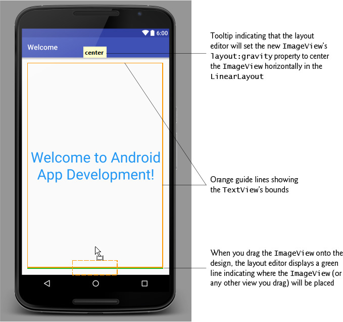
Next, you’ll add an ImageView to the GUI to display the image you added to the project in Section 2.5.1. You’ll do this by dragging an ImageView from the Palette’s Widgets section onto the canvas below the TextView. When you drag a view onto the canvas, the layout editor displays orange guide lines, green guide lines and a tooltip:
• The orange guide lines show the bounds of each existing view in the layout.
• The green guide lines indicate where the new view will be placed with respect to the existing views—by default, new views are added at the bottom of a vertical LinearLayout, unless you position the mouse above the orange box that bounds the layout’s topmost view.
• The tooltip displays how the view will be configured if you drop it at the current position.
To add and configure the ImageView:
1. From the Palette’s Widgets section, drag an ImageView onto the canvas as shown in Fig. 2.26. Before releasing the mouse, ensure that center appears in the tooltip at the top of the design—this indicates that the layout editor will set the ImageView’s layout:gravity property to center the ImageView horizontally in the LinearLayout. When you drop the ImageView by releasing the mouse, the layout editor assumes that the ImageView’s layout:weight should be the same as the TextView’s and sets the layout:weight to 1. It also sets the layout_height to 0dp as we did for the TextView. The new ImageView appears below the TextView in the design and below welcomeTextView in the Component Tree. The ImageView’s properties are displayed in the Properties window.
2. In the Properties window, locate the ImageView’s src property (which specifies the image to display), then click its value field’s ellipsis button to display the Resources dialog (Fig. 2.27). When the dialog opens, type bug to search the list of resources for the image you added in Section 2.5.1, then click OK. For every image you place in a drawable folder, the IDE generates a unique resource ID (i.e., a resource name) that you can use to reference that image. An image’s resource ID is the image’s file name without the file-name extension—bug for the bug.png file.
3. Double-click the ImageView in the layout editor and set its id: to bugImageView.
The GUI should now appear as in Fig. 2.28. If you select the ImageView in the layout editor, Android Lint displays a light bulb () next to the ImageView—clicking this displays a message indicating that a property is missing for visually impaired users. You’ll correct this in Section 2.7.


2.5.12 Previewing the Design
Android Studio also enables you to preview your design in landscape orientation and to preview your design for multiple devices. To toggle the design between portrait and landscape orientations, simply click the Go to next state button ( ) in the toolbar at the top of the layout editor. This helps you determine whether your design adjusts appropriately for each orientation. To preview the design for multiple devices, click the virtual device drop-down (Fig. 2.11) at the top of the layout editor, then select Preview All Screen Sizes.This displays miniature screens (Fig. 2.29) for many devices listed in the virtual device drop-down—some in portrait and some in landscape. These help you quickly determine whether your design works appropriately on various devices.

You can return to displaying one device by clicking the virtual device drop-down and selecting Remove Previews. You also can preview your design for a particular device be selecting that device in the virtual device drop-down.
2.6 Running the Welcome App
You’re now ready to run the Welcome app. Perform the steps shown in Section 1.9.3 to run the app on the AVDs you configured previously for both the Nexus 6 phone and Nexus 9 tablet. Figures 2.30–2.31 show the app running in the Nexus 6 AVD (in portrait and landscape) and the Nexus 9 AVD (in landscape), respectively. You can toggle an AVD between portrait and landscape orientations by typing Ctrl + F11 or control + F11. Typically, for apps that run on both phones and tablets, you’ll also provide a tablet layout that makes better use of the screen’s available space, as we’ll demonstrate in later chapters. If you have an Android device, you can follow the steps in Section 1.9.4 to run the app on your device.


2.7 Making Your App Accessible
Android contains accessibility features to help people with certain disabilities use their devices. For people with visual disabilities, Android’s TalkBack can speak screen text or text that you provide (when designing your GUI or programmatically) to help the user understand the purpose of a view. Android also provides Explore by Touch, which enables the user to hear TalkBack speak what’s on the screen where the user touches.
When TalkBack is enabled and the user touches a view for which accessibility text is specified, the device vibrates to indicate that the user touched a significant view and TalkBack speaks the views’s accessibility text. All standard Android views support accessibility. For those that display text, TalkBack speaks that text by default—e.g., when the user touches a TextView, TalkBack speaks the TextView’s text. You enable TalkBack in the Settings app under Accessibility. From that page, you also can enable other Android accessibility features such as a larger default text size and the ability to use gestures that magnify areas of the screen. TalkBack is not currently supported on AVDs, so you must run this app on a device to hear TalkBack speak the text. When you enable TalkBack, Android walks you through a tutorial on using TalkBack with Explore by Touch.
Enabling TalkBack for the ImageViews
In the Welcome app, we don’t need more descriptive text for the TextView, because TalkBack will read the TextView’s content. For an ImageView, however, there is no text for TalkBack to speak unless you provide it. It’s considered good practice in Android to ensure that every view can be used with TalkBack by providing text for the contentDescription property of any view that does not display text. For that reason, the IDE warned us that something was wrong by displaying a light-bulb icon (—as you saw in Fig. 2.28) in the layout editor next to the ImageView. If you click the light bulb, you’ll see the message, “[Accessibility] Missing contentDescription attribute on image.” The text you provide should help the user understand the purpose of the component. For an ImageView, the text should describe the image.
To add the ImageView’s contentDescription (and eliminate the warning):
1. Select the bugImageView in the layout editor.
2. In the Properties window, click the ellipsis button to the right of the contentDescription property to open the Resources dialog.
3. Click New Resource, then select New String Value... to display the New String Value Resource dialog.
4. In the Resource name field specify deitel_logo and in the Resource value field specify "Deitel double-thumbs-up bug logo", then press OK. The new string resource is chosen automatically as the contentDescription value.
After you set the ImageView’s contentDescription, the layout editor removes the warning light bulb.
Testing the App with TalkBack Enabled
Run this app on a device with TalkBack enabled, then touch the TextView and ImageView to hear TalkBack speak the corresponding text.
Dynamically Created Views
Some apps dynamically create views in response to user interactions. For such views, you can programmatically set the accessibility text. For more information on this and Android’s other accessibility features, and for a checklist to follow when developing accessible apps, visit:
2.8 Internationalizing Your App
To reach the largest possible audience, you should consider designing your apps so that they can be customized for various locales and spoken languages. Then, if you intend to offer your app, for example, in France, you would translate its resources (text, audio files, etc.) into French. You might also choose to use different colors, graphics and sounds based on the locale. For each locale, you’ll have a separate, customized set of resources. When the user launches the app, Android automatically finds and loads the resources that match the device’s locale settings. Designing an app so it can be customized is known as internationalization. Customizing an app’s resources for each locale is known as localization.
2.8.1 Localization
A key benefit of defining your string values as string resources (as we did in this app) is that you can easily localize your app by creating additional XML resource files for those string resources in other languages. In each file, you use the same string-resource names, but provide the translated string. Android can then choose the appropriate resource file based on the device user’s preferred language.
2.8.2 Naming the Folders for Localized Resources
The XML resource files containing localized strings are placed on disk in subfolders of the project’s res folder. Android uses a special folder-naming scheme to automatically choose the correct localized resources—for example, the folder values-fr would contain a strings.xml file for French and the folder values-es would contain a strings.xml file for Spanish. You also can name these folders with region information—values-en-rUS would contain a strings.xml file for United States English and values-en-rGB would contain a strings.xml file for United Kingdom English. If localized resources are not provided for a given locale, Android uses the app’s default resources—that is, those in the res folder’s values subfolder. We discuss these alternative-resource naming conventions in more detail in later chapters.
2.8.3 Adding String Translations to the App’s Project
Android Studio provides a Translations Editor for quickly and easily adding translations for existing strings in your app. Follow these steps to add translated strings to the project:
1. In the Project window, expand the values node, then open the strings.xml file.
2. In the editor’s upper-right corner, click the Open editor link to open the Translations Editor.
3. In the upper-left corner of the Translations Editor, click the Add Locale button ( ), then select Spanish (es)—you can search for this entry by typing part of the language name or its abbreviation (
es). After you select the locale in the list, a new strings.xml (es) file will be created and be placed in the strings.xml node in the Project window (the file is stored in a values-es folder on disk). The Translations Editor also displays a new column for the Spanish translations.
4. To add a Spanish translation for a given String resource, click the cell for the resource’s Spanish (es) translation, then in the Translation: field at the bottom of the window enter the Spanish text. If a string should not be translated (for example, a string that’s never displayed to the user), check the Untranslatable checkbox for that String resource. For the Welcome app, use the translations in Section 2.8.4.
Repeat the preceding steps for each language you wish to support.
2.8.4 Localizing Strings
In this app, the GUI contains one TextView that displays a string and one content-description string for the ImageView. These strings were defined as string resources in the strings.xml file. You can now provide the translated strings that will be stored in the new version of the strings.xml file. For this app, you’ll replace the strings
"Welcome to Android App Development!"
"Deitel double-thumbs-up bug logo"
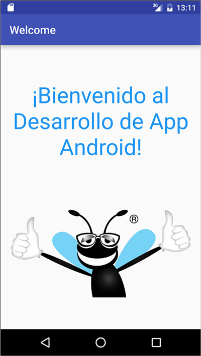
"¡Bienvenido al Desarrollo de App Android!"
"El logo de Deitel que tiene el insecto con dedos pulgares
hacia arriba"
In the Translation Editor window:
1. Click the cell for the welcome resource Spanish (es) translation, then in the Translation: field at the bottom of the window enter the Spanish string "¡Bienvenido al Desarrollo de App Android!". If you cannot type special Spanish characters and symbols on your keyboard, you can copy the Spanish strings from our res/values-es/strings.xml file in the final version of the Welcome app (located in the WelcomeInternationalized folder with the chapter’s examples), then paste the Spanish string into the Translation: field.
2. Next, click the cell for the deitel_logo resource’s value and enter in the Translation: field "El logo de Deitel que tiene el insecto con dedos pulgares hacia arriba".
3. We chose not to translate the resource app_name, though we could have. The window should appear as in Fig. 2.32.
4. Save the Spanish strings.xml file by selecting File > Save All or clicking the Save All toolbar button ( ).
).

2.8.5 Testing the App in Spanish on an AVD
To test the app in Spanish on an AVD, you can use the Custom Locale app that’s installed on the AVD.
1. Click the home ( ) icon on your AVD.
2. Click the launcher ( ) icon, then locate and click the Custom Locale app’s icon to open it.
3. Drag the mouse to scroll to the es - español option, then click it and click the SELECT 'ES' button to change the AVD’s locale.
The emulator or device changes its language setting to Spanish.
Next, run the Welcome app, which installs and launches the localized app (Fig. 2.33). When the app begins executing, Android checks the AVD’s (or device’s) language settings, determines that the AVD (or device) is set to Spanish and uses the Spanish welcome and deitel_logo string resources defined in res/values-es/strings.xml. Notice, however, that the app’s name still appears in English in the app bar at the top of the app. This is because we did not provide a localized version of the app_name string resource in the res/values-es/strings.xml file. If Android cannot find a localized version of a string resource, it uses the default version in the res/values/strings.xml file.
Returning the AVD to English
To return your AVD to English:
1. Click the home () icon on your AVD.
2. Click the launcher () icon, then locate and click the Custom Locale app’s icon to open it.
3. Drag the mouse to scroll to the en-US - en-us option, then click it and click the SELECT 'EN-US' button to change the AVD’s locale.
2.8.6 Testing the App in Spanish on a Device
To test on a device you must change the language settings for your device. To do so:
1. Touch the home () icon on your device.
2. Touch the launcher () icon, then locate and touch the Settings app ( ) icon.
3. In the Settings app, scroll to the Personal section, then touch Language & input.
4. Touch Language (the first item in the list), then select Español (España) from the list of languages.
The device changes its language setting to Spanish and returns to the Language & input settings, which are now displayed in Spanish. Run the app from the IDE to install and run the localized version on your device.
Returning Your Device to English
To return your AVD (or Device) to English:
1. Touch the home () icon on the emulator or on your device.
2. Touch the launcher () icon, then locate and touch the Settings app () icon—the app is now called Ajustes in Spanish.
3. Touch the item Idioma e introduccion de texto to access the language settings.
4. Touch the item Idioma, then in the list of languages select English (United States).
2.8.7 TalkBack and Localization
TalkBack currently supports English, Spanish, Italian, French and German. If you run the Welcome app on a device with Spanish specified as the device’s language and TalkBack enabled, TalkBack will speak the app’s Spanish strings as you touch each view.
When you first switch your device to Spanish and enable TalkBack, Android will automatically download the Spanish text-to-speech engine. If TalkBack does not speak the Spanish strings, then the Spanish text-to-speech engine has not finished downloading and installing yet. In this case, you should try executing the app again later.
2.8.8 Localization Checklist
For more information on localizing your app’s resources, be sure to check out the Android Localization Checklist at:
2.8.9 Professional Translation
App-development companies often have translators on staff or hire other companies to perform translations. In fact, in the Google Play Developer Console—which you use to publish your apps in the Google Play store—you can find translation-services companies, and in the Translations Editor window there is an Order translations... link. For more information on the Google Play Developer Console, see Chapter 10 and
For more information regarding translation, see
2.9 Wrap-Up
In this chapter, you used Android Studio to build the Welcome app that displays a welcome message and an image without writing any code. You created a simple GUI using the IDE’s layout editor and configured view properties using the Properties window.
In the layout XML file, you changed the default RelativeLayout to a LinearLayout, which you then configured to arrange views vertically. The app displayed text in a TextView and a picture in an ImageView. You modified the TextView from the default GUI to display the app’s text centered in the GUI, with a larger font size and in one of the standard theme colors. You also used the layout editor’s Palette of GUI controls to drag and drop the ImageView onto the GUI. Following good practice, you defined all strings and numeric values in resource files in the project’s res folder.
You learned that Android has accessibility features to help people with certain disabilities use their devices. We showed how to enable Android’s TalkBack to allow a device to speak screen text or speak text that you provide to help the visually impaired user understand the purpose and contents of a view. We discussed Android’s Explore by Touch feature, which enables the user to touch the screen to hear TalkBack speak what’s on the screen near the touch. For the app’s ImageViews, you provided content descriptions that could be used with TalkBack and Explore by Touch.
Finally, you learned how to use Android’s internationalization features to reach the largest possible audience for your apps. You localized the Welcome app with Spanish strings for the TextView’s text and the ImageViews’ accessibility strings, then tested the app on an AVD configured for Spanish.
Android development is a combination of GUI design and Java coding. In the next chapter, you’ll develop a simple Tip Calculator app by using the layout editor to develop the GUI visually and Java programming to specify the app’s behavior.
Self-Review Exercises
2.1 Fill in the blanks in each of the following statements:
a) Layout files are considered app resources and are stored in the project’s __________ folder. GUI layouts are placed within that folder’s layout subfolder.
b) When designing an Android GUI, you typically want it to be __________ so that it displays properly on various devices.
c) You can easily __________ your app by creating additional XML resource files for string resources in other languages.
d) The two measurement units for density independent pixels are __________ and __________.
e) __________ enables the user to hear TalkBack speak what’s on the screen where the user touches.
f) Android uses a special folder-naming scheme to automatically choose the correct localized resources—for example, the folder __________ would contain a strings.xml file for French and the folder __________ would contain a strings.xml file for Spanish.
2.2 State whether each of the following is true or false. If false, explain why.
a) Android Studio is used to create and test Android apps.
b) A RelativeLayout arranges views relative to one another or relative to their parent container.
c) A LinearLayout arranges views horizontally.
d) To center the text in the TextView, set its alignment property to center.
e) Android’s accessibility features help people with various disabilities use their devices.
f) For people with visual disabilities, Android’s SpeakBack can speak screen text or text that you provide to help the user understand the purpose of a GUI component.
g) It’s considered a best practice in Android to ensure that every GUI component can be used with TalkBack by providing text for the contentDescription property of any component that does not display text.
Answers to Self-Review Exercises
a) res.
b) scalable.
c) localize.
d) dp and dip.
e) Explore by Touch.
f) values-fr, values-es.
a) True.
b) True.
c) False. A LinearLayout arranges views horizontally or vertically.
d) False. To center the text in the TextView, set its gravity property to center.
e) True.
f) False. The feature is named TalkBack.
g) True.
a) Android Studio’s __________ allows you to build GUIs using drag-and-drop techniques.
b) For an app based on the Empty Activity template, the GUI layout is stored in an XML file called __________, by default.
c) The default GUI for an app based on the Empty Activity template consists of a(n) __________ (layout) and a TextView containing "Hello world!".
d) The documentation for supporting multiple screen sizes recommends that you use density-independent pixels for the dimensions of GUI components and other screen elements and __________ for font sizes.
e) One density-independent pixel is equivalent to one pixel on a screen with 160 dpi (dots per inch). On a screen with 240 dpi, each density-independent pixel will be scaled by a factor of __________.
f) On a screen with 120 dpi, each density-independent pixel is scaled by a factor of __________. So, the same component that’s 100 density-independent pixels wide will be 75 actual pixels wide.
2.4 State whether each of the following is true or false. If false, explain why.
a) For images to render nicely, a high-pixel-density device needs lower-resolution images than a low-pixel-density device.
b) It’s considered a good practice to “externalize” strings, string arrays, images, colors, font sizes, dimensions and other app resources so that you, or someone else on your team, can manage them separately from your application’s code.
c) You can use the Layout editor to create a working app without writing any Java code.
2.5 (Scrapbooking App) Find three open source images of famous landmarks using websites such as Flickr. Create an app in which you arrange the images in a collage. Add text that identifies each landmark. Recall that image file names must use all lowercase letters.
2.6 (Scrapbooking App with Accessibility) Using the techniques you learned in Section 2.7, enhance your solution to Exercise 2.5 to provide strings that can be used with Android’s TalkBack accessibility feature. If you have an Android device available to you, test the app on the device with TalkBack enabled.
2.7 (Scrapbooking App with Internationalization) Using the techniques you learned in Section 2.8, enhance your solution to Exercise 2.6 to define a set of strings for another spoken language. Use an online translator service, such as translate.google.com to translate the strings and place them in the appropriate strings.xml resource file. Use the instructions in Section 2.8 to test the app on an AVD (or a device if you have one available to you).