7. Applying and Managing Color
Introduction
Color management is an important part of working with InDesign. Setting up document and graphic image color settings in the right way will make it easier for a printer to produce the results that you want.
InDesign does its best to manage color for you. However, sometimes there are color conflicts or you have specific color requirements that you want to use. If a document’s profile doesn’t match the current working color space or is not assigned a color profile, you can use the Assign Profile dialog box to change or remove a profile to avoid conflicts. A working space is a temporary color space used to define and edit color in Adobe programs. Each color mode has a working space profile. InDesign’s color modes are Lab, RGB (Red, Green, and Blue), and CMYK (Cyan, Magenta, Yellow, and Black). Color modes not only define the working color space of the active document, they also represent the color space of the output document. You can use the Color Settings dialog box to select a working space profile.
InDesign not only lets you select virtually any colors you desire in the Color panel, it also lets you store those colors for future use in the Swatches panel. You can also create swatches with color tints, gradients, and mixed inks. If you’re not sure what colors to use, you can use the swatch libraries from color systems, such as Trumatch and Pantone, to select colors with predictable results.
After you create the colors and swatches you want, you can apply them to objects in your documents. The Tools panel provides color boxes to make it easy for you to apply fill and stroke colors and the Eyedropper tool on the Tools panel makes it easy to quickly pick up a color from one area of your artwork and apply it to another area.
Changing Color Settings
InDesign does its best to manage color for you. However, sometimes there are color conflicts or you have specific color requirements that you want to use. When you create or open a document, InDesign creates or looks for a color profile, which specifies color usage in the document. The Color Settings dialog box allows you to specify color settings and select options to deal with conflicts. The two main color settings are Working Space and Color Management Policies. Working Space controls how RGB and CMYK colors are used in a document that doesn’t have an embedded profile, while Color Management Policies controls how InDesign works with color when opening files that don’t have a color profile or one that doesn’t match your current color settings from the RGB and CMYK menus. If you need to convert colors between color spaces, use Advanced mode.
Change Color Settings
![]() Click the Edit menu, and then click Color Settings.
Click the Edit menu, and then click Color Settings.
![]() Click the Settings list arrow, and then select from the following preset color settings:
Click the Settings list arrow, and then select from the following preset color settings:
♦ Monitor Color. Useful for video and onscreen content. Sets the RGB working space to your current monitor space.
♦ North America General Purpose 2. Useful for screen and print content in North America.
♦ North America Prepress 2. Useful for common printing conditions in North America. The default RGB color space is set to Adobe RGB.
♦ North America Web/Internet. Useful for non-print content on the web in North America.
![]() Click OK to use the defined settings, or select your own custom settings:
Click OK to use the defined settings, or select your own custom settings:
♦ Working Spaces. Controls how RGB and CMYK colors are used in a document that doesn’t have an embedded profile.

Select Monitor RGB for onscreen output; Adobe RGB for photo inkjet printers (converts RGB images to CMYK images); ProPhoto RGB for inkjet printers; and sRGB IEC61966-2.1 for web output.
♦ Color Management Policies. Controls how InDesign works with color when opening files that don’t have a color profile or one that doesn’t match your current color settings from the RGB and CMYK menus.
Select Off to prevent the use of color management, Preserve Numbers to preserve the document color profile for CMYK documents, Preserve Embedded Profiles to preserve links to color profiles, or Convert to Working Space to use the working space color (useful for the web).
Select the appropriate check boxes to choose if and when InDesign will warn you of profile mismatches (no warning, when opening the file, or when pasting) or missing profiles (when opening a file or no warning).
![]() To set additional options for conversion purposes and use Black Point compensation, select the Advanced Mode check box.
To set additional options for conversion purposes and use Black Point compensation, select the Advanced Mode check box.
![]() Click OK.
Click OK.

Changing Color Profiles
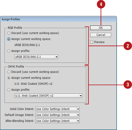
When you create or open a document, InDesign creates or looks for a color profile, which specifies color usage in the document. If a document’s profile doesn’t match the current working color space or is missing an assigned color profile, you can use the Assign Profiles dialog box to change or remove a profile to avoid conflicts. You can also specify rendering intent (object display or print) for the transition from one color space to another. When you change a color profile, color in your document may shift to match the new color profile.
Change or Remove Color Profiles
![]() Click the Edit menu, and then click Assign Profiles.
Click the Edit menu, and then click Assign Profiles.
![]() Select one of the following RGB or CMYK Profile options:
Select one of the following RGB or CMYK Profile options:
♦ Discard (use current working space). Select to remove a color profile from your document and use the current working color settings.
♦ Assign Current Working Space. Select when your document doesn’t have an assigned profile or its profile is different from the current working space.
♦ Assign Profile. Select to assign a different profile to your document.
![]() Select any of the following options:
Select any of the following options:
♦ Solid Color Intent. Specify a rendering intent for vector objects.
♦ Default Image Intent. Specify a rendering intent for bitmap images.
♦ After-Blending Intent. Specify a rendering intent for the proofing or final color space for colors (from transparency interactions).
![]() Click OK.
Click OK.
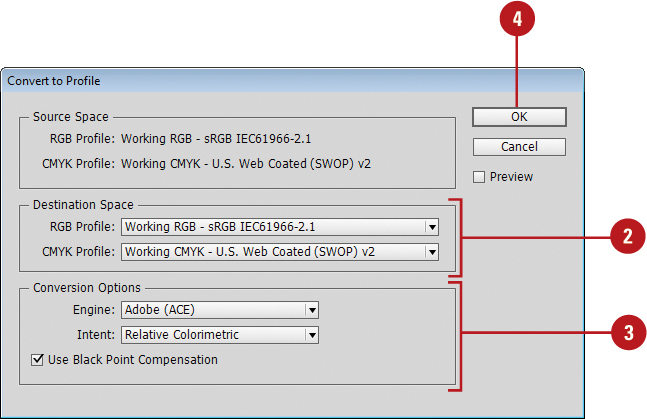
Convert Document Colors to Another Profile
![]() Click the Object menu, and then click Convert to Profile.
Click the Object menu, and then click Convert to Profile.
![]() Click the RGB Profile and CMYK Profile list arrow, and then select a profile.
Click the RGB Profile and CMYK Profile list arrow, and then select a profile.
![]() Select the Conversion Options you want:
Select the Conversion Options you want:
♦ Engine. Specify the color management module used to map the gamut of one color space to the gamut of another.
♦ Intent. Specify rendering intent (object display or print) for the transition from one color space to another.
♦ Perceptual. Use to preserve the visual look of colors; useful for photographs. The standard in Japan.
♦ Saturation. Use to create vivid color in an image; useful for graphics and charts.
♦ Relative Colorimetric. Use to shift out-of-gamut colors to the closest color in the destination color space. The standard in North America and Europe.
♦ Absolute Colorimetric. Use to leave out-of-gamut colors unchanged in the destination color space.
♦ Use Black Point Compensation. Select to preserve shadow detail in images. Use when printing to ensure the detail.
![]() Click OK.
Click OK.
Working with Color Modes
Color modes define the colors represented in the active document. Although you can change the color mode of a document, it is best to select the correct color mode at the start of the project. InDesign’s color modes are Lab, RGB (Red, Green, and Blue), and CMYK (Cyan, Magenta, Yellow, and Black). Color modes not only define the working color space of the active document, they also represent the color space of the output document. It’s the document output (print, press, or monitor) that ultimately determines the correct document color mode. Color modes do not just determine what colors the eye sees; they represent how the colors are mixed, and that’s very important because different output devices use different color mixes.
Lab Mode
The Lab color mode is an old color measuring system. Created in France, its purpose was to measure color based on visual perception. Since personal computers had not been created at that time, the Lab mode is not based on a particular computer or operating system, and so Lab color is device independent. The Lab mode measures color using a lightness channel, an “a” channel (red to green), and a “b” channel (blue to yellow). Lab color works well for moving images between operating systems (Mac to Win), and for printing color images to PostScript Level 2 or 3 devices. Because of its ability to separate the gray tones of an image into an individual channel (lightness), the Lab color mode is excellent for sharpening, or increasing the contrast of an image without changing its colors.
RGB Mode
The RGB color mode is probably the most widely used of all the color modes. RGB generates color using three 8-bit channels: 1 red, 1 green, and 1 blue. Since each channel is capable of generating 256 steps of color, mathematically, that translates into 16,777,216 possible colors per image pixel. The RGB color mode (sometimes referred to as Additive RGB) is the color space of computer monitors, televisions, and any electronic display. This also includes PDAs (Personal Digital Assistants), and cellular phones. RGB is considered a device-dependent color mode. Device independent means that the colors in images created in the RGB color mode will appear differently on various devices. In the world of computer monitors and the web, what you see is very seldom what someone else sees; however, understanding how InDesign manages color information goes a long way to gaining consistency over color.
CMYK Mode
The CMYK color mode is the color mode of paper and press. Printing presses (sometimes referred to as 4-color presses) convert an image’s colors into percentages of CMYK (Cyan, Magenta, Yellow, and Black), which eventually become the color plates on the press. One at a time, the plates apply color to a sheet of paper, and when all 4 colors have been applied, the paper contains an image similar to the CMYK image created in InDesign. The CMYK color mode can take an image from a computer monitor to a printed document. Before converting an image into the CMYK mode, however, it’s important to understand that you will lose some color saturation during the conversion. The colors that will not print are defined as being out of gamut. Out of gamut means that the current RGB or Lab color doesn’t have a CMYK equivalent, which means you can’t use it on a commercial project unless you select a substitute color close to a CMYK equivalent.
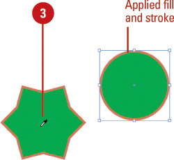
Applying Colors
The Tools panel provides color boxes to make it easy for you to apply fill and stroke colors. The color box in the foreground is the Fill box and the outlined box in the background is the Stroke box. When you select an object, fill, or stroke, the color boxes (also known as thumbnails), on the Tools and Control panel display the current colors. To change the fill or stroke color, select an object, fill or stroke, select the Fill or Stroke box, and then select a color from the Color or Swatches panel. You can also drag the current color swatch and apply it to an object.
Apply Colors to an Object, Fill or Stroke
![]() Select an object, fill, or stroke using a selection tool.
Select an object, fill, or stroke using a selection tool.
![]() Click the Fill or Stroke color box on the Tools panel to choose the color’s destination.
Click the Fill or Stroke color box on the Tools panel to choose the color’s destination.
![]() Click the Apply Color button on the Tools panel to apply a color or click Apply None to apply no color.
Click the Apply Color button on the Tools panel to apply a color or click Apply None to apply no color.

![]() Use any of the following methods to change the active fill or stroke colors:
Use any of the following methods to change the active fill or stroke colors:
♦ Select the Swatches panel, and then click a color swatch to change the color.
♦ Click the Fill or Stroke color box on the Control panel, and then click a color swatch to change the color.
♦ Select the Color panel, and then specify a color using the sliders or the color spectrum.
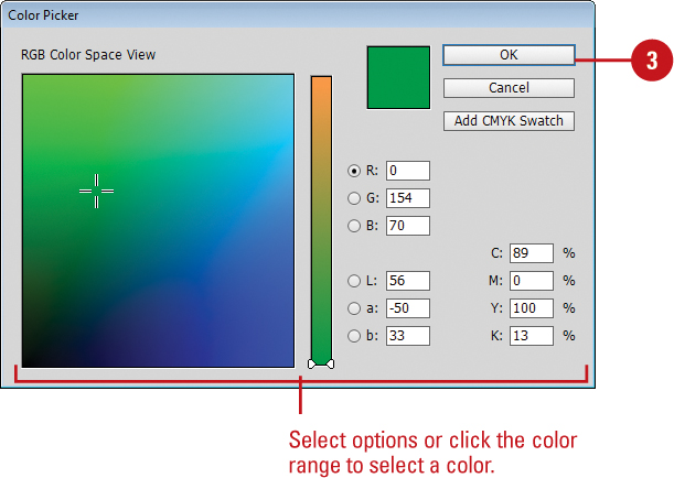
♦ Double-click the Fill or Stroke color box to open the Color Picker dialog box, select a color or enter color values, and then click OK.
♦ To set the default colors of black and white, click the Default Fill and Stroke icon on the Tools panel.
♦ To switch the current fill and stroke color, click the Swap Fill and Stroke icon on the Tools panel.

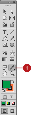
Using the Eyedropper Tool
The Eyedropper tool on the Tools panel makes it easy to quickly pick up a color from one area of your artwork and apply it to another area. When you click an object with the Eyedropper tool, it picks up the object’s color and stroke attributes and displays them in the Tools, Color, and Stroke panels. You can pick up attributes from any type of object, even a graphic image, and the object doesn’t even need to be selected. If an object is selected, the color and stroke attributes are applied to the selected object. The Eyedropper tool also provides options for you to customize the attributes—such as Stroke, Fill, Character, Paragraph, and Object—that you want to pick up with the tool.
Apply Colors and Attributes with the Eyedropper Tool
![]() If you want to apply the acquired color and attributes to one or more objects, then select them first.
If you want to apply the acquired color and attributes to one or more objects, then select them first.
![]() Select the Eyedropper tool on the Tools panel.
Select the Eyedropper tool on the Tools panel.
The eyedropper appears white, ready to sample object attributes.


![]() Click an object that contains the color and attributes that you want to pick up and apply.
Click an object that contains the color and attributes that you want to pick up and apply.
The eyedropper appears black, filled with object attributes. If an object is selected, the attributes are applied to the object.
![]() Click an object to apply the attributes.
Click an object to apply the attributes.
♦ To pick up different object attributes, Alt+click (Win) or Option+click (Mac) another object.
♦ To have the Eyedropper tool only pick up an object’s color and not other attributes, click the Fill or Stroke box on the Tools or Color panel, and then Shift+click the color to be picked up.
![]() Click the Expand arrow to display individual options for the main settings (Stroke, Fill, Character, Paragraph, or Object).
Click the Expand arrow to display individual options for the main settings (Stroke, Fill, Character, Paragraph, or Object).
![]() Select the check boxes for the options that you want the Eyedropper to pick up and deselect the ones you don’t.
Select the check boxes for the options that you want the Eyedropper to pick up and deselect the ones you don’t.
![]() Click OK.
Click OK.

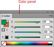
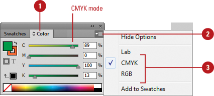
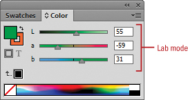
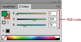
Working with the Color Panel
The Color panel gives you access to InDesign’s color-generation tools. This single panel lets you select a color mode (Lab, RGB, or CMYK), create colors using different sliders, spectrum color selectors, and an option that lets you create a color ramp for the current fill and stroke colors. For example, the CMYK spectrum displays a rainbow of colors in the CMYK color gamut. Moving the eyedropper into the spectrum box and clicking lets you select any color and gives you a visual representation of the relationships between various colors.
Select Color Modes with the Color Panel
![]() Select the Color panel.
Select the Color panel.
♦ Click the Window menu, point to Color, and then click Color.
![]() Click the Options button on the panel.
Click the Options button on the panel.
![]() Select from the following type of Color Sliders:
Select from the following type of Color Sliders:
♦ Lab. Creates three sliders (L, a, and b). The L slider has a possible value from 0 to 100, and the a and b sliders have a possible value from-128 to 127.
♦ CMYK. Creates four subtractive sliders (cyan, magenta, yellow, and black). Each slider has a possible value from 0 to 100. The values for CMYK are rounded to the nearest whole number. Converts the lower portion of the Color panel to the CMYK spectrum. Clicking anywhere in the spectrum changes the active color.
♦ RGB. Creates three sliders (red, green, and blue). Each slider has a possible value from 0 to 255. Converts the lower portion of the Color panel to the RGB spectrum. Clicking anywhere in the spectrum changes the active color.
♦ Click the Window menu, point to Color, and then click Color.
![]() To change a color, click a color box, use a slider, enter specific color values, or click a color in the spectrum. The box with the red diagonal line is the None color.
To change a color, click a color box, use a slider, enter specific color values, or click a color in the spectrum. The box with the red diagonal line is the None color.
♦ Hold the Shift key while you drag a slider to have all the other sliders move too.
♦ You can also drag a color directly from the Color panel onto objects.
![]() To change a color using the Color Picker, double-click a color box, select a color using the color range or color mode options, and then click OK.
To change a color using the Color Picker, double-click a color box, select a color using the color range or color mode options, and then click OK.
![]() To add the current color to the Swatches panel, drag it to the Swatches panel, or click the Options button, and then click Add To Swatches.
To add the current color to the Swatches panel, drag it to the Swatches panel, or click the Options button, and then click Add To Swatches.
Did You Know?
You can identify out-of-gamut colors. If an out-of-gamut warning icon (a triangle with an exclamation point) appears below the color boxes on the Color panel, it indicates that the current RGB or Lab color doesn’t have a CMYK equivalent, which means you can’t use it in a commercial project.
You can convert out-of-gamut colors. If an out-of-gamut warning icon (a triangle with an exclamation point) appears below the color boxes on the Color panel, click the small square next to the out-of-gamut symbol to convert the color to the closest process-color equivalent.
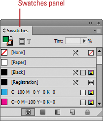
Working with the Swatches Panel
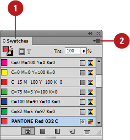
InDesign not only lets you select virtually any colors you desire, it also lets you store those colors for future use in the Swatches panel. Where the Color panel lets you select virtually any color you need, the Swatches panel lets you save and re-use specific colors that you use often. In the Swatches panel, you can point to a color box to display a tooltip indicating the color’s settings. If you want to view more information, you can change the Swatches panel display to make it easier to view and work with colors. To help you find the swatches you need, you can display them by type or you can adjust the size of the swatch.
Change the Swatches Panel Display
![]() Select the Swatches panel.
Select the Swatches panel.
♦ Click the Window menu, point to Color, and then click Swatches.
![]() To display different types of swatches, click one of the following buttons: Show All Swatches, Show Color Swatches, or Show Gradient Swatches.
To display different types of swatches, click one of the following buttons: Show All Swatches, Show Color Swatches, or Show Gradient Swatches.
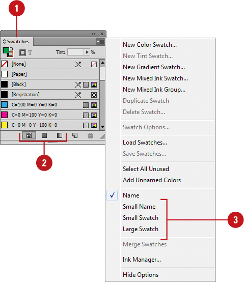
![]() To display swatches by size, click the Options button, and then choose from the following options: Name, Small Name, Small Swatch, or Large Swatch.
To display swatches by size, click the Options button, and then choose from the following options: Name, Small Name, Small Swatch, or Large Swatch.
Did You Know?
You can duplicate a color swatch from the Swatches panel. Select the Swatches panel, select a color swatch, and then click the New Swatch button on the panel. The duplicate color swatch appears at the bottom of the list with the word copy at the end of the name.
♦ Click the Window menu, point to Color, and then click Swatches.
![]() Click the Options button, and then click New Color Swatch to add a new color swatch, or double-click the swatch to edit it.
Click the Options button, and then click New Color Swatch to add a new color swatch, or double-click the swatch to edit it.
Timesaver
Alt+click (Win) or Option+click (Mac) the New Swatch button on the panel to add a color swatch.
♦ To add a color, you can also drag a color from the color boxes on the Tools or Color panel to the Swatches panel.

![]() To enter a color swatch name, deselect the Name with Color Value check box, and then enter a name.
To enter a color swatch name, deselect the Name with Color Value check box, and then enter a name.
![]() Click the Color Type list arrow, and then click one of the following:
Click the Color Type list arrow, and then click one of the following:
♦ Process. Colors printed using small dots of the CMYK inks to create color combinations.
♦ Spot. Colors printed using color-specific inks.
![]() Click the Color Mode list arrow, and then select a color mode.
Click the Color Mode list arrow, and then select a color mode.
![]() Adjust the color sliders to create the color you want.
Adjust the color sliders to create the color you want.
![]() Click OK.
Click OK.

Did You Know?
You can delete a color swatch from the Swatches panel. Select the Swatches panel, display and select the color you want to delete, and then click the Delete Swatch button.
Managing Color Swatches
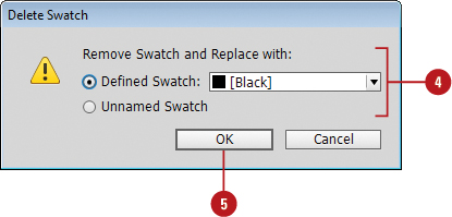
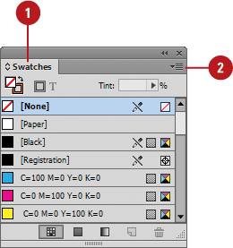
In addition to adding and editing swatches, you can also move, delete, duplicate, merge, save, load, rename, and name unnamed color swatches in the Swatches panel. Unnamed colors are colors that are applied to objects using the Color panel or Color Picker, while named colors are applied from the Swatches panel. If you no longer use a color or you want to change the use of a color, you can use the Delete Swatches button on the Swatches panel. If a color is not in use, InDesign simply deletes it. If the color is in use, InDesign gives you an opportunity to delete the color and use another one or specify the color as unnamed. The default swatches for None, Paper, Black, and Registration cannot be edited or deleted.
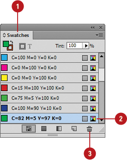
Delete Color Swatches
![]() Select the Swatches panel.
Select the Swatches panel.
♦ Click the Window menu, point to Color, and then click Swatches.
![]() Select the swatches you want to delete.
Select the swatches you want to delete.
♦ To select multiple swatches, hold the Shift key to select the first and last swatch in a contiguous range, or hold the Ctrl (Win) or ![]() (Mac) key to select noncontiguous swatches.
(Mac) key to select noncontiguous swatches.
![]() Click the Delete Swatch button on the panel.
Click the Delete Swatch button on the panel.
If the swatch is being used, an alert dialog box appears.
![]() Click the Defined Swatch option, and then select a color, or click the Unnamed Swatch option.
Click the Defined Swatch option, and then select a color, or click the Unnamed Swatch option.
![]() Click OK.
Click OK.
Did You Know?
You can delete all unused color swatches. Select the Swatches panel, click the Options button, click Select All Unused, and then click the Delete Swatch button on the panel.
Work with Swatches
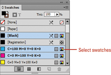
♦ Select Swatches. Hold the Shift key to select the first and last swatch in a contiguous range, or hold the Ctrl (Win) or ![]() (Mac) key to select noncontiguous swatches.
(Mac) key to select noncontiguous swatches.
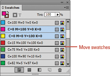
♦ Move Swatches. Select a swatch in the Swatches panel, and then drag the swatch to a new position. A thick black line appears, indicating the new position.
♦ Duplicate Swatches. Select a swatch in the Swatches panel, and then click the New Swatch button on the panel.
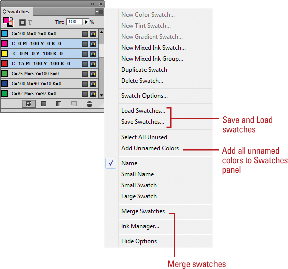
♦ Merge Swatches. Select the Swatches panel, click the first color (which is the merge into color), hold the Ctrl (Win) or ![]() (Mac) key, and then click to select other swatches for the merge. Click the Options button, and then click Merge Swatches.
(Mac) key, and then click to select other swatches for the merge. Click the Options button, and then click Merge Swatches.
♦ Save Swatches. Select the swatches you want to save in the Swatches panel, click the Options button, click Save Swatches, specify a name and location, and then click Save. Swatches are saved with the Adobe Swatch Exchange (ASE) file format.
♦ Load Swatches. Select the Swatches panel, click the Options button, click Load Swatches, select the ASE swatches file, and then click Open.
♦ Add All Unnamed Colors to the Swatches Panel. Unnamed colors are colors that are applied to objects using the Color panel or Color Picker. Select the Swatches panel, click the Options button, and then click Add Unnamed Colors. The unnamed colors are named with color percentage values.
Working with Swatch Libraries
Instead of creating your own color swatches, you can use the swatch libraries from color systems, such as Trumatch and Pantone. Trumatch and Pantone are common color libraries in North America for prepress and desktop color printing. These color systems are universally used by printers, so you can produce consistent results. Other color libraries include ANPA (commonly used for newspapers), DIC (commonly used in Japan), Focoltone (commonly used in France and Great Britain), HKS (commonly used in Europe), System (Macintosh), System (Windows), Toyo (commonly used in Japan), and Web. Web is a common color library of 216 web-safe colors for use on the web by both the Macintosh and Windows operating systems.
Add Colors from Swatch Libraries
![]() Select the Swatches panel.
Select the Swatches panel.
♦ Click the Window menu, point to Color, and then click Swatches.
![]() Click the Options button, and then click New Color Swatch to add a new color swatch, or double-click the swatch to edit it.
Click the Options button, and then click New Color Swatch to add a new color swatch, or double-click the swatch to edit it.
![]() Click the Color Mode list arrow, and then select a swatch library.
Click the Color Mode list arrow, and then select a swatch library.
![]() Select a color in the library.
Select a color in the library.
![]() Click OK.
Click OK.

Did You Know?
You can import swatches from other documents. Select the Swatches panel, click the Options button, click Load Swatches, navigate to and select the InDesign or Illustrator document, and then click Open.
Creating Tint Swatches
A tint is a shade of a base color. The base color is a 100% tint. You can adjust the tint of a color by lowering the percentage from 1% to 99%. You can create a new tint swatch by using a dialog box or the Tint option at the top of the Swatches panel. I like the dialog box method better. After you create a new tint color swatch, it appears in the Swatches panel list with the new tint percentage in the name. If you need to edit a tint swatch, simply double-click the swatch to open the Swatch Options dialog box to make the changes you want.
Create and Edit a Tint Swatch
![]() Select the Swatches panel.
Select the Swatches panel.
♦ Click the Window menu, point to Color, and then click Swatches.
![]() Do either of the following:
Do either of the following:
♦ New. Select a base color in the Swatches panel as the basis for the color tint, click the Options button, and then click New Tint Swatch.
♦ Edit. Double-click the tint swatch.
![]() Enter a Tint percentage value or drag the slider to create a tint screen of the color.
Enter a Tint percentage value or drag the slider to create a tint screen of the color.
![]() Click OK.
Click OK.
The new tint swatch appears in the Swatches panel list with the new tint percentage.


Did You Know?
You can create a tint swatch without the dialog box. Select the Swatches panel, select a color as the basis, enter a tint percentage in the Tint control at the top of the Swatches panel, and then click the New Swatch button on the panel.
Creating Gradient Swatches
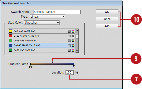
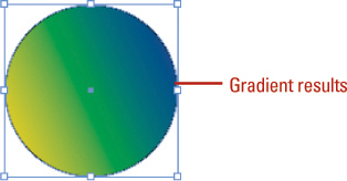
A gradient is a smooth transition between two or more colors in an object. You can create and save a gradient of your own by using the Swatches panel. You can create a gradient with two or more colors. There are two types of gradients: Radial (circular) and Linear (horizontal). You can adjust the number and blend of gradient colors by adding or changing color stops. After you create a gradient, you can apply it to objects just like any other swatch in the Swatches panel. In addition to the Swatches panel, you can also create a gradient by using the Gradient panel. The gradient is unnamed and not saved unless you store it as a swatch.
Create a Gradient Swatch
![]() Select the Swatches panel.
Select the Swatches panel.
♦ Click the Window menu, point to Color, and then click Swatches.
![]() Click the Options button, and then click New Gradient Swatch.
Click the Options button, and then click New Gradient Swatch.

![]() Enter a name for the gradient swatch.
Enter a name for the gradient swatch.
![]() Click the Type list arrow, and then select a gradient type: Radial or Linear.
Click the Type list arrow, and then select a gradient type: Radial or Linear.
![]() Click the left color stop.
Click the left color stop.
![]() Click the Stop Color list arrow, select a color type, and then use the sliders to create the color you want.
Click the Stop Color list arrow, select a color type, and then use the sliders to create the color you want.

![]() Repeat the previous step for the right color stop.
Repeat the previous step for the right color stop.
![]() To add color stops, click below the gradient spectrum in a blank area. To remove a color stop, drag it down and away from the gradient spectrum.
To add color stops, click below the gradient spectrum in a blank area. To remove a color stop, drag it down and away from the gradient spectrum.
![]() To adjust the amount of each color in the gradient, drag the diamond above the gradient spectrum.
To adjust the amount of each color in the gradient, drag the diamond above the gradient spectrum.
![]() Click Add to add the gradient to the Swatches panel and continue to add gradients, or click OK.
Click Add to add the gradient to the Swatches panel and continue to add gradients, or click OK.
♦ Click the Window menu, point to Color, and then click Gradient.
![]() Click the Type list arrow, and then select a gradient type: Radial or Linear.
Click the Type list arrow, and then select a gradient type: Radial or Linear.
![]() Click the left color stop.
Click the left color stop.
![]() Use the color spectrum and sliders in the Color panel to create the color you want.
Use the color spectrum and sliders in the Color panel to create the color you want.
![]() Repeat the previous step for the right color stop.
Repeat the previous step for the right color stop.
![]() To add color stops, click below the gradient spectrum in a blank area. To remove a color stop, drag it down and away from the gradient spectrum.
To add color stops, click below the gradient spectrum in a blank area. To remove a color stop, drag it down and away from the gradient spectrum.
![]() To adjust the amount of each color in the gradient, drag the diamond above the gradient spectrum.
To adjust the amount of each color in the gradient, drag the diamond above the gradient spectrum.
![]() Enter an Angle value to set the angle of the gradient.
Enter an Angle value to set the angle of the gradient.
![]() To reverse the position of the color stops, click the Reverse button.
To reverse the position of the color stops, click the Reverse button.


![]() To save the gradient, drag the gradient preview box to the Swatches panel or click the New Swatch button on the Swatches panel.
To save the gradient, drag the gradient preview box to the Swatches panel or click the New Swatch button on the Swatches panel.

Creating Mixed Inks
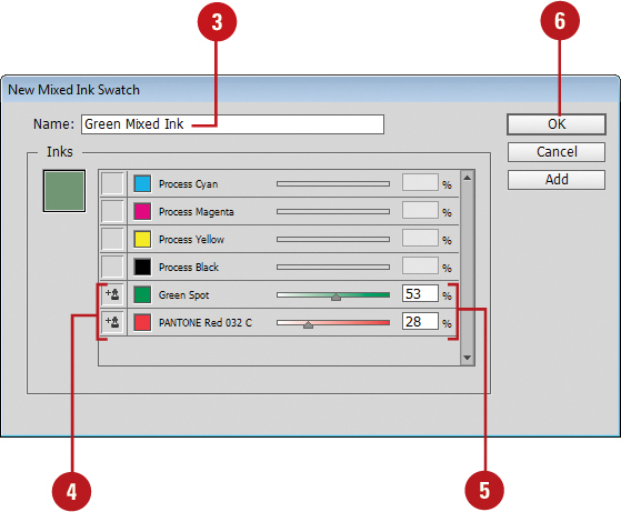
Mixed inks combine a spot color with other spot colors or process colors to give you more color options for your custom designs. Mixed inks can be useful when you want a darker shade of a color to make it stand out in your design or to create a new spot color from two other existing spot colors. You can even use a mixed ink group to create a collection of mixed inks. This is useful when you want to create a series of color mixes.
Create a Mixed Ink
![]() Select the Swatches panel.
Select the Swatches panel.
♦ Click the Window menu, point to Color, and then click Swatches.
![]() Click the Options button, and then click New Mixed Ink Swatch.
Click the Options button, and then click New Mixed Ink Swatch.

![]() Enter a name for the mixed ink swatch.
Enter a name for the mixed ink swatch.
![]() Click two or more ink controls to select the colors you want to use in the mixed ink swatch.
Click two or more ink controls to select the colors you want to use in the mixed ink swatch.
![]() Drag the sliders to adjust the inks to achieve the color you want.
Drag the sliders to adjust the inks to achieve the color you want.
![]() Click OK.
Click OK.
♦ Click the Window menu, point to Color, and then click Swatches.
![]() Click the Options button, and then click New Mixed Ink Group.
Click the Options button, and then click New Mixed Ink Group.

![]() Enter a name for the mixed ink group.
Enter a name for the mixed ink group.
![]() Click two or more ink controls to select the colors you want to use in the mixed ink group.
Click two or more ink controls to select the colors you want to use in the mixed ink group.
![]() Enter an Initial value to define the color amount for the first instance of an ink.
Enter an Initial value to define the color amount for the first instance of an ink.
![]() Enter a Repeat value to set the number of mixed inks in the new color.
Enter a Repeat value to set the number of mixed inks in the new color.
![]() Enter an Increment value to set the increment value for each new mixed ink.
Enter an Increment value to set the increment value for each new mixed ink.
![]() Click Preview Swatches to see the results of the grouping.
Click Preview Swatches to see the results of the grouping.
![]() Click OK.
Click OK.


Did You Know?
You can edit a mixed ink group. Select the Swatches panel, and then double-click the mixed ink group. Select the ink controls to remove colors, or use the list arrows to change colors. Choose Swatch Options from the Options button and then select the Convert Mixed Ink Swatches To Process check box to change all the colors in the mixed ink swatches to their process color equivalents. When you’re done, click OK.
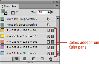
Using Colors from the Kuler Panel
The Kuler panel is an extension to InDesign that allows you to use groups of color, or themes in your projects. You can use the panel to browse thousands of color themes, create your own using the complementary harmony rules, and share them with others in the Kuler community. After you find or create the theme you want, you can add it to the Swatches panel for use in your project. You can access the Kuler panel by using the Extensions submenu on the Window menu. The Kuler panel is also available in Photoshop, Flash, Illustrator, and Fireworks.
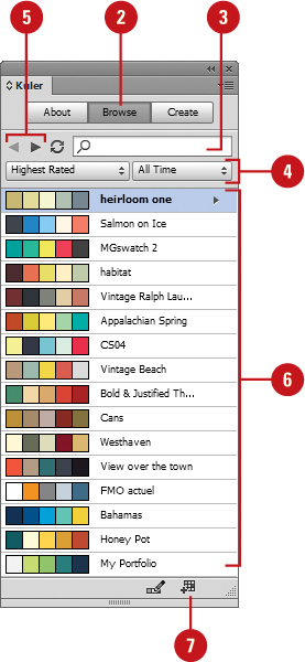
Browse Themes and Add to the Swatches Panel
![]() Click the Window menu, point to Extensions, and then click Kuler.
Click the Window menu, point to Extensions, and then click Kuler.
![]() Click the Browse tab.
Click the Browse tab.
![]() To search for a theme, click in the Search box, enter the name of the theme, a tag, or a creator, and then press Enter (Win) or Return (Mac).
To search for a theme, click in the Search box, enter the name of the theme, a tag, or a creator, and then press Enter (Win) or Return (Mac).
Important
In a search, use only alphanumerical characters (Aa-Zz, 0-9).
![]() To narrow down the browse list, click the list arrows, and then select the filter options you want. Some include Highest Rated, Most Popular, Newest.
To narrow down the browse list, click the list arrows, and then select the filter options you want. Some include Highest Rated, Most Popular, Newest.
♦ To save a search, click the first list arrow, click Custom, enter your search criteria, and then click Save.
![]() To browse for a theme, click the View Previous Set Of Themes or View Next Set Of Themes button.
To browse for a theme, click the View Previous Set Of Themes or View Next Set Of Themes button.
![]() Select a theme in the panel.
Select a theme in the panel.
![]() To add the theme to the Swatches panel, click the Add Selected Theme To Swatches button.
To add the theme to the Swatches panel, click the Add Selected Theme To Swatches button.
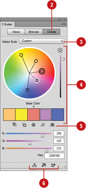
![]() To create or edit a theme, do either of the following:
To create or edit a theme, do either of the following:
♦ Create a theme. Click the Create tab.
♦ Edit a theme. Click the Browse tab, select the theme you want to edit, and then click Edit Theme in Create Panel.
![]() Click the Select Rule list arrow, and then select a harmony rule or Custom.
Click the Select Rule list arrow, and then select a harmony rule or Custom.
The harmony rule uses the base color as the basis for generating the colors in the color group, so you can create a theme with complementary colors.
![]() Select a color box, and then use the sliders and the color wheel to display the color you want.
Select a color box, and then use the sliders and the color wheel to display the color you want.
![]() Use the buttons below the color boxes to add/remove the theme color, add the current stroke/fill color as the base color, or adjust the other colors.
Use the buttons below the color boxes to add/remove the theme color, add the current stroke/fill color as the base color, or adjust the other colors.
♦ Double-click a color box to set the active color in InDesign.
![]() Upon completion, do any of the following:
Upon completion, do any of the following:
♦ Save theme. Click Save Theme, name the theme, and then click Save to create a new one.
♦ Add to Swatches Panel. Click the Add This Theme To Swatches button.
♦ Upload to Kuler. Click the Upload Theme To Kuler button.
Overprinting Colors
Overprinting allows you to set the color of one object to mix with any colors underneath. For example, when you have a red object overlapping a blue object, the red object knocks out the overlapped area underneath in the blue object. When you set the red object to overprint, the red object mixes with the blue object underneath to create another color. You can individually set fill, stroke, and gap colors to overprint. After you set overprint options for an object, you can preview your results by using Overprint Preview.
Set a Fill or Stroke to Overprint and Preview the Results
![]() Select the object.
Select the object.
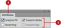
![]() Select the Attributes panel.
Select the Attributes panel.
♦ Click the Window menu, point to Output, and then click Attributes.
![]() Select from the following options:
Select from the following options:
♦ Overprint Fill. Select to set the object’s fill color to overprint.
♦ Overprint Stroke. Select to set the object’s stroke color to overprint.
♦ Overprint Gap. Select to set the gap color applied to stroke effects to overprint.
♦ Nonprinting. Select to not print the object.
![]() To preview overprinting, click the View menu, and then click Overprint Preview.
To preview overprinting, click the View menu, and then click Overprint Preview.

Proofing Colors on the Screen
As you start to use color in your document, it’s important to see how your color or grayscale settings appear. It would be nice to see a printed copy in color to see the actual colors. However, that is not always possible. Instead, you can view a soft proof on your screen to quickly see how your colors or grayscale will appear. A soft proof simulates the output of your actual device and media, such as a printer with a specific type of paper.
Display a Soft Proof
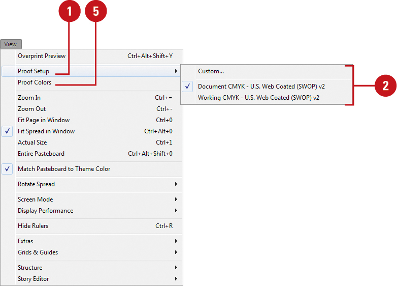
![]() Click the View menu, and then point to Proof Setup.
Click the View menu, and then point to Proof Setup.
![]() Select from one of the available output devices to simulate, or click Custom to set up your own.
Select from one of the available output devices to simulate, or click Custom to set up your own.
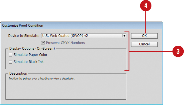
![]() For a custom soft proof setup, select from the following options:
For a custom soft proof setup, select from the following options:
♦ Device to Simulate. Select a target device to simulate.
This includes additional targets: grayscale Dot Gain (10%, 15%, 20%, 25%, 30%) Gray Gamma 1.8 or 2.2, Black & White, and sGray.
♦ Preserve CMYK Numbers. Select to use colors as they are and not convert them to the color space. Deselect to use a rending intent to display colors.
♦ Simulate Paper Color. Select to simulate white paper.
♦ Simulate Black Ink. Select to simulate dark gray instead of black.
![]() Click OK.
Click OK.
![]() Click the View menu, and then click Proof Colors.
Click the View menu, and then click Proof Colors.
See Also
See “Setting PDF Output Options” on page 430 for more information on exporting a grayscale PDF using grayscale profiles.
Changing the Interface Color Theme
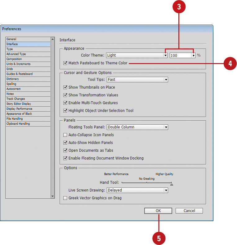
InDesign allows you to change the color theme of the user interface from a dark gray (default) (New!) to a light gray (similar to InDesign CS6). You can change the interface color theme in Interface preferences with a specified color theme or a custom one. In addition, you can select an option match the pasteboard color area around the document in the Document window with the color theme (New!).
Set the Interface Color Theme
![]() Click the Edit (Win) or InDesign (Mac) menu, and then point to Preferences.
Click the Edit (Win) or InDesign (Mac) menu, and then point to Preferences.
![]() Click Interface.
Click Interface.
![]() Click the Color Theme list arrow (New!), and then select an option:
Click the Color Theme list arrow (New!), and then select an option:
♦ Light. Selects a color theme shade with 100%.
♦ Medium Light. Selects a color theme shade with 67%.
♦ Medium Dark. Selects a color theme shade with 33%.
♦ Dark. Selects a color theme shade with 0%.
♦ Custom. Enter a shade percentage (0-100%), or lick the Color Theme arrow, and then drag the slider.
![]() To match the pasteboard in the Document window to the color theme, select the Match Pasteboard to Theme Color check box (New!).
To match the pasteboard in the Document window to the color theme, select the Match Pasteboard to Theme Color check box (New!).
![]() Click OK.
Click OK.