
Hour 24. Implementing Mobile Form Elements and Controls
What You’ll Learn in This Hour:
 Adding mobile versions of HTML form elements to mobile pages
Stylizing buttons, check boxes, selects, and other form elements
Implementing a flip switch and slider elements to make users happy
How the mobile form framework treats form elements
Using selects to create custom menus
Adding icons to buttons
jQuery Mobile provides an excellent framework that stylizes the HTML form elements to fit better with mobile pages. Using these stylized elements, you can add much better interaction and control to your web pages and a better experience for your users.
In this hour, you get a glimpse into how the mobile framework treats the form elements and how to utilize the framework in applying the form elements as controls on the mobile page—for example, combining check boxes, radios, buttons, and the like into groups that look and act as a single control.
Understanding Mobile Forms
Before you get started implementing mobile forms, you should understand a few differences from normal HTML forms controls. The following sections discuss those difference so that you understand how to implement the mobile form elements.
Form Data Attributes
jQuery Mobile introduces several attributes for elements that help extend and define the behavior to support mobile devices. Table 24.1 lists some of those attributes that you will need to be familiar with as you begin implementing mobile forms. The list is not comprehensive.
Adding/Hiding Labels
Labels are required on form inputs in jQuery Mobile. This allows the library to format the form elements appropriately for mobile devices. Therefore, you need to add a label and use the for attribute to link it to the form input. The good news is that jQuery Mobile provides a class that you can easily hide the label with. For example:
<div data-role="fieldcontain" class="ui-hide-label">
<label for="username">Username:</label>
<input type="text" name="username" id="username" value="" placeholder="Username"/>
</div>
Disabling Form Elements
Form elements can be disabled by adding the ui-disabled class to them in the HTML definition or programmatically in your jQuery code. Disabling the elements prevents the control from accepting input from the user. jQuery Mobile also has special styling that is applied to disabled controls to make it apparent to the user that the form element cannot be used.
Refreshing Form Elements
When programmatically changing items in a form, such as adding options to a select, you need to call the refresh function on the item. The following shows some examples of adjusting form elements using jQuery and then refreshing them:
var mySelect = $("#mySelect");
mySelect[0].selectedIndex = 1;
mySelect.selectmenu("refresh");
$("#myCheckbox").prop("checked",true).checkboxradio("refresh");
$("#myRadio").prop("checked",true).checkboxradio("refresh");
$("#mySlider").val(100).slider("refresh");
Submitting Forms
jQuery automatically submits forms using AJAX. The submission will default to get and the action will default to the current page’s path, found using $.mobile.path.get(), unless you specify an action and method attribute in the form.
Forms also support the data-transition and data-direction="reverse" attributes that allow you to transition back to the original page.
Caution
Using a multipart form with a file input is not supported by AJAX. Therefore, you need to add the data-ajax="false" to the parent form element to ensure that the form is submitted properly to the server.
Using Text Elements
jQuery Mobile text inputs are, for the most part, standard. It supports the HTML 5 input types, such as search, password, email, tel, number, and so on. This allows for standard HTML format checking and on some devices quick entry, such as a phone number.
You can enclose the text input field in a <div data-role="fieldcontain" class="ui-hide-label"> container to hide the labels. You can also set the text input theme by using data-theme.
Listing 24.1 shows an example of some basic HTML elements being added to a web page. The results are shown in Figure 24.1. The full code can be found on the book’s website in code/hour24/hour2401.html.
LISTING 24.1 HTML Code That Implements Textual Elements
20 <div data-role="fieldcontain" class="ui-hide-label">
21 <label for="search">Search</label>
22 <input type="search" name="search" id="search" value="" />
23 </div>
24 <div data-role="fieldcontain" class="ui-hide-label">
25 <label for="username">Name</label>
26 <input type="text" name="username" id="username" placeholder="your name here"/>
27 <label for="title">Title</label>
28 <input type="text" name="title" id="title" value="" placeholder="some title"/>
29 <label for="email">Email</label>
30 <input type="email" name="email" id="email" value="" placeholder="email"/>
31 </div>
32 <label for="area">Textarea:</label>
33 <textarea name="textarea" id="area" data-theme="a">
34 Simple text area input
35 </textarea>

Defining Buttons
jQuery Mobile provides a good set of options to create and style buttons for mobile use. You have already seen that adding the data-role="button" to an <a> tag will render the link as a button. You can also create buttons using the standard HTML methods in <button> and <input> elements.
jQuery Mobile styles the buttons automatically and enables you to add icons, adjust the theme, and render mini versions by adding the appropriate data attributes to the HTML tag.
A nice benefit of jQuery Mobile is that you can add icons to a button just by using the data-icon attributes. You can position it using data-iconpos. You can even render only the icon by using data-iconpos="notext".
Another feature jQuery Mobile provides is the capability to group buttons together so they appear as a single set. To create a button set, add the buttons inside a
<div data-role="controlgroup" data-type="vertical">
or
<div data-role="controlgroup" data-type="horizontal">
element.
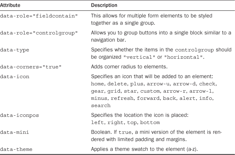
To illustrate the use of buttons, Listing 24.2 renders several types of buttons—some with icons, some in mini form. It also includes both vertical and horizontal button groups. The rendered results are shown in Figure 24.2. The full code can be found on the book’s website in code/hour24/hour2402.html.
LISTING 24.2 HTML Code Mobile Button Elements
22 <a href="" data-role="button">Link Button</a>
23 <button data-inline="true" data-theme="b">Accept</button>
24 <button data-inline="true" data-theme="e">Decline</button>
25 <div data-role="controlgroup" data-mini="true" id="vGroup">
26 <button data-icon="arrow-u">Increment</button>
27 <button data-icon="arrow-d">Decrement</button>
28 </div>
29 <div data-role="controlgroup" data-type="horizontal" data-mini="true">
30 <button>b</button><button>i</button><button>u</button>
31 </div>
32 <div data-role="controlgroup" data-type="horizontal" data-mini="true">
33 <button data-icon="grid" data-iconpos="notext">b</button>
34 <button data-icon="gear" data-iconpos="notext">b</button>
35 <button data-icon="star" data-iconpos="notext">b</button>
36 </div>
37 <input type="submit" value="Submit" data-icon="check" data-iconpos="right"/>
Adding Sliders and Toggle Switches
An extremely useful control that you can add to your mobile pages is the slider. The slider makes it much easier for users to input data because they can use finger swipes to adjust values rather than clicking a text box for input.
To add a slider to the mobile page, use an <input type="range"> element and then set the value, min, max, and step attributes. You also need to add a <label> element with the for attribute linking to the slider.
After you have created the slider, you can style it. The data-theme attribute allows you to select a swatch. You can also have the data side of the slider highlighted using the data-highlight="true" attribute. The code in Listing 24.3 shows two sliders to control the zoom and opacity of an image. I put the sliders in a fieldcontain so that the labels would track next to them and they would be closer together.
Another useful visual control similar to the slider is the toggle switch. The toggle switch has two states, on and off. This is another feature that makes it easier for users to interact with because it is not as easy to accidentally trigger as a check box or radio button because it takes a bit of a slide to toggle it on or off.
A toggle is created by implementing a <select data-role="slider"> element with two options. The first option is styled as the on state, and the second option is styled as the off state. Listing 24.3 also contains an example of a slider element with options to show or hide the image.
Try it Yourself: Using Toggles and Switches Allows Users to Manipulate Elements
1. In Aptana, create the hour24, hour24/css, and hour24/js folders, and add the hour24/hour2403.html, hour24/hour2403.css, and hour24/hour2403.js files. Then copy the hour22/js/initmobile.js file into the hour24/js folder.
2. Add the code shown in Listing 24.3-css to the CSS file.
3. Add the code shown in Listing 24.3-html to the HTML file.
4. Look at the following code in Listing 24.3. This code defines two sliders. The first has a range from 50 to 200 to control the zoom percentage. The second has a range from 0 to 1 in .05 step increments to control the opacity. The data-highlight option is set to true in both so that the slider will indicate the data side. The fieldcontain element around the sliders allows the labels to track to the side. Notice the code uses the data-mini display option.
20 <div data-role="fieldcontain">
21 <label for="sizeSlide">Zoom</label>
22 <input type="range" name="sizeSlide" id="sizeSlide"
23 value="100" min="50" max="200" data-mini="true" />
24 <label for="fadeSlide">Fader</label>
25 <input type="range" name="fadeSlide" id="fadeSlide" data-highlight="true"
26 value="1" min="0" max="1" step=".05" data-mini="true" />
27 </div>
5. Look at the following lines that define a toggle switch. The data-role="slider" is set on the select to define it as a mobile toggle switch. The toggle switch is put into a fieldcontain element to make the label track to the side:
28 <div data-role="fieldcontain">
29 <label for="flip">Image</label>
30 <select name="flip" id="flip" data-role="slider">
31 <option value="off">Hide</option>
32 <option value="on">Show</option>
33 </select>
34 </div>
6. Open hour2403.js and add the following .ready() function. The code adds three event handlers. The first two event handlers are for the change event on the slider switches. The width of the image is adjusted by the first and the opacity by the second using the .val() value from the slider element. The third handles the change event handler for the toggle switch <select> element. If the switch is on, the <img> element is displayed. If it is off, the <img> element is hidden.
1 $(document).ready( function() {
2 checkForMobile();
3 $("#sizeSlide").on("change", function(){ $("img").width(210*$(this).val()/100); });
4 $("#fadeSlide").on("change", function(){ $("img").css({opacity:$(this).val()}); });
5 $("#flip").on("change", function(){
6 if($(this).val() == "on") { $("img").show(); }
7 else { $("img").hide(); } });
8 });
7. Save all the files and then open the HTML code in a browser on your mobile device. The web page should look similar to Figure 24.3. You should be able to adjust the zoom and fade in the image with the sliders and turn the image on and off with the toggle switch.

LISTING 24.3 HTML Code Implementing Mobile Slider Elements to Control an Image
01 <!DOCTYPE html>
02 <html>
03 <head>
04 <title>Hour 24-3</title>
05 <meta charset="utf-8" />
06 <meta name="viewport" content="width=device-width, initial-scale=1">
07 <script type="text/javascript" src="../js/jquery-1.9.0.min.js"></script>
08 <script type="text/javascript" src="js/initmobile.js"></script>
09 <script type="text/javascript" src="../js/jquery.mobile-custom.min.js"></script>
10 <script type="text/javascript" src="js/hour2403.js"></script>
11 <link rel="stylesheet" href="../js/css/jquery.mobile-custom.min.css" />
12 <link rel="stylesheet" href="css/hour2403.css" />
13 </head>
14 <body>
15 <div id="border"><div id="frame">
16 <div data-role="page" id="pageOne">
17 <div data-role="header"><h1>Buttons</h1></div>
18 <div data-role="content">
19 <div id="imgFrame"><img src="../images/peak.jpg" /></div>
20 <div data-role="fieldcontain">
21 <label for="sizeSlide">Zoom</label>
22 <input type="range" name="sizeSlide" id="sizeSlide"
23 value="100" min="50" max="200" data-mini="true" />
24 <label for="fadeSlide">Fader</label>
25 <input type="range" name="fadeSlide" id="fadeSlide" data-highlight="true"
26 value="1" min="0" max="1" step=".05" data-mini="true" />
27 </div>
28 <div data-role="fieldcontain">
29 <label for="flip">Image</label>
30 <select name="flip" id="flip" data-role="slider">
31 <option value="off">Hide</option>
32 <option value="on">Show</option>
33 </select>
34 </div>
35 </div>
36 </div></div>
37 </body>
38 </html>
LISTING 24.3-js jQuery Mobile Code That Handles Changes in the Sliders and Toggle Switches
1 $(document).ready( function() {
2 checkForMobile();
3 $("#sizeSlide").on("change", function(){ $("img").width(210*$(this).val()/100); });
4 $("#fadeSlide").on("change", function(){ $("img").css({opacity:$(this).val()}); });
5 $("#flip").on("change", function(){
6 if($(this).val() == "on") { $("img").show(); }
7 else { $("img").hide(); } });
8 });
LISTING 24.3-css CSS Code That Styles the Image and Frame
1 img {width:210px;}
2 #imgFrame {width:210px; height:137px; border:1px solid; overflow:hidden;
3 border:4px ridge white; box-shadow: 5px 5px 5px #888888;}
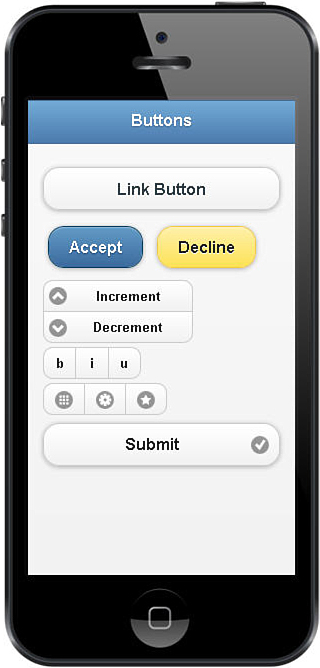
Defining Radios and Check Boxes
jQuery Mobile also has a mobile-friendly version of radio and check box inputs. Most notable is the capability to group them together into control groups that can be displayed vertically or horizontally. When added to the controlgroup, the elements share a common outer border so it becomes obvious that they are connected.
Listing 24.4 shows examples of radio groups and check box groups, and both a horizontal and a vertical version of each. Notice that the <fieldset> element sets the data attributes for the radio groups rather than creating a separate <div>.
The full code can be found on the book’s website in code/hour24/hour2404.html. You can download that code and play around with it. The rendered results are shown in Figure 24.4. It contains the standard change event handlers to adjust the image size.
LISTING 24.4 HTML Code Implementing Radio and Check Box Groups
24 <fieldset data-role="controlgroup" data-mini="true">
25 <input type="radio" name="rc" id="rc1" value="rc1" /><label for="rc1">Family</label>
26 <input type="radio" name="rc" id="rc2" value="rc2" /><label for="rc2">Friend</label>
27 <input type="radio" name="rc" id="rc3" value="rc3" /><label for="rc3">Acqaintance</label>
28 </fieldset>
29 <fieldset data-role="controlgroup" data-type="horizontal" data-mini="true">
30 <input type="radio" name="hrc" id="hrc1" value="hrc1" /><label for="hrc1">Accept</label>
31 <input type="radio" name="hrc" id="hrc2" value="hrc2" /><label for="hrc2">Decline</label>
32 <input type="radio" name="hrc" id="hrc3" value="hrc3" /><label for="hrc3">Maybe</label>
33 </fieldset>
34 <div data-role="controlgroup">
35 <input type="checkbox" name="cb" id="cb1" /><label for="cb1">Newsletter</label>
36 <input type="checkbox" name="cb" id="cb2" /><label for="cb2">SpecialOffers</label>
37 <input type="checkbox" name="cb" id="cb3" /><label for="cb3">PartnerOffers</label>
38 </div>
39 <div data-role="controlgroup" data-type="horizontal" data-mini="true"data=theme="a">
40 <input type="checkbox" name="hcb" id="hcb1" /><label for="hcb1">Road</label>
41 <input type="checkbox" name="hcb" id="hcb2" /><label for=”hcb2”>Topo</label>
42 <input type="checkbox" name="hcb" id="hcb3" /><label for="hcb3">Sat</label>
43 </div>
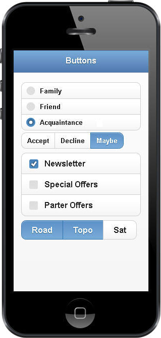
Implementing Select Menus
Mobile menus are often accomplished with listviews and collapsible elements. However, at times, a traditional select is easier to implement under the covers because of the support for multiple selections and value accessibility.
jQuery Mobile provides basic support for <select> elements out of the box with no additional formatting. However, the actual select elements are not styled like the rest of the mobile elements, as shown in Figure 24.5.
You can have jQuery Mobile generate custom select menus that have the mobile formatting. These custom menus do a good job of implementing the full <select> functionality across browsers and mobile OSes. The reason that custom select enhancements are not enabled by default is that it can be a bit of a performance hit, especially when dealing with large select menus.
To enable the custom select menus, you need to set the following option in the mobileinit handler. You should already be familiar with that handler because it was covered in the previous hour.
$(document).on('mobileinit',function(){
$.mobile.selectmenu.prototype.options.nativeMenu = false;
});
When this option is set, jQuery Mobile converts the <select> element into a mobile version. This option provides the benefit that if the menu is too large, the framework will create a new page for it and switch to that page as a standard listview of options. That is shown in Figure 24.5 when day is selected.
You can also use a <fieldset data-role="controlgroup"> element to wrap multiple selects into a single element. Listing 24.5 and Figure 24.5 show a controlgroup as a date selector.
The full code for Listing 24.5 can be found on the book’s website in code/hour24/hour2405.html. You can download that code and play around with it. The rendered results are shown in Figure 24.5. It contains the standard change event handlers to adjust the image size.
LISTING 24.5 HTML Code Implementing Custom Selects
25 <label for="select-choice-0" class="select">Shipping:</label>
26 <select name="ship" id="ship">
27 <optgroup label="UPS">
28 <option value="us">Standard</option>
29 <option value="uex">2nd Day Air</option>
30 <option value="und">Next Day</option>
31 </optgroup>
32 <optgroup label="FedEx">
33 <option value="fs">Standard</option>
34 <option value="fex">Express</option>
35 <option value="fnd">Overnight</option>
36 </optgroup>
37 </select>
38 <br>
39 <fieldset data-role="controlgroup" data-type="horizontal" data-mini="true">
40 <legend>Date:</legend>
41 <select name="mon" id="mon">
42 <option>Jan</option><option>Feb</option><option>Mar</option>
43 <option>Apr</option><option>May</option><option>Jun</option></select>
44 <select name="day" id="day">
45 <option>-</option><option>1</option><option>2</option><option>3</option>
46 <option>4</option><option>5</option><option>6</option><option>7</option>
47 <option>8</option><option>9</option><option>10</option><option>11</option>
48 <option>12</option><option>9</option><option>13</option><option>14</option>
49 <option>15</option></select>
50 <select name="year" id="year">
51 <option value="13">2013</option>
52 <option value="14">2014</option>
53 <option value="15">2015</option></select>
54 </fieldset>
Summary
In this hour, you learned how to apply the different form elements to implement forms and page controls. You learned that you can combine buttons, check boxes, and even selects to create controlgroups that appear as a single control on the mobile page.
You were introduced to the jQuery Mobile toggle switches and learned how to use them and sliders to allow users to provide input with finger swipes instead of mobile keyboard input.
Q&A
Q. Is there a way to only use native form elements?
A. Yes, you can add data-enhance="false" to a form element and it will not be enhanced for mobile users. You need to activate this functionality by setting $.mobile.ignoreContentEnabled=true;.
Q. Is it possible to apply my own custom icons to buttons?
A. Yes. You need to add the data-icon attribute to the button and use a unique name for the button name—for example, data-icon="cool-button". jQuery Mobile automatically creates a style for the custom button named ui-icon-cool-button. Then all you need to do is add a CSS rule that applies the image as the background-image to that class. The button must be an 18×18 pixel PNG-8 file with transparent background. See the code that follows:
HTML:
<button data-icon="cool-button">Coolness</button>
CSS:
.ui-icon-cool-button {
background-image: url("cool-button.png");
}
Workshop
The workshop consists of a set of questions and answers designed to solidify your understanding of the material covered in this hour. Try to answer the questions before looking at the answers.
Quiz
1. How do you set the mobile theme for one text input in a set but not another?
2. How do you hide labels in a fieldcontain element?
3. How do you add an icon to a button?
4. How do you create a toggle switch?
5. How do you enable custom selects?
Quiz Answers
1. Add data-theme= {swatch letter} text input.
2. Use class="ui-hide-label".
3. Use data-icon to add the button and data-iconpos to position it.
4. Create a <select data-role="slider"> with two options. The first is on, the second is off.
5. Add the following statement to the mobileinit handler function:
$.mobile.selectmenu.prototype.options.nativeMenu = false;
Exercises
1. Open the code in Listing 24.3 and add two additional sliders with change events that adjust the position of the image. You will need to change the position property of the image and the image frame to absolute and then move the page elements down. In the change handler, you need to figure out how to adjust the position of the image element inside the frame.
2. Create your own mobile web app from the ground up. Start by copying code from one of the examples and then implement some list data, form elements, and other mobile content. Enjoy—it’s been a pleasure!