
Hour 22. Implementing Mobile Web Pages
What You’ll Learn in This Hour:
 Basic structure of mobile pages
How to link multiple mobile pages together
How to load additional mobile pages
Using navbars to navigate mobile sites
Implementing dialogs in mobile pages
A good mobile website will act more like a mobile application than a traditional website. To implement a website as a mobile app style, you need to think about things a bit differently. You don’t want a lot of controls, tables, or content all on the same page because mobile devices, even tablets, don’t have the screen area.
To build a good mobile website, you need to break up the content of the major pages into sections that compose “mobile” pages with mobile formatted content. Then you can apply simple transitions from one section to another using swipes, buttons, toolbars, and menus.
The following sections discuss creating web pages, linking them together, and then using jQuery navigational controls and events to transition between them.
Building Mobile Pages
Creating mobile pages is very simple. Pages consist of <div> elements that are enhanced in jQuery Mobile using the data tags discussed in the previous hour. This section focuses on using the data tags to define mobile web pages.
Understanding Page Anatomy
Mobile pages are composed of three main parts: the header, the footer, and content in between. All three are not necessarily required; however, it is a good idea to at least have a header with the content, especially when working with multiple pages.
All these elements are defined by adding data-role attributes to <div> elements. The content inside the <div> elements can be just about anything—text, images, forms, lists, and so on. The following shows the basic code for defining a mobile page with all three elements:
<div data-role="page">
<div data-role="header"><h1>Header</h1></div>
<div data-role="content" id="content">
<p>Images</p>
<img src="../images/flower.jpg" />
</div>
<div data-role="footer"><h4>Footer</h4></div>
</div>
Notice that each of the components has a distinct value for data-role. Figure 22.1 shows the resulting mobile web page.

Everything else in mobile applications is based on these basic components. As you will see going forward, you can add buttons and toolbars to the header and footer and a wide array of elements to the content, but all mobile web pages start with these three components.
Creating Fixed Headers and Footers
Notice that in Figure 22.1, the footer is not at the bottom of the screen on the device. That is because it is flowing with the content. Both the header and the footer flow with the content, meaning if you scroll the content up or down, the header scrolls with the content, as shown in Figure 22.2.
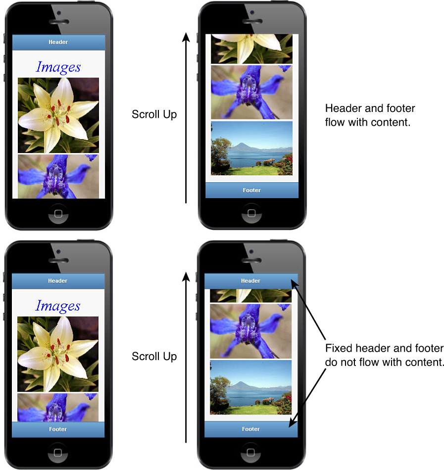
FIGURE 22.2 Setting the data-position="fixed" will make the header and footer stick to the device screen instead of scrolling with the content.
Flowing headers and footers are often a desired result; however, there are also many times that you want one or both to stay in a fixed position on the device screen so that it is always displayed. jQuery Mobile makes that adjustment very simple to make.
To make the header or footer—or a toolbar, for that matter—fixed, you add the data-position="fixed" attribute to the <div>. For example:
<div data-role="header" data-position="fixed"><h1>Header</h1></div>
...
<div data-role="footer" data-position="fixed"><h4>Footer</h4></div>
This will make them stay in place: the header at the top of the page and the footer at the bottom, regardless of how the content scrolls. This is illustrated in Figure 22.2.
Implementing Mobile Sites with Multiple Pages
Mobile sites are composed of either a single HTML document with multiple <div data-role="page"> elements or multiple HTML documents with those elements. Each <div> element represents a single mobile page.
When using multiple pages in your mobile website, you need to implement code and UI controls to provide ways for the user to transition from one mobile page to another. The transitions should be smooth and intuitive based on the controls and content interaction.
Changing mobile pages is accomplished by linking to the second page from the first. This can be done using one of two methods: adding navigation buttons or programmatically changing the page in your jQuery code.
The pages can come from <div> elements in the same web page or external URLs downloaded to the device. The following sections describe the methods of implementing multiple page mobile sites.
Adding Navigation Buttons
Navigation buttons are links to other mobile pages. Typically, this is done in the header or footer element for easy visibility. However, you can also place them inside the mobile content.
The sole purpose of the navigation buttons is to allow the user to move from one mobile page to the next, so it is important to implement them with that in mind.
Creating Navigation Buttons
Navigation buttons are created by adding the data-role="button" attribute to an <a> link. The href attribute should point to the hash tag or URL of the mobile page you want to switch to. An example of the navigation buttons is shown in Figures 22.3 and 22.4. The following code shows the syntax for defining an <a> tag as a navigation link:
<a href="#page2" data-role="button">Next</a>
<a href="hour2201-page3.html" data-role="button">Next</a>


Positioning Navigation Buttons
You can position the button on the left or right side of the header or footer, adding the .ui-btn-right or .ui-btn-left class to the <a>.
The following code shows some examples of the navigation button links:
<a href="#page2" data-role="button" class="ui-btn-right">Next</a>
<a href="hour2201-page3.html" data-role="button" class="ui-btn-left">Next</a>
Creating a Back Button
Another useful feature included in jQuery Mobile is the capability to define a navigation button as a back button. A back button uses the browser history to navigate to the previous button mobile page. To define a link as a back button, you need to add the data-rel="back" attribute. For example:
<a data-rel="back data-role="button" class="ui-btn-right">Back</a></div>
Notice that there is not an href attribute. That is because the href attribute will be ignored; instead, the most recent URL will be popped off the browser’s navigation history list.
Changing Pages with jQuery Code
The second method is to use the $.mobile.changePage(URL, options) function call where the URL is the link location. Table 22.1 shows the available options for the .changePage() call. The following is an example of adding a swipeleft event handler to load a remote web page when the user left-swipes the page on the device. Notice that a transition of “slide” is used, and reverse option is set to true:
$("#pageTwo").on("swipeleft", function(){
$.mobile.changePage("newPage.html", {transition:"slide", reverse:true}); });

Loading Mobile Pages Without Displaying Them
Another helpful function is the .loadPage(URL, options) function. Load page downloads the mobile page from the web server using an AJAX call, but does not change the mobile page to the downloaded one. Actually, .changePage() calls .loadPage() underneath to retrieve the page. Most of the options listed in Table 22.1 are also available via .loadPage(), except changeHash, dataUrl, reverse, and transition.
The .loadPage() function is useful to preload pages in the initialization functions that you want available later but do not want to display yet. The following code shows an example of loading a page using POST data from a form:
$.mobile.loadPage("newPage.php", {data=$("form").serialize(), type="post"});
Events Triggered by Changing Pages
An important feature included with jQuery Mobile is the capability to trigger and handle events linked to changing and loading pages.
When you change pages, the following events are triggered:
pagebeforechange, pagechange, pagebeforeload, pageload, pageshow, pagehide
When you load pages, the following events are triggered:
pagebeforeload, pageload
These events allow you to implement code to handle new pages being transitioned and prevent pages from being downloaded from the server. The events are implemented as standard jQuery events, and the object passed back to the handler includes things like url, absUrl, dataUrl, and xhr objects, as well as the options used for changing pages.
The following shows an example of adding a pageload event handler:
$(document).on("pageload", function(e, obj){
if($("#pageThree .ui-content").length) {
$("#pageThree .ui-content").append("Page loaded from ."+ obj.url); }
});
Linking to Other Mobile Pages
Linked mobile pages displayed on the device can be prepared and displayed in one of three ways, which are listed next and are described in more detail in the sections that follow:
Included in the original HTML document and linked by a local hash.
Downloaded via AJAX request and inserted into the original DOM.
Downloaded via non-AJAX request (traditional) and displayed as a new page.
The first two options provide the advantage that you are working with a single DOM. The benefits are that the libraries and CSS code are loaded only once, and it is easier to share data between pages because everything stays in memory. The downside is that for complex pages, the single DOM method may take a lot of browser memory because all pages remain in memory.
Local Hash
The simplest method in linking to another page is using a local hash. To do this, the page must already be loaded in the DOM. You can then link to the page by adding an <a> tag with the data-role="button" attribute set and an href value pointing to the id of the desired page.
For example, the following code adds a link button to the header of #pageOne that links to a second mobile page #pageTwo as shown in Figure 22.3:
<div data-role="page" id="pageOne">
<div data-role="header"><h1>Page 1</h1>
<a href="#pageTwo" data-role="button" class="ui-btn-right">Next</a></div>
...
</div>
<div data-role="page" id="pageTwo">
...
AJAX DOM Insertion
This is the default functionality for <a> tags and .changePage() handling external URLs. The AJAX insertion occurs when you pass an external URL in the <a> tag or the .changePage() call. jQuery Mobile will first load the document from the web server, enhance it for jQuery Mobile, and then insert it into the DOM. Then the current page will be changed over to the new page.
Caution
In jQuery Mobile, AJAX is used to load the contents of external pages into the DOM as you navigate, but the DOM ready handler executes for only the first page. Therefore, to execute code whenever a new page is loaded and created, you need to put the initialization code in $(document).on('pageinit') instead of $(document).ready().
For example, the following code adds a link button to the header of #pageOne that links to a second mobile page #pageThree that is in a separate HTML document, as illustrated by Figure 22.4:
<div data-role="page" id="pageOne">
<div data-role="header"><h1>Page 1</h1>
<a href="hour2201-page3.html" data-role="button"
class="ui-btn-right">Next</a></div>
...
HTML snippet file on web server:
<div data-role="page" id="pageThree">
<div data-role="header"><h1>Page 3</h1></div>
<div data-role="content">
<p>New Day</p><img src="../images/sunstar.jpg" /></div>
<div data-role="footer"><h4>Footer</h4></div>
</div>
In reality, the best solution is to mix these two methods. Use a single DOM as much as possible and then load a fresh DOM when working with the larger amount of content.
Bypassing AJAX
At times, you do not want to have the mobile page inserted into the DOM. For example, when you have a large amount of data being transferred with pages, you might not want to have all of them loaded at once.
To prevent the AJAX DOM insertion when linking to a web page, you can use a target attribute in the <a> tag or specify a rel="external" or data-ajax="false". For example:
<a href="hour2201-page3.html" data-role="button" target="_blank">New</a>
or
<a href="hour2201-page3.html" data-role="button" data-ajax="false">New</a>
or
<a href="hour2201-page3.html" data-role="button" rel="external">New</a>
In these instances, a normal HTTP request will be made to load the HTML link as a normal web page.
Adding Page Transitions
A great feature of linking pages is the animated transitions between them. This can be extremely useful in giving users a better experience. A good example of this is when you swipe to change pages and can swipe either left or right. It is nice to have the new page slide in the direction of the swipe, as if the user actually pulled the page in from off the device screen.
Transitions are added to the page links either by adding the data-transition attribute to the <a> tag or setting the transition option in the .changePage() call. You can also use the data-direction="reverse" attribute or reverse:true option to specify that a transition should happen in reverse, such as a slide backward. An example of using setting the page transition is shown next:
$.mobile.changePage("#pageTwo", {transition:"slide" });
<a href="#pageTwo" data-role="button" data-transition="slide">Next</a>
$.mobile.changePage("#pageOne", { reverse:true});
<a href="#pageOne" data-role="button" data-direction="reverse">Back</a>
Try it Yourself: Implementing a Mobile Web Page with Multiple Links
1. In Aptana, create the hour22, hour22/js, and hour22/css folders, and then add the hour22/hour2201.html, hour22/hour2201-page3.html, hour22/js/hour2201.js, hour22/js/initmobile.js, and hour22/css/hour2201.css files.
2. Add the code shown in Listing 22.1-initjs to the initmobile.js file. The code binds to the mobileinit handler and sets the default header and footer themes to "b". Also, the code includes a checkForMobile() function that will adjust the CSS for nonmobile browsers. This function will put the phone image around the mobile content to visualize it better when developing.
3. Add the code shown in Listing 22.1-html, Listing 22.1-html-page3, and Listing 22.1-css to the HTML and CSS files.
4. Notice the following lines of code in Listing 22.1-html. This code defines the first mobile page using data-role attributes in the <div> elements. Also notice that there is a navigation button added to the header. This navigation button links to the next page #pageTwo.
16 <div data-role="page" id="pageOne">
17 <div data-role="header"><h1>Page 1</h1>
18 <a href="#pageTwo" data-role="button" class="ui-btn-right"
19 data-transition="slide">Next</a></div>
20 <div data-role="content">
21 <p>Flower</p><img src="../images/flower.jpg" /></div>
22 <div data-role="footer"><h4>Footer</h4></div>
23 </div>
5. Notice the code lines 24–34 of Listing 22.1-html. This code defines the second mobile page. In lines 26 and 27, a back button is defined to go back to the first page, and in lines 29 and 30, a navigation button is defined that goes to the external link hour2201-page3.html. This loads the external page and inserts it into the DOM.
26 <a href="#pageOne" data-role="button"
27 data-rel="back" data-direction="reverse">Back</a>
...
29 <a href="hour2201-page3.html" data-role="button"
30 data-transition="slide" class="ui-btn-right">Next</a></div>
6. Check out the code in Listing 22.1-html-page3. This is just an HTML snippet, but it is enough to load the third page into the DOM.
7. Open hour2201.js and add a .ready() function with a call to checkForMobile(), as shown in line 2. Then add the following swipeleft and swiperight event handlers. These handlers will catch the user’s horizontal finger swipes and use them to implement page changes. Notice that when the user swipes to the left, the reverse transition is used so that the page swipes with the direction of the user’s finger.
03 $("#pageOne").on("swipeleft", function(){
04 $.mobile.changePage("#pageTwo", {transition:"slide"}); });
05 $("#pageTwo").on("swiperight", function(){
06 $.mobile.changePage("#pageOne", {transition:"slide", reverse:true}); });
07 $("#pageTwo").on("swipeleft", function(){
08 $.mobile.changePage("hour2201-page3.html", {transition:"slide", }); });
8. Add the following pageload event handler that will add the URL text to the third web page after it has successfully downloaded and is inserted into the DOM. The url is retrieved from the obj argument to the event handler.
09 $(document).on("pageload", function(e, obj){
10 if($("#pageThree .ui-content").length) {
11 $("#pageThree .ui-content").append("Page loaded from: "+ obj.url); }
12 });
9. Save all the files and then open the HTML document in your mobile device, as shown in Figure 22.5. You should be able to use the navigation buttons and finger swipes to navigate among the three pages.
LISTING 22.1-html HTML Builds the Mobile Pages
01 <!DOCTYPE html>
02 <html>
03 <head>
04 <title>Hour 22-1</title>
05 <meta charset="utf-8" />
06 <meta name="viewport" content="width=device-width, initial-scale=1">
07 <script type="text/javascript" src="../js/jquery.min.js"></script>
08 <script type="text/javascript" src="js/initmobile.js"></script>
09 <script type="text/javascript" src="../js/jquery.mobile-custom.min.js"></script>
10 <script type="text/javascript" src="js/hour2201.js"></script>
11 <link rel="stylesheet" href="../js/css/jquery.mobile-custom.min.css" />
12 <link rel="stylesheet" href="css/hour2201.css" />
13 </head>
14 <body>
15 <div id="border"><div id="frame">
16 <div data-role="page" id="pageOne">
17 <div data-role="header"><h1>Page 1</h1>
18 <a href="#pageTwo" data-role="button" class="ui-btn-right"
19 data-transition="slide">Next</a></div>
20 <div data-role="content">
21 <p>Flower</p><img src="../images/flower.jpg" /></div>
22 <div data-role="footer"><h4>Footer</h4></div>
23 </div>
24 <div data-role="page" id="pageTwo">
25 <div data-role="header">
26 <a href="#pageOne" data-role="button"
27 data-rel="back" data-direction="reverse">Back</a>
28 <h1>Page 2</h1>
29 <a href="hour2201-page3.html" data-role="button"
30 data-transition="slide" class="ui-btn-right">Next</a></div>
31 <div data-role="content">
32 <p>Paradise</p><img src="../images/volcano.jpg" /></div>
33 <div data-role="footer"><h4>Footer</h4></div>
34 </div>
35 </div></div>
36 </body>
37 </html>

LISTING 22.1-html-page3 HTML Snippet Used to Define the Third Mobile Page
1 <div data-role="page" id="pageThree">
2 <div data-role="header"><h1>Page 3</h1>
3 <a data-role="button" data-rel="back" data-direction="reverse">Back</a></div>
4 <div data-role="content">
5 <p>New Day</p><img src="../images/sunstar.jpg" /></div>
6 <div data-role="footer"><h4>Footer</h4></div>
7 </div>
LISTING 22.1-initjs jQuery Mobile and JavaScript Code That Initializes Some Default Settings and Adds a Phone Image Frame for Nonmobile Browsers
01 $(document).bind( "mobileinit", function () {
02 $.mobile.page.prototype.options.headerTheme = "b";
03 $.mobile.page.prototype.options.footerTheme = "b";
04 });
05 function checkForMobile (){
06 if(!/Android|webOS|iPhone|iPad|iPod|BlackBerry/i.test(navigator.userAgent)){
07 $("#border").css({ "background-image":'url(../images/phone.png)',
08 height:700, width:350});
09 $("#frame").css({height:475, width:267, "margin-top":112, "margin-left":40,
10 position:"absolute", overflow:"hidden" });
11 }
12 }
LISTING 22.1-js jQuery Mobile Code That Implements the Swipe Event Handlers and Changes the Page
01 $(document).ready(function() {
02 checkForMobile();
03 $("#pageOne").on("swipeleft", function(){
04 $.mobile.changePage("#pageTwo", {transition:"slide"}); });
05 $("#pageTwo").on("swiperight", function(){
06 $.mobile.changePage("#pageOne", {transition:"slide", reverse:true}); });
07 $("#pageTwo").on("swipeleft", function(){
08 $.mobile.changePage("hour2201-page3.html", {transition:"slide", }); });
09 $(document).on("pageload", function(e, obj){
10 if($("#pageThree .ui-content").length) {
11 $("#pageThree .ui-content").append("Page loaded from: "+ obj.url); }
12 });
13 });
LISTING 22.1-css CSS Code That Styles the Mobile Pages
1 p { text-align:center; font:italic 45px Helvitica; color:blue; margin:5px; }
2 img { width:235px; }
Creating a Navbar
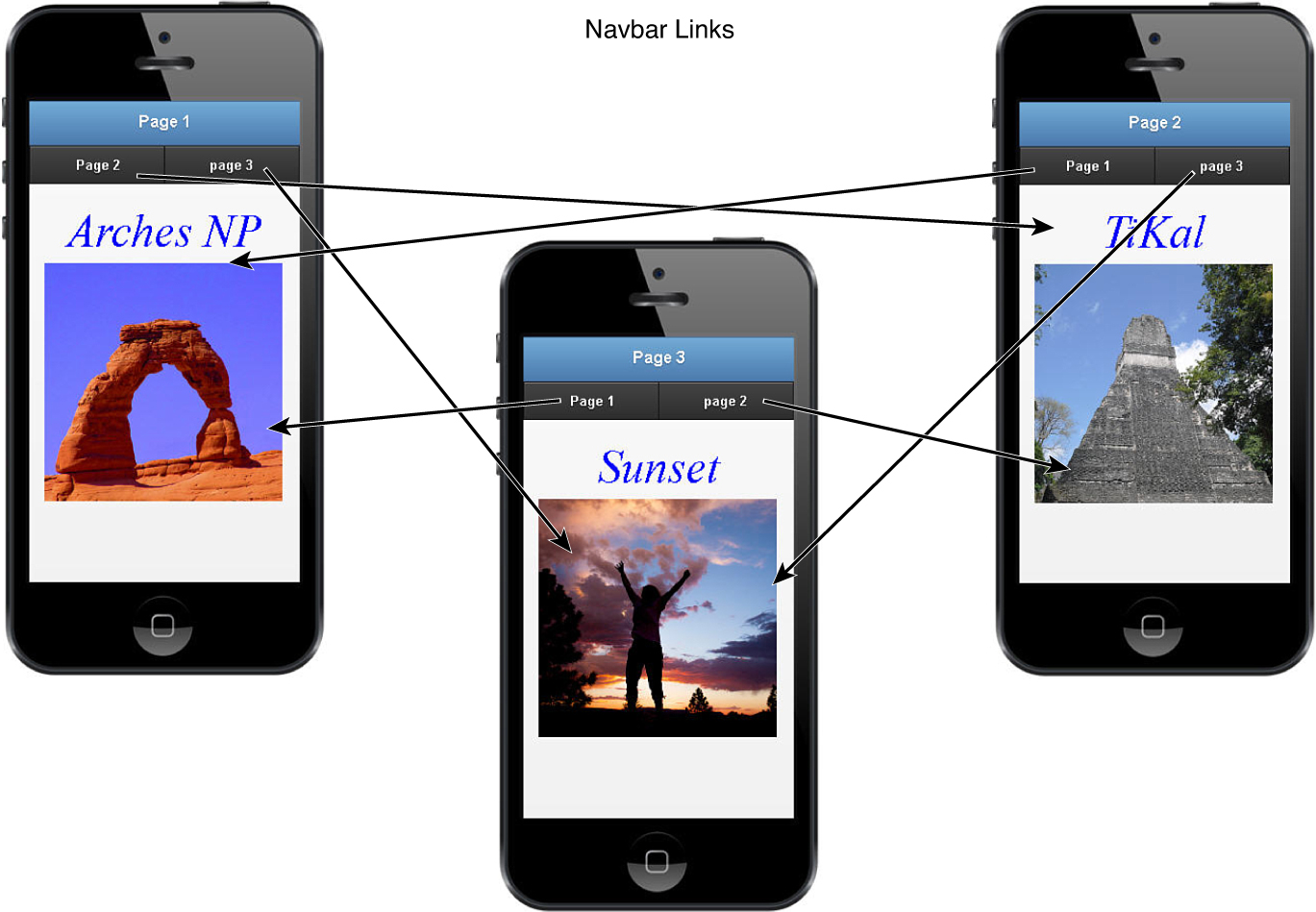
Another method of navigating pages is using a navbar. A navbar is a set of buttons grouped together in a single bar element. Each button links to a different mobile page.
Navbars are defined by adding the role="navbar" to a div and then adding a list of pages to link to using <ul>, <li>, and <a> elements. For example, the following code will render a navbar similar to the one in Figure 22.6:
<div data-role="navbar" >
<ul>
<li><a href="#pageTwo">page 2</a></li>
<li><a href="#pageThree">page 3</a></li>
<li><a href="#pageFour">page 4</a></li>
</ul>
</div>

The navbar <div> can be placed anywhere. You can put it in the header, footer, content, or it can stand alone between the other sections of the mobile page. A common place to put the navbar is in a fixed footer. This allows the navbar to remain present even as the content scrolls.
Try it Yourself: Adding Navbars to Mobile Web Pages
1. In Aptana, add the hour22/hour2202.html, hour22/hour2202.css, and hour22/hour2202.js files.
2. Add the code shown in Listing 22.2-css and Listing 22.2-js to the JS and CSS files. The jQuery code just calls the checkForMobile() function to initialize the phone image for nonmobile browsers.
3. Open the hour2202.html file and add the code shown in Listing 22.2. The code should be familiar to you because it is very similar to the previous example.
4. The big change is that there are now <div data-role="navbar"> elements at lines 18–20, 26–26, and 34–36, as shown next. The content contains three mobile pages. Each of the pages contains a navbar with links to the other two. The link buttons are styled with data-theme="a" to make the menu more visible.
18 <div data-role="navbar" ><ul>
19 <li><a href="#pageTwo" data-theme="a">page 2</a></li>
20 <li><a href="#pageThree" data-theme="a">page 3</a></li></ul></div>
...
26 <div data-role="navbar" ><ul>
27 <li><a href="#pageOne" data-theme="a">page 1</a></li>
28 <li><a href="#pageThree" data-theme="a">page 3</a></li></ul></div>
...
34 <div data-role="navbar" ><ul>
35 <li><a href="#pageOne" data-theme="a">page 1</a></li>
36 <li><a href="#pageTwo" data-theme="a">page 2</a></li></ul></div>
5. Save all the files and then open the HTML page in a browser on your mobile device. The web pages should look similar to Figure 22.7. You should be able use the navbars to link between web pages.
LISTING 22.2-html HTML Builds the Mobile Pages
01 <!DOCTYPE html>
02 <html>
03 <head>
04 <title>Hour 22-2</title>
05 <meta charset="utf-8" />
06 <meta name="viewport" content="width=device-width, initial-scale=1">
07 <script type="text/javascript" src="../js/jquery.min.js"></script>
08 <script type="text/javascript" src="js/initmobile.js"></script>
09 <script type="text/javascript" src="../js/jquery.mobile-custom.min.js"></script>
10 <link rel="stylesheet" href="../js/css/jquery.mobile-custom.min.css" />
11 <script type="text/javascript" src="js/hour2202.js"></script>
12 <link rel="stylesheet" href="css/hour2202.css" />
13 </head>
14 <body>
15 <div id="border"><div id="frame">
16 <div data-role="page" id="pageOne">
17 <div data-role="header"><h1>Page 1</h1></div>
18 <div data-role="navbar" ><ul>
19 <li><a href="#pageTwo" data-theme="a">Page 2</a></li>
20 <li><a href="#pageThree" data-theme="a">page 3</a></li></ul></div>
21 <div data-role="content">
22 <p>Arches NP</p><img src="../images/arch.jpg" /></div>
23 </div>
24 <div data-role="page" id="pageTwo">
25 <div data-role="header"><h1>Page 2</h1></div>
26 <div data-role="navbar" ><ul>
27 <li><a href="#pageOne" data-theme="a">Page 1</a></li>
28 <li><a href="#pageThree" data-theme="a">page 3</a></li></ul></div>
29 <div data-role="content">
30 <p>TiKal</p><img src="../images/pyramid2.jpg" /></div>
31 </div>
32 <div data-role="page" id="pageThree">
33 <div data-role="header"><h1>Page 3</h1></div>
34 <div data-role="navbar" ><ul>
35 <li><a href="#pageOne" data-theme="a">Page 1</a></li>
36 <li><a href="#pageTwo" data-theme="a">page 2</a></li></ul></div>
37 <div data-role="content">
38 <p>Sunset</p><img src="../images/jump.jpg" /></div>
39 </div>
40 </div></div>
41 </body>
42 </html>
LISTING 22.2-js jQuery Mobile Code That Calls the Check for Mobile Devices
01 $(document).ready(function() {
02 checkForMobile();
3 });
LISTING 22.2-css CSS Code That Styles the Mobile Pages
1 p { text-align:center; font:italic 45px Helvitica; color:blue; margin:5px; }
2 img { width:235px; }
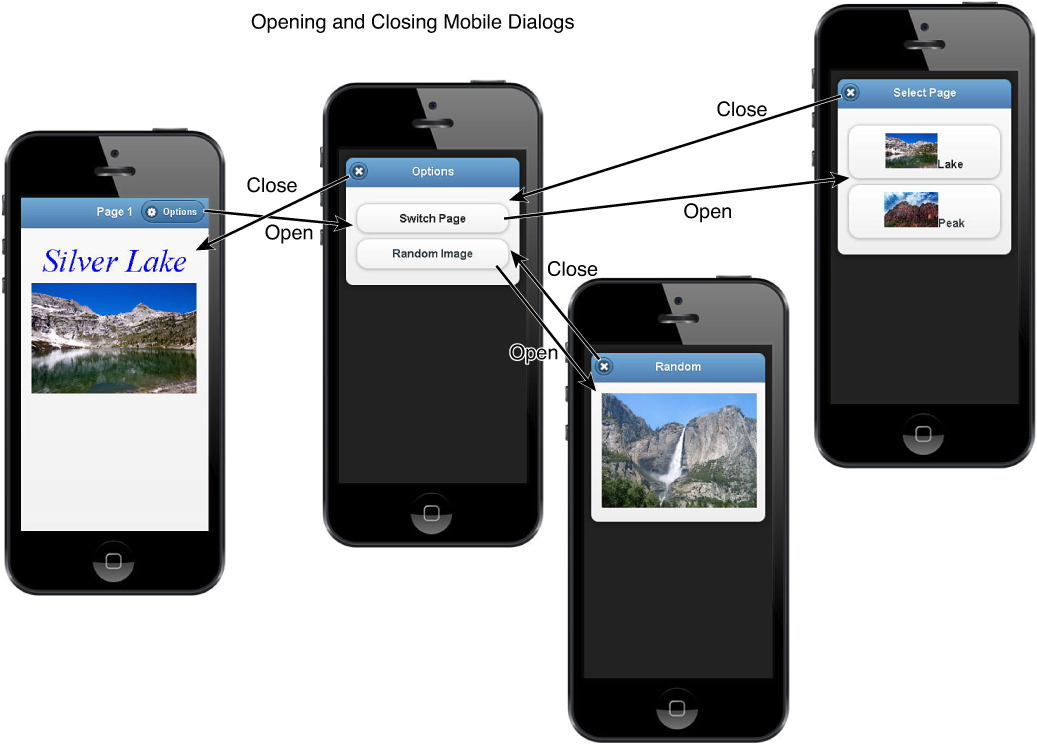
Implementing Dialogs
Another type of page in jQuery Mobile is the dialog. A dialog is just a mobile page that is presented as a dialog using the data-rel="dialog" attribute in the <a> link. Instead of displaying the page as a normal full page, it will be displayed as a dialog with a close button in the header.
The following code shows an example of a dialog link in the header of a mobile page with the data-rel="dialog":
<a href="#imageDialog" data-role="button" class="ui-btn-right"
data-rel="dialog" data-icon="gear">Options</a>
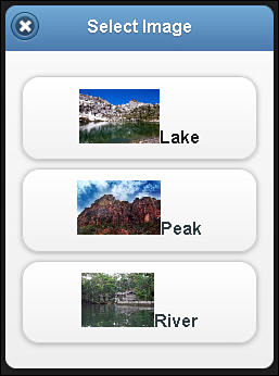
When the link above calls is clicked, the following mobile page is loaded as a dialog, as shown in Figure 22.8:
div data-role="page" id="imageDialog">
<div data-role="header"><h1>Select Image</h1></div>
<div data-role="content">
<a href="#pageOne" data-role="button"><img src="../images/lake.jpg" />Lake</a>
<a href="#pageTwo" data-role="button"><img src="../images/peak.jpg" />Peak</a>
<a href="#pageThree" data-role="button"><img src="../images/river.jpg"
/>River</a>
</div>
</div>
A dialog is not treated as a page link as far as the browser history is concerned; it is just an overlay on top of the page with the <a> link that launched it, so pressing the back button will navigate to the previous page, not back to the calling page.
You can chain multiple dialog pages together, one linking to the other. Closing subsequent dialogs will automatically link back to the previous dialog.
The dialog UI container is styled by the .ui-dialog-contain class. It has a width of 92.5 to render the dialog smaller than the original page.
Try it Yourself: Adding Dialogs to Mobile Web Pages
1. In Aptana, add the hour22/hour2203.html, hour22/hour2203.css, and hour22/hour2203.js files.
2. Add the code shown in Listing 22.3-css to the CSS file.
3. Add the code shown in Listing 22.3-js to the JS file. The following lines of that code implement the pageshow event handler that will be called when the #random dialog page is shown. The code selects a random image and displays it in the dialog.
3 $("#random").on("pageshow", function(){
4 var images=["lake","peak","sunset2","falls"];
5 $("#randomImg").attr("src", "../images/" +
6 images[Math.floor(Math.random()*4)] + ".jpg");
7 return false;
8 });
4. Open the hour2203.html file and add the code shown in Listing 22.3-html. The links to the options dialog page are shown next. Notice the added data-icon="gear", which puts an icon on the button. The data-rel="dialog" is included so that the linked page will be treated as a dialog:
18 <a href="#options" data-role="button" class="ui-btn-right"
19 data-rel="dialog" data-icon="gear">Options</a>
...
27 <a href="#options" data-role="button" class="ui-btn-right"
28 data-rel="dialog" data-icon="gear">Options</a>
5. The following code shows the options page. It is just a normal page, but because the links to it specify data-rel="dialog", it will be rendered as dialog. It also contains links to two additional pages, which will be treated as dialogs.
34 <div data-role="page" id="options">
35 <div data-role="header"><h1>Options</h1></div>
36 <div data-role="content">
37 <a href="#imageDialog" data-role="button"data-rel="dialog">Switch Page</a>
38 <a href="#random" data-role="button" data-rel="dialog">RandomImage</a>
39 </div>
40 </div>
6. The #imageDialog page shown in lines 41–47 of Listing 22.3-html adds links to other mobile pages in the content.
7. The #random page in lines 48–53 of Listing 22.3-html contains a single image element that is updated by the pageshow event handler in the jQuery code.
8. Save all the files and then open the HTML code in a browser on your mobile device. The web pages should look similar to Figure 22.9. The dialogs should show up as dialogs when you click the links to them.
LISTING 22.3-html HTML Builds the Mobile Pages with Dialogs
01 <!DOCTYPE html>
02 <html>
03 <head>
04 <title>Hour 22-3</title>
05 <meta charset="utf-8" />
06 <meta name="viewport" content="width=device-width, initial-scale=1">
07 <script type="text/javascript" src="../js/jquery.min.js"></script>
08 <script type="text/javascript" src="js/initmobile.js"></script>
09 <script type="text/javascript" src="../js/jquery.mobile-custom.min.js"></script>
10 <script type="text/javascript" src="js/hour2203.js"></script>
11 <link rel="stylesheet" href="../js/css/jquery.mobile-custom.min.css" />
12 <link rel="stylesheet" href="css/hour2203.css" />
13 </head>
14 <body>
15 <div id="border"><div id="frame">
16 <div data-role="page" id="pageOne">
17 <div data-role="header"><h1>Page 1</h1>
18 <a href="#options" data-role="button" class="ui-btn-right"
19 data-rel="dialog" data-icon="gear">Options</a>
20 </div>
21 <div data-role="content">
22 <p>Silver Lake</p><img src="../images/lake.jpg" class="full" />
23 </div>
24 </div>
25 <div data-role="page" id="pageTwo">
26 <div data-role="header"><h1>Page 2</h1>
27 <a href="#options" data-role="button" class="ui-btn-right"
28 data-rel="dialog" data-icon="gear">Options</a>
29 </div>
30 <div data-role="content">
31 <p>Zion NP</p><img src="../images/peak.jpg" class="full" />
32 </div>
33 </div>
34 <div data-role="page" id="options">
35 <div data-role="header"><h1>Options</h1></div>
36 <div data-role="content">
37 <a href="#imageDialog" data-role="button" data-rel="dialog">Switch Page</a>
38 <a href="#random" data-role="button" data-rel="dialog">Random Image</a>
39 </div>
40 </div>
41 <div data-role="page" id="imageDialog">
42 <div data-role="header"><h1>Select Page</h1></div>
43 <div data-role="content">
44 <a href="#pageOne" data-role="button"><img src="../images/lake.jpg" />Lake</a>
45 <a href="#pageTwo" data-role="button"><img src="../images/peak.jpg" />Peak</a>
46 </div>
47 </div>
48 <div data-role="page" id="random">
49 <div data-role="header"><h1>Random</h1></div>
50 <div data-role="content">
51 <img id="randomImg" class="medium"></img>
52 </div>
53 </div>
54 </div></div>
55 </body>
56 </html>
LISTING 22.3-js jQuery Mobile Code That Handles the pageshow Event for the #random Page
1 $(document).ready(function() {
2 checkForMobile();
3 $("#random").on("pageshow", function(){
4 var images=["lake","peak","sunset2","falls"];
5 $("#randomImg").attr("src", "../images/" +
6 images[Math.floor(Math.random()*4)] + ".jpg");
7 return false;
8 });
9 });
LISTING 22.3-css CSS Code That Styles the Mobile Pages
1 p { text-align:center; font:italic 45px Helvitica; color:blue; margin:5px; }
2 img {height:50px; width:auto; }
3 img.full { width:235px; height:auto; }
4 img.medium { width:220px; height:auto; }
Summary
In this hour, you learned about mobile web pages. You learned how the parts of the mobile page are header, footer, content, and occasionally a navbar. You learned how to link multiple mobile pages together by adding navigation links to the headers and footers, or by using a navbar with a list of pages to link to. You also implemented dialog boxes.
Q&A
Q. Is there a way to cache mobile pages in the DOM so I don’t have to keep reloading them?
A. Yes, you can use the following setting to enable the DOM cache. This will enable caching for all pages.
$.mobile.page.prototype.options.domCache = true;
You can also add the data-dom-cache="true" attribute to the page if you want to cache only specific pages. For example:
<div data-role="page" id="cacheMe" data-dom-cache="true">
Additionally you can do it programmatically using the following:
pageContainerElement.page({ domCache: true });
Workshop
The workshop consists of a set of questions and answers designed to solidify your understanding of the material covered in this hour. Try to answer the questions before looking at the answers.
Quiz
1. How do you define a <div> as a page header?
2. How do you add transitions to page changes?
3. True or False: A jQuery Mobile link to an external HTML document will not load the scripts in that file.
4. How do you define a page as a dialog box?
5. Name three events that are triggered by a page change.
Quiz Answers
1. Add the data-role="header" attribute.
2. Add the data-transition attribute in the <a> link that points to the page.
3. True. The jQuery Mobile page load defaults as an AJAX request.
4. Use the data-rel="dialog" attribute in the <a> link that points to the page.
5. beforepageload, pageload, beforepagechange, pagechange, pagehide, and pageshow.
Exercises
1. Open the code in Listing 22.1. Add an id attribute to the <img> tag. Then in the jQuery .ready() function, add a click event that resizes the image. For example:
$("#img1").on("click", function(){
$(this).css({width:400})
});
2. Open the code in Listing 22.3 and add an additional mobile page to the HTML. Then add a link from the #options dialog to that page. The link should include the data-rel="dialog" so that your page opens as a dialog.