
Hour 21. Introducing Mobile Website Development
What You’ll Learn in This Hour:
 Why mobile web development is so important
How jQuery Mobile can help build mobile-friendly web pages
Using jQuery Mobile ThemeRoller to create a custom look and feel
Implementing jQuery Mobile in your web pages
Mobile devices are the fastest growing development platform. Much of that development is geared toward making websites mobile friendly. It is much easier to implement and maintain a mobile website than it is to maintain a mobile application.
In this hour, you jump in to learn how jQuery—and especially the jQuery Mobile library—can help you create some clean, cool mobile web pages.
Jumping into the Mobile World
Before you get started creating mobile web pages with jQuery Mobile, the next section points out a few things about the mobile world we live in. It has changed rapidly, and the changes appear to be accelerating.
Is Mobile Still Mobile?
There used to be a very distinguishable line between mobile devices and computers/laptops. That is no longer the case, and here are the reasons why:
Mobile device network speeds are very close to traditional PCs.
Many mobile screen sizes are much larger than they used to be, especially in tablets.
Mobile processors, disk IO, and available memory is no longer such a limiting factor.
There are more smart mobile devices in use than PCs.
Those factors have gotten rid of a lot of the old problems and requirements for mobile solutions. However, they have created a few new ones:
Mobile screen sizes vary wildly. You can’t just define a small mobile version of your website.
People are using mobile devices for many tasks, and they now expect the same level of features and performance as traditional apps and web pages. At the same time, they want the interfaces to their mobile tools to be clean and uncluttered.
With the wild popularity of social tools such as Twitter and Facebook, users expect their social world to follow along with them into as many places as possible.
People would often rather have mobile sites than mobile apps so that their links, profile information, and user experience remains consistent.
Based on those new problems, jQuery Mobile could become your new best friend in the upcoming shifts.
Size Matters
In today’s mobile world, the fact that a user is on a mobile device is no longer the critical question. The new critical questions are first, how much screen space do users have to work with? And second, how much network bandwidth does their device connection support?
You can use the following JavaScript and regex statement to parse the navigator.userAgent value to determine whether a user is coming into your website on a mobile device:
if( /Android|webOS|iPhone|iPad|iPod|BlackBerry/i.test(navigator.userAgent) ) { }
That information is useful, but you also need to check the screen size of the device. Does it have a 3-inch, 4-inch, or 11-inch screen? There is a big difference. If you design your website for a 3- or 4-inch screen, but the user comes in on an 11-inch screen, it is awkward and frustrating. The same is true in reverse. A good idea is to get the screen size using screen.height and screen.width in JavaScript and then adjust your pages dynamically to support that size. For example:
$("#contentBody").width(screen.width).height(screen.height);
The network bandwidth is important because it may limit the amount of data you want to send. This is another situation where you can’t err on the side of caution. If you send low-resolution images to a device where the user expects high resolution, your website looks lousy. If you send high-res images to slow devices, your website is too slow. If you are working with large data sizes, it is a good idea to time some of the AJAX requests to the server and back to determine how fast the user’s device is.
Why jQuery Mobile?
Why would you want to learn jQuery Mobile? jQuery Mobile provides several advantages with developing mobile solutions, including the following:
Hiding some of the complexities of resizing page elements to a wide array of mobile devices.
Providing simple UI components with mobile event interactions already built in to them.
JavaScript and jQuery are common and well-developed languages that are based on proven concepts.
Developing a mobile web app, especially with jQuery Mobile, is so simple to do and does not require any installation on the user’s part. That is why they are becoming more and more popular.
Getting Started with jQuery Mobile
How do you get started with jQuery Mobile? You download the library, put in your website path, and start using it. The following sections take you through the process of getting and implementing the jQuery Mobile library.
Adding the jQuery Mobile Library
To get started with jQuery Mobile, you will need to download the library and add it to your web pages. The jQuery library can be downloaded from the following location by selecting the version and options that you would like to include, and clicking the Download button at the bottom. This downloads zip files containing the jQuery Mobile library. http://jquerymobile.com/download/
Caution
The .css files and the images folder that are included with the jQuery Mobile library come as a set. You need to make sure that they are installed in the same location and that you don’t mix and match them from different custom downloads.
When you download the jQuery Mobile library, you will get a zip. Inside the zip file are three main components that you need to put where they can be loaded by your mobile web pages. They are as follows:
js files—There will be a jquery.moble.###.js as well as a minified version. This is the main library file, and one of these needs to be placed in a location where you can add it to your project files in a <script> tag.
css files—There will be jquery.mobile.###.css, jquery.mobile.###.structure.css, and jquery.mobile.###.theme.css files, as well as their minified forms. This is all the styling code and should be placed in the same location as the jquery.moble.###.js file.
images folder—This folder contains the images and icons used by jQuery Mobile to style the elements. This should also be placed in the same location as the jquery.moble.###.js file.
After the library is downloaded, you can add it to your web pages in the header file by adding the <script> tag to load the JS file and a <link> tag to load the CSS file. For example, the following code loads the jQuery library first because it is required by jQuery Mobile and then loads the jQuery Mobile JS and CSS files:
<script type="text/javascript" src="../js/jquery.min.js"></script>
<script type="text/javascript" src="../js/jquery.mobile-custom.min.js"></script>
<link rel="stylesheet" href="../js/css/jquery.mobile-custom.min.css" />
Using ThemeRoller
In addition to the basic jQuery Mobile theme, you can also use the jQuery Mobile ThemeRoller shown in Figure 21.1 to create custom themes. You can specify the font family, colors, corner radius, and so on. When you set the data-theme attribute, the custom theme will be applied to the jQuery Mobile elements.

To access the jQuery Mobile ThemeRoller, follow these steps:
1. Open the following URL in your browser:
http://jquerymobile.com/themeroller/
2. From the Global tab, shown in Figure 21.1, you can set the global values.
3. Select the theme letters to customize the alternative theme swatches.
4. When you are finished, click the Download Theme Zip File button. This takes you back to the main download page.
5. Click the Download button to download the customized jQuery Mobile files.
Understanding jQuery Mobile
Now that you are able to get the library downloaded and in place, you need to know a few things about the jQuery Mobile syntax and structure. Two of the main additions that you will see in jQuery Mobile are the data attributes and new mobile events.
Introducing jQuery Mobile Data Attributes
Much of the jQuery Mobile framework is built on extending the current HTML elements with additional functionality. The advantage of this aspect is that you keep the HTML conceptual knowledge that you already have and build on it.
The way the jQuery Mobile builds on the HTML framework is by adding data attributes to the HTML elements. The data attributes all begin with data- and end with some slightly descriptive word of what the attribute means. As those attributes are processed by the jQuery Mobile library, additional methods, events, styles, and values that fit the mobile needs are attached to the element. You will see this extensively in the examples to come.
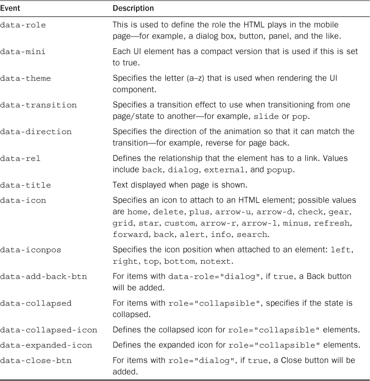
Table 21.1 lists many of the attributes along with some of the values that they support. The table is a good way to visualize how the data attribute method works and can act as a reference.
Understanding Swatches
The CSS files that come with jQuery Mobile include several versions of styling called swatches. A swatch is just a letter assignment that specifies what color scheme to use when rendering the mobile elements. Swatches are typically specified using the data-theme attribute. For example:
<div data-role="header" data-theme="b"><h1>Teach</h1></div>
Looking at New Mobile Events
One of my favorite features of jQuery Mobile is how easy it is to implement mobile events. The library automatically creates the events and adds them to elements based on the data attributes. If you want to add or remove a specific mobile event, you can do so using the .on() method from jQuery that you are already familiar with.
For example, to add a tap handler to an element #myImage, you would use the following:
$("#myImage").on("tap", function() { });
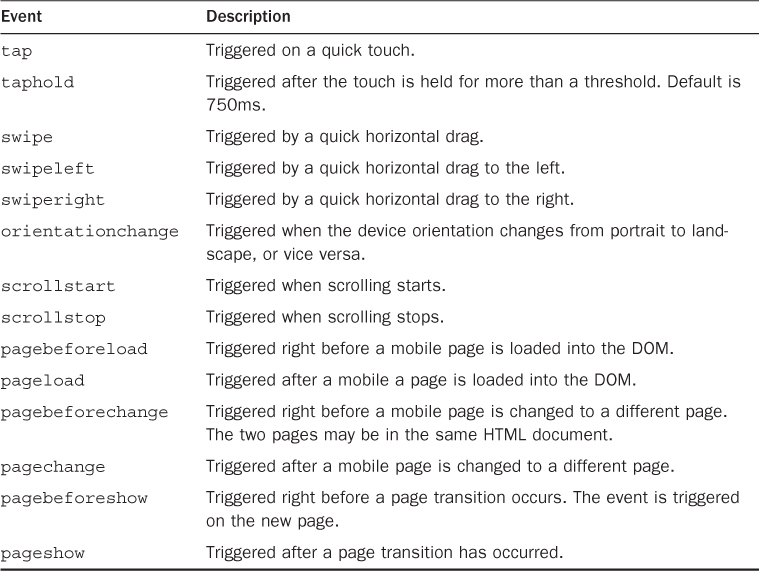
Table 21.2 lists some of the mobile events and describes their purpose.
Note
jQuery Mobile also includes several virtual mouse events that mask the mouse and touch events to allow developers to register just the basic mouse events. These work well for the most part, but there are still a few quirks with them. The virtual events are vmouseover, vmouseout, vmousedown, vmousemove, vmouseup, vmouseclick, and vmousecancel.
Defining the Viewport Meta Tag
A critical component of using jQuery Mobile is adding the viewport settings in a <meta> tag inside the page <head> tag. The viewport defines how the browser displays the page zoom level as well as the dimensions used.
Specifically, you need to set the content="width=device-width, initial-scale=1" as shown next. These settings force the device’s browser to render the web page width at exactly the number of pixels available on the device.
<meta name="viewport" content="width=device-width, initial-scale=1">
Without specifying the viewport setting, the mobile page is at a much higher size than the screen width, making the page look very small. The user will still be able to zoom in on the web page.
Configuring jQuery Mobile Default Settings
jQuery Mobile is initialized when the library is loaded. Any page elements with jQuery Mobile tags will be initialized as well and use the default settings to create mobile versions of the elements.
Occasionally, you might want to override the default settings. To do this, you will need to add a mobileinit event handler to the document object before loading the jQuery mobile library, and then add your default override code in that handler function.
Use the mobileinit handler to change the default theme swatches because that can’t be done on-the-fly after the library has been loaded. The following code shows an example of setting the default header and footer themes:
<script type="text/javascript" src="../js/jquery.min.js"></script>
<script>
$(document).bind( "mobileinit", function () {
$.mobile.page.prototype.options.headerTheme = "b";
$.mobile.page.prototype.options.footerTheme = "b";
});
</script>
<script type="text/javascript" src="../js/jquery.mobile-custom.min.js"></script>
Notice that the init <script> is placed after jQuery is loaded, but before jQuery Mobile is loaded.
Try it Yourself: Building Your First jQuery Mobile Web Page
1. Find out the IP address of your PC. To connect with a mobile device, you need an external address.
2. Open the Apache configuration file in XAMPP and uncomment the following two lines and comment the third. This opens up Apache to support external connections on the IP address from step 1. You will also need to restart Apache.
Listen 0.0.0.0:80
Listen [::]:80
#Listen 80
3. In Aptana, create the hour21 folder and then add the hour21/hour2101.html file.
4. Copy the code/js folder from the book’s website to the js/ folder in your Aptana project if you have not already done so. You can also download the latest version of the jQuery Mobile library and install it as described earlier in this hour. However, if you install your own, you need to make sure that the <script> and <link> tags that load the jQuery Mobile files are updated for the examples in the book.
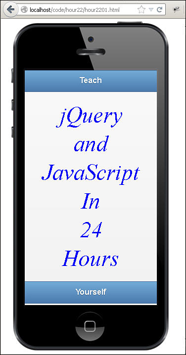
5. Add the code shown in Listing 21.1. This is straightforward code to validate that the jQuery Mobile library is installed properly. The <div> elements build a mobile web page with a header, content, and a footer.
6. Notice that the function checkForMobile() will apply additional classes around the #border and #frame <div> elements. These elements are extras added to display a phone background image when the page is not viewed from mobile device. That helps you visualize what the page will look like on a mobile device when testing from a development browser.
11 function checkForMobile (){
12 if(!/Android|webOS|iPhone|iPad|iPod|BlackBerry/i.test(navigator.userAgent)){
13 $("#border").addClass("border");}
14 }
7. Make sure that the locations specified in lines 8 and 9 for the jQuery Mobile library and the CSS file are correct for what you have installed:
08 <script type="text/javascript" src="../js/jquery.mobile-custom.min.js"></script>
09 <link rel="stylesheet" href="../js/css/jquery.mobile-custom.min.css" />
8. Save all the files, and then open the HTML document in a web browser, as shown in Figure 21.2. You should see a basic web page inside the phone image with header and footer. Then try to open the page using your mobile device’s web browser and the address from step 1. You should see the header, content, and footer, but not the phone image.
LISTING 21.1 HTML Document That Adds the jQuery Mobile Libraries and a Basic Mobile Web
01 <!DOCTYPE html>
02 <html>
03 <head>
04 <title>Hour 21-1</title>
05 <meta charset="utf-8" />
06 <meta name="viewport" content="width=device-width, initial-scale=1">
07 <script type="text/javascript" src="../js/jquery.min.js"></script>
08 <script type="text/javascript" src="../js/jquery.mobile-custom.min.js"></script>
09 <link rel="stylesheet" href="../js/css/jquery.mobile-custom.min.css" />
10 <script>
11 function checkForMobile (){
12 if(!/Android|webOS|iPhone|iPad|iPod|BlackBerry/i.test(navigator.userAgent)){
13 $("#border").addClass("border");
14 $("#frame").addClass("frame");}
15 }
16 $(document).ready(function() {
17 checkForMobile();
18 });
19 </script>
20 <style>
21 .border { background-image:url("images/phone.png"); height:700px; width:350px;}
22 .frame { height:475px; width:267px; margin-top:112px; margin-left:40px;
23 position:absolute; overflow:hidden; }
24 p { text-align:center; font:italic 45px Helvetica; color:blue; margin:5px; }
25 </style>
26 </head>
27 <body>
28 <div id="border"><div id="frame">
29 <div data-role="page">
30 <div data-role="header"><h1>Teach</h1></div>
31 <div data-role="content">
32 <p>jQuery</p><p>and</p><p>JavaScript</p><p>In</p><p>24</p><p>Hours</p>
33 </div>
34 <div data-role="footer"><h4>Yourself</h4></div>
35 </div>
36 </div></div>
37 </body>
38 </html>
Summary
In this hour, you were introduced to the world of mobile web development. You learned how jQuery Mobile can help in building web pages that are mobile friendly and yet very powerful. You also downloaded, installed, and used the jQuery Mobile library in a basic mobile web page.
Q&A
Q. Is there a way to build native mobile apps using jQuery?
A. Yes, using PhoneGap. The PhoneGap platform allows you to build native phone apps using HTML5, CSS jQuery, and JavaScript. PhoneGap packages the web pages to run as a native application within the UIwebView or WebView on mobile devices.
Workshop
The workshop consists of a set of questions and answers designed to solidify your understanding of the material covered in this hour. Try to answer the questions before looking at the answers.
Quiz
1. How does jQuery Mobile extend HTML to provide mobile versions of the HTML elements?
2. What is the purpose of the viewport <meta> tag?
3. What mobile event is triggered when the user slides a finger horizontally across the touch screen on a mobile device?
Quiz Answers
1. Using additional data attributes.
2. To set the initial size and zoom of the mobile web page to match the screen size of the device.
3. swipe, swipeleft, or swiperight.
Exercise
1. Try using the jQuery Mobile ThemeRoller to create a custom theme and install it in your project.