
Hour 20. Using jQuery UI Widgets to Add Rich Interactions to Web Pages
What You’ll Learn in This Hour:
 Adding autocomplete, slider, and spinner elements
How to add a datepicker calendar to your forms
Ways to stylize dialogs and buttons
Implementing tooltips
Organizing your web pages with custom menus and tabbed panels
How to apply status bars to your work flow
jQuery UI provides a wide array of prebuilt widgets that provide extended functionality to HTML elements. These widgets provide functionality that make forms and other input controls much more intuitive and easy to use, such as a calendar view for choosing dates and expandable menus.
This hour introduces you to each of those built-in widgets to get you started with them. The purpose of this hour is just an introduction so that you understand what widgets are available and how to implement them into your web pages. The examples are pretty basic, so you should also look at the docs at the jQuery UI site for more information about specific widgets that you might like to use: http://api.jqueryui.com/category/widgets/.
No “Try It Yourself” sections are included this hour because the examples are basic and easy to follow. The code for each of the listings and the supporting images can be found at the book’s website at code/hour20.
Reviewing Widgets
Before you get started, this section reviews how options and attribute values are accessed on widget elements, because it is a little bit different than on normal jQuery objects.
When you are creating the widget, options are specified in the object passed to the constructor. For example, the following code sets the min and max options for a slider widget:
$("#mySlider").slider({min:2, max:10});
To access those options later, you need to specify "options" as a parameter to the .slider() call. For example, the following sets and then gets the max option:
var slider = $("#mySlider").slider({min:2, max:10});
slider.slider("option", "max", 100);
var currentMax = slider.slider("option", "max");
Attribute values for the widgets are accessed in a similar way. For example, the following code gets and then sets the value of the value attribute on a slider:
var value = $("#mySlider").slider("value");
$("#mySlider").slider("value", value+5 );
In fact, value and options are methods on the slider widget that get called when passed in as the first argument.
Adding an Expandable Accordion Element
The accordion widget combines pairs of headers and content into an expandable accordion view. The accordion widget is applied to a container element, and all the headers are identified. The header will become a tab and the content in between the headers will be attached to a separate <div> element that is expandable/collapsible.
The code in Listing 20.1 creates an accordion view with an image as the content in each tab. The visual can be seen in Figure 20.1. The following options are part of the example:
header—Specifies a selector to use when determining the header elements.
collapsible—Boolean. If true, all content in the accordion can be collapsed.
LISTING 20.1 jQuery, CSS, and HTML to Implement the Accordion
...jQuery...
11 $(document).ready(function(){
12 $( "#accordion" ).accordion({header:"p", collapsible:true});
...CSS...
16 div { width:200px; }
17 img { width:200px; }
...HTML...
20 <div id="accordion">
21 <p>Jungle</p><div><img src="images/jungle.jpg" /></div>
22 <p>Peak</p><div><img src="images/peak.jpg" /></div>
23 <p>Sunset</p><div><img src="images/sunset3.jpg" /></div>
24 <p>Lake</p><div><img src="images/beachhouse.jpg" /></div>
25 </div>

Implementing Autocomplete in Form Elements
The autocomplete widget gets attached to text input elements. As the user types into the text input, suggestions from a list are displayed. This is especially helpful in circumstances where you have a finite set of possibilities that can be typed in and you want to make sure the correct spelling is used.
The code in Listing 20.2 creates a basic autocomplete input to specify the day of the week. The visual can be seen in Figure 20.2. The set of days to autocomplete are added by setting the source attribute to an array of day names in line 14.

LISTING 20.2 jQuery, CSS, and HTML to Implement the Autocomplete Field
...jQuery...
13 $( "#autocomplete" ).autocomplete({
14 source: ["Monday", "Tuesday", "Wednesday", "Thursday", "Friday"]
15 });
...CSS...
19 input { border:2px ridge blue; border-radius:5px; padding:3px; }
...HTML...
22 <label for="autocomplete">Day of Week: </label>
23 <input id="autocomplete">
Applying jQuery UI Buttons to Form Controls
A great feature of jQuery UI is the work that has been done to stylize buttons. Let’s face it, the HTML button styles are outdated and ugly. Using jQueryUI, you can quickly stylize buttons, check boxes, and radio elements.
To stylize a single item, all you need to do is call .button(options) on the jQuery object that represents it. To stylize a set of radios or check boxes, you call .buttonset().
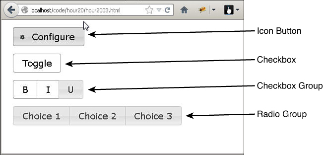
The code in Listing 20.3 illustrates styling HTML elements as jQuery UI buttons. Notice in line 12, the icons option is set to "ui-icon-gear", which is one of the icons included with jQuery UI download. Also, the text option is set to true. If this option is false, only the icon would be displayed. The visual can be seen in Figure 20.3.
LISTING 20.3 jQuery, CSS, and HTML to Implement the Autocomplete Field
...jQuery...
12 $( "#button1" ).button({icons: {primary: "ui-icon-gear"}, text: true});
13 $( "#check" ).button();
14 $( "#format" ).buttonset();
15 $( "#radio" ).buttonset();
...CSS...
19 div {margin:15px; }
...HTML...
22 <div><button id="button1">Configure</button><br></div>
23 <div><input type="checkbox" id="check" /><label for="check">Toggle</label></div>
24 <div id="format">
25 <input type="checkbox" id="check1" /><label for="check1">B</label>
26 <input type="checkbox" id="check2" /><label for="check2">I</label>
27 <input type="checkbox" id="check3" /><label for="check3">U</label>
28 </div>
29 <div id="radio">
30 <input type="radio" id="radio1" name="radio" /><label for="radio1">Choice 1</label>
31 <input type="radio" id="radio2" name="radio" /><label for="radio2">Choice 2</label>
32 <input type="radio" id="radio3" name="radio" /><label for="radio3">Choice 3</label>
33 </div>
Creating a Calendar Input
The datepicker widget provided with jQuery enables you to implement a calendar interface that allows users to select a specific day using a simple click of the mouse. This can save a lot of problems when users input dates incorrectly because they are typing them by hand.
The datepicker widget is attached to a text, date, or datetime <input> element. When the user clicks the <input>, the calendar is displayed. You also add an icon image to launch the datepicker.
The code in Listing 20.4 creates a date with an image icon. The visual can be seen in Figure 20.4. Settings for the following illustrate some of the available options:
onSelect—Specifies a function that will be called each time a new date is selected.
showOn—This is set to “button” so that the datepicker will be launched when the button icon is clicked.
buttonImage—Specifies the location of the image file to use.
buttonImageOnly—When true, the datepicker is launched only when the button icon is clicked and not the <input>.
numberOfMonths—Specifies the number of months to display.
showButtonPanel—When true, the Today and Done buttons are displayed on the bottom of the datepicker.
dateFormat—String that describes the format that will be placed in the <input> field.

LISTING 20.4 jQuery, CSS, and HTML to Implement the Datepicker Widget
...jQuery...
13 $( "#month" ).datepicker({
14 onSelect:dateChanged,
15 showOn: "button", buttonImage: "images/calendar.png", buttonImageOnly: true,
16 numberOfMonths:2,
17 showButtonPanel:true,
18 dateFormat: "yy-mm-dd"
19 });
...CSS...
23 input { border:2px ridge blue; border-radius:5px; }
...HTML...
26 <label>Start Date: </label><input type="text" id="month"></input>
27 <span></span>
Generating Stylized Dialogs with jQuery UI
The dialog widget is a very useful inclusion to jQuery UI. You can easily get rid of the plain dialogs provided in JavaScript and replace them with dialogs that have styled attributes and even forms.
The code in Listing 20.5 creates a jQuery UI dialog that includes an image, icon, button, and some stylized text. The visual can be seen in Figure 20.5. The following options are part of the example:
modal—Boolean. When true, other items on the page are disabled until the dialog returns.
buttons—This is an object where the key is the button name, and the text displayed in the button and the value is the function that will be called when that button is clicked. Notice that in line 13, a button named Sweet closes the dialog.

LISTING 20.5 jQuery, CSS, and HTML to Implement the Dialog
...jQuery...
11 $(document).ready(function(){
12 $( "#dialog" ).dialog({ modal: true,
13 buttons: { Sweet: function() { $( this ).dialog( "close" ); }}});
...CSS...
17 img { height:60px; float:left; }
...HTML...
20 <div id="dialog" title="Upload Successful"><p>
21 <img src="images/peak.jpg" />
22 <span class="ui-icon ui-icon-circle-check"></span>
23 Image Uploaded Successfully.
24 </p><p>Currently using <b>76% of your storage space</b>.</p>
25 </div>
Implementing Stylized Menus
One of the most-often used jQuery UI widgets is the menu widget. The menu widget enables you to turn an element tree into an expanding menu. Typically, menus are created by using cascading sets of <ul>/<li> elements with an <a> element that defines the link behavior and menu text.
Tip
You can customize the element tags that are used to build the element using the menus option; for example, menus:"div.menuItem".
The code in Listing 20.6 creates a jQuery UI menu from a set of list items. Notice in the HTML that some of the <li> fields include a <span> that has class="ui-icon ui-icon-{type}". These items include the jQuery UI icon specified along with the menu text.
The selected item is displayed in the <p> element to show how the selection handler works using the menuselect event handler defined in line 14. Also, the width of the menu is defined in the CSS code on line 19 by setting the width value in the .ui-menu class. The visual can be seen in Figure 20.6.

LISTING 20.6 jQuery, CSS, and HTML to Implement the Menus
...jQuery...
12 $( "#menu" ).menu();
13 $( "#menu" ).on("menuselect", function(e, ui){
14 $("p").html("Selected " + ui.item.children("a:first").html());
15 });
...CSS...
19 .ui-menu { width: 200px; }
20 p { box-shadow: 5px 5px 5px #888888; border:3px ridge red; color:red;
21 display:inline-block; height:80px; width:100px; }
...HTML...
24 <ul id="menu">
25 <li><a href="#">Open</a></li>
26 <li><a href="#">Recent</a><ul>
27 <li><a href="#">Some File</a></li>
28 <li><a href="#">Another File</a></li>
29 </ul></li>
30 <li><a href="#">Save</a></li>
31 <li class="ui-state-disabled"><a href="#"><span class="ui-icon ui-icon-print">
32 </span>Print...</a></li>
33 <li><a href="#">Playback</a><ul>
34 <li><a href="#"><span class="ui-icon ui-icon-seek-start"></span>Prev </a></li>
35 <li><a href="#"><span class="ui-icon ui-icon-stop"></span>Stop</a></li>
36 <li><a href="#"><span class="ui-icon ui-icon-play"></span>Play</a></li>
37 <li><a href="#"><span class="ui-icon ui-icon-seek-end"></span>Next</a> </li>
38 </ul></li>
39 </ul>
40 <p></p>
Creating Progress Bars
The progress bar widget allows you to create some very simple-to-implement progress bars. The progress bar is controlled by changing the value property that ranges from 0 to 100. The progress is represented by an element with a class .ui-progressbar-value.
The code in Listing 20.7 provides an example of implementing a progress bar. The bar is updated in the inc() function, which illustrates getting and setting the value of the progress bar. setTimeout() is used for time delay. The visual can be seen in Figure 20.7.

LISTING 20.7 jQuery, CSS, and HTML to Implement the Progress Bar
...jQuery...
11 function inc(){
12 var value = $("#progressbar").progressbar("value") + 5;
13 if (value <= 100){
14 $("p").html("Progress: " + value + "%");
15 $("#progressbar").progressbar("value", value);
16 setTimeout(inc, 100);
17 }
18 }
19 $(document).ready(function(){
20 $("#progressbar").progressbar({ value: 0});
21 inc();
22 });
...CSS...
25 #progressbar { box-shadow: 5px 5px 5px #888888; border:2px ridge;
26 display:inline-block; height:20px; width:300px; }
27 #progressbar .ui-progressbar-value{
28 background-image: -moz-linear-gradient(center top , #0000FF, #88BBFF); }
...HTML...
31 <p></p>
32 <div id="progressbar"></div>
Implementing Slider Bars
The slider widget allows you to create slider controls that adjust a value by dragging the mouse. The slider has two components: the slide and the handle. The slide is styled by the .ui-slider-range class, and the handle is styled by the .ui-slider-handle class.
You can define both a min and max handle that allows you to use a single slider control to define a range instead of a single value.
The code in Listing 20.8 provides an example of implementing a set of sliders that are used to adjust the background color of another element. The slider is applied to the <div> elements in lines 22–29 and sets the following options:
orientation—Can be set to "horizontal" or "vertical".
range—Can be set to true, "min", or "max". Used to define the range. "min" goes from the slider min to a handler, and "max" goes from the slider max to a handle.
max—Specifies the maximum value.
value—Specifies the current value.
slide—Event handler to call when the slide moves.
change—Event handler to call when the slide value changes.
Also pay attention to the class settings in lines 38–43 of the CSS. Those alter the appearance of the slider and handler. The visual can be seen in Figure 20.8.

LISTING 20.8 jQuery, CSS, and HTML to Implement the Sliders
...jQuery...
11 function cValue(selector){
12 var v = $(selector).slider("value").toString( 16 );
13 if (v.length ===1) { v = "0" + v;}
14 return v;
15 }
16 function refreshSwatch() {
17 $("#mix").css("background-color", "#" + cValue("#red") +
18 cValue("#green") + cValue("#blue"));
19 $("#mix").html($("#mix").css("background-color"));
20 }
21 $(document).ready(function(){
22 $( "#red, #green, #blue" ).slider({
23 orientation: "horizontal",
24 range: "min",
25 max: 255,
26 value: 127,
27 slide: refreshSwatch,
28 change: refreshSwatch
29 });
30 $("#red").slider("value", 128);
31 $("#green").slider("value", 128);
32 $("#blue").slider("value", 128);
33 });
...CSS...
36 #mix { width:160px; height:100px; text-align:center; font:18px/100px arial; }
37 #red, #green, #blue { float: left; clear: left; width: 150px; margin: 15px; }
38 #red .ui-slider-range { background:red; }
39 #red .ui-slider-handle { border-color:red; }
40 #green .ui-slider-range { background:green; }
41 #green .ui-slider-handle { border-color:green; }
42 #blue .ui-slider-range { background:blue; }
43 #blue .ui-slider-handle { border-color:blue; }
...HTML...
46 <div id="mix"></div>
47 <div id="red"></div>
48 <div id="green"></div>
49 <div id="blue"></div>
Adding a Value Spinner Element
The spinner widget allows you to create a value input that has up and down arrows that enable you to increment/decrement the value with the mouse instead of typing in numbers.
The code in Listing 20.9 provides an example of implementing a basic spinner input and two currency spinner inputs. The spinners are defined with the following options. The visual can be seen in Figure 20.9.
step—Specifies the step value to apply when incrementing or decrementing the spinner.
culture—Specifies Globalize culture to use for the value; for example, en-US, eu-ES.
numberFormat—Specifies the Globalize format for the number; for example, "n" is for decimal #.##, "C" for currency.

This example uses the Globalize jQuery plug-in to add additional cultures. For more information about the Globalize jQuery plug-in, go to https://github.com/jquery/globalize
LISTING 20.9 jQuery, CSS, and HTML to Implement the Spinner
...jQuery...
14 $( "#spin1" ).spinner({step: 0.005, numberFormat: "n3"});
15 $( "#spin2" ).spinner({step: 5, numberFormat: "C", culture:"en"});
16 $( "#spin3" ).spinner({step: .1, numberFormat: "C", culture:"eu-ES"});
...CSS...
20 label { display:inline-block; width:100px; }
...HTML...
23 <label for="spin1">Value:</label><input id="spin1" name="value" /><br>
24 <label for="spin2">US Currency:</label><input id="spin2" name="value" /><br>
25 <label for="spin3">EU Currency:</label><input id="spin3" name="value" /><br>
Creating Tabbed Panels
The tabs widget allows you to create a series of tabbed panels. This provides the capability to easily break chunks of content up and yet have it easily accessible. Each tab represents a panel that contains content that can be revealed by activating the tab.
Tabs are a list of elements containing an <a>. The tabs widget links the tab with content using the href value of an <a> element. Tabs can be activated by clicking them, or you can set options to have the tabs enabled on mouseover or some other event.
The code in Listing 20.10 provides an example of three tabs: one with image content, one with text, and another with a list. The tabs are defined with the following options. The visual can be seen in Figure 20.10.
event—Specifies what event on the tab element will cause the tab to become active; for example, click or mouseover.
collapsible—Boolean. Specifies whether the active tab can be collapsed by clicking on it or by setting active to false.
active—When set to false, the active tab is collapsed. Requires collapsible to be true.

Note
In the example, the tabs link to locations on the page using ID values. You can also specify links external to the web page or even retrieve data from the server via AJAX to populate the panel content.
LISTING 20.10 jQuery, CSS, and HTML to Implement the Tabbed Panel
...jQuery...
12 $( "#tabs" ).tabs({event: "mouseover", collapsible: true, active:"false"});
...CSS...
16 * { vertical-align:top; }
17 img { height:120px; margin:5px; }
18 .mini {height:23px; margin:0px; }
19 #tabs { width:450px; }
20 p { text-align:justify; }
...HTML...
23 <div id="tabs">
24 <ul><li><a href="#tabs1"><img class="mini" src="images/sunstar.jpg"/>Images</a></li>
25 <li><a href="#tabs2">Content</a></li><li><a href="#tabs3">Widgets</a></li></ul>
26 <div id="tabs1">
27 <img src="images/sunstar.jpg" /><img src="images/sunset3.jpg" />
28 <img src="images/peak.jpg" /><img src="images/jungle.jpg" />
29 </div>
30 <div id="tabs2">
31 <h3>jQuery UI Widgets</h3>
32 <p><b><i>jQuery UI</i></b> provides a wide array of prebuilt widgets that
33 provide extended functionality to HTML elements. These widgets provide
34 functionality that make forms and other input controls more intuitive
35 and easy to use. For example a calendar view for choosing dates and
36 expandable menus.</p>
37 </div>
38 <div id="tabs3">
39 <ul><li>Accordion</li><li>Menu</li><li>Button</li><li>Slider</li>
40 <li>Progress Bar</li><li>Tabs</li></ul>
41 </div>
42 </div>
Adding Tooltips to Page Elements
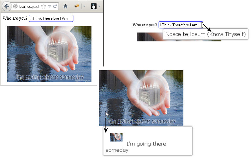
The tooltips widget allows you to easily add tooltips to form input, images, and just about any other page element. To implement tooltips, apply .tooltip(options) to the document or other container. Inside the options, specify the items that should include tooltips and then the tooltip content handler.
As the mouse hovers over an item supported by the tooltip, the tooltip message is displayed. The code in Listing 20.11 provides an example of implementing tooltips on <input> and <img> elements. The visual can be seen in Figure 20.11.
items—Specifies the selector used to determine whether the page element supports tooltips.
content—Tooltip handler function called when a supported element is hovered over. The function should return the content to be displayed. Notice that for the image, a mini version is displayed in the tooltip.
position—Specifies the position to place the tooltip; for example:
position: {my: "left top+15", at: "left bottom", collision: "flipfit" }
LISTING 20.11 jQuery, CSS, and HTML to Implement the Tabbed Panel
...jQuery...
11 $(document).ready(function(){
12 $(document).tooltip({
13 items: "img, input",
14 position: {my: "left+15 top", at: "left bottom", collision: "flipfit" },
15 content: function() {
16 var obj = $(this);
17 if (obj.is("input")) { return obj.attr( "title" ); }
18 if (obj.is("img")) {
19 var img = $("<img></img>").addClass("mini").attr("src", obj.attr("src"));
20 var span = $("<span></span>").html(obj.attr( "alt" ));
21 return $("<div></div>").append(img, span); }
22 }});
23 });
...CSS...
26 input { border:2px ridge blue; border-radius:5px; padding:3px; }
27 img { height:200px; margin:15px; }
28 .mini {height:30px;}
...HTML...
31 <label for="size">Who are you? </label>
32 <input id="size" title="Nosce te ipsum (Know Thyself)" /><br>
33 <img src="../images/someday.jpg" alt="I'm going there someday"/>
Creating Custom Widgets
Creating custom widgets is a fairly simple process. The $.widget() factory needs a name and then the prototype object shown next. The widget factory will handle setting everything up so that the widget can be applied to page elements.
The code in Listing 20.12 shows a basic outline for a custom widget. To create the widget, follow these steps:
1. Replace "custom.mywidget" with your own name.
2. Add the options with default values.
3. Add any additional code in _create(), _refresh(), _destroy(), _setOptions(), and _setOption().
4. Add additional attributes or methods to the prototype object to implement the widget.
LISTING 20.12 jQuery Code Outline to Implement a Custom Widget
01 $.widget("custom.mywidget", {
02 options : {
03 // custom options
04 },
05 _create: function() {
06 //creation code
07 },
08 _refresh: function() {
09 //refress code called when element refreshed
10 },
11 _destroy: function() {
12 //cleanup code called when widget is destroyed
13 },
14 _setOptions: function() {
15 // _super and _superApply handle keeping the right this-context
16 this._superApply( arguments );
17 this._refresh();
18 },
19 _setOption: function( key, value ) {
20 // set individual option value override code
21 this._super( key, value );
22 }
23 });
Summary
jQuery UI includes a large set of built-in widgets that provide some much-desired functionality and styling left out of conventional HTML elements. In this hour, you saw the widgets and how to implement them on pages, including autocomplete elements, buttons, datepicker, dialog, menu, progress bar, sliders, spinners, tabs, and tooltips.
Q&A
Q. What is the Globalize plug-in and why would I want to use it?
A. The Globalize plug-in is a project that simplifies the process of internationalizing your web pages to match currency, time, and other value formatting that varies from locale to locale. If you plan to have a website with elements that need localization, it is a good idea to at least check it out.
Workshop
The workshop consists of a set of questions and answers designed to solidify your understanding of the material covered in this hour. Try to answer the questions before looking at the answers.
Quiz
1. How do you get the value of a slider from the element #mySlider?
2. True or False: Datepicker widgets must be attached to an <input> element.
3. How do you attach an event handler to a button, a check box, or a radio stylized by jQuery UI?
4. How do you populate the possible values for an autocomplete element?
Quiz Answers
1. $("#mySlider").slider("value");
2. False.
3. The normal way you would with jQuery or JavaScript.
4. Set the value of the source option to a JavaScript array of values.
Exercises
1. Open the code in Listing 20.5 and add an Input element to the dialog box. Then add a second button that gets that value and displays it on the web page somewhere.
2. Open the code in Listing 20.10 and add a new tab called Sliders. Then have it link to the hour2009.html file that contains the sliders example.