
19. Type

In This Chapter
Changing the font family and font style
Shifting type from the baseline
Formatting type with paragraph and character styles
Transforming the bounding box for paragraph type
Putting type in a spot color channel
We’ve never heard the phrase “A word is worth a thousand pictures,” but in Photoshop, where you can do such artful things with type, the line between pictures and words is blurred (sometimes literally!).
In this chapter, you’ll learn how to create editable type, then style and format it using a wide assortment of character and paragraph controls. You will also learn special techniques, such as how to transform type, screen it back (as in the image shown at right), rasterize it, and make it look like cut paper. Finally, you will learn how to put type shapes into a spot color channel.
When you use the Horizontal Type tool or Vertical Type tool, editable type appears in your document and a new layer appears on the Layers panel. You can easily change the attributes of editable type, such as the font family, style, and size; kerning, tracking, leading, alignment, and baseline shift values; and color. Moreover, you can transform, warp, or apply layer effects to editable type; change its blending mode; and change its opacity and fill values. To style type, we’ll show you how to use the Character panel ![]() A, the Paragraph panel,
A, the Paragraph panel, ![]() the Paragraph Styles panel,
the Paragraph Styles panel, ![]() the Character Styles panel,
the Character Styles panel, ![]() and the Options bar.
and the Options bar.
Note: Many type controls that were on the Layer menu > Type submenu in Photoshop CS5 are located on a new Type menu in CS6. ![]()

A You can apply Character panel attributes to all the type on a layer or to selected characters or words.
Creating editable type
You can be casual about where you position editable type initially and about which typographic attributes you choose for it, because you can easily edit those attributes or move, transform, or restack the layer.
To create an editable type layer
1. Choose the Horizontal Type tool ![]() or Vertical Type tool
or Vertical Type tool ![]() (T or Shift-T).
(T or Shift-T).
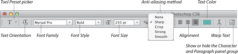
2. On the Options bar,A do all of the following:
A The Options bar offers many controls for the type tools.
Choose a font family, and from the adjacent menu, choose a font style. A sample of each font displays on the menu.
Choose or enter a font size (you can use the scrubby slider).
Choose an anti-aliasing method for the way in which Photoshop introduces partially transparent pixels along the edges of the characters, to make them look smoother: Sharp (sharpest), Crisp (somewhat sharp), Strong (heavier), or Smooth (smoothest). With anti-aliasing off (None), the edges of the type will be jagged; choose None for Web output.B–C

B With Anti-aliasing off, type edges look jagged.

C With Anti-aliasing on, type edges look smoother.
Click an alignment button to align point type relative to your original insertion point or to align paragraph type to the left edge, right edge, or center of the bounding box (see also page 364).
Click the Text Color swatch, then choose a color via the Color Picker or Swatches panel, or click a color in the document, then click OK.
3. Do either of the following:
To create point type (suitable for a small amount of text), click in the document to establish an insertion point, then type the desired text. You can press Enter/Return to create line breaks, where necessary, to prevent the type from disappearing off the edge of the canvas. (You can also move the type later with the Move tool.)
To create paragraph type (suitable for a larger block of text), drag to define a bounding box for the type to fit into, then type the desired text. Let the words wrap naturally to the edges of the bounding box, pressing Enter/Return only when you need to start a new paragraph. Note: If you prefer to specify dimensions for the bounding box first, Alt/Option click in the document, then enter dimensions in the Paragraph Text Size dialog.
4. To accept the new text, press Enter on the keypad (not on the main keyboard) or click the Commit button ![]() on the right end of the Options bar. (To cancel the type, press Esc or click the Cancel button
on the right end of the Options bar. (To cancel the type, press Esc or click the Cancel button ![]() on the Options bar.) Each time you create new type with the Horizontal or Vertical Type tool, it appears on a new layer (A–B, next page).
on the Options bar.) Each time you create new type with the Horizontal or Vertical Type tool, it appears on a new layer (A–B, next page).

A After typing “EcoStorage,” we pressed Enter/Return, so we could type the next word on a second line.
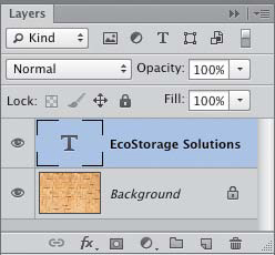
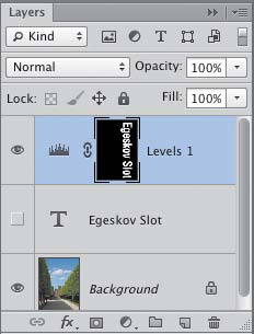
B Editable type layers have a ![]() icon in the thumbnail and are given the name of the first word or few words of type in the layer.
icon in the thumbnail and are given the name of the first word or few words of type in the layer.
Note: If you prefer not to establish new default Options bar settings for your type tool, click or drag with the tool in the document before choosing settings.
• Photoshop uses vector outlines for specific font families and styles when you resize editable type, save a file to the PDF format, or output a file to a PostScript printer. Like vector graphics, editable type outputs at the resolution of the printer, not at the resolution of the file.
• If you need to typeset a sizable quantity of text for a particular project, you may find it easier to create just the imagery in Photoshop and then add the type in a layout or Web page creation program.
• You can right-click an editable type listing on the Layers panel and choose an anti-aliasing method from the context menu. The new setting will display on the Anti-Aliasing menu on the Character panel.
• To display either East Asian Features or Middle Eastern Features on the Character and Paragraph panels and panel menus, see “Choose Text Engine Options” on page 443. ![]()
• To fill a type bounding box with “dummy” text quickly, choose Type > Paste Lorem Ipsum. ![]() For overflow text, see page 366.
For overflow text, see page 366.
• If you place phrases, words, or characters on separate layers, you’ll be able to move and apply effects to them individually. To organize multiple type layers, gather them into layer groups. To display only type layers, choose Kind from the Filter Type menu at the top of the Layers panel, then click the Filter for Type Layers button. ![]()
![]()
Selecting type
Before you can change the character or paragraph attributes or content of type, you have to select a type layer or a specific string of characters or phrases.
Note: To apply some kinds of edits to type, such as filters or brush strokes, you must rasterize it first (see page 368). Note that once type is rasterized, its character or paragraph attributes (such as the font and leading) can’t be edited.
To select type for editing or style changes
Do one of the following:
Click a type layer, choose the Horizontal Type tool ![]() or Vertical Type tool
or Vertical Type tool ![]() (T or Shift-T), then drag across some characters or words to select them,A or double-, triple-, or quadruple-click, as described in the sidebar on this page.
(T or Shift-T), then drag across some characters or words to select them,A or double-, triple-, or quadruple-click, as described in the sidebar on this page.

A To select type characters for editing, drag across them with a type tool.
With any tool selected, double-click the ![]() icon on the Layers panel. All the type on the layer becomes selected. To reduce the selection, drag or double-or triple-click.
icon on the Layers panel. All the type on the layer becomes selected. To reduce the selection, drag or double-or triple-click.
To change the attributes of all the type on a layer via the Character or Paragraph panel, such as the font size, leading, or alignment, simply click the layer (you don’t need to select a type tool).
• To delete type that you have selected, press Backspace/Delete. Or to delete one character at a time, click with a type tool to the right of a character to be deleted (or in the case of vertical type, click below the character), then press Backspace/Delete.
To exit type-editing mode
When you’re done editing your type, do one of the following:
Click the Commit button ![]() on the Options bar.
on the Options bar.
Press Enter on the keypad (not on the main keyboard).
Click a different tool.
Click a different layer.
(To cancel your edits before confirming them, either click the Cancel button ![]() on the Options bar or press Esc.)
on the Options bar or press Esc.)
Recoloring type
To recolor type
1. On the Layers panel, click a type layer.
2. Do either of the following:
Choose the Horizontal Type tool ![]() or Vertical Type tool,
or Vertical Type tool, ![]() then click the Text Color swatch on the Options bar.
then click the Text Color swatch on the Options bar.
On the Character panel, ![]() click the Color swatch.
click the Color swatch.
3. Choose a color via the Color Picker or Swatches panel, or click a color in the image, then click OK to exit the Color Picker.
• You can also apply a color, gradient, or pattern to a type layer via an editable overlay layer effect (see pages 378–379).
To recolor selected characters or words
1. With the Horizontal Type tool ![]() or Vertical Type tool,
or Vertical Type tool, ![]() select the characters or words to be recolored.
select the characters or words to be recolored.
2. On the Options bar, click the Text Color swatch.A
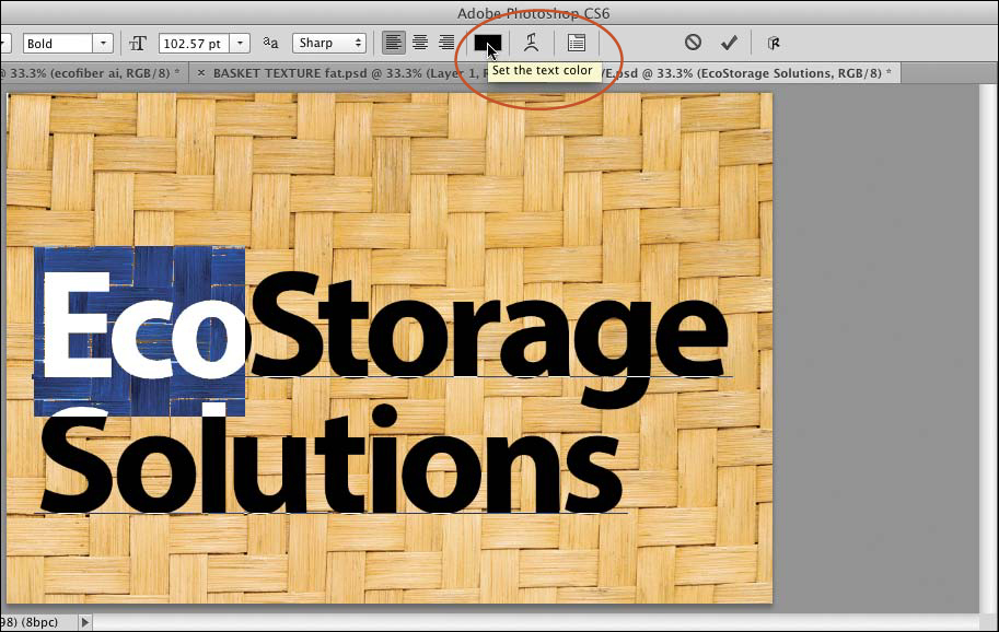
A Drag across the characters to be recolored, then click the Text Color swatch on the Options bar.
3. Choose a color via the Color Picker B or Swatches panel, or click a color in the image, then click OK to exit the Color Picker.

B Choose a replacement color from the Color Picker.
Changing the font family and font style
To change the font family and font style
1. Select the type to be restyled (use any method in step 1 on the preceding page).
2. On the Options bar or the Character panel, ![]() choose from the Font Family menu, then choose from the adjacent Font Style menu.
choose from the Font Family menu, then choose from the adjacent Font Style menu.
• To deal with missing fonts in a file, see page 35.
• When the Type > Font Preview Size submenu has a setting other than None, ![]() a sample of each font family displays next to the font listings in the Font menu on the Options bar and the Character panel. From the Font Preview Size menu, you can select a size for the previews (e.g., Small, Medium, or Large). Note: If the samples are previewing too slowly, either choose a smaller preview size or choose None to turn the feature off.
a sample of each font family displays next to the font listings in the Font menu on the Options bar and the Character panel. From the Font Preview Size menu, you can select a size for the previews (e.g., Small, Medium, or Large). Note: If the samples are previewing too slowly, either choose a smaller preview size or choose None to turn the feature off.
• If the Character panel is open but collapsed to an icon, click the ![]() icon.
icon.
• Select the Horizontal Type tool or Vertical Type tool, then click the Toggle the Character and Paragraph Panels ![]() button on the Options bar.
button on the Options bar.
• Choose Type > Panels > Character Panel ![]() or Window > Character.
or Window > Character.
Converting type
To convert paragraph type to point type
On the Layers panel, right-click the name of a paragraph type layer and choose Convert to Point Text. A paragraph return will be inserted at the end of every line of type except the last one. If the type object contains hidden (overflow) text, an alert dialog may appear, warning you that the hidden text will be deleted if you proceed; click OK.
To convert point type to paragraph type
On the Layers panel, right-click the name of a point type layer and choose Convert to Paragraph Text. To reshape the resulting bounding box, follow the steps on page 366. Be sure to delete any unwanted hyphens that may have been inserted.
Changing the font size
To assign a specific font (point) size to all the characters you select, use either the Options bar or the Character panel.
To change the font size
Method 1 (Options bar)
1. Choose the Horizontal Type or Vertical Type tool, then click a type layer or select the type characters to be resized.
2. On the Options bar, use the Font Size icon ![]() as a scrubby slider (Alt-drag/Option-drag for smaller increments), or enter a value, or choose a preset size from the menu.A
as a scrubby slider (Alt-drag/Option-drag for smaller increments), or enter a value, or choose a preset size from the menu.A

A To change the font size of selected type via the Options bar, use the scrubby slider, enter a value, or choose a preset size from the menu.
Method 2 (Character panel)
On the Layers panel, click a type layer, then choose a Font Size on the Character panel.B

B Another way to change the type size is via the Font Size scrubby slider, field, or menu on the Character panel.
• To choose a measurement unit for the Character and Paragraph panels, see page 441.
You can also resize type interactively with the Move tool. This is especially useful if your type selection contains different point sizes and you want to preserve those relative differences while resizing.
To scale type with the Move tool
1. On the Layers panel, click a type layer.
2. Click the Move tool ![]() and check Show Transform Controls on the Options bar. On the bounding box for the type, click any handle.
and check Show Transform Controls on the Options bar. On the bounding box for the type, click any handle.
3. Do either of the following:
To scale both the height and the width of the type, drag a corner handle. To preserve the original proportions of the characters while scaling them (better!), Shift-drag a corner handle.C
C To scale type proportionally with the Move tool, Shift-drag a corner handle on the transform box.
To scale just the height or width of the type, drag a side handle.
4. To accept the scale transformation, click the Commit ![]() button on the Options bar or double-click in the text block. (To cancel the edit before accepting it, click the Cancel Transform
button on the Options bar or double-click in the text block. (To cancel the edit before accepting it, click the Cancel Transform ![]() button on the Options bar or press Esc.)
button on the Options bar or press Esc.)
• To typeset narrow or wide characters, we recommend using a condensed or extended font, in which the proportions are balanced, instead of the Vertical Scale ![]() or Horizontal Scale
or Horizontal Scale ![]() control on the Character panel, which produce distortion.
control on the Character panel, which produce distortion.
Applying kerning and tracking
Kerning changes the spacing between a pair of text characters, whereas tracking changes the spacing between multiple characters.
To apply kerning
1. On the Layers panel, double-click a ![]() icon, then click to create an insertion point between two characters.
icon, then click to create an insertion point between two characters.
2. Do either of the following:
On the Character panel, choose Metrics from the Kerning menu to apply the kerning value built into the current font or choose Optical to let Photoshop control the kerning; or use the Kerning icon ![]() as a scrubby slider (for finer increments, hold down Alt/Option); A or enter or choose a positive or negative value.B
as a scrubby slider (for finer increments, hold down Alt/Option); A or enter or choose a positive or negative value.B

A The Kerning and Tracking controls are available only on the Character panel (not on the Options bar).

B Use a negative kerning value to tighten the gap between a pair of characters (we chose a value of –100).
Press Alt/Option plus the left or right arrow key on the keyboard (to kern in a larger increment, hold down Ctrl-Alt/Cmd-Option while pressing).
• To restore the spacing between two characters to the kerning setting of Optical, select both characters, then choose Optical from the Kerning menu.
To apply tracking
1. Do either of the following:
To apply tracking to a whole layer, click the layer.
To apply tracking to part of a layer, double-click a ![]() icon, then select some characters or words.
icon, then select some characters or words.
2. Do either of the following:
On the Character panel, use the Tracking icon ![]() as a scrubby slider (hold down Alt/Option for finer increments) or enter or choose a positive or negative value.C
as a scrubby slider (hold down Alt/Option for finer increments) or enter or choose a positive or negative value.C

C On occasion, we might spread out a few words, as in the header in this figure, but never a whole paragraph (that’s a typesetting no-no!).
If type is selected, you can press Alt/Option and the left or right arrow key (to track in a larger increment, hold down Ctrl-Alt/Cmd-Option).
• To reset the tracking value of selected characters to 0, press Ctrl-Shift-Q/Cmd-Control-Shift-Q.
• If Fractional Widths is checked on the Character panel menu, Photoshop uses fractions of pixels to control the spacing of type (on the entire layer), to optimize its appearance. Keep this option checked unless you’re setting small type for Web output.
• To reset the Character panel and any selected type to the default settings, choose Reset Character from the Character panel menu.
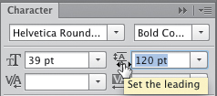
Adjusting the leading
The Leading value controls the spacing between each line of paragraph type and the line above it. In a block of text that has a uniform font size, uniform leading looks best. Note: Leading has no effect on the spacing above the first line in a paragraph. To reposition a whole layer, drag it with the Move tool (simple, yet easy to forget!).
To adjust leading in horizontal paragraph type
1. On the Layers panel, do either of the following:
Click a type layer.
Double-click the ![]() icon for a type layer, then select the paragraphs for which you want to change the leading value.
icon for a type layer, then select the paragraphs for which you want to change the leading value.
2. Show the Character panel. ![]() Use the Leading icon
Use the Leading icon ![]() as a scrubby slider A–C (Alt-drag/Option-drag for finer increments), or enter a value in the field, or choose a preset value from the menu.
as a scrubby slider A–C (Alt-drag/Option-drag for finer increments), or enter a value in the field, or choose a preset value from the menu.
A This is the Leading area on the Character panel.

B This type has a leading value of 154 pt.

C A leading value of 120 pt. brought the bottom line of type closer to the top one.
The leading will change from Auto to a numerical value. If you’re not sure what value to use, start with a number that’s a couple of points larger than the current font size, then readjust it if needed.
Note: The character with the highest leading value in a line controls the spacing of that line.
• The Auto setting for leading is calculated as a percentage of the current font size, and is set in the Justification dialog (choose Justification from the Paragraph panel menu). For instance, with Auto Leading set to the default percentage of 120%, the leading for 30-point type will be 36 points. To restore the Auto setting to selected type, press Ctrl-Alt-Shift-A/Cmd-Option-Shift-A.
• To adjust the vertical spacing between characters in vertical type, click the type layer, then change the Tracking value (not the leading value) on the Character panel.
• To change the orientation of type, right-click a type layer name on the Layers panel and choose Horizontal or Vertical. Or double-click a type layer thumbnail, then on the Options bar, click the Toggle Text Orientation button. ![]() After changing the orientation, you may need to move the type or adjust the tracking. To rotate each character of vertical type 90° clockwise, select the type, then uncheck Standard Roman Vertical Alignment on the Character panel menu.
After changing the orientation, you may need to move the type or adjust the tracking. To rotate each character of vertical type 90° clockwise, select the type, then uncheck Standard Roman Vertical Alignment on the Character panel menu.

Shifting type from the baseline
Use the Baseline Shift feature to raise or lower type characters from the normal baseline (1 point at a time).
To shift characters from the baseline
1. On the Layers panel, double-click a ![]() icon, then select the characters or words to be shifted.
icon, then select the characters or words to be shifted.
2. On the Character panel, ![]() use the Baseline Shift icon
use the Baseline Shift icon ![]() as a scrubby slider (Alt-drag/Option-drag for finer increments), or enter a value.A A positive value raises characters upward; a negative value moves them downward.B–D
as a scrubby slider (Alt-drag/Option-drag for finer increments), or enter a value.A A positive value raises characters upward; a negative value moves them downward.B–D

A Use the Baseline Shift feature to shift characters or words upward or downward by a few points.

B These characters have a Baseline Shift value of 0.

C Here the characters have an assortment of different Baseline Shift values, some positive and some negative.

D To emphasize the curve more, we applied Edit > Transform > Warp (Flag preset); see page 340.
Inserting special characters
The OpenType buttons on the Character panel substitute alternate glyphs for standard characters, if available in the current OpenType font. For instance, a fraction glyph would be substituted when you type the characters for a fraction, such as ½ for 1/2 or ¾ for 3/4. Among the other OpenType options are ligature glyphs for specific letter pairs (such as ff, ffl, and st) and swash and titling characters. The OpenType “Pro” fonts contain the most glyph options.
To insert or specify alternate glyphs for OpenType characters 
1. Do either of the following:
To change all applicable occurrences in existing text, either click a type layer on the Layers panel or highlight characters with a type tool, and if you haven’t already done so, choose an OpenType font family and font style.
To specify alternate glyph options for text to be entered in a specific OpenType font, choose a type tool and that font family and style.
2. On the Character panel, ![]() click the desired — and available (not dimmed) — OpenType button(s).E
click the desired — and available (not dimmed) — OpenType button(s).E

E These are the OpenType buttons on the Character panel.
The buttons are Faux Bold, Faux Italic, All Caps, Small Caps, Superscript, Subscript, Underline, and Strikethrough.
Applying paragraph settings
Using the Paragraph panel, you will find options for justification, alignment, indents, and paragraph spacing, similar to those found in a page layout program. The controls on this panel apply primarily to paragraph type; the first three alignment buttons are the only controls that apply to point type.
To choose a paragraph alignment or justification option for horizontal type
1. Do either of the following:
On the Layers panel, double-click a ![]() icon, then click in a paragraph or select a series of paragraphs.
icon, then click in a paragraph or select a series of paragraphs.
To apply settings to all the type in a layer, click the layer, but don’t select anything.
2. Show the Paragraph panel. ![]()
• If the Paragraph panel is closed, choose Type > Panels > Paragraph Panel. ![]() Or if a type tool is selected, you can click the Toggle Character and Paragraph Panels
Or if a type tool is selected, you can click the Toggle Character and Paragraph Panels ![]() button on the Options bar, then click the Paragraph tab.
button on the Options bar, then click the Paragraph tab.
3. Click an alignment and/or justification button at the top of the panel: A
The buttons in the first group — Left Align Text, Center Text, and Right Align Text — align type to the center or an edge of the bounding box that surrounds the type. These options can also be used on point or paragraph type.
The buttons in the second group — Justify Last Left, Justify Last Centered, and Justify Last Right — justify the type, forcing all but the last line to span the full width of the bounding box.
The last button, Justify All, forces all lines of type, including the last one, to span the full width of the bounding box.
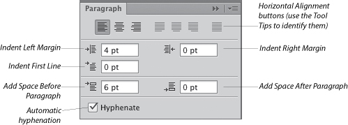
A These are the controls on the Paragraph panel.
4. Check Hyphenate at the bottom of the panel to enable automatic hyphenation. If you chose a justify alignment option, we recommend that you also turn on hyphenation, to help minimize the gaps between words.
• To change the alignment and/or justification values for vertical type, the procedure is the same as described above, except the buttons have different labels.
• To reset all currently selected type and the Paragraph panel to the default settings, choose Reset Paragraph from the panel menu.
• To specify parameters for hyphenation, choose Hyphenation from the Paragraph panel menu.
Formatting type with paragraph and character styles
Using paragraph and character styles, you can format and style type quickly and ensure that it looks consistent throughout your document. When you edit a type style, all the type to which it is linked updates instantly.
To create a paragraph style
1. Apply the desired character and paragraph settings to some type in your document, then click in the text.
2. On the Paragraph Styles panel, ![]() click the New Paragraph Style button.
click the New Paragraph Style button. ![]()
• To rename a style, double-click the style name, enter the desired name in the dialog, then click OK.
To apply a paragraph style
1. Click a type layer, or click in a paragraph, or drag through a string of paragraphs.
2. On the Paragraph Styles panel, click a style.A

A We applied a paragraph style to this type.
• If a style doesn’t apply correctly, click the Clear Overrides button ![]() (overrides are attributes in the text that are unrelated to the style, as indicated by a plus sign next to the style name).
(overrides are attributes in the text that are unrelated to the style, as indicated by a plus sign next to the style name).
To create a character style
1. Apply the desired character settings to a character or word, and keep the type selected.
2. On the Character Styles panel, ![]() click the New Character Style button.
click the New Character Style button. ![]()
To apply a character style
1. Select the characters or words to be styled.
2. On the Character Styles panel, click a style.B
B Next, we applied a character style to the numerals.
To edit a paragraph or character style
Do either of the following:
Select and restyle a paragraph (or characters) that contain the style you want to edit, so it has the desired new attributes. From the menu on the Paragraph Styles (or Character Styles) panel, choose Redefine Style.
Choose Select > Deselect Layers, then on the Paragraph Styles or Character Styles panel, double-click a style. The Paragraph Style Sheet or Character Style Sheet dialog opens. Change the settings in any of the panels, then click OK.C

C We edited the color and font in the character style: The changes appeared instantly in the whole document.
Transforming the bounding box for paragraph type
If you change the shape of the bounding box that surrounds paragraph type (e.g., make the box narrower or wider), the type will reflow to fit the new dimensions without the characters becoming distorted. Enlarging the bounding box is a necessity when you want to reveal overflow type (indicated by a tiny plus sign in the lower-right corner handle). Instructions are also given here for rotating the bounding box.
To transform paragraph type via its bounding box
1. On the Layers panel, double-click the ![]() icon for a paragraph type layer, then click anywhere in the text. A dashed bounding box surrounds the type.
icon for a paragraph type layer, then click anywhere in the text. A dashed bounding box surrounds the type.
2. Do one of the following:
To reshape the bounding box, drag a control handle.A To preserve the proportions of the bounding box while scaling it, start dragging a corner handle, then hold down Shift and continue to drag. The type will reflow into the new shape.B

A Drag a control handle to transform the bounding box.

B When we widened the bounding box, the type reflowed into the new shape.
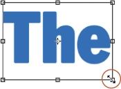
To rotate the bounding box, position the pointer just outside one of the corners (it will become a curved, double-arrow pointer), then drag in a circular direction.
3. To accept the transformation, press Enter on the keypad or click the Commit button ![]() on the Options bar. (To cancel the edits, press Esc or click the Cancel button
on the Options bar. (To cancel the edits, press Esc or click the Cancel button ![]() on the Options bar.)
on the Options bar.)
• To align or distribute multiple layers, such as type layers, see page 261.
• To access the Move tool temporarily while you’re working with type (perhaps to move the type), hold down Ctrl/Cmd. Note: If you press V to access the Move tool instead, make sure your type cursor isn’t inserted in type, or you will either replace the selected type with that letter or insert the letter into your text.
Screening back type
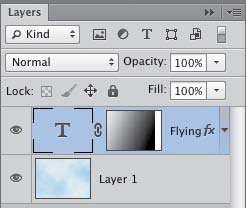
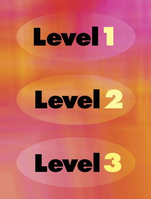
In these steps, you’ll use a Levels adjustment layer to screen back type. A lightened version of the image will be visible only within the type shapes. This is a very “Photoshoppy” way to combine type with imagery.
To screen back type
1. Create a document that contains a medium to dark image layer and an editable type layer (the type color doesn’t matter), preferably in a large font size and a bold or black font style.A

A The original document contains an image layer and an editable type layer.
2. On the Layers panel, Ctrl-click/Cmd-click the ![]() icon to load the type as a selection. Hide the type layer, then click the underlying image layer or Background.
icon to load the type as a selection. Hide the type layer, then click the underlying image layer or Background.
3. On the Adjustments panel, click the Levels button. ![]() The Levels controls display on the Properties panel, and the selection disappears from view temporarily.
The Levels controls display on the Properties panel, and the selection disappears from view temporarily.
4. Move the middle Input Levels slider to the left to lighten the midtones in the type (you can also move the highlights slider). Move the Output Levels shadows slider to the right to reduce the contrast in the type.B–C
B The mask on the Levels adjustment layer is hiding the adjustment everywhere but within the type shapes.

C In this screened-back version, the Levels adjustment is visible only within the type shapes.
• To screen back the imagery instead of the type, after following the steps above, click the adjustment layer mask thumbnail, then on the Properties panel, click Invert.
• To reposition the type in the image, click the adjustment layer, then Ctrl/Cmd drag in the document.
• You can apply layer effects to the adjustment layer. For some great results, try Drop Shadow, Inner Shadow, or Bevel & Emboss.
Rasterizing a type layer
If you want to edit type by applying a filter or the Transform > Distort or Perspective command, or draw strokes on it directly with a tool such as the Brush, you have to convert it to pixels first via the Rasterize Type command. Although you can’t change the typographic attributes of rasterized type, there are countless creative things you can do with it.
To rasterize type into pixels
1. Optional: To preserve the editable type layer, duplicate it (Ctrl-J/Cmd-J), then hide the original. Keep the duplicate layer selected.
2. Right-click the editable type layer name and choose Rasterize Type (or choose Type > Rasterize Type Layer ![]() ). In the layer thumbnail, you will see the type shapes surrounded by transparent pixels (checkerboard pattern).
). In the layer thumbnail, you will see the type shapes surrounded by transparent pixels (checkerboard pattern).
Creating a Cut Paper Effect
In this example, we’ll “attack” the type characters with knives (well, actually, a lasso tool)!
1. Create an editable type layer, duplicate it, then right-click the duplicate layer and choose Rasterize Type. Hide the editable type layer.
2. To select a portion of a type “character,” drag with the Lasso tool ![]() (L or Shift-L) or click with the Polygonal Lasso tool.
(L or Shift-L) or click with the Polygonal Lasso tool. ![]() A
A

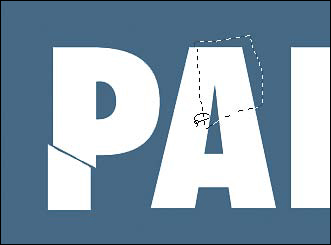
A We created editable type in an extra bold font, duplicated and hid the type layer, and rasterized the duplicate. With the Polygonal Lasso tool, we created a straight-edged selection of the stem on the letter P.
3. Choose the Move tool ![]() or hold down Ctrl/Cmd, then drag the selection in the document window or press any of the arrow keys.B
or hold down Ctrl/Cmd, then drag the selection in the document window or press any of the arrow keys.B

B We repositioned the selection with the Move tool.
4. Repeat steps 2–3 for other “characters” to create an aesthetically pleasing design (A–F, next page).
A With the Lasso tool, we created an irregular-shaped selection of the top of the letter A.

B We moved the selection.

C This is the final “cut paper” image after we moved more straight-edged and irregular selections of the rasterized type layer.
Putting Sections of Rasterized Type onto Separate Layers

D With the Magic Wand tool (Tolerance 0, Contiguous checked), we clicked each piece of “cut paper” separately, then used the Layer > New > Layer Via Cut command (Ctrl-Shift-J/Cmd-Shift-J) to put it on a new layer. Note: If you follow these steps, remember to reselect the original rasterized layer each time before clicking with the Magic Wand.

E With the sections on different layers, we were able to apply the Color Overlay and Drop Shadow layer effects to each separate layer, and also move the layers individually. Fun!
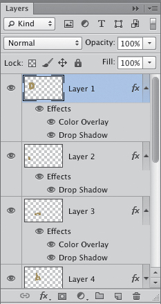
F These are some of the Layers panel listings for the image shown at left.
Putting type in a spot color channel
Note: Show the Layers and Channels panels, both of which you will be using in this exercise.
To put type in a spot color channel
1. Make sure your document has a suitable resolution for commercial printing (typically, 300 ppi).
2. If you haven’t already done so, create some editable type. When you’re done, choose the Move tool. ![]()
3. Display the Channels panel, ![]() then from the panel menu, choose New Spot Channel.
then from the panel menu, choose New Spot Channel.
4. In the New Spot Channel dialog, click the Color swatch, and if necessary, click Color Libraries to get to the Color Libraries dialog.
5. From the Book menu, choose a spot color matching system, such as a PANTONE + (nonprocess) system, click the desired color or type a number that you have gotten from a fan book, then click OK twice to exit both dialogs.
6. Ctrl-click/Cmd-click the ![]() icon on the Layers panel to select the type shapes,A then hide the type layer.
icon on the Layers panel to select the type shapes,A then hide the type layer.

A The type is converted to a selection.
7. On the Channels panel, make sure the new spot color channel is still selected, then choose Edit > Fill (Shift-Backspace/Shift-Delete). In the dialog, choose Use: Black; Mode: Normal; and an Opacity value that matches the tint, or density, value of the spot color ink to be used on press. Click OK. The selection will fill with the spot color.
8. Deselect (Ctrl-D/Cmd-D). On the Channels panel, the type shapes should display in only the spot channel thumbnail.B Click the RGB channel.

B Because our type shapes are now in a spot color channel, our commercial printer will be able to create a special printing plate for them.
9. To preserve the spot color channel, save the file in the Photoshop or Photoshop PDF format.
• To reposition the type shapes, click the spot channel listing on the Channels panel, drag in the document with the Move tool, then click the RGB channel listing.
• You can’t edit the type characters in a spot color channel, since technically they’re just areas of color, not type. If you don’t like the results, you will need to redo it from scratch. Fill the channel with White, 100% Opacity, redisplay and edit the original type layer, then repeat steps 6–8, above.