
Programming with Web Parts
The user and custom controls developed earlier had two limitations:
• They worked only for MyPictureLibrary, and there was no way an end user could configure the name of the picture library.
• Further, the end user could not add or remove these controls on just any page using the web browser.
Web parts offer a solution to these limitations, in an elegant and standardized way.
Web parts are specialized custom controls designed to support user customization. Web parts enable business users to manipulate content, appearance, and behavior of site pages using the web browser. Web parts are rendered inside Chrome, in the web part zones, on the web part pages. Chrome is responsible for providing a standardized user experience when dealing with web parts.
Web parts are managed by the Web Part Manager. Web Part Manager is responsible for serializing and deserializing web parts to the content databases, managing web part functionality as well as the web part events. The SPWebPartManager class provides implementation of Web Part Manager in the SharePoint world.
The concept of web parts was first introduced in WSS 2.0 and later on adopted in ASP.NET. The legacy WebPart class is still bundled with SharePoint 2010 and is present in the Microsoft.SharePoint.WebPartPages.WebPart namespace.
Web part definitions are stored in SharePoint in the form of XML-based template files. The template file contains information required by the Web Part Manager to create an instance of the web part. The document library where these files are stored is called the Web Part Gallery. Every site collection has exactly one Web Part Gallery, existing at the top level site.
The Image Viewer Web Part
To further understand how web parts solve the issues discussed in the beginning of this section, let’s convert the Image Viewer custom control to an Image Viewer web part, which extends the WebPart class present in the System.Net.Web.UI.WebControls.WebParts namespace.
Try It Yourself: Develop a Web Part
1. Fire up Visual Studio and create a new Empty SharePoint Project by name ImageViewerWebPart.
2. Configure the project to be deployed as a sandboxed solution.
3. Add a new Web Part item into the project and call it ImageViewerWebPart.
4. At this point you notice that Visual Studio has already created a class called ImageViewerWebPart for you and overridden the CreateChildControls method. As was the case with the custom controls, you override this method most of the time when developing web parts. Copy the same source code that you had written while developing the ImageViewerCustomControl and paste it inside this function.
5. Rename the feature associated with the project to ImageViewerWebPartFeature.
6. Build and deploy the solution, using Visual Studio, and at this point you are ready to use the web part in your site pages.
7. To test the web part, deploy it on one of your site pages. Edit a site page and select the Insert Web Part option. The web part appears under the Custom web parts folder in the Web Part Gallery. Once added to a site page, your web part should now look similar to Figure 5.7.
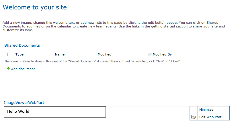
Figure 5.7. The Image Viewer web part
The web part resembles the custom control developed earlier; however, now it is rendered inside Chrome, which provides additional things such as a border and a toolbar with a menu. In addition to these visual elements, you can now add or remove the web part using the browser on any of the site pages. The important point to note here is that you get all these additional goodies for free, by just inheriting from the WebPart class instead of the Control class earlier.
As you dirty your hands with web part development, it is possible that you create a web part that causes your entire page to crash because of a missing null check or an unhandled exception, for example. In such scenarios you can navigate to the Web Part Maintenance page and remove the defective web part from the page. You can navigate to the Web Part Maintenance page by adding Contents=1 to the web part page URL.
For example, to view the Web Part Maintenance page for the http://<< yourservername >>/SitePages/Home.aspx page, you can use the following URL:
http://<< yourservername >>/SitePages/Home.aspx?Contents=1
Moving from a custom control to web part has already solved our second issue (listed in the beginning of this section), that is, the end users can add or remove the web parts to a site page using a web browser. To solve the other issue—allowing users to easily configure the name of the picture library—let’s look at the idea of customization and personalization.
Customization and Personalization
There are two ways you can modify properties of a web part. Customization (or the shared view modification) refers to a change by a privileged user that is visible to and affects all users. Personalization (or the user view modification) on the other hand affects only the user doing the change and does not affect the view of other users.
Let’s create a new property, PictureLibraryName, and let end users configure this using the web browser. Decorate this property with the following three attributes:
• Personalizable(PersonalizationScope.Shared)
• WebBrowsable
• Category(“Configuration”)
The WebBrowsable attribute ensures that the property is visible in the Web Part editor and the Category specifies the group name under which the property appears in the Web Part editor.
Build and deploy the solution using Visual Studio and navigate to the site page where you added your web part earlier. Notice that the web part prompts you with a message to configure the picture library, as shown in Figure 5.8.

Figure 5.8. Prompt to configure the picture library
Use the Edit Web Part option provided by the menu in the web part Chrome, to edit the web part. The Web Part editor should now display your property under the Configuration category as shown in Figure 5.9.
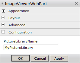
Figure 5.9. Configuring the picture library in the Web Part editor
Enter the name of a picture library, created at the top-level site and click OK to save your changes. The web part should now display the images in the configured picture library. Notice that even if you close and open the web browser and navigate to the same page, your changes are persisted. The Web Part Manager is now responsible for repopulating your configuration (that is, the picture library name) every time you reload the page.
Configuring Web Parts with Editor Parts
Although things worked well with the web part so far, there is still one thing missing in the web part configuration. While configuring the picture library name, the user is free to enter anything in the text box as we are not doing any sort of validations against the picture library name. Additionally, rather than having validation logic in place, it would be even better if you can show a drop-down list of values to the users so that there is very little chance of making a mistake. The editor parts help us to achieve exactly the same effect.
Editor parts are specialized web controls meant for designing property editing interfaces. Let’s examine the process of developing an editor part to edit our Picture Library Name property in a more elegant and user friendly way.
All your editor parts should inherit from the System.Web.UI.WebControls.WebParts.EditorPart class. The System.Web.UI.WebControls.WebParts class provides you with an option to override the CreateEditorParts method, which you can override and return an EditorPartCollection containing your list of editor parts (with each editor part inheriting from the EditorPart class) along with the EditorPartCollection returned by the base class, as shown in the following code:
public override EditorPartCollection CreateEditorParts()
{
// Get the base editor part collection
EditorPartCollection baseCollection = base.CreateEditorParts();
// Create new ImageViewerEditorPart object
ImageUploaderEditorPart imageViewerEditorPart = new
ImageUploaderEditorPart();
imageViewerEditorPart.ID = "ImageViewerEditorPart";
// Create new ImageViewerEditorPart list, multiple custom editor parts
// can be added to the list
List<EditorPart> editorPartList = new List<EditorPart>();
editorPartList.Add(imageViewerEditorPart);
// Return new EditorPartCollection passing on the
// references to base collection and
// our newly created editor part list
return new EditorPartCollection(baseCollection, editorPartList);
}
In this code, ImageViewerEditorPart is the custom editor part created by inheriting from the EditorPart class.
To create an editor part, at the minimum, you should override the following methods of the EditorPart base class:
• CreateChildControls
• OnPreRender
• SyncChanges
• ApplyChanges
The following discusses the implementation of each of these methods, to create the ImageViewerEditorPart:
• CreateChildControls—In this method we create two child controls, a literal control to show the caption Select a Picture Library and a drop-down list to display available picture libraries in the top-level site and add these controls to the controls collection of the editor part.
• OnPreRender—The OnPreRender method contains the core functionality of the editor part. Here we check whether the count of items in the drop-down list is zero. If it is, then we populate it with the list of picture libraries. If the list is already populated, we call the SyncChanges method to synchronize the selected value in the drop-down list with the picture library name value returned web part.
• SyncChanges—Sets the selected value in the picture library drop-down list.
• ApplyChanges—Applies the user selection to the web part.
Refer to the code samples for this hour for implementation details.
Note that if you carefully examine the editor part you see two configuration sections for the picture library name setting, as shown in Figure 5.10. This is because, although we added an editor part to allow users to configure the value via the drop-down list, we still did not remove the WebBrowsable attribute from the PictureLibraryName property.
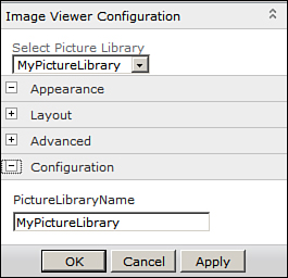
Figure 5.10. Two configuration sections to configure the picture library name
Since now you are controlling the modifications to the property via your editor part, there is no need to make the property WebBrowsable; therefore, we can safely remove this attribute now. As soon as you do so and redeploy the solution, the configuration section containing the text box to specify the picture library name will no longer appear in the web part editor.
Programming with Visual Web Parts
Visual web parts, as the name suggests, aim to ease the process of designing the user interface for the web parts, by leveraging Visual Studio’s design time support for user interface creation. To achieve this effect, visual web parts combine the functionalities offered by user controls with the web parts. A visual web part contains a user control and an associated code behind the file, and a class inheriting from the web part class (which acts as a wrapper for the user control), in addition to other files created in a standard web part project element. Visual Studio 2010 provides a project template as well to create visual web parts. This project can only be deployed as a farm solution, since the associated user control template file must be deployed to the CONTROLTEMPLATES folder under the SharePoint root (or the 14 hive). Visual web parts are useful in scenarios where you have a user interface with many child controls. Controlling the layout and rendering of child controls can be challenging in such scenarios, thus increasing the need for design time support to create the visual elements of the control.
Try It Yourself: Create a Visual Web Part
1. Fire up Visual Studio and create a new Visual Web Part project named ImageUploaderVisualWebPart.
2. Delete the VisualWebPart1 item that Visual Studio adds to your project by default.
3. Add a new Visual Web Part item to the project and call it ImageUploaderVisualWebPart. At this point you should have a project structure similar to Figure 5.11.
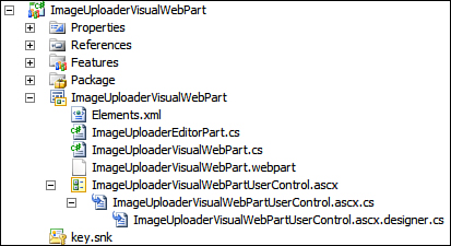
Figure 5.11. Developing a visual web part
4. Examine the contents of the ImageUploaderVisualWebPart class generated by Visual Studio. The ImageUploaderVisualWebPart class inherits from the System.Web.UI.WebControls.WebParts class, loads the underlying user control from the CONTROLTEMPLATES folder, and adds the same to the web part’s control collection. Thus in effect it is acting only as a wrapper for the underlying user control. When you use the Visual Web Part control template, Visual Studio automatically generates the following code to perform these tasks:
[ToolboxItemAttribute(false)]
public class ImageUploaderVisualWebPart : WebPart
{
// Visual Studio might automatically update this path when you change the Visual Web Part project item.
private const string _ascxPath =
@"~/_CONTROLTEMPLATES/ImageUploaderVisualWebPart/ ImageUploaderVisualWebPart/ImageUploaderVisualWebPartUserControl.ascx";
private ImageUploaderVisualWebPartUserControl userControl;
protected override void CreateChildControls()
{
Control control = Page.LoadControl(_ascxPath);
Controls.Add(control);
}
}
5. Now modify the ImageUploaderUserControl.ascx and ImageUploaderUserControl.cs files and copy the code from the ImageUploaderUserControl developed earlier.
6. Further, also create an editor part to enable the user to select the picture library from the drop-down list into which the image file will be uploaded. Let’s call this editor part ImageUploaderEditorPart and copy the exact same code from the ImageViewerEditorPart.
7. Create a public property called PictureLibraryName both inside the ImageUploaderVisualWebPart class and ImageUploaderUserControl class. When the user configures the PictureLibraryName property from the editor part, we pass down the value to the underlying user control, from the wrapper web part. To achieve this, instead of casting the user control to the Control class object, cast it to an object of the ImageUploaderUserControl class. Your code should now look something similar to the following:
public class ImageUploaderVisualWebPart : WebPart
{
// Visual Studio might automatically update this path when you change the Visual Web Part project item.
private const string _ascxPath = @"~/_CONTROLTEMPLATES/ ImageUploaderVisualWebPart/ImageUploaderVisualWebPart/ ImageUploaderVisualWebPartUserControl.ascx";
private ImageUploaderVisualWebPartUserControl userControl;
[Personalizable(PersonalizationScope.Shared), Category("Configuration")]
public string PictureLibraryName
{
get;
set;
}
protected override void CreateChildControls()
{
userControl = Page.LoadControl(_ascxPath) as
ImageUploaderVisualWebPartUserControl;
userControl.PictureLibraryName = this.PictureLibraryName;
Controls.Add(userControl);
}
public override EditorPartCollection CreateEditorParts()
{
// Get the base editor part collection
EditorPartCollection baseCollection = base.CreateEditorParts();
// Create new ImageViewerEditorPart object
ImageUploaderEditorPart imageViewerEditorPart
= new ImageUploaderEditorPart();
imageViewerEditorPart.ID = "ImageViewerEditorPart";
// Create new ImageViewerEditorPart list, multiple custom editor parts
// can be added to the list
List<EditorPart> editorPartList = new List<EditorPart>();
editorPartList.Add(imageViewerEditorPart);
// Return new EditorPartCollection passing on the references to base collection and
// our newly created editor part list
return new EditorPartCollection(baseCollection, editorPartList);
}
}
8. That’s it; the ImageUploaderVisualWebPart is ready and should now function similarly to the user control developed earlier.
9. Build and deploy the solution using Visual Studio and add the web part to a site page.
Thus you see that by using a wrapper web part and an underlying user control, you can get the benefits of design time support, which otherwise is not available while developing web parts.
Did you know that traditionally SharePoint developers have used the user control technique to build web parts? The user interface elements were placed in a user control and a wrapper web part was written to load the same. It was, however, in Visual Studio 2010 that a Visual Web Part template was first introduced and the concept was formalized.
Developing Connected Web Parts
All the web parts you developed so far operate in isolation, completely unaware of the existence of other web parts on a page. However, this concept of working in isolation might not work well in real-world scenarios. Consider a scenario in which a business user working on a sales report, which displays all the products with corresponding sales figures in tabular form, wants to view details for a selected product adjacent to the main report, on the same screen. If you were to develop two web parts working in isolation, one to display the sales report and the other to display product details, the details web part would never know what product has been selected by the business user in the sales report web part. This scenario calls for establishing a connection between web parts, so that you can pass the information related to selected product (which can be, say, a selected product ID) from the sales report web part to the product detail web part. Now when the business user selects a product in the sales report, the selected product value would be passed on to the product details web part, which would refresh its content to display the selected product details.
You can connect two or more web parts together by using web part connections. Web parts connected via the web part connections are labeled as connected web parts. A web part connection is established from a web part, which acts as a connection provider to a web part acting as a connection consumer. When a user adds a connection provider and a connection consumer web part on a page, it is the job of the web part manager to discover the compatible web parts and provide the user with an option to establish a connection. Connectable web parts share a common underlying interface definition. The connection provider implements this common interface, and by making use of interface methods and properties, the consumer can access the provider.
The ConnectedWebParts project in the accompanying source code for this hour highlights implementation details for the important steps involved in creating connected web parts. The interface IConfigurationProvider, defines two properties, the values for which are passed on from the ConfigurationProdiver web part to the ConfigurationConsumer. Consider the following interface definition:
public interface IConfigurationProvider
{
string PictureLibraryName { get; set; }
string ImageFileName { get; set; }
}
The ConfigurationConsumer web part uses these two properties to display the configured image from the picture library. The configuration provider implements this interface and provides values of the properties to the consumer. Apart from implementing the interface, the configuration provider also needs to define a function decorated with the ConnectionProvider attribute to provide the web part manager an instance of class implementing the IConfigurationProvider interface. Since in this case, the configuration provider is itself implementing the IConfigurationProvider interface, the function simply returns a reference to the ConnectionProvider class’s instance, as shown here:
[ConnectionProvider("Image Configuration", AllowsMultipleConnections = true)]
public IConfigurationProvider ConfigurationProviderConnectionPoint()
{
return this;
}
Setting AllowMultipleConnections allows the configuration provider to connect to multiple consumers. This seems a possible scenario, where consumer multiple web parts may want to connect to the provider to get the Image Configuration data.
Similarly the consumer must define a method decorated with the ConnectionConsumer attribute and accepting a reference to the interface object as a parameter, as shown in the following code:
[ConnectionConsumer("Image Configuration", AllowsMultipleConnections = false)]
public void ConfigurationProviderConnectionPoint
(IConfigurationProvider configurationProvider)
{
this.configurationProvider = configurationProvider;
}
Since it doesn’t make sense for the consumer to receive Image Configuration from multiple providers (as it can display only one image at a time in this case), set the AllowsMultipleConnections to false.
Be aware of the fact that since it is the end user who ultimately creates connections between the web parts there might be scenarios in which the consumer web part is not connected to any source. In such cases, it is important to do a null check before accessing any of the provider’s properties; otherwise, you might end up with an object reference not set to an instance of an object exception.
With this, your Connection Consumer and Connection Provider web parts are ready to use. Simply add both to a site page and edit the web parts. As shown in Figure 5.12, you should now have an option to connect the web parts by using the Connections menu item.
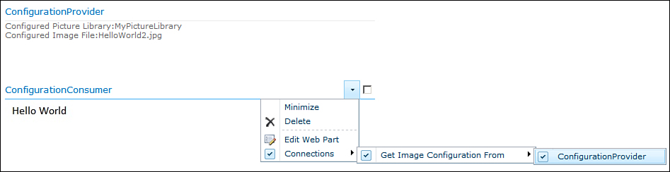
Figure 5.12. Connected web parts
Once a connection is established, the Connection Consumer displays the configured image.
Developing Ajax Web Parts
AJAX, or Asynchronous JavaScript and XML, is a web development technique for creating interactive web applications. AJAX improves “perceived” performance using asynchronous partial page updates, resulting in a better user experience. All the controls and web parts developed so far, cause the entire page to post back and reload to perform an operation on the server. This is fine in scenarios where your web part’s contents are mostly static and require less user interaction. However for web parts that take time to load, or are highly interactive, frequent postback and page load delays can degrade the user experience. For example, in the case of a slideshow web part (which you develop next), if the user wants to refresh the contents automatically, say, once every 5 seconds, doing a full page postback and reload results in a lot of flickering and a poor user experience. In scenarios like these ASP.NET AJAX comes to the rescue by enabling partial page updates so that only the contents inside the slideshow web part are refreshed and not the entire container page.
Developing web parts with ASP.NET AJAX in SharePoint 2007, required developers to perform a number of activities, before they could begin with the actual web part development; these included registering a number of libraries in web.config, programmatically adding script manager to their code, and so on. In SharePoint 2010 things have changed considerably and ASP.NET AJAX is now supported out of the box.
Try It Yourself: Create an Ajax Web Part
• Allows the user to specify picture library to be displayed as slideshow
• Allows the user to configure the time interval between slide transitions
• Allows the user to play and pause the slideshow and manually browse through the images
• Update Panel—(Present under the Ajax Extensions section in the toolbox), to get support from APS.NET AJAX to update only the contents of the update panel in case of a postback initiated by a control contained in the update panel
• Update Progress—(Present under the AJAX Extensions section in the toolbox), to indicate to the user that a partial page update is in progress
• Timer—(Present under the AJAX Extensions section in the toolbox), to cause postbacks after the configured interval and load the next image in the sequence
• Image—To render the image
• ImageButton—(Three of these), to allow the user to move to the previous image, move to the next image, and play/pause the slideshow
1. Fire up Visual Studio and create a new Empty SharePoint project named SlideShowWebPart.
2. Add a new Visual WebPart item to the project. Name this item SlideShowWebPart.
3. Open the SlideShowWebPartUserControl.ascx file and from the code samples accompanying this hour, copy the markup code between the asp:UpdatePanel tag to build the user interface of the web part, so that after deployment, your web part’s user interface looks similar to Figure 5.13.
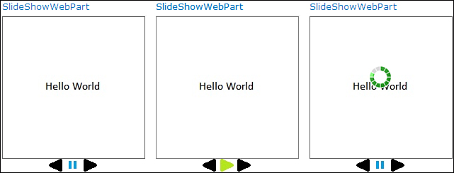
Figure 5.13. Slideshow web part—Play, Pause, and Refresh states
4. Once the preceding user interface elements are in place, most of the work is already done. Now like a regular web part you need to add two properties, namely, picture library name and timer tick interval to allow the end user to configure the web part. These properties should be added to the wrapper web part, which loads the underlying user control and configuration values passed on to the user control. Refer to the following code to achieve the effect:
public class SlideShowWebPart : WebPart
{
// Visual Studio might automatically update this path when you change the Visual Web Part project item.
private const string _ascxPath = @"~/_CONTROLTEMPLATES/SlideShowWebPart/ SlideShowWebPart/SlideShowWebPartUserControl.ascx";
[WebBrowsable, Personalizable(PersonalizationScope.Shared),
Category("SlideShow Settings")]
public string PictureLibraryName { get; set; }
[WebBrowsable, Personalizable(PersonalizationScope.Shared),
Category("SlideShow Settings")]
public int TimerInterval { get; set; }
protected override void CreateChildControls()
{
if (this.TimerInterval > 0 &&
!string.IsNullOrEmpty(this.PictureLibraryName))
{
SlideShowWebPartUserControl control =
Page.LoadControl(_ascxPath)
as SlideShowWebPartUserControl;
control.PictureLibraryName = this.PictureLibraryName;
control.TimerInterval = this.TimerInterval;
Controls.Add(control);
}
else
{
if (this.TimerInterval <= 0)
{
this.Controls.Add(new LiteralControl(
"Please configure a value greate"+
"than 0 for timer<br/>"));
}
if (string.IsNullOrEmpty(this.PictureLibraryName))
{
this.Controls.Add(new LiteralControl(
"Please configure a picture library<br/>"));
}
}
}
}
5. Finally, add the code for timer tick, Back, Play/Pause, and Next buttons. On clicking the Next button and timer tick event, you simply move on to the next image in the list, and on clicking the Back button, you move to the previous item in the list, as shown in the following code snippet:
protected void ImageTransitionTimer_Tick(object sender, EventArgs e)
{
// Load the next image on timer tick
currentImageID += 1;
this.DisplayImage();
}
protected void ImageButtonNext_Click(object sender, ImageClickEventArgs e)
{
// Load next image
currentImageID += 1;
this.DisplayImage();
}
protected void ImageButtonBack_Click(object sender, ImageClickEventArgs e)
{
// Load previous image
currentImageID -= 1;
this.DisplayImage();
}
6. Similarly, on clicking the Play/Pause slideshow button, you toggle between playing/pausing the image and enabling/disabling the timer accordingly, as demonstrated in the following code:
protected void ImageButtonPlayPause_Click(object sender, ImageClickEventArgs e)
{
// Toggle play/pause functionality which includes:
// 1. Toggling between play/pause images
// 2. Enabling/disabling timer
if (Path.GetFileName(this.ImageButtonPlayPause.ImageUrl). ToLower().Equals("pause.jpg"))
{
// Enable timer
this.ImageTransitionTimer.Enabled = false;
// Switch to play image
this.ImageButtonPlayPause.ImageUrl = "~/_layouts/ images/SlideShowWebPart/play.jpg";
}
else
{
// Disable timer
this.ImageTransitionTimer.Enabled = true;
// Switch to pause image
this.ImageButtonPlayPause.ImageUrl = "~/_layouts/ images/SlideShowWebPart/pause.jpg";
}
}
7. The most important method in the slideshow web part is the DisplayImage() function, which is responsible for loading and displaying images from the picture library configured by the user. The following code sample provides the implementation of this function:
private void DisplayImage()
{
if (!string.IsNullOrEmpty(this.PictureLibraryName))
{
try
{
// Load next image
SPWeb rootWeb = SPContext.Current.Site.RootWeb;
SPPictureLibrary pictureLibrary =
rootWeb.GetList(this.PictureLibraryName)
as SPPictureLibrary;
if (pictureLibrary != null)
{
if (currentImageID == pictureLibrary.ItemCount)
{
currentImageID = 0;
}
if (currentImageID < 0)
{
currentImageID = pictureLibrary.ItemCount - 1;
}
if (pictureLibrary != null)
{
this.Image1.ImageUrl =
Path.Combine(
rootWeb.Url,
pictureLibrary.Items[currentImageID].Url);
this.Image1.Visible = true;
int height, width;
int.TryParse(
pictureLibrary.Items[currentImageID]
["Picture Height"].ToString(),
out height);
int.TryParse(
pictureLibrary.Items[currentImageID]
["Picture Width"].ToString(),
out width);
// Don't let image dimensions exceed
// 200 by 200 container box
// In case dimensions exceed the box,
// reduce the size preserving aspect ratio
if (width > 200 | | height > 200)
{
if (width > height)
{
this.Image1.Width = 200;
this.Image1.Height = height * 200 / width;
}
else
{
this.Image1.Height = 200;
this.Image1.Width = width * 200 / height;
}
}
else
{
this.Image1.Width = width;
this.Image1.Height = height;
}
// Vertically center the image
this.PanelTopMargin.Height =
new Unit((200 - Image1.Height.Value) / 2,
UnitType.Pixel);
}
}
}
catch
{
// Eat any errors and restart the image loading on error
currentImageID = 0;
}
}
}
This function fetches a reference to the picture library configured by the user and retrieves the next image in the navigation flow. Next we scale down the images (if required), since we are rendering the images in a fixed area of 200px by 200px dimensions, preserving the image aspect ratio. Finally we adjust the top margin to ensure that image is centered both vertically and horizontally in the display area. Refer to the accompanying code samples for the complete implementation details. To keep the things simple, we will not be implementing the editor parts to configure the picture library and the timer interval.
8. Build and deploy the web part using Visual Studio.
9. Once deployed you should see the follow configuration options under the SlideShow Settings section, in the web part editor, as shown in Figure 5.14.
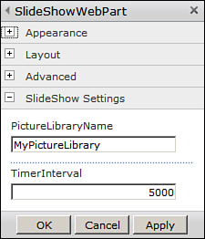
Figure 5.14. Configuring the slideshow web part
10. Once configured, the web part loads the images from the configured picture library and displays in the form of a slideshow.
An important point to note here is that although on every postback caused by our web part (whether by timer tick, or by user clicks) we see only the contents of the web part being refreshed and not any other item on the page, on the server, the entire page is being generated and sent back to the client on every postback. Thus there are no benefits involved on the server side with this approach, other than an improved user experience on the client side.
As you dirty your hands with AJAX development, you will discover that to achieve performance benefits on the server side, developers often develop an underlying script service (consumed directly by the client) and provide the contents for partial page updates. The slideshow web part created in this hour serves as a really good example to break the ice and get you started with AJAX development.