9 Creating and Modifying Charts
Introduction
When you’re ready to share data with others, a worksheet might not be the most effective way to present the information. A page full of numbers, even if attractively formatted, can be hard to understand and perhaps a little boring. Microsoft Excel makes it easy to create and modify charts so that you can effectively present your information. A chart is a visual representation of selected data in your worksheet. Whether you turn numbers into a bar, line, pie, surface, or bubble chart, patterns become more apparent. For example, the trend of annual rising profits becomes powerful in a line chart. A second line showing diminishing annual expenses creates an instant map of the success of a business.
A well-designed chart draws the reader’s attention to important data by illustrating trends and highlighting significant relationships between numbers. Excel generates charts based on data and chart type you select. Excel makes it easy to select the best chart type, design elements, and formatting enhancements for any type of information.
Once you create a chart, you may want to change your chart type to see how your data displays in a different style. You can move and resize your chart, and even draw on your chart to highlight achievements. Other formatting elements are available to assure a well-designed chart.
Understanding Chart Terminology
Choosing the Right Type of Chart
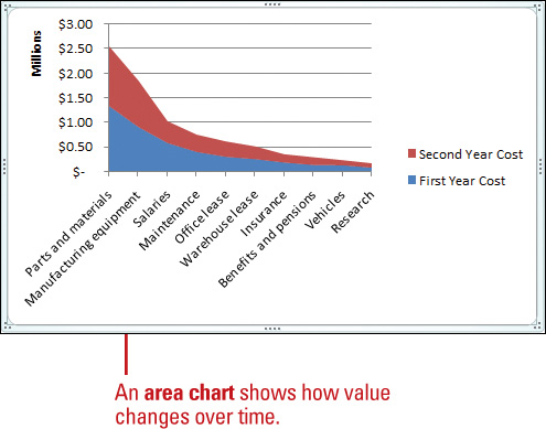
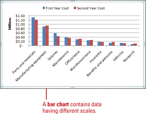
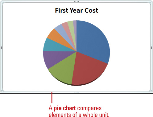
When you create a chart in Excel, you can choose from a variety of chart types. Each type interprets data in a slightly different way. For example, a pie chart is great for comparing parts of a whole, such as regional percentages of a sales total, while a column chart is better for showing how different sales regions performed throughout a year. Although there is some overlap, each chart type is best suited for conveying a different type of information.
When you generate a chart, you need to evaluate whether the chart type suits the data being plotted, and whether the formatting choices clarify or overshadow the information. Sometimes a colorful 3-D chart is just what you need to draw attention to an important shift; other times, special visual effects might be a distraction.
Creating a Chart
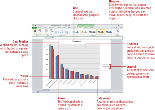
A chart provides a visual, graphical representation of numerical data. Charts add visual interest and useful information represented by lines, bars, pie slices, or other markers. A group of data values from a worksheet row or column of data makes up a data series. Each data series has a unique color or pattern on the chart. Titles on the chart, horizontal (x-axis), and vertical (y-axis) identify the data. Gridlines are horizontal and vertical lines to help the reader determine data values in a chart. When you choose to place the chart on an existing sheet, rather than on a new sheet, the chart is called an embedded object. You can then resize or move it just as you would any graphic object.
Insert and Create a Chart
![]() Select the data you want to use to create a chart.
Select the data you want to use to create a chart.
![]() Click the Insert tab.
Click the Insert tab.
![]() Use one of the following methods:
Use one of the following methods:
![]() Basic Chart Types. Click a chart button (Column, Line, Pie, Bar, Area, Scatter, Other Charts) in the Charts group, and then click the chart type you want.
Basic Chart Types. Click a chart button (Column, Line, Pie, Bar, Area, Scatter, Other Charts) in the Charts group, and then click the chart type you want.
![]() All Chart Types. Click the Charts Dialog Box Launcher, click a category in the left pane, click a chart, and then click OK.
All Chart Types. Click the Charts Dialog Box Launcher, click a category in the left pane, click a chart, and then click OK.
A chart appears on the worksheet as an embedded chart.


Move a Chart to Another Worksheet
![]() Click the chart you want to modify.
Click the chart you want to modify.
![]() Click the Design tab under Chart Tools.
Click the Design tab under Chart Tools.
![]() Click the Move Chart button.
Click the Move Chart button.
![]() Use one of the following methods:
Use one of the following methods:
![]() To move the chart to a chart sheet, click the New sheet option, and then type a new name for the chart tab.
To move the chart to a chart sheet, click the New sheet option, and then type a new name for the chart tab.
![]() To move the chart to another worksheet as an embedded object, click the Object in option, and then select the worksheet you want.
To move the chart to another worksheet as an embedded object, click the Object in option, and then select the worksheet you want.
![]() Click OK.
Click OK.


Editing a Chart
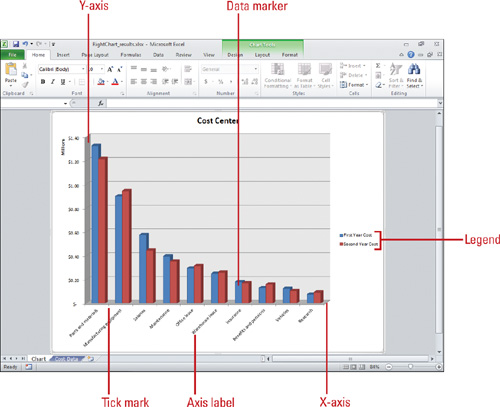
Editing a chart means altering any of its features, from data selection to formatting elements. For example, you might want to use more effective colors or patterns in a data series. To change a chart’s type or any element within it, you must select the chart or element. When a chart is selected, handles are displayed around the window’s perimeter, and chart tools become available on the Design, Layout, and Format tabs. As the figure below illustrates, you can point to any object or area on a chart to see what it is called. When you select an object, its name appears in the Chart Objects list box on the Ribbon, and you can then edit it. A chart consists of the following elements.
![]() Data markers. A graphical representation of a data point in a single cell in the datasheet. Typical data markers include bars, dots, or pie slices. Related data markers constitute a data series.
Data markers. A graphical representation of a data point in a single cell in the datasheet. Typical data markers include bars, dots, or pie slices. Related data markers constitute a data series.
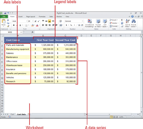
![]() Legend. A pattern or color that identifies each data series.
Legend. A pattern or color that identifies each data series.
![]() X-axis. A reference line for the horizontal data values.
X-axis. A reference line for the horizontal data values.
![]() Y-axis. A reference line for the vertical data values.
Y-axis. A reference line for the vertical data values.
![]() Tick marks. Marks that identify data increments.
Tick marks. Marks that identify data increments.
Editing a chart has no effect on the data used to create it. You don’t need to worry about updating a chart if you change worksheet data because Excel automatically does it for you. The only chart element you might need to edit is a data range. If you decide you want to plot more or less data in a range, you can select the data series on the worksheet, as shown in the figure below, and then drag the outline to include the range you want in the chart.
Moving and Resizing a Chart
You can move or resize an embedded chart after you select it. If you’ve created a chart as a new sheet instead of an embedded object on an existing worksheet, the chart’s size and location are fixed by the sheet’s margins. You can change the margins to resize or reposition the chart. If you don’t like the location, you can move the embedded chart off the original worksheet and onto another worksheet. When resizing a chart downward, be sure to watch out for legends and axis titles.
Move an Embedded Chart
![]() Select a chart you want to move.
Select a chart you want to move.
![]() Position the mouse pointer over a blank area of the chart, and then drag the pointer to move the outline of the chart to a new location.
Position the mouse pointer over a blank area of the chart, and then drag the pointer to move the outline of the chart to a new location.
![]() Release the mouse button.
Release the mouse button.
Resize an Embedded Chart
![]() Select a chart you want to resize.
Select a chart you want to resize.
![]() Position the mouse pointer over one of the handles.
Position the mouse pointer over one of the handles.
![]() Drag the handle to the new chart size.
Drag the handle to the new chart size.
![]() Release the mouse button.
Release the mouse button.

Selecting Chart Elements
Chart elements are the individual objects that make up a chart, such as an axis, the legend, or a data series. The plot area is the bordered area where the data are plotted. The chart area is the area between the plot area and the chart elements selection box. Before you can change or format a chart element, you need to select it first. You can select a chart element directly on the chart or use the Chart Elements list arrow on the Ribbon. When you select a chart, handles (small white circles) display around the window’s perimeter, and chart tools become available on the Design, Layout, and Format tabs. When you select an element in a chart, the name of the object appears in the Chart Elements list, which indicates that you can now edit it.
Select a Chart Element
![]() Select the chart you want to change.
Select the chart you want to change.
![]() Click the Format or Layout tab under Chart Tools.
Click the Format or Layout tab under Chart Tools.
![]() Click the Chart Elements list arrow.
Click the Chart Elements list arrow.
![]() Click the chart element you want to select.
Click the chart element you want to select.
When a chart object is selected, selection handles appear.
TIME SAVER To select a chart object, click a chart element directly in the chart.
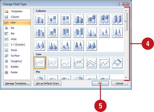
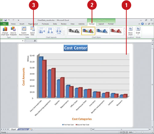
Changing a Chart Type
Your chart is what your audience sees, so make sure to take advantage of Excel’s pre-built chart layouts and styles to make the chart appealing and visually informative. Start by choosing the chart type that is best suited for presenting your data. There are a wide variety chart types, available in 2-D and 3-D formats, from which to choose. For each chart type, you can select a predefined chart layout and style to apply the formatting you want. If you want to format your chart beyond the provided formats, you can customize a chart. Save your customized settings so that you can apply that chart formatting to any chart you create. You can change the chart type for the entire chart, or you can change the chart type for a selected data series to create a combination chart.
Change a Chart Type for an Entire Chart
![]() Select the chart you want to change.
Select the chart you want to change.
![]() Click the Design tab under Chart Tools.
Click the Design tab under Chart Tools.
![]() Click the Change Chart Type button.
Click the Change Chart Type button.
![]() Click the chart type you want.
Click the chart type you want.
![]() Click OK.
Click OK.

Change a Chart Type of a Single Data Series
![]() Select the data series in a chart you want to change.
Select the data series in a chart you want to change.
You can only change the chart type of one data series at a time.
![]() Click the Design tab under Chart Tools.
Click the Design tab under Chart Tools.
![]() Click the Change Chart Type button.
Click the Change Chart Type button.
![]() Click the chart type you want.
Click the chart type you want.
![]() Click OK.
Click OK.
Changing a Chart Layout and Style
Excel’s pre-built chart layouts and styles can make your chart more appealing and visually informative. Start by choosing the chart type that is best suited for presenting your data. There are a wide variety chart types, available in 2-D and 3-D formats, from which to choose. For each chart type, you can select a predefined chart layout and style to apply the formatting you want. If you want to format your chart beyond the provided formats, you can customize a chart. Save your customized settings so that you can apply that chart formatting to any chart you create.
Change a Chart Layout or Style
![]() Select the chart you want to change.
Select the chart you want to change.
![]() Click the Design tab under Chart Tools.
Click the Design tab under Chart Tools.
![]() To change the chart layout, click the scroll up or down arrow, or click the More list arrow in the Chart Layouts group to see variations of the chart type.
To change the chart layout, click the scroll up or down arrow, or click the More list arrow in the Chart Layouts group to see variations of the chart type.
![]() Click the chart layout you want.
Click the chart layout you want.


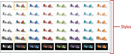
Apply a Chart Style
![]() Select the chart you want to change.
Select the chart you want to change.
![]() Click the Design tab under Chart Tools.
Click the Design tab under Chart Tools.
![]() Click the scroll up or down arrow, or click the More list arrow in the Chart Styles group to see color variations of the chart layout.
Click the scroll up or down arrow, or click the More list arrow in the Chart Styles group to see color variations of the chart layout.
![]() Click the chart style you want.
Click the chart style you want.

Formatting Chart Elements
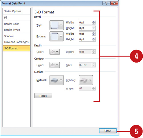
Before you can format a chart element, you need to select it first. You can select a chart element directly on the chart or use the Chart Elements list arrow on the Ribbon. After you select a chart element, you can use the Format Selection button to open the Format dialog box, where you can change formatting options, including number, fill, border color and styles, shadow, 3-D format, and alignment. Formatting options vary depending on the selected chart element. In the same way you can apply shape fills, outlines, and effects to a shape, you can also apply them to elements and shapes in a chart.
Format a Chart Object
![]() Select the chart element you want to modify.
Select the chart element you want to modify.
![]() Click the Format tab under Chart Tools.
Click the Format tab under Chart Tools.
![]() Click the Format Selection button.
Click the Format Selection button.
![]() Select the options you want. The available options vary depending on the chart.
Select the options you want. The available options vary depending on the chart.
Some common formatting option categories in the left pane include the following:
![]() Numberto change number formats.
Numberto change number formats.
![]() Fill to remove or change the fill color, either solid, gradient, picture, or texture.
Fill to remove or change the fill color, either solid, gradient, picture, or texture.
![]() Border Color or Styles to remove or change the border color and styles, either solid or gradient line.
Border Color or Styles to remove or change the border color and styles, either solid or gradient line.
![]() Shadow to change shadow options, including color, transparency, size, blur, angle, and distance.
Shadow to change shadow options, including color, transparency, size, blur, angle, and distance.
![]() 3-D Format to change 3-D format options, including bevel, depth, contour, and surface.
3-D Format to change 3-D format options, including bevel, depth, contour, and surface.
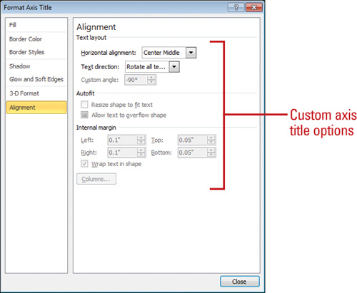
![]() Alignment to change text alignment, direction, and angle.
Alignment to change text alignment, direction, and angle.
![]() Click Close.
Click Close.

Apply a Shape Style to a Chart Object
![]() Select the chart element you want to modify.
Select the chart element you want to modify.
![]() Click the Format tab under Chart Tools.
Click the Format tab under Chart Tools.
![]() Click the Shape Fill, Shape Outline, or Shape Effects button, and then click or point to an option.
Click the Shape Fill, Shape Outline, or Shape Effects button, and then click or point to an option.
![]() Fill. Click a color, No Fill, or Picture to select an image, or point to Gradient, or Texture, and then select a style.
Fill. Click a color, No Fill, or Picture to select an image, or point to Gradient, or Texture, and then select a style.
![]() Outline. Click a color or No Outline, or point to Weight, or Dashes, and then select a style.
Outline. Click a color or No Outline, or point to Weight, or Dashes, and then select a style.
![]() Effects. Point to an effect category (Preset, Shadow, Reflection, Glow, Soft Edges, Bevel, or 3-D Rotations), and then select an option.
Effects. Point to an effect category (Preset, Shadow, Reflection, Glow, Soft Edges, Bevel, or 3-D Rotations), and then select an option.

Changing Chart Gridlines and Axes
You can change the chart display by showing axis or gridlines with different measurements. An axis is a line bordering the chart plot area used as a reference for measurement. Chart axes are typically ξ (vertical or value), y (horizontal or category), and ζ (only for 3-D charts). If axis titles or scales are too long and unreadable, you might want to change the angle to make titles fit better in a small space, or change the interval between tick marks and axis labels to display with a better scale. Tick marks are small lines of measurement similar to divisions on a ruler on an axis. Gridlines are horizontal and vertical lines you can add to help the reader determine data point values in a chart. There are two types of gridlines: major and minor. Major gridlines occur at each value on an axis, while minor gridlines occur between values on an axis. Use gridlines sparingly and only when they improve the readability of a chart.
Change Chart Gridlines
![]() Select the chart element you want to modify.
Select the chart element you want to modify.
![]() Click the Layout tab under Chart Tools.
Click the Layout tab under Chart Tools.
![]() Click the Gridlines button, point to Primary Horizontal Gridlines, Primary Vertical Gridlines, or Depth Gridlines (3-D charts) and then click any of the following options:
Click the Gridlines button, point to Primary Horizontal Gridlines, Primary Vertical Gridlines, or Depth Gridlines (3-D charts) and then click any of the following options:
![]() None
None
![]() Major Gridlines
Major Gridlines
![]() Minor Gridlines
Minor Gridlines
![]() Major & Minor Gridlines
Major & Minor Gridlines
![]() To select custom chart gridlines options, click the Gridlines button, and then do one of the following:
To select custom chart gridlines options, click the Gridlines button, and then do one of the following:
![]() Point to Primary Horizontal Gridlines, and then click More Primary Horizontal Gridlines Options.
Point to Primary Horizontal Gridlines, and then click More Primary Horizontal Gridlines Options.
![]() Point to Primary Vertical Gridlines, and then click More Primary Vertical Gridlines Options.
Point to Primary Vertical Gridlines, and then click More Primary Vertical Gridlines Options.
![]() Point to Depth Gridlines, and then click More Depth Gridlines Options.
Point to Depth Gridlines, and then click More Depth Gridlines Options.

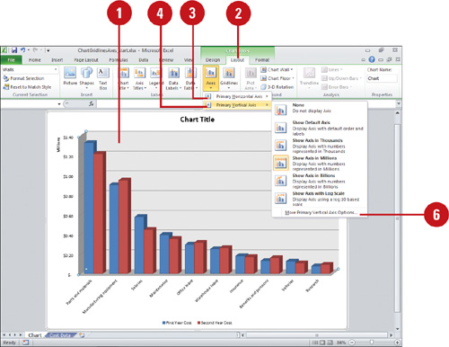
Change Chart Axes
![]() Select the chart element you want to modify.
Select the chart element you want to modify.
![]() Click the Layout tab under Chart Tools.
Click the Layout tab under Chart Tools.
![]() Click the Axes button, point to Primary Horizontal Axis, and then click any of the following options:
Click the Axes button, point to Primary Horizontal Axis, and then click any of the following options:
![]() None
None
![]() Show Left to Right Axis
Show Left to Right Axis
![]() Show Axis without labeling
Show Axis without labeling
![]() Show Right to Left Axis
Show Right to Left Axis
![]() Click the Axes button, point to Primary Vertical Axis, and then click any of the following options:
Click the Axes button, point to Primary Vertical Axis, and then click any of the following options:
![]() None
None
![]() Show Default Axis
Show Default Axis
![]() Show Axis in Thousands
Show Axis in Thousands
![]() Show Axis in Millions
Show Axis in Millions
![]() Show Axis in Billions
Show Axis in Billions
![]() Show Axis with Log Scale
Show Axis with Log Scale
![]() Click the Axes button, point to Depth Axis (3-D charts), and then click any of the following options:
Click the Axes button, point to Depth Axis (3-D charts), and then click any of the following options:
![]() None
None
![]() Show Default Axis
Show Default Axis
![]() Show Axis without labeling
Show Axis without labeling
![]() Show Reverse Axis
Show Reverse Axis
![]() To select custom chart axes options, click the Axes button, and then do one of the following:
To select custom chart axes options, click the Axes button, and then do one of the following:
![]() Point to Primary Horizontal Axis, and then click More Primary Horizontal Axis Options.
Point to Primary Horizontal Axis, and then click More Primary Horizontal Axis Options.
![]() Point to Primary Vertical Axis, and then click More Primary Vertical Axis Options.
Point to Primary Vertical Axis, and then click More Primary Vertical Axis Options.
![]() Point to Depth Axis, and then click More Depth Axis Options.
Point to Depth Axis, and then click More Depth Axis Options.

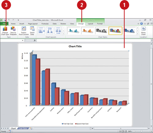
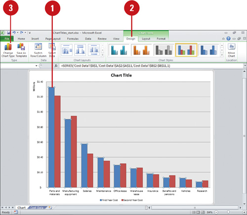
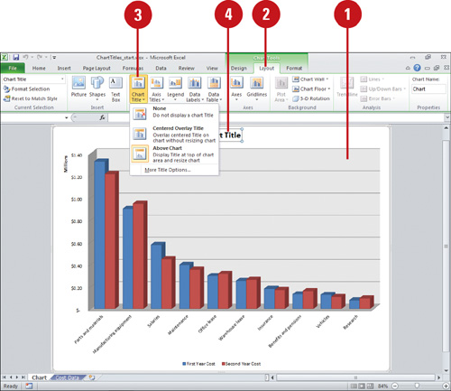
Changing Chart Titles
The layout of a chart typically comes with a chart title, axis titles, and a legend. However, you can also include other elements, such as data labels, and a data table. You can show, hide, or change the positions of these elements to achieve the look you want. The chart title typically appears at the top of the chart. However, you can change the title position to appear as an overlap text object on top of the chart. When you position the chart title as an overlay, the chart is resized to the maximum allowable size. In the same way, you can also reposition horizontal and vertical axis titles to achieve the best fit in a chart. If you want a more custom look, you can set individual options using the Format dialog box.
Change Chart Title
![]() Select the chart you want to modify.
Select the chart you want to modify.
![]() Click the Layout tab under Chart Tools.
Click the Layout tab under Chart Tools.
![]() Click the Chart Titles button, and then click one of the following:
Click the Chart Titles button, and then click one of the following:
![]() None to hide the chart title.
None to hide the chart title.
![]() Centered Overlay Title to insert a title on the chart without resizing it.
Centered Overlay Title to insert a title on the chart without resizing it.
![]() Above Chart to position the chart title at the top of the chart and resize it.
Above Chart to position the chart title at the top of the chart and resize it.
![]() More Title Options to set custom chart title options.
More Title Options to set custom chart title options.
![]() Double-click the text box to place the insertion point, and then modify the text.
Double-click the text box to place the insertion point, and then modify the text.
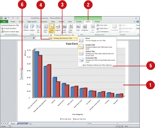
Change Chart Axis Titles
![]() Select the chart you want to modify.
Select the chart you want to modify.
![]() Click the Layout tab under Chart Tools.
Click the Layout tab under Chart Tools.
![]() Click the Axis Titles button, point to Primary Horizontal Axis Title, and then click any of the following options:
Click the Axis Titles button, point to Primary Horizontal Axis Title, and then click any of the following options:
![]() None to hide the axis title.
None to hide the axis title.
![]() Title Below Axis to display the title below the axis.
Title Below Axis to display the title below the axis.
![]() Click the Axis Titles button, point to Primary Vertical Axis Title, and then click any of the following options (to show or hide):
Click the Axis Titles button, point to Primary Vertical Axis Title, and then click any of the following options (to show or hide):
![]() None to hide the axis title.
None to hide the axis title.
![]() Rotated Title to display the axis title rotated.
Rotated Title to display the axis title rotated.
![]() Vertical Title to display the axis title vertical.
Vertical Title to display the axis title vertical.
![]() Horizontal Title to display the axis title horizontal.
Horizontal Title to display the axis title horizontal.
![]() To select custom chart axis titles options, click the Axis Titles button, and then do one of the following:
To select custom chart axis titles options, click the Axis Titles button, and then do one of the following:
![]() Point to Primary Horizontal Axis Title, and then click More Primary Horizontal Axis Title Options.
Point to Primary Horizontal Axis Title, and then click More Primary Horizontal Axis Title Options.
![]() Point to Primary Vertical Axis Title, and then click More Primary Vertical Axis Title Options.
Point to Primary Vertical Axis Title, and then click More Primary Vertical Axis Title Options.
![]() To change title text, double-click the text box to place the insertion point, and then modify the text.
To change title text, double-click the text box to place the insertion point, and then modify the text.
Changing Chart Labels
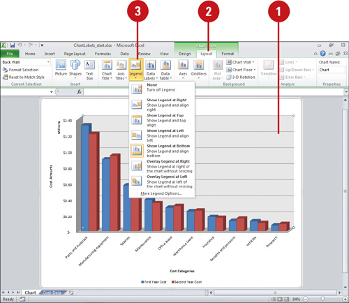
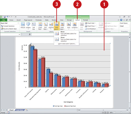
A legend is a set of text labels that helps the reader connect the colors and patterns in a chart with the data they represent. Legend text is derived from the data series plotted within a chart. You can rename an item within a legend by changing the text in the data series. If the legend chart location doesn’t work with the chart type, you can reposition the legend at the right, left, top or bottom of the chart or overlay the legend on top of the chart on the right or left side. Data labels show data values in the chart to make it easier for the reader to see, while a Data table shows the data values in an associated table next to the chart. If you want a customized look, you can set individual options using the Format dialog box.
Change the Chart Legend
![]() Select the chart you want to modify.
Select the chart you want to modify.
![]() Click the Layout tab under Chart Tools.
Click the Layout tab under Chart Tools.
![]() Click the Legend button, and then click one of the following:
Click the Legend button, and then click one of the following:
![]() None to hide the legend.
None to hide the legend.
![]() Show Legend at Right to display and align the legend on the right.
Show Legend at Right to display and align the legend on the right.
![]() Show Legend at Top to display and align the legend at the top.
Show Legend at Top to display and align the legend at the top.
![]() Show Legend at Left to display and align the legend on the left.
Show Legend at Left to display and align the legend on the left.
![]() Show Legend at Bottom to display and align the legend at the bottom.
Show Legend at Bottom to display and align the legend at the bottom.
![]() Overlay Legend at Right to position the legend on the chart on the right.
Overlay Legend at Right to position the legend on the chart on the right.
![]() Overlay Legend at Left to position the legend on the chart on the left.
Overlay Legend at Left to position the legend on the chart on the left.
![]() More Legend Options to set custom legend options.
More Legend Options to set custom legend options.
Change Chart Data Labels
![]() Select the chart you want to modify.
Select the chart you want to modify.
![]() Click the Layout tab under Chart Tools.
Click the Layout tab under Chart Tools.
![]() Click the Data Labels button, and then click one of the following:
Click the Data Labels button, and then click one of the following:
![]() None to hide data labels.
None to hide data labels.
![]() Show to display data labels centered on the data points.
Show to display data labels centered on the data points.
![]() More Data Label Options to set custom data label options.
More Data Label Options to set custom data label options.
The available options vary depending on the select chart.
Show or Hide a Chart Data Table
![]() Select the chart you want to modify.
Select the chart you want to modify.
![]() Click the Layout tab under Chart Tools.
Click the Layout tab under Chart Tools.
![]() Click the Data Table button, and then click one of the following:
Click the Data Table button, and then click one of the following:
![]() None to hide a data table.
None to hide a data table.
![]() Show Data Table to show the data table below the chart.
Show Data Table to show the data table below the chart.
![]() Show Data Table with Legend Keys to show the data table below the chart with legend keys.
Show Data Table with Legend Keys to show the data table below the chart with legend keys.
![]() More Data Table Options to set custom data table options.
More Data Table Options to set custom data table options.

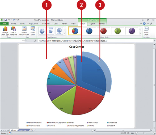
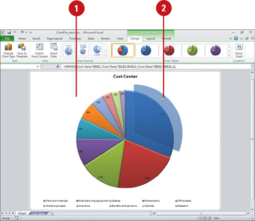
Pulling Out a Pie Slice
A pie chart is an effective and easily understood chart type for comparing parts that make up a whole entity, such as departmental percentages of a company budget. You can call attention to individual pie slices that are particularly significant by moving them away from the other pieces, or exploding the pie. Not only will this make a visual impact, it will also restate the values you are graphing.
Explode a Pie Slice
![]() Select a pie chart.
Select a pie chart.
![]() To explode a single slice, double-click to select the pie slice you want to explode.
To explode a single slice, double-click to select the pie slice you want to explode.
![]() Drag the slice away from the pie.
Drag the slice away from the pie.
![]() Release the mouse button.
Release the mouse button.
Undo a Pie Explosion
![]() Select a pie chart.
Select a pie chart.
![]() Drag a slice toward the center of the pie.
Drag a slice toward the center of the pie.
![]() Release the mouse button.
Release the mouse button.
Formatting Chart Data Series
If you want to further enhance a chart, you can insert a picture in a chart so that its image occupies a bar or column. You can use the Format Selection button to open the Format dialog box and change Fill options to format a chart data series with a solid, gradient, picture, or texture fill. In addition, you can also change a chart data series with a border color, border style, shadow, and 3-D formats, which include bevel, depth, contour, and surface styles.
Format a Chart Data Series
![]() Select the chart series you want to modify.
Select the chart series you want to modify.
![]() Click the Format tab under Chart Tools.
Click the Format tab under Chart Tools.
![]() Click the Format Selection button.
Click the Format Selection button.
![]() Select the options you want:
Select the options you want:
![]() Series Options to change the gap width and depth (for 3-D charts), or series overlap (for 2-D charts).
Series Options to change the gap width and depth (for 3-D charts), or series overlap (for 2-D charts).
![]() Shape to change the shape to a box, pyramid, cone, or cylinder (for 3-D charts).
Shape to change the shape to a box, pyramid, cone, or cylinder (for 3-D charts).
![]() Fill to remove or change the fill, either solid color, gradient, picture, or texture.
Fill to remove or change the fill, either solid color, gradient, picture, or texture.
![]() Border Color or Styles to remove or change the border color and styles, either solid or gradient line.
Border Color or Styles to remove or change the border color and styles, either solid or gradient line.
![]() Shadow to change shadow options, including color, transparency, size, blur, angle, and distance.
Shadow to change shadow options, including color, transparency, size, blur, angle, and distance.
![]() 3-D Format to change 3-D format options, including bevel, depth, contour, and surface.
3-D Format to change 3-D format options, including bevel, depth, contour, and surface.
![]() Click Close.
Click Close.


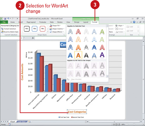
Formatting Chart Text
Objects such as chart and axis titles, data labels, and annotated text are referred to as chart text. To make chart text more readable, you can use formatting tools on the Home or Format tabs to change the text font, style, and size. For example, you might decide to change your chart title size and alignment, or change your axis text color. If you want to change the way text appears, you can also rotate text to a diagonal angle or vertical orientation. On the Format tab under Chart Tools, you can apply WordArt and Shape Styles to chart text.
Format Chart Text
![]() Select the chart that contains the text you want to change.
Select the chart that contains the text you want to change.
![]() Select the text object in the chart you want to format.
Select the text object in the chart you want to format.
If you want to select only a portion of the text, click the text object again to place the insertion point, and then select the part of the text you want to format.
![]() Click the Format tab under Chart Tools, and then click the WordArt or Shape Style you want.
Click the Format tab under Chart Tools, and then click the WordArt or Shape Style you want.
![]() Click the Home tab.
Click the Home tab.
![]() In the Font group, select any combination of options: Font, Font Size, Increase Font Size, Decrease Font Size, Bold, Italic, Underline, Fill Color, or Font Color.
In the Font group, select any combination of options: Font, Font Size, Increase Font Size, Decrease Font Size, Bold, Italic, Underline, Fill Color, or Font Color.
![]() In the Alignment group, select any combination of alignment options.
In the Alignment group, select any combination of alignment options.
TIMESAVER To quickly format chart text, right-click the text, and then click a formatting button on the Mini-Toolbar.
![]() To set custom text formatting options, click the Font or Alignment Dialog Box Launcher.
To set custom text formatting options, click the Font or Alignment Dialog Box Launcher.

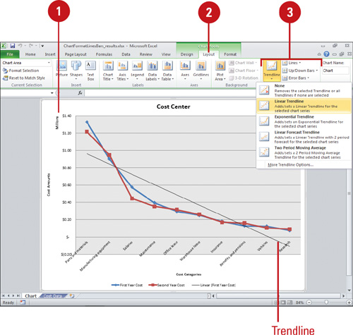
Formatting Line and Bar Charts
If you’re using a line or bar chart, you can add trendlines, series lines, drop lines, high-low lines, up/down bars, or error bars with different options to make the chart easier to read. Trendlines are graphical representations of trends in data that you can use to analyze problems of prediction. For example, you can add a trendline to forecast a trend toward rising revenue. Series lines connect data series in 2-D stacked bar and column charts. Drop lines extend a data point to a category in a line or area chart, which makes it easy to see where data markers begin and end. High-low lines display the highest to the lowest value in each category in 2-D charts. Stock charts are examples of high-low lines and up/down bars. Error bars show potential error amounts graphically relative to each data marker in a data series. Error bars are usually used in statistical or scientific data.
Format Line and Bar Charts
![]() Select the line or bar chart you want to modify.
Select the line or bar chart you want to modify.
![]() Click the Layout tab under Chart Tools.
Click the Layout tab under Chart Tools.
![]() In the Analysis group, click any of the following:
In the Analysis group, click any of the following:
![]() Trendline to remove or add different types of trendlines: Linear, Exponential, Linear Forecast, and Two Period Moving Average.
Trendline to remove or add different types of trendlines: Linear, Exponential, Linear Forecast, and Two Period Moving Average.
![]() Lines to hide Drop Lines, High-Low Lines or Series Lines, or show series lines on a 2-D stacked Bar/Column Pie or Pie or Bar of Pie chart.
Lines to hide Drop Lines, High-Low Lines or Series Lines, or show series lines on a 2-D stacked Bar/Column Pie or Pie or Bar of Pie chart.
![]() Up/Down Bars to hide Up/Down Bars, or show Up/Down Bars on a line chart.
Up/Down Bars to hide Up/Down Bars, or show Up/Down Bars on a line chart.
![]() Error Bars to hide error bars or show error bars with using Standard Error, Percentage, or Standard Deviation.
Error Bars to hide error bars or show error bars with using Standard Error, Percentage, or Standard Deviation.
Changing the Chart Background
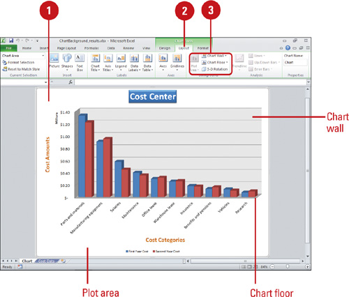
Format the background of a chart by showing or hiding the chart wall or floor with a default color fill, or by changing the 3-D view of a chart. The plot area is bounded by the axes, which includes all data series. The chart wall is the background, and the chart floor is the bottom in a 3-D chart. The 3-D view allows you to change the rotation of a 3-D chart using the x-, y-, or z-axis, and apply a 3-D perspective to the chart.
Change the Chart Background
![]() Select the chart element you want to modify.
Select the chart element you want to modify.
![]() Click the Layout tab under Chart Tools.
Click the Layout tab under Chart Tools.
![]() Click any of the following buttons:
Click any of the following buttons:
![]() Plot Area to show or hide the plot area.
Plot Area to show or hide the plot area.
![]() Chart Wall to show or hide the chart wall with the default color fill.
Chart Wall to show or hide the chart wall with the default color fill.
![]() Chart Floor to show or hide the chart floor with the default color fill.
Chart Floor to show or hide the chart floor with the default color fill.
![]() 3-D Rotation to change the 3-D viewpoint of the chart.
3-D Rotation to change the 3-D viewpoint of the chart.
In the Format Chart Area dialog box, click 3-D Rotation or 3-D Format in the left pane, select the 3-D options you want, and then click Close.

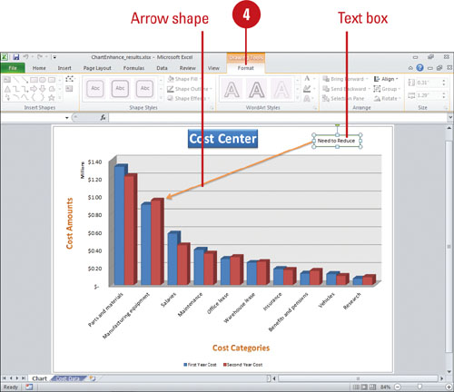
Enhancing a Chart
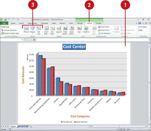
If you want to further enhance a chart, you can insert a picture, shape or text annotation to add visual appeal. In the same way you insert a picture, shape, or text box into a worksheet, you can insert them into a chart. The Picture, Shapes, and Text Box button are available on the Layout tab under Chart Tools.
Insert a Picture, Shape, or Text
![]() Select the chart element you want to modify.
Select the chart element you want to modify.
![]() Click the Layout tab under Chart Tools.
Click the Layout tab under Chart Tools.
![]() Use any of the following:
Use any of the following:
![]() Picture. Click the Picture button, select a picture, and then click Insert.
Picture. Click the Picture button, select a picture, and then click Insert.
![]() Shapes. Click the Shapes button, click a shape, and then drag to draw the shape.
Shapes. Click the Shapes button, click a shape, and then drag to draw the shape.
![]() Text Box. Click the Text Box button, drag to create a text box, and then type the text you want.
Text Box. Click the Text Box button, drag to create a text box, and then type the text you want.
![]() Use the Format tab under Drawing Tools to format the shape or text box.
Use the Format tab under Drawing Tools to format the shape or text box.
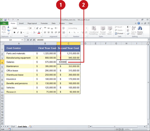
Editing Chart Data
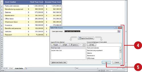
You can edit chart data in a worksheet one cell at a time, or you can manipulate a range of data. If you’re not sure what data to change to get the results you want, use the Edit Data Source dialog box to help you. In previous versions, you were limited to 32,000 data points in a data series for 2-D charts. Now you can have as much as your memory to store (New!). You can work with data ranges by series, either Legend or Horizontal. The Legend series is the data range displayed on the axis with the legend, while the Horizontal series is the data range displayed on the other axis. Use the Collapse Dialog button to temporarily minimize the dialog to select the data range you want. After you select your data, click the Expand Dialog button to return back to the dialog box.
Edit Data in the Worksheet
![]() In the worksheet, use any of the following methods to edit cell contents:
In the worksheet, use any of the following methods to edit cell contents:
![]() To replace the cell contents, click the cell, type the data you want to enter in the cell. It replaces the previous entry.
To replace the cell contents, click the cell, type the data you want to enter in the cell. It replaces the previous entry.
![]() To edit the cell content, double-click the selected cell where you want to edit.
To edit the cell content, double-click the selected cell where you want to edit.
Press Delete or Backspace to delete one character at a time, and then type the new data.
![]() Press Enter to move the insertion point down one row or press Tab to move the insertion point right to the next cell.
Press Enter to move the insertion point down one row or press Tab to move the insertion point right to the next cell.
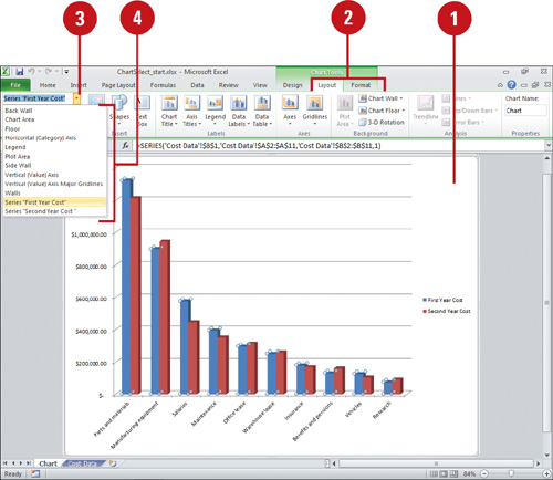
Edit the Data Source
![]() Click the chart you want to modify.
Click the chart you want to modify.
![]() Click the Design tab.
Click the Design tab.
![]() Click the Select Data button on the Design tab under Chart Tools.
Click the Select Data button on the Design tab under Chart Tools.
![]() In the Select Data Source dialog box, use any of the following:
In the Select Data Source dialog box, use any of the following:
IMPORTANT Click the Collapse Dialog button to minimize the dialog, so you can select a range in the worksheet. Click the Expand Dialog button to maximize it again.
![]() Chart data range. Displays the data range in the worksheet of the plotted chart.
Chart data range. Displays the data range in the worksheet of the plotted chart.
![]() Switch Row/Column. Click to switch plotting the data series in the chart from rows or columns.
Switch Row/Column. Click to switch plotting the data series in the chart from rows or columns.
![]() Add. Click to add a new Legend data series to the chart.
Add. Click to add a new Legend data series to the chart.
![]() Edit. Click to make changes to a Legend or Horizontal series.
Edit. Click to make changes to a Legend or Horizontal series.
![]() Remove. Click to remove the selected Legend data series.
Remove. Click to remove the selected Legend data series.
![]() Move Up and Move Down. Click to move a Legend data series up or down in the list.
Move Up and Move Down. Click to move a Legend data series up or down in the list.
![]() Hidden and Empty Cells. Click to plot hidden worksheet data in the chart and determine what to do with empty cells.
Hidden and Empty Cells. Click to plot hidden worksheet data in the chart and determine what to do with empty cells.
![]() Click OK.
Click OK.
Adding and Deleting a Data Series
Many components make up a chart. Each range of data that comprises a bar, column, or pie slice is called a data series; each value in a data series is called a data point. The data series is defined when you select a range on a worksheet and then open the Chart Wizard. But what if you want to add a data series once a chart is complete? Using Excel, you can add a data series by using the Design tab under Chart Tools, or using the mouse. As you create and modify more charts, you might also find it necessary to delete or change the order of one or more data series. You can delete a data series without re-creating the chart.
Add a Data Series Quickly
![]() Click the chart you want to modify.
Click the chart you want to modify.
![]() Click the Design tab under Chart Tools, and then click the Select Data button.
Click the Design tab under Chart Tools, and then click the Select Data button.
![]() Click Add.
Click Add.
![]() Enter a data series name, specify the data series range, and then click OK.
Enter a data series name, specify the data series range, and then click OK.
![]() Click OK.
Click OK.


Delete a Data Series
![]() Click the chart you want to modify.
Click the chart you want to modify.
![]() Click the Design tab under Chart Tools, and then click the Select Data button.
Click the Design tab under Chart Tools, and then click the Select Data button.
![]() Click the data series you want to delete.
Click the data series you want to delete.
![]() Click Remove.
Click Remove.
![]() Click OK.
Click OK.

Change a Data Series
![]() Click the chart you want to modify.
Click the chart you want to modify.
![]() Click the Design tab under Chart Tools, and then click the Select Data button.
Click the Design tab under Chart Tools, and then click the Select Data button.
![]() Click the series name you want to change.
Click the series name you want to change.
![]() Click Edit.
Click Edit.
![]() Click the Collapse Dialog button to change the series name or values, make the change, and then click the Expand Dialog button.
Click the Collapse Dialog button to change the series name or values, make the change, and then click the Expand Dialog button.
![]() Click OK.
Click OK.
![]() Click OK.
Click OK.

Change Data Series Order
![]() Click the chart you want to modify.
Click the chart you want to modify.
![]() Click the Design tab under Chart Tools, and then click the Select Data button.
Click the Design tab under Chart Tools, and then click the Select Data button.
![]() Click the series name you want to change.
Click the series name you want to change.
![]() To switch data series position, click the Switch Row/Column button.
To switch data series position, click the Switch Row/Column button.
![]() To reorder the data series, click the Move Up or Move Down button.
To reorder the data series, click the Move Up or Move Down button.
![]() Click OK.
Click OK.
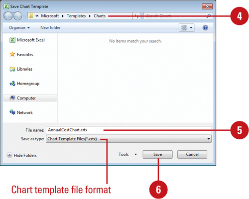
Saving a Chart Template
A chart template file (.crtx) saves all the customization you made to a chart for use in other workbooks. You can save any chart in a workbook as a chart template file and use it to form the basis of your next workbook chart, which is useful for standard company financial reporting. Although you can store your template anywhere you want, you may find it handy to store it in the Templates/Charts folder that Excel and Microsoft Office uses to store its templates. If you store your design templates in the Templates/Charts folder, those templates appear as options when you insert or change a chart type using My Templates. When you create a new chart or want to change the chart type of an existing chart, you can apply a chart template instead of re-creating it.
Create a Custom Chart Template
![]() Click the chart you want to save as a template.
Click the chart you want to save as a template.
![]() Click the Design tab under Chart Tools.
Click the Design tab under Chart Tools.
![]() Click the Save As Template button.
Click the Save As Template button.
![]() Make sure the Charts folder appears in the Save in box.
Make sure the Charts folder appears in the Save in box.
Microsoft Office templates are typically stored in the following location:
Windows 7 or Vista. C:/Users/your name/AppData/Microsoft/Roaming/Templates/Charts
Windows XP. C:/Documents and Settings/your name/Application Data/Microsoft/Templates/Charts
![]() Type a name for the chart template.
Type a name for the chart template.
![]() Click Save.
Click Save.

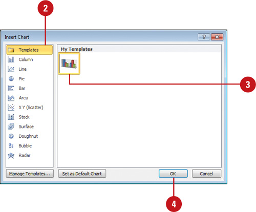
Apply a Chart Template
![]() Use one of the following methods:
Use one of the following methods:
![]() New chart. Click the Insert tab, and then click the Charts Dialog Box Launcher.
New chart. Click the Insert tab, and then click the Charts Dialog Box Launcher.
![]() Change chart. Select the chart you want to change, click the Design tab under Chart Tools, and then click the Change Chart Type button.
Change chart. Select the chart you want to change, click the Design tab under Chart Tools, and then click the Change Chart Type button.
![]() In the left pane, click Templates.
In the left pane, click Templates.
![]() Click the custom chart type you want.
Click the custom chart type you want.
![]() Click OK.
Click OK.
Managing Chart Templates
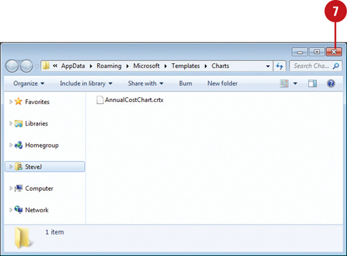
If you no longer need a chart template, you can use the Chart Type dialog box to access and manage chart templates files (.crtx). You can click the Manage Templates button to open the Charts folder and move, copy, or delete chart templates. Microsoft Office stores chart template files in the Charts folder, so all Office programs can use them. When you store templates in the Charts folder, those templates appear as options when you insert or change a chart type using My Templates. So, if you no longer need a chart template, you can move it from the Charts template folder for later use or you can permanently delete it from your computer.
Move or Delete a Custom Chart Template
![]() Select a chart.
Select a chart.
![]() Click the Design tab under Chart Tools.
Click the Design tab under Chart Tools.
![]() Click the Change Chart Type button.
Click the Change Chart Type button.
TIMESAVER To open the Chart Types dialog box, you can click the Charts Dialog Box Launcher on the Insert tab.
![]() Click Manage Templates.
Click Manage Templates.
The Charts folder opens.
Windows 7 or Vista. C:/Users/your name/AppData/Microsoft/Roaming/Templates/Charts
Windows XP. C:/Documents and Settings/your name/Application Data/Microsoft/Templates/Charts
![]() To move a chart template file from the Charts folder, drag it to the folder where you want to store it, or right-click the file and use the Cut and Paste commands.
To move a chart template file from the Charts folder, drag it to the folder where you want to store it, or right-click the file and use the Cut and Paste commands.
![]() To delete a chart template file, right-click it, and then click Delete.
To delete a chart template file, right-click it, and then click Delete.
![]() When you’re done, click the Close button.
When you’re done, click the Close button.
![]() Click Cancel in the Change Chart Type dialog box.
Click Cancel in the Change Chart Type dialog box.