
4. Measurements, URLs, and Color Units
In the discussion of CSS syntax in Chapter 1, you saw that the second part of each CSS declaration is a value. In this chapter, you’ll explore some common units for defining sizes (<length> and <percentage>), colors (<color>), and URLs (<url>) for defining these values.
Measurements
Dimensions and other measurements, such as font-size, are not just raw numbers but a number of some specified of units of measure. CSS has quite a variety of measurement units; the most commonly used are outlined in the following sections.
Pixels (px)
A pixel unit (<length>) is a fixed measurement based on the size of a common pixel.
Note
Pixel units are not always a “pixel” or “dot” but are defined as a relative length measurement based on the given display. High-resolution media such as print will output 1px as multiple physical dots, and high-resolution devices such as the 326-dpi iPhone 4 will render a px unit at an appropriate size.
Ems (em)
One em unit (<length>) is a relative unit that equates to the font size of the element. When applied to the font-size property of an element, an em unit is relative to the parent element’s font size. This behavior makes it useful for keeping the font size for emphasis, headers, and other tags relative to the base font sizing. It’s also useful when applied to dimensions as a way to control readability and line lengths.
Points (pt)
Points are an absolute length–based unit (<length>) equal to 1/72 of an inch. Points can be useful when setting type sizes for print and similar media where physical measurements may be stressed. On screen and mobile media, points are approximated based on the resolution of the display and the system settings, and working with px or em units can lead to more consistent results.
Percentages (%)

Percentage-based units (<percentage>) are relative to another measurement. Percentages can be greater than 100 percent. Which measurement the value relates to is defined on a case-by-case basis; the previous code lines show some examples.
Other Units of Note
Points are considered an absolute length–based units: They correspond to a physical measurement of 1/72 of an inch (approximated by the browser and device). Other absolute units include in (inches), cm (centimeters), mm (millimeters), and pc (picas, or 12pts).
Pixels and ems are relative length–based units: They are relative to some other measurement. Like em, the ex unit is relative to the size of the font (the ex-height or height of the character “x”). CSS3 has defined some other interesting relative length units such as the following: rem (relative to the font size of the root element) and vw and vh (relative to the viewport width and height, respectively). These units are just starting to be supported in previews of the next generation of browsers but are something to look forward to using.
URLs
The URL function (<url>) is used to designate the address of a resource for use in a property such as background-image or list-style-image. The path of the resource follows the same rules as other uniform resource identifier (URI) usages like link href values in HTML. When using external style sheet documents, relative paths relate to the document the CSS rule is found in (the external CSS document) and not the source HTML document.
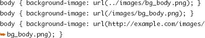
URIs can be quoted with single or double quotes or can be left unquoted. For historical reasons dating back to IE for the Mac, single quotes are sometimes avoided as a best practice.
Basic Colors
The following color units (<color>) define several different ways to designate solid colors and can be used for properties like text color, background-color, and border-color.
#rrggbb or #rgb
In hexadecimal notation, colors are represented by three sets of hexadecimal values (base-16), with the first set representing the red (r) value, the second representing the green (g) value, and the next representing the blue (b) value based on how displays add light to create the colors you see. A value of #000000 represents no light (black), #ffffff represents the most light (white), and #ff0000 represents only red light (bright red).
#rgb is a shorthand for #rrggbb, which is available to use when the two r characters match, the two g characters match, and the two b characters match (#a3b is equivalent to #aa33bb).
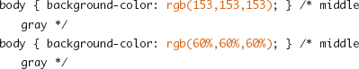
rgb(r,g,b)
You can also define RGB colors using decimal notation (sometimes called functional notation) along the same 256-step range (0 to 255) that the hexadecimal values represented. Each value can also be defined as a percentage of that 256-step range.
Note
You cannot mix integers and percentages in the same color unit designation. White is rgb(255,255,255) or rgb(100%,100%,100%), but not rgb(255,100%,255).
hsl(h,s,l)
The hue-saturation-lightness color scheme offers a way to look at the color wheel that can be more intuitive when working with colors of a similar hue or tonality. Hue (h) is a number from 0 to 360 representing a radial position on the color wheel (0 or 360=red, 120=green, 240=blue). Saturation (s) is a percentage value from 0 to 100 percent with values closer to 0 percent approaching desaturated, or gray. Lightness (l) is again a percentage value from 0 to 100 percent, where 0 percent is black and 100 percent is white.
A chart of HSL colors in the CSS3 Color Module specification (http://www.w3.org/TR/css3-color/#hsl-examples) illustrates how the three scales work together to create colors.
Color Keywords
The HTML 4 specification defined the following 16 color keywords and their corresponding hex values: aqua, black, blue, fuchsia, gray, green, lime, maroon, navy, olive, purple, red, silver, teal, white, and yellow. Keywords are case insensitive and are not placed between quotes.
Several (131 to be exact) more commonly supported color keywords, such as pink, plum, deepskyblue, and firebrick, originally defined in the SVG specification, were added in CSS3, bringing the number of color keywords to 147.
Many Ways to Say the Same Thing
The following are all ways to set the same text color for a paragraph element in your document:
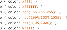
The notation you choose to work with can depend on many factors. Your familiarity with the different color systems, which is the easiest to transpose from your favorite graphics application uses, or how the color palette for the site is designed all should impact this decision. With hsl(), it can be easier to write transitions via JavaScript, but watch for browser support issues since it’s also the newest method of defining color.
Color with Alpha Transparency
CSS3 defines the ability to add a level of transparency to the otherwise solid color designation. Applying alpha transparency to borders, text colors, or backgrounds allows the color of the elements behind the targeted element to bleed through or combine with what is behind it. Figure 4.1 shows the use of a transparent background color to mute the distractions created by a background image so that text can be readable.
Figure 4.1. Using a transparent background color to make solid text more readable against a background image.

The transparency in the color applies only to the parts of the element that color applies to and does not affect the transparency of elements it may contain or other objects like images. I discuss the opacity property, which applies to the visibility of an entire element, in Chapter 6.
rgba(r,g,b,a)
The r, g, and b values work on the same scale as their rgb() unit counterparts discussed earlier in this chapter. The alpha (a) value is a decimal number from 0 to 1, with 0 being completely transparent and 1 being fully opaque.
Tip
Color units with alpha values of 1 are equivalent to using the solid color unit. Consider using that solid color unit instead because it may be supported by more browsers.
hsla(h,s,l,a)
Like rgba(), hsla() is the same color as hsl() with an added designation for alpha transparency. This unit is also a decimal number from 0 to 1.
transparent
The transparent color keyword represents a color value that is fully transparent (and thus red channel or hue designations don’t matter). You can think of it as a shorthand form for (and gets computed in browsers as) rgba(0,0,0,0).
rgba() and hsla() Colors with Non-CSS3 Browsers
Colors units with alpha channels are supported in recent versions of Safari, Firefox, Opera, and the upcoming IE9. Browsers that don’t support these units will skip them entirely because the rgba() or hsla() notation is as foreign to them as madeupscheme() is. This means if you defined an element’s background to be “blue but a little transparent,” the browser will not fall back to “blue but not transparent” and instead use whatever the previously defined or inherited color may be. If you want the fallback to be “blue but not transparent,” you can write the rule set as follows:

All browsers will read the first background-color declaration. Browsers with rgba() support will then override that setting with the second declaration, while others will ignore it as invalid syntax.
As a variation on this method, if your layout calls for transparent red against white, resulting in a pink color, you might use that resulting color in the first declaration instead of a deeper red.
Creating and Maintaining Color Palettes
Defining a color palette for use in a web site and sticking to that set of color values can be a useful tool for styling new elements on a site, providing a consistent appearance throughout a site, and making it easy to find color values when making site changes.
Design
Color theory is far outside the scope of this book and is something you could study for years; however, here are a few tips for choosing the color scheme for a web site:
• Design applications such as Adobe Photoshop offer a detailed color picker that can be switched between RGB, HSL, and other color systems, making for easy translations into CSS units.
• Adobe Kuler is a tool for creating, browsing, and bookmarking color swatches from your browser or your desktop. You can make swatches based on a color wheel or drawn from an uploaded image file (http://kuler.adobe.com/).
Maintenance
Maintaining consistent color usage across a large amount of CSS code can sometimes be difficult. Color units are defined in so many different declarations across so many different elements that it is easy to keep the shade of gray being used the same or know what color should be used for links. Here are some hits for making the task easier:
• Pick one color unit type, and stick with it so searching for a color when it is time to change it is easier. Don’t use #ff0000, rgb(100%,0,0) and the keyword red interchangeably.
• Maintain a style guide that lists all the colors used on the site along with the preferred unit value to represent them, and use only these colors.
• For complex or very large sites, consider using a CSS preprocessor like those discussed in Chapter 13 that allow you to define placeholders for color values and define a specific color value only once in your code.