
Active Learning
Learning More With Less
Abstract
In this part of the book Data Science for Software Engineering: Sharing Data and Models, we show that sharing all data is less useful that sharing just the relevant data. There are several useful methods for finding those relevant data regions including simple nearest neighbor, or kNN, algorithms; clustering (to optimize subsequent kNN); and pruning away “bad” regions. Also, we show that with clustering, it is possible to repair missing data in project records.
| Name: | QUICK |
| Also known as: | Active learning, reverse nearest neighbor. |
| Intent: | When data collection is expensive or slow, it is useful to reflect on the currently available information to define the next, most informative, questions. |
| Motivation: | When collecting software effort data, some data points are more expensive to collect than others. For example, on US government projects, it is easier to get (i) descriptions of the delivered software than to get (ii) detailed costing information about the development of that software from subcontractors (as those subcontractors may want to hide their actual development costs). |
| Solution: | Active learning focuses software effort data collection on what might be the most informative next data items to collect. Specifically, to reduce the cost of data collection, (1) collect an initial sample of whatever you can; (2) reflect over that data to find what most distinguishes that data; and (3) focus your subsequent data collection on just the most “distinguishing” data. |
| Constraints: | When working with effort estimation data, the initial sample may be very small indeed (just a few rows and columns). Hence, apply outlier pruning to sort that initial sample into central and peripheral information (and then focus on the former and ignore the latter). |
| Implementation: | QUICK applies the POP1 measure from the last chapter (the reverse nearest neighbor counts, a.k.a. popularity) to columns and rows. Peripheral rows are those with lowest popularity (fewest near neighbors) while the most central and most important columns are the ones with least nearest neighbors (as that means they are least correlated to other columns). The QUICK algorithm hence sorts rows and columns using POP1, then keeps the most popular rows and the least popular columns. |
| Applicability: | QUICK found that for 18 effort estimation data sets, estimates could be generated using just 10% (median value) of the cells in that data. Those estimates were very nearly as good as estimates generated by state-of-the-art tools using all the data. That is, with tools like QUICK, it is not required to collect all data points on all projects. Rather, active learners like QUICK can quickly find what data matters and what other data points can be ignored. |
| Related to: | QUICK extends the POP1 system of the previous chapter. |
This chapter is an extension to “Active learning and effort estimation: Finding the essential content of software effort estimation data” by E. Kocaguneli, T. Menzies, J. Keung, D. Cok, and R. Madachy, which is published in IEEE Transactions on Software Engineering, Volume 39, Number 9, pages 1040 to 1053, 2013. In this chapter we extend that prior paper with new preliminary results on defect prediction, additional related work from recent publications, as well as an extensive rewrite with a strong practitioner focus.
So far in this book we have dealt with a number of different learners for a variety of different problems such as the issues of privacy, software defect prediction, as well as software effort estimation (SEE). Some of these learners (e.g., k-NN) are simpler in comparison to more complex alternatives (e.g., neural nets, support vector machines). The discussion of why a more complex learner is preferred over a less complex one is an important, yet often overlooked issue. In this chapter, we will argue that the complexity of the learner should match the essential content of the data set. In other words, if a data set can be summarized with only a handful of instances and features, then there may be no need for a complex learner. We will call the summary of a data set its “essential content.” More formally, the essential content can be defined as follows: Given a matrix of N instances and F features, the essential content is N′ * F′ where N′ and F′ are subsets of the instances and features, respectively. The models learned from N′ and F′ perform as well as the models learned from N and F.
The mere fact that it is possible to find an essential content of a data set—an essential subset of instances and features—is quite exciting because relatively large data sets that are not appropriate for manual investigation become available for discussion by the experts. For example, imagine a data set with hundreds of instances and tens of features, which is not easy to be discussed in a meeting. However, the essential content of this data set summarized by tens of instances and a couple of features (we will see examples of such cases in the results of this chapter) is much more feasible to be tackled by domain experts.
The fact that an essential subset of a data set can be much smaller than the original data set also opens another possibility for a practitioner collecting data. One of the problems of predictive analytics is that the labels are difficult to collect and they come with a cost. In the case of SEE, the cost may be the domain experts that are employed to collect accurate information about the time spent by the software engineers. In the case of defect prediction, it may be the cost of matching the reported bugs to the related software modules. We argue in this chapter that it is possible to reduce the cost associated with collecting labels. Another term that we will frequently use throughout this chapter is “active learning,” which is a variant of semisupervised learning. In active learning, the learner is allowed to query a human expert (or another source of information) for the labels of instances. Some heuristic is used to sort instances from the most informative to the least informative and the instances are queried in this order. The fundamental idea is that each instance label comes with a cost (e.g., time or effort of human experts) and ideally we want the learner to ask for as few labels as possible, yet have a good estimation performance.
In this chapter we introduce an active learner called QUICK, which discovers the essential content of a data set and asks labels of only a few instances, which belong to the essential content. We will show our results in the context of SEE data sets. Here is a quick description of how simply the QUICK algorithm works (more formal description to follow in later sections): QUICK computes the Euclidean distance between the rows (instances) of SEE data sets. That distance calculation is also performed between matrix columns (features) using a transposed copy of the matrix. QUICK then removes features that are very close to other features (we will refer to such features as synonyms) and rows that are very distant to the other rows (we will refer to such rows as outliers). QUICK then reuses the distance calculations a final time to find estimates for test cases, using their nearest neighbor in the reduced space.
Although seemingly simple, we demonstrate in this chapter that QUICK's estimates from the reduced space are as good as those of state-of-the-art supervised learners that require all the labels in a data set. The essential content used by QUICK for its performance is 10% (or less) of the original data (see Table 18.1).


It is important to justify the success of a simple method like QUICK that learns from a very limited subset of the data. From our experimentation, the explanation we derived is that the essential content of data sets (in this context the effort and defect data sets) may be summarized by just a few rows and columns. The implication of this observation for a practitioner is that for data sets with small essential content, elaborate estimation methods may be creating very limited added value. In such cases, simpler methods should be preferred, which saves time invested in creating an elaborate estimation method.
18.1 How does the quick algorithm work?
In this section we will describe how QUICK works. Basically QUICK has two passes on the data set to find the essential content: pruning synonyms (synonyms are similar features) and pruning outliers. At the end of these two passes, the estimate is generated using a 1 nearest-neighbor (1NN) predictor (Table 18.2).
Table 18.2
Explanation of the Symbols that will be Used in the Rest of this Chapter
| Symbol | Meaning |
| D | Denotes a specific data set |
| D′ | Denotes the reduced version of D by QUICK |
| DT | Transposed version of D |
| N | Number of instances in D |
| N′ | Number of selected instances by QUICK from D |
| F | Number of independent features in D |
| F′ | Number of independent features by QUICK from D |
| P | Represents a project in D |
| Feat | Represents a feature in D |
| i, j | Subscripts used for enumeration |
| Pi, Pj | ith and jth projects of D, respectively |
| DM | An N × N distance matrix that keeps distances between all projects of D |
| DM(i, j) | The distance value between Pi and Pj |
| k | Number of analogies used for estimation |
| ENN | Everyone's nearest-neighbor matrix, which shows the order of P's neighbors w.r.t. a distance measure |
| E(k) | E(k)[i, j] is 1 for i ≠ j and ENN ≤ k, 0 otherwise |
| E(1) | Specific case of E(k), where E(1)[i, j] is 1 if j is i's closest neighbor, 0 otherwise |
| E(1)[i, j] | The cell of E(1) that corresponds to ith row and jth column |
| Pop(j) | Popularity of j: |
| n | Number of projects consecutively added to active pool, i.e., a subset of D, i.e., n ≤ N |
| Δ | The difference between the best and the worst error of the last n instances |
| xi, | Actual and predicted effort values of Pi, respectively |
| Perfi, Perfi | ith and jth performance measures |
| Mi, Mi | ith and jth estimation methods |
18.1.1 Getting rid of similar features: synonym pruning
Throughout the rest of the chapter we will use the term synonyms, which is nothing but features that are similar to one another according to a certain measure (e.g., Euclidean distance in this chapter). QUICK discovers such features and removes them from the data set as follows:
(1) Take an unlabeled data set (i.e., no effort value) and transpose it, so that the independent features become the instances (rows) in a space whose dimensions (columns) are defined by the original instances.
(2) Let ENN be a matrix ranking the neighbors of a feature: closest feature is #1, the next is #2, and so on.
(3) E(k) marks k-closest features (e.g., E(1) marks #1s).
(4) Calculate the popularity of a feature by summing up how many times it was marked as #1.
(5) Leave only the unmarked features, i.e., the ones with a popularity of zero.
The features with a popularity of zero are the unique features, which are not similar to any other feature. In our data set, we want to have features that are different from one another so that they convey different information. That is why we are picking only the features that have a popularity of zero.
18.1.2 Getting rid of dissimilar instances: outlier pruning
The concept of outlier pruning is very similar to the concept of synonym pruning, they both remove cells in a multidimensional space. A good explanation is given by Lipowezky [262], who says that the two tasks (feature and outlier pruning) are quite similar: They both remove cells in the hypercube of all instances times all features. According to the viewpoint of Lipowezky, it should be possible to convert a case selection mechanism into a feature selector and vice versa. Here we will see that the feature selector mechanism we used above is used almost in an as-is manner as an instance selector, with some minor, yet important, differences:
• With synonym pruning, we transpose the data set, so that the features are defined as rows, which are what we want to work on. Then we find the distances between “rows” (which, in the transposed data are the features). We count the popularity of each feature and delete the popular ones (note that these are the synonyms, the features that needlessly repeat the information found in other features).
• With outlier pruning, we do not transpose the data before finding the distances between rows (as rows are already what we want to work on, i.e., instances). Then we count the popularity of each instance and delete the unpopular ones (these are the instances that are most distant, hence most dissimilar to the other instances).
A quick note of caution here is that the data set on which we prune outliers contains only the selected features of the previous phase. Also note that the terms feature and variable will be used interchangeably from now on. To summarize, the outlier pruning phase works as follows:
(1) Let ENN be a matrix ranking the neighbors of a project, i.e., closest project is #1, the next is #2, etc.
(2) E(k) marks only the k-closest projects, e.g., E(1) marks only #1s.
(3) Calculate the popularity of a project by summing up how many times it was marked as #1.
(4) Collect the costing data, one project at a time in decreasing popularity, then place it in the “active pool.”
(5) Before a project's, say project A, costing data is placed into the active pool, generate an estimate for A. The estimate is the costing data of A's closest neighbor in the active pool. Note the difference between the estimate and the actual cost of A.
(6) Stop collecting costing data if the active pool's error rate does not decrease in three consecutive project additions.
(7) Once the stopping point is found, a future project—say project B—can be estimated. QUICK's estimate is the costing data of B's closest neighbor in the active pool.
18.2 Notes on active learning
In the introduction of this chapter, we talked about active learning and how it can be used to reduce the labeling costs of a data set for a practitioner. However, QUICK's possible use as an active learner may have been somewhat implicit until this point. That is why in the remainder of this section, we will provide some notes and pointers regarding the active learning literature as well as how QUICK can be used as an active learner.
Active learning is a version of semisupervised learning, where we usually start with an unlabeled data set. A certain heuristic is then used to sort instances from the most interesting to the least interesting. Here, interesting means the highest value of a certain metric that is used to measure the possible information gain from each instance. In the case of this chapter, the heuristic we use is each row's popularity value. Hence, the most interesting instances to be investigated would be the ones with the highest popularity metric values. After sorting, the instances are investigated in accordance with the sort order for their labels. Ideally we should terminate the investigation for labels, before we investigate all the instances. Learning can terminate early if the results from all the N instances are not better than the results from a subset of M instances, where M < N.
There is a wealth of active learning studies in machine learning literature for a practitioner willing to gain in-depth information about the subject. For example, Dasgupta [90] use a greedy active learning heuristic and show that it is able to deliver performance values as good as any other heuristic, in terms of reducing the number of required labels [90]. In Ref. [435], Wallace et al. used active learning for a deployed practical application example. They propose a citation screening model based on active learning augmented with a priori expert knowledge.
In software engineering, the practical applications of active learning can be found in software testing [44, 449]. In Bowring et al.'s study[44], active learning is used to augment learners for automatic classification of program behavior. Xie and Notkin [449] use human inspection as an active learning strategy for effective test generation and specification inference. In their experiments, the number of tests selected for human inspection were feasible; the direct implication is that labeling required significantly less effort than screening all single test cases. Hassan and Xie listed active learning as part of the future of software engineering data mining [166] and the recent work has proven it to be true. For example, Li et al. use a sample-based active semisupervised learning method called ACoForest [254]. Their use of ACoForest shares the same purpose as QUICK: finding a small percentage of the data that can practically deliver a similar performance as using all the data. In a similar fashion, Lu and Cukic use active learning in defect prediction and target the cases, where there are not previous releases of a software (hence, not defect labels) [272]. They propose an adaptive approach that combines active learning with supervised learning by introducing more and more labels into the training set. At each iteration of introducing more labels, Lu and Cukic compare the performance of the adaptive method to that of a purely supervised method (that uses all the labels) and report that the adaptive approach outperforms the supervised one. The possibility of identifying which instances to label first can also pave the way to the use of cross-company data (the data coming from another organization is called cross-company data) in the context of active learning. Kocaguneli et al. explore this direction [226], where they propose a hybrid of active learning and cross-company learning. Firstly, they use QUICK so as to discover the essential content of an unlabeled within-company data (an organization's own data). Then they use TEAK (as introduced previously in this book) to filter labeled cross-company data. The filtered cross-company data is employed to label the essential content of the within-data, so that the domain experts have initial labels to start the discussion on their essential set.
18.3 The application and implementation details of quick
We have discussed an overview of QUICK so far, but for a practitioner looking for a pseudocode or some equations to follow, the overview may not be enough. This section provides the extra details for such a practitioner. Recall that QUICK has two main phases: synonym pruning and outlier removal. In the following subsections, we use this separation to provide the details.
18.3.1 Phase 1: synonym pruning
The first phase (synonym pruning) is composed of four steps:
2. Generate distance-matrices.
3. Generate E(k) matrices using ENN.
4. Calculate the popularity index based on E(1) and select nonpopular features.
1. Transpose data set matrix. It is assumed that the instances of your data set are stored as the rows prior to transposition. Hence, this step is not necessary if the rows of your data set in fact represent the dependent variables. However, rows of SEE as well as software defect data sets almost always represent the past project instances, whereas the columns represent the features defining these projects. When such a matrix is transposed the project instances are represented by columns and project features are represented by rows. Note that columns are normalized to 0-1 interval before transposing to remove the superfluous effect of large numbers in the next step. To make things clear for readers, who are not familiar with distance calculation: The main reason of dealing with the transposition of a data set is to prepare it for step #2, where we generate the distance matrices. At the end of step #1 we aim the rows to represent whatever objects (in synonym pruning they are the features) between which we want to calculate the distances.
2. Generate distance-matrices. For the transposed dataset DT of size F, the associated distance-matrix (DM) is an F × F matrix keeping the distances between every feature-pair according to Euclidean distance function. For example, a cell located at ith row and jth column (DM(i, j)) keeps the distance between ith and jth features (diagonal cells (DM(i, i)) are ignored as we are not interested in the distance of a feature to itself, which is 0).
3. Generate ENN and E(1) matrices. ENN[i, j] shows the neighbor rank of “j” with regard to “i,” e.g., if “j” is “i's” third nearest neighbor, then ENN[i, j] = 3. The trivial case where i = j is ignored, because an instance cannot be its own neighbor. The E(k) matrix is defined as follows: if i ≠ j and ENN[i, j] ≤ k, then E(k)[i, j] = 1; otherwise E(k)[i, j] = 0. In synonym pruning, we want to select the unique features without any nearest neighbors, as these are dimensions of our space that are most unique and different from other dimensions. For that purpose we start with k = 1; hence, E(1) identifies the features that have at least another nearest neighbor and the ones without any nearest neighbor. The features that appear as one of the k-closest neighbors of another feature are said to be popular. The “popularity index” (or simply “popularity”) of feature “j,” Pop(Featj), is defined to be ![]() , i.e., how often “jth” feature is some other feature's nearest neighbor.
, i.e., how often “jth” feature is some other feature's nearest neighbor.
4. Calculate the popularity index based on E(1) and select nonpopular features. Nonpopular features are the ones that have a popularity of zero, i.e., Pop(Feati) = 0.
18.3.2 Phase 2: outlier removal and estimation
Outlier removal is almost identical to synonym pruning in terms of implementation, with a few important distinctions. However, most of your code implemented for synonym pruning can be reused in the outlier removal. Below are the four steps of forming the outlier removal:
1. Generate distance-matrices.
2. Generate E(k) matrices using ENN.
3. Calculate a “popularity” index.
4. After sorting by popularity, find the stopping point.
1. Generate distance-matrices. Similar to the case of synonym pruning, a data set D of size N would have an associated distance-matrix (DM), which is an N × N matrix whose cell located at row i and column j (DM(i, j)) keeps the distance between the ith and jth instances of D. The cells on the diagonal (DM(i, i)) are ignored. Note that D in this phase comes from the prior phase of synonym pruning; hence, it only has the selected features. Remember to retranspose (or revert the previous transpose) your matrix, so that in this phase the rows correspond to the instances of your data set (e.g., the projects for SEE data sets or the software modules for software defect data sets would correspond to rows).
2. Generate ENN and E(1) matrices. This step is identical to that of synonym pruning in terms of how we calculate the ENN and E(1) matrices. To reiterate the process: ENN[i, j] shows the neighbor rank of “j” with regard to “i.” Similar to the step of synonym pruning, if “j” is “i's” third nearest neighbor, then ENN[i, j] = 3. Again, the trivial case of i = j is ignored (nearest neighbor does not include itself). The E(k) matrix has exactly the same definition as the one in the synonym pruning phase: if i ≠ j and ENN[i, j] ≤ k, then E(k)[i, j] = 1; otherwise E(k)[i, j] = 0. In this study the nearest-neighbor-based Analogy-based estimation (ABE) is considered, i.e., we use k = 1; hence, E(1) describes just the single nearest neighbor. All instances that appear as one of the k-closest neighbors of another instance are defined to be popular. The “popularity index” (or simply “popularity”) of instance “j”, Pop(j), is defined to be ![]() , i.e., how often “j” is someone else's nearest neighbor.
, i.e., how often “j” is someone else's nearest neighbor.
3. Calculate the popularity index based onE(1) and determine the sort order for labeling. Table 18.3 shows the popular instances (instances that are the closest neighbor of another instance) among the SEE projects experimented with in this chapter. As shown in Table 18.3, the popular instances j with Pop(j) ≥ 1 (equivalently, E(1)[i, j] is 1 for some i) have a median percentage of 63% among all data sets; i.e., more than one-third of the data is unpopular with Pop(j) = 0. The meaning of this observation is that if we were to use a k-NN algorithm with k =1, then one-third of the labels that we have would never be used for the estimation of a test instance.
Table 18.3
The Percentage of the Popular Instances (to Data Set Size) Useful for Prediction in a Closest-Neighbor Setting
| Data Set | % Popular Instances |
| kemerer | 80 |
| telecom1 | 78 |
| nasa93_center_1 | 75 |
| cocomo81s | 73 |
| finnish | 71 |
| cocomo81e | 68 |
| cocomo81 | 65 |
| nasa93_center_2 | 65 |
| nasa93_center_5 | 64 |
| nasa93 | 63 |
| cocomo81o | 63 |
| sdr | 63 |
| desharnaisL1 | 61 |
| desharnaisL2 | 60 |
| desharnaisL3 | 60 |
| miyazaki94 | 58 |
| desharnais | 57 |
| albrecht | 54 |
| maxwell | 13 |
Only the instances that are closest neighbors of another instance are said to be popular. The median percentage value is 63%, or one-third of the instances are not the closest neighbors and will never be used by, say, a nearest-neighbor system.
4. Find the stopping point and halt. Remember that, ideally, active learning should finish asking for labels before all the unlabeled instances are labeled, so that there would be some sense in going into all the trouble of forming an active learner. This step finds that stopping point before asking for all the labels. QUICK labels instances from the most popular to the least popular and adds each instance to the so-called active pool. QUICK stops asking for labels if one of the following rules fire:
1. All instances with Pop(j) ≥ 1 are exhausted (i.e., QUICK never labels unpopular instances).
2. Or if there is no estimation accuracy improvement in the active pool for n consecutive times.
3. Or if the Δ between the best and the worst error of the last n instances in the active pool is very small.
For the error measure in point #3, we used MRE; in other words, the magnitude of relative error (abs(actual − predicted)/actual). MRE is only one of many possible error measures. As shown below, even though we guide the search using only MRE, the resulting estimations score very well across a wide range of error measures. During the implementation of the algorithm, a practitioner should feel free to opt for the most appropriate learner for his domain. In the experiments that we will report in this chapter, we used n = 3 and Δ < 0.1. The selection of (n, Δ) values is based on our engineering judgment, so refrain from seeing these values as absolute. The sensitivity analysis of trying different values of (n, Δ) can reveal the best values for a different domain.
18.3.3 Seeing quick in action with a toy example
The above pseudocode and formulation probably makes things clearer for the reader; however, personally we find it very helpful to view an algorithm in action with a small example. This subsection provides such an example. Assume that the training set of the example consists of three instances/projects: P1, P2, and P3. Also assume that these projects have one dependent and three independent features. Our data set would look like Figure 18.1.

18.3.3.1 Phase 1: Synonym pruning
Step 1: Transpose data set matrix. After normalization to 0-1 interval, then transposing our data set, the resulting matrix would look like Figure 18.2.

Step 2: Generate distance-matrices. The distance matrix DM keeps the Euclidean distance between features. The matrix of Figure 18.2 is used to calculate the DM of Figure 18.3.

Step 3: Generate ENN and E(1) matrices. According to the distance matrix of Figure 18.3, the resulting ENN[i, j] of Figure 18.4 shows the neighbor ranks of features. Using ENN we calculate the E(1) matrix that identifies the features that have at least another nearest neighbor. E(1) matrix is given in Figure 18.5.


Step 4: Calculate the popularity index based on E(1) and select nonpopular features. Popularity of a feature is the total of E(1)'s columns (see the summation in Figure 18.5). Nonpopular features are the ones with zero popularity. In this toy example, we only select Feat3, as it is the only column with zero popularity.
18.3.3.2 Phase 2: Outlier removal and estimation
In this phase, QUICK continues execution with only the selected features. After the first phase, our data set now looks like Figure 18.6.

Since our data now has only one independent variable, we can visualize it on a linear scale as in Figure 18.7.

Step 1: The first step of QUICK in this phase is to build the distance matrix. Because projects are described by a single attribute Feat3 (say KLOC), the Euclidean distance between two projects will be the difference between the normalized KLOC values. The resulting distance-matrix is given in Figure 18.8.

Step 2: Creating the ENN matrix based on the distance matrix is the second step. As we are creating the ENN matrix we traverse the distance matrix row-by-row and label the instances depending on their distance order: closest neighbor is labeled 1, the second closest neighbor is labeled 2, and so on. Note that diagonal entries with the distance values of 0 are ignored, as they represent the distance of the instance to itself, not to a neighbor. After this traversal, the resulting ENN is given in Figure 18.9.

Step 3: Calculating the popularity index based on ENN and determining the labeling order is the final step of the algorithm. Remember from the previous section that E(1) is generated from ENN: E(1)[i, j] = 1 if ENN[i, j] = 1; otherwise, E(1)[i, j] = 0. The popularity index associated with each instance is then calculated by summing the values in every column (i.e., the sum of the first column is the popularity index of the first instance, the sum of the second column is the popularity index of the second instance, and so forth). The E(1) matrix and the popularity indices of our example is given in Figure 18.10. Note that E(k) matrices are not necessarily symmetric; see that E(1) of Figure 18.10 is not symmetric.

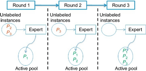
In our data set example, Figure 18.10 produces the labeling order of the instances {P1, P2, P3}. In other words, in the first round we will ask our expert to label P1 and place that label in the active pool. In that round, because the active pool contains only 1 labeled instance it will be the closest labeled neighbor of every test instance and the estimates for all the test instances will be the same (the label of P1).
In the second round, P2 will be labeled by the expert and placed into a pool of “active” (i.e., labeled) examples. This time the test instances will have two alternatives to choose their closest-neighbor from; hence, the estimates will be either the label of P1 or the label of P2. Finally, the expert will label P3 and place it into the active pool. The change of the active pool is shown in Figure 18.11. Note that we only move from Roundi to Roundi+1 if the stopping rules (described above) do not fire.
18.4 How the experiments are designed
Our experiments start with forming a baseline of the successful supervised learners. These are the learners that we choose based on the previous literature. Then we run QUICK and find its performance on SEE data sets. Finally, we compare QUICK's performance to the baseline to see how good or bad it performs. In other words, our experiments are composed of three main parts:
1. Generate baseline results. Apply CART and passiveNN (passiveNN is the standard ABE0 algorithm, i.e., k-NN with k = 1) on the entire training set (we select CART and passiveNN due to their previous high performance on SEE data sets; a practitioner may change these learners with other successful candidates in his/her domain).
2. Generate the active learning results. Run QUICK on the same data sets as CART and passiveNN.
3. Compare the baseline results against the results of QUICK.
1. Generate baseline results by applying CART and passiveNN on the entire training set. The algorithms are run on the entire training set and their estimations are stored using a 10-way cross-validation, which works as follows:
• Randomize the order of instances in the data set.
• Divide data set into 10 bins.
• Choose 1 bin at a time as the test set and use the remaining bins as the training set.
• Repeat the previous step using each one of the 10 bins in turn as the test set.
2. Generate the active learning results by running QUICK. At each iteration, first the features are selected and the active pool is populated with training instances in the order of their popularity. Training instances outside the active pool are considered unlabeled and QUICK is only allowed to use instances in the pool. Train and test sets are generated by 10-way-cross-validation.
Before a training instance is placed in the active pool, an expert labels that instance, i.e., the costing data is collected. When the active pool only contains 1 instance, the estimates will all be the same. As the active pool is populated, QUICK has more labeled training instances to estimate from.
3. Compare baseline to active learning. Once the execution of the algorithms is complete, the performance of QUICK, passiveNN, and CART are compared under different performance measures.
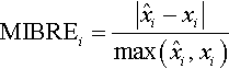
For our experiments, we use seven different error measures that are commonly employed in the SEE domain: MAR, MMRE, MdMRE, MMER, PRED(25), MBRE, and MIBRE. Below is the derivation and explanation of these error measures: The absolute residual (AR) is the absolute difference between the predicted and the actual values of a test instance
where xi and ![]() are the actual and predicted value for test instance i, respectively. The summary of AR is taken through the mean of AR, which is known as mean AR (MAR).
are the actual and predicted value for test instance i, respectively. The summary of AR is taken through the mean of AR, which is known as mean AR (MAR).
The magnitude of relative error measure, a.k.a. MRE, is quite widely used in SEE (and other domains). It is the error ratio between the actual effort and its delta with the predicted effort
A related measure is MER (magnitude of error relative to the estimate [133]):

The overall average error of MRE can be derived as the mean or median magnitude of relative error measure (MMRE and MdMRE, respectively):
A common alternative is PRED(25), which is defined as the percentage of successful predictions falling within 25% of the actual values:

where N is the dataset size. For example, PRED(25) = 50% implies that half of the estimates fall within 25% of the actual values (Figure 18.12).

Mean balanced relative error (MBRE) and the mean inverted balanced relative error (MIBRE) are two other performance measures, which are both suggested by Foss et al. [133]:

There are a number different alternatives to summarize each error measure; however, we will use a simple—yet effective—technique called the win-tie-loss calculation. In this procedure, one method is compared to another one using the procedure of Figure 18.13. In this chapter, among win, loss, loss values we will make use of the loss values, because we want QUICK to performjust as well as the other methods, not better. QUICK's main contribution is not better performance, but statistically significantly the same performance with much less instances and features. The calculation of the win, loss, loss values is as follows:

We use a total of 18 public SEE data sets to test QUICK in this chapter. We already talked about these data sets in a prior chapter, so it will suffice to provide a summary with Figure 18.14 in this chapter.

18.5 Results
In this section we will take a look at the performance of QUICK with regard to the baseline that is formed by the supervised learners of CART and passiveNN. QUICK is an active learner working on the essential content of the data set, so we will also investigate how many instances QUICK asks to be labeled as well as the size of the essential content.
18.5.1 Performance
Before we start looking at the plots of performance vs. number of labeled training instances, we will walk through a sample plot step-by-step to explain how to interpret these plots. Figure 18.12 is a sample plot that is derived from an actual representative data set (shown is the desharnais data set). Figure 18.12 is the result of QUICK's synonym pruning (four features are selected for the sample desharnais data set) followed by labeling N′ instances in decreasing popularity. Here is how we can read Figure 18.12:
• Y-axis is the logged MdMRE error measures: The smaller the value the better the performance. In case MdMRE is not the ideal error measure for a practitioner's problem domain, he/she should feel free to switch it with an appropriate error measure.
• The line with star-dots shows the error seen when ith instance was estimated using the labels 1,…, (i − 1), i.e., each instance can only use the i − 1 labeled instances in the active pool.
• The horizontal lines show the errors seen when estimates were generated using all the data (either from CART or passiveNN).
• The vertical line shows the point where QUICK advised that labeling can stop (i.e., N′). Recall that QUICK stops asking for labels if one of the predefined rules fire.
• The square-dotted line shows randNN, which is the result of picking any random instance from the training set and using its effort value as the estimate.
Figure 18.12 shows that QUICK uses a considerably smaller number of labeled instances with fewer features. But of course the reduction in the labels and features would not have much meaning unless QUICK can also show a high performance. However, to observe the possible scenarios we cannot make use of Figure 18.12 any more for two reasons: Repeating Figure 18.12 for 7 error measures × 17 data sets would consume too much space without conveying any new information and more importantly, Figure 18.12 does not tell whether or not differences are significant; e.g., see Tables 18.5, 18.6 showing that performance differences among QUICK, passiveNN, and CART are not significant for the desharnais data set. Therefore, we will continue our performance analysis with summary tables in the following subsections.
18.5.2 Reduction via synonym and outlier pruning
Table 18.4 shows reduction results from all 18 data sets used in this study. The N column shows the size of the data and the N′ column shows how much of that data was labeled by QUICK. The ![]() column expresses the percentage ratio of these two numbers. In a similar fashion, F shows the number of independent features for each data set, whereas F′ shows the number of selected features by QUICK. The
column expresses the percentage ratio of these two numbers. In a similar fashion, F shows the number of independent features for each data set, whereas F′ shows the number of selected features by QUICK. The ![]() ratio expresses the percentage of selected features to the total number of the features. The important observation of Table 18.4 is that, given N projects and F features, it is neither necessary to collect detailed costing details on 100% of N nor is it necessary to use all the features. For nearly half the data sets studied here, labeling around one-third of N would suffice (median of
ratio expresses the percentage of selected features to the total number of the features. The important observation of Table 18.4 is that, given N projects and F features, it is neither necessary to collect detailed costing details on 100% of N nor is it necessary to use all the features. For nearly half the data sets studied here, labeling around one-third of N would suffice (median of ![]() for 18 data sets is 32.5%). There is a similar scenario for the amount of features required. QUICK selects around one-third of F for half the data sets. The median value of
for 18 data sets is 32.5%). There is a similar scenario for the amount of features required. QUICK selects around one-third of F for half the data sets. The median value of ![]() for 18 data sets is 38%.
for 18 data sets is 38%.
Table 18.4
The Essential Content of the SEE Data Sets Used in Our Experimentation (From Ref. [231].)
| Data Set | N | N′ | F | F′ | |||
| nasa93 | 93 | 21 | 23% | 16 | 3 | 19% | 4% |
| cocomo81 | 63 | 11 | 17% | 16 | 6 | 38% | 7% |
| cocomo81o | 24 | 13 | 54% | 16 | 2 | 13% | 7% |
| maxwell | 62 | 10 | 16% | 26 | 13 | 50% | 8% |
| kemerer | 15 | 4 | 27% | 6 | 2 | 33% | 9% |
| desharnais | 81 | 19 | 23% | 10 | 4 | 40% | 9% |
| miyazaki94 | 48 | 17 | 35% | 7 | 2 | 29% | 10% |
| desharnaisL1 | 46 | 12 | 26% | 10 | 4 | 40% | 10% |
| nasa93_center_5 | 39 | 11 | 28% | 16 | 6 | 38% | 11% |
| nasa93_center_2 | 37 | 16 | 43% | 16 | 4 | 25% | 11% |
| cocomo81e | 28 | 9 | 32% | 16 | 7 | 44% | 14% |
| desharnaisL2 | 25 | 6 | 24% | 10 | 6 | 60% | 14% |
| sdr | 24 | 10 | 42% | 21 | 8 | 38% | 16% |
| desharnaisL3 | 10 | 6 | 60% | 10 | 3 | 30% | 18% |
| nasa93_center_1 | 12 | 4 | 33% | 16 | 9 | 56% | 19% |
| cocomo81s | 11 | 7 | 64% | 16 | 5 | 31% | 20% |
| finnish | 38 | 17 | 45% | 7 | 4 | 57% | 26% |
| albrecht | 24 | 9 | 38% | 6 | 5 | 83% | 31% |

The essential content of a data set D with N instances and F independent features would be the ratio of its actual features and instances to the selected features (F′) and selected instances (N′), i.e., ![]() .
.
The combined effect of synonym and outlier pruning becomes clearer when we look at the last column of Table 18.4. Assuming that a data set D of N instances and F independent features is defined as an N-by-F matrix, the reduced data set D′ is a matrix of size N′-by-F′. The last column shows the total reduction provided by QUICK in the form of a ratio: ![]() . The rows of Table 18.4 are sorted according to this ratio. Note that the maximum size requirement (albrecht data set) is only 32% of the original data set and with QUICK we can go as low as only 4% of the actual data set size (nasa93).
. The rows of Table 18.4 are sorted according to this ratio. Note that the maximum size requirement (albrecht data set) is only 32% of the original data set and with QUICK we can go as low as only 4% of the actual data set size (nasa93).
18.5.3 Comparison of QUICK vs. CART
Figure 18.15 shows the PRED(25) difference between CART (using all the data) and QUICK (using just a subset of the data). The difference is calculated as PRED(25) of CART minus PRED(25) of QUICK. Hence, a negative value indicates that QUICK offers better PRED(25) estimates than CART. The left-hand side (starting from the value of −35) shows QUICK is better than CART, whereas in other cases CART outperformed QUICK (see the right-hand side until the value of +35).

From Figure 18.15 we see that 50th percentile corresponds around the PRED(25) value of 2, which means that at the median point the performance of CART and QUICK are very close. Also note that 75th percentile corresponds to less than 15, meaning that for the cases when CART is better than QUICK the difference is not dramatic.
18.5.4 Detailed look at the statistical analysis
Tables 18.5, 18.6 compare QUICK to passiveNN and CART using 7 error measures. Smaller values are better in these tables, as they show the number of losses: A method loses against another method if its performance is worse than the other method and if the two methods are statistically significantly different from one another. When calculating “loss” for six of the measures, “loss” means higher error values. On the other hand, for PRED(25), “loss” means lower values. The last column of each table sums the losses associated with the method in the related row.
Table 18.5
QUICK (on the Reduced Data Set) vs. passiveNN (on the Whole Data Set) with Regard to the Number of Losses, i.e., Lower Values are Better
 |

The right-hand column sums the number of losses. Rows highlighted in gray show data sets where QUICK performs worse than passiveNN in the majority case (4 times out of 7, or more). Note that only 1 row is highlighted.
Table 18.6
QUICK (on the Reduced Data Set) vs. CART (on the Whole Data Set) with Regard to the Number of Losses, i.e., Lower Values are Better
 |

The right-hand column sums the number of losses. Gray rows are the data sets where QUICK performs worse than CART in the majority case (4 times out of 7, or more).
By sorting the values in the last column of Table 18.5, we can show that the number of losses is very similar to the nearest neighbor results:
| QUICK : | 0, 0, 0, 0, 0, 0, 0, 0, 0, 0, 0, 0, 0, 0, 0, 0, 3, 6 |
| passiveNN : | 0, 0, 0, 0, 0, 0, 0, 0, 0, 0, 0, 0, 0, 2, 3, 6, 6, 7 |
The gray rows of Table 18.5 show the datasets where QUICK loses over most of the error measures (4 times out of 7 error measures, or more). The key observation here is that, when using nearest-neighbor methods, a QUICK analysis loses infrequently (only 1 gray row) compared to a full analysis of all projects.
As noted in Figure 18.15, QUICK has a close performance to CART. This can also be seen in the number of losses summed in the last column of Table 18.6. The 4 gray rows of Table 18.6 show the data sets where QUICK loses most of the time (4 or more out of 7) to CART. In just 4/18 = 22% of the data sets is a full CART analysis better than a QUICK partial analysis of a small subset of the data. The sorted last column of Table 18.6:
18.5.5 Early results on defect data sets
To question the robustness of QUICK, we also adapted it to defect prediction (which is a classification problem unlike SEE). The data set and the statistical comparison of QUICK to other methods is provided in Table 18.8. We compared QUICK to successful learners in defect prediction domain such as CART, k-NN (i.e., passiveNN), as well as Naive Bayes. Because defect prediction is a classification problem, we used different evaluation criteria: Let A, B, C, D denote the true negatives, false negatives, false positives, and true positives, respectively. Then pd = (D/(B + D)) and pf = (C/(A + C)), where pd stands for probability of detection and pf stands for probability of false alarm rate. We combined the pd and pf into a single measure called the G-value, which is the harmonic mean of the pd and (1 − pf) values (Table 18.7).
Table 18.7
QUICK's Sanity Check on 8 Company Data Sets (Company Codes are C1, C2,…, C8) from Tukutuku
  |
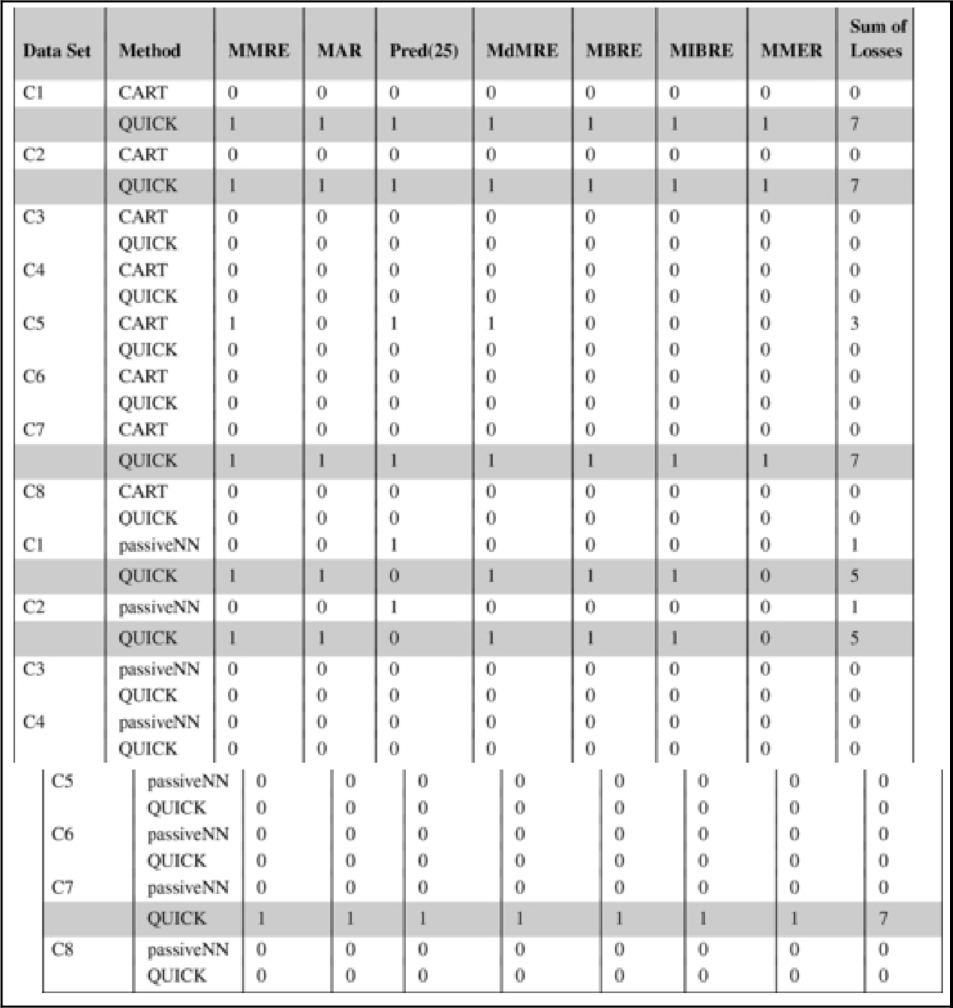
Cases where QUICK loses for the majority of the error measures (4 or more) are highlighted. QUICK is statistically significantly the same as CART for 5 out of 8 company data sets for the majority of the error measures (4 or more). Similarly, QUICK is significantly the same as passiveNN for 5 out of 8 company data sets.
Table 18.8
Statistical Significance of the G-Value Comparison
| Dataset | G-QUICK | G-passiveNN | G-CART | G-Bayes | G-Forest | Total |
| lucene2dot2 | 0.59 | ✓ | ✓ | ✓ | ✓ | 18 of 32 |
| lucene2dot4 | 0.63 | ✓ | ✓ | ✓ | ||
| velocity1dot5 | 0.51 | ✓ | ||||
| xerces1dot4 | 0.73 | ✓ | ||||
| synapse1dot2 | 0.59 | |||||
| velocity1dot6 | 0.67 | ✓ | ✓ | ✓ | ✓ | |
| xalan2dot5 | 0.57 | ✓ | ||||
| xalan2dot6 | 0.74 | ✓ | ✓ | ✓ | ✓ |
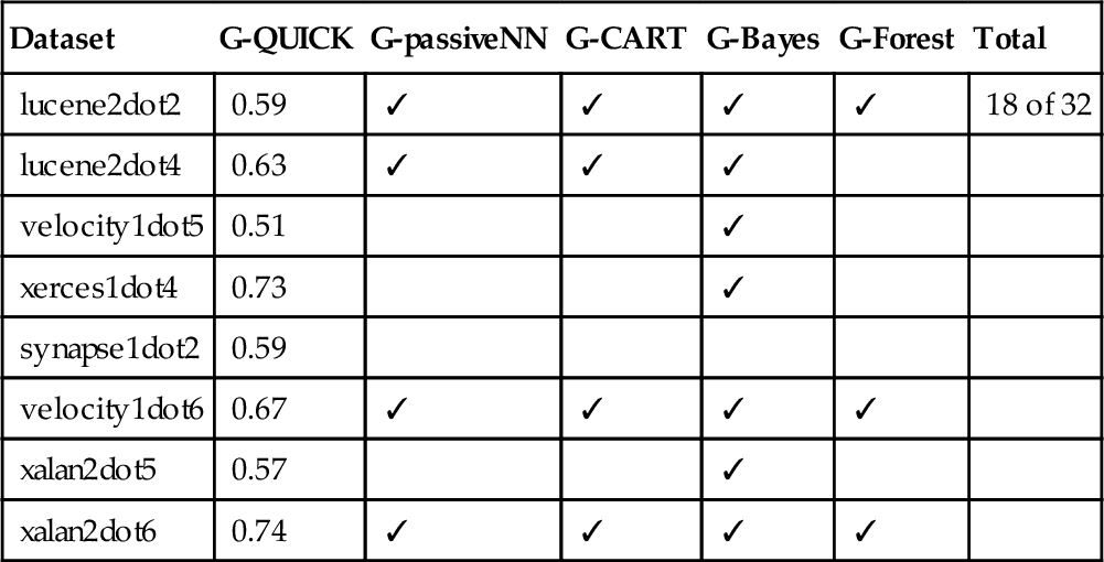
Table 18.8 shows whether QUICK is statistically significantly better than the compared method (according to the Cohen significance test). As can be seen, in 18 out of 32 comparisons, QUICK (that uses only a small fraction of the labels) is comparable or better than the supervised methods (that use all the labeled data). This is a good indicator that the performance of QUICK-like active learning solutions are transferable. The results of Table 18.8 is part of an ongoing study; hence, we will not go deep into other aspects of the results of QUICK's performance on defect data sets.
18.6 Summary
In this chapter, we have tried to find the essential content of data sets and use the instances of the essential content as part of an active learner called QUICK. Our results on SEE data sets showed that essential content of SEE data sets is surprisingly small. This may not be the case for all the data sets of all the domains; hence, a practitioner experimenting with other data sets may observe different percentages of his/her data sets being the essential content. However, the fact that essential content is considerably smaller than the original data set is likely to hold.
Also, as we noted from time to time throughout the chapter, there are particular choices in the implementation of QUICK that are domain specific. For example, to check whether QUICK should stop asking for labels, we used MRE as an error measure. The error measure could be different for other domains. Another design decision that could be altered by the experts is the firing of stopping rules. The stopping rules that QUICK uses come from expert judgment; hence, a practitioner should be open to experimentation and flexible to come up with different stopping criteria.